#i had the urge to use my micron pens
Text

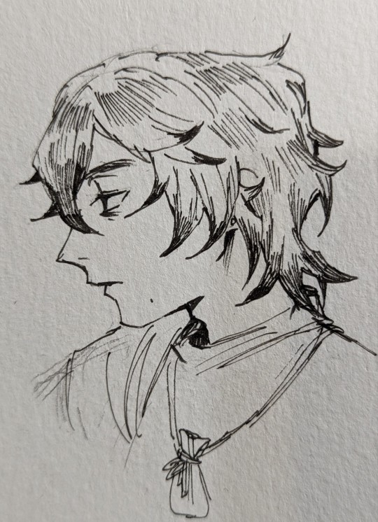
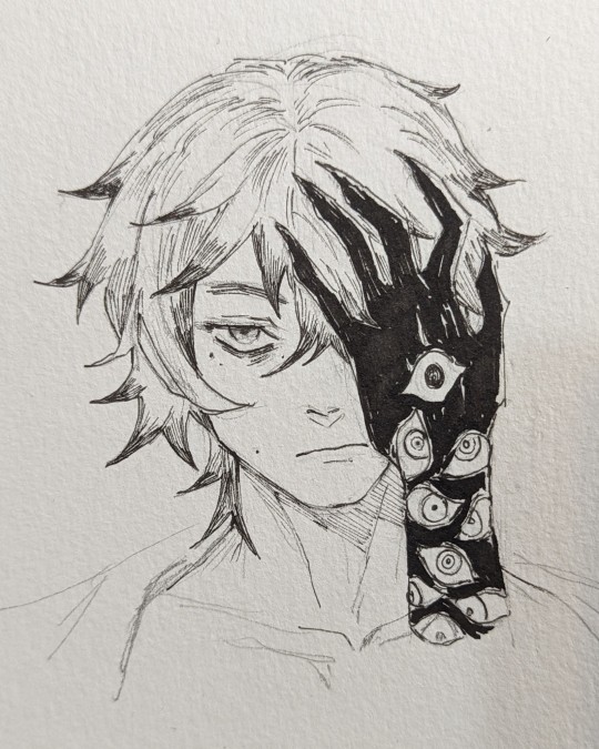
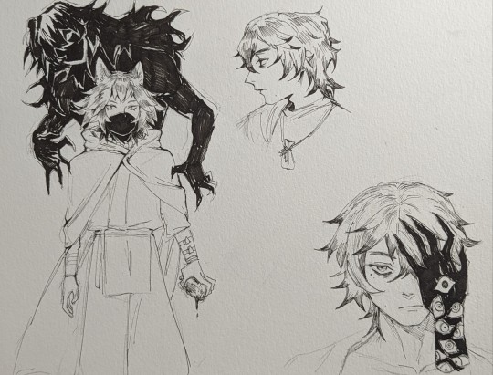
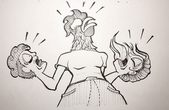
OC doodles
#OC#doodles#i had the urge to use my micron pens#and try out this watercolor pad ive had just collecting dust on my bookshelf#i couldn't think of anything else to fill in the empty space
7 notes
·
View notes
Photo
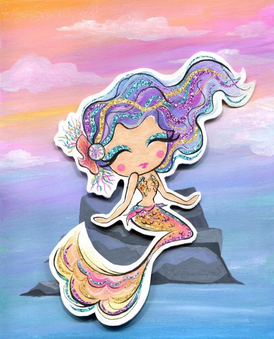
Sparkle By the Sea
Pardon me as I just barely squeeze a MerMay piece of art in.
I'll be honest with you guys, I've been pretty lacking in artistic motivation since NaPoWriMo ended. Although if you've noticed my lack of uploads, you probably could've already guessed that. This isn't abnormal for the aftermath of a month-long challenge for me, especially with a brand-new video game calling my name at every moment of the day, but even so I feel like this particular motivation drought was a bit different.
Part of it definitely had to do with the changes to DeviantArt that I'm sure I don't need to remind everyone of, but that's been more of me dreading seeing what the state of the community is than anything else. (However, I have noticed I'm not a fan of the new tag system over the old category one, as confusing as the category system could be sometimes.) Rather, I think this lake of motivation has more to do with the fact that being largely absent from all social media during NaPo reminded me...well, that I hate social media.
This is really a bigger discussion for a journal or something, but suffice to say it did not feel good to realize just how many literal hours I had previously been spending trying to desperately to scrape up just a little bit of support on other social media platforms (namely Twitter), versus the more natural growth I see here on dA that also feels a lot more genuine and less forced/obligatory.
I can't really explain it, but that reminder/realization really helped my brain slip back into a place where I felt like creating again. And with that, I'll transition into talking about the art and save the social media talk for, as I said, a journal or something later on.
Naturally, I've been seeing a lot of mermaid art this month and every year I feel the urge to get in on the fun, though I know better than to try actually doing the MerMay Challenge (especially not this year after having just done NaPo), so I usually either do a one-off drawing or if I'm too busy with other projects I just skip it. But I was starting to feel that need to make art in my brain again and I've had a specific set of stickers from the dollar store sitting in my stash for quite a while now that more or less sealed the deal for me.
How do these stickers fit into the mix? Well, I originally fell in love with/picked them up because they are mermaid-themed and absolutely adorable--See for yourself! And I thought they would make for nice decals in a book project since they're wall stickers and therefore repositionable with minimal adhesive-yuck. And at first, I thought maybe I'd end up making them into said hypothetical book project in time for MerMay...except that felt a little cheap in combination with my lack of uploads. Did I really want to come back with a book project featuring mermaids I didn't even draw? And for MerMay of all things?
So I sat on the idea and left the stickers out where I could see them, and eventually I sat down and took a closer look at them. The art style, upon further inspection, actually didn't look like it would be too far outside my usual art-making realms...Most of the coloring looks a lot like watercolor, except for the skin which I thought was flat and smooth like alcohol marker and the glitter accents which from my perspective pretty much had to be digital, but could potentially be replicated with glittery/metallic supplies...
And that was the moment the idea hatched. I decided I'd try drawing a mermaid myself in the same style. This would work for MerMay, have something to do with the stickers, and based on my plans would work well for me as a mixed-media project, which as I'm sure I've said before is where I think my artistic talent shines best.
I thought the scariest part was going to be replicating the looser and less strict line style, and to a point it was, but it wasn't nearly as bad as I thought it was going to be. I find it's usually kind of tricky to explain this, but really what this part of the process boils down to for me (if I'm replicating an existing style and not using my own), is really just studying the original artwork(s) and looking for patterns, then trying to stick to those patterns. For example, the style here features fairly large & rounded faces, and the hands are more like hand-shaped mittens (which was great news by the way because hands are always a pain in the butt for me), so I did my best to emulate those features.
As per usual, I did start with a sketch, but I tried to keep it looser than usual, and then when I did the inking I started with my 0.2 Micron, again trying to keep things loose and no be too fussy if I could help it. Then I went back with a brush tip liner from Prismacolor to get more natural variation in the lines and to force myself to not have quite so much control over the line weight.
I was also very careful with my choice of liners because I knew pretty much everything except the skin was going to see a lot of watercolors, which meant the lines had to be waterproof. And of course, I went with watercolor paper (my nice 100% cotton stuff this time) to make sure I didn't have any issues with blending or layering.
Now, at this stage, I didn't know what I was going to do for the background, though I was leaning towards the idea of making one separately and placing the mermaid on top afterward, as sort of a nod to the original mermaids being stickers. But I wasn't totally sure yet.
What I was sure of was how scared I was to just dive into coloring. The sketching and inking and gone so well I was thinking I was in for a rude awakening at any moment. So, just in case, I scanned my uncolored lines as a fall-back if I royally screwed up. With my paranoid mind set at ease (for the most part), I could begin with color application.
I started with the skin since it was the easiest; Just one good layer of alcohol marker, leaving a little white space here and there like the artwork I was emulating. Although 1. The marker color turned out a bit darker than I was expecting and later blended too well with her tail, so I had to lighten it in Photoshop, and 2. because watercolor paper really soaks up the ink, I ended up with less white space than I thought I would. But beyond that, this step went off without a hitch.
So then came the second-scariest part: The watercolor. I used a mixture of my Master's Touch watercolors and Mermaid Markers (yes, that was a very conscious supply choice ) and tried to take my time and be mindful of the color balance I was looking for.
I'd decided ahead of time that I wanted to try and stick with a soft-ish palette like the original art, but I still wanted my choices to be different. Since yellow/gold is featured in the original but not used for a tail color, that's what I went with, and I opted for the blue-y-purple hair since a soft blue and purple are also prominent in the original and based on color-theory would be a nice contrast to the gold-orange tail. Though I did also try to get some pink in both the tail and the hair for a bit of unity and calling back to the pink in the original art.
The trickiest part with the coloring was actually the tiny lips and blush spots. I ended up using a fluorescent pink for that turned out as more of a red originally and had to be touched-up via Photoshop because of that and also because of the lightening I did to the skin. It's more that it was a bit of a challenge to get the shapes of these much smaller areas right and in the correct place, since I had to use very minimal pencil markings, lest I end up with nasty graphite marks mixed into the paint.
Getting the hair to be dark enough without being extreme compared to the rest of the drawing was also a great test of patience, but it ultimately worked out, I think.
I also had a hard time deciding what color the piece of coral in her hair should be, which is why it ended up as this vague dusky-orange color. And I got more pink on the sand dollar next to it than I intended, but neither of those things is a huge deal.
While I waited for all that to dry though, I had to decide how I was going to go about tackling all that extreme sparkle the original art had. I could have just added it in digitally and not even attempted it traditionally, but everything else had gone so smoothly that I decided to push my luck this time.
Originally, I started with just glittery gel pens, but I found pretty quickly that they were sinking back into the colors underneath them too much and thus just weren't doing what I wanted. I wanted high-impact sparkle. After some brief consideration, I turned to the metallic watercolor sets I have made by Art Philosophy, which are very high-impact metallic and pretty opaque, which would work well over my failed gel pen and would work wonders for the areas where I wanted that high-impact over an opposing color. (I.E. Where I wanted the blue sparkle over a very orange-yellow area, which would normally make brown mud if the color on top wasn't opaque.)
The funny part about that is that I originally used a different shade of purple and gold for those areas of sparkle that I ended up completely covering with different shades (the purple needed to be lighter and the gold needed to be darker/more gold and less yellow). And her eye shadow cover saw all three colors before I settled; The purple just seemed wrong, and the gold blended too well with her skin. I thought the blue wouldn't work so close to her blue hair, but it actually ended up looking the best out of the three.
Although, I do have to make a full disclosure that the high-impact sparkle you see here is in fact where I went in and re-did it digitally once I scanned the artwork in. Unfortunately, glitter and metallic supplies just don't scan very well and usually end up looking too dark, dull, or flat by comparison. The metallic paints work just fine in person since you can move the art and see how they reflect the light, but it just doesn't work in a still image that's been captured by having a bright light uniformly shined over it.
Still, re-tooling the sparkle digitally ended up being an interesting challenge, especially since it's been a fairly long time since I was messing with digital textures like this.
Also worth noting is that I had to re-paint some of the metallic areas because they weirdly lifted off onto the plastic cover I used to protect the art when I pressed it onto the background to make the glue stick. I'm not sure if it's because those were the extra-layered areas and they hadn't fully dried all the way down to the paper, or if that particularly plastic just picks up this metallic paint really easily or what.
And speaking of that background...
Like I said earlier, I wasn't really sure what I wanted to do for a background for a while, but after reviewing my mermaid-centric Pinterest board I decided a simple rock seat and something to vaguely suggest the ocean/water without getting too detailed would suffice just fine. Based on that, I felt like using gouache would work nicely (and I just really felt like using the gouache since I don't find a lot of opportunities to use it) and that a color scheme that flipped her hair and tail colors would be best for the effect I wanted.
I've found I really like the Strathmore 400 series mixed media paper for gouache because of how smooth it is, so I cut a piece down to size and got busy.
For the most part, I just kind of went in with the colors doing whatever felt right, and trying to use some gouache I'd already mixed from past projects (since gouache can be reactivated and I've found this kind, in particular, seems to reactivate really nicely) either on their own or to mix the colors I felt like I needed. And I also tried to do a lot of blending straight on the paper to get more variations in color and make things a bit more lively.
Oddly enough, this ended up being a good example of gouache's covering power because I accidentally started applying the colors upside down--using more greens and blues on top and more pinky-purple on the bottom--and not only had to flip the paper around but also had to do a fair amount of covering the colors I'd already put down with colors you don't really want to mix with them because they don't make very pretty results. But it worked out just fine, so yay!
I also added some clouds for a little extra ambiance, which I think looks quite nice.
Believe it or not, the most difficult thing about the background was the rocks. I spent far longer than I care to admit (or bothered to document, for that matter) trying and in many ways failing to mix the proper shades of gray I wanted, and the end result didn't turn out quite as clean and graphic as I had hoped, but by the time I put the mermaid on top, you really can't tell because you can only see a fraction of what's actually there. And I mean, the end result isn't terrible, it's just not quite what I was picturing in my mind's eye is all.
Personally, I know it's kind of an odd choice, but I really like how there's no defining line between the water and the sky, and yet you still get a clear idea that they're separate and the rocks aren't just floating in space. I'm not sure how, but I think I'd like to work with this kind of ambiguity more often. It's like a step between abstract and more structured art.
Anyway. With the background done, the next step was to attach the mermaid, which I felt like doing in a more 3D and less flat manner, so I chopped up a cardboard box that previously held a chocolate bunny I had on hand and glued some pieces together to boost the mermaid up a bit. This where those deep shadows between her and the background are coming from.
Here I feel the need to insert a comment about how difficult it was to get my tacky glue to dispense the glue for me, though there's a chance this is because I need to poke the opening in the tip to be a bit wider. (You have to poke it open yourself and I always felt like I never did get it open quite enough...unless you like strenuous hand exercises...)
Of course, once all the above was done then I had to scan the art in, which I was admittedly a bit nervous about after the incident with the plastic cover peeling off the metallic paint (though fortunately, the scanner glass didn't have the same effect), and then all that was left wad the digital retouches.
Overall, I'm really happy with how this turned out. It doesn't blend in as well as I originally wanted it to with the original art, but in the end, that doesn't really bother me. It's just a nice piece of art on its own that is also unique from what I normally do...except it's still got a lot of similar elements to how I normally make art. It feels a lot like the days when all I made was fanart. The key difference here is that I know myself better as an artist now and thus can use that knowledge to my advantage.
I can't promise this a return to regular posting for me, though I do hope it's a gateway to me posting more frequently at least, but I can say I do intend on getting back to working on art more often and therefore being more present online again. At the very least, I can happily tell you guys that I have a couple of new art supplies en route to me that I've been wanting for a while and am excited to share with you once they arrive. If nothing else, we at least have that to look forward to!
____
Artwork © me, MysticSparkleWings
____
Where to find me & my artwork:
My Website | Commission Info + Prices | Ko-Fi | dA Print Shop | RedBubble | Twitter | Tumblr | Instagram
1 note
·
View note
Text
Self Examination Time!
Reflecting on my progress in art so far. Been climbing up a mountain, and it’s good to look back and see how far I’ve come! Or how horizontally I’ve walked.
TIME CHECK!
It’s been 27 years since I started arting.
8 years and 6 months since I started this blog.
1 year and 7 months since I started a now stagnant webcomic.
Comics I’m happiest with
"Food Science”

My first webcomic post. After practicing on Adobe Draw for a month or so, flying across the country to visit my best friend, and spending lots of time wandering around while she was at work, this comic came out of a conversation we had. In fact, the following year’s comics were almost entirely inspired by conversations between us. I’ve never met someone with whom absurdity sprouts so effortlessly, like dandelions on your freshly mowed, monoculture lawn. Something about this specific post captured something I’ve been chasing. I still don’t know what it is, but I come back to this one often.
“Urges”

Something about it. If I were to do it again, there’s a lot I’d do differently. It’s sloppy. But it’s another one that felt more like me, or more like the kind of thing I want to make. ELUSIVE “THING!”
I also started experimenting here with turning my handwriting into a font, because the lettering was just so very time consuming. Mostly because I was using a low quality stylus that came on the end of a free pen I took from the Dentist’s office.
"On the nature of stress”

It was inked traditionally, as I was (am) getting sick of digital art. It has clear black lines, is emotive, could be read in multiple directions. I like analogies, and this captured what I was feeling that day at work- when each drop imperceptibly increases my stress load until suddenly, tears. Whoops.
Areas for Improvement
Consistency
I’ve spent some time learning the rules so I can break them, but I need to break them in a uniform way. Still struggling to develop an identifiable style that is self-consistent.
Sloppiness
Cut back on: poor lighting, fingers in photos, light glare. Those are definitely a result of laziness, and *NOT* artistic choice...
Speed

It’s slow going. Better than not going at all, but there’s room for improvement here.
1) The faster I make art, the more likely I am to put it out there. I’ve also improved on how quickly I can make a decent product. I hope to keep improving on that front.
2) Posting things consistently... I’m less concerned about this, because I’d rather just do things at my own pace. I have timelines at my work life, I don’t need it in my art life. BUT. If I can post consistently and still be happy, I should!
3) Don’t be afraid to complete something in multiple sittings. I had gotten into the habit of rushing to finish a project because I knew that if I put it down, I would never pick it back up again. I refuse to live that way anymore. In fact, this blog post was written across multiple sittings, over multiple days. All I have are pockets of time, and if I wait for chunks of time to fall into my life, I’ll be waiting for Godot.
Digital vs Traditional : Can’t live without that [ctrl + z]

(left: Adobe Draw + Stylus ; right: Watercolors and micron pen)
So far I’ve used:
Samsung Tablet + Adobe Draw + Stylus - Beautiful, simple, but ultimately limiting. I got so used to the delay and imprecision of this setup, that when I finally got a more responsive setup, I couldn’t handle it!
Wacom Intuos Draw + Laptop - I used this all of twice. From the steep learning curve of not looking where my pencil is drawing, to the fact that I do most of my drawing while on the go, I realized this just did not work for me.
iPad Pro + Apple Pencil + Procreate - My current setup. It’s.... It’s too good for me...! I’m still getting used to it after having it for a few months- it’s one of those things that is so powerful, I'm spending a lot of time learning how to make it work for me. But I think it will pay off / has already paid off. I take it everywhere with me, and I am now almost as quick digitally as I am traditionally.
Traditional sketching + Digital Inking - My personal favorite. Works the best for me. I have all the fine control of pencil & paper- zooming in just means shoving my face closer to the page and widening my eyes. Meanwhile, digital inking relieves me of all the paper tearing, smear lines, and eraser shavings. I can also enjoy the glorious lasso tool, and [ctrl + z]!
YET TO BE RESOLVED: Headaches and eye strain from looking at a screen are a real thing! If anyone has advice on that front, hit me up.
Social Media
I need you... And I FEAR YOU...
Like most others, I have a fraught relationship with social media. I simultaneously want EVERYONE and NO ONE to see my hard work. I simultaneously want EVERYONE and NO ONE to know who I am.
I'm torn between intimate autobiographical commentary, and cryptic absurdity. I've jumped about on Facebook, Instagram, tumblr, Webtoons, Tapas and a personal website. Once all at the same time.
Never again.
I'm easily overwhelmed, so bare bones is my goal. Right now my solution is to stick with Instagram, track long term progress over this Tumblr, and use a personal website as a polished home base to point strangers to, as well as to practice site building.
0 notes
Text
My name is Nicoline Mann and I’m from Nanaimo, British Columbia, Canada. I have always been deeply inspired by nature and animals. I loved drawing as a kid and even considered going to art school as a young adult, but my mom advised me that art was a hobby not a career. I didn’t trust that I could make a living as an artist or that I was good enough anyway, so I abandoned it entirely for a couple of decades in favour of “real” jobs.
Until one day in February 2017 I felt so exhausted I couldn’t get out of bed, and I remained there for 2 weeks. As I slowly tried getting back to my old life, I realized it was impossible. I later discovered that I had ME/CFS (myalgic encephalomyelitis/chronic fatigue syndrome). During this time, and desperate to not fall into depression, I had the urge to draw again so I drew a Basset Hound that I felt compelled to add colour to. I found my daughters old watercolour pans from elementary school and I painted the Basset blue! The next day I did the same thing with a German Shepherd in bright pinks and a black Sharpie. I had never used watercolour before but found playing with it instantly lifted my mood and made me feel hopeful again.
I posted my playful dogs on Facebook and was surprised by the happy responses of my friends and family. I started receiving pet commissions that inadvertently and unexpectedly started my art business! Because I really had no idea what I was doing, I got very tense with the commissions. Even though I charged very low prices, I felt an obligation to do an incredible job and I found I wasn’t able to capture the lightheartedness and playfulness I felt when doing it just for me. Within a few short months of my fledgling pet portrait business I developed severe tendonitis in my right arm and was unable to hold anything in my hand for several months. I painted and drew with my left hand at this time, but I kept those to myself! Having art taken away from me so quickly, made me realize how much I loved it and needed it in my life.
As my arm healed I explored doing illustrative style of portraits and committed to a self-imposed 100 days of dogs series on Instagram. A few days into my challenge people started asking if their dog could be in the 100. It was such an incredible experience that developed my social network while also developing my skills! Each portrait was the size of a trading card (2″x3″). At first I cut Arches paper to size, but decided to purchase precut sizes available from Strathmore and they were perfect! I used 140 lbs coldpress precut Strathmore 400 Series trading cards and sketched the dogs directly onto the paper.
It takes erasing well and is a durable paper for this purpose. I then used a size 3 micron pen to outline some of the dog, then did light washes of watercolour overtop. Finally I added the name of the dog, the number out of 100 for that card and the dogs information (provided by the owner) onto the back of the cards. At the end of the project I offered the dog portraits to the owners for $35 and approximately 60 of them sold. They were shipped all over the world including, the UK, the Philippines, Australia, Hawaii, Canada and the USA. It was a slightly exhausting experience, but it gave me purpose and connection with others which was incredibly enriching and rewarding.
Since then I have taken a slower approach to my art and business. I continue to be realistic with my art, but because I still struggle with tendinitis I realize that my arm does not appreciate a tight style of art. Due to my physical limitations, I have begun seeking out teachers who offer a looser style of painting. I have been learning from Louise De Masi and most recently signed up for Jean Haines online school. I feel my sweetspot may be somewhere in the middle between their two beautiful styles, but only time will tell!
My approach to painting an animal is always the same. I ask for several photos of the pet in various poses and favourite images from the owner. I study the animal for a long time, looking at its features, eye colour, how its hair lays or curls and any unique or interesting features I want to highlight. I also ask the owners to tell me about their pet so that I can get a feel for it’s personality and soul. I sketch it out on sketch paper first and then transfer my drawing to my watercolour paper using a lightbox, window or transfer paper.
I used to try and capture every detail of the animal, but am now concentrating on only a few details while keeping the rest of the animal more implied. I then pick out the colours I will use. Most animals can be painted with a very limited palette. I always use French Ultramarine, Permanent Alizarin Crimson, Lemon Yellow, and Burnt Sienna. Sometimes I also use van dyke brown, sepia, raw sienna and burnt umber. I like to work wet-in-wet for most of the animal and then wet on dry for the details. I pay particular attention to the eyes because if they aren’t right, nothing is right.
My favourite paints to use are Daniel Smith and M. Graham. M. Graham is wonderful for people who have physical issues with their painting arm and hand. They use honey as a binder, so the paint remains soft and is very easy to reconstitute. Sometimes just getting paint ready to use or mixing it can be too much for someone with arthritis, carpal tunnel or tendonitis. I highly recommend a honey-based professional paint like M. Graham for someone who has these issues.
My favourite papers for commissions are cold press 300lbs Legion Stonehenge or Arches in bright white. I have found the 140 lbs Arches buckles too much for my style and I don’t have the energy to stretch paper or make it flat afterwards. I like to use Strathmore 500 Series 140lb paper in cold press and hot press for studies. It doesn’t buckle as much as Arches at the same weight, is bright white, comes precut in popular sizes, stays fairly flat even with a lot of water and is very affordable! My favourite brushes to use are Silver Black Velvet in size 10 and size 6, I also use smaller brushes by Rosemary & Co. for the detail work.
My work continues to evolve as I grow and develop as an artist. I used to think that art was talent someone was born with, but easily see now that it is a skill that can be developed and honed with practice. I’ve also come to see how incredibly therapeutic it is to have an art practice while also being shown the places where I can grow. In the beginning I felt like I needed to prove that I was a good artist in order to be taken seriously.
I felt like everything I created needed to look incredible or I shouldn’t share it. This was my perfectionism speaking and we still have words with each other, but she’s learning to trust and realize that perfection is the feeling one has while creating and not just the outcome. Art has made me see the world through a new lens, nothing looks as it used to. I notice so much more than I ever did before and have become an amateur botanist and birder along the way because of it.
Through art my love of nature and animals has only deepened. The gifts art continues to give, in the people I meet, the wisdom gained, the skills learned, the new ways of seeing, they all continue to astound and delight me. It is a gift and honour to be an artist and I am incredibly proud and humbled to call myself one.
Thanks again for this opportunity Charlie, it has been a delight revisiting the origins of my art journey!
Nicoline Mann
Website
Instagram
Facebook
GUEST ARTIST: "Art For Therapy And Personal Development" by Nicoline Mann - #doodlewash #WorldWatercolorGroup #watercolor #watercolour My name is Nicoline Mann and I'm from Nanaimo, British Columbia, Canada. I have always been deeply inspired by nature and animals.
#WorldWatercolorGroup#animals#art therapy#artist#birds#canada#cats#dogs#doodlewash#featured#inspiration#painting#pet portrait#pet portraits#watercolor#watercolour
0 notes
Last Seen Blogs

attackerman
The Anxious Introvert

myfootcare
My Footcare, medizinische Fußpflege
the-poutine-routine
currently rebranding...

killzoners
your favorite boy girl