#i just do whatever on the underpainting (i guess) layer
Text

rendering/painting is a little bit magical to me
#i just do whatever on the underpainting (i guess) layer#and then go ham on a single layer on top of everything#it really helped me to not feel as stressed about making things perfect on the first try#because i know i'll likely paint over it later anyway#learning to render changed my life i swear 😭#i don't even know if i can give good advice about it it's just a thing that happens
52 notes
·
View notes
Note
sorry if youve talked about this before, but do you have any tips relating to your coloring process? i ADOREE the way you render things and it looks soso cool and once i saw a post where you said your art typically only took a couple hours and i was in SHOCK. cuz ive been working on a yuji piece that has a similarish (not really but idk how to describe it…) coloring style and ive been working at it for. about a month now…sorry this is rambly i hope u have a good day!!!
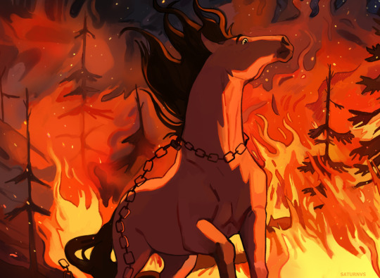
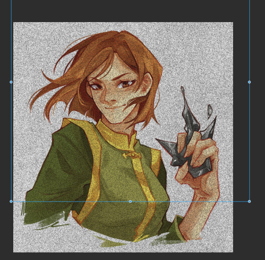
hi!!! first of all thank you so much I'm happy you like the way I render! honestly it Is still the aspect of drawing that takes the longest for me, I've only recently started to come up with ways to streamline my process (mainly through keeping my layers/brushes limited and overall being less anal about details) . these days my average drawing does take about 2.5-4 hours I'd say, with Big Illustrations obviously being the exception
i wouldn't beat yourself up too much about taking longer to finish a drawing tho ! it took me. a While to learn how to speed up and honestly my biggest piece of advice is loosen up and let certain things look imperfect or unfinished ! and if you're like i was and want to work at getting faster then i would recommend practicing churning out sketchy/rough pieces and see what tricks and habits you can implement or adjust to save time
all that being said I realize haven't done an updated overview of my colouring/rendering process so I guess this can be that ! I'll put it under the cut because i too like to ramble and this Will get long
lineart and base colour/underpainting


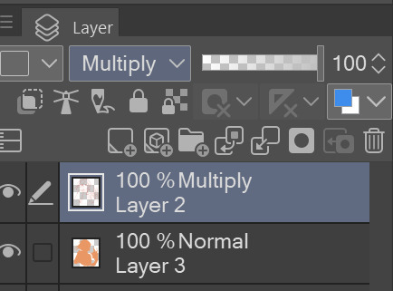
my lineart is nearly Always on multiply. it helps the lines stand out less starkly against the colours and makes it so that I don't have to change the colour of as many sections of lines later on
the base colour layer is honestly completely optional, tbh i sometimes skip it so you don't Have to have one but i like it for a few reasons:
- I like to keep all my colours on the same layer so if i'm going for a painterly style this serves as an underpaint layer of sorts . having this means that when i paint, whatever colour i have here will blend with all the other colours i use and help them look cohesive
- even if I'm not painting, i still like to work with all my colours on the same layer and it helps me make sure I'm not missing any spots, which helps when it comes time to section individual areas off in the next steps
2. flats
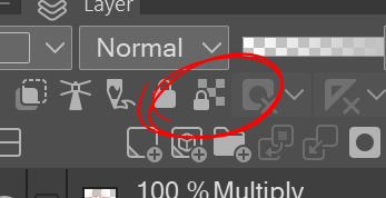

lock transparency button my beloved . this makes it so that you're only able to paint on areas where there is Already colour (which is where having an underpaint layer comes in handy)
not much else to say about this step, just choosing colours rly !
3. shading
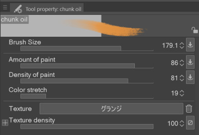
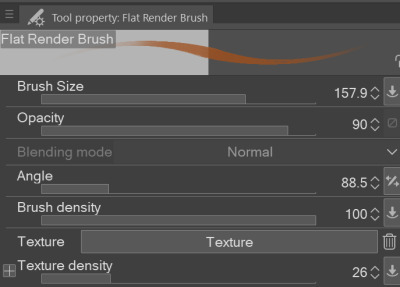
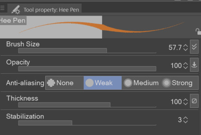
here's where the fun starts ! since i'm working all on one layer, i use the wand or lasso tool to section off whatever area I want to work on, then go in with (usually) one of the three brushes below: from left to right
1. my favourite dry brush that i use to cover large areas, it has an amazing dry paint stroke-y texture and i use it in everything. great for skin/clothes/hair/fur/organic material...she does it all
2. smaller, blendier/smoother brush that I use to soften out the rougher edges left by the first brush. I find it's really good for hair and small clothing creases
3. rough pen brush that I use to add little bits of flavour in the form of crosshatches or stray lines, usually to hint at individual hair strands! I also use it to line sometimes but I'm using it less for that recently
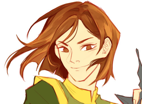
also, since the lineart layer is set to multiply, it's super easy to colour directly under the lines on my colour layer and use that as a way to make certain lines Darker . it's most obvious at the eyelashes and under the jaw but I do it everywhere

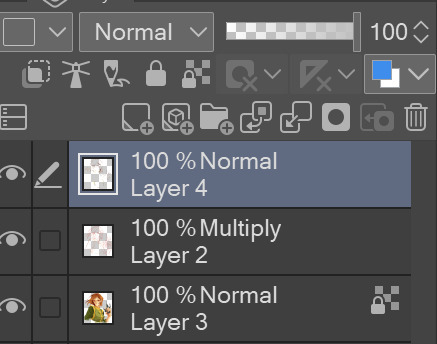
4. finishing touches and texture overlay
here I add another layer above the multiply/lineart layer and use it to add highlights and other details! this is also the layer i use to paint directly on top of any areas that got messy or need extra definition
my texture overlay of choice is just a rough monochrome static file that I got on the csp assets page but use whatever you'd like tbh ! set the layer mode to overlay and adjust the opacity to your liking (I also like to rasterize the layer to make it easier to work with but it's not too consequential if you skip that step since you're basically done by this point anyway)
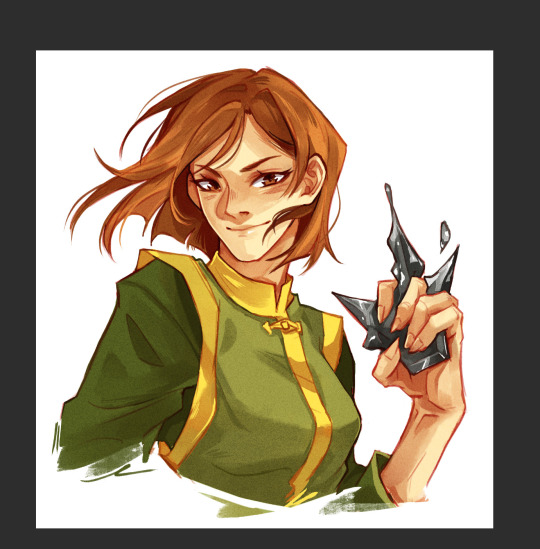
And done ! slap a signature on that bad boy and send it <3

#answered#flowingredscale#art advice#my art#i rly hope this was helpful!!!#best of luck with your yuuji piece <3
32 notes
·
View notes
Text
Week 5
Link #1: How to Create a Painting With Shading : Painting Techniques
~You want to make sure you have at least one dark color and one light color.
Okok, so I’ll be including a little picture of what I did, but I’ll be using Emerald Green as the light color and Ultramarine as the dark color :)
~Now mix them together to get your medium tone.
Oh. I mean, it comes out as a pretty teal owo. You’ll see in a bit, dw.
~Dip your brush in the water and just dip into your middle tone and paint a circle on your paper or canvas.
I hope y’all know that I don’t expect you to do this with me. I mean, I wouldn’t mind if you tried this out LOL. Whatever floats your boat y’know. Besides, who doesn’t love painting circles, am I right?- But seriously, circles do be pretty hard to make legit circles. Like, I think I’ve only managed to get one even close to being an actual circle, and that wasn’t even that close.
~It’s completely okay to have some variation, thicker paint around the edges and then kind of wash you paint in the center of the sphere (for now it’s a circle, but that’s besides the point)
~You don’t have to completely rinse your brush out. It's okay to leave a little bit of that color on because it’ll create a smooth transition.
I actually didn’t think of that to be completely honest with you. I tend to always wash my brush completely before I even go into the next color. I- well the more you know, the better you can be c:
~Grab a little bit of that light color and you’re gonna add some highlights in the upper left or right corner of your sphere (whichever one you prefer I suppose, I tend to always have the light coming from the left)
~Even though we’re using acrylic, the paint should be staying fairly wet and just kinda blend that lighter color in with the darker color.
So like, wait. I just kinda went braindead for half a second, I’m like- Acrylic paint isn’t wet, that’s only water colors. And- I’m just sitting here now dumbfounded because when you think about it- Water color isn’t wet- But acrylic paint is- it’s- yes- look I have no idea where I was going with this bit LOL. But here it is-(Intense brush strokes) LOL
~Create as smooth of a transition as possible between the upper and lower part of your sphere.
I cannot tell you guys how good this looks tbh, and we’re only maybe halfway done LOL
~Dip the brush back in the water (What if I wanted to dunk it though-) and go for your dark color and basically you’re just going to do the opposite of what you did with the light color, meaning that you’ll be in the opposite, bottom corner (Don’t mind the fact that I just said the bottom corner for a sphere- I’m intelligent, yes.)
~Really try to blend it in with the paint that’s already down there.
~You should be doing light brush strokes, you don’t need to push too much paint down onto the page.
See, the thing is. I have a pretty heavy hand when it comes to anything really, so I would say this was the most challenging thing for me, so far that is one of the main struggles for me.
~Now rinse your brush out and leave a little bit of paint on the brush and this is going to be used for the shadow, which is just gonna be a washy shape surrounding the bottom of the sphere and that’ll create a plane for your object (sphere) to be on.
I never actually thought of it like that- Usually I thought of the shadow as, well, a shadow lol. But I guess when you add the shadow it does give it a little place to sit. Almost like a dog sitting on a mat or something.
My little video painting a sphere :)
(This video was well done, I would like to say that the sphere doesn’t really look all that much like a sphere BUT it does show enough to help with one’s shading, which was the whole point of that video)
Link #2: Beginners Guide to Highlighting and Shading
(So, since this is a website not a video. I’m going to only write down what I didn’t know already, that way it doesn’t take years to get through all of this kk? I did include the link^ so y’all can check it out yourself as well :) )
~Most beginners use black for all their shadows. In reality, shadows are rarely a true black.
Okay, it’s not like I didn’t know this before. But I once made the mistake of trying to make every single shadow black. I can feel the pain, it’s okay. I just learnt this at the beginning of this class to be honest with y’all LOL.
~To find the right shadow color for your object, add tiny amounts of black or the cool complementary color to the original color of your subject.
So basically, what the first link said as well. You have the light color, and the dark color. But to get that dark color you need your medium tone, so kinda backwards in a sense-ish.
~Blend out the edges to make sure you don’t have a harsh line. Use various mixes of your shadow color to gradually lighten your shading and blend it into the surrounding area.
I meannnn, I think I’m pretty good at not having harsh lines for the most part. I would say that the edges are usually always a bit harsh, but other than that I think the shading part is pretty well blended.
~You can also use a glaze to add shading. (Yo, okay so I have zero idea what a glaze is when it comes to painting- I-)
~Shadows are not always dark.
To be fair, I think most of the beginners (including myself) start off thinking shadows are always dark. That they’re more prominent than the object itself. I think that’s what’s stopped me a lot of the times with my earlier paintings that I did a while ago.
~It is important to study your scene or reference photo before planning out your painting
I 100% agree, study the scene, the object, everything. Analyze the reference you want to paint before you actually dive right in. That goes with any art actually, not just painting.
~It is tempting to add pure white paint where the light source hits your subject. (I can relate, don’t worry) However, as with shadows, highlights are rarely pure white.
~Use a soft brush with a light touch for highlights. They should be subtle and the edges well blended into the surrounding color.
Oh goodness, again I’ll have to work on my heavy hand, but other than that I would say I’m doing pretty good about this.
~Gradually build up the highlight rather than having a blob of light colored paint.
Uh, oOpS ._.
Link #3: 7 Must-Know Painting Techniques For Artists
1. Under painting
~Create an underpainting in burnt umber or a mix or burnt sienna and phthalo blues to establish shadows and values.
I never actually thought about doing this tbh. I usually start with a white canvas and go from there, y’know? Maybe if I try this I’ll see some big improvements, who knows :)
~Work paint up from thin to thick, especially when using slow-drying paints. It’s impossible to work on top of heavy, wet paint. (I agree, like- There’s been times that I’ll legit just try and paint over the first coat maybe 15 minutes after I paint it on. I’m like, nahhh it’ll be fine to paint on, what’s the worse that can happen. Well- I ruined the painting lesson learned though) In the same way, work up to highlights, adding the brightest, and usually heavier, paint at the end.
2. Blocking in
~A filbert is a good general brush for blocking in form and paint. It has a dual nature, combing aspects of flat and round brushes so it can cover detail as well as larger areas.
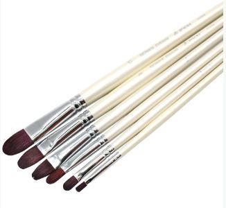
These would be the type of paint brush that they’re talking about. They’re a mix of flat brushes and round brushes. I maybe have like- 2 of these in all between 3 art kits to be honest. I may have to start investing in more of them, who knows.
3. Building up texture
~Almost anything can be used to add texture to your paint. (I honestly never knew that people added things to their paint to create texture) There are already made texture media available, but I have seen items such as egg shells and sand used to add interest to a painting.
Oh? Bro, who would’ve thought about adding eggshells to your paint, like I honestly never thought about adding anything actually. I just paint with what I got, y’know. But maybe I’ll try this soon™
~Use an old toothbrush to spatter your image with paint. This can be remarkably effective at suggesting noise and grain.
Well, that’s new. I really didn’t think about using anything else for a painting besides paint brushes. oOpS
4. Dry brushing
~This method tends to work best when applying light paint over dark areas/dried paint and is useful for depicting rock and grass texture.
So, I’ma be completely honest with you guys. I used to paint without water, and like- I was so ignorant about most of the things that I know now. I would only use water to wash my paint brush afterwards, but now. Water has become so helpful in my paintings oml, it’s amazing what a little bit of water can do for your painting.
5. Sgraffito
~Removing paint can be just as important as applying it.
I- I only ever removed paint when it was in the wrong spot.- I didn’t know that removing paint from anywhere can help, especially when you want to expose the underpainting.
6. Glazing
~Glazing is the process of laying a coat of transparent paint over a dry part of the painting, and it’s used for intensifying shadows and modulating colour.
Well, now I know what glazing is LOL.
7. Painting with mediums
~Mediums are fluids that can be added to paint to modulate its consistency, drying time and texture.
Again, I honestly never knew that. I’m so inexperienced with painting items and ways it’s not even funny man.
~In the case of acrylics, you get different mediums that make the paint matte or gloss.
Link 4: Acrylic Painting Techniques
1. Dry Brush
~You want to aim for seeing your brushstrokes in the paint.
I don’t tend to like seeing my brushstrokes within my painting to be honest, but if it works it works, kinda thing.
2. Sgraffito/combing
~Involves painting a layer or two of paint and then etching into it to create a design and reveal what’s underneath.
Again, I really don’t tend to do this either. Considering I just learnt it LOL but I wouldn’t have thought about removing paint or etching anything within the paint.
3. Wet-in-wet
~You can do wet-in-wet with acrylic just like you can with watercolor so go ahead and lay down some water on your paper and then you can just drop in the acrylic paint.
My thinking- If you want a watercolor effect, why not just use watercolors? Big brain time LOL
4. Overlay/glazing
~Start by laying down a darker color on your paper and then letting it dry. (Yes, we need to let this dry for several minutes. So while you’re waiting, pop in some popcorn, watch it pop, eat some and then you can go back to painting :) )
~What you’re going to do now is overlay or glaze a lighter wash over top so water down your paint just a little bit.
Y’know, this technique might actually come in handy with my next painting ngl. But we won’t talk about that until the time comes owo
5. Impasto
~You’re going to use a palette knife instead of a brush so this is a really nice way to achieve a lot of different texture within the paint.
So, I only ever use palette knives before for backgrounds. To get that kind of color dye/blending feel y’know- I can’t think of the word right off hand but- TYE DYE yes tye dye feel, hush- :(
6. Modeling Paste
Before we even learn anything, like- I never knew that you could use modeling paste for painting?!?!?! Like- I only ever used modeling paste when I was fixing a clay sculpture or something of the sort, y’know?- The more you know
~A great way to add texture into your artwork. So you can use a palette knife to scoop it out and then apply it onto your paper. You could also use a paintbrush to softly apply it to your paper. (My brain man, this is all so new for me- I-) Note you can also mix it directly with the paint color if you want to. Let the modeling paste dry and then you can paint over top of it.
Waittt, you could use this to make the texture of mountains owo and rock beds, bro- I feel so inspired by this one ngl.
7. Stencil/Stamp
So the girl in the video was pretty basic with it, you just use it as a stencil should be used and of course washing it afterwards.
8. Sponge
~With a sponge, similar process as you would use with watercolor. You’re just using the sponge to apply paint instead of a brush. (Big brain, she knows) You can go back in after you let the first layer dry a bit and add like a second or third layer of paint.
Y’know, time for a funny-ish story. So back in elementary school, we did this sponge painting, we could only use the sponge. And I’m like, I wonder what a pufferfish would be like with a sponge. So- I painted the sponge right, then I took some bottled glue, put the glue on the back of the sponge and glued it to the paper. LOL My art teacher found it funny, but had me remake the painting and explained that it had to be painted with the sponge, not made out of the sponge. So yeah-
9. Drips/Splatters
~To achieve drips, mix some water into your acrylic paint and you’re just gonna kind of angle your paper and guide the drips down. (So like, this would be kinda effective when you want the feel of a waterfall? Yes, no, maybe so?)
~For splatters, it’s better to use a flat bristle brush. Load it up with paint and you can actually just kind of flick the bristles and really control your splatters.
10. Gel Medium
~Gel medium is used to thicken your paint and also actually make it a little bit more adhesive. So you can mix it directly with your color and it’ll lighten it just a little bit.
So, when using this don’t expect the exact color, okay got it.
11. Scumbling
~You can scumble with paint just like you can with colored pencils. So use your brush in a circular motion but keep it controlled.
Well, that’s new. Now I know what it’s called at least LOL. I honestly never knew what that technique was called until now, but I remember always coloring with colored pencils like that just because my mum did--
12. Masking
~You can mask with masking tape of course or you can also use rubber cement.
Rubber. Cement. I- Howcanonemakecementrubber- I might actually have to search up what it looks like, I’ve never heard of anything called rubber cement.
~If your paint bleeds through, just go back through and patch it up with some paint.
13. Mediums: Gloss or Matte
She really just explained what she was doing for this one.
14. Soft edge vs. hard edge
~Soft edge and hard edge are just two paint terms for how the paint is laid down and the quality of it.
Who knew, I actually didn’t realize that how you lay down the paint affects how soft or hard the edge is.
So, I’m sorry for this being a bit late. But I feel like I learnt a lot with this one :)
0 notes
Last Seen Blogs

horizon-verizon
real black-bride shit

windvous
hello!

cypecore
CYPECORE

thempregsimmer
thempregsimmer
otpotpotpotpotps
Full Pledged Trash