#i like without the wings. but i must post the wing version lest i am killed with hammers (i am being threatened!!!!!help!!!)
Text
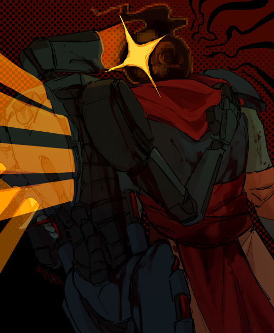
v1 & the beheaded <3
#strangely peaceful. they would fight with each other FOR SURE#dead cells#ultrakill#the beheaded#v1#theyre cute though. weird gay thing going on#very fun comm. i think they can kiss#commission fooorr @carcazation#blood#theres variants for without tje blood and without v1s wings#i like without the wings. but i must post the wing version lest i am killed with hammers (i am being threatened!!!!!help!!!)
608 notes
·
View notes
Photo
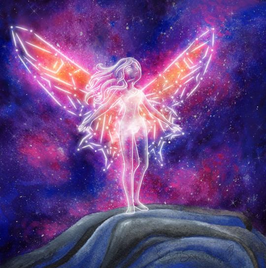
On The Edge
It feels like it's been quite some time since I sat down and got to work on a more involved mixed-media project. And in plenty of ways it has, but I have been working on other artsy projects behind the scenes, which I should be posting sometime soon, I hope.
Anyway, this artwork had to be moved to the top of my priority list and also my upload schedule (some of those other projects are already finished, just back-logged) because this is my entry into the Arteza Awards hosted by, shocker, Arteza, and the deadline to enter was the 24th.
I actually started working on this piece a week or two early, but me being me, I procrastinated and only just barely got it posted to Instagram with the appropriate tags (per the contest rules) with about 20 minutes to spare. Then again, maybe that's a good thing because I've been known in the past to pull some of my better work out of thin air at the last minute. If that proves the case this time, it would certainly be to my advantage.
Anyway. There was no set theme for the contest. The main rules were that you had to use Arteza supplies and they needed to be visible in the image posted to Instagram. I understand why, but I normally don't photograph my art with the supplies because I can usually get more accurate colors and proportions with a scan, and you can pretty much always see the details way better on a scan. But considering the prizes on offer, I wasn't about to let that stop me. I figured I'd just post the supply image first, then add the scan so you could swipe to see it. That way I could have my nice scanned version and still follow the rules. (Also, since they specify Instagram is the main platform for the contest, I'm assuming it doesn't matter if I don't post the supply picture everywhere else. If it does...whoops :P )
For reasons I don't think I should get into here, I knew I needed to go for something kind of high-impact when you first glance at it. But it also needed to not be too involved, lest I be working on it well after the entry window closed and my efforts become somewhat less valuable. I'm not exactly sure how, but this led me around to a concept I've had floating around in my head for a while: A girl (because I am one and know I can draw them better) standing on a mountain top, that looks as if she's one step from free-falling. Originally, I dreamed up this idea hoping to make it into an acrylic painting, but (aside from that fact that I didn't get around to executing the idea until now) I do not own Arteza'a acrylic paints (though I have wanted them for quite some time--It just hasn't happened yet) and also acrylics are not my strongest suit, so now did not seem like the time for an impulse-purchase that could compromise the integrity of my work and therefore my chances in the contest. Although for the day I do get my hands on their acrylics, I now have a solid idea to use to test them out. ;)
The Arteza supplies I do have at my disposal are their tube watercolors, woodless watercolor pencils, and 72 expert colored pencils. Which as I learned the last time entered a contest hosted by Arteza, is a fairly limited variety as to what I can actually do. The watercolors by far as the most versatile and my personal favorite of the three though, so they're what I used the most of here.
Also, somewhere between deciding to run with my standing-on-the-edge idea and actually doing it, I also decided to add-in the wings in this constellation style I've used somewhere infrequently but am very fond of. As a result, the whole concept has a very similar feel to me as this artwork that I found here on dA years ago and fell so in love with that it spent a good few months as my desktop wallpaper.
Obviously, the two images are very different, but to me the idea of the wings is similar: Their structural integrity to fly is questionable, as the wings in the original image appear to be made of glass. Maybe it matters, maybe not. Same thing here: Maybe the wings are really there and just look like a constellation, or maybe this girl just stood in exactly the right spot at exactly the right time. Is the girl even there? Is she real? Can she die? Does it matter if she falls? Would she choose to fly at all, whether the wings work or not?
It's sort of a Schrodinger's Cat situation, and something about that is really intriguing to me.
Anyway. I started out with a digital sketch this time, mostly to iron out the kinks with...well, everything.
I knew getting the right pose would be difficult, and I actually had a pretty different one of her looking out over the edge, maybe clutching her chest or something, originally, but I just couldn't get it to work the way I wanted to and I really struggled to find references for it, so I went with the pose you see here, that I found references for by accident while looking for the other one. I have to admit, seeing the final product I think this pose might actually have been the better choice anyway.
The mountain/cliff/whatever I was also having a hard time finding references for, at least for exactly what I wanted, so in the end I had to mostly wing it. I think it turned out okay, though.
The wings were probably the most challenging part to plan because I wanted something between traditional butterfly/fairy wings and something that stretches out farther like bird or bat wings. I toyed with the lines for a long time until I got something I was happy with, and then I actually went in and did the constellation lines for both sides by hand instead of doing one side and making a flipped copy, because I wanted to make sure I kept the overall shape of the wing on the (our)right (her left), as after all the warping I did to get the original lines, I wasn't sure I could replicate the process again.
I also drew 2 or 3 versions of a simple dress over the figure before giving up because I wasn't happy with how any of them were turning out and decided that I would instead preserve her modesty with magically misty cloud-things. Although, it's kind of a shame because that ended up mostly hiding the one piece of hair clinging over her left (our right) shoulder. :P
But once the digital sketch was done so I had some idea of what I was doing, it was time to move on to the traditional, actual artwork.
I cut a piece of my 100% cotton paper down to size (nice paper because I didn't want to be held back in that regard--go big or go home, as they say) and then held it up to me screen to trace my cliff lines into place, and some vague markers for the figure and her wings.
My idea from the very beginning was to make the galaxy largely with watercolor in such a way that it gives the wings color and focus, without having to actually color all the individual segments. This means lighter colors towards the main area of the wings, and getting darker as I moved out/away from them.
Now, because it has been a while since I was painting with watercolors regularly, I did set aside a smaller piece of the same paper and busted out a practice baby galaxy before diving into the final. I learned very quickly I was going to have to be extremely careful with my placement of this orangey color and black, less either of them ends up mixing with colors they weren't supposed to and leaving me with a big muddy mess. (The practice piece did survive though and I'll be posting it some other time.)
Before I could get to the fun part [the galaxy] though, I painted the mountain with a mixture of black and blue, which actually went a lot smoother than I thought it would. It took several light layers of blending out the paint built up slowly, but ultimately I'm pretty happy with how the color for it turned out...Even if it's still kind of up for debate how much it looks like a "mountain" or "cliff-edge" or not.
With that out of the way, I cut some paper to act as a mask for that section and then spent far too long going back and forth, putting down layers of color and blending them out, dabbing color on and waiting for it to dry, rinse, repeat, trying to get the Galaxy portion just right. I was actually having a fair amount of trouble getting the right color balance, and as sometimes happens with these things, I was pretty worried about how it was looking before I went to bed that night. (I had procrastinated just long enough that I had 2 nights to do this is; the bulk of the painting took place on night 2) But the next day, once it was fully dry, it didn't look so bad.
It did need just a few more touches before I went in and added the splatter/stars, though. So I broke out the colored pencils, which I really should have done sooner because they were much easier to blend out and had a bit more covering power over the watercolor than...more watercolor because watercolor is often transparent and there it can be hard to cover with it.
Admittedly, I still had more worries about the "naked" galaxy, but then I went to splatter town with the white, added a few pointed stars, and as it usually does, that really brought everything together and made it look a lot better. Never underestimate the power of a good splatter-fest! ;)
I must say though, I underestimated the combination of the white watercolor and white colored pencil together when I moved on to the figure and wings. I was trying very hard to not use my white gel pen (because the rules for the contest didn't say if it was okay to use non-Arteza supplies in conjunction with Arteza supplies or not) and so I was sort of bending over backward to find another way with my limited resources. (Although I assumed using a lightbox to see the lines underneath the paint, as is a normal practice for me, wouldn't really matter because it's not like you can really tell from the final product anyway.)
Still, even though a mixture of paint lifting, the white colored pencil, and the white watercolor were better than I expected, I still ended up having to punch the lines up a bit digitally to get them to pop the way I wanted them to. But oh well, at least it made a nice glowing effect and mostly worked for the cloud-mist covering. :P
Overall though, I do really like how it turned out. If it weren't a little on the small side I might actually consider using it as my new wallpaper/banner art everywhere. Maybe that's a conversion project of some kind for another day?
Point being, I'm pleased. I probably won't place in the contest because I'm just too small of a fish in this pond, but I made some pretty art and it was mostly fun, so no harm done. :)
Actually, if this could maybe be the excuse my brain needs to get back into posting regularly, that would actually be really great. I miss it, despite what my most recent journal entry and my spotty activity levels might lead one to believe. If it is, I hope you guys don't mind seeing some crafty things thrown into the mix! :D
____
Artwork © me, MysticSparkleWings
____
Where to find me & my artwork:
My Website | Commission Info + Prices | Ko-Fi | dA Print Shop | RedBubble | Twitter | Tumblr | Instagram
2 notes
·
View notes
Last Seen Blogs

satyamguptadelhi-blog
Untitled

yuliskincare
YÜLI

genialbrilliance
Remember
thesanealienn
Buckle Up, Creampuffs

myproject-tester-blog
Rule the World RPG