#i need to make more dect art ..........
Text
i hear people on tumblr like this robot
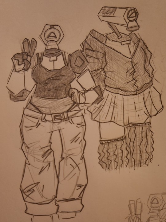
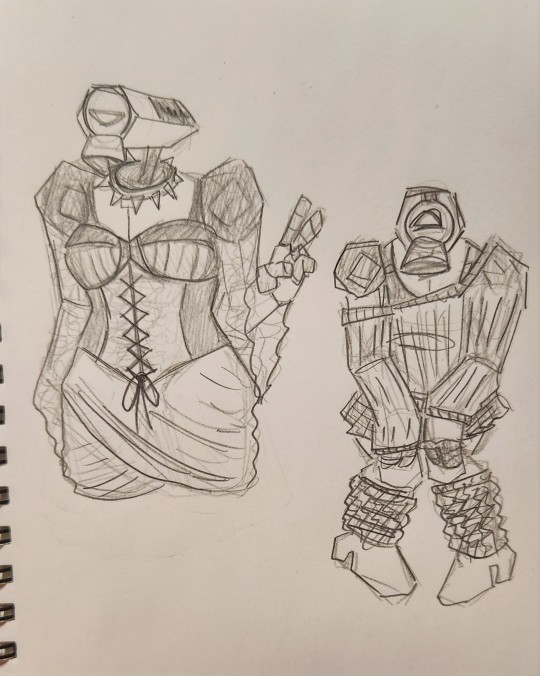
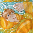
assorted mirage doodles. she is like a dress-up doll to me.
#ultrakill mirage#ultrakill#my art#idk ......#i like drawing her tbh .#i have more art if people are interested in the prettiest girl in town#also i am so very not normal about dreams end come true. ohhhhhh my god. aaaaaaaaa#i need to make more dect art ..........#shes not straight btw i refuse. i simply refuse.#i really like drawing her doing a peace sign huh
74 notes
·
View notes
Note
Can we get ultrakill pride stuff!!!! Shakes you around.. I kinda wanna ask specially for v2 stuff since Im so in love with it and your art.
yayayay pride headcanons!! i'm not sure if i'll be good at putting this into words, but i very much love whatever the machines have going on with their genders - v1 is strictly it/its to me, while v2 is an any and all pronouns haver. both of them very rarely experience attraction as well, but when they do, it's a strong pull to the other party who can be any gender or presentation. having my brain rewired by dect like everyone else as well as bc of my own personal interpretation of the character, i like to think v2 would primarily be drawn by intricacies of thought and an emotional connection, as those are incredibly rare for it to find. bc i think of v2 so much as a dreamer, i am absolutely drawn to its chemistry with mirage in her rumination, and i certainly think it could only feel attraction to someone else when it felt its mind and inner self were understood. v1 is its flip side, needing to feel its spark through physical connection, generally through a fight but it's more than just that fight being good - the movements, the attacks, the flow all influence how it feels. overall, v2 is cerebral while v1 is material in how they are attracted to others, because that's how they define themselves in a sense
gabriel is definitely gay to me and very much in the process of figuring out what he likes and how his attraction works since any relationships he's had never got the chance to breathe before this. he does crave a lot of affection and attention, both physical and emotional, and he can be quite romantic but the way he loves and experiences love is very different from humans. i also very much like trans gabe hcs, if only just bc it makes me happy and i think it suits him. bonus for bi minos of course, nb ferryman, and trans sisyphus :] and just in general, i feel so comfy in how the machines relate to their gender so differently and have aesthetic ideas and presentations, but don't identify in binary terms. i'm an nb ace myself with a strong pull to neutral pronouns (esp "it"), so i love seeing machines like the mindflayers that have defined aesthetic/presentation preferences but those don't necessarily indicate their gender, if that makes sense
#these are just my thoughts tho i generally love all lgbt hcs!!#ALSO...im sorry if anything seems vague i have trouble defining my own identity SO......#i tend to cycle through lots of different ideas for all of these characters at different times#so honestly if you hand me any lgbt hc for any one of these characters im gonna like it lol#and idk i don't talk about them much but mindflayers...i love them#they are so personally gender affirming for me!!#cake answers
24 notes
·
View notes
Text
20/05 Typeface:
Typeface:
Article: https://uxdesign.cc/tips-when-choosing-a-typeface-with-infographic-d8a85a999f1
Scope: - Designers should think whether typeface will be used for digital projects or also in print - Designers should also think about whether the fonts will be used for a limited time or indefinitely. - Helpful to make a list of potential projects a typeface will be used for at the outset of choosing a new font. Mood: - All projects has a mood. formal, informal, fun, serious, modern, classic. - Every typeface also has a mood. - Important to consider the mood of the project and how the typefaces they’re considering reinforce or clash with that mood.
Functionality: - Test fonts considering at each size they may use those fonts to be sure they’re readable and don’t negatively impact UX.
Versatility: - Fonts that are perfect for web use may not trasnlate well to use in print - Can the same fonts be used on multiple medium
Message: - Message of the project whether it’s a slide dect or a brand’s visual identity-is viral determining the best font to use. - Wrong font can completely derail the message a brand is trying to send.
Readability: - Most important feature since type is used to communicate a message. - Readability and legability aren’t exactly the same. Legibility refers to how easy it is to distinguish letterforms within a font. Readability takes that one step further and refers to how easily different words can be distinguished and read. - can both be impacted dramatically by the size of the font being used.
Languages: - Not every website or design project will be trasnlted into multiple languages. - Some types do not support accents and umlauts.
Style: - Basic font styles: serif, sans serif, display and script. - Serif: more triditional and formal - Sans serif: More modern and minimalist - Display: Fonts are unsuitable for use at small sizes, appearances varies widely: - Script: resemble handwritten or calligraphy. Used for headlines and titles
For readability: - Serif fonts are viewed as more reader friendly in print while sans serif fonts are more reader-friendly on screen. But most modern typefaces in both sytles can work well in either mediums.
- Consider whether they want to use display or script fonts for their headlines and titles, and decide whether serif or sans serif typefaces better suit their message and the projects brand.
Brand: - Everybrand has a mood and a message - Important that all visual elements not just typefaces match and support the impression the brand wants to give off. - Narrowing down typeface choices based on brand suitability can start with making a list of keywords that represent the brand. From there, designers can search for fonts that include those keywords or synonyms.
Licensing: - be understanding the liscensing of any fonts they’re considering using and what limitations those license might impose.
Combinations: - Some fonts are neutral enough to be paired with hundreds of other fonts. - Other fonts have unique character that suitable combinations are limited. - Having wilder options can offer up more flexibility. - “Choosing font combinations is both an art and a science and takes fair amopunt of experimentation and practice for designers to master.”
Large font families: - Roboto or Baskerville that have multiple weights and styles makes it easier for designer to create complex typographic designs without the stress of figuring out which typefaces work well together. - On longterm projects like brand’s visual identity, larger font families also offer more versatility. Bring able to switch between multiple weights or styles based ont he exact project needs offers designers mpre flexibility without having to deviate from the brands estabilished identity.
Choosing right typeface: - Practice choosing new typeface for a well-known brand or fictional project then be faced with real-world projects. - other considerations such as readability, functionality, language support can help designers further refine those choices to find the perfect font for their design work.
Reflection: - This article is really helpful looking at using typography for long terms and really trying to future proof projects. I found that having to keep the future in mind, really helps to eliminate using some typographys and stay within the classic types that will not go out of style.
0 notes
Last Seen Blogs
myinnergi
Innergi
thedigeblog
Le Blog du Digé
mewbleu
Mewmew the ecchier
a-heydon-photography-blog
Why Hello There.
mewbleu
Mewmew the ecchier