#if you see a reference to my past life in this aesthetic graphic then dont mention it bc i didnt realize it was there until after i made it
Text
Ship: Cady/Regina
Words: ~810
Rating: Teen
Summary:
"Her eyes move to the caption of the picture, which casually says, “pov you’re losing your mind at how cute they are.” Which, like, what? Finally, finally, she takes in the actual account, which appears to be called… cadyshotgfsightings."
While at Yale, Cady discovers an Instagram dedicated to capturing pictures of Regina on campus.
read on AO3 :)
#cadina#cady x regina#mean girls#mean girls 24#mean girls 2024#mean girls the musical the movie#my writing#cady heron#regina george#if you see a reference to my past life in this aesthetic graphic then dont mention it bc i didnt realize it was there until after i made it#AND now i dont care to find a different pic#shit will haunt me forever#anyway#grad school universe#for gwen <3#everyone say THANK YOU GWEN for making social media edits
40 notes
·
View notes
Text
graphics guide
a guide filled with basic info, tips, and answers to common questions that i hope helps people who want to start making graphics
*this was made based on my experiences of making graphics and is what i thought was important to cover but everyone has different ways and approaches so dont feel the need to follow everything on here
what is a graphic?
a graphic (also known as ‘gfx’) is a image edit that incorporates various elements (textures, filters, text, etc) in order to visualize a idea or to create a aesthetic composition
unlike making gifs, there is no right or proper way to make a graphic so dont get too caught up in the idea that a graphic should look a certain way - just stick with your style and what you think looks good
anatomy
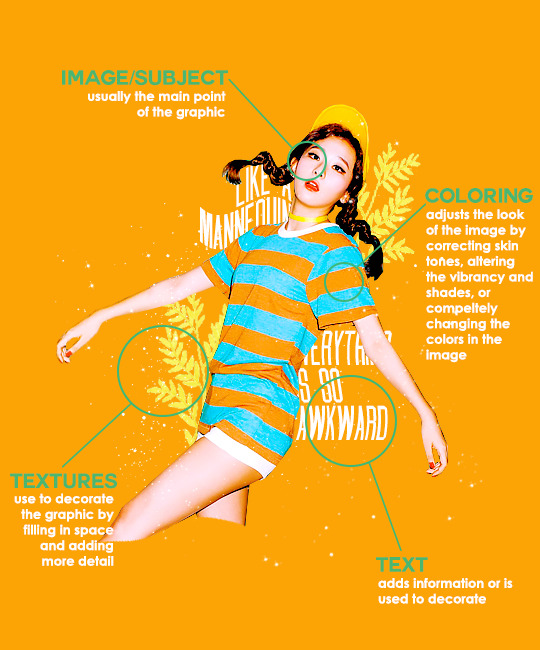
image/subject
usually the main focus of the whole graphic
you should always try to use a sharp hd picture - getting it from the original source is always the best option
make sure the source of the picture allows editing - pictures from public sources like a company or the news can be edited while fansite pics and scans need to have permission asked (and if they give you permission make sure you link them when you post your graphic!)
coloring
often referred as ‘psd’ because that is the format they are in (i.e. pink psd pack)
comprise of multiple layers that can alter the images look
a lot of people make their own colorings since the outcome of the look also depends on the image’s original coloring
textures
smaller cut out images that are often used to decorate the graphic
can also refer to a image that can be use as a background of a graphic
can be found in the form of a png (copy + paste into graphic) or a brush (”painted” on to the graphic)
avoid using any textures that does not state the original poster made them - you could unintentionally be using someone’s work that was not made to be used
[read more about it here + resources that you can actually use]
text
text can be used to tell information or just for decoration
try to choose fonts and colors that are legible
faq
what software can i use to make graphics
most people use some version of photoshop (i currently use photoshop cc 2018) and a lot people have it cracked but if you cant afford photoshop, find a cracked version or a patcher (i used adobe zii 3.0.4 for mac), or are uncomfortable with getting a cracked version then there are other softwares that are just as good!
i can only vouch for gimp since i used it when i first started making gfxs. it is very similar to photoshop and shares most of the same tools and has a similar look to photoshop. it is also probably the most popular photoshop alternative and would totally recommend it if you cant get photoshop!
[visit + download gimp here]
where do you get your pictures from
official sources such as teasers companies release, photos released by press, photos from idol’s instagram - basically photos that are made for the public to see are whats best to use for a gfx. you should download the photos straight from the source so you get it at its highest quality
some phrases you can use to search for pictures on google:
- [group name] photoshoot
- [idol name] press
- [group name] showcase
- [idol name] teaser
remember the more specific you are in your search the better! also when you search through google make sure you check your source!
avoid getting photos from reposting websites like we heart it and pinterest
avoid using fansite pictures and scans unless you are granted permission
i don’t know where to start/i’m overwhelmed and i don’t know what to do/ where should i begin
figure out what you want to make or a theme you want to follow - do you want to make a simple graphic or a infographic? do you want it to center around a certain theme like a comeback or a photoshoot? once you determine what you want to do it becomes easier getting ideas and finding stuff you will need for the gfx
example thought process:
“i want to make a loona graphic” → do you want it to be the whole group or a certain member or unit? will it just be a simple gfx or a AU gfx or based on a event that the group is doing?
“i’ve decided on doing a kim lip one” → do you want it to have a certain theme like kim lip smiling or kim lip with blonde hair? is there a certain frame of time in which you want the graphic to represent like during eclipse era or hi high era?
“i want it to be from max and match era with her teasers” → from here you can start finding pictures to use and thinking of colors and textures that would fit your theme
where do you get ideas/inspiration from
i mean it’s different for everyone but for me i literally just think of stuff and i’m like wow i want to make that happen asdfsdfj but mostly when i see pictures or watch something thats where i suddenly get a idea
but tumblr is full of graphic makers!!! ive seen so many amazing graphics from various fandoms like kpop, anime, marvel, etc.
some amazing graphic editors i know myself include:
primirene, ireone, nctjaemin, celo-mar, 1hyungseo, jeongahn, haechxnie, sonxiumin, syua, lulumelody, dinomite, lovelyeo, joohys, whatchatalkabout, yveu, maerinah, mihyon, lorbits, cherryjennie, thatporcelain, monoka, ifbin, 7ww
some other places you can look at are behance (dont go on behance if you have a cracked ver of ps - it might trigger a ingenue software alert that is a huge pain to deal with), pinterest, deviantart, dribble, and probably any social media platform if you just look up #graphicdesign
remember if you take inspiration from someone’s work then you should cite them in your caption - if you are afraid that you might’ve accidentally copied someone when you were trying to take inspiration from them its best to either try to remake the gfx again or just to ask the creator permission if its fine if certain details are similar/same
my stuff sucks how do i get better
literally just keep on making stuff aka practice. you can’t improve if you don’t bother putting effort.
ways i’ve forced myself into practicing making gfxs is by:
1) starting a gfxs series - its self paced and is based on what you want to make (i.e. introducing my biases gfx series, my favorite outfits gfx series, etc)
2) taking in requests - people who would request from you probably like your stuff so its a win win situation (i.e. send me a idol + era, send me your bias + palette, send me a group and i’ll make a gfx of my fav member, etc)
tips
only sharpen your pictures after you are done resizing them, if you sharpen and then resize it might result in a more blurry or grainy picture
always save your graphic every 5-10 mins in case photoshop crashes
have two copies of your image cutout: one will be the original and the other one will be the one you edit with - in case you mess up like over erasing or over sharpening your image you have a back up you can use
stick with a color palette so you don’t get overwhelmed when having to color everything and it makes all the graphic panels you have look more cohesive
on photoshop you can favorite fonts!!! take advantage of it!!! your computer has a lot of fonts saved on it and it takes forever to look through a whole list of fonts so by favoring fonts you can see all of the fonts that you like to use for graphics
combine a png pack to one psd → when you open a png pack you will probably get a lot of png files and it gets annoying having a lot of tabs open in photoshop when most of them are just textures so by putting all of those pngs into one psd you can cut down the files you open and can easily see all of your options
make folders dedicated to colorings and textures that way you can easily access them instead of looking through your computer for a certain file
name your layers... i dont do it because its easy for me to tell what layer is what but when you are working with a lot of layers its best just to name them it’ll make life easier
lock your main image/subject so that when you play with texts’ and textures’ location you don’t accidentally move your main image
use curves to help get a photo back to its original coloring! like if you have a photo that has a weird filter on it just use curves and it’ll help the picture look more natural! [tutorial]
try warping your text to make it stand out more! you can access it by pressing the icon on the top text bar that has a T with a curved line under it. i use flag and wave the most
alter a particular color by using a selective color layer
rather than changing the actual color of an image/texture you can:
create new layer → select the image/texture and color it on the new layer instead of on top of the image/texture → change the opacity or the mode of the layer so that the color is put on the image/texture while keeping its detailing and not affecting the actual image/texture
resources
colorings: can be found on deviantart or tumblr just look up ‘psd coloring’ or ‘[color] psd’
textures: can be found on deviantart (check to see if its og content or stolen) simply just search what you are trying to find or ‘png pack’ or ‘texture pack’
common textures you can try to find: vintage flowers, memphis shapes, organic shapes, doodles
other wesbites: pngtree, creative market, lost and taken, spoongraphics
fonts: if you are looking for a certain font then you can just do a google search but if you are browsing then dafont and font squirrel are really good websites too
some of my favorite fonts: abril fatface, agfatumc, antonellie calligraphy, arcadeclassic, bebas neue, century gothic, couture, daily news 1915, dark larch, hondurhas, kotori rose, krinkles, risingstar, sant joan despi, studly, zing rust
color palettes: i made one myself which you can find here, color hunt, and honestly a quick google search will give you tons of options
if you have any questions, other stuff you want me to cover, or want to add more resources and tips then please dm or send an ask! i hope this helps!
#i really hope this helps someone and that it makes sense#i literally woudlve been so happy if i saw this when i first started it took me so long to figure things out and im still learning#also i basically told where i got everything so like please dont take advantage of this and end up copying my gfxs... its happened to me a#lot#idk what to properly tag this alfkjasd#ps help
127 notes
·
View notes
Text
Finished MEA
THE GOOD
THE CC. yeah yeah there’ve been like 5000000 complaints about it and like 60% of them are valid but also I can actually make an East Asian Ryder. Like it took 6 games but bioware finally got there LET ME HAVE THIS BEFORE DA4 TAKES IT AWAY BECAUSE APPARENTLY EAST ASIAN PEOPLE DONT EXIST IN THEDAS.
VETRA. light of my life. My moon and stars. So tall. So kind. She’s just-so good. Like she keeps a literal crate of cereal in her room how was I supposed to not romance her. Honestly I really liked almost all of the tempest crew, barring Cora who…I don’t dislike, I just wish she’d talk about something besides asari. But I really think her story of self doubt has a lot of potential if it’s done correctly.
GAMEPLAY. Fighting in this game is so fun! I’m not a fan of the profile set up but combat in general is so much more fluid and dynamic without being too frustrating. I do wish the guns did more damage but I was also admittedly playing on hardcore. Yes that was a humblebrag let me have this. In general my melee weapon did a lot more damage than any of my firearms which I guess is fine, though it did get a little boring constantly going pull-charge-melee on everything.
THE SIDEQUESTS. I made it a point to only do the ones that sounded interesting but honestly they’re so much better than DAI’s.
KADARA was probably the best part of the game for me. Fun plot line, interesting lore, not having to crawl inside the nomad every five minutes so I don’t die. THE BEST.
THE NOMAD is so much better than the mako. I feel regret for every time I ever insulted the nomad on Eos because I can actually turn with it and that’s a feeling I never thought I’d get to experience with a vehicle in mass effect.
THE ANIMATION. yeah yeah it’s weirdly jerky and a lot of the faces are cringey but after the patch it still looks better than any of the other mass effect games sorry not sorry
THE FINAL QUEST. Actually really enjoyed the final charge. It kind of feels like what me3 should have been, in that all the allies you made throughout the game actually show up to help you and be your meatshields in combat. Also twin angst feels.
LOYALTY MISSIONS. good shit.
THE MEH
LIAM is not meh. Liam is an angel. But I feel like the people who wrote his loyalty mission/convos with ryder and the people who wrote his banter with other squadmates were on two completely different pages. It feels like he’s presented as friendly, open, and willing to break the rules to do what’s right, but then I’m in the nomad and half the convos between him and other squadmates have him with a stick up his ass and acting like a by the book cop. Which we were told that he quit BECAUSE he wasn’t like that. But whatever.
THE ANGARA are ok. Though the game keeps on telling me they’re open with their emotions and I…did not see that. Like crying because you found out your mortal enemy is a zombified version of your race or being angry that a bunch of aliens are suddenly all up in your grill seem pretty reasonable to me. I enjoyed the moshae, it’s nice having a character who is firmly confident in her beliefs.
VANGUARD. is so broken. 90% of the time I loved the combat and I’m either at full barriers all the time ripping turrets apart with my sword or I’m dead because the kett two feet in front of me is apparently an Invalid Target and I can’t charge them. Unrelated but I feel like vanguard mains are equivalent to dog owners in that we can’t and won’t shut up about how vanguard is the best class even if you’re talking about any other class. It’s Me. I’m guilty of this.
ASARI FACES are all the same and a lot of people have complained about this but it’s actually true for all the of the original games as well, they just hid it better through lots of variations in makeup, skin tone and facial markings. It seems like a combination of the graphics being so much better and way less variation in terms of makeup/tattoos just made it incredibly blatant.
SAM is…SAM’s ok, they just seem way too overpowered and I still don’t really understand what about them specifically makes them able to control the remnant besides Alec Ryder being Just That Good Of A Programmer. I like that SAM grows along with Ryder and you can see that as the game progresses (especially that Convo with your sibling near the end, that was Good), they just need to set some limitations on what they’re capable of because right now 80% of the quests are just “wave SAM at the thing to do the thing.”
REYES VS SLOANE. Out of context I really enjoyed this plot line and Kadara, but…man, pitting the only prominent black woman in the game against one of only two mlm romance options and forcing you to choose between them is. Not great. Also, it feels like they were definitely pushing for the player to go with reyes-you get more chances to know and interact with him, and the game’s a lot more blatant about how evil sloane is compared to him when in actuality they’re both very morally grey. Also, if you’re playing a gay Ryder and you’re uncomfortable with letting sloane die you’re fucked either way since it’s either let that happen or not have the chance to finish the romance path of one of only two options (and if you’re not interested in the baby plot, really the only option). Also I loved Reyes he is a great character but please for the love of god hire someone who is actually latino to voice him because right now all I hear is default white mhawke trying and failing to do a sexy accent to impress his LI.
THE NONSENSE
THE ORB BOSS KETT THINGS are stupid.
HAINLY ABRHAMS aka we fucked up writing a trans character so we’ve just decided to remove any reference of her being trans at all to make up for it. Bioware, progressive bastion of the video game industry.
JILL is exactly as bad as you would expect and I hope to god they just remove her from the game completely.
FANDOM. yes yes it’s unrelated to the game but I’ve already seen like five posts whitewashing Reyes and another five turning him into a goddamn stereotype and I. I am so tired.
THE KETT are so boring. I’m sorry they just. They just are. Also the Archon talks about genetic perfection yet his head is literally??? A horn circle??? There’s literally no plausible reason I can think of for why a species obsessed with being the strongest would use its resources and considerable scientific knowledge to grow a kett who has the equivalent of a Christmas ornament hanger on his head, in fact I’d argue it’s actually a detriment, like every time I see it I just want to yank. Also how would that even grow?? I’m assuming it acts similar to how horn growth occurs in mammals so how do the two horns eventually converge into one, and why would you want them to converge when having horns is already way more useful than a stupid halo that’s just begging for someone to loop a rope through and use him as a door knocker. Like the only feasible reason for why it exists is for target practice? Like some Kett hazing ritual, haha shoot through the horncle for 50 points it’ll be fine I swear come on man oh no oh fuck oh shit run. It’s so useless and serves absolutely no purpose yet some important kett scientist knowingly made this aesthetic choice. None of the other Kett leaders have it so why???! Does it exist????? I can’t take him seriously every time I see him and his deep ominous voice and his baby face I just can’t get past the horncle it destroys the tension why did whoever was in charge of character design let this happen goddamnit
#mass effect#I have like 5000 fic/art ideas and I can do none of them because drawing turians sounds like a nightmare
2 notes
·
View notes
Last Seen Blogs