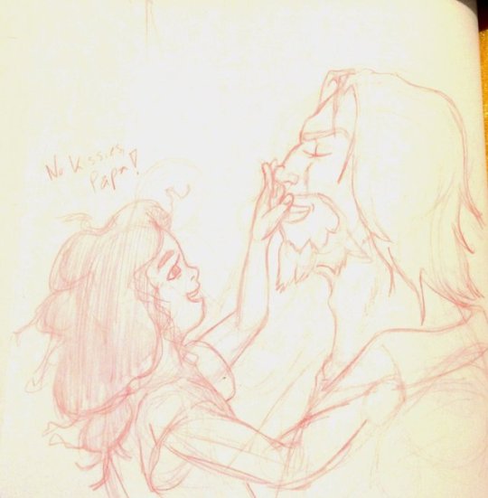
#illustratiosn
Text


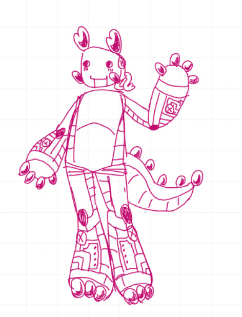
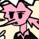
designs from this week for characters i havent really drawn much
#illustratiosn#divine creatiosn#prototype#mark#lampert#ignore how they all have the same arms theyre like really fun to draw LAWL
33 notes
·
View notes
Text

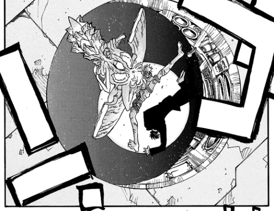
[ID: Three panels from Trigun Maximum. The first shows Vash suspended in midair, possibly by the sheer power of his fully-formed Angel Arm that's complete with wings, halos, and faces with too many eyes. A sphere of energy is visible hovering over his right shoulder in amongst the branches of the Angel Arm, but the barrel of the gun actually seems to be opening behind Vash. The next panel shows light blasting from the barrel of the gun. The third panel shows Vash and Wolfwood falling down through a perfectly circular hole that's been blasted in the Ark. End ID.]
The illustratiosn of the Angel Arm are so intricate and detailed, but then that last panel is so fuckin looney tunes. They look like they were running on air for a few seconds before noticing that the ground was gone from under them. Look at those limbs gangle.
#Trigun#I also just goddamn love this incredible Vash tactic#whips out the most powerful gun on the planet just to blast an escape route and harm nobody#chef's kiss
14 notes
·
View notes
Text
The charting in Nightbringer
Hi, hello Obey Me fandom! So, I’ve been playing Nightbringer and holy fuck, I love it! The musedash gameplay, the story, the illustratiosn on the cards, the remixes?! Ugh, so good (except Crazy About You, wtf is that monstrosity, what did they do to my boy’s song???)
BUT! In everything that’s good, there’s something bad and gah DAYUM is the charting in some of the levels bad. Like, the charting on the brothers’, Diavolo’s and Solomon’s songs are great! Normal, hard and Extreme. But Simeon’s, Luke’s and Barbatos’ songs have such bad charting and sinful indulgence on hard mode too! I understand if that’s their first rythm game experience but, why did it happen to Barbatos, Luke, Simeon and Sinful Indulgence specifically when all the other beatmaps were just fine? I changed my settings from 0 to -1 (wich was what I got when I did the regulation test) and vice versa and it changed nothing.
I will not talk about the quality of the remixes since all of them are decent/good and the only one I have beef with is the Barbatos one because YOU COUDL’VE GONE FOR A POP VERSION LIKE BEEL’S SONG, WHY ROCK TO LO-FI??? BUAAAAAAAAAAA
But alas, I was wondering if the charting discomfor in these songs are just a me thing because my friends have also related not liking or it being off-beat compared to the song so like?????? Where rythm????
But yeah, that’s all, thx for coming to my ted-talk and uh yeah, heavily considering sending a message (report?? idk, english hard sometimes) about this to the devs n stuf becaue I cannot enjoy these songs due to the beatmap not being timed properly
16 notes
·
View notes
Photo

Some art from the archives.
Wanted to make Aiel outfits more accurate to the books. Most illustratiosn seem to ignore the fact that they are clearly described colored like modern day camouflage uniform rather then just grey/brown fabric.
9 notes
·
View notes
Photo

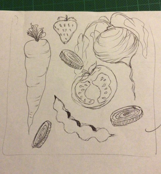
some sketches i had done after looking at alot of pinterest board inspirationa nd making a mood board as shown in the next post. im going for a rustic classic eco friendly style box with browns and greens i think hand drawn illustratiosn will fit these charateristics and aesthetic better
0 notes
Photo


Font change: I changed the font to Fira a sans serif typeface, it was used in lucys interview originally and i liked how it looked and thought it was suitable style for all interviews. i was the only interview that used a serif typeface.
When switching to the Fira font, in most cases it was smaller than previous fonts used in the interview. This made some challenges in terms of spacing on the pages of the interview
For adians interview the smaller font created too much white space, i repeats some of his mushroom and celebration illustratiosn to fill up the empty space as it looked unfinished with too much white space. I liked adrians use of the lines to seperate between the questions in the interview, this is something i implemented into everyones interview except lucys as she already had some designed airplane dotted line ones - this dotted line style did not suit everyones work which i shwy i decided not to use it, it also took up a significant amount of space between paragrahs and thought this would involve too much changing up of the others interviews.
I also changed the position and size of the illustrations and some images in my own photoshoot to account for the smaller font. and added in the seperator lines between questions in my interview. I followed these steps for both lucy and charmaines interviews. i also changed the text colour on lucys interview to white to make it more visible against the dark background.
0 notes
Photo

DTYIS Wallpaper by Hdyh Jeem #DTYIS , draw this in your style. I love joining this challenge ! this s my first post for the wallpaper ! My art is more like a aesthetic concept but i implied with the disney style of course >o< . nice to meet you all and have a nice day visit my on my instagram.com/iamselynart Adobe... Download at https://hdwallpapers.cc/wallpaper/dtyis/
0 notes
Text
My #sciencefiction #novel is coming out soon. The story is written but plays out at your own pace ;) Join three researcher's whose illegal experiment sends them to the southernmost continent on the planet. #Antarctica . If you love #science #scifi #danger #journey #adventure #books #book #writing #reading give me a follow! I have some very exciting characrer illustratiosn coming soon too! #author
1 note
·
View note
Text
Monstronomicon Update - PDF to download!

Hello beloved lovers of the Eldritch, the Cosmic and the Horror! The Atlas project is going strong and with some very nice progress indeed. If you're reading this, I assume that you either follow me here or just keep an eye for the project, so you most likely see the steady flow of Great Old Ones in artwork form in my gallery. But that's only part of the job for the Atlas! Because every being will ultimately be accomodated with a story to match, a story told in journal snippets and notes of our hero, a traveler, an explorer and researchers who wandered the world far and wide at the end of the XIX century in search of the eldritch and methaphysical.
Here! Have a link - you will find an ALPHA version of the book, which included all 52 being chosen for the Atlas, all the correct Data of their first apperances and authors, 12 illustratiosn so far and 5 short stories!
What will you find in The Monstronomicon?
52 beings of fantastic powers, from the incomprehensible Outer Gods to the lesser malignant entities that roam the Earth under guises or in deep shadows. Every being will be displayed with a traditional (ink and watercolors) illustration, a short story and some information about it, of which the most important will be when it first appeared in the collected works of the mythos as a whole.
So if you’re looking for a tome that collect a vast majority of the cosmic horrors in one place, the Atlas is surely for you.
If you want to keep track of all the updates, have access to alpha and beta PDF files with the book, be able to read first drafts of the stories, follow the project on Facebook!
>>> HERE! <<<
#2018#monstronomicon#book#atlas#monsters#creatures#Great Old Ones#lovecraft#lovecraftian#eldritch#Eldritch Abomination#cosmic horror#short stories#Illustration#Colored Illustration#inks#watercolor
159 notes
·
View notes
Text
aughh i need to do Assignment augghgghhhgghh 7 illustratiosn......
#SIGHHHH#i just gotta finish like. 3 or 4. all the way and then i will have enough that he wont say shit to me#mutterings
0 notes
Text
Illustration ideas for final dress
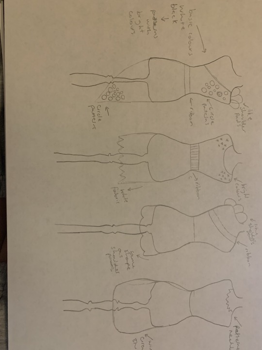
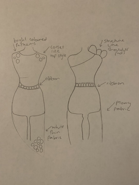
These couple of illustrations that I drew were my ideas at first for the order side as i didnt create illustratiosn with the choas side yet.

This is my final illustrations for my dress. For the chaos side I want to design something like a workshop that we did with the wormholes and created balls with the tights and add them on onde side creating like a sleeve for the top half and then also adding it the the middle of the dress and adding more texture with fabric and make it not as neat as the order side. For my order side im thinking of adding this flowy fabric to one shoulder and then doing a one leg bottom with the bottom of the dress and then painting some circles on it with the colour pallette on my moodboard.
0 notes
Text
happy lesbian visibility week. im not drawing anything else
22 notes
·
View notes
Photo

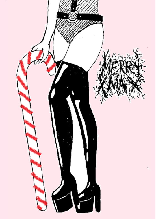

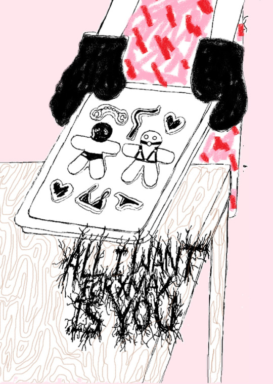

XMAX
Illustratiosn By Melissa Olivares
3 notes
·
View notes
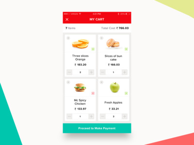
Photo

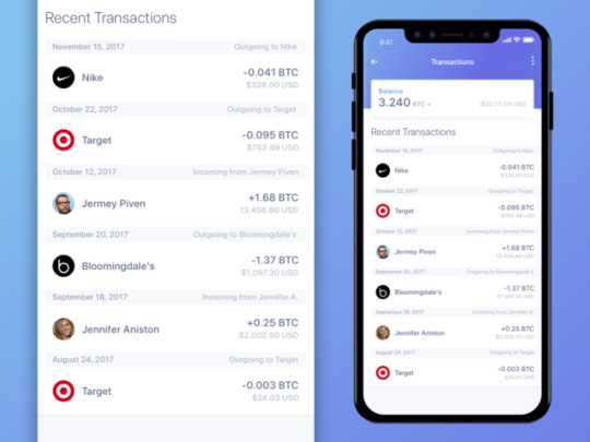


Location Selection and Favourites Screen Research - Travel App Research
Finq app Screen
I chose to talk about the Finq app because it included a feature that I thought would be helpful to my app; Finq include a map for users, I think this would be a useful app for my users as it is intended to be used to find the best restaurants in an entire city. What I do think is that it might not be necessary to include a map in the app but rather provide a button that will open the user’s map app that they already have installed with the address preloaded to direct the user.
Recent transactions Screen
I selected this recent transactions screen I found on Dribbble because I really liked how each the text for each item was layout out and how it used colour and scale to create a hierarchy between the values for dollars and bitcoin.
I also liked the addition of the small strip that had a colour change to with the information telling the user the date of the transaction as a way of separating the content because I thought it was a nice alternative to the use of lines to separate content as the strip used also serves a purpose to the user.
Apple Podcasts Screen
I often listen to podcasts on my way to uni so I am often looking at the interface of the Apple Podcasts app, I thought that the library screen used had a layout that would be great for my location selection screen, I thought the use of square boxes for each podcast at the size Apple used would be perfect for thumbnail illustrations such as a pizzeria or a sushi restaurant.
Shopping Cart App Screen
I like the shopping cart screen I found for the same reasons I liked the Apple Podcasts app, it has a layout that I think would work really well for a screen showing different restaurants because I will be able to put illustrations and Icons in the cards. Although I am considering using a more simple list layout like seen in the recent transactions screen because I icons/illustrations will often repeat in the in the results so seeing the same icon at larger sizes all over the screen might not be as appealing.
Things Today Screen
I picked this screen because I liked the interface style; the icon art style, the typography and flat design style approach gave it a bubbly style that I liked a lot, the interface looked really friendly and like it didn’t take itself seriously which is something I would like my app to be like.
I also thought that this layout was a good blend of the styles used in the shopping cart app and recent transactions screen as this screen still manages to make use of fun icons and showcards but each item on the screen doesn’t take up anywhere near as much space on the screen which will work better considering the number of restaurants that could potentially be in the results.
what layouts fit the needs for each screen?
I think that for my layouts, designs with large buttons with illustrations are more suited for my favourite screens as the icons/illustrations will vary in the results and because there will be a more limited selection in a users favourites tab. I think that a more compact simplified apporch is apporiate for the location selection screen as there will be more results but also because the if a user is searching for pizza all the icons/illustratiosn will be of pizza or a pizzeria.
0 notes
Photo
I have so many Overwatch Headcanons it’s disgusting. Some are serious, some follow pretty close to canon, but a whole bunch of them are along the lines of “What if this person was allowed to be happy?” “What if they were allowed to retire and NOT spend the rest of their life running from bounty hunters?” “What if they adopted kid(s) with their significant other and just had a quiet, happy, domestic existence while working as advisors for the next generation of Overwatch?”
...
So yeah, I have a whole lot of McCree headcanons that make no sense in Canon Story, but fight me, I want my cowboy son to be happy. ;-;
(Girl is his adopted daughter of Mexican heritage. Rescued while McCree&Co are on a mission and is eventually adopted by said cowboy. Haven’t decided on a name yet, but yeah. You can pry this “Jesse Is Allowed a Long and Happy Life Despite His Bounty” AU from my cold, dead hands)
Anyway, something other than sketches/dumb comics will be posted soon. Been reevaluating some illustratiosn and starting new ones. Sorry for the delays but life seems to be settling down again so there should be more Complete Work in the near future!
0 notes
Text
garment cutting for workshops
garment cutting for workshops
I promised a list of the books on garment cutting brought in already for the workshops Auckland Libraries (Waitakere Central Library Henderson)
These are some of my favourites
Guide to dressmaking
by J. Henry Symonds, , 1876
https://archive.org/details/guidetodressmaki00symo
(full illustratiosn for stitches and trimmings)
The science and geometry of dress
by Mrs. Louisa L. Jackson, 1876
https://a…
View On WordPress
0 notes
Last Seen Blogs
citrusstudies
Studyblr Sideblog

tomtebolyckans-kennel
Untitled
stunfiskz
a regular puzzle pagliacci
ontheblock
bunni
the-1-bigshot
Ate The Chalk Kinda Sussy