#im a graphic design GENIUS (canva is doing most of the work)
Text
#81
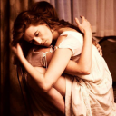
The hero’s capture shouldn’t have happened. She’s not even entirely sure how it happened. She stepped a foot wrong, or so she assumes, and the villain’s henchmen had leapt on her.
She’s contemplating her predicament from the villain’s classic choice of iron bars and dingy jail cell. Nothing is adding up. The villain always targets her when she’s obvious—in the public eye, in the limelight, on show. Tonight his henchmen found her alone, on a random street, blending into the background. How the hell did they know where she was? Who she was?
Her blood runs cold at the implications. If they found her this easily, who’s to say who else they could find? It doesn’t bear thinking about, not when she’s as useless as this in a goddamn cell.
The door opposite clanks open like it’s purposely announcing the newcomer. Not that it needs to, since the hero knows exactly who’s approaching her cell by the clicking of heels and the swish of a well-loved coat.
“Fancy seeing you here,” the villain greets, his grin weaving into his voice.
The hero doesn’t even grace him with a glance. She stares at his shoes instead. “What a coincidence.”
“Thought you’d at least be curious who got you here.”
“Not really.” The hero scowls. “I know all your henchmen by name by now.”
The villain makes a noise vaguely resembling a laugh. “No, my dear hero. Not who picked you up. Who found you.”
The hero frowns. She can smell a trap from a mile away. “You, I assumed.”
The following silence forces the hero’s gaze up to the villain’s face. The grin in his voice is also on his face, the asshole. “No. Not me.”
He turns to gesture beyond the doorway, and curiosity gets the better of her. She leans to look past him at the pair of figures traipsing into the room, heavy footfalls punctuated by quick, nervous steps. A henchman, and someone else.
“Meet,” the villain says with a smug glint in his eye, “your new nemesis.”
The hero’s eyes fall on someone familiar. Someone small, young, easily drawn to the wrong side.
“[Sidekick]?” She can’t help the name coming out a little incensed. Her sidekick cringes at her tone. “I swear to god, [Villain], you’re going to—”
“He came to us,” he interrupts, and the hero shuts up in disbelief. “He wanted to share some really pivotal stuff with us. Didn’t you?”
The sidekick nods and smiles pleasantly when the villain ruffles his hair. The hero can’t believe what she’s seeing. “[Sidekick],” she says again, softer. “He’s tricking you. They’re the bad guys.”
“We didn’t trick anyone,” the villain says shortly, as if her judgement offended him. “We told him the truth, and he picked his side.”
“You weren’t very nice to me,” the sidekick adds quietly.
“Yeah, and that.” The villain looks positively delighted at the hero’s disgraced expression. “You weren’t very nice to him. So he came and told us exactly where we could find you and when.”
The hero barely holds back her blanch. The sidekick gives her one last glance, mildly disinterested, before reaching back for the henchman, and they take his hand like a parent. They throw a glance to the villain, and with a short nod of confirmation they steer the sidekick back to the door.
“[Sidekick]!” the hero calls desperately, but he ignores her. The door clanks shut again, and the villain sighs.
“He’s a good kid,” he comments idly. “You missed out.”
The hero’s barely containing her seething. “You poisoned his mind.”
“God, no, [Hero], what do you take me for? A monster?” He barks a mocking laugh. “No, I opened his eyes. He’s the first of many.”
The hero can only glare. She doesn’t trust herself to speak, but the villain seems more than happy to fill the space for her. “Now” — He settles on an upturned bucket that’s seen god knows what liquids — “let me tell you all about how great he’s doing without you.”
#creative writing#writblr#writers on tumblr#writing#writing community#heroes and villains#happy sixth of christmas yall#im FINALLY gettin to the good stuff at work im so pumped#social mediaing this thang like no one business#some of the posts are bangin if i do say so myself#im a graphic design GENIUS (canva is doing most of the work)
26 notes
·
View notes
Text
https://www.canva.com/design/DAGE02N5d0w/vBgIXLeQgdlC-HQ9CcpqDg/edit?utm_content=DAGE02N5d0w&utm_campaign=designshare&utm_medium=link2&utm_source=sharebutton @whydontyouputyourseatbelton @crystaltreebee @i-got-personality @aaaaaa-musical-trash
Also here are my notes. Not all of them make sense anymore but some do lol.
So we all know i love musicals and thats why i chose this topic. i knew from the beginning that i wanted to do smt with musicals for this but i wasnt sure whT to chose. I was debating doing the portrayal of death in musicals but nit all of you answered in time whether thya would trigger anybody so that was out. The second option was costumes in musical whoch wooild make sense for us as fashion forst graders but then u realised i could include that in this.
Now obviously there isnt one way to make a good musical and its always a matter of opinion. And while i do have an opinion, i tried to form a critical opinion on everything.
Theres a lot of stuff that goes into musicals. When you think of a good one you may think of one with good lyrics or a cool story. But theres also stuff that you don’t think of at first, that alone couldn’t’make’ a good play, but in combination are the most important parts! Like the light design >insert rest of agenda.< (kannst einfach ablesen, was auf der folie steht!)
story wise i think heathers did a great job. Heathers is about a girl who falls in love with a killer. Ups and downs, and just a generally creative and good story with a good and,,more or less sense-making plot. The layout is very good too: a great hook, some happy stuff, scary and then things go down with a bittersweet ending. Im not sure how to explain what makes a good or a bad plot but for reference imma give you cats in comparison as an example of a not so good plot
Talking lyrics, i dont need to think twice to tell you hamilton! Its about alexander the great and his life. There is no way to convince me of anything else. Its a peotic masterpiece which especially brings out alexander hamitons own lyrical genius. Lin Manuel Miranda is a great fan of motifs and mass rhymes, and methaphors. His stylisation is nit only unique but really really good!
but I honestly didn’t like the choreo: it was sloppy and ensemble based. They were just rearranging furniture and stuff. There was only one song, “Satisfied” that was choreographed well. i do however think that westside storry has an awesome choreo! Westside story is about racism and separation between gangs in the 1960’s new york city. It tells storry but it’s still dancing. Good dancing i mean. They mixed elements of ballet with hip hop, flamenco and countles other kinds of dancing and it came out with perfection
and while the tunes are awesome there, there are better ones. Like Rent. But even better: hadestown. A modern retelling of the story of greek mythology god orpheus and his love interest euridacy. The tunes are everything there! It captured the mood and it was,,, seductive to your ears! The orchestra and composer did a great job! Its not easy to make all instruments work with each other so well. Or in the hights! Awesome composition!
yk what else is great about in the hights? The mood! It has ups and downs. An awesome balance thats brought acroos awesomely! Some would argue that SIX is by far the play with the best mood and don’t get me wrong SIX also has a great mood but i dont think they found a good balance for that. The mood is almost exclusively positive for what its worth and it didnt have enough variety
while its not like in the heights had the chance to, they still didn’t have the greatest costumes… however six didn’t have the chance either, but they still did it. They’re original and iconic and make the characters! Six tells the story of the six wives of henry the eighth who were divorced, beheaded, died, divirced, beheaded and survived. Of course there goes a lot into costume making which makes this even better Theres a lot to concidder:
-cholortheory
-color psychology
-prises
-fabric
And then of course the require some necessary qualities like
-quickchanges
-dancable
-rechognise characters (especially when one actor plays several) and set the ensemble apart
-makes no noises OR make specific noises
-You need to concidder the period in which the play takes place, and clothes aren’t the only complicated part of costumes: wigs/ hair and makeup or facepaint can make a whole look!
And the kind of musical can also influence the kinds of costumes. Some examples are
Types/ways of costumes (I tried to make this as few categories as possibles possible)
(Erklären!!!)
- Normal clothing. Examples: come from away, Illinois, the prom
- Periodically./accurate (unter punkt: seemingly adequate) Examples: newsies, the greatest show, something rotten
- Periodically modernised: Hamilton who had periodical clothes and hair and make up modern,
- Modernised: SIX which was almost robitic, descendants
- Interpretation Starlight express, (where trains and cars wore roler skates), tarzan, and lionking? Possibly? I feel like lionking could be a category of its own though to be honest
- made into outfit:: spongebob, Arielle/the little mermaid, (starlight express)
- Actually just costumes: cats, Shrek, beauty and the beast or wicked
- Inadequate: six
- Portraying: into the woods and parts of starlight express
- Simplified: hamilton
- using the stage: illinois, ride the cyclone
then theres storry telling for which i say cats. cats… which is quite ironic. Cats is about…. Well… cats
They could have done better but i still think it’s the best there is! They TELL their storry. Like in six exept they actually have a present that like,, exists. The lyrics alright i guess but the composing could have had a little more variety, however i did love the stage there as well because it was always the same but still did awesome stuff like the train thingy
talking about stages! I think the stage is such an important part thats often overlooked. There are musicals like dear evan hansen, the prom, be more chill or tuck everlasting that have a variety of different sets with self driving probs but it’s just actually different things and not very creative. There are two versions of good stages. One that take you in the setting, but that only works if your setting is a special place. There are many musicals that made this one very well. My top two are frozen on ice and tarzan they are actually in an icepit with icedanging and stuff and in tarzan they swing around like actual monkeys and spray you with water and stuff. The second type is when there is one element thats used through the whole show and that makes the setting. This is also called a Uni-set. One of the best examples for this is probably the grey cube: Falsettos. It’s about aids and judaism (?)
But whats part of the stage design is the light design which is overlooked even more than the stage itself. I know i said said that i didnt like the stage of dear evan hansen but it does have an awesome light design! In general the technical aspects and also the sound design there is really good! Dear evan hansen is about a boy who pretends to have been friends with a kid that recently passed.
then theres what i call the manipulation aspect which is choices that were purposely made but not pointed out. I think that hamilton did a great job here too. A lot of people talking at once when to much is going on in his life and only him talking when he makes the dumbest decision in his life. Walking in straight lines when thinking simple and good but in circles when it’s complicated and a lot. That sort of stuff.
the last aspect is performance. Its hard to rate this since for stage musicals the actors and therefore the performance changes constantly but i think the original tuck everlasting cast did a great job! Tuck everlasting is about a girl, Winnie, who meets an immortal family
something that i honestly probably shouldnt count but gives bonus points is: every musical should have at least one singer tht seems to not even be able to miss a tune if they tried. Sure all singers should be good i love when theres just this one over the top adelle level person. The greatest showman has one and its epic, like,,, goosbumbs throughout the whole song “never enough” with the swedish nightingale. The greatest showman is about Pineas Barnum- an actual guy- who believed in true happiness and that as long as a smile is real, it doesn’t matter if the ‘cause’ of that smile is. He was the reason for the saying “freakshow”
however those are only the best in their aspects but if you’re asking what the BEST MUSICAL IS I definitely say Newsies! im not saying that because i like it -which i do- but actually critically thinking!
Newsies is a Musical based on the newsboys strike of 1899 where the Newsies working for the World and the Journal held the first ever successful strike in america that was organised by kids in history. The story centres Centers around a Newsboy Jack Kelly and his new friend Davey. They start a strike against the owners of the Newspapers and stop selling because they raised the prices for the papers even tho they have more than enough money, when the Newsboys barely make a living. Davey tries to talk him out of it at first but doesn’t succeed. Eveantually he gives in and actually gets really invested in the strike himself in the end.
Now your prolly thinking: why? Well. This presentation is far from over. (That was a lie. Its almost done dont worry)
Lyrics are honestly great! I have zero complaints about that. If anything, i have complements! Sure, its not as good as Mirandas works but, lets be honest: what is? I think the lyrics were still more than A+! The story is simply great. i personally think its harder to make something that already exists or happened into a storry. It requires much more creativity despite already having a ‘template’ you have to make the whole thing fit and make sense with your own thing and still be accurate and theres a lot about this actually. Newsies did great with that! It’s composed geniusly too. Menken/Ortega outdid himself by far with it. The choreo? Bombastic! Don’t even get me started. Prolly the best I’ve even seen! And I‘m not just saying that. I actually don’t think i’ve ever seen anything choreographed this well before. They have dance breaks in songs, DESPITE DANCING THE WHOLE TIME anyways
Tunes? Through the roof top. (Haha get it— cuz of santa fe— laugh>:()
The mood was great but it had a balance! It was introduced with a good mood, making u invested but still,,, deep and sad.
You just need one picture -and this is gonna sound really bad for my case but- this[bild zeigen] is all you need to know about the show
While the costumes aren’t too original they’re definitely iconic and not too bad.
Story telling is fantastic! There are some talking to yourself/the audience and telling the story! Some telling it WITHIN the plot (which they did a gooood job making it seem natural and not forced info) and some middle grounds. I really liked it. They also blurred the lines there perfectly.
Stages! I love using newsies as an example for a good stage because they have BOTH kinds of a good stage! (sorta) its one element that is rearanged to make a whole different setting. They only needed some little elements that weren’t always the same. Add a few tables and chairs? Diner. Ad fancier chairs? Pulitzers office. Typewriter? Boom! Editors office. I also think that the metall stuff did a really good job reminding u where and when exactly this is taking place and that that combination of time and place: lower manhattan in 1899 wasnt the best mix of time and place to live in so that sorta counts for the first type.
We dont even need to talk about the “manipulation” aspect bc i wouldnt even know where to start. Im not even sure it was all on purpose. What character has what choreo, the double meaning of some things, the reprises, the rhymes and so much more
They have medda and jeremy jordan as jack kelly so they have not one but TWO of those perfect singers!
And Ive honestly never seen a bad performance of newsies . So yes. Chritically, Newsies is the best musical
Anyway my favourite is and always will be
Starlight express
Despite not being on place one in even ine of these
#newsies#my posts#kosa newsies strike#heathers#hamilton#cats#SIX#the greatest showman#come from away#lionking#descendants#tarzan#frozen#starlight express#beauty and the beast#wicked#into the woods#in the heights
2 notes
·
View notes
Note
hi! im that anon that asked for a tutorial and you said something specific and i really liked your harvey dent edit? the one that said, god is dead. and it was all red and stuff and super cool looking? no pressure! i just think your stuff is really cool and was wondering what the process behind some of it was!
ofc! it’s no problem at all :)
so i’ll just give a brief rundown and a v rough tutorial on how i made those particular graphics. thank u so much for the support, i’m especially proud of them too and it’s nice to hear u like them as well!
what you’ll need:
photoshop cc 2015.5 but any ps would do really
basic knowledge of photoshop
patience
fonts: dk shaken not stirred, liquido, couture, helvetica, helvetica neue, votu
so the first graphic is a really stupid move and i just realized it like hours after i posted it: it’s one of two graphics that feature a fanart instead of a faceclaim. looking at it as a whole, cohesive set it looks really stupid and surreal? bc it doesn’t match and just throws u off? so my advice is don’t do that. if ur gonna edit from an actual comic then the rest should be like that too (2D) but if ur gonna edit with real life elements i suggest to just stick to that path (3D) so that everything looks coordinated and neat :)
the second one actually took me a while to get right but basically the red circle is in [linear light] and the black circle is in [hard light] mode while the top most white is in [normal]. the paper texture is above all three layers and is on [multiply] mode so it only looks visible on the white circle. the “angels” text is just some basic layer mask so it looks like it’s inside the white circle. as for the style of the graphic itself it’s just based on the previous harvey graphic i did here, the last one on the left. the thing with that is i look for inspiration from other graphics i find and there’s a lot on behance, flickr and even pinterest. just search for ‘graphic designs’ and you’ll find a lot of good ones. u don’t have to copy them exactly but u can adopt and transform it into something urs! but if imitating some designs and tricks is what helps, then it’s fine too. nobody is born an innate artist/designer/whatever so just explore and experiment with what u know and what u want to see. eventually, u’ll be able to develop ur own style.
the third one is basically the same as the second and fairly straightforward. the big, red 2 is set to [darken] mode. i guess with this graphic it’s mostly abt negative space??? and also maybe laziness but negative space is good so that overall, ur graphic set wouldn’t look too cluttered. it helps the eyes breathe i think. also the main focus is the faceclaim, and since the graphics above and below it is already optically centered, it’s at the rightmost side for asymmetry. just a thought.
ok i’ll be real this is one of my faves bc it just looks so harvey i couldn’t believe my eyes when i saw that hand. i just cut it and applied a gradient map of white and light red i believe so it looks like it’s sketched out or smthng. it looks just like harvey’s burned hand but bc i’m an idiot i forgot to flip the canvas so that it would look like his left instead of his right hand. to this day i regret this mistake. if u look close enough the coin has harvey’s face on it too. damn i love him. but moving on, the lines are made with the pen tool. the pen tool can be a hit or miss thing to use and i just recently learned how to use it properly but it’s v convenient once u got around it! it’s like a sophisticated brush tool if u want to incorporate more lines in ur stuff. u can also use it to cut stuff out (like with the quick selection and magic wand tool) but i don’t do that method often so probs don’t listen to me. i only have a v basic knowledge on it but there’s a yt video tutorial on how to properly use the pen tool if ur interested.
this fifth one is very….. meh. theoretically, it could’ve been better but since i’m the Worst in practice it ended up like that. the design is p much those adidas ads with the many dots? sorry for the plagiarism, adidas, but i don’t make money off of this. so when in doubt just slap some geometry on ur edit and ur good to go. i go for circles bc they’re more aesthetically flexible, if that makes sense? i find rectangles cool but they tend to look out of place in something so vertical; it leaves little space for words and other elements. but polygons look better on horizontal canvases so u can try that too!
the last and definitely least is the most ‘meh’ out of the bunch bc i literally stopped caring abt 2/3 into this thing. the thought that comes to mind is: time magazine cover nov2017 so what does that say abt it really. the text is naturally like that thanks to the font: liquido with a wave-like option if ur into that kind of stuff. some layer masks too to get the effect of the text being inside the harvey art. it looks so dumb now wtf i’m an idiot. but hey, 2 harveys. i’m a visual genius in that respect. again, some gradient maps and a red rectangle border. tip: u should most definitely add a contrasting color or accent in ur graphics, which i once again failed to do here. in this case it’s black since the color palette is red, white and black. it adds a depth to ur work. if ur skilled enough, u can use a wider range of color palettes instead of the usual black, white, [random color]. i, myself, haven’t mastered that yet so that’s what i usually use but one extremely prolific graphic maker who has a good eye for these colors is user mattelektras. u can check out her stuff and see how she uses complementary colors in her edits.
some other things to note:
if u need a paragraph-like text for filler, u can go to type > paste lorem ipsum then adjust the font size to ur liking (somewhere around 0.8pt for maximum unreadability)
it’s good to pay attention to colors and spaces in ur works! the color wheel is ur friend in this trying time
smart sharpen always and forever (at abt 65-130 depending on ur image size)
this got lengthy but i hope i was able to help! i know it’s not that detailed but if u have anymore questions don’t hesitate to ask :) i’m not bothered at all so don’t worry abt it. happy designing!
4 notes
·
View notes
Last Seen Blogs

sdfhjpoutr
Unbetitelt

microbloggertosaveamerica-blog
Microblog to Save America
lesbiandemondaddy
I JUST WANNA BE PART OF YOUR SYMPHONYYY (of Lungs)

oxpertech
Oxper

distractedvoid
✨the silly✨