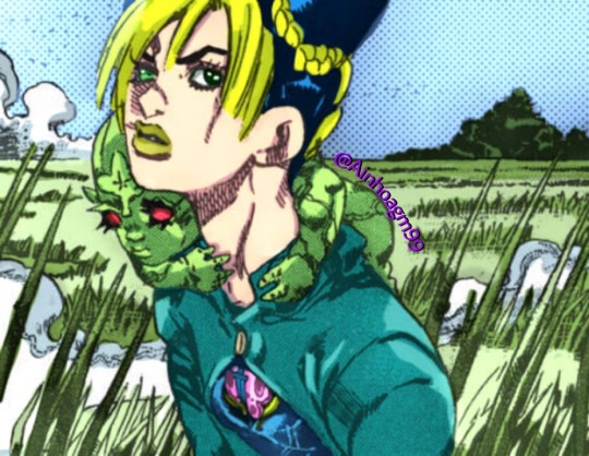
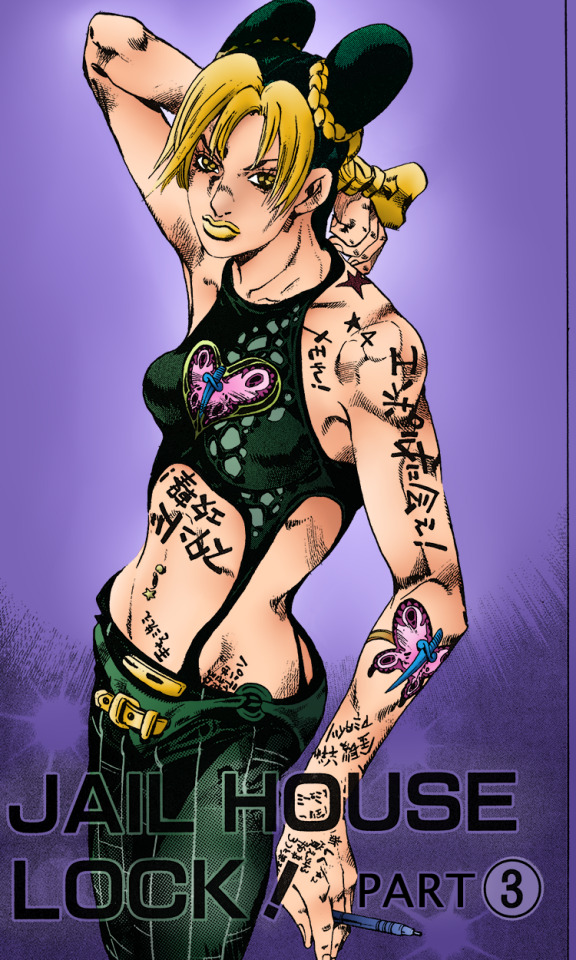
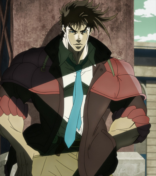
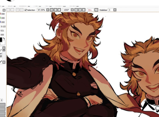
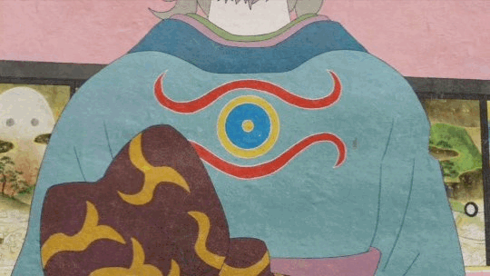
#jolyne manga colored
Photo
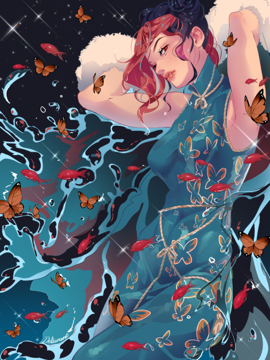
universe soup🐟🦋✨
#Stone Ocean#JJBA#JoJo's Bizarre Adventure#jolyne cujoh#Jolyne Kujo#deliart#a little aimless piece since i wanted to try some stuff out!!#confession: i havent wacthed the latest(last) part yet#but ive read the manga so im really curious how they portray certain parts...#need to get the time together to watch it someday...#hope we get some cool alt colors...
2K notes
·
View notes
Text

jolyne cujoh transparent [ch. 146]
#jjba transparent#jojo transparent#jolyne cujoh#jolyne kujo#manga panel#colored#covers and illustrations#chapter 740
248 notes
·
View notes
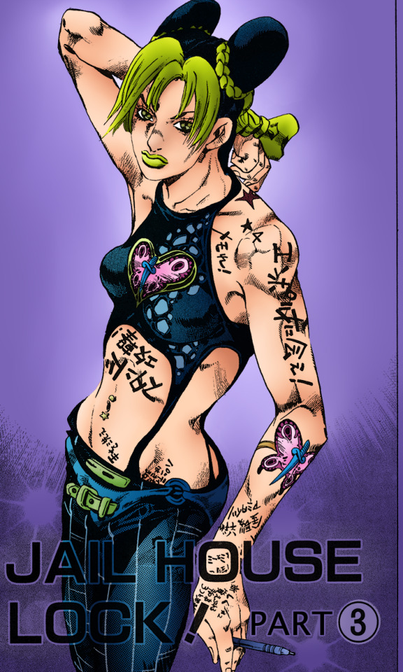
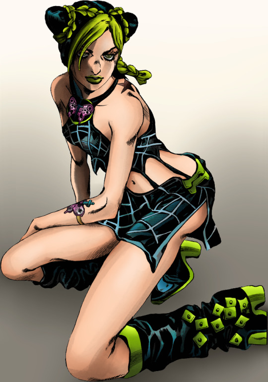
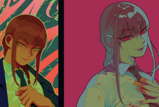
Text
italian style. specifically naples.
#jolyne cujoh#jolyne kujo#jojo's bizarre adventure#stone ocean#jjba#jojo#illustration#digital art#featuring my favorite jolyne color palette from the BEST manga cover#for the love of god open at 100% resolution. it is a imperative for my artstyle to have no resizing#and so i am cursed forever when it comes to posting on social media.#i am QUITE HAPPY with this tbh. it started as just me fucking around but the result is honestly pretty good!!#does this count as a manga redraw? that wasn't my intention but i guess it kind of ends up looking like one. oh well.#my art
69 notes
·
View notes
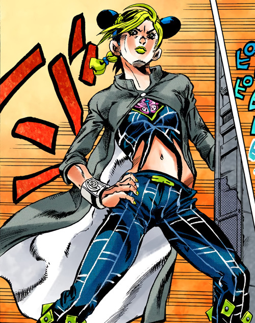
Text
Stone Ocean - Coloring
#jojo no kimyou na bouken#jojo's bizarre adventure#jojo part 6#jolyne cujoh#jotaro kujo#coloring#manga coloring
13 notes
·
View notes
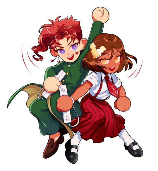
Text
what if.. we kissed in a prison in Florida..
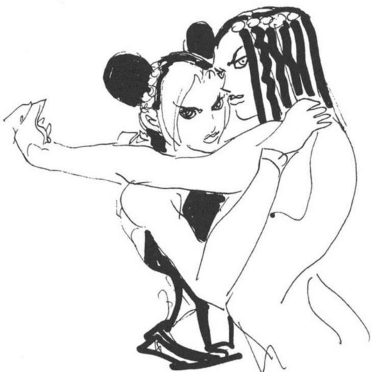
#manga coloring#sharkz coloringz#sketch coloring#jjba#jjba stone ocean#jjba jolyne#jjba ermes#jolyne x ermes#hirohiko araki
9 notes
·
View notes
Photo
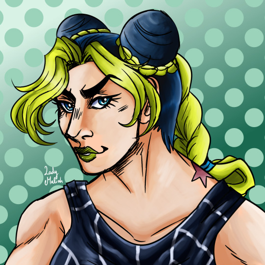
Best Jojo gal <33
#blue-eyed jolyne truther#her manga colors <33#jolyne cujoh#jjba#stone ocean#jojo#jojo fanart#jojo part 6#jjba jolyne#jojo's bizzare adventure stone ocean#my art
13 notes
·
View notes
Text
JJBA - Stone Ocean - Chapter 2 - Page 1
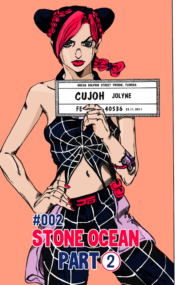
I really pushed myself this time and I think it came out well. I had never coloured over text before, but I think it works.
2 notes
·
View notes
Text
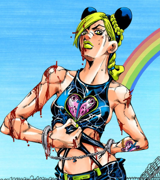
#samhaine posts absolute nonsense: image edition#panel screencaps#step one: cover jolyne in blood#ceo of jackin off in jail#colored manga#so
2 notes
·
View notes
Text
#anime manga#anime#manga#colored by me#manga colored#colored belong me#my colored#manga anime#jjba#jojos bizarre adventure#jolyne cujoh#jolyne kujo#araki hirohiko#hirohiko araki#stone ocean
15 notes
·
View notes
Text
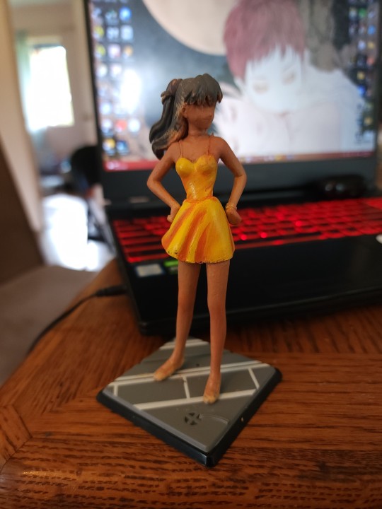
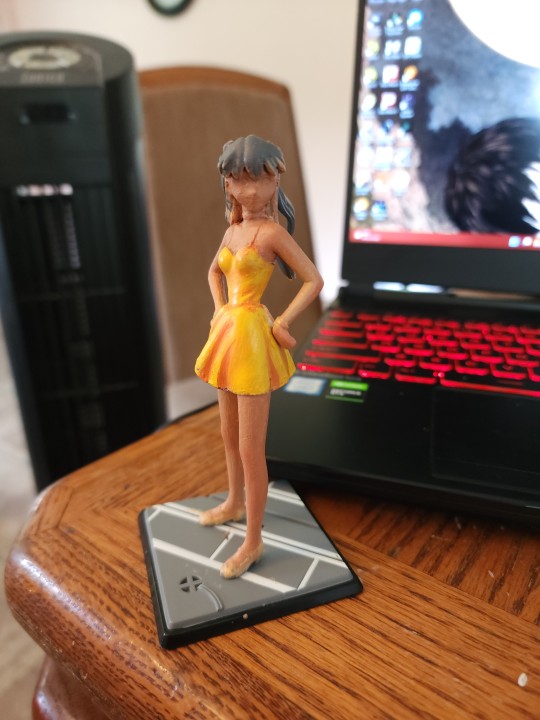
very early wip obviously but I finally got around to getting figures to repaint and started doing that :3 very fun very satisfying
#i got two nge ones because its very easy to get cheap nge figures.#for now ive got asuka. rei is in the mail. eventually ill also do shinji and kaowru to have all the kids#mari is excluded because i dont like the rebuilds#after the eva ones i think ill do a jojo one. i had my eye on a pretty cheap jolyne figure i wanted to repaint to her manga colors#so maybe her next#ghost.txt#wip#mine
6 notes
·
View notes
Text
2 notes
·
View notes
Text
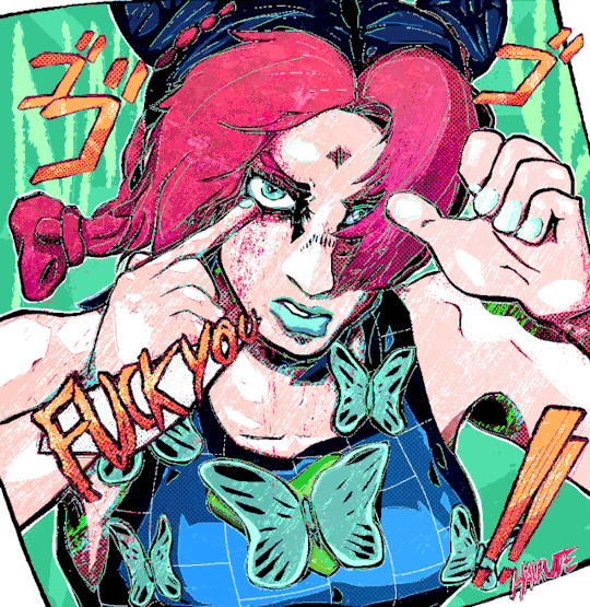
Like with the anime vs manga shit for me like
While trying to emulate arakis art style to anime they really loose to fluid softness of his art style to make a more ridged character model to animate and it makes me sad!
Like I think there's also something to say when ppl are like, arakis art style looks ugly, but I argue that it's stylized in a very specfic way but he design characters, especially protags, that we're built to carry the art style he has!
Like especially part 3 jotaro to me, I think in managa he is so sweet and cute looking, I kno2 it might still be a far jump but I feel manga jotaro feels more like a 17/18 year old than anime (at least a buff 17/18 year old in arakis art style. Like IN the world of his art im like yeah this one's clearly softer and younger than his elder peers. He just looks like the most uptight giant teen in the world lol.) And this still varies as the part goes and from panel to panel
But look at manga jotaro for me..


Also I still have beef with the anime coloring. I know there's the whole 'colors that animate best on tv' but man...

Some of the saddest anime color changes are the p2 and p6 adaptation and how (especially part 2) gets such a pukey desaturation to me. It's so dad to me
Joseph's purple haaair, jolynes color palleteeee so sad!!
65 notes
·
View notes
Text

jotaro & jolyne transparent [ch. 609]
(link to high-res transparent image)
#jjba transparent#jojo transparent#kujo jotaro#6taro#jolyne cujoh#jolyne kujo#manga panel#colored#6#chapter 609#jojoveller#covers and illustrations#sorry this image is massive because the scan is from jojoveller which is. massive
148 notes
·
View notes
Text
Hello Everyone!! Basically me and my group of friends started a back rooms AU! Roleplay I would like to post about and keep it updated, many characters from variety of fandoms are there. Some you might be familiar with others not so much but nonetheless!
CW: Spoilers ahead for the characters from each fandoms. No death or anything but power skill sets and such as of that nature. Proceed with caution. ^^
There are equally 6 groups of eight. Each group is chaotic in its own way and dear Lord..😟
Fandoms included are: JJBA, Sally Face, TMNT, pcfs, Splatoon mangas, Regretavator, Parrapa, One Piece, when they cry, Demon Slayer, CRK, TPOT, Modaozushi, Metal Gear, Colorful stage, Usagi, TLOU, Angels of death, JJK, Heathers the movie, Undertale, BSD
Group 1. Johnny, Iggy, Sal Fisher, Ronin Mikey, Mi-na , Mars, Goggles, Bive
Group 2. Avdol, Diego Brando, Jolyne, Pilby, Lammy, Narancia, Luffy, Wei Wuxian
Group 3. Rena, Zach, Armstrong, Muichiro, Nick, Marlon, Ermes, Gyro
Group 4. Rise Raph, Fugo, Glimmer, Satoko, Ginger brave, Mafuyu, White Snake Pucci, Polnareff
Group 5. Chérie, Two, Rika, Usagi,
MM!Leo, Dazai, Tanjiro, Bruno
Group 6. Sasuke (Shonen Jump), Old Joseph Joestar, Sans (OG), Josuke, Ellie, Parrapa, Gojo, JD
Most over powered characters have been restrained.
EX: Johnny only has up to Tusk Act. 2
Gojo doesn't have that purple thingy I forgot the name of..
Pucci has only White Snake
So on and so on
Attached is a picture of all the sillies on a template. If you have any questions feel free to ask!!
#jjba#the backrooms#liminal#jjk#project sekai#when they cry#crk#undertale#sally face#tmnt#rise of the teenage mutant ninja turtles#pcfs#splatoon#regretavator#parappa the rapper#monkey d. luffy#muichiro tokito#tanjiro kamado#two tpot#wei wuxian#senator armstrong#usagi#ellie williams#angels of death#gojo satoru#jason dean#sans#dazai osamu#AU#ocs
14 notes
·
View notes
Text
Omgggg
Sksjsks I went onto my insta and saw that someone liked this… old Jolynes from like, 2015-17 or so that I never got to finish (they’re all on my old laptop… I will rescue my files one day… this was my old cartoony style. I’ve revamped it a LOT. It used to be so much more loose… I kind of wish that it still was because it made the style look more simplistic and free? I’ve always been a huge fan of simple art styles!) I remember making an attempt at drawing every canon Jolyne outfit that I could find (at least the official colored drawings, not the ones from the manga since that would’ve been too much for me. I have the Jojoveller (I bought the Jojoveller back when it first came out from Japan and paid like, almost $200 for it orz….. should’ve waited for the price drop lol. I have every JJBA artbook tbh. But that helped me track down most of the official Jolyne stuff. Not all but a lot of it!) I’d drawn up at least 20 outfits at this point. At least I think so? These were just some of them. Hopefully, I’ll be able to retrieve my drawings again… the faces that I used to draw on my old style used to be so ugly, sorry.
Here’s an example of this same style but revamped to now lol…
(Yuki wip…. The bodies have more standard anatomy but the hands are still blocky like??? The faces are prettier tho…. Has it lost a bit of personality? Maybe… I do like my new style tho… But could I still even call it a cartoony style, especially since it looks more anime than before :/…. Uh, I’m thinking too hard on this :(….)
Another example is this Rengoku… it’s a little diff from the Yuki one despite being the same cartoon like style? (Barely cartoon anymore…) I don’t usually draw the nostril slit for this style but I did so for Yuki since it just looked better… idk if I’m gonna start doing that or not, I’ve literally been driving myself insane over deciding if I want to start drawing nostrils or not… for this Rengoku, it’s definitely more accurate to the style that I was pushing for but hm….. Similar to these Makima’s…. I didn’t draw the nostril…
I like to keep the ears very simple in this style as well and again, look at Makima’s hands. They’re supposed to be blocky like this hehe. The Yuki wip is more of an improvement of this same style but I’ve been so all over the place with it… I feel so bad, omg. The most polished example that I could find immediately of the original cartoon style was of these Shinobu’s… see how round and free everything is!?
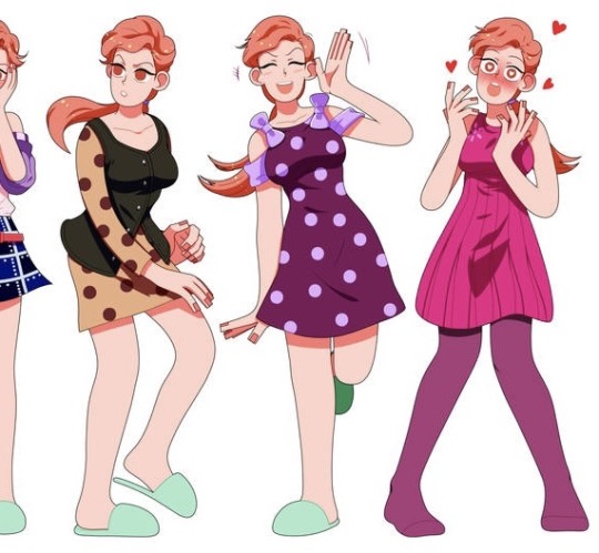
Don’t even get my started on the chibi styles…. I have a handful… because I’m indecisive. The Sukuna wips are from a new chibi style that I’ve been thinking about and I rly like it… The Kak/Oc chibi was for a commission that I had sm fun drawing for. I still like the style! I’ve always loved when artists left the pupils white for some reason? I wanted to do that, too! I forgot to color the lineart in the girls skirt lol….
This style with Sanemi and Uzui is rly cute to me as well… I will not be retiring it. I kind of hate the old chibi style with Josuyasu tho. Hideous to me. And overly complicated. I don’t really like chibi styles that have TOO much going on, especially if they’re not as cute since chibi’s are supposed to be cute. I said ugly but beauty in art is subjective sjsjs… if they’re pretty and cute than idc. So I technically have three chibi styles that I like.
Ohh actually, I have two other chibi styles….. fuck, I just don’t have any pics of them that I’ve uploaded, only saved as files. One isn’t really a serious style at all tho, they were for fun (experimental) and the chibi that you can see hanging in the corner of Yuki in the wip above is of another simpler style as well…
#whaaaaaaaa#rambling#my art#sorry I’m always yapping!!!#an artistic Journey haha… I hardly ever talk about my artistic thoughts so…
8 notes
·
View notes
Note
Random question but do you have a fav anime/manga art style? Or a least fav?
Keep in mind idk art terms (I only recently got into sketching and watercolor and idk WHAT the fuck I'm doing lol)
So I really love the shading in older stuff like Cowboy Bebop and that era of anime. I can't describe it but the muted color palette and way backgrounds were done back then especially make my eyes happy.
Also speaking of more muted subtle color palettes, I like Naoki Urasawa's art style and I love the anime adaptation of Monster. I also like Pluto but the fire effects look so fucking stupid, I get the effects are meant to clash with the 2D style but I hate it so much, it looks like someone making a YTP and using Adobe Premiere for the first time and it almost ruined the anime for me. All the tension in a scene crumbles when I see those stupid CG effects. But Monster is so pretty to me. I also appreciate Urasawa giving his women actual noses and like. Personalities. Eva Heinemann is one of my favorite female characters in anything, and it helps that she's a bitchy trainwreck who flips the gender dynamics of mysteries by giving HER *SPOILERS* a murdered significant other that fuels HER story as opposed to a women fueling a male character's manpain.

I like the weird wonky art style of Mob Psycho 100 and Chainsaw man, where the wonkiness kind of works to its advantage and can convey expressions just by being drawn Like That. It isn't bad but there's something about the weird expressions in CSM especially that kill me when something funny is happening.
Mob Psycho's anime and the first season of OPM are beautifully animated and MP100 perfectly adapts the original manga style. It keeps the spirit of the original panels but also adds so much stylization and all of the action sequences are gorgeous.
I also like the weird/wonky style of FKMT'S comics like Kaiji and Middle Manager Tonegawa, and the anime adaptations are also examples of great adaptation imo.
Sometimes I'm annoyed by the dehydrated look that JJBA has in the later parts, especially around the arms, but Araki's colored panels are so gorgeous to me. My favorite parts are 4 and 6 and I'm not in love with the manga style he had for faces in Part 4, but the anime looks perfect to me. Look at this boy. His face is perfect.
And yes this includes the piss-yellow sky because I like the color palette of the DiU anime a LOT. Since a lot of animators work on the Jojo anime, characters can look really different between episodes and even between scenes, but I love the way Jolyne looks in almost all of Part 6 when she has a fuller face. And the color palette of Stone Ocean's anime took a bit for me to get used to since the colored manga has a vastly different shade of green for her, but I really like Yellow-green Jolyne and how she stands out while complementing FF and Hermes's green shades.

You can tell by this list so far that I usually like wacky bullshit and artists that just do whatever they want. As far as pure lovemaking for the eyes, I adore shit like Mononoke where texture is king and every shot is pure ecstasy.
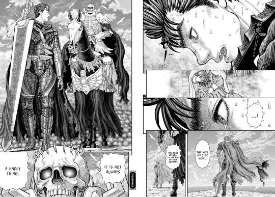
I also love Berserk's art style and I'm lowkey amazed Miura's assistants are able to replicate it so well considering his insane attention to detail. Even when displaying grotesque and sometimes misogynistic horrors, every spread of this series is a masterpiece. I also can't believe that he was able to give a skullfaced character so much emotion and expression (subtle, but still there) despite the fact that because he is a fucking skeleton, Skull-King's face can't actually change. This page makes me choke up just looking at it. I choked up while searching for it on Google for fucks sake
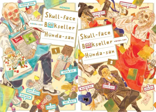
Speaking of skeleton characters I love, I like the flatter look of Skull-Faced Bookseller Honda-san, one of my favorite manga of all time! The way the mangaka personifies all his employees is just so cute looking to me, and I love the color palette of the covers and the anime.
And while I give Ohba's writing a metric ton of shit, Obata's art is so pretty. When I think of the trinity of "Mangaka who draw peak fashion", it's Araki, Obata, and Tite Kubo. If I was not a suburban white woman, I would say that they give their characters tons of drip.
8 notes
·
View notes
Last Seen Blogs

yllucsanad
but so are lies

thepinklioness007
The Pink Lioness

poisonflowerxprincess-blog
N A R C I S S I S T

jkg9sv9vo
Untitled

naughtybiboy469
Married BiCurious Male early 50s