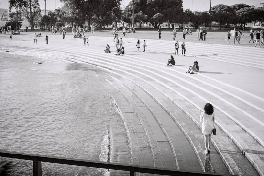
#just wanted to emulate the colors and composition and vibes
Text

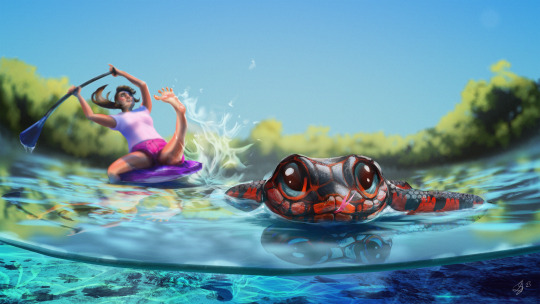
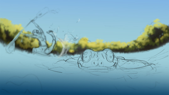
Little study of this shot from Gyeongseong Creature that I really liked for some reason
#not one to one but that was kinda on purpose#just wanted to emulate the colors and composition and vibes#gyeongseong creature#netflix#art#digital art#artists on tumblr#digital painting#illustration#my art
24 notes
·
View notes
Text
Nostalgia and Memory
Final
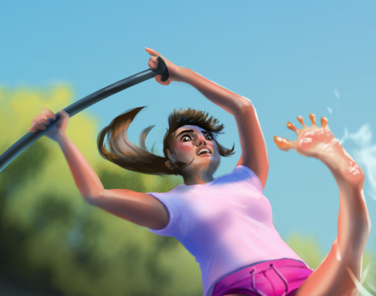
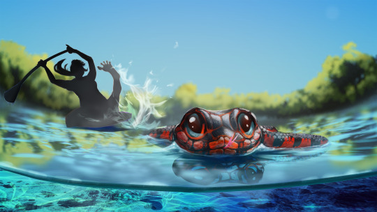
I wanted to choose a positive memory for this piece from a holiday adventure to Crystal River in Florida. I have a fear of snakes and my encounter with this particular mud snake helped overcome that a little. I was paddling along the river, my partner and our tour guide further upstream, when a large black and vivid red snake passed close to my leg. I immediately thought of the age-old advice that brightly coloured creatures are often poisonous, which I learned was mostly false when I frantically researched it later. I stayed perfectly still in my panic, but as the snake passed, I noticed that it was happily minding its own business, just going about its day quite confidently and happy to share the space with a large floating biped. Still, when the snake had passed a safe distance, I hurriedly took my legs from the water just in case anything else crept up on me.
Research

Crystal river is a fresh water river with stunningly clear waters that wouldn't feel out of place in the Caribbean. I wanted to capture the colour and clarity of the water in my piece. The colour itself lends to the welcoming and holidaying vibe of this memory.
I chose emulate Disney/Pixar rendering and colour style for this memory as memory doesn't always appear in the mind as realistic, and Pixar has a marvelous and very scientific way of eliciting emotion through its colour use (ROGERS, 2021). Most of the Pixar colours seem to be neon pastels, this style gives space for capturing the colours of crystal river and even enhancing them as memory can.
Examples of Pixar pallets:


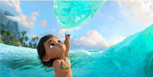
In Moana, the neon color of the water entity enhances the feeling of wonder and magic.
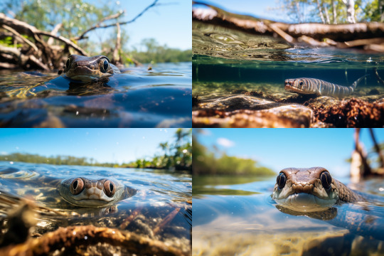
My memory does not accurately recall details, for example, when I think back to that event, I do not see the Smaug-like eyes of the snake pictured below, but rather a more caricature version where the snake has cute shiny, button eyes. Pixar has a wonderful stylisation of real life that will lend to the feelings I'm trying to convey.

I wanted to be accurate in my colours when presenting the snake, but also stylise its features to come across as cute, confident, and oblivious to the alarm it caused!

A key style cue for Pixar animals is large eyes that don't seem to anatomically fit in the head, bright colours, expressive eyebrows and a big smile.
Process
As I began my rough thumbnail sketching, I was struggling to show the snakes face, which would need to be a key focal feature in order to show his cuteness. I realised that I needed to for-go the strict recollection form the first person and adjust the angle to make it all about the snake, but still capturing the aftermath of his passage. I tried a lower angle with a wide-angle lens distortion to capture the micro-elements. The distorted curve helped add drama and a dynamic flair to a simple composition.

As I was pleased with the direction, and to get a more relevant photo-reference, used the prompt: "looking down at a very cute mud snake swimming ontop of the crystal river in florida with depth-of-field mangrove roots in the background and blue water underneath. --ar 3:2". This was a great realistic reference for rendering.
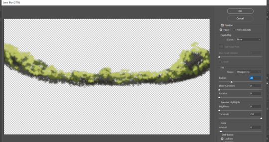
I had chosen to go with a depth of field with a shallow focal range, this meant most of my assets would be blurred. I was able to work quickly and efficiently by using Photoshop's powerful blurring filters to achieve a realistic result.

After roughly painting out the forms with a foliage brush, I ran it through the Lens Blur filter in Photoshop.
I also used a Photoshop filter to blur the undulating water effects which were painted using a water specular concept brush. To match the shallow depth of field, I used the Tilt Shift blur filter which lets you control the depth of field (1), focal range (2), and focal point (3).

I duplicated the water effect layer twice to create the light refraction. The first layer is the primary layer that shows the colour of the water beneath the surface. The second layer is a deeper and darker blue moved just a couple of pixels above to create a core shadow, and the third layer, in white, moved just a couple of pixels above the last, creates the specular. I adjusted the opacity of each until accurate.

Crystal River underwater reference image:

The water beneath the surface was relatively easy to achieve with a pretty realistic result. The most valuable players being the rocky textured brush and the perspective transformation tool.
In image one I created the water line against the lens and painted in the vibrant colours that captured the Crystal River.
In image 2 I used the texture of the brush to add in some debris and then manipulated it into perspective.
In image three I used another concept brush for ground rocks.
In image 4 I used a rectangular brush with fall-off to create the caustics, which I also warped into perspective. The shadow of the snake helps emphasise its length and size and the trail of caustics is a cute detail to show motion.

I wanted to spend time detailing the caricature of myself even though it was going to be blurred. I wanted to capture the fear in my eyes and have my focus be on the snake. Sadly, I think this feature is a little lost, but if this were to be animated, a change in focus, or a close-up of the character's face would help sell the emotion beyond the large movement of the limbs. The splayed toes are another cue to the emotion which I think is pretty cute and funny.
I wanted to have more control of how the character was blurred, so I created a depth map where pale is foreground and dark is further away, this would have to be inverted later to be applied using the Photoshop filter.
The filter requires the depth map to be applied as a layer mask (unlined or later deleted so opacity is not affected). I copied the depth map and pasted is directly in situ into the layer mask (alt+lft click to select) and inverted the entire layer.
In the Lens Blur filter, I selected "Layer Mask" as the source for my depth map and adjusted the sliders to where I was happy with the blur amount.

It was a little late, but because my assets were painted independently to the rest of the scene, I was able to move the character and snake into positions better suited to the composition.
I am really pleased with the way this piece turned out, the colours and characters match the style I decided to pursue. The main critique from my peer review, on which I agree, is the movement of the character; pushing the dynamic element of the pose and positioning. I struggled a little with the angle of the person, and the movement seems to create some confusion as to whether this person is falling in the water or dramatically pulling their leg from it, I will need to work on the clarity of my story telling!
References:
ROGERS, A. (2021). How Pixar Uses Hyper-Colors to Hack Your Brain. [Online]. Wired. Available at: https://www.wired.com/story/how-pixar-uses-hyper-colors-to-hack-your-brain/ [Accessed 25 October 2023].
Image References:
DISNEY. (2016). Moana. [Photograph]. Burbank: The Walt Disney Company.
GRANT, C., SAUNDERS, M. (2023). Waterways of Crystal River, Florida. [Photograph]. [Online]. Available at: https://www.outsideonline.com/adventure-travel/destinations/north-america/explore-the-waterways-of-crystal-river-florida/ [Accessed 25 October 2023]
MIDJOURNEY, (2023). Looking down at a very cute mud snake swimming ontop of the crystal river in florida with depth-of-field mangrove roots in the background and blue water underneath. --ar 3:2. [AI Generated Photo].
PIXAR. (2016). Finding Dory. [Photograph]. Burbank: The Walt Disney Company.
POWERS, L. (2014). Red-bellied Mudsnake 01. [Photograph]. [Online]. Available at: https://kysnakes.ca.uky.edu/snake/farancia-abacura [Accessed 25 October 2023].
POWERS, L. (2014). Red-bellied Mudsnake 04. [Photograph]. [Online]. Available at: https://kysnakes.ca.uky.edu/snake/farancia-abacura [Accessed 25 October 2023].
QUALITY LOGO PRODUCTS BLOG. (2023). 8 Color Schemes from the Pixar Universe. [Online]. Quality Logo Products. Available at: https://www.qualitylogoproducts.com/blog/pixar-color-schemes/ [Accessed 25 October 2023].
WAKE AND WANDER MEDIA. (2020). Crystal River, Florida. [Photograph]. [Online]. Available at: https://www.forbes.com/sites/willmcgough/2020/08/20/road-trip-florida-5-insider-tips-for-visiting-crystal-river/ [Accessed 25 October 2023]
0 notes
Note
hiii! i really admire your art skills. and the fact that you improved so much in just 6 months is inspiring! do you have any tips on how to improve? i'm 26 and i want to improve but i feel like ive neglected my art for so long and now it's too late. :(
THANK YOU SO SO MUCH OMG ?? oh man i’m so bad with feeling and gratitude but this seriously means more than i can express so i worked really, really hard on narrowing down my best tips! so here’s
Eli’s Top 5 Rules To Be a Totally Cool Awesome Badass Artist In As Long As It’s Going To Take (In Order) :
Most important rule of all is it should be FUN. be disgustingly self indulgent, draw what you want and LOVE, not what you think you should or what everyone else is, or how everyone else is! don’t vibe with doing sketches first? hate lining? despise complicated painting styles? find shortcuts, don’t do them!!! if you’re doing digital maybe draw your sketches traditionally first and scan them/take a photo to draw over, try a lineless style, cel shading, or mixing mediums, the options are endless! this is where your “style” will come from. all “style” is, is an artists shorthand.
You are your only competition. never compare your progress to anyone but your past self, it’s not a race in terms of how good you are at X age after X amount of time spent practicing. i saw it illustrated in this comic a few years ago (that made me cry at the time, because i hadn’t started drawing yet) as seeing your skills as a beautiful potted plant- just because some people are walking around with theirs fully grown and thriving, doesn’t mean your little sprout will stay small forever. just be patient, keep watering it, and eventually, it’ll be a beautiful flower all your own. ❀
Use references Obsessively. this includes tracing! (ethically) there’s a ton of resources out there, redraws of frames from movie or shows are great too! play around with it, try using the perspective but change the style or turn it into a character au for a fandom you love. (this is part of that first tip!) mashing together images past the point of original intelligibility is acceptable as well. the goal isn’t to obsess over accuracy or stop using references altogether though, just to use them differently over time.
Inspiration/motivation won’t be gone forever. don’t force yourself to practice drawing, or you’ll end up resenting it altogether. i’ve had my tablet and pencil since january but i say 6 months bc there were two (almost three) entire months where i had no inspiration and just did Nothing. take time to consume new media for ideas or look at what inspires you instead! keep folders of the things you find most appealing to pull up when you need them. art can be a freeing escape if you allow it to be!
Look at art you admire and think about Why you admire it. why does it look good, what catches your eye most? is it the colors? the lighting? the shapes and perspective? the varied line thicknesses or the overall layout composition? everything can be broken down into components, hone in on the ones you like most and try to emulate them. we’re all just flowing down the stream of shared inspiration together. :)
bonus digital art tip: you will always need more layers than you think you do. give each element its own layer like it’s the most introverted mf you’ve ever met, i swear on everything good in this cursed world you will thank me later. layer/item selection and transform are your best goddamn friends for life.
there’s also a lot of art related posts in this tag and on my art twitter ♡ thank you endlessly again and good luck on your journey!!
#art tips#art advice#anonymous#love me#i just know i'm forgetting sth#and i'll kick myself when i remember later#but i Think that's everything#that's helped me most at least!#i hope it can help you at all#it's never too late ♡
95 notes
·
View notes
Text
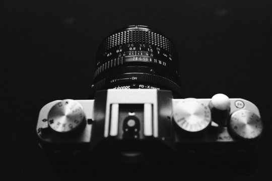
The “film look” in digital - what I’ve learned so far
Let me start this article by addressing the elephant in the room: if you want a real authentic film look, shoot film! There’s just no way around that, no matter how close you can get with digital these days, there’s something about film that digital just can’t touch. I’ve been shooting film sporadically over the last couple of years and I still get a big ol’ smile on my face when I get the scans back from the lab, it’s a very different kind of reward than the immediacy of digital. Plus, the experience of shooting film has been extremely helpful for my digital photography - shooting with an old film camera forces you to slow down, learn the basics of the exposure triangle and focus on composition, as opposed to navigating through menus and letting the camera decide all of the settings for you.
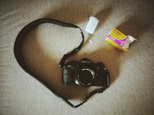
My trusted Canon A1 ready for summer vacations
But of course there are a large number of practical reasons for shooting digital, and at least for my needs and reality shooting film exclusively is just not an option. I shoot digital 95% of the time, but I always strive to make my photos look as “organic” and close to film as possible, because that’s the aesthetic I like the most.
For the purpose of writing this article I’ve questioned myself where does my fascination with film come from, and I guess it’s probably due to the fact that all of my childhood and teenage memories where shot on film. When I think about film I think about long summer vacations, family get-togethers and embarrassing haircuts - in other words, instant nostalgia! And that’s the kind of warm-fuzzy feelings that I want to associate with my photos, so basically ever since I got my first mirrorless camera back in 2015 that has always been my reference.
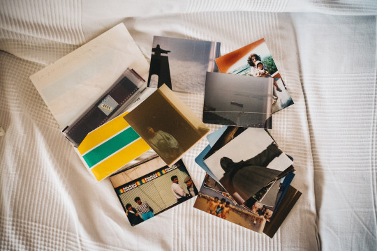
The first roll of film I ever shot when I was around 10, with a tiny plastic 110mm film camera
Over the course of these last 3 years trying to emulate film I’ve tried dozens of different presets for Lightroom, some of them really good, but quickly discovered that these will only get you halfway there. If you apply a film-preset to a perfect digital image file, in most cases you'll end up with a perfect digital image with some vintage tones, but there’s much more to film than that! There are a lot of “imperfections” that come from the limitations imposed by the gear used and the film itself, which have been eliminated in modern digital cameras and just can't be introduced in post-editing.
The best way I’ve found to mimic these imperfections is to actually impose some of those same limitations when shooting digital, so here’s a few tips on how to do that:
1. Use vintage lenses
Modern lens are amazing pieces of technology. Most of them offer perfect corner to corner sharpness, great anti-flare coatings, amazing contrast, you name it. But if you're going for that 70s / 80s consumer film look, that's pretty much the opposite of what you need! Lenses back then where far from the perfection we know today, the consumer photography market was booming and there were a lot of different brands coming up with different designs, new materials, new focusing systems, etc. As a result, each lens had its very particular set of characteristics and quirks (sometimes design flaws, really) that got imprinted into every photo taken and ultimately defined its character. A perfect example of this are the Helios 44M lenses: these Russian copies of the Carl Zeiss Biotar became famous for a design flaw that resulted in a very unusual swirly bokeh. Earlier models displayed this effect very pronouncedly, but as they improved the design in subsequent versions that particular characteristic was lost, and that’s why the earlier models are the most sought after nowadays.

That classic Helios 44M-4 swirly bokeh
The good news is that these old manual lenses are (for the most part) dirt cheap and you can use them on mirrorless cameras with a simple plastic adapter, so you can get that specific look they were known for without any need for Instagram filters or post-processing magic! In my next article I'll go into more detail about these vintage lenses and how to use them.
2. Use manual focus
One of the biggest innovations in photography in the late 70s/early 80s was the invention of autofocus. Before that cameras were limited to manual focus, and even when the first AF systems were introduced to the consumer market they were rudimentary at best. Chances are that if you look at your film photos from that period, half of them will be slightly out of focus (or completely out of focus, depending on the competence of the photographer! ;)) But that’s not a bad thing at all, I feel that in most cases it only adds to the nostalgic feeling and can sometimes create an additional layer of mystery.
The missed focus on this one gives it a timeless feel
So if you want that classic film look, switch to manual focus on your modern digital camera or use an old manual lens. Don't be afraid to miss focus sometimes, this was something that took me quite a while to realize and “accept”, and I only did so thanks to shooting film. Some of my favorite photos shot on film are pretty out of focus!
Blurry? Definitely, but the fact that you can’t distinguish their faces makes this so much more universal
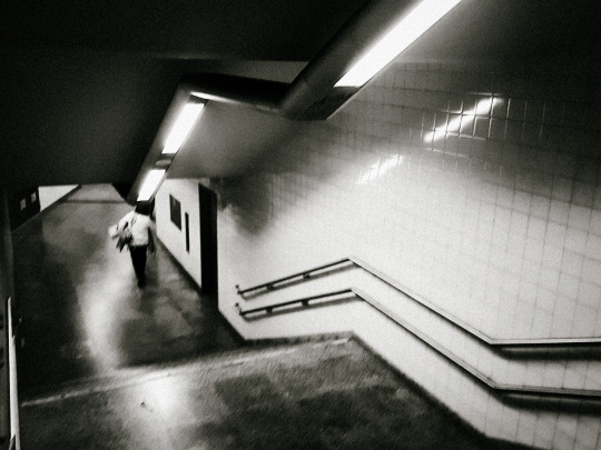
3. Use slow shutter speeds
Another limitation of film is the maximum ISO speed available, or Asa as it was called originally. Nowadays our digital cameras have incredibly high ISO sensitivities, but on film the maximum you get is 3200, though most consumer films are rated at 200 or 400 Asa. This means that to get a proper exposure on film you have to use much lower shutter speeds than on digital to get enough light, and as a result motion blur is highly likely. Personally, I love some blur, as it gives a sense of movement to an otherwise static medium. One of my favorite all time photographers, Anton Corbijn, shot many of the world’s most famous bands and musicians on film using slow-shutter speeds, to get some movement in the frame and that extra grit!
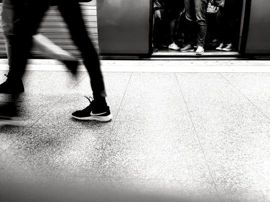
The subway rush - shot on a Huawei P10 smartphone
If you wanna try this out, I would advise to start with 1/30th of a second, look at the results and then adjust as necessary. If you’re shooting in bright sunlight this probably won’t work unless you use a neutral density, but again experimentation in the key.
A little extra tip: smartphones are actually great for this if you turn off the flash, as their small lens aperture and tiny sensor force slower shutter speeds to compensate.
4. Use High-ISOs for authentic film-like grain
This tip is in direct contradiction with the previous one (unless you’re shooting in really low-light), so usually you’ll have to choose between one or the other. It is also a tip specific to the Fuji X series cameras, as I haven’t tested other brands in this particular aspect.
I’m a big fan of grainy photos, it’s one of my favorite things about film. But the technology in digital cameras these days is so good that in most scenarios you’ll get perfectly clean images straight out of the camera. Even though image-editing software has also evolved tremendously in the past few years and can deliver very believable grain simulations, I’ll be the first to admit that it’s not the same as the real deal and it also feels kinda like cheating to be adding fake grain. That’s where the Fuji X-trans sensors come in, in particular their latest iteration X-trans III.
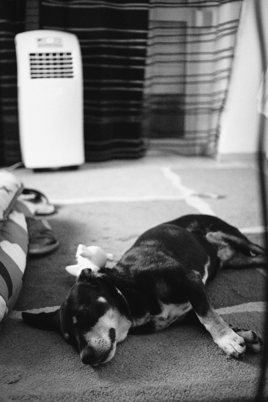
My furry friend shot at ISO 12800
The ACROS film simulation when used with high-ISOs of 6400 and above produces some digital noise that, to my eyes, is very very close to real Black and White film grain - and the best part is that you’re not adding anything fake in post-processing, it’s a real side-effect of ISO just like with real film! So most of the times when I want to shoot in Black & White I’ll use my own Acros custom setting at 12800 ISO and use the SOOC jpegs. This technique also works with color film simulations, but not so well in my opinion.
5. Post-process your photos accordingly

Different films have different characteristics, so it’s important to decide exactly what film look are you going for and learn a bit more about what defines it. Is it a low-contrast or a high-contrast film? saturated or muted? Fine grain or heavy grain? These things will help you understand what you can do in post-processing to get closer to that film look, and most of them are very simple to adjust. Where it gets a bit more complicated is getting the right tones to match the original film stock, but with some investigation and patience it can be done.
Going for that warm Kodak vibe
Of course if you want to save time you can just buy one of the many film presets out there! Like I said in the beginning of this article they will get you close to the original film tones, so if your base digital file already contains some “imperfections” introduced with the techniques above, it’s as close as you’ll get to the real thing. You can also use in-camera film simulation settings to mimic some film types, which I already covered in my previous article.
Can you tell which is which?
These are some of the techniques I’ve learned by trial and error mostly, I hope you’ll find them useful if the film look is your thing too. I can’t stress enough that the best thing you can do is to actually shoot film whenever possible, not only it will be great fun but it will surely improve your digital photography as well.
Let’s end this with a fun little game: can you tell which of the photos below are film and which are digital? No cheating looking in the exif data, I’ll post the results in a couple of days! ;)
1:
2:
3:
4:
5:
6:
7:
8:

9:

10:

#photography#film photography#film#digital photography#vintage lens#slow shutter#grain#grainisgood#post processing#fuji#fujifilm#fujifeed#fujilove#fujixseries#fujifilm x-t20#fujifilm x100f#canon a1#canon fd 35mm#helios 44m-4
12 notes
·
View notes
Text
Three beautiful TV shows you probably aren’t watching
I’ve worked on episodic television. I know how fast it moves. That’s why I’m amazed at how good recent TV shows tend to look. Not only are the stories and acting better than what I see in features, but the cinematography is on par as well. It’s not always as complex as one will see on a feature, but it’s amazing what television cinematographers are able to do quickly and simply.
The following are three shows that I’ve watched and enjoyed over the last year or two that tend to be pretty obscure, at least in the U.S. Each has a different look. I’m going to touch on what I see in all three, and if you happen to watch any of them maybe you’ll see the same things I did… and maybe more.
PATRIOT (Amazon)
This is my favorite of the bunch. It’s a slow burn, but it’s incredibly smart, quirky, dark and funny. This is the kind of show you’d never see produced on a network. It’s a little bit hard to describe, but here goes:
Imagine a burned out super spy by the name of John Lakeman (really John Tavner), who agrees to a top secret, deniable mission to help out his father, who is a bigwig in U.S intelligence. It’s the last thing he wants to do: he accidentally killed the wrong man on his previous mission and spent three months being tortured in a foreign country, and all he really wants to do is bring his wife to Amsterdam, get stoned, and ride bikes with her across Europe.
But… family wins out, and before long he finds himself trying to get work as a piping export at a construction company in Milwaukee. This gives him cover to go to Luxembourg, where he’s to give a bag of money to an Iranian politician in order to influence an election.
Of course it all goes horribly and hysterically wrong. Soon he’s on the run from the Luxembourg police, whose homicide squad is composed entirely of women because the men have snapped up the “sexy” financial crimes jobs, and there are (normally) no murders in Luxembourg—until he arrives with a bag of money that is immediately stolen.
That’s only the first episode. That’s part of the first episode. There’s LOTS more.
The show is amazingly quirky. For example, Tavner’s only stress release is singing folk music at open mic nights, but his improvised songs include sensitive details about his current mission. In this scene, his brother—a U.S. congressman—has to react quickly to his brother’s performance:
What grabbed me about this show is that it is SMART. It’s extremely well plotted, the dialog is excellent, the actors are phenomenal, but the cinematography and the directing show incredible vision and foresight. For example:
There are several scenes, scattered throughout the series, where—in one take—eight or nine things go catastrophically wrong. Tavner often contemplates his predicaments while seated outside in a field of concrete pipes, and in one scene—likely the one above—people enter the frame one by one and tell him something that destroys just a little bit of his world. They enter from all directions, but the scene never seems forced: each character enters frame and drops a little bombshell that compromises John Tavner’s plans while he sits, dejected, wishing to be anywhere else.
There are several examples of this kind of mise en scene in the series, where a scene plays out in one complex and beautifully-choreographed Steadicam move, or the camera sits perfectly still (as in the frame above) and characters move in and out of the frame.
Here’s one such scene from the first episode. A coworker complains that John stabbed him in the thigh because he tried to follow John in Luxembourg, but then reveals that he subscribed to a local newspaper to see what John was up to. John knows that this is going to result in a police investigation, and he’s not thrilled—but then he discovers that he’s likely going to be dropped from the return trip to Luxembourg, which he needs to take because the original trip didn’t go to plan. He also pushed a fellow job applicant in front of a truck to make sure that he got the job instead, but even with brain damage the guy won’t go away. A security guard has figured out who John really is, and makes a point of telling him. And then John’s dad calls to let him know that they’ve been played and the money is in the wrong hands. His life crumbles in one five minute Steadicam shot:
How often do you see this kind of thing played out in a TV series? It’s brilliant.
Composition is not an easy thing to do well. It requires buy-in from the director and a lot of planning, as composition and coverage are inextricably linked.
For example, in this scene from the pilot, the sequence of shots is:
I love starting scenes on close shots and waiting a bit before pulling wide and showing the environment. It’s a clever way to draw the viewer into the scene, as not knowing exactly where it is set builds tension that is released by the wide shot. It’s a beautiful wide shot, too, but it only appears once for a few seconds. My guess is they only ran the performances for the first 30 seconds of the scene, cut, and then covered the entire scene again in closer shots.
Old-time TV directors used to do this: they’d shoot a master until they were one line into where they knew they’d only use closeups. They’d cut, and then move in for closeups. They didn’t get coverage they didn’t need. In this case the wide shot is beautiful, and serves a purpose at the beginning of the scene, but after that, it’s done.
Notice, also, that the camera always faces the same direction. I love this style of coverage: even though the characters don’t face each other, they face us, and it just… works.
The series has a Wes Anderson single point perspective vibe that works well to keep the show somewhat light even though John Tavner’s life gets worse with every minute of every episode.
And, like so many series now, it is clearly shot at very low light levels. When I was a camera assistant, I knew I could get any shot in focus on any lens at T4. T2.8 saw me getting a little nervous, and T2 saw me getting very nervous. T1.3 was… well, I just gave it my best shot. Back then we had to do all this by eye, and we didn’t know what was in focus until the next day, so I lost a lot of sleep when working with DPs who lit scenes with a single Kino tube. (I remember once having to pull focus on a night interior shot, handheld, at T1.3, without a rehearsal. It was the last night of the feature, and I still don’t know how much of it was in focus. Normally I’d find out in dailies, but by the time they saw dailies I was on to the next job.)
Now camera assistants regularly pull focus using wireless controllers while watching a 17″ monitor near the set. This is not the best way to pull focus for entire scenes, as it’s often easier to focus using set marks when actors are moving around, but it’s perfect for nailing focus when actors stop and miss their marks. Because of this, series DPs are now free to light to very low levels and shoot at very wide stops, using natural light whenever possible and taking advantage of the low contrast that most lenses impart to a scene when used wide open.
As the stop opens up, the light has to pass through more glass, and that causes the light to bounce around a bit more. Some DPs talk about how the light fills itself in at low light levels, and often the image on the monitor looks very much like what the eye sees.
This isn’t a license not to light, however. Most naturally-lit scenes look awful, particularly on faces, and the environmental lighting may not suit the subject matter. Rather, the lighting can be simpler: we can use smaller units, or use negative fill to shape ambient light, or light the foreground but let ambient light illuminate the background. Those tricks make for high quality imagery on a fast-paced TV show schedule.
This is probably my favorite TV show of the year. It’s not the fastest paced show you’ll see, but it is by far the smartest. If you like dark humor, you can’t go wrong. If you like gorgeous but naturalistic cinematography, this is a master class in composition, staging, and lighting quickly and minimally.
Patriot has been renewed for a second series.
TRAPPED (Amazon)
This “Nordic Noir” thriller is also one of the best shows I’ve seen all year. When a torso is found in the water just off the shoreline of a small Icelandic town, the local police find themselves stretched to the breaking point as they piece together an astounding web of local corruption that leads to multiple deaths.
Not only are the performances and the story stellar, the cinematography is stunning—but in a very different way to Patriot. Once again, the emphasis is on using natural light, or emulating natural light, and shooting at very low light levels, but the look is much grittier.
It’s not ugly, and it doesn’t make people look bad, but it also doesn’t look lit. That’s quite a feat.
What I love the most is that I can feel where the light sources are, even though I can’t always see them, and the fill light matches what I’d expect to see from the environment. For example,
This looks like a night scene to me, not just because it’s dark but because there are multiple light sources mixing together in a kind of low contrast murk. I see this when walking down a city street at night: lots of small light sources combine into a base of colored fill light, and yet it’s still obviously night.
There’s something magical about low contrast mixed light source night scenes, and now that we can shoot wide open without worrying too much about focus we can quickly create such environments.
I love how there’s no direct light hitting his face. He appears to be lit by bounce light from the snow. The highlights in the background keep the shot from appearing dull by giving us a “brightness reference,” which tells us the frame is supposed to be dark and not accidentally underexposed. This is where this series excels: lighting shots that would look exactly this way in real life, but without looking ghastly. I frequently thought to myself, “Wow—light would actually do that!”
I’d recommend watching this series for its use of naturalistic environmental lighting, while paying extra attention to the fill light. Fill light has a direction to it, and if it comes from the wrong direction it can make a scene look lit just as quickly as a misplaced key light. One example of this is filling from the key side, which almost always cleans up faces regardless of where the key light is placed, and almost never looks forced.
Trapped has been renewed for a second series.
UTOPIA
I’m not going to lie. This series is messed up. It is frequently brutal to watch. It’s also very well done. Several people from wildly different backgrounds stumble onto a plot that will effectively result in the end of the world, and when they try to stop it they discover that the organization they are up against is vastly bigger than they could ever imagine.
What’s fun about the cinematography is that it’s shot in 2.39:1 wide screen and the filmmakers use the entire frame, all the time. Mostly they put people and things in the dead center of frame, but they also work the sides as well. Many shots are framed dead on to the background. The images feel as if the camera is usurping control of the characters’ lives. It’s all very disturbing, and suits the series perfectly.
Like Patriot, there’s a lot of single point perspective going on, and the filmmakers aren’t afraid to frame their shots with a lot of extra headroom:
We’re all taught in film school that head room is “this much,” but I love that we’re getting away from that in TV and commercials. Headroom is arbitrary. You see still photographers composing with “this much” headroom for every photo; rather, they use the entire frame and either fill it with something that leads the eye around the frame or use negative space to “push” the eye into the one thing in the frame they want you to look at.
The trick with this kind of framing is to make sure there’s always something at the top of the frame to justify the extra space… or, alternately, make sure there’s nothing there. These kinds of images can feel sloppy if the top of the frame cuts off something at the top of frame for no particular reason.
I wrote an article about this that you can find here, but the short version is that you have to think like a painter. A painting hangs in a frame, against a white wall, along with lots of other paintings. Your goal as a painter is to keep the viewer focused on your painting for as long as possible. The key is to make sure that the viewers eye travels around within the painting but doesn’t leave it, because if it leaves then they’ll move on to the next painting. The picture frame isn’t enough: the picture elements themselves must accomplish this task.
Often I will sweep my eyes around a shot in a circle and see if there’s a part of the frame that lets my eye “escape.” If so, I’ll try to put something there—a line, a piece of architecture, a grad, a cloud, the top of a door frame—that will prevent the eye from escaping.
Here’s an example from one of my favorite landscape painters, Alfred Bierstadt:
If you sweep your eyes around this frame, they’ll probably start at the top (because it’s the brightest part of the frame, and that attracts attention), follow that dark cloud on the right down and across into the trees, down the trees to the ground and across the bottom of the frame, past the deer and through the center of the painting, along the line of white water to the cliffs, and up the cliffs to that dark diagonal cloud that brings you back to the top of the painting. There’s always something at the edges to keep your eyes moving within the frame.
I very much enjoy seeing multiple pieces of action happening within the frame, and wide screen is great for that:
I’d watch this series for its use of framing and space around characters. Also, as compositions take place across both space and time, watch how the different compositions cut together. Some cut seamlessly, but others force your eye to jump around a bit, which is a great way to increase tension in a scene or show the emotional distance between characters.
This trailer gives you an idea of how powerful composition can be across an edit. Also, keep an eye on elements at the top of frame that justify excess headroom. Not every shot has something obvious performing this task, but most do.
I don’t know where to watch this in the U.S. right now. The series originally aired on UK Channel 4, and the episodes were on Youtube for a while. Here’s hoping one of the big streaming services picks this up. There are two series.
Art Adams
Director of Photography
The post Three beautiful TV shows you probably aren’t watching appeared first on ProVideo Coalition.
First Found At: Three beautiful TV shows you probably aren’t watching
1 note
·
View note
Last Seen Blogs

hathorslove
Hathor's Love

sobolev-project
Психолог-сексолог

at-kilis-service
At Kili's Service
at-kilis-service
At Kili's Service

biwestpark86
Untitled