#lighttheme
Explore tagged Tumblr posts
Visit Tumblr Blog
Explore Tumblr blogs with no restrictions, modern design and the best experience.
Last Seen Tumblr Blogs


Fun Fact
Tumblr has been providing a Korean-language service since 2013.
Text
🇦🇿 Sosial şəbəkələri, mobil tətbiqləri və s. bu kimi şəxsi hesablarını qaranlıq temada istifadə edənlər, işıqlı temaya keçmək istəyərkən, yaşadıqları macəralar!
🇷🇺 Те Люди которые используют со��иальные сети, мобильные приложения и другие свои личные учётные записи в тёмной теме, когда пытаются переключиться на светлую тему, они должны пережить вот такие приключения!
🇹🇷 Sosyal ağlar, mobil uygulamalar vb. Kişisel hesaplarını karanlık temada kullananların, açık temaya geçmek istediklerinde yaşadıkları maceralar!
#shahinelected #macəra #macərayaxındadır #macərabaşlayır #macera #приключения #приключение #драма #dram #drama #keko #хакер #хакеры #xaker #hackernews #darktheme #lighttheme #isiqli #isiqlandirma #işıqlandırma #ışıklı #beyaz #siyah #karanlık #qaranlıq #светлое #темное #crazy #çılgın #дурашки
#shahinelected#blogger#dünya#azəri blogger#insan#insanlık#insanlıq#insanlar#тревожные люди#токсичные люди#люди#человеки#человечек#человечество#человечность#человек#хакер#hacker#crazy human#crazy woman#crazy man#crazy girl#like crazy#crazy#çılğın#delikanlı#dəlisov#prikol#zarafat#mizah
5 notes
·
View notes
Photo
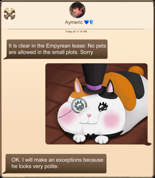
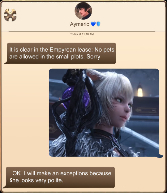
I will make an exceptions because (s)he looks very polite
#FFXIV #meme #FatCat #Yshtola #Aymeric #lighttheme
8 notes
·
View notes
Text

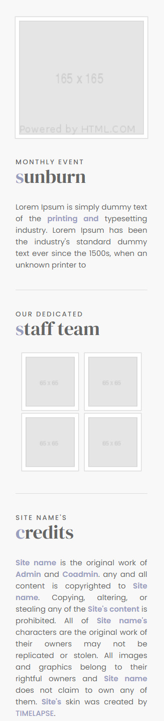


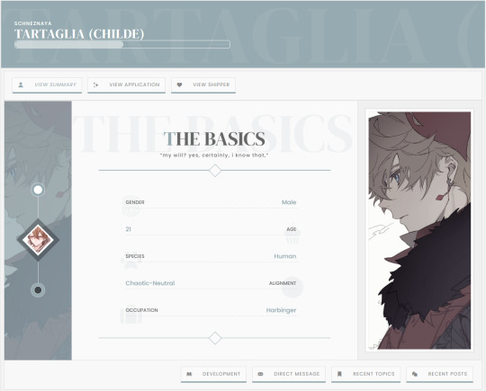
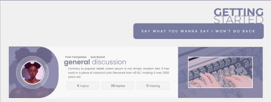
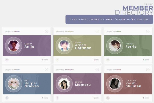
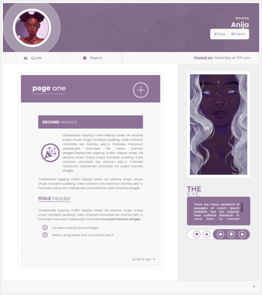
PLUS — JCINK SKIN ($70 CAD)
Plus is a responsive skin optimized for Chrome and compatible with all major browsers (Microsoft Edge, Firefox, Opera, and Safari 13.1 +). The skin features a light and a dark mode. However, due to image restrictions, the screenshots above only show light mode views.
A video preview of both modes can be found on Youtube [light mode] [dark mode].
For a live preview and similar inquiries, contact me via discord.
This theme includes:
Light/Dark Toggle
Full HTML templates
Toggle Sidebar
Toggle to view Sub-forums
Toggle-scroll recent topics list
Tabbed-carousel-shipper profile with four free-form areas. (Sample layouts for each tab are included).
10 custom group colours.
Set-Up Guide
General Template that includes styles for: H1 to H6 headings - Aside - Blockquote - Custom trait tags - Strong, B, I, and U tags - Icon, portrait, landscape, and header images.
Posting Templates: The following templates are derived from the general template. While they are included in the skin, they are also available as a free resource here [link]:
Approval Template
Event Template
Face Claims
Canon List
General Template
Four (4) Basic Post Templates
Plotter/Shipper/Post Template
The Main Profile:
The main profile contains three (3) tabs. Each tab has two (2) slides for user content. Four (4) of the slides are entirely free-form spaces, relying on styles from the general template to provide users with full control over their application content. Sample layouts are included. A gif of the profile can be seen here. (The profiles are also shown in the videos linked above.)
The skin can be found here on my Payhip. For a live preview and similar inquiries, contact me via discord.
Please review my policies before making any purchases. ♥
DISCORD - Boone #8792
67 notes
·
View notes
Photo

We have Discord on Instagram, the light and Dark themes in fact. This was cosplayed at Magfest 2020. I know I use the Dark theme on Discord myself, and pretty much wherever it's an option, how about yall? Also It's glitched a bit... because hey, running Discord on Instagram would be a bit glitched up right? Right. Not sure who's cosplaying these themes but please let me know if you do know! #discord #discordcosplay #lighttheme #darktheme #cosplay #コスプレ #supermagfest #magfest2020 #magfest #supermag #아리 #glitch4ndroid #glitch Also if yall got some good Discord servers I can join, let me know lol (at MAGfest) https://www.instagram.com/p/CQJjeQpLYDB/?utm_medium=tumblr
#discord#discordcosplay#lighttheme#darktheme#cosplay#コスプレ#supermagfest#magfest2020#magfest#supermag#아리#glitch4ndroid#glitch
3 notes
·
View notes
Text
UI Kit Elements for Sketch

A free UI kit for Sketch with various elements available in a light and dark theme. Nice work by Leoh Nguyen! Read the full article
0 notes
Text
طریقه فعال سازی تم روشن ویندوز 10

در بهروزرسانیهای قبلی ویندوز ۱۰، مایکروسافت تم تاریک را به این سیستمعامل افزود و در آخرین بهروزرسانی، تم روشن را بههمراه پسزمینهای جدید ارائه کرده است. طریقه فعال سازی تم روشن ویندوز 10 مایکروسافت در بهروزرسانی جدید ویندوز ۱۰، تم جدید روشن را ارائه داده و تصویر پسزمینه پیشفرض را هم دستخوش تغییراتی کرده است تا روشنتر و با تم جدید بیشتر سازگار باشد. در این مطلب، قصد داریم به شما آموزش دهیم این قابلیت جدید را فعال کنید. برای فعالسازی تم روشن ویندوز ۱۰ باید به مسیر Settings > Personalization > Colors بروید. میتوانید برای دسترسی سریعتر، با راستکلیک روی صفحهی دسکتاپ و انتخاب گزینهی Personalize یا با کلیدهای ترکیبی روی صفحهکلید Windows + I وارد بخش تنظیمات ویندوز شوید و گزینهی Personalization انتخاب کنید. سپس، روی Colors کلیک و به تنظیمات مدنظرتان دسترسی پیدا کنید.

بهخاطر داشته باشید برای دسترسی به این ویژگی، باید نسخهی ۱۹۰۳ ویندوز ۱۰ را دریافت کرده باشید که بههمراه بهروزرسانی مه ۲۰۱۹ ارائه شده است. شایان ذکر است در نسخههای قدیمیتر ویندوز ۱۰ این گزینه وجود ندارد.تم روشن در بهروزرسانی مه ۲۰۱۹ به ویندوز ۱۰ اضافه شده است همانند تصویر پایین در قسمت Colors، روی منو بازشونده Choose your color کلیک کنید و گزینهی Light را برگزینید تا تم روشن برایتان فعال شود.

در نسخههای قبلی ویندوز ۱۰، بهصورت پیشفرض نوار وظایف تاریک و برنامههای ویندوز روشن بود. شما میتوانید با انتخاب گزینهی Custom، حالت پیشفرض ویندوز و برنامهها را بهصورت دلخواه به تاریک یا روشن تغییر دهید یا با انتخاب گزینهی تم تاریک، تمام برنامههای پیشفرض ویندوز مانند File Explorer و منوهای ویندوز را بهصورت تاریک درآورید. همچنین، در همین قسمت میتوانید رنگ نوار ابزار را بهصورت دلخواه تغییر دهید.

اگر از تصویر پسزمینهی پیشفرض ویندوز استفاده میکردید، با دریافت بهروزرسانی مه ۲۰۱۹ ویندوز ۱۰، تغییراتی هم در تصویر پسزمینه پیشفرض ویندوز اعمال شده است تا با تم روشن جدید ویندوز بیشتر هماهنگ باشد. اگر از تصویر پسزمینهی پیشفرض استفاده نمیکن��د، با دریافت بهروزرسانی ویندوز، تصویر پسزمینهی شما تغییر نمیکند. پسزمینهی جدید ویندوز برای اینکه تصویر پسزمینهی جدید ویندوز را روی صفحه دسکتاپ خود داشته باشید، میتوانید با رفتن به مسیر Settings > Personalization > Background و بخش Choose Your Picture، تصویر جدید ویندوز را بهعنوان پسزمینهی دسکتاپ انتخاب کنید.

اگر به هر دلیلی تصویر پسزمینهی جدید ویندوز ۱۰ را در قسمت Choose your picture پیدا نکردید، با کلیککردن روی گزینهی Browse و رفتن به شاخهی C:\Windows\Web\4K\Wallpaper\Windows (با فرض اینکه ویندوز خود را در درایو C نصب کرده باشید)، میتوانید تصویر مدنظر را بیابید و از میان تصاویر موجود، تصویر متناسب با ابعاد رزولوشن ویندوز خود را انتخاب کنید.

تم جدید روشن ویندوز ۱۰ نوار وظیفه، منو استارت، بخش اعلانات و منو کلیکراست ویندوز را تغییر میدهد و فقط روی برنامههای پیشفرض ویندوز اثرگذار است. آیا شما کاربران محترم میثم صفرپور نیز از این ویژگی جدید ویندوز ۱۰ استفاده میکنید؟ دیدگاههای خود را با ما بهاشتراک بگذارید. Read the full article
0 notes
Link
Know about the new features in Windows Update 2019.

#windowsupdate#newfeature#update2019#lighttheme#cortana#passwordless#microsoft#webmobrilblog#thursdaythoughts#mobileapp#webmobril
0 notes
Note
Hello! I love your template! Can you teach me how to add a light theme in it? Also, is there a way to put the menu in the left side instead of in the bottom? I’m kinda new to twine. If it’s not possible that’s ok! ☺️
hello! if you're new to twine i'd suggest taking a look and poke around the sugarcube documentation & various html-/css-learning websites since they'll help you get a better handle on what's going on. for implementing a light theme, you're going to need to look at the settings api and work around some basic css styling to adjust the colours.
so using the example from the settings api in adding a toggle between light and dark modes, something like this would go into the story's javascript sheet:
var settingThemeHandler = function () { if (settings.lighttheme) { // is true $("html").addClass("lighttheme"); } else { // is false $("html").removeClass("lighttheme"); } }; Setting.addToggle("lighttheme", { label : "Toggles a light theme.", default : false, onInit : settingThemeHandler, onChange : settingThemeHandler });
essentially that adds a 'lighttheme' class to the html of the page when toggled. you'll have to manually style that in your css, so something along the lines of:
html.lighttheme #passages { background-color: #eee; }
as for the menu, it's certainly possible, but it'd require a lot more css work bc of repositioning and the like. if you're specifically looking for a sidebar type menu though, you might want to check out nyehilism's templates!
21 notes
·
View notes
Text
Windows 10 – What’s New in April 2019 Update (@How-To Geek)

Windows 10′s April 2019 Update is on its way!
The upcoming big Update for Windows 10 is already being developed. Codenamed “19H1”, it’s expected to roll out in Spring 2019 – and Microsoft has already announced all the new Features and Improvements that will be added!
It will be the first of two large updates coming this year and it will introduce a bunch of new Features – including a new Light Desktop Theme, a less messy Start Menu, Improved Search Bar and Cortana Experiences, Speed Improvements and much more!
Get to know all the changes with this very informative article by Chris Hoffman at HowToGeek.com:
➤ https://bit.ly/2FWYdZQ
#Microsoft#Windows#Windows10#WindowsUpdates#April2019Update#19H1#NewFeatures#Improvements#LightTheme#StartMenu#Search#Cortana#Speed
0 notes
Photo

#lighttheme #park all set up for a nights walk 😍 #jejuisland (at 제주허브동산)
0 notes
Photo

9.3.17 - I HAVE NOTHHHINGGG to post. So here’s me. Ew. - my pic. 🤷♀️ #pastel #bluetheme #pastels #pastelblue #lighttheme #aesthetic #aestheticthemes #cute #sweet #adorable #kawaii #grunge #goodvibes #pastelpink #tumblr #vsco #vscocam #tumblrtheme #themes #selca #instaphoto #pastelthemes #likeforlike #followback
#vsco#likeforlike#selca#sweet#instaphoto#followback#pastel#kawaii#pastels#grunge#cute#tumblrtheme#pastelpink#lighttheme#bluetheme#themes#vscocam#adorable#tumblr#pastelblue#pastelthemes#goodvibes#aestheticthemes#aesthetic
0 notes
Text


DEVIL IN YOUR EYES - JCINK SKIN ($70 CAD)
Devil Eyes is a fully responsive skin optimized for Chrome and compatible with all major browsers (Microsoft Edge, Firefox, Opera, and Safari 13.1 +). This is an unlimited skin with matching template sets being sold here.
Includes:
Full HTML templates
Tabbed main profile
A customizable webpage that doubles as a general post template.
Modal pop-ups for staff, navigation, event, and featured content.
Fully responsive mobile design.
Eight (8) custom colours, not including custom colours for default members and administrators. (There are 10 colours altogether).
An extensive guide for set-up and modification.
The skin can be found here on my Payhip. For a live preview and similar inquiries, contact me via discord. Please review my policies before making any purchases.
DISCORD - Boone #8792
41 notes
·
View notes
Text
How Rich Are The Libraries Of React Native For Cross-Platform App Development?
The growing use React and the rise of Native Mobile App development (and PWA), React Native is getting significant adoption across the world every day. Just like React, cross-platform ReactNative also encourage you to build UI with the help of isolated components. The platform is power packed with component libraries and UI toolkits which help you save time and develop your apps much faster, with the help of a pre-made set of components. Pre-made components and libraries are the keys to ReactNative. If you are offering to react native consulting and development services to clients, you must make sure you have knowledge of ample of libraries and their usage as you can save significant time in app development. To help you in your endeavor, we are mentioning popular ReactNative UI libraries. If you master your skills in such UI libraries, you will get a quick start for your project. 1. NativeBase Native base till day has obtained 10k stars and 1k forks. It is currently a highly renowned UI component library enabling dozens of cross-platform components for ReactNative. When using NativeBase, it allows you to use any Native Third-party libraries. Developers can go out of the box and project the project by using a rich ecosystem around it, from useful starer-kits to customizable theme templates. NativeBase is an excellent starter kit. 2. React Native Elements Having more than 12k stars, React Native Elements is based on Javascript and considered as a highly customizable cross-platform UI toolkit. Even its author state that React Native Elements is built to encourage component structure than actual design. Means, developer face less boilerplate in setting up certain elements but throughout command over the design. That is the attribute which makes this UI library appealing for new developers and seasoned veterans. 3. Shoutem Blessed with 3.5k Shoutem, ReactNative UI Kit consist of 3 parts such as UI components, Themes, and component Animation. It helps developers significantly by offering a set of cross-platform components for Android and iOS. All components are built to be both composable and customizable. However, each component comes with its predefined style that is consistent with the rest, and it further enables you to build complex components without manually defining complex styles. 4. UI Kitten Still date, UI Kitten has gained 3k stars and for the true reason. The library offers a react-native component kit that is customizable and reusable. The components of UI kitten is based on the concept of moving style definitions into a specific place making components reusable and styled in a single way. Developers can change Themes easily as 'on the fly' as well as by passing a different set of variables. There are several nice examples available to look arund for it. You can search and look at them. 5. React Native Material UI Having 2k stars, React Native Material UI presents highly customizable UI components. It is implementing Google's material design and uses a single JS object such as uiTheme that go through via context for enhanced customizability. By default, uiTheme object in React Native Material UI is based on the lightTheme. You can find many visual examples if you search using this library. Conclusion: If you are looking for world-class react native consulting services and react native application development solutions, hire the best vendor today and discuss project requirements.
6 notes
·
View notes
Text
Implementing Dark Mode In React Apps Using styled-components
Implementing Dark Mode In React Apps Using styled-components
Blessing Krofegha
2020-04-28T10:30:00+00:002020-04-29T14:07:00+00:00
One of the most commonly requested software features is dark mode (or night mode, as others call it). We see dark mode in the apps that we use every day. From mobile to web apps, dark mode has become vital for companies that want to take care of their users’ eyes.
Dark mode is a supplemental feature that displays mostly dark surfaces in the UI. Most major companies (such as YouTube, Twitter, and Netflix) have adopted dark mode in their mobile and web apps.
While we won’t go in depth into React and styled-components, a basic knowledge of React, CSS, and styled-components would come in handy. This tutorial will benefit those who are looking to enhance their web applications by catering to those who love dark mode.
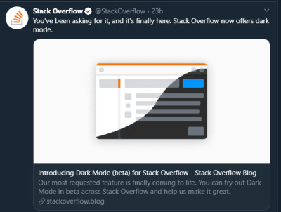
StackOverflow announces dark mode on Twitter (Large preview)
A few days before the writing of this article, StackOverflow announced its release of dark mode, giving users the chance to toggle between the two modes.
Dark mode reduces eye strain and helps when you’re working for a long time on a computer or mobile phone.
What Is Dark Mode?
Dark mode is the color scheme of any interface that displays light text and interface elements on a dark background, which makes the screen a little easier to look at mobile phones, tablets, and computers. Dark mode reduces the light emitted by the screen, while maintaining the minimum color-contrast ratios required for readability.
Why Should You Care About Dark Mode?
Dark mode enhances visual ergonomics by reducing eye strain, adjusting the screen to current light conditions, and providing ease of use at night or in dark environments.
Before implementing dark mode in our app, let’s look at its benefits.
Battery Saving
Dark mode in web and mobile apps can prolong the battery life of a device. Google has confirmed that dark mode on OLED screens has been a huge help to battery life.
For example, at 50% brightness, dark mode in the YouTube app saves about 15% more screen energy than a flat white background. At 100% screen brightness, the dark interface saves a whopping 60% of screen energy.
Dark Mode Is Beautiful
Dark mode is beautiful, and it can significantly enhance the appeal of the screen.
While most products are going for that similar bland white look, dark mode offers something different that feels mysterious and new.
It also provides great opportunities to present graphic content such as dashboards, pictures, and photos in a fresh way.
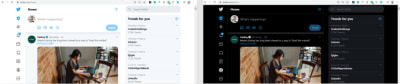
The beauty of Twitter’s dark mode over light mode (Large preview)
Now that you know why you should implement dark mode in your next web app, let’s dive deep into styled-components, which is the defining resource of this tutorial.
Dark mode is the color scheme of any interface that displays light text and interface elements on a dark background, which makes it a little easier to look at on mobile phones, tablets, and computers.
“
What Are styled-components?
Throughout this article, we will be using the styled-components library very often. There have always been many ways to style a modern web app. There’s the traditional method of styling at the document level, which includes creating an index.css file and linking it to the HTML or styling inside the HTML file.
A lot has changed in the ways that web apps are styled recently, since the introduction of CSS-in-JS.
CSS-in-JS refers to a pattern in which CSS is composed using JavaScript. It utilizes tagged template literals to style components in a JavaScript file.
To learn more about CSS-in-JS, check out Anna Monus’s article on the subject.
styled-components is a CSS-in-JS library lets you use all of the features of CSS that you love, including media queries, pseudo-selectors, and nesting.
Why styled-components?
styled-components was created for the following reasons:
No class name hell Instead of you scratching your head to find a class name for an element, styled-components generates unique class names for your styles. You’ll never have to worry about misspellings or using class names that have no meaning.
Using props styled-components allow us to extend styling properties using the props parameter, commonly used in React — thus, dynamically affecting the feel of a component via the application’s state.
Supports Sass syntax Writing Sass syntax out of the box without having to set up any preprocessors or extra build tools is possible with styled-components. In your style definitions, you can use the & character to target the current component, use pseudo-selectors, and experiment with nesting.
Theming styled-components have full theming support by exporting a ThemeProvider wrapper component. This component provides a theme to all React components within itself via the Context API. In the rendering tree, all styled-components will have access to the provided theme, even when they are multiple levels deep. As we continue in this tutorial, we will look deeper into the theming features of styled-components.
To learn more advantages of styled-components, check out Kris Guzman’s article.
Implementing Dark Mode
In this article, we are going to implement dark mode on a simple YouTube-like web page.
To follow along, ensure that you clone the original repository from the starter branch.
Setting Up
Let’s install all of the dependencies in our package.json file. From the terminal, run the following command:
npm install
Upon its successful installation, run npm start. Here is what the web page looks like without dark mode implemented on it.
The web page to be used, without dark mode. (Large preview)
To install styled-components, in your terminal run npm install styled-components.
Implementation
To implement dark mode, we need to create four different components.
Theme This contains the color properties of our light and dark themes.
GlobalStyles This contains the global styles for the entire document.
Toggler This holds the button element that toggles the functionality.
useDarkMode This custom hook handles the logic behind the change of theme and the persistence of our theme in localStorage.
Theme Component
In the src folder, you’ll see components in the components folder. Create a Themes.js file, and add the following code to it.
export const lightTheme = { body: '#FFF', text: '#363537', toggleBorder: '#FFF', background: '#363537', } export const darkTheme = { body: '#363537', text: '#FAFAFA', toggleBorder: '#6B8096', background: '#999', }
Here, we’ve defined and exported lightTheme and darkTheme objects with distinct color variables. Feel free to experiment and customize the variables to suit you.
globalStyles Component
Remaining in your components folder, create a globalStyles.js file, and add the following code:
import { createGlobalStyle} from "styled-components" export const GlobalStyles = createGlobalStyle` body { background: ${({ theme }) => theme.body}; color: ${({ theme }) => theme.text}; font-family: Tahoma, Helvetica, Arial, Roboto, sans-serif; transition: all 0.50s linear; } `
We’ve imported createGlobalStyle from styled-components. The createGlobalStyle method replaces the now deprecated injectGlobal method from styled-components version 3. This method generates a React component, which, when added to your component tree, will inject global styles into the document, in our case, App.js.
We defined a GlobalStyle component and assigned background and color properties to values from the theme object. Thus, every time we switch the toggle, the values will change depending on the dark theme or light theme objects that we are passing to ThemeProvider (which will be created later, as we proceed).
The transition property of 0.50s enables this change to occur a little more smoothly, so that as we toggle back and forth, we can see the changes happen.
Creating Theme-Toggling Functionality
To implement the theme-toggling functionality, we need to add only a few lines of code. In the App.js file, add the following code (note that the highlighted code is what you should add):
import React, { useState, useEffect } from "react"; import {ThemeProvider} from "styled-components"; import { GlobalStyles } from "./components/Globalstyle"; import { lightTheme, darkTheme } from "./components/Themes" import "./App.css"; import dummyData from "./data"; import CardList from "./components/CardList"; const App = () => { const [videos, setVideos] = useState([]); const [theme, setTheme] = useState('light'); const themeToggler = () => { theme === 'light' ? setTheme('dark') : setTheme('light') } useEffect(() => { const timer = setTimeout(() => { setVideos(dummyData); }, 1000); return () => clearTimeout(timer); }, []); return ( <ThemeProvider theme={theme === 'light' ? lightTheme : darkTheme}> <> <GlobalStyles/> <div className="App"> <button onClick={themeToggler}>Switch Theme</button> { videos.map((list, index) => { return ( <section key={index}> <h2 className="section-title">{list.section}</h2> <CardList list={list} /> <hr /> </section> ); })} </div> </> </ThemeProvider> ); }; export default App;
The highlighted code is the one newly added to App.js. We’ve imported ThemeProvider from styled-components. ThemeProvider is a helper component in the styled-components library that provides theming support. This helper component injects a theme into all React component below itself via the Context API.
In the rendering tree, all styled-components will have access to the provided theme, even when they are multiple levels deep. Check out the section on “Theming”.
Next, we import the GlobalStyle wrapper from ./components/Globalstyle. Lastly, from the top, we import both the lightTheme and darkTheme objects from ./components/Themes.
In order for us to create a toggling method, we need a state that holds our theme’s initial color value. So, we create a theme state, and set the initial state to light, using the useState hook.
Now, for the toggling functionality.
The themeToggler method uses a ternary operator to check the state of the theme, and it toggles either dark or light based on the value of the condition.
ThemeProvider, a styled-components helper component, wraps everything in the return statement and injects any components below it. Remember that our GlobalStyles inject global styles into our components; hence, it’s called inside the ThemeProvider wrapper component.
Lastly, we created a button with an onClick event that assigns our themeToggler method to it.
Let’s see the outcome thus far.
Dark mode implemented without persistence (Large preview)
Our App.js file needs to be refactored; a lot of its code is not DRY. (DRY stands for “don’t repeat yourself”, a basic principle of software development aimed at reducing repetition.) All of the logic seems to be in App.js; it’s good practice to separate our logic for the sake of clarity. So, we’ll create a component that handles the toggling functionality.
Toggle Component
Still within the components folder, create a Toggler.js file, and add the following code to it:
import React from 'react' import { func, string } from 'prop-types'; import styled from "styled-components" const Button = styled.button` background: ${({ theme }) => theme.background}; border: 2px solid ${({ theme }) => theme.toggleBorder}; color: ${({ theme }) => theme.text}; border-radius: 30px; cursor: pointer; font-size:0.8rem; padding: 0.6rem; } \`; const Toggle = ({theme, toggleTheme }) => { return ( <Button onClick={toggleTheme} > Switch Theme </Button> ); }; Toggle.propTypes = { theme: string.isRequired, toggleTheme: func.isRequired, } export default Toggle;
To keep things neat, we’ve styled our toggle button in the Toggle component, using the styled function from styled-components.
This is purely for presentation; you can style the button as you see fit.
Inside the Toggle component, we pass two props:
the theme provides the current theme (light or dark);
the toggleTheme function will be used to switch between themes.
Next, we return the Button component and assign a toggleTheme function to the onClick event.
Lastly, we use propTypes to define our types, ensuring that our theme is a string and isRequired, while our toggleTheme is func and isRequired.
Using Custom Hooks (useDarkMode)
When building an application, scalability is paramount, meaning that our business logic must be reusable, so that we can use it in many places and even in different projects.
That is why it would be great to move our toggling functionality to a separate component. For that, we would create our own custom hook.
Let’s create a new file named useDarkMode.js in the components folder, and move our logic to this file, with some tweaks. Add the following code to the file:
import { useEffect, useState } from 'react'; export const useDarkMode = () => { const [theme, setTheme] = useState('light'); const setMode = mode => { window.localStorage.setItem('theme', mode) setTheme(mode) }; const themeToggler = () => { theme === 'light' ? setMode('dark') : setMode('light') }; useEffect(() => { const localTheme = window.localStorage.getItem('theme'); localTheme && setTheme(localTheme) }, []); return [theme, themeToggler] };
We’ve added a few things here.
setMode We use localStorage to persist between sessions in the browser. So, if a user has chosen the dark or light theme, that’s what they’ll get upon their next visit to the app or if they reload the page. Hence, this function sets our state and passes theme to localStorage.
themeToggler This function uses a ternary operator to check the state of the theme and toggles either dark or light based on the truth of the condition.
useEffect We’ve implemented the useEffect hook to check on component mounting. If the user has previously selected a theme, we will pass it to our setTheme function. In the end, we will return our theme, which contains the chosen theme and the themeToggler function to switch between modes.
I think you’ll agree that our dark-mode component looks sleek.
Let’s head over to App.js for the final touches.
import React, { useState, useEffect } from "react"; import {ThemeProvider} from "styled-components"; import {useDarkMode} from "./components/useDarkMode" import { GlobalStyles } from "./components/Globalstyle"; import { lightTheme, darkTheme } from "./components/Themes" import Toggle from "./components/Toggler" import "./App.css"; import dummyData from "./data"; import CardList from "./components/CardList"; const App = () => { const [videos, setVideos] = useState([]); const [theme, themeToggler] = useDarkMode(); const themeMode = theme === 'light' ? lightTheme : darkTheme; useEffect(() => { const timer = setTimeout(() => { setVideos(dummyData); }, 1000); return () => clearTimeout(timer); }, []); return ( <ThemeProvider theme={themeMode}> <> <GlobalStyles/> <div className="App"> <Toggle theme={theme} toggleTheme={themeToggler} /> { videos.map((list, index) => { return ( <section key={index}> <h2 className="section-title">{list.section}</h2> <CardList list={list} /> <hr /> </section> ); })} </div> </> </ThemeProvider> ); }; export default App;
The highlighted code is newly added to App.js.
First, we import our custom hook, destructure the theme and themeToggler props, and set it with the useDarkMode function.
Note that the useDarkMode method replaces our theme state, which was initially in App.js.
We declare a themeMode variable, which renders either a light or dark theme based on the condition of the theme mode at the time.
Now, our ThemeProvider wrapper component is assigned our just recently created themeMode variable to the theme prop.
And lastly, in place of the regular button, we pass in the Toggle component.
Remember that in our Toggle component, we defined and styled a button and passed both theme and toggleTheme to them as props. So, all we have to do is pass these props appropriately to the Toggle component, which will act as our button in App.js.
Yes! Our dark mode is set, and it persists, not changing color when the page is refreshed or visited in a new tab.
Let’s see the outcome in action:
Dark mode implemented, but with a glitch in the button color when the browser reloads. (Large preview)
Almost everything works well, but there is one small thing we can do to make our experience splendid. Switch to the dark theme and then reload the page. Do you see that the blue color in the button loads before the gray for a brief moment? That happens because our useState hook initiates the light theme initially. After that, useEffect runs, checks localStorage, and only then sets the theme to dark. Let’s jump over to our custom hook useDarkMode.js and add a little code:
import { useEffect, useState } from 'react'; export const useDarkMode = () => { const [theme, setTheme] = useState('light'); const [mountedComponent, setMountedComponent] = useState(false) const setMode = mode => { window.localStorage.setItem('theme', mode) setTheme(mode) }; const themeToggler = () => { theme === 'light' ? setMode('dark') : setMode('light') }; useEffect(() => { const localTheme = window.localStorage.getItem('theme'); localTheme ? setTheme(localTheme) : setMode('light') setMountedComponent(true) }, []); return [theme, themeToggler, mountedComponent] };
The highlighted code is the only one added to useDarkMode.js. We’ve created another state named mountedComponent and set the default value to false using the useState hook. Next, inside the useEffect hook, we set the mountedComponent state to true using setMountedComponent. Lastly, in the return array, we include the mountedComponent state.
Finally, let’s add a bit of code in App.js to make it all work.
import React, { useState, useEffect } from "react"; import {ThemeProvider} from "styled-components"; import {useDarkMode} from "./components/useDarkMode" import { GlobalStyles } from "./components/Globalstyle"; import { lightTheme, darkTheme } from "./components/Themes" import Toggle from "./components/Toggler" import "./App.css"; import dummyData from "./data"; import CardList from "./components/CardList"; const App = () => { const [videos, setVideos] = useState([]); const [theme, themeToggler, mountedComponent] = useDarkMode(); const themeMode = theme === 'light' ? lightTheme : darkTheme; useEffect(() => { const timer = setTimeout(() => { setVideos(dummyData); }, 1000); return () => clearTimeout(timer); }, []); if(!mountedComponent) return <div/> return ( <ThemeProvider theme={themeMode}> <> <GlobalStyles/> <div className="App"> <Toggle theme={theme} toggleTheme={themeToggler} /> { videos.map((list, index) => { return ( <section key={index}> <h2 className="section-title">{list.section}</h2> <CardList list={list} /> <hr /> </section> ); })} </div> </> </ThemeProvider> ); }; export default App;
We’ve added our mountedComponent state as a prop in our useDarkMode hook, and we’ve checked whether our component has mounted, because this is what happens in the useEffect hook. If it hasn’t happened yet, then we will render an empty div.
Let’s see the outcome of our dark-mode web page.
Final result of dark mode (Large preview)
Now, you’ll notice that while in dark mode, when the page reloads, the button’s color doesn’t change.
Conclusion
Dark mode is increasingly becoming a user preference, and implementing it in a React web app is a lot easier when using the ThemeProvider theming wrapper in styled-components. Go ahead and experiment with styled-components as you implement dark mode; you could add icons instead of a button.
Please do share your feedback and experience with the theming feature in styled-components in the comments section below. I’d love to see what you come up with!
The supporting repository for this article is available on GitHub. Also, check it out on CodeSandbox.
References
“Documentation”, styled-components
“Create a Dark Mode of your app using Styled Components”, Tom Nolan, Medium

(ks, ra, il, al)
0 notes
Text
A Dark Mode Toggle with React and ThemeProvider
I like when websites have a dark mode option. Dark mode makes web pages easier for me to read and helps my eyes feel more relaxed. Many websites, including YouTube and Twitter, have implemented it already, and we’re starting to see it trickle onto many other sites as well.
In this tutorial, we’re going to build a toggle that allows users to switch between light and dark modes, using a <ThemeProvider wrapper from the styled-components library. We’ll create a useDarkMode custom hook, which supports the prefers-color-scheme media query to set the mode according to the user’s OS color scheme settings.
If that sounds hard, I promise it’s not! Let’s dig in and make it happen.
See the Pen Day/night mode switch toggle with React and ThemeProvider by Maks Akymenko (@maximakymenko) on CodePen.
Let’s set things up
We’ll use create-react-app to initiate a new project:
npx create-react-app my-app cd my-app yarn start
Next, open a separate terminal window and install styled-components:
yarn add styled-components
Next thing to do is create two files. The first is global.js, which will contain our base styling, and the second is theme.js, which will include variables for our dark and light themes:
// theme.js export const lightTheme = { body: '#E2E2E2', text: '#363537', toggleBorder: '#FFF', gradient: 'linear-gradient(#39598A, #79D7ED)', } export const darkTheme = { body: '#363537', text: '#FAFAFA', toggleBorder: '#6B8096', gradient: 'linear-gradient(#091236, #1E215D)', }
Feel free to customize variables any way you want, because this code is used just for demonstration purposes.
// global.js // Source: https://github.com/maximakymenko/react-day-night-toggle-app/blob/master/src/global.js#L23-L41 import { createGlobalStyle } from 'styled-components'; export const GlobalStyles = createGlobalStyle` *, *::after, *::before { box-sizing: border-box; } body { align-items: center; background: ${({ theme }) => theme.body}; color: ${({ theme }) => theme.text}; display: flex; flex-direction: column; justify-content: center; height: 100vh; margin: 0; padding: 0; font-family: BlinkMacSystemFont, -apple-system, 'Segoe UI', Roboto, Helvetica, Arial, sans-serif; transition: all 0.25s linear; }
Go to the App.js file. We’re going to delete everything in there and add the layout for our app. Here’s what I did:
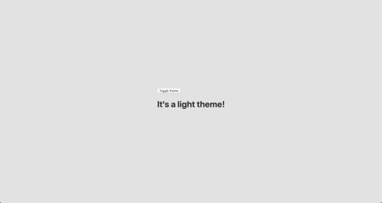
import React from 'react'; import { ThemeProvider } from 'styled-components'; import { lightTheme, darkTheme } from './theme'; import { GlobalStyles } from './global'; function App() { return ( <ThemeProvider theme={lightTheme}> <> <GlobalStyles /> <button>Toggle theme</button> <h1>It's a light theme!</h1> <footer> </footer> </> </ThemeProvider> ); } export default App;
This imports our light and dark themes. The ThemeProvider component also gets imported and is passed the light theme (lightTheme) styles inside. We also import GlobalStyles to tighten everything up in one place.
Here’s roughly what we have so far:
Now, the toggling functionality
There is no magic switching between themes yet, so let’s implement toggling functionality. We are only going to need a couple lines of code to make it work.
First, import the useState hook from react:
// App.js import React, { useState } from 'react';
Next, use the hook to create a local state which will keep track of the current theme and add a function to switch between themes on click:
// App.js const [theme, setTheme] = useState('light'); // The function that toggles between themes const toggleTheme = () => { // if the theme is not light, then set it to dark if (theme === 'light') { setTheme('dark'); // otherwise, it should be light } else { setTheme('light'); } }
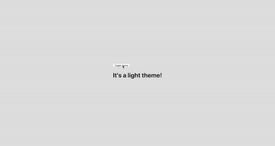
After that, all that’s left is to pass this function to our button element and conditionally change the theme. Take a look:
// App.js import React, { useState } from 'react'; import { ThemeProvider } from 'styled-components'; import { lightTheme, darkTheme } from './theme'; import { GlobalStyles } from './global'; // The function that toggles between themes function App() { const [theme, setTheme] = useState('light'); const toggleTheme = () => { if (theme === 'light') { setTheme('dark'); } else { setTheme('light'); } } // Return the layout based on the current theme return ( <ThemeProvider theme={theme === 'light' ? lightTheme : darkTheme}> <> <GlobalStyles /> // Pass the toggle functionality to the button <button onClick={toggleTheme}>Toggle theme</button> <h1>It's a light theme!</h1> <footer> </footer> </> </ThemeProvider> ); } export default App;
How does it work?
// global.js background: ${({ theme }) => theme.body}; color: ${({ theme }) => theme.text}; transition: all 0.25s linear;
Earlier in our GlobalStyles, we assigned background and color properties to values from the theme object, so now, every time we switch the toggle, values change depending on the darkTheme and lightTheme objects that we are passing to ThemeProvider. The transition property allows us to make this change a little more smoothly than working with keyframe animations.
Now we need the toggle component
We’re generally done here because you now know how to create toggling functionality. However, we can always do better, so let’s improve the app by creating a custom Toggle component and make our switch functionality reusable. That’s one of the key benefits to making this in React, right?
We’ll keep everything inside one file for simplicity’s sake,, so let’s create a new one called Toggle.js and add the following:
// Toggle.js import React from 'react' import { func, string } from 'prop-types'; import styled from 'styled-components'; // Import a couple of SVG files we'll use in the design: https://www.flaticon.com import { ReactComponent as MoonIcon } from 'icons/moon.svg'; import { ReactComponent as SunIcon } from 'icons/sun.svg'; const Toggle = ({ theme, toggleTheme }) => { const isLight = theme === 'light'; return ( <button onClick={toggleTheme} > <SunIcon /> <MoonIcon /> </button> ); }; Toggle.propTypes = { theme: string.isRequired, toggleTheme: func.isRequired, } export default Toggle;
You can download icons from here and here. Also, if we want to use icons as components, remember about importing them as React components.
We passed two props inside: the theme will provide the current theme (light or dark) and toggleTheme function will be used to switch between them. Below we created an isLight variable, which will return a boolean value depending on our current theme. We’ll pass it later to our styled component.
We’ve also imported a styled function from styled-components, so let’s use it. Feel free to add this on top your file after the imports or create a dedicated file for that (e.g. Toggle.styled.js) like I have below. Again, this is purely for presentation purposes, so you can style your component as you see fit.
// Toggle.styled.js const ToggleContainer = styled.button` background: ${({ theme }) => theme.gradient}; border: 2px solid ${({ theme }) => theme.toggleBorder}; border-radius: 30px; cursor: pointer; display: flex; font-size: 0.5rem; justify-content: space-between; margin: 0 auto; overflow: hidden; padding: 0.5rem; position: relative; width: 8rem; height: 4rem; svg { height: auto; width: 2.5rem; transition: all 0.3s linear; // sun icon &:first-child { transform: ${({ lightTheme }) => lightTheme ? 'translateY(0)' : 'translateY(100px)'}; } // moon icon &:nth-child(2) { transform: ${({ lightTheme }) => lightTheme ? 'translateY(-100px)' : 'translateY(0)'}; } } `;
Importing icons as components allows us to directly change the styles of the SVG icons. We’re checking if the lightTheme is an active one, and if so, we move the appropriate icon out of the visible area — sort of like the moon going away when it’s daytime and vice versa.
Don’t forget to replace the button with the ToggleContainer component in Toggle.js, regardless of whether you’re styling in separate file or directly in Toggle.js. Be sure to pass the isLight variable to it to specify the current theme. I called the prop lightTheme so it would clearly reflect its purpose.
The last thing to do is import our component inside App.js and pass required props to it. Also, to add a bit more interactivity, I’ve passed condition to toggle between "light" and “dark" in the heading when the theme changes:
// App.js <Toggle theme={theme} toggleTheme={toggleTheme} /> <h1>It's a {theme === 'light' ? 'light theme' : 'dark theme'}!</h1>
Don’t forget to credit the flaticon.com authors for the providing the icons.
// App.js <span>Credits:</span> <small><b>Sun</b> icon made by <a href="https://www.flaticon.com/authors/smalllikeart">smalllikeart</a> from <a href="https://www.flaticon.com">www.flaticon.com</a></small> <small><b>Moon</b> icon made by <a href="https://www.freepik.com/home">Freepik</a> from <a href="https://www.flaticon.com">www.flaticon.com</a></small>
Now that’s better:

The useDarkMode hook
While building an application, we should keep in mind that the app must be scalable, meaning, reusable, so we can use in it many places, or even different projects.
That is why it would be great if we move our toggle functionality to a separate place — so, why not to create a dedicated account hook for that?
Let’s create a new file called useDarkMode.js in the project src directory and move our logic into this file with some tweaks:
// useDarkMode.js import { useEffect, useState } from 'react'; export const useDarkMode = () => { const [theme, setTheme] = useState('light'); const toggleTheme = () => { if (theme === 'light') { window.localStorage.setItem('theme', 'dark') setTheme('dark') } else { window.localStorage.setItem('theme', 'light') setTheme('light') } }; useEffect(() => { const localTheme = window.localStorage.getItem('theme'); localTheme && setTheme(localTheme); }, []); return [theme, toggleTheme] };
We’ve added a couple of things here. We want our theme to persist between sessions in the browser, so if someone has chosen a dark theme, that’s what they’ll get on the next visit to the app. That’s a huge UX improvement. For this reasons we use localStorage.
We’ve also implemented the useEffect hook to check on component mounting. If the user has previously selected a theme, we will pass it to our setTheme function. In the end, we will return our theme, which contains the chosen theme and toggleTheme function to switch between modes.
Now, let’s implement the useDarkMode hook. Go into App.js, import the newly created hook, destructure our theme and toggleTheme properties from the hook, and, put them where they belong:
// App.js import React from 'react'; import { ThemeProvider } from 'styled-components'; import { useDarkMode } from './useDarkMode'; import { lightTheme, darkTheme } from './theme'; import { GlobalStyles } from './global'; import Toggle from './components/Toggle'; function App() { const [theme, toggleTheme] = useDarkMode(); const themeMode = theme === 'light' ? lightTheme : darkTheme; return ( <ThemeProvider theme={themeMode}> <> <GlobalStyles /> <Toggle theme={theme} toggleTheme={toggleTheme} /> <h1>It's a {theme === 'light' ? 'light theme' : 'dark theme'}!</h1> <footer> Credits: <small>Sun icon made by smalllikeart from www.flaticon.com</small> <small>Moon icon made by Freepik from www.flaticon.com</small> </footer> </> </ThemeProvider> ); } export default App;
This almost works almost perfectly, but there is one small thing we can do to make our experience better. Switch to dark theme and reload the page. Do you see that the sun icon loads before the moon icon for a brief moment?
That happens because our useState hook initiates the light theme initially. After that, useEffect runs, checks localStorage and only then sets the theme to dark.
So far, I found two solutions. The first is to check if there is a value in localStorage in our useState:
// useDarkMode.js const [theme, setTheme] = useState(window.localStorage.getItem('theme') || 'light');
However, I am not sure if it’s a good practice to do checks like that inside useState, so let me show you a second solution, that I’m using.
This one will be a bit more complicated. We will create another state and call it componentMounted. Then, inside the useEffect hook, where we check our localTheme, we’ll add an else statement, and if there is no theme in localStorage, we’ll add it. After that, we’ll set setComponentMounted to true. In the end, we add componentMounted to our return statement.
// useDarkMode.js import { useEffect, useState } from 'react'; export const useDarkMode = () => { const [theme, setTheme] = useState('light'); const [componentMounted, setComponentMounted] = useState(false); const toggleTheme = () => { if (theme === 'light') { window.localStorage.setItem('theme', 'dark'); setTheme('dark'); } else { window.localStorage.setItem('theme', 'light'); setTheme('light'); } }; useEffect(() => { const localTheme = window.localStorage.getItem('theme'); if (localTheme) { setTheme(localTheme); } else { setTheme('light') window.localStorage.setItem('theme', 'light') } setComponentMounted(true); }, []); return [theme, toggleTheme, componentMounted] };
You might have noticed that we’ve got some pieces of code that are repeated. We always try to follow the DRY principle while writing the code, and right here we’ve got a chance to use it. We can create a separate function that will set our state and pass theme to the localStorage. I believe, that the best name for it will be setTheme, but we’ve already used it, so let’s call it setMode:
// useDarkMode.js const setMode = mode => { window.localStorage.setItem('theme', mode) setTheme(mode) };
With this function in place, we can refactor our useDarkMode.js a little:
// useDarkMode.js import { useEffect, useState } from 'react'; export const useDarkMode = () => { const [theme, setTheme] = useState('light'); const [componentMounted, setComponentMounted] = useState(false); const setMode = mode => { window.localStorage.setItem('theme', mode) setTheme(mode) }; const toggleTheme = () => { if (theme === 'light') { setMode('dark'); } else { setMode('light'); } }; useEffect(() => { const localTheme = window.localStorage.getItem('theme'); if (localTheme) { setTheme(localTheme); } else { setMode('light'); } setComponentMounted(true); }, []); return [theme, toggleTheme, componentMounted] };
We’ve only changed code a little, but it looks so much better and is easier to read and understand!
Did the component mount?
Getting back to componentMounted property. We will use it to check if our component has mounted because this is what happens in useEffect hook.
If it hasn’t happened yet, we will render an empty div:
// App.js if (!componentMounted) { return <div /> };
Here is how complete code for the App.js:
// App.js import React from 'react'; import { ThemeProvider } from 'styled-components'; import { useDarkMode } from './useDarkMode'; import { lightTheme, darkTheme } from './theme'; import { GlobalStyles } from './global'; import Toggle from './components/Toggle'; function App() { const [theme, toggleTheme, componentMounted] = useDarkMode(); const themeMode = theme === 'light' ? lightTheme : darkTheme; if (!componentMounted) { return <div /> }; return ( <ThemeProvider theme={themeMode}> <> <GlobalStyles /> <Toggle theme={theme} toggleTheme={toggleTheme} /> <h1>It's a {theme === 'light' ? 'light theme' : 'dark theme'}!</h1> <footer> <span>Credits:</span> <small><b>Sun</b> icon made by <a href="https://www.flaticon.com/authors/smalllikeart">smalllikeart</a> from <a href="https://www.flaticon.com">www.flaticon.com</a></small> <small><b>Moon</b> icon made by <a href="https://www.freepik.com/home">Freepik</a> from <a href="https://www.flaticon.com">www.flaticon.com</a></small> </footer> </> </ThemeProvider> ); } export default App;
Using the user’s preferred color scheme
This part is not required, but it will let you achieve even better user experience. This media feature is used to detect if the user has requested the page to use a light or dark color theme based on the settings in their OS. For example, if a user’s default color scheme on a phone or laptop is set to dark, your website will change its color scheme accordingly to it. It’s worth noting that this media query is still a work in progress and is included in the Media Queries Level 5 specification, which is in Editor’s Draft.
This browser support data is from Caniuse, which has more detail. A number indicates that browser supports the feature at that version and up.
Desktop
ChromeOperaFirefoxIEEdgeSafari766267No7612.1
Mobile / Tablet
iOS SafariOpera MobileOpera MiniAndroidAndroid ChromeAndroid Firefox13NoNo76No68
The implementation is pretty straightforward. Because we’re working with a media query, we need to check if the browser supports it in the useEffect hook and set appropriate theme. To do that, we’ll use window.matchMedia to check if it exists and whether dark mode is supported. We also need to remember about the localTheme because, if it’s available, we don’t want to overwrite it with the dark value unless, of course, the value is set to light.
If all checks are passed, we will set the dark theme.
// useDarkMode.js useEffect(() => { if ( window.matchMedia && window.matchMedia('(prefers-color-scheme: dark)').matches && !localTheme ) { setTheme('dark') } })
As mentioned before, we need to remember about the existence of localTheme — that’s why we need to implement our previous logic where we’ve checked for it.
Here’s what we had from before:
// useDarkMode.js useEffect(() => { const localTheme = window.localStorage.getItem('theme'); if (localTheme) { setTheme(localTheme); } else { setMode('light'); } })
Let’s mix it up. I’ve replaced the if and else statements with ternary operators to make things a little more readable as well:
// useDarkMode.js useEffect(() => { const localTheme = window.localStorage.getItem('theme'); window.matchMedia && window.matchMedia('(prefers-color-scheme: dark)').matches && !localTheme ? setMode('dark') : localTheme ? setTheme(localTheme) : setMode('light');}) })
Here’s the userDarkMode.js file with the complete code:
// useDarkMode.js import { useEffect, useState } from 'react'; export const useDarkMode = () => { const [theme, setTheme] = useState('light'); const [componentMounted, setComponentMounted] = useState(false); const setMode = mode => { window.localStorage.setItem('theme', mode) setTheme(mode) }; const toggleTheme = () => { if (theme === 'light') { setMode('dark') } else { setMode('light') } }; useEffect(() => { const localTheme = window.localStorage.getItem('theme'); window.matchMedia && window.matchMedia('(prefers-color-scheme: dark)').matches && !localTheme ? setMode('dark') : localTheme ? setTheme(localTheme) : setMode('light'); setComponentMounted(true); }, []); return [theme, toggleTheme, componentMounted] };
Give it a try! It changes the mode, persists the theme in localStorage, and also sets the default theme accordingly to the OS color scheme if it’s available.
Congratulations, my friend! Great job! If you have any questions about implementation, feel free to send me a message!
The post A Dark Mode Toggle with React and ThemeProvider appeared first on CSS-Tricks.
A Dark Mode Toggle with React and ThemeProvider published first on https://deskbysnafu.tumblr.com/
0 notes
Text
Implementing Dark Mode In React Apps Using styled-components
About The Author
Blessing Krofegha is a Software Engineer Based in Lagos Nigeria, with a burning desire to contribute to making the web awesome for all, by writing and building … More about Blessing …
Light mode is a convention in most web and mobile apps. However, in modern development, we have seen how dark mode, which displays light text and interface elements on a dark background, is quickly becoming a user preference. In this article, we’ll learn how to efficiently implement dark mode in a React app on a simple web page, using the styled-components library and leveraging some React features like hooks. We will also discuss the pros and cons of dark mode and why it should be adopted.
One of the most commonly requested software features is dark mode (or night mode, as others call it). We see dark mode in the apps that we use every day. From mobile to web apps, dark mode has become vital for companies that want to take care of their users’ eyes.
Dark mode is a supplemental feature that displays mostly dark surfaces in the UI. Most major companies (such as YouTube, Twitter, and Netflix) have adopted dark mode in their mobile and web apps.
While we won’t go in depth into React and styled-components, a basic knowledge of React, CSS, and styled-components would come in handy. This tutorial will benefit those who are looking to enhance their web applications by catering to those who love dark mode.
StackOverflow announces dark mode on Twitter (Large preview)
A few days before the writing of this article, StackOverflow announced its release of dark mode, giving users the chance to toggle between the two modes.
Dark mode reduces eye strain and helps when you’re working for a long time on a computer or mobile phone.
What Is Dark Mode?
Dark mode is the color scheme of any interface that displays light text and interface elements on a dark background, which makes the screen a little easier to look at mobile phones, tablets, and computers. Dark mode reduces the light emitted by the screen, while maintaining the minimum color-contrast ratios required for readability.
Why Should You Care About Dark Mode?
Dark mode enhances visual ergonomics by reducing eye strain, adjusting the screen to current light conditions, and providing ease of use at night or in dark environments.
Before implementing dark mode in our app, let’s look at its benefits.
Battery Saving
Dark mode in web and mobile apps can prolong the battery life of a device. Google has confirmed that dark mode on OLED screens has been a huge help to battery life.
For example, at 50% brightness, dark mode in the YouTube app saves about 15% more screen energy than a flat white background. At 100% screen brightness, the dark interface saves a whopping 60% of screen energy.
Dark Mode Is Beautiful
Dark mode is beautiful, and it can significantly enhance the appeal of the screen.
While most products are going for that similar bland white look, dark mode offers something different that feels mysterious and new.
It also provides great opportunities to present graphic content such as dashboards, pictures, and photos in a fresh way.
The beauty of Twitter’s dark mode over light mode (Large preview)
Now that you know why you should implement dark mode in your next web app, let’s dive deep into styled-components, which is the defining resource of this tutorial.
Dark mode is the color scheme of any interface that displays light text and interface elements on a dark background, which makes it a little easier to look at on mobile phones, tablets, and computers.
What Are styled-components?
Throughout this article, we will be using the styled-components library very often. There have always been many ways to style a modern web app. There’s the traditional method of styling at the document level, which includes creating an index.css file and linking it to the HTML or styling inside the HTML file.
A lot has changed in the ways that web apps are styled recently, since the introduction of CSS-in-JS.
CSS-in-JS refers to a pattern in which CSS is composed using JavaScript. It utilizes tagged template literals to style components in a JavaScript file.
To learn more about CSS-in-JS, check out Anna Monus’s article on the subject.
styled-components is a CSS-in-JS library lets you use all of the features of CSS that you love, including media queries, pseudo-selectors, and nesting.
Why styled-components?
styled-components was created for the following reasons:
No class name hell Instead of you scratching your head to find a class name for an element, styled-components generates unique class names for your styles. You’ll never have to worry about misspellings or using class names that have no meaning.
Using props styled-components allow us to extend styling properties using the props parameter, commonly used in React — thus, dynamically affecting the feel of a component via the application’s state.
Supports Sass syntax Writing Sass syntax out of the box without having to set up any preprocessors or extra build tools is possible with styled-components. In your style definitions, you can use the & character to target the current component, use pseudo-selectors, and experiment with nesting.
Theming styled-components have full theming support by exporting a ThemeProvider wrapper component. This component provides a theme to all React components within itself via the Context API. In the rendering tree, all styled-components will have access to the provided theme, even when they are multiple levels deep. As we continue in this tutorial, we will look deeper into the theming features of styled-components.
To learn more advantages of styled-components, check out Kris Guzman’s article.
Implementing Dark Mode
In this article, we are going to implement dark mode on a simple YouTube-like web page.
To follow along, ensure that you clone the original repository from the starter branch.
Setting Up
Let’s install all of the dependencies in our package.json file. From the terminal, run the following command:
npm install
Upon its successful installation, run npm start. Here is what the web page looks like without dark mode implemented on it.
The web page to be used, without dark mode. (Large preview)
To install styled-components, in your terminal run npm install styled-components.
Implementation
To implement dark mode, we need to create four different components.
Theme This contains the color properties of our light and dark themes.
GlobalStyles This contains the global styles for the entire document.
Toggler This holds the button element that toggles the functionality.
useDarkMode This custom hook handles the logic behind the change of theme and the persistence of our theme in localStorage.
Theme Component
In the src folder, you’ll see components in the components folder. Create a Themes.js file, and add the following code to it.
export const lightTheme = { body: '#FFF', text: '#363537', toggleBorder: '#FFF', background: '#363537', } export const darkTheme = { body: '#363537', text: '#FAFAFA', toggleBorder: '#6B8096', background: '#999', }
Here, we’ve defined and exported lightTheme and darkTheme objects with distinct color variables. Feel free to experiment and customize the variables to suit you.
globalStyles Component
Remaining in your components folder, create a globalStyles.js file, and add the following code:
import { createGlobalStyle} from "styled-components" export const GlobalStyles = createGlobalStyle` body { background: ${({ theme }) => theme.body}; color: ${({ theme }) => theme.text}; font-family: Tahoma, Helvetica, Arial, Roboto, sans-serif; transition: all 0.50s linear; } `
We’ve imported createGlobalStyle from styled-components. The createGlobalStyle method replaces the now deprecated injectGlobal method from styled-components version 3. This method generates a React component, which, when added to your component tree, will inject global styles into the document, in our case, App.js.
We defined a GlobalStyle component and assigned background and color properties to values from the theme object. Thus, every time we switch the toggle, the values will change depending on the dark theme or light theme objects that we are passing to ThemeProvider (which will be created later, as we proceed).
The transition property of 0.50s enables this change to occur a little more smoothly, so that as we toggle back and forth, we can see the changes happen.
Creating Theme-Toggling Functionality
To implement the theme-toggling functionality, we need to add only a few lines of code. In the App.js file, add the following code (note that the highlighted code is what you should add):
import React, { useState, useEffect } from "react"; import {ThemeProvider} from "styled-components"; import { GlobalStyles } from "./components/Globalstyle"; import { lightTheme, darkTheme } from "./components/Themes" import "./App.css"; import dummyData from "./data"; import CardList from "./components/CardList"; const App = () => { const [videos, setVideos] = useState([]); const [theme, setTheme] = useState('light'); const themeToggler = () => { theme === 'light' ? setTheme('dark') : setTheme('light') } useEffect(() => { const timer = setTimeout(() => { setVideos(dummyData); }, 1000); return () => clearTimeout(timer); }, []); return ( <ThemeProvider theme={theme === 'light' ? lightTheme : darkTheme}> <> <GlobalStyles/> <div className="App"> <button onClick={themeToggler}>Switch Theme</button> { videos.map((list, index) => { return ( <section key={index}> <h2 className="section-title">{list.section}</h2> <CardList list={list} /> <hr /> </section> ); })} </div> </> </ThemeProvider> ); }; export default App;
The highlighted code is the one newly added to App.js. We’ve imported ThemeProvider from styled-components. ThemeProvider is a helper component in the styled-components library that provides theming support. This helper component injects a theme into all React component below itself via the Context API.
In the rendering tree, all styled-components will have access to the provided theme, even when they are multiple levels deep. Check out the section on “Theming”.
Next, we import the GlobalStyle wrapper from ./components/Globalstyle. Lastly, from the top, we import both the lightTheme and darkTheme objects from ./components/Themes.
In order for us to create a toggling method, we need a state that holds our theme’s initial color value. So, we create a theme state, and set the initial state to light, using the useState hook.
Now, for the toggling functionality.
The themeToggler method uses a ternary operator to check the state of the theme, and it toggles either dark or light based on the value of the condition.
ThemeProvider, a styled-components helper component, wraps everything in the return statement and injects any components below it. Remember that our GlobalStyles inject global styles into our components; hence, it’s called inside the ThemeProvider wrapper component.
Lastly, we created a button with an onClick event that assigns our themeToggler method to it.
Let’s see the outcome thus far.
Dark mode implemented without persistence (Large preview)
Our App.js file needs to be refactored; a lot of its code is not DRY. (DRY stands for “don’t repeat yourself”, a basic principle of software development aimed at reducing repetition.) All of the logic seems to be in App.js; it’s good practice to separate our logic for the sake of clarity. So, we’ll create a component that handles the toggling functionality.
Toggle Component
Still within the components folder, create a Toggler.js file, and add the following code to it:
import React from 'react' import { func, string } from 'prop-types'; import styled from "styled-components" const Button = styled.button` background: ${({ theme }) => theme.background}; border: 2px solid ${({ theme }) => theme.toggleBorder}; color: ${({ theme }) => theme.text}; border-radius: 30px; cursor: pointer; font-size:0.8rem; padding: 0.6rem; } \`; const Toggle = ({theme, toggleTheme }) => { return ( <Button onClick={toggleTheme} > Switch Theme </Button> ); }; Toggle.propTypes = { theme: string.isRequired, toggleTheme: func.isRequired, } export default Toggle;
To keep things neat, we’ve styled our toggle button in the Toggle component, using the styled function from styled-components.
This is purely for presentation; you can style the button as you see fit.
Inside the Toggle component, we pass two props:
the theme provides the current theme (light or dark);
the toggleTheme function will be used to switch between themes.
Next, we return the Button component and assign a toggleTheme function to the onClick event.
Lastly, we use propTypes to define our types, ensuring that our theme is a string and isRequired, while our toggleTheme is func and isRequired.
Using Custom Hooks (useDarkMode)
When building an application, scalability is paramount, meaning that our business logic must be reusable, so that we can use it in many places and even in different projects.
That is why it would be great to move our toggling functionality to a separate component. For that, we would create our own custom hook.
Let’s create a new file named useDarkMode.js in the components folder, and move our logic to this file, with some tweaks. Add the following code to the file:
import { useEffect, useState } from 'react'; export const useDarkMode = () => { const [theme, setTheme] = useState('light'); const setMode = mode => { window.localStorage.setItem('theme', mode) setTheme(mode) }; const themeToggler = () => { theme === 'light' ? setMode('dark') : setMode('light') }; useEffect(() => { const localTheme = window.localStorage.getItem('theme'); localTheme && setTheme(localTheme) }, []); return [theme, themeToggler] };
We’ve added a few things here.
setMode We use localStorage to persist between sessions in the browser. So, if a user has chosen the dark or light theme, that’s what they’ll get upon their next visit to the app or if they reload the page. Hence, this function sets our state and passes theme to localStorage.
themeToggler This function uses a ternary operator to check the state of the theme and toggles either dark or light based on the truth of the condition.
useEffect We’ve implemented the useEffect hook to check on component mounting. If the user has previously selected a theme, we will pass it to our setTheme function. In the end, we will return our theme, which contains the chosen theme and the themeToggler function to switch between modes.
I think you’ll agree that our dark-mode component looks sleek.
Let’s head over to App.js for the final touches.
import React, { useState, useEffect } from "react"; import {ThemeProvider} from "styled-components"; import {useDarkMode} from "./components/useDarkMode" import { GlobalStyles } from "./components/Globalstyle"; import { lightTheme, darkTheme } from "./components/Themes" import Toggle from "./components/Toggler" import "./App.css"; import dummyData from "./data"; import CardList from "./components/CardList"; const App = () => { const [videos, setVideos] = useState([]); const [theme, themeToggler] = useDarkMode(); const themeMode = theme === 'light' ? lightTheme : darkTheme; useEffect(() => { const timer = setTimeout(() => { setVideos(dummyData); }, 1000); return () => clearTimeout(timer); }, []); return ( <ThemeProvider theme={themeMode}> <> <GlobalStyles/> <div className="App"> <Toggle theme={theme} toggleTheme={themeToggler} /> { videos.map((list, index) => { return ( <section key={index}> <h2 className="section-title">{list.section}</h2> <CardList list={list} /> <hr /> </section> ); })} </div> </> </ThemeProvider> ); }; export default App;
The highlighted code is newly added to App.js.
First, we import our custom hook, destructure the theme and themeToggler props, and set it with the useDarkMode function.
Note that the useDarkMode method replaces our theme state, which was initially in App.js.
We declare a themeMode variable, which renders either a light or dark theme based on the condition of the theme mode at the time.
Now, our ThemeProvider wrapper component is assigned our just recently created themeMode variable to the theme prop.
And lastly, in place of the regular button, we pass in the Toggle component.
Remember that in our Toggle component, we defined and styled a button and passed both theme and toggleTheme to them as props. So, all we have to do is pass these props appropriately to the Toggle component, which will act as our button in App.js.
Yes! Our dark mode is set, and it persists, not changing color when the page is refreshed or visited in a new tab.
Let’s see the outcome in action:
Dark mode implemented, but with a glitch in the button color when the browser reloads. (Large preview)
Almost everything works well, but there is one small thing we can do to make our experience splendid. Switch to the dark theme and then reload the page. Do you see that the blue color in the button loads before the gray for a brief moment? That happens because our useState hook initiates the light theme initially. After that, useEffect runs, checks localStorage, and only then sets the theme to dark. Let’s jump over to our custom hook useDarkMode.js and add a little code:
import { useEffect, useState } from 'react'; export const useDarkMode = () => { const [theme, setTheme] = useState('light'); const [mountedComponent, setMountedComponent] = useState(false) const setMode = mode => { window.localStorage.setItem('theme', mode) setTheme(mode) }; const themeToggler = () => { theme === 'light' ? setMode('dark') : setMode('light') }; useEffect(() => { const localTheme = window.localStorage.getItem('theme'); localTheme ? setTheme(localTheme) : setMode('light') setMountedComponent(true) }, []); return [theme, themeToggler, mountedComponent] };
The highlighted code is the only one added to useDarkMode.js. We’ve created another state named mountedComponent and set the default value to false using the useState hook. Next, inside the useEffect hook, we set the mountedComponent state to true using setMountedComponent. Lastly, in the return array, we include the mountedComponent state.
Finally, let’s add a bit of code in App.js to make it all work.
import React, { useState, useEffect } from "react"; import {ThemeProvider} from "styled-components"; import {useDarkMode} from "./components/useDarkMode" import { GlobalStyles } from "./components/Globalstyle"; import { lightTheme, darkTheme } from "./components/Themes" import Toggle from "./components/Toggler" import "./App.css"; import dummyData from "./data"; import CardList from "./components/CardList"; const App = () => { const [videos, setVideos] = useState([]); const [theme, themeToggler, mountedComponent] = useDarkMode(); const themeMode = theme === 'light' ? lightTheme : darkTheme; useEffect(() => { const timer = setTimeout(() => { setVideos(dummyData); }, 1000); return () => clearTimeout(timer); }, []); if(!mountedComponent) return <div/> return ( <ThemeProvider theme={themeMode}> <> <GlobalStyles/> <div className="App"> <Toggle theme={theme} toggleTheme={themeToggler} /> { videos.map((list, index) => { return ( <section key={index}> <h2 className="section-title">{list.section}</h2> <CardList list={list} /> <hr /> </section> ); })} </div> </> </ThemeProvider> ); }; export default App;
We’ve added our mountedComponent state as a prop in our useDarkMode hook, and we’ve checked whether our component has mounted, because this is what happens in the useEffect hook. If it hasn’t happened yet, then we will render an empty div.
Let’s see the outcome of our dark-mode web page.
Final result of dark mode (Large preview)
Now, you’ll notice that while in dark mode, when the page reloads, the button’s color doesn’t change.
Conclusion
Dark mode is increasingly becoming a user preference, and implementing it in a React web app is a lot easier when using the ThemeProvider theming wrapper in styled-components. Go ahead and experiment with styled-components as you implement dark mode; you could add icons instead of a button.
Please do share your feedback and experience with the theming feature in styled-components in the comments section below. I’d love to see what you come up with!
The supporting repository for this article is available on GitHub. Also, check it out on CodeSandbox.
References
(ks, ra, il, al)
Website Design & SEO Delray Beach by DBL07.co
Delray Beach SEO
source http://www.scpie.org/implementing-dark-mode-in-react-apps-using-styled-components/ source https://scpie.tumblr.com/post/616690895071379456
0 notes