#me with my silly little mobile app and silly no ui change
Text
as primarily a mobile user i feel like i'm watching the world burn around me blissfully ignorant as i refuse to step even an inch near the desktop version any time soon
#rambles#me with my silly little mobile app and silly no ui change#i feel like a bystander watching a group of kids get bullied#im so sorry lovies💔good luck on your desktop journey
62 notes
·
View notes
Text
I still think this new grid layout looks... so crowded. And the fact that it basically follows what twitter has been looking like in the past 5+ years (and a grid that FB also copied in 2020? Aaaaand insta now has it too, so... 🤔) doesn't help either :)
Why does it has to be... on the left (again) and static (AGAIN)?
The fact that this isn't really... neat to eye, is kinda awful.
I said in my other post that I dunno why it looks like EVERY SINGLE UI/UX web designer forget that not everyone uses a big screen. I have taken screencaps of when Tumblr used to look too wide with spaces before, because I did have a bigger PC screen (1920x1080) that I stopped using in late 2017, but once I had to move to a smaller screen (1366x768) it somehow looked a little "smaller", and while it wasn't AS crowded as it is with this new layout, at least there was still some space on the left that was "OKAY" to me. This is just an eyesore, lmao.
I'm pretty sure they just wanted to make it look "uniformized" as it looks in mobile (MAYBE not in the app, but accessing it through a normal web browser, I meant), ig.
Sure, instrictively I don't find "wrong" clicking some things on the left (but I kinda blame Twitter for the physical memory), but... I DO miss when the menu (or some elements of the menu, at least, everything concerning your Account's blogs like the likes, followers, ppl you follow, drafts, etc.) was on the RIGHT side of the screen. I don't know why they wanted to make it into a menu... but I'm pretty sure old posts from way back when from staff kinda might illustrate WHY.
OH, I SEE I have to make ANOTHER click to look at my drafts and activity and queue. WOW. HOW USELESS...
SURE, being an old time tumblr user (circa 2009), I know we have been complaining from every single change this website makes from the more "sillier" ones (the classic blue in the background) to the not so much silly ones (the change of size of the posts), to the more "i kinda? get it, but at the cost of what" ones (the nsfw ban)... but MY GOD, I wish, SOMEHOW this site would just stop "following the leader" in these sort of aesthetic web design changes (that also goes in hand with that one post of "their expectatives as a platform in the future" from last month).
Wish I would find that one old post of someone comparing Tumblr as an apartment owned by a landlord and all the unnecessary changes they make EXCEPT in fixing or prioritizing the problems we complain about -bugs, spambots, the mobile app's experience, what you have it), which they make REALLY obvious in the aforementioned post I mention in the point above.
Also, this grid might work on old geocities fansites from the old internet? when it was about their menus, but that was by choice of the owner of those sites, not.. you know... whatever the hell social media platform thinks it works as perfect.
1 note
·
View note
Text
Speed Dating Events for all Ages
Here are 7 reasons why dating is important in a relationship. Treat the relationship as if it’s your first: When you’re married or in a relationship for a long time, you get into a certain rhythm and develop habits that support it. Whether you are struggling with your relationship or you're in a state of pure bliss with your honey, learning how to best communicate that love will help your relationship become more satisfying. נערות ליווי בתל אביב A modern variant on the technique is able to date far more recent fired clay material. As a result of adopting Parse-This, my role in working on Yarns’s parsing functions became more devoted to testing and troubleshooting. But from the perspective of people who use Bridgy on their own sites, POSSE offers a way to get the benefits of corporate social media while avoiding some of its downsides. Unlike some international dating sites, eharmony is a well-established and trusted company within the industry, having helped over 2 million local and international couples find love over our 20 years of existence. Laurel House is an International Dating Coach, online dating expert, and author of Screwing The Rules: The No-Games Guide to Love.
Love is for losers. No way, I would love it! Ultimately, your top priority is reassuring your children that you love them unconditionally and that you intend to always be with them. From Dublin to Galway, Cork to Donegal, our members are all looking for one thing: lasting love. While some postings may reflect their own personal experience, if you keep reading similar comments about the way the site is set up or how the members didn't even end up with one date, you might want to try a different site. That alone makes it one of the stronger IPO candidates in a while. She connected me with one. 4In the second year of my PhD, I took Ratto’s Critical Making course as an elective, and later became a teaching assistant for the same course. And same thing with those years that we were together. Then I Kings 6:1 specifies that the Jerusalem Temple was built in the 4th regnal year of Solomon, 480 years after the Exodus of the Israelites from Egypt. Dating programs addressing complex and challenging contexts and research questions almost always unfold over many years.
Its main focus is helping American and European men meet Asian women, and it has over 50,000 members. Your partner is very stressed over planning a party for their friend. Encourage them by saying how much the friend is going to appreciate their work. My dream guy doesn't work out. Take this quiz to find out which of the five love languages you speak! Ideally, he would love both. That sounds silly. I love it! Ugh, that sounds awful. Ugh, that is so weird. But on the off chance that you're clomping around your apartment in a diaper wishing you had someone to change you (ugh, sorry for typing that), then use your little fingers to log onto your new favorite site. An Introduction to a Series of Nightmarish Tales and Nuggets of Wisdom - Even the thought of online dating makes me throw up in my mouth just a little bit. “I don’t know. I have a little bit of a cynical view on online dating. The rules here are clear: make sure prospective matches can see your face, don’t use too many selfies, steer clear of a bunch of group shots, and don’t post photos with someone who could be mistaken as (or was!) an ex.
It’s also possible to message for free, although both people must match for the recipient to see the message. It’s not a secret that the world has been changed due IT-technologies. This app development framework has taken the world by storm with its simplicity, widgets, and pixel-by-pixel based mobile UI development. This app will show you some people nearby by and they are very cute. That depends. Are they cool people? I think it depends on the rule. I guess it depends on what he's saying. I guess we'll find out! I don't know, whenever he wants, I guess. I think it's a great way for my partner to get to know my friends and vice versa. If it's someone I know well, yes, but sometimes I get intimidated into doing things I don't want to do. I don't know. I have never thought about it. However, this train of thought cannot be any further from the truth. It's a truth they can't deny. Yes, that would get annoying quick.
1 note
·
View note
Text
Twitching
Similar stories and bonus material on my Patreon.

To my surprise people keep joining the stream. Usually it was only my friends and occasionally someone random that watched me play. Space strategy games are not the most audience-friendly. They require you to know a lot about the game mechanics, and they take a long while to play through a full campaign. But all my mates know the game, and are just here to socialize and sometimes provide a tip.
This evening is different though. It had started with some "Lucy333" joining what must have been almost an hour ago. More than 30 minutes for sure. But over the past 10 minutes I've gotten 12 more viewers I think. Suddenly there is a coin sound effect and the chat stream lights up with a donation. $2 from Lucy333 and the text "Hey, spaceboy! Take your shirt off!"
I can instantly feel myself blushing. I'm flattered for a few milliseconds. I'm aware of the streams with girls showing lots of skin to get donations. I've never watched any of them. I'm not even aware of any with boys in them, but I know they exist. "Thanks for the donation, Lucy. This isn't that kind of stream though, clearly." I'm just playing for my mates when we don't feel like meeting up or doing something else. And I know I'm not a looker, though not shockingly ugly like Pete. Honestly, if there wasn't a pandemic going on we would probably do exactly the same thing anyway, playing space strategy and talk Marvel.
There is a flurry of responses from the newcomers in the chat. "Do it! Do it!" says one Donnatrix. "It could be that kind of stream," says fluffy2000. Soon my mates start cheering on as well. It basically turns into a dare. I'm not proud of my body, but I'm not ashamed of it either. It just is. Fuck it. I don't know what I'm going to be teased for more, if I take my shirt off, or if I don't. I reckon if I do what they ask for they have less ground to stand on. I set the game speed to low, say "Ok then", take off my headset, and pull off my T-shirt.
I'm met with a torrent of cheers in the chat. "Now it is that kind of stream," says fluffy. Donnatrix drops $5 and the comment "YAAAASSS". It feels weird. I can't decide if this is a group of sorority girls that randomly and sarcastically sexualize nerds, or if they are genuinely supportive.
"Thank y'all. Now back to trade route 14 to Zephyr-C". My emissary mission hasn't moved far at this speed. I'm about to increase the in-game speed when I get another $2 donation from Lucy. "Spaceboy, keep the game in slow mode and jump over to Heavenly Bodies."
I have no idea what she is talking about, if she even is a she. Her message is instantly met with a wave of support from the other newcomers. At this game speed it would take hours before I need to take any action, and I'm already up a Whopper meal without having done anything, so I reckon I can play whatever they want me to play for a while. Who knew I was that easily bought? "I don't know what that is," I say into my headset.
A few seconds later Lucy sends me a private message with a TinyURL. "This better not mess with my game rig. If it's porn I'll switch back to the game." I say. "It could be that kind of stream too." fluffy offers in the chat. "He could use some porn tbh" my friend Mike responds. I click the link.
The browser loads something that looks like a web game. It's a character creation screen with a faceless, very neutral model on the screen. Looks like those posable figures you use when learning to draw. There are no controls, except a set of buttons that offers you to upload settings, import from Facebook, and similar. I click the Facebook one, click a few approvals, and a progress bar that only lasts a few seconds appears. When it is gone there is a 3D model of me on the screen. "Wow! This looks just like me." Whatever AI they have combing through my online photos managed to get almost everything right. I'm wearing some sort of speedos, but I don't own any, so that part was a miss, but the model looks spot on. "Whatever else they have in the game, I don't think they are going to top this."
A long list of sliders and customizations appear on the screen. It looks like an incredibly detailed character creation screen. I try moving the height controller and is met with a message box saying I'm out of credits, and that I need $10,000 to change my height to whatever I moved it to. Clearly not real money. "I can't change anything". Lucy responded I need to share it. I exit fullscreen on the game and move the browser over to my other screen so everyone on the stream can see. "No, you need to click the share button in the UI and post the link in the chat", Donnatrix writes.
A big gift-wrapped box appears in the corner of the game window. I click it and it presents the text "Hair color and style" with bold letters and below that a text message from Lucy "I think this will be cute on you." I click accept and the 3D model is updated with new hair. It's dark blonde or whatever the oxymoronic name is for it, instead of my usual rat brown hair. It's short on the sides and on top is a big swooping quiff. It looks utterly silly. "Thanks, nice one," I tell the stream. I see a lot of cheers coming in the chat, but I'm a bit perplexed about the "OMYFUCKING GDO!" from Mike. It's just silly hair.
Immediately a new gift box appears on the screen, and soon after a (2) is added on top of it, possibly indicating two gifts waiting. I find it a little bit cute that these girls are essentially playing with paper dolls, but digitally and modeled after someone real. I open the next gift, "Facial Features" from Julia_Awesome. I click accept again, and the doll on the screen is updated. Weirdly it felt like a flash of heat hit me, like those flame effects on concerts. The doll still looks like me, but pretty fictionalized. The face is much sharper, not just less fat, but probably also some bone structure changes as well. It's equally interesting and disheartening, like one of those really good mobile phone filter apps that makes you into a photo model. Makes you understand how unobtainable the Men's Health cover look really is. "Thank you, Julia, but I'm not sure about this look."
I'm ignoring the chat, though I see it is going bananas. I'll have to read that later when the stream is over. I open the next box. Another two has already arrived. This gift is from Donnatrix and is "Core Body", whatever that means. It feels like a gut punch. Perhaps not that, because it doesn't hurt, but it knocks the air out of me. Almost made me fall out of the chair. I'm confused about what is actually happening though because things don't make sense. My body looks deformed. It takes a moment before my brain stops associating what I see with HR Geiger's nightmarish paintings and start to understand what I really see. My body is suddenly a lot leaner and a hell of a lot more stacked than before. Proper abs muscles like a pan of Hawaii rolls.
I look up at the main screen for the first time in what feels like an eternity. The model on the screen looks ripped as well. How stupid can one person be? I turn to the side monitor and look at the window from the webcam. It's me, all new muscles, strong jaw, and a silly quiff on top.
"Hold up! Hold up! Hold up! This is insane! This isn't possible."
"lol, of course not" I see moving by in the chat. I go back to the program. Four more gifts waiting. I look at the model on the screen. I look at the webcam view. "Arms" says the next gift with the text "Promise to flex for me." Well, fuck Zephyr-C and trade route 14.
375 notes
·
View notes
Text
Xamarin.Forms on the Web
TLDR: I implemented a web backend for Xamarin.Forms so that it can run in any browser. It achieves this without javascript recompilation by turning the browser into a dumb terminal fully under the control of the server (through web sockets using a library I call Ooui). This crazy model turns out to have a lot of advantages. Try it here!
A Need
I have been enjoying building small IoT devices lately. I've been building toys, actual household appliances, and other ridiculous things. Most of these devices don't have a screen built into them and I have found that the best UI for them is a self-hosted website. As long as the device can get itself on the network, I can interact with it with any browser.
There's just one problem...
The Web Demands Sacrifice
The web is the best application distribution platform ever made. Anyone with an internet connection can use your app and you are welcome to monetize it however you want. Unfortunately, the price of using this platform is acuquiecense to "web programming". In "web programming", your code and data are split between the client that presents the UI in a browser and the server that stores and executes application data and logic. The server is a dumb data store while the client executes UI logic - only communicating with the server at very strategic points (because synchronization is hard yo). This means that you spend the majority of your time implementing ad-hoc and buggy synchronization systems between the two. This is complex but is only made more complex when the server decides to get in on the UI game by rendering templates - now your UI is split along with your data.
Getting this right certainly is possible but it takes a lot of work. You will write two apps - one server and one client. You will draw diagrams and think about data state flows. You will argue about default API parameters. You will struggle with the DOM and CSS because of their richness in both features and history. You will invent your own security token system and it will be hilarious. The web is great, but it demands sacrifices.
(And, oh yes, the server and client are usually written in different languages - you have that barrier to deal with too. The node.js crew saw all the challenges of writing a web app and decided that the language barrier was an unnecessary complication and removed that. Bravo.)
Something Different
I was getting tired of writing HTML templates, CSS, REST APIs, and all that other "stuff" that goes into writing a web app. I just wanted to write an app - I didn't want to write all this boilerplate.
I decided that what I really wanted was a way to write web apps that was indistinguishable (from the programmer's perspective) from writing native UI apps. If I wanted a button, I would just new it up and add it to other UI elements. If I wanted to handle a click event, I wanted to be able to just subscribe to the event and move on. What I needed was a little magic - something to turn my simple app into the server/client split required by web apps.
That magic is a library I call Ooui. Ooui is a small .NET Standard 2.0 library that contains three interesting pieces of technology:
A shadow DOM that gives a .NET interfaces to the web DOM. It has all the usual suspects <div>, <span>, <input>, etc. along with a styling system that leverages all the power of CSS.
A state-synchronization system. This is where the magic happens. All shadow DOM elements record all the operations that have ever been performed on them. This includes changes to their state (setting their inner text for example) but also methods that have been called (for instance, drawing commands to <canvas>). This state can then be transmitted to the client at any time to fully mirror the server state on the client. With this system, all logic is executed on the server while the client renders the UI. Of course, it also allows for the client to transmit events back to the server so that click events and other DOM events can be handled. This is the part of Ooui that I am the most proud of.
A self-hosting web server (with web sockets) or ASP.NET Core action handlers to make running Ooui very easy. If I want to self-host a button, I simply write:
var button = new Button { Text = "Click Me!" }; button.Clicked += (s, e) => button.Text = "Thanks!"; // Start a web server and serve the interactive button at /button UI.Publish("/button", button);
I can do this from any platform that supports .NET Standard 2. I can run this on a Mac, Linux, Windows, Raspberry PI, etc.
Alternatively, you can host it on an ASP.NET MVC page if you want it up on the internet:
public class HomeController : Controller { public IActionResult Index() { var button = new Button { Text = "Click Me!" }; button.Clicked += (s, e) => button.Text = "Thanks!"; // Return interactive elements using the new ElementResult return new ElementResult(button); } }
Pretty neat huh?
But one more thing...
Xamarin.Forms Support
The DOM is great and all, but what do .NET developers really love when you get right down to it? XAML. This little serialization-format-that-could has become the standard way to build .NET UIs. Whether you're writing a Windows, UWP, or mobile app, you expect there to be XAML support.
So I made XAML work on the web by implementing a new web platform for Xamarin.Forms. Now, any of your Xamarin.Forms apps can run on the web using ASP.NET.
Xamarin.Forms was not at all on my radar when I was building Ooui. Eventually though I realized that it was the perfect basis for a web version of Forms. I thought the idea to be a little silly to be honest - web developers love their CSS and I didn't think there was much point. But one day I heard someone ask for just that feature and I thought "now we're two".
I had never written a backend for Xamarin.Forms but found the process very straightforward and very easy given its open sourceness (e.g. I copied a lot of code from the iOS implementation :-)). There's still a bit of work to be done but Xamarin.Forms and Ooui are getting along like long-lost cousins.
Animations work, pages and layouts work, styling works (as far as I have implemented), and control renders are currently being implemented. Fonts of course are an annoyance and cause a little trouble right now, but it's nothing that can't be fixed.
Once I got Xamarin.Forms working on the web I realized how wrong I was for thinking this to be a silly technology. Writing web apps with the Forms API is a real pleasure that I hope you'll get to experience for yourself.
Now that I am officially releasing Ooui, I want to work on a roadmap. But for now I mostly just want to hear people's opinions. What do you think about all this? What are your concerns? How do you think you could use it? Do you think it's as cool as I do? (Sorry, that last one is a little leading...)
13 notes
·
View notes
Text
Time to Search for Marketing

My plan was for things to let up this month to leave a little more time for job hunting, and do marketing research half the time. Instead I’ve found that even finding a marketing person is a full time job, cold emailing and searches are always tough, and onboarding new folks will always be tricky (so consider instead investing in more long term contracts since onboarding is a real time cost). These two weeks’ news: marketing knowledge, searching for the right person once more, and onboarding!
Nintendo Power praises by Chris Zukowski.
Marketing Knowledge
I watched a GDC talk most mornings the last two weeks, including:
Erik Johnson's “Making Indie Games That Sell”
Chris Dwyer's "(Opportunity) Cost Effective Marketing & PR for Indies"
David Wehle’s “No Time, No Budget, No Problem: Finishing The First Tree”
Casey Yano's "Slay the Spire: Success through Marketability"
“Put Your Name on Your Game, a Talk by Bennett Foddy and Zach Gage"
Nick Popovich's "Making Games That Stand Out and Survive"
Mike Rose’s “Making the World Give a Damn About Your Game in 2018″
Chris Zukowski’s “Build Your Own Fan Club: How to Use Your Email List”
Mike Rose’s and Chris Zukowski’s I’ve linked since I found them especially formative to how I will approach marketing now. All the talks are good for different reasons, all reinforce the same ideas of developing a relationship with your audience and all suggest, like a good friend, investing in that relationship by routinely sending them cool stuff you think they’d enjoy. Nintendo Power is cited in Chris’s talk as the best example of this yet. But having an audience that loves consuming your work, whether it’s love letters as an email newsletter for Date Everything, or a Discord server that gets secret news and updates early, investing in the community and connection that is your audience will help grow and maintain that so that when your game does launch, the strongest fans can immediately invest and help push it up the charts. It’s a great core idea, and it depends on respecting and mutually investing in your audience in a really healthy way.
Also: did some preliminary video tests with friends so we can start making more marketable content soon. Hopefully more on that soon!

Do you like filling out webforms? Yes? Great, cold emailing is perfect for you!
Searching for Marketing Folks
Cold emailing folks is still hard! I think this will be rough forever. Making a template helps so you don’t rewrite the same core every time. Tweaking it to respect someone’s individuality and showing what you care about helps too. We all have to communicate with a lot of people, and I think as long as there is respect both ways in mind and in action, using your own templates for certain emails is fine. If you’re going to say the same three sentences every time, stop wasting time rewriting them. They do their job - customize the message elsewhere.
The search has been just as rewarding as when looking for an artist though. It broke down into a few steps like last time:
Searching for portfolios I trusted. This was on Google, leading to individuals’ sites for “indie games marketing” or “mobile game marketing” keywords, then cold emailing, getting rejected, and then asking for their recommendations for more folks which had a 1 in 5 chance of getting another 2-5 names. Repeat. (this process took about 3 rounds to find/email some 10-20 people, with rounds costing probably 4hrs of time each on separate days since email replies average 24-48hrs)
Sending back and forth emails with a smaller pool of the top 5-8 individuals. Different backgrounds gave some leads for trailers and PR folks that were not marketing directly as well. This email back and forth averaged about 5 emails, taking 2-3hrs each day for about 3 days.
Phonecalls and Skype chats with just over half of those individuals, a half hour each with buffer times for setup and notes/emails after, have narrowed us down to probably the final two candidates once again. That meant another 3-5hrs combined to talk with everyone and read some longer emails that needed 30min+ each to read and reply to.
One last round of phonecalls, another 2hrs, and we should have the final marketing candidate. That means in total, finding a candidate for this position probably took between 23 and 28 hours, or a little over half workweek but divided over two weeks. That’s not a small amount of time! I would expect any major new hire, from a zero reference starting point, to just cost a week of work over 2-3 weeks in the future. Due to the back and forth there’s not a great way to accelerate this either. It’s part of the process I didn’t really know how to make time for, but both hiring for design and hiring for marketing have worked this way so I want to make that a clear expectation in the future.

SBA’s website is fancier than I’m used to for government sites!
Business Plans & Executive Summaries
A friend introduced me to SBA - Small Business Administration, a government support agency for entrepreneurs and small businesses. It is surprisingly excellent and has given me some really good wakeup moments for facing the upcoming financial challenges and expectations. They want people who walk through their doors to be well equipped to make a sustainable business, or acquire funding to grow, and in return they want to see your business numbers so they have a sense of what markets are shrinking or growing. From the perspective of a small business, it’s a very useful tool - and they’re not only holding me accountable but teaching me where I need to focus my efforts to financially survive. I am excited to keep working with an advisor I have here now and turn an executive summary I wrote this week into more of a real business plan - useful both for managing expectations of returns, and for marketing to the best audience possible.

Better “onboarding” (like a boat) involves “iterating” (like the photo)! Ahh? Ahh??
Onboarding
Don’t be fooled by the silly photo - this part was hard and important!
Searching for new contractors took more time than expected, but onboarding known contractors also took a larger than expected amount of time. My biggest regret on this is not taking a more iterative approach to onboarding. I passed on instructions for a new artist I worked with recently (a cool person at that!) and later learned I had not been clear in communicating my needs, the style, or the goals in the way I believed I had. My value is that it is on the communicator to deliver a message on average, and I wish I had done more checking early to ensure I had delivered the right message.
For a contracted game designer I am bringing on to do a pass on adding animal videos, I’ve asked that they show first drafts early and often at the start so we are on the same page before too much work risks being done down the wrong path. I value the concept of hiring good people, clearly communicating, and getting out of the way - but at times those last two points can be in conflict with one another. I hope to share more details soon on finding a better approach here too.

Ahh! What’s this? Secret developer options ingame? 👀
Design & Tech
Just some fun final details! I added a debug mode to show all animals, questions, and silhouettes! This increases onboarding and test results times in a way I’ve always wanted to do, but couldn’t justify until it was slowing down the work of others. Now that’s in and has gotten me to also do a quick pass at optimizing the videos, so they’ve all been trimmed to 11sec and cropped to the size of the frame, saving us 400/600MB of video space. Awesome!
Rapid video bulk editing was done with ffmpeg for trimming and MPEG Streamclip for cropping and video quality level control. I’ve also added dynamic quality adjustors (whoops forgot that before) so low ram devices run lowres videos compared to high ram devices. Accidentally, I had set everything to low ram before. But that’s fixed!
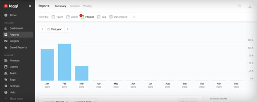
Toggl report so far for 2020! March is work from home + halfway into the month.
Time Keeping
Toggl is my timekeeping app, and it’s been very useful lately as I bulk categorized all work that had been done on both this and my last project. When working for others, I seem to successfully track 7.5hrs/day of work (there’s a little wiggle room here as I don’t always start tracking exactly when I start - but it’s a solid approximation) and when I work for myself, I successfully track about 6hrs/day (and even though personal tracking is significantly less accurate, this is still is a concerning number). In short: I’m slacking! I really want those numbers to go up, even if I think a big part of it is also how many of those hours are focused vs unfocused work. But it’s good to see my work numbers aren’t ridiculously off the mark. It’s definitely possible for me to hit full workdays in self employment, I’m just not there yet.
Pomodoro Timer techniques on my smart watch have actually been incredibly effective lately for that focus. I’ll set a timer for 25min, then a break timer for 5min, and the wrist accessibility keeps me really focused and moving forwards to getting those hours in. With startup work especially, it’s hard to tell where breaks give the creativity needed to keep up with how the goals change, and where focus gives you the work needed to pump out a product on the current path. Lightfield capture technology was a big distraction this week among all the virus news (if we have to stay indoors, I want to develop a better and more 3d Skype!) and while that might be more profitable as a field longterm, short term it’s better to focus on just finishing the job you started. So what’s best? I think that’s something to continuously be reassessed by context, per project, and a healthy dose of gut feeling.

Was it most efficient to reuse UI for testing? Or just done to look pretty?
Conclusion
Time is short! How do we make the most of it? One of the marketing talks said 30% of your time as an indie dev should go towards marketing, starting before the project starts. And that makes sense. But how do we fill in all the other balancing pieces? Should optimizing get as much priority as finding a good marketing person? Should we spend more time onboarding someone we find, or finding someone who doesn’t need onboarding? And depending on what kinds of profits you can expect and how confidently, you can take all the time in the world. Marketing, business, and development time have this entanglement that I’m only just starting to feel directly - and beyond creating art to change the world, I am experiencing now everything about the marketing and business side of game development, and the stresses of it, directly.
Next time: I hope I decide on a business and marketing plan and a target demographic before I commit to a game’s development, rather than the end of it. It will make sustainable game development significantly easier.
3/13/20
0 notes
Text
An iPod. A phone.
Ten years ago, I had the random luck of landing in New York at 6pm on June 29. Something else was happening at that time, and I wasn’t about to let the opportunity to be a part of it pass me by.
Other than being an Apple fanboy for years, I was (and still am) a tragic early adopter with a firm belief in the potential for technology to simplify and enhance our lives. Back in that PC-centric world, this translated to faith in what Steve Jobs described as the ‘digital hub’ - having a (likely desktop) computer be the central repository for your communications (email), documents, photos, music and movies, connected to other satellite devices such as a phone, laptop, camera, music player (ahem, iPod) and video camera feeding them content. It was a remarkably clear and tidy vision allowing a true digital library of your life at your fingertips (provided you were seated in front of your computer), however it relied on one being able to have any or all of those devices available to you when you wanted to acquire that content.
That’s a lot of devices to carry around, and pockets / bags have limited space within. I recall my daily morning routine of putting my phone, keys, wallet and iPod carefully in my pockets to minimise bulge, packing my laptop and sometimes camera (and, very rarely when travelling, video camera) in my bag, and feeling like I had everything I needed at my disposal (while hoping that nothing fell out or was stolen). And of course, the devices in your bag (and the ones left behind) were never easily accessible or useful, being large and unwieldy to carry on their own or together.
Email was simply inaccessible without a laptop and WiFi. Blackberries were a novelty at the time and the preserve of high-powered executives and consultants - even as someone then working in a corporate environment, only the most senior members of my firm carried them. Some particularly adventurous individuals had digital personal organisers called PalmPilots to store their contacts and calendars, but these were of little use beyond that. I’d been working at a conference a few years earlier when I observed many of the participants carrying around small PalmPilot-like devices called iPAQs that hooked up to WiFi gave them access to their conference schedules as well as their emails. I thought this was the bees knees, and couldn’t wait to see this technology filter down to the consumer market.
The hottest things in mobile phone technology back then were polyphonic ringtones, stamp sized photos sent through MMS, and the devices getting smaller. Despite being around for some time in Australia, apparently texting through SMS was only just becoming widespread in the US - but of course was stunted by its 160 character limit (hmm, why does that seem familiar?). You’d type a text through the muscle memory of knowing how many times to press a number on the pad to toggle a particular character - and wait a few seconds if consecutive characters were assigned to the same number. The manual process of entering contacts was laborious and repetitive, especially when changing devices or SIM cards, as there was no easy way to transfer them.
Eventually, HP and other vendors started offering devices (‘Pocket PCs’) like the ones I’d seen at the conference to consumers, at fairly astronomical prices. Some had WiFi included thanks to horrendously large antennae, while others required the purchase of a separate SD card for connectivity. Most shipped with the ironically-named Windows Mobile and required a stylus and an abstract Palm-esque character system for handwriting recognition (or an absolutely tiny software keyboard that needed to be prodded by said stylus). Due to the limits of this character recognition and the resistive screens of these devices, this experience was fraught with errors and inaccuracies. Other devices had large Blackberry-style physical keyboards requiring a similar symphony of thumb presses, this time somewhat resembling the experience of using a regular keyboard but with greater potential for RSI. Palm had such a product called the Treo, as did Motorola (then-known for its extremely popular slim flip-phone, the RAZR, and less so for its clunky iTunes Phone, the ROKR) with the Q.
In 2005, once Pocket PCs finally started to incorporate a mobile phone as well, I saved up and splurged on what I thought to be one of the most elegant - the i-mate JAM. About the size of the original iPod, it was compact but with a then-decent sized screen. Its ability to recognise one abstractly-scribbled word at a time felt like a revelation, and turned the one-character-at-a-time experience of texting and writing emails into something slightly more fluid. Of course, emailing and web-browsing were limited by the need for WiFi (and I did buy one of those silly SD cards for occasional use) and the awful and very rare mobile-optimised websites (the ‘baby web’ as Steve Jobs would go on to call it). I could get useful information such as weather forecasts, but only occasionally when hooked up to WiFi through that card - forget about getting anything useful through 2G GPRS data - or download a bunch of information at a time when syncing to my computer (clunky though it was, given it ran Windows and I used a Mac). But the fact that it did sync to my computer at all, and provided all (well, most) of my contacts when I needed them felt incredibly useful - instead of having to repeatedly press a button to scroll through my contacts to make a call, I’d simply find it using my stylus. I’d occasionally even get by scribbling characters messily with my thumb or forefinger, but for most intents and purposes the stylus was the most effective method for input.
Several years earlier, the iPod had stormed the market for portable music players and effectively killed portable CD players - despite lukewarm efforts by other manufacturers to build MP3 players or alternative technologies like MiniDisc. Ostensibly, the iPod triumphed over its competitors due to its straightforward ability to sync a library through iTunes, its non-removable hard drive for storage, as well as its simple user interface and click wheel - which, despite the steady addition of photos, videos and games, few people felt could be adapted for other purposes like a phone. At the same time, despite the ROKR flop, phones were starting to include the ability to store and play music - which posed a long-term existential threat to the iPod. Much as the hard-drive based iPod Mini was killed and replaced by the superior flash-based iPod Nano, so too would the iPod itself need to be replaced by a convergent product. Similarly, ‘3G’ phones were providing limited online walled-gardens where carriers would provide certain services or information, thereby also posing a threat to the nascent Pocket PC market as well.
I say all this because I was one of those people searching for the mythical ‘one device’ that would replace all of these others and surpass their various limitations. There had already been considerable talk and rumour-mongering of an ‘iPod Phone’ which I hoped would come to pass eventually, but had no idea how soon that would be. In January 2007, I was utterly amazed to see Steve Jobs unveil just that: not just a better widescreen iPod with touch controls, not just a better mobile phone, and not just a more effective way to get information from the internet - but all three of those in one. Gone were both stylus and click wheel, replaced by a smooth capacitive touch interface that allowed you to use your always-available fingers to do everything you needed - and with barely any physical buttons, the entire screen was the phone, and the UI adapted to the needs of the specific app you were using. There was no physical keyboard simply because there was no need for one. This device was not just an iPod, a phone, or an internet communicator - it really was a computer in your pocket.
It was the third part of the ‘device’ that spoke to me the most and I was surprised at how lukewarm its reception was at the time - being able to view whole web pages at a time and tap to zoom in on the content you were interested was absolutely mind-blowing (and now that it’s dead, we can forget the minor inconvenience of not being able to view battery-hogging Adobe Flash content). And add to that the fact that it also had maps and a limited type of GPS as well, so it could potentially also replace a Melway (our local street directory), printed directions or even those expensive in-car GPS systems. Unlike the Blackberry or even Pocket PCs before it, this was a smart phone that any consumer signing up to a telco contract could access - and to top it off, on a technological level it left those predecessors firmly in the dust.
With that kind of tremendous change came a predictably hostile response from the incumbents and pundits, all of whom couldn’t grasp how such a device could have anything but niche appeal when it was so different to what success currently looked like and what they believed people then wanted out of their phones (see Steve Jobs’ later co-option of Wayne Gretzky’s line about skating to where the puck will be, not where it’s been). I, on the other hand, was a true believer, and wouldn’t be brought down by such negativity - even if it was reasonable or proved to be valid (happily for me, it wads neither). I was well and truly sold and, being unable to bear the anticipation of getting my hands on this game-changing device, skinned my JAM to resemble the iPhone interface and patiently waited to hear when we might be lucky enough to get an Australian release for the device - likely months or years down the track.
So you can imagine my excitement when by chance I was asked to chaperone my nephew on a vacation to New York that just happened to land on the day the iPhone was released (Modern Family’s Phil Dunphy had a similar description for how fate aligned the stars to make his birthday coincide with the release of the iPad several years later). We landed just as the doors would have opened at Fifth Avenue and the first lucky customers who had lined up days earlier would walk out with their shiny new toys. Despite the 20-odd hour journey, I pleaded with the relatives we were staying with to take me to the nearest Apple Store as soon as we unpacked. The last thing I wanted to do was go that far and find the product had sold out. Luckily, this was a mall store in Long Island, and I was completely shocked to find no queue, not that many people around, and plenty of stock sitting at the counter. It seemed not quite everyone was sold on the future just as yet. I did not hesitate, and walked out of there USD 600-odd lighter.
Of course many people then posed the obvious question to me: as an Australian, what good was a phone locked to a US carrier that couldn’t even be activated without signing up to a contract? I may have been blinded by my enthusiasm, but I wasn’t stupid about it - and luckily again, the particular circumstances surrounding the original iPhone conspired to make things work for me. Despite the lack of the ‘outright’ device purchasing model at that time in the US, the original iPhone had the carrier subsidy built into the contract, not the device itself - so while you did have to sign up to a two-year contract to use the phone, you did that after purchasing the phone at an ‘outright’ (not subsidised) price. So the sting in the tail was a USD 300 cancellation fee if you left prior to the end of the two years. Factoring this as a cost of purchasing a ‘widescreen iPod with touch controls’ and ‘breakthrough internet communicator’ I persuaded my relatives to take up then AT&T contract so that I could activate the device, and would reimburse them for the cancellation fee. But again luck struck - as the phone was effectively purchased at an unsubsidised price, the contract termination fee didn’t kick in until 30 days after purchase - so I got my device (without the phone) at its sticker price (and even better, would later be refunded USD 100 when Steve Jobs finally realised he’d ripped off all of us early adopters a little too much). When I finally made the pilgrimage to the Fifth Avenue store a few days later, I picked up another one for my (now) wife.
Using this ‘touch iPod’ (soon to be made redundant by an actual iPod Touch) during those early days was a total thrill, and completely surpassed the experience of using my not-very-old-but-ancient-feeling Pocket PC. The skeuomorphic ability to touch the device with your fingers and have it appear to respond in a physically consistent way was tremendous. Certainly it also had appeal as a novelty - its absence from the Australian market did result in quite a bit of interest from friends and onlookers after my return. I was somewhat surprised by the quality of the photographs it took, though not sufficiently to use it to regularly replace my point and shoot or DSLR. And it definitely became my full-time iPod, as the cover flow visuals and multitouch interface made up for its relatively modest 8GB storage. But, as if that weren’t enough, within a few months enterprising hackers had found the Death Star's weakness, and exploited it to allow people to jailbreak the iPhone and unlock it from its Apple and AT&T shackles. While it was by no means the easiest or risk-free process and required a bit of technical know-how, thanks to some pretty detailed instructions published by said legends I was able to carefully work my way through them and fully unlock the phone - making it almost fully functional at home and allowing me to finally ditch my other mobile phone. Of course, our mobile telco plans were then still stuck in past as far as data, and I had to switch carriers to find a 'reasonable' plan that gave me a 'generous' allowance of 50MB/month (thanks Virgin Mobile!). But for the limited purposes of browsing and checking email in that data-lite era, this was still enough for the experience to be a revelation.
It's true that it wasn't until the iPhone 3G launched (and was finally made available in Australia as well) that the iPhone started to feel more like a mature product - and the local availability of the 3G obviated the need for the various workarounds and hacks I had to employ to make use of the original. Many of the features weren't really refined or perfected until the iPhone 4 or 5. A feature film was shot entirely on an iPhone 5S, and the capabilities of today's iPhone 7 (as well as the iPad, the iPhone's spiritual sibling, on which I’m typing this post) are drastically beyond what most people can fully utilise as they can store your entire (much larger) media library locally or access it through the cloud. Our phones now no longer look like they used to then - all modern phones and tablets still have the same basic form factor and layout as the 10 year old original iPhone, which truly felt like the opening of the technological floodgates and the start of an incredible paradigm shift. Of course, that shift has had many positive as well as negative consequences since - most notably, as a function of its widespread adoption, how we communicate with others, interact socially, and work outside the office - but that is always the way with (and cost of) progress.
Today, a 'phone' truly can be the only thing you need to carry with you - as well as those original applications (phone, media, web), it's now commonly the only camera and video camera you'll use, the only (or most common) computer you'll use (with apps that can do almost anything you would have needed a desktop or laptop for), your car navigation, your wallet, even your keys. And all of that effectively started with Apple’s 'one device', ten years ago today.
0 notes
Last Seen Blogs

miss-geeky-girl
Drink up, me harties, yo ho!

lenovokurulusu
İsimsiz

andromedacorp
[ TESTING, TESTING... ]

narutouzumakiishere
Untitled

light-cloudy
題名未設定