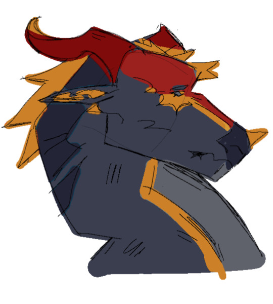
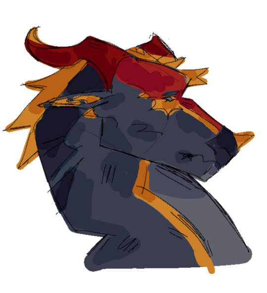
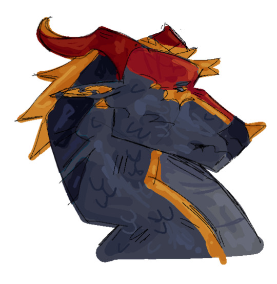
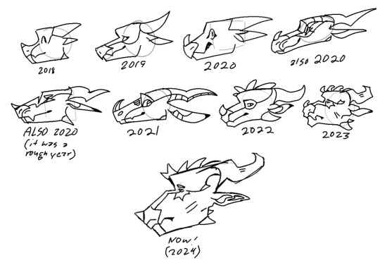
#messy sketchy render
Explore tagged Tumblr posts
Visit Tumblr Blog
Explore Tumblr blogs with no restrictions, modern design and the best experience.
Last Seen Tumblr Blogs


Fun Fact
28.6 is the average number of monthly visits per US mobile user.
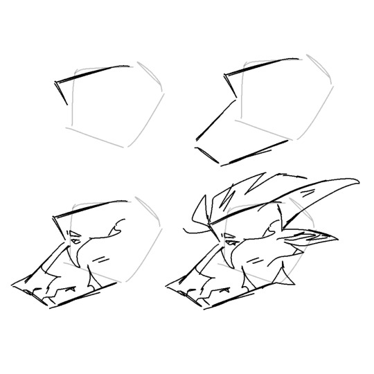
Text
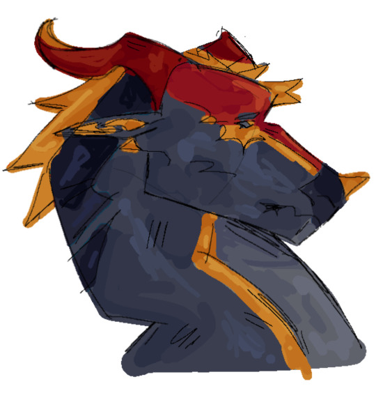
its bocchin time 🟦🟨🩷

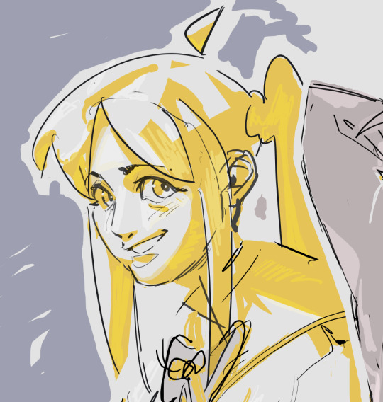
hi im alive actually
#art#artists on tumblr#messy sketchy render#fanart#doodle#sketch#bocchi the rock!#bocchi fanart#bocchiposting#bocchi the rock#hitori gotou#bocchi anime#nijika ijichi#nijika ichiji#post this nijika#ryo#ryo yamada#yamada ryo#perkie paint
169 notes
·
View notes
Text
Another lady doodle
#my art#sketchy sketch#lady#elf#original character#I was doodling this while watching the pilot for First Wave (1998)#I really liked the pilot so I'll be checking more#the hair is very messy and I will not render it more you can't make me
56 notes
·
View notes
Text

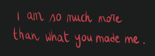

I am so much more than what you made me.
#digital art#bg3#astarion#bg3 fanart#baldur's gate 3#digital painting#fanart#art#astarion fanart#sketchy art#i can never finish rendering properly#i like it messy why do we have to be tidy fu
183 notes
·
View notes
Text
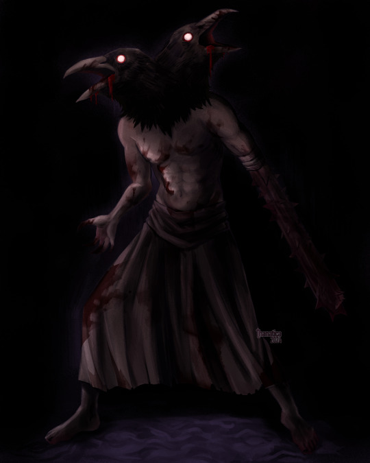

caw (x2)
#fear and hunger#fear & hunger#crow mauler#funger fanart#hi sorry long time no post again im trapped in a cycle of art block & depression. but here is. something!#did not want to over render it into oblivion letting it stay messy and sketchy in parts#look it's an art tag
56 notes
·
View notes
Text
annddd artfight attack number 2! this one is Alastair, he belongs to the lovely @edgy-senju :D
I LOVE his design- I saw it and wanted to draw that coat immediatelyyy EHEHE
#chdoodles#artfight#so- i'm kinda going for sketchy stuff this year bc i don't wanna wear out my wrist too much doing a buncha rendered stuff-#so i apologize for the messiness JFDSKLJ#regardless tho- I HAD A LOT OF FUN WITH THIS!!!#get attacked <33 EHEHE
44 notes
·
View notes
Text
Can't believe I just let Mu's future design in my files for like 3 years now-
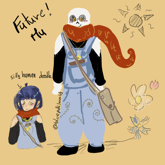
#me doing artz#Mu#future!Mu#adult!Mu#I drew that at the end of 2021 it seems?#I showed it to like 2 peeps and I think my brain thought I certainly must have posted it then#but no#so well here it is#I liked the sketchy thing so I'm not rendering it or stuff XDc#she studies at an university btw unlike her traveler of a brother#and I have like two design of her best friends from uni (messy sketchs but still)#she knows sign language (slow signing tho) but she still prefers her notebook when she can#she does have a smaller notebook with words instead of images for people who don't know her enough to guess with her drawings#she's not studying to have a job (don't see much point in earning money rn) she just likes the uni vibes and does actually like learning#she's still a force of nature but now she can reach the cupboards for better of for worse
10 notes
·
View notes
Text
#its silly but I feel self conscious of making those ''art from each month'' collages at the end of every year#bc every one of them feels like its colored in a different way and I dont have a consistent color palette everythiing looks out of place#I feel unorganized and idk if the coloring type/artstyle defines how much engagement i'll get#I feel like I dont have a proper identity and that interferes with getting engagement and followers#sometimes I make fully rendered art that doesnt do well and wonder if it were in a simpler sketchy style it would get more attention#I admire people who have a very consistent color palette and style so that I can immediately tell its theirs#ik having different art styles is not a bad thing but 😭#i feel like my artstyle is all over the place it makes my portfolio look messy like I dont have a direction to go yet#and that might drive people away#idk maybe im overthinking it
13 notes
·
View notes
Text
I find I enjoy my art a hell of a lot more the messier and scratcher the lines and colors are done, but I always have it in my head that like "Well Teeth only you think rougher drawings look better; you can't do that if it's for a comm or for someone else because it will come off as laziness"
#it's even seedier when like#i LOVE when artists offer sketchy options and it has nothing to do with it usually costing less than render like i legit like messy art mor#if you charged the same for sketch/rough color/render i would still pick it over clean render i am so serious#gonna have another dragged out of the venue kicking and screaming moment as i shout#THERE IS!! A RAWNESS TO AN ARTIST'S SKETCH!!! THAT CAN'T BE REPLICATED BY SIMPLY PUTTING MORE TIME INTO A PIECE#YOU CANNOT CAPTURE IT IN ANY OTHER WAY THAN VOMITING ENERGY ONTO THE CANVAS!! THERE IS BEAUTY IN THAT!!
17 notes
·
View notes
Text
[Click image for better quality]
I FIGURED OUT A WAY TO FUCKING MAKE THE IMAGE SMALLER FOR POSTING ON TUMBLR WITHOUT SACRIFICING THE ACTUAL QUALITY OF THE IMAGE OH MY GOD
Ok so, what I did is go into the clip studio paint file, make a new file, copy and paste the group in the original file, merge everything, get rid of the extra stuff outside of the canvas, and then make the flattened image smaller and crop the canvas. Once you have that, export it and you're done. This helps maintain the actual quality of the image and also helps shrink the file size down to something actually postable (if anyone has a better way of doing this please tell me)
[Edit]: Ok I guess posting something to Tumblr just naturally compresses the image a bit more somehow because I'm looking at it now and zooming in too much makes it a bit blurry so I'm still gonna have to futz around with image quality for future pieces oof
Artist's Note:
I'm so glad I figured out a way to do this because I like working on a big canvas so I can get as much detail in as I possibly can. Only problems are how laggy it gets while drawing lol.
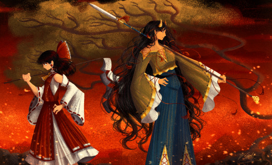
I had an idea for a drawing with Reimu and Zanmu because I really like thinking about their potential dynamic a lot. I also wanted an excuse to draw Zanmu again but in my normal rendering style because last time I drew her she was in my more sketchy style with generally flat colours so I wanted to draw her again. Speaking of, looking at the sketch for this is a jumpscare that I never enjoy seeing, like, man am I glad I didn't use those for my final piece.
Also about her spear. I was originally gonna make it like the ones she had in game, but it kinda threw off the whole piece. It was too big, too blue, and too flat, so I just went "fuck it" and gave her a different one instead. My headcanon justifying this is that the ones she uses in game are for danmaku battles whereas in any other fight she just uses a proper yari, or she still uses the yari and just makes it all glowy to power it up, maybe both lol. I pulled as much inspiration as I could from Sengoku era spears, and even put in some blue into the decorative part of the spear and also added a little skull to pay tribute to the original spear. Also, in my research I saw some art of izanami and izanagi making japan and saw that the yari izanagi has had a little decorative tassley thingy on it so I took some inspo from that and just made it one of Zanmu's tassles (Idk when that art was from or if the spear was still accurate to Sengoku period Japan but hey, probably the same reasons Eirin puts little bow ties on her arrows, it's just for personalization purposes).
I love rendering hair and clothes so much omg, while I like the super curly hair Zanmu, the longer, wavier hair suits her better for this drawing (I imagine it only does that like how Ghibli characters hair moves when they feel angry lol). I love making Zanmu's hair all messy and crazy, as well as giving her grey hairs, this woman has aged like a fine wine. Also, if the hem on the ends of her sleeves, top of her shirt, and her pants look like gold to you, that's because it is! It's fairly light so she's not collapsing under the weight, but it's gold! (I don't care how impractical it is, it's just cool). Not the undershirt though, it's made of a gold fabric. I had a cute idea with Reimu's hair to make it have a red shine to it. I also changed up Reimu's outfit so it isn't just a blob of red. I like it a lot when Reimu's skirt and outfit is segmented into different layers, so I wanted to incorporate that.
I tried to draw their hands differently as well, but IDK how noticeable that is. Also, I am super happy with how the side profiles for the two of them turned out, I used to struggle a lot with how to make the side profile of a character actually look like the character, so I'm really happy that they actually look like themselves.
Also added in the tree and rocks in the background as an homage to Zanmu's character art in Touhou 19, just because I was getting kinda stumped on what to do with the background lol.
In terms of a story idea with Reimu and Zanmu, idk why but the potential plotline of Zanmu wanting to ascend to godhood is so fascinating to me. Like, it is very possible that if she just convinced everyone she was a god (which would be very easy for her to do), she would become one in a heartbeat. Also, if she were to become a god, with her ability to return stuff to nothing, could she hypothetically get similar abilities to (Jojo Part 5 spoiler btw) GER? Like, idk about the death timeloop stuff, but the concept has been haunting me every night as I have been trying to find loopholes in GER's ability for a while now ( for no reason in particular). Back to the main topic, I imagine that she would probably tell Reimu that if she were to become a god she would take over the Hakurei shrine since the god there might as well be dead, and Reimu just says to her, "Over my dead body bitch." Like, I have no idea how to summarize their dynamic but like, it's the type of hero-villain dynamic where the phrase "We're not so different, you and I" would definitely be a phrase said during a fight. I think that if another IN style game were to release, Reimu and Zanmu would be in a team together. They could also have an interesting mentor and pupil kind of dynamic. Can you tell that Zanmu has been charging my mind rent these part few months? Like, instead of living in my head rent free, she kinda just uno reversed the whole situation and now she's the one charging me rent. What happens if I get evicted from my own brain? Actually, scratch that, I don't think I wanna know.
#touhou project#art#fanart#touhou fanart#touhou 19#touhou#東方project#zanmu nippaku#unfinished dream of all living ghost#reimu hakurei#東方
282 notes
·
View notes
Note
Art style
HI HI :3 sunnie here, uh I really really love your art! i've seen it from alot of places especially tiktok and i'm just amazed at how you do your pieces. Can I ask, do you render? or is it just sketch, lineart and coloring? thanks!!

Theres my old tutorial
Here’s a Timelapse of one of my drawings to get an idea but I’ll elaborate
Essentially I just draw a shitty rough sketch, then color on top of it. I rarely use layers which is why my art comes out very sketchy and rough looking.
But yes I mostly render, I don’t really do the sketch -> line art -> color -> render. Unless it’s a commission) usually it’s sketch-> render.
I like my art style because I can be very messy, it’s kinda how I do acrylic painting were you just have to keep going on one layer. Cute bunnies
46 notes
·
View notes
Text
🤘💥
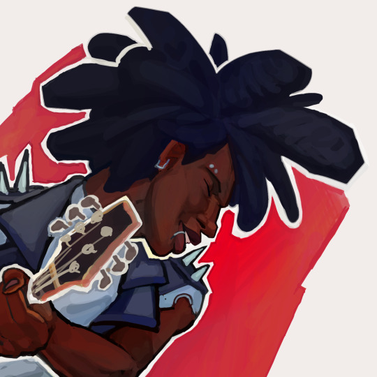
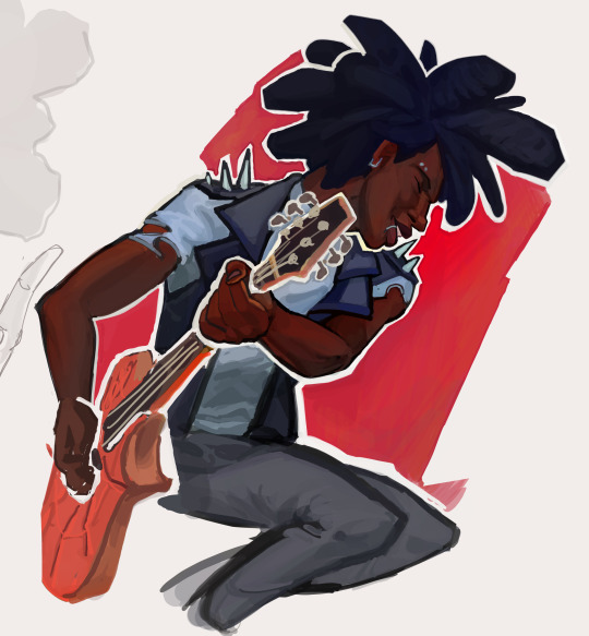
hes so cool ok
#messy sketchy render#spiderverse 2#across the spiderverse#atsv#atsv fanart#atsv hobie#atsv hobie brown#hobie brown#spider punk#spiderverse fanart#hobie#hobie fanart#fanart#spiderman#spider punk fanart#spiderpunk#hobie brown fanart
179 notes
·
View notes
Text
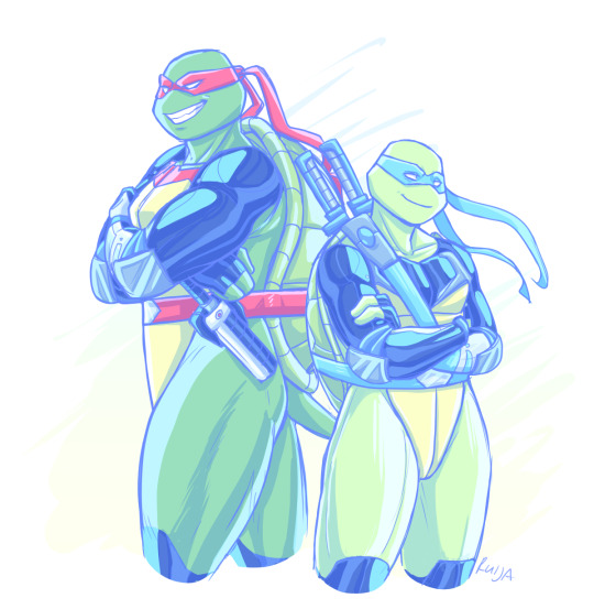
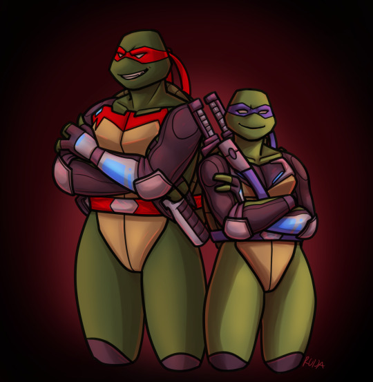
So! The evil art challenge! Thank you everyone who gave their input, you wrote really nice things💙💙 and you've definitely picked out my habits pretty well, lmao. Below I'll write a breakdown of my style and thoughts behind the "evil" version.
Aesthetically I love pastel and saturated colors and I'm 100% biased toward cooler tones. Regardless of color, whether it's red or blue adjacent, I'll always pick the cooler variable of it. I tend to avoid using black and I particularly have an aversion toward basic red. I have a short attention span and limited reserves of energy, so I try to work fast and stick to simple techniques; hence the sketchy linearts and mostly flat colors. I also just visually like smooth surfaces and gradients.
I want to convey the shapes and weight of the things I draw but with a minimalistic amount of lines and shading. This ties into putting emphasis on anatomy and muscles. I do tend to spend a lot of time sketching, because I usually have a very specific pose or vibe in my mind, and I want to be able to capture it.
For the "evil" version: - I sketched Raph and Leo a lot faster and attempted stiffer poses than in the normal one. - Thick and non-sketchy lineart - Dark and reddish color scheme - More rendered, airbrushy and kinda messy shading (I suffered) - Slightly less defined muscles...?
At some point I thought I should make them sharper, but then I just forgot lol.
Also, here's a flat colored version of the evil art because I like it 100% better. (Works better with the lineart style)

I picked Leo and Raph for this challenge for the opposing red and blue color schemes. As an extra, I put them in Fast Forward gear, as its blueness and the season's more saturated look are very fitting for my style. And then I'd get to make it work in a warmer tone.
Anyway, hope you enjoyed my ramblings and art~
222 notes
·
View notes
Note
can you do a style tutorial?? dude there's geniunally nobody else who draws like you, your art is so poetic and divine, it's inspiring
WAAA THANK YOU ANON OH MY DAYS ??? genuinely this is one of the nicest compliments ive ever received on my art omga what .
im not very good at explaining things but eem ill try !!
i feel like one of the biggest things is the sort of sketchy/messy vibe .. i use a super tiny brush ('digital brush' on ibis (its a premade lol) on size 1-2) and kind of scribble scrabble sometimes .. i also dont do lineart, i cant be bothered to do allat so i just clean up my sketch using an eraser !
i also stay away from using curves and instead try to use as many straight edges as possible if that makes sense .. also arbitrary lines in the drawing are a must . i think thats one of my fav parts of drawing :)
when it comes to coloring and rendering, i start by adding a darker, slightly more saturated color for shading, then blend it out with a midtone, do thr same for lighting, and then i add details !!
ive also been told that my usage of warmer tones is recognizable, and i achieve that by playing around with the 'color balance' filter on ibis until im happy with the results
for shading, i use a dark color (anywhere between blue and red, depending on the character and environment) for shading and a light yellowy color for lighting on an overlay layer ! then (also on overlay) i use those colors to add more arbitrary lines and scribbles
here i kind of tried to break down my sketching process, idk if it makes sense or not tho😓
my current artstyle is the result of six or so years of constant drawing and growing and experimenting !! experimenting with your artstyle is a huge factor in allowing it to evolve as well as for you to find what works the best .
referencing/figuring out how specific artists that you like achieve their artstyles is super good for experimenting !! in 2021 i was a huge fan of bellasaurus and animatedwings, so i referenced their art a lot, picked out what i liked, and incorporated it into my own style :)
i didnt include humans in this because im not very confident when drawing them and still have to heavily reference things lol .. maybe another day
overall just have fun and go with whatever feels right ! below ill attach some of my art pieces broken down if you want to use them as a reference

136 notes
·
View notes
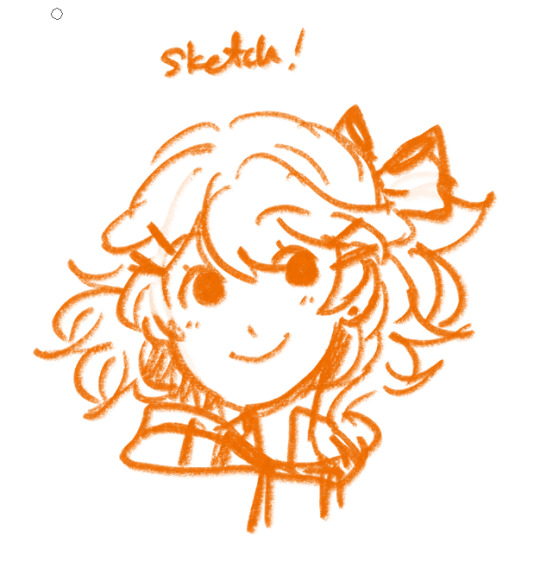
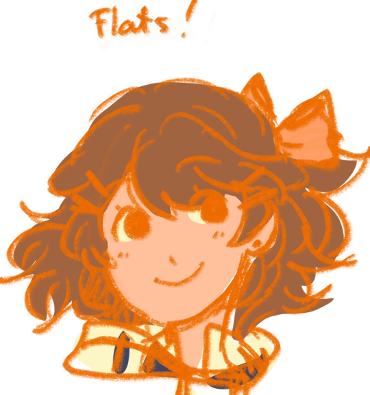
Text

(Click image for better quality!)
Super quick doodles vs. Full sketches!
I wanted to see just the stark differences between my doodles and my render sketches (idk what else to call em LOL) and so I drew this for funsies and to practice my own style! -Anddd to play around with the DCA outfits o3o
vvvv More yapping and Clean Render sketch below! vvvv

The sketch is just cleaned up, not drawn over with lineart, so it's still messy but got that flowy sketchy charm!
Usually Moon is my favorite but that Sun pose and face is just PERFECT. I am so surprised at how I was able to draw that - especially so easily! I was struggling with Moon's face for a bit, so maybe that practice made Sun just come out extra noice!
You'll probably notice some interesting design choices.
Long story short, drawing the ruffles are a bit meh for me, and ironically I don't like drawing necks - which the ruffles hid.
My fix? Put absolutely NOTHING there. Magic✨✨✨
Bendy accordion torso hehe-
The pants have elastic drawstrings for 2 reasons.
1. Ease of access/adjustable. 2. I wear pants like that and they make me happy :3
I also kept forgetting to draw the ribbons, but I decided to play around with the idea of them to see if i could turn it into something fun for me. I turned them more into a wristband with dangling bells - it reminds me of paddle drums! I added them to the bottom of the pants to make the design repeat just a little. :)
Idk what possessed me to draw them so cunty but here we are. o3o
I love the goofy and stylistic mouths I use when I doodle them, but they end up looking like they don't fit right when I render, so unfortunately they disappear for the normal smile...
At least the normal smile is still very charming! ^^
#They are so silly#Why#Sun is so extra in this and I love that for him#This is like... A stylize practice sorta?#All I know is that they're cocky MFS#LOOK AT THE PETTY-#I love the distinction so much lol#Sundrop#Moondrop#FNAF Moon#FNAF Sun#Daycare attendant#DCA fandom#DCA#dca fnaf#fnaf dca#my art
65 notes
·
View notes
Note
if you don't mind asking, the people (me) would like to know if you can share the tiktoker that inspired you to make the new rendering style because is so so pretty or if you can't find them if you can give tips on how to render like that, no pressure for neither but I am really loving how it looks literally chewed on both the baxter and cove art fdgfdg
I actually have the tiktok saved just for a frame of ref on how the messy render style would look LMFAO, heres the tiktok that inspired this whole color style and im pretty sure they also make a tutorial on how they do that specific render style
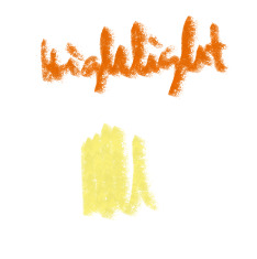
But! I have my own spin on it so heres some tips on helping understanding and achieving this way to render
So for starters i only use the charcoal brush for the entire thing but u can use any texture brush of ur choosing

i treat this coloring style how i treat color pencils or color pastels in real life
Meaning i start sketching with like a more lighter color
Its preferable to like usually sketch with either purple, pinks or reds but i usually sketch with how the vibes are feeling rn or what kinda color i associate the chr with LOL
The after that i just proceed with flats and heres the fun part
With how i shade in general i very much rely on my color wheel

Basically when adjusting colors like lets say i wanna shade i adjust the color wheel to the left and adjust the colors saturation but thats depending on how dark you want your shadows to be, if you want them to be darker just keep adjusting a bit more to the left of ur color wheel and lower the saturation more but not TOO much
Same also kinda applies to adding highlights and the only fee changes is adjusting the color wheel to the right
So rinse and repeat and u get these colors for the base skin
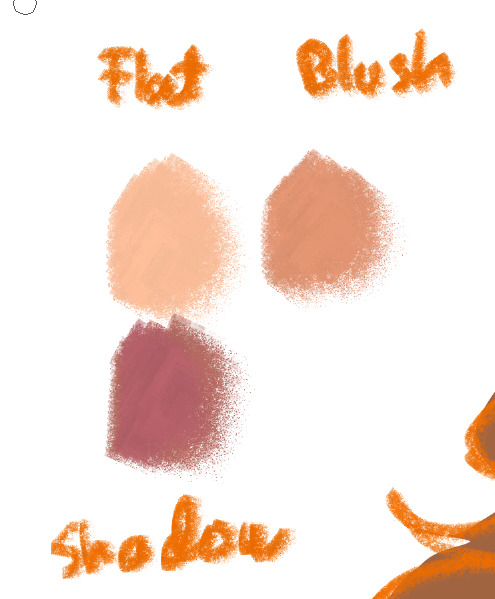
Note that these is just a pallete guide on how to pick colors to shade and highlight the skin but for me usually i keep adjusting the colors anyways to like find a way to blend
Remeber kids! Eye dropper tool is your best friend if you wanna blend colors together
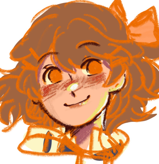
When all goes well the face will look like this
Few notes is that you dont want to get rid of the sketch outline even when overlaying when shading and rendering
It also adds more color and life to it if that makes any sense
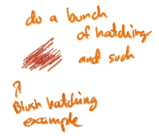
Another thing about shading is that you can do hatching and shit, be free of ur strokes! It maintains the sketchy feel of the piece
One last thing to note as well is where the light and shadows could be coming from when rendering
I also need an excuse to share a lesson i had with my professor on my art college LOL

Bringing out the artist ball but these are the 4 main things you need to note
A reflective light can be made by just putting ur color wheel to the opposite side of your color wheel LOL
Understanding this could go a long way trust me

Then after that youre basically done! Again just rinse and repeat with how you pick your colors and you should be good
If you wanna better understand how to color properly theres this one video that helped me out alot with understanding how to pick colors
Anywahs to wrap this up cause im running out of brain power to explain LOL be very loose with this style, its very sketchy but it adds flare to it if that makes sense
Hopefully i was able to help explain how i do it in some way!
And if not well you can just watch the tiktok tutorial on how to do this HAHAHAHA
26 notes
·
View notes
Text
it's interesting to me how so many people tend to be drawn toward pieces with more smooth rendering over those with a lot of line energy or shapes. even when the rendering isn't like. particularly good, they're the pieces of mine that get the most online attention over ones that I personally love that are i guess subtler and simpler in the things i enjoy about it. Like these ?
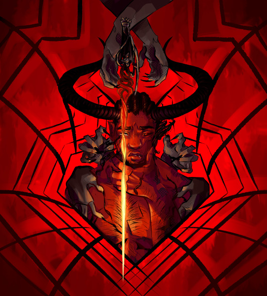
The left: I hate it. I don't like looking at it. I overworked it and it feels kind of muddy to me and lacking a real clear focal point or visual contrast. It's very monochrome but the purple and yellow pulls that out a bit for me. The horns get lost with the lines of the background. But it's my solo wyll piece with the most notes, 723.
The right: I don't like how it turned out. Lighting is all over the place. Colors all over the place. They all Almost work together but just not quite. A little too far apart to be monochrome but not far apart enough to feel it's meant to look like that intentionally (bc it was meant to be monochrome lmao). Rendering style all over the place. I did Not draw his hair with a reference for locs and you can tell. As a whole it lacks depth in the shading. It has 704 notes.
My two personal favorites??? Are these two. The ones that have about 100 notes each. I'm using Wyll specific comparisons bc they have the same baseline of being in a widely watched tag

The left is fun and silly bc I wanted to call back to a style I tried to force when I was like 13 and it's got good solid shapes and a pretty solid silhouette. The limited colors work together really well and gives it a very graphic feeling. The right is like. muah. wonderful composition. All lines pointing toward the eye, the brighter lines in particular radiating toward it, the contrast of the brightness and saturation in the eye drawing you toward it. The messy sketchiness doing similar work as gently blurring whatever isn't in focus and giving it a frantic feeling ! I'm really proud of it
I don't have a point! I just think it's interesting what things the majority ends up liking vs what I think are just way better overall and also I enjoy critiquing art and seeing the things that can get better alongside what did well
#droodles#wyll ravengard#i am So long winded every time i type im sorry jhdsjk#the critique on the top two is unusually harsh for me but that because i didn't like Either of them when i finished jhsjhs they fought me#and i should have just started over!
25 notes
·
View notes