#minimal vector icons
Explore tagged Tumblr posts
Visit Tumblr Blog
Explore Tumblr blogs with no restrictions, modern design and the best experience.
Last Seen Tumblr Blogs


Fun Fact
12.7% of mobile users access Tumblr.
Text

tag yourself I'm chomp champ
#artists on tumblr#cool art for attractive people#digital illustration#neon#vector#graphic art#vector illustration#minimal#retro#icon
8 notes
·
View notes
Text
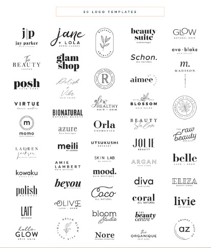
50 Logo Template
#graphic design#adobe#logo design#logo template#branding#minimal logo#creative logo#custom logo#modern logo#abstract logo#logo identity#business logo#sleek design#logo concept#vector logo#professional logo#logo branding#clean design#geometric logo#iconic logo#elegant logo#logo mockup#visual identity#logo illustration#bold logo#flat design#typography logo
2 notes
·
View notes
Text

Lock Icon Design
To place your order Click on the link Fiverr: https://www.fiverr.com/s/0bE2gry
You can also DM or Email Email: [email protected]
Facebook: https://web.facebook.com/emangraphics01/ Instagram: https://www.instagram.com/eman_graphics01/ Dribbble: https://dribbble.com/emanahsan Behance: https://www.behance.net/emangraphics Artstation: https://www.artstation.com/emangraphics4 Pinterest: https://www.pinterest.com/emanahsan990/ BSKY: https://bsky.app/profile/emangraphics.bsky.social VSCO: https://vsco.co/emangraphics/gallery Tumblr: https://www.tumblr.com/blog/eman-graphics
#icondesign #icondesigner #universalicon #solidicon #flaticon #glyphicon #vectoricon #iconset #iconpack #icons #icon #minimalicon #coloredicon #iconography #graphicdesign #graphicdesigner #iconaday #uidesign #linearticon #doodleicon #isometricicon #roundicon #dualtoneicon #design #adobeillustrator #brand #art #websiteicon #professionalicon
#icon design#icondesigner#universal icon#solid icon#flat icon#glyph icon#vector icon#icon set#icon pack#icons#icon#minimal icon#colored cion#iconography#graphic design#graphic designer#icon a dau#ui design#line art icon#doodle icon#isometric icon#round icon#dualtone icon#design#adobe illustrator#brand#art#website icon#professional icon
1 note
·
View note
Text

BRAND LOGO DESIGN
#logo design#lettering#modern art#minimal logo#modern logo#logotype#minimalist#icon#psd icons#crative#vector logo#vector#icon set#icongraphy#graphic design#business logo#typography#BRAND LOGO#BRAND DESIGN#branding#logo#product design
0 notes
Text
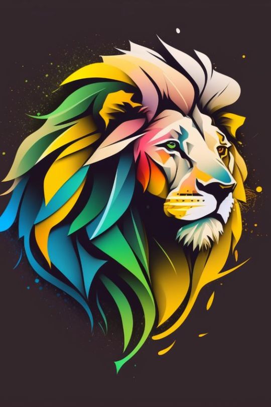
https://society6.com/product/lion-logo-graphic_print?sku=s6-28117554p4a1v45
A graphic logo stylized as a lion's head with a characteristic mane around it. Black, white and red colors are used to create sharp contours and accents. The logo conveys the strength and spirit of the wilderness in a minimalist graphic design.
#logo#stylization#minimalism#graphic#lion head#predator#mane#contour#black-white#accent#color#wild#strength#spirit#graphics#emblem#icon#illustration#vector#line art#abstract#lion
1 note
·
View note
Text

#593 - Rubik's cube
0 notes
Text
Count Dracula: An Everlasting Icon Between Legend and Modernity
Count Dracula, a legendary and iconic figure, has captivated the collective imagination for over a century. Originating from Bram Stoker's 1897 Gothic novel "Dracula," the character has become the quintessential vampire, influencing countless film, television, and literary adaptations. But what makes Count Dracula so enduring and relevant? And how can we reinterpret this figure through modern art? In this context, the "Transylvanian Dracula Count Vectorized Art Pack" offers a new perspective, blending tradition and innovation.
The Myth of Dracula
Count Dracula is partly inspired by the real Vlad III, also known as Vlad the Impaler, a 15th-century prince of Wallachia (now part of Romania). Vlad was infamous for his cruelty and use of impalement as a method of execution, making him an ideal inspiration for Stoker's bloodthirsty character. However, Dracula is not merely a reflection of Vlad; he is also a symbol of the hidden fears and desires of Victorian society, embodying themes of power, sexuality, and death.
The Evolution of Dracula in Art and Media
Since Dracula's debut, his image has been shaped by countless artistic representations. Classic films like the 1931 "Dracula" starring Bela Lugosi and the 1992 "Bram Stoker's Dracula" directed by Francis Ford Coppola have helped solidify the vampire's look and aura in the collective imagination. In these representations, Dracula is often depicted as an elegant and mysterious aristocrat, endowed with a dark and seductive charm.
"Transylvanian Dracula Count Vectorized Art Pack": A New Interpretation
The "Transylvanian Dracula Count Vectorized Art Pack" represents a modern and stylized interpretation of Count Dracula. Using vectorization techniques, this art pack reimagines the vampire in a way that blends classic elements with contemporary aesthetics. The distinctive features of the Count – the cloak, prominent fangs, aristocratic appearance – are maintained but revisited with surprising realism, despite being vector-based.
Features of the Art Pack
Realism and Elegance: Despite the vector technique, the portrait maintains a high level of realism, highlighting accurate details and a faithful representation of the character.
Minimalism without Colors: The absence of strong and contrasting colors lends a timeless refinement to the portrait, allowing focus on the details and technical mastery of the artwork.
Versatility: The vectorized art pack is highly versatile, usable in digital projects, prints, merchandise, and more, demonstrating how Count Dracula's image can adapt to modern design needs.
The Significance of Reinterpretation
Reinterpreting Dracula through vector art is not just an aesthetic exercise but also a way to keep a historical character alive and relevant. This reinterpretation allows for a renewed interest in the Dracula myth, making it accessible and attractive to new generations.
Count Dracula continues to be a figure of great fascination and relevance. Through works like the "Transylvanian Dracula Count Vectorized Art Pack," we can see how modern art can revisit and adapt classic myths, keeping their essence alive while giving them new life and modernity. The result is a fusion of tradition and innovation that celebrates the immortality of Count Dracula, both in legend and art.
#Dracula#VampireArt#GothicLiterature#HorrorArt#ModernArt#CountDracula#TransylvanianVampire#DraculaLegend#BramStokersDracula#DraculaVectorArt
3 notes
·
View notes
Text
New icon/pfp/avatar/pictorial representation alert!
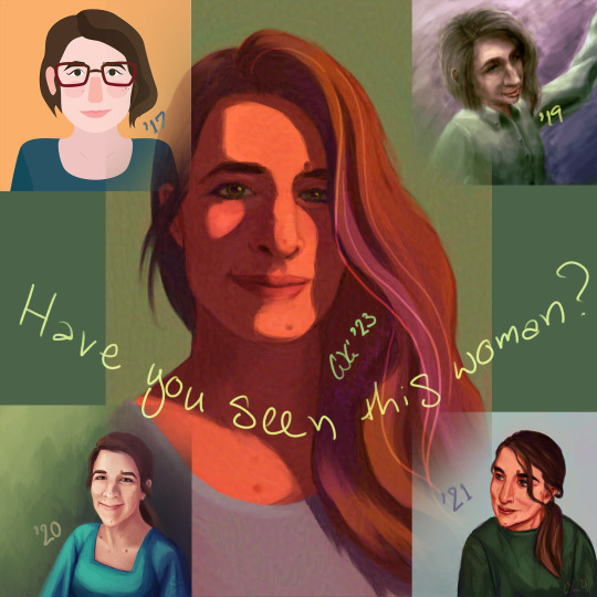
I think it's fair to say my icon self-portraits are improving. And it's not just because I have and use Pureref now. (Though I'm not showing you my reference to compare because it was a combination of a terribly lit photo and a horrific empty-eyed husk, aka the 3D model I abandoned this winter, but lit dramatically.)
Video and image descriptions under the cut.
[Video ID: A sped up recording of digitally painting a portrait in Photoshop. It starts with an orange background, sketching over it with dark brown. The sketch is refined, flipping horizontally once for the details before flipping back to lay in a green background, then shadows, then colors over the lines but under the shadows. When nearly everything has been colored, the contrast is lowered for legibility of the lines that return over the top. Painting resumes, combining the color and shadows, correcting the shapes back to those sketched. The painting is refined without the sketch or adjustment layer but the final piece includes some of those sketched lines in lowered opacity.
Image ID: The resulting digitally painted portrait, surrounded by four smaller ones, in each corner. Handwritten text in pale green reads, "Have you seen this woman?" The subject is the same woman, with pale skin, brown hair, downward slanted eyes, and a prominent nose, eyebrows, and jaw. The upper left is a vector drawing with simplified shapes that portrays her with an asymmetrical bob haircut and glasses, labeled '17. Upper right is a blotchy digital painting that shows the same haircut but from an awkwardly high angle; her head is too large for her torso and arms, her nose and eyes still larger. It's labeled '19. Lower left is more realistic proportions but still somewhat uneven perspective and intensity of lighting, labeled '20. Lower right has stylized proportions emphasizing her eyes and the length of her nose, with intense lines and defined planes that make her face look less soft than the other images and her hair almost greasy but the colors are more playful and saturated with highlights of magenta and lime; it's labeled '21. The central image is in portrait orientation (as opposed to the four squares) and shows the subject close to straight on, minimizing the protruding bridge of her nose as only the vector illustration did before. She's lit dramatically with golden orange from her left, her hair loose over that shoulder and, along with her profile, casting sharp shadows over her face. The color palette and dynamic range are narrow but include purple and green dimensions to her mostly orange-hued hair and skin, and a few pale lines imply silver strands of hair in the front. Her signature, a stylized CJG, accompanies the label '23. End ID]
#cj gladback#portrait#process video#artists on tumblr#though i did post this on instagram first and am therefore missing the soundtrack in this silent video#(there's a nifty loop this long at 3:15 in Glitch Mob's Fortune Days so i may have had my reel playing nonstop for an hour today)#gallery
2 notes
·
View notes
Text
Imagery – Visual Storytelling Without Saying a Word

From jaw-dropping photography to charming illustrations and punchy icons, imagery is the part of your design that grabs people before they even know what it’s about. If typography whispers the message, imagery yells it across the street (politely, of course).
So let’s get visual!
📸 What Counts as Imagery?
Imagery includes:
Photos (stock, original, product shots)
Illustrations (hand-drawn, vector, 3D, etc.)
Icons & Symbols
Textures & Patterns
Infographics & Data Visuals
Basically, anything that isn’t text qualifies. But here’s the kicker: not all images are created equal.
🎯 Why Imagery Matters
Sets the tone: A moody black-and-white photo vs. a playful cartoon completely changes perception.
Enhances communication: Especially when explaining abstract or complex ideas.
Increases retention: People remember 65% of visual info 3 days later vs. only 10% of text.
Engages emotions: The right image connects to viewers on a gut level.
Breaks monotony: A wall of text without visuals is a digital sedative.
🔍 Choosing the Right Image
Don’t just slap a photo into your layout because there’s empty space. You need images with:
1. Relevance
Every image should have a purpose. If it doesn’t enhance the message, delete it.
2. Consistency
Keep a consistent style (color tone, lighting, format). Mismatched visuals = chaotic vibes.
3. Authenticity
Skip cliché stock photos (handshake in front of a skyline, we’re looking at you). Look for images that feel genuine, or better yet—create your own.
4. Quality
Resolution matters. Grainy, pixelated images will tank your credibility. Aim for 300 DPI for print, 72 DPI for web.
🧑🎨 Photography vs Illustration: What’s the Difference?
Photography
Feels realistic, grounded
Great for products, people, events
Can be expensive or require gear
Illustration
Offers flexibility and control
Ideal for abstract ideas, brand storytelling, or when photography isn’t practical
Comes in many styles (flat, isometric, 3D, hand-drawn)
Pro tip: Combining both can work wonders—but only if they harmonize stylistically.
🛠️ Editing & Enhancing Visuals
You don’t always need to use images as-is. Here's how to elevate them:
Crop with purpose (think about the focal point)
Adjust brightness/contrast for clarity
Apply filters to unify aesthetics
Use overlays (a tinted color block) to make text readable over photos
Masking to blend or create dynamic shapes
Tools like Photoshop, Canva, or Figma let you tweak images without needing a photography degree.
🧩 Icons, Textures & Patterns: The Spice of Design
Icons
Minimal, symbolic graphics to represent actions or ideas.
Use icon libraries like Feather, FontAwesome, or Heroicons.
Keep the stroke weight and style consistent!
Textures & Patterns
Can add depth and tactility.
Subtle is key—grunge textures, noise, gradients, or repeating motifs.
Use sparingly to avoid sensory overload.
🧠 Unique Fact of the Day
NASA photos were once hand-retouched. Before digital editing, NASA’s moon landing photos were manually edited using paintbrushes and dyes. Yes, someone literally painted over cosmic dust. That’s dedication.
Also, the infamous "Distracted Boyfriend" meme? It’s from a stock photo shoot, and the model’s name is Mario. He became accidentally iconic—proving that even the most generic imagery can become unforgettable with the right (or wrong) context.
https://letterhanna.com/imagery-visual-storytelling-without-saying-a-word/
0 notes
Text

Code Hard. Fail Fast. Innovate Faster. – Minimalist Tech Tee
Push the limits of innovation with this sleek white t-shirt made for coders, creators, and digital visionaries. Featuring the bold mantra "Code hard, fail fast, innovate faster" in sharp, modern typography—each phrase pops with purpose: dark gray monospace for precision, vibrant red for urgency, and electric blue for future-forward energy. Subtle tech details like binary code, circuit lines, and a tiny rocket icon are seamlessly woven into the design for a clean, high-tech aesthetic. Rendered in ultra-detailed 4K vector style, this shirt is the perfect blend of minimalism and motivation—ideal for devs, engineers, and tech enthusiasts who
1 note
·
View note
Text
The Role of High Contrast and Recognizable Shapes in Modern Icons
Icon Design Principles: Q & A Tutorial
1. How do trends in minimalism and flat design influence the development of icons in contemporary digital products?
Trends in minimalism and flat design emphasize simplicity, clarity, and functionality, leading to the development of icons that are more streamlined and less ornate. This encourages the use of basic shapes, limited colors, and intuitive symbols, making icons easily recognizable and enhancing user experience across contemporary digital products. Overall, these trends promote efficient communication and a clean aesthetic in design.
2. In what ways are accessibility considerations shaping icon design trends, and how can designers ensure their icons are inclusive for all users?
Accessibility considerations are shaping icon design trends by emphasizing clarity, contrast, and simplicity to accommodate users with visual impairments. Designers can ensure inclusivity by using recognizable symbols, providing alternative text, maintaining high contrast, and considering color blindness. Testing designs with diverse user groups also helps create icons that are functional and understandable for everyone.
3. How has the rise of mobile and responsive design impacted the size, shape, and functionality of icons in user experience design?
The rise of mobile and responsive design has led to smaller, simplified icons that are easily recognizable on various screen sizes. Icons must be functional and intuitive, ensuring clarity in touch interactions. This prioritizes minimalism and scalability, allowing designers to create user-friendly interfaces that enhance accessibility and usability across devices.
4. What role does animation play in icon design trends today, and how can it enhance user interaction and engagement?
Animation in icon design enhances user interaction by providing visual feedback, guiding users’ attention, and creating a more dynamic experience. It can make icons feel more alive, improve usability through clearer communication of actions, and engage users emotionally. Overall, animation helps convey information quickly and adds an element of fun, making interfaces more memorable and enjoyable.
5. In what ways are responsive design principles affecting icon design, particularly in terms of scalability and adaptability across different devices?
Responsive design principles emphasize scalability and adaptability in icon design by ensuring icons remain clear and recognizable across various screen sizes and resolutions. This involves using vector graphics for flexibility, maintaining simplicity for legibility, and creating adaptive layouts that adjust icon size and positioning based on device context, enhancing user experience on mobile, tablet, and desktop platforms.

Visit: VS Website See: VS Portfolio
0 notes
Text


protions (sticker candidates)
#cool art for attractive people#neon#vector#digital#simple#minimal#icon#artists on tumblr#graphic art#glow#potions
5 notes
·
View notes
Text
Types of Leaves Vectors Lineal Icon Pack — Free Download by Iconadda
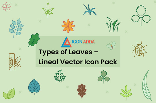
Want to add more organic elements to your design? For web designers, UI developers, graphic designers and plain, minimalist botanical icons, Iconadda has a distinctive kind of leaves of lean icon packs.
Lineal lies What is going on in Icon Pack? Most Lincial-style leaf graphics that are scalable, edited and suitable for printed and digital projects are available within this vector magazine icon pack. Such a leaf vector is ideal for any project connected to the Lynial Icon Pack nature, eco-friendly applications or any project connected to organic brand concepts.

Why use the icon of lineal leaves? Since they are minimal and contemporary, linear icons are ideal for interfaces with a simple design. The icons of the leaves of our well-planned dynasty assure perfect clarity and visual beauty of all sizes.
These icons work well with Ui/UX Mockup. Design a logo Graphics for social media Packaging design Environmentally friendly site or blog about nature
iconadda: Why? Iconadda offers a top-quality free icon set, image and graphic component made for artists. Our resources comprise: Expertised with designers cured Updated on a regular basis Free and no extra fee payable downloadable SEO optimized to maximize project visibility
Get leaf pack for leaves for nothing Want to obtain this huge vector in order to receive linual icon pack with leaves? Go at iconadda.com and take it instantly. No registration is needed!
#LinealIcons #VectorIcons #LeafIcons #LeavesVector #NatureIcons #PlantIcons #MinimalDesign #IconPack #GraphicDesign #DesignAssets #BotanicalDesign #EcoDesign #FlatDesign #UIIcons #VectorArt #CreativeAssets
#LinealIcons#VectorIcons#LeafIcons#LeavesVector#NatureIcons#PlantIcons#MinimalDesign#IconPack#GraphicDesign#DesignAssets#BotanicalDesign#EcoDesign#FlatDesign#UIIcons#VectorArt#CreativeAssets
0 notes
Text

Pin Location Icon Design
To place your order Click on the link Fiverr: https://www.fiverr.com/s/0bE2gry
You can also DM or Email Email: [email protected]
Facebook: https://web.facebook.com/emangraphics01/ Instagram: https://www.instagram.com/eman_graphics01/ Dribbble: https://dribbble.com/emanahsan Behance: https://www.behance.net/emangraphics Artstation: https://www.artstation.com/emangraphics4 Pinterest: https://www.pinterest.com/emanahsan990/ BSKY: https://bsky.app/profile/emangraphics.bsky.social VSCO: https://vsco.co/emangraphics/gallery Tumblr: https://www.tumblr.com/blog/eman-graphics
#icondesign #icondesigner #universalicon #solidicon #flaticon #glyphicon #vectoricon #iconset #iconpack #icons #icon #minimalicon #coloredicon #iconography #graphicdesign #graphicdesigner #iconaday #uidesign #linearticon #doodleicon #isometricicon #roundicon #dualtoneicon #design #adobeillustrator #brand #art #websiteicon #professionalicon
#icon design#icon designer#universal icon#solid icon#flat icon#glyph icon#vector icon#icon set#icon pack#icons#icon#minimal icon#colored icon#iconography#graphic design#graphic designer#icon a day#ui design#line art icon#doodle icon#isometric icon#round icon#dualtone icon#design#adobe illustrator#brand#art#website icon#professional icon
0 notes
Text

ALCOA STEEL LOGO DESIGN
#logo design#lettering#modern art#minimal logo#modern logo#logotype#minimalist#icon#psd icons#crative#simple#NEW#vector logo#vintage
0 notes
Text
UI/UX Design

User Interface (UI) and User Experience (UX) design play a crucial role in the success of websites and applications. They ensure that digital products are not only visually appealing but also functional and easy to use. In this post, we’ll break down the key concepts of UI/UX and how you can start learning them.
What is UX Design?
UX (User Experience) design is the process of creating products that provide meaningful and relevant experiences to users. It focuses on the user's journey — how they feel when interacting with a product, how easy it is to use, and how well it solves their problems.
Core Elements of UX Design:
User Research: Understanding user needs and behaviors through interviews, surveys, and testing.
Wireframing: Creating low-fidelity layouts to map out structure and flow.
Prototyping: Building interactive versions of a design for testing.
Usability Testing: Observing real users as they interact with your product.
What is UI Design?
UI (User Interface) design focuses on the look and feel of a product — the visual and interactive elements that users engage with. It includes typography, color schemes, button styles, icons, and layout.
Core Elements of UI Design:
Visual Design: Aesthetic appeal through color, spacing, and graphics.
Consistency: Ensuring uniformity in buttons, fonts, and navigation.
Responsiveness: Designing interfaces that adapt to different devices and screen sizes.
Accessibility: Making designs usable for people with disabilities.
Difference Between UI and UX
While they are closely related, UI and UX are not the same:
UX: How a product feels. It’s about solving problems and user satisfaction.
UI: How a product looks. It’s about visual and interactive design.
Popular Tools for UI/UX Design
Figma: Collaborative interface design tool.
Adobe XD: Design and prototype tool for UI/UX.
Sketch: UI-focused vector design tool (Mac only).
InVision: Prototyping and collaboration platform.
Balsamiq: For quick wireframing.
Best Practices for UI/UX Design
Design with users in mind — always solve a real problem.
Keep interfaces clean, minimal, and intuitive.
Use consistent navigation and visual elements.
Make use of whitespace to avoid clutter.
Ensure your design is responsive and accessible to all users.
Start Learning UI/UX
If you're new to UI/UX, start with these steps:
Learn the basics of design principles: color theory, typography, layout.
Study great apps/websites and what makes their UI/UX strong.
Practice by redesigning existing apps or websites.
Take courses on platforms like Coursera, Udemy, or freeCodeCamp.
Join design communities like Dribbble, Behance, and Designer Hangout.
Conclusion
UI/UX design is essential for creating products people love to use. By learning both the aesthetics of UI and the functionality of UX, you can become a valuable asset in any digital team. Whether you're a developer, designer, or entrepreneur — understanding UI/UX is a skill worth mastering.
0 notes