#mistakes web design
Explore tagged Tumblr posts
Visit Tumblr Blog
Explore Tumblr blogs with no restrictions, modern design and the best experience.
Last Seen Tumblr Blogs


Fun Fact
Tumblr has been providing a Korean-language service since 2013.
Text
In the Hall of the Embroidery Trouble Shooting Guide (x) (x)
#had to add the music I could HEAR it while I was scrolling lol#I hope whoever made an archived that mistake in March 2014 - 11 years ago - knows the hilarity that is living on on the archive#web design#websites#html#shenanigans#embroidery trouble shooting guide#graphic design is my passion#web design is my passion#memes#in the hall of the mountain king#do you love the color of the sky#video#meme#funny#flashing images#flash warning#flashing image tw#epilepsy warning#embroidery troubleshooting guide
21 notes
·
View notes

Text
CEO Found Out Website Was Down via WhatsApp | Website Maintenance Company in Qatar
In 2023, a company’s site went down all weekend. No alerts. No one noticed. The CEO only found out when a client WhatsApped him Sunday morning. That’s what happens when you don’t monitor. We fix that.
Want real-time site monitoring with zero guesswork? Visit: Website Maintenance Company in Qatar
#website maintenance#web maintenance qatar#website downtime story#site monitoring fail#how to monitor uptime#real time server alerts#business tech mistake#website error 500#hosting fail story#devops fail case#digital forge monitoring#lost leads downtime#server health check#uptime log system#ceo client fail#web infrastructure mistake#web design company Qatar#web design agency Qatar#digital forge#qatar#doha#digital marketing agency qatar#digital marketing agency
0 notes
Text
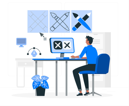
A successful website demands more than just excellent design; it also requires clients and developers to make wise development choices. Unfortunately, even the greatest projects can be derailed by typical errors like low performance optimization, poor communication, disregarding mobile friendliness, and poor SEO techniques. This blog focuses on the most common web development errors that result in underperforming websites, delays, and budget overruns. Building websites more quickly, efficiently, and effectively may be achieved by developers and business owners alike by being aware of these problems. Learn what to avoid and how to do it correctly from the beginning to stay ahead of the game.
0 notes
Text
How a Poor Website Design Is Killing Your Conversions
Is your website driving users away? Discover how common web design flaws like slow loading, bad navigation, and weak CTAs are killing conversions. Learn how to fix them and turn your site into a lead-generating machine. Contact Koobr today for expert web design that delivers real results.
#poor website design UK#web design mistakes#website conversion issues#fix slow website#mobile responsive web design#improve site navigation#call to action optimisation#unclear value proposition#trust signals on website#web design SEO problems#web analytics tracking#user-friendly website design#Koobr
0 notes
Text

A website redesign is an exciting opportunity to breathe new life into your brand, but it can also be a risky venture if not executed properly. Whether you’re a growing eCommerce brand or an established business, a poorly handled redesign can lead to traffic drops, user confusion, and even revenue loss.
At Tech Wishes, a leading website design company, we’ve helped 100+ brands avoid costly missteps and turn their redesigns into powerful conversion magnets. For more information view: https://www.techwishes.com/redesigning-your-website-avoid-these-costly-mistakes
0 notes
Text
10 UX Mistakes That Are Costing You Conversions
How to Fix Them?

User Experience (UX) is one of the most critical factors influencing conversions on your website or app. A poor UX can frustrate users, leading them to abandon their journey before completing a purchase or desired action. In this post, we’ll explore 10 common UX mistakes that could be hurting your conversion rates—and how you can fix them.
1. Slow Loading Speed
Problem: If your website takes more than 3 seconds to load, users may leave before even seeing your content. Solution:
Optimize website speed using tools like Google PageSpeed Insights
Compress images and enable caching
Use a Content Delivery Network (CDN)
2. Poor Mobile Optimization
Problem: A website that isn’t mobile-friendly leads to a frustrating experience for smartphone users. Solution:
Implement a responsive design
Test across various screen sizes
Ensure buttons and links are easily clickable on mobile screens
3. Complicated Navigation
Problem: If users struggle to find information, they’ll bounce rather than explore. Solution:
Use simple, intuitive navigation
Reduce the number of clicks to reach key pages
Follow UI/UX navigation best practices
4. Lack of Clear Call-to-Action (CTA)
Problem: If your CTA buttons are unclear or blend into the background, users won’t know what action to take. Solution:
Use action-focused text like “Get Started” or “Claim Offer”
Apply contrasting colors for visibility
5. Cluttered Layout & Too Much Text
Problem: Overloading users with excessive text or elements can overwhelm and confuse them. Solution:
Embrace minimalist design principles
Use whitespace effectively
Break up content into sections and bullet points for easy reading
6. Annoying Pop-ups & Auto-Playing Media
Problem: Intrusive pop-ups or auto-playing media can negatively impact user experience. Solution:
Use pop-ups sparingly and based on user behavior
Offer value (e.g., discount or newsletter) to justify interruptions
Allow full control over autoplaying content
7. Forms That Are Too Long or Complex
Problem: Long or complex forms can result in form abandonment. Solution:
Keep forms concise
Enable auto-fill where possible
Use progress indicators for multi-step forms
8. Ignoring Accessibility Standards
Problem: A non-accessible website may exclude a large audience and violate legal standards. Solution:
Follow WCAG accessibility guidelines
Ensure high contrast, readable fonts, and alt text
Design for screen readers and keyboard navigation
9. Unclear or Missing Trust Signals
Problem: Lack of trust leads to hesitation during transactions. Solution:
Display trust badges, verified reviews, and client testimonials
Offer secure payment options and clear return policies
10. Lack of User Testing & Feedback
Problem: Relying on assumptions instead of real feedback often leads to UX flaws. Solution:
Use tools like Hotjar or Crazy Egg for heatmaps and session recordings
Conduct usability testing
Collect user feedback through surveys or interviews
Final Thoughts
Fixing these UX mistakes can significantly improve your website’s conversion rate and overall customer satisfaction. Prioritize continuous testing, user feedback, and performance tracking to ensure your design evolves with your users’ needs.
Need help auditing your UX? Contact us for a UX consultation.
#UX mistakes#UX design#conversion rate optimization#user experience tips#website UX issues#mobile UX design#call to action#form optimization#website speed#accessibility in UX#trust signals#user feedback#usability testing#responsive design#UI/UX best practices#web design flaws#boost conversions#improve UX#user-centered design#digital product design
0 notes
Text
10 klaidų, kurios pasitaiko kiekvienam web dizaineriui (ir kaip jų išvengti)
Klaidos web dizaine - tai kaip šaukštas deguto medaus statinėje: atrodo dalykas nedidelis, tačiau gali greitai viską sugadinti. Kartais, net ir nereikšminga klaida, pavyzdžiui, per daug teksto ar neveikianti nuoroda, gali stipriai nuvilti lankytojus ir sumažinti konversijas. Todėl svetainių kūrimas visada remiasi į gerą dizainą. Geras svetainės dizainas yra ne tik patrauklus, bet ir funkcionalus, jis padeda pasiekti verslo tikslus ir užtikrinti, kad jūsų lankytojai tikrai sugrįš. Taigi, jei norite išvengti dažniausių web dizaino klaidų, skaitykite toliau. Juk geriausia mokytis iš svetimų klaidų, tiesa.
Svetainės pritaikymas mobiliesiems įrenginiams
Svetainės pritaikymas mobiliesiems įrenginiams jau yra nebe prabanga, o būtinybė. Daugiau nei pusė lankytojų naršo internetą iš savo telefonų, todėl jeigu jūsų svetainė juose atrodo prastai, jūsų lankytojai tiesiog išeis. Šiais laikais „responsive“ dizainas, kuris automatiškai prisitaiko prie bet kurio ekrano, yra dizaino pagrindas, o ne papildoma funkcija. Be to, Google labai mėgsta mobiliesiems pritaikytas svetaines ir jas paieškos rezultatuose paprastai rodo aukščiau. Taigi, jei nenorite likti už konkurentų, įsitikinkite, kad jūsų svetainė puikiai atrodo ir veikia ant mažo ekrano.
Neaiškus raginimas veikti (CTA)
Neaiškus raginimas veikti (CTA) yra kaip pasakyti lankytojui: „Padaryk kažką… bet pats nuspręsk ką.“ Tačiau, jeigu vartotojas tiksliai nežino, ko iš jo norite, jis greičiausiai tiesiog išeis. Todėl jūsų raginimas veikti turi būti aiškus kaip šviesoforo signalai ir nukreipti tiksliai ten, kur reikia. Naudokite paprastus, bet veiksmingus tekstus, pvz., „Pirkti“, „Registruotis“ ar „Gauti nemokamą pasiūlymą“. Ir atminkite, jeigu jūsų CTA neveikia, tai ne lankytojo kaltė, o jūsų.
Netinkama tipografija
Netinkamai parinktas šriftas gali sugadinti ne tik jūsų svetainės dizainą, bet ir lankytojų patirtį. Pavyzdžiui, sans-serif šriftai (Arial, Helvetica ir pan.) yra tobuli ekranams - jie švarūs ir lengvai skaitomi. Tuo tarpu serif šriftai (Times New Roman), suteikia elegancijos ir puikiai tinka antraštėms ar akcentams. Bet atsargiai, nes per daug skirtingų šriftų gali sukelti chaosą. Tinkamai parinkta tipografija ne tik padės perteikti jūsų prekės ženklo charakterį, bet ir padarys svetainę maloniai skaitomą. Galų gale, niekas nenori skaityti teksto, kuris atrodo kaip iššifruotas slaptas kodas, tiesa?
Nekokybiškas turinys
Prastas ir nekokybiškas svetainės turinys, ne tik nuvilia lankytojus, bet ir verčia viskuo abejoti. Klaidų kupinas tekstas ar neaiškiai dėstomos mintys, lankytojus priverčia galvoti: „Jeigu jie nesugeba parašyti normalaus sakinio, ar tikrai galiu jiems pasitikėti?“ Blogai suformuluotas turinys ne tik vargina akis, bet ir gali tiesiog nuvilioti lankytojus, kurie paliks svetainę, taip ir nesupratę, ko iš jų norite. Todėl prieš publikuojant tekstą, atidžiai patikrinkite kiekvieną žodį, sakinį ir pastraipą. O geriausia, patikėkite turinio kūrimą ir redagavimą profesionalams.
Lėtas svetainės greitis
Laukti, kol užsikraus svetainė, tai kaip sėdėti užstrigus kamštyje - niekas to nemėgsta. Jeigu jūsų interneto svetainė kraunasi ilgiau nei 3 sekundes, didelė tikimybė, kad lankytojas tiesiog išeis. O blogiausia tai, kad lėtas svetainės krovimo greitis ne tik nervina lankytojus, bet ir kenkia jūsų SEO. Google labai nemėgsta lėtų svetainių. Taigi, optimizuokite svetainės nuotraukas, įjunkite Gzip ir spartinančiąją atmintį (caching), bei atsisakykite nereikalingų skriptų.
Dideli turinio blokai
Per daug turinio svetainėje, tai kaip perpildyta spinta - sunku rasti tiksliai tai, ko reikia. Kai puslapis užgrūstas tekstu, nuotraukomis ir mygtukais, lankytojas greitai pasimeta svetainės valdyme ir dažniausiai ją palieka. Todėl laikykitės paprastos taisyklės: „mažiau yra daugiau“. Susitelkite į esmę, palikite tik svarbiausią informaciją ir nepamirškite tuščios erdvės, kadangi būtent ji leidžia svetainės dizainui kvėpuoti ir lengviau suvokti turinį. Kartais, paprastumas yra ne tik gražus, bet ir veiksmingas.
Automatiškai paleidžiami vaizdo įrašai
Automatiškai paleidžiami vaizdo įrašai yra kaip netikėtas šūksnis bibliotekoje - niekam tai nepatinka ir greičiausiai liksite nesuprastas. Tai ne tik erzina vartotojus, bet ir gali juos tiesiog išgąsdinti. Atsisakykite automatiškai paleidžiamų vaizdo įrašų ir leiskite patiems lankytojams valdyti, ką ir kada jie nori matyti ar girdėti. Na, nebent jūsų svetainė pristato ekstremalias patirtis ir paslaugas, tuomet triukai iš siaubo filmų tikrai gali suveikti 🙂
Neaiški svetainės navigacija
Svetainė su neaiškia ir netvarkinga navigacija yra kaip labirintas, kuris verčia lankytojus rasti teisingą kelią. Jeigu svarbiausia informacija yra paslėpta po šimtu mygtukų arba meniu punktų, jūsų svetainė greitai taps vienu dideliu nusivylimu. Todėl sukurkite paprastą, aiškią ir intuityvią navigaciją. Naudokite logiškus meniu pavadinimus ir struktūrą, kuriai neprireiks žemėlapio. Čia raktas slypi paprastume, juk lankydamiesi interneto svetainėse, mes retai kada norime žaisti detektyvus, tiesa?
Netinkamas spalvų pasirinkimas
Netinkamas svetainės spalvų pasirinkimas gali ne tik sukelti lankytojų nesusipratimą, bet ir tiesiog juos erzinti. Per ryškios arba blogai suderintos spalvos apsunkina skaitomumą ir gali apskritai sugadinti jūsų prekės ženklo įvaizdį. Todėl spalvas rinkitės protingai. Jos turi ne tik derėti, bet ir atspindėti jūsų prekės ženklo esmę. Jei nesate tikri, kur tiksliai galite pradėti, galite pasinaudoti specialiais spalvų generatoriais.
Per mažas dėmesys SEO optimizacijai
Jeigu jūsų parduotuvės niekas neranda Google, vadinasi klientų sulauksite nedaug. Šiais laikais, svetainės SEO (optimizavimas paieškos sistemoms) yra ne prabanga, o būtinybė. Tinkamai atliktas SEO padeda jūsų svetainei pasirodyti aukščiau paieškos rezultatuose, o tai reiškia daugiau lankytojų be papildomų reklamų išlaidų. Investavimas į SEO padės jums tapti labiau matomiems, pritraukti naujus klientus ir sparčiau augti.

0 notes
Text
Why You Should Avoid DIY Website Builders
In today's digital landscape, having a professional online presence is essential for businesses and individuals alike. With the rise of DIY website builders such as Wix, Squarespace, and Weebly, creating a website seems easier than ever. While these platforms offer convenience, they come with several drawbacks that can hinder your brand’s growth and credibility. Here’s why you should avoid DIY website builders and opt for a professional web design solution instead.

1. Limited Customization and Functionality
DIY website builders often use templates that restrict your ability to create a unique and customized design. While they allow for minor modifications, you’re ultimately confined to their pre-set structures and features. This limitation can prevent your website from standing out, making it look generic and unoriginal.
Additionally, these platforms may lack advanced features such as custom integrations, interactive elements, and complex eCommerce functionalities. If your business grows and requires more sophisticated solutions, you may find yourself needing a complete redesign with a professional developer.
2. Poor SEO Performance
Search Engine Optimization (SEO) is crucial for online visibility. DIY website builders typically offer basic SEO tools, but they lack the flexibility and technical control needed for effective optimization. Many sites built with DIY platforms suffer from slow loading speeds, poor mobile responsiveness, and suboptimal site architecture—factors that negatively impact search rankings.
Professional web developers optimize your site’s code, structure, and content to enhance search performance, ensuring your website ranks higher and attracts organic traffic.
3. Lack of Scalability
As your business grows, your website should be able to adapt and expand accordingly. DIY website builders often have limitations on scalability, restricting the number of pages, storage capacity, and advanced features available. This can be a major setback if you plan to add new services, integrate third-party tools, or scale up your online store.
With a professionally built website, you have the flexibility to upgrade and expand as needed, without worrying about outgrowing the platform.
4. Unprofessional Branding and Credibility Issues
First impressions matter. A DIY website often looks unpolished compared to a professionally designed one. Many DIY platforms include their branding, such as "Powered by Wix" or "Built with Squarespace," which can make your business seem amateurish. This can hurt your credibility, especially if you're trying to establish trust with potential clients or customers.
A custom-designed website allows you to control every aspect of branding, ensuring a cohesive and professional look that reflects your business identity.
5. Security and Data Risks
Cybersecurity is a growing concern for websites of all sizes. DIY website builders may not provide robust security measures, making your site vulnerable to attacks, data breaches, and hacking attempts. Many platforms offer limited control over security settings, and you may be unable to implement custom security protocols to protect sensitive information.
A professionally developed website ensures proper security measures, such as SSL certificates, regular updates, and advanced encryption, keeping your data and customer information safe.
6. Hidden Costs and Long-Term Expenses
While DIY website builders seem affordable at first, hidden costs can add up over time. Many platforms charge extra for essential features like custom domains, eCommerce capabilities, and additional storage. As your business grows, you may need to upgrade to premium plans, increasing costs significantly.
In contrast, investing in a professional website from the start provides better value in the long run. A well-built website reduces the need for costly redesigns, improves efficiency, and offers better return on investment.

Conclusion
Although DIY website builders offer a quick and seemingly easy solution, they come with many limitations that can harm your brand’s credibility, SEO performance, security, and scalability. Investing in a professionally designed website ensures that your online presence is not only visually appealing but also optimized for growth, functionality, and long-term success.
If you’re serious about your brand’s online presence, working with an expert web designer or agency is the best way to create a website that stands out and meets your business needs. Don’t settle for limitations—build a website that grows with you!
#Web Design#Website Development#DIY Website#Small Business Tips#Marketing Strategy#Branding Matters#Professional Web Design#SEO Optimization#Website Mistakes#Web Design Trends#Ecommerce Tips#User Experience#Business Growth#Website Performance#Digital Marketing
0 notes
Text
5 Website Mistakes Hurting York Businesses (And How to Fix Them)

In today’s digital world, your website is often the first impression potential customers have of your business. If your site isn’t up to scratch, you could be losing valuable leads and sales without even realising it. Many businesses in York make common website mistakes that harm their online presence and reduce their visibility on search engines like Google.
In this blog, we’ll highlight five critical website mistakes York businesses make and how to fix them. If you want to improve your online presence, attract more local customers, and boost conversions, read on.
1. Poor Website Speed
A slow-loading website frustrates users and increases bounce rates. Research shows that 53% of users abandon a site if it takes longer than three seconds to load. Google also considers page speed as a ranking factor, meaning a sluggish site could be harming your search engine rankings.
How to Fix It:
Optimise images and compress files.
Use a fast and reliable hosting provider.
Enable browser caching and content delivery networks (CDNs).
Minimise unnecessary scripts and plugins.
2. Lack of Mobile Optimisation
With mobile searches surpassing desktop, having a mobile-friendly website is no longer optional. If your site isn’t responsive, potential customers in York will struggle to navigate it on their smartphones, leading them to leave and go elsewhere.
How to Fix It:
Use a responsive website design that adapts to different screen sizes.
Ensure buttons and text are easy to click and read on mobile devices.
Test your site’s mobile-friendliness using Google’s Mobile-Friendly Test tool.
3. Weak Local SEO Strategy
Many York businesses fail to optimise their websites for local searches, making it harder for potential customers to find them. If your business doesn’t appear in Google’s local search results, you’re missing out on valuable traffic.
How to Fix It:
Optimise your Google Business Profile with accurate business details.
Include location-specific keywords (e.g., “SEO services in York”) on your website.
Encourage customer reviews and testimonials.
Ensure your business name, address, and phone number (NAP) are consistent across directories.
If you need professional assistance with SEO, Inflowen’s York SEO services can help improve your rankings and drive more local traffic to your business.
4. Poor Website Navigation & Structure
A confusing website layout can frustrate users and make it difficult for them to find important information. If visitors can’t quickly find what they need, they’ll likely leave and look elsewhere.
How to Fix It:
Use clear and intuitive navigation menus.
Implement a logical page hierarchy and internal linking structure.
Ensure essential pages (e.g., Contact, Services, About Us) are easy to find.
Improve on-site search functionality if needed.
5. Lack of Clear Calls to Action (CTAs)
A website without clear CTAs fails to guide visitors towards taking action, whether it’s making a purchase, booking a service, or contacting your business. Without CTAs, potential leads may leave without engaging further.
How to Fix It:
Use strong, action-oriented language (e.g., “Get a Free Quote,” “Book a Consultation”).
Place CTAs prominently on key pages.
Use contrasting colours to make CTAs stand out.
Ensure buttons lead to relevant landing pages to increase conversions.
Conclusion
Avoiding these common website mistakes can make a significant difference in how your York business performs online. From improving site speed and mobile responsiveness to optimising for local SEO and enhancing user experience, small changes can lead to big results.
If you’re looking for expert guidance to enhance your website and SEO strategy, Inflowen’s York SEO services can help you achieve better rankings, more traffic, and higher conversions.
Frequently Asked Questions (FAQs)
How do I check my website speed? You can use tools like Google PageSpeed Insights or GTmetrix to analyse your website’s speed and get optimisation recommendations.
Why is local SEO important for York businesses? Local SEO helps businesses appear in search results when people in York look for products or services. It improves visibility and attracts more local customers.
What is a responsive website design? A responsive design ensures your website adjusts and functions properly on all devices, including desktops, tablets, and smartphones.
How can I improve my website’s conversion rate? Improve your CTAs, optimise landing pages, enhance user experience, and ensure fast loading speeds to increase conversions.
How can Inflowen help with my website’s SEO? Inflowen offers expert SEO services in York, including local SEO, technical optimisation, and content strategy, to help businesses improve their search rankings and attract more customers.
By fixing these common mistakes, your business website can become a powerful tool for growth, ensuring you stand out in York’s competitive market.
0 notes
Text
Top 5 Mistakes to Avoid on Your Doctor Website: Key Points
Top 5 Mistakes to Avoid on Your Doctor Website highlights common pitfalls in doctor web design that can harm your online presence. From neglecting mobile optimization and clear CTAs to ignoring SEO and using outdated content, these mistakes impact patient trust and engagement. A professional, responsive, and patient-friendly website is essential for success in today's digital healthcare landscape.
1 note
·
View note
Text
7 Common Mistakes to Avoid When Hiring Web Designers
You won't regret your choice if you choose the right web developers for hire for your website development needs. This will genuinely assist your business expansion. However, how can one steer clear of these warning signs when selecting the ideal agency?
Here are the top 7 mistakes businesses make when hiring a web development company, and this article can help you avoid them.
1. You Hire a Web Designer by Seeing Their Portfolios on Online Platforms
For modest, short-term jobs, you frequently just search for "web designers near me" and then approach freelancers to complete your work. You may have seen the portfolios of the web designer you hired on sites like Yelp, Bark, Behance, or Dribbble. The issue with this strategy is that since they haven't created their portfolio in front of you, it is challenging to assess their true talent.
From their perspective, though, we should also take into account the fact that they are unable to display their clients' work on any websites. Although many designer mockups are imaginative ideas intended to demonstrate abilities, it frequently happens that they do not help accomplish business goals.
2. Using the Wrong CMS for Your Needs
Whether it's WordPress, Expression Engine, Squarespace, Drupal, or Shopify, many web designers work primarily with one CMS platform. That is perfectly acceptable; I also operate in that manner, which facilitates quicker improvement through familiarity.
However, each person has various needs for their website. I mostly use WordPress, although occasionally Shopify, Expression Engine, or Squarespace are better choices. As a web expert, it is my responsibility to know which platforms are ideal for the client's needs and to comprehend the various options accessible. Whether or not I sell the product, it is my responsibility to recommend the best alternative.
A skilled designer who looks out for your best interests can save you time and money by putting you into the appropriate solution, not just the one they happen to sell.
3. Ignoring the Hidden Expenses of a "Cheap" Website
It is difficult to know what to anticipate when choosing a web solution that is cheaper or if you are just a startup with a limited budget. Even if it's a cheaper website, you will be paying additional costs.
Be ready to invest more effort and time if you are less budgeted and want to make money. Although it is easy to find a web designer to create a website for you at lesser rates keep in mind it may take months to complete and meet your business objectives.
4. When You Select Only One Website without Taking Any Factors into Account
A website project might range in price from high costs to extremely low due to differences in scope. You can choose the right development company for front end web development services, a website that will represent your company's identity, not merely an interface or responsiveness of your web design framework. It's common for you to choose a website based only on its pricing page. Not specifically looking for the services and features offered by the websites.
When choosing a website, it is essential to consider the following elements in order to guarantee the greatest deliverables. Make sure the website you choose offers smooth integrations with third-party app tools, an easy-to-follow setup guide, and a web designer who is adaptable enough to work with these elements.
5. When the Web Designer Picks the Domain and Its Name on Your Behalf
Letting the web designer choose the domain name and web hosting is one of the biggest blunders businesses make. Keep in mind that a web designer is merely a worker for your company. Let them handle other technical duties; you shouldn't get involved.
According to an article by Forbes on choosing the right domain name, selecting a domain name directly impacts your branding and SEO strategy.
Since the website is an essential component of your brand, don't let anyone else take care of these important duties on your behalf. Make sure your commonly used eternal email account is connected to the domain name you choose. Additionally, pay attention to when it renews; if you miss it, you will either lose your domain or have to pay more to renew it.
6. Believing that building a website is a one-time event and that maintenance is not important
Give up the notion that after a website is created, upkeep is not necessary. The business world is always evolving. It constantly requests that you update it on your website. To remain relevant in the market as your firm grows, you must oversee new upgrades, company updates, marketing campaigns, get rid of old material, and more.
7. When Your Budget Is Greater Than Your Allotted Budget
Just remember one thing. A website's obligation includes more than just its design. Similarly, the website needed a web hosting platform, dependable plugins, a domain name, and everything else. These also come with additional expenses, which will raise your actual budget and make you second-guess your decision to hire a web designer for your new websites.
In actuality, however, other aspects will increase your expenditure.
Domain cost: Look for your dream domain name or even buy it before deciding on your design budget. Some domains are highly expensive and made especially for businesses.
Platform expenses: Check out what platform to use and how much will it cost. This is especially important for e-commerce websites because the costs of moving transactions between platforms can have a big effect on your earnings.
Photographer or stock images: Whether they are stock photos or photos taken by a photographer, high-quality images are crucial for any website.
To improve audience involvement and communication on your website, pick between brand imagery, which is more costly, and stock photographs, which are more affordable. Decide how much you want to spend on user photographs after taking your business needs into account.
Conclusion
However, by taking certain steps, you can steer clear of these hiring errors for web designers. It hurts that these web designers made hiring errors! Although you are thrilled with your new website, the expenses are escalating and surpassing your original budget. A competent designer will collaborate with you to identify solutions that fit your requirements and price range. You may reduce the possibility that your web design project will go over budget by being organized, honest, and open with your communication. Avoid these mistakes and get in touch with the top web design or development company.
0 notes
Text
Avoid These Common Landing Page Mistakes to Boost Conversions
Landing pages are one of the most effective tools for turning visitors into customers. However, even minor mistakes can significantly reduce their effectiveness. To create high-performing landing pages, you need to avoid these common pitfalls:
1. Weak or Missing Call-to-Action (CTA)
Your call-to-action (CTA) is the heart of your landing page. A poorly crafted or hidden CTA confuses visitors and fails to drive conversions.
Solution: Use clear, action-oriented language, such as "Start Free Trial" or "Claim Your Discount," and make your CTA visually prominent using bold colors and strategic placement.
2. Cluttered and Overwhelming Design
An overly busy landing page with too much information or too many elements can overwhelm users and distract them from the main goal.
Solution: Prioritize simplicity and focus. Highlight the key benefits of your offering, use ample white space, and limit distractions by removing unnecessary links or content.
3. Neglecting Mobile Optimization
With most users browsing on mobile devices, failing to optimize your landing page for smaller screens is a critical mistake. A page that isn’t mobile-friendly will drive users away.
Solution: Implement responsive design to ensure your landing page adapts seamlessly to all devices, providing a smooth and engaging user experience.
4. Slow Page Load Speeds
A landing page that takes too long to load can frustrate visitors and cause them to abandon the page. In today’s fast-paced world, users expect pages to load in seconds.
Solution: Optimize page speed by compressing images, minimizing code, and using fast hosting services. Tools like Google PageSpeed Insights can help identify bottlenecks.
5. Lack of Social Proof
Visitors may hesitate to trust your product or service without evidence of its value. Landing pages that lack reviews, testimonials, or trust badges can struggle to convert.
Solution: Add testimonials, client logos, case studies, or trust badges to reinforce credibility and reassure potential customers.
6. Misaligned Messaging
When there’s a disconnect between your ad copy and the landing page content, visitors may feel misled or confused. This inconsistency can lead to a higher bounce rate.
Solution: Ensure that your landing page matches the tone, visuals, and offer presented in the ad or email that brought users there.
7. Skipping A/B Testing
Creating a single version of a landing page without testing its effectiveness is like shooting in the dark. You’ll miss opportunities to optimize for better performance.
Solution: Run A/B tests to compare headlines, CTAs, images, and layouts. Use tools like Optimizely or Google Optimize to identify which version drives the most conversions.
8. Missing Analytics and Tracking
Without analytics, you’re unable to measure the success of your landing page or understand user behavior. This oversight can lead to missed opportunities for improvement.
Solution: Set up tracking with tools like Google Analytics or Hotjar to gain insights into visitor interactions and pinpoint areas for enhancement.
9. Overlooking Trust Signals
Trust is essential for conversion. Pages without trust signals—such as secure payment icons or privacy assurances—often fail to convince users to take action.
Solution: Include elements like security badges, privacy policy links, and return guarantees to build confidence in your offering.
10. Too Many Distractions
Landing pages with multiple CTAs, navigation bars, or external links dilute focus and confuse visitors.
Solution: Keep your landing page laser-focused on one goal. Use a single CTA and remove all unnecessary distractions to guide users toward the desired action.
Final Thoughts Creating a high-converting landing page requires attention to detail and a deep understanding of your audience. By avoiding these common mistakes, you can optimize your landing pages to drive more conversions and achieve better results.
Need expert help? At Digiluxo, we specialize in designing and optimizing landing pages that deliver measurable results. Let us help you maximize your marketing efforts and grow your business.
💻 Contact us today at Digiluxo.com

0 notes
Text
SEO common mistakes(Do's & Don'ts)
When designing a website, it’s crucial to avoid common SEO mistakes that can negatively impact your search rankings and overall user experience. Here are some key SEO mistakes to watch out for:
1. Lack of Mobile Optimization
Mistake: Not designing your website to be mobile-friendly.
Impact: With the majority of web traffic coming from mobile devices, a non-responsive design can hurt both user experience and rankings since Google uses mobile-first indexing.
Solution: Use responsive web design to ensure the site functions well on all screen sizes.
2. Slow Page Load Times
Mistake: Heavy images, unoptimized code, and slow servers can lead to long load times.
Impact: Slow websites lead to higher bounce rates and lower rankings, as page speed is a ranking factor.
Solution: Compress images, use lazy loading, minimize CSS and JavaScript, and leverage browser caching.
3. Not Using SEO-Friendly URLs
Mistake: Using URLs with random strings of numbers or characters (e.g., http://example.com/page?id=1234).
Impact: Search engines and users prefer readable, keyword-rich URLs, which help with ranking and click-through rates.
Solution: Create clean, descriptive URLs that include relevant keywords (e.g., http://example.com/adventure-gear-reviews).
4. Missing or Improper Use of Headings (H1, H2, etc.)
Mistake: Not using heading tags (H1, H2, H3) properly or at all.
Impact: Headings help search engines understand the structure of your content. Missing or misused headings can confuse search engines and hurt rankings.
Solution: Use only one H1 per page for the main title and organize content logically with H2 and H3 tags.
5. Ignoring Image Optimization
Mistake: Not optimizing images with alt text and proper file names.
Impact: Alt text is crucial for accessibility and helps search engines understand what the image represents, impacting image search rankings.
Solution: Use descriptive, keyword-rich alt text and compress image files to improve load times.
6. Thin or Duplicate Content
Mistake: Having pages with very little content or duplicating content across multiple pages.
Impact: Thin or duplicate content offers little value to users and can result in penalties from search engines.
Solution: Create unique, valuable content for each page and avoid duplicating text across your site.
7. Poor Internal Linking Structure
Mistake: Not having a clear internal linking strategy or overloading pages with irrelevant links.
Impact: Internal links help search engines crawl your site and establish a hierarchy of content. A poor linking structure can confuse both users and search engines.
Solution: Use a clear, logical internal linking structure that connects relevant pages and uses keyword-rich anchor text.
8. Not Optimizing Meta Tags (Title & Description)
Mistake: Failing to optimize or include unique title tags and meta descriptions.
Impact: Meta tags are key for SEO and click-through rates. Missing or generic meta tags reduce the likelihood of your pages ranking well.
Solution: Write unique, keyword-rich title tags and meta descriptions for every page, making them enticing for users.
9. Using Flash or Heavy Multimedia Elements
Mistake: Relying on Flash or heavy multimedia elements that are difficult for search engines to crawl.
Impact: Flash-based websites or overuse of videos and animations can cause slow load times and prevent search engines from properly indexing your content.
Solution: Avoid Flash and optimize multimedia elements, using HTML5 for videos and interactive content.
10. Not Having an SSL Certificate (HTTPS)
Mistake: Having a site that is not secure (HTTP instead of HTTPS).
Impact: Google uses HTTPS as a ranking signal, and unsecured sites may be flagged as "Not Secure," hurting credibility and rankings.
Solution: Install an SSL certificate to ensure your website is secure and ranks better.
11. Blocking Search Engines from Indexing
Mistake: Accidentally using robots.txt or noindex tags to block important pages from being crawled or indexed.
Impact: This can prevent your pages from appearing in search results, even if they’re otherwise optimized.
Solution: Check your robots.txt file and ensure critical pages are not blocked, and remove unnecessary noindex tags.
12. Missing or Inconsistent Sitemap
Mistake: Not including an XML sitemap or keeping it outdated.
Impact: Sitemaps help search engines crawl and index your site more effectively. Without it, certain pages may not be indexed.
Solution: Create and submit an updated XML sitemap to search engines and ensure it includes all relevant pages.
By avoiding these common SEO mistakes in web design, you can improve both user experience and search engine rankings, ultimately driving more organic traffic to your site.
0 notes
Text

The Web Design Mistakes That Will Haunt Your Business Forever In this blog, you will find out common web design mistakes that will haunt a business. To avoid these mistake read on here.
0 notes
Text
10 Common Web Design Mistakes That Are Killing Your Leads
Is your website losing leads? Discover the top web design mistakes that hurt user experience and conversions. From slow loading speeds to unclear CTAs, learn how to fix issues and maximise results. Contact Koobr today to create a strategic, high-performing web design for your business.
#web design mistakes#website lead generation tips#slow website issues#mobile responsive design#improve website navigation#high quality website imagery#modern website design UK#SEO fundamentals for websites#web design optimisation UK#Koobr
0 notes