#moodle themes
Text

My half of a character design swap I did with @linkenblog for Halloween!!!
#we both put together little Halloween themed moodboards and then designed our characters based on each other’s moodboards it was great#character design#Halloween#late halloween but still...#close enough lmao#moodles mcdoodles
36 notes
·
View notes
Text
What I'm Made Of (Sonic Heroes OST) 🤝 With Me (Sonic and the Black Knight OST):
Final boss songs who's lyrics apply almost just as much to Sonic as they do to the villain he's facing
#im crazy im crazy#also i know with me is used as Merlina's leitmotif but like#you know who throughout all of satbk is like accepting being the villain of the story? Just like Merlina does? Sonic#He's literally like oh killing king arthur will make me the bad guy? oh well lol can't always be the hero#they're both willing to do what they must even if they become the villain because of it#''you know every world will have its end and i'm here to prove it all to you''#''i am who you don't think i am''#like come oonnnn that's exactly what Sonic and Merlina are arguing about throughout the final battle#and those lines could apply to either of them#AND THEN DONT GET ME STARTED ON WHAT IM MADE OF#that song people are more likely to immediately think of Sonic when they hear it for the first time#but if you listen from the perspective of Metal Sonic it's like mind blowing#especially since its such a sonic style song like its got such a familiar feel to all of Sonic's other Crush 40 themes#and I'm including Open Your Heart and Live and Learn in this#Open Your Heart is just Sonic singing directly to Perfect Chaos and Live and Learn is similar to the songs im talking about above#in that Live and Learn can apply just as much to Shadow as it can to Sonic it's their duet as they save the world from Gerald's plan#(insert an ''I'm Live'' ''and I'm Learn'' the Live and Learn Brothers joke here)#but anyway the point is that you think of those songs when you hear What I'm Made Of#it SOUNDS like a Sonic song#but then really you listen to it...... and it sure does sound like things Sonic would say yeah#but ultimately? It IS a Metal Sonic theme. And it is playing on the parralels between Metal and Sonic on purpose#''i don't care what you're thinking as you turn to me cause what i have in my two hands is enough to set me free''#LIKE THAT'S THE FIRST LINE IN THE SONG... Sonic is ALREADY free. You know who isn't and is doing everything in order to be free?#''let me show you just what i'm made of'' is a Sonic line but oh my god is it also a Metal line#dont get me fucking started on the verse about 'one by one they all become black marks on the floor' and how insane the implications make m#these boss songs are all CONVERSATIONS!!!!!!!!!!!!!!!!!!!!!!!!!!#anyway. Sonic music good#sth#moodle rambles
1 note
·
View note
Text
Seminars
As advised during my progress review, I went back to rewatch and catch up on the seminars on moodle.
Today I caught up on rewatching the first half of the seminars.
Exploring ideas- part 1
-dont be afraid of ideas / concepts
-encouraged discuss and share ideas with peers
-on going concept devlopment
-trust the process and critically reflect + evaluate work
-draw
-concepts can be anything; colour, processes, connecting things ect
Exploring ideas- part 2
-"best way to have a good idea is to have lots of ideas"
-small gap between quantity and quality of ideas, more small ideas = more good big ideas
-exposing myself to new experiences such as new music, new movies ect could lead to new ideas
-note those new ideas immediately
Drawing seminar- part 1
-drawing is a way of talking to people through art
-practice drawing as it is a skill, everyone can draw
-people draw from what is around them/what influences them
-choice of style for artwork has an affect on the final outcome of an artwork
Drawing seminar- part 2
-dont be afraid to go back to things youve already drawn
-try to draw in the actual space / setting of your objects instead of taking a photo and drawing from a photo
-drawing in the actual space helps get the essence of your subject
Ideas development seminar
-research book
-bullet points work
-opinions about art
-historical and modern relevance of ideas
-can judge success of ideas
-concept, plan, opinions
-critically reflect
colour seminars
-copyrighted colours: worlds blackest black
-artifical and natural are examples of colour
-test cards to set up tv cameras
-pantone colour matching system
typography seminar
-the way "type" is displayed
-huge history behind it
-printing press made it accessible
-basis for how we communicate
-everywhere: producs, bus stops, signs ect
Creative recording seminar
-time based art: photos or videos
chris burden-747
Composition seminar
-applies to everything and is foundation of image making
-variation has no limits
-the arrangement of visual elements such as shapes, pattern, colour ect
-main elements: colour, form, line, shape, texture, value
-principles: balance, emphasis, depth, movement, contrast, tension ect
-shape of canvas affects image
Relief print seminar
-image manipulation
-everywhere: even armor -> etching
-4 main groups- relief block print, intaglio print, lithography and screen print
-print; mark on surface which is then transferred to other surfaces, allows for copies
-also utilized in other areas such as lino cast in plaster for large scale pieces broken into blocks
-accessible process that can be done everywhere
Form development seminar
-clay has a lot of potential
-soft-> print rolled, pressed, mold, shape, sculpt.
-melts with water
-can cast and recycle it
-ceramic is fired clay
-prototypes can be made from paper
-craft led practice: jack doherty
-design led process: ann mcbride
-surface: paul scott
3d studies seminar
-core element
-engagement with physical and tacticle elements
-artist: ruth asawa- wire that has been hand twisted
Tumblr seminars
-explain how everything is related to "temporary" theme
-research
-edit on pc as it looks different on a phone
-edit photos properly
3 notes
·
View notes
Text
Why is Moodle considered the best learning management system, and how does CuteBrains take it to the next level?

When it comes to education technology, choosing the right learning management system (LMS) is crucial. Moodle, one of the most popular LMS platforms globally, stands out as the best for institutions of all sizes. But how does it stack up to other platforms? And more importantly, how can you leverage its strengths to manage both learning and school administration more efficiently?
In this post, we’ll explore why Moodle is considered the best LMS and how CuteBrains—India’s FIRST Moodle-Integrated School Management System—takes Moodle’s strengths to the next level, offering a seamless and comprehensive solution for both learning and administrative tasks.
What Makes Moodle the Best LMS?
Moodle is not just any LMS—it is one of the most widely used open-source learning platforms in the world. Educational institutions from K-12 schools to universities and corporate training centers have adopted Moodle due to its flexibility, rich feature set, and global support. Let's break down what makes Moodle stand out:
1. Comprehensive Feature Set
Moodle offers a vast range of features that cater to diverse educational needs. Whether you're conducting an online course or supplementing face-to-face teaching, Moodle has the tools you need. Some of Moodle's top features include:
Assignments: Teachers can create, manage, and grade assignments, making it easy to assess student work. Various types of assignments such as essays, reports, and multimedia projects can be submitted through the platform.
Quizzes: Moodle provides an extensive quiz engine that supports different types of questions—multiple choice, true/false, short answer, and more. Educators can create detailed quizzes that assess student understanding in a variety of ways.
Forums: Online discussions are an essential part of collaborative learning. Moodle’s forum feature encourages interaction between students and teachers. It can be structured into different formats, such as question-and-answer or general discussion, providing flexibility in communication.
Interactive Content: The integration of tools like H5P within Moodle allows educators to create interactive learning experiences. From drag-and-drop activities to interactive videos, this feature enhances engagement and supports active learning.
Video Conferencing: Moodle integrates with video conferencing tools like BigBlueButtonBN, enabling live virtual classes. This feature is especially important for remote learning, providing real-time interaction between teachers and students.
Tracking and Reporting: Moodle's ability to track user activity, grades, and course completion is crucial for both educators and administrators. It provides detailed analytics on student performance and participation, making it easier to identify areas where learners might need additional support.
2. Flexibility and Customization
One of Moodle’s biggest advantages is its open-source nature, which allows institutions to customize the platform to their specific needs. Whether it’s the look and feel of the user interface or the addition of plugins to enhance functionality, Moodle offers unparalleled flexibility. Institutions can integrate external tools and customize workflows, making it adaptable to various educational contexts.
3. Global Community and Support
Moodle’s open-source framework is supported by a global community of developers, educators, and institutions. This means that the platform benefits from continuous updates and improvements. Moodle’s vast library of plugins, add-ons, and themes is developed and maintained by its community, ensuring that users have access to the latest tools and resources.
4. Proven and Trusted
With millions of users worldwide, Moodle has proven its reliability time and time again. Whether you are managing a small class or an entire university, Moodle scales efficiently and remains dependable, making it a go-to solution for institutions of all sizes.
CuteBrains: Enhancing Moodle with Seamless School Management
While Moodle offers a top-tier LMS experience, there’s often a need for more than just managing learning activities. Schools also require administrative tools to handle tasks like attendance tracking, grade management, and student information systems. This is where CuteBrains shines.
CuteBrains is India's FIRST Moodle-integrated school management system, designed to provide an all-in-one solution for both learning and administrative needs. By integrating Moodle with robust school management tools, CuteBrains delivers a seamless experience for educators, administrators, and students alike. Let’s take a look at how CuteBrains enhances Moodle’s already impressive capabilities.
1. Unified Learning and Administrative Platform
CuteBrains merges Moodle’s learning tools with a comprehensive school management system. This integration allows institutions to manage everything—from course content to student records—within a single platform. Teachers and administrators no longer need to juggle between multiple systems. Whether it’s creating assignments, tracking grades, or managing attendance, CuteBrains provides a unified solution that streamlines both teaching and administration.
2. Advanced School Management Features
Beyond Moodle’s educational tools, CuteBrains offers features specifically designed for school administration. These include:
Student Information Management: With CuteBrains, schools can manage student data effectively, tracking academic progress, personal information, and even parental details—all integrated with Moodle’s LMS features.
Attendance Tracking: Gone are the days of manual attendance sheets. CuteBrains automates attendance tracking, providing accurate and up-to-date records for each student.
Grade Management: Managing grades can be a tedious process, but CuteBrains simplifies it with an integrated system that allows for easy entry, calculation, and reporting of grades.
3. Enhanced Communication Tools
Effective communication is key to successful school management. CuteBrains enhances Moodle’s communication tools by offering advanced messaging, announcements, and notifications. This ensures that teachers, students, and parents remain informed and connected at all times.
4. Seamless User Experience
By integrating Moodle and school management functionalities, CuteBrains eliminates the need to switch between platforms for different tasks. Teachers can manage their lessons, assignments, and student data all in one place, while administrators can handle attendance and grades without leaving the system. This seamless experience saves time, reduces errors, and boosts productivity across the board.
5. Customization and Flexibility
Just like Moodle, CuteBrains offers customizable features that can be tailored to the unique needs of each school. Whether it’s setting up different grading systems, creating custom reports, or adding new tools, CuteBrains can adapt to various educational models, ensuring that each institution gets a solution that fits their requirements.
Why Choose CuteBrains?
While Moodle is a powerful LMS on its own, CuteBrains amplifies its potential by integrating essential school management features. This combination provides a holistic solution that caters to both educational and administrative needs. Here’s why CuteBrains stands out:
India’s FIRST Moodle-Integrated School Management System: CuteBrains is the first in India to offer a seamless integration with Moodle, bringing the best of both worlds to schools across the country.
Improved Efficiency: By combining learning and administrative tools into one platform, CuteBrains reduces the complexity of managing multiple systems, freeing up time and resources for educators and administrators.
Scalable Solution: Whether you’re a small school or a large institution, CuteBrains can scale to meet your needs, providing a flexible and reliable platform that grows with you.
Enhanced Student Experience: With CuteBrains, students can access their learning materials, track their grades, and communicate with teachers—all from a single, easy-to-use interface.
Conclusion
Moodle is undoubtedly one of the best learning management systems available today, offering a comprehensive set of tools for educators and learners alike. However, when it’s integrated with a school management system like CuteBrains, the potential for streamlining both educational and administrative tasks reaches new heights.
CuteBrains enhances Moodle’s core capabilities by providing a unified platform that not only supports learning but also simplifies the management of student information, attendance, grades, and more. As India’s first Moodle-integrated school management system, CuteBrains is setting a new standard for educational technology, offering a powerful, scalable, and efficient solution for schools across the country.
#edtech#school#school erp#moodle#education#digitallearning#school system#educationinnovation#school management software#studentsuccess
1 note
·
View note
Text
🚀 Elevate your e-learning experience with the latest trends in Moodle theme development! From hyper-personalization and responsive design to enhanced accessibility and gamification, discover how cutting-edge themes are transforming online education. 📚✨
Explore how these innovations can create more engaging and inclusive learning environments. Whether you’re an educator or a developer, staying ahead of these trends is key to delivering a superior educational experience. 🌟
Read more about how to optimize your Moodle platform and unlock its full potential! - https://seorisinglms.wordpress.com/2024/07/30/innovating-online-learning-the-latest-in-moodle-theme-development/
#Moodle#LMS#EdTech#OnlineLearning#ThemeDevelopment#UXDesign#Accessibility#Elearning#Gamification#LearningAnalytics#Education#WebDesign#MobileLearning#Customization#EdTechTrends
0 notes
Text
week 2
The reading due this morning had an interesting narrator
l4 l5 reflect l6 sight
compromise
vr chat world creation
maybe linking up with pen pal group?
Week 2 global project
The reading due this morning had an interesting narrator. I enjoyed hearing about Lazlo’s work but also wasn’t too keen on the narrators view of looking down on design that wasn’t activist. I think that creativity doesn’t have to be limited to improving something and this highlights the difference between design and art. Does good design have to improve something? Is art the same? art can provoke thought that could be considered activist in terms of bringing attention to different situations. this is most likely the approach we will take for this project as we tackle different motives and themes by making conscious creative decisions throughout.
L4 L5 reflect, L6 sight
While i was sceptical with the group pickings, i knew if i wanted to improve my skills, learn from previous projects as well as other group members, i would have to put forward a plan of action to ensure each meeting is the most productive. (Our initial meeting being most crucial). This way, we wouldn’t be fumbling or going around in circles as if we followed a structure for our brainstorming, we could cut out the tangents and focus at the task at hand.
My proposition for this will be to firstly have a refresher summary of each others pitch. We could pick three main points to our own pitch so that we can see what the most important elements/ which part each individual likes the most about their idea. From there we could make a 5 way Venn diagram or equivalent to see the overlaps in our ideas to see which points to automatically bring forward. And then we can go through and select more elements that we would like to bring forward as well. We should discuss socio-geographical similarities and differences as another starting point for content and context. It would be a good idea to settle on a theme as early as possible too so this could be chosen within this process. We can then look into video game genres as well as engines to allow us to decide on which engine we would like to use for the game.
pitch 3 point summaries
5 way Venn diagram
Socio-geographical similarities and differences/ socio-geographical challenges and solutions for sustainable development in global communities.
Select a theme to work from
Game genres
Questions for Kyiv
to gain more context of Ukraine and Kyiv, i did some research into socio-geographic specific issues.
Ukraine relies on £3billion per month in financial aid from allies to see this year through. They have already had £73billion from these countries however US support seems to be faltering and packages have suffered major delays.
It gets very cold in winter, as of Wednesday 7th Feb 2024, 355 homes in Kyiv were without heating in their homes. (Dniprovskyi district)
Moth/pest issues on crops
Rush hour traffic
how is living in Ukraine? "Generally ok, though we experience lack of produce in shops and deficits of gasoline. It is caused by disruption of logistics. Also lack of jobs because a lot of businesses closed down or partially open. In view of this less money for people. But there is electricity, water, gas , internet. Most necessary services work. A lot of people walking around, including military and regular citizens. In the night there is curfew."
Difference in technology
Barriers
Notes from Fred’s talk on Wednesday:
First draft is explaining to yourself, word vomit. Pair it back
Moodle Harvard referencing . Up to 15 mins for video essay
Phases of the moon as a tool?
After seeing everyone’s pitches on the Monday, i saw overlaps with Liz’s idea of digital pen pals. One of the cosy game examples i had included in my own presentation was “kind words”. To look into how similar these ideas were, i bought the game on steam as it was only £3.99. The game works as you send anonymous letters with a request for advice. Other anonymous users can then respond with their own advice or kind words. You can also send paper airplanes with quotes/ affirmations etc that are distributed to others playing the game. There is also a sticker trading aspect that is used in conjunction with sending responses to other’s letters as well as thanking other users for taking the time to respond. I found the community to be very wholesome and encouraging. I think the anonymity of the game enabled this as there was no judgement or prejudice, only real advice based on each situation. I’d like to potentially share this with my own group and mentioned the game to Liz in case her group would like to explore how the game works.
Wednesday was particularly frustrating for me. I had prepped and come into the studio with an open mind and tools to approach a collaborative talk with my group so that i didn’t come across as stubborn or dismissive. While this day was more focused on the essay side of the project, with no allocated time to focus on generating initial group ideas to show to Ukraine, it was hard to have the time to develop this aspect and utilise my plan stated above. Three members of the group however were able to have a conversation on ideas for the project. Me and Layla ended up being excluded from this talk as we were sat in other spaces around the room and were unaware this talk was going on. As not everyone was involved in the brainstorm, the outcomes didn’t include aspects from either of our pitches. I was definitely upset about this and felt like withdrawing. We hadn’t set up a means of communication like we usually do, (such as a WhatsApp groupchat) so once the session had ended, so did the discussion.
I also didn’t have a tutorial from Lara or Fred so felt a bit lost in terms of what steps i should take next, which is why i took initiative to email for clarification. Once knowing we needed one representative per group to give a brief overview of ideas, for Kyiv to respond to, i was then able to get back on track and put my stubbornness aside to progress with the group. Lewis emailed us on the Thursday to hopefully set up a means of communication as well as schedule a meeting as a full group. I then helped set up the WhatsApp as i had nearly everyone’s numbers already. This allowed us to start conversation on ensuring everyone was on the same page.
On Friday, i went into the studio so that i could be more productive. Joe was also in, helping with the first year students and Kateryna invited me to join in with their group tutorials for their nature/performance lab. It was really interesting to see the same issues as we had dealt with in the same projects last year. I really felt their frustrations with group members not showing up but hopefully we provided them with reassurance to keep pushing on and for them to know they are on the right path. I really liked one of the group’s outcomes for the nature lab. They have four different animal masks that represent different issues within nature. I liked the message that they were going to convey and also the execution of the one mask that was finished was great.
Once we had been around all of the groups, i then went back to my own work.
Kateryna showed me CLO3D, a 3d fashion modelling software. She explained that this could be a good tool to use if I would like to make 3D avatars to put into our game or into spatial.
I think if we decide to go with a more realistic visual, we can use this software to create stills that can be used as sprites or models for our game.
Research how indie teams work with clients etc
Relation to the game how use the similarities and differences
Reflect on the place for each other in terms of relationships through the making and the actual tame
0 notes
Text
Blog 6:Slides production and detail refinement

After the research and ideas were in place and communicated to the group, we decided to start creating the slides, and for better "synchronization" we chose the platform Google Slides.
The group members worked together to complete the PowerPoint presentation, I think it is very important is the "logic chain", each person needs to summarise their own part of the research into several modules, and following the artefacts idea generation - the group members of the idea summary and refinement --Artefact production - Artefact publicity and promotion;
Therefore, I have listed a few suggestions for the presentation on Google Slides based on the different specializations of the group members and the work they have done, and regarding the template for group presentations given by Dr. Matt on Moodle:
These include:
·the order of presentations
·fixed language at the beginning and end
· The key points to be mentioned in the presentation
· A list of group study patterns
· What each person might include in his or her presentation

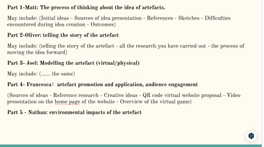
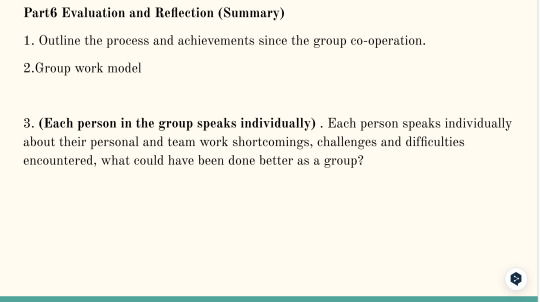
Figure 9&10&11 Screenshot of Google Slides - made by myself
And for me personally, I made the following content refinements while making it:
·extracted key data and examples from all the research I have done
·collect images and short videos
·minimize text
· The unity of the background color palette and the theme of the Slide production
·Going into detail: promotional and application video sections
Below is a video I independently produced and dubbed for New Forest's publicity and promotions:
The hedgehog is introduced as the first point of view, its friends are introduced in turn, and an interesting storytelling video is created by combining the different habits of the four animals in the New Forest, and ending with - welcome to The New Forest, which attracts and guides the audience to the next step of the virtual game interface.
0 notes
Text
15- 22 Mar | Live Commission Project - Submission
NER - Live Commission Project

The deadline for the live commission is almost here and you will now need to make sure you have all aspects of the live commission project are ready for submission. All of the following will need to submitted in their correct file format:
3x Empire magazine front covers with Disney theme. - Exported as separate Adobe InDesign package, which have been zipped.
3x Full-page advertisement which have been placed within Empire Magazine + Mockup - Saved as a .pdf and .jpg
3x Out Of Home (OOH) billboard advertisement. + Mockup - Exported as a .jpg
1x Digital advertisement (DOOH). Exported as a .mp4
1x Scripted audio advertisement and an audio recording - Script as a. pdf audio file exported as a .mp3.
Supporting document - online PowerPoint document - Saved as a .pdf
List of post the post for this project:
Introduction to Live Commission Project.
Live Commission Project - Empire Magazine - Part 1
Live Commission Project - Empire Magazine - Part 2
Live Commission Project - Empire Magazine - Part 3
Live Commission Project - Empire Magazine - Part Continued
Live Commission Project - Full-page Advertisements. Part 1
Live Commission Project - Full-page Advertisements. Part 2
Live Commission Project - Digital Out Of Home (DOOH) PART 1.
Live Commission Project - Digital Out Of Home (DOOH) PART 2.
Live Commission Project - Out of House Design.
Live Commission Project - The Podcast/Audio Advertisement - Part 1
Live Commission Project - The Podcast/Audio Advertisement - Part 2
The deadline for this assignment is the 22nd of March 2024 at 10pm. Moodle submission point here
Creating an Adobe InDesign Package for Submission:
youtube
How to compress/zip your Adobe InDesign Package:
youtube
0 notes
Text
Week 4
Monday
Due to damage on the overhead line at Coventry, all trains were cancelled towards birmingham from Northampton. This meant i was unable to travel in to uni. As soon as i knew i wasn’t going to make it, i informed Lara and my group. Asking if they would keep me updated throughout the day and if they could call me on teams if there was any group discussion being made.
Once i was back at home, i read through the narrative PowerPoint on Moodle, and tried to brainstorm some ideas for a narrative/ theme for our installation. Just so that if the group were to call me or for the next time i was back at uni, i had something to contribute. Here are a few of my ideas:
- Landmarks (express lift tower, greyfriars bus station etc.)
- shoe factory
- Great Fire of Northampton (1675)
-Everest (Northamptonshire made the shoes of Everest summiters Edmund Hillary and Tenzing Norgay)
-DNA/ double helix themed space
I also found a BBC article on how northampton proposes to save its dying town centre (from May 2019). Conservative councillor Mr Nunn was quoted in this article warning against quickly filling empty shops by selling off land and said does not want “a mediocre thing that does not actually achieve anything for the town.” This should suggest the local government would be in favour of a proposal such as ours as its aim is to bring the community together and to bring more footfall back to Northampton’s town centre. Hindsight is also interesting as a lot of the empty high street stores in northampton have been converted into casinos within the past year which would indicate that this aim was unsuccessful.
I also looked into what type of exhibitions were currently on display in Northampton’s museum and art gallery. They have a punk exhibition and their permanent shoe exhibit. Both of these could be good to go and see when the group come to visit the location. I then also remembered 78 Derngate is another artistic landmark in the town centre as it is Charles Renee mackintosh’s only house designed by him. I forwarded this to the group to see if it was of any interest to them.
Other than this, I didn’t really get to talk to my group about our ideas. They only offered to call when they were going to present their ideas on narrative to the group at the very end of the day and by this point I had to start getting my things together for dance as we were having a class competition in the evening and my dad had kindly agreed to drive me to Sutton Coldfield so I wouldn’t miss it.
There was no progress on what our next steps are to move forward within our project, only a message at 6pm from Lewis suggesting we reconsider having our project based in Birmingham. I found this slightly irritating as we had the whole day to discuss our ideas yet he chose this time of evening to message the group. I also think that changing our idea four weeks into the project would be detrimental to the quality of our work. Therefore I did not respond to the message as I would rather speak to the whole group in person and see what the whole group thinks instead of coming up with a response just from one persons message.
Tuesday
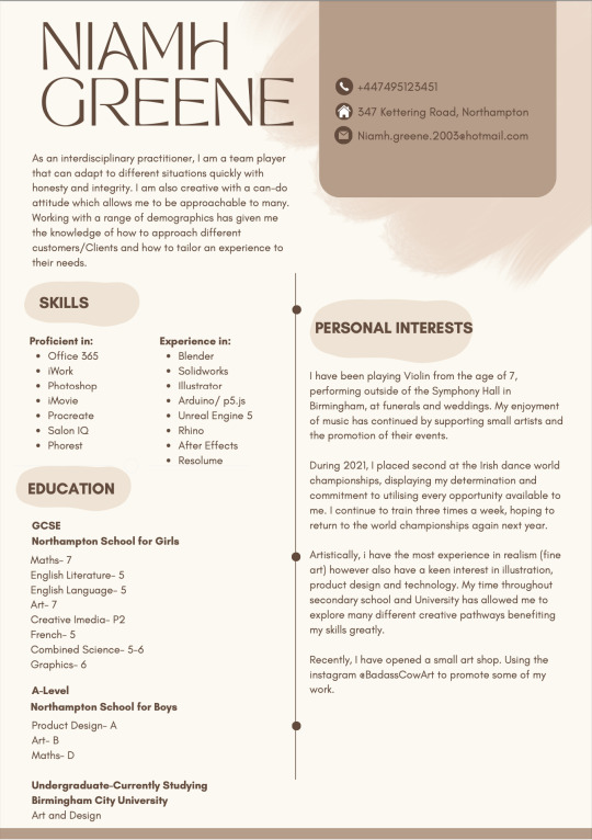
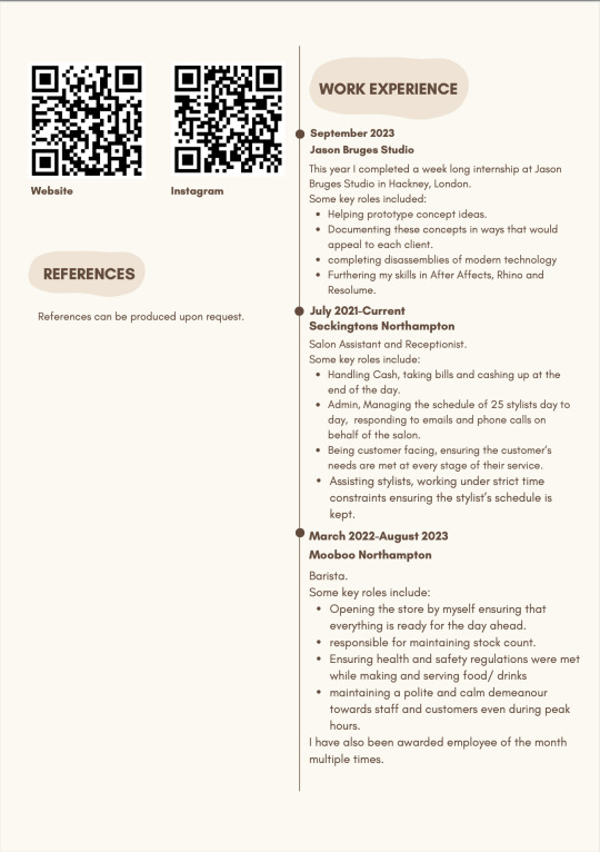
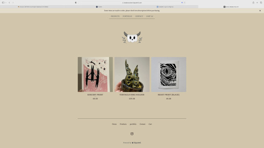
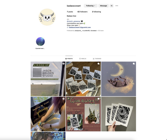
I spent most of this day converting my website to have a section for my portfolio. prior to this, I had tried to create a digital portfolio using a different website however all of the sites used to make a portfolio type of website required a subscription. there do seem to be limits with using big cartel as a portfolio. I seem to only be able to have my images displayed singularly in a top to bottom aspect, unless they are items being sold. this makes it a lengthy process to navigate through my work and its different categories.
Here are images of where I am currently with my CV, website/portfolio and instagram:
Wednesday
The morning began with our feedback from David. I presented to him my CV, website and instagram. He seemed to like what I had in terms of branding and contents. His feedback was mainly for my website. we discussed whether or not I should separate myself from my shop brand, marketing myself in two different manners. this clarity was great for myself to understand how I will market myself in the future. as we decided my art shop is more of a side hustle, rather than my main career goal, I should create a LinkedIn profile for myself, that mentions my shop as one of my projects. from this, I have decided to add "by Niamh Greene" to the description of Badass Cow across my instagram and website. this also confirmed that I should keep my portfolio on my website as it may bring me other commission type of work.
For my website, we also discussed having the categories of my work displayed on one page that would link to collections of my work that could then be enlarged with a description of each piece of work. I will have to do some more playing around with this possibility as I'm not sure big cartel would allow this internally. David also mentioned having more text on my website. I feel I could include this as a welcome to my site/shop, as well as each section/page of the site.
I will also add more highlights to my instagram so that people can quickly navigate through my different categories of work, and potentially upload carousels of different projects that are featured in my portfolio.
I found this day to be the most difficult with my group. The way we originally decided between Birmingham and Northampton was by having a vote and majority ruling because this was the most fair way of deciding. Northampton had the majority yet I feel a lack of engagement from some of the group members. While I understand Northampton is further away and most of the group cannot pop down regularly to the town centre just to have a look around, we are doing a national project and there are copious amounts of online research potentials to make up for this. Not to mention I would be more than happy for them to send me to go check anything out for them. We are also planning a visit to Northampton anyway so that everyone in the group can get a feel for the town and the possibilities.
sunday
more potential narratives:
the high street was mare alive when we were children, the space could mimic the feeling of being a child again, transporting you to a different time.
Northamptons love for theatre (taking design inspiration from the circus?)
dystopian death of the high street, artistic representation of what the current high street looks/feels like.
fireworks/ gunpowder plot
During our group discussion on Wednesday, the others mentioned that they were visual people who struggle to understand a concept unless they can see it. to help display these narratives, I put together some Pinterest boards. We said we would make some designs for the space over the week so I have opted to go for collages to propose this.
here are the mood board/ collages I put together:
^childhood
we could also use charity shop shirts/ garments to make a more sustainable exhibition as well as highlight the high levels of consumerism that takes place in shops on the high street.
^gunpowder
this narrative could be tied with the Northampton landmarks too.
^circus/theatre
^dystopian
this reminded me of the nature lab in first year, specifically joe's group and their "nature will prevail" ethos.
0 notes
Text
29/09/2023 - collaborative research task
For this task, we had to collaborate with each other on our text analyses. The task was split into three steps:
The first step was to pair up with someone else and explain the basis of our text to that person. We had to make notes on what we learned about each other's texts - what new ideas, concepts or ways of thinking have we discovered? We had to also find links between our text and understand how they were related.
The second step was to join another pair to make a group of four. In our groups, we had 10 minutes to explain the two texts that we've read, and a summary of the conversation we had in our pairs so far. We had to make notes on any links we could find between all 4 texts. Questions we had to ask ourselves included 'are there common themes?', 'do new ideas, thoughts and reflections come out of the conversations that you are having?' and so on.
The third step was to finally write an annotated bibliography for each of your 4 texts. Essentially, our entries (no more than 200 words) needed to include reflection, connections to wider themes/ideas/contexts and possibly critique. We needed to also include a single image in our entries that would represent the essence of our texts. The bibliography needed to be cited in Harvard style (but we could grab that from the texts document on Moodle).
There was supposed to be a fourth step and that was to upload our finalised cited entries on Padlet via Moodle, but for some reason I could not do that (I think I couldn't sign in Outlook/Microsoft for whatever reason). Either ways, I'm going to write up our findings here. Though I have gone back since Friday 29/09 and have updated each entry (and I've added images since they weren't originally on the Google Docs we all pasted our analyses on).
STEP 1
So I paired up with another person whose assigned text was Towards Relational Design by Andrew Blauvelt. Together we discussed each other's texts and found a lot of similarities between our texts. This was the original summary I wrote about my partner’s assigned text:
This text is concerned with the evolution of art over time and how different art movements have affected modern art. How artificial intelligence is going to have an effect on modern artwork and the concept of no longer needing human designers involved with production of art. Mass production was also a key point in this text - a robot designer in a museum in the Netherlands can produce up to 600 original artworks, which a human cannot possibly do.
I’m obviously going to need to rewrite the summary, so that it could have a lot more substance than…whatever this is. This will mean I will have to read the text and make my own judgements but ugh, I really don’t want to. But then I won’t feel fulfilled that I’ve done this task justice, so I will be reading all four texts in full. Yay me.
STEP 2
Both me and partner grouped up with another pair and all four of us quickly discussed our analyses. The texts were Designing Programmes by Karl Gerstner and Zeros and Ones: Digital Women and the New Technoculture by Sadie Plant. Eventually, we found the links between all four of them and here are my notes on both of those texts. Keep in mind, these notes are a lot more rough as I was quickly typing as we each took turns explaining our analyses of our texts in full:
Notes on Designing Programmes by Karl Gerstner:
Designing programmes text (3) - analyisng mathematical functions + codes and put it into a program and make it a foundation for your program
Talks about angles, textures, photos
Links to design - foundation for your designs, softwares like Photoshop + InDesign, algorithmic, rules + regulations for graphic design
Criticism - can’t rely on this coding because of lack of human creativity
Similar to my text - both texts explain usage of algorithms as a basis of programming (which then leads to AI etc)
Notes on:
‘Zero + ones (18)’ - text is about the inequalities between men and women (particularly the exploitation of women) and how the rise in the advancing technology pushes this narrative/reality
I didn't type much for this text, only because I couldn't keep up with the analysis. I'll have a deeper look into this text anyways, seeing as I am interested in the links between the mistreatment of women and the rise in technology advancements. I have a feeling things have only gotten worse since this book was written (which was 1997!)
STEP 3
We all wrote up our annotated bibliographies. We honestly just copied the citations from the Moodle doc and just pasted it before the beginning of our short entries. This what it currently looks like:
Plant, S. (1997) Zeros + Ones: Digital Women + the New Technoculture. London: Fourth Estate. pp. 32–37
Upon reading the by; Plant, S. (1997) Zeros + Ones: Digital Women + the New Technoculture, I concluded that from the comparison between modern technology and the exploitation of women, the writer seeks to highlight the inequality between men and women by addressing the notion that women are mere servants and assistants to men, the words; “He ruled, she served” proves this point well. Similarly, postwar computer systems which became more widely accessible in the 1970s were developed to assist the corporate workforce, largely dominated by men. Just like women for a long time have been viewed as nothing more than helpers to men, computers are the same, but because the computer in this scenario is a literal object to which the women are being compared too, it emphasises the objectification women have endured throughout history.
Cohen, H. (1974) On Purpose: An enquiry into the possible roles of the computer in art. Available at: https://www.studiointernational.com/index.php/on-purpose-an- enquiry-into-the-possible-roles-of-the-computer-in-art (Accessed: 29/09/2023)
This text is about how computers can be seen as ‘artists’ in their own right. Cohen was concerned with how he could program the computer/machines to create art instead of just using punched cards that would already have preset ideas for the outcome. He experimented with coding programmes and produced artwork using a teletype and a computer system. He also talks about the difficult mathematical concept of ‘recursion’ as being a system/structure and how that can be applied to computer art. It’s the idea of a structure having provided itself with ‘something’ by its last function/process.
Blauvelt, A. (2008) Towards Relational Design. Available at: https://walkerart.org/magazine/towards-relational-design (Accessed: 29/09/2023)
This text was about the evolution of design throughout time and how society has influenced art movements throughout art history. Later they talk about how they think art trends are going to change and develop in the future. They discuss how programming systems will aid in creating art in the future.
Gerstner, K. (2021) Designing Programmes (re-print). Zurich: Lars MÜller, pp. 6–18
This text mainly uses a set of systematic data to digitize some design elements and design methods, model programming, and some of their applications. In the author's illustrated explanation, he does not provide us with a specific idea, but some objective skills supported by data, such as grid diagrams, structures, rules, and the technical basis of the design. Compared with broader concepts, this book seems to be more inclined to be a "reference book", which provides a systematic idea and guidance for our design through the support of data and systematization.
There'll be a separate post with the link to the finalised collaborative text and with images too!
0 notes
Text
The Best Web Development Services for Online Learning and Education Platforms
Do want to know what will be the best web development services for online education?
Yes! Online education becomes an integral part of every student’s life nowadays. Therefore, picking the appropriate services is crucial.
When it comes to web development services for online learning and education platforms, several options stand out for their quality and features.
One of the top choices is WordPress, a versatile and widely used content management system (CMS) that offers a range of powerful plugins and themes specifically designed for education websites. WordPress allows for easy content creation and management, making it an ideal platform for blogs and other educational resources.
Another popular choice is Drupal, another robust CMS that provides extensive customization options and scalability. Drupal offers various modules tailored to education platforms, enabling the creation of interactive and engaging content. Its flexible architecture allows for the integration of third-party tools and the development of complex functionalities.
Additionally, there are specialized learning management systems (LMS) that offer comprehensive solutions for online education. Platforms like Moodle and Canvas provide dedicated features for course management, online assessments, student tracking, and collaborative learning. While these platforms may require more technical expertise to set up and customize, they offer a complete suite of tools specifically designed for educational purposes.
For more advanced and custom-built solutions, hiring a web development agency experienced in building online learning platforms can be a great option.
Now you can get all these services in INNOVENTITY. We are always ready to serve you our best web development services. Our company can create tailor-made websites and web applications that cater to specific educational requirements. We have expertise in developing responsive designs and implementing e-learning features such as course management systems, user profiles, and interactive multimedia content. INNOVENTITY will collaborate closely with the client to understand their goals, requirements, and target audience. After that, we conduct thorough research to gain insights into the educational domain and identify the key features and functionalities needed for an effective online learning platform. From initial consultation to design, development, integration, testing, and maintenance, they provide comprehensive services to create a feature-rich, user-friendly, and scalable platform that facilitates effective online education.
In conclusion, the best web development services for online learning and education platforms depend on the specific needs and preferences of the organization or individual. WordPress and Drupal are excellent options for those seeking user-friendly CMS solutions with a wide range of plugins and themes. INNOVENTITY will offer tailored and advanced solutions, while specialized LMS platforms provide comprehensive features for managing online courses.
1 note
·
View note
Text
Fundamentals 1: Week 4
15th March
This week in our fundamentals class we are taking a break from Illustrator to learn about the basics of Photoshop.
Photoshop is an Adobe software that I don't have any experience with. It was something (like Illustrator) that I was fairly intimidated by and didn't really take the time to figure out so I'm glad that I have this opportunity to learn these skills and have guidance from the teachers on how to use the software best.
We first talked about the difference between colour correction vs colour grading. These are important to understand when it comes to editing photos to get the desired end result.
Colour correction means to "fix an image" or "matching two or more images to fit together. It can be seen as a checklist of processes to improve an image, or moving image footage to an optimal appearance.
Colour grading is often applied to images or moving image footage creatively with a stylistic image in mind (like a colour themes to set a certain tone)
Our task for the class today is to go through a series of photos provided to us by Toby on Moodle and learn about the different tools that we can use for colour correction and colour grading. The first photo that we looks at was this one.

As you can see the image appears to be really faded with a high level of brightness and our goal is to correct the image so the level of brightness and exposure is more realistic. After uploading the image we then learnt about the layers palette in Photoshop and the different adjustment layers that we can add to the photo that we are editing. The layers feature in Photoshop looks like this.


In the first image above you can see the layers palette which shows the image as a background layer as well as the "Layer 1" which is the grading scale on the side of the image. We learnt that by clicking on the fourth icon on the options bar at the bottom (looks like a circle that is partially filled in) we get a list of editing features that are called "Adjustment Layers". Toby informed us to use the "Curves" feature for editing brightness rather than the "Brightness/Contrast" feature as the curves graph can allow for better control of the brightness of pixels instead of the linear scales used in "Brightness/Contrast".
Here's what the curves feature looks like using the image of the woman above.

This is a curve histogram used for for colour correcting which shows the information of the pixels in the image, which shows the presence of darkest pixels (shadows) in the bottom left to the brightest pixels (highlights) in the top right. The line going on a diagonal angle through the histogram is the "curve" that can be used to manipulate the brightness of different areas of pixels. By changing the curve you therefore change the brightness of pixels with different brightnesses.
Here's how we changed the brightness of pixels in the image of the woman above.


By bringing the starting point of the curve further right to where to darkest pixels are, you are then lowering the brightness of these pixels which create more shadows on the image. We were encouraged to play around with the curves and add points through the middle to understand how it can influence the brightness of these pixels. Moving the points of the curve around enough where the image becomes too bright or too dark, undersaturated or oversaturated shows how the image can lose pixel information and not look as realistic and look like a low-quality photo.
We were then given another version of the same image but it was set in a darker tone. We then had to correct the image to look more balanced with its shadows and highlights.


As you can see by changing the end of the curve have its highest point where the lightest pixels are you are increasing the highlights seen in the image while the shadows are still present.
We then move on to the next image to learn about using curves on a photo with colour. Here's the image we looked at and edited.


As you can see with the original image on the left it's brightness and low and although it does have colour it is hard to see this with such low exposure. By adjusting the curve you can then increase the presence of highlights and maintain some shadows to show the presence of colour in the image.
We move on to the next image where we are still using the curves to adjust the brightness of the image and also learning about the "Hue/Saturation" adjustment layer. This layer can be used to manipulate the colour intensity and colour grading of the image by using hue and saturation slider scales. A hue is a colour or a shade, and saturation is the intensity and purity of a colour which is displayed in an image - the lower the saturation, the closer a colour is to being grey. Here's the image that we used.


First off we adjusted the brightness of the image using the curves adjustment layer to add more highlights into the image so it appears lighter and more realistic as it appears to be a cloudy day in the photo. By using the same icon to bring up the different adjustment layers we click on the "Hue/Saturation" which is shown below.

As you can see it has three slider scales - Hue, Saturation and Lightness can be adjusted. Increasing the saturation makes the image appear more vibrant and more intense colour in it. Lightness doesn't really need to be used as we can use the curves feature, and hue should only really be used if we want to change the colours seen in the image. Since we are still wanting to achieve a realistic colour correction we don't to need to do much colour grading here.
For the next image we are moving on to another adjustment layer called "Colour Balance". Colour balance can be used to adjust the hues present in the highlights, mid tones and shadows of an image. Here's the image we used.


As you can see in the two images above, the "Colour Balance" adjustment layer has three different sections which are the shadows, mid tones and highlights. It also has three different sliding scales which are the same for each option, these are: cyan-red, magenta-green, and yellow-blue. By playing around with adjusting these different scales we could see how colour balancing can influence the detail and overall appearance of an image. Increasing the presence of certain hues in the shadows, mid tones and highlights can alter which colours may stand out more than others. This feature can be used for colour grading if we are wanting to add some creative flare and colour theme to our images.


For now we are still aiming for a more realistic end result. I decided to add more blue to the shadows as I thought the shadows were too warm and yellow in the original image. To balance that out, I played around with adding more yellow to the mid tones to create a better balance of dark cold shadows and lighter warmer mid tones. The end result is shown above in the image on the right.
As we move on to the next image I realise I am starting to feel more familiar with the tools and feel more confident in getting the desired end result when editing these images. The next image has quite a strong blue hue to it and we have the freedom to use all of the adjustment layers that we've learnt about to create a more realistic end result. The original image is shown below on the left, and the image on the right shows how I have adjusted the curves adjustment layer to add more highlights while still maintaining an appropriate amount of shadows.


Next we move on to the colour balance. I realised it has quite a cyan-like hue to the image which seems to be most present in the mid tones. This led to me adding more red to the mid tones and in the image below on the left you can see how adding the red mid tones adds more of a natural range of colours and looks more realistic. I then just started to play around with the other scales for the mid tones to see what hues could help make the image look more realistic.


The final image above on the right is the end result that I got from using colour balancing. You can see how much of a difference the colour balancing can make when comparing the end photo to the original.
The last photo that we looked at on Photoshop was this one here:
This one already looks like it'll be tricky as some parts of the photo look washed out where the saturation and contrast is low and there's not a lot of depth to it. Whether it was how the photo was taken or if it was edited afterwards, you can see that some pixel information is lost around the trees in the background. Trying to find a balance where you don't lose any more information but also bring saturation and contrast back into the photo will be interesting.
First off I got straight to the curves adjustment layer to see how I can bring back some darkness to the photo.

As you can see I adjusted the curves slightly and already it has brought in a lot of colour and depth to the photo. However, the loss of information in the background behind the trees and also in the bottom right corner makes it difficult to adjust the contrast any further without causing more of a washed out look. My next step is to do some colour correcting to make the photo look more natural. Already you can see that it is a very warm-toned picture so I think adding some colder blue tones may help.

By adding blue to the shadows it has changed to warmth of the photo drastically. It was hard to find the right balance of colours to get the most realistic looking photo, but regardless I was happy with this as it still maintained a vibrant colour to all of the woven fabrics while reducing the overpowering warm tones. It's the sort of photo that you could adjust over and over again but I was happy to get this result and called it a day.
I felt like this was a really great session on Photoshop as it helped me feel a lot more confident using the software and I learnt a lot about these different layers and tools that can be used to edit any sort of photo, and also understand how to get the desired results. Photoshop is something that I used to be intimidated by because as a newbie it does look really confusing to use, but I'm grateful for this Fundamentals paper where Toby is showing us step-by-step how to use these different software tools in class and also checking in on us to make sure we're on track. Using curves to adjust brightness, colour correcting and colour grading are skills that I will definitely use a lot to edit my own photos in the future!
0 notes
Text
Top eLearning Software for Modern Online Learning
With the rise of remote work and online education, eLearning software has become increasingly popular. These digital tools provide a platform for learners to access educational materials and complete courses from anywhere in the world. In this blog, we'll take a closer look at some of the top eLearning software options available today, with a particular focus on the innovative assessment platform offered by EasySim cloud.
EasySim cloud Assessment Platform:
EasySim cloud offers a powerful assessment platform that is specifically designed for educators and trainers. This platform makes it easy to create custom assessments and exams, with a range of question types and settings available. It also provides detailed analytics and reporting, allowing instructors to track student progress and identify areas for improvement.
In addition, the EasySim cloud assessment platform includes a number of advanced features that make it particularly useful for online learning. For example, it offers remote proctoring capabilities to help prevent cheating, as well as tools for automated grading and feedback. With this platform, educators can provide a seamless and engaging learning experience for their students, while also ensuring the integrity of their assessments.
Other Top eLearning Software Options:
In addition to EasySim cloud, there are many other eLearning software options available today. Here are a few of the most popular:
Moodle: Moodle is an open-source learning management system that allows educators to create and manage online courses. It includes a range of features such as course creation tools, multimedia support, and collaborative learning activities.
Blackboard: Blackboard is another popular learning management system that provides a comprehensive suite of tools for online education. It includes features such as course creation and management, communication tools, and a range of assessment options.
Adobe Captivate: Adobe Captivate is an eLearning authoring tool that allows educators to create interactive and engaging eLearning content. It includes a range of templates and themes, as well as tools for multimedia integration and responsive design.
Articulate Storyline: Articulate Storyline is another eLearning authoring tool that offers a range of features for creating interactive and engaging courses. It includes tools for multimedia integration, custom animations, and branching scenarios.
Conclusion:
In conclusion, top eLearning software has become an essential tool for modern online learning. With platforms like EasySim cloud, educators and trainers can create engaging and effective assessments that provide valuable insights into student progress. In addition, there are many other eLearning software options available today, each with their own unique features and benefits. By choosing the right software for their needs, educators can create a seamless and engaging learning experience for their students, no matter where they are in the world.
0 notes
Text
Field Trip support group
I also picked the group where people go places, because changing landscapes prompt different conversations. And I do like to go places sometimes.
I picked this support group as I figured it’d be a good way to practice speaking naturally. Being in different places could organically prompt all kinds of conversations. I was kind of on the fence about this group, since I first had the idea that it’d be expensive for some reason. Pretty soon I found out that wouldn’t be the case, but you could pick where to go instead. I was also afraid it’d be awkward as it’d be just us students, but after visiting a few places, I noticed it’s actually really easy to come up with topics to discuss when there’s all kinds of stuff around!
7.2.
We met for the first time on February 7th. As this was a “kick-start” group, we would only have the one session with a teacher and would have to conduct things on our own after. I hadn’t been in one before, so I was curious to find out how well it’d work out!
When I arrived I noticed the group was pretty big. For a starter we went around introducing ourselves; we talked to each other and had to remember each other’s names, fields of study and an adjective to describe ourselves with. I went with the adjective “tired” as that was my state of existence that day and to be honest, also on many other days. I also have a bad memory, but luckily we were allowed to write people’s names down. So you can bet I did that. Then we were supposed to introduce each other and recite the field of studies and the adjective. Some people had a bit of a problem, as they weren’t sure what their studies were in English. Luckily my field of Geography is very straightforward (at least in name).
The next obstacle was figuring out a way to communicate between the group members. Since everyone already had a ton of Moodle pages, we unanimously decided to communicate by WhatsApp and made a group with everyone in it.
After that, we started to plan our trips. We had sent a lot of ideas and such beforehand, which we then went through. I think a lot of them looked great! There were suggestions of going to museums, cafés, and so on. I particularly liked the idea of campus tours which someone had come up with. It would be fun as we’re mostly only familiar with our “home” campuses, and even going around one’s home turf could be fun. So when we were asked where would we like to go first and no one stepped forward, I suggested that the first tour could be my (and some other folks in the groups’) campus in Kumpula. We agreed to meet there the next week, on the 14th.
14.2.
We met in the geographers’ (among others) building Physicum’s lobby at 17 o’clock. It was a bit later in the day, so places like the campus café weren’t open which was a bit of a shame. But the timeslot was as such so everybody could join.
I think there were five of us there altogether if I’m right. Three of us were geography majors so only two were new to the place, which was pretty funny. But at least there were enough tour guides!
Throughout the tour, we conversed in English only. Besides the surroundings we also talked about our studies and the differences of our campuses while walking between destinations. It was interesting to find out how different our university experiences have been so far!
Obviously we had to start the tour from our home turf, the geography department. We went from there to the geologists’ side and continued to the library, where we walked around. After that we walked through the connecting corridor to Exactum, the mathematicians’ and computer scientists’ building. In there, we climbed up all the floors to the balcony on the roof. That was super cool – I wasn’t aware there was one, and hadn’t been there before. You could really see pretty far, the view was great. It’s apparently used mostly for some technology and horticulture themed research. It being February there was only a few dead plants there, though.
We finished our tour in Chemicum, the chemists’ building across the road. First we had to visit the must-see celebrity of Chemicum, the downstairs drink vending machine. It’s the only one on the campus and only works on select telecommunications providers’ subscriptions, mine not included. I did notice a coin slot on it though, and as we were on the Science Campus, I had to conduct a little experiment. I’m happy to report it worked as it was supposed to and I got a bottle of Coke for my money.
It was around 18 o’clock then, so we decided to conclude our tour there as the campus doors were about to lock up. We did stand around chatting for a while after.
The trip was great for speaking practice. It was nice having people around: if someone didn’t remember a word for something, the others helped. I hope we all learned something new on the meet and I bet it did good for all of ours’ talking skills.
1.3.
The next trip I could attend was on March 3rd. This time we went to visit another campus, the one in Meilahti. There was about to be a bus drivers’ strike, so we were unsure if people could make it. No one spoke up in the group chat in favor or against it and we didn’t know how long the strike would go on for, so we decided to go through with the plan.
We met up at 15 o’clock in front of the psychologists’ building. Either due to the bus strike or overlapping plans only two of us showed up: me and the psychology major whose campus it was. That didn’t matter at all, though! I got a private tour in English of Meilahti Campus, which I had never before visited.
We went around the psychlogists’ building first. It was nice: they had a lot of plants around! It looked clean, sleek and modern and was probably renovated on this side of the millenia, but I got shown around the psychologists’ hang out space in the basement as well, where you could see that the building is older than Physicum in Kumpula. We went through an underground corridor (cool!) into the other building, which housed the campus library and a café that had apparently been closed for a long while already and wasn’t about to open any time soon. That’s weird. The library was very different from the other libraries I’ve seen, as it was more of an open layout. As the downstairs wasn’t as much of a quiet space as the libraries are supposed to be, the noise of conversation carried up onto the level people are supposed to work on. That’d be distracting if I had to work there!
There was one more building a bit further away, with another Unicafe. We went upstairs into a corridor behind which there was a nice, quiet, open space with some chairs. There seemed to be several of these quiet nooks that would be ideal for working in around the different buildings of Meilahti campus. As the library wasn’t as peaceful, it’s good there’s options! In this building there were also a lot of thick gray metal doors that remained closed with all kinds of interesting name plaques on them like “Department of Pathology”. I have to admit I was a bit morbidly intrigued, but alas, those doors remain locked behind restricted access (probably for good reason). A lot more closed doors around the medical students’ space than in my home campus.
As a side note, while it is a hospital area, for some reason there were a lot of fire trucks around. I wondered if that was common, but my tour guide refuted it. Later I came across an article that there had been a fire in the tunnels under one of the hospital buildings. Huh!
As there wasn’t that much to see around and there was the manageable amount of two of us, we decided to go get some coffee after as an excuse to sit around and practice talking a bit more. We didn’t know any cafés nearby, but we went to see the Töölö library as well and noticed a café close by. While on the tour and in the café we talked about all kinds of things, mostly pertaining to current and past studies and also future work life plans. It was good practice for that kind of vocabulary! Especially working-related words will probably be useful in the future, so I’m glad I got a chance to rehearse.
Those were my trips with the group so far! In case there are more, I’ll add to this blog entry.
Honestly this has been really great to naturally train conversing about various subjects in real life. I can’t really come up with a better way to say it. It’s super useful to teach yourself to use the language in practice and helps probably other aspects than speech as well. Probably improves speed of coming up with and actually uttering the words, too. It’s been a fun excuse to see places and to get to know other people from the course!
It's been around 8 hours of work altogether to add to the tally.
0 notes
Text
Dive into the world of Moodle customization with our latest podcast episode: "Top Customization Tips for Moodle Development"! 🚀 Whether you're an educator looking to enhance your online courses or a tech enthusiast exploring Learning Management Systems, this episode is packed with actionable insights.
Join us as we uncover:
🔹 How to tailor Moodle to meet your specific educational goals.
🔹 Best practices for choosing and customizing themes that resonate with your brand.
🔹 Tips on integrating plugins to extend Moodle's functionality.
🔹 Strategies for optimizing course layouts and enhancing user navigation.
🔹 The importance of accessibility and ensuring your Moodle site meets WCAG standards.
Whether you're a seasoned Moodle developer or just getting started, this podcast episode will equip you with the knowledge and tools to create a personalized, engaging learning experience for your users.
Tune in now and discover how customization can transform your Moodle platform! 🎧💡
0 notes
Text
MOVEMENT: Reflection

Theme
Upon reflection of semester 1, I realised that I made some poor choices in choosing my theme for exploration. I chose something very broad which I didn’t know much about, and when it came to assessment time, I couldn’t clearly talk about what I had actually done.
My aim for this project was to turn that around and instead explore something that I already have a flare for. This lead to me exploring the theme of Movement Through Collective Effervescence in Irish Culture. (Ref. movement post 1 for definition).
To fully explore this theme, I made use of my three disciplines: Painting, Photography and Sculpture.
Sculpture began with much trial and error as I was still figuring out the message of my project. My attempts ultimately lead to my piece “Armóin”. This features a small trad session composed of wire sculptures and clay instruments. I chose these media because I wanted to convey the transience of Irish music and how it never focuses on one particular musician; each person plays an important role in unison with the group and while the musicians themselves vary and change throughout the generations, the music will always remain the same.
“Armóin” Completed Sculpture Piece

Painting began with a workshop with Sylvia. In this workshop, we completed a life painting and I learned many techniques about colour theory and composition. After a lengthy discussion with Michael about removing the “illustrative” element in my work, I was now working had to convey my theme through means other than detail. I had a brief tutorial with Eoin where I learned about mark making techniques and this inspired my method for my next painting “The Kesh”. I used only acrylic paint and a ruler to complete this painting. The composition of this piece was inspired by a line of Irish dancers but in my attempts to remove the illustrative element, I managed to reduce all shapes in the piece to simple triangles. I was really happy with this result as it helped portray the Irish tricolour with even more depth.
“The Kesh” completed painting

Photography was a difficult discipline for me, because of the nature of my coursework as a B.ed student, I was unable to attend the morning workshops for the final 2 weeks of the project. However, I wanted to make the most of the time I had and I referred back to previous seminars from semester 1 as well as the content published on Moodle. I also did my own research of tutorials centred around iPhone Videography which was my chosen medium. From these videos, I learned many new techniques for producing high quality clips with a phone. I created a series of clips that portray movement but not necessarily “music”. I came to a conclusion of naming it “anti-music”. I approached each of my instruments with a new perspective as if i had no pre-existing knowledge of the object. This approach was similar to how I began to interpret all artworks after my eye-opening tutorial with Michael. (More depth on this in original photography x sculpture post). If i was to further my investigation of these objects with the benefit of hindsight and experience, I would definitely employ a more thorough approach in planning, production and editing to create a more clean and professional result.
‘Anti Music” completed Videography

1 note
·
View note
Last Seen Blogs

xem-nghe-sieu-kho
[Viet-Sub]Xem Nghề Siêu Khó - Xem phim trực tuyến đầy

saki-to
「SAKI

heeschy
Heeschy😉

rajkumarpandeypym-blog
Rajkumar Pandey

test-br
Untitled