#mpresearch
Text
Pentawards / The packaging design book
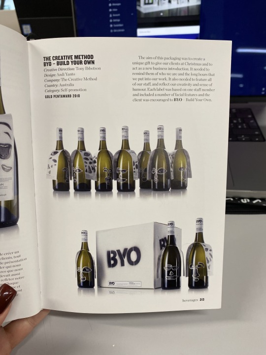


Byo - Build Your Own
This wine bottle collection offers customers the opportunity to personalise their bottles with stickers, which creates an engaging and interactive experience. It's a clever way to divert attention from the product itself to a fun activity. This enhances customer engagement even before they taste the wine.
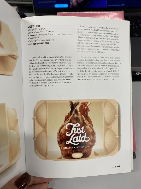
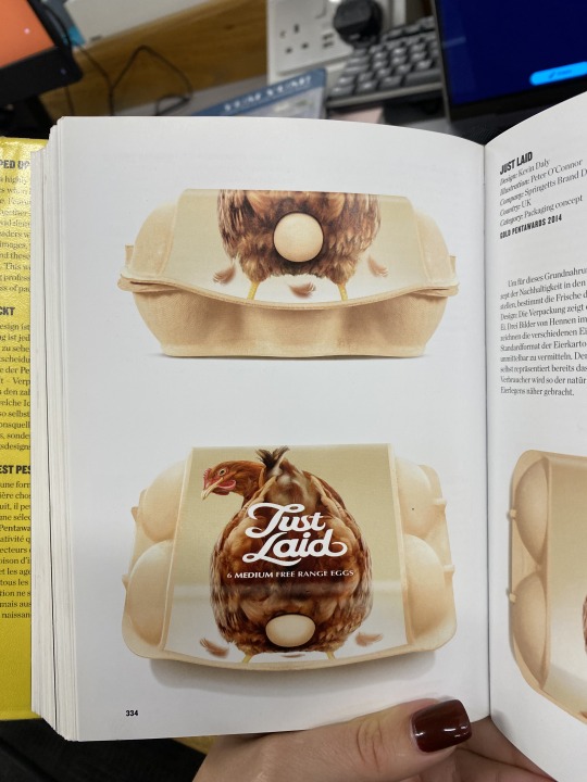
Just Laid
This brand employs simple yet memorable packaging with a brave and humorous approach. It resonates with the idea of using wit in branding to make customers smile. Among all the products mentioned, Just Laid stands out as the most memorable, which proves the effectiveness of humour in branding.
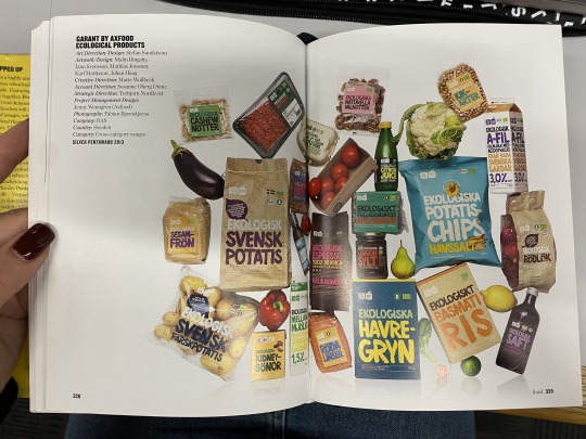
Food lines
I have looked at food line brands to gain an understanding of how consistency can be achieved throughout different packagings. The left example, achieves it through typography, despite using different colours for each product. This demonstrates how type can serve as a unifying visual element across a product line. The second brand uses flat figures of the product on each packaging to create visual cohesion while allowing for product differentiation. Kallo's approach to brand identity involves using various illustrations that correspond to the contents of each product. The abstract style creates a cohesive and visually appealing hierarchy across the product line.
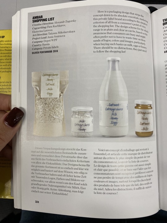
Amber Shopping List
Although this packaging design uses an idea of a shipping list that names all the essentials you might need to get, it sparked an idea of crossing out bad ingredients that are typically used in upf products. I can apply this to ingredient lists or even use it in the logo if it becomes a part of my brand identity.
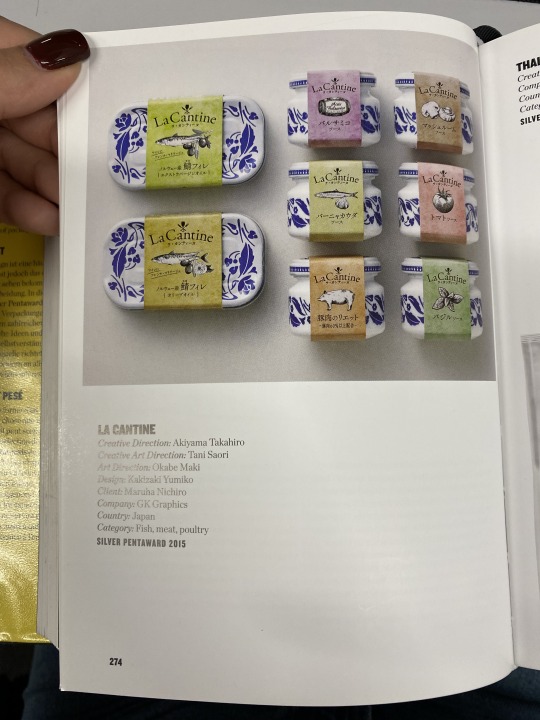
La Cantine
I liked this brand as it is sustainable and allows you to reuse the packaging. The use of paper sleeves adds an element of excitement to the packaging experience.
2 notes
·
View notes
Photo


http://www.ruslanpelykh.com/
This visual artists website stands out to me the most as you get a real taste for his work and style even in just the website layout rather than going for a classic clean look. His style is heavily influenced in the website design which is great to see as isn’t polishing it up, it’s genuine! Another artist on the Instagram hype to which is great to see, with his own following at 21k+ he is able to promote his work to a large audience. I want to develop my own audience on social media to so it’s great to see other doing well at it.
0 notes
Text
Sustainability / UPF and pollution
https://www.soilassociation.org/blogs/2022/august/24/how-bad-is-ultra-processed-food-for-the-planet/
Ultra-processed food typically undergoes extensive processing, resulting in significant waste generation, substantial water and energy usage, and elevated levels of greenhouse gas emissions. This aspect shows that processed food not only impacts our health negatively but also has detrimental effects on the environment and biodiversity.
Highlighting this factor in my project is crucial, as environmentally conscious consumers are more likely to connect with a brand on a deeper level when they understand its commitment to environmental issues.
0 notes
Text
Social platforms
With 60% of Instagram users falling within the 18-34 age range, aligning with my target demographic, I've chosen Instagram as the primary advertising platform. Additionally, Instagram users are notably active and engage with ads more frequently compared to other social platforms. To expand my reach further, I'll also design posters for public spaces, allowing me to connect with the target audience across various environments.
0 notes
Text
Lucie Corbasson-Guévenoux


I'm often drawn to vibrant illustrations, and this time, I found inspiration in Lucie's artworks to explore colour matching for my own project. Her use of a similar colour palette provides valuable insights into creating harmonious and visually engaging designs.
0 notes
Text
Presentation research


Fun ways of presenting branding/packaging:
images of the real product with stickers/text over it
photo animations
instagram story without a phone
flat design of the packaging
tote bag
0 notes
Text
Food labelling
I went back to gov.uk to make sure I haven't missed any important labels.
0 notes
Text
Food Traffic Lights

The Food Traffic Lights system offers a universal approach to distinguishing between healthy and unhealthy products. However, its complexity becomes apparent when considering that calculations are based on serving sizes, which often differ from the full size of the product. Additionally, factors such as variations in ingredients, processing methods, and nutritional density further complicate the interpretation of these labels. That's why using this system wouldn't resolve the issue of healthy and unhealthy food.
0 notes
Text
Achieving a truthful look

I asked chatGPT for tips to achieve a truthful look. This will help me with promotional materials.
0 notes
Text
Behavioural economics
This article provided valuable insights into consumer behaviour and the psychological tactics employed by other brands to influence their customers' purchasing decisions.
0 notes
Text
Motivational Theory

In explored motivational theories to promote healthier eating and encourage people to choose Truth. Maslow's hierarchy of needs suggests that addressing individuals' basic needs, such as providing nutritious food options and ensuring a sense of safety and belonging, can help motivate healthier choices. Herzberg's motivation-hygiene theory emphasises the importance of both satisfying basic needs (hygiene factors) and providing motivators like trust and recognition. By building trust with consumers through transparent communication and reliable products, they will be more keen to purchase products by Truth. Additionally, Vroom's expectancy theory shows the importance of clear communication about the expected outcomes of healthier eating, ensuring that individuals perceive the benefits.
0 notes
Text
How do you know when it's UPF?
I looked at this article, hoping that it would guide me toward visual similarities in UPF packaging, however, it only touched on ingredient lists.
It was still helpful in a way that I could analyse the links between how ultra-processed the product is and the messaging on the packaging. A lot of the time when there are health claims, there are additives. Because once again, no-one needs to explain to people that apples are healthy.
0 notes
Text
Dr Chris van Tulleken / Interview / UPF

there are now health claims on healthy products, no-one needs to explain that broccoli is healthy
real food doesn't need added vitamins
this isn't food, its an industrially produced substance
if you get rid of poverty, you will get rid of around 60% of diet related diseases
making real food affordable and available
resisting addiction is impossible, you need to go on a journey from being addicted to being disgusted, that's how you fall out of love with ultra-processed food
love and disgust are neurologically close in the brain
every ingredient in upf does you harm in some way
the height difference in kids aged 5 that eat upf and the ones that don't is 9cm; 'you can't have physiological differences without neurological', meaning that these kids are also behind in their brain development
give people resources and let them decide
you need to build a sustainable form of activism
While I gained valuable insights from reading Chris's book, watching his interview provided even deeper understanding of the ultra-processed market and his perspectives on promoting healthier food choices. The interview offered numerous insightful points, which I've listed above, and I found plenty of valuable takeaways to apply to my own work.
One key lesson I took from the interview is the importance of honesty and transparency in advertising and messaging. Rather than dictating how people should live their lives, the focus should be on providing them with information and alternatives to encourage healthier choices. This approach respects individuals' decisions and allows them to make choices that align with their own values. This also makes them feel more in control of their life, which improves their overall happiness and gives a sense of achievement.
0 notes
Text
Academic Support / Library
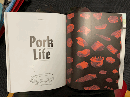

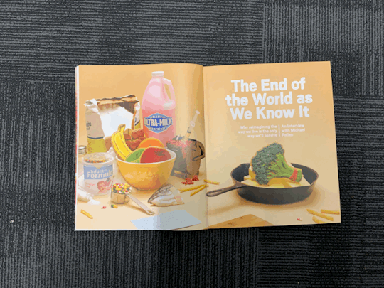

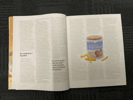


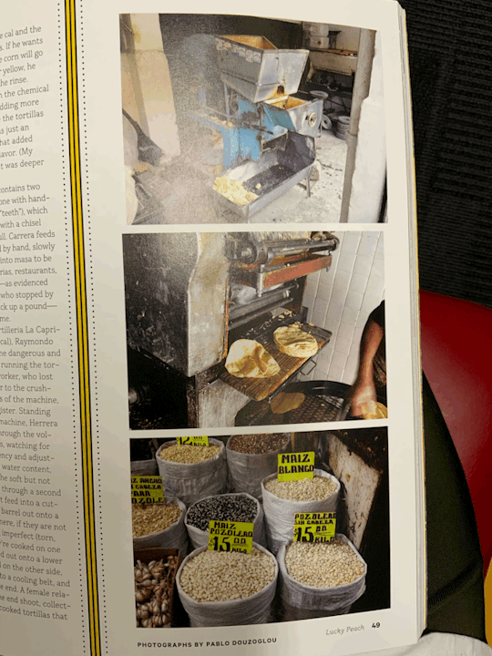
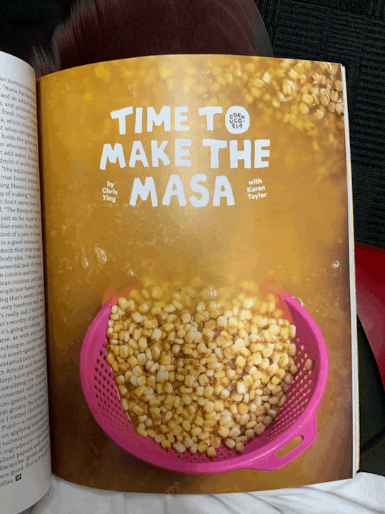
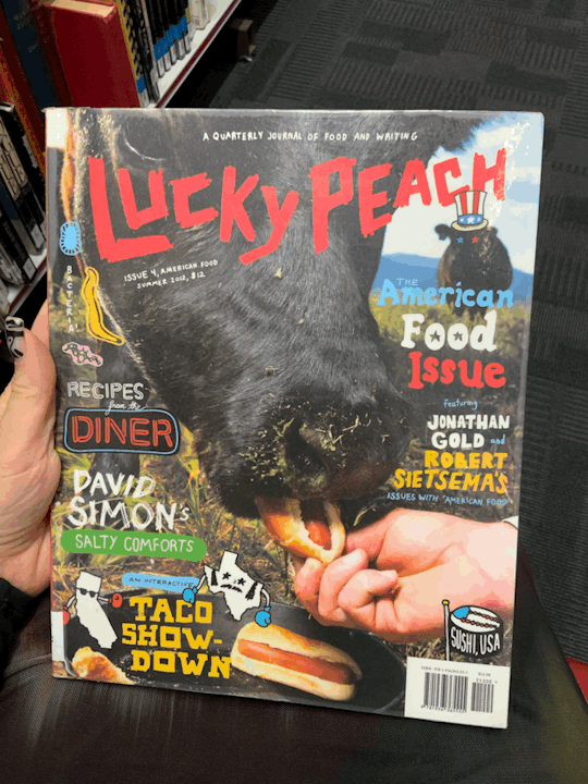


I discussed my project with Suzi and asked about available library resources on the food industry and typographical examples that effectively integrate images and text. She recommended looking into Lucky Peach Magazine, which I found really inspiring. The magazine features a bold array of visuals and thought-provoking articles centered around food. I was particularly drawn to the photography and the magazine's ability to convey complex topics through imagery.
The typefaces used in Lucky Peach Magazine struck me as disruptive yet organic. Some of the imagery was especially impactful, such as the depiction of a cow being fed hot dogs, which evokes a sense of absurdity as it confuses the viewer. However, when you think about it, humans, while also being animals, happily eat unnatural stuff. Another striking image from the Apocalypse issue portrayed vegetables in a bowl, but they were merely icing drawings on cookies, which highlights the prevalence of artificial substitutes in our food.
These visual metaphors resonate deeply and offer valuable insights. They prompt reflection on our choices and behaviours, and stress the importance of being aware.
0 notes
Text
Brand Iceberg Model

Exploring the branding iceberg model in my tutorial was a valuable suggestion. This step will offer me greater clarity and help structure my project more effectively. In the upcoming post, I'll delve into the invisible aspects of my project to define clear boundaries and ensure comprehensive understanding of my brand's objective.
0 notes
Text
Beach Studio / Branding Research / Assets
I reviewed several projects from Beach Studio, particularly those related to food, to gain insights into how they approached various aspects of branding. My aim was to research execution methods that would effectively convey the essence of my own brand. By studying their approach to different assets across various brands, I aimed to identify strategies that would best align with my brand's vision and values.


Botivo
This non-alcoholic beverage brand emphasises its ingredients and the environments where it can be enjoyed across various touchpoints. By showcasing the settings where the drink fits best, they create a mood that excites consumers and allows them to envision themselves indulging in the experience. The innocent illustration style reinforces the non-alcoholic and playful nature of the product. Through their Instagram carousel, they effectively depict the target audience and the types of individuals who would most enjoy the product, which enhances relatability and connection with the brand.


Eaten Alive
This brand specialises in sauces and fermented vegetables, and like the previous project, they showcase how their products can be enjoyed, sparking excitement among customers. This approach provides a fresh perspective that diverges from their main visual style, adding variety to their brand identity.


TYME
This brand caters to individuals who prioritise health but are short on time. Initially, the colour scheme confused me, but upon further reflection, I realised that the visual language effectively conveys the fast-paced nature of modern life. The transparent packaging underscores the brand's commitment to openness and honesty. Overall, the design is dynamic and vibrant, sparking excitement while promoting health-conscious choices. The assets showcase the product in action, illustrating its use in fast-paced environments. Additionally, the packaging is convenient, and the copy enhances the brand's mission and values.


Palace Culture
This cheese brand's presentation utilises a blend of illustrations and photography. I particularly admire how they overlay illustrations onto photographs as it effectively emphasises the brand's value of sharing. This approach not only enhances visual appeal but also communicates a sense of warmth and community associated with enjoying cheese together.
0 notes
Last Seen Blogs

loodle-doodle
Loodle
garzagatos
Norma & Zelda
mygirlycorner
My girly corner

freethelightning
LaxusMyAddiction

josephpolizzotto-blog
Untitled