#nornabihah
Photo


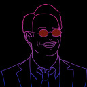
For week 2, we learnt about how to do minimalist poster.
I drew Ejen Ali and Train To Busan posters.
Firstly, the poster I did is solely focusing on the spectacle which is the main thing in Ejen Ali that is known as Iris which has some technology and has ‘Override’ mode which is why the glasses is white/holo to portray override mode. The title ‘Ejen Ali’ is solely based on the original poster, mixture of silver and red. The base background would be purple-ish and black referenced as original poster.
Secondly, I drew Train To Busan, only the train as it is the main key in the movie. Extra details such as blood/red and handprints to show the genre of the movie is thriller and suspense toward viewers. It is simple but I think it represents the movie enough.
2 notes
·
View notes
Text
Doing business without advertising is like winking at a girl in the dark. You know what you are doing but nobody else does"
Advertising is wanting to let people know you. If you have ideas, however you don’t showcase, people won’t know what you can and want to do. Therefore, comes advertising to let people acknowledge. Well-known brands are because of good advertising of them. For example, the Apple brand that is known globally. They know what they are doing and therefore they know what their targeted audiences are.
You don’t see Apple bargaining for their cheapest price, but their high quality products for those who values qualities more than quantity. Whenever they released new model, they would not need complex advertising, just simple one is enough to show the quality. Plus, the brand itself is becoming more known when the advertising is superb.
1 note
·
View note
Photo


On Week 8, we learnt about magazine covers and were described on how a good magazine cover should be. It needs to include 7 elements for it to consider as a good magazine cover for all genre. We need:
1.masthead
2. selling lines
3.datelines
4. main image
5. Main cover line
6. Cover line
7. Barcode
So, I chose 2 magazine cover specifically fashion magazine cover since I will be doing a fashion magazine cover. There are a lot of styles on how each magazine do it but I picked two that has all the elements.
0 notes
Photo

On Week 7, we learnt photoshop and cropping steps for creating a design. The lecturer has made a competition with requirement using Upin Ipin, bubble text and ourselves in a picture with Eid as the theme. Therefore, this is my design for this assignment.
First of all, I put upin ipin as required, added Kak Ros, Opah and Rembo as the characters to make it more merry. The perspective is Rembo, the chicken first then Upin Ipin, Opah, Kak Ros and me at the back.
I put shadow, only slight because it was noon setting. I also added a few decorations on the ceiling and ‘pelita’ on the left. I edit the exposure on all the characters except Rembo to make it more suitable and realistic.
0 notes
Photo

This is the final font poster that I have done.
It has 6 elements including typefaces, point size, line length, leading, tracking and kerning.
I use small ‘b’ for my name and drag the b to fit it in the poster.
The color I pick is contrast to each other. as for the texture I use oil-painting like texture with base color of pale peach.
The line length is put and adjust to be fixed and in a box. The kerning is not crowded and easily viewed. The tracking is also not too close to one another.
0 notes
Text


2 FONT SKETCHES
On week 5, we learnt hands-on to do font design poster using Adobe Illustrator by doing font sketches first. So these above are my sketches.
I chose Verdana as my typeface. It is apart of sans-serif font family and created in 1996 and rooted from Tahoma font from 2 years before. We need to list down the alphabet and numeric in Verdana font. As you can see, there are two different design with 'biha' words for my name. Both 'B' and 'b' are different sizes from 'iha' to make it as focal point. the poster is designed to have 3 different colors according to creator's creativity. Another requirement is the font much touch the edges, so therefore, the first letter is big.
For the first font, I did with capital letter and drag the 'h' while the second sketch is all small letter, I could not drag my 'h' because of the inconvenience of the letters.
0 notes
Text
TYPOGRAPHY

On Week 4 lecture, we learnt about Typography that is technique of arranging words to make language visible and readable. There are several things to look for good typography such as typefaces, point size, line length, leading, tracking and kerning.
Above are two posters I found when I was on drive on highway.
So, for the first poster, we have "CUBREMI" product. In my opinion, the text under the brand name is quite small and unreadable from a far. It should be bigger but not too big that it will overshadow the upper letters. Next the Kerning is too small. I think this is because they want to make fit the face of the woman/founder. The typefaces, line length, leading and tracking seemed fine to me.
Next is the "Cinderella" billboard. Honestly, the brand name is too small and the typefaces used is so unhelping as it contributes to the words being small for its curly style. The taglines underneath are totally lost cause because I can't even see it because of it's too small. However the typefaces used on the 'No 1 Best...' is good because the fonts are big and they are bold.
0 notes
Photo


On Week 3, we learnt about six elements that are important to have in creating a posters which are, line, shape, size, texture, color and value.
So, I picked two posters that have all these elements above.
First poster, we have a straight line on the “Lorem ipsum ipsimus...”. Next, it has the coconut tree shape that fulfill one of the element as well as the circular design. For the size element, we have different sizes for ‘Summer’, ‘Festival’. Next is color has contrast in it of green and orange thus the value focal point is a bit unclear, but in my opinion, it is to highlight the dates and genre. Lastly, the texture is the little bit of splash color and the straight lines in the background. It is a complete design, however the focal point needs to be fixed.
Second poster is a movie. The lines are the title, the quotes above area of the poster and the names of director and producer and some of them have different sizes which are fitting for sizes element. Next the color is really contrast as the orange and turquoise that we can easily see. The value is that the focal point is the characters or crews in the poster. For the shape we have round-ish shape in the background. Lastly, its background has some sort of compass and safe designs that could be considered as texture in the poster.
I chose these two poster because they all have the elements of design that make them complete and considered as a good design.
0 notes
Last Seen Blogs

3rrr3
Untitled
ghost-of-diogenes
The Holistic Universe

sarshadominoharvey
Conundrum

babyfayyy
Hi, Im Farah .
nathanblogsposts
Sem título