#not happy w composition but ok w colours
Text

Get shojo-ed idiot.
#trying smthn new#my art#Larent#Laurent Saint-Zachaire#dnd oc#dnd 5e#procreate#digital art#messing around w layers and doing. not painter-y#not happy w composition but ok w colours#Tho. did not think before starting again so#values kinda fucked.#i keep making monochromatic pale characters and it always bites me in the ass.
4 notes
·
View notes
Text

spiraling
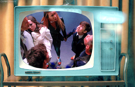
#my art#jujutsu kaisen#jjk#jjk fanart#jujutsu kaisen fanart#jjk art#megumi fushiguro#fushiguro megumi#gojo satoru#jjk spoilers#jjk manga spoilers#the minute i realized how tg coded the composition n colours were i decided to turn it up to 11#i was racking my brain trying 2 figure out how to get the layered tissue paper look tht i talked abt ishida's cover art having#cycled through all my usual layer modes n nothing ws Quite right#until wouldnt u know it . divide n subtract!!!!! i NEVER use divide or subtract bc theyre impossible#but fr this??? its like they were made for it oh my god#it makes the greys look translucent n all my textures pop in a way that makes them appear splotchy n Bruised#which ws the whole point thts the Look god i am so PLEASED#when the layer modes tht notoriously get No love finally find their niche <33 peace and love <333#filing this away fr later i am going 2 have a lot of fun with this new information i think#im very happy w how the colours look n i dont think anything else wld have kept the right Mood#but i am always so >:/ when i have to use a palette tht forces me into giving megumi blue eyes#had to set aside th green eyed megu agenda fr the Aesthetic unfortunately#anyway i knew from the minute i saw it that i wanted to do smth involving the opening panel of 268#bc that panel is S tier#i figured tht if nothing came 2 me i wld just redraw it as-is bc it's alr so good but as i ws sketching i was like#u know what u havent done in a while? art tht looks like u r going Insane#art tht makes ur family ask whether everything is ok#so i once again tucked megumi's knees up 2 his chest and apologized insincerely to him fr making the third megumi angst piece in a row#:)
3K notes
·
View notes
Text
content creator 2021 wrapped tag game
Cut this into what works for you. Want to do only one instead of five? Do it. Tag 2 people? Do it. This game is not your mum or the Apple App store to tell you what to do. But there are a couple of rules:
RULE 1: Review your creations over 2021. Tag some gifmakers/creators, friends and strangers to get them to do the same.
RULE 2: Link to the content, commentary optional.
thank you to @robinsonjudy! you are wonderful zahraa :)
5 (or more!) creations from others that made you smash the reblog button hard, closely followed by your ‘insp’ tag or ‘fave tag’. Link to sets that started conversations, outstanding composition, colouring, etc.
I’m not backing out this time, time to get you off my mind. by @seance
you have no idea how much this lives in my head rent free and i actually was insp by shatter glass effect that i used it quite a few times :) a lot of arianne’s sets are insp :)
#five of cinnamon rolls by @yenvengerberg
honestly this one was so cute and funny and becca’s skills are always just awe-inspiring. i also love her ladiesmeme :)
shadow and bone (season 1, part 1 & 2) by @meliorn
i absolutely loved this two part set. the detail in this is speculator. i am such a sucker for looking at each part of a concept set and the work this much of taken. *chef’s kiss*
the umbrella academy as a horror movie by @number5theboy / @jameszmaguire
an absolute fucking delight. i love the mix of genre and lizzie just captures it so well. plus the coloring, the clips... damn i love this set a lot :)
it’s your turn (ladies of sab) by @crow-club
i honestly such a beautiful set, i was actually staring it for awhile when i doing the ccss and this is so gorgeous kay :)
i kept it to five sets because i would be here actually all day but there’s just so much insp from so many gifmakers and thank you for it :) here’s to creating more wonderful things in 2022!
4-5 creations of which you’re proud. These are goals you scored. Nothing to do with notes.
i have a very specific tag for this lol like i really do make a lot of gifs that i don’t posts (mainly for tua when i started the rewatch, but also before then)...
one: diego and lila -> #they share one and a half brain cells (i love them <3)
two: luther and the bowling alley scene -> oh, for… (loved the coloring for the set and it always makes me laugh)
three: inej/purple coloring w/bonus quote (1.06) -> “One minute [Kaz] made [Inej] blush and the next he made her want to commit murder.” (absolute nightmare to color, it took me such a long time to get it to that shade)
four: diego -> paint me like one of your french girls (the caption is implied lol)
there is no end to our story (malina) set, this one sat in my drafts for about a week or two... because i was kind of scared of posting it. i’m primarily gif crows/kanej/soc content so it sort of felt like i was entering unknown territory... but this one kind of popped into my head and i loved the quote, so i posted it on a whim and liked it :D
3-4 creations others loved. Include the one that one that got most notes, great comments, or the classic ‘how dare you!’
tua: portraits and photographs (1/3) i lowkey loved how simple of a project this was but i think it was also just a lot of praise for the set designer and i loved seeing the tagged comments for this one because it was so funny to me
tua: tangled (2010) // tua: diego & lila paralells (1/2) i thank the one anon every day for this set because a lot of people were very delightfully confused. it was nice to see the reactions be mostly positive. plus @wyrd-syster did a fantastic parallel fic for it :)
sab: kanej (ft. jesper) + “kaz says ‘i love you weird” ok so this one wasn’t supposed to have the last gif ft but because reasons.. and i’m so happy with the end results. the comments have been fantastic. everyone loving how in character/canon this was. i love it.
sab: “[inej] laughed, and if [kaz] could have bottled the sound and gotten drunk on it every night, he would have.” tbh i just loved that this was kind of my introduced into the book quotes and those are always great to make :)
2-3 creations that stretched you as a creator: style, coloring, blending, text, etc. include the one that should have got more notes.
my diego rewatch sets lol ngl these sets take long... and ok, i wanted to do it as a selfish project because there was a lack of diego content! but i do think they push me creatively, specifically:
number five (1.05)
the white violin (1.10)
1 creation of yours that you find most aesthetically pleasing to the eye and self AND 1 creation that broke and (maybe remade you) as a creator – we all have that one.
most aesthetically pleasing to the eye and self? ladies of shadow and bone -> color palette / characteristics i made for ccss for kay... like i worked on this for awhile and there were some scenes i didn’t end up using but i was really inspired but one of her set. and i was like well if i could just figure out how to do this one thing... and i won’t lie i had no idea what i was doing but i’m so happy it turned out.
creation that broke me? hargreeves siblings + “do not stand at my grave and weep” i literally stayed up late and then i woke up early before work to fix it and because i was so sleep deprived i just posted it without editing it. i also just had really not started blending per se... but i wasn’t great at it. so this was me trying something i thought was gonna be a straightforward project and i was in near tears from it.
0 the creation that never was because nothing was working that day.
this one is easy because i have been working on it for i wanna say like two months AND I’m still like well what the fuck is it??? it’s kind of like the hargreeves in screens... like this...
like i think i just need a good quote but i’m also like ok this is a thing i’ve made... if you have a good quote pls send it my way lol (if you’ve gotten this far :P)
Overall comment on your creativity year 2021: i mean objectively i’ve made more things than the previous two years which given that i tend to disappear for long periods of times... is a good thing (if you want to see it that way). sometimes i just made sets for fun, like the incorrect set/book quote/au sets... kind of sometimes i was accidentally funny. and with the concept sets, especially the diego ones, are really the ones i wanted to use colors when i could. i really have tried to push myself. sometimes successfully, sometimes not so much. it’s been the biggest mixed bag. i’m not sure if i can continue this energy in 2022, but we’ll see :D
thank you! tagging @lilapittss @steve-harringtons @rreputatiions @kendalroys @concepts @kazs-rietvelds @mcudaredevil
and anyone who i’ve already tagged :D
happy 2022!
16 notes
·
View notes
Text
6: Brand Focus: Los Angeles Apparel
September – the season of changing leaves, pumpkin spice lattes (those are nasty but if I speak…), and – usually – back to school shopping.
However, now that life has transitioned online, there is no reason to wear anything that is uncomfortable or at least two sizes oversized on a day-to-day basis. But – and don’t fight me on this - there is nothing more satifying than new and quality loungewear.
This is where Los Angeles Apparel comes in.
The brand formerly known as American Apparel rebranded as Los Angeles Apparel – the same basics brand, full of heavyweight cotton, styles ranging from classic to contemporary, and a wide range of colours, everything from neutrals to neon colours.
After bankrupting twice, American Apparel was purchased by Canadian manufacturer, Gildan, in 2017. Gildan went on to rebrand and remove the more notable points of the company’s marketing strategy – namely, the borderline pornographic advertising and sinfully high price range (some AA products can now be purchased on websites such as Wordans and Amazon).
Founder and Montreal native Dov Charney (who has his own demons, including accusations of sexual harassment and mismanagement of funds when he ran American Apparel in 2014*) then decided to take his ideas elsewhere, introducing Los Angeles Apparel.
Now operating out of a south Los Angeles warehouse, LAA poses itself as an ethical, basics, brand, paying workers between $15-$20 USD, as well as overtime pay and benefits, and varies from other fashion retailers in the amount of transparency to behind the scenes of their warehouse and in the production process – many of the brand’s Instagram stories include shots of models, posing outside and throughout the warehouse, and well as videos of various garment and production workers at their daily dyeing, stitching, and cutting tasks. Another plus of this brand is the composition of the garments, specifically their sweatshirts and sweatpants, tops, and bodysuits. Most places do not manufacture goods with 100% cotton - traditional brands either use a 50/50 blend of cotton and polyester, or an 80/20 blend for goods in the heavyweight category. Using 100% cotton leads to a garment that looks even better with wear and tear, as well as prevents pilling, worn out elastic cuffs and hems, as well as less discolouration. Lastly, LAA is mostly devoid of branding – their clothing has no flashy logos or tags, no awkward stitching or excessive distressing, product styles, and unsavoury colour combinations – likely stemming from their roots as a wholesale blanks company. There is a bit of 90’s flavour to the styles shown on the website, included oversized sweats and t-shirts, lots and lots of pleats (pants, skirts, shorts, everything), as well as having more fresh-faced models, both men and women.
I’ve never personally been a huge American Apparel shopper – the original brand was not the most inclusive in terms of sizing as most of their items run on the smaller size (even to this day – their 2XL fits more like a very roomy XL) or were the dreaded “slim fit” (the ugliest cut of clothing to touch down on this face of the Earth, please don’t argue with me). However, since rebranding, Charney and the rest of the LAA team began to embrace more true-to-size and oversized fits. After rebuilding my wardrobe with quality basics, I can say about 80% of my wardrobe is from LAA – the pieces are good quality, minimal, and tasteful. Also, as a person who tries to be as ethical with my spending practices as possible and invest in quality clothing, I feel a bit better knowing the $40 t-shirt won’t be falling apart in the wash or after a few wears. For anyone who has considered dipping their toe into LAA or has been looking for other basics to add to their collection, here is a listed review of my favourite items from Los Angeles Apparel**.
HF09GD Unisex - Garment Dye 14oz. Heavy Fleece Hooded Pullover Sweatshirt
If I had the power to get rid of all of the hoodies in the world and replace them with only one, this would be it. This hoodie is thick as hell to the point where sometimes it feels like canvas, but not in an uncomfortable way. The colours are also super rich – my favourite one is Chocolate (one day we will talk about how brown is the supreme neutral for its ability to be and blend with both warm and cool tone colours, but I digress). Another interesting thing about these hoodies is that they don’t hold smell the way I’ve found polyester blends do and when washed, literally smell like an entirely new garment. This is also one of the products that I found is actually more of an oversized fit, and as with most cotton goods – stretch (but not unreasonably) with wear. It comes in a huge selection of colours as well and the sizing is fairly unisex, as both me and my boyfriend have worn this hoodie and have marveled at the quality. While it is an investment ($100 CAD per hoodie, about double that for the whole set), it is truly the hooded sweatshirt I’ve ever owned.
Size: XL, Colour: Chocolate, Price: $100 CAD
3380GD - Heavy 2x1 Rib Crop Tank
As our beautiful friend who was floating around Twitter not too long ago said, “Get into eeeeet!”. And she was absolutely right. This tank top is made for the people who want to get into the w*fe-beater/undershirt-as-a-shirt trend but don’t particularly enjoy the length or thinness of those traditional tops. This cropped tank is a racerback, but not to the point where it is completely unwearable without a bra, provided you have a convertible bra. This top is also 5% elastane as opposed to polyester (for those who are curious, elastane is a member of the Lycra and Spandex family, so the stretch in this top will also provide some shaping benefits). While it does only come in two colours for the time being, I’m one of those people who owns everything in my closet in both black and white, so this was perfect for me. Another thing to note, all my BBWs, this top does not roll up or require too much adjusting throughout the day, and sits just above the belly button for a cropped look without making you look like Roger the Alien (you know what I’m talking about….). This tank top is relatively affordable, considering the wearability, and the ribbing isn’t too noticeable so if you wanted a nice cropped but semi conservative top, this just might be it.
Size: L, Colour: Black, Price: $30 CAD
1215GD - Heavy Jersey Garment Dye Casual Pants
Ok, you know when you want to wear sweatpants, but you also realize that maybe the occasion is not appropriate, or you just need a little bit of pizzazz without all of the frump? This is these pants. When I first read the reviews, I was skeptical, but after realizing all I own are jeans and sweatpants, I copped a pair. I wore these in 75-degree weather, walked a good three or four miles, and was comfortable all day. Plus, unlike most traditional womenswear pants, these pockets are DEEP. Like Mariana Trench deep, which I love because one thing about me – I’m going to use a damn pocket. I would say to avoid these if you aren’t into the straight leg look because with a t-shirt, they do give very public-school art teacher vibes, but they also come in a huge range of colours. A lot of people complain about the elastic band for a lot of their products (too tight), but personally I prefer that – it provides a longer wear time before you have to wash (since it takes longer for the garment to stretch out) and keeps everything cute and covered. These pants are also a nice alternative to jeans, and even come in the couple shades of blue to mimic the idea of dark/light wash. The price is a little obscene for some casual pants, but I think you’re someone who usually wears pants from Urban Planet, H&M, or even Zara, these will be a nice upgrade, sure to last a very, very long time.
Size: L, Colour: Black, Price: $52 CAD
1406GD - Long Sleeve Garment Dye Mockneck T-Shirt
Another one of my favourite things about LAA is the fact that a lot of their products are unisex (while not explicitly labelled as such, you will see a lot of the same items in both the men and women tabs on their website). I love a good long sleeve shirt, but my proportions were never too forgiving to pull it off without looking like a 1960’s ghost, or like I had gotten dressed in the tent section of Home Depot. This top is more of a boxy fit, but the bottom is cropped enough to make it hit just above the thighs for a nice, slouchy look. The colours in these are also super nice, veering more towards neutrals and pastels. This shirt looks good with bike shorts and tucked into jeans, and (the best part) the white is not see-through at all, which was one of my biggest complaints when buying shirts from brands like Hanes, Gildan, Fruit of the Loom, and Keya. The neckline is a lot higher than most traditional crew necks, but I’m a fan. Plus, I feel like it looks a lot better when you layer jewelry over it. If you’re springing to get a basic colour, I’d say it’s totally worth it, at $41 a pop, considering that it’ll last damn near forever.
Size: XL, Colour: White, Price: $52 CAD
B128CF - Long Sleeve Crossfront Bodysuit
The bodysuit that started it all. Y’all. The number of compliments I get whenever I wear this top is insane, not to mention of all the bodysuits I have purchased from this brand, this one is the most flattering, the most versatile, and the most forgiving, in terms of sizing. The cross-front bodysuit is a happy medium for people who want to get into the criss-cross top look without the hassle of strings and shit like that. Not to mention, many bodysuits in this style tend to be ribbed – and not the good kind of ribbing either *retches*. I own this bodysuit in both a medium and a large, and my advice would be to size down, especially if you’re planning on wearing it without a bra (not much of a choice considering this bodysuit has a deep, deep, V neck) and will definitely add to the effortless look of the whole ensemble. This bodysuit can be dressed up and dressed down, but my favourite way to wear this is with some slouchy ass sweatpants, white sneakers (preferably a little beat up) and a small shoulder bag – ad square or transparent sunglasses for some big 90s energy, like you just left a Bikram yoga class or something. The colours on this could be better – aside from the white, black, and flesh toned colour, I really don’t see a purpose for the coral or blue shade, but I may be biased considering I do avoid bright colours like that. Now, it may seem a little overpriced for what it is, but I promise you – in my years of bodysuit research, the only brand that’s coming close to this, especially for larger chested laydeez, is Capezio, and that’s literally dancewear. Like, industrial ass dancewear. Regardless, this bodysuit is top 2 and it’s not 2.
Size: M, Colour: White, Price: $49 CAD
BD12 - Bull Denim Oversized Bag
If I had to give a name to my aesthetic – particularly when it comes to accessories – I’d say I’m somewhere in between “Bag Lady” by Erykah Badu and first year art student in the Midwest working part time at a dusty bookstore. This bag is more of the latter. For reference on size, it’s about as big, laid flat, as my large Telfar, but when on, doesn’t have the same structure, thus keeping it from looking like a burlap sack (or keeping you from looking like Santa on December 24th). The material is bull denim, which is similar in texture and style to regular denim, however, dyed to give it a rich and uniform colour. Also this bag comes in literally all of the ROYGBIV colours, plus black and white, and in a variety of styles and closures (they have one with a zipper for people who are diligent about things like that, as well as a more standard tote size and shape). This bag is perfect for literally everything – I like it when I go grocery shopping, or even getting from A to B when I have to carry a million things. Another bonus is the construction of the strap is thick without being comical, meaning that you won’t have those nasty lines in your shoulder after a long day, and you won’t have to worry about a strap busting and embarrazzzzing you (Nella Rose voice) when you’re out. In terms of pricing, you could get a little pleather number from H&M for the same price, but if you don’t take yourself seriously, then just say that (kidding!). as someone who loves the look of a good canvas tote, without wanting to look too much like a crunchy granola kinda person, this bag is lowkey one of my favourites (sorry, Mr. Clemens!).
Size: OS, Colour: Navy, Price: $58
Notes:
*= We do not condone predatory behaviour from anyone, but it is important to highlight that just because you love something doesn’t mean it’s perfect. Part of being a responsible consumer is also knowing about who you purchase from, not just what and how things are made. I am aware of this and am taking accountability for not knowing this information sooner.
**= All of these opinions are my own and not sponsored. Product codes will be listed in the title, and sizing, colour purchased, as well as CAD pricing will be listed at the end of each review.
2 notes
·
View notes
Text

plan from July:
-Drawabox lessons 4-5 (two weeks each - 2 pages of insects per day) ✗ finished lesson 4 except for the very last insect drawing
-finish 100 heads ✓
-studies for Shepard: textures, hands, draw mass relay, red/blue lighting ✓ (kinda - mostly focussed on hands though)
-study people interacting with everyday objects (hands) ✓
ACTIONABLES: use more references✓, plan out multiple light sources better✓, clean up lineart✗, reference faces/necks/hands in particular✓, figure out a less cartoony way of drawing eyebrows✗, try to define edges on faces more when painting✓, keep going with composition✗, try to do background in two sittings (?), study textures more (ongoing)✓, more figure drawing mannequinising stuff✓
Overview of August:
finished 100 heads challenge, nearly finished lesson 4 of DAB. Drawing all the insects has helped me analyse stuff better and also has improved my sense of 3D->2D space. Redid a few of them until they made more sense, which I think is probably a very important thing to keep doing at this stage of development.
Figure drawing improving. Need to keep trying to mannequinise them instead of falling back on ~the intuitive way~. Path of great resistance but great reward. Gave self permission to focus on interesting bits and not worry about finishing each figure. Thinking about 3D and hip/torso orientation is helping my unreferenced sketches too, which is nice.
Drew a bunch of hands but they were kinda too sketchy to actually help go to something more precise. Quality of hands in my finished art varied WILDLY this month, although they mostly look 'ok'.
Put the stuff I learned about head structure into practice with a painting - was good to actually try out defining nose/eye/lip planes. Need to keep practicing this, though, and not sure how much focus I'll be able to give it. aaaaa
During the painting, I also used lots of references (although my ability to use the information was pretty limited), tried to represent texture and learned how to blend in a more smooth way. Even though I'm not super happy with the way the finished thing turned out, I did get presented with a lot of new information - hopefully I'll retain some of that.
September plan:
finish DAB Lesson 5 (multiple pages per day if possible so I don't lose momentum)
study whatever the next step in the Radiorunner curriculum is
do 30min figure drawing/other studies at least 15/30 days
finish that damn comic
sketch out/thumbnail every prompt fill for October prompt lists
probably a busy month, but I got this!!
notes and improvements from finished stuff:
orochimaru: hands SUPER off and ended up being 'eh, kinda looks like a hand, whatever', forearm connection is kinda fucked, lines too messy/pointy to look graceful, hands don't really look like they're interacting enough
good points: tried several iterations on a difficult pose, arm movement is relatively clear, sense of energy
kylo: values WAY off & look washed out (I THINK because the background has more contrast??), hand is completely fucked up (too wide and lighting doesn't make sense on it), glove doesn't look like leather, mouth too low, cutout effect isn't done well (+ it isn't obvious whether it is a flat graphic effect or a physical sheet in front of him - drawing a thin shadow on his face didn't help here), level of messiness in foreground/background and kylo is uncomfortably different
good points: I really do like the colours (hues) even though the values are messed up, nice sense of energy from brushstrokes, the detail fadeoff in the shadows looks intentional (I mean, it was)
femshep: shadow values went too dark too quickly bc I wasn't sure how to handle multiple light sources, sunk-cost fallacy w/ left eye and/or nose (facial features are in different perspectives), overall shapes not interesting, neck connection to body is wrong, near shoulder looks dislocated even though I took a photo reference (possibly related to the neck being wrong - or maybe the strap going across her chest is oriented wrong too & flattened out), background looks messy, composition is boring, clothing folds aren't realistic, shading is too soft
good points: at least there IS some texture to everything, I LEARNED HOW TO BLEND, facial features are overall painted pretty well, nice transition between lightsources on face, hair texture and placement of texture looks really good, somehow the hand came out looking 3D with minimal effort, tried to do a lot of things I had 0 experience with and learned a lot
ACTIONABLES: CLEAN UP LINEART, reference/learn about neck-body connection & shoulders, mannequinise figures, take own clothing reference photos for exact pose instead of trying to abstract existing images (not skilled enough to do this yet), draw hands, study leather texture in particular (since it's a common material), start drawing in greyscale again
1 note
·
View note
Text
Last Thursday I shared a black and white as well as a colour photo of the composite below. I also did a two split… but thought I’d like to try a three-way effort. I hope it works for you…
Oh-ho-ho… just by the way… we are now well into the latter part of the year! Yes… where has it all gone, this thing we call 2019? Be positive… be happy and enjoy your August fool’s day, won’t you?
OK, so… here’s another take on the B&W train pics… just in case you don’t mind the above rendition…

Thursday Thought – Train… Again! Last Thursday I shared a black and white as well as a colour photo of the composite below.
0 notes
Last Seen Blogs
mimik-u
mimik-u

queerfaltneustadt
Queerfalt* - Gays, Lesbians & Friends Neustadt
vooo-doo-dolll
Raven in the Matchbox
aelaer
Stephen Strange Support Squad

scootthekoan
The Book of Hondo