#pixite apps
Explore tagged Tumblr posts
Visit Tumblr Blog
Explore Tumblr blogs with no restrictions, modern design and the best experience.
Last Seen Tumblr Blogs


Fun Fact
Tumblr has 411 employees.
Video

flickr
🎵 Me pergunta..... por ♎︎ ∂ιαηα νєηтυяє / ιηαηηα вєαυту ♎︎ Via Flickr: 🎵🎵Pode Falar ✔Follow Me DeviantArt ✔Follow Me PrimFeed ******************************************************************************** ✔Mesh Body: Ebody - Reborn Body 1.69.6 Update- @Mainstore ✔Boobs: Ebody - Waifu Boobs - @Mainstore ✔Rings: [VIPERA] - Cece Rings - @Mainstore ✔Bodysuit: Effervescence - Gerta Lace Suit (Bom&Materials APP) - @Tres Chic ✔Bracelets: [piXit] - Gerta Bracelets - @Tres Chic ✔Pose: [piXit] - Gerta Pose Pack - @Tres Chic
0 notes
Text
Announcing Grayscale Category in Pigment.

In the next couple of weeks, we at Pixite are excited to bring grayscale coloring to Pigment! While Pigment has long offered the ability to import photographs and other images, (a process that renders them in shades of gray and allows artists to reintroduce color using Pigment’s tools,) we’re thrilled now to offer a new category of themed coloring books, full of gorgeous, high-resolution images that have been carefully selected for their responsiveness to the special techniques of grayscale coloring. Since the term “grayscale” can refer to several things in the art and coloring world, we’d like to take a moment to go over the term and talk more about what awaits artists in the app.
“What is grayscale?”
Simply put, it’s complicated—But don’t let that scare you. The experience of grayscale coloring could become your next creative obsession once you give it a try! The best place to start is to understand the term and the different, but related, things it refers to. “Grayscale” can mean any or all of the following:
The literal definition of the term which is the gradient, or expression of the range of shades and tones, between pure black and pure white. Johnny is using a grayscale palette—his “colors” are all just differing intensities of black and white.
The general category of images that are rendered in this gradient format, which often includes but is not limited to photography. Johnny’s favorite kind of pictures are grayscales—whether it’s a photo of a dog or a sketch of a tree.
The specific category of coloring pages, both analog and digital, that are rendered in this gradient format. Johnny’s favorite kind of coloring books are grayscale coloring books...he just loves the realism grayscales inspire!
The techniques and processes associated with introducing color to these images. Johnny has a lot of experience with grayscale coloring.
The literal definition of the term which is the gradient, or expression of the range of shades and tones, between pure black and pure white. Johnny is using a grayscale palette—his “colors” are all just differing intensities of black and white.
For the purposes of advanced/adult coloring, the term “grayscale” most often refers to the namesake category of images and the techniques involved in coloring them. While any image can be turned into the familiar black-and-white by stripping the color information away, that does not necessarily result in an image that will provide the best canvas for grayscale coloring. Great grayscale coloring starts with a great grayscale coloring page and that requires a unique balance of darker and lighter areas, both in quantity (the overall amount of black and white in a picture) and in quality (the intensity of those black and white areas—that is, how dark or how light those areas are). The images we’ve curated for you in Pigment are perfect for grayscale coloring because they represent that critical balance of light and dark that will help you make your grayscale colorings look their best.
“How do I add color to a black and white image in Pigment?”
Since grayscale images are much more complex than the line art images that have historically filled the Pigment library, they do not respond to the “automatic” and “advanced” coloring modes. Those modes rely on simple, clear black lines that separate white areas from one another. With grayscales, there are no obvious black lines or pure white areas to separate from one another, so the best mode to work in is Pigment’s “freehand” mode. This mode is also the most realistic coloring mode since it mimics analog coloring by placing no restraints on where color is deposited when touching the “paper” (screen). We’ve made things a little easier by ensuring that when you open a grayscale coloring page from one of our grayscale books, you’ll automatically be put in “freehand” mode so you don’t have to remember to switch over. Just like paper coloring, you’ll be free to move across the page and place color anywhere; there are no lines to color in or outside of which means you’ll be in charge of making sure color goes where you want it to go. The great thing about digital coloring in Pigment is that if (whoops!) color goes where you don’t want it to, you can always undo your stroke or use the eraser tool. You can also color directly over another color and eliminate any mistakes you might make that way. How cool is that?!
“Is there a right or wrong way to color grayscales?”
Nope! However, there are some tools that will work better than others for coloring grayscales in Pigment. There are also some techniques that you can use to get the most out of grayscale coloring and maximize the “wow factor” of your finished images.

The tools:
In general, the basic brushes (such as pencil, marker, airbrush, paintbrush, and oil brush) and basic fills (such as plain fill and pillow fill) will give you more control and result in a better grayscale coloring experience than the patterned brushes (like the wood brush) and patterned fills (like the floral fill). Also, keep in mind that since you’re working in freehand mode, all fills will literally fill your entire picture because there are no boundaries between areas like you see with simpler, line art images. This can be useful if, for example, you’re coloring a grayscale portrait where most of the image will be skin tones—you can use the plain fill tool to deposit an entire layer of color and then go in with one of the brush tools and refine that color by adding light and dark versions of different colors, (check out the instructional video here to see what we mean: How To Color Grayscale)
“Can I import my own grayscale images?”
You can. We’re making it easy to enjoy grayscale coloring by curating gorgeous, high-resolution images that we know will respond well to grayscale coloring techniques...something that isn’t always true of imported images. We’re also simplifying things for you by making sure you’re automatically placed in the correct coloring mode when you’re working on a grayscale image from the library. You’ll still be able to import images and color them just as before, but we invite you to take advantage of our themed, curated collections and see if you have as much fun experimenting with grayscale coloring as we do.
We can’t wait to witness the creativity grayscale coloring inspires amongst our community of artists. Be sure to share your work in the Gallery and we’ll see you there!
+++++
Art painted by: @AmeliahMariah @Chr22840 @brady
Pigment - Adult Coloring Books
#grayscale#black and white#black & white#B&W#coloring#painting#adult coloring book#coloring book#pigment#pigment app#pigmentapp#pixite#pixite apps#pixiteapps
1 note
·
View note
Text
software that pretends to be free but only offers you a very, VERY hobbled version of itself and wants a weekly subscription for any of the features that would make it even remotely useable is the woooooooooooooorst
all I want is to fuck around with shapes so I can figure out how I’m doing my quilt because the weird-as-hell aspect ratio makes it really hard to suss out on paper; just let me pay all at once and have done with it instead of bleeding me slowly
#talkin' to you pixite#i like the idea of assembly i do not like how you've presented it#which reminds me i need to uninstall the 2011 office suite because it's officially dead and i'll have to use mac's native office apps
1 note
·
View note
Text
Creating my Steampunk Penguin in Pixite Assembly vector graphic app.
13 notes
·
View notes
Link
creative journaling -- ZInnia is a digital journaling app the iPad, relevant bullet journaling, creative journaling, art journaling.
1 note
·
View note
Text
Coloring Apps Market to Observe Strong Growth to Generate Massive Revenue in Coming Years
Latest study released by AMA Research on Global Coloring Apps Market research focuses on latest market trend, opportunities and various future aspects so you can get a variety of ways to maximize your profits. Coloring Apps Market predicted until 2027*. When the rest of the world is going digital, there's no reason for Coloring to be left behind. Hence, welcome to the realm of digital coloring with these new appealing designs. Apps for Coloring The Recolor Coloring app 2022 takes coloring to the next level with its 3 Dimensional Coloring Objects, which deliver a high-quality painting experience. It includes a variety of 3-D templates in addition to the original 2-D patterns, giving a three-dimensional coloring experience. Coloring apps have been around for quite some time. Adults performing them to reduce stress, on the other hand, is a relatively recent concept. In the current situation, it's more or less acceptable for adults and children to use a coloring app. On platforms like IOS and Android, there are a variety of coloring book apps. Many coloring applications claim to be services as well as charge on a weekly, monthly, or yearly membership basis.
Some of Key Players included in Coloring Apps Market are
Recolor (Finland)
Pixite Inc. (United States)
Shapefactory (United kingdom)
Veraxen (Cyprus)
Colorfly (United States)
Sumoing (Finland)
Fabros (Belarus)
Beresnev Games (Czech Republic)
Market Trends: Increasing Awareness Among Consumer Regarding The Benefit Of Coloring Application
Drivers: High Accuracy In Designs With Rate Of Human Error Is Minimal
Increasing Penetration Of Internet
Challenges: Device Compatibility With Coloring Application
Opportunities: Growing Demand From Emerging Economics Market Such As China, India, Brazil, Among Others
The titled segments and Market Data are Break Down by Type (Paint Mandalas, Patterns, Animals, Florals, Thematic Images), Application (Adults, Kids), Platform (PC, Tablet, Smartphone), Subscription Options (Weekly, Monthly, Yearly)Presented By
AMA Research & Media LLP
0 notes
Text
My only regret in switching from an Apple to an android phone is that I can no longer use the Assembly app from pixite. Like, a vector art program with a selection of drag and drop geometric shapes?? That i can easily edit the vectors of?? I miss this. Apple why
1 note
·
View note
Text
27 Striking Examples of Minimal Design That'll Kickstart Your Creative Process
New Post has been published on https://tiptopreview.com/27-striking-examples-of-minimal-design-thatll-kickstart-your-creative-process/
27 Striking Examples of Minimal Design That'll Kickstart Your Creative Process

If you’ve been on the internet, chances are you’ve come across stark, simple websites or ad creative. In fact, this design sensibility — known as minimalist design — has been rising in popularity, though it’s far from a passing trend.

What is minimalist design?
Minimalism is a design aesthetic that embodies the phrase “less is more.” With minimalist design, you push an idea by stripping it down to essential (sometimes bare) elements, using clean, modern, and minimal aesthetic, font, and color choices.
Whether you’re curating an Instagram feed or designing a web page, there are plenty of advantages to minimalist design.
Minimalist Graphic Design
Rather than bogging your audience down with vibrant patterns or paragraphs of text, a minimalist approach allows you to focus on a few key components of your brand you feel are truly important.
However, minimalist isn’t as simple as white space. To avoid creating boring or uninspiring designs in your attempt to become minimalist, it’s critical you take a look at some successful examples of minimal design, ranging from posters to logos, to kickstart your creative process.
1. Braga Da Cruz
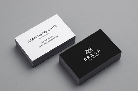
These Braga Da Cruz jewelry store business cards, designed by Luke Halota, are a good example of how minimalism can help brand name stand out on the page. Halota uses grids to center the company name on one side, with a small, unobtrusive logo placed above. On the back, he makes sure to use simple white space to make Francisco Cruz the focal point.
2. Visme
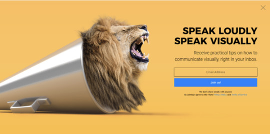
Minimalism doesn’t have to be boring. Here, Visme created a pop-up ad where the primary focus remains on the “Join us!” blue button, which contrasts nicely against the orange background. Additionally, to grab the viewer’s attention, Visme placed a large lion’s head image on the left side of the ad.
3. Heather Shaw Book Design

Heather Shaw ensures true simplicity in her Ocean Conservancy book, which grabs the reader’s attention with minimal text and colors. The information is plainly outlined and easy-to-follow. Additionally, there’s a lightly outlined sketch of an ocean behind the text — while not overbearing, it adds texture to the design.
4. Helix Sleep by Stefanie Brückler

These Helix Sleep referral cards look both sleek and helpful. Stefanie Brückler uses contrasting colors and clean font to ensure the cards can do their jobs without seeming unoriginal.
5. Pixite by Peter Komierowski

On his page, Komierowski explains, “I was asked by Pixite to create a set of nature-inspired shapes for their app Fragment.” Ultimately, his design is aesthetically-pleasing and fun, with simple, cohesive lines that form the shape of a fox.
6. Mastercard by Pentagram
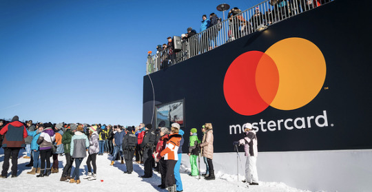
One of the most iconic minimalist designs, Mastercard’s financial design is undoubtedly a staple of the brand. The simple red and orange circles signify connectedness and seamlessness. The circles are recognizable enough that Mastercard can use the icon in place of any brand text, and still convey its ownership.
Minimalist Web Design
You can take the tenets of minimalist design and apply them to brand websites, resulting in clean interfaces that guide users where you need them to go. Here are great examples of minimalism used on the web:
1. Huge Inc.
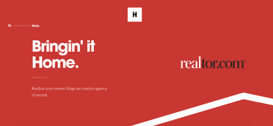
Huge Inc.’s homepage is clean and polished, with minimal text to ensure a new viewer doesn’t feel overwhelmed by the page. Additionally, the small details — like the black that appears in the logo as well as the second half of realtor.com, and the small jagged line in the bottom right corner — signify a sense of cohesiveness.
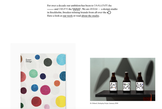
2. Bedow
Bedow, a Stockholm-based design studio, knows its viewers priorities, and thus doesn’t waste time with a busy homepage — instead, they include a short blurb about their studio, and then leave a section of white space before displaying some of their designs.
3. Reducing the Obvious
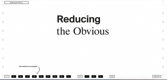
One of the more simple designs in the list, Reducing the Obvious’s design is compelling and mysterious, with little information displayed on the homepage. However, the page is still helpful and inviting, with a small “Use buttons to navigate!” command in the bottom left.
4. Jorgeriera Flores
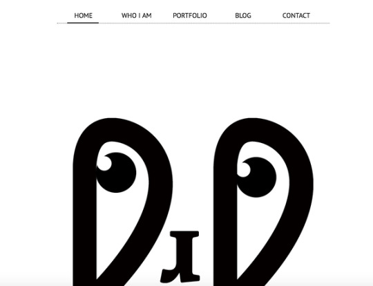
Jorgeriera Flores’ page is fun and inviting, with a blinking, life-like design and a clean navigation bar. Additionally, the creature’s nose serves as a “J”, demonstrating Flores’ attention-to-detail.
5. Design Co.

Oftentimes, minimalist design enables a brand to convey its purpose more powerfully than it could with a busier page. Design Co., for instance, is able to capture the viewer’s attention with its compelling message — spreading the creative spirit across 7,107 islands — by ensuring its background, while colorful, is devoid of distracting add-ons. Additionally, the small white logo serves to reinforce their main point.
6. Evoulve

It’s impossible to see a page like this and not find yourself curious to explore further. Evoulve does a good job expressing a sense of innovation and sleekness — with its world-icon and bright, futuristic design — without needing any additional text or imagery to compel the user to explore further.
7. Tim Brack

Brack’s use of white space and overlapping elements serves to create a clean and inviting homepage. Additionally, the photo of himself with a pig highlights a sense of playfulness and humor, and you’re able to obtain most relevant information — including Tim’s title as art director — instantly, without any distraction.
8. Tinker

Minimalism is often accomplished best when a brand knows exactly why a visitor might come across their website. In this case, Tinker understands its viewers are looking to browse and potentially purchase a watch, so it aims its design-elements to drive attention toward that single purpose.
9. ETQ Amsterdam

The close-up of the shoe offers a new viewpoint, making ETQ’s homepage intriguing and original even in its simplicity. Additionally, the small white font looks simple and clean against the photo background.
Minimalist Logo Design
The logo is one of your most important elements in your design arsenal. You don’t want a beautiful minimalist design to be supported by a clunky and overdone logo. These brands used minimal logos to support the feel of the rest of their brand:
1. UBAR
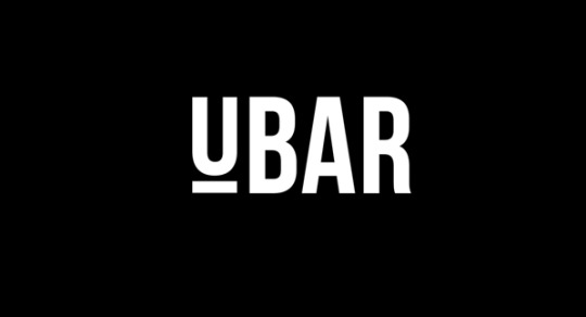
The bold block text and black-and-white contrast lends itself well to Simon McWhinnie’s UBAR design. The simplicity allows the text to dominate the logo and evokes a sense of power and strength.
2. Cloud Bed by Michael Spitz

If you have one product you sell well, why complicate it? This logo, designed by Michael Spitz, communicates the brand’s product — bedding — without text. Additionally, it’s clean and calming, particularly with the use of light blue and white, which ensures a sense of calmness for the viewer.
3. Varnom Ross by Bibliothèque

Varnom Ross’s logo is bold, powerful, and striking. Additionally, the replicated box shape around the Varnom, used again as the “o” in Ross, signifies a sense of cohesiveness.
4. The Row Apartment Homes by PurdyLogo

This logo looks retro and funky, but it uses plenty of white space, as well as white lines within the letters, to maintain simplicity. Additionally, the colors work well together, ensuring “Row” stands out most prominently in the logo.
Minimalist Poster Design
Posters need to say a lot in a finite amount of space. That’s why minimalism works so well in poster design. Here are some great examples that support this idea:
1. Miselu

Miselu’s graphic design undoubtedly supports the notion that less is more. On their page, Miselu explains the design as “simultaneously edgy, approachable, and clearly expresses our core business: music”. Ultimately, these posters, along with their other designs, reinforce their core products while remaining simple enough to be adaptable as their brand changes over time.
2. Ilmars Rumpeters
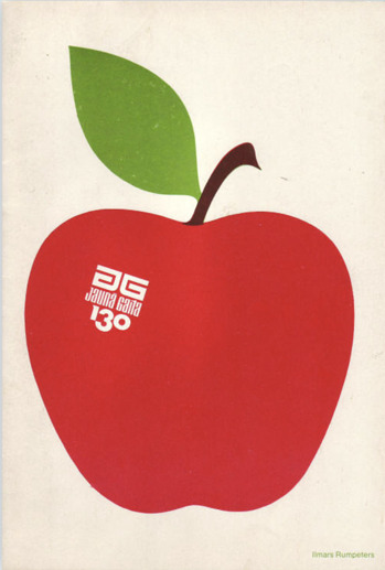
Ilmars Rumpeters created multiple simple covers for Jauna Gaita magazine, and this one in particular stands out as attention-grabbing and bold, with its vibrant colors and intriguing font. With minimalism, you want your focus to be on one or two elements — in this case, Rumpeters succeeded in drawing primary attention to the apple, and then to the magazine title itself.
3. Paul Rand

Paul Rand, a famous logo creator and graphic designer, created this poster to advertise the International Design Conference in Aspen, 1966. Ultimately, the piece is intriguing and complex even in its minimalism, causing viewers to likely pause and wonder over the significance of the black splatters or egg-shape in the background.
Minimalist Text Design
You’ll notice in each of the designs above, the text is chosen intentionally and displayed in a way that adds rather than detracts from the visual elements. With a minimalist design, one of the first things you’ll want to consider is the font choices used throughout the website or marketing collateral. You’ll want to choose fonts that are:
Crisp
Clear
Legible
Easy to read (even at small sizes)
Simple
Consistent
Geometrical
Here are some examples of fonts used in minimalist design:
1. Open Sans

Because serifs can be more difficult to read, especially on the web, minimalist designs often use sans-serif fonts. Open Sans is the quintessential sans-serif font (except perhaps Arial) and is easy-to-read and modern. The body text in particular is particularly crisp, making it ideal for long-form text in a minimalist setting (like a blog).
2. Libre Baskerville

Even though sans-serif fonts are a staple of minimalist design, serifs still have their place. Libre Baskerville does a great job of providing an air of elegance and class without sacrificing readability. The body text is just as easy on the eyes as Open Sans, and even the italicized subeading text is legible (though you wouldn’t want to rely on it too much).
3. Montserrat

Montserrat has some lovely rounded lines, making the letter shapes easily recognizable, and the italicized subheading provides a more dynamic look when paired with the bold headers and clean body font.
4. Poppins

Minimalist text design certainly doesn’t mean devoid of personality, as you can see from the graphic, web, and poster designs above. Poppins is a great font family that adds a bit of fun to the minimalist style with overly rounded and almost cartoonish letters. At the same time, it looks modern and professional.
5. Overpass

Overpass provides a more industrial look with its narrow letter shapes and sharp corners.
Now that you’ve seen several iterations of what minimalist design looks like in action, you can begin to create your visual marketing strategy and design marketing materials that supports your brand in a clean and modern but still attractive way.

Editor’s note: This post was originally published in February 2019 and has been updated for comprehensiveness.
Source link
0 notes
Text
22 Striking Examples of Minimal Design That'll Kickstart Your Creative Process
Whether you're curating an Instagram feed or designing a web page, there are plenty of advantages to minimalist design.
Rather than bogging your audience down with vibrant patterns or paragraphs of text, a minimalist approach allows you to focus on a few key components of your brand you feel are truly important.
However, minimalist isn't as simple as white space. To avoid creating boring or uninspiring designs in your attempt to become minimalist, it's critical you take a look at some successful examples of minimal design, ranging from posters to logos, to kickstart your creative process.
Minimalist Graphic Design
1. Braga Da Cruz
These Braga Da Cruz jewelry store business cards, designed by Luke Halota, are a good example of how minimalism can help brand name stand out on the page. Halota uses grids to center the company name on one side, with a small, unobtrusive logo placed above. On the back, he makes sure to use simple white space to make Francisco Cruz the focal point.
2. Visme
Minimalism doesn't have to be boring. Here, Visme created a pop-up ad where the primary focus remains on the "Join us!" blue button, which contrasts nicely against the orange background. Additionally, to grab the viewer's attention, Visme placed a large lion's head image on the left side of the ad.
3. Heather Shaw Book Design
Heather Shaw ensures true simplicity in her Ocean Conservancy book, which grabs the reader's attention with minimal text and colors. The information is plainly outlined and easy-to-follow. Additionally, there's a lightly outlined sketch of an ocean behind the text -- while not overbearing, it adds texture to the design.
4. Helix Sleep by Stefanie Brückler
These Helix Sleep referral cards look both sleek and helpful. Stefanie Brückler uses contrasting colors and clean font to ensure the cards can do their jobs without seeming unoriginal.
5. Pixite by Peter Komierowski
On his page, Komierowski explains, "I was asked by Pixite to create a set of nature-inspired shapes for their app Fragment." Ultimately, his design is aesthetically-pleasing and fun, with simple, cohesive lines that form the shape of a fox.
6. Mastercard by Pentagram
One of the most iconic minimalist designs, Mastercard's financial design is undoubtedly a staple of the brand. The simple red and orange circles signify connectedness and seamlessness. The circles are recognizable enough that Mastercard can use the icon in place of any brand text, and still convey its ownership.
Minimalist Web Design
1. Huge Inc.
Huge Inc.'s homepage is clean and polished, with minimal text to ensure a new viewer doesn't feel overwhelmed by the page. Additionally, the small details -- like the black that appears in the logo as well as the second half of realtor.com, and the small jagged line in the bottom right corner -- signify a sense of cohesiveness.
2. Bedow
Bedow, a Stockholm-based design studio, knows its viewers priorities, and thus doesn't waste time with a busy homepage -- instead, they include a short blurb about their studio, and then leave a section of white space before displaying some of their designs.
3. Reducing the Obvious
One of the more simple designs in the list, Reducing the Obvious's design is compelling and mysterious, with little information displayed on the homepage. However, the page is still helpful and inviting, with a small "Use buttons to navigate!" command in the bottom left.
4. Jorgeriera Flores
Jorgeriera Flores' page is fun and inviting, with a blinking, life-like design and a clean navigation bar. Additionally, the creature's nose serves as a "J", demonstrating Flores' attention-to-detail.
5. Design Co.
Oftentimes, minimalist design enables a brand to convey its purpose more powerfully than it could with a busier page. Design Co., for instance, is able to capture the viewer's attention with its compelling message -- spreading the creative spirit across 7,107 islands -- by ensuring its background, while colorful, is devoid of distracting add-ons. Additionally, the small white logo serves to reinforce their main point.
6. Evoulve
It's impossible to see a page like this and not find yourself curious to explore further. Evoulve does a good job expressing a sense of innovation and sleekness -- with its world-icon and bright, futuristic design -- without needing any additional text or imagery to compel the user to explore further.
7. Tim Brack
Brack's use of white space and overlapping elements serves to create a clean and inviting homepage. Additionally, the photo of himself with a pig highlights a sense of playfulness and humor, and you're able to obtain most relevant information -- including Tim's title as art director -- instantly, without any distraction.
8. Tinker
Minimalism is often accomplished best when a brand knows exactly why a visitor might come across their website. In this case, Tinker understands its viewers are looking to browse and potentially purchase a watch, so it aims its design-elements to drive attention toward that single purpose.
9. ETQ Amsterdam
The close-up of the shoe offers a new viewpoint, making ETQ's homepage intriguing and original even in its simplicity. Additionally, the small white font looks simple and clean against the photo background.
Minimalist Logo Design
1. UBAR
The bold block text and black-and-white contrast lends itself well to Simon McWhinnie's UBAR design. The simplicity allows the text to dominate the logo and evokes a sense of power and strength.
2. Cloud Bed by Michael Spitz
If you have one product you sell well, why complicate it? This logo, designed by Michael Spitz, communicates the brand's product -- bedding -- without text. Additionally, it's clean and calming, particularly with the use of light blue and white, which ensures a sense of calmness for the viewer.
3. Varnom Ross by Bibliothèque
Varnom Ross's logo is bold, powerful, and striking. Additionally, the replicated box shape around the Varnom, used again as the "o" in Ross, signifies a sense of cohesiveness.
4. The Row Apartment Homes by PurdyLogo
This logo looks retro and funky, but it uses plenty of white space, as well as white lines within the letters, to maintain simplicity. Additionally, the colors work well together, ensuring "Row" stands out most prominently in the logo.
Minimalist Poster Design
1. Miselu
Miselu's graphic design undoubtedly supports the notion that less is more. On their page, Miselu explains the design as "simultaneously edgy, approachable, and clearly expresses our core business: music". Ultimately, these posters, along with their other designs, reinforce their core products while remaining simple enough to be adaptable as their brand changes over time.
2. Ilmars Rumpeters
Ilmars Rumpeters created multiple simple covers for Jauna Gaita magazine, and this one in particular stands out as attention-grabbing and bold, with its vibrant colors and intriguing font. With minimalism, you want your focus to be on one or two elements -- in this case, Rumpeters succeeded in drawing primary attention to the apple, and then to the magazine title itself.
3. Paul Rand
Paul Rand, a famous logo creator and graphic designer, created this poster to advertise the International Design Conference in Aspen, 1966. Ultimately, the piece is intriguing and complex even in its minimalism, causing viewers to likely pause and wonder over the significance of the black splatters or egg-shape in the background.
from Marketing https://blog.hubspot.com/marketing/minimal-design
0 notes
Text
There’s a new coloring book by Steve McDonald for Pigment.

We’re thrilled to announce “Home Sweet Home”, our latest artist collaboration and coloring book for Pigment.

Steve McDonald is an International best selling Canadian illustrator and artist. He is the creator of the Fantastic series of coloring books from Chronicle and has also done illustration work for Amazon, Entertainment Weekly, Architectural Digest, and Blue Man Group among others. His distinctive and detailed line drawings are recognized around the world. Steve is also known for his fantastical illustrations of imaginary places and vehicles. Steve studied editorial illustration and fine art at The Ontario College of Art and Design. Steve, his wife, and two teenage daughters call Ontario home but have spent time living in India, Italy, Indonesia, and the Middle East.
We had a few questions for Steve, and he was kind enough to answer them for us. Can you describe the time when you first realized that creating was something you absolutely had to do? I always wanted to be a visual artist. For as long as I can remember. I was lucky that way, I was going to do this no matter what. My grandmother was an artist and when I was little just the site of her paint box full of oils and brushes filled me with awe. It was a sort of magic as far as I was concerned...the ability to capture a scene or person on a panel or canvas with color and lines, to make it your own...I was determined to do this. My tools have changed over the years, I mainly use a tablet and a stylus now, but the same wonder remains. The act of image crafting - whether it be for drawings for coloring books, full-color magazine illustrations, web images or even fine art was always the only option for me - and I consider myself fortunate to do what I love for a living.

What’s your favorite thing you’ve ever created? My favorite artistic creation would have to be the Fantastic coloring book series from Chronicle. It was an incredibly rewarding experience in so many ways. The series consists of five books - Fantastic Cities, Fantastic Structures, Fantastic Collections, Fantastic Planet and Fantastic Machines. They have become an internationally best-selling series with over half a million books in print. They have been published in more than 30 countries and have been translated into more than twenty languages. The project allowed me to widely showcase and share the work I love doing the most - my detailed line drawings - in a way that so many people could enjoy them and also be encouraged to get creative themselves. The idea that the books gave many people a mindful break from the busy world around them was such a pleasant surprise. I received countless letters remarking on how the coloring books helped people get through various personal challenges. Any kind of creativity is good for the soul, the fact that this project was so successful at helping others be creative has to be the most rewarding part of it all.

What’s the best advice you ever had about how to be more creative? Don't be so critical. Have fun. Create what you want. Experiment. The act of creation can be a personal one. Try not to think about the result but the process. I truly believe we should all draw more. Play more music. Write more poetry. About what? Whatever it is about the world that resonates with you. Document it. Record it. Paint it. Write it down...your view is valid and interesting. So much of life is 'creating'...the clothes you wear, the way you decorate your house, your hairstyle, even the way you lay out your desk...enjoy those acts of creation and let yourself be original or singular. In the world today we are so busy and online so much of time that any act of creation becomes a challenge. Sometimes we need to turn off the noise, get offline, take a walk outside and let your true self emerge in order to find that creative center in ourselves. Are there other coloring book artists or illustrators that inspire you? There are so many coloring book illustrators that I admire. Carlo Stanga is wonderful at architecture. He has such a beautiful nostalgic style. The coloring books of Kerby Rosanes are amazingly imaginative and detailed. I think you have to give Johanna Basford credit as well...she was really the first to recognize a market for adult coloring books and her work is really wonderful. As far as other illustrators that I admire, there are so many. I've been spending a lot of time looking at anime lately. I love the artwork from Tekkonkinkreet by Taiyō Matsumot - It was directed by Michael Arias, which established him as the first non-Japanese director of a major anime film. The story was based on the homonym three-volume seinen manga series by Taiyō Matsumoto, which was originally serialized from 1993 to 1994 in Shogakukan's Big Comic Spirits. I'm also a huge fan of the wonderful art of Teikoku Shônen Aka Imperial Boy. His cityscapes are so rich with life and detail. You can look at them for hours. I also love good traditional painting. The work of William Fisk, he paints super realistic huge canvases of everyday objects, is mesmerizing in its detail but still quite expressive. I love the interior spaces and figurative work of Zoey Franks - her use of color is so bold and brave. Speaking of figurative work, the paintings of Daniel Hughes are worth exploring. His subtle style of playing with light on the human form is so effective. Nathan Walsh's architectural drawings/paintings are super fun to contemplate.
Richard Hind is an illustrator/artist I follow on instagram, I love his line drawings. Vera Berezina is another. Her architectural drawings are a delight to look at. Roman Maklakov's work is also really amazing...I could go on and on here. I do love the fact that social media (especially Instagram) has allowed so many artists to exhibit and share their work with a wide audience. There is so much inspiration to find there. It's worth exploring.
+++++
Find Steve online: https://sdmcdonald.com/
https://www.instagram.com/stevedmcdonald/ https://www.facebook.com/fantasticcities/ https://www.facebook.com/artbysteve/
Purchase Fantastic Cities:
https://www.chroniclebooks.com/fantastic-cities.html
Interested in Pigment? You can find everything you need right here.
Happy painting! Team Pixite
#adult coloring books#coloring books#painting#illustration#drawing#Steve McDonald#pigment#pigment app#pigmentapp#pixite#pixite apps#architecture#interview#process#artistic process
1 note
·
View note
Text
Braavo raises $6M for its app financing business
Braavo, a startup that provides financing to mobile app developers, is announcing that it has raised $6 million in Series A funding.
The might not seem like much compared to the $70 million that Braavo announced raising last year, but that was debt financing, used to loan money to developers. This new round is equity financing, used to fund Braavo’s own operations and growth.
Co-founder Mark Loranger told me Braavo was founded in 2015 in response to the “new dynamics” of mobile app businesses. And it’s worked with developers including Verv, Fanatee an Pixite.
“The data is there to create ways to provide financing to companies that otherwise would have to raise more [venture funding] and dilute themselves,” Loranger said.
For its first financing product, Braavo looks at Apple App Store and Google Play data, specifically the amount of money already earned by an app but not yet paid out. It can then provide an advance on some of that revenue.
Loranger described Braavo’s newer product as “more exciting” and “more data-driven.” It looks at user acquisition, user engagement and revenue, projecting how revenue would grow if a developer had more money for user acquisition — and then it can provide debt financing for that growth.
Braavo gets paid back as “a fixed percentage of future earnings,” Loranger said, so its incentives are aligned with the developers: “We only make our money back as they earn more revenue in the future.” And if app revenue doesn’t grow as anticipated, that just means Braavo gets paid back more slowly.
“We’ve never, ever lost a dime,” he said.
The company is also announcing the launch of a new analytics product that will allow businesses to track key metrics like the lifetime value of their customers.
Loranger said this will be available for free to anyone to anyone with a “revenue-generating mobile app business.” Rather than charging for the product directly, the goal is to “create more success for mobile app business that may end up qualifying for funding.”
The new round brings Braavo’s total equity financing to nearly $8 million. It was led by e.ventures, with participation from SWS Venture Capital (founded by Green Dot CEO Steve Streit) and Shipt CEO Bill Smith.
0 notes
Photo

Throw it over those mountains. . Check my insta story for the creative steps. . Made with apps @pixiteapps @tangentapp @shift_by_pixite . . #pixite #pixiteapps #tangentapp #shift_by_pixite #mountains #design #shapes #lines #apps #art #abstractart #surrealism #surreal42 (at Mildred New York)
#mountains#surrealism#shapes#surreal42#apps#design#pixite#shift_by_pixite#art#abstractart#pixiteapps#tangentapp#lines
0 notes
Photo

0 notes
Text
Marvel – Color Your Own Invites you to bring your own Unique Style to the Marvel Universe
Marvel Entertainment and Pixite launch exciting new coloring app featuring your favorite Marvel Super Heroes
Pixite LLC, creators of award-winning entertainment apps, announced today the launch of its newest and most anticipated coloring book app, MARVEL: COLOR YOUR OWN powered by Pigment. Full of action-packed designs and exclusive Laser and Halftone coloring tools, MARVEL: COLOR YOUR OWN is a free to download app that lets users become part of the creative process and allows them to bring their own artistic choices to the Marvel Universe.
MARVEL: COLOR YOUR OWN offers 200 incredible coloring pages from Guardians of the Galaxy, Civil War, Doctor Strange, Age of Ultron, Women of Power, Young Marvel, and more. Each week, the amazing collection keeps growing as more pages are added to it. Satisfying fans of all ages, each design is hand-picked and fully vectorized, allowing the stellar line work to remain silky smooth without any pixilation even when users are fully zoomed into the pages.
Experience the Marvel Universe like never before with MARVEL: COLOR YOUR OWN
“Color adds a vital layer to the comic book page that brings everything to three-dimensional life,” says Axel Alonso, Marvel Editor in Chief. “MARVEL: COLOR YOUR OWN, quite literally, allows users to take control of how they want their favorite Super Heroes to appear and grants fans of all ages the ability to bring their own personal style to the Marvel Universe.”
For artists on the go, MARVEL: COLOR YOUR OWN provides five free stunning fill effects ranging from the standard fill to the ultra-realistic metallic and graphite effects. For artists who want the full-blown coloring experience, MARVEL: COLOR YOUR OWN provides five free exhilarating brushes ranging from the all-purpose marker and airbrush to the specialized laser and halftone brushes, exclusive to MARVEL: COLOR YOUR OWN. There is no limit to the creativity that users can unleash with these extraordinary coloring tools.
The Ultimate Access subscription, available as an in-app purchase, takes MARVEL: COLOR YOUR OWN to the next level by unlocking all of the premium pages, along with additional fill effects, brushes, and color palettes. Ultimate Access also removes the watermark on saved images and allows saving in high-resolution, which is fantastic for printing the finished masterpiece.
“Because coloring was such a big part of my childhood, I find myself as an adult sneaking away from my desk to color my own version of Groot or Iron Man,” says Pixite co-founder, Eugene Kaneko. “Being able to color all my favorite Marvel Super Heroes anywhere using my phone or tablet is, in one word, awesome!”
MARVEL: COLOR YOUR OWN will be available globally as a free download with in-app subscription on the App Store.
Features (some may require in-app purchase)
More than 200 exciting coloring pages from Guardians of the Galaxy, Civil War, Doctor Strange, Age of Ultron, Women of Power, Young Marvel, and more!
New exciting pages added every week
Tap to fill, brush with your finger, or use a stylus
Full pressure and tilt support for Apple Pencil with iPad Pro
Realistic coloring with 12 stunning brushes like oil and splatter brushes
Exclusive brushes like halftone and laser brushes designed specifically for comic book artwork
Adjust thickness and opacity of each brush
8 amazing fill effects including metallic and serpentine
37 striking color palettes to choose from
Innovative shade control to find the perfect color for your design
Save, print, or share your artwork on social media
Ultimate Access subscription unlocks all premium content and features
Device Requirements
iPhone, iPad, and iPhone touch
Requires iOS 9.3 or later
Pricing and Availability
COLOR YOUR OWN is a free download with in-app subscription. MARVEL: COLOR YOUR OWN is available worldwide exclusively through the App Store in the Entertainment category as a universal app.
Links
MARVEL: COLOR YOUR OWN on the App Store – Marvel Color Your Own
MARVEL: COLOR YOUR OWN Website – color.marvel.com
Pixite on Facebook – facebook.com/pixiteapps
Pixite on Instagram – instagram.com/pixiteapps
Pixite on Twitter – twitter.com/pixiteapps
About Pixite
Pixite LLC, located in San Diego, California, is an award-winning entertainment app company run by a team of talented developers since 2009. Pixite is focused on providing mobile artists and photographers with tools that push the boundaries of creativity on mobile devices. Pixite’s apps include:
Pigment – Adult Coloring Book (App Store Best of 2016, demo app on iPad Pros in Apple Stores across the U.S.)
Assembly – Vector Graphic Design (App Store Best of 2015)
Matter – 3D Objects (Previous Editor’s Choice, Free App of the Week)
Tangent – Graphic Design (App Store Best of 2013, Previous Editor’s Choice)
Fragment (#1 in the Top Paid iPad App, Photo and Video category, Free App of the Week, demo app in U.S. Apple Stores)
Union (#1 Top Paid iPad App, Photo and Video category)
#Marvel - Color Your Own Invites You To Bring Your Own Style Marvel - Color Your Own Invites you to bring your own Unique Style to the Marvel Universe…
#Doctor Strange#Hot Apps#Iron Man#Marvel#Marvel Entertainment#Marvel Universe#MARVEL: COLOR YOUR OWN#Pixite#Power
0 notes
Link
LoryStripes - Add 3D Ribbons and Stripes to Your Photos by Pixite LLC has gone on sale on the App Store. Download now!
1 note
·
View note
Text
Pixite LLC, creators of award-winning entertainment apps, announced today the launch of its newest and most anticipated coloring book app, MARVEL: COLOR YOUR OWN powered by Pigment. Full of action-packed designs and exclusive Laser and Halftone coloring tools, MARVEL: COLOR YOUR OWN is a free to download app that lets users become part of the creative process and allows them to bring their own artistic choices to the Marvel Universe.
MARVEL: COLOR YOUR OWN offers 200 incredible coloring pages from Guardians of the Galaxy, Civil War, Doctor Strange, Age of Ultron, Women of Power, Young Marvel, and more. Each week, the amazing collection keeps growing as more pages are added to it. Satisfying fans of all ages, each design is hand-picked and fully vectorized, allowing the stellar line work to remain silky smooth without any pixilation even when users are fully zoomed into the pages.
Experience the Marvel Universe like never before with MARVEL: COLOR YOUR OWN
“Color adds a vital layer to the comic book page that brings everything to three-dimensional life,” says Axel Alonso, Marvel Editor in Chief. “MARVEL: COLOR YOUR OWN, quite literally, allows users to take control of how they want their favorite Super Heroes to appear and grants fans of all ages the ability to bring their own personal style to the Marvel Universe.”
#gallery-0-4 { margin: auto; } #gallery-0-4 .gallery-item { float: left; margin-top: 10px; text-align: center; width: 33%; } #gallery-0-4 img { border: 2px solid #cfcfcf; } #gallery-0-4 .gallery-caption { margin-left: 0; } /* see gallery_shortcode() in wp-includes/media.php */
For artists on the go, MARVEL: COLOR YOUR OWN provides five free stunning fill effects ranging from the standard fill to the ultra-realistic metallic and graphite effects. For artists who want the full-blown coloring experience, MARVEL: COLOR YOUR OWN provides five free exhilarating brushes ranging from the all-purpose marker and airbrush to the specialized laser and halftone brushes, exclusive to MARVEL: COLOR YOUR OWN. There is no limit to the creativity that users can unleash with these extraordinary coloring tools.
The Ultimate Access subscription, available as an in-app purchase, takes MARVEL: COLOR YOUR OWN to the next level by unlocking all of the premium pages, along with additional fill effects, brushes, and color palettes. Ultimate Access also removes the watermark on saved images and allows saving in high-resolution, which is fantastic for printing the finished masterpiece.
“Because coloring was such a big part of my childhood, I find myself as an adult sneaking away from my desk to color my own version of Groot or Iron Man,” says Pixite co-founder, Eugene Kaneko. “Being able to color all my favorite Marvel Super Heroes anywhere using my phone or tablet is, in one word, awesome!”
MARVEL: COLOR YOUR OWN will be available globally as a free download with in-app subscription on the App Store.
Features (some may require in-app purchase)
More than 200 exciting coloring pages from Guardians of the Galaxy, Civil War, Doctor Strange, Age of Ultron, Women of Power, Young Marvel, and more!
New exciting pages added every week
Tap to fill, brush with your finger, or use a stylus
Full pressure and tilt support for Apple Pencil with iPad Pro
Realistic coloring with 12 stunning brushes like oil and splatter brushes
Exclusive brushes like halftone and laser brushes designed specifically for comic book artwork
Adjust thickness and opacity of each brush
8 amazing fill effects including metallic and serpentine
37 striking color palettes to choose from
Innovative shade control to find the perfect color for your design
Save, print, or share your artwork on social media
Ultimate Access subscription unlocks all premium content and features
Device Requirements
iPhone, iPad, and iPhone touch
Requires iOS 9.3 or later
Pricing and Availability
MARVEL: COLOR YOUR OWN is a free download with in-app subscription. MARVEL: COLOR YOUR OWN is available worldwide exclusively through the App Store in the Entertainment category as a universal app.
Links
MARVEL: COLOR YOUR OWN on the App Store – https://itunes.apple.com/us/app/marvel-color-your-own/id1136343771?ls=1&mt=8&at=11l4HQ&pt=14691&ct=marvelpress
MARVEL: COLOR YOUR OWN Website – http://color.marvel.com/
Pixite on Facebook – https://www.facebook.com/pixiteapps
Pixite on Instagram – https://www.instagram.com/pixiteapps/
Pixite on Twitter – https://twitter.com/pixiteapps
About Pixite
Pixite LLC, located in San Diego, California, is an award-winning entertainment app company run by a team of talented developers since 2009. Pixite is focused on providing mobile artists and photographers with tools that push the boundaries of creativity on mobile devices. Pixite’s apps include:
Pigment – Adult Coloring Book (App Store Best of 2016, demo app on iPad Pros in Apple Stores across the U.S.)
Assembly – Vector Graphic Design (App Store Best of 2015)
Matter – 3D Objects (Previous Editor’s Choice, Free App of the Week)
Tangent – Graphic Design (App Store Best of 2013, Previous Editor’s Choice)
Fragment (#1 in the Top Paid iPad App, Photo and Video category, Free App of the Week, demo app in U.S. Apple Stores)
Union (#1 Top Paid iPad App, Photo and Video category)
About Marvel
Marvel Entertainment, LLC, a wholly-owned subsidiary of The Walt Disney Company, is one of the world’s most prominent character-based entertainment companies, built on a proven library of more than 8,000 characters featured in a variety of media over seventy-five years. Marvel utilizes its character franchises in entertainment, licensing and publishing. For more information visit marvel.com. © 2017 MARVEL
MARVEL: COLOR YOUR OWN Invites you to bring your own Unique Style to the Marvel Universe Pixite LLC, creators of award-winning entertainment apps, announced today the launch of its newest and most anticipated coloring book app, …
0 notes