#pjsekai art style tutorial
Explore tagged Tumblr posts
Visit Tumblr Blog
Explore Tumblr blogs with no restrictions, modern design and the best experience.
Last Seen Tumblr Blogs


Fun Fact
Mobile US users spent an average of 115.8 minutes on Tumblr app monthly.
Text
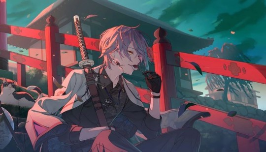
lesson O1: cel shading and how to achieve it.
Project SEKAI uses a unique shading method, which is a cross between rendering techniques and what is commonly referred to as "Cel Shading." Cel Shading was a term coined by animators before computer animation, who worked in "cels" or hand-drawn scenes. Because of the limitations of the time, the animators had to find a cheap and simple way to shade, resulting in the shading we see usually in modern animation.
Project SEKAI uses this style in combination with rendering tactics to create their iconic art style.
In this lesson, I'll be going over how Project SEKAI achieves that look by breaking down their Live2d models and card cutouts.
Cel Shading is the basis upon which everything in Project SEKAI is shaded. Commonly, this is seen in: Live2d models and card trims. Here are some examples.
In both examples, you can notice the more "simplistic" style of shading. Now, the real question is: "How is this done?"
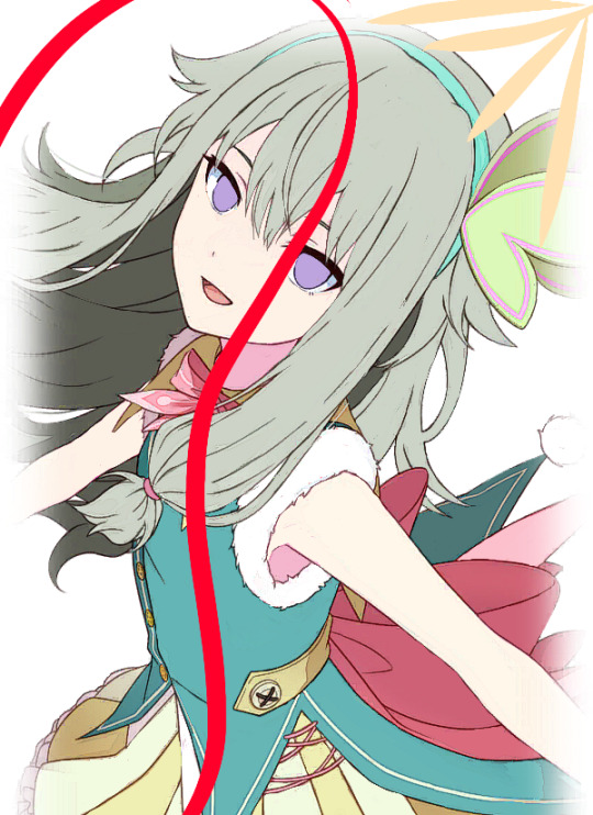
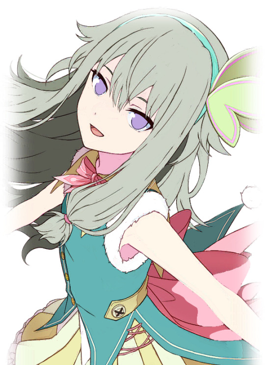
To explain this, I'll be using the card trim on the right as an example.
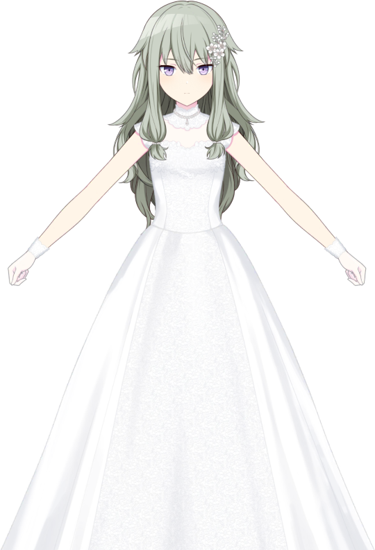
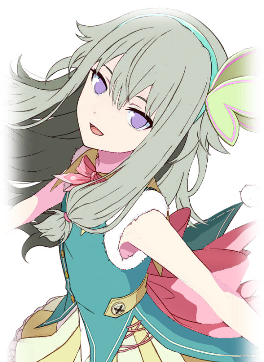
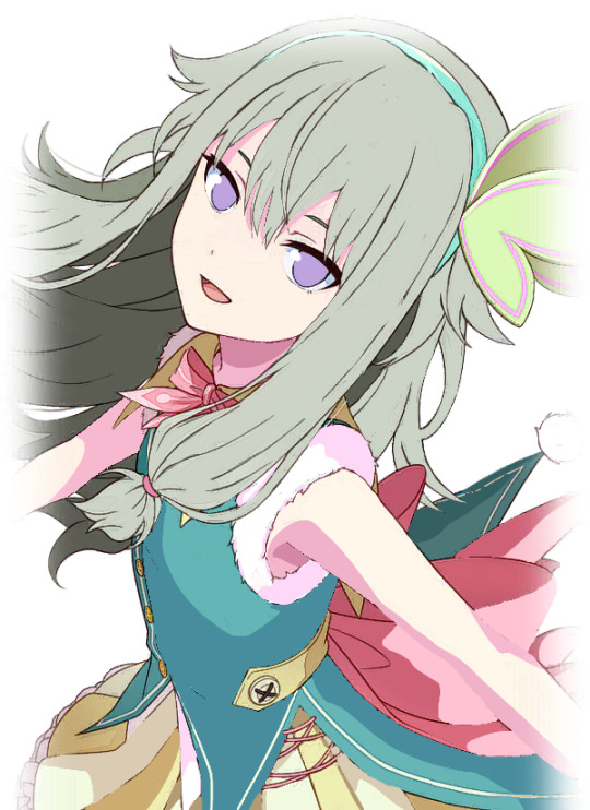
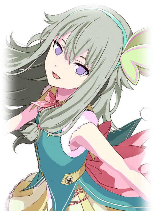
Firstly, artists need to put base colors under their lineart. Base colors are the bare-bones, not shaded colors. This is to provide a guideline as to what areas need what colors. Below, you can see the same Nene card trim, but reduced to its base colors.
It is a bit sloppy, considering I made it myself, but the point is; there is still **some** shading blocked out where it's needed. For comparison, see below.
So, now the question is: "how do I even do Cel Shading from here? I've gotten my base colors down, now what?"
And, luckily, I can share that too! First, let's start by doing the most important thing, deciding where our light source will be.
In this card, it looks to be at the top right, coming down to shine on her.
The yellow is where I estimate the light would hit her. Now, we need to decide where our darkest areas are.
In this card, the darkest colors would be away from the light, meaning they would be to the left.
The red is where I estimate the darkest areas would be. The areas behind her arm would also be darker than the rest of the card, since they aren't being hit directly by the light.
This understanding of lighting will help me to place my shadows and highlights later!
After this, I'd suggest putting in a new layer on top of your base colors, and clip it.

Now, I would be sure to grab a reference. For this drawing, I will be referencing the original trim, as well as the full card. I will be using a reference window, but use whatever works for you!
Now, we can get started! First, I'm going to block out where the **lightest** areas would be. I will be loosely following the card trim as a reference. Using the places we previously determined would be hit by the light, I blocked them out with loose colors.
We know that these areas would be directly exposed to the light if it continued at the angle we previously determined. Now, as for the headband, I decided to block out a very light yellow color. This is because of something called ambient lighting. Ambient lighting is just when highlights have a similar color to their light source. This is seen a lot in photography, and sometimes, even in cards!
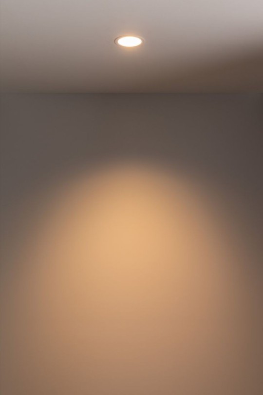
As you can see here, the light itself has a yellow tint, so the wall behind it will also appear yellow as a result.
We can also see it in Rui's newest card!
The light behind him is a reddish-pink, so that light bounces onto him, and makes the highlights appear that color. You can also see it on the railing and the building behind him!
Back to Nene, I then blocked out some of the darkest parts of her, based on our previous assumptions about the source of the light.
I shaded the areas of her dress according to how the bow was shaded. Since they were in almost the same place, we can use it as a guideline. We know that the dress isn't exposed to the light, since it is in front of the bow. As for the arms, we know the arm closest to her face would be fairly far from the light source, so I blocked out a shadow there as well.

Here, I adjusted some of the shadows, and I added some shadows to the dress. I blocked them all out in shapes, which I will go back and refine later.
I also added some shadows to the white fur on her dress. I paid specific attention to the edges of it in an attempt to make it seem "fluffier."
Here, I blocked out more shadows of her dress based on how the light would hit her. Now, we'll move on to the hair!
While it is messy, I wanted to ensure that the areas I placed shadows in would line up with my assumption of the light source. So, I toggled back and forth between the reference for the light source and the card itself to see where it fell. Now, with that, we are done blocking our our shading! I would suggest duplicating this layer to touch up everything to ensure you're satisfied with it.
The eyes will be a lesson by themselves, seeing as I didn't want to rush out two lessons in one and overwhelm people with so much information. This was a longer post than I anticipated anyhow.
If you have any questions, please feel free to shoot me a dm or an ask in the ask box! I hoped this helped at least a few people, and I will try to do weekly/bi-weekly lessons if I can!
If you found this helpful, please consider reblogging this post for more reach! I want to help as many people as I can!
#art tutorial#art study#project sekai art#pjsekai#pjsekai art style tutorial#proseka art academy#art lessons#nene kusanagi#kusanagi nene#shading test#cel shaded#prsk
40 notes
·
View notes
Text
WONDERSHOW MEETS MAGIKARP
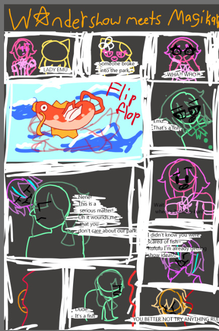
Mascot: LADY EMU
Someone broke into the park!
Emu: WHA?! WHO?!
-
Nene: Emu... that's a fish.
Rui: Nene! This is a serious matter! Oh it wounds me that you don't care about our park!
E: guys... where's Tsukasa-kun?
-
N: dude it's just a fish.
R: I didn't know you were scared of fish. Kufufu I'm already getting show ideas!
Tsukasa: YOU BETTER NOT TRY ANYTHING RUI‼️ (or alternative but not in character: you cringy fruit by the foot)
~~~~
Scroll for ramble (+ you can recommend where Magikarp goes to next fandom list here)
I'm in my pokemon era again and for some reason also felt like drawing Wondershow?? I haven't done anything PJSEKAI related in awhile and these guys are my babies. I'm laying with my Rui Nui rn actually.
But I may have wrote it slightly wrong since I haven't read a Wondershow story in over a year. Also their new outfits are weird I dunno I miss when they were highlighters. Love Emus new casual tho. She is so me coded
I got a massive art inspo when I saw egophiliac's art tutorial actually, so I tried being expressive with the poses (but I lost motivation while drawing so it's not as dramatic as it originally was going to be)
This isn't connected but I made a whole PJSEKAI Pokemon a while ago when I was hyperfixated on proseka. (That was a name for the game, yes?) Might do a revamp of that after I make my Twisted Wonderland one. (I have all of the hisui part written out, all of Heartsybuls team planned and how Yuu is in the universe).
Also I got a new art style so I gotta draw all of Wondershow in it. My eyes are kinda wacky (/pos) so I gotta figure out how to do those. For Emu so far I chose a bunch of round bumps and tried doing a lil candy-looking-ish eyelash. Looks more like a bow if anything.
~~~~
Anyways thanks for reading
Comments appreciated
Have a wonderhoytastic day!! (I use that on all my posts but this is my first PJSEKAI related one)
#The legendary Magikarp#pjsekai#wonderland x showtime#emu otori#tsukasa tenma#nene kusanagi#rui kamishiro#magikarp#send asks#magikarp jump#anyone remember that?#project sekai colorful stage#comics#but spedran#crossover#pokemon gen 1#pokemon#hatsune miku colorful stage#wxs#rambles#kinda#i mean I threw one in at the end
15 notes
·
View notes
Text
lesson O2: eye shape and coloring.
Eyes are arguably the most important part of a piece of art. Mostly because they are usually a focal point of most drawings. This is especially clear in Project SEKAI! It's one of the things that define the art style. Let's look at some examples, so we can get a feel for what we need to recreate.


Let's look at these two card trims! As you can see, both Saki and Honami have different eye shapes. To get a better look at this, let's break these two down into basic shapes.


Here, you can see some differences in how their eyes are drawn. Saki's are very round and full of life, while Honami's are a bit more curved. This is done intentionally to convey character personality. So, we want to be sure to capture that when drawing. This comparison can be made with everyone in the cast. Using this chart below, one can notice all the different eye shapes in the game.

So, for this particular example, I wanted to redraw the eyes of the Nene card below. First, we need to determine a few things.

We need to determine where it is she is looking, so we can get a better idea of where her line of sight would be.
We can assume that Nene, in this card, is looking to the left.
After erasing the eyes from the card, I began to decide on where the eggs should be locating, loosely referring to the card when needed.

To determine where I wanted the eyes, I split her face into fourths, sketching the eyes according to these new guidelines.

This is ultimately my rough placement of her eyes. I focused on two things with this sketch; placement and eye shape.

I then refined this basic shape, mapping out the eyelids more, and getting a basic idea of where the eyelashes would go.

I then added in these eyelashes, following the line of her eye to make them look natural.

Then, I refined the bottom of her eye, as well as adding the crease of her eyes.

Then, it was time to sketch out where the pupils would be. Keeping the line of vision in mind, I also loosely placed the area I wanted her irises to be.
Notice here that the pupil sits neatly on the bottom of the eye. This is something that is usually done in the art style to define where the bottom of the eye is.

I then added a clipping layer, going in with a lighter redd-ish brown color and coloring the edges of her eyes with this color. As for her pupil, I colored it with a darker version of her eye color, just to make things look smoother.

Then, I made a layer under my sketch, filling in the pupil with the base color of her eye, which is usually neither the slightest nor darkest shade of the eye.

I then added in the darkest and lightest parts of the eye. The darkest part usually forms a crescent above the iris, while the slightest part of the eye forms a circle near the bottom of the iris, extending down to the bottom of the pupil, while still keeping a circular shape.

Then, I added the most noticeable highlight, which is usually next to the pupils on both eyes. It can be either to the left or right, but because of her line of vision, it would be to the left in this case because of how the light would be hitting her face.
I also added a half circle around her iris, which changes from a more light saturated purple on the light part, to a darker purple on the base color.

I then made a line of white under the half circle by doing repeated strokes in a downward motion to mimic the look of light reflecting on the eye.
Also, using a color close to that purple, on the color wheel (which in this case, was blue), I added highlights to the darkest part of her eye.

After that, I made a layer under this one to do the white of her eye. The top part almost always is shaded by a blue or purple color in most Project SEKAI cards. I used a blue here, seeing as her eyes were purple. The rest was colored in white.

After adjusting the position of the eyes a bit, I added a clipping layer on top of the sketch, coloring the crease of her eyes a pink color to match her skin. I also lightly airbrushed her skin color over the bottom of her eyes to make it appear "softer".
To compare, my eyes are on the left, and the original eyes are on the right.
This tutorial can be applied to eyes of any character of any gender, as long as you know the base shape of their eye!
My next lesson will be on hair, as I myself struggle with it at times. I hope this lesson was able to help you! If it did, please consider reblogging this post so I can reach more people!
If you have a question, shoot me a message through the askbox!
#pjsekai art style tutorial#project sekai art#art study#art tutorial#art lessons#artists on tumblr#pjsekai#pjsk#illustration#kusanagi nene#nene kusanagi#honami mochizuki#saki tenma#proseka art academy
18 notes
·
View notes