#poliphilus
Text


It's Fine Press Friday!
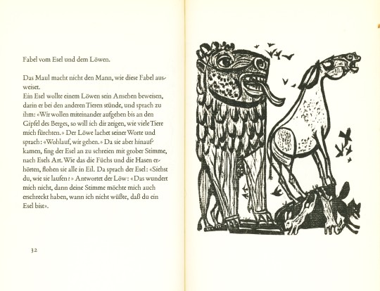
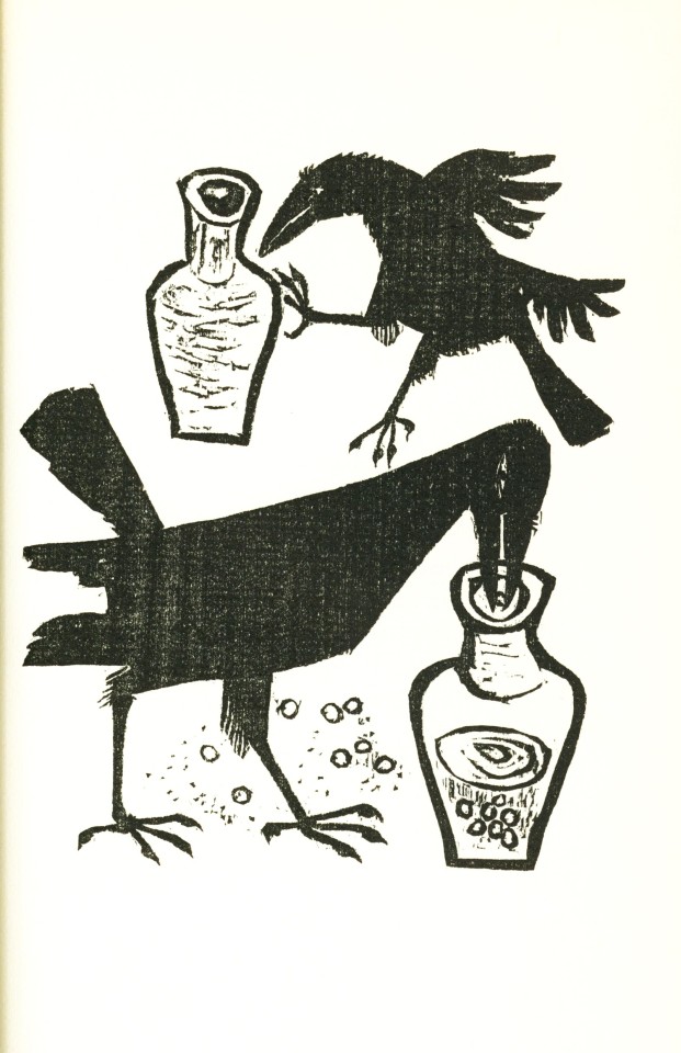
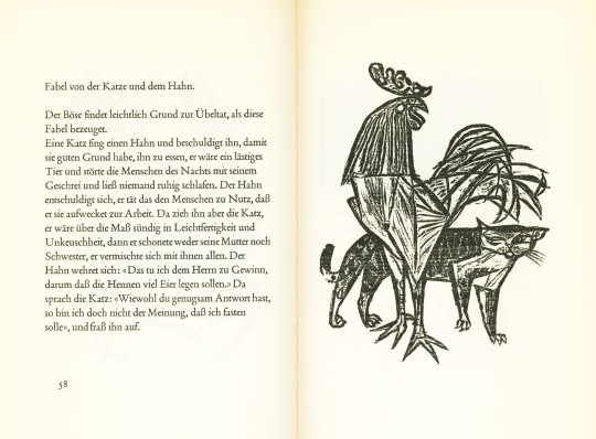
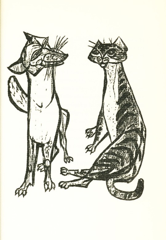
In getting ready for the weekend, we present this 1967 German edition of Aesop's fables, Drei Dutzend Fabeln von Äsop, published in Bern by Angelus Druck, with 36 original woodcut illustrations by Swiss artist Felix Hoffmann (1911-1975). The book was designed by Swiss book and type designer Max Caflisch (1916-2004), typeset in Poliphilus Antiqua, and printed in an edition of 200 copies signed by the artist.
View more posts with illustrations by Felix Hoffmann.
View more editions of Aesop's Fables.
View more Fine Press Friday Posts.
#Fine Press Friday#fine press fridays#Felix Hoffmann#woodcuts#Aesop#Aesop's fables#Drei Dutzend Fabeln von Äsop#Angelus Druck#Max Caflisch#Max Caflisch (1916-2004)#typeset in Poliphilus Antiqua#fine press printing#fine press books
50 notes
·
View notes
Text
What is the history of the bembo typeface

In France, his work inspired many French printers and punchcutters such as Robert Estienne and Claude Garamond from 1530 onwards, even though the typeface of De Aetna with its original capitals was apparently used in only about twelve books between 14. The type is sometimes known as the "Aldine roman" after Manutius' name. Modern font designer Robert Slimbach has described Griffo's work as a breakthrough leading to an "ideal balance of beauty and functionality", as earlier has Harry Carter. One of the main characteristics that distinguished Griffo's work from most of the earlier "Venetian" tradition of roman type by Nicolas Jenson and others is the now-normal horizontal cross-stroke of the "e", a letterform which Manutius popularised. Griffo was one of the first punchcutters to fully express the character of the humanist hand that contemporaries preferred for manuscripts of classics and literary texts, in distinction to the book hand humanists dismissed as a gothic hand or the everyday chancery hand. This book, usually now called De Aetna, was a short 60-page text about a journey to Mount Etna, written by the young Italian humanist poet Pietro Bembo, who would later become a Cardinal, secretary to Pope Leo X and lover of Lucrezia Borgia. His first printing in the Latin alphabet, in February 1496 (1495 by the Venetian calendar), was a book entitled Petri Bembi de Aetna Angelum Chabrielem liber. Manutius at first printed works only in Greek. These were used as a master to stamp matrices, the moulds used to cast metal type. Griffo, sometimes called Francesco da Bologna (of Bologna), was an engraver who created designs by cutting punches in steel. The regular (roman) style of Bembo is based on Griffo's typeface for Manutius. This section is engraved as a simulation of Tagliente's handwriting other parts were set in a typeface of similar design. Giovanni Antonio Tagliente's 1524 writing manual, which inspired Bembo's italic. Bembo has been released in versions for phototypesetting and in several revivals as digital fonts by Monotype and other companies. Prominent users of Bembo have included Penguin Books, the Everyman's Library series, Oxford University Press, Cambridge University Press, the National Gallery, Yale University Press and Edward Tufte. Since its creation, Bembo has enjoyed continuing popularity as an attractive, legible book typeface. Monotype also created a second, much more eccentric italic for it to the design of calligrapher Alfred Fairbank, which also did not receive the same attention as the normal version of Bembo. It followed a previous more faithful revival of Manutius's work, Poliphilus, whose reputation it largely eclipsed. Monotype created Bembo during a period of renewed interest in the printing of the Italian Renaissance, under the influence of Monotype executive and printing historian Stanley Morison. The italic is based on work by Giovanni Antonio Tagliente, a calligrapher who worked as a printer in the 1520s, after the time of Manutius and Griffo. Bembo is named for Manutius's first publication with it, a small 1496 book by the poet and cleric Pietro Bembo. It is a member of the " old-style" of serif fonts, with its regular or roman style based on a design cut around 1495 by Francesco Griffo for Venetian printer Aldus Manutius, sometimes generically called the "Aldine roman". Bembo is a serif typeface created by the British branch of the Monotype Corporation in 1928–1929 and most commonly used for body text.
0 notes
Photo

quick as boiled asparagus
a favorite expression of augustus caesar. set capitalis quadrata, of upper-case poliphilus—vide ‹poor poliphilo›. the tabula ansata is digital issue of a cut originally engraved by eric gill for the golden cockerel press [itc golden cockerel ornaments].
#typography#rome#augustus caesar#typesetting#poliphilus#tabula ansata#eric gill#golden cockerel press
17 notes
·
View notes
Photo

Spelling out Pierre de Ronsard in linocut. E as in Exil. No paper and no ink: I show the linocuts themselves. A new frame inspired by the title page of « Discours du Songe de Poliphile »(The Dream of Poliphilus), 1546 Paris edition. Engraved linocut boards, frame 11 x 8 inches, initial 5 x 4 inches, 2022. #exil #poliphile #poliphilus #16thcentury #16esiecle #pierrederonsard #ronsard #frenchpoetry #lettrine #initials #linocut #linogravure #fredericlere #ronsardlere https://www.instagram.com/p/CZ9wh6fuMzH/?utm_medium=tumblr
#exil#poliphile#poliphilus#16thcentury#16esiecle#pierrederonsard#ronsard#frenchpoetry#lettrine#initials#linocut#linogravure#fredericlere#ronsardlere
0 notes
Photo

Hypnerotomachia Poliphili (/hiːpˌnɛəroʊtəˈmɑːkiːə pəˈliːfəˌliː/; from Ancient Greek ὕπνος hýpnos 'sleep', ἔρως érōs 'love', and μάχη máchē 'fight'), called in English Poliphilo's Strife of Love in a Dream or The Dream of Poliphilus
It is a famous example of an incunable (a work of early printing). The work was first published in 1499 in Venice by Aldus Manutius. This first edition has an elegant page layout, with refined woodcut illustrations in an Early Renaissance style. Hypnerotomachia Poliphilipresents a mysterious arcane allegory in which the main protagonist, Poliphilo, pursues his love, Polia, through a dreamlike landscape. In the end, he is reconciled with her by the "Fountain of Venus".
The author of the book is anonymous. However, an acrostic formed by the first, elaborately decorated letter in each chapter in the original Italian reads "POLIAM FRATER FRANCISCVS COLVMNA PERAMAVIT", which means "Brother Francesco Colonna has dearly loved Polia". Despite this clue, the book has also been attributed to Leon Battista Alberti, and earlier, to Lorenzo de Medici. Manutius himself claimed that the author was a different Francesco Colonna, a wealthy Roman governor. The identity of the illustrator has at times been attributed to Benedetto Montagna, and Sandro Botticelli.
The text of the book is written in a bizarre Latinate Italian. Without explanation, the text is full of words based on Latin and Greek roots. The book, however, also includes words from the Italian language and illustrations which include Arabic and Hebrew words. Moreover, Colonna would invent new forms of language when those available to him were inaccurate. The book also contains some uses of Egyptian hieroglyphs, but they are not authentic. Most of them have been drawn from a late antique text of dubious origin called Hieroglyphica.
The Hypnerotomachia Poliphili, set in 1467, consists of a series of precious and elaborate scenes involving the title character, Poliphilo ("friend of many things" from the Greek words poly- meaning "many" and philos meaning "friend"). In these scenes, Poliphilo wanders a bucolic-classical dreamland in search of his love, Polia ("many things"). The author's style is elaborately descriptive and unsparing in its use of superlatives. The text makes frequent references to classical geography and mythology, mostly by way of comparison.
In 1592, in a London edition, "R. D." (who is believed to be Robert Dallington) partially translated the Hypnerotomachia Poliphili. Here, it was given its best known English title, The Strife of Love in a Dream. In 1999, a first complete English translation by musicologist Joscelyn Godwin was published. However his version was based off of the Italian translation and uses standard, modern language, rather than following the original text's unusual pattern of coining and borrowing words.
12 notes
·
View notes
Photo

Poliphilus surrounded by remains of classical antiquity (fol. a vii recto), Anonymous Germany, 1499, Harvard Art Museums: Prints
Harvard Art Museums/Fogg Museum, Gift of Philip Hofer
Size: 11.5 × 14 cm (4 1/2 × 5 1/2 in.)
https://www.harvardartmuseums.org/collections/object/252045
10 notes
·
View notes
Link
The semicolon was born in Venice in 1494. It was meant to signify a pause of a length somewhere between that of the comma and that of the colon, and this heritage was reflected in its form, which combines half of each of those marks. It was born into a time period of writerly experimentation and invention, a time when there were no punctuation rules, and readers created and discarded novel punctuation marks regularly. Texts (both handwritten and printed) record the testing-out and tinkering-with of punctuation by the fifteenth-century literati known as the Italian humanists. The humanists put a premium on eloquence and excellence in writing, and they called for the study and retranscription of Greek and Roman classical texts as a way to effect a “cultural rebirth” after the gloomy Middle Ages. In the service of these two goals, humanists published new writing and revised, repunctuated, and reprinted classical texts.
One of these humanists, Aldus Manutius, was the matchmaker who paired up comma and colon to create the semicolon. Manutius was a printer and publisher, and the first literary Latin text he issued was De Aetna, by his contemporary Pietro Bembo. De Aetna was an essay, written in dialogue form, about climbing volcanic Mount Etna in Italy. On its pages lay a new hybrid mark, specially cut for this text by the Bolognese type designer Francesco Griffo: the semicolon (and Griffo dreamed up a nice plump version) is sprinkled here and there throughout the text, conspiring with colons, commas, and parentheses to aid readers.
[...]
Nearly as soon as the ink was dry on those first semicolons, they began to proliferate, and newly cut font families began to include them as a matter of course. The Bembo typeface’s tall semicolon was the original that appeared in De Aetna, with its comma-half tensely coiled, tail thorn-sharp beneath the perfect orb thrown high above it. The semicolon in Poliphilus, relaxed and fuzzy, looks casual in comparison, like a Keith Haring character taking a break from buzzing. Garamond’s semicolon is watchful, aggressive, and elegant, its lower half a cobra’s head arced back to strike. Jenson’s is a simple shooting star. We moderns have accumulated a host of characterful semicolons to choose from: Palatino’s is a thin flapper in a big hat slouched against the wall at a party. Gill Sans MT’s semicolon has perfect posture, while Didot’s puffs its chest out pridefully. (For the postmodernist writer Donald Barthelme, none of these punch-cut disguises could ever conceal the semicolon’s innate hideousness: to him it was “ugly, ugly as a tick on a dog’s belly.”)
The semicolon had successfully colonized the letter cases of the best presses in Europe, but other newborn punctuation marks were not so lucky. The humanists tried out a lot of new punctuation ideas, but most of those marks had short life spans. Some of the printed texts that appeared in the centuries surrounding the semicolon’s birth look as though they are written partially in secret code: they are filled with mysterious dots, dashes, swoops, and curlicues. There were marks for the minutest distinctions and the most specific occasions. For instance, there was once a punctus percontativus, or rhetorical question mark, which was a mirror-image version of the question mark. Why did the semicolon survive and thrive when other marks did not? Probably because it was useful. Readers, writers, and printers found that the semicolon was worth the trouble to insert. The rhetorical question mark, on the other hand, faltered and then fizzled out completely. This isn’t too surprising: does anyone really need a special punctuation mark to know when a question is rhetorical?
17 notes
·
View notes
Photo

“Taken literally, the title Hypnerotomachia means a "love fight during sleep." This leads us to expect that a person dreams of phantasms involved in an erotic fight, perhaps his own erotic phantasm. That is precisely what happens: two phantasms, that of the dreamer-Poliphilusand that of the girl he loves-Polia-are at the center of the scenario. The tale is not constructed so as to be easily understood. It is an enigma whose solution is given only at the end. The reader is informed that Pollphilus seeks Polia, but does not know why or how. Of the 311 pages of the Guegan-Kerver edition, the first part takes up 250 whereas the second, which provides indispensable explanations, takes up only 60. The first part tells of the endless roaming of Poliphilus amid the ruins of antiquity, of triumphs, emblems and impresae, each with its own secret meaning. As Yates observed, it could be a matter of mnemotechnics "escaped from control and degenerated into wild imaginings." In any case, such oneirico-archeologico-mnemotechnics, however fascinating, will not preoccupy us here. In the end, Poliphilus finds Polia, and the lovers plead their case before the heavenly tribunal of Venus. The second part, which contains two monologues, is therefore a tale within a tale, and the end is destined to complicate the enigma still more: we learn that everything that happened was only Poliphilus's dream, so that the search for Polla and the appeasement of desire were but adventures in phantasy.” (p.42)
From Eros and Magic in the Renaissance by Ioan Petru Culianu
1 note
·
View note
Photo

Font specimen for Poliphilus.
0 notes
Text


Wood Engraving Wednesday
In the summer of 1997, Wisconsin/Minnesota wood engraver and fine-press printer Gaylord Schanilec conducted an interview with socialist-inspired commercial printer Ernest Morgan (1905-2000) at Morgan's North Carolina home. Schanilec's three-day visit with Morgan eventually resulted in this book, Ernest Morgan, Printer of Principle, with the text transcribed from the interview and handset in Poliphilus and Blado italic types, and printed in an edition of 226 copies on Mohawk Superfine paper in 2001 at Schanilec's Midnight Paper Sales in Stockholm, Wisconsin.
Along with actual and facsimile examples of bookplates and printed ephemera by Morgan, Schanilec includes four of his own original color wood engravings, shown here. He writes:
Ernest Morgan was ninety-two years old when I visited him. The stories of his exploits were polished by years of telling. . . . He was bubbling over with ambitious ideas and schemes, but seemed frustrated that age had robbed him of the ability to carry out many of them. Still, he carried himself with elegance and grace. Above all, he was proud to be a printer. Ernest Morgan died in his home on the morning of October 1, 2000.
View other posts on the work of Gaylord Schanilec.
View more posts with wood engravings!
#Wood Engraving Wednesday#wood engravings#wood engravers#Gaylord Schanilec#Midnight Paper Sales#Ernest Morgan#Ernest Morgan Printer of Principle#printers
16 notes
·
View notes
Photo

risorgimento
opening lines from a. d. f. hamlin’s A history of Ornament, Renaissance and Modern [the century co., new york, 1923, p13].
set in digital reissue of monotype blado—vide ‹is a rose a Rose?›. following venetian, period practice italic set with classical roman capitals; these are adapted from monotype poliphilus small caps—for details of poliphilus vide ‹poor poliphilo›. linotype benedictine series headpiece [x-1378] & jenson floriated initial [x-1441 & x-1443] [The Manual of Linotype Typography, mergenthaler linotype company, brooklyn, 1923, p158]. the vine leaf is digital reissue of english monotype 66; this may be original to monotype—if an ancient exemplar exists i have not located it.
1 note
·
View note
Photo
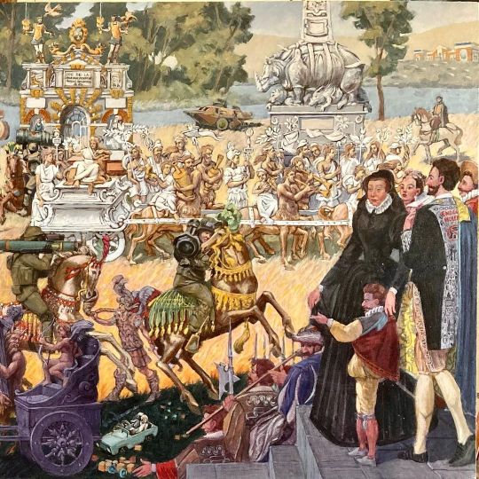
“Ode De La Paix”, right side. Started from the 16th Century "Tenture des Valois" tapestry series, three of which are currently on view @chateaufontainebleau. The series was probably commissioned by Catherine de Medicis, who can be seen in the foreground next to Henri de Navarre sporting a lavish “End Gun Violence” coat, which was actually worn by New York City Mayor Eric Adams during the 2022 Met Gala. The royal group looks on to two Ukrainian cavaliers with rocket launchers. On the ground, children toys abandoned after the 1986 Chernobyl disaster can be seen. Behind them, centaurs based on "The Dream of Poliphilus" parade in front of a destroyed Russian armored vehicle and a rhinoceros sculpture. The triumphal arch on the left was built based on a script developed by Ronsard to celebrate the 1571 entrance of Charles IX in Paris. Top right, the Kramatorsk railroad station, Ukraine, hit by a Russian missile on April 8, 2022. #valoistapestries #renaissance #tapestries #tapisseriedesvalois #catherinedemedicis #endgunviolence #odedelapaix #ronsardlere #oilpainting #fredericlere (at Trôo) https://www.instagram.com/p/CeBp77VIR-n/?igshid=NGJjMDIxMWI=
#valoistapestries#renaissance#tapestries#tapisseriedesvalois#catherinedemedicis#endgunviolence#odedelapaix#ronsardlere#oilpainting#fredericlere
0 notes
Photo

Poliphilus meeting at the gate of the venerable matron, followed by her six young female attendants (fol. viii verso), Anonymous Italy (Venice) 1499, 1499, Harvard Art Museums: Prints
Harvard Art Museums/Fogg Museum, Gift of Philip Hofer
Size: 11.2 × 14 cm (4 7/16 × 5 1/2 in.)
https://www.harvardartmuseums.org/collections/object/251982
3 notes
·
View notes
Text
t 02.23.10
Even in something as diminutive as the letters of a typeface, we may detect well-developed personalities, about whose lives and daydreams we could without great difficulty write a short story. The straight back and alert upright bearing of a helvetica 'f' hint at a punctual, clean, and optimistic protagonist, where as his poliphilus cousin, with a droopy head and soft features, strikes a sleepier, more sheepish, and more pensive note. The story may not end well for him.
text credit: botton's 'architecture of happiness'
#text#alain de botton#architecture of happiness#helvetica#poliphilus#architecture#architektur#typography#my favourites#design
4 notes
·
View notes
Photo


Typography Tuesday
Last week we presented wood engravings by the English-American artist Nora S. Unwin (1907-1982) from Joseph; the King James Version of a Well-loved Tale, arranged with an introduction by her friend and frequent collaborator Elizabeth Yates, and printed and bound by the Plimpton Press in 1947 for Alfred A. Knopf in America and the Ryerson Press in Canada.
Today we present Unwin’s fine wood-engraved historiated initials for the chapter openings of the book. The initials mesh well with the solid stateliness and deep color of Stanley Morison’s Poliphilus typeface (released by Monotype in 1923), and integrates uniformly with Unwin’s engraved illustrations, creating a harmonious and holistic presentation to the entire production. This copy is another gift from our friend and benefactor Jerry Buff.
View more posts with historiated initials.
View more Typography Tuesday posts.
View more posts with women wood engravers.
View more posts with wood engravings!
#Typography Tuesday#typetuesday#historiated initials#wood engraved initials#wood engravings#wood engravers#women wood engravers#Nora S. Unwin#Joseph; the King James Version of a Well-loved Tale#Typography Tuesday#Poliphilus#Monotype Corporation#Stanley Morison#elizabeth yates#Plimpton Press#Alfred A. Knopf#Ryerson Press#Jerry Buff
41 notes
·
View notes
Photo


It’s Fine Press Friday!
This week we present Poem Upon the Lisbon Disaster, by Voltaire (François Marie Arouet), illustrated with original wood engravings by American printmaker, illustrator, and wood engraver Lynd Ward, and translated by the American poet Anthony Hecht from the Pléiade edition of 1961. It was designed by Michael McCurdy at the Penmæn Press and set by Michael Bixler in Monotype Blado for the French text and Poliphilus for the English. McCurdy hand-printed the book on Ragston paper with assistance from Evelyn Clarke, and the book was bound by Robert Burlen and Son in Lincoln, Massachusetts in 1977 in three separate versions, totaling 500 assorted copies.
In his introduction to the edition, Arthur Wilson notes that the massive earthquake that hit Lisbon in 1755 had a profound impact on then-famous dramatist, poet, and historian Voltaire, reinvigorating his disbelief in “all is for the best,” with the cynical quote “Optimism and all-is-well got it in the neck.” The Lisbon earthquake is believed to be the most extreme earthquake in human history, with estimations concluding that 60,000 people perished from the first shocks or the ensuing tremors and seismologists believe that this event would have registered an 8.9 on the Richter Scale. It is no wonder that Voltaire found himself questioning his primary beliefs and values after a disaster of this scale, and he even referred to this poem as a sermon.
Ward’s wood engravings follow this religious theme by tying a sense of impending doom into the increasingly dark perspective of the poetry. Beginning with a man gazing into a sunny sky and ending with hooded creatures approaching the man, the illustrations further convey the idea of despair and loss that Voltaire unmistakably conveys throughout the meandering, sorrowful poem. This poem is widely regarded as an introduction to Voltaire’s acclaimed 1759 novel Candide where he confronts the problem of evil, and also includes an episode on the Lisbon earthquake.
View more posts featuring Lynd Ward illustrations.
View more Fine Press Friday posts.
-Emily, Special Collections Writing Intern
#Fine Press Friday#Fine Press Fridays#Voltaire#Lynd Ward#Anthony Hecht#Michael McCurdy#Penmæn Press#Poem Upon the Lisbon Disaster#Arthur Wilson#Michael Bixler#Blado#Poliphilus#fine press books#Lisbon earthquake#wood engravings
39 notes
·
View notes
Last Seen Blogs

flingpoly
you really are my true posse

jjhn2ill
Untitled

cris-aybar
@Cris_Aybar

jjjj
제목 없음

boyavoyager
安寧