#progress photos and documentation of process for things i've made
Explore tagged Tumblr posts
Visit Tumblr Blog
Explore Tumblr blogs with no restrictions, modern design and the best experience.
Last Seen Tumblr Blogs


Fun Fact
Tumblr was created by web developers David Karp and Marco Arment.
Text
cool cool cool cool cool in things i totally don't need right now my primary hard drive may be toast
there's so much stuff on my hard drive
i'm not sure if i'm going to cry or scream but it's like midnight and i need to go to bed because i have work in the morning
(yes, i tried opening my case up and reseating my hard drive. i've been using computers since like 1988 because my dad worked on them, he has been consulted already also despite it being the middle of the night and a different time zone, etc etc etc)
#uggggggggggggghhhhhhhhhh#years of projects#all my edited photos for my sewing/crafting business#tons of writing#all my gifs#lots of reference material for projects#progress photos and documentation of process for things i've made#pjvifzey ZZ jhvpkbpjbohvufxye#i have no idea what i'm gonna do about this#clearly nothing right now
3 notes
·
View notes
Text
I'm Doing A Thing
So...
For those that don't know, I'm a theater costume designer, commissioner and cosplayer. I'm really terrible at remembering to post in-progress pictures and end photos of the things I've made. But cest le'vie. It’s not really fair to say that it’s a hobby as I do make money off my commissions, but I do consider making something for my self wildly different than making something for work or a client. Making stuff for myself gives me the chance to experiment, try new things and build confidence.
And nothings more confidence building than what I’m gonna be doing for my next project.
Because…
I'm also a massive Sleep Token fan.
And I’m a fan of people who wear armor.
I’ve decided to do a thing.
Some Background:
I was listening to Even in Arcadia while working another project when I was struck with what I can only call divine madness.
It should be noted that I’ve read many Sleep Token fan theories, but i don’t necessarily subscribe to any particular ones because while I find the story endlessly fascinating, I really am here for the music and performances. And I really believe that Vessel wants us to connect with it in our own way, instead of seeking out some official canon. (I have read the Teeth of God graphic novel and i also felt this way after reading it. Beautiful novel, adored it.)
But Even in Arcadia did something for me.
As a Greek Mythology nerd and a writer, it got me thinking.
After a couple days of research, drawing and planning, I finally completed the design. I’m so excited to start this process.
And I’m so excited to share the process this time!!
Over the next few months, I will be working to complete this new design, inspired by Even in Arcadia.
The Arcadian Knight.


The hope is that I’ll be able to actually document my progress on here (and maybe my IG but let’s not get too ahead of ourselves, honestly.) so you all can see how it’s going. You know, actually blog my progress. I’m hoping to have it finished by the time the King Richards Faire starts, so I can actually wear it out. I’m really excited to work on this and eventually see the final costume in all its glory.
I’m actually really excited to share something like this with fellow Sleep Token fans too. I don’t interact with fandoms often, but I do love this community and I hope you all have fun watching if you see my posts. Can’t wait to bring this to life!!!
#artists on tumblr#costume design#digital art#sleep token#sleep token worship#sleep token offering#cosplay#original art#original design#knightcore#even in arcadia#sleep token fanart#original character#original charater art
21 notes
·
View notes
Text


There Are Good Things Yet To Bury (2024) 7.5 x 9 in Case bound book, 84 pages. Photography and poetry.
There Are Good Things Yet To Bury features photos of community gardens and poems on climate grief, gardening, and the purpose of hope. Physically cut into many of the pages are windows, enabling fragments of images and text on the previous and following pages to be reactivated and recontextualized. The book reflects on how gardens nurture during crises, and the futures that hope can bring us.
---
Final project for my VAST class this semester! Agh I really think it’s my new favourite…!!
I was actually struggling with this one for a while, I just couldn’t seem to clarify the concept in my mind clearly enough. I think it was writing the rainbow poem when things really started to pull together, which was tricky as hell making sure it was still coherent through all 7 ‘window’ pages AS WELL AS a full spread! But I truly had SO much fun writing all the poems in this book it was such a joy :’)
This is a project that I would love love love to be made into multiples and distributed in some capacity... I don't know if traditional publishing would ever take something like this on with how many window cuts there are haha, not that I know how complicated or uncomplicated it would be (but certainly more than if 0 windows lol). The profs on my panel review mentioned that I could look into getting a grant to make multiples but hoo that still sounds kinda spooky to me awaaa
But!! Ever since my Sunlight is moonlight book with that one window cut at the end I've wanted to do more with cutting into the page and having whatever is visible through the window be recontextualized with the flip of a page AH it's so fun and so much potential for poetic play!!!
process photos/more thoughts:
These documentation photos were kinda a pain btw lmao (i mean when are they not) i'm struggle so much with themm.. I'm also trying to be more aware of how much of a poem I'm showing in these photos as I recently learned that most literary magazines etc won't accept submissions if that piece of writing is posted (ie published) online already. I think small excerpts might be okay as long as it's not the full piece???? awagh I don't know I'm still learning AND I don't even know how focused I want to be on submitting poems to magazines... But I figured probably better to keep more options open for future-me just in case...
My mid-term presentation of the project! featuring:
wip mid-term artist statement
hastily printed out photos I was thinking of using in the final book
big bunch of poems to potentially use in the final book that I picked from my poem drafts that I keep in my notes app
that red book with a circle window I made for another class (just to practice case bookbinding) as an example of a window cut into the cover
lil white book in the back that was our class' "Seeded Notebook" assignment which was essentially a moodboard for our project
a mockup that had the idea for a hidden accordion fold page (the concept being that it would spill out of the book unexpectedly while you were flipping through it)!! kinda sad I didn't have time to add that into the final but boy o boy did I run out of time lol

Did u know I was gonna put illustrations!! into the final book as well! and while I had some fun making them and using my ipad as a makeshift light table and using my new fountain pen (oough don't get me started I've been on a fountain pen kick lately)... Ultimately I felt I 1. didn't have time to include them in a resolved enough way and 2. they felt kinda outta place from the photos and poems

Some inspirations during my researchy/brainstorming phase that I got from my school's artist's book collection!:
the cover of Water, Gold, Soil by Sayler/Morris, which got me hooked on the idea of putting a photo slightly embedded into the cover (doesn't it look so good on that book!!??)
Aunt Sallie's Lament by Margaret Kaufman, featuring these wild progression of increasingly smaller pages that change how you read the poem; nothing specific I took from this book tbh but was cool to look at lol
And you know I gotta look at Tree of Codes by Jonathan Safran Foer for a book with window cuts!! I soon realized It's only printed one-sided, which meant they didn't have to worry about how it would affect any text on the verso page. Which is like, fair enough for them they had a whole NOVEL of words to deal with lmao


I made my own book cloth for this project!! sort of!! I feel like I was doing something wrong, the interfacing I got wasn't really sticking to the fabric very well at times ????? Was kinda finicky not sure if I was doing something wrong during ironing... But I got to go into the fabric store and find the exact shade of pink I wanted for the cover C:
Did 3 small cover tests too (as per assignment requirements lol but also they were kinda helpful). Takeaway was that I didn't like how test 2 and 3 looked lol


AND HERE'S ME TRYING TO FIGURE OUT AND GET IDEAS FOR WINDOW CUTS. THIS PHASE WAS ACTUALLY EXTREMELY HELFUL because at the time i was SO stuck for ideas I'm not kidding I'm was STRUGGLING throughout this entire project from a conceptual standpoint. For some reason the thesis, the bones just weren't solidified in my head, and it kinda stayed that way until almost the very end when I was formatting the poems esp the rainbow poem. But I think it clarified completely once I thought of the title, which just kinda stepped into my brain after writing one of the poems (which has the line "there are good things yet to come") and then I was like I need a book title... and my brain did a few hops and there it was LOL and I'm so happy with the title :') it captures the main theme with a lot of nuance in a pretty simple phrase which is HOO boy chefs kiss and hard to come by haha I felt very lucky

Printing was also a pain because the print techs at my school misunderstood what I was trying to do (and I'm extra salty because I was right in the first place and they made me second guess myself cause they said they needed it formatted a different way!!! But in the end I was right the first time!!!) Siigh whateevsss the silver lining was that I did notice some things I needed to fix before printing anyways... Anyways I was trying to format it their way and I fucked it all up lol I was printing a b/w mockup on my own and despairing cause I thought I was gonna have to redo all my formatting (which, with WINDOW cuts which makes every page before/after matter a LOT felt like a nightmare)

But again I was right the first time lol so crisis averteddd just a lil spike in stress levels lol
Used the digital stack cutter on my own for the first time and ohh my goodness... I love my old manual big guillotine cutter but this guy. this guy was pretty cool look at his cool line of light that tells you where the blade is gonna hit

After agonizing so much over the concept and content I was sooo happy to just be Physcially Putting The Book Together, a real turn my brain off and just do him activity yaaay
This was my fun lil set up, I was recently given this bright light stand thingy which was actually so helpful lol; I like my dim cozy room light but it's not the best for Seeing what you're doing for art stuff

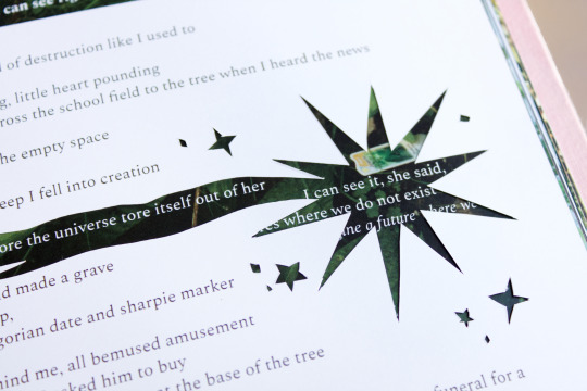
So much window cutting... Yes I just freehanded all round edges lol verryy carefully.. Some alignement issues but minor enough to not affect readability ^^
For example in these first two images with the star, I just ended up cutting off the misaligned cut-lines which made the star a lil bigger lol; was trickier with a star shape like that vs like a rectangle though because of how many vertices it had, aka more opportunities to fuck up the shape

Binding time!! look at that satisfying stack oouh yummy.. Also featuring my big slab of marble that's very heavy and works great to weigh down during drying lol. Also yes I put ziplog bags between the end pages and book block to protect against glue dampness because I've gotten spooked by how damp my Hazelnuts Grow on Trees book got when clamping it lmao


Some page alignment issues with the windows after binding but nothing major :)

#there are good things yet to bury#process#2024#books#artist books#photography#poetry#uni#wip#print#featured#oh my god i initally put '42 page book' but its actually 84!!!!! I WAS COUNTING THE SPREADS NOT THE PAGES LMAO#i just still have it in my brain from when I was printing the spreads like "yes im printing 42 sheets of paper' GIRLIE that means you have#EIGHTY FOUR PAGES#thats so wild i can't believe i did this#thats so many pages
2 notes
·
View notes
Text
So it turns out I completely forgot to take any pictures of my last sewing project. Oops. In fairness, it's a gift for my mother, whose birthday is tomorrow, and I didn't want to post any pictures until after it had arrived at her house and been opened. But I still meant to take some pictures, if not of the process at least of the final product. It wasn't until I got home from mailing it that I realized I full on completely forgot to take any photos at all. Oh well. Maybe Mom can snap a picture or two for me since I flat out forgot. Pics of that if/when I actually have them, lol.
But I'm already into my next sewing project, and I've resolved not to make that same mistake again. Which, really, is nearly the same mistake as I made with my fleece dress last month, when I didn't take any pictures at all until all the major seams were sewn. After documenting so much of my sewing throughout 2023, I seem to have completely forgotten all about taking photos of my works-in-progress the last couple of months. I aim to get back on course with this project, though!
The project in question is a hooded wrap sort of thing, made from the black and gray brushed cotton herringbone that I got a bolt of on ebay a couple of weeks back. After washing the bolt, it looks to be about 43" wide and roughly eight and a half yards long. I want to make an overdress for my fleece dress out of it too, but I think this wrap project will only take up about a yard and a half, maybe two, so I should have plenty left for an overdress. And then I can wear the wrap and the overdress together, potentially.
But really the thing I'm sewing this for is my birthday, which is coming up in about seven weeks. I have somehow talked Jack into going to Disneyland and spending all day in the Star Wars Galaxy's Edge area so I can pilot the Millennium Falcon as many times as possible, and doing some original costuming "Batuu-bounding" while we're there, too. Because I am nothing if not a costume nerd, and my life-long love for Star Wars has recently been reignited, so what better way to spend my birthday than dressed up in one of the best examples of 360 degree set building that I've ever seen.
After combining a bunch of pieces from my closet and my costume boxes, I've come up with an outfit that I like the look of, for a general purpose Force-sensitive smuggler pilot: my every-day tall Doc Martens with wraps over them, leather-look leggings, the vest from my Moment cosplay, and various accessories from my pirate-core and Wasteland days. I may need a better shirt to go with it, but I'm hoping to hit up Goodwill at least once or twice between now and then and see what I can find. The final choice will depend on a bit on the weather that week, which in late February in southern California can be literally anything from the cusp of freezing to 80 degrees, sunny or rainy or windy or some combination of all of them. I won't really know until the weekend beforehand.
Besides a shirt, the last piece I really want to add is this hooded wrap, both for practicality -- warmth in the morning and the evening, and keeping the sun off my head at midday without messing up my hair too much -- and for just the drama of a big hood and drapey wrap. I based the hood pattern on the hooded Vuvalini jacket I made for Wasteland Weekend way back in 2016, but took it in a bit both in width and depth (since I'm not trying to catch the wind with this one, and won't be wearing a fluffy scarf with it).
Over the weekend I drafted a pattern and made a mock-up, but the mock-up is really kinda ugly, since I used left over fabric and made a part of it significantly smaller just to save on fabric, so it's one of those mock-ups where you have to squint and imagine what the final product will look like. Not going to bother taking pictures of that. But it did serve the purpose of clarifying some design elements and finalizing fit, so still worthwhile.
With the hood pattern drafted and tested, and measurements for the long wrap bits figured out, I went ahead and cut it out of the herringbone fabric. Here it is all cut out, three pieces for the hood and two pieces for the back:
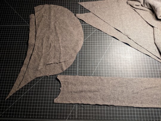
I'm doing french seams on this project, both to combat the fabric's tendency to fray, and to keep all the inner seams looking pretty when the hood is down, etc. Tonight I sewed up the first set of seams on the center back of the wrap, and all three hood pieces (as modeled by my sewing ham):
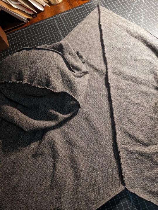
Tomorrow I'll press those narrow seams flat, and then sew each of them again a bit further in to completely encase the raw edges (ie a classic french seam). Next step after that will be attaching the hood to the right angle formed by the wrap pieces coming together in the center back. I did this, with shorter and narrower pieces, in my mock-up, and it's a little bit fiddly but not too bad. I didn't french seam the mock-up though, so we'll see if that adds any headaches to this.
Once both stages of the neck seam are done and the hood is attached, the last step will be hemming! And it's a lot of hemming, lol. The shorter edges of the wrap (starting from the top of the center back, where it meets the hood) are each 48" long and 18" wide. I actually haven't measured the outer, longer edge, nor done the math to figure out what it must be given that the center back is cut on a 45 degree bias, but let's just say it's a lot of inches. And then there's the hood opening too, which was cut to have a generous drape. Many many inches of hemming, really probably better measured in yards.
I need to play around with a couple of options, see if I like the look of top stitching or if I want to do the whole thing by hand with invisible stitches, but right now my assumption is that I'll end up doing this by hand. I actually enjoy handsewing hems, so that's not the worst thing in the world, and I've got plenty of time to get this finished before I plan to wear it at the end of February. I do have at least one other sewing project I'd like to tackle for our Star Wars Batuu-bounding day, and I'd like to leave room for other things to come up at the last minute too, so I'm going to keep buzzing through this just as quickly as I can. More pictures tomorrow, in all likelihood.
After I call my mom of course, and wish her a happy birthday. And beg her for photos of that thing I made for her, lol.
#my sewing#hooded wrap#Batuu bounding#Star Wars bounding#Disneybounding#2024 mood#long post#I am stupidly excited about this whole thing#my outfit and Jack's outfit and going to Disneyland and piloting the Millennium Falcon again. all of it#we have reservations for some of the harder-to-get-into things too#but I'm hoping it'll be a pretty quiet day in the park when we go#mid-week at the end of February isn't really busy time#it was pleasantly quiet when my mom and I went in October. other than the rush for RotR right at opening#Jack hasn't been to Galaxy's Edge at all and this trip largely came out of my desire to share it all with him#and yes also my desire to pilot the Falcon again AND get to dress up a bit too#hopefully there'll be lots of photos of all of this ~7 weeks from now
4 notes
·
View notes
Text
CULTURE PROJECT Development
For this stage I unfortunately didn't document everything but I do have a few work in progress images. The process honestly went by incredibly fast for me though.
I had started out trying to emulate a frankenstein poster and struggled to find an image of jk rowling, so I had to edit one myself to give it more of a Holywood lighting. I also looked at a lot of images of electroshock therapy to try and fit in the image. When doing this, it really felt like the poster was getting muddied and less clear. I had tried to maybe even incorporate images from the day the Supreme Court had passed the law on gender identity as this was fresh information as I was working on this, and it was incredibly relevant. But I was really struggling to cut them out correctly, I also just couldn't get the feeling of the poster to work it was just all over the place, and I felt stuck.

This was the last save i had of this progress, and it just felt ugly and terrible without a clear message. I'm sure it could have been developed further, but I decided to take a step back and look at what interested me originally as I got too focused on one aspect of what drew me to this idea.
I also spoke to a friend about the project and the ideas I had. They helped me sift through my thoughts of what I wanted from this image. We agreed that the 'evil people' in the image kinda made it less appealing and not about the community but rather ended up being more about the forces against the community and that if anything we need to spending less focus on them and focus more on the community itself and celebrate it.
Sophie Xeon, trans woman from Glasgow who passed, is a pillar in the trans community across the world. She had a profound influence on the music industry that is now only being totally expanded on and explored by other artists like her good friend Charlie xcx, whom she worked with on many projects. So, i wanted to capture her importance to me and the community in this image. I really wanted to communicate the idea of freedom, beauty, femininity with her. I also really wanted to just get the idea of blooming and transitioning as a beautiful process regardless if you medically transition, if you 'pass' asceticly or not as these things shouldn't matter to society as a whole just to people as individuals and what they want for themselves not what others want for us.

This was the end template I ended up with before I messed around too much with the colour of the image as I still felt very visually impressed with the screen prints i had saw online but it wasn't a process I had access to so I decided to get inspired by it instead.
On the top, we have Sophie front and centre around moons and doves. To me, they represent her feminity, power, and how free she really looked to me.
The message government will never define gender in response to the Supreme courts ruling, I've never really been great at tag lines, but I wanted text and was happy with this.
On the bottom, we have an image of someone with top surgery that I got online as a royalty free image as I didn't want to just take anyone's image online and use it for my poster. It felt like the most ethical thing I could do for an image as vulnerable as this second to getting permission from a trans masc person who has had top surgery for a similar photo but I think this is effective enough. Next to them we have Zephyranthes, they are there to represent rebirth and new beginnings. I wanted something that wasn't over done like a phenix or a butterfly but to carry similar meanings. And on the bottom probably the imagery I'm least big on being the bridge. To me I've put this here to represent the journey on transitioning and getting to the next stage in life.

Here is the final image, the previous one I flattened to make it a single thing and opened a new page on Photoshop. From here i edited it with the camera RAW filter to make the image B&W but also to mess with the contrast a bit. I then added a smart filter to give it that dotty texture you might get from a printer and put a solid pink layer over the top of the image. The final stage to give it more of a tactile feeling I found a photocopy texture online and messed with the transparency of it until it felt natural over the image.
0 notes
Text
Journal 8: (July 23rd - 28th)
We have reached the point of the summer now where the time goes by incredibly quick but also quite slow. It feels like the past week lasted for two weeks, but if you blinked, you'd missed it all. Like I expected, this week proved itself to be challenging in its own ways. First and foremost, we had no agents or volunteers on camp to assist in tending to the kids. We as a camp had to come together to look out for each other, and help where we could. This often meant we needed to do tasks we otherwise wouldn't do very often. For me and a few other staff, we were pulled to work in our camp store, which is where the kids will come and get their afternoon snacks and such. It's also the place that the kids can pick up various camp souvenirs, like stuffed animals, shirts, hats and more. We had different jobs as part of store time, which involved marking off the campers money cards, grabbing the items they wanted, or even restocking. The majority of us who helped with this part also had classes to return to after working one, like I did on Monday. I also had the chance this week to work a different night activity than I normally do. Typically, I run camp fires on Monday and Tuesday nights for smores, but this past week, I did something different on Tuesday night. On Tuesday night, I ran the slip and slide for our older groups. We have a few basic rules for our slip and slide, mostly being no feet on the tarp (as in their flat feet), and only starting on their front. What they did after was up to them. It was fun for me to do something different, but it was also really enjoyable to see how much the kids loved having the ability to let out some steam. While the rest of the week stayed relatively similar to previous, it was more an more obvious this week that we were struggling to hold our barrings at all times. We now only have a small handful of days before I'm able to go home and rest before coming back up to school this fall. In all my time out here, I've had plenty of fun, but the friends I have made this summer will last me the longest. I have met many people this summer, and I've managed to find the ones that really look out for everyone, and not just themselves. We are able to seek shelter in one another, and celebrate each other. I'm sad to see the summer come to a close, but also excited to see where this last week will take us. This coming week will be about the same size as this past week; however, we will have agents this week to help support us. This week, we will also be doing a great deal of clean up, and tear down all the parts of the camp that are not used after the summer is over. That means Archery, the horse barn, canoes, a d more will all need to be cleaned up this Friday after the campers leave. I'm looking forward to seeing the summer out with my face towards the sun, and sad to see the shadows I'm leaving behind.
On the bright side though, since I have been taking weekly journals, I have been able to document different things that have happened here at camp, and not have all my memories lump together like they have before. I'm proud of how far I've come this summer, and excited to share my progress and process with others too.


And these are all some photos I've collected either this week, or previous weeks, of some of the various activities I do here. 😄😄
0 notes
Text
Twinning! /j
I did manage to find some things when I was working on mine- whether I used them all or not, that's a different story ^^"
In no particular order...
regarding the sparkles/star-like bits in his hair, I saw some methods in a tiktok cosplayer's comment section: spraypaint, using a stencil & painting by hand, etc; I personally used white felt and attached with tacky glue
for a faux hairline for one part of his bangs (see below image), there's a buncha tutorials on youtube

I'm not sure what wig you're using, if it's one made for him or if it's a normal red wig, but I left the curls alone for mine- probably would try the iron/crimping methods to lessen the risk of tangles, 'cus mine's still tangled a little at the back of the neck from all the walking ^^"
In a similar vein (as it depends on the wig), if there's white wefts added for the white spot in his hair, I used a little bit of red sharpie at the top to try to make a gradient into the white kinda?
For styling his bangs & the hairspike, teasing & hair dryers are your best friend, especially if the wig can handle heat- if not then just teasing (/lh).
Tutorials might be a good idea for the hairspike- I've seen some use wires to keep the structure & let it be posable. I..will have to redo that when I fix/restyle the wig
So many references just for the bangs alone..trying to separate teh chunks in the wig is my go-to, and I think I referenced his emotes the most since they're simpler shapes- also minor inspo from other cosplayers' styling.
I also found 2 tiktoks with some helpful things after the fact :,) these might be useful! xhiriearts (less of a tutorial, more of progress photos- a Bunch of teasing 😭) ; aeonik (sort of a tutorial, more like documenting the process, but more in-depth than the former)
I've seen some folks use spray-on glitter or glitter paint to make it shimmery, similar to adding the star-like bits.
Best of luck! ^^
@ the Argenti cosplayers how do you figure out how to style your wigs
I've seen like no tutorials, do you just go off references and pray Idrila will help you make it absolutely fucking beautiful /gq /lh
#has image id#cosplay#hsr cosplay#argenti cosplay#idk how to tag this#as soon as I saw the notif I jumped for my slides w/ my notes 😭
6 notes
·
View notes
Text
Ghillie Poster idea development
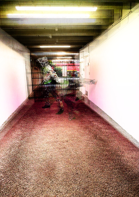
To progress my idea I wanted to change a few things:
Changed the printing from landscape to portrait, I did this to simulate how the poster would look when made in a larger scale. My intention for the final outcome will be a landscape print, but the cutouts will be presented in this horizontal style. Plus this was a good opportunity to see (in a smaller scale) if my idea would look right.
Changed the ghillie cut pattern to the pattern used on my original poster for April seminar. I stated in my previous poster development post that I thought the ghillie cutting pattern used on the suits I've been wearing seems to best suit material.
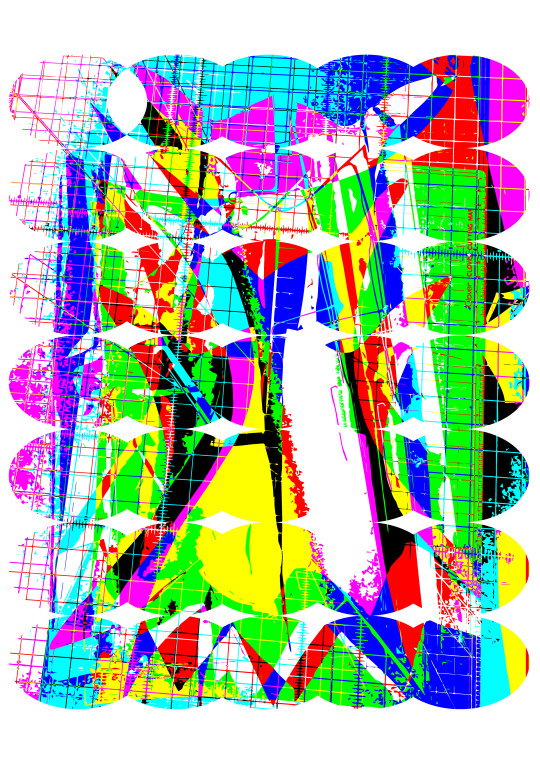
I was starting to see how I can play around with the 'Mona Lisa effect', leaving more white on the top layer to act as the iris. I was also thinking about how I could best use the gradient effect I had used in my last attempt. With this version I was seeing if I could make the eyes into more or creatures than static eyes.
I replaced the gradients that I used for the back side of the cut layer, and the base layer with my own imagery. For the imagery I was playing around with how I could layer some of the sequence photos I had taken on my documentation of wearing the ghillie suit. For the back of the cut layer, I was again just trying a layering, this time layering the process of making one of my first mask works. I chose to use this specific graphic due to the amount of colour, and also the lines that were created by the cutting board. As a back layer I think it provides a good contrast with the eye top layer.


Thoughts after printing/cutting of moch up poster:
The colours didn't come out as bright as expected, but I'm not to worried as it was printed at home not by a professional printer. I think it could be important to think about the CMYK colour print when producing my next version, as I'm not sure if some of the more vibrant colours can be effectively printed the way I want them to be.
The cutting and folding process was A LOT easier, so for future prints I will definitely be the pattern used. I also think that it more effectively gives space for each eye, and also adds a lot to the interesting wave optical illusion effect the the cutting style creates.
I think the bottom layer and the back of the cut out layer work really well to contrast the eyes on the top, the gritty look of the base layer works really well, and although not as effective as I wanted it to be due to colour works quite well.
Defiantly think that for these smaller moch ups printing and building in a portrait format is the way to go, I haven't tried hanging this moch up on the wall yet, but that's definitely something I need to try to make sure it works the way I want it to.
Thinking for my next poster:
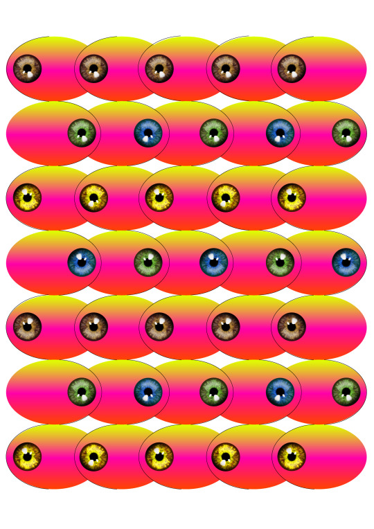
Id like to try just having eyes on the top layer, no extra colour, and I also want to try using the whole eye. For future works I think it could be interesting to capture images of peoples eyes, rather than use PNG's that I've found, more diversity, and more interactive with my practice. For now I think my next version will just use an eye I find on the internet though.
For the bottom of the cut layer I want to try putting words or letters on this layer, rather than just a image. I think it will make the work much more interactive, and also work better as a form of lenticular lens.
Keeping to dark colours or gritty texture for the bottom layer works really well, it accentuates the top layers, but I want to play around with how the bottom layer can interact more with the layers above.
If I'm going to use full eyes, then I will need to reshape the oval I'm using at the moment, stretch it, making it longer, allowing more room so the actual eye doesn't get folded. I think even folding on the eye could be interesting to test too.
Eye direction is also something that I want to look at, do two eyes create a face when see from the side? how does rotating eyes effect the outcome? and can I also have eyes on the bottom layer of the cut out?
This was just something that was made by accident when joining the shapes on the bottom layer of the cut layer together. Though id just add it in because I found it interesting. Whether I actually use this ore not I'm not sure.
1 note
·
View note