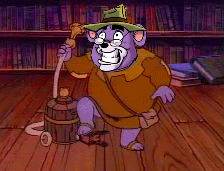
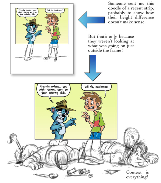
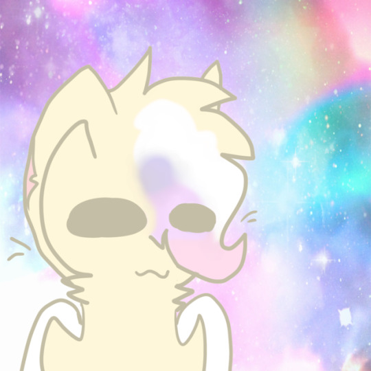
#redrew this so i could change my icon :3
Text
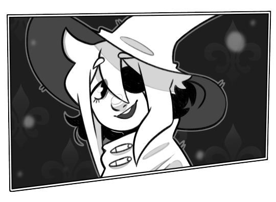
redraw of one of my favorite screens!
#hehehe. squish.#isat#in stars and time#isat siffrin#isat fanart#paper craft#siffrin#redrew this so i could change my icon :3#its rly cute i think i did good...
544 notes
·
View notes
Text
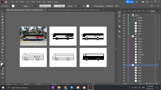
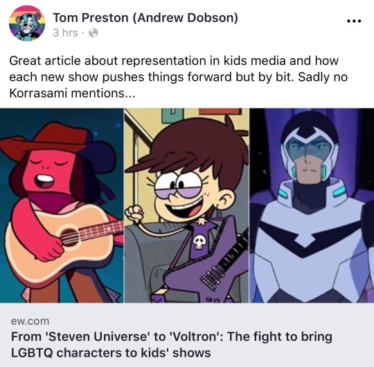
Assignment 1: Stripping Down!
My Abstraction Process
My Vision for the Assignment
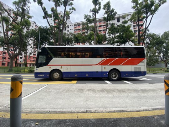
My reason behind choosing a bus for this abstraction piece is that while a bus has many small details such as the lights, windows and even design on the side, its distinctive appearance comprises only a few simple shapes. Thus, I wanted to see to what extent these details could be removed, while still making it recognisable as a bus.
Stage 1
In the first stage, I used the Quick Selection Tool in Adobe Photoshop to remove the background of the bus. I then exported the picture and opened in Adobe Illustrator, where I did an Image Trace of the bus. This rendered a black and white drawing of the bus.
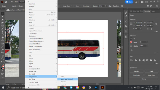
During this stage, I aimed to remove the biggest distractions in the picture, which I identified as the background and the multitude of colors present. Thus, I eliminated the background and reduced it to a black and white image. I chose the fill to be black and white as they are very neutral colors, and also provide a strong contrast, allowing us to focus on the features of the bus.
All the following stages were edited on Adobe Illustrator.
Stage 2
In the second stage, I used the Shape Tool, Direct Selection Tool and Pen Tool to manually trace a drawing of the bus from the previous image. This helped to create a cleaner vector image— as the previous drawing was an automatically-generated trace, some parts were not as smooth. While making the outline, I also left out some small details such as the lights along the side of the bus, further simplifying it.

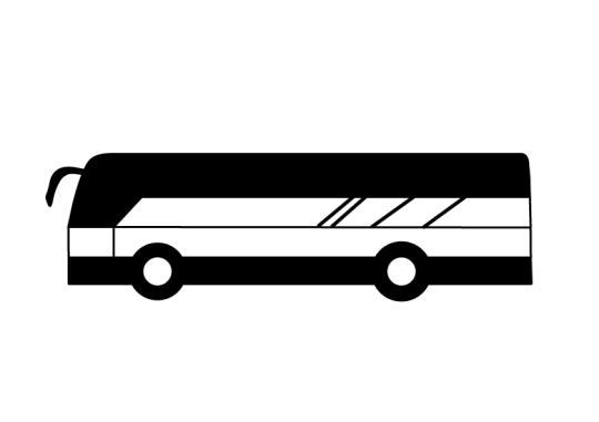
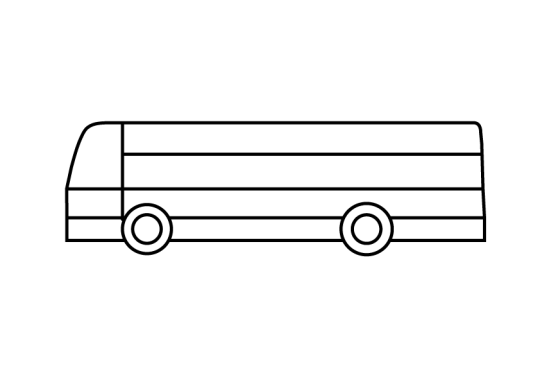
Stage 3
In the third stage, I decided to inverse the drawing to form an outline. This involved changing the fill and stroke colors. Additionally, I also redrew certain parts using the Pen Tool such that they were represented by simpler strokes.
Through these changes, I have created a neat outline of the bus that still includes distinctive features such as the door, windows, design and tyres.

Stage 4
In the fourth stage, I further simplified the outline by changing all the lines within the bus to straight lines. I also removed some details such as the design at the side of the bus and the inner rings of the tyres. This was done using the Pen Tool and Direct Selection Tool.

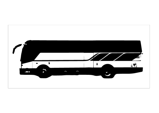
Stage 5
In the final stage, I took into consideration my intentions to create a logo as my final product, and decided to invert the color, using black as the main fill. This eliminated the need for an outline as well, since the contrast between the two colours helped define the different elements clearly.
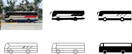
Final Product Before Critique

Feedback & changes
Listed below are the feedback given by classmates during the critique session, as well as my responses and relevant changes.
The change in color in the last panel seems a bit abrupt. Perhaps the black color could have been incorporated earlier on as well?
The change in color was to provide a simpler and cleaner version of the previous iterations. Since I intend to use it as an icon, it is likely to be reduced in size, and needs to be sharp, ideally with as few lines as possible. Thus, I do not think the color needs to be added in earlier as it is a simple one-time process that I had saved for the last stage of abstraction.
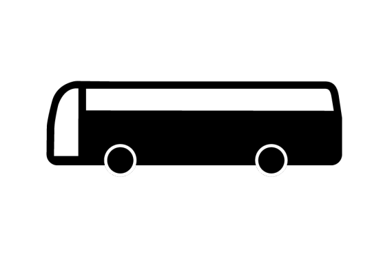
The edges of the bus seem a bit too rounded, especially in the last two panels.
Since most public buses tend to have sharper edges, I thought the rounded edges of this private bus was a unique feature that I wanted to retain in my design. While I do not aim for people to identify it as a private bus specifically, I thought it was an interesting element that I wanted to retain. However, the last two panels were admittedly a bit too rounded, so I have followed the feedback of my classmates to go with the shape used in the fourth panel.
The 5th panel was edited to follow the shape of the bus in the 4th panel.
The bus door in the final abstraction can be moved up such that it aligns with the windows.
I asked a few family and friends around me and majority of them agreed the shorter door panel looked more natural, so I revised it for the final iteration.
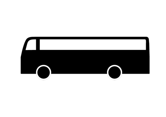
Final Product
Reflection
For this project, I focused mainly on simplifying the drawing through the use of lines. As seen from the process, the initial lines used for the drawing were very life-like, and thus slightly messy. I then converted these lines into cleaner outlines by removing details and representing the shapes in simpler ways. Ultimately, no individual lines were used in the final frame, which only consists of five different shapes, each with either a black or white fill. This process has also shown me that something as complex as a bus can be reduced to a few blocks of color, and still be recognizable to the masses. The key is being able to identify its distinguishable features— in this case, the shape of the bus, along with its wheels.
The products of such abstraction are present in our everyday lives as well, which only accentuates the importance of this process.
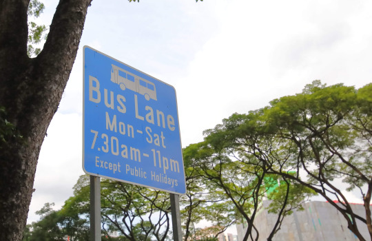
A bus lane sign with a logo of a bus (retrieved from AutoApp)
0 notes
Text
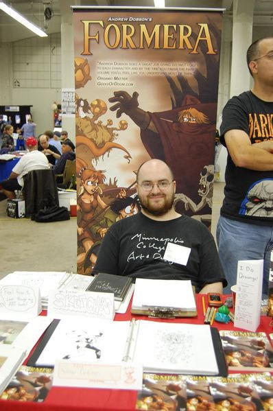
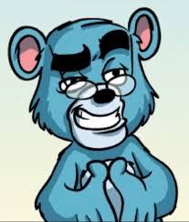
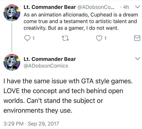
Dobbear! SYAC: The Master Review 6
I am so going to ruin someone’s childhood with that now, but...
guys, it had to be done!
Dashing and daring…
Courageous and caring!
Faithful and friendly…
With stories to share!
Doesn’t at all apply to this one artist…
Lesbian obsessed and each nerddom’s nightmare!
Dobby BEAR!
Whinning here and there and everywhere!
Making claims that are beyond compare…
This is our Dobby-Bear!
Yeah, if you can’t guess, around now is the time I am going to put down the kids gloves and will really dig into why SYAC is garbage. And a huge factor into this, is in part Dobson’s self insert past 2012.
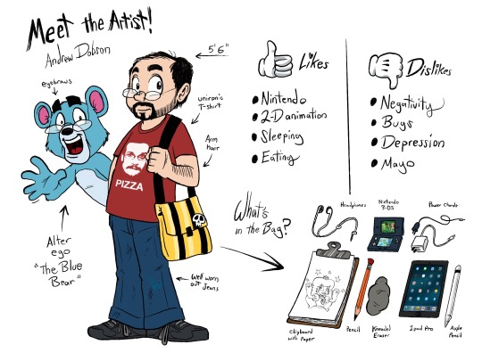
The existence of the blue bear as Dobson officially calls it (or Dobbear as most people call it) is in my opinion rather baffling already in terms of design choices.
I get e.g. that Dobson wanted to distance himself of his past humanoid self inserts as much as possible. But why of all things a bear?
The fact I am focused on that may sound weird, but hear me out for a bit. For starters, I know that Dobson likes western animation. And seeing how western animation has for the longest time been dominated by anthropomorphic animals, I can understand why he would redesign himself as a funny cartoon animal.
But there are at least three things that feel weird about it. First, Dobson had made it clear in the past that he hates furries. So him actually redesigning himself as an anthropomorphic animal is kinda weird
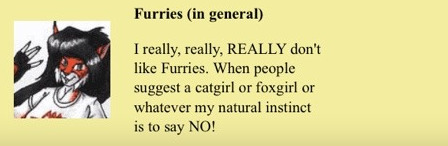
In fact, Dobson himself acknowledges that realization in one of his strips shortly after his fursona took over.
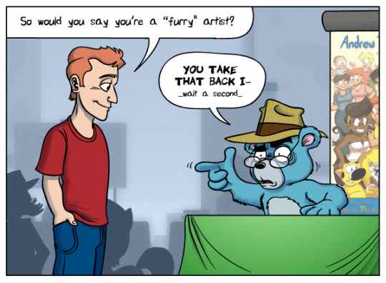
Second, of all the animals to choose from, why a bear? This question is in so far valid, as that bears are not necessarily one of the first to go animals, furries or western animators tend to go for when designing an anthro. And before any furries or anthro enthusiasts are calling me a hater, let me make one thing clear: I like anthropomorphic cartoon and comic characters too, and am okay with most furries. As long as you don’t have a diaper fetish, are a pedophile or hurt actual animals, you can do and enjoy whatever you like.
But I am also aware enough of furry culture to know, that bear based anthros are most of the time hyper sexualized and muscular, connecting them to how the term “bear” is used in real life gay culture. Which is okay, I think it is just a funny coincidence that Dobson choose an animal, that most furries associate with a life style that Dobson is deeply afraid of, even if he claims to be an LGBT ally.
And as stated earlier, bears are not necessarily the go to animals for animators.
Don’t get me wrong, we all know some cartoon bears like Winnie the Pooh, Yogi Bear, Poh and the main cast of TaleSpin (btw, Kit Cloudkicker fan for life). But lets be honest here; ducks, mice, rabbits, canines, felines, equines and any other “easily to domesticate” animal in the real world tends to make better for easily recognizable cartoon characters than something that can reach a size of 3 meters tops and weigh over 500 pounds.
Truth be told, the pool of cartoon bears is so small, these are the first two things that came to my mind when thinking what may have inspired the Dobbear
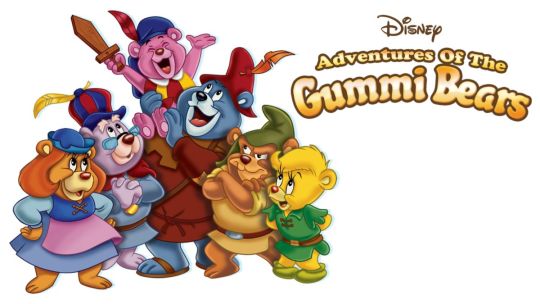
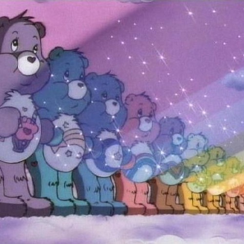
And wouldn’t you know? According to Dobson, the Carebears were supposedly the main inspiration for his design.
Unfortunately, this is also more or less the most I could find of Dobson addressing what went into the creation of the character.
Which kinda brings me also to the third issue as why I think the bear redesign is weird; It is too sudden.
One day Dobson draws himself as a shaved 20 something, the next day he is a fedora wearing Carebear clone, likely created and then rejected by Care Bear villain No Heart, as part of a plot to create a mole when conquering Care-A-Lot.
… and now I need to reevaluate my choices in life, that I was able to make such an elaborate Carebear joke.
It is just a change of design that in my opinion should have been addressed either outside of the comic or in context of it. Which it kinda is, but isn’t.
See, this is the first strip with the blue bear
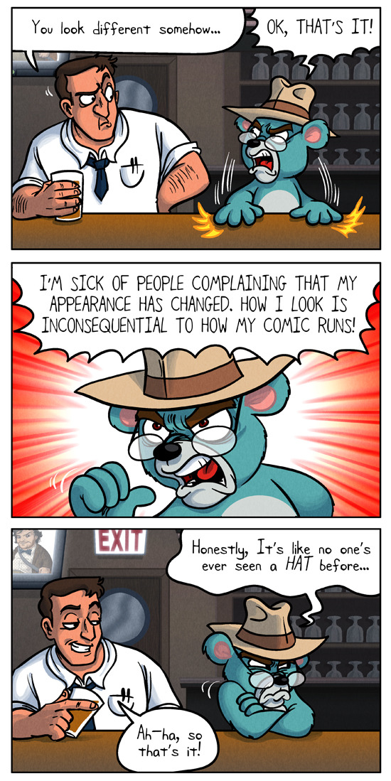
And then only 13 strips or so later in something called “Continuity” is Dobson more or less willing to address the change…
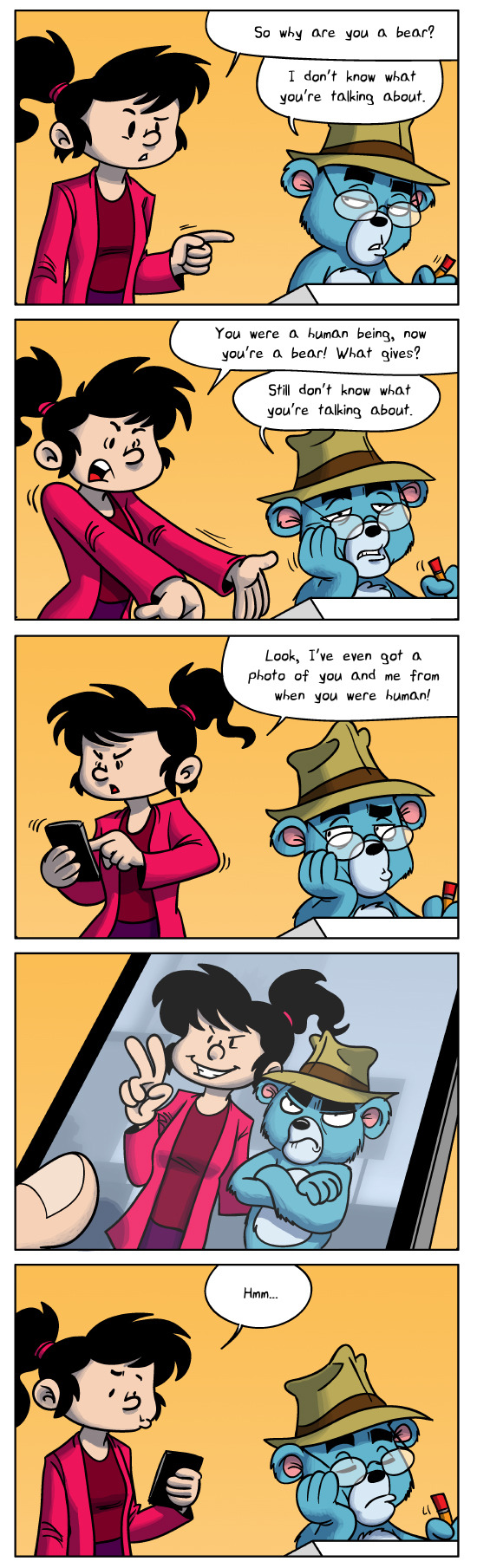
And he does so in a passive aggressive manner, with Persistent Pam as a stand in for those asking him what is going on, while Dobson just dismissively continues working.
On one hand, you can argue that this is just the joke. The change happened, don’t bother with it, just enjoy what is still to come. And you know, I don’t want to make a rope out of everything Dobson ever posted, including that comic.
But then you have also to account for the fact, that Dobson would eventually associate himself with the blue bear so much, he made him his avatar and icon for his comics and online accounts. In fact, that one comic I posted WAY BACK in the first Master post of Dobson reminiscing how he started SYAC?
For reasons that are a bit confusing to me, he redrew himself (badly I have to add) as the blue bear in one of his earliest strips ever. The one where he belittles the manga fangirl for drawing manga. So I have to ask, what is going on here? Has Dobson increasingly decided to reset his past? Does he want to destroy any traces of his “human” self in his work to create the illusion to any new readers, that he never was as controversial of a person as he was and that there never was a need for him to reimagine and reinvent himself? Is this 1984? And how many of you realize that this paragraph is just me going conspiracy nuts for the sake of entertainment?
But still, it is kinda weird that he went to the bother of redrawing his human self in that one background sketch as a bear. Plus, I honestly think Dobson never even attempting to “explain” the change in the pages of his comics is a wasted opportunity for some decent jokes. Like every time Dobson tries to explain why he is a bear now, something interrupts him or we only get fragments of a story that if we put them together would be as ridiculous as the entirety of “Trapped in the Closet”.
I mean, the dumbest joke idea I have in mind is that Dobson went to build a bear to get a present for a family member. Instead he was build into a bear and later on successfully sued the company, which explains why he can afford to live despite not really working on comics anymore but lecture people badly about the evils of nerd culture.
So yeah, three major things about the design choice that more or less confuse me.
But here is the thing: Confusion is nothing compared to feeling genuine disdain for the design at hand. And compared to Dobson’s earlier human designs, Dobbear is just utterly unlikable.
A lot of that boils down to the following three facts:
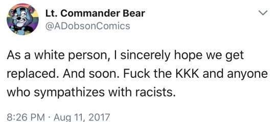
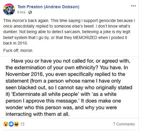
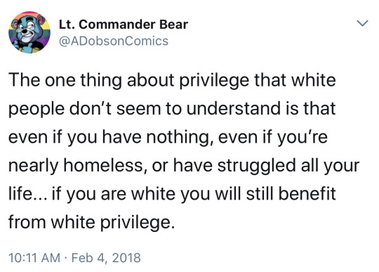
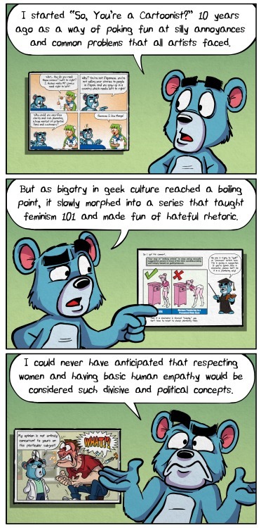
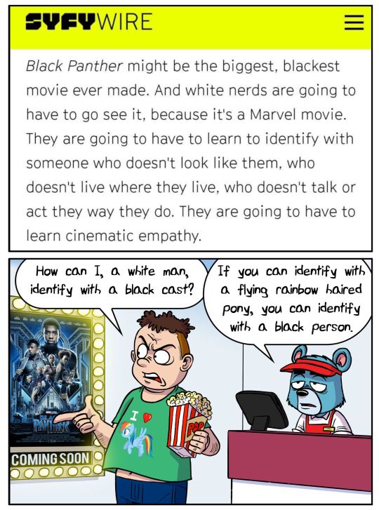
1. From a certain point in time on (which I will cover in more detail later on) Dobson uses his bearsona primarily as a soapboxing mouth piece to talk about “politics” in nerd culture. Or at least what Dobson perceives as politics, coming off like a condescending jackass who believes among other things that white people are inherently incapable to identify with black people…
… or that comic book shops have radicalized nerd culture, essentially calling them terror cells.
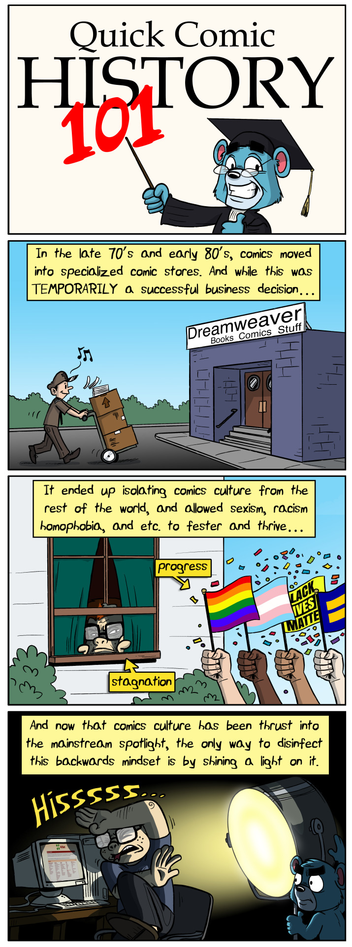
Which btw are so inherently offensive to me, I promise I will cover these two separately. One even sooner than the other.
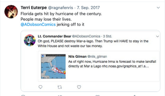
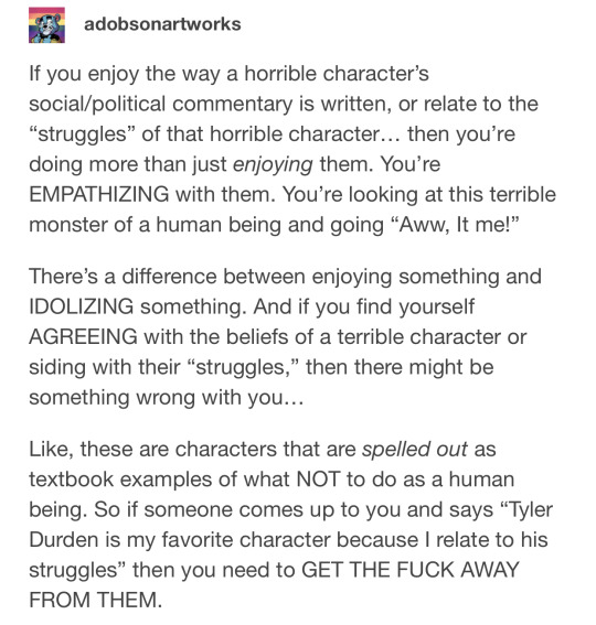
2. If Dobbear is not talking about politics, he will tend to be a smug asshole to other people (most of the time strawmen) or their interests in one way or another. Being e.g. used by Dobson to express his disdain for criticism…
or to mock legit criticism he had gotten by exaggerating things.
All while also tending to make his critics look like inherent assholes.
These two facts, combined with Dobson’s average erratic behavior online on platforms such as dA, twitter and tumblr over the years, pretty much assured such a close association between the two, that a separation between artist and creation was not possible anymore, condemning them.
And for the record; Dobson was always a bit of a whinner who liked to act as if he was a better nerd than the average comic book fan. Otherwise, we would have not e.g. gotten Danny and Spot out of it.
But as the years went by in the last decade, Dobson turned from someone in his mid 20s, desperate to be seen as a “quirky” and likable internet persona (like certain internet reviewers), into a virtue signaling, lesbian obsessed asshole who likely regrets his life choices.
… Like certain internet reviewers.
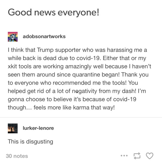
But seriously, Dobson turned into someone who would flip the lid at something as ridiculous as Cheeto flavored chicken fries…
While also being just the worst type of condescending nerd….
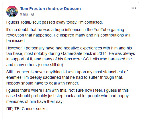
All while losing his mind about politics. Especially after Donald Trump became president
And just as Dobson became a radicalized left winged jackass who saw politics in everything he consumed, so did by default Dobbear, because Dobbear was not a character with his own personality, but a mouth piece.
Something I am about to get into detail in the near future.
But till then, I want to cover in the next post the following third and final fact about Dobbear that really makes him unlikable to me: The fact he can’t be happy.
#syac#Andrew Dobson#dobbear#tom preston#so...you are a cartoonist#review#master review#webcomic#comics
29 notes
·
View notes
Text
Hello, my name is korny and some of you know me as a former beta, then sweet elite’s former clothing artist, that also (singlehandedly) drew the animated mini-game with momo and the little coffee and coin icons. I never had a proper introduction which is why probably most of you see me for the first time now.
I didn’t plan on publicly making a statement, but it has been brought to my attention that the se management said rude and nasty things that – most importantly – are just plain bullshit and I cannot let this be said without a proper response.
If you click this link you will find a google doc with various screenshots, showing what exactly has been going on that made me (& cecile) finally leave the team. I made the doc and the screens a few days prior to leaving (April 2019) and already shared it with all the betas and some staff back then, but also some people on tumblr who have come into my dms asking me to clarify what happened. I feel the right time has come to share this link with the public, although it might be a little confusing to understand for some.
Now, what bothers me the most about serenas ugly behaviour from the past few days is the topic of “’lazy’ cecile”. I’d like to clarify that this entire post is MY opinion, and was written because *I* am angry about this, I was not forced to write this whatsoever by Cecile or anyone else. I’ve kept my mouth shut so far bc I could not be bothered, but this is where I draw the line.
“Lazy Cecile” has been something even BEFORE my beta days (which started in January 2018). Serena used (and still does, as you can see in her latest posts) to call Cecile “lazy” a lot jokingly, but saying it that often didn’t make it funny anymore, and it certainly isn’t a nice thing to say to a good friend. She continued to say it even after Cecile approached her not to.
To add, Cecile is - if not THE - most hardworking person that ever participated in the production of the game. While juggling a full-time job, she also drew AND redrew ALL the sprites, for a short time also drew ALL the illustrations WITH customization (2 genders x 3 three different hairstyles), AND new backgrounds because An already left the team. And that’s just the art she did! She also took part in writing large chunks in almost every chapter, even writing an entire big ass chapter 7 ON HER OWN, which she now has posted on her blog @retconomics (which Serena in response tried to make us afraid by telling us how merciful she is by not suing us for copyright. Your case wouldn’t be that strong honey LMAO not without a contract anyway 😉 ). ALL WHILE WORKING A FULL DAY JOB AND GETTING A DOG, WHICH ALSO REQUIRES A LOT OF ATTENTION. Meanwhile, it took Serena several months to almost a YEAR now, guessing from the release date, to write chapter 6 and it wasn’t a rare case for her to magically loose the file or it getting corrupted. So please tell me how the fuck cecile is lazy? In any fucking way?
Her time schedule was very demanding, so of course we had to cheat a little bit, which brings me to my next point: professionalism. Serena claims that Cecile was very unprofessional, “cutting corners” and her art “unpolished” and “not up to par”. In her example of ‘proper’ professionalism, serena used this image:
Illustrating how the new artist does things better and more polished.
This is where I call huge, MAJOR bullshit.
I have worked on the sprites with cecile. Due to the tight deadline Serena has given us, Cecile would give me the rough sprites and I would finish them & look for any spots that were smudges/did not have clear edges or full transparency. Wanna know how these files looked like?
Hm! Absolutely no fucking different! The expressions were all on one layer, unlike in the example above, but as Serena said: she didn’t say anything against that. That was because Serena wanted to pump content out, which, fair enough, and she needed everyone in the team to “set priorities”, as she said. And adding so much customization was NOT a priority at that time and she knows it.
However, if it DID bug her that much, it’s her own fault if she won’t say “hey Cecile, could you put all the brows on one single layer, all the mouths etc”. And if her excuse is that Cecile lacked the time, I could’ve done it just as easily, as I worked on the sprites anyway and did not have the huge workload cecile had at that time. If the manager is unhappy with their product, they should say something, otherwise nothing will happen. So, if Serena was unhappy with the ‘lack’ of expressions (lets be real tho, 5 expressions isn’t lacking at all)? Her fault.
“Not to mention, all of the sprites will be polished and the artstyle will finally be consistent throughout the entire game (something that our old artist really struggled with at times). Also, both Alita and Ariel are awesome at what they do, take growth and sustainability seriously, and constantly look for ways to improve and build onto the world of Sweet Elite.” Taken from here (x).
Ah, yes. You want consistency and yet hired two artists with two very different styles, and even *advertised* it as something good. Also, if somebody improves art wise, they rarely stay the same way. Art is FLUID. Art CHANGES, especially while improving. And if ceciles art was so unprofessional looking and unpolished for you serena, why didn’t you just tell her to stop drawing? Why not “get rid of the garbage” sooner? Would have saved both you and cecile the clownery that has happened and is going on right now.

(taken from here)
Also calling Cecile a weakness while she literally held the weight of the entire game on her shoulders while having to provide so much art and writing while you failed to write even one chapter during all that? You’re pettier than you care to admit.
I literally could go on and on about this, but this is already 1k words, so im gonna wrap this up. But I am so mad about this “boo hoo there is a narrative spun against me ☹” “I was creatively constricted by my cowriters” (also bullshit lmao, but another topic). You’re just a big liar and an awful person overall, and don’t get me started on your boyfriend.
While you’re getting “rid of the garbage”, please also remove MY minigame which I was forced to make while I was collecting money for my dog, and pay me 100€. You can have the clothes as I actually *agreed* on doing that for no money. 25€ for all the coffee and coin icons would be appropriate as well.
Now, as a former fan thats been on this journey since 2015, I am very dissapointed in how this game is developing. You’re taking this game into a direction you promised not to - not diverse, full of clichés, mainstream. As a fan, this broke my heart. A lot.
I hope you learn that your actions have consequences and that I will NOT be quiet if you decide to spit some lies again.
379 notes
·
View notes
Photo
i redrew my very old icon !!!
(the bottom one is the original, the top is the redrawing !!)
the original was created 3 years ago: july 22, 2015.
i feel like i’ve improved a lot then, and even though i don’t really draw cats anymore, i feel like i still improved !!!!
drawing cats was what really got me into art ! my two friends, in 4th grade, drew cats all the time. i wanted to be like them !!! one of them used to doodle in the margins, so i remember drawing in the margins of my notebook to be like her. they got me into warriors, which made me draw even more !!!! my interests have changed, so i don’t draw cats that much, but a lot of my art reflects cat-like elements and how my old art looked !! i even still draw cat mouths on my people ! i don’t know why, i just am used to it ! this was really fun to do, nonetheless, and i feel good with the outcome !!!
some fun art notes:
i know she has a more mellow expression in the original one, but i wasn’t sure how to make it fit ! also, the background was stolen off of the internet. i don’t know who the creator is, but i’m so sorry for using your work without permission ! though it’s not as beautiful, i opted to draw my own background instead.
though i really wanted to, i didn’t change the colors at all for the design !
i used the exact same tools and drawing program ! i tried to be as true to the original as i could, but i made some adjustments and stylistic changes to mirror my current style ! i did cell shading, since around that time i did cell shading a lot. i don’t know why i didn’t do it on this particular piece, but i added it to the new drawing !
i hope y’all like this, and sorry for my paragraphs !!!
15 notes
·
View notes
Last Seen Blogs

malecunicorn-blog
Aku cinta kamu
jpmtjr
JT

gateglue2
Sofa Slot di Indoslot388

friends-gifsetc
Friends

programmingconfidence
Super High School Level Programmer