#responsive website design
Explore tagged Tumblr posts
Visit Tumblr Blog
Explore Tumblr blogs with no restrictions, modern design and the best experience.
Last Seen Tumblr Blogs


Fun Fact
25% of US internet users with an annual income of $80-100K use Tumblr.
Text

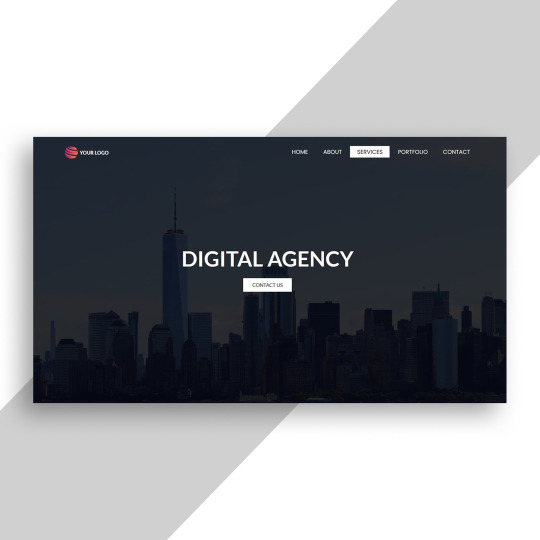
Responsive Website with Bootstrap
#responsive website design#html css#learn to code#divinector#webdesign#css3#css#frontenddevelopment#html#responsive web design#bootstrap website design#responsive landing page website#create a website
5 notes
·
View notes
Text
Responsive Website Layout
#responsive web layout#responsive web design#html css#frontend#css#html#css3#frontenddevelopment#webdesign#neduzone#responsive website design#website design#simple homepage design
3 notes
·
View notes
Text
2 notes
·
View notes
Text
4 notes
·
View notes
Text
Website Design East Pretoria | Professional Web Services
Source: Website Design East Pretoria | Professional Web Services
#custom website design#E-commerce website design#responsive website design#web application development#Web developers East Pretoria#Website Design East Pretoria#Website hosting Pretoria East#Website maintenance East Pretoria#Website redesign East Pretoria#WordPress website design
0 notes
Text
Website Design & Development Services | Custom Web Solutions – Moironix.
Moironix offers responsive website design, eCommerce development, and custom web solutions. Get a fast, secure, and SEO-friendly website today!
We specialize in creating stunning, responsive websites that elevate your online presence. Our web design and development services are crafted to meet your unique needs, delivering exceptional user experiences. Moironix offers responsive website design, eCommerce development, and custom web solutions. Get a fast, secure, and SEO-friendly website today!
Website Design and Development, responsive website design, ecommerce website development cost, website redesign services, website speed optimization services, landing page design and development
#Website Design and Development#responsive website design#ecommerce website development cost#website redesign services#website speed optimization services#landing page design and development
0 notes
Text
Create Stunning Website Design With Web99's Dental Websites Melbourne 2025
The days of Potential Customers calling you to know more about your services are history. They have taken an easy route to gather more information, your Website. If you own a business and don’t have an online presence, you’ll stop getting new customers & will start losing the existing ones.

Your Website is like your office that never sleeps! It assists customers whenever they need it. So it’s critical to have a Well-designed, Customised & High-performance Website. It can help your customers shop easily, get more information about your services, know more about your Business & book an appointment with you.
For this, you’ll need the Best Web Designers. At Web99, that’s precisely what we offer, fully Custom Website Design Sydney services.
We have assisted Dentists, Tradies, Solar Companies, & NGOs in Sydney with their custom website needs.
Single point of Contact
You will be assigned a dedicated expert who will handle all the communication with you. So whenever you have a query, you will be assisted by the same expert.
This will save your time & ours too, as we will be able to help you more efficiently.
2 Customised Design
We understand your Business is unique, so you’ll need a unique design to stand out. So we craft Build a website around your Business. Such a Website attracts more customers, helps you stand out, & boosts your Brand Credibility.
3 Services across Multiple Business niche
We have served clients from different niches, including Dental, Entertainment, E-commerce, Tradesmen & Renewable energies in Sydney. Such experience is a clear indication of our commitment to deliver outstanding results across any niche.
4 Scalable & Google-friendly design
When your Business grows, our websites grow with you. So you don’t have to burn a lot of money to get a new website every now & then.
Also, our websites are built as per Google’s latest algorithms. This helps your Website appear on the top Google results as compared to your competitors.
5 Extensive Experience
Experience is the key, & we have tonnes of it. When you work with Web99, you get access to the unlimited talent pool in our team. This team has more than 27 years of collective experience, making us the perfect choice for your Dental Websites Melbourne needs.
6 Proudly Australian
We are an Australian owned & Australian-based Agency with offices in Sydney & Canberra. We know how to get things done in Australia. Don’t you think you need an agency that has an office where you can visit? Think about it!
#Dental Websites Melbourne#Dental Websites Brisbane#Dental Websites Perth#dental website design#innovative web design#responsive website design#Web Designing
0 notes
Text
Why Do Some Developers Struggle With Responsive Design?
Creating a seamless and engaging website experience across multiple devices is no easy feat. Many developers face significant challenges when implementing responsive design, often leading to frustration and inefficiencies. Despite advancements in web technologies, the complexity of ensuring that a website adapts perfectly to all screen sizes continues to be a common struggle. Businesses in Hallam, for instance, require high-quality websites that look and function flawlessly on desktops, tablets, and smartphones. This is why Responsive website design Hallam services are essential for ensuring websites remain user-friendly and visually appealing across all devices.

Common Challenges Developers Face
1. Lack of Understanding of Flexible Grids and Layouts
One of the primary reasons developers struggle with responsive design is a limited understanding of flexible grids. Responsive layouts require fluid grid systems that adapt seamlessly to different screen resolutions. Some developers rely too heavily on fixed units like pixels, which restrict adaptability and lead to inconsistent user experiences.
2. Improper Use of Media Queries
Media queries play a vital role in responsive design, allowing developers to apply styles based on screen width, resolution, and other factors. However, misuse of media queries—such as setting breakpoints incorrectly—can lead to unbalanced designs where elements either shrink too much or appear misaligned. Implementing a strategic approach to media queries is key to ensuring smooth and visually cohesive layouts.
3. Ignoring Mobile-First Design
Many developers still design for desktop-first and then attempt to scale down for smaller devices. This approach often results in clunky mobile experiences. A mobile-first strategy ensures that websites are designed with smaller screens in mind first, allowing for a more streamlined and efficient scaling-up process.
4. Performance Optimization Issues
A common oversight in responsive design is failing to optimize for performance. Large images, excessive animations, and unoptimized scripts can slow down loading speeds, negatively affecting user experience. Implementing proper optimization techniques, such as image compression and asynchronous loading, can greatly enhance website performance.
5. Cross-Browser and Device Compatibility
What looks perfect on one browser may break entirely on another. Developers must thoroughly test websites across multiple browsers and devices to ensure consistency. This process requires time and meticulous debugging, yet it is crucial for achieving a fully responsive website.
The Importance of Responsive Web Design for Businesses
A responsive website is no longer a luxury—it’s a necessity for businesses looking to provide an exceptional online experience. Poorly executed responsive design can drive visitors away, impacting sales and brand reputation. This is why businesses seeking Responsive website design Hallam services should invest in skilled professionals who understand the nuances of adaptive layouts and mobile optimization.
Conclusion
Developers struggling with responsive design often face issues related to flexible grids, media queries, performance optimization, and cross-browser compatibility. By adopting a mobile-first approach and prioritizing optimization, they can create websites that deliver a seamless experience across all devices. If you're a business owner in Hallam looking for expert web design solutions, investing in the right development team can make all the difference in ensuring a high-performing, visually appealing website.
0 notes
Text
The Impact of Responsive Design on Modern Websites

In the world of web designing, responsive design is what makes the difference. A mobile-friendly website design will solve a lot of problems for you and increase the amount of time people spend on your website.
Simply defining responsive web design — improve the way your website looks on different devices and let people enjoy their time visiting your website through interesting UI/UX and responsiveness.
We are here to discuss the importance of web design and what it brings to your business. The goal of responsive design is to avoid the unnecessary clutter that occurs while scrolling, zooming, or doing any activity on a website.
Everything you’ve put together to create a website, those elements must be fluid proportion-based that can help viewers view your website effortlessly no matter which device they are using.
Everything from layouts, images, content, and menus should change their sizes to fit into the screen they are visible. This will increase customer satisfaction, save their time, and engage them more.
Responsive design is a blessing for all of us. This way you can eliminate the need to design a separate mobile site. Improving user experience will prove your plus point. It makes life a little easier for a company to maintain and create as well as for their customers who visit their website.
Benefits of responsive web design -
1 — Cost-effectiveness
Maintaining two different websites for mobile and desktop can be very expensive. For all the mobile and non-mobile users, there’s only one site that works for both. By having responsive web design, you can save money, time, and effort. Invest only in a single site design that appeals to both mobile and desktop users at the same time.
2 — Flexibility
When you have a responsive site, you are free to make changes quickly and efficiently. You do not have to worry about changing two different sites — desktop and mobile. It’s so flexible that if you need to do a quick change, you are just there and doing a change with the speed of light. You only have to do it once and boom, your site is ready again to engage the users.
3 — Better user experience
No one wants to do business with unprofessional places. User experience is the most crucial thing if you want to create a website. If you want your people to like your site and want them to come back every time, give people a reason to stay and connect again through responsive design.
If someone visits your website on a mobile device, and it takes them forever to load your website, they’ll never visit your website again. It makes your brand/company image unprofessional. But with responsive design, you are ready to impress your customers because everything will be perfect on whatever device they are using.
4 — Easy management
Responsive websites make management easier with every update you want to add or give. Especially for those who have small businesses who don’t have a lot of time to spend on complex website management, they have an easy way for quick changes and an effortless website.
By having a single site that works effortlessly for all devices, it will be much easier for people to get connected with you. Also, you don’t have to worry about two different redirecting links attached to your social media platforms. Because a single responsive link can lead your customers to your website.
5 — Enhances visibility in search engines
Google impresses with its responsiveness. If you have a responsive website, you are in the eye of Google to get the topmost rank for responsiveness. Lack of adaptability in website designing and mobile-friendliness will penalize you. Having a responsive website is a boon to stay ahead of the competition.
6 — Reduce duplicate content issues
If you have both desktop and mobile websites, it may happen you’ll get duplicate content concerns. The advantage of creating a responsive website is that it eliminates the chances of duplicate content and enhances website search ratings.
Any SEO efforts you are putting will automatically apply to the mobile responsiveness through the desktop version.
7 — Lowers bounce rate
A visitor who comes to your website and leaves without doing anything is referred to as a bounce rate. Mobile responsive websites make people stay longer on the website and lower the bounce rate. Visitors love to move forward and visit the different web pages to see what you offer. This will improve your conversion rate.
We feel that having a responsive website design for your business is crucial is low maintenance and convinces your customers to stay for a longer period. Embrace responsiveness and be up-to-date with the latest trends and technologies.
#responsive design#responsive web design#mobile-friendly website design#responsive website design#creating a responsive website#benefits of responsive web design#importance of web design
0 notes
Text
Affordable Website Design for Small Businesses
Small businesses, your online home matters! Learn how affordable, custom web design can help you stand out and grow. #WebDesign #SmallBusiness #OnlinePresence #jfvworks
#affordable website design#small business website#custom WordPress websites#budget-friendly website design#professional website design#brand-focused web design#responsive website design#online presence#website design services#website development#Affordable Website Design for Small Businesses#Affordable#Website Design#Small Businesses#JFV Works
0 notes
Text
Best Website Designers in Jalandhar – Elevate Your Online Presence with N-Dev Website Designers
In the digital age, having a well-designed website is crucial for establishing a strong online presence and engaging your target audience. If you're looking for the best website designers in Jalandhar, your search ends with N-Dev Website Designers.
Why Choose N-Dev Website Designers?
At N-Dev Website Designers, we specialize in creating stunning, user-friendly, and responsive websites that cater to all your business needs. Here’s why we are the go-to choice for businesses in Jalandhar and beyond:
12+ Years of Experience: Our team comprises professional web designers with over a decade of experience in delivering top-notch designs.
Innovative & Trendy Designs: We stay ahead of the curve by incorporating the latest trends in web design to make your website stand out.
Responsive Design for All Devices: Whether it’s a desktop, smartphone, or tablet, our websites guarantee a seamless user experience across all devices.
Cost-Effective Solutions: Get premium-quality web designs without breaking your budget.
Tailored Solutions for Your Business Needs: We understand that every business is unique, so we craft websites that reflect your brand’s essence perfectly.
Explore Our Work
Check out some of our recent projects and success stories:
N-Dev Website Designers – Best Website Designers in Jalandhar (PDF)
Medium Article: Best Website Designers in Jalandhar
Quora Article: Best Website Designers in Jalandhar
Our Latest Blog: Nitin Kumar – The Best Website Designer in Jalandhar
Stay Connected
We’re always here to help you grow your online presence. Connect with us on:
X (formerly Twitter): @N_DEV_JALANDHAR
Facebook: N-Dev Website Designers
Instagram: @ndev_website_designers
LinkedIn: N-Dev Website Designers
Contact Us
Phone: 7009564745
Email: [email protected]
Address: N-Dev Globe Colony, Gujja Peer Road, Industrial Area, Jalandhar, Punjab - 144004, India
Let’s Build Your Dream Website
Don’t wait! Take the first step toward building a robust online business setup. Visit us at N-Dev Website Designers.
Your website is more than just a digital platform – it’s a mirror of your business. Let us help you make the best impression.
#website development#Website Designers in Jalandhar#Best Web Designing Company#Responsive Website Design#Jalandhar Web Designers#Creative Web Solutions#Professional Web Designers#Web Development in Punjab#N-Dev Website Designers#Affordable Web Designing Services#Online Business Setup
0 notes
Text

Portfolio Website Design
#personal portfolio website design#html css#divinector#learn to code#css#frontenddevelopment#html#css3#webdesign#create a website#make a website#responsive website design#responsive web design
5 notes
·
View notes
Text
Why Responsive Design is Important for Any Website in 2024

Your website is the face of your brand in this digital age. As more people use a variety of devices like smartphones, tablets, laptops, and desktops to surf the web, it’s essential that your site adapts smoothly across all platforms. This is the magic of responsive design. In 2024, a website that seamlessly adjusts to different screen sizes isn’t a luxury—it’s essential for your success.
In this blog, we’ll explore why responsive web design is vital for your website in 2024, backed by specific insights, technical explanations, and real-world examples. We’ll also highlight how partnering with us, the most trusted website design company in Kolkata, can help ensure your site meets modern web standards.
The Rise of a Mobile-First World
With the increasing reliance on mobile devices for everyday activities such as browsing, shopping, and information gathering, having a mobile-friendly website has become a necessity. In fact, Google reports that over 60% of searches are now conducted on mobile devices. Websites that aren’t optimized for mobile users will likely miss out on significant traffic and lose potential customers. Responsive website design ensures that your website automatically adjusts to fit any screen size, whether visitors are browsing from a smartphone, tablet, or desktop. This adaptability offers users a seamless experience, helping to reduce bounce rates and increase engagement.
Key Benefits of Responsive Design for Mobile Users:
1) Effortless navigation across devices 2) Faster load times, especially on mobile 3) Enhanced user engagement, leading to lower bounce rates
By collaborating with us, a reputable web development company in Kolkata, you can design a site that’s optimized for mobile-first usage, ensuring that your website caters to the growing mobile audience.
Improved SEO Performance
Search engine optimization (SEO) plays a critical role in driving organic traffic to your website. Google’s algorithm now prioritizes mobile-first indexing, meaning that websites optimized for mobile devices rank higher in search results. Without a mobile-friendly, responsive website, your SEO efforts could be undermined.
Investing in responsive web design ensures that your website not only looks great but also performs well on search engines. A responsive site offers faster load times, minimizes duplicate content, and provides a better overall user experience, all of which contribute to improved rankings on search engines like Google.
SEO Advantages of Responsive Design:
1) Mobile-first indexing ensures better visibility 2) Faster load times improve SEO performance 3) Unified URL structure helps avoid duplicate content issues
A reputable website design company can work with you to optimize your site for SEO using responsive website design principles, making it easier for potential customers to find your site organically.
Enhanced User Experience (UX)
The user experience (UX) is one of the most critical factors that determine whether visitors stay on your site or leave. If your website is slow, difficult to navigate, or doesn’t display properly on mobile devices, users will quickly abandon it. Responsive design addresses these issues by providing a consistent experience across all devices.
A well-designed responsive website ensures that users can easily navigate, interact with your content, and complete actions, whether they’re filling out a form, shopping, or reading a blog. This kind of fluid, intuitive experience leads to longer browsing sessions, more page views, and higher conversion rates.
UX Benefits of Responsive Design:
1) Consistent look and feel across all platforms 2) Simplified navigation for diverse audiences 3) Enhanced accessibility, improving the overall user journey
Working with an expert web development company ensures that your website is tailored to provide the best possible user experience, keeping your audience engaged and satisfied.
Cost-Effectiveness and Time Efficiency
In the past, businesses often needed to create separate websites for desktop and mobile users, a time-consuming and expensive process. Maintaining multiple sites also meant additional resources were spent on updates and bug fixes. With responsive website design, you eliminate the need for separate sites, saving both time and money.
A responsive approach allows a single website to serve all platforms, reducing development and maintenance costs. This simplifies ongoing management and ensures that content is consistent across devices. Having just one website also streamlines updates, as you only need to make changes in one place, which improves efficiency.
Financial and Time-Saving Benefits of Responsive Design:
1) One website for all platforms (mobile, desktop, tablet) 2) Reduced development and maintenance costs 3) Faster, easier updates and content management
We, are a trusted website design company in Kolkata, can build a website that functions seamlessly across all devices while ensuring ease of management, allowing you to focus on growing your business.
Increased Conversion Rates
Your website’s primary goal is to drive business outcomes, whether that’s generating leads, increasing sales, or providing valuable information. If users struggle to navigate your site or if it doesn’t function properly on mobile devices, they are less likely to convert into customers.
A well-executed responsive design simplifies the user experience, making it easier for visitors to complete actions such as filling out contact forms, making purchases, or subscribing to newsletters. The smoother the navigation and interaction process, the higher your conversion rates will be.
How Responsive Design Boosts Conversions:
1) Intuitive navigation encourages users to take action 2) Faster load times result in higher user satisfaction and more conversions 3) Optimized touchpoints across devices improve ease of use
By partnering with a web development company you can build a website that not only looks good but also facilitates conversions, helping you achieve your business goals.
Adaptability for Future Technologies
The digital landscape is constantly evolving, with new devices and screen sizes emerging regularly. From smartwatches to large 4K displays, users are accessing the internet on a growing range of devices. By implementing responsive web design, your website will automatically adapt to new technologies, ensuring it remains functional and visually appealing no matter how users access it.
This adaptability ensures that your website is future-proof, ready to handle new devices and innovations as they emerge. By keeping up with technological trends, your site stays ahead of competitors who may not have embraced responsive design.
Preparing for Future Technologies with Responsive Design:
1) Flexible layouts that adjust to new devices and screen sizes 2) Scalability for evolving technologies 3) Competitive advantage by staying up-to-date with the latest web standards
Working with an experienced website design company ensures that your website is built to adapt to future technology trends, keeping your digital presence relevant for years to come.
Enhanced Social Media Integration
Social media continues to be a major driver of web traffic, with the majority of users accessing platforms like Facebook, Instagram, and Twitter from mobile devices. When someone clicks on a link to your website from social media, it’s vital that your site loads quickly and displays correctly. If your site isn’t optimized for mobile through responsive design, you risk losing valuable traffic from social media referrals.
Responsive website design ensures that visitors from social media enjoy a seamless experience. Whether they’re reading a blog post, sharing your content, or following a call-to-action, responsive design enhances engagement and encourages users to spend more time on your site.
Social Media Integration Benefits:
1) Smooth transitions from social media to your website 2) Consistent user experience, regardless of referral source 3) Increased engagement and traffic from mobile users
We, a professional web development company in Kolkata, can create a website that integrates seamlessly with your social media marketing efforts, maximizing your reach and impact.
Conclusion
Responsive design will be a game-changer in 2024. As more users go mobile, your website must adapt flawlessly across devices. Beyond better SEO and higher conversion rates, responsive design future-proofs your site. The benefits are endless and can profoundly enhance your business.
Collaborate with us, a top website design company in Kolkata to ensure your website is both beautiful and high-performing. Whether creating a new site or upgrading an existing one, responsive design will keep you ahead of the pack in 2024 and beyond.
-----------------------------------------------
Why is responsive design important for any website?
Responsive design ensures that your website is accessible and functional on all devices, providing a consistent user experience, which improves engagement and SEO rankings.
Is responsive design only for mobile devices?
No, responsive design is for all devices, including desktops, laptops, tablets, and mobile phones, ensuring your website looks and functions well on any screen size.
How does responsive design improve user experience?
Responsive design enhances user experience by ensuring that visitors can easily navigate and interact with your website, regardless of the device they use.
Can responsive design reduce bounce rates?
Yes, by providing a seamless and user-friendly experience across all devices, responsive design can reduce bounce rates and keep visitors on your site longer.
How does responsive design affect Google’s mobile-first indexing?
Google’s mobile-first indexing means that Google primarily uses the mobile version of your site for indexing and ranking, making responsive design crucial for SEO success.
How does responsive design reduce development costs?
Responsive design reduces the need to create and maintain multiple versions of your site for different devices, cutting development and long-term maintenance costs.
Can responsive design future-proof my website?
Yes, responsive design ensures your website is adaptable to future devices and screen sizes, providing long-term usability without frequent redesigns.
Can responsive design improve mobile engagement?
Yes, responsive design ensures that mobile users have a smooth experience, which increases mobile engagement, click-through rates, and conversions.
-----------------------------------------------
You May Also Read
Web Design Trends to Transform Your Website in 2024
Why Should You Hire UX Designers for Your Dream Project
5 Common UI Design tips to make it perfect
Are your webpage RESPONSIVE
#responsive design#responsive web design#responsive website design#web development company#website design company
0 notes
Text
Why Pretoria Businesses See Growth with Professional Website Design
In today’s digital age, a strong online presence is no longer a luxury—it’s a necessity. For businesses in Pretoria, a well-designed website can be the key to unlocking growth, attracting customers, and staying ahead of the competition. But building an effective website isn’t as simple as it seems. That’s where a professional website design company comes in. Here���s why businesses in Pretoria…
#affordable website design#corporate website design#custom website design#DIY website builder#ecommerce website design#free website design#professional website design#responsive website design#small business website design#template website design#website design courses#website design jobs Pretoria#website design training Pretoria#website maintenance#website redesign
0 notes
Text
#responsive web design#web developemnt#responsive website design#web developemnt agency#app development#web design in florida#web design in chicago#web developemnt in new york#'web design in uisa
0 notes
Text
Web99's Dental Websites - A Website Design For Dentist
Website Design
The days of Potential Customers calling you to know more about your services are history. They have taken an easy route to gather more information, your Website. If you own a business and don’t have an online presence, you’ll stop getting new customers & will start losing the existing ones.

Your Website is like your office that never sleeps! It assists customers whenever they need it. So it’s critical to have a Well-designed, Customised & High-performance Website. It can help your customers shop easily, get more information about your services, know more about your Business & book an appointment with you.
For this, you’ll need the Best Web Designers. At Web99, that’s precisely what we offer, fully custom Website design services.
We have assisted Dentists, Tradies, Solar Companies, & NGOs in Sydney with their custom website needs.
Our Services
We offer comprehensive Website Design Penrith, Sydney, Canberra, & Orange.
These services include
Custom Websites Development
E-commerce Development
HTML Website Development
Custom WordPress Website Development
How do we roll?
We are a team of passion-driven Website-designers offering services in Bella Vista, Fyshwick, Blacktown, Penrith , Mitchell, & Gungahlin. Unlike your average designing agency, you will talk with experts whenever you call us. We are focused on delivering stunning Websites that act as your 24x offices. From Design & Development to Performace, everything is tailored for you.
We understand the importance of a Google-friendly website & how it can impact your Business. So we ensure your Website is built as per the latest Google standards so you can get the best results. Our Google-certified teams are well-equipped to handle any Google updates & help you stay ahead.
Our Process
1 Understanding your needs
This is the most crucial step for us. We sit with you for consultation & understand your goals in detail before we start. We precisely note every detail that you want on your Website for your 100% satisfaction.
Whenever necessary, our experts offer their inputs too.
2 Wire-framing & Prototyping
Once your goals are finalised, our designers start working on wireframes. These low-fidelity designs offer an overall view of how your Website will look like.
Any changes in design as per you can be done at this stage. Once done, our coders craft a fully functional prototype.
3 Rigorous testing
We believe a perfect website is one that rarely falters once launched. So once the prototype is ready, we perform exhaustive tests in real-world conditions.
Such testing allows us to identify & fix any flaws in the design.
4 Final Launching
Any flaws are found in the prototype are fixed & all the last minute changes in design are incorporated. Once everything is good & merry, we make your Website live.
5 Maintenance
But that’s not the end of the road. We keep a vigilant eye on your Website for any glitches. We also help you stay on the top of Google with our top-rated SEO services.
What’s different about Web99?
We don’t boast of being different or doing things differently. WE MAKE THINGS SIMPLE, FOR YOU & FOR US, that’s it.
How do we do it?
1 Single point of Contact
You will be assigned a dedicated expert who will handle all the communication with you. So whenever you have a query, you will be assisted by the same expert.
This will save your time & ours too, as we will be able to help you more efficiently.
2 Customised Design
We understand your Business is unique, so you’ll need a unique design to stand out. So we craft Build a website around your Business. Such a Website attracts more customers, helps you stand out, & boosts your Brand Credibility.
3 Services across Multiple Business niche
We have served clients from different niches, including Dental, Entertainment, E-commerce, Tradesmen & Renewable energies in Sydney. Such experience is a clear indication of our commitment to deliver outstanding results across any niche.
4 Scalable & Google-friendly design
When your Business grows, our websites grow with you. So you don’t have to burn a lot of money to get a new website every now & then. Web99 creates attractive Dental Websites in Australia.
Also, our websites are built as per Google’s latest algorithms. This helps your Website appear on the top Google results as compared to your competitors.
5 Extensive Experience
Experience is the key, & we have tonnes of it. When you work with Web99, you get access to the unlimited talent pool in our team. This team has more than 27 years of collective experience, making us the perfect choice for your Website Design Penrith needs.
6 Proudly Australian
We are an Australian owned & Australian-based Agency with offices in Sydney & Canberra. We know how to get things done in Australia. Don’t you think you need an agency that has an office where you can visit? Think about it!
#Dental Websites Melbourne#Dental Websites Brisbane#Dental Websites Perth#dental website design#innovative web design#responsive website design#Web Designing
0 notes