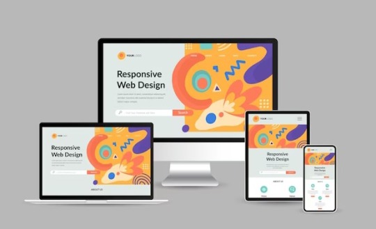
#responsive web design
Explore tagged Tumblr posts
Visit Tumblr Blog
Explore Tumblr blogs with no restrictions, modern design and the best experience.
Last Seen Tumblr Blogs


Fun Fact
Tumblr has 411 employees.
Text

Product Card Responsive
#responsive web design#responsive product card#html css#divinectorweb#css3#html5#frontenddevelopment#responsive card design#css#html#webdesign#css tricks
6 notes
·
View notes
Text

Responsive Navigation Menu
#codingflicks#html css#responsive navigation menu#css menu#css#html#css3#frontend#frontenddevelopment#webdesign#navbar#learn to code#responsive web design#menu html css
5 notes
·
View notes
Text
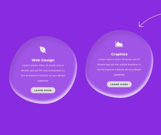
Responsive Service Section
#service section css#responsive service section#frontenddevelopment#html css#codenewbies#html5 css3#pure css animation#webdesign#css#water drop effect#css water drop effect#responsive web design#css snippets
6 notes
·
View notes
Text
I've found someone you should follow on Pinterest!
I thought you'd like the ideas this person's been saving on Pinterest... https://pin.it/4ZUJ4bryL
https://pin.it/4ZUJ4bryL
Follow me on Pinterest 😉
#pinterest#html#css3#tamilitmemes#tamilwebdesign#css animation#web design#web development#website#webdesign#youtube#web developer#website development#development#developer#responsive webdesign#responsivewebdesign#responsive design#responsive web design#it memes#office memes#memelife#memes#funny memes#programmers#programminglanguage#programmer#program#work in progress#affiliate program
10 notes
·
View notes
Text
#web design#website#web design india#website design#website design india#web designers#responsive web design#responsive website#responsive web development
2 notes
·
View notes
Text
Responsive web design is: How do I use the service?
Discover the power of responsive web design and learn how to harness its services effectively. Find out what responsive web design is all about and unlock the potential to create seamless and engaging user experiences across devices.
2 notes
·
View notes
Text

We are a leading website design company Dubai delivering reasonable contemporary and responsive web design services in Dubai. Contact us today for more details.
#app developers#ecommerce development#web designer#website design#development#website design company#professional development#Web Design Services#Responsive Web Design
3 notes
·
View notes
Text
HTML Elements & Tags
Element: anything from the start tag to the end tag.
Tag: a piece of markup language that is used to indicate the beginning and end of an html element in an html document.
Example: <p> your text here </p>
<header><;/header> - Represents a container for introductory content or a set of navigation links. Usually contains one or more heading elements (<h1> - <h6>), logo or icon, or authorship information.
<;h#></h#> - header element. The higher the number, the greater the importance. Only use one <h1> element per page. There can only be six. Main topic on a web page. When visitors to your website see the h1's, it draws attention as it stands out the most on the page as it generally appears as a larger font size and in bold.
<p></p> - paragraph. used to create a paragraph of text on websites. Always starts on a new line. A lot of browsers add some white space (a margin) before and after a paragraph.
<;!-- ____: _______ --> - comment. Used to notate code with text that will not appear on the website/browser display. It allows you to make code inactive. You can use them to explain your code, which can help you when you edit the source code at a later date.
<main></main> - an element that identifies a content area. The main element. Specifies the main content of a document. This type of element/tag makes your html easier to read and helps with Sear Engine Optimization and accessibility. Should not contain any content that is repeated across documents such as sidebars, navigation links, copyright information, site logos, and search forms. When you put things inside the main element, this is called nesting. Nesting elements should be placed two spaces further to the right from the element they are nested in. This spacing is called indentation and is used to make html easier to read.
Example: <main> <h1>Tumblr Meme App</h1> <h2>Tumblr Photos</h2> <!-- TODO: Add link to Tumblr photos --> <;p>See more Tumblr memes in our gallery</p> </main>
<img> - used to images to your website. This element has an opening tag without a closing tag. A tag for an element without a closing tag is called a self-closing tag.
{{ under construction }}
#html#html coding#coding#web development#website development#web design#responsive web design#html web design#html how to#how to html#hot to html#html5#html elements#html tags
3 notes
·
View notes
Text

Efficient System Administration Services for Streamlined Operations || Rasonix
Unlock Your Digital Potential with Rasonix. Being one of the best Web Development Company in Bangalore, from inception to execution to sustainment, we provide comprehensive support for your digital journey. We pride ourselves on delivering high-quality solutions that meet our clients' needs and contribute to their success. Our team of skilled professionals is dedicated to providing exceptional service and exceeding client expectations.
At Rasonix, we follow a well-defined and efficient application development process to deliver high-quality and innovative solutions. We ensure that our clients receive top-notch solutions that align with their requirements, exceed their expectations, and drive their business forward. Call us today to get best website designing and application development services. Rasonix is a leading website development company in Bangalore.
#software development company#software development firm#responsive web design#rasonix#web design#web development company#website designer near me#enterprise application development
4 notes
·
View notes
Text
Navigating Responsive Design: Best Practices for Website Builders
In today's digital landscape, where users access websites on a myriad of devices with varying screen sizes and resolutions, responsive design has become an essential aspect of modern website development. Mastering responsive design involves understanding the principles and strategies that ensure a seamless user experience across devices. From flexible layouts to optimized images, implementing responsive design techniques can significantly enhance a website's usability and accessibility. Let's delve into some essential strategies for mastering responsive design in website development.

First and foremost, creating a responsive layout is fundamental to accommodating different screen sizes. Instead of fixed-width layouts, developers utilize fluid grids and proportional sizing to ensure that content adapts dynamically to the user's device. By employing relative units such as percentages and viewport width (vw), elements on the webpage can scale proportionally, maintaining consistency and readability across various screen sizes.
Moreover, adopting a mobile-first approach is pivotal in responsive web design. This methodology involves designing for mobile devices initially and then progressively enhancing the layout for larger screens. By prioritizing mobile optimization, developers ensure that the website delivers a smooth experience on smartphones and tablets, which are increasingly prevalent among users.
Another crucial aspect of responsive design is media queries. These CSS rules allow developers to apply different styles based on the characteristics of the device, such as screen width, orientation, and pixel density. Media queries enable targeted adjustments to typography, layout, and images, optimizing the presentation for each device category. By leveraging media queries effectively, developers can create adaptive designs that seamlessly adjust to the user's viewport.
Furthermore, optimizing images is imperative for responsive web design. Large, high-resolution images can significantly impact page load times, especially on mobile devices with limited bandwidth. Techniques such as responsive images, where multiple image sizes are served based on the device's screen size and resolution, help minimize bandwidth usage and improve loading performance. Additionally, using image formats like WebP or JPEG 2000 can further reduce file sizes without compromising visual quality.
In addition to layout and media optimization, ensuring touch-friendly navigation is essential for responsive design. On touchscreen devices, traditional mouse-centric interactions may not translate well, leading to a frustrating user experience. Implementing touch-friendly elements such as larger buttons, ample spacing between links, and swipe gestures enhances usability on mobile devices, making navigation intuitive and effortless for users.
Moreover, performance optimization plays a crucial role in responsive design. As users expect fast-loading websites regardless of their device, developers must prioritize performance optimization techniques such as minification, caching, and asynchronous loading of resources. By reducing unnecessary HTTP requests and optimizing code and assets, developers can significantly improve the website's loading speed and overall performance on all devices.
By harnessing the latest technologies and best practices in responsive design, VerloopWeb guaranties your website adapts seamlessly to varying screen sizes and resolutions, delivering an exceptional user experience across desktops, tablets, and smartphones. With VerloopWeb, you can confidently navigate the ever-changing digital landscape, knowing that your website will always remain accessible, engaging, and visually stunning, regardless of the device used to access it. Partner with us today and elevate your online presence to new heights with our expertise in responsive website design.
#website development#web design#responsive web design#website designers#front-end development#website maintenance#dedicated web designer
2 notes
·
View notes
Text
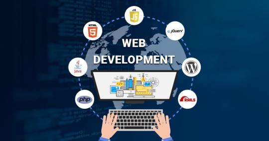
TOP 3 Web Development Course in Chandigarh
Looking for excellence in web development training? Our web development course in Chandigarh offers top-notch instruction in HTML, CSS, JavaScript, and more. With a focus on practical projects and personalized mentorship, we ensure you gain the skills needed to excel in the field. Enroll now for the best web development course in Chandigarh at Excellence Technology

Welcome to Excellence Technology's Web Development Course!
Are you ready to unlock your potential in the world of web development? Look no further than Excellence Technology's comprehensive web development course. Whether you're a beginner or an experienced programmer looking to enhance your skills, our course is designed to cater to all levels of expertise.
Our web development course is carefully crafted to provide you with the knowledge and practical skills needed to excel in this rapidly evolving field. Led by industry experts, our instructors bring a wealth of experience and up-to-date insights to guide you through the intricacies of web development.
Here's what you can expect from our course:
Fundamentals of Web Development: Gain a solid foundation in HTML, CSS, and JavaScript, the building blocks of the web. Understand how these technologies work together to create visually appealing and interactive websites.
Front-End Development: Dive into the world of front-end development, where you'll learn how to create engaging user interfaces and responsive designs. Master popular frameworks like React and Angular to build dynamic web applications.
Back-End Development: Explore the back-end technologies that power websites and web applications. Learn server-side programming languages such as Python, PHP, or Node.js, and work with databases like MySQL or MongoDB to handle data storage and retrieval.
Full-Stack Development: Get a holistic understanding of web development by combining front-end and back-end skills. Become proficient in both client-side and server-side programming, enabling you to build end-to-end web solutions.
Project-Based Learning: Apply your newfound knowledge through hands-on projects. From building a personal portfolio website to creating a fully functional e-commerce platform, our course projects will challenge you to think creatively and solve real-world problems.
Industry Best Practices: Stay updated with the latest industry standards and practices. Learn about version control, testing, deployment, and optimization techniques to ensure your websites are secure, efficient, and scalable.
Career Support: Our commitment to your success extends beyond the classroom. Benefit from our career support services, including resume building, interview preparation, and job placement assistance. We'll help you showcase your skills and connect with potential employers in the web development industry.
Now I tell you about TOP 3 Institution for Web Development course
•https://www.excellencetechnology.in/
•https://extechdigital.in/
•https://thebrightnext.com/
At Excellence Technology, we believe in providing a nurturing and inclusive learning environment. Join our web development course and become part of a vibrant community of learners, where you can collaborate, network, and grow together.
Don't miss this opportunity to embark on an exciting journey into the world of web development. Enroll in Excellence Technology's Web Development Course today and unlock your potential in this ever-expanding field.
Connect with us
If you do not like to fill up the form above, contact us at the following details, we will be happy to connect.
Email: [email protected]
Phone: +91 9317788822, 93562-55522
#webdesign#webdevelopment#webdesigner#userexperience#responsive web design#webdesigninspiration#web design agency#websitedesign#web design services#graphic design#webdesigncommunity#uxdesign#frontenddevelopment#Webdesignlife#web design company#creativewebdesign
7 notes
·
View notes
Text

Responsive Website Design
#responsive web design#responsive website#html css#divinector#css#html#webdesign#css3#frontenddevelopment#learn to code#create a website#make a website
5 notes
·
View notes
Text

Animated services Section
#animated services section#html css#neduzone#css#frontend#html#css3#code#webdesign#frontenddevelopment#responsive web design#learn to code
3 notes
·
View notes
Text

CSS Responsive Profile Card
#css cards#codenewbies#html css#html5 css3#webdesign#css#css profile card#profile card html css#responsive web design
3 notes
·
View notes
Text
Responsive Animated Website With HTML & CSS
youtube
#html#tamilitmemes#css3#tamilwebdesign#css animation#web development#web design#website#webdesign#youtube#responsivewebdesign#responsive design#responsive webdesign#responsive web design#webdev#htmlcodes#htmlcss#learn html#html5#html course#css tutorial#html css#html5 css3#css#htmlcoding#frontenddevelopment#javascript#csstricks#websitedesign#website development
5 notes
·
View notes
Text
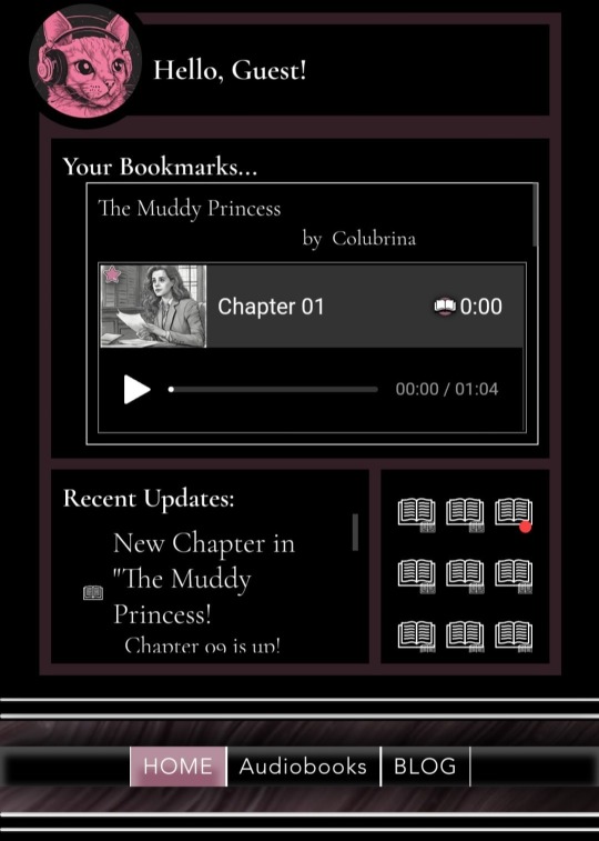
Looking for some feedback!
I'm working on The Podfic RePawsitory, and tinkering with the dashboard on mobile.
If you were going to use a Podfic website, what would you want in a dashboard? Please comment if you have design tips or ideas!
I've got bookmarks, an update feed for subbed authors and fandoms, and notification icons that will hook to various elements.
What else? I'd love some input.
---
I really like the header ("Hello, Guest!), but the rest of it just isn't right. I'm thinking of moving the notification icons to the header, that'll help. Expanding the "Recent Updates" to be full width within formatting.
Definitely want to keep it within 1 viewport height, and aligned in drawer style, ie, off the page until you drag the tab. Possibly as a lightbox or modal window.
#wix#responsive web design#website#website design#coding#programming#headers#dashboards#html css#javascript#html#css
3 notes
·
View notes