#she swatched and reviews all kinds of art supplies
Text
i forget there interests I don’t really talk about to other people or keep to a minimum bc I know they’re not the most conventional but I have a huge special interest in crayola art supplies/and collecting and I have almost every recent release of specialty crayon and I get so excited when they release new ones . I got so excited recently bc they just released swirl crayons ( I think they’re a revival from a 90s version) but I’m literally so fucking excited you don’t get it. you don’t even know. Sorry I wanted to ramble. Hark! to my completely unrelated tumblr blog I go!☝🏽
#there’s this woman I watch on YouTube#she swatched and reviews all kinds of art supplies#and she does crayola ones often!!#she has to be in her mid/late 50s bc she talks abt the ones she had when she was younger#and she would but them for her kids too!!! she collects a bunch now too!!!#I’m watchybf a video of her swatching all the retired crayon shades… autism heaven ….#Jenny’s crayon collection my beloved <3#Maybe I need to make a side blog for this or something bc I know a lot of ppl aren’t interested#but I want to Yao sometimes sorry 💔💔💔#txt#*yap
106 notes
·
View notes
Text
Barnyard Episode - Episode 585- The Knitmore Girls
This week's episode is sponsored by:
Carry your creativity with Erin Lane Bags! Whether you show your fiber fandom with the woolly wonder
Sheepleverse, or dive into history with the Curiosities collection, our project bags, totes, and hook and needle
organizers are at the ready to keep your hobby happy.
When was the last time your knitting yarn was a work of art?
Infinite Twist produces one-of-a-kind semi-solid gradients featuring speckles, high-lights, low-lights, and gorgeous color transitions. From 700 y Giant Gradients to 200 y matching sock sets, Infinite Twist Gradients will hold your interest from cast on to bind off.
See the currently available gradients at infinitetwist.com, or be the first to know when new colors are posted by signing up for our newsletter at infinitetwist.com/newsletter-signup
Have you ever had to frog because you forgot a step several rows back? Or lost your spot because you dropped your magnet board or lost track with your highlighter tape? Instead of wrestling with paper, use the knitCompanion app. It keeps you on track so you can knit more and frog less. knitCompanion works with ALL your patterns and is available for apple, android and kindle fire devices.
LoLo Body Care, formally Bar-Maids, creates exceptional moisturizers hand-poured by staff who add a good dose of heartfelt love to each one. Most all their supplies are made in the US, and their beeswax sourced from a local farm. Besides quality, the value of their product lies in that they last a very long time and are loved to the very last bit. They built their brand on being eco-friendly and their new packaging rocks. Their customers and customer service are rare and treasured jewels.
One minute family update
On the Needles:(1:11)
After a month of concerns about users who have been harmed by NuRav being ignored, we are shifting to adding more content to our shownotes pages in order to make them as accessible as possible to our listeners.
From here forward, we will be putting our projects here on our blog as well as in Ravelry.
Gigi is swatching for a Ridgeline cowl out of Backyard Fiberworks
Gigi is working on Knitmore cowls. She is working on a Fade cowl out of an Onyx Fiber Arts mini skein bundle.
and one out of primary colors from Black Trillium Fibers
Gigi is working on the Ochre cardigan
Jasmin picked up her 2014 SPAKAL Harvest Cardigan. She has finished the sleeves, and is nearly done
with the bottom edging.
Jasmin is making good progress on her Match and Move shawl (by Martina Behm #behmalong); she's
knitting it in Black Cat Fibers Nomad Sock.
Gigi is working on Opus the Octopus. She sewed eyelids, and is working on tentacles Gigi finished the
washcloth blanket out of acrylic yarn
Gigi knitted a washcloth blanket out of acrylic yarn
Gigi had set up a preemie hat kit: she is making more baby bear hats (RAVELRY LINK) out of Jamieson yarn and some
yellow yarn, and is knitting plain hats to embroider later.
In Stitches (14:51)
Gigi is sleeping under a Stack and Whack quilt.
She is wearing her A line skirt, using a burrito pillow case, and also the yellow Cal King quilt
Events(20:29)
The Operation Sock Drawer book will be published in October. Call Hicklebees for a SIGNED preorder
copy of Operation Sock Drawer
We talk about Drinking French
knitty.comhttps://knitty.com/sos.php has a comprehensive list of events that have been canceled
Stash Dash 2020. Dates 5/22 to 8/22/20 #teamcuteknitter #beatbostonjen
Fiberworld 2020
Tour de Fleece has started! #Team Sasquatch
Mother Knows Best:(29:00)
Just keep swimming.
We reference Dr Gemma
When Knitting Attacks: (32:44)
Gigi : cast on again for the primary color cowl. Making it pool is hard
Gigi: Ochre cardigan. She ripped out the sleeve, and picked up more sleeve stitches at the underarm
Jamin dropped a stitch on her 2014 SPAKAL Harvest Cardigan.
Review:(41:48)
Cable Knits from Nordic Lands by Ivar Asplund
Jasmin mentions Elsebelth Lavold
Viking Knits
Viking Patterns
Straw into Gold:(48:51)
Tour de Fleece! Jasmin is finished spinning and plying the Targhee/Romney/Angelina from Morro Fleece
for a sweater.
Jasmin finished spinning her Elsa blue Abby batts
Jasmin is half finished with spinning the cashmere/silk roving from Abstract Fiber
She is using the Schacht Double Ended Electric Bobbin Winder, blue shop towels and oil applicator
Gigi is spinning on the Jenkins Turkish drop spindle
Knits in Space:(54:48)
Jasmin took Gigi on a virtual fabric store visit
And Sew On:(58:20)
Gigi dug out UFOs. Working on the background of a whole cloth quilt piece. There are feathers with a
grid background. Genevieve is practicing sewing straight lines. Gigi cut fashion fabric and lining for
Grinch bags. They are black light reactive .She is hand basting the zipper from her Carli sweater
Check out this episode!
3 notes
·
View notes
Photo
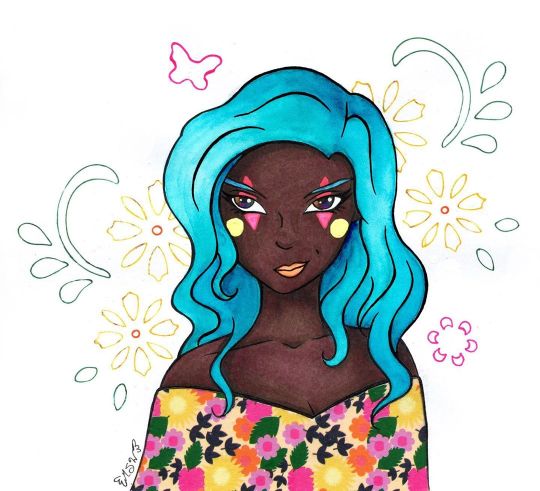
Covered in All the Colored Lights
Well, this looks wild and different coming from me, doesn't it?
If you've been a Sparkler long enough, you may remember this character of mine from ages ago when I made This Is Where You Wanna Be, which featured her. Her name is Windith, and she's a performer who likes mixing old-time circus elements with more contemporary stuff.
(She was originally just a circus performer but that felt too limiting for me, and I'm thinking it might be a little too passive for her personality. I don't have a set story for her, so her character will perpetually be in development )
This drawing was also me testing out some new paper and the new Skin Tone marker set from Ohuhu. Which I simply had to get because it meant more colors of their brush tip markers that I've tested out in the past. (Ohuhu Brush Marker Review and Sweet Ohuhu Snail)
I'll cut to the chase for those that aren't interested in the longer version: I kinda hate this paper and it, unfortunately, was not the best choice for what was supposed to be a mostly-marker illustration. But I like the markers! The markers themselves are nice as always, and I like the addition of the new colors, but the one thing I have to point out is that Ohuhu is still lacking in good colors for super pale skin that doesn't have a strong pink or gray undertone. They're doing really good with peachy tones, mid-tone, warm browns, and the new colors add some really nice darker/cooler browns, though.
In fact, the new marker colors are what primarily inspired me to bring Winidth back into the fold in the first place; some of the colors looked like they would work really well for her skin tone in particular, and I've avoided drawing her traditionally in the past because I wasn't sure I could capture it accurately with the supplies I had.
And...that's really all I have to say about the markers, actually. As brush markers, virtually nothing has changed from the last two rounds of testing I did with the Ohuhus, and thus the only thing I can really comment on is the colors. I really appreciate having more to pick from, especially because some of the colors in the set really do stand apart from the rest of my alcohol marker collection, but a lot of the "light skin tone" options are either too orange/pink or too yellow or just generally too dark for a light/pale skin tone. So, my final commentary is the same as always: More colors, please!
Now, as for that paper...
I picked up a new sketchbook from my local Ross, which I've known for a while now as having a surprisingly good (maybe not the best, but surprisingly good) art supply section. This paper is by a brand called Craft Smith, which as far as I can tell seems to be very into making scrapbook/craft paper and doesn't appear to be actively selling/promoting sketchbooks currently. (At least not anywhere I could find online.) It also claims to be "Mixed Media Paper 120 lb (180 gsm)."
I actually have some 120 lb mixed media paper that I use semi-frequently in the form of a sketchbook by Denik. And funnily enough, that's the same paper I used on my other two Ohuhu marker pieces. So we have both a baseline for comparison in terms of performance and in terms of feel.
Now, I'm not an idiot. I did inspect the paper before I actually bought the sketchbook, and it's alarming how deceptive this paper is. It definitely has the right weight/thickness to it, even compared to the 120 lb. paper I already had once I got it home. The only truly notable differences are 1. This paper is a brighter white (the Denik paper is almost on the blue/purple side) and 2. This paper feels smoother. And the second point was actually one of the reasons I bought it, as I thought it was make for a really nice marker paper. (Smoother paper tends to be a better option for brush markers so you don't wear out the nibs as quickly)
Oh boy, how wrong would I be!
So, let me explain just by going through my process for the art, since that and discovering the atrocities of this paper go pretty hand-in-hand.
Trying desperately to get used to my current tablet situation, I started by doing the lines for the illustration digitally, having been inspired for a pose/facial expression by some Ball Jointed Dolls over on Instagram. The lines didn't turn out perfectly, but they were good enough that I felt comfortable printing them out and re-inking them traditionally as I did for Fairy Enchanting, the artwork featured on my Commission Sheet.
In that process, I would end up with a 1/2 of the drawing that didn't print correctly, the proper print out I used to do the inking, and also similarly to Fairy Enchanting, a first attempt at tracing my lines that was not turning out how I wanted that got scrapped. So, essentially, I had 1.5 test pages just for colors/color placement (as they were on regular printer paper), and 1 to see how this paper would actually handle my supplies. And while normally I'd be scolding myself for wasting paper and ink, in this case, it's actually a very good thing that happened.
My second attempt at inking on this paper went a lot smoother (I think I just needed to loosen up the inking part of my brain), and I was actually pretty happy with how the lines turned out. So much so that once I discovered major problems with the paper, I actually scanned the inked version in to preserve it, just in case. And I even inked it a third time on to the Denik paper I mentioned earlier, extra-just in case so I could even do a side-by-side comparison of the two papers to show "this paper is crap, this other paper is not." (Fortunately, I don't think I'll be needing that third inking despite the tale I'm about to tell.)
I started out by using the different test pages to make sure I had the right tones/colors I wanted for the skin. The swatches looked okay, so I went ahead and tried coloring the skin to test some blush and shading. Right away I noticed that 1. The ink feathers/bleeds across the page (outside of lines) way more than it should for a paper this thick, and 2. once the ink settles into the paper, it's kind of patchy/spotty. And 3. If you trying layering a light color over a darker color with alcohol markers, it makes the patchy/spotty-ness more apparent.
Obviously, these things combined make layering and blending tricky without the end result looking strange and uncomfortable.
Just in case there was something this paper didn't like about the Ohuhu markers, in particular (and also because I wasn't super happy with my color choices for Ohuhu for this particular hair color), I did try a test blend for the hair with some Copic markers. Nope, still feathering badly and doing the weird spotty thing. Still not layering very well without re-working the entire area.
Briefly, I panicked.
The whole idea for this paper was to be for markers, and I had largely intended for this illustration to be pretty markers-only. But this paper, quite apparently, hates markers.
Okay, okay. I tried one more blending/coloring test, this time just seeing if I could do the skin and get it to look decent on this paper inside my lines, and while not super ideal, I did manage to get something I was mostly happy with. Likewise, my next step was to do that again on the final piece. At least then I'd have the most important part--the skin--for this piece done and then I could proceed with whatever seemed like the best option for the rest of it.
So the skin actually turned out okay in the end because I was being exceptionally careful to work with the issues I'd already discovered. By nature, it's not the best (as in it would look better on better paper), but it works.
I still had at least a small problem on my hands though.
To be fair, even before I printed the lines off I was thinking I might try washi tape for her clothes/shawl/whatever, so the paper not liking markers really just re-enforced that idea.
The problem was I still had the hair to do.
I tried a couple more blending/coloring tests, trying desperately to make the markers work for that, but it just wasn't happening. The way I blend hair just requires too many layers for this paper.
So my next solution was to try some tests with colored pencils.
For smooth, flat color, this paper is actually pretty nice for colored pencils. For layering and blending, however, (just as I suspected before I even tried it) it's too smooth. Blending works pretty okay if you're just doing 1-2 layers, but anything beyond that is just slippery and unsatisfying, to say the least. That was my two main mediums thrown out the window. Now what do I do?
Because I was largely at my wit's end, I got a little crazy and tried some tests using some Faber Castell gelatos to see what they would do. And I have to say, putting the gelatos to this paper does feel exceptionally good, as the smoothness of the paper suits the creamy texture of the gelatos. Although the gelatos don't blend out super well when you add water to them on this paper, so that limits what you can do with them by a fair amount.
Not really knowing what else to do, I broke out some actual watercolors and tried those.
Fortunately, while the paper does warp fairly easily (that's to be expected with any paper less than 140 lb.), the paint lays down and blends fairly smoothly and nicely.
And so I finally had something to work with.
There's a reason when I work with watercolors I usually don't go for a hard illustration like this, but I think I managed fairly well to get the paint to do what I wanted. I knew going in it wouldn't have the same look or dimension as my markers or pencils, so I made my peace with that ahead of time. The main thing I wanted was at least the suggestion of shading and relatively smooth coverage. There are some small areas where the paint just did what it wanted anyway, but it's little enough I don't think it ruins the whole thing. I'm sure I could've worked with the hair more to get arguably better results, but by this point, I was so relieved the paint was working that I decided not to push my luck. (I did end up having to digitally tweak it because it shows up as a little more blue on the scan than it actual is, but that's not really the paper's fault.)
Since I wasn't sure what exactly I wanted to do with the face/makeup at this point, I moved on to dealing with the washi tape.
Fortunately, this ended up working out fairly easily. I actually put the tape down on my inking-gone-wrong (as the areas where I needed to cut it turned out well enough it would work for this) and used an Exacto knife to carefully cut the top of tape away to make the neckline and keep the tape from covering up the little bit of hair that reaches down that far, the hair being the tricker part to cut. Even so, I had a less challenging time than I thought and I only minimally dented/cut into the very top layer of the paper underneath. (Which was why I wanted to cut the tape on not-the-final-piece in the first place; I knew indentions were going to be made from the knife no matter what I did, but it's hard to predict how bad it'll be until it's usually too late.) Once that was done, I could simply peel the pre-cut tape off of my test page and re-apply it to the final one.
Naturally, the cut wasn't 100% accurate, but it was close enough that the little bit that wasn't quite right was easily disguised but going back over my lines again and filling any gaps.
I went back to the face once that was taken care of, and I ended up relying on the heavy feathering this paper does to get Windith's eyes right.
Originally when I drew her, I tried to give her "oil slick" eyes. As in, her eyes are black but have a rainbow sheen to them, like how if you ever see oil in a parking lot, it's black but has that really pretty rainbow shine to it. I never had to consider before how this might translate into a traditional drawing though since that drawing was done digitally and at a time where I thought digital art was going to be my primary medium going forward. (My oh my, how the tables have turned indeed...)
After a couple of failed tests (failed due to personal preference and actually not the paper this time) I ended up going with a dark selection of alcohol markers in very teeny tiny dots to make a pseudo-rainbow. It's not a perfect translation of what her eyes are supposed to look like, but it's close enough to suit me.
Then came the makeup.
Originally, I was going to just make her lips a more natural color and largely call it done, but I didn't want them to blend in too much with her skin and even when I tried a less natural berry color I just couldn't get the blending right in such a small space on this paper.
And I was also thinking it would be nice to give her eye shadow and bring the colors from her shawl-thing up into the face area a little bit. But I'd already discovered colored pencils weren't the way to go and I had a feeling I wasn't going to like how this paper handled pastels either, so I just skipped testing that altogether.
After some thought, since I originally thought of Windith as a circus performer, I deiced to do some testing with gel pens (which I figured would handle just fine on this paper, given the nature of gel pens in general) and this simple kind of clown makeup. (I'm sure there's a more proper name for it out there somewhere but I haven't the foggiest idea what that said name is.)
I ended up really liking that, especially with how the bright colors pop against her dark skin tone, and in that, I thought a bright color would work well for her lips, too. I tested my orange gel pen, but it was a little too bright and just a little too imprecise for my taste, so I opted for a little fluorescent orange watercolor instead.
I know the makeup probably looks kind of silly to most, but I really like it and how it ties the colors together better. And besides, I think it says a lot of about Windith's character that she can wear makeup like that but still looks as confident and determined as she does here.
But I wasn't done quite yet.
I wanted to do something to fill the empty space in the background, but as I mentioned earlier I really was not keen on finding out how this paper would handle pastels after the struggles I'd already been through. And also I didn't really think any of my pastel colors would work all that well with the other colors going on here.
It's not too much, but I ended up defaulting to some of my dollar-store stencils to add some florals and a little butterfly back there. I figured that would tie in nicely with the floral washi tape, add a bit of color, yet not totally overpower everything. I also ended up with some artsy white dots because I somehow got some random ink dots/smudges around a few edges and once I covered those up I added some more dots so it would look like an intentional part of the look. Unfortunately, said white dots did not show up on the scan.
The final piece is definitely far from perfect and this paper is not good for a lot of things I was hoping it would be (I can report it seems to work pretty good for regular sketching, though, so it won't go to waste!). However, I still managed to get something pretty decent out of the equation, I think. Small victories?
I may not be looking forward to making more finished pieces with this paper, but I am looking forward to playing with the Ohuhu Skin tone markers more, that's for sure. I've got a few sketches that I'm thinking about turned into a mini-series illustrating a few different skin tones with them, but I haven't decided 100% on that just yet. I do have a couple of other projects definitely coming down the pipeline though, so stayed tuned.
P.S. The title is a reference to The Greatest Show, the opening them from "The Greatest Showman," the same song that largely inspired the first time I drew Windith. It's just kinda her thing now.
____
Artwork © me, MysticSparkleWings
____
Where to find me & my artwork:
My Website | Commission Info + Prices | Ko-Fi | dA Print Shop | RedBubble | Twitter | Tumblr | Instagram
1 note
·
View note
Text
Makeup fans blush, beat and blog on social media sites
New Post has been published on https://britishdigitalmarketingnews.com/makeup-fans-blush-beat-and-blog-on-social-media-sites/
Makeup fans blush, beat and blog on social media sites
Ithaca College sophomore Lucia Tepper sits in her dorm room, a light and tripod pointing toward her. A row of clear boxes filled with brushes, lipsticks and palettes line the desk in the background.
“Hi guys,” she says to the camera, addressing the thousands of followers subscribed to her YouTube channel, LuciaTepperBeauty. “My name is Lucia, and today I’ll be showing you my makeup and beauty empties.”
She rummages through a bag in her lap, holding up finished mascara containers, lip gloss tubes and blush palettes. She shows each containers’ empty contents to the camera, reviewing her experience with each product. Her resulting video, “Makeup and Beauty Empties! November 2018,” has 3,895 views as of Nov. 6.
Tepper is one of the thousands of beauty vloggers on social media, particularly on YouTube. These vloggers, some of whom are self-proclaimed “beauty gurus,” post videos of themselves creating makeup looks and reviewing products. The most subscribed-to beauty vlogger in the world is Mariand Castrejon Castañeda from Mexico, whose channel, Yuya, has approximately 22.5 million subscribers. Some of the most popular English-speaking beauty gurus are Zoe Sugg, whose Zoella channel has nearly 12 million subscribers, and Jeffree Star with approximately 11 million.
Sophomore Lucia Tepper has over 30,000 subscribers on her YouTube channel, LuciaTepperBeauty. (Julia Cherruault/The Ithacan)
Tepper began her YouTube channel three and a half years ago, initially as a channel sharing videos of her singing. She then changed her mind, deciding to become a beauty vlogger after watching uploads from others in the makeup community.
“I started off just wanting to be a beauty guru,” she said. “I wanted to have a gigantic makeup collection. I wanted to do tutorials and everything.”
She said her channel had 1,000 subscribers until she began a series “Makeup Your Mind” in January 2018. Often to fund buying makeup, some beauty vloggers receive public relations packages of sponsorships or receive payments from advertisements on their channel. While most beauty videos focus on new products, Tepper’s series criticized beauty vloggers’ sponsored products and consumerism. Within a month, she gained 30,000 subscribers. Currently, LuciaTepperBeauty has 31,948 subscribers as of Nov. 6.
One of the more popular topics for beauty videos is “hauls.” YouTubers buy multiple products at once, often from the same makeup brand, and review them. Many haul videos advertise, with aggressive capitalization, the amount of money spent on higher-end brands. Jeffree Star’s video is titled “$2,500 ULTA DRUGSTORE HAUL! | Jeffree Star,” while another channel, COSMEHOLICS ANONYMOUS, posted a video titled “I ACCIDENTALLY SPENT OVER $1000 ON FENTY BEAUTY! (HAUL, PRICES & SWATCHES).”
“Getting something that’s worth money is like a special occasion,” freshman makeup fan Hannah Brule said. “Then you have that one palette that you love showing people.”
Tepper said her constant consumption of makeup made her anxious, and she began doing “anti-hauls,” where she shows reasons not to buy new things, instead focusing on anti-consumption. She said she’s also done “product panning,” which focuses on “hitting pan” on products, or reaching the bottom of the container and using all of the product available.
She said her series was controversial. Previously, Tepper had released videos that criticized other beauty gurus for accepting PR packages, or sponsored products brands send to review, and advocating constant consumption. She began receiving critical comments, video responses and death threats in the comments of her videos when she later began accepting sponsored products. She said in a video that “anti-consumerism” means being a conscious consumer of products, and she wanted to focus on using and reviewing products while raising awareness of advertising techniques in sponsorships.
“My content is very controversial, which is ridiculous because it’s makeup,” Tepper said. “I never want to cause drama. I just speak my truth, and I really just want to stop people from spending a ton of money and having anxiety. But a lot of people … found things I said controversial.”
Senior Abiola Tubosun-Kassim runs a beauty and lifestyle YouTube channel as well, although her main platform is Instagram. Her Instagram account abiolakassim.mua features bright blue, pink and orange blended eyeshadows and golden highlights. She has a series called #RemixFriday that she uses to recreate makeup looks from other Instagram makeup artists.
“I feel like, for me, it’s more of an art,” she said. “And it allows for myself to feel beautiful, and I get to make other people feel beautiful.”
Tubosun-Kassim said she does makeup for clients on campus and in New York City. She began taking clients in February 2017 and said she charges $30 to $40 per session, usually lasting an hour.
“I try to make it affordable because I know for college students, it’s not that easy to come by for money,” she said.
Tubosun-Kassim says she uses bright colors in her makeup looks. She says she views makeup and beauty as a form of creative expression. (Julia Cherruault/The Ithacan)
The high-end makeup brands many beauty gurus use in their videos are notoriously expensive. So, how much do beauty fans spend on makeup?
“Don’t even ask me that question,” said junior Margaret Tippet, beauty editor of Distinct Magazine. She said she watches beauty vloggers for product reviews to keep up to date on product releases and to decide what drugstore makeup is good quality.
Tippet said that at her peak of using makeup, she would spend $100 a month on beauty supplies. Tubosun-Kassim said her most expensive makeup purchase was Ulta’s Too Faced Sweet Peach Palette, costing $42. The most expensive product on Ulta’s website is $195 for a collection of liquid lipstick. On Fenty Beauty, another high-end makeup brand by pop star Rihanna, a highlight brush goes for $32.
“It’s really expensive,” Tubosun-Kassim said. “I usually just stick to drugstore– friendly stuff from Target or Walmart or stuff like that because it’s really expensive, and sometimes, I don’t have the money to spend on it. So I just try to get it as cheap as possible.”
Tubosun-Kassim also said that there can be limited shades available for darker skin tones. She said as a black woman it can be hard to find her shade range, particularly in higher-end brands, but also in drugstore makeup aisles. The lack of diversity in makeup shades has been discussed by other beauty YouTubers as well. Vlogger Jackie Aina uploaded a video in January 2018 that addressed the lack of products that matched dark skin.
“I feel that with the more high-end … stuff, it’s really hard to find your shade range, and even sometimes with drugstore makeup it’s hard,” Tubosun-Kassim said. “I know there’s this Maybelline Super Stay Foundation that they came out with, and I couldn’t find my shade, and in order for me to have my shade,I would have to mix two colors together. So sometimes it is hard finding the right color, but then there are brands like Fenty Beauty who have the full range for women of color.”
Along with the limited diversity in product shades, another criticism of the beauty industry is its rebranding as feminist. Many beauty gurus have posted about makeup’s empowering effect, like vlogger NikkieTutorials’s upload “ENDING MAKEUP SHAMING!” Others view beauty brands taking advantage of women’s insecurities and need for validation to sell more products. A 2016 study showed that women who wear makeup earn more than women who don’t, and some women say there is pressure to wear perfect makeup.
“It’s kind of f—-–, but it gives you confidence, obviously,” freshman Justine Brady said. “… I think it’s that a lot of the time, makeup artists make this image of themselves that they always look like this, like they always look perfect … when in reality, you need to show that that’s not real.”
Tepper said she used to feel uncomfortable walking around without makeup when she first became involved in the beauty industry. However, she said she now views makeup as an art form and way of expressing herself.
“I think when I first got into it, I got into the idea of I have to do this to look good,” Tepper said. “… It can feel like that, especially if you don’t have self–esteem by yourself, which I didn’t. And then, I took a break from makeup, and when I came back to it, I came back to it as an artistic outlet. And like, I want to learn skills and be good at something, and then that’s when it switched.”
Tubosun-Kassim said she doesn’t think of her makeup use as a feminist statement but another avenue for expressing personality. Equally as prominent as natural makeup looks are dramatic, costume-based makeup tutorials.
“I think makeup is more about expressing yourself,” Tubosun-Kassim said. “You can do so many things with makeup; re–create movie characters and Disney characters and stuff like that, or some people use makeup to write expressions for social justice. … You can use whatever your passion is and express it through your makeup.”
Source: https://theithacan.org/life-culture/makeup-fans-blush-beat-and-blog-on-social-media-sites/
0 notes
Text
Cheers to those who show up to try what’s new to them, even when fear is presenting itself!
On a beautiful sunny August afternoon in Tucson, Arizona, I facilitated an art journaling watercolor workshop and I saw this “trying what’s new” in so many ways. The lovely shop where the workshop was hosted– The Ninth House, was newly opened this year by an inspired first-time business owner. The women who attended the workshop were new to watercolor. It was my first time teaching about anything. A heartfelt thank you to all the friendly faces that showed up!
This article will share a little bit about my experience and observations, go over the supplies, swatches and such, and share a few of the participants’ inspiring work.
What made this workshop special, was that Doodlewash and a couple of companies helped me out by generously sponsoring products. This enabled everyone to take home a fully stocked quality watercolor sketching kit, everything needed to keep keepin’ on with the watercolor adventure.
Rule of Thumb
When considering and buying art supplies, use what you have and buy the best you can afford. If art journaling, sketching, painting and creating is something you want to stick with, purchasing higher quality supplies up front will save you money in the long run. Often, when people buy cheaper and lesser quality, they eventually want to upgrade. Buy the better artist quality from the beginning, and you are all set. Watercolor lasts a long time, a little goes a long way. It’s worth the investment, and so are you. Another point to consider, sometimes people have cheap quality supplies and get frustrated that their watercolor isn’t looking as luminous as they see in other people’s paintings. Some of it has to do with supplies, not just technique or skill. With all this said, always use what calls to you and what feels best!
I believe that you and your creativity are worth investing in.
A Few Things I Learned + Observations
I get so excited sharing about watercolor and supplies! I let that excitement carry me through the nerves of this first-time workshop, because doing this was a big stretch for me. I didn’t really know what to expect, and it ended up not being like any ideal I may have had anyhow. I’m aware of some changes that need to be made that will help me if I move forward with other workshops. Like keep things basic, be super clear about what is being offered, and have people exploring the paint while you are talking. I talked first, then got into the paints, this wasn’t the best way to go. Ten people in a workshop means ten different experiences. People surprised me in a number of ways, filled me with awe with their open-hearted enthusiasm, diversity of vision, how they approach things, and what they find inspiring.
One thing I learned about myself, was how much information I’ve picked up and learned over the past few years by being diligent with this watercolor hobby, and by blogging about it. A huge thing that came out of this experience, is how to take criticism. Respecting other people’s experiences by listening openly. Then taking a step back to consider what was offered and what felt true to better myself and improve what I offer, and throw the rest out. Especially the I’m not good enough to be doing this story in my own head.
It’s good to ask yourself why you want to teach/facilitate anything and be honest about the answers that come up from that inquiry. I checked in with myself about this workshop, and my heart is in the right place. It felt like the right direction to go in for personal growth. You know, giving of oneself, sharing what you know, facing fears, vulnerability and such.
Much like in dreams, I feel that our emotions, intuition, subconscious, larger aspects of ourselves, will speak to us through imagery and artistic expression, and that it is important to allow ourselves to explore creativity. Because we get skilled at stuffing those important aspects of ourselves down, ignoring them, or distracting ourselves. There are many things that will be revealed to us if we allow for creative exploration and pay attention– look deeper. Only the individual can interpret these things for themselves, the answers are within. Creating anything– painting, sketching, music, dancing, writing, sculpture, cooking, knitting, whatever inspires– gets us out of our mundane, everyday thoughts (programs we run) and places our attention into the realm of possibility, in the now— this is where the magic happens. We are naturally creators, every single one of us. I feel a pull to encourage others in their creative explorations. This is part of my why.
Some Other in a Nutshell Thoughts
Fear + heightened interest/passion= DO IT. Overthinking = inertia. Inertia is the killer of dreams. Somebody wants and values what you have to share. Imperfections are gifts in ways we don’t realise. Start where you are, and go from there, one step, one movement, one inspiration at a time. Everything is a process, and it unfolds as we go. These are things we all know, but forget in moments of contraction and doubt. Have faith in yourself and your process. Open your heart.
Bring some candy, or something sweet for people.
In general. Have some fun! Laugh when you miss the mark, or other such things. Like this swatch below that I was using for demo purposes. In my enthusiasm, I kept on stampin’. Give the left brain a rest sometimes, it works so hard. I try my best to rejoice in this kind of thing, because like many of us, I’m prone to too much left brain function, overthinking and things needing to be logical. Thinking things to death does not feel good and sucks the life out of our creativity. Being in enthusiasm and flow feels optimistic, it feels good! Splash some paint around!
Swatching on the first page in a journal is a great way to break it in.
You know it’s a labor of love when you are willing to label, attach magnets (that had to be cut to size), and hand fill this many watercolor pans—and you liked it. Ha! 66 pans. My thumbs were a little sore the next day 🙂
Sponsors + Supplies
Hahnemühle Fine Art provided A6 watercolor books. These are great to sketch in. If they look familiar, Charlie uses Hahnemühle for his daily Doodlewashes, and other Doodlewashers use them too. Here’s a review on their sketchbook, watercolor books, and papers.
Doodlewash provided the waterproof Pigma Micron Pens. And everyone got a Doodlewash button. Love the button.
Da Vinci Paint Co. provided the artist quality watercolors. After a bit of consideration, I chose six colors from a limited palette that guest Doodlewash artist Jane Blundell shares on her blog. There is generous information on her blog about watercolor, swatches and mixing.
The Da Vinci colors used:
Arylide Yellow
Quinacridone Gold
Alizarin Crimson Quinacridone
Ultramarine
Phthalo Green
Burnt Sienna
I loved all the range of greens, turquoise and sky color that this palette mixes.
On a side note, Da Vinci Paint Co. has a 12 full pan watercolor travel tin for $56. I have one of these and love it, here’s a review. The price is great. They also have artist inspired tube sets starting as low as $19.95, you might see some names you recognize!
A big thank you to all of these sponsors for making this workshop possible.
I added in a few other essentials– a natural/synthetic mix round paintbrush, a multi-purpose clip, mixing palette, along with hand poured magnetized full pans in an Altoids type tin and included a swatch card on 90 lb. Arches watercolor paper. All zipped up in a waterproof travel bag. Nice sweet little set up. Plus an in depth reference handout, and some watercolor paper samples for people to explore at home, because paper makes a big difference. I enjoy and find benefit in working with flower essences, so also included a flower essence that helps facilitate the process of creativity. It’s called Creativity Formula and is made by Desert Alchemy flower essences here in Tucson.
A few pictures shared from workshop attendees.
So much diversity of expression! I love these!
A bit more on sharing, inspiration from others and paying it forward.
Part of what makes Doodlewash.com special, is the community of artists and sharing. Seeing Charlie post his Doodlewash everyday, has kept me going. I’ve learned immensely from other people. This has saved me from figuring some things out by trial and error. For some reason, I’ve always found grid type watercolor mixing charts intimidating. Maybe because it seems the ones that I have seen online look huge, with lots of squares. This overwhelms me.
Then I found the perfect mixing chart for this palette. Tonya of Scratchmade Journal shares about a few different sized charts on her blog with instruction on creating a watercolor mixing chart. She offers a free blank printable version of this chart, so that you can print your own on watercolor paper. Super helpful! So, I made my first ever mixing chart to have it for sharing in the workshop. Thank you Tonya! You can find her Doodlewash guest artist feature here.
Chart printed on 90 lb./185 gsm Arches cold press watercolor paper.
If you too are embracing your fears when it comes to expressing your creativity, a great reminder is the Doodlewash Manifesto!
Happy painting and sketching.
SPECIAL FEATURE: Embracing Your Fears Cheers to those who show up to try what’s new to them, even when fear is presenting itself!
0 notes
Text
Art Supply Review: Eventually Everything Mixes
I wanted to share with you this amazing handcrafted watercolor brand called Eventually Everything Mixes!
Recently I got to meet Amé on a trip to Berlin. She is a wonderfully sweet and kind person, and she obviously put a lot of thought into the processes she uses to make her watercolor paints.
Her paints are all vegan and cruelty free. That might sound my distance distinction, but the majority of watercolor paints have either honey or ox gall (which comes from the gallbladder of cows) in them, which makes them not vegan. Instead, Amé uses sugar syrup and synthetic ox gall as the humectant and wetting agent in her paints.
Personally, I am not vegan, but I do believe in trying to make the products that we use as free from cruelty and as gentle on the environment as possible. This is obviously something that Amé cares about. Not only are her products free of animal byproducts, but she also even notes when the pigment might be dangerous to the water supply and aquatic life. This is something that’s almost never noted and is really important since watercolors are often flushed down the drain.
In addition to all of this, her paints are beautiful, moody, and inspire me to be more creative.
Stats
Quality Where Does it Stand? Lightfastness depends on the pigment, but the colors are sourced from Kremer Pigments Where Is It Made? Berlin, Germany Identification (Color Labeling and Accuracy) Name and pigment number on the pans, but other information only available on the website Tube size Available in half pans, full pans, and bottle tops Price around $5 per half pan
Colors Reviewed
LAUSITZER OCHRE - PY 43
PYRELENE MAROON - PR 179
WATER BY THE PIER - PB 71, PR 101
FREE- HE WANTED TO BE - PB 71, PBK 11, COPPER BLUE
Amé gave me a full pan of Pyrelene maroon, a bottle top of Lausitzer Ochre, and a dot sheet with Water By The Pier and Free He Wanted To Be. The dot sheets were very generous, and I’ve done several paintings and all of my swatches with these alone!
Swatches
p>You can see in the slots is that all of these colors are pretty granulating. Even though purely maroon, which is not actually a granulating color, has a more textural quality than in other brands.
The colors are all extremely highly pigmented, and they have a medium level of dispersion.
Even though I am a stickler for single pigment colors, I am absolutely in love with “Water by the Pier” and “Free – He Wanted to Be.” Normally I don’t see any reason to have a great color on my palette, but that granulation and the different colors in ”Free – He Wanted to Be" entrance me every time I use it.
Mixing
This is the part that I was worried about. I have never used handmade watercolors before, but I know that watercolors which are not correctly formulated or not correctly mulled can be very difficult to mix and glaze. But this is not the case with these pains.
They paint and makes just like I would expect them to and it’s easy to get a wide range of colors from just the four paints that I have.
Obviously, this is not a high intensity palette, but I was still able to get some version of basically each color.
Re-wetting
These colors rewet pretty easily, although there is a bit more difficult re-wetting the Lausitzer Ochre. It’s pretty common for first colors across brands to be more difficult to rewet.
“Free – He Wanted to be" was also a bit more difficult to rewet, and clearly had a bit more binders and the other paints. It had a sort of a gummy texture. It’s also more muted in intensity.
The easiest color to work with was the Pyrelene maroon, which is crazily intense as soon as you put a brush into it.
Glazing and Layering
No problems here either. I painted a portrait, which normally includes a lot of layering and glazing. The collars had no trouble staying on the paper and did not lift off inadvertently.
One thing that I did notice is that the colors seem to stay wet on the page longer than with my conventionally made paints.
Vibrancy
These pains are very vibrant and have very deep color. However did notice that, depending on the paper you use, they may be a fairly large color shift. The colors are much darker when they are wet than when they are dry. However the saturation level seems to stay about the same, and the colors do not become pale and washed out after drying.
Pros and Cons
Pros Cons Cruelty free, vegan, and environmentally friendly paint Large color shift Unique colors The rewet ability of the paint might vary by pigment Supports an independent artist Smells of Cloves Pigment is sourced from a reputable supplier, and no fillers are added
Who is it for?
If you want to dip your toe into the world of handmade watercolors, I would definitely start with this brand.
I don’t often add new colors to my palette now that I’ve decided on a set of colors, but I find myself often wanting to play with these paints. I’m not sure if it’s the moody colors, the scent of cloves, or the memory of meeting Amé, but using these payments is very freeing. If you like deep, dark, moody paints with a lot of texture and the smell of clothes, then these are the perfect paint for you. If you are looking for a high-quality, vegan watercolor brand, this is absolutely perfect.
Of course we can’t forget that every purchase helps the support an independent artist who also organizes workshops to help get people acquainted with making art!
The Last Word
This is a great first experience with handmade watercolors, I really want to try out some more colors in her line, and see how they compare with other handmade watercolors!
Price: ★★★★
Quality: ★★★★★
Overall: ★★★★★
Official Website
“Eventually, Everything Mixes!” Handmade x Cruelty Free Paints and Workshops
Eventually, Everything Mixes - Facebook
Availability
Home · Eventually, Everything Mixes! · Online Store Powered by Storenvy
Other Discussions
EveBolt
0 notes
Last Seen Blogs

explorevip
Vacations in Paradise Destination Weddings
leebobmod
TICKLING BOB BLOG LOL

nvictt
Vitor

jokoheratmo
iseng iseng berhadiah

thenevisky
Hopes and nopes.