#small edit: I will be adding alt image descriptions later!!!
Text
tiny appreciation post/insane rambling about Tom Bronson
re-re-re-reading JSA 2007. Tom Bronson is a good character, fight me. Everyday I claw at the air in rage for the many characters introduced into the JSA and then never given any more detail. There's just too many people in the '07 JSA, man. Too Many. Tom is unfortunately one of those comic characters that has a super niche fanbase and nothing to follow up on outside of JSA.
so, in light of me inserting him into the TAXONOMY!verse and putting the guy smack dab into the Battle for the Cowl and Bette Kane's radar - I'm just gonna gush a little bit about his first appearance. (and include some headcanons for the au).
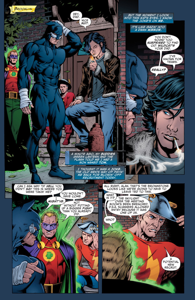
Putting aside my favorite Old Man Trio, can I just say that I like how pretty the art makes Tom look? The first time I read this comic, I got a very James Dean/1950's bad boy vibe from Tom. I'd like to think it was a little bit intentional in order to parallel Ted Grant and his eternal Old Americanism. At least it's something I'll keep in mind.
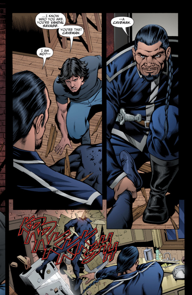
Getting into the main post though, throughout his first appearance and the later fight with Vandal Savage, its made clear that Tom is surprisingly knowledgable about superheroes and the surrounding goings-on of them. He knows who Wildcat is (though obviously Ted is canonically an old hero, he has to be somewhat well-known) and he instantly recognizes Vandal Savage.
(sidenote: Ted looks like a stiff Barbie doll being thrown into the kitchen there)
I take the fact that he recognizes and correctly identifies heroes/villains as a point towards my "Tom is an observant and analytical person" hc.
Earlier on in issue #3, we see that Tom gets right to heart of things when talking with Ted and that he's quick to reach (somewhat right) conclusions.


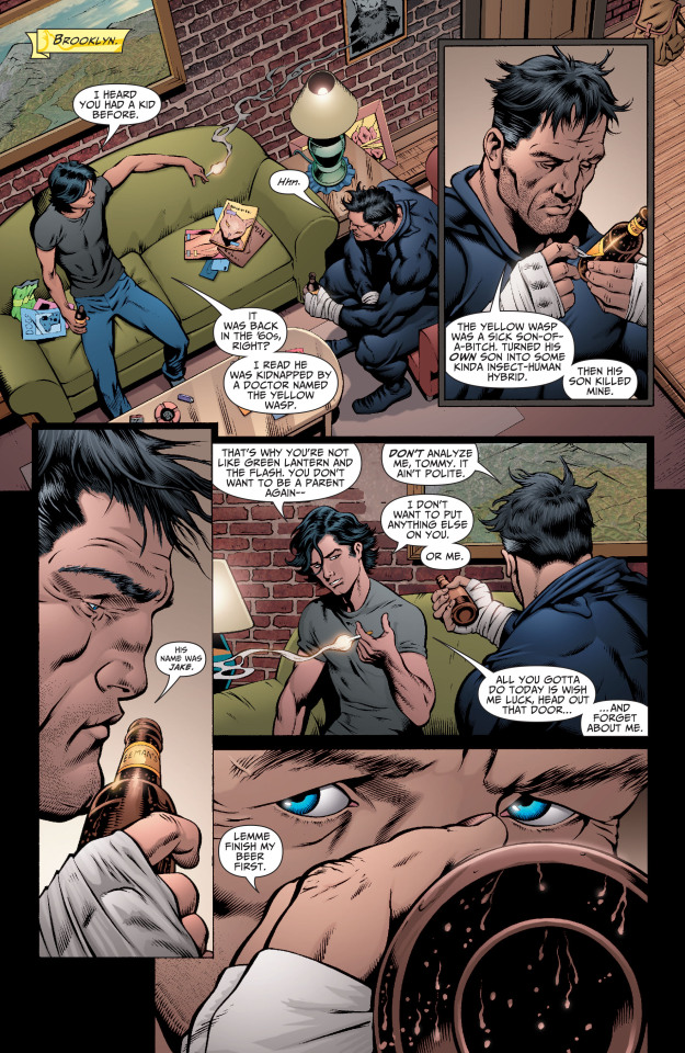
Despite this, he doesn't really show it anymore as he quickly drifts into a side character spot as the comic run goes in. I choose to believe that Tom doesn't voice his thoughts to the JSA bc he doesn't know them well and he prefers to make snarky remarks in conversation instead of inserting himself into anything personal.
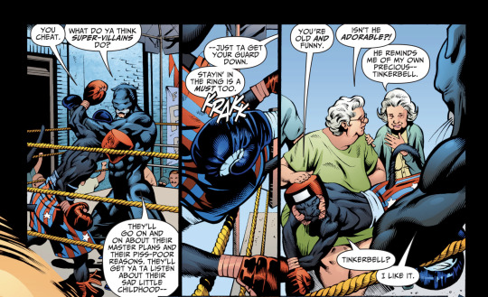
Later on in the series, Tom is reluctant to learn how to box and is shown to dislike fighting in general.

Given the whole estranged-dad-is a famous boxing champ thing, Tom probably doesn't like boxing specifically because of Ted. He says that he doesn't like fighting because of his were-cat form, which it's assumed that he would unconsciously shapeshift into whenever he got into conflict.


(sidenote: why is this the only time I see his inner monologue in comics *sob*)
This distinct trait of disliking combat, at least the personal fist-flying kind, is definitely something I'm including in the au.
Both Tom and Bette are chosen for the au partially because I like them, but also because they have distinct personalities and philosophies that clash with baby Damian Wayne who's coming fresh into the Bat-scene. There will be conflict as Damian will dislike and mostly abhor Tom's personal disdain for fighting. Tom doesn't seem to fight unless necessary and he canonically prefers to rely heavily on his powers to get out of fights. He's only shown getting more violent than usual after Grant Emerson's death, which is pretty reasonable. They were clearly fast and close friends.
Hooo boy Grant should not have died. Especially in Blackest Night, of all things. Despite my personal dislike of it though, I'm still flip-flopping between leaving him dead and then resurrecting him in the au - or just ignoring his canon death altogether. On one hand, I like Grant and I like their friendship so I want him to appear in the au somewhere (alongside Maxine). On the other, his death allows for a just a little bit of dramatic character development/detailing for Tom that lets me explain why he's not with the JSA and instead is in Gotham. Choices.....
Ending the post here with the final smorgasbord of headcanons and blurbs for the au.
he is Mexican-American, but distant from his roots because his mom raised him single and cut-off from her larger family.
he and Bette will enter a relationship. It came to me in a vision and I decided to implement it bc why not. Tom/Bette is bi4bi.
they start dating bc they both strike me as "why not?" type of people, but it develops relatively quickly after Damian enters the picture and they have to co-parent/watch over him as Gotham collapses in slow-motion around them
its shown in the background of some of the panels above that he's into music, specifically guitar and piano
so he will be in a band at some point
bc Alfred does not have the same relationship with Damian in the au, Tom is one who gives him/lets him keep the kitten
(also bc I don't subscribe to the "League of Assassins hate/kill animals" idea - Tom bonds with Damian over a mutual care for animals/cats)
Tom and Damian are a rocky pair, and it takes them longer to get along than Bette does with Damian
He treats Damian as the annoying little brother he never had, and their sense of humor kinda lines up
Tom fully encourages Damian’s sarcasm and rude comebacks
Believe me, there will be a scene where Tom unconsciously purrs in his werecat form and Damian definitely notices
adding to the maybe Grant stays dead part, I'm still iffy on whether to include a one-sided crush on Tom's part that adds to the angst
unlike Grant though, I'm definitely keeping Yolanda Montez alive
Tom and Yolanda have a semi-distant sibling relationship that's a little awkward bc of the age gap and differing experiences with Ted
Might also resurrect Jake Grant, I need the Wildcat family reunion
Ted and Tom still talk, and even though Tom doesn't stick with the JSA, he's still regularly invited to whatever gathering they have
Tom still keeps up with working out/a bit of training - but he focuses on defense and avoidance instead of out-right conflict
Tom got into heroism bc of Ted, but he stuck with it bc of Grant and Maxine
he does not have strict ideals or a drive to save the world, but he likes to focus on the small things and helps where he can
#tom bronson#wildcat#dc comics#flamebird-in-gotham au#wasp does a thought#justice society of america#justice society of america 2007#jsa#TAXONOMY!verse#tom bronson headcanons#dc#small edit: I will be adding alt image descriptions later!!!#Damian Wayne#is mentioned#Bette Kane#is also mentioned#dc's junk drawer appreciation
9 notes
·
View notes
Text
Other good posts have gone around about this, but I wanted to give another boost to this survey from a Tumblr staff-affiliated blog @benevolenthellsite (warning: the blog itself has gifs, some of which are potentially slightly flashy).
Please, send them politely but strongly worded feedback about our frustration with accessibility issues. In particular, I recommend telling them you won't be buying anything from Tumblr, let alone turning off your ad blocker, unless they:
add a photosensitivity community label
give users an option to block gif/video audio play on both posts and ads, on both mobile and browser
give users the option to have alt text display automatically, in customizable font size/colors to ensure readability
give users the option to disable small text, colored text, etc
(you'll notice XKit Rewritten does some of the two above points, making me doubt it would be especially hard to code)
stop putting inaccessible art on Tumblr Radar
(seriously, there are so many wonderful artists who describe their work and so many more who will happily edit IDs into their posts once someone provides them in the notes. this would not be hard and would immediately incentivize more people to add descriptions)
fix the zoom-in feature for images on mobile so that it's actually usable again
ensure that any collapsing of reblog chains will be a setting you can permanently opt out of (this is an accessibility issue because it would make it harder to access image descriptions added later in threads)
Oh, and if you want, it wouldn't hurt to politely but firmly complain about the prev tags thing and any other signs of enshittification you can think of, btw.
I don't have high hopes that this will change anything, but I also don't think it can hurt (it takes like 5 minutes), and I would love to see @staff prove me wrong and actually start taking accessibility concerns seriously for once. Don't give them Crab Day money or whatever until they do.
198 notes
·
View notes
Text
I've just been looking at Mystia's Izakaya order bonuses for different stores, for the purposes of adding them to the MFC database, and I figured I should share them here too since I do like a lot of them. Preorders close on February 22nd 2024, so if you really want the game and haven't ordered it yet, you have a few days left to do that as of the date of this post.
The image descriptions for everything in this post are in the alt text. I'll mention if I know a store ships worldwide, but I won't if I don't.
I've personally ordered through Amiami, so I'll cover that first, but before even that, here's an overview of the special edition.
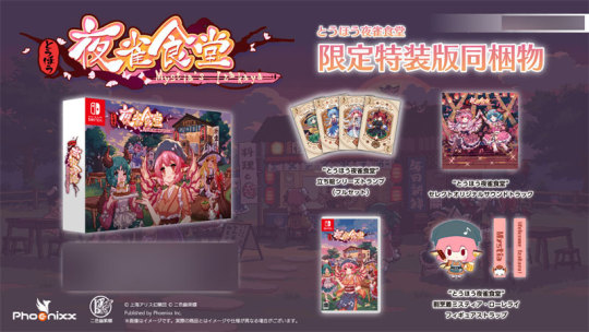
First, you of course get the game. It's a switch game, nothing too unique about it in comparison to other switch games. The cover features some nice art of Mystia, Kyouko, Marisa and Reimu, with Youmu and Yuyuko in the background too. It looks like this art is also present on the box for the whole product, and it's featured on another piece of merch later in this post too.
Outside of the game, the special edition also comes with a figure strap of Mystia, some playing cards and a soundtrack. These items have been posted about on the game's steam page here, so feel free to read that if you want to know more about these specific items and see a more detailed image of them all.
Now onto store-specific bonuses, under the read-more:
Amiami

The Amiami bonus is an acrylic keychain of Reimu and marisa, featuring the art that's used for them in-game. I think it's nice that this bonus features characters from the game outside of Mystia and Kyouko, and you'll see that more later on as well.
Through Amiami, you can order the Special Edition, with all the items shared above, or the Regular Edition, with just the game and the order bonus. Or, if you just want the game, you can get that there too.
Amiami ships globally, so you can safely order from here outside of Japan no problem.
Amazon JP

Amazon JP's order for the game has two versions, one with a beer glass and a coaster, and one with only a coaster. The coaster features art from the game of Mystia and Kyouko, and the glass has a very small image of Mystia. I really like these bonuses, I think they're really fitting for the game.
Amazon JP has both limited and regular edition, as well as versions of both with no exclusive bonus, only the coaster or the coaster and glass. But you can choose from the items page, so I'll only link the one
Melonbooks

Melonbooks' bonus is an acrylic keychain of Flandre with her art from the game, which you can get with either the limited edition or regular edition.
I like this bonus. It's about on the same level as the Amiami bonus, it's cute and it's nice to see characters outside of Mystia and Kyouko be included.
I believe melonbooks can be bought from using a service such as Buyee, though I'd look into that yourself if you're interested in it.
Gamers

Gamers' bonus is a tin badge of Flandre. It also comes with some bromides of the EOSD cast. I don't have too much to say about these, I feel similarly to them as the other merch mentioned above
You can buy the limited edition version or the regular edition
and then we have Ebten. Oh boy.
Ebten
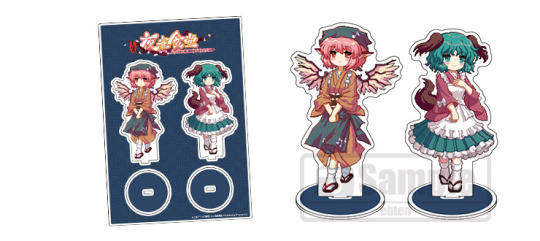
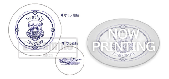
Ebten has two acrylic stands of Mystia and Kyouko, in their work uniforms, as well as a plate featuring Mystia and a tapestry of the game's cover art. There's also some bromides. I don't think there's any denying that this is the most impressive set of merch. Theres's a ton of items that're unique when compared to other stores. There's even MORE stuff availible if you go through all the different versions.
Ebten is hard for me to navigate, so I'll share one link
Other Stores
There's other stores that're selling the game that don't seem to have bonuses, so you can find a full list here
#Mystia's Izakaya#Touhou Project#Amiami#Ebten#Gamers#Melonbooks#Amazon JP#Phoenixx#preorders#preorder bonuses#acrylic stands#tapestries#dishes#badges#keychains#overviews
5 notes
·
View notes
Text
Hello artists participating in the exchange!
There is an FAQ on Ao3 already for posting and editing that includes information on how to add an image, but it only lists sites not to use and no suggestions on where you can host the image. This is a small visual tutorial for hosting the image via discord to post your art on Ao3 for the exchange. I'm currently only able to access mobile so I'll add any needed updates for pc users at a later date.
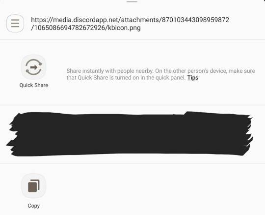
This can technically be done in any server or even just a message to a friend, but I personally use a private server for organization and storing links, so I uploaded my image there. For those unfamiliar on uploading images to discord, you will use the little + to the left of the message bar.

Once your image is on discord, click it and you should see a small menu with three icons in the upper right corner. You want the share button, which is the middle one that looks like three dots connected by lines.

This will open another interface and give you some quick share options (for the sake of privacy I have blacked those out) and also an option that says copy. Click copy to get your image link.
Then you will move over to Ao3 and create a new work. You can add the image via the rich text editor or by directly adding the html code. For the rich text editor, choose the icon on the edit bar that looks like a box with a sun over two mountains. It's highlighted in grey below and is the 8th button from the left (this screenshot was taken after I had already added the image to the work)

You will get a popup that asks for the image source, which is where you will paste your link from discord.
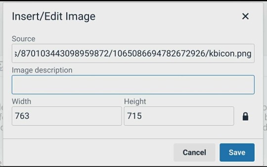
You can also set the width and height manually here if you like, but it will automatically assign that based on the image added. This is also where you can add alt text for people who use assistive technology, under the image description.
If you prefer to just add the image via HTML the code looks like this:

Except obviously you'll use your image link as the image source.
Here is a tutorial for making large images fit in mobile browsers as well.
If you need additional assistance or have other questions please let me know!
1 note
·
View note
Text
Starting out with image descriptions: formatting
Plain text: "Starting out with image descriptions: formatting" in title text. end PT
Continuing my series about accessibility, I have decided to explain how an ID should be put in a post. I see a lot of people in here who already do image descriptions but aren't sure how to properly format them, or who format them in a way that isn't accessible. I decided to make a post to explain the basics on how to make IDs.
This won't explain what to write when you're making IDs; just how to properly put your ID in the post in a way that is accessible. For more resources on IDs, you can go to my "accessibility" and "reference" tags.
1. Text ID vs Alt Text
Plain text: Small title text saying, "1. Text ID vs Alt Text". end PT
A text ID is an ID you write on the body of the post, visible to everyone. Alt text, on the other hand, is an ID you code in along with the image, so it isn't visible for people with screenreaders, but people with it can click on the image and get that ID read out loud.
Tumblr offers the possibility to add alt text to your images, if you click on the three dots that appear on the corner of the image on mobile. Except... Oops, it doesn't always work
As with many Tumblr features, Tumblr alt text is known to glitch, and the entire alt text might disappear or not be available to users without the O.P necessarily knowing. The reasons for this range from "the post was edited later" to "reblogs ate the alt text" to "damned if I know". So, it is unreliable, and that alone is a reason why it should not be used
There are, however, other important reasons! Namely, that alt text isn't actually accessible to a lot of visually impaired people. This is because alt text can only be accessible via a screenreader, since the ID will only be available in the post's code. And not every visually impaired person uses a screenreader, including blind people
There are other accessibility features that legally blind and visually impaired people use, such as: bigger text, bigger display, high contrast text, the enhance button, color correction, and more. These people still need IDs (including of screenshots of text! They need these accessibility features to see text, so if you post a screenshot of regular text, they can't read it), but cannot see them if you only put it on alt text
Not to mention that some blind people cannot use a screenreader even if they preferred that to other accessibility features, because they are Deafblind, have auditory processing disorder, or simply cannot listen to something at the moment for whatever reason
Tumblr is working on a feature that allows alt text to show up in the body of the post so people can read it normally, but while it isn't available to everyone, alt text is not accessible. It is not accessible to Deafblind people, people with APD, and people who prefer not to use screenreaders, which is a choice they have the right to make. Therefore, using it is not a good accessibility practice and using plain text IDs is preferable
There is also an important argument, which is that alt text is designed to be invisible to sighted folks, and that in itself is problematic because it discourages people to think about accessibility, recognize when something is or isn't accessible, and start incorporating accessibility practices into their lives. I am a strong supporter of this argument, which is another reason why I don't think I'll ever advocate for alt text. This part, however, isn't a consensus. The other parts are
2. Placement of the ID
Plain text: Small title font that reads, "2. Placement of the ID". End PT
Imagine that Tumblr's newest glitch is that any images added to a post end up at the bottom. So you see a text post that makes use of several images, but every time there is an image in the middle, you just get text that says "image" and you have to scroll down, find the image in question, then scroll back up
This is the experience you are giving blind and visually impaired people when you leave your IDs at the bottom of the post
Folks, when you add an image (or more) to a text post, you don't put it in a random place, do you? You put it in the ideal place for someone to comprehend your text. There is a logical, comprehensible sequence between text and image, and the image is right where it's supposed to be
Therefore, it is also where the ID should be
Please understand me clearly: an ID is their user's image. It substitutes the image for them. When you are writing one, it is helpful to ask yourself, "what would this look like if there was no image, only the ID?". Because that's what it's effectively like for people who need IDs
If the ID is anywhere that is not directly over or under the image, it's in the wrong place. If a place is where the image should be, then it's also where the ID should be
And yes, this includes when you post an image post with just a one-line caption underneath. Most of the time, the caption doesn't make sense without knowledge of the image. If you didn't post the caption before the image, there's no reason to put the caption before the ID
3. About "ID" and "End ID"
Plain text: Small title font reading "3. About 'ID' and 'End ID'." End PT
I occasionally see people posting IDs without the "ID" and "End ID" at the beginning and end, so I thought it'd be helpful to explain why they are needed.
Without the "ID" at the beginning, someone who can't see your image will not be able to tell that the image is described, and will assume that what you are posting is a caption. Then they will probably skip it, or at least believe they are missing the image's information
There is really no other way to make it obvious that what you are about to post is an image description. And a lot of the time, even reading the ID won't make it obvious that it's an ID if you can't already see the image. This is particularly true when the image in question is a screenshot of text and the ID is just a transcription without information that it's a transcription. Someone who sees that and can't see the image will assume that it's your own caption to the image, which could be literally anything
Similarly, the "End ID" is important for the person to know where the ID ends and the poster's caption or commentary begins. Again, there is no way for them to know otherwise. Not even the paragraph break, because some IDs are longer than a paragraph, especially if it's an image with lots of information, such as an infographic or spreadsheet
Using brackets [] instead of the "ID" and "End ID" is NOT ["not" in caps and bold] an appropriate substitution, because brackets are a form of punctuation, and therefore, screenreaders will just read them as a pause. A pause which they would already have because of the paragraph breaks. So, for screenreader users, they offer absolutely no differentiation
Note: "ID" stands for "Image Description", not "Identification". So you don't need to say "Image ID", as that would be "Image Image Description". That's not a cardinal sin that deeply affects your accessibility or anything, but it's good to know. I was saying "Image ID" for like a year before I realized that and I felt really stupid afterwards, so I thought you'd like to know
4. Formatted text
Plain text: Small title font that says, "Formatted text". End PT
I see a lot of people posting their IDs in formatted text (usually tiny text or italics, but occasionally bold, colored text, and others). You should not have your ID in any kind of formatted text
Why? Because most forms of formatted text are unreadable to at least some people with visual impairments, if not all of them. This will generally not be a problem for screenreader users unless you use all caps, stylized fonts, or embedded links. But they will be a problem to users who don't have screenreaders, which, as we've seen before, make up a significant amount of ID users
Legally blind or visually impaired users who don't use screenreaders generally rely on bigger text/display as an accessibility feature. This means that they set their phone to make text bigger for them. If you put your ID in tiny text, you are making the text small all over again. So they won't be able to read it, and your ID will be useless
I have my phone's text and display set to biggest, and Tumblr tiny text looks roughly the same size in that mode as Tumblr regular size in regular mode. That is not big enough for lots of visually impaired people to read; if it was, they wouldn't have their phones set to make text bigger
Similarly, italics make the text look thinner, which is harder for a lot of visually impaired people to read. Bold makes the letters get easily smushed together, which is also hard for some to read. Colored text has a lower contrast, which will also be harder for them to read. Not to mention visually impaired people might have other conditions that affect reading such as color blindness or dyslexia
This is specially harmful if it's long chunks of text. I've seen some people who will put everything that was directly transcribed from the image in bold or italics, and I've even done it myself for a brief period. Please don't do this! It is very hard for a lot of people to read
Every time you mess with formatting on your text, you are basically annulling someone else's accessibility features display. And since Tumblr does not allow users to turn those settings on or off, this is an accessibility issue
Note: not everyone will be negatively impacted by the use of these. Some people even find them helpful, especially if it's to signify key words. But again, since it's impossible to turn it on or off, the best way to do an ID is without formatting, a.k.a in plain text. The exception to this is BlockQuote (a.k.a idented text) and bullet points
To find out more about plain text, you can check out the other post I made about it on the link below
Link
"Do I need to put the ID between brackets?"
Plain text: Small title font reading, "Do I need to put the ID between brackets?". End PT
You might have noticed that most people post IDs between brackets, like this: [ID: A pig wearing a baseball hat. End ID]. This might be the most common way of formatting it
It is not, however, necessary. As far as I know, people do this so people who don't need the IDs can easily know where it begins and ends, and skip them. They do not serve any accessibility purpose
Personally I don't use them, and if I want to have a visual cue to show where the ID begins and ends, I put it in BlockQuote. This is not necessary either, although it might help some people with dyslexia and ADHD better organize the contents of the post. It is fine to do, though, as long as it doesn't substitute the "ID" and "End ID"
And that's all, folks! Thanks once again for reading this long post, and I hope it was helpful
TLDR
Plain text: small title font reading "TLDR". End PT
You should make your IDs in text, directly under or over the image, with the "ID" and "End ID" at the beginning and end, and without italics, bold, or tiny text. Using brackets isn't necessary but it's okay
#accessibility#image descriptions#reference#resources#how to make ids#has plain text#has tldr#long post
758 notes
·
View notes
Photo


Tutorial - Decor crowds (and decor sims)
Hi everyone! Someone asked me if I could make a tutorial showing how I make decor crowds. Now my university stress is mostly gone so I finally have the time and energy to show the procress.
I am not going to show how to make poses, so if you don’t already know how to make poses, I recommend this tutorial.
This tutorial works for both one sim and for crowds. You just need to skip some parts if you only want to make one sim.
Now, let’s get started.
You will need:
TS4 SimRipper
Sims 4 Studio and Blender (preferably 2.70 if you want to follow along with my tutorial in the same version)
Image editing tool of your choosing, I use Paint Tool Sai, but you can use any that supports files with transparent backgrounds (PNG-files).
I recommend that you create one folder which you work within to keep track on all files, but that it up to your own preference!
Edit: 3/8-2020 Hello everyone! I can recommend checking out this tutorial if you experience any problems with shadows! It’s extremely useful and made by the talented @theroyalthornoliachronicles
Step 1 - Make one or a bunch of sims.
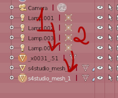
Make one or more sims that you want to have as your decor sims/crowd. Name them something easy like A A or 1 1. Each of these sims are names 1.1 1, 1.2 1, 1.3 1, etc. This makes them very easy to locate later.
When you’re finished, save your game and close/minimize it.
Step 2 - Launch TS4 SimRipper
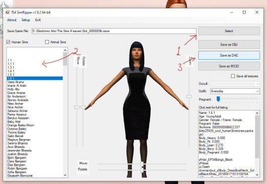
TS4 SimRipper is super easy to use. Place it in a folder so you have every file at the same place, unzip it, install it and then launch the program. If you cannot find the file, it should be a program file, look below for a guide.
When it launches, press Select (1) and choose the file at the top of the list. Let it load (don’t click anything).
When it’s finished, choose the sim you want to export (2). Again wait, it may take a while but that is normal.
When the sim is loaded, press Save as .dae (3). This is going to also take a while, so you can do other stuff in the meantime. For example, you may proceed to the next step in this tutorial. Remember to name them something easy to find, like 1, 2, 3, etc.
Remember to check if the program is finished every now and then to export the other sims you made.

If you cannot find the program, it should look like this. My system language is Swedish, but it should be named something along the line of program under the type-category.
Step 3 - Export files and rigs from Sims4Studio.
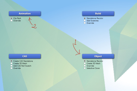
Now it’s time to start making the decor sims. Either start with Objects (1) or Poses (2). If you want a tutorial on how to make poses, please follow the tutorial I linked above.
When it comes to Object (2), choose create 3D Mesh and then the blue button.
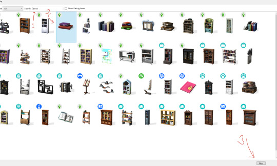
Like my last tutorial, we are going to use these books are our base. Start by searching for them (1), click on them (2) and then press Next (3). Name it whatever, but I recommend a name that will make sense a mod folder.
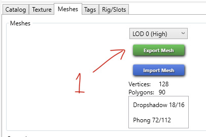
When it has loaded, click on Meshes and choose Export Mesh (1). Again, name the file whatever you want. I named my Grund - which means base in Swedish.
Step 4 - Working in Blender

Open the newly exported mesh in Blender by double-clicking on it. You should be met with something that looks like this.
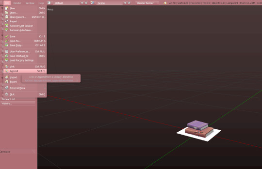
Open the File-folder and press Append, or just click Shift + F1.
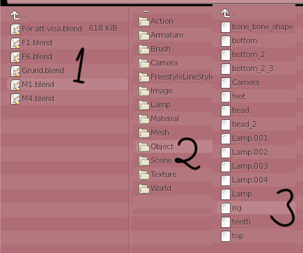
Choose one of the poses you made in advance or just import the rig you exported earlier. I am using a pose from my Mourning pose pack. Click on the pose (1), then Object (2) and finally rig (3). You do not need any of the other pieces in this tutorial.
If you are using another creator’s cc, like a pose, be sure to ask for permission before sharing the decor sim with the public.

When done correctly, it should look like this. This is the sim’s frame which we will base our decor sim on. This rig will be named rig.001, just leave it be.
Step 5 - Import the .dae file
Unlike my last tutorial, this step is super easy and takes almost no time.
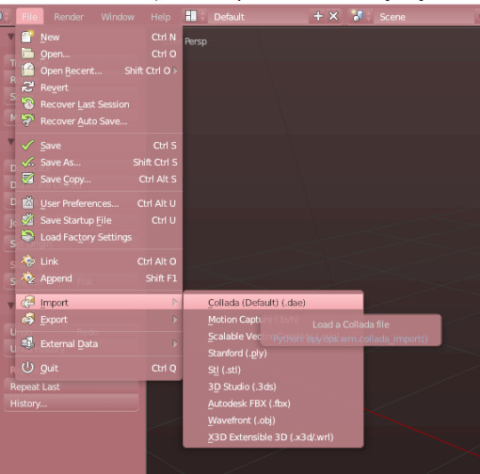
Go to file, then down to Import. Choose Collada (Default) (.dae). This is your sim with its rig and body exported from the game. This means that you can make decor sims of any body size, skin colour or other feature.
Click on any of the .dae files you exported eariler.
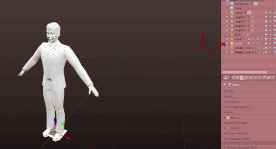
Now you will have a new rig named rig.002. Go right ahead and delete it.
Now the body will be named something like this instead, just keep an eye what it turns into.

Now press the modifier-button (1). Then click on the Object bar on the rig modifier (2). Choose the second rig (3) and press Apply (4).
After pressing the Apply button, you cannot move the sim’s body, so if there is something that needs to be fixed, do that before.
When that is done, delete rig.001.
Step 6 - Preparing the meshes to be merged
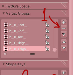
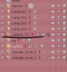
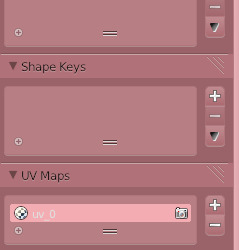
Now we’re gonna delete any trace that this sim used to be a moving object. Start by removing every vertex group from the sim. Delete them by clicking on the - button a whole bunch of times (1). Then rename the first UV-map to uv_0 (2) and delete the second one (3).
This is what it should look like when you’re done.
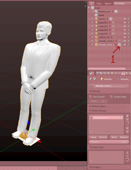
Now we’re gonna merge the two meshes. Start by clicking on the Sims4Studio-file’s thingy I marked (1). Then press A so it looks like it does on the image. When the mesh is orange, press X to delete it. You’ll need its values, so do not delete the whole thing, only it’s mesh.
Now, click on the sim in the list of things (1). Then hold shift and click on the S4S-mesh (2).

When they’re both marked like in the picture, press Ctrl + J, or the join button to the left.
Now it should look like this, if it’s all black, you need to go back and rename the uv-maps to uv_0. You go back by pressing Ctrl + Alt + Z.
Step 7 - Save and finish up the project.
Now save your project before doing this step.
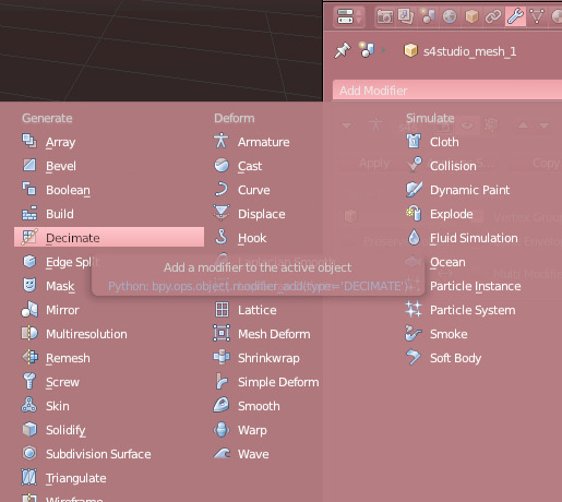
When it’s saved, go back to modifiers and add the Decimate-modifier.
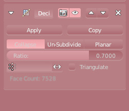
Chance the Ratio to anywhere between 0.6 to 0.8. I usually go with 0.7. Click apply when you’re satisfied.
Save your project again.
If you are only making one decor sim, you’re finished here for now!! You only need to add the other LODs, so you can skip the next step.
Step 8 - Fixing the uv-map (Not necessary for only one sim).
The uv-map is already finished if you are making only one sim, but if you are going to make a crowd, this is a very important step. Don’t worry, it’s really easy.
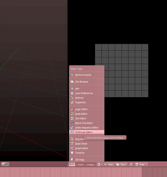
Open the uv-map by opening a new window and then choosing the UV/imagine Editor. Remember to enter the edit-mode on the mesh.
Press A on both windows to highlight everything.
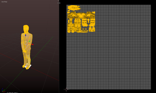
When it’s highlighted, scale it down so that it can fit more uv-maps on it. You make it smaller by pressing S on your keyboard and you can move it by pressing G.
Make sure that it’s big enough to still be able to show textures. but small enough to allow other sims’ uv-maps to be placed beside them.
Now you’re done. Now, redo all the steps you just did but place the uv-map on another spots. You do not want them to overlap or they’ll look ugly.
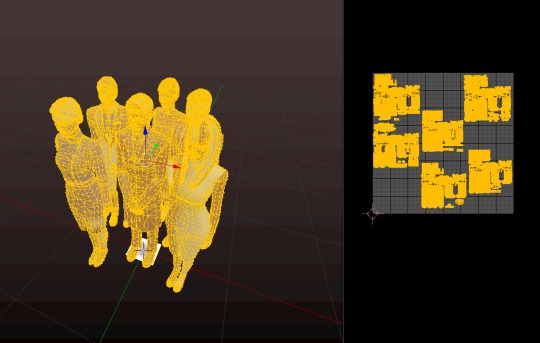
When you done all that, append the decor sims together so they form one mesh and uv-map. If done correctly, it should look like this.

After that, export the uv-map like this. Name it whatever you want.
Save your work again, and decimate the mesh. Try to make it to a 0.5 ratio. This make the crowd more manageable for the game.
Save it again and minimize Blender.
Step 9 - Making the object and fixing the texture.
Okay, here comes the annoying part. Now it’s time for a lot of waiting and to put a texture on your uv-map.
Unless you’re only making one sim, which means that you only need to import both files you just created!
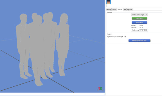
Start by importing your mesh into Sim4Studio. Now this is going to make a while, the more sims you added to your crowd, the longer the waiting. I made 6 sims, so that is a very big file.
When it’s loaded into S4S, save your file, so you don’t lose any progress.
While its loading, open your imagine editing tool and prepare yourself for a lot of fiddling.
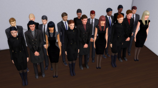
Your uv-map should look like this. So now it’s time to open every diffuse map you exported earlier in your editing tool and start matching them up.
When you’ve managed to fix the uv-map, it looks like this. This took a lot of time, as one pixel makes a big difference. Have patience when you do this part.
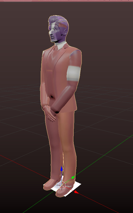
When you take the time, the crowd looks something like this, or hopefully a little more dapper, as mine is quite... depressed.
Step 10 - LODS and Shadow-LODS
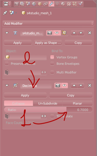
ANYWAY let’s fix the LODs. Go back to your blender-file and decimate it with a ratio between 0.6 - 0.8. Again, I use 0.7. Press save and import it into Sims4Studio. Repeat once more for the last LOD. Save between each LOD if you are worried about losing the progress.

Last step in Blender is to make a shadow LOD.
Start by deleting this mesh (1). This is the shadow when you have the “full” object, so now it is just in the way.
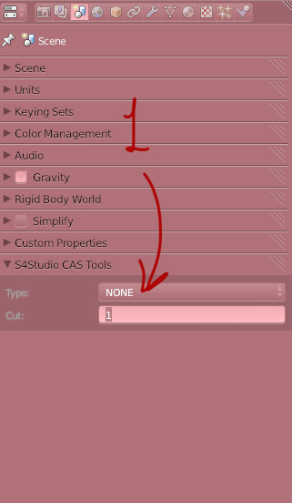
When its gone, change the Cut from 1 to 0. This makes it into a shadow mesh. Save and go back into Sims4Studio.
Now you can import that same shadow-mesh into every shadow LOD. Then it’s finished, you’re done!
Now all that’s left is to fix the Catalog name, description and tags.
Thank you so much for following my tutorial! If you have any questions, feel free to ask me🌸
398 notes
·
View notes
Text
New Post has been published on Website Design Naples Florida Webmaster
New Post has been published on https://vinbo.com/photoshop-how-to-cut-out-an-image-remove-delete-a-background/
Photoshop: How To Cut Out an Image - Remove & Delete a Background
This time, I'm going to show you a much quicker and easier way of doing it, and it is just going to be almost as accurate as the pencil first thing you want to do is import your image by simply dragging it into the work area or going To file an open, you also want to go to the layer and where it says background you want to left-click on this lock to unlock it to be a layer.
You want to hold alt on your keyboard and use the scroll wheel to go up, so you can zoom into your image. If you can't do it this way, you can go to the zoom tool, which is right here, and that will let you do it that way. The tool that we're going to be using is the third tool down so get to it. You can either press L on your keyboard or you can go here and right click on it and it will be the bottom one.
Basically, the way that this Tool Works is similar to the pen tool where it uses dots to go around and select certain objects. But this one will automatically detect where the outline is and the computer will plot it down for you, and all you got to do is pretty much guide it around the object that you wanted to select. Now, in the last article I mentioned that it's not as accurate, and that is true, but you can adjust the settings to make it more accurate, there's a few things that you need to know.
First of all, about the selection tool and the magnetic lasso tool. The first thing is these options right here: if we only use this option right here, which is the first one – and we create a selection right here – and we want to let's say, add on to this one – we won't be able to it'll give us a separate Selection, it will give us a brand new one if we press ctrl + D to deselect this and select the second option.
This will allow us to add on to this right here, and you can see now you have a plus next to it, and if we create Univ 1, we now have two shapes inside each other which merged together. The third option is all about cutting the current selection. As you see, we have the opposite effect now it is turned into a minus and we can actually take it away from here and we could just cut this into a smaller custom shape.
The very last option is to create a custom shape inside of this one, and what I mean by this is, if you have a selection here, but you only want this bit here. You click on this one and only select this area right here, so that is the free selection options. You should consider and know the two of options. Next, to that one is favoring, and if you don't know what favoring is it pretty much adds a nice soft effect around your selection? You can see that the image has a soft edge around it.
If you're looking for nice sharp edges, then you want it to have it on 0, okay, so the last three options. These are also really important to know what these options do. Is these actually determine how well or how bad the magnetic lasso tool works? For example, if we look at the width and contrast and frequency, the wave of it is how many points it will plot between each one. So if we have this on 10 pixels, it will plot it down every 10 pixel.
The contrast of it is how well it can determine the line that you are wanting to select. So if your image was difficult to select, you can increase the contrast and it will try to pick up colors much better. The frequency of it is how many points it will plot in total. The first thing you want to do is pick a corner or an area which you're going to start. It's a lot easier if you start the bottom and work your way all around this image.
You want to create the first point by left-clicking and then all you got to do after that is let the computer do the work for you. If you wanted to, you, can manually, add them yourself. So, as you can see right now, I'm adding some of them on the edges and the corners to help it be more accurate. But you can start to pick up your speed as you can see, and it is doing a really nice job right now of selecting our image.
The corners are usually the ones that, in my struggle with, as you can see down here, is sometimes struggles to pick up certain colors, and that is something you don't need to worry about it right now. We can easily fix that later on. All you got to do is go back to the first door and connect it all now that you've created the selection, we are also going to edit it and fix the parts that we didn't do we're going to zoom into this area right here, I'll start off With this first, okay, so the next tool that we're going to use is called the polygonal lasso tool.
This one is similar to the pen tool, but this one doesn't have any points. So what we're going to do is we're going to remove this area right here. For us to be able to edit this selection right now, you need to make sure that you are selecting this option right here. You will now see it is a plus and to do the opposite to this. You hold alt, and now you see swapped over to a minus. So all you got to do is hold alt click, the first point and then you can let go of alt and go around the parts which you don't need and the parts that you want to cut out once again hold alt and click on it.
Select the parts that you don't want we're going to go further down and also fix this area here. So this time, rather than holding alt all you're going to do, is click on this line here and select the parts you want to be added to it. Okay, so another useful thing about this tool is: if you wanted to, you, don't have to go to the first dot. You can connect it up from here by holding ctrl and then you'll see the icon changes to a circle, and we can connect it from here.
If we left click, it is now selected we're also going to fix this area right here, where it goes out slightly once again hold ctrl and click on it and there we go. So if we look at this image right now, it's looking really good. Okay. So all you got to do now is go down to this icon right here and create yourself a mask. As you can see, the background is now gone, but we can always switch back by disabling the mask.
So if you hold shift and click on the icon, it will disable the mask and if you hold shift again and click on it, it will show you the image with the mask. If yours is the opposite, let's say yours is like this, where the background is actually go out and the person isn't all you got to do is press ctrl, + I and that will invert it. Ok, so to fix up the hair. What we're going to do is we're going to use the brush tool and we are going to select a black color, make sure you go up here and set this one to feathering and then just fix up some of the parts which aren't looking good.
You can use the shortcut keys on your keyboard, which is the square bracket and the N square bracket to make it larger or smaller all right, so we've pretty much removed the background. If you want this to be completely gone and you don't want the background, you can right-click on the layer and convert a small object, and now it will just be the image and it's standalone form or without the background, all right.
So now what we're going to do is we're also going to fix up the edges a little bit. Let's say your image isn't as smooth on the edges. You can hold ctrl and click on the icon and that will select your image, go to the second tool and click on select and mask, and these options will pretty much help you to fix the edges of your image. You have all the preview options here. If you wanted to, you can preview it on certain colors or certain overlays, you can look at transparency.
The edges, the ones that you will focus on are smooth, feather and contrast. These play an important role to fix your image you have February, in which this will create the fevour effect and then contrast will take it away, and this will smoothen your image down. You can play about with these and see which one works for you once you've done. All that and you're happy with your settings. You can press, OK and that will apply it to a new layer and that's pretty much it that's how you use the magnetic lasso tool to remove the background.
You can always move this wherever you want, you can pray to certain projects that you have open. You can save it. You can add a background right here. If you wanted to, you can create one by creating a background, but anyway, I hope this article was helpful if it was leave a comment and give it a thumbs up to show other people. It was a good article if you'd like to see more tutorials, you can go down to the description and there is a playlist to photoshop or if you want to learn editing.
0 notes
Text
7 Easy Slow Cooker Recipes You Should Make This Season - Crock Pot Dinner Recipes
7 Easy Slow Cooker Recipes You Should Make This Season – Crock Pot Dinner Recipes
Date: 2019-10-27 14:03:42
[aoa id=’3′][dn_wp_yt_youtube_source type=”101″ id=”tzb4u9GpAks”][/aoa]
Hey guys!
Welcome to the channel Easy Food Recipes.
This video highlights weeknight dinners you can make using your crockpot or slow cooker!
All of my videos are edited by me (credit given to original content creators) using the editing programs Final Cut Pro and Adobe Photoshop. I create an intro,…
View On WordPress
0 notes
Text
Hey Bibliomaniacs,
It’s Wednesday, which means it’s time for my weekly spotlight features, “What’s on your desk, Wednesday?”, where we take a visit to see what’s on somebody’s desk and have a good old nose around. (No kidding!) So without further ado, let’s meet today’s desk, I mean guest…
Welcome to where stories are created, from the desk of Callie Carmen
The desk of Callie Carmen – Alternative-Read.com
Tell us about your writing routine:
My fifteen-year-old Chihuahua wakes me in the middle of the night wanting to go out. I bring her outside and get back in bed, but I usually can’t sleep because I’m now freezing, wet from rain or wide awake from the lights I had to turn on along the way. That’s true love. I pick up my computer and get some work done. An hour or two later I fall asleep.
A few hours later I wake up and start my marketing. When the first round of ads is done, I get up and get ready for the day including something to eat and walking the dog. Last week my closest sidekick while working, Misty, passed away in my arms. I’m still working on getting over that. I’m sure it will take some time.
Then I get to work on edits my most recent work which at the moment is “Joseph” from my Risking love series or “Dream Catcher” a supernatural anthology from BVS that I’m doing with several other author friends. It should be fantastic as they are all wonderful writers. At some point, I take a break to do some cooking or housework, as little of that as possible. Oops, did I write that? Then another round of marketing.
In the evening, I get some more edits or writing done during the down time at soccer games or while watching TV with my family. Of course, there are those nights when my honey and I go dancing or to the movies and then I don’t get any work done, but the time away is more than worth it.
What’s the weirdest thing on your desk?
I have a list of Nouns, Verbs, and Adjectives for writing romance on my desk. It has lovely words like ravish, swell, and full-bodied. I bet those words would be in a very spicy romance book.
The most useful item?
That has to be my headphones. Since I gave up my office a few months back to my now semi-retired husband, I’m located smack dab in the middle of the family room. In the past, I worked in silence with the occasional song to break up the day. Now I have family members coming in and out of the room, and they use the television. Ugh!
Three words to describe your desk?
Coffee-table when closed.
Where can we find out more about you?
Author Callie Carmen on Alternative-Read.com
I started in the book business as a bookstore manager which was the perfect place for me since I was an avid reader. After two years, I moved to the corporate office as a buyer and eventually became a senior book buyer. This was a rewarding career that I loved.
Along the way, I decided to become a stay home Mom. I couldn’t give up working around books altogether. I volunteered to run the book fairs in our small farm town, six per year. At the same time, I started and ran, A Child Oasis Company, with the sole purpose of placing a small book library in the homes of all the needy children in the nearby city. As my children became teens, I found I needed more in my personal life than the volunteer Mom for the schools. I sat down at the computer one day and Patrick, book one of the Risking Love series, was born. Book two, Nicolas is now available and receiving five-star reviews on Amazon and Goodreads.
I am lucky that I found my soul mate and married him. Like my characters, I am a firm believer in true love and love at first sight.
NICOLAS by Callie Carmen
Carlie planned to finish at the top of her class, get a corporate job, and work her way up the ladder. She refused to risk having a life of poverty ever again. Within her plans, there was no room for a relationship. So she had sworn off men; especially the good Dr. Nicolas Antonis.
Nicolas had other plans. They included her becoming his.
As if Nicolas wasn’t a big enough distraction; Carlie had to worry about her roommate’s, abusive ex-boyfriend, coming for her too.
Nicolas is the second novel in the Risking Love series. The stories chart a group of friends through life and love. These steamy stories will have you laughing, crying, and have your heart racing.
Purchasing links
Patrick (Risking Love Book 1)
https://amzn.to/2D2BJFF
https://books2read.com/u/3krqEW
Nicolas (Risking Love Book2)
https://amzn.to/2GkldCD
books2read.com/u/mqVGQv
Box set (including both Patrick & Nicolas)
Craving Loyalty
http://getBook.at/CravingLoyalty
Social media links:
Facebook https://www.facebook.com/profile.php?id=100011326206882https://www.facebook.com/CallieCarmenAuthor/
Twitter https://twitter.com/Callie_Carmen
Instagram https://www.instagram.com/calliecarmennovel/
MeWe https://mewe.com/profile/5aea84c00dc9f110e68a9373
Goodreads https://www.goodreads.com/author/show/17829431.Callie_Carmen
Linkedin https://www.linkedin.com/in/callie-carmen-72ba98156/
Tumblr https://calliecarmenauthor.tumblr.com/
Pinterest https://www.pinterest.com/calliecarmennovel/
Website link https://www.calliecarmen.com/
Join in!
Want to take part in this weekly author spotlight here on Alternative-Read.com?
CHECK OUT THIS LINK http://bit.ly/WOYDWform
Open to anyone with a desk, a writing routine, and a book, product or website to promote. That means book bloggers, authors, freelance writers… you get the gist!
I regularly tweet past guest posts…
What’s on your desk, Wednesday? Callie Carmen Reveals All… #AuthorSpotlight #Interview with @Callie_Carmen Hey Bibliomaniacs, It's Wednesday, which means it's time for my weekly spotlight features, "What's on your desk, Wednesday?"
0 notes
Text
Reflection
What Primary and Secondary research did I do?
For my primary and secondary research, I focused on reviewing and playing online multiplayer games that offer a variety of designs and characters. I also looked over articles, books and interviewed the game design students about their designing process.
How did my research help me to develop ideas?
My research helped me plan out my process and give me inspiration for my own set of characters. The research also helped me on how I should go about the designing process and how to make my designs fit the role that they were given.
What games have I looked at?
The games I focused on were massively multiplayer online (MMO) games as they have multiple characters to choose from unlike regular single player games. For example, League of legends has over 134 (dated in march 2017) characters and even more designs in the form of “skins” (When you can change the outfit or appearance of a specific character). I have also looked at a designer by the name of Fumito Ueda, due to his designs being almost revolutionary in the gaming industry.
How did they inspire and influence my work?
Fumito Ueda inspired me to be a little bit more unique with my work, despite wanting to keep my designs simple. Fortnite inspired me to keep my characters in a human form instead of experimenting with different creatures.
What were my initial ideas?
My initial ideas were to have four characters, one for each class in a classic MMO games. I had a basic idea of having two male and two female characters so a can explore more with the different genders. Each character was given a basic description for me to follow while designing.
How have I developed those ideas?
My ideas for my characters developed throughout the whole designing process. For example, I wanted one of my characters to be draped in an Ox skin, but later changed it to a wolf for practical reasons. I have also changed my outcome, from being posters for the game to prints of the characters to show them off in a dramatic way. Instead of doing four prints, I decided to do only three as I was running short on time for the project.
What materials and techniques have I used?
For my prints, I used both digital and traditional techniques to create the finished outcomes. All my line art and sketches were done in pen and ink while I coloured and edited the pieces in photoshop for the finished outcome. I have also experimented with different materials and other multi medias. For example, I embodied one of my prints and stuck it in my sketchbook as an example of my experimentation with materials and different techniques.
Which materials and techniques were the most successful?
I found that my pencil and ink sketches were the most successful as they helped me shape my characters into what I wanted them to look like in certain poses and facial expressions. Editing in photoshop also really transformed my prints from a drawing into a quality print with dramatic lighting and a serious mood to the image. I also added shading and depth into my prints while using photoshop to help create the mood.
How/ why did I choose the techniques and materials for my final outcome?
I chose to mix digital and traditional techniques of drawing to bring more variety and originality in my prints instead of just doing all of it in photoshop or illustrator. This gave the line art more texture as well as the texture of the paper showing up in the final piece. I find this more aesthetically pleasing instead of having just a clean cut print which would not suit any of my rugged, feral, boisterous characters.
Do my final outcomes communicate my intended messages?
My final outcomes main purpose was to show off my characters in a certain way to portray their personality through the way they were drawn. For example, My two moody characters had a greyscale styled print, while my brave and heroic character, Odin, had a vibrant watercolour base.
Did I make any changes in my design development that altered my final outcomes? Why?
I made many but small design changes to each of my characters to either make them look more appealing or to be practical for their role. For example, I changed Ocolotts race from Asian to African American. I also changed Odin’s hair from a dusty brown to pure white. These design alts were for aesthetic only. Some, however, were to make their appearance more fitting for their role. For example, Frida wears pants instead of a skirt so she has more mobility. Willow keeps her hair short so she can’t be grabbed and it wont get in her face.
Are my final outcomes successful? How/Why? Why not?
I believe my final outcomes are successful because each one of my characters have a unique aspect to them, which make them no normal human character. The prints are also drawn and portrayed in a dramatic light, to give the characters more of a serious feel. I also used one of my prints for colour experimentation and used watercolours for a base.
What new skills, knowledge, techniques and processes have I learned?
My skills on photoshop have improved due to the editing on my prints. I have learnt new tools on photoshop that I can use in the future for other projects to produce more high quality outcomes. I have also improved in painting with watercolour and human anatomy drawing. My artstyle changed dramatically because of this project, so I am able to draw humans more accurately and confidently. I have also learnt of embroidery and how you can use it to turn a plain drawing into something unique and interesting to look at.
Is there anything I could have done differently to make my project more successful?
I would have done more quality prints for each of my characters. Due to lack of time, I was only able to do three prints instead of four, one for each character. I would have also liked to be more wild with my designs by making non human characters but following the classic MMO games, a large amount of their characters are human or have very human-like features.
Did I meet the requirements of the project brief?
I believe I met all the requirements to this projects brief. I designed four original characters, completed my research and created 3 prints to show off my designs. I also dedicated multiple pages to each character to experiment with their designs.
0 notes
Text
I have wanted to try Schmincke Watercolor pans for some time but the price point was a bit too high for me to follow through with an actual purchase. I was given some cash for Christmas this year. (Thank you, grandpa!) So I choose to purchase the Schmincke Horadam Limited Edition 2017 New 12 Half-Pan Watercolor Tin for about $70.
Schmincke Horadam Limited Edition 2017 New 12 Half-Pan Watercolor Tin
Schmincke 12 Tin
I was interested in this set for a few reasons: Firstly, it is an iAMart exclusive set. iAMart is a coalition of independent and locally owned art stores. When we support small art stores over big box stores we ensure a continuing resource of art supply knowledge that is just not available at your area Hobby Lobby, Michelle’s, etc. Local art stores are also important for regional art as they often offer art classes and promote the work of local artists. Secondly, this set contains twelve of Schmincke’s new colors that were released in 2017. As part of my Art New Years resolution, I am trying to be more experimental with my color choices and twelve colors I have never seen before seemed like a good place to start. Lastly, the case holds eighteen pans so I could add on additional colors later if I choose to.
I experimented with loose florals to try out this set. I am not the greatest a these but want to work on areas that I feel kind of weak on. If you would like to learn loose floral techniques I suggest Jay Lee Watercolor Painting or the Frugal Crafter channels on YouTube. If you are a SkillShare subscriber I recommend Yasmina Creates or Amarilys Henderson’s floral courses.
To start I randomly picked several colors for leaf and flower practice. I then basically filled the paper with floral shapes practicing my leaves and petal shapes. Sometimes it is nice to be free and just paint what pops into your head rather than mapping a painting out in advance.

I then did some simple roses and a tulip. For each, I chose a three or four color pallet and tried to stick with it. The first rose on the upper left has some Magenta in it which I added to the set.

Lastly, I did doodled out two watercolor wreaths.

Not perfect but I am hoping to get better with practice. Art is persistence!
Happy Art Journey,
Justine

New Year, New Paint, and Loose Florals. I have wanted to try Schmincke Watercolor pans for some time but the price point was a bit too high for me to follow through with an actual purchase.
0 notes
Text
New world news from Time: TIME’s Top 10 Photos of 2017
In the photographers’ own words, here are the stories behind the images.
It was a relentless year for news. For many, the beginning of Donald Trump’s polarizing presidency in January set a tone of heightened tension, but it went beyond that. The wildfires and mass shootings, hurricanes and wars—tragedies and milestones that could happen in any year—felt amplified.
Maybe it was the sheer amount of imagery that emerged—the images we scroll past on Instagram when we wake up and browse before bed, the ones we Like and Love and Sad-Face on Facebook, the ones we flip past in newspapers and magazines and are bombarded with online, on line at the grocery store and on the walls of coffee shops, in restaurants and our own homes.
[time-ad size=“large”]
But if the images made a difference, it wasn’t merely a matter of quantity: 2017 was also a stand-out year for photographs. If the year goes down in history books as some great test of humanity, these 10 pictures will serve as the art of that pivotal moment.
Throughout the year, our photo editors set aside thousands of photographs that stuck out for one reason or another—light or composition, beauty or oddity, surprise or suspense. In recent weeks, we chipped away at the pile until we hit the Top 100, then the Top 10. These pictures were chosen not just for the information they provide and the emotions they evoke, but for their staying power: their ability to not just define the year we leave behind but to inform the one ahead. — Andrew Katz, TIME’s Deputy Director of Multimedia
Carolyn Cole—Los Angeles Times/Getty ImagesTwo people sit in an apartment with a wall missing along the waterfront in San Juan, nearly one week after Hurricane Maria hit Puerto Rico, on Sept. 25.
‘SHE STARTED TO WAVE HELLO’
By Carolyn Cole
In the initial aftermath of Hurricane Maria, which made landfall on Sept. 20, it was impossible to reach many parts of the island except by helicopter. Wind gusts up to 145 mph had downed trees and power lines, leaving many of the American island territory’s 3.4 million residents without electricity. From the air I could see the widespread damage: roofs blown off, crops flattened, denuded forests, flooded neighborhoods.
But I felt my aerial photographs were missing the human element. On the way back to the San Juan airport, I asked the pilot to fly along the city beachfront, home to many resort hotels and upscale apartment buildings. It was there that I saw one apartment missing an entire wall.
When I zoomed in, I could see a woman sitting casually by the edge on the 13th floor. I only shot two frames before she started to wave hello. The destructive force of Hurricane Maria may have temporarily changed the landscape of the island, but from what I experienced, it didn’t change the generous and positive spirit of the Puerto Rican people.
Meridith Kohut—The New York Times/ReduxChildren view the body of their 17-month old cousin, Kenyerber Aquino Merchán, who died of heart failure caused by severe malnutrition, in San Casimiro, Venezuela, on Aug. 21.
‘HOW CAN THIS BE?’
By Meridith Kohut
Kenyerber Aquino Merchán starved to death when he was 17 months old, at only 8.8 lbs.—the weight of a newborn baby. I met his father, Carlos, as he was picking up Kenyerber’s emaciated body from the hospital morgue in Caracas and followed him home to San Casimiro to photograph the wake.
Despite the country having the largest known oil reserves in the world, hundreds of babies have starved to death in the past two years in Venezuela—a country suffering widespread shortages of affordable food, medicine and infant formula—during the worst economic crisis in its history.
The family struggles to afford enough to eat, and had to borrow money and make sacrifices to be able to bury Kenyerber. They held his wake at a family home, to cut costs, and hired a young mortuary worker to come to the house and prepare Kenyerber’s body for burial. He wiped away blood, and injected the body with embalming chemicals on a well-worn couch in the kitchen—next to a refrigerator with no food inside it. Several young cousins kept trying to peak into the kitchen to watch, and Kenyerber’s aunts had to keep shooing them away.
This photo was taken shortly after the mortuary worker finally took the small gray coffin out for viewing, and as the young cousins were able to see Kenyerber’s body for the first time.
More and more family members arrived later. They came carrying wild flowers from the hillside to place around his coffin, and cut out angel wings from a white government food-ration box—a Venezuelan tradition believed to help the souls of babies reach the heavens. Carlos fell to his knees crying: “How can this be?” He hugged the coffin and spoke softly, as if to comfort his son in death. “Your papá will never see you again.”
David Becker—Getty ImagesPeople run from the Route 91 Harvest country music festival after gunfire in Las Vegas on Oct. 1.
‘HORROR WASHED OVER ME’
By David Becker
After photographing the final act of the Route 91 Harvest country music festival on Oct. 1, I began to edit photos in the media tent when loud pops startled me. A security guard told me he thought it was firecrackers or the sound system malfunctioning. This seemed plausible, so I went back to work. Moments later, loud pops rang out again. This time, concert-goers began to flee.
Instinctively, I picked up my cameras. With the concert lights turned off, it was extremely dark as I photographed people running for cover and some lying still on the ground. About 10 minutes later, back in the tent, the only visible light came from my computer screen. The pictures loading onto my computer were telling of the tragedy that had unfolded. Horror washed over me as I saw the images that I had captured. With trembling hands that made it necessary to hold one hand over the other, guiding the track pad, I frantically edited photos.
As authorities began to secure the area, I was told to leave the grounds. I hurriedly packed my gear and was escorted to the exit.
This photograph was one of the first to be uploaded. The image established the urgency of the situation. The posture of the man encouraging the girls to keep running, and people taking cover amidst all the debris strewn about, illustrated the turmoil.
With the area on lockdown, I hunkered in my car across the street all night. I continued working from my vehicle, as authorities had warned me to stay in place. Others in their cars around me seemed to be in a state of disbelief. Shock.
My phone began to ring with people calling from around the world, including family, friends and colleagues. I realized that the photos uploaded to Getty Images had been published. With media outlets calling for comment, I further grasped the magnitude of what I had witnessed. It was the worst mass murder in modern U.S. history.
I put my head down and cried.
Marcus Yam—Los Angeles Times/Getty ImagesA family prepares to evacuate as the Thomas Fire gets closer to their home in Ventura, Calif., on Dec. 5.
‘THE MOST SURREAL REALITY’
By Marcus Yam
When the brush kicked off on Dec. 4 in Santa Paula, Calif., I skipped ahead—following the direction of the wind—and positioned myself in the path of the flames in Ventura. Chaos ensued; fire was spreading everywhere and burning indiscriminately. Some people evacuated early while others stayed behind until the very last moment before packing up their cars. The electricity was out and visibility was poor due to the smoke.
I parked my car on a street in the darkness and, with the engine still on, I walked up to a cluster of fire moving in behind a Victorian-styled home. The homeowners were calmly packing up and I recall thinking to myself, “Gosh they are in their pajamas. They were probably asleep.” I made a few frames of what I thought was the most surreal reality of living in beautiful California—under threat of hellfire. I continued to stand there, shivering, and watched as the homeowners drove off into the darkness before I could leave the scene.
Within an hour or two after I made that picture and shared it on social media, a man named Kirby Ditto emailed me and said he had not been able to reach his mother in Ventura but saw the picture I had made of her packing up her car. He said he was “extremely happy and relieved to see that she was able to evacuate.”
In times like that, I was happy to reply: “I saw them drive off, so I’m hopeful they made it to a shelter. Good luck.”
Kevin Frayer—Getty ImagesA boy cries as he climbs on a truck distributing aid near the Balukhali refugee camp in Cox’s Bazar, Bangladesh, on Sept. 20.
‘HE DISAPPEARED INTO THE CHAOS’
By Kevin Frayer
I arrived to Cox’s Bazar, Bangladesh, in mid-September, a few weeks into the Rohingya crisis. From its early days, I was jarred by the images and stories of the exodus of hundreds of thousands of people with no rights, risking their lives just to survive. I wanted to contribute in some way.
The image of the boy was taken early in that first trip. I was looking for places to photograph food aid because there was such a need for it and so little of it around. I was in an area where there was a crowd of people surrounding a truck. The scene was quite chaotic; people were shouting and reaching because they were obviously distraught and hungry. There was a lot of pushing in the crowd and I wanted to get above it, so I climbed on the truck.
That’s when I saw this small boy. He had just pulled himself up onto the truck and he was weeping. I couldn’t hear much because the scene was so loud, but at one point the boy reached out his hands, begging to the man standing over the food. Then, he wrapped his arms around the man’s legs, clinging to him. I was totally struck by it: he had clawed his way onto the truck in complete desperation. I wish I knew more about him, but he disappeared into the chaos of the moment.
Andrew Mills—NJ Advance Media/APNew Jersey Gov. Chris Christie uses the beach with his family and friends at the governor’s summer house at Island Beach State Park on July 2.
‘LET’S GO. RIGHT NOW.’
By Andrew Mills
July 2, a Sunday, was the perfect Jersey Shore beach day. Only one problem: A budget fight had forced a shutdown of state-run beaches and parks. Friday and Saturday had been nasty days at the Statehouse in Trenton. Sunday, though, would allow for some cooling off time, and Gov. Chris Christie had already drawn his line in the sand, telling reporters he would go to his private beach on Island Beach State Park even if 9 million other New Jersey residents couldn’t. “Run for governor,” Christie said, “and you can have a residence there.”
I had been planning to fly on Tuesday, July 4, to photograph the state’s crowded beaches. On Sunday, though, I called my regular pilot to see if he was available. When I pulled in at the airport and saw a State Police helicopter—Christie’s ride—I told the pilot, “Let’s go. Right now.”
Minutes later, I saw a single cluster of beachgoers on miles of empty, pristine beach. I was leaning out the window—my right tricep jammed up against the door of the Cessna—to steady myself. We made two quick passes at 40 knots, just under 50 mph. On the second, Christie looked right at me. I fired 86 frames from my Canon EOS-1Dx camera.
The governor threw gas on the fire a few hours later, as I was finishing my edits and captions. “I didn’t get any sun,” Christie said at an afternoon press conference. But the photos were live soon after, just as families across the state were gathering for evening cookouts. The internet erupted. The budget was no longer the story; it was replaced by “beachgate.” By late Monday, the governor signed the budget—in plenty of time for New Jersey residents to reclaim the white sands of Island Beach State Park on the Fourth of July.
Dar Yasin—AP/ShutterstockRelatives comfort the wailing sister of a Kashmiri civilian who was killed during a protest, near the site of a gun battle, south of Srinagar on Aug. 1.
‘A BIRTHDAY I WON’T FORGET’
By Dar Yasin
It was my birthday, Aug. 1, and my kids were making plans for the evening as we were having breakfast. Soon after, I got a call from a fellow photojournalist about a gun battle raging in south Kashmir and I rushed out. By the time we got there, protests had already spread around to nearby villages. Two top rebels had been killed and a couple of residential houses were destroyed with explosives during the operation.
The media usually covers the funerals of rebels and civilians in these situations, so we hung around and covered the funeral of one the rebels. Then we got news that a civilian had also been killed in one of the villages nearby. I reached the house of Firdous Ahmad Khan, a 30-year-old, who according to the police was killed in the crossfire between rebels and security forces. The villagers alleged he was killed during the clashes with police, not during the gun battle.
His family was quite obviously in shock and devastated with their loss, and I saw the deceased’s pregnant wife and his sisters wailing while other relatives and villagers comforted them. I quickly shot a few frames and left as I didn’t want to intrude on a very private moment of inconsolable grief and loss of a loved one. Their cries were all I could hear on the ride home.
As I entered my house, tired and still shaken, my wife and kids came rushing out to hug me. Before I knew it, I was in the midst of my own birthday party celebrations. I smiled and went through the evening with a smile on my face and anguish in my heart. At the time, I remember how hard I struggled to reconcile the horrific scenes of fighting and killing and grieving with the fact that, there I was a little while later, in the cocoon of my own family—at least outwardly—celebrating my own birthday. It was a birthday I won’t forget.
Ryan M. Kelly—The Daily Progress/APPeople fly into the air as a vehicle drives into a group of protesters demonstrating against white nationalists in Charlottesville, Va., on Aug. 12.
‘IT WAS PURE REFLEX’
By Ryan M. Kelly
This was supposed to be my last day on the job at The Daily Progress. Several weeks earlier, I had accepted a new job outside of journalism, but I made sure to schedule that start date for after the Unite the Right rally in Charlottesville on Aug. 12.
All morning, fights had broken out as people from different groups continued to arrive and everybody was on edge. Before the rally itself could even begin, the whole area was declared an unlawful assembly while police cleared everybody away. A few hours later, I came across a group of several hundred counterprotesters marching together, chanting and singing. It was the calmest the city had felt all day. I ran ahead of them as they reached 4th Street, and made some pictures of the crowd as they moved toward me.
I crossed the street as I photographed the crowd in front of me. A few seconds after I reached the far sidewalk, I heard a car speed past, coming from behind me. That was the only indication that anything out of the ordinary was happening. The moment the car passed me, I grabbed my camera and followed it with my lens, taking as many photos as possible. It was pure reflex. Years of photojournalism experience had prepared me to react instinctively, and it was more muscle memory than intentional composition that led to those photos.
After the car drove into the crowd of people, it backed up the same road it had just driven down. I followed the car and continued taking photos, and when it reached the nearest cross street, it turned and kept driving. I ran after the car, but by the time I made it to that cross street, the car was out of the area. It wasn’t until that moment that I was able to look at my camera, and realized I might have a photo of the attack. Before then, I wasn’t sure if I had any photos at all. Everything happened so quickly that I could just as easily have ended up with a blurry mess.
I briefly met our other photographer, Andrew Shurtleff, who was nearby and came to cover the aftermath, and then I left to grab my laptop from my car so I could send photos back to the newsroom. I knew this would be a defining moment of the day, but it wasn’t until I was looking at full-sized photos on my computer that I realized the true impact of what had happened.
So far, witnessing the attack hasn’t haunted me the way I expected it to. I still jump whenever I hear the screech of car tires, but fortunately that’s been the extent of the aftermath. I think seeing everything through a camera lens provided some separation. However, the images are burned into my brain, and I don’t think I’ll ever be able to forget them.
Cristina Mittermeier—SeaLegacyAn emaciated polar bear struggles to move across the tundra on Somerset Island, in the Canadian Arctic, in July.
‘HE COULD BARELY HOLD HIMSELF UP’
By Cristina Mittermeier
While looking for belugas on the eastern shore of Somerset Island, in the Canadian Arctic, our group, an expedition team from SeaLegacy, came to a bay where we found an unoccupied fishing camp. Looking through binoculars, we saw a white form lying on the ground but could not quite tell what it was. We stared for a long time until it lifted its head and we realized it was a polar bear that looked very weak.
We decided to go on land to better assess the situation and quietly situated our cameras behind one of the sheds, as not to disturb him and waited while he slept, some 500 feet away. After a while, he slowly got up and laboriously started walking towards us. It was then that we realized just how terrible his condition was. He looked emaciated, with muscles atrophied to the point he could barely hold himself up as he searched for something to eat. From an old oil drum, he pulled a piece of trash that looked like burnt foam and started chewing on it.
Our team was heartbroken and struggled to process what we were witnessing. The polar bear wandered around a little more, and eventually laid on the ground once again. Shortly after that, he got up and made his way into the water. At first, we thought he might not be able to swim, but he seemed more at ease and agile as he swam away.
As the debate over climate change continues to rage around the world, we wanted to let audiences know what the fate of Arctic wildlife might look like in the absence of decisive action.
Felipe Dana—AP/ShutterstockA boy rides his bike past destroyed cars and houses in a neighborhood recently liberated by Iraqi security forces on the western side of Mosul on March 19.
‘I WAS LEFT WONDERING WHAT BECAME OF HIM’
By Felipe Dana
I was on assignment for the Associated Press in Mosul, covering the offensive to retake control of Iraq’s second largest city from Islamic State fighters. It was a couple of months into the operation and Iraqi forces had already liberated the eastern side of the city. The more densely populated western side still had many months of brutal and devastating fighting ahead. I remember being shocked by the amount of destruction left behind as the troops advanced into Islamic State-held territory.
One day, as we drove through one of these destroyed neighborhoods, I noticed this surreal scene of a car somehow hanging atop what was left of a house. The street appeared to be abandoned, and after checking that it was safe, I decided to walk into the area and take some pictures. At one point, I climbed on top of the rubble from another house across the street to get a better angle. As I got ready to take a photo, a boy appeared out of nowhere, peacefully riding his bike. He looked at me for a moment, without stopping, probably as surprised to see me as I was to see him.
After this brief encounter I was left wondering what became of him. Although I returned to Mosul several times, I never saw him again. When I look back at this photo and see the horror from which thousands have fled, I also think about those who stayed and somehow kept going.
[time-ad size=“large”]
December 22, 2017 at 11:38PM ClusterAssets Inc., https://ClusterAssets.wordpress.com https://ClusterAssets.tk
0 notes
Text
WordPress SEO
WordPress SEO
As many of you already know SEO or search engine optimization has become so important in recent years especially with the advances and improvements in how search engines rank sites in their searches. Web designers especially now have a greater responsibility in creating web pages that are coded to standards and are search engine friendly. Some still still dispute SEO but believe me it is definitely necessary to achieve website success in today's competitive internet world. Well, on this subject there is so much to talk about but here I'm just going to concentrate on WordPress SEO (most of which applies to basic web design as well).
Right let's start with the on site basic. WordPress is very good at itself at being SEO friendly right from word go without having to do much at all. However like most things there is always room for improvement.
Permalinks
As standard WordPress creates permalinks using "p = postid" which as you can see is not very search engine friendly (no one is going to search for page id's). You can have far more success with you permalinks just like your domain name if you use topic related post names and category names for you permalinks. To change the format of the permalinks just enter your WordPress control panel and go to Settings -> Permalinks and under custom structure enter /% category% /% postname% /. Now your permalinks contain keywords that users may search for increasing your chance of success.
Another thing you may want to think about doing to your permalinks to increase WordPress SEO, is install the SEO Slugs plugin, this automatically removes stop words from your slugs once you save a post, this will stop those really long URLs being created if you develop a long post title.
Optimise Your Titles
This is a really important SEO factor. Titles are key when it comes to searching keywords. If your title does not contain the right keywords or they are arranged poorly then this can have a dramatic effect on where you rank. Your keyword rich post name should always be at the start of your title. Search engines put more importance on early words so putting them later not only puts less importance on them but in search engine results they also may be hidden from view of the user.
Check your header.php file, and make sure that the code for is like this: wp_title ('') ;. This gives you full control over your title.
I would also recommend installing All in One SEO Plugin by Michael Torbert of Semper Fi Web Design. This gives you full control over all the important header meta information such as page titles. It will allow you to format your page titles whatever way you wish and will also allow you to customize page descriptions and add keywords for each post or page as well.
For me I have found the following formats work well:
Post Title:% post_title% | % blog_title%
Page Title:% page_title% | % blog_title%
Category Title:% category_title% | % blog_title%
And so on.
Create SEO Friendly Descriptions
In the categories section of your WordPress admin area use a decent and friendly keyword related description for you categories. This will not only entice people to click on a search result but can also be matched for your chosen keywords as well.
One important thing to remember when creating descriptions is not to allow for auto generation of descriptions. This is a poor technique and will not achieve the success you are looking for. Always manually add keyword related and post related description to all your posts, pages and categories for optimum success.
Image SEO
Many designers always overlook the importance of images to get some extra web traffic. It may not always be the traffic you want but any traffic is good traffic. By always making sure you add good alt tags and title tags to your images you are not only helping out yourself in terms of image search engine results, but it is also good practice to keep all your pages coded to web standards (another important topic) and help less able to make sense of your pages.
Navigational Breadcrumbs
You may want to consider adding a navigational breadcrumb to all your post pages. This is not really to help your search engine results but will really help your users understand where they are in your site and help search engine understand site structure. It may look like this:
HOME >> DESIGN >> SEO
All breadcrumbs should link back to the home page and indicate the category the post is in. There are numerous breadcrumb plugins out there for you to find to help with this.
Headings
You're probably using a WordPress theme that is already doing this well but if not the use of H1, H2, H3, and effectively. H1 should be used for blog name on home page, category name on categories page and post name on posts. H1 should be used once on a page, maybe twice and more again.
Clean Limited Code
Less code is good practice. Do not have code in pages that is not needed. This will not only help pages be rendered sooner but will also benefit yourself when editing the pages in the future. Remove javascript and css from pages and place in external files. Remove unnecessary php as the more calls to the server will slow down your page load times.
Load Times
I now know many of you reading this are now smiling as this is not always in our hands. There are however a certain few things we can do to help the process.
Like I said earlier remove unnecessary php and calls to the server which can slow down load times. If its not needed remove it.
Add a caching plugin to your site such as WP-Total-Cache or WP-Super-Cache. This will cache pages and return the user to visited pages quickly. Depending on which plugin you choose that may be in the form of a html created page, or some plugins will allow the use of a CDN (content delivery network) to quickly load images, external files etc.
Finally and probably the most important is choose your hosting provider wisely. The cheapest is never going to be the best or the quickest.
Links
Do not fill your pages with unnecessary or unrelated links. I know sometimes we like to help others out by giving them links but one link on one page is more than enough. Giving anyone an unrated or site wide link does not help them or you anything other than one quality related link.
Duplicate Content and NoIndex
With WordPress as standard there can be a lot of duplicated content in your site as well as search engines. Using The All In One Plugin I mentioned earlier there are options to reduce a lot of this duplicated search engine pages. If you create a post you are placing it into a date archive, a category, a tag all of which can be indexed but all of which are essentially the same. Using the plugin settings you can use the noindex option allowing you not to index all the content. I personally choose just to index the tags as this is usually the most post related.
Page Numbers
If you want the search engine bot to be able to find all of your category posts or archive posts then it is necessary to have a direct link to them from every page. To do this simply add a pagination plugin and make a few tweaks to some of your template pages (index.php, archive.php etc) and hey presto all your posts can be easily sourced by the bot. To download a plugin either type into Google WordPress pagination plugin or visit my site where you can find a plugin.
Remove Unnecessary links
Another simple little alteration you can make to make your pages more SEO friendly is to stop linking to your login, registration or RSS feeds on every page. There is no problem in a adding a link on your home page or a RSS feed link after each post asking users to sign up but it is not needed on all pages.
User Comments
Its funny that blogging is actually meant to be about interacting with user and other bloggers alike. However sometimes comments, especially a lot of comments, can actually rupture our posts in terms of SEO rankings. Comments destroy our carefully constructed keyword density posts. Obviously if you want success with your comments are necessary though a few small alterations can help. First if you have important or successful posts then why not after the initial period of release turn them into pages with the same URL. This will remove posted comments but why does this matter as you've already got your users discussing by posting it as a post. Another tip is to add a function to close comments after a short period of time. This allows our regular and loyal readers to add a comment but reduces the amount of comments which can destroy the carefully constructed keyword density. A simple function to close comments can also be found by searching on Google or visiting my site.
Related Posts
To give search engines a hand and allow them to easily find older posts is to add a related posts feature. Again there are many plugins out there to add this feature so give it a go.
Comments
I hear you say how can comments affect my status. Well probably more than you think. If you invite people to comment and get people discussing ideas on your site then people will feel engaged and fulfilled when using your site. If people feel involved and welcome them they are much more likely to link to you therefore improving your page rank.
Off Site SEO
Now we get to the real heart of SEO. You can do all the onsite SEO and improve your rank but still you may not be where you want. The reason for this is despite the search engines love you they may also love other sites more as they are seen as more important due to how many people are linking towards them.
Twitter and Facebook
Nowadays these two social media giants control so much of the web. They are probably two of the most used sites out there so why not use them to your advantage. You can source so many new visitors by getting people to link to you on twitter or Facebook and people are usually more likely to comment on twitter than on blogs.
Follow Other Blogs
If people follow your blog then why not follow others. It's so important to be part of the blogging community. If you comment on other people blogs and link to them in your posts it shows that you care and then they may just do the same for you.
Final Thought
Backlinks are important and we all know that so work hard and build them. The more you get, the easier it will be to get more. The more users you get, the easier it is to get more. But remember above all keep up the quality of your sites content and get people talking about you.
Ata Rehman
0 notes
Text
5 things I wish I knew before buying my website domain
Today I want to share with you the 5 things I wish I knew the first time I bought a domain for my website.
All my clients ask me at some point “which domain do you think I should get?”, and I’m glad they do because it’s an important decision. It can be tough to decide what will be the best name for your website, but following my tips I’m sure you will find it easier than you think!
For those who are not familiar with the website language, your domain is the name of your website. It will appear in Google searches, at the top bar of your website and of course it will be the link that you will give to all your new contacts, friends and social media so they can visit your new amazing website.
This may seem less important than you think, but truly believe me when I say it’s the first important decision that you will take while creating your new website. It’s true that you can always change it, but search engines like Google will not be happy with that choice, so better think twice today than regretting tomorrow.
Here you have few tips to help you decide the best name for you:
Make it brandable:
Use your brand or company name.
Make it easy to type:
Finding a domain name that’s easy to type is critical to online success. If you use slang (u instead of you) or words with multiple spellings (express vs. press), it might be harder for customers to find your site.
Use keywords:
Are you a jewelry maker? Think about adding “jewelry” to your domain. When I was starting my wedding stationery business in Ibiza I had two domains: one was loverloveloving.com (just my brand name) and the other one was perfect for SEO, lovingibizaweddings.com. I created a redirection between them and I only had a hosting in the main one, which means I only payed hosting once and I only edit the website once, but people could find me from two different domains and names in Google.
Target your area:
Are you a local business? Don’t think twice and add your country or city in the domain.
Try to get .com:
Nowadays there are plenty of options, but still .com continues being the most familiar and trustable extension. If it is not available, you have the option to get a local extension such as .es for Spain, .uk for UK, etc… But I strongly recommend you to visit the .com website that has the same domain as you want and think if you really want to compete with them.
It really happened to me with Heartmade. It’s a commonly used name so when I decided to create my website someone had already purchased the .com. Although at the beginning I was brave and decided to go for it with .es, few years later I regretted my decision.
Quick story: I was featured for the first time on a popular magazine. They wrote an amazing review about my handmade creations (woven wall hangings) but when they added the link to my website they wrote .com instead of .es. Imagine my face when I saw it. I really wish this never happens to you, so please take your time to decide your unique domain.
Now that you know my top 5 tips on choosing the right domain for your website, I recommend you to do a list of different possibilities.
With that list, visit Domain Name Generator For Perfectionists and let magic happen. This amazing tool will give you more ideas with keywords related to your business and at the same time it will only show you the available domains.
It really is one of my favorite tools and I recommend you to use it to find the best domain for your website.
Finally, to not loose your amazing name, here is my last advice: Buy it now!
Domains are very cheap and they renew yearly, so even though you feel you aren’t yet ready to start creating your website, you don’t want to loose the opportunity to have the best domain. It’s a small investment for a better future
Also, I want to warn you that when the time comes to create your website, things will be much easier if your hosting and domain are registered in the same provider, so check my post about the best hosting and use my discount code for Fozzy:
10% off with the code byheartmade here: follow this link
Now you don’t have any excuse to register the best domain for your website!
La entrada 5 things I wish I knew before buying my website domain aparece primero en heartmade.es.
from 5 things I wish I knew before buying my website domain
0 notes
Last Seen Blogs

ro-water-purifiers-in-hyderabad
Benefits of Using RO Water Purifiers in Hyderabad

privateraelle
dumb noodling nay-nay horse

rasta-ronnie
Highgradespecialist

afemynada
afe my nada