#so i had to make them fit into some kinda wonky proportions
Text

skelebuns & musclebuns
#art#sketches#illustrations#wips#rabbits#skeleton#definitely taking some artistic liberties with these lol#they'll be transferred onto wood cutouts I'll be painting later#so i had to make them fit into some kinda wonky proportions
274 notes
·
View notes
Text
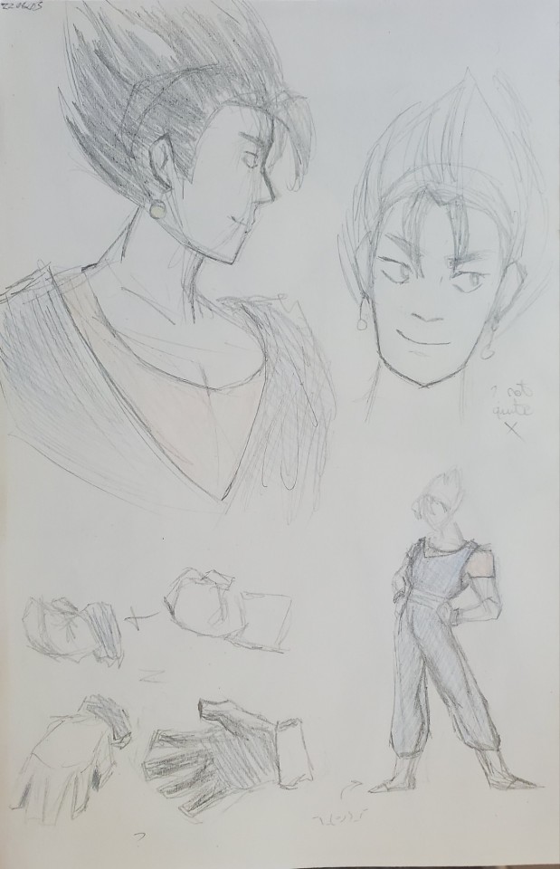
its hot and i didnt want to try to work from my computer so sketchbook for the day. i wanted to have vegito's outfit be a little more of a mix and i am thinking. questionably coherent design thoughts below
vegito always looked a little weird to me (not in a bad way, but when i had seen him as a kid my brain registered a bit of a visual mismatch that made him feel really interesting) and im trying to figure out a way to mix that with how i draw his components, along with trying to make his outfit be a little less like.. for lack of a better word segmented? like how he Just has vegeta's gloves and shoes with Just goku's gi with reversed colors. it works to show that theres a connection between them and while keeping him distinguishable, but i think there could be more and i'm messing around a bit to try it.
i in part designed him in contrast to how i draw gogeta but Thats in part bc i have some ideas about designing fusions in general. my concept is that, based on the fusion dance being a deliberate convergence with an emphasis on being in sync, while a potara fusion i feel is inherently a bit more chaotic, as two people could literally be at each other's throats and refuse to cooperate but still be able to fuse with the earrings, but the dance Requires them to trust each other and understand each other. i tried to have my gogeta design be like overall visually in-between goku and vegeta in a sense, whereas vegito's look is more like... some features may intensely be one or the other or they might not be immediately distinguishable. my idea is that gogeta's features are a little more balancee between goku and vegeta, but vegito has a more kind of unknowable mixture that may not even always make sense. i dont think any of This made sense lets talk about the clothes
im keeping the broad strokes of his outfit the same (trying to generally keep a similar silhouette and color balance), but alter the nuances. i draw goku's gi pretty baggy meanwhile vegeta apparently lives exclusively in tighter clothes, as even when hes not wearing the saiyan armor, he seems to gravitate toward something close and when he and goku fuse i'm pretty sure its the latter (im still in the android saga, i havent actually met him yet), and ive given vegito's clothes a closer fit as well as making the shirt a bit more of a tank top like vegeta's, and taking the fact that when i draw goku, his undershirt's sleeves are rolled up, for vegito i decided to not (this sentence fell apart). i wanted to combine the wristbands and the gloves and ive been thinking about giving him two-toned gloves for a while but i couldnt settle exactly on what else to do about how they'd look. i decided to roll them up (originally i actually made the gloves shorter but they started looking a little wonky) and have the palm of the glove be blue while the top of the hand would be white, and have that be reversed at the cuff of the glove. im not sure what exactly to do with the boots yet, as i'd like to make it look less like Just vegeta's shoes but he's still taking a lot clothing-wise from goku and if i were to, for example, make the boots white but with the patterns from goku, it would be kind of oversaturated by him. to balance out goku more, i've given vegito more of the shape language i would use for vegeta (theyre both pretty angular, contrast with goku and gogeta whom i have more soft and flowy) as well as proportions more like vegeta (vegito is taller, from goku, but his long legs and slimmer frame are from vegeta) but i feel like it isnt as apparent in part bc it ends up averaging out to basically how he looks in canon but a little different, as it feels like a little bit too much of the goku got kinda lost in translation. my intention was to have vegito overall just kind of be his own guy with the influences not Always being readily apparent from goku and vegeta, with him leaning more vegeta when they Are, but i might have done that a little too well. whatever send post
#my art#do i dare enter the tags..#maybe i will another day#but i do want to do it for organization.. but i also dont want to tag him.#i dont know how to solve this dilemma bc i think the 'only first 5 tags are indexed' thing is outdated#but i have no way to like. verify that bit of information#again keep in mind i am Still in the android saga i do not know this man
0 notes
Video
(no audio bc I’m bad + awkward at talking lmao why are my hands so ORANGE?????)
tried filming an instagram style video with my dad’s tripod recording myself fidgeting with the book pendant i made (this one is the bi-ble/bisexual agenda variant 😎) to show off how it moves! (i think I got a couple bruises trying to set up recording, ow :
It’s been a while since I’ve done a book pendant but it’s definitely a step up in complexity from the last few I’ve done. (worked out how to make it from scratch like … uhhhh…. I think two years ago now? had to grok the proportions and the design with bead mentor’s help as I went along bc I was REALLY into peyote and nothing else at the time, herringbone SUCKED and still SUCKS AND I HATE THAT STITCH and I was tired of doing spiral stitch over and over)
The way that both peyote and brick stitch (and I guess most things in beading in general) works is that it uses beading thread and not glue to put the beads together so they can still move, thus why the final piece, both the cover and the pages are flexible and I can move them like above. You can even roll the beads in place if you hold it in the right place and apply the right amount of pressure (not a lot, it’s still pretty delicate, but still), so it’s very stimmy! (at risk of causing the colours to fade/coating to come off but the weathered look I feel sells the book look)
If you want a REALLY in-depth thing about how I made it, that’s under the read more below! :D
Did peyote for the book cover and the pages with “writing” in rose gold colour (apparently? that’s what it’s technically named, also did them for the corners of the cover to make it look a little bit more book-like) metallic delicas on them and brick stitch for the bee page. I don’t think the bee wings show up well against the crystal luster I used for the background - it’s a soft irregular pinky purple silver metal. Seeming as it’s opaque and the glass beads aren’t, if you put it up against a light, or even angle it so that the light source isn’t directly above like it is here, you could tell them apart more easily.
(while they make the same product in the end, there are some key differences; peyote is far more forgiving AND faster once you know what you’re doing if you want to undo, but brick stitch at least you can see where you’re going wrong at the start as it’s a straight row and not filling in the gaps, or “teeth” for complicated designs that aren’t symmetrical, if not the turns are a little annoying having to increase every row to stop it from decreasing automatically. When it’s irregularly shaped things or complicated designs, brick’s your go to. I learnt that the hard way trying to do the bee page in peyote and kept getting disheartened :/ The bee page was too small and the wings couldn’t show up at all so I had to use a combination of brick and peyote to add a one bead wide border all around, meant I also had to extend the cover to make sure it fit inside, but looked much better. I got there in the end!)
So after making everything individually I sewed the pages individually onto the jump rings by looping through the rings and the teeth until it was secure enough but still let the pages move on the rings to act like paper (kind of). They all had to be the same orientation, or it wouldn’t work and would look wonky, so I had to plot out their designs and make sure I stuck to them and didn’t make mistakes.
You might notice the fuchsia is a little worn away - that’s because it’s a galvanised metal delica that the other colours making up the flag aren’t, so the coating’s come off as I’ve worked with it - the middle purple stripe is just glass (and even then it’d be wrong to call it a solid PURPLE since its edges are indigo and kinda fades into violet which I Love, I really want to do something else with it), and the deep blue is a silverlined type that looks pale unless you use the right colour bead thread - considering colours and material/finish is more important than you’d think!
To make the book wearable, I made a loop of the same delicas about ¼ of the way down the “spine” so it could hang diagonally - with an odd number in the loop too so that there isn’t a gap at the top with the jump ring on where it could slip off the thread at the join - and went through that to secure it so the chain could be passed through it easily. There’s a couple loose threads where I messed up that didn’t go entirely through where I got sloppy, but because it was purple it doesn’t show up much against the flag colours of the cover.
Aaaaand then one part pages kept coming off the jump ring so bead mentor had to twist them both open and close them tighter with pliers (I’d forgotten to do that, :
FINALLY tidying up the threads that had come out, I used a clear nail polish to get them to set so it wouldn’t come undone after I snipped the ends with a bead cutter. Also made it SMELL a whole lot of varnish and changed the texture up a little so it became a little stiffer, but it gave a little more gloss too for some extra pop.
#aurrie's jewellery#video#ft. my hands which for some reason come up REALLY orange in the unedited video#eugh quality sucks but what can you do
27 notes
·
View notes
Photo

Figures in Good Style
It's about time I got this one finished and uploaded!
This piece was inspired by this adorable vintage Valentine: Vintage Valentines - Worth Your While graciously posted by Yesterdays-Paper
Believe it or not, I actually started on the sketch back in January not long after the original Valentine was posted. (From pretty much the moment I saw it I wanted to draw something inspired by it so I've had it open in another tab so I wouldn't forget this entire time! ) I got about halfway through and started to run into...not really problems so much as frustration. Some of the details were just not working out the way I wanted, the proportions looked wonky, etc.
So I gave up and worked on some other things for a little while; some things that were on my to-do list, others that came up as I went along, stuff like that. The longer I went, the more it was looking like the sketch was going to be abandoned, especially as it drew closer to Valentine's Day (because originally I wanted to post it before then for hopefully obvious reasons). But all the while there was this voice in the back of my mind more or less egging me on to go back to it.
One night when I was feeling artsy but had finished my other projects, I decided to go back to it.
This was one of those times where there must've been something artful in the air because even though it was still trying my patience a little, I didn't get discouraged like I did before and powered through to finish the sketch. (Well, what I was calling finished, anyway.) And somewhere in the mix, I had decided to see it through to completion, after Valentine's Day or not.
Compared to the original, I did alter some details and age the two characters up a bit to better suit my own style. The eyes, in particular, I couldn't make out the color on the original that well, so I gave the girl blue eyes to tie in with the boy's shirt and he got green eyes to go with her dress. I think it connects them a bit more since otherwise, their looks don't really go together.
I sat on the sketch for a day or two to figure out what I wanted to do exactly beyond just coloring it. I ended up doing the line art on this Parchment Paper by Strathmore that I got on clearance sometime last year, And I really should use that stuff more often. It's got five tinted colors to pick from (I went with the darker of two creamy/tannish options here) and the pages have a sort of subtle marbled look to them. It's also pretty smooth, so markers work pretty nicely on it, but not so smooth that colored pencils won't stick. It's only the 200 series, 60 lb. so it's kinda thin, but I haven't had any issues with that. (Beyond the very obvious I am never taking water to this paper because I am very sure it wouldn't hold up to it very well).
I thought the creamy and marbled look would fit with the vintage theme, and the tints of the paper are light enough that they don't affect the color too much.
Because I was feeling a little lazy I went with doing a base layer in alcohol markers--good, even coverage pretty quickly without having to build up layers--do a little minor shading, and then deepen up the shadows with pencils. This worked quite well, and again this is something I should do more often. I like colored pencils, but they do tend to take a little longer. I also like markers, but sometimes it's intimidating to me to try and get enough depth/shading/etc. with them alone. (Only thing is I can't use the markers on my tan and gray papers, which is a shame)
Originally I wasn't going to include the little pattern on the girl's skirt, but once I started working with the pencils I said, "eh, I can do a little quick sketch-in with a darker green" and then later I accented it with a Pentel Sparkle Pop, so IRL when you move the picture it sparkles. This led me to add the ribbon on the boy's hat so he would have some glitter too. (I did do a couple of gold buttons on him, but it didn't feel like enough). The gold on the fan also sparkles; leaving it plain white in that spot didn't feel right.
Then obviously I took my white gelly roll to them, And IRL the shine on their eyes somehow now looks almost like it's glowing because it is so nice and bright .
Now, I had figured out while I was doing all this that I didn't want to just leave it on the paper and that be that.
Once I was done with the coloring and everything, I let the drawing sit for another day or two and thought about what else I could/wanted to do with it.
From my Elizabeth Tower piece, I have this stack/block of paper printed with maps/test/ledgers/etc. On a whim, I started flipping through it, possibly to cut and mount the drawing on a piece.
I went through a few different ideas, but I ultimately came back to this piece left over from the Tower; I'd cut a butterfly out of one corner. I hated to waste a whole new piece to cover up most of it, so I was thinking about how I could use this piece that had already been marred.
I still had the butterflies I used; So I pulled one out and cut one out of the other corner To fill it out, I pulled out on the ledger pages and mounted it on that, then cut out the drawing and mounted it on that.
Though I hadn't planned on it, I ended up mounting my little paper sandwich on a piece of my metallic cardstock just to give it some more stability. (The cardstock I got pretty cheap and don't use it that much, so I don't mind using it for stuff like that.)
Some details and proportions still came out a little bit funny, but ultimately I'm happy with it. It's cute, and the different papers make it feel a bit fancier.
This was also the piece that put a nicer paper cutter than the one my mom got from the dollar store many years ago on my art shopping list because that one was still cutting crooked and giving me trouble. (I have since purchased a pretty nice one by Fiskars that works wonderfully from Wal-Mart).
I went with "Figures in Good Style" for the title as it comes from the text on the original and seemed like a good fit.
Next up...hmm...I've got a new resource to share, a colored pencil test, and another test, but I also have one other thing that's not quite finished I plan on wedging in there somewhere.
____
Artwork © me, MysticSparkleWings
____
Where to find me & my artwork:
My Website | Commission Info + Prices | Ko-Fi | dA Print Shop | RedBubble | Twitter | Tumblr | Instagram
2 notes
·
View notes
Text
Art Growth Compilation

I really enjoy doing posts about improvement in art.
It makes me feel better about my work, especially with how busy I am these days.
I wanted to compile all the comparisons I’ve made over the years and kinda discuss the posts, for myself or others.
I thought it’d be funny to start with comparing how I first drew on a tablet, using dodge and burn tools, to how I do now which is using layers and actually painting. It’s funny to look back on that, you know?
I linked the post I made, compiling all the month to month memes from 2003-2017 that I try and do yearly. And everything else is under a cut ;w;’‘/

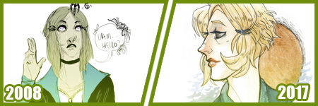
Most artists have done a drawing of themselves and a few Pokemon, or their team. I did that in 2010, and was dissatisfied with my work...
I took a crack again in 2013 after I’d learned to draw more animals and not be so Edgy(tm) I really liked the results. I still didn’t use references though, because I was lazy. I just didn’t want to. I still was on that boat feeling like I was CHEATING. I wasn’t being CREATIVE if I looked at references.
Artists get stuck on using reference and it’s AWFUL. USE THEM. USE TWENTY. LEARN!! It’s so HELPFUL, I wish I had started sooner.
In 2014 though -

I tried again.
I had gotten better at anatomy, but most of all, I started to work off references more. I started to really focus on not stylizing so much, but to work on actually making things look like things. I started to work on caring about COMPARISON sizes. Composition!!
While Pokemon reference sizes are -wiggle hands- and while my team changed up, I was satisfied that I could draw Arbok ACTUALLY like a cobra now, Meowth is easy given it’s just a noseless cat so to speak, Haunter is literally a triangle cloud - I was satisfied having drawn that team.
My secondary team in the new games? I was excited to draw them. It was fresh and new and FUN and it turned out PRECIOUS.
I learned better how to proportion things in an image for layout, and just... making characters feel COHESIVE in the same space.
It was a nice thing to keep visiting. I have a sketch in the works for an update even hopefully.
These pieces are kind of interesting to me too, because they’re towards the end of my era of THIN lineart?
My lineart has gone from this, and THIS, to this.
Literally I use to not believe in line weight, I can still do thin work of course, but I’m not a fan of trying to FORCE it like I use to? Even the second link, I went from the SMALLEST brush in Sai, to using a marker brush that had barely ANY give, to a custom brush on Sai that acts like a Paint Chat brush I use to use with friends online!
That’s what I mean about style too, like you may reserve yourself about things - like not coloring black in and outlining with white, or certain ways you do things. But the growth and changing and figuring FUN ways to color that black etc is where the fun of art comes in, to me??
Learn. EXPERIMENT. PUSH!
A few months ago, I did my first redraw. Of this piece from 2012.
Six years difference.
This was interesting for a number of reasons. There’s aspects I like more in the old one, but not many. I really like the pose a bit better, but I like the casual closeness that I did in the new one because that’s more my Shepard.
But technically speaking, it’s worlds better because I took time. I paid attention to details. I did fun things instead of rushing. I took time with my coloring and didn’t SMEAR it around. I had a friend who use to complain I drew so fast and they felt so SLOW, but I love what that taught me. I started taking more time on my art, and enjoying it more since I caught more mistakes and vastly improved. By leaps and bounds.
It’s amazing what a difference six years makes in not only style, which is often a FOCUS of these things? My style has come awkwardly and naturally to me over the years of critically picking certain things apart? but I really love where it’s gotten.
I have things I want to get back to, but I love... where it is, and CAN be?
But it’s wild to me how much change happens in technical handling? It’s a hand in hand thing, you can’t focus on one or the other only, or the other suffers.
Honestly this has been my favorite improvement to notice though?
Kisame was a character I felt I should be able to draw EASILY? Not so much. Itachi? ALSO EASY. Not so much??
Kisame has weird eyes to grasp how to draw? Thus focusing on them kept making them wonky to me!! On top of that, he’s everything I’ve been use to drawing for AGES because he has a muscular body, with a smaller waist? ... that was something I was use to drawing? I still was awkward getting back into the swing of that... Drawing HIS HAIR though? NOT SO EASY....
But like, Itachi should have been easy, but I have a thing about him appearing too feminine as he gets drawn because his eyelashes, and I’ve really found a nice... medium at this point?
But even still like my face styles and eye styles are finally to a comfortable point for me? I have stopped focusing on some weird things with Itachi’s hair and just... DO IT? But even still like...
The improvement here is literally just if I don’t know how to do something, or I’m not satisfied with how I do it? I just keep at it.
It’s a theme of this post honestly... repetition, persistence.
Keep drawing it. Keep trying to figure out what it is that’s catching you off about how you do it. Don’t like how you do eyes or how they fit on the face? Look at facial structures and references and figure it out. Draw them separate and figure out how to apply them to what you are.
Remember there’s a skull in there. I draw the holes in the skull like the eye sockets, and the nose area to help my proportions for SURE.
I’ve also gotten to a nice marriage in my lineart? The piece before the recent one, those lines feel HARDER or HEAVIER? The newest piece seems...softer? Like I’m lighter handed again?
I really like critiquing my own growth on what is good or working better for me? Older pieces it looks like I’m putting lineweight for SAKE of it versus where it goes now?
INTERESTING.
Like this lineup -

My style shifts so RAPIDLY, it still is noticeably MY style to people, but parts shift so VIOLENTLY because I’m constantly picking at what I don’t LIKE.
It’s funny too in the case of Kisame and Itachi because consistently I’m drawing the SAME character over and over - can make you REALIZE how you’re doing something wrong?
Like, here’s a difference of eight years, and it’s all the brush I use now, and it REALLY shows how my style has changed - in the aspect of one point of reference?
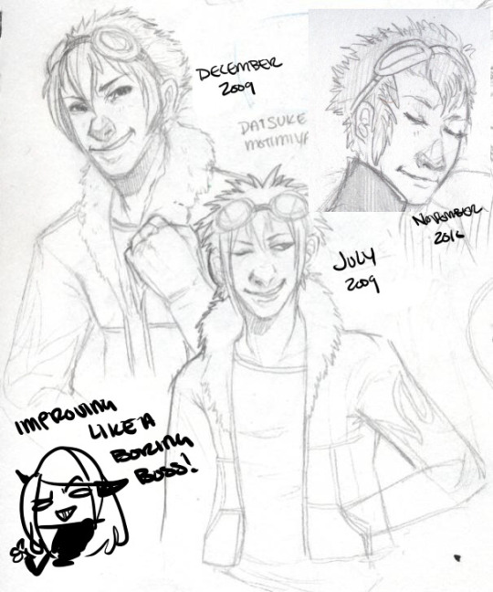
I have a childhood favorite character too, of Daisuke, and I use to be bad at drawing boys, and I use to be SUPER bad at drawing fluffy hair?
It was something I specifically started to learn to do? And I started to draw Daisuke every few months or years for a while. Especially when I started to first REALIZE I didn’t like my style that much?
But the middle one was July 2009, top left is less than 6 months later, and the last one is about a year later. DRASTIC DIFFERENCE. But next -
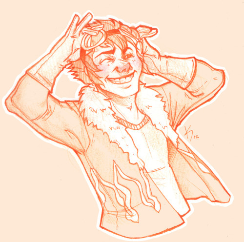
This one was in 2012, when I started to do more with teeth, or first dipping my toes into anatomy. I started to focus more on HANDS too, I was super bad at them. Overall I started to focus more on making my art have...ages? Like a boy versus a man. Facial features being DIFFERENT.
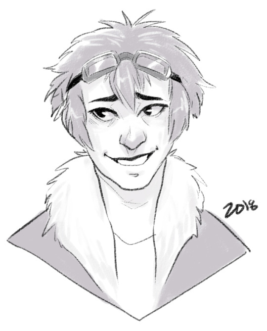
I can look at this boring little bust and see that he comes off more of a teenage boy to me now. I need to work more on figuring how to draw asian features especially the eyes. Sometimes I hit the mark, other times I don’t.
but between this and 2012? Not too much has changed. I do hair fluffier now, and I angle the eyes better. The teeth not being outlined doesn’t give that weird effect where I might give him TOO MANY TEETH....
People do that and it’s easy but whoof.
So there’s still learning and adapting to do in QUICK drawings, you know? but I can still see there’s good things. That took me like 5 minutes to draw? Not bad honestly.

In it’s own bracket is original characters though too?? But also divergent of STYLE shifts because like...
OKAY. Nightmare Syndicate’s story.. started for me in 7th or 8th grade, that was when I was...14? 15? I’ve been fleshing it out for like 13 years, that’s wild haha!! I love my kids and all.
But okay so SIALI. She’s still fairly similar but I restructured her face for SURE. She’s gotten less edgy, she’s.... a teenage girl.

FELIX?? CHRIST. He’s been such a long journey!! More on that later?
Rot and even Cor?? Rot and Cor are a shorter span of development, but Rot started in Highschool so almost 10 years ago, and Cor has been fairly solid - but even just DRAWING him over three years? Go look at how much he changes.. I’m not married to concepts easily. haha!
People act like making a character you’re STUCK with it. Like Oh boy, I better make this character good, from the get go!!
I only worry about that with small potatoes like my Pillar(Gods) designs I just made for the comic?? Even still, small things will change with them I’m sure.
But not only has Felix and Siali changed, but they’ve GROWN with my style and DEFINED it even. I’ve had to adjust my style to support Felix’s look honestly a LOT. Bend my rules. Break my anatomy stickler attitude - and honestly, that’s the thing.
You have to learn the rules and anatomy BEFORE you can break them. A style built upon broken anatomy will fail you down the road if you just excuse everything with style.
Learn to draw the hands. Learn to draw the feet. Figure out the face. Bones exist. You can break the FUCK out of it once you learn how to do it, you know? Like I’ve seen so many styles I LOVE who are cartoony and BROKEN AS FUCK, but there’s still some STRUCTURE to it. Most of those people can still structure a face just fine, and the reason exaggeration works so well is because there’s like unwritten rules for what works and doesn’t based on that?
Idk.
Felix has a very elongated torso, he’s like 7′ or 8′ tall so I mean?? He’s... broken anatomy, but he’s... lanky - but his muscle is LITHE and stretched. It makes contextual sense. That’s the important part.
But even designs, it’s important to understand designs YOU make, or like... to understand they’ll CHANGE and that’s growth within your art too?
Like okay, example. Felix has a millipede inspired monster form. But with designing that? I still have to know how millipedes and SNAKES work because there's bones and vertebrae in there??

But there’s also the difference of like... CONCEPT, versus execution. You can design a fucking badass character, but understanding your own concept is SOMETHING.
I had no idea how this would play out, until I was mapping out his ‘midsection’ spikes? and man. MY STYLE WAS MADE FOR THIS CHALLENGE NOW. Which is so interesting how smooth my style has always been? Felix has defined ANGLES in it, and it’s hilarious tbh?
But even too, I’ve had to work with Felix’s monster form FACE, to break the rules to make it WORK the way I need it too?
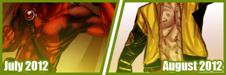
On the anatomy subject too, like when I first got into Marvel comics 6 years ago or so? I had no idea how to do muscle structures?? I was so BAD at it.
I can look at this left image and CRINGE so badly at how NONE of those are muscles?? THOSE ARE THINGS I PERCEIVE AS MUSCLES. Like...
A course I took taught me to draw what I see, not what I know. That’s the whole point of that post that goes around about drawing a shrimp. Look it up. It’s hilarious and cute.
But it’s like, asking an artist to draw a bike, you can tell who uses reference and who WINGS it. It’s funny, but like it’s what you know versus what you see.
I started to study anatomy like crazy and was seeing improvements days at a time. The right image was done like... a month later? already I can see the muscles under the pectorals? those look normal now. the abs aren’t dough lumps under the skin in a perfect 6 pack, they’re the actual plane shapes.
I was trying to find a good reference for myself of learning to make men ‘thicker’ too in terms of the waist etc since the left is really...thin.... but...

A bit better, but even still, comparing these two - they’re 2 months apart? and I can see understanding more about arms and how they connect to the body, where the planes ACTUALLY lay for the chest and obliques and such?
I can see improvements from July 2012 up there, to - WHOOPS. I FORGOT TO CHANGE THE YEAR LMAO... TO FEBRUARY 2013...omg
I mean, I could go on and on about improvements I see, when I go through my art though? Gosh.
Like I’m seeing so SO many bad hands and feet in my old stuff, and just CRINGING because tricks I learned for myself by now?
I give so many pointers and streams and screenshares on discord still to help people with art and it cracks me up?? Like...
I dunno. I’m pretty mediocre tbh, but god damn.
21 notes
·
View notes
Last Seen Blogs

kelthebarb
kelian ✫

offroadclub4x4tirol
Offroad Club 4x4-Tirol
parkhyeminnim
Pony's Make Up

reiblu
Don't let this world come to an end