#sometimes I have no further jpegs to consider so I try to make these two in picrew and it is Impossible
Text
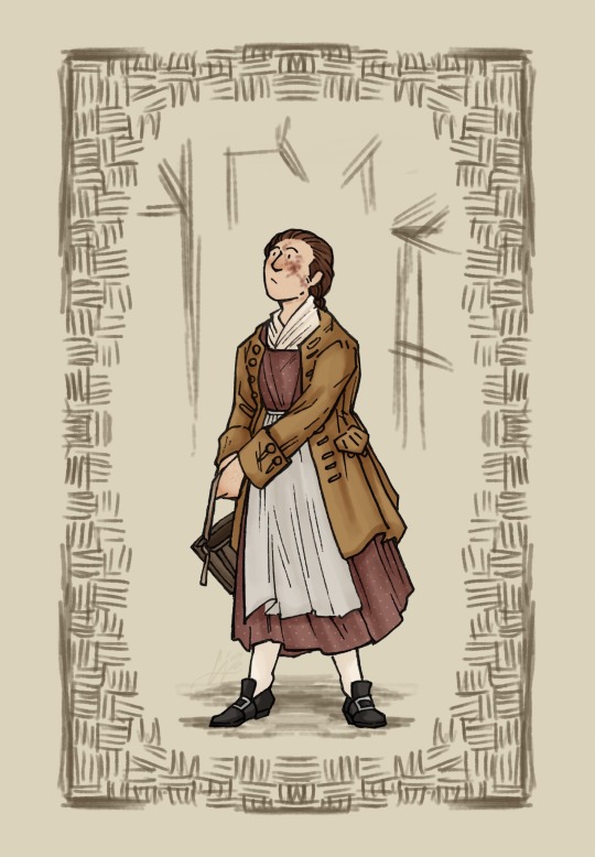
a moment's pause along the way
#em draws stuff#oc time again hehe#haunted by your hand#the gambler: james webster#thinkin about what she would have been like when she was younger again...#thinkin also about the entire concept of hbyh as it revolves around Eighteenth Century Butch...#many thoughts ideas &c. none of them coherent. consider my jpegs instead. you know you want to consider my jpegs.#sometimes I have no further jpegs to consider so I try to make these two in picrew and it is Impossible#if only I could just write about them but it is also Impossible. in such a manner we shuffle onwards.
48 notes
·
View notes
Text
24/3/20_Illustrator2
In this weeks session we explored Illustrator further by rendering using the pen tool and different colour options, creating a personal monogram and the use of Ai and Ps as a fluid pair.
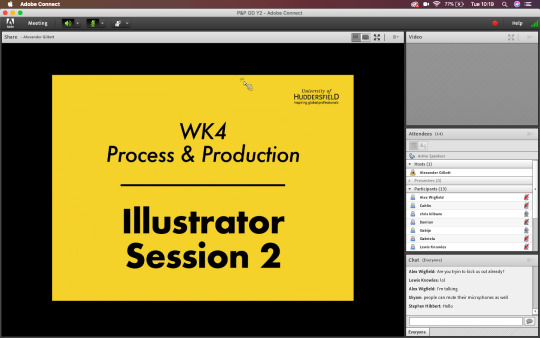
This weeks session was a little different, being an online session using Adobe Connect, raising its own issues and tasks despite the lesson itself. Please bear this in mind when moving forward with my blog and thank you for your understanding.
-- stage 1 --
Renderings:
We started the further exploration into Illustrator through the pen tool. When manipulating a shape or drawn line, the direct selection tool is perfect. You can select individual points of a shape, or multiple at a time in order to create the perfect lines.
In order to directly copy a shape inside another, with perfect distance between the two lines, you can use offset path. Its a tool that isn't used that much, but when you need it you can create absolutely perfect lines.
When using the pen tool, both Alex and I usually draw half of a mirrored shape and then copy and mirror the drawn line using TransformReflect. You can then press Cmnd Y to bring us the wireframes up, you then can select the two mirrored points with the direct selection tool, use Cmnd J and join the points together.

The final step to the renderings is to add colour and keep in mind the order of the layers when colouring. To move the layers about you can use Cmnd [ ] to get them into the right order. Remember to have a play around with the thickness of the lines to get a sense of depth and dimension.
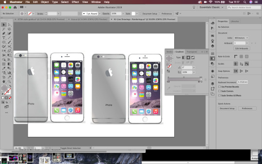
Instead of the Apple Watch task I decided to do the iPhone task instead, as I have used rendering in Adobe Illustrator quite a lot and wanted a bigger challenge. In the time given in the lesson, I was able to render the back of the iPhone with fairly accurate gradients. I don’t use the gradient tool very often but I learnt quite a lot when playing about with it today.
Below: On the left is the example and on the right is my rendering.
-- stage 2 --
Monograms and the Gestalt Principles:
The Gestalt psychology is the theory that we see things as a whole rather than individual objects. Gestalt psychology or gestaltism is a school of psychology that emerged in Austria and Germany, based on work by Max Wertheimer, Wolfgang Kohler, and Kurt Koffka.
It gets us thinking about principles of layout and why things look right or wrong, we can use these principles to get us out of a design jam and prompt us to think about what might not be working. Rather than seeing individual elements we see the relationships between them, objects will be perceived in their simplest forms. When designing we need to think about context and what helps our brains perceive the world around us.
The six main principles are:
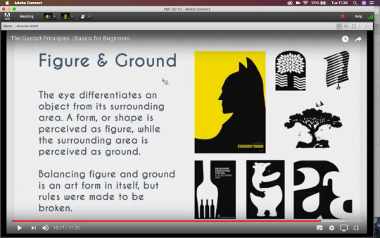
-Figure-Ground
-Similarity (relationship between objects through similarly in shape or colour)
-Proximity (how close a shape is to another)
-Closure (negative or blank space, filling in the gaps)
-Continuity (guiding the eyes)
-Order
By human nature we perceive lines and curves as a single element, e.g. a roundabout. The mind will attempt to fill in details that aren’t actually there, meaning that white space or negative space design can work. According to Gestalt psychology, the world is different from the sum of its parts. The mind will always attempt to fill in gaps or work through continuation, when the eye is compelled to move through one object and continue to another object (often used in typography based logos). With continuation you can guide the eye from one object to another through compelling with guidelines or gestures. With continuation the design implies that an element is there when isn't really, allowing our mind to fill in the gaps through implication.
Using implication and negative space is so simple but so effective, thinking about the shapes and context you are working with will allow you to create a thoughtful and unique logo.
Using my initials, NB, I created a few monograms in the lesson. I only managed three in the time given for the exercise. I like the third logo and it goes to show how developing an idea over and over gets you to a better final render.
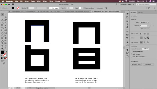
Inspired by modern minimalist design, my logo would fit in well in a sports scene, being very sleek and masculine looking. It is important to keep in mind how something relates to its context and how it visually fits into it.
-- stage 3 --
Using Photoshop and Illustrator together:
When creating a workable document, it's important to use layers, grids and guides. This will help us get an accurate document to work with across the above suite.
In Illustrator, we can create a grid bu going to object-path-split to grid. With this we can the create a gutter (InDesign usually uses 4.322mm gutter). Adding these grids to the top layer and locking them will show a guide over the image, with accurate layout.

Working with Photoshop and Illustrator together, rather than saving the file as Jpegs and placing them as Jpegs, you can move a .psd file straight into Illustrator.
Cmnd+Tab scrolls trough apps quickly!
To find a file from another Adobe software, press ALT and double click it to open the original file.
-- reflections --

I will definitely be updating this blog in the future with my own personal branding. I really enjoy creating logos and although it is difficult to create something for yourself, it is important to have your own personal brand.
The essence of personal branding is reducing a persons whole career, identity and skillset into its visual essence. My client has a background in design and works as an in-house graphic designer for a gaming company. This will require an insight into both the design and gaming world in order to marry the two fields together and create an effective personal brand.
-- inspirations --
One logo designer that inspires me is Paul Rand:

Left: Logo for IBM, 1956; right: 8-bar version 1972
He skilfully uses contrast and minimalistic colours alongside negative space to create memorable brands. His work isn’t exactly colourful, but he notably followed the Gestalt principles and from this created some of his own:
“A logo derives meaning from the quality of the thing it symbolises, not the other way around.”
Designers should see logos as a means of converting messages. Rand however sees a logo’s meaning by association with the brand or product itself. Not that logos are insignificant, but that they are free to be designed however one chooses. They are visual language of marking something, not the context itself.
“The only mandate in logo design is that they be distinctive, memorable and clear.”
This means a logo doesn’t necessarily have to directly visually depict the company it is trying to represent. The subject matter of the logo has relatively little importance, and sometimes it is better to have a completely free logo!
“Simplicity is not the goal. It is the by-product of a good idea and modest expectations.”
A logo has capabilities, but like everything these are limited. Trying to sum up every point, key detail and context of a brand will create a cluttered logo. Focusing on key points or elements will in itself generate beautiful simplicity. Don’t strive for the end goal, instead create a considered and refined concept and simplicity will naturally derive from this.
-- further development --
To further develop my monogram branding, I created a few more logos that I could possibly use or use as inspiration in the near future.
Working from the Gestalt theory and Paul Rand’s principles, I created a personal logo based on my initials, nicknames and current brand name.

Above: An idea I tried based on the morse code for the letter N. I like the look of it, but think it could use a little more creativity. The logo idea and execution is a little basic for my liking. Maybe generating an idea around iconography will work more in my favour.
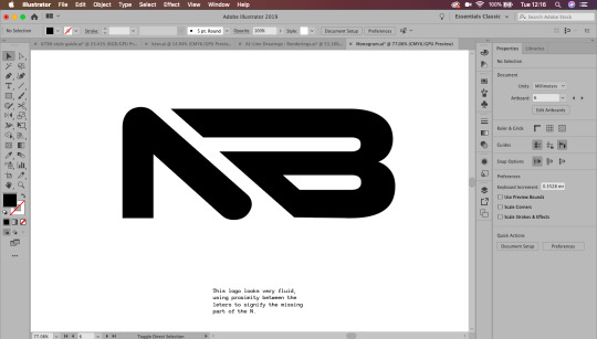
Two other concepts I created were edits of the N shape. I wanted my logo to look fluid and Nimble, like the name of my personal brand. Creating a sense of movement and speed was important to me when creating this logo. I think I created good sense of movement through the implication of arrows, giving my design a sense of direction, literally.
I created two styles of this directional logo, matching bottom text with the weight and style of the logo. I think I prefer the second logo as it has a more clear sense of direction and movement. Although I like these logos, I am still not satisfied with them as a final design.

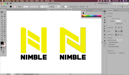
I ended up revisiting my third logo to make the N and B lines match, I much prefer this as a logo, and though there are still a few edits I would make, I am pleased with my exploration of Illustrator rendering.
1 note
·
View note
Photo

Image of mask https://www.netsafe.org.nz/healthline-covid-19-calls/
For starting my assignment 2 processing code, I have chosen to do use New Zealand covid cases data and turn this into a digitally embodied face mask. This is because I am not to sure how the LEDS work and how much it would cost for me to buy the equipment to make. The quiz website idea was also a possible option but I couldn’t decide what kind of quiz, I also went to the warehouse to find a tote-bag but they had ran out. I thought covid 19 was the most relevant idea especially with New Zealand being in level 2 again. I also have access to data through https://www.health.govt.nz/our-work/diseases-and-conditions/covid-19-novel-coronavirus/covid-19-current-situation/covid-19-current-cases. This data shows New Zealand’s current cases, how many total cases, how many deaths and other relevant information. During lockdown I would always look on this website and I know that this has lots of possible data I could use for my assignment 2 work.
My current workflow:

This is a photo of my current workflow. A work flow is important to understand each step you will take in your process and also allows other people to see your work flow and understand how the mask was made.


https://www.health.govt.nz/our-work/diseases-and-conditions/covid-19-novel-coronavirus/covid-19-data-and-statistics/covid-19-current-cases
Step 1: Saving as a .CSV
First I used the data on health.govt.nz and copied and pasted it into sheets, this pasted into one column and row, so I had to rewrite each New Zealand city. I also decided only to have the DHB (district health board) and TOTAL (total number of cases) because this was the two headers I want my mask to represent compared to how many are active, recovered, decreased ETC. This means my mask shows the total number of cases for each NZ place. I have also gotten rid of the “Managed Isolation and Quarantine” row. This is because it isn’t a New Zealand city, and I am unsure where they are in isolation.
We have learn’t about saving as a .csv through spreadsheets. CSV means Comma Separated Value. We have previously worked on birthdaydata.csv and have imported this into processing through using Table birthday data. Table is the variable. To make sure the data is imported correctly, you have to save your .csv file into a “data” folder in your sketches folder otherwise it would not be able to find the document. I will be using the birthday example as an example for reminding me how to import a .csv into processing.
(THE COVID STATS WHERE UPDATED FROM THE 5TH OCTOBER 2020, I would have to get regular stats but currently I am working from this dataset)
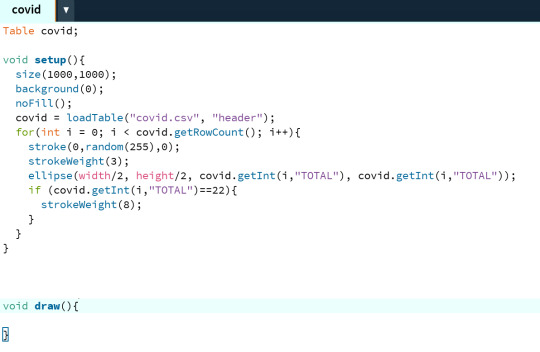

Step 2:
Putting it into processing. I have used the birthdayData template as a guide, I have changed the data sheet and therefore the ellipses represented the covid 19 cases in New Zealand in each city, for example Capital and Coast had/has a total of 95 cases. Therefore the ellipse will be medium shaped close to small. The bigger the total case number in that New Zealand city the bigger the ellipse(). I have made sure to change where the birthdayData was put and changed this to Table covid. Table covid gets the table from covid=loadTable(”covid.csv”, “header”)
I have chosen New Zealand stats because I wanted it to be relevant to where I live. It was also easy to find the correct stats because over the lockdown period I would always check https://www.health.govt.nz/our-work/diseases-and-conditions/covid-19-novel-coronavirus/covid-19-data-and-statistics/covid-19-current-cases and I knew they had the statistics written on the page. I also found it interesting to see what city in New Zealand had the most cases. According to my statistics Waitematā had the most cases with 293, therefore they are the biggest ellipse() on this sketch. Overall I have changed the birthdayData and used it as a guide to import my own statistics into processing
Colour
I have decided to choose green because green resembles the colour of germs from a snotty colour. Green I can relate to bacteria and thats what I want to show through the ellipses. I have done stroke(0,random(255),0). Processing uses RGB, green stands for G and therefore is the middle parameter. I decided to use the random function, to have a varied amount of greens this means each time you run the code you’re not always going to get a dot with the same green. It creates randomness and variation within the data visualisation and I feel that it adds another layer of complexity to the code.
The black background has been chosen to display contrast between green and black. Sometimes the ellipses would get to light and therefore be hard to see. I have set the background to black by using background(0); function. This therefore shows that I have considered contrast in my making.

Step 3:
I have now worked on the idea of random. I want to create random dots as if the bacteria bubbles have spread across the page. This is because I feel that it is more interesting to have variation in the bubbles but this means your mask is personalised to you, when you run it you get a different mask pattern and therefore know that it is your mask. It also means that you can decide which mask you like when buying them in a shop.
When randomising I like how the bubbles appear spread out but also overlapping each other, it would look affective on a mask. I have the idea of instead of a bubble how could I show bacteria? I thought that I could try and import an image of a photoshopped bubble and replace ellipse() with an image. I will have to do some research on how to add a image into processing because I have not done this before.
Step 4 photoshop bubble

https://www.freepik.com/premium-vector/covid-19-coronavirus-virus-bacteria-outlined-icon-illustration_7972163.htm
I have creative commons sourced an image of a covid 19 bubble. This is because we want to make sure there is no copy right within the image. I can use photoshop to crop the bubble and change the colour to green. This is because I want my overall final covid bubble mask to be green. Green means germs and bacteria and works well to show the bubble.

I have used photoshop to edit the covid bubble. I have used the “wand” tool to get rid of the background and made it transparent to save as a png file ready for processing. The purpose of the .png format is because when the bubbles overlap I want to be able to see through the covid bacteria bubbles. In photoshop I have also cropped the image so that you can’t see the word “Covid-19.″ I then changed the colour of the bacteria image to green by overlaying the colour. Overall the png has worked successfully.

I have saved this png into the data folder. This is because the data folder is where processing can access the correct image. This works similar to when importing a .csv file, you have to put it within the data folder.
Step 5 research
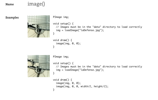
https://processing.org/reference/image_.html#:~:text=Select%20%22Add%20file...,%2C%20JPEG%2C%20and%20PNG%20images.
For creating my mask I have done some research on how to get an image into processing to replace a ellipse();
The image() function draws an image to the display window. Images must be in the sketch's "data" directory to load correctly. Select "Add file..." from the "Sketch" menu to add the image to the data directory, or just drag the image file onto the sketch window. Processing currently works with GIF, JPEG, and PNG images.
We have to write PImage img; at the begining of the code as a variable. Then replace the ellipse() code with image(img, random(1000), random(500), covidData.getInt(i, “TOTAL”),covidData.getInt(i, “TOTAL”)); this therefore means that instead of a ellipse, it gets the png image and sizes it depending on the data from covidData.csv. This is an example of experimenting and improving my code. (This also works with .svg images);
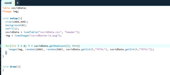

Step 6: Running my code
Overall my code has successfully worked. I have used PImage img; to get processing to find the image in the data folder. The “img” has been set in the void setup(), it calls processing to get the image and put it in the variable of img. img= loadImage(”covidBacteria.png”) (processing gets the image from data folder). We then replace the ellipse function with - i(img, random(1000), random(500), covidData.getInt(i, “TOTALl”),covidData.getInt(i, “TOTAL”)) It gets the integer of total number of cases from the data set and then uses the bacteria img to show the size of the cases in that city along the 1000x and 500y canvas size. I have used random as the same size as the canvas, therefore the bubbles appear around the whole canvas, not just a section of the x and y. Overall the width and height is determined by the the number of total cases in that place. EG. if the total number of cases was 95, therefore the bubble will be 95width and 95 height. The (”TOTAL”) also means that proccessing gets the “header” of the csv and inputs all the values that are bellow that column in the csv file. This overall shows the number total cases New Zealand had/has of covid 19 by each city.
Improvement idea:
I think that I could further improve this code. Some of the covid bubbles are small and look like dots. I need to make sure that the embroidery machine is to pick up the small details in my design. This means that my face mask will look better in the final outcome. I could do this by experimentation. Experimenting maybe *5 each bubble by covidData.getInt(”TOTAL”) *5 = TOTAL number is times by 5 and therefore a bigger bubble in size. EG: 95 width and 95 height x 5 = 475. This could be too big so I would have to experiment. I could also change the smaller bacteria bubbles by using the ellipse() inside of a if statement, if it is < 100 = an ellipse().
0 notes
Text
14 PowerPoint Presentation Tips to Make More Creative Slideshows [+ Templates]
New Post has been published on http://tiptopreview.com/14-powerpoint-presentation-tips-to-make-more-creative-slideshows-templates/
14 PowerPoint Presentation Tips to Make More Creative Slideshows [+ Templates]

youtube
I like to think of Microsoft PowerPoint as a test of basic marketing skills. To create a passing presentation, I need to demonstrate design skills, technical literacy, and a sense of personal style.
If the presentation has a problem (like an unintended font, a broken link, or unreadable text), then I’ve probably failed the test.

Even if my spoken presentation is well rehearsed, a bad visual experience can ruin it for the audience.
Expertise means nothing without a good presentation to back it up. For starters, grab your collection of free PowerPoint templates below, and use the tips that follow to perfect your next presentation.
No matter your topic, successful PowerPoints depend on three main factors: your command of PowerPoint’s design tools, your attention to presentation processes, and your devotion to consistent style. Here are some simple tips to help you start mastering each of those factors, and don’t forget to check out the additional resources at the bottom of this post.
How to Make a PowerPoint Slide
Open Microsoft PowerPoint.
If a page with templates doesn’t automatically open, go to “File” at the top left of your screen and click “New Presentation”.
To use a template, either click the “Design” tab or go to “File” again and click “New from Template”.
Insert a new slide by clicking on the “Home” tab and then the “New Slide” button.
Consider what content you want to put on the slide, including heading, text, and imagery.
Keep the amount of text under 6-8 lines (or 30 words) at a minimum of size 24 pt.
Add images by clicking “Insert” and clicking the “Picture” icon.
Add other elements by using features in the “Home” and “Insert” tabs on the top ribbon.
Play around with the layout by dragging elements around with your mouse.
How to Make a PowerPoint Presentation
A presentation is made up of multiple slides, and now that you know how to make one, you can delve deeper into PowerPoint’s capabilities.
1. Open a blank presentation again or start from one you’ve already created.
If you’ve already created a presentation, double click the icon to open the existing file. Otherwise, open Microsoft PowerPoint, click “File” in the top left corner, and click “New Presentation.” From there, you can follow the prompts to set up a new presentation.
2. Choose a “theme” or create your own.
Microsoft offers built-in themes and color variations to help you design your slides with a cohesive look. To choose from these pre-built themes, choose the “File” tab again, select “New”, choose one of the options, and click “Create.”
Otherwise, you can use PowerPoint elements, your design sense, and your brand’s color palette to make your own “theme.”
3. Create a variety of slides for different purposes.
You don’t want to present the same exact slide, just with different content on it. This would bore your audience. Ensure that you create multiple variations, accommodating some of the common uses for slides. At minimum, you’ll need:
A title slide
An agenda or table of contents slide
A slide that introduces the speaker
Various content slides (create different layouts considering what kind of multimedia you’ll use)
4. Use the Duplicate Slides feature to save you time.
There’s no reason to create these designs over and over again. Now that you have a few to draw from, you can simply duplicate them before inputting your content. Here’s how to do that:
On the left pane, right click the thumbnail of the slide you want to duplicate.
Choose “Duplicate Slide” from the pop-up menu.
This will automatically add a copy of this slide to the presentation. From there, you can customize it for your needs.
5. Add transitions to your slides (optional).
Done well, transitions can add a little bit of movement and showmanship to your presentation. PowerPoint has several transitions built in for you to choose from.
To access them, select the “Transitions” tab from the top ribbon. From there, you can select a transition for it to preview on your screen. To customize it further, click “Effect Options” and play with the features to find something that suits your liking. To remove a transition, select “Transitions” and click “None.”
6. Add animations to your slides (optional).
Like transitions, animations can add movement, reveal information, and help you underscore the points you want to hit during your speech. To animate an element, follow these steps:
Select the element you want animated by clicking on it.
Choose “Animations” from the top ribbon.
You’ll have the option to choose from several effects displayed in the ribbon.
Clicking on one will give you a preview.
To customize the animation, select “Effect Options.”
To remove an animation, click “None” in the ribbon.
Some of the ways to customize animations include:
On Click
With Previous
After Previous
Duration
Delay
These describe how you want the effect to behave, so play around with them until you find an effect that suits your liking.
You’ll also have the option to move animations around as you edit your slides with the “Reorder Animation” function in the top ribbon.
7. Save your presentation.
Click “File” and “Save”, making sure to specify which folder or destination you want your PowerPoint to be stored.
8. Run your presentation.
It’s always good to do a trial run to ensure that your slides are set up properly and your animations fire they way you expect them to.
To present your PowerPoint, go to the “Slide Show” tab and click “Play from Start”. The slide will cover your whole screen, blocking out your desktop and PowerPoint software. This is so your audience (in this case, you for the trial run) is solely focused on the visual elements of your presentation.
9. Advance the slides.
When you’re done with one slide and want to show the next in your sequence, click your mouse in presentation mode. This will advance the slide.
PowerPoint Presentation Tips
Don’t let PowerPoint decide how you use PowerPoint.
Create custom slide sizes.
Edit your slide template design.
Write text with your audience in mind.
Make sure all of your objects are properly aligned.
Use “Format Menus” to better control your objects’ designs.
Take advantage of PowerPoint’s shapes.
Create custom shapes.
Crop images into custom shapes.
Present websites within PowerPoint.
Try Using GIFs.
Keep it simple.
Embed your font files.
Save your slides as JPEGs.
Embed multimedia.
Bring your own hardware.
Use “Presenter View.”
PowerPoint Style
1. Don’t let PowerPoint decide how you use PowerPoint.
Microsoft wanted to provide PowerPoint users with a lot of tools. But this does not mean you should use them all. Here are some key things to look out for:
Make sure that preset PPT themes complement your needs before you adopt them.
Try to get away from using Microsoft Office’s default fonts, Calibri and Cambria. Using these two typefaces can make the presentation seem underwhelming.
Professionals should never use PPT’s action sounds. (Please consider your audience above personal preference).
PowerPoint makes bulleting automatic, but ask yourself: Are bullets actually appropriate for what you need to do? Sometimes they are, but not always.
Recent PPT defaults include a small shadow on all shapes. Remove this shadow if it’s not actually needed. Also, don’t leave shapes in their default blue.
2. Create custom slide sizes.
While you usually can get away with the default slide size for most presentations, you may need to adjust it for larger presentations on weirdly sized displays. If you need to do that, here’s how.
In the top-left corner, choose “File.”
Select “Page Setup.”
Type the height and width of the background you’d like, and click “OK.”
A dialogue box will appear. Click “OK” again.
Your background is resized!
Tip: Resize your slides before you add any objects to them or the dimensions of your objects will become skewed.
3. Edit your slide template design.
Often, it’s much easier to edit your PowerPoint template before you start — this way, you don’t have design each slide by hand. Here’s how you do that.
Select “Themes” in the top navigation.
In the far right, click “Edit Master,” then “Slide Master.”
Make any changes you like, then click “Close Master.” All current and future slides in that presentation will use that template.
4. Write text with your audience in mind.
A significant part of a PowerPoint’s content is text. Great copy can make or break your presentation, so evaluating your written work from a few different angles could make you seem more persuasive. Thinking about how your text is received differentiates good presenters from the best.
Typography:
Many people underestimate the influence of typeface, but choosing the right font is important — the perception of your font type could influence your audience’s impression of you. The right font is an opportunity to convey consistent brand personality and professionalism.
Some fonts are seen as clean and professional, but this doesn’t mean they’re boring. A common mistake is thinking your font isn’t “exciting” enough, which could lead you to choose a font that distracts from your overall message.
Source: Workfront
That said, you can still use fun and eccentric fonts — in moderation. Offsetting a fun font or large letters with something more professional can create an engaging presentation. Above all, be sure you’re consistent so your presentation looks the same throughout each slide, so your audience doesn’t become distracted by too many disparate fonts.

Source: Design Shack
5. Make sure all of your objects are properly aligned.
Having properly aligned objects on your slide is the key to making it look polished and professional. You can manually try to line up your images … but we all know how that typically works out. You’re trying to make sure all of your objects hang out in the middle of your slide, but when you drag them there, it still doesn’t look quite right. Get rid of your guessing game and let PowerPoint work its magic with this trick.
How to align multiple objects:
Select all objects by holding down “Shift” and clicking on all of them.
Select “Arrange” in the top options bar, then choose “Align or Distribute.”
Choose the type of alignment you’d like.
How to align objects to the slide:
Select all objects by holding down “Shift” and clicking on all of them.
Select “Arrange” in the top options bar, then choose “Align or Distribute.”
Select “Align to Slide.”
Select “Arrange” in the top options bar again, then choose “Align or Distribute.”
Choose the type of alignment you’d like.
PowerPoint Design
6. Use “Format Menus” to better control your objects’ designs.
Format menus allow you to do fine adjustments that otherwise seem impossible. To do this, right click on an object and select the “Format” option. Here, you can fine-tune shadows, adjust shape measurements, create reflections, and much more. The menu that will pop up looks like this:
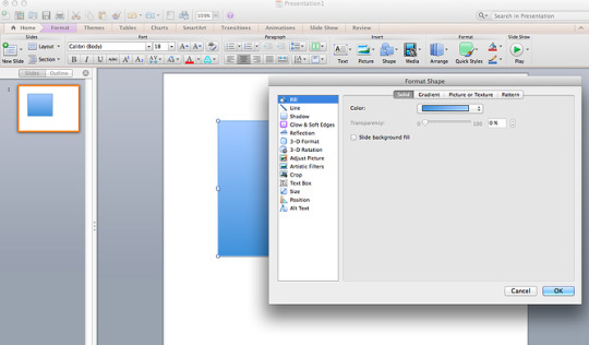
Although the main options can be found on PowerPoint’s format toolbars, look for complete control in the format window menu. Other examples of options available include:
Adjusting text inside a shape.
Creating a natural perspective shadow behind an object.
Recoloring photos manually and with automatic options.
7. Take advantage of PowerPoint’s shapes.
Many users don’t realize how flexible PowerPoint’s shape tools have become. In combination with the expanded format options released by Microsoft in 2010, the potential for good design with shapes is readily available. PowerPoint provides the user with a bunch of great shape options beyond the traditional rectangle, oval, and rounded rectangle patterns, unlike even professional design programs like Adobe Creative Suite or Quark.
Today’s shapes include a highly functional Smart Shapes function, which enables you to create diagrams and flow charts in no time. These tools are especially valuable when you consider that PowerPoint is a visual medium. Paragraphing and bullet lists are boring — you can use shapes to help express your message more clearly.
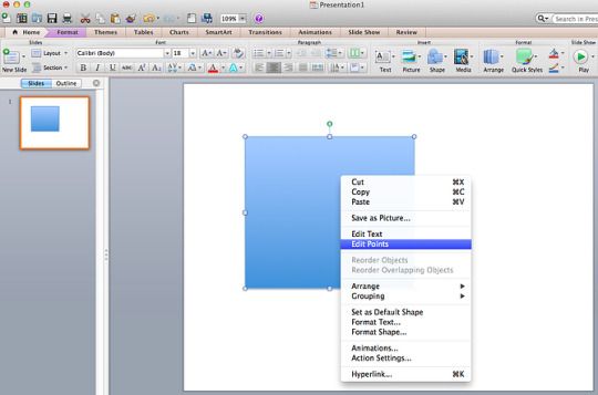
8. Create custom shapes.
When you create a shape, right click and press “Edit Points.” By editing points, you can create custom shapes that fit your specific need. For instance, you can reshape arrows to fit the dimensions you like.
Another option is to combine two shapes together. When selecting two shapes, right-click and go to the “Grouping” sub-menu to see a variety of options.
Combine creates a custom shape that has overlapping portions of the two previous shapes cut out.
Union makes one completely merged shape.
Intersect builds a shape of only the overlapping sections of the two previous shapes.
Subtract cuts out the overlapping portion of one shape from the other.
By using these tools rather than trying to edit points precisely, you can create accurately measured custom shapes.
9. Crop images into custom shapes.
Besides creating custom shapes in your presentation, you can also use PowerPoint to crop existing images into new shapes. Here’s how you do that:
Click on the image and select “Format” in the options bar.
Choose “Crop,” then “Mask to Shape,” and then choose your desired shape. Ta-da! Custom-shaped photos.
Learn more about creating images for your marketing channels in the video below.
youtube
10. Present websites within PowerPoint.
Tradition says that if you want to show a website in a PowerPoint, you should just create link to the page and prompt a browser to open. For PC users, there’s a better option.
Third party software that integrates fully into PowerPoint’s developer tab can be used to embed a website directly into your PowerPoint using a normal HTML iframe. One of the best tools is LiveWeb, a third-party software developed independently.
By using LiveWeb, you don’t have to interrupt your PowerPoint, and your presentation will remain fluid and natural. Whether you embed a whole webpage or just a YouTube video, this can be a high-quality third party improvement.
Unfortunately, Mac users don’t have a similar option. Agood second choice is to take screen shots of the website, link in through a browser, or embed media (such as a YouTube video) by downloading it directly to your computer.
11. Try Using GIFs.
GIFs are looped animated images used to communicate a mood, idea, information, and much more. Users add GIFs to Powerpoints to be funny or quickly demo a process. It’s easy to add GIFs to your slides. To do so, simply follow these steps:
Download and save the GIF you want.
Go to the slide you want the GIF on.
Go to the “Home” tab, and click either “Insert” or “Picture”.
From the “Picture” drop-down menu, choose “Picture from File”.
Navigate to where you saved your GIF and select it. Then, choose “Insert”.
To play the animated GIF, click the “Slide Show” tab and then “Play from Current Slide”.
PowerPoint Process
12. Keep it simple.
PowerPoint is an excellent tool to support your presentation with visual information, graphics, and supplemental points. This means that your powerpoint should not be your entire presentation. Your slides — no matter how creative and beautiful — shouldn’t be the star of the show. Keep your text and images clear and concise, using them only to supplement your message and authority.
If your slides have dense and cluttered information, it will both distract your audience and make it much more likely that you will lose their attention. Nothing in your slides should be superfluous! Keep your presentation persuasive by keeping it clean. There are a few ways to do this:
Limit bullet points and text.
Avoid paragraphs and long quotes.
Maintain “white space” or “negative space”.
Keep percentages, graphs, and data super basic.
13. Embed your font files.
One constant problem presenters have with PowerPoint is that fonts seem to change when presenters move from one computer to another. In reality, the fonts are not changing — the presentation computer just doesn’t have the same font files installed. If you’re using a PC and presenting on a PC, then there is a smooth work around for this issue. (When you involve Mac systems, the solution is a bit rougher. See Tip #11.)
Here’s the trick: When you save your PowerPoint file (only on a PC), you should click Save Options in the “Save As …” dialog window. Then, select the “Embed TrueType fonts” check box and press “OK.” Now, your presentation will keep the font file and your fonts will not change when you move computers (unless you give your presentation on a Mac).
14. Save your slides as JPEGs.
In PowerPoint for Mac 2011, there is no option to embed fonts within the presentation. So unless you use ubiquitous typefaces like Arial or Tahoma, your PPT is likely going to encounter font changeson different computers.
The most certain way of avoiding this is by saving your final presentation as JPEGs, and then inserting these JPEGs onto your slides. On a Mac, users can easily drag and drop the JPEGs into PPT with fast load time. If you do not use actions in your presentation, then this option works especially well.
If you want your presentation to appear “animated,” you’ll need to do a little tinkering. All you need to do is save JPEGs of each “frame” of the animation. Then, in your final presentation, you’ll just display those JPEGs in the order you’d like the animation to appear. While you’ll technically have several new slides in place of one original one, your audience won’t know the difference.
An important consideration: If your PPT includes a lot of JPEGs, then the file size will increase.
15. Embed multimedia.
PowerPoint allows you to either link to video/audio files externally or to embed the media directly in your presentation. You should embed these files if you can, but if you use a Mac, you cannot actually embed the video (see note below). For PCs, two great reasons for embedding are:
Embedding allows you to play media directly in your presentation. It will look much more professional than switching between windows.
Embedding also means that the file stays within the PowerPoint presentation, so it should play normally without extra work (except on a Mac).
Note: Mac OS users of PowerPoint should be extra careful about using multimedia files.
If you use PowerPoint for Mac, then you will always need to bring the video and/or audio file with you in the same folder as the PowerPoint presentation. It’s best to only insert video or audio files once the presentation and the containing folder have been saved on a portable drive in their permanent folder. Also, if the presentation will be played on a Windows computer, then Mac users need to make sure their multimedia files are in WMV format. This tip gets a bit complicated, so if you want to use PowerPoint effectively, consider using the same operating system for designing andpresenting, no matter what.
16. Bring your own hardware.
Between operating systems, PowerPoint is still a bit jumpy. Even between differing PPT versions, things can change. One way to fix these problems is to make sure that you have the right hardware — so just bring along your own laptop when you’re presenting.
17. Use “Presenter View.”
In most presentation situations, there will be both a presenter’s screen and the main projected display for your presentation. PowerPoint has a great tool called Presenter View, which can be found in the “Slide Show” tab of PowerPoint 2010 (or 2011 for Mac). Included in the Presenter View is an area for notes, a timer/clock, and a presentation display.

For many presenters, this tool can help unify their spoken presentation and their visual aid. You never want to make the PowerPoint seem like a stack of notes that you use a crutch. Use the Presenter View option to help create a more natural presentation.
Pro Tip: At the start of the presentation, you should also hit CTRL + H to make the cursor disappear. Hitting the “A” key will bring it back if you need it!
With style, design, and presentation processes under your belt, you can do a lot more with PowerPoint than just presentations for your clients. PowerPoint and similar slide applications are flexible tools that should not be forgotten. With a great template, you can be on your way to creating presentations that wow your audience.

Editor’s note: This post was originally published in August 2019 and has been updated for comprehensiveness.

Source link
0 notes
Text
What Will Best Decorative Concrete Sealer Be Like In 100 Years?
Through these hugely educational displays several within the home could see a mood change occurring. The awareness shared within the presentations and in the little breakout groups that were shaped seemingly found an especially basic but extremely efficient answer to the majority in the claimed problems. Makers started to recognize that Despite the fact that governmental interference might have pressured them to make modifications for their item, they probably had not handed that facts down throughout the distributors to the tip consumers as successfully as they could have.
Pure products and solutions get the job done A lot slower and so it is a authentic problem to maintain the stripper damp. A superb tip for keeping the solution moist, cover the stripper having a moist cotton sheet. A thin bed sheet will maintain the stripper moist and may take up the dissolved sealant for elimination.
Consider, In the event your concrete was stained or dyed employing Xylene, it may possibly problems or alter the coloration from the concrete. If you would like increase a new solvent-based sealant, you could just apply The brand new solvent straight unto the concrete while not having to go through getting rid of the previous sealer. You'll want to however eliminate any indications of peeling or chipping in advance of applying The brand new sealant.
If you plan on resealing the pavers it is best to get rid of just as much as possible of the previous sealer. If you don't You will find there's sturdy chance which the "white haze" will return in Those people spots.
I know I’ve covered allot of this product in other blogs on This website but I have to make clear how critical issues may become in trying to restore a stamped concrete task that has sealer on it.
At first it looked terrific. A few days later on it seemed terrible. Contractor mentioned it is colder out so it should be much better when it warms up. It will likely be 60 tomorrow. I'm afraid that it was a temperature concern with the sealer or sand situation. 1st pic would be the working day sealer was used 2nd was a few days afterwards. What do you're thinking that? Any assistance could be appreciated 014AC989-D9E6-4C1F-8A21-13041B439ACF.jpeg 6138B1EA-99AA-4B10-A71F-D5C273BCB644.jpeg FA11B5ED-85E8-43F5-85DE-8C418E33FB38.jpeg 86041984-BDDB-4F37-8D09-D2DEB8476AE6.jpeg "established":null,"listing":null Reply Share We will reply towards your remark shortly The Sealer Store · 10/22/2018 It can should be stripped to fix. Appears like it may be sand caught to the very best from the floor beneath the sealer. "set":null,"record":null Reply Share We are going to reply on your remark shortly Sal Denaro · 08/27/2018 Humidity in sealed pavers, I do not Feel this patio had sufficient time for you to dry soon after remaining wet. When we sealed with SRW reduced luster the pavers appeared dry but I believe humidity was beneath. How can I resolve this problem 0827181042.jpg "set":null,"record":null Reply Share We'll reply for your remark shortly Sal Denaro · 08/27/2018 Ok, I prepared on Yet another coat but I did not intend to make it worse by Placing far more sealer on and further trapping in humidity. I have been in business enterprise eighteen decades, initially time I've observed this and the very first one particular in which I did not personally set down the sealer. So I could just require An additional coat. Howevere it stays soaked similar to this for times. We have now experienced plenty of rain as well as sprinklers are on lots. The grass outside the house the realm is soaked. "established":null,"record": "two":one Reply Share We'll reply in your comment shortly The Sealer Keep · 08/27/2018 It could want One more coat as tumbled pavers are quite porous. Do a examination spot. "set":null,"record":null Reply Share We are going to reply to the remark Soon Fred · 08/07/2018 Used Solvent sealer to pavers looked excellent . 50 percent hour afterwards unexpected Tian shower, now white places everywhere? Recommendations "established":null,"list":null Reply Share We're going to reply to the remark Soon The Sealer Retail outlet · 08/08/2018 Use this to fix: "established":null,"list":null Reply Share We will reply for your comment Soon Sheila · 08/07/2018 I have applied a patio sealer mixed with some patio powder dye it's dried but when I rub my hand across the slabs it comes off as well as the black arrives off on to my ft any recommendations make sure you "established":null,"checklist":null Reply Share one two 3 four 5
The floor may perhaps presently bear so many coats of sealer that it is dulled or discolored. A clean layer of solvent may well not have permitted the freshly soaked layer underneath to dry appropriately, leaving a surface area that is easily marred and susceptible to clouding. Or, it's possible the consumer just doesn’t similar to the way it seems to be.
A methacrylate heal and sealer formulated precisely exterior apps, which includes uncovered mixture together with other decorative concrete surfaces. Surface area Grip – Slip resistant additive
Usage of a polymeric sand. This is actually the fault of these sorts of sand. If you do not remove every one of the sand from the surface with the pavers, the sand can switch white underneath the paver sealer.
Super Luster Defend is a brilliant significant gloss, UV Resistant acrylic copolymer concrete sealer meant for all types of con-crete. Tremendous Luster Shield gives enhanced resistance to rain, the sun, freezing temperatures, stains, and other pollutants that sometimes is usually dangerous to concrete.
On initial installation, most contractors will seal the concrete like a remaining phase. Nonetheless, many homeowners will not know that they must frequently reseal their decorative concrete. The following consists of in depth Guidelines for resealing your decorative concrete.
The sealer puddled in lower spots and was overapplied as consequence. The sealer turned white when it acquired damp.
youtube
Solvent based strippers are the most typical different types of strippers utilised when eradicating concrete sealers. They operate quickly and you don't have to use as much substance as other strippers.
As soon as the sealant has dissolved, you'll have to carry out a extremely great cleaning afterward, whether or not the mattress sheet has pulled up the dissolved sealant.
0 notes
Text
How a Joint Photo Shoot Helped Me Understand Style
What is style? This is a question to which I’ve given a lot of thought. The best answer I’ve come up with is that your style is the sum of all your choices.
Warning: This article contains portraits that may not be safe for work.
Style is not presets or filters or film emulators. Those are all just choices that can contribute to your style. Style is not your in-camera “Picture Control”: Standard, Neutral, Portrait, Vivid, etc., but those too can contribute to your style if you use them with purpose. Black and white itself is not a style, but the deliberate choice to use it to achieve a specific result is (and for that matter, a black and white image is not automatically “artistic”).
The Rule of Thirds is not style either, but your choice to adhere to it, or to deliberately break the rule, can be part of your style. Your ultra fast prime, your new mirrorless body, your sensor size, and resolution; these things are definitely not your style, but how and why you choose each tool and how and why you use them, is.
Style develops slowly over a long period of time. When I first started out, I shot everything: portraits, still-lifes, street, landscapes, macro, sports, etc. I was sampling all these different kinds of photography and in doing so, learning what topics interested me and what topics did not. After some time, my focus began to narrow, and I found that I favored certain topics more than others. But I also found that I started making and repeating certain choices again and again: lenses, lighting, angles, models, poses, etc. At the same time, I also began to observe and recognize the developing style of my photographer friends.
Sometimes the best way to think about style is to think about it relative to someone else’s style. The choices you make consistently may contrast strongly with those of a fellow photographer and that could help you start to see and understand your style. I got a chance to see this in action in a joint photo shoot with my friend and fellow photographer, David Hatfield.
Since Dave did the work to put this collaboration together with Breanne, our model, and since they worked jointly on the concept, Dave took the lead in the shoot. He was the primary photographer, which meant that the pressure was on him to deliver good photos. This had two unexpected benefits:
1. With no pressure on me, it meant I was free to just play. I could experiment with different compositions and try out some ideas—ideas I might have otherwise not considered because I’d be too worried about getting a “safe” and usable shot (if only I could approach every shoot this way!).
2. It helped to really highlight the differences in our respective styles.
I was never a big fan of the idea of joint photo shoots. I always figured I’d end up with the same shots as the other photographer(s). But this photo shoot showed me otherwise. And the added benefit of being able to shoot without any pressure and without any real attachment to the result made for a really fun shooting experience. I’d recommend it to any photographer out there asking questions about style. Get together with a friend, set up a photo shoot, and see how different (or how similar) your results are.
Over the years, Dave and I have developed and grown together as photographers. I think he is the better photographer of the two of us. But in terms of pure technical ability, we’re at the same level. So we should technically be able to make the exact same photos. And yet, our style can and does differ substantially.
Check out the results:
First, Dave:
Now, me:
And here are Dave’s photos from the second half of our shoot:
And my photos from the second half of the shoot:
Dave likes grit and texture. He likes film emulations and film grains especially. But he uses them well. They’re necessary to his process. They work for him. When I use them, it feels weird, forced.
I like a really clean image that’s got minimal post process. And yet, I’ll obsess over every last detail. I didn’t like the position of some water droplets in some images from the shower scene, so I removed them or repositioned them.
I will go through multiple versions of each photo, taking weeks to arrive at a “final” edit (quotes added because I might come back at an even later date to make more tweaks to my photo!). Dave will take his JPEGs directly from his camera, make some quick global edits, apply and tweak whatever effects he decides are needed (and masks them out where they’re not needed), crops, and he’s done and on to the next project. I don’t think I’ve ever known him to go back and re-edit old work.
We both like high contrast images. But I prefer softer lighting while Dave often favors harder, direct light. For this shoot, Dave lit the shower scene mainly with handheld LED flashlights (usually ~$8 to $15 each). That would never have even occurred to me.
Speaking more generally, our approaches are different too. He’s more confident and tenacious. For the shower scene, he put his camera in a water housing so he could get water spraying directly on his lens (within the housing) while he made some portraits. Again, I’m not sure it would have occurred to me to shoot this way. Instead, I shot through the glass of the shower door, alternately focusing on Breanne, and also on the water droplets on the glass. I think both are good approaches and make for dramatic, moody portraits. Is one better than the other? I don’t know, but Dave’s work is pretty d*mn good if you ask me.
Dave working the scene from inside the shower
I’m the more introverted of the two of us. I prefer to observe, hang back a bit, and then approach a scene carefully and methodically. I like to do a bit more planning and studying. In a shoot like this one, it can take me dozens or even hundreds of frames to arrive at a scene and composition I like, and even then I’ll keep shooting, to be absolutely sure I have the shot I want. Dave gets there faster, and moves along to the next scene, faster. He’s more decisive with his compositions.
And yet, for all my indecision, all that clicking around can often get me to a shot that turns out to be really successful, one I would never had made if I hadn’t persisted. I’m not sure Dave has the patience for that kind of process. But my approach isn’t necessarily better. My persistence doesn’t always pay off. I’ll stay on a scene and shoot hundreds and hundreds of throw-away shots, looking for a something that works, where Dave will quit the scene and find another shot, and fast.
He likes to be spontaneous where I’m a bit more cautious, deliberate. I think we need both kinds of photographers. Both are valid. I like to joke that if he’s Kirk, I’m Spock. Our personalities are very different, and these differences are reflected in the kind of photography we do, and, ultimately, in the photographs we make.
To anyone thinking about how to further develop their style, the advice is simple: Shoot more. A lot more. Then go back over your work, and see what choices you’re making consistently. Better yet, get together with your fellow photographers, consider doing some joint photo shoots, and see just how different (or similar) you are. See what you can learn about your own style, but also take the opportunity to learn from each other. And of course, share the results.
About the author: Carlos Chavez is an aspiring photographer based in San Diego, California. You can find more of his work on his website. This article was also published here.
source https://petapixel.com/2019/03/19/how-a-joint-photo-shoot-helped-me-understand-style/
0 notes
Text
How a Joint Photo Shoot Helped Me Understand Style
What is style? This is a question to which I’ve given a lot of thought. The best answer I’ve come up with is that your style is the sum of all your choices.
Warning: This article contains portraits that may not be safe for work.
Style is not presets or filters or film emulators. Those are all just choices that can contribute to your style. Style is not your in-camera “Picture Control”: Standard, Neutral, Portrait, Vivid, etc., but those too can contribute to your style if you use them with purpose. Black and white itself is not a style, but the deliberate choice to use it to achieve a specific result is (and for that matter, a black and white image is not automatically “artistic”).
The Rule of Thirds is not style either, but your choice to adhere to it, or to deliberately break the rule, can be part of your style. Your ultra fast prime, your new mirrorless body, your sensor size, and resolution; these things are definitely not your style, but how and why you choose each tool and how and why you use them, is.
Style develops slowly over a long period of time. When I first started out, I shot everything: portraits, still-lifes, street, landscapes, macro, sports, etc. I was sampling all these different kinds of photography and in doing so, learning what topics interested me and what topics did not. After some time, my focus began to narrow, and I found that I favored certain topics more than others. But I also found that I started making and repeating certain choices again and again: lenses, lighting, angles, models, poses, etc. At the same time, I also began to observe and recognize the developing style of my photographer friends.
Sometimes the best way to think about style is to think about it relative to someone else’s style. The choices you make consistently may contrast strongly with those of a fellow photographer and that could help you start to see and understand your style. I got a chance to see this in action in a joint photo shoot with my friend and fellow photographer, David Hatfield.
Since Dave did the work to put this collaboration together with Breanne, our model, and since they worked jointly on the concept, Dave took the lead in the shoot. He was the primary photographer, which meant that the pressure was on him to deliver good photos. This had two unexpected benefits:
1. With no pressure on me, it meant I was free to just play. I could experiment with different compositions and try out some ideas—ideas I might have otherwise not considered because I’d be too worried about getting a “safe” and usable shot (if only I could approach every shoot this way!).
2. It helped to really highlight the differences in our respective styles.
I was never a big fan of the idea of joint photo shoots. I always figured I’d end up with the same shots as the other photographer(s). But this photo shoot showed me otherwise. And the added benefit of being able to shoot without any pressure and without any real attachment to the result made for a really fun shooting experience. I’d recommend it to any photographer out there asking questions about style. Get together with a friend, set up a photo shoot, and see how different (or how similar) your results are.
Over the years, Dave and I have developed and grown together as photographers. I think he is the better photographer of the two of us. But in terms of pure technical ability, we’re at the same level. So we should technically be able to make the exact same photos. And yet, our style can and does differ substantially.
Check out the results:
First, Dave:
Now, me:
And here are Dave’s photos from the second half of our shoot:
And my photos from the second half of the shoot:
Dave likes grit and texture. He likes film emulations and film grains especially. But he uses them well. They’re necessary to his process. They work for him. When I use them, it feels weird, forced.
I like a really clean image that’s got minimal post process. And yet, I’ll obsess over every last detail. I didn’t like the position of some water droplets in some images from the shower scene, so I removed them or repositioned them.
I will go through multiple versions of each photo, taking weeks to arrive at a “final” edit (quotes added because I might come back at an even later date to make more tweaks to my photo!). Dave will take his JPEGs directly from his camera, make some quick global edits, apply and tweak whatever effects he decides are needed (and masks them out where they’re not needed), crops, and he’s done and on to the next project. I don’t think I’ve ever known him to go back and re-edit old work.
We both like high contrast images. But I prefer softer lighting while Dave often favors harder, direct light. For this shoot, Dave lit the shower scene mainly with handheld LED flashlights (usually ~$8 to $15 each). That would never have even occurred to me.
Speaking more generally, our approaches are different too. He’s more confident and tenacious. For the shower scene, he put his camera in a water housing so he could get water spraying directly on his lens (within the housing) while he made some portraits. Again, I’m not sure it would have occurred to me to shoot this way. Instead, I shot through the glass of the shower door, alternately focusing on Breanne, and also on the water droplets on the glass. I think both are good approaches and make for dramatic, moody portraits. Is one better than the other? I don’t know, but Dave’s work is pretty d*mn good if you ask me.
Dave working the scene from inside the shower
I’m the more introverted of the two of us. I prefer to observe, hang back a bit, and then approach a scene carefully and methodically. I like to do a bit more planning and studying. In a shoot like this one, it can take me dozens or even hundreds of frames to arrive at a scene and composition I like, and even then I’ll keep shooting, to be absolutely sure I have the shot I want. Dave gets there faster, and moves along to the next scene, faster. He’s more decisive with his compositions.
And yet, for all my indecision, all that clicking around can often get me to a shot that turns out to be really successful, one I would never had made if I hadn’t persisted. I’m not sure Dave has the patience for that kind of process. But my approach isn’t necessarily better. My persistence doesn’t always pay off. I’ll stay on a scene and shoot hundreds and hundreds of throw-away shots, looking for a something that works, where Dave will quit the scene and find another shot, and fast.
He likes to be spontaneous where I’m a bit more cautious, deliberate. I think we need both kinds of photographers. Both are valid. I like to joke that if he’s Kirk, I’m Spock. Our personalities are very different, and these differences are reflected in the kind of photography we do, and, ultimately, in the photographs we make.
To anyone thinking about how to further develop their style, the advice is simple: Shoot more. A lot more. Then go back over your work, and see what choices you’re making consistently. Better yet, get together with your fellow photographers, consider doing some joint photo shoots, and see just how different (or similar) you are. See what you can learn about your own style, but also take the opportunity to learn from each other. And of course, share the results.
About the author: Carlos Chavez is an aspiring photographer based in San Diego, California. You can find more of his work on his website. This article was also published here.
from Photography News https://petapixel.com/2019/03/19/how-a-joint-photo-shoot-helped-me-understand-style/
0 notes
Text
Fujifilm kicked off a global digital photography revolution when it released the X100 fixed prime lens rangefinder-style mirrorless camera in 2011 at a time when digital photography was dominated by big DSLRs made by the then two biggest camera manufacturers.
How things have changed, in some quarters at least. DSLRs still dominate the local newspaper industry but most photojournalists and documentary photographers of my acquaintance here and overseas left the DSLR world for the mirrorless realm some years ago.
Little wonder. Recently I showed a DSLR-dedicated friend one of my mirrorless cameras and he began wondering why he had put up with his DSLRs’ old-world features and functions for so long.
Longevity
With Fujifilm’s announcement of the X100 series’ fourth iteration, the longevity of the original X100’s concept is demonstrated yet again.
The original X100 is a camera I use to this very day, especially when needing to be extra discrete, even more invisible than usual.
That original X100 has ably handled demonstrations, protests, festivals, conferences, travel and urban documentary projects.
Its autofocus is slow compared to the current generation of mirrorless cameras but not impossibly so, and its sensor is far from the biggest going, but the old adage holds true, that you only need 6 megapixels for a double-page spread or a single-page portrait.
Exhibition prints and 48-sheet posters are another thing altogether but Fujifilm now has those bases amply covered with its GFX 50S medium format masterpiece.
The X100F has moved up a notch to the same sensor as its X-Pro2 and X-T2 sisters, all 24.3 megapixels of it, and that is something of a minor miracle in such an affordable, professional-quality, small-bodied camera.
We are lucky to be living in the digital photography age, one no longer beset by golfball grain and beautiful though ultra-slow films – Kodachrome 25 and Panatomic-X anyone? – if the project demands sharpness and high resolution.
That a camera the size of the X100F can deliver image quality rivalling if not surpassing Fujifilm’s analog era mirrorless or SLR-based GX680 series 120-format cameras, especially when using faster films in them, is no small miracle.
I can see why photojournalism-style wedding photographer Kevin Mullins will be adopting an X100F alongside his two X-Pro2s equipped with XF 23mm f/1.4 and XF 56mm f/1.2 lenses as part of his core wedding photojournalism kit.
Mr Mullins’ style is based on almost-straight-out-of-camera (almost-SOOC) JPEGs with his JPEG settings dialled down for a gritty hardness perhaps partially inspired by great British photographer Bill Brandt, but Mr Mullins’ photographs are almost grain-, or in reality digital noise- free.
Like Mr Mullins, I would definitely choose a black X100F over the silver one for its contribution to a photographer’s anonymity and near-invisibility.
Like him also, I consider the X100F as a complement to the X-Pro2, a fixed lens camera with the advantages that fixed lenses can bestow such as leaf shutter, high-speed flash sync, built-in ND filter and small form factor.
X100F and X-Pro2 compared
Photographs are not to scale.
Accessories for the X100F
There are three Fujifilm-brand accessories I consider essentials for the X100F, the WCL-X100 II Wide Conversion Lens, the TCL-X100 II Tele Conversion Lens and an L-grip.
I would also add a Peak Design Clutch and Cuff camera strap pair, the latter a wrist-strap and the former a hand-strap, both ensuring good grip and safety if the camera falls out of your hand.
I have yet to see a Fujifilm brand L-grip for the X100F, similar to the FUHGX100T grip for its three predecessors, make its appearance online but surely it is a matter of time. I have used the X100 with and without this hand grip and, given the camera’s tiny built-in grip and slippery surface, consider it a necessity. Otherwise a few third-party alternatives will doubtless be available soon.
Conclusions
As usual, the proof of the pudding is in the trying and I look forward to giving an X100F a good roadtest sometime in the near future. For those who enjoy specs charts, a specifications spreadsheet PDF is available further down this page.
Meanwhile, I wish to hail the Fujifilm X100F as the rightful heiress to the classic that the X100 was in its day, and that may itself be a future classic in the waiting.
Recommended Viewing:
Fujifilm’s global YouTube.com channel FUJIFILMGlobal appears not have received the memo about female gender equality in its product videos given that all fifteen of its video feature male photographers with not one woman photographer in sight.
On the other hand, the Fuji Guys Channel run by Fujifilm employees based in several different countries including Australia has featured two female photographers so far, both in the USA.
Let’s hope more videos featuring women appear very soon, with at least one of them being Australian.
bighead taco – First Impressions: Fujifilm X100F
Fuji Guys Channel – Adrian Murray and the X100F at Home and Abroad (USA)
Fuji Guys Channel – Bryan Minear and the X100F in California (USA)
Fuji Guys Channel – Fuji Guys – FUJIFILM X100F Camera – First Look
Fuji Guys Channel – Valerie Jardin and the X100F in Minneapolis (USA)
Fuji Guys Channel – Victoria Wright and the X100F in Seattle (USA)
FUJIFILMGlobal – FUJIFILM X100F Promotional Video / FUJIFILM
FUJIFILMGlobal – X100F: Bob Sala x Street / FUJIFILM
FUJIFILMGlobal – X100F: Chris Upton x Landscape / FUJIFILM
FUJIFILMGlobal – X100F: David Cleland x Documentary / FUJIFILM
FUJIFILMGlobal – X100F: David Airob x Street photography / FUJIFILM
FUJIFILMGlobal – X100F: Derek Clark x Documentary / FUJIFILM
FUJIFILMGlobal – X100F: Gabriele Lopez x Urban Photography / FUJIFILM
FUJIFILMGlobal – X100F: Kevin Mullins x Street Photography / FUJIFILM
FUJIFILMGlobal – Kiriako Iatridis “X100F and leafshutter” / FUJIFILM
FUJIFILMGlobal – X100F: Matt Hart x Street Photography / FUJIFILM
FUJIFILMGlobal – X100F: Maurizio Faraboni x Street Photography / FUJIFILM
FUJIFILMGlobal – X100F: Patrick La Roque x Street Photography / FUJIFILM
FUJIFILMGlobal – X100F: Szymon Szczesniak x Documentary / FUJIFILM
FUJIFILMGlobal – X100F: Thorsten Rother x Travel / FUJIFILM
FUJIFILMGlobal – X100F: Tim Georgeson x Documentary / FUJIFILM
FUJIFILMGlobal – X100F: Vojtech Hurych “Storyteller”/ FUJIFILM
Olafphoto – Street Photography with Fujifilm X100F
Recommended Reading:
Coming soon.
Specifications:
Click here to download a PDF of the X100F specifications chart.
Image Credits:
Header aka featured image created in Photoshop by Carmel D. Morris.
Fujifilm Comes Up Aces Yet Again with the X100F, Heiress to the Noble X100 Tradition Fujifilm kicked off a global digital photography revolution when it released the X100 fixed prime lens rangefinder-style mirrorless camera in 2011 at a time when digital photography was dominated by big DSLRs made by the then two biggest camera manufacturers.
#APS-C#digital photography#discrimination#Equality#female gender equality#fixed lens#Fujifilm#Fujifilm X100#Fujifilm X100F#Fujifilm X100T#Fujinon#gender equality#mirrorless#rangefinder#rangefinder cameras#rangefinder-style#rangefinders#X-Trans
0 notes
Last Seen Blogs

maxinejiji
maxinejiji stories

cherry-xxx-brenno
ask's open

2-dthot
Who are you?
cherry-xxx-brenno
ask's open

kazu9238-blog
題名未設定