#still learning about nodes in blender... confusing...
Explore tagged Tumblr posts
Visit Tumblr Blog
Explore Tumblr blogs with no restrictions, modern design and the best experience.
Last Seen Tumblr Blogs


Fun Fact
Tumblr was attacked by a cross-site scripting worm deployed by the Internet troll group GNAA on Dec 3, 2012.
Text


They're just bobbing there.... MENACINGLY!
#normal beetle art#3d render#3d model#sun fnaf#moon fnaf#fnaf dca#daycare attendant fnaf#fnaf sundrop#fnaf moondrop#not too happy with the normals but they look fine in vrchat so its whatever#i based the faces off of whats on the pickup pass!!#also my girst proper 3d renders!! woo!!#still learning about nodes in blender... confusing...
1K notes
·
View notes
Text
Daily Log #11
I'M ON TOP OF THE WORLD!!!
9/29:
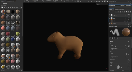
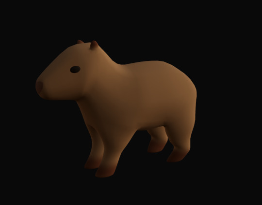
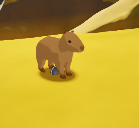
Colored capybara model (fun!)
Made cel-shading texture for the capybaras (AAAAAAHHHH)
Added a blob shadow under the capys (nice)
Okay, so starting out, I went into Blender and unwrapped the first (and so far, only) capybara model. I will learn how to unwrap UVs in Maya eventually, but I'm more familiar with Blender's system, so I'm sticking with that for now. Painting the capy was so fun, and it turned out adorable, if I do say so myself.
Alright, story time, and fair warning, this is going to be long. I was expecting it to be pretty simple to get the cel shading texture done. Then, I tried working on it, and realized I was screwed.
The problem is, cel shading is done post-process, and would apply to the entire scene. So, if I wanted a cel-shaded capybara, I would have to have the entire game and landscape be cel-shaded. After all the work I put into the environment, I was NOT happy with this.
I was so excited for the stylistic choices I had made and really didn't want to give up. After lots of research, I figured out I had five options:
Cel shade the whole scene (not a chance, bucko).
Use complex nodes that I have no clue about, and that have almost no notation online to learn from, to sort of mask out the capys (WAY too confusing, and believe me, I tried my best... but my best wasn't good enough).
Create a post-processing cube, and copy and paste it around the capybara model like some kind of weird post-processing skin, which would take absolute ages and would break as soon as I started animating.
Take the L and choose a different style for the capy characters (I admit, I almost just gave up and went with this one).
Fake it.
I chose option 5.
Let me tell you, it was a eureka moment when I thought of how to do this. I realized I could use what I learned creating the tree leaves texture and, hopefully, rearrange the hell out of it, add to it, and get it to work. I worked on it for so long, but eventually...
IT WORKED! I literally jumped out of my chair in excitement.
So, the way it works is that it detects the direction that the material normals are facing, and basically selects them based on this direction and applies a different color. For the trees, I used just the Z axis for shadows on the bottom. A little tweaking, and I could adjust it for all three axes. I put in a parameter for each so I could change the direction the "light" is coming from. So, unlike real cel shading, it doesn't respond to the actual lighting of the scene. You arrange the shadows yourself. I'm sure with more complex code I could get it to respond to a single light source, but I highly doubt I'd ever get it to respond to multiple light sources.
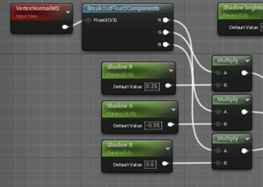
I used these as the alpha/mask for a lerp node. I could then set up the base color as the A value in the lerp, and then plug in a bunch of modifications (like saturation, darkness, etc.) to the base color and put it in the B value, so I could adjust the shadow's appearance.
The next problem was, the shadow color was applying beautifully, but there were still default shadows from the engine itself. I needed to get rid of all the shadows. My solution? Well, lights don't cast shadows, so if the capybara was emitting even just a little, tiny, itty bit of light, it wouldn't collect shadows. I took everything that I plugged into the base color pin and plugged it into the emissive color pin. It messed up the colors, but it did remove the shadows! With some more adjustments I got the colors correct again.
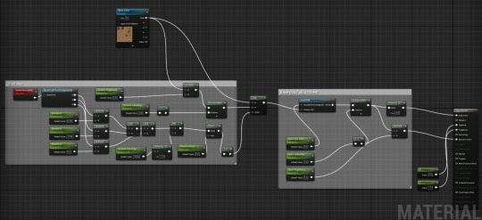
Here's the finished code:
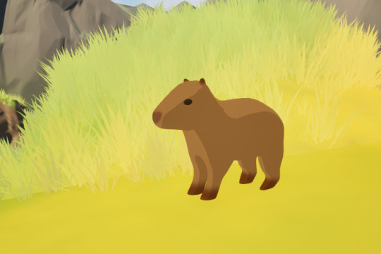
One final problem: If you look above at the capybara screenshot, it's not casting a shadow. Obviously, it's emitting light, so it makes sense that it wouldn't, but it looked like it was just floating there. Solution: add a blob shadow!
I tried just putting a plane underneath the capybara actor and applying this texture. Unfortunately, my landscape is really varied in height, but the shadows were just flat horizontal, and would clip into the ground or hang over the top of the ground (and sometimes both at once!)
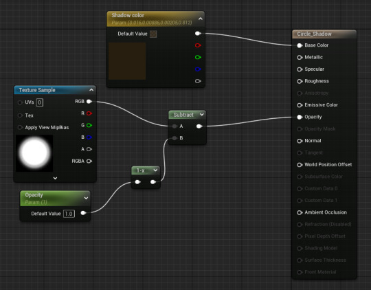
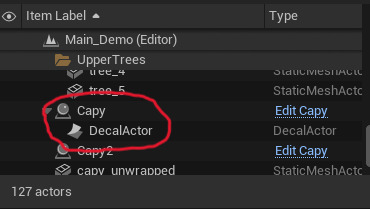
After some research I learned about decals, which cling to the landscape. I could just create a decal actor and nest it to the capybara actor in the level itself (technically not perfect; I was hoping to be able to combine them in the actor blueprint itself, but it's such a quick fix that it's simply the best and easiest option).
VOILA, IT WORKED! Now the shadow is always applied clinging to the landscape, so no weird clipping!
Here's the final result of hours of texturing:
Don't mind the little gear-shaped icon, it doesn't appear during play.
After all that, I went to bed and passed out immediately (it was like 6 in the morning). Best sleep I've had in weeks. Totally worth it!
This was a really long post, sorry for yapping but I'm sure you can understand how proud I am of myself. I just had to gush about it.
Have a good one!
0 notes
Note
May i ask how you learned blender and specifically 2d animation on blender? I know there’s a lot of sources and it’s an annoying question but theres limited videos on the 2d part of it on youtube, and the interface is so confusing to me i love your work so much and in need of a direction of where to look sorry :(
Hey no worries! It's a very good question (^v^)b
Learning the 2D side of Blender is still on my to-do list, so unfortunately I don't know much about it, but I'll gladly offer any help I can.
Blender is foremost a 3D program, so if you're learning the interface and the controls, I feel it may be better to start off with that side of it to at least get familiar. While dealing with complex software like Blender or Unity, the learning curve with always be on the steeper side, especially in the beginning. For me, getting the hang of its internal logic (like where everything is and how its organized) as well as getting to know the terminology is a good first step. Even after years of getting to know the program, I'm still learning something new and discovering curve balls I never knew even existed, so knowing what questions to ask to solve a problem becomes imperative (if you have a friend who knows Blender, you can also go pester them. Sometimes solving problems can be more fun together, though beware of headaches.)
Start with an easy project, something simple that focuses on one thing. Get a hang of each thing individually and once you start feeling comfortable with them, you can start combining them. Experimenting with each functions can also be pretty fun. While it's easy to jump into big projects, they tend to get overwhelming pretty fast, especially once you start encountering things you don't know.
Take for example my animation (big project):
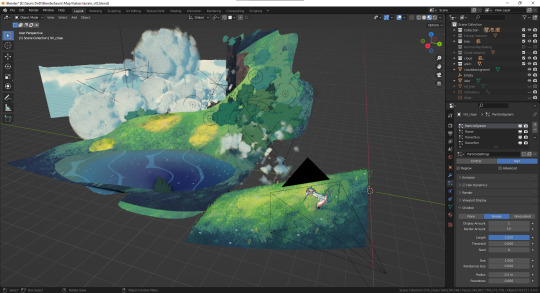
Each individual part required a different set-up, and you'll notice there's actually very little 2D in this, haha. Here's a Youtube turorial playlist for all kinds of cool 2D-like effects which are secretly 3D. I've referred to a lot of these to make this.
End results are really satisfying.

For the Pterosaur itself, I've actually done the 2D animation in Clip Studio Paint, saved it as a .avi and imported it in Blender as a flat plane. Here's the node set-up:
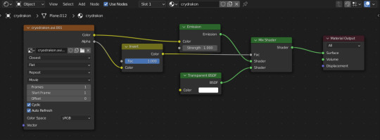
There's the .avi as an Image Texture node, where instead of having it as a "single image," it's put in as a "movie" (Blender will usually recognize so on it's own), and I made sure Cyclic and Auto Refresh were checked. The rest of the nodes are just there so that it appears as transparent (also don't forget to go into you Material Properties > Settings and put Blend Mode and Shadow Mode to Alpha Clip, or transparency won't work. Note: this is for the Eevee Render Engine)
To get started with blender, here's a really good beginner tutorial that goes over all the basics.
If you wish to only do 2D without any 3D, Blender may not be the best program. Something more specialized and focused on 2D will be far easier to learn, but Blender does have its own benefits (plus it's free :D hooray!)
#I'm self-taught with Blender so I can't be called much of an expert ':D#I hope this help sorry if I couldn't say much about the 2D side of Blender#I hate doing backgrounds the 3D saves me so much time and trouble#and the vector-base Grease Pencil has me dreaming big#but when you get started things can be pretty frustrating sometimes#I'm going through the similar learning curve with Unity and it is a CLIMB#like were is anything I'm so lost#but learning is a lot of fun and the power of these programs is close to infinite#It's like a playground but first you gotta figure out what the heck a shovel and a pail is lol#good luck in your ventures anon#ask#Blender
132 notes
·
View notes
Text
FREE GRAPHIC DESIGN SOFTWARE 2019
Graphic design is necessary for effective marketing. Did you know that people can retain 65% of information three days after when it’s paired with an image?
Premium software and exclusive memberships are usually costly, meaning it can be hard for professionals to invest in the best software out there (especially if they’re just starting out).
Fortunately, you can create your own amazing graphics, illustrations and infographics without having to spend a fortune! We’ve compiled a list with the best free graphic design software for 2019.
Keep reading it to find out everything you need to know about each and every one of them!
1. Inkscape
Inkscape is an open-source graphics software that comes with a consistent and stable interface. The editor runs smoothly on Windows, Mac and Linux.
It comes with a huge array of advanced tools and effects and can easily compete against Adobe’s Illustrator.
With Inkscape, you can create stunning vector art that no one will be able to tell was made using a free, open-source program.
Here are some of Inkscape’s main features:
A wide range of pen tools, including pencil, brushes as well as drawing and calligraphy modes.
Perfect for designing SVG (Scalable Vector Graphics).
Compatible with multiple file formats, making it so much easier to import graphics from your own library without having to worry about compatibility.
Node editing functionality that allows users to manipulate vector images, graphics and objects. With Inkscape, you can move, edit or delete nodes with ease.
Maximise creativity with a multi-functional object creation tool. Combine the pencil and pen tools to alternate between freehand drawing and intricate line and Bézier curve designs.
That being said, the program is slow at times as processing slows down editing.
While it’s true that Inkscape doesn’t run as smoothly as its premium competitors, it’s still impressive that it manages to do the things that it does for free.
Definitely give this one a try. You really have nothing to lose.
2. Canva
Canva is an online graphic design tool that allows for extensive customisation, allowing users to create unique and distinctive designs.
You can choose from a range of preset layouts and dimensions to create the perfect design. Canva features:
A rich collection of layouts, uniform graphics and vectors.
A plethora of graphics allow users to quickly create unique designs from zero; makes it easy for non-professionals to come up with interesting and professional-looking designs. There are literally hundreds of templates to choose from.
Intuitive UI that’s user-friendly and extremely easy to use. Canva is an amazing tool can help businesses cut down on budget and design time by creating graphics in-house.
Cross-platform compatibility makes it easy to come up with designs on the spot. You can create a first draft on your phone using the mobile app and add the finishing touches later using the web version.
However, Canva’s free plan comes with some restrictions that may annoy some. Custom resizing is only available on premium plans and the majority of graphics are not available for free.
Paid plans open up further customisation capabilities that free users don’t have access too.
It’s also impossible to filter image and graphic searches so that the free options appear on top.
This is frustrating and inconvenient, especially if you’re using Canva as a free alternative to other premium graphic design tools!
3. GIMP
We can’t talk about free graphic design software and not mention GIMP.
GIMP is an incredible tool for any designer or marketer that works with photos.
It is another open-source image editing application that’s completely free but is fitted with professional-quality features.
You can start with a blank template or import your own photos and images for fine-tuning.
Some of its features include:
Photo enhancement. After Photoshop, GIMP is probably the best choice for photo editing. It comes packed with tons of customisation options.
Creation of original artwork. GIMP is known for its retouching and editing capabilities but can also act as a well-rounded creative design tool.
The software runs smoothly across all platforms. The web version has its issues but has been running better with the new updates.
It’s community-developed, meaning you have direct input as a user. It can also be manipulated and re-purposed by users who know how to code.
It’s easily expandable and regularly updated. You can add plugins and scripts to help you perfect your creations and designs the way you envisioned them.
GIMP is one of the best free graphic design software out there but suffers from poor UI design.
The interface can be inconsistent at times, which might slow you down during work.
Photoshop is still the king of editing, but if you’re looking for a free alternative that will get the job done, GIMP may be the best option for you.
4. Blender
Blender is an amazing design tool for animators, designers, scientists and artists who work in 3D graphics.
This computer graphics suite is intuitive and feature-rich.
It can be used to create 3D models and applications for video games, animated films and video ad campaigns.
When you look at its tool set and features, you’ll find it hard to believe that Blender is open-source and completely free:
Blender does animation flawlessly and is highly customisable. You can replace its base theme to suit your needs.
Comes with a large number of hotkey commands, meaning you don’t have to navigate through the interface, which can drastically increase your working speed.
The software is lightweight and runs well on all platforms. Blender boots up in just a few seconds and does not struggle even when multiple assets and graphics are loading and interacting with each other.
As with other open-source tools, Blender is constantly improved and updated based on immediate user feedback.
Blender’s community is helpful and always quick to help users solve problems.
Although Blender comes with many features and can do a lot of things well, it’s not often used professionally.
It’s unnecessarily complex and users have to rely on the community to resolve common issues.
Autodesk Maya is still preferred by most major studios.
Blender, like most open-source and free software tools, suffers from poor interface design.
Users are often put off by the amount of information that’s on the screen that often times doesn’t seem to serve a specific purpose.
Artists without a developer background may have a hard time navigating through Blender’s confusing interface.
5. Krita
Free graphic design software can get the job done, and Krita is a testament to that.
Krita is great for both amateur and professional artists looking for a drawing and sketching platform to transform their ideas into art.
Krita is a powerful program that comes with many advanced drawing aids and templates.
It was created by artists for artists, with the idea that top-notch drawing software should be accessible to all graphic designers.
It’s especially useful if you’re interested in illustration or comics.
Here are some of its features:
A great number of masks, filters and layer styles that help you create the perfect drawing.
Highly intuitive UI that makes navigation easy and drawing a pleasure.
Several animation features that can help breathe life into your creations. Krita uses frame-by-frame raster animation.
The software is highly customisable, meaning users have the ability to change most of the shortcuts to improve workflow.
Included vector tools. You can also import and edit vectors that you’ve created with the help of other programs (e.g. Inkscape).
Wrap around and canvas only modes allow for more detailed fine-tuning and versatility.
Krita seems to eat up a lot of memory, which can slow your computer and negatively impact your workflow as a result.
It also has a steep learning curve and takes some time to get used to, which might scare some graphic designers away.
Other known issues include buggy text tools and a hard-to-control smudge brush (blending may be challenging for beginners).
Free graphic design software may not be perfect but can help graphic designers get things done. Because all these programs are free, anyone can download and try them out.
Unless you’re willing to invest in premium graphic design software, you’ll have to combine and utilise different free tools.
Different tools are good for different jobs: Some are better for designing raster images while others specialise in SVG or 3D designs.
Want to know exactly what a graphic designer does? Find out why graphic designers are the backbone of every successful marketing campaign by clicking here!
Article first published here: FREE GRAPHIC DESIGN SOFTWARE 2019
2 notes
·
View notes
Text
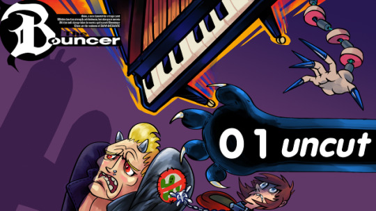
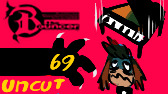
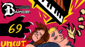
Making of “Let’s Play The Bouncer“ Thumbnail
This explains my process for creating the thumbnail for a Let’s Play of The Bouncer, at https://forums.somethingawful.com/showthread.php?threadid=3858341.
I uploaded the thumbnail and banner art themselves in an earlier post, with some more info, at http://hand-drawn-square.tumblr.com/post/174582524859/art-for-the-bouncer-lets-play-banner-and.
I’m writing this in part to practice how to talk and write about how I do this stuff, and how I can explain the processes and tools I use. This isn’t anything special, regardless of the detail I might go into.
Krita
Preliminary Sketches
Drawn in Krita, at 168 x 94 pixels, the smallest possible size at which video thumbnails may be displayed. This was to ensure the thumbnail would be clear and readable, even at small sizes.
Sketch 1
Sketch 2
Volt Krueger was fun enough to make it into the final thumbnail, and I even got an additional visual gag out of him.
Now to work on the real deal!
Thumbnail art
The project file for the thumbnail is a 2560x1440 Krita file (.KRA).
Since I couldn’t make up my mind how exactly I wanted to arrange all the elements, each one is it’s own group. The piano, panther arm, sion, volt and the segmented arm are each split into their own Group Layers, with each group containing roughly these four raster layers:
Line-art
Additional Highlights
Shading
Colour/Fill
I’d probably only need 1 and 4 in the end, and I probably still have a lot to learn before I can call this a professional workflow.
So that’s the base image, with no background or text, which is exported as "thumbnail-art.png”. That’s all from Krita for now.
Natron
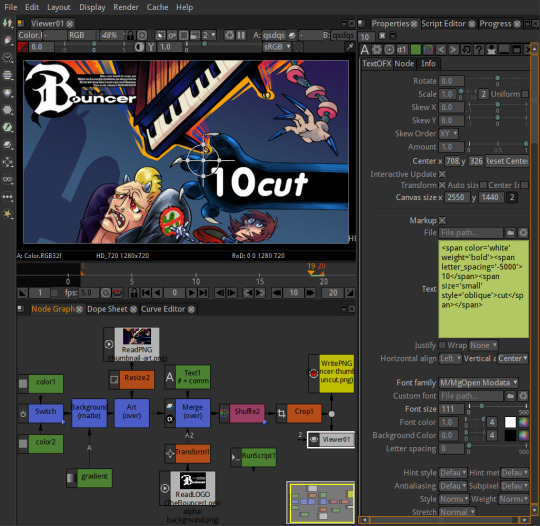
Natron is a node-based image and video compositor. I already wrapped my head around nodes back in Blender, so that helped me out. Values and properties in Natron projects can also be changed with python expressions, so you can do stuff like change them based on what frame you’re on.
But Natron is still confusing so here’s basically what I’m doing with it in this specific project:
A Read PNG node that displays thumbnail-art.png
A Read PNG node that overlays the bouncer logo.
A Text node that displays the video number and commentary type. For each even-numbered frame:
Increase video number
Switch commentary type to "uncut"
A Switch node that switches between two colours for the background. The switching is done with this python expression: ret=frame % 2 Which switches between 1 and 0 every frame.
So I end up with an output folder full of as many video thumbnail sequences as the video series needs, if not more.
There’s probably a better way to do this in Natron, or a better way to do with what I have in general, but I wanted an excuse to learn more about Natron and about how to automate some of the work. This is by no means a perfect workflow, and a lot of it was specific to this situation, so I might do things completely differently next time!
I might make another post on how I made the banner art, we’ll see. Until then I hope this mess was helpful in some small weird way!
6 notes
·
View notes