#tbh it’s mostly because it contrasts well with a bright red background and because I was using blue ink but still
Text
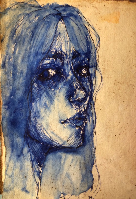
Art I have already overshared immensely because I’m actually sort of proud of how it turned out.
There are obviously a lot of things I’m not happy with and want to improve on but I think my art has come a long way and I’m happy about the progress I’ve made.
#my art#Art#lots of blue#i refuse to even attempt actual real skin tone#too much to think about#I would rather just make it blue or something#I’ve been making a lot of skin blue recently#tbh it’s mostly because it contrasts well with a bright red background and because I was using blue ink but still#meow meow#I am so tired
26 notes
·
View notes
Text
bon’s coloring tutorial
so this tutorial was originally requested by @eddiesbuckaroo who wanted to know how i colored this edit, but i'm an idiot who's terrible about saving PSDs, so instead i used the same method on this one (spoilers for 911 5x01), so i’ll be using 2 of those gifs in this tutorial
so if you look through my edit tag you'll see that i'm basically incapable of making an edit that is not gaudy super colorful, and while sometimes i do use the whole color layers/masking technique (if you're not familiar with what i'm talking about, the lovely and talented ally has a great tutorial on that here), i often don't because the scenes i'm using have too much movement and i'm a bit of a masochist
SO this tutorial will be focusing on how i get gifs like this:
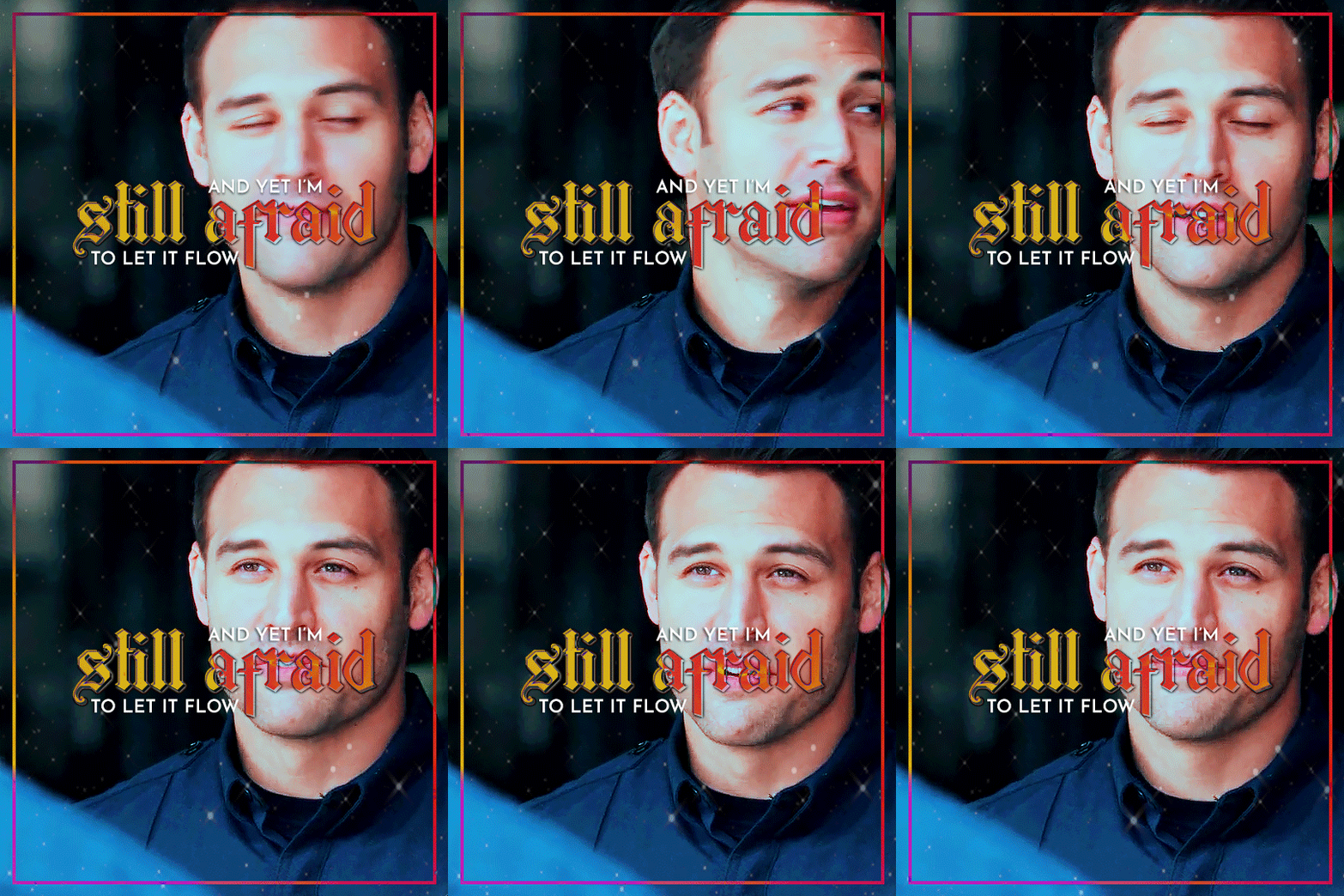
without altering any layer masks
rest of the (way too long) tutorial under the cut!
(side note: yes i am using 2 scenes from the most recent episode of 911, but it's mostly just buck and eddie looking at each other so it's not really spoilery)
BIG disclaimer first: this is a very loose method. because it doesn’t use layer masks, it relies on building color and contrast largely from the colors already present in the scene. this means sometimes you’re able to get really nice contrast between the characters and the background, and sometimes you’re not. and certain colors just aren’t going to work well. and no single step is set in stone. you’re gonna have to be willing to play around with things and start over if need be
disclaimer #2: i’m almost entirely self-taught when it comes to coloring, so if something seems dumb or inefficient that’s probably because it is. if you know of a better way to get a similar effect, go for it! (and better yet, let me know!!)
alright, all that aside, let’s look at gif #1:

WHY do they have to make it so fucking brown 😭
the first thing i do no matter what is add curves, levels, and brightness/contrast layers
for my curves, i use the eyedropper tool as much as possible since it adds color correction as well as lightening. i’m not gonna get into the weeds on this, so for a detailed explanation of how to do this see this tutorial, but these are the points i clicked on:

for the white, i used the light behind buck, but instead of clicking on the brightest portion, i clicked i little to the right of it so that it brightened things up a bit. it also made things even more orange though, since there was a lot of blue/cyan in there, but i fixed that by picking a spot with more yellows/reds for the gray. for black i usually go for one step lighter than true black if i can find it, which adds a little more contrast
with those adjustments, and raising the main RBG curve a little, this is the result (upper left), along with what my curves look like:
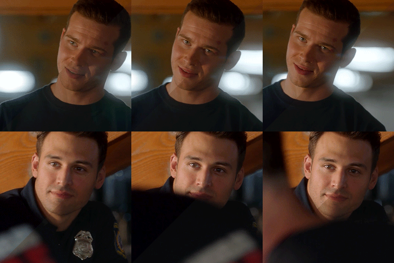

sometimes the curves make a huge difference but it's pretty subtle here. then i do my levels and brightness/contrast, and in this case a selective colors layer on the reds and yellows since it's still pretty fucking orange (you basically just have to play around with this until you're happy with it):

now our gif looks like this and we're ready for the fun stuff:
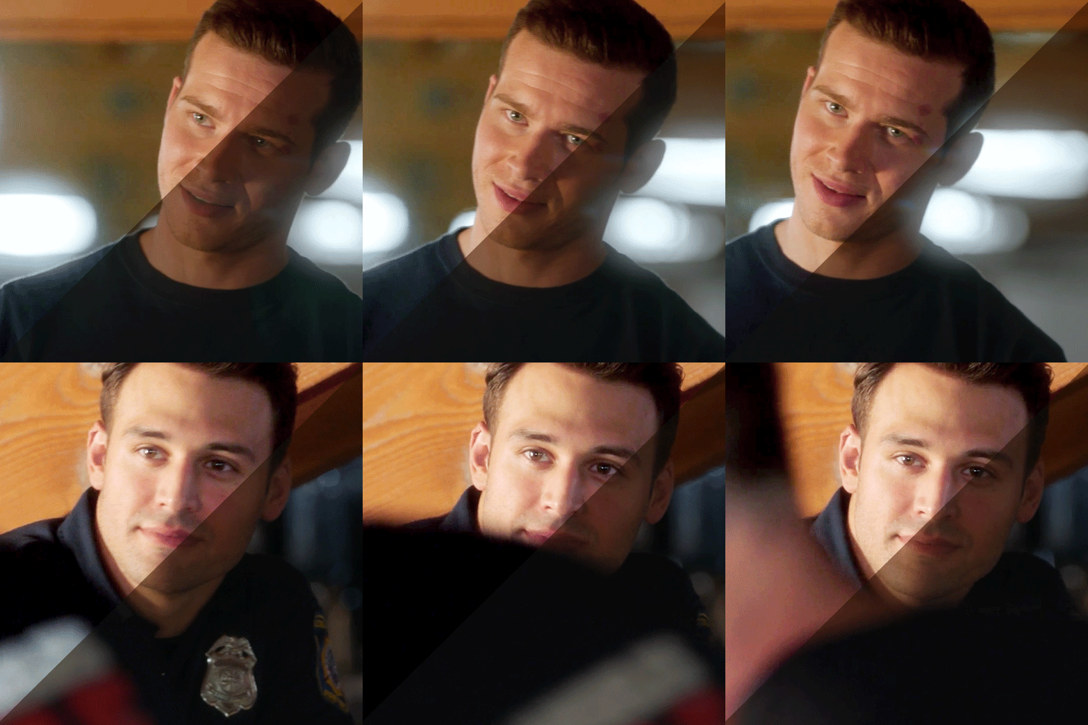
i'm kind of obsessed with color palettes rn so i'm using this one for this edit. i decided i'm just gonna pick whatever color i like best for each scene, so i'm gonna use the third one for this gif, which means my goal is that kinda bubblegum pink
i also always choose a secondary that's more or less on the other side of the color wheel for things like highlights. this usually ends up being cyan/blue if the color is warm, and magenta/yellow if it’s cool, just because i personally don’t like working with green and red bc tbh i think they’re hard to make look pretty.
so basically now i start building up color, pushing everything i can towards pink, and everything that doesn’t really work with pink towards cyan
the first layer i add is always a color balance layer, which i use just to nudge everything in the direction i want. i usually just adjust things by 5 points which honestly doesn’t add much and probably isn’t necessary in most cases but whatever i do it anyway
these are the settings i ended up with:

you’ll noticed i went with cyan instead of magenta for midtones and highlights, and that’s because there’s so much red in the background and buck’s face and i wanted to mitigate that a bit.
sometimes i add a channel mixer layer here, and i did try that initially, but it wasn’t really working for me. that’ll come up with the next gif though. for now, i add my first solid color layer and go through the blending modes to find the best fit. you’re generally gonna wanna steer clear of the lighten section since that’ll replace your blacks with the overlay color and that’s hard to work with. i went with soft light for this one and set opacity at 40%, and now the gif looks like this (in the circle is just the base coloring above):

next is a selective color layer. i basically just go through each color in order and adjust them until i’m happy with them (make sure you have it set to absolute and not relative, otherwise the adjustment is too subtle). this is what i ended up with:

(there isn’t a green one bc there’s no green in the scene) initially i tried to adjust the reds to be a bit more pink but because buck’s face is almost the exact same color as the wood behind him, it made him like. fuchsia. not a good look. i played around with it for a while but there was just no way to adjust those bits separately, so i took the L and just accepted that the wood was just never gonna be pink. better that than pink oompa loompa buck. so instead i turned down the magentas and turned up the yellows to preemptively mitigate the pink on his face when i add the next color layer (god bless ryan guzman’s olive skin that doesn’t absorb red like a sponge). so this is what we have now:

for the next solid color layer, i normally set it to color and set the opacity between 20 and 30% depending on the scene. this one is at 20%:
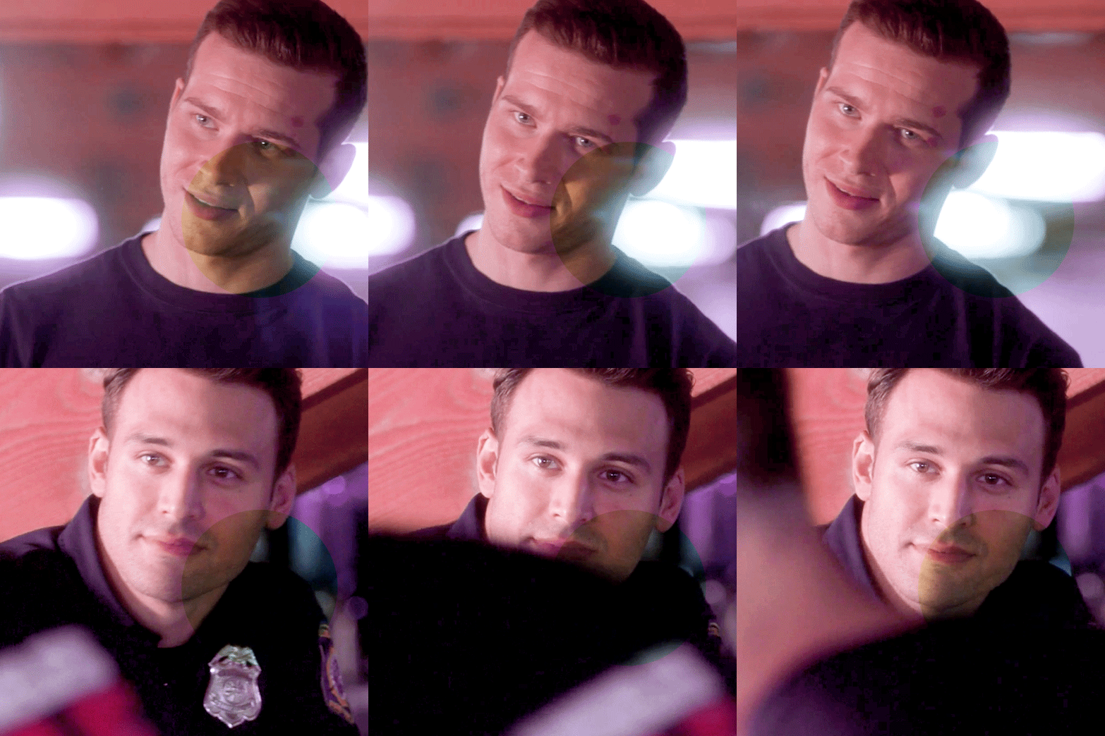
aaaand another selective color layer:

(no yellows, greens, or cyans this time) i had to do a pretty significant adjustment on the reds to, once again, make buck’s face look normal. the blues and magentas were just to bring out the pinks a bit more and get it even closer to the goal color, and i added a bit of cyan to the white just to give it a little bit of contrast. same thing with adding cyan/blue to the blacks, but i also increased the black a little bit because of the pixelation on buck’s shirt. it didn’t make it completely go away but it helped:

the last major thing i did was a channel mixer layer. like i said earlier, i normally do this towards the beginning of this process but i just felt like this gif needed a little extra help. channel mixer can be daunting to work with, and i usually just do small increments with it, but i did use it a little more heavily with this one:

in my experience, the best way to learn how to use channel mixer is just to play around with it, but there’s also this tutorial which does a really good job of explaining how it works. anyway, now my gif looks like this (and we’re almost done!):

the last layer i added was a b&w gradient map to soften the colors a bit since we’re approaching oompa loompa territory again. i set it to saturation and opacity at 15%. then i just did my standard sharpening and export settings and voila! the final product:
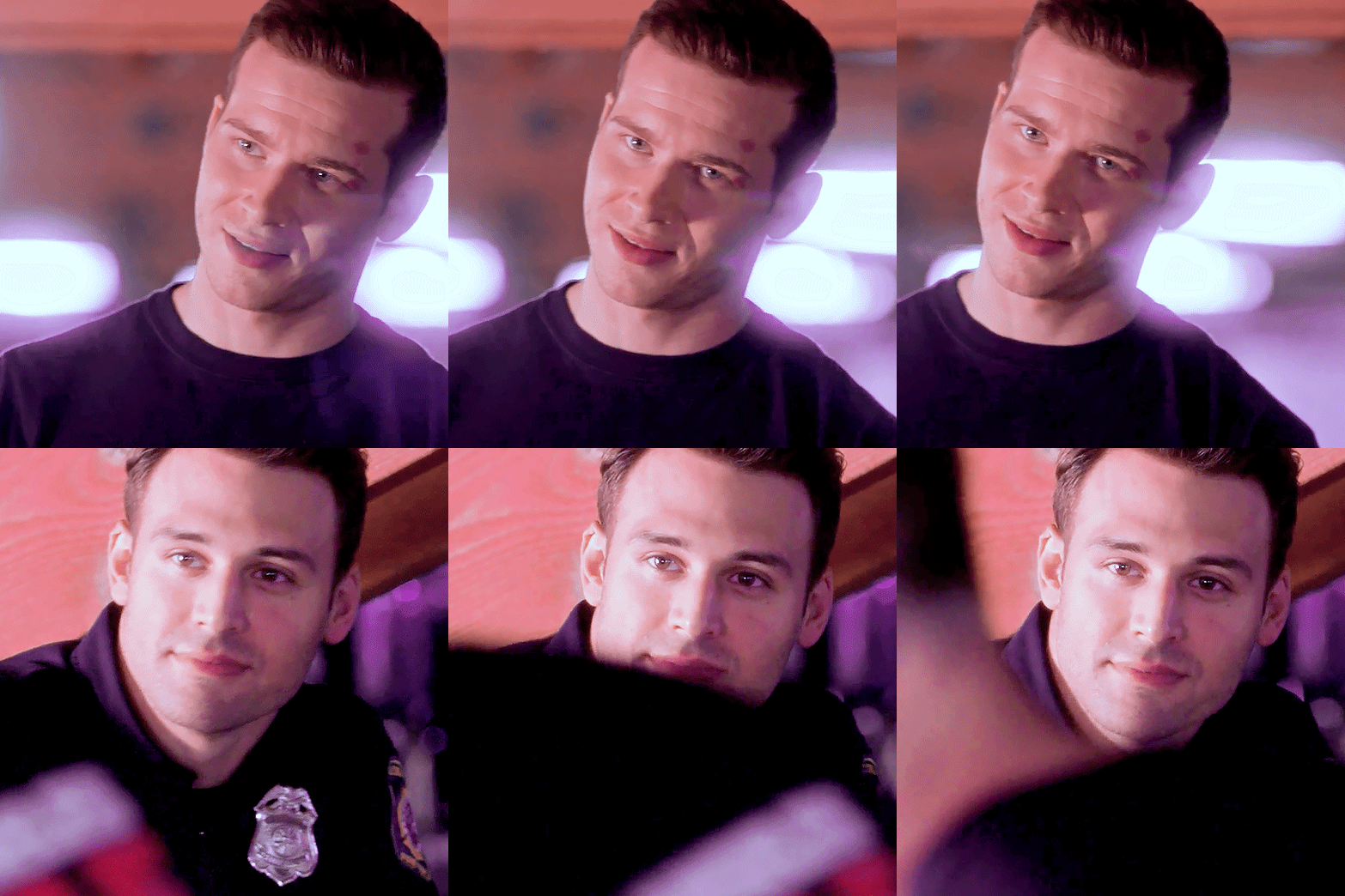
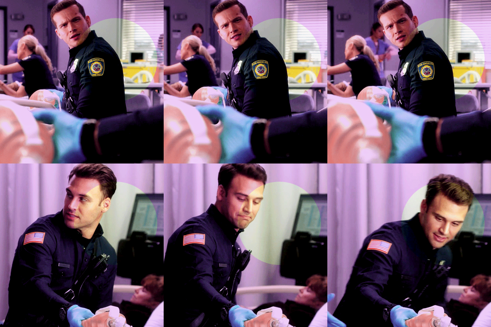
onto gif #2! here’s what it looks like to start:
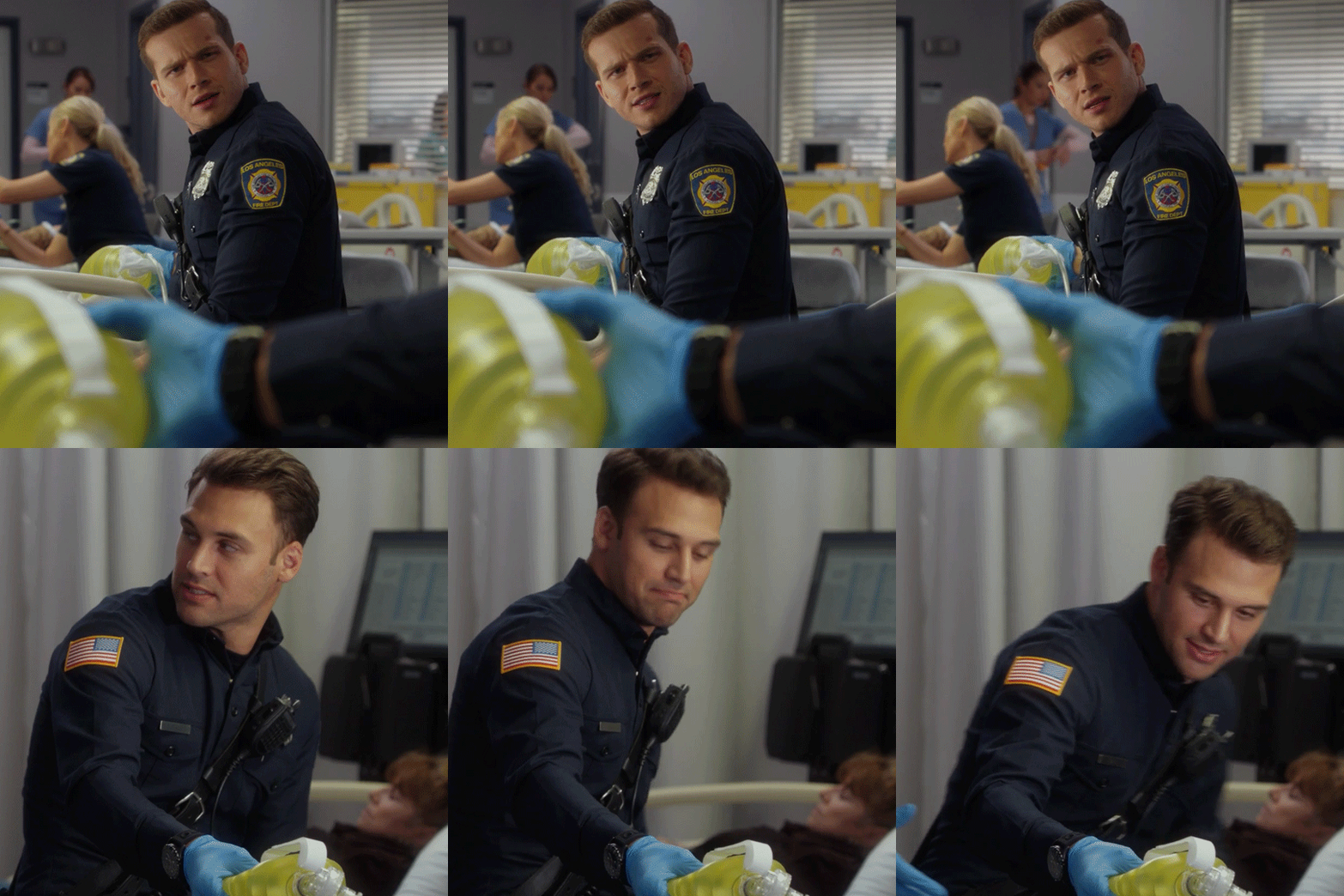
i’ll be using the fourth color in the palette for this one, so my goal is a mild purple
the first four steps are gonna be exactly the same as before, i.e. curves > levels > brightness/contrast > selective color (on relative to fix skin tone). after all that we have this:
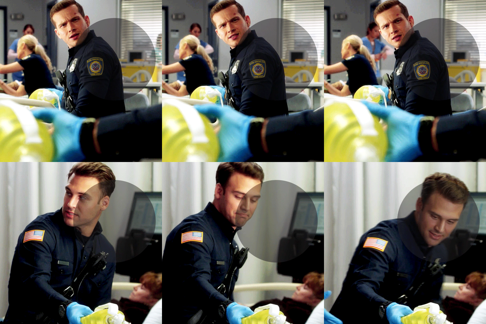
then we add our color balance layer. since the goal is purple, for the shadows/midtones i increased the magentas and cyans, and the yellows in the highlights for contrast:

this time, i did add a channel mixer layer, and but just increased/decreased everything by increments of 5:

and here’s the gif so far (the circle contains the base coloring from above):

next is a solid color layer set to linear burn, opacity at 30% (again, just play around with blending modes until you hit one that fits):

selective color layer (i decided play up the contrast in the cyans rather than the yellows, which is why the yellows ended up kind of salmon-colored):


another solid color layer set to color, opactity 20%:
i’m actually happy with how the colors look now, so for my last selective color layer i’m just gonna adjust the whites and blacks:
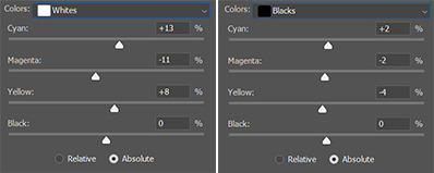

like before, the last thing i did was add a b&w gradient map set to saturation at 15% opacity. with that and my sharpening, the finished product is this:

and that’s it! like i said at the start of this, none of this is set in stone, so don’t be afraid to play with everything and get comfortable using all the different layers and tools. and if anyone needs any clarification anything, feel free to send me an ask/dm or reply to this post! happy coloring!!
#this is so long im sorry#i hope it makes sense 😖#i've never done anything like this before so idk#resources#coloring tutorial#my resources
38 notes
·
View notes
Note
Hi I just wanted to say I love your art! And that I have a question. I haven't played ffxiv yet so idk if it's true but I've heard that the gear tends to look bad on darker skin and I thought maybe that was the reason Aydee is lighter in the game but darker in the art. Is that true?
(not trying to accuse you off anything by the way)
Tysm for the compliments, I’m glad you like my art :)
As for the screenshots, I wouldn't say that's a problem about the gear (if you mean gear as in: clothers, armor), it's mostly that the lighting in game varies A LOT depending on the scene, magical effects, angle, time of the day and a lot of similar factors, and I do struggle to keep the skintone consistent in ccreenshots since I often have to compromise between likeness and actually having a well lit, colorful screenshot.
I use gpose to take screenshots of Aydee in game (gpose is like, a little screenshot application built inside the game where you can apply filters to your screens, pose the character, etc), that can also allow you to direct/adjust the lighting however you want. Considering Aydee is dark skinned, I often bump the light in gpose a lot to make her pop in contrast to the environment and background. So that CAN make her skin lighter. Especially in screenshots where it's night time, I bump the lighting up a lot so I can see properly her eyes, face, expression, etc.
The reason she looks darker in my drawings is because I am finally able to draw her the way I envision her without having to compromise with gpose's lighting, camera angles, nighttime scenes and such.
Tbh if I were more of a pro at taking screenshots and using gpose in game to keep the lights consistent (like some amazing people around manage to do) this probably wouldn't happen, it's totally a me being kind of a newb in gpose, but it's something I have to think about when having dark skinned character, yeah. Especially in cutscenes sometimes, where you cannot control the lighting/colors, etc, she gets very light/very dark/very ashy depending on the lightining situation of the scene.
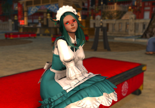
Consider that these are all screens with different lighting on: (cutscenes or not)
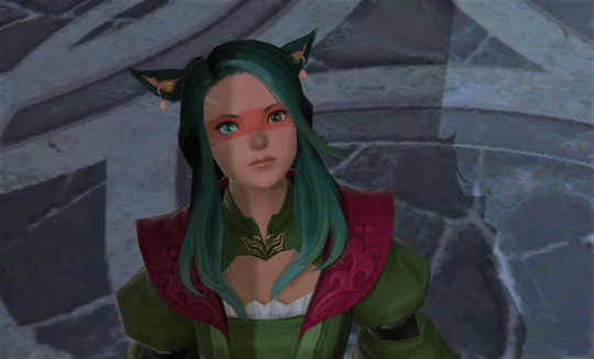
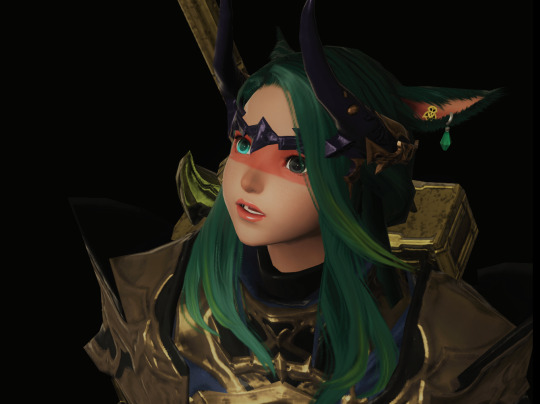
this is a cutscene in shadowbringers, I did edit this picture a bit but she's way lighter here than in other scenes
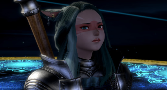
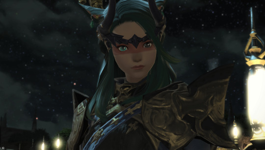
this is an example of aydee during a cutscene in nighttime. her skin gets darker and sometimes 'ashier' and makes her pop less in contrast to the background

while here for example it's also a nighttime scene but I bumped up the lights and colors in gpose so she can pop in the picture a bit more, and that DOES make her skin a bit lighter than 'canon'
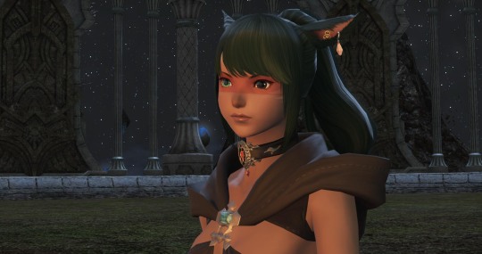
for example in this nightscene she's well lit (and the skintone is actually accurate) because she's right next to a bonfire, so a light source that lights her face well
So yeah, in my case having a dark skinned character in game does mean I have to struggle a bit to keep the skintone consistent through the edits in gpose/photoshop, BUT it's not that big of a problem... after all, having access to editing programs and even just gpose means you can fiddle around and find out what works best for the character. I remember when I first started playing and had no idea how to take screens, I used the 'standard' lighting in gpose (which is definitely NOT meant for dark skinned characters as it basically whitewashes them by overexposing the image), it took a lot of fiddling around to find out what worked best with aydee's skin.
Even Arihel, that has red skin, sometimes looks like a fucking boiled lobster because the scene has brightness and hue bumped out a lot, and in some he looks very dark red. It's definitely something that varies a lot in game, especially in cutscenes where you have no control over the lighting and color setting (unless you use a reshader).
But yeah, really interesting question actually, got me thinking a lot about my process! Thanks for asking! :)
8 notes
·
View notes
Note
For the oc meme im.on phone idk what that thing is b u t pretend i did and + salem!!
okay so it’s time to talk about the girl tm
salem !!

alright so here’s really how she came about
so me and a friend finally watched gravity falls in its entirety together and they wanted me to play the dating sim that the fandom made for it (which btw is really cute and i also need to finish ford’s route oof)
but anyway in the game you get to pick your name and pronouns and we were trying to come up with a good name for the protag and we googled names and unisex names eventually settling on city names which is where her name came from
and she’s also decidedly a gravity falls oc based on those circumstances, having originated from the dating sim anyways lol
but she did not have a design for the longest time until i finally got through a majority of stan’s route and grew attached to her as a character. (this is also where the nickname “salem the thirsty” comes from bc we kept joking about her being thirsty for the stan twins bc of some of the options you can choose in the dating sim lmaooo)
but as far as her design goes i actually combined a few traits from character designs to get her shape and form. i used the shape of gwen from camp camp as inspiration for her body type and her hairstyle was designed after a combination of hanazuki’s and this little cloud girl from this 3d animation short because i thought the designs were cute. her outfit i chose because it was simple but a lil flashy for the occupation i later gave her.
she went through a lot of color palette changes as i tried to decide what she looked like. and i mean A LOT. my sister helped me to decide on colors because i wanted her palette to be easy on the eyes yet catching. eventually we decided her having a dark color scheme worked best with the whole witch thing she has going. one of her color palettes was bright red hair in contrast with her outfit but i decided a soft, dark blue worked best for her. her design was also chosen because it’s fun for me to draw and simple enough that it’s probably easy to animate since she’s supposed to be from a cartoon.
also!!!! i decided since her name was salem i just had to make her a witch (bc i love witches and magical characters a LOT) but i considered the idea that it’s just a nickname since the background stuff about her character and the fact that it could be her stage name as a stage performer. however, i decided not to give her a surname or middle name (at least for the time being, that may change) bc i can’t really find a good last name for her.
in an essential sense, she is a “green” or “nature” witch due to her ability to manipulate and work with plants and is strongly connected to nature. however, i call her a “harvest witch” because of her ability to quickly grow plants to the point of being ready to harvest them and for the importance of pumpkins to her character. there’s a little more i still haven’t worked out regarding her magic but she’s really bad at hiding she’s a witch when she’s caught as plants can grow in her footsteps as she walks or moves places outdoors.
her personality is very shy at first but once she warms up and trusts someone, she’s loud and silly and will really do most anything for a friend. she is greatly drawn to humans and their world but often hesitates from fear perpetuated in her home realm by her family. (she’s from a witches realm and got pulled into a human realm and eventually made her way to gravity falls) but she is also a hopeless romantic and finds herself often distracted when she needs to focus on something. (which again is def something i got from the dating sim bc personally i think it’s really funny) though she’s terrible at acting on her feelings unless she feels close to the person she likes. she also tends to pull on her hat when she’s embarrassed or frustrated and will stomp when angry.
and her background i’m still working out the details in but basically it goes like this: salem was born in a witches realm to a family of two parents and three siblings. her siblings performed well in their magic studies but she tended to slack since she thought most spells were useless. she however had a natural ability to manipulate plants from a very young age and was mostly drawn to nature and would do magic related to that.
also she had a familiar named fig that her parents disapproved of her naming after something from a human’s realm. she also loved pumpkins as they were so rare to her in her realm. and she also had a strong curiousity for humans but her family warned her they hated witches and to stay away from them. but one day when she was outside something bad happened and she ended up being pulled from her realm to a human’s realm and was later adopted and raised by a kind old farmer into her teens. then she had to live on her own and ended up becoming a touring performer, hiding under the guise of being just a “witch performer” as the fear her parents tried to instill settled in after ridicule she’d recieved and the way witches were treated/viewed in a human realm. by happenstance, she ends up in gravity falls and meets the pines family on one of her performance days that goes horribly wrong and needs to stay with them for a time. and some things happen that i still am working out and being vague about on purpose lol.
also when salem walks, depending on her mood, different types of plants will grow in her footsteps if she is outside. she is also able to grow fungi and mushrooms and sometimes even moss and vines at whim or involuntarily. i just thought that would be a fun character trait to have tbh…. also there’s more that her powers can do but some of it i’m still developing lol-
and there’s loads more i can say about her but this is already really long but dw i’ll def share more some other time!!!!!!!
#answered asks#fericul-ivel#oc ramblings meme#salem#salem the harvest witch#gravity falls#tho mostly just#gf oc#tysm friend!!!
12 notes
·
View notes
Note
hey, 'yaena, i'm just curious- what are some of aspects of a character that u like the most? like a certain species or body type or type of color palette etc!! is there any type of character u like drawing the most vs looking at the most?
hi!! thanks for the questions
colour-wise i absolutely adore bright saturated schemes in primary colours specifically (yellow blue red etc) with strong contrasting elements (mostly black tbh). but when it comes to character design, i tend to stick to conservative palettes for… some reason. i like the idea of someone looking at mayday and knowing that they’re a tabby cat, or seeing tar and being like yep, striped hyaena. so i have a hard time bringing myself to just grab bright and unnatural colours when designing characters. however when someone else has a character design that incorporates bright contrasting colours that looks good and well-thought-out, i absolutely love it. i’m not too hot on pastels and vaporwave/cyan-magenta stuff and my favourite colour is orange
in terms of species, anything goes really! i have a bias towards mammals and birds (i’ve been toying with the idea of designing a seagull or penguin character!) in my personal work but if a design is good i literally don’t care what the species is.i love cats especially, they’re defo my favourite animals and i love drawing them… they are surprisingly difficult to get right. i also love seeing people’s feline characters. sabertooth tigers seem to be the most popular among ppl i follow but my bias is towards smaller cats (today i have been researching the lesser-known wild cats and i’ve literally fallen in love with pampas cats lmao so expect to see a pampas cat character soon)
overall though the thing i like most in a design, visually, is i guess a well-developed pattern?? that sounds weird. but i don’t like character designs where there’s like a few dots here and some stripes there and it all seems disconnected and ultimately it falls flat. this is also how i do costume design for my human art - i like a recurring motif and large dynamic elements rather than scattered small bits. if that makes sense. it’s hard to articulate, i’m not like an artist or anythin
i also really really like it when the artist has put some genuine thought into the speculative elements of their design. as someone with a background in biology and medicine, my passion is spec bio and realism in creature design. i lose my shit when i find well-done original species where the creator has put genuine care and research into their designs, where logic is taken into account in each design decision. obviously it’s all fantasy art in the end so there’s leeway but hey, well-reasoned magical systems are amazing to see too. this might seem a little out of the blue since this is a blog for me to draw furrys and shit. but on my personal (which i will not link here) i engage in serious spec bio for multiple creative projects. all the art for those is kinda ugly because it’s mostly concept sketches lmao
uhh i think that’s it. thanks for reading

(i’m starting to get sick so this is an accurate representation of myself rn)
65 notes
·
View notes