#the artist is william o’connor btw
Text
While I continue to procrastinate on SMS I think y’all need to see the copy of Frankenstein I just bought because I’m OBSESSED with it
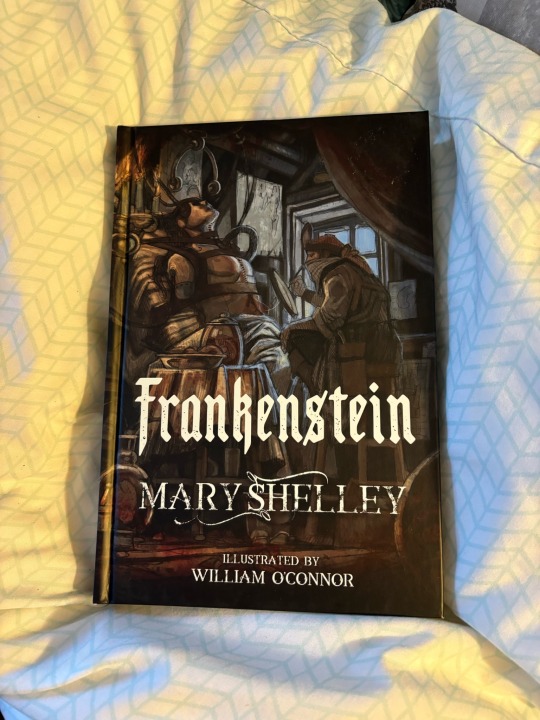
First of all, gorgeous cover art.
Then you get to the actual PAGES, and

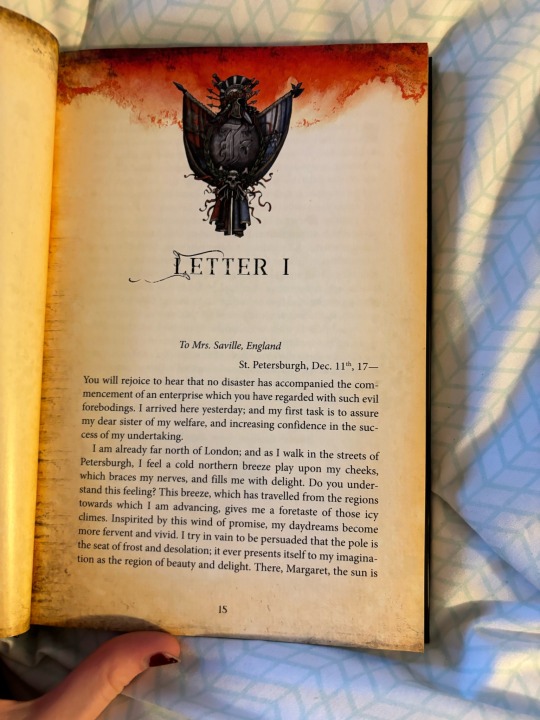
LOOK AT THAT

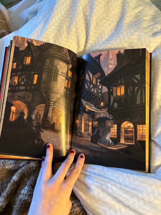
IT’S SO GORGEOUS

THIS LOOKS LIKE IT COULD BE FROM PHANTOM OF THE OPERA


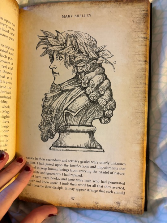
THE CREATURE LOOKS SO FUCKING COOL RAAAAHHHH
#can you tell i’m autistic#frankenstein#frankenstein book#frankenstein or the modern prometheus#frankenstein art#adam frankenstein#victor frankenstein#the artist is william o’connor btw#gothic literature#gothic lit#classic literature#classic lit
2K notes
·
View notes
Photo

The Amazing Colossal Irishman -- Get Outta Town (1960) poster
Although I generally choose subjects for these essays which—in addition to providing fodder for my witty commentary—are reasonably competent in both an artistic and marketing sense, today’s poster doesn’t necessarily fit that criteria. This poster isn’t especially inspired and doesn’t seem to have that “hook” that might pique the ticket-buying interest of movie audiences. However, Get Outta Town is a sentimental favourite and the poster is worthy of examination.
As noted above, I have a soft spot for Get Outta Town (the movie, not the poster so much). Clearly a low-budget vanity project for actor Doug Wilson, the film has nice noir-ish feel to it, the location shooting adds verisimilitude, and the vernacularised title* draws attention (apparently the working title was “The Day Kelly Came Home,” which isn’t bad; the picture was re-released in 1964 as Gangster’s Revenge, which sounds like a generic translation of a Japanese yakuza movie title).
*[ Get Outta Town was the first in a planned trilogy, to be followed by Fuhgettaboutit and Whatsamattayou. Alright, that’s totally not true. As far as I know.]
Most of the behind-the-camera personnel behind Get Outta Town don’t have extensive Hollywood credits. Executive producer William B. Hale might be the same “William B. Hale” who made a 1950s documentary on the Watts Towers entitled “The Towers,” but this is unconfirmed. Co-producer/director Charles Davis is only cited by IMDB as the director of one other, later independent film (assuming this is the same Charles Davis); cinematographer Larry Raimond has a handful of credits spanning nearly 3 decades. Scripter Bob Wehling seems to have had the most work experience, directing a couple of features and doing some acting in additional to his writing chores. Co-producer and star Doug Wilson has a handful of TV appearances on his resumé, and IMDB also indicates he was a film editor, although no credits are provided.
[To be fair, technical credits on episodic Fifties television series are not well documented, so at least some of these people could have been hard-working professionals, just not on theatrical features. As an aside, Get Outta Town’s on-screen credits are in the familiar “Sixties TV sitcom” font, which subliminally reinforces the television-industry connections of the cast and crew.]
Get Outta Town carries a 1959 copyright date by “MCP Film Distributing Co.” (the production company is listed variously as “Albex Films” and “Davis-Wilson Productions”) and was released in 1960 by Sterling World Distributors (the 1964 re-release was handled by Beckman Film Corp.). A fair amount of “paper” can be found for Get Outta Town, including the one-sheet poster illustrated here, lobby cards (I think I even own one), and an insert.
The poster for Get Outta Town (which spells the title Get Outta’ Town, although the film itself doesn’t have the apostrophe) isn’t horrible, but is rather bland. The yellow background was, for some reason, a popular motif in some Fifties-Sixties cinema posters: perhaps the designers thought it was eye-catching or made the artwork “pop” more than a white background would. To me, it signifies “cheap indie film,” though, but I suppose that could be a conditioned response based on the number of posters I’ve seen like this, as opposed to a strictly artistic evaluation.
[More yellow-background posters, from a quick scroll thru www.wrongsideoftheart.com: Carnival Rock, Because of Eve, Cage of Evil, Curse of the Faceless Man, Eighteen and Anxious, Fingerprints Don’t Lie, Girl Fever, Girl on the Run, Liane Jungle Goddess, Red Lips, Right Hand of the Devil, Teenage Zombies, The Violent Years, Wild for Kicks, The Naked Road, Teenage Thunder, Operation Conspiracy, New Orleans Uncensored, Five Guns West, The Party Crashers, Chained for Life, The Incredible Petrified World, The Woman Eater, Voodoo Island, and many more. The titles alone give you an idea of the class of movies that used the garish yellow background in this era.]
The main image is, of course, of producer-star Doug Wilson. He’s big, burly, with muscular arms and a hairy chest revealed by his unbuttoned shirt. There’s a sort of John Wayne-ish vibe about this portrait, and it was probably not coincidental. I’m of two minds about this. First, the art does convey the impression of a tough, action-oriented, even working-class protagonist, perhaps a truck driver or an oil rig worker or a longshoreman or a construction boss, etc. (this is somewhat at odds with the tone of the film itself, which is more of an urban crime picture). On the other hand, Doug Wilson stars in the movie but he’s not a movie star, so a gigantic painting of him, mostly devoid of context, might not be the best sales tactic. He’s looming over a cityscape, there’s a dead body and two women, but mostly this is DOUG WILSON, TOUGH GUY. Take it or leave it.
Two women are pictured on the poster. The poster’s text (to be discussed shortly) suggests these are the protagonist’s “two girl friends,” and we can surmise that Lefty is the good girl (modest top and skirt combo, tasteful necklace) and Righty is the bad girl (spaghetti-strapped gown with a fringed hem, bare shoulders), but they are both awkwardly posed and both share the same shocked and apprehensive expression. They’re his “girl friends?” They seem to be regarding him fearfully, not affectionately. Maybe it’s awe of his massive masculinity that makes them look that way.
Thus, while the artwork and design aren’t crude or confusing, the exact nature of the film is hazy. Perhaps the text can clear this up? But if you’re relying on the printed words on a poster to educate your audience about what to expect, you’ve got one strike against you to begin with.
The Get Outta Town poster’s text is relatively on-point. “Kelly turned the town upside down the day they killed his kid brother!” Got it: revenge motive for town-inversion. “He took the law into his own hands!” His own big, meaty, tough-guy hands. How would you describe Kelly? “A two-fisted Irishman with two girl friends!” One girlfriend for each fist, it seems.
[Doug Wilson is credited as “Kelly Oleson”—I don’t remember if his heritage is explained in the film itself, but “Oleson” is a “Danish-Norwegian patronymic surname,” according to the unimpeachable source for everything, Wikipedia. Even if you spell it “Olson,” it’s still Scandinavian, not Irish. But I guess “two-fisted Irishman” sounds better than “two-fisted Scandinavian.” Unless of course you’re Scandinavian.]
The poster indicates the film has an “All-Star Hollywood Cast.” You keep using those words. I do not think they mean what you think they mean. Perhaps you do know, you’re just hoping we don’t call your bluff. “All-Star Hollywood Cast?” Doug Wilson was in an episode of “Rawhide.” And two episodes of “Science Fiction Theater!” Jeanne Baird did a lot of television in the Fifties and Marilyn O’Connor played “Rita—Saloon Gal” in an episode of “Tombstone Territory.” The rest of the cast is a mixture of people who made a few other appearances (mostly on television) and those whose sole IMDB claim to fame is Get Outta Town. So we’ll give them “Hollywood Cast,” but I’m calling shenanigans on “All-Star.”
The text on the Get Outta Town insert poster is significantly different than the one-sheet’s. The top tag-line is hilarious: “ ‘Squirrel’s’ Tongue Slipped!” No, it’s not an erotic movie shot at a furry convention, “Squirrel” is the name of a minor character in Get Outta Tongue. He let something slip, you see, “...and Kelly’s Fists Went Into Action!” [btw, “Kelly’s Fists” would have been a good alternate title for the film.] “This Irishman cleaned up gangland when police didn’t!” Also “His love for two girls solved a nasty crime!” However, it also caused considerable heart-ache.
The poster for Get Outta Town isn’t bad—technically speaking, the art and design are professional—but it’s not unique or compelling, especially given the no-star nature of the production. In a way that’s too bad, because the film itself is rather enjoyable in its way.
0 notes
Last Seen Blogs

jackienelsen-blog
Untitled

balajisewingmachine
Untitled

gaze2
Untitled

vegglete-blog
vegglete

theoriginalsareperfect
The Vampire Diaries