#the cats are more dramatic than Remy LOL
Text


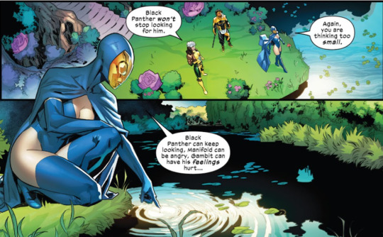
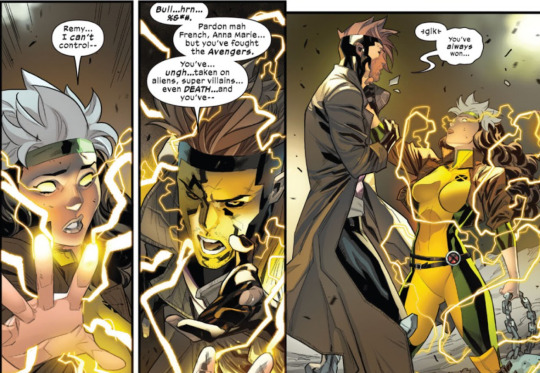
#spoilers#rogue#rogue comics#well it's rogue and gambit not sure it's spoilers#read more pls stay there ty#y'know i wasn't super impressed with this storyline some bits i did enjoy tho#the cats are more dramatic than Remy LOL#meh fall of x idek what the flow is with Rogue. it feels like it's missing pieces so i yoloed.
13 notes
·
View notes
Text
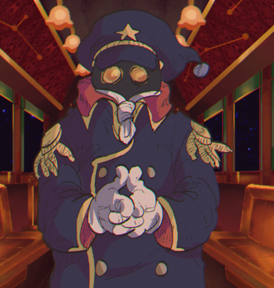
sorekara setting design
Here are some notes on the development of SOREKARA's style and presentation. If you couldn't already tell, SK takes a lot of inspiration from 70's/80's anime, Nobody's Boy Remi being the reference point for much of it. I've always respected Dezaki for his monumental work so I've always wanted to pay tribute to it (especially the early stuff). I don't think I was as successful as I'd like to have been, but alas! There is still more to come! So without further ado!
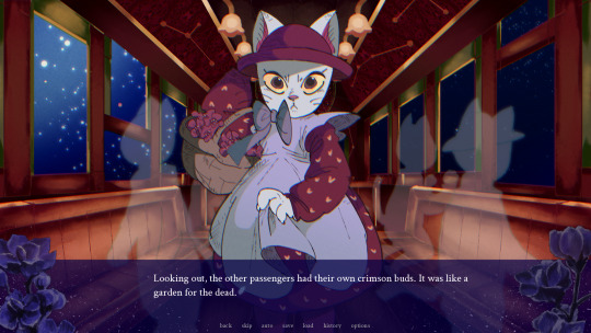
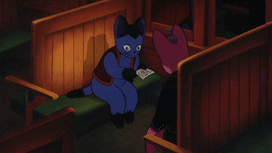
I was just talking about Dezaki , but now I shall talk about something completely different. To set the tone, I created the cat and the trolley setting first. The Girl's design should be plenty obvious (lol). But the background here I paid special attention to... I find the paints of Night on the Galactic Railroad to be very unique. They have a line less, airbrushed quality to them that blends in surprisingly well with the characters. I did some research and studied 児玉喬夫 Takao Kodama's work, as they were credited with setting design for this film as well as Genji Monogatari. Actually, if you look at Genji Monogatari's backgrounds, they have the exact same airbrushed quality! I had never done a background like this before (I am certainly not an environmental artist) but I think I did a fairly good job of it.
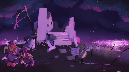

...I immediately switched gears and without thinking, went back to Dezaki works. I can't say I was very faithful at all. The night sky is easy to paint, with it's notable color spray and paint blots, but I diverged quite a bit with the watercolor textures. Shichiro Kobayashi is the artist I looked to the most, and this project made me appreciate him more than ever before. Just looking at his paints gets me emotional... The vibrant colors, the dramatic angles, you can just feel his reverence for life overflowing from the work. There really isn't anyone better. I need to study more if I'm to capture even a fraction of his skill. That being said, I did make sure to animate the backgrounds slightly with the sparkles on the water-- The reflection of light on water is my favorite to draw! Also, flowers are a very important motif (for various reasons, ohohoho). Kobayashi seemed to love drawing flowers, the paint around the edges give is a delicate look. Actually, if you look at the textbox...
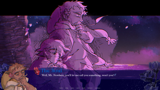
Instead of full-color CGs, I opted to use "postcard memories". This was a technique Dezaki used where he would show a detailed, scratchy-lined illustration to highlight important moments instead of fully animating them. It creates a really memorable image that draws out all of your emotions! I tried to emulate them (the more single-toned ones, that is) for the game. It was 1/3 Dezaki worship, 1/3 time-saving technique, and 1/3 excuse to draw lots of scratchy lines. I love scratchy lines. This way, I could make a lot of memorable shots that were visually interesting without overworking myself.
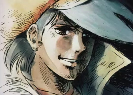
As another note, I looked to Akio Sugino's character art when drawing. The characters don't really look like Sugino characters, but I was emulating his shading technique with (once-again) the scratchy lines. Ah, I was in heaven. Looking at his older work, the linework is hardly ever clean-- but the rough, hand-drawn edge gives everything a tactile quality and the strong anatomy makes everyone so gorgeous. It's like an engraving come to life.

Finally, the anime effects! On the left you can see soothat before his values are adjusted (very dark, isn't he?) and on the right you can see he is in-game, values adjusted with a more appropriate "anime" look. This is because anime cells are put onto a CRT screen, so they end up looking very different. I created an auto action in CSP to adjust the color grating and line quality of every asset before popping them into the game for the chromatic aberration to take effect. The lines are slightly crunched a blurrier compared to the original. It gives it a more "physical" look. The colors are fixed up-- you'll see there is no pure black. If you look at a physical anime cell, you'll see they more often than not do not include pure black. There is usually a tint of green or red in there.
The chromatic aberration filter... I don't know how noticeable it is to the average player, but the game actually has a built-in filter that creates a slight "chroma" effect to emulate the look of frames through a crt/light. This means the red + blue + green values of the entire screen are split up and adjusted to layer slightly off from each other, giving it a little visual interest. It was AN EXTREME doozy to put in, with my poor programmer coding it and re-coding it until the end. It seemed simple at first, but there are parts where the game zooms in which totally broke the filter! It made out eyes bleed! But it was repaired in the end, so blessing upon you, Sandy. You saved my life.
The reason why I looked to Ie Naki Ko/Nobody's Boy Remi specifically is because that's where I feel the most "pure" energy from. It is a show that leans incredibly hard on it's techniques to get by but because of that it really embodies what I love about old anime-- It has a selfless reverence for its subject that drives you to watch and surrender your heart. Dezaki's powerful directing, Sugino's gorgeous drawings and Kobayashi's majestic paintings come together to make a work that shines. The setting is truly at the forefront with the characters getting lost in the grandeur. That's the attitude I had with SOREKARA: "There are things much greater than us, so isn't it wonderful that we are able to see them side-by-side?" There are many animation techniques that are cost-effective while still being utterly beautiful, I would love to copy them someday but I wasn't able to go that far yet. At least not in the demo. There's still time, I suppose... Studying limited animation from old anime is actually extremely useful when creating visual novels. Understanding the placement of cells and their layering/movement has given me even more ideas for stories!

I ended up going on a rant about anime again ^^" But it's so beautiful, you must now understand my heart going into the work. I always think of my characters and their journey, of course, but before that I think of the setting. I want the player to experience beautiful and mysterious things alongside their traveling companions. There is still so much more to make. I hope to incorporate more Dezaki-style techniques in this and future works. Please remember the true message of my works.... Not that love finds a way, or that your connections can transform your world...it's that....anime is very, very cool.
Thank you for reading 🙇🏽♂️
18 notes
·
View notes
Last Seen Blogs

musicsus
Music

a-court-of-azriel-and-gwyn
giulia :)

takumasato365-blog
Takumasato

pyrolytic-blog
grrrowl

fzat
My Own Satisfaction and Joy