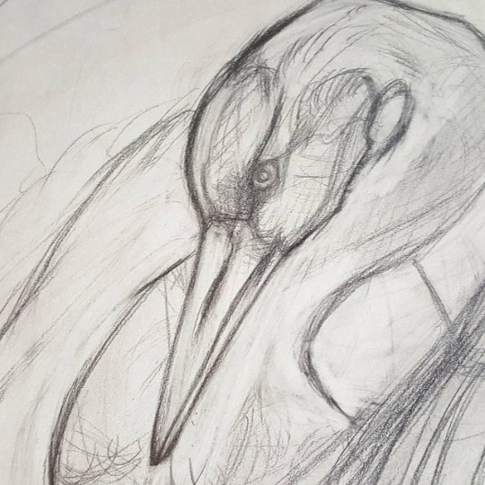
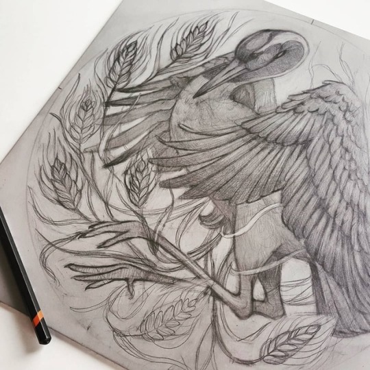
#the linocut is missing some details still
Text

O Nidere ♡ Linocut & drypoint test prints
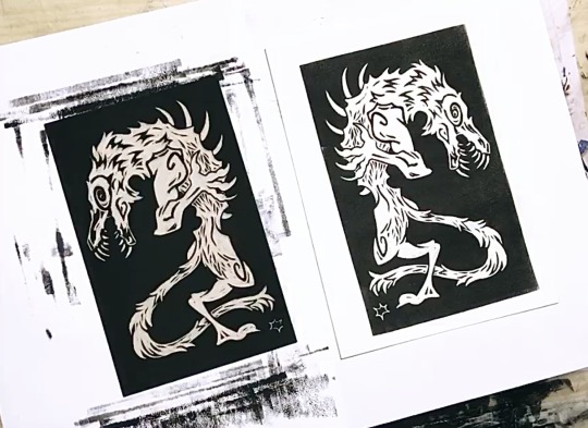

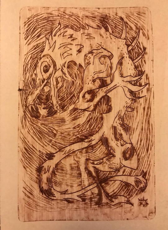
#I love this creature so much this is insane#the linocut is missing some details still#that drypoint was made on a soda can and I don’t know how to print that either#ordem paranormal#opq#ordem paranormal quarentena#nidere#ordem paranormal fanart#linocut#drypoint#etching#printmaking#test print#illustration#my art
151 notes
·
View notes
Text
Mini-PSB
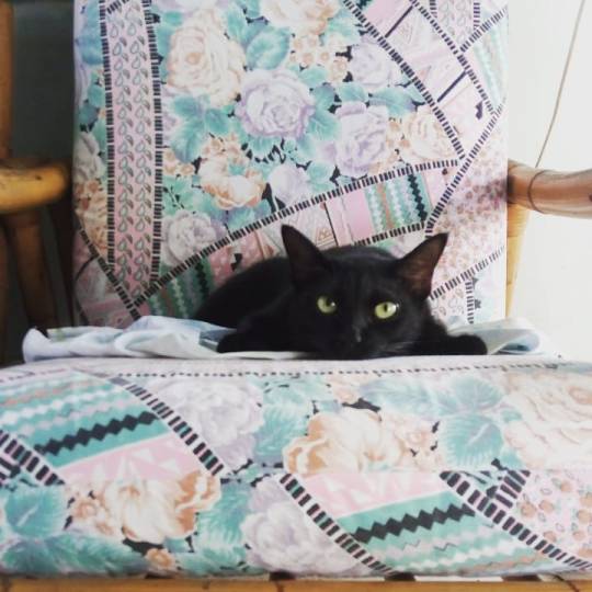
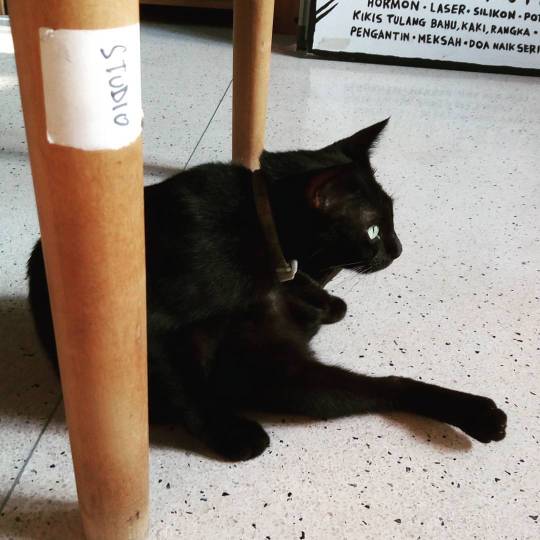
Our cat, Mini-PSB -- velvet-black, quite little, with a twitching stub tail that Sharon called a cooked-prawn tail, because of the way it curled -- has been missing for five days.
We do not think she will be coming home.
+
When we talked about her with friend we tended to call her "our mew".
We'd given her a complicated name that was complicated to explain. Briefly:
"Mini-PSB", because her father was probably a stray we called Penyu's Sister's Boyfriend -- very compact, very black, very shy; if he even suspected we were watching, he'd freeze in the middle of our driveway, turn around, and trot away;
"Penyu's Sister's Boyfriend", because he used to come around with Penyu's Sister, another stray -- white, with a smudged face;
"Penyu's Sister", because Penyu was a cat we had -- white with a dusty face and one dirty paw -- she was the sweetest cat we had.
+
Mini-PSB was complicated. We have never truly tamed cats. She was proof of that.
When we took her to the vet she bolted out of her carrier and tried to jump down the clinic restroom's toilet bowl, to escape.
She had only four humans she could stand, in all the world:
Sharon and myself;
Selvam, our gardener, who'd feed and keep her company when we were in the city; and
Sze, who house-sat for us, for a few months, and took the time to befriend a wild animal.
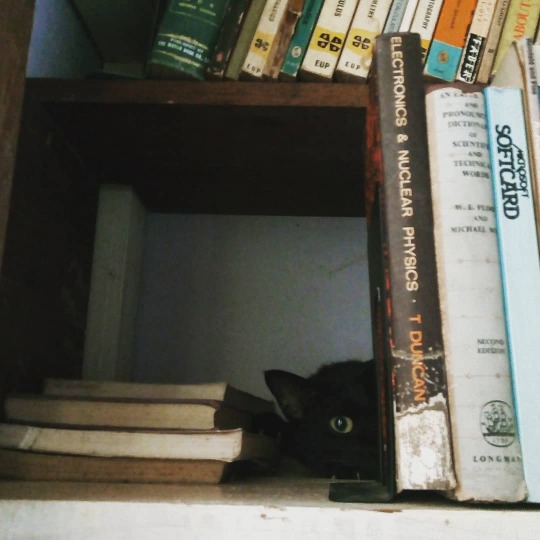
She never stopped being wary of us. She chose nests that were always hidden away, or out of reach. Most times I tried to sit next to her, she'd jump off her cushion, and duck under a chair.
She'd roam the house, checking every room, just so she could keep track of us at all times.
+
Mini-PSB was kind to us.
When Sharon got home from her terrible haunting in Vietnam, Mini-PSB sat at our front door, keeping watch.
When I started obsessing over my bad writing, midnights, she'd want to jump into my lap, for a good purr. This didn't help my work, but always made me feel better.
She'd leave us gifts: on the living room floor; under my desk; in the shower -- geckos she'd caught and killed. She would leave just the heads.
"Murderer!" I'd call her.
+
Mini-PSB lived with us for over three years. Our longest.
She kept to the house, mostly; the most she'd been away, previously, was two nights. She never went exploring.
Did stray dogs get her? There are packs roaming the school behind our house, at night.
Did a python get her? They eat small mammals.
I've asked our neighbours. I've searched the school grounds. Why would she go to these places, anyway? She was so afraid of people.
"Maybe it is best this way," Sharon said -- and she is right. the worst scenario would've been if she had fallen ill; going to the vet again would've been the thing that killed her.
+
This way is better. She was a wild animal, who came to live with us, a while. She returns to wildness.
+
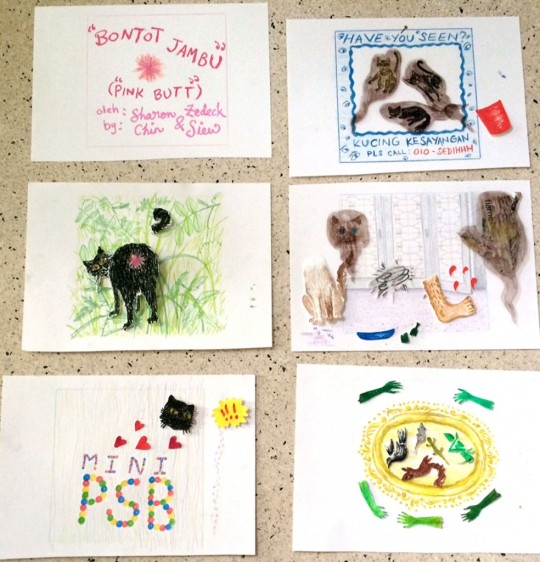
Mini-PSB leaves behind some things. Sharon's made a lot of art about her.
There's "Bontot Jambu / Pink Butt", a series of animated GIFs about our cats, featuring her pink ass and cooked-prawn tail;
There's the linocut print you can see here, "The Way Home / Jalan Pulang", made after Vietnam;
She's a detail in the linocut that bookends our book. See that cat, surrounded by the ghosts of other cats? That's her!
+
Still have her as a wallpaper for my phone screen. As my profile pic on Twitter. Not sure when I'll swap those out.
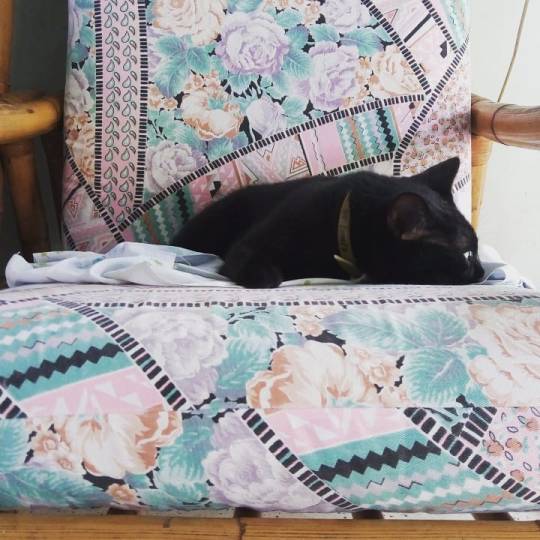
I remember her on her back, on our front step, relaxed. I remember her paw, dangling off the edge of her favourite cushion. She is all over the house.
Once, twice, I thought I heard her squeak. It was only some metal, scratching on metal.
I feel her in my lap. A weight. kneading. Another ghost cat, now.
9 notes
·
View notes
Photo
Printmaker & Artist:
Maarit Hänninen Linocuts
"Lintukoto"
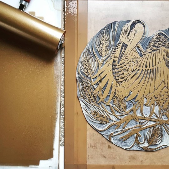
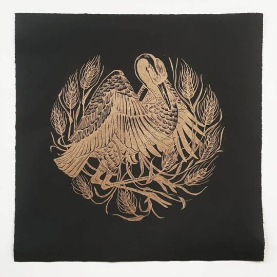
“Sketching for my next print. Been thinking about making a crane piece for some time, and now the moment felt right. This is often how my planning process goes: I come up with a concept and let it incubate for a while before I actually start working on it. Not a conscious decision, but just what works best for me.My latest linocut, "Lintukoto", gold on black. •
Finns used to believe that migrating birds would fly over to the edge of the world for winter, to a place called Lintukoto (bird home). Because they pictured world as a disk, and sky as a dome, the edge of the world would naturally be a small, snug place, and it's human-like inhabitants tiny. These little humans were said to be in constant war with cranes who would try to devour their grain, or depending on the storyteller, their frogs. In modern day Finnish language lintukoto is still being used for describing a safe, cozy place.
•
"Lintukoto" and all other linocuts on my website are on -10% discount until November 26th (link in bio). Enter code 0HH62IH at checkout! •
•
•
•“
“Ready for the first cut! 🙈.”
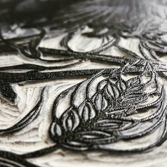
“Here's a little detail of my first cuts. Somebody asked me yesterday if I ever feel nervous when starting to carve a new block, and the answer is: every time. Being so used to drawing with a pencil, linocut feels like an extremely unforgiving medium to me. One slip or misjudged cut, and you can cause a lot of damage. But I think that's also part of its charm. You're forced to think about every cut very carefully, meaning that you need to focus a lot. I think that's why so many linocut artists compare it to meditation. I can certainly agree with that.“
“Getting there...“
“Back to work after a much-needed holiday in my homeland of Finland. I count myself very fortunate for having been able to visit my parents, siblings, and even my three remaining grandparents all of whom are healthy and able to live at home. It was a pleasure to enjoy their company with the beautiful Lappish nature around us and homemade food in my belly. Feeling relaxed and ready for the busy holiday season ahead 😊 here's a little sneak peak at my next print. More to follow tomorrow! •“
My latest linocut, "Lintukoto", gold on black. •
Finns used to believe that migrating birds would fly over to the edge of the world for winter, to a place called Lintukoto (bird home). Because they pictured world as a disk, and sky as a dome, the edge of the world would naturally be a small, snug place, and it's human-like inhabitants tiny. These little humans were said to be in constant war with cranes who would try to devour their grain, or depending on the storyteller, their frogs. In modern day Finnish language lintukoto is still being used for describing a safe, cozy place.
•
"Lintukoto" and all other linocuts on my website are on -10% discount until November 26th (link in bio). Enter code 0HH62IH at checkout! •
“That perfect inking 🖤.”
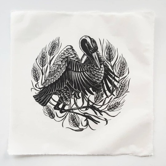
“4th and final color combination: black and white. This design is too large to fit through my small etching press, so I spent a few days hand-burnishing all 4 colors. It was slow and tough going, but also satisfying to pull each one of those prints, knowing that they're 100% me. And I didn't get as many misprints as I tend get with a press, so that's a win!
Ps. Starting tomorrow and running for the rest of the month, I have a lot of special holiday stuff planned for my webshop. Keep your eyes peeled for my post tomorrow because you don't want to miss what's coming! 🎁
•
•
•”
https://www.maarithanninen.com
#Maarit Hänninen#Maarit Hänninen Linocuts#Linocuts#Printmaking#Prints#Printmaker#Art#Artist#Relief Printmaking#Printmaking Process#Carving#Gold Ink#Initial Drawing#Inking
33 notes
·
View notes
Photo
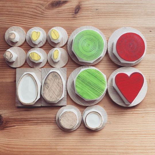
Getting ready to clean and glue after carving some more stamps. I still need to do test printing before cleaning just in case I missed to carve lines or small details. Process afterwards: - clean pencil marks - test printing - carve more if needed - clean ink marks thoroughly - glue mounts - packaging #talktothesun #etsy #handmade #handcarvedstamp #rubberstamp #stampcarving #craft #create #creativelifehappylife #illustration #linocut #get_imprinted #heytheremaker #makersgonnamake #artoftheday #artistsoninstagram #blockprinting #printlife #printmaking #scrapbooking #patterndesign #patternlove #inkandpaper #消しゴムはんこ #手作り #handmadeinjapan #linocutprint #blockprinting #patternlicious #stamp #workinprogress https://www.instagram.com/p/CPCtD25rVmn/?utm_medium=tumblr
#talktothesun#etsy#handmade#handcarvedstamp#rubberstamp#stampcarving#craft#create#creativelifehappylife#illustration#linocut#get_imprinted#heytheremaker#makersgonnamake#artoftheday#artistsoninstagram#blockprinting#printlife#printmaking#scrapbooking#patterndesign#patternlove#inkandpaper#消しゴムはんこ#手作り#handmadeinjapan#linocutprint#patternlicious#stamp#workinprogress
0 notes
Text
Hello Book
For my hello book I knew I wanted to do something with waves. I was looking at books online for inspiration I came across this spread of a photograph of a wave (unfortunately I can’t find the image). It spanned both pages, and the waves rushed in towards the viewer and it was absolutely beautiful. Instead of just making a little book of photographs of waves, I wanted to interact with them more, add some interest to the images to make them connect. A different image inspired me, one of a tattoo done in red ink of a section of the painting The Great Wave off Kanagawa by Hokusai. There was something about the intricate line drawings done in red that really spoke to me. I decided I would combine the two, photographs and illustrations of waves, in my little book.
To start, I chose a relatively small size 5.5″x5.5″ because I felt that it would make the entire thing a bit more intimate. As well, it was my first book and I didn’t want to bite off more than I could chew. I looked at various online sources for images, because I didn’t have any photographs of my own. All of the images featured in my book comes from https://unsplash.com/. Since the images varied greatly, I decided I would tie them together by editing them all to have a navy blue hue. This would contrast nicely with the red while still tying into the idea that water is blue (even though it really isn’t). This would be the easiest part of the entire project, just spending a few hours looking at pretty pictures and editing them.
Next, I looked into different Japanese wave paintings. I knew drawing a bunch of waves on my own wouldn’t really work with the aesthetic I was aiming for. I collected various paintings and drew over key areas, followed the flow of the linework and in some cases, slit the painting into various parts in order to capture just the waves. In certain cases, this was simple because the painting didn’t have much detail. In others, I spent hours trying to get every line, every curve just right so that I would be perfect. Doing this all in Illustrator, I played with various line weights and different types of strokes in order to make the piece look finished.
Finally, it came time to combine the two elements. This was something I hadn’t really considered when working on either side - the illustrations or the photographs. I played with different layouts that would allow me to overlap the images with the photographs, but very much enjoyed having them offset and playing with white space. I layered images, cut out very small sections, and really tried to create interest through my compositions.
Before I printed my book, I looked through and felt as if there was something missing. There was nothing that introduced the reader to the book, and then wrapped it up at the end. I decided that I wanted to keep the text minimal, so I went with a cheesy joke. What did the ocean say to the shore? Nothing, it just waved. This wave idea also worked with the concept of the “hello” book - waving hello.
The cover - I knew I had scene really interesting paper at a store on Queen Street West in Toronto before, and I wanted to use something red to bring out the illustrations in the book, so I did some research. I looked up different papers they had online @ https://shop.thepaperplace.ca/ and found a few options before I went in store to see what they had. Once I went in I fell in love with a linocut printed paper, of red hills and waves. It fit perfectly with the vibe of the book. I decided that the string would be white because I didn’t want it to stand out too much and it worked well with the white paper and white accents on the cover.
Printing and sewing the book was an interesting process because it was something I had never done before. I had made booklets in the past, but I had never sew them before. This book was relatively simple and I’m very glad I had Steph there to help me out with the process. Something I was really disappointed with was the quality of the printing at York. While the images and the colour turned out lovely (which is a first) the pages were very offset and when it came time to trim them, some of the spreads didn’t line up over the gutter and images or text that was supposed to be centred, wasn’t. However, at the end of the day that’s not something that could really be helped.
Overall, I really enjoyed making this book and was very happy with how it turned out. I think it would also work really well at a larger scale so that the reader can see more detail in the illustrations, but that’s something to try at another time.
Failed ideas:
I had originally wanted to print my book using the risograph. I was going to print all the pages with the photographs first, and then print the illustrations on top of them, insuring I would get a brighter red. However, that idea didn’t work as well as I had planned and caused me a lot of pain and heartache. The linework was too thin for the risograph to print effectively, and the illustrations were barely showing up once I tried to print them.
When I first came up with the idea of using the wave pun, I wanted to put one on every page where the folio would be. This idea was quickly scrapped because 1. I couldn’t find enough puns and 2. I felt that it would make the book less impactful.
Another folio addition I considered was adding the location that each image was taken in, with the little location icon seen on places like google maps. This didn’t work out because not all the photographs specified where they were taken and I felt it wouldn’t make sense to include it on some pages, and not others.
0 notes
Text
I was in London a couple of weeks ago, visiting Bankside Gallery – the Gallery of the Royal Watercolour Society (RWS), and the Royal Society of Painter Printmakers (RE). It’s a really great place to go and visit because they really push both new and established artists.
Despite the fact that there was no printmaking exhibition on, there were still racks of prints available to flick through and a lovely guy (a printmaker called Richard) was picking through and getting out his favourite pieces and we were having lovely chats about them. THEN I came across this print by Jim Anderson that stood out because it was so bright and because it looked kind of like a 1930’s book cover – like a more colourful Bawden or Ravilious print. I liked it. It was this one:
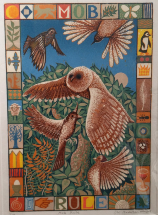
Mob Rule – Jim Anderson
The variety and softness of colour on the nightingales and the owl is amazing! I’m really curious to know how many layers this cut took – the attention to detail is incredible. The sky has this beautiful gentle blue gradient, and the smaller images that frame the birds are so beautiful. The colours that Anderson has used clash off each other so beautifully. His work has this fantastical feel about it which, I have to say, is something that is often missing from mainstream linocuts and wood engravings, and is something that I have always loved about Ravilious. ‘Mob Rule’ reminded me of this image (here we go):
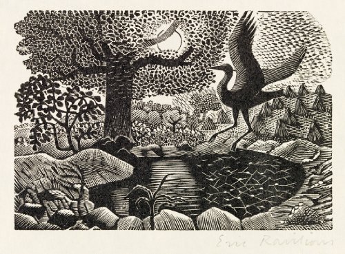
This is ‘A Heron Landing’ by Eric Ravilious, created for an edition of the “Natural History of Selborne” by Gilbert White.
So it’s black and white, but it still has this real dreamlike quality about it, and I for one just can’t get enough of it – there’s so much movement in it, and it’s just lines! Anderson’s work has the same effect – but the cutting technique and the way in which he has printed his work is much softer. Whilst Ravilious uses nature as his subject, I’m pretty sure that Anderson has more to his ideas than what’s directly in front of him. There’s definitely satire and I reckon a bit of a weird sense of humour thing going on in there which I really like.
#gallery-0-7 { margin: auto; } #gallery-0-7 .gallery-item { float: left; margin-top: 10px; text-align: center; width: 33%; } #gallery-0-7 img { border: 2px solid #cfcfcf; } #gallery-0-7 .gallery-caption { margin-left: 0; } /* see gallery_shortcode() in wp-includes/media.php */
I’ve spent a silly amount of time trying to figure out the connections between the main images and those around the outside and whilst I have come up with links for some, I’ve stopped because it’s maybe a bit weird and there probably isn’t one. But it’s not very often that I find work that makes me stop and really, really look at it and analyse it – and that’s usually because it just doesn’t strike up any sort of spark with my imagination, and this really does.
Lastly, I noticed when reading about Anderson in the gallery, that he won the 2016 T.N Lawrence prize in the RE’s annual exhibition for ‘Sargasso’ (below). Whilst it’s not coincidence of the year or anything, it made me smile because when I first moved to Brighton I got a job in Lawrence’s. It was there that I was introduced to the world of printmaking and if it wasn’t for that job I wouldn’t be printmaking now. Anyway, Jim Anderson sent me this image of ‘Sargasso’, along with the images that I’ve used in this post (thank you), and I hadn’t seen this one yet. I’ve added it in because THE GRADIENT! Particularly on the white, I really do love it.
Please, if you get a chance, go to either Bankside or For Art’s Sake Gallery (both in London) and see these prints up close. They really are amazing.
I was in London a couple of weeks ago, visiting Bankside Gallery - the Gallery of the Royal Watercolour Society (RWS), and the Royal Society of Painter Printmakers (RE).
#artists#bankside gallery#eric ravilious#jim anderson#linocut#linocutting#printmakers#printmaking#prints#Royal Society of Painter Printmakers
0 notes
Last Seen Blogs

fursttimes
1stTimes
beecryptic
QSMP Sideblog

gourmeted
Gourmeted

dailyngequotes
1 EVA quote a day keeps Instrumentality at bay

bil7ub
بالحب