#the sketch was great but too messy which made the lineart difficult
Photo
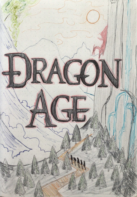
Dragon Age cover page from my bujo, mainly based on da2 loading screen for chateau Haine
#dragon age#da#da2#dai#dao#bujo#bullet journal#I love how the letters turned out#everything else kinda meh#the sketch was great but too messy which made the lineart difficult#but now I know for next time#mabari also with the party#the sun is based on how it looks in the korcari wilds#date : august 2022#clearing out some queuests
2 notes
·
View notes
Photo

Since i got nothing to do this afternoon,i took on the @sealbatross challenge, but instead of drawing Stan, i did Ford instead
Since you can’t have his bro without his twin!
They aren’t exactly as equal as their orginal artist’s style, but i did my best!
The rules are simple
1: no tracing or copying
2: Try some different poses or expressions
I went with mugshots beacause i didn’t totally skipped this rule, no sir, i did not
So here we go!

@kiki-kit
This was relatively easy to make since we have very similar styles, but i gotta love how smooth and clean their lineart is
The style is very recognizeable and rounded with a great attention to detail,with a small yet cool color for shading
It made me slowly enter in the mood for this challenge and it helped my hand relax for the anxiety i was feeling of “not being as good as theirs”

@hellmandraws
Oh boy that was fun! I think this is my favorite of the bunch and i cannot express how much fun i’ve had with this one
I love how simple yet so awesome their style is and how clean the lineart is, i also love the attention to details in shading and the huge care even for the smallest of details
10/10 would draw with this style again

@eregyrn-falls-art
Another banger
This was fairly easy and fun to make, i only struggled with the shadin beacause i couldn’t find a brush similar to the shading tool that has been used so i guess we just had to stick with this :/
I just gotta love that half smile, it always melts my heart and it gives me some late 50s/60s PSA or commerical cartoons vibe
(also that jawline is THICC)

@sealbatross
i obviously add the creator of the challenge
It was a nice cooldown after i went out of my comfort zone, which is a thing i did multiple times during this challenge XD
I love this sharp and blocky style and the similarity between their arty and the doodles made by Alex when he goofs around or even makes them during charity events
It was really nice and solid to make and i loved it

@siriuslyart (or siriuslymeg i dunno)
This one is my least favorite, not beacause i think the style is bad, mind you, but beacause it’s the one i screwed up the most
I like how polish and clean their sketches are and i tried my best with it, also i love how they draw the jawlines and the teeth, UGH! it melts my heart!

@sleepsentry
I have been firends with them for quite some time now and i thought i wanted to bring some justice to it by drawing something in their style
It helped me to come out of my comfort zone, trying watercolors instead of markers and clean colors
It was a fun challenge and it made me shape interest in doing painting more often!

@smudgethistle
I’ve always loved her style and how intriguing it is, this is sort of semi-realistic style with some nice watercolors that give it these washed out and bleak tone to the picture as a whole
It was fun to come out of my comfort zone once again with this one just to show how much i love their style and them as a person
(also sorry if i forgot the glass holders or however they are called, i miss them like 24/7 when drawing)

@gruvu
And last but not least we have the moth boy itself, Gruvu
I love how messy his style is and how manly his characters always look, and that jawline that cheeckline that’s so good but so difficult to draw, holy frick!
It helped me cool down too and it was absolutely amazing to draw with this style
Welp, that’s pretty much it, if you want to add some feedbacks or comment about the artworks, especially if you are one of the guys i just mentioned,let me know
(Reblog are VERY welcome)
#gravity falls#ford pines#stanford pines#grunkle ford#ford tumblr art challenge#fta challenge#5 hours of my life well spent#oh gosh though it took me a lot#it was so much fun to practice them all and try new thigns#especially watercolors#like#watercolors are the shit man#i love them
212 notes
·
View notes
Text

plan from July:
-Drawabox lessons 4-5 (two weeks each - 2 pages of insects per day) ✗ finished lesson 4 except for the very last insect drawing
-finish 100 heads ✓
-studies for Shepard: textures, hands, draw mass relay, red/blue lighting ✓ (kinda - mostly focussed on hands though)
-study people interacting with everyday objects (hands) ✓
ACTIONABLES: use more references✓, plan out multiple light sources better✓, clean up lineart✗, reference faces/necks/hands in particular✓, figure out a less cartoony way of drawing eyebrows✗, try to define edges on faces more when painting✓, keep going with composition✗, try to do background in two sittings (?), study textures more (ongoing)✓, more figure drawing mannequinising stuff✓
Overview of August:
finished 100 heads challenge, nearly finished lesson 4 of DAB. Drawing all the insects has helped me analyse stuff better and also has improved my sense of 3D->2D space. Redid a few of them until they made more sense, which I think is probably a very important thing to keep doing at this stage of development.
Figure drawing improving. Need to keep trying to mannequinise them instead of falling back on ~the intuitive way~. Path of great resistance but great reward. Gave self permission to focus on interesting bits and not worry about finishing each figure. Thinking about 3D and hip/torso orientation is helping my unreferenced sketches too, which is nice.
Drew a bunch of hands but they were kinda too sketchy to actually help go to something more precise. Quality of hands in my finished art varied WILDLY this month, although they mostly look 'ok'.
Put the stuff I learned about head structure into practice with a painting - was good to actually try out defining nose/eye/lip planes. Need to keep practicing this, though, and not sure how much focus I'll be able to give it. aaaaa
During the painting, I also used lots of references (although my ability to use the information was pretty limited), tried to represent texture and learned how to blend in a more smooth way. Even though I'm not super happy with the way the finished thing turned out, I did get presented with a lot of new information - hopefully I'll retain some of that.
September plan:
finish DAB Lesson 5 (multiple pages per day if possible so I don't lose momentum)
study whatever the next step in the Radiorunner curriculum is
do 30min figure drawing/other studies at least 15/30 days
finish that damn comic
sketch out/thumbnail every prompt fill for October prompt lists
probably a busy month, but I got this!!
notes and improvements from finished stuff:
orochimaru: hands SUPER off and ended up being 'eh, kinda looks like a hand, whatever', forearm connection is kinda fucked, lines too messy/pointy to look graceful, hands don't really look like they're interacting enough
good points: tried several iterations on a difficult pose, arm movement is relatively clear, sense of energy
kylo: values WAY off & look washed out (I THINK because the background has more contrast??), hand is completely fucked up (too wide and lighting doesn't make sense on it), glove doesn't look like leather, mouth too low, cutout effect isn't done well (+ it isn't obvious whether it is a flat graphic effect or a physical sheet in front of him - drawing a thin shadow on his face didn't help here), level of messiness in foreground/background and kylo is uncomfortably different
good points: I really do like the colours (hues) even though the values are messed up, nice sense of energy from brushstrokes, the detail fadeoff in the shadows looks intentional (I mean, it was)
femshep: shadow values went too dark too quickly bc I wasn't sure how to handle multiple light sources, sunk-cost fallacy w/ left eye and/or nose (facial features are in different perspectives), overall shapes not interesting, neck connection to body is wrong, near shoulder looks dislocated even though I took a photo reference (possibly related to the neck being wrong - or maybe the strap going across her chest is oriented wrong too & flattened out), background looks messy, composition is boring, clothing folds aren't realistic, shading is too soft
good points: at least there IS some texture to everything, I LEARNED HOW TO BLEND, facial features are overall painted pretty well, nice transition between lightsources on face, hair texture and placement of texture looks really good, somehow the hand came out looking 3D with minimal effort, tried to do a lot of things I had 0 experience with and learned a lot
ACTIONABLES: CLEAN UP LINEART, reference/learn about neck-body connection & shoulders, mannequinise figures, take own clothing reference photos for exact pose instead of trying to abstract existing images (not skilled enough to do this yet), draw hands, study leather texture in particular (since it's a common material), start drawing in greyscale again
1 note
·
View note
Last Seen Blogs

t4oatlmboy
Untitled

fotoacervo2904
Pessoas bonitas - Beautiful people

html-action
HTML Action

infinite-chump
We can catch every lion with at most one exception

makoto-shinkai
moved to booyoungs