#the typography is so nice too! this looks so elegant :')
Text
Today is presentation day!
Here are my works so far.. to be honest i didn't like them : D i like the poster and the fonts because i tried my best so i like to appreciate myself hehe.. but for the Instagram asset.. I don't really like em since i kinda rushed and like .. don't really try my all on em.. so yeah i don't like them.

This one ks the outline, so you can really see their anatomy.. Thi it's really are messy.

Poster & Instagram asset..


My font name is Glints Serif ✨ because i want it to shine the brands or the typography people made. And yeah of course because of their sparkling accents.

I made the poster in black and white so my fonts will looks contrast and look more shining 🌟. And for the corner i put the highlight/the unique parts of my font! So when people take a look at the poster they'll notice the unique parts first then will get interested (hopefully) with the font. I also use a little purple because purple is represented as elegant.
As for the first Instagram asset, i tried to show some of the DNA for Glints serif (that's also count as USP) and also show the type and the type in ghlyps mode/beautiful version.
As for the second asset i tried to show them in all different way of use. Like for the branding, in the gradient, and even for the food with contrast color.
Here are the feedback for my fonts ✨
For the poster it seems that the elegance is true but the stylist and attractive is subjective and it is! :D... And the sparkles on the poster (the one that not the parts of my fonts) is distracting so gonna throw em.
For the fonts Q and J have the same serif's DNA, it looks nice on Q but not on J so gonna revise the J.
The S corner is nice so better try to make that as the serif's DNA like for C and G.
The i dots its too far. The lowa cas it's not working! Better to just use the uppercase.
For the Instagram asset
Don't need to make them all have beautiful version. Just some of it is perfectly fine.
Dont need to make the caption for it (like regular versions/ghlyps version)
Be more playful with the in action, try different way to use em.
For the gradient one it's too much, better to try to use the color in the picture.
For the fashion one, don't make it like copying Vogue, try different way to use it.
The sushi one is.. it's typo 😂 joke aside, the image is too much that they'll focused more to the image rather than the font. Don't use the image too big. And yeah for the food, the lower case is work.
Also i need to be more careful for the display. Don't export it as pixel bc it's look a bit blurry. And be careful with the printing bc i printed them with the wrong size.. my bad.. also for the cutting.. there's still white paper left, be careful and be more beat next time !
0 notes
Note
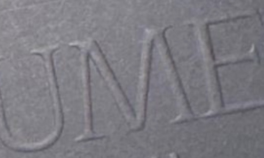
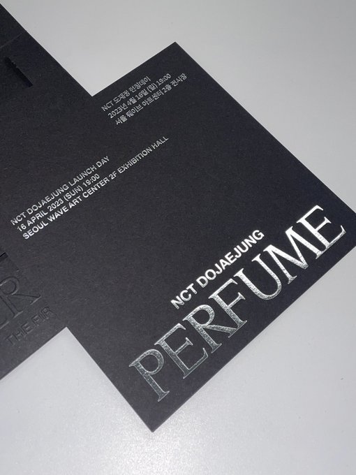
Haha yes, perfume is too literal even for a non-english speaker like me. And idk if it’s personal taste but i just don’t find perfume to sound beautiful. When you pronounce it, it doesn’t has a nice ring to it. And the font.. it’s really easy to make serif fonts look tacky nowadays because a lot of companies and designers promotes modernity, simplicity, elegance, cleanliness with sans serif (it’s basically just more popular nowadays but with reasonss). Not that you can’t use serif but look at the huge serif of the perfume font. It’s making it too crowded and it doesn’t help that the designer puts the letter very near to eo. Is it intentional? It’s way too sharp, looks like fork to me. The M and E is the worst. M reminds me of the mummy movie. Honestly this looks similar to the font I’ve made in my typo class. Especially the serif part. I still hate my font from back then with passion. (This is just just my analysis on the font, no hate intended tho i do hate the font🥲)
But the best part is I think it’s the only thing i find to be annoying. The bottle reminds me of lego people which cracks me up every now and then but honestly it could work with better typography. For the logo I think they want to give the imagery of love. And for the other promotional stuff, I don’t analyse it (photography and filmography is still a mystery to me) but I like them so far. Especially starting from blotter papers ( my fav is doyoung’s). I don’t remember much about tge bunny moon video. I like jungwoo’s the most for the musical film poster. It looks like coming of age movie poster. And his expression fits the quote very well. Something about sharing this love story with just us? Haha too lazy to open twitter now. And of course we’re getting lots and lots of doyoung. This promotion is getting me to be interested in jaehyun and jungwoo more as an individual artist and tgeir personality as well. I’m opening my senses to you jaehyunnnnn
You are right, the chosen font is too "toothy" for a love theme. Here what a font library gave me for "perfume". Mostly flowy, "handwritten" fonts to resemble spirals of aroma in the air and hint at a "personal touch".
Another direction is "clean", "classic", "sophisticated".
People react to lines, lines have character. Fonts is a difficult science to master (I suck at them, personally), but that's precisely why you shouldn't trust your inhouse "all-rounder" designer and hire a pro.
The bottle is generic, it's passable. I thought that there was an opportunity to tie the space/Moon theme in - make the bottle circular with rounded grooves or a narrow crescent on top to resemble a shape of the spacesuit helmet. Stylised enough to not be literal, just a hint at the shape.


I don't know if SM will really go for "homesickness" as fans proposed (at this point, looks more like they won't), however, space travel indeed has a strong association with it. Lovers separated by a journey is a long-lasting trope (a sailor/warrior and his wife, a knight and his ladylove).
I don't much like the bottle on the black cover because the cover is ultra masculine and dominant, meanwhile the rest of the image we are presented with is not.
The photographs and the videos are pretty good (except those pictures with weirdly angled limbs, from the "we sell clothes" series, the bar was lowered there). SM has a roster of good specialists it can contact quickly. I've watched a video with a Japanese MV maker, where he said the usual time frame is two weeks for everything, from the concept to the shooting. Therefore, they can do what they already know well quickly.

I think the problem with the logo and the fonts is that noone in SM (or, rather, among those who worked with DJJ) is aware of the problem. The logo had to be created quickly to handle it to the companies who prepared invitation cards and the bottle sculpture, who did the 3D rotating model for IG, that's why, I suspect, it was done by an inhouse designer.
The idea of the logo is not bad, I agree that it evokes "love knot" association. It looks OK in a small size and in 3D with moving reflections. Both hide the mistakes in lines and distances. It's like a circular shape with uneven wobbly edges against a proper circle. The circle is a perfect shape, the wobbly thing is not.

For me it's Jungwoo - Doyoung - Jaehyun.
Woo's is indeed like a scene from a drama, like he is looking at someone, they are having an intimate dialogue in an empty classroom. This Woo instantly resembles the Woo in his first MV cameo. (I guess they aimed for it).
Doyoung portrays "commitment" well, he looks like he waits, in pain, for someone. Stoic, but sad. Jaehyun is his romantic self, however, we saw better pictures with this angle, and the pose doesn't reflect "passion" well.
Still, it's just posters for socmed. It's appropriate quality for the task, with a lot of attention to details (the text, the phrases), so no complaints (the main font doesn't match the words well, but it's the album title's font, so it's just a passed down mistake).
1 note
·
View note
Note
book meme! 1, 2, 5
book asks!
I answered 1! Rambled a lot about it, actually!
2: top 5 books of all time?
How
dare you
come into my house with this question.
UGHHHHH okay. Okay. Let's try and work this out.
Dune has to be on there somewhere, I know that. It was too big and too cool and too interesting, even at thirteen years old, and even not being able to pick up the sequels for years afterward! Neuromancer, too, because cyberpunk is too important to me, and I still regularly think about lines from this book just in my day to day. Memory Called Empire probably makes it on here because it's just too much of My Shit in too good a package. I'd like a fantasy novel on there somewhere... but while I remember loving a lot about Name of the Wind and that prose still absolutely slaps, it's been a long time since I read it. I really really loved Leckie's The Raven Tower like a LOT, so honestly that might be up there -- it ticks a lot of boxes for me, in terms of structure, and perspective work. And I thiiiiiink I gotta throw The Long Goodbye on there too. I gotta go through all of Chandler's books at some point, honestly I barely tapped the surface, but there are moments in Goodbye that I remember hitting me like a truck, and I can't set that aside.
But then Caves of Steel doesn't have a spot, and that's... well, it has its problems, but I loved that fucking book, right? That was the basis for everything I thought was cool for like ten years! And I have a real soft spot for Voice in the Whirlwind too, I rarely talk about it, but parts of it live rent-free in my head at almost all times. When he finds out where his training comes from? And then when he takes that shot in the crowd?! Holy shit.
FUCK YOU JADE THIS QUESTION SUCKS I QUIT >:(
5: where do you buy books?
Digitally? Wherever. It used to be Amazon, before they took away my account (don't ask) and these days it's usually Google Books or Kobo, and I transfer them to my now-ancient Kindle Paperwhite if I'm feeling spicy.
Physically? For common editions, just wherever I can find 'em online. Barnes and Noble is nice but they tend to overcharge.
For the really nice editions? The Folio Society. I've gotten four or five editions from them, including an old one from years ago long out of print, and they are exceptionally beautiful, well-crafted pieces of art. Solid bindings, elegant designs, great artists. I like how they handle t their typography. And they're on the cheaper end of "nice" too -- you can pick up one of their cheaper editions for between fifty and eighty bucks, and those are absolutely no slouch!
God help you if you want to get a hold of their more expensive editions, though. I've never gone there, I probably never will. But they look real cool.
6 notes
·
View notes
Text
9 Essential WEB SITE DESIGN Methods for DIY Beginners
Let’s get right down to it, shall we? Below are a few of the very most useful styles and guidelines to learn when building your first website:
1. SET ASIDE the Mouse, GRAB a Pencil
Your site may already exist as a lovely, complete entity in your mind which is the reason why you immediately leap into Photoshop (or worse, an internet browser and HTML) to plan it out. Whoa, whoa-cool your jets for another! Don’t place the cart before the equine. First, get out a pencil and pad of paper and start putting your ideas into something easily tangible. That is an important stage to map out the framework of your site using only rectangles, doodles and influenced ideas (categorized as wireframing). Things can be very tough at this time; no one’s heading to view it nevertheless, you.
It is more easily at this time to alter designs you originally thought works however now discover are cluttered and confusing in writing. This can save you many hours of disappointment instead of making the same finding after the site is coded and in a web browser. Plus, it can help significantly to create a web page when you have research at hand to seek advice from rather than moving in blind.
2. Follow a Hierarchy
It’s an undeniable fact that a lot of web surfers tend to only check out webpages rather than take time to read everything. You should be ready because of this by placing the most crucial content first. This means that a consumer can break down the most essential information on a full page all in a single screen on preliminary load, and never have to focus or scroll. That is, of course, easier said than done. Here are some tips to help you better understand the significance of the design theory:
Keep Content “Above the Collapse”
We call that preliminary display of loaded content “the fold”-and everything below it that must be scrolled to be observed is considered supplementary. Generally, your most significant information rests “above the collapse”. The crucial thing to perform within this area is to entice a consumer to do this or generate the motivation to scroll down further.
Utilizing a “Hero” Image
A common trend in web site design nowadays is to fill this “above the fold” area using what is named a “hero” image or banner. They are full-screen history images with very succinct and to-the-point overlaid text messages, usually combined with a call-to-action button. Feasibly the whole purpose of the net web page could be included within this banner area, although it also acts as a great primer for this content to follow.
“The Collapse” May Change With regards to the Device
Here’s where things become complicated-and why you shouldn’t overburden yourself attempting to match everything above this marvelous line. Concerning the user’s device, the display screen sizes could differ greatly. A jaw-dropping 5K screen has a vertical quality of 2880 pixels, whereas an iPhone 5 has not even half of this. This means that mobile users just aren’t heading to have the ability to fit as much content to their display real property. (More upon this later.)
3. Typography Is Your Design
Unless you’re owning a photography business, the text is the solitary most important component of any website, so it’s important to get this done part right. Your web page’s hierarchy is greatly reliant on the typography you select: how your headings, subheadings, and body text message follow an all-natural circulation and stay aesthetically distinctive in one another
Make sure the written text is legible (avoid flowery fonts!) and large enough (usually around 16px for your body).
Stick to only two fonts-and make sure they set well together!
Give your paragraphs some room to inhale between one another, and arranged enough top cushioning or margin on your headings to symbolize clear breaks in content.
Avoid long lines of text. It’s easier on the eye for paragraph lines to be approximately only 15 words long-and a little significantly less than that for mobile displays.
Serif fonts are usually best only in print-unless they may be found in large headlines on the net
4. Colors & Comparison Are Crucial
We’ve discussed color mindset at length, however, the idea bears duplicating. The colors you select for your website play a massive role in how users understand your brand, as well as how motivated they could feel in taking action (i.e.: buying things) through your website. Why? Well, every color evokes certain feelings, and either for their natural character or by social fitness, these colors have grown to be associated with certain types of businesses. If a children’s toy company or a financial consultant painted their whole website in the stark dark, it could send the incorrect indicators with their meant viewers. Around the flipside, a shiny orange or an enjoyable blue, respectively, would catch the perfect firmness and consciousness for his or her customers.
If you’ve already established the colors of your brand, use those on your website then. It’s best, however, to keep it at only three colors for your site; like fonts, you don’t want to overdo it here or your site could finish up with multiple personality disorder. Also, be skeptical of way too many splashes of color across your website; our eye is attracted to them like honey traps, plus they could interrupt the natural movement of your articles. Use color only once it is most needed, such as links or control keys.
In contrast, your text message must stick out from the backdrop. Using light greys, yellows or greens for your fonts will likely render them unseen on the web page. Black on the white background is the foremost combination of comparison and is normally what you ought to stick to.
Additionally, you want your text message to pop against background images. Using very occupied photos can distract from the written text, to avoid this issue either use less comprehensive photos or use an overlay of, say, rgba(51,51,51,0.5)to help soften the image within the text.
Contrast also is important in how users are attracted to certain important elements of your site. Your most significant call-to-action control keys must get attention through the use of contrasting colors. A blue “Buy Now!” button manages to lose its urgency and well worth it when it's swallowed by a niche site that uses blue everywhere-but a red button on that same web page grabs a user’s attention by shouting “Hey! Click me!”
5. Using Pictures
Deciding on the best images to use on your website partly boils down to your artistic aptitude, but there are also intellectual considerations to consider that should assist with your selection process. First of all, avoid embellishing your site with extraneous photos because they could look nice. Instead, think of how each image you utilize serves its purpose, and how it functions as content. A well-chosen picture can convey your brand, service, product, or audience a lot more effectively than words. Use photos to help your users understand something, to evoke feelings, or even to inspire trust and self-confidence; with them solely for visual reasons should be supplementary.
Understanding Document Types & Compression
There can be an extra step that must be taken for using images on the net. Those elegant photos you have from sites like Shutterstock and iStock could be very substantial (5,000+ horizontal pixels and 10+ megabytes in proportions) which is okay for printing, but they’re unfit for websites. Not everyone has superfast Dietary fiber Internet, and that means you must decrease the size of your images to support for launching times (not forgetting 40% of site visitors will leave if the website takes much longer than 3 mere seconds to weight!). Typically, you want to keep each of your images at no more than 500 kilobytes in proportions, though your average quality should of times be around 100 kilobytes.
JPEG is the typical format for photos. It is a lossy format, this means its image quality is reduced when compressed. If you’re utilizing a JPEG for a full-width history image I quickly recommend keeping its horizontal quality at a minimum of 1200px. For general purposes, stay away from any image with significantly less than 600px horizontal quality, as it'll likely show up blurry on modern displays.
PNG is the most well-liked choice for images or for images that want transparency. It is a lossless format, which is ideal for keeping image quality but may also greatly increase document sizes. Generally, you’ll use PNG images for illustrations, symbols, or smaller images that may be stacked together with other elements for their transparency. You’ll hardly ever need a PNG to be bigger than 1000px.
SVG (Scalable Vector Image) is a more recent format that is changing GIF and even PNG in some instances. SVG wonders that it could be as large or as small onscreen as you will need it to be, all while keeping perfect clearness and crispness (but still be a little quality). You should think about using SVG for just about any logo design, icon, or vector visual on your website; as high DPI shows are becoming commonplace, the sharpness of SVG provides the best image quality.
6. Mobile-First Design
We’ve now reached a period where most people consume online quite happy with their cell phones rather than on the desktop computer. As a total result, there is much larger precedence in web site design to tailor specifically to the mobile experience, which has resulted in the “mobile-first” design viewpoint.
This means that essentially, throughout your initial sketching and planning phase in some recoverable format, it is best to focus on the site’s mobile layout first. Only the most crucial content necessary for the functioning of your site will be displayed on smaller screens. This causes you to simplify your design and slice out any distracting elements immediately. Think back again to your “above the flip” content: if you first ensure that the important info can fit on the original screen of the phone, then you’ll know for several it'll fit on bigger displays. Once you’ve nailed the fundamental mobile layout, you'll be able to start adding in embellishments or bigger images for desktop displays.
Your mobile layout assumes a far more vertical design that inspires scrolling, as opposed to the wide landscape of the desktop. If, say, your product web page displays entries in a grid of 3 across on desktops, then usually your mobile layout will display them as only a single column.
Yes, which means that you essentially need to produce several layouts for every web page of your website. Fortunately, a worthwhile website contractor should provide reactive templates that change these designs automatically so you’ll then just need to fine-tune them.
7. Keep Things Aligned
When elements appear sporadically laid across your site it is often due to an alignment issue. Imagine your website on the sheet of graph paper. Individual it into even columns by sketching, for example, six right lines. You now want to ensure that the remaining sides of your elements are distributed and aligned to only these six vertical lines.
8. Keep It Simple
It is said that the best web site design moves unnoticed; it is a poor design that phone calls focus on itself. As stated earlier, the main facet of any website is merely its text message. If you can offer outstanding typography that is a joy to learn, you won’t do much more. Wanting to overdesign your site will just mess and complicate things.
Are the package shadows necessary? The crazy, ornate patterns? A large number of colors? Not probably.
9. Big Open up Spaces
Your articles need room to breathe. White space is the prevailing design choice for modern websites: wide, open up areas of nothingness to pad areas between content. It’s a far more pleasant way to process information, looked after stimulates you to eliminate superfluous text messages and images to keep carefully the site clean.
Get more advice Thought Media is a leading Chicago web design providing professional website development services, and one of the top SEO companies. The agency has worked with hundreds of clients all over the world! Creating high converting website designs, providing reliable website hosting, and successful Search Engine Optimization Marketing campaigns!
Conclusion
Web site design can be considered a sprawling field of technology to learn, ideas to practice, dialects to review, and artistry to understand. Only with experience will all of these components start to make sense, however, you already are well on the way simply by grasping the basics of why is a good website work. I am hoping that guide acts as your launching-off point, which offers you the self-confidence to consider your website into the own hands and build it just how that only a business proprietor knows best.
1 note
·
View note
Text
Best WordPress eCommerce Themes for Bold, Effective Online Shops | Templified
New Post has been published on https://templified.com/best-wordpress-ecommerce-themes/
Best WordPress eCommerce Themes for Bold, Effective Online Shops
You’ve got plenty of options when searching for the best WordPress eCommerce themes.. For many, it can be time consuming to wade through allthese themes to find a real winner. We’v done the hard work for you. Our goal in creating this collection of WordPress eCommerce themes was to pick out the best. Themes that look great and perform even better.
WordPress is the most popular blogging platform anywhere. It’s dominant and it powers almost one third of the web. Many of those websites are eCommerce sites. No matter which eCommerce plugin you use, WordPress can handle the job with ease. Some folks swear by WooCommerce, some by Easy Digital Downloads. Some go with Cart66 or the eCommerce Shopping Cart. That list isn’t exhaustive. There are tons of other carts available like Ecwid, PayPal, Ecommerce WD or the Selz Cart. Whatever you choose, this list of themes is going to rock your world. With that rise in popularity, there’s been a rise in the number of themes available. You just have to pick the right one. Some of these themes are useful and functional. Some are not so good. We’ve set about trying to find the best themes and put them in this collection.
Every one of these themes is responsive and they each offer a little something different. Style, features, audience, functionality. There’s a lot of variety out there. I hope there’s something for everybody in this incredible collection.
Divi
Divi is a theme that can simply do anything you ask it to do, so we’ve included it in this eCommerce WordPress themes collection. I couldn’t find a great example in Elegant Themes demo section, so I found one out in the wild. This is an actual real live use of Divi by a buyer of the theme. It looks pretty nice as a watch shop, so I’m imagining it’ll look pretty sweet for just about any product. You’ve probably already heard about how powerful Divi’s drag and drop page builder can be, but page builders can scare some people off. While the flexibility is nice, it can be intimidating to attempt to design your website from the ground up. Luckily, there are tons of pre-designed layouts you can choose from if you’re worries you won’t be able to set your eCommerce site up yourself. This theme is likeable for many reasons, swift support, succinct documentation, handsome designs and the fact that any style website is possible.
Demo More Information Get Hosting
Space
This well built, easy to use, adaptable, modern and stunning theme enables you to contact customers, supervise shipping and your stock, market brand new products, expand your small business and market old products and a lot more.
WordPress is an excellent method to start or rebrand a business online, even if you don’t happen to be a specialist in programming, because it may be straightforwardly adjusted to match your preferences. This modern style looks exceptional on any device since it’s designed to be responsive. If you’re setting up an online business, potential customers are obviously vital and enabling them to gain access to your website at anyplace at any time is crucial.
WooCommerce offers all the equipment that you need to start a business fast and effectively and this eye-catching, well-designed and trendy eCommerce template is the 1st step on a path to developing your own business. No matter if you are selling boots or shoes, clothes, gadgets, downloadable items like films, video, mp3s or software program, this theme is an ideal selection because it’s so flexible.
Demo More Information Get Hosting
MF
Okay, here we go, the highest rated WordPress business theme. It’s called MF and it’s a clean, corporate style WordPress theme for any sort of business. MF theme has been updated often since its initial release. That means that it has kept up with the times and with recent WordPress changes. Keeping up to date is important for a WordPress theme, so MF covers that base.
There are quite a few homepage Styles included. Each of them has the same flat, corporate style. But, they all deliver a little different look and feel for your website. Each demo style is easy to install. It just takes a couple of clicks. If that’s too much, the developer even offers free theme and a demo installation. That’s a nice feature that can help you get started with a clean, corporate website. If you are a beginner at WordPress, it’s worth looking into. I remember the first time I tried to install a theme, I wasn’t sure what I was doing. For many of you, that might not be an issue. It’s nice to have as a fallback, just in case you should happen to need that service.
Demo More Information Get Hosting
Buyvilla
For folks who are looking to set up an online e-commerce shop, WooCommerce is often the tool of choice. There’s a good reason for that, working with WooCommerce, you can establish any sort of online shopping center that you want. The tools are flexible and dynamic, easy to use and Powerful. Ultimately, you can extend WooCommerce with dozens of different add-ons, giving you all the tools you need to have a truly professional shop. You could spend thousands on a proprietary system, but the free WooCommerce setup is a really nice option, particularly for people who are just beginning the process of setting up a shop.
If you want to see more of the best WooCommerce agency themes, check out our full collection of themes. The themes in that collection all offer a smooth user experience, they are the absolute top themes that you can download. If you want to achieve your goals, finding a theme that is acceptable is the first step. I believe there WordPress theme is a critical component of any successful business. If you are theme is not well put together, if it is scattered and unpleasant to look at, if it is not adaptable or user-friendly, what good does it do you? The first step is always the hardest, but bringing visitors to your site and showing them unorganized, feature filled website can keep them interested in what you have to offer. Making a fantastic first impression is what these themes are all about, and that is a big part of the battle.
Demo More Information Get Hosting
UX Shop
UX Shop shop delivers a fantastic experience for buyers and sellers alike. This theme, which has a perfect five star rating on ThemeForest by the way, allows you to create a multi-vendor Marketplace. That means you can’t allow visitors to register and sell products on your website, sort of like Etsy or eBay. That’s a new trend over the last few years but it’s growing in popularity.
This responsive business theme is an all-around eCommerce solution with Page Builder and responsive design. This theme support touch sliders, typekit, WC vendors and visual composer two. The awesome design quality of this WordPress theme has the potential to help your website perform better than you could have possibly imagined. Not only is it incredibly clean and easy to use this shopping cart theme, but the development support is fast and friendly too.
The UX Shop WordPress theme as an incredible design places to work from, it has the ability to mold itself too many different styles, so it really doesn’t matter what you are selling with this template. There are product slider images, One Click demo data import, support for type kit, WPML support and content sliders 2. The products list are clean and well-organized, there’s an advanced grid system for your shop and this theme is incredibly developer-friendly too. It’s well-documented, the support is fantastic and I think the same could be used for any purpose.
Well I think this template is very, very attractive, the fact remains that not all themes are perfect for every one out there. We all have different wants and needs and new theme is guaranteed to deliver everything to everyone. That’s why we’ve created so many incredibly large and thoroughly researched theme collections.
DemoMore Information Get Hosting
Oxygen
Oxygen is one of the best simple, clean and elegant themes I’ve ever seen. This Oxygen theme can be used for nearly any type of eCommerce site. Fashion or electronic gadgets, hand crafted gifts or jewelry, it hardly matters what kind of product you’re selling. The overall style is so clean and fresh, your products will look incredible. It’s a very big challenge running your own online store so Oxygen helps you make the most of your precious time by making it whole process of managing your store as easy as possible. You have tons of options to create a custom look for your store with multiple headers, almost unlimited typography choices, unique layouts and more. Oxygen has been sold over 3,000 times and it’s rating is 4.86 so you can tell this is a high quality theme.
DemoMore Information Get Hosting
Marketify
Marketify was one of the first WordPress multi vendor marketplace themes and it’s still among the very best. Marketify is the premier solution for creating a bold, daring, professional and well-appointed multi-vendor WordPress marketplace and we’d love to show you what this theme is all about. With thousands of sales already under their belt, Astoundify (that’s the folks who made the theme) have released version 2.0 and it’s got even more great features. The responsive layout was completely revamped, the latest EDD extension w06ere updated, security was tightened and a lot more. Marketify is completely loaded with layout possibilities (they actually use widgets instead of a plugin like Visual Composer), so you still have the flexibility to create more awesome designs. Easy Digital Downloads is supported of course, with it’s front end submissions, commission settings, reviews, a store wallet system, recommended products and wish lists, just to name a few great features.
Demo More Information Get Hosting
MartFury
Hey there, this is another review of a high quality multivendor WordPress theme that we’ve just discovered. It’s been around for a while now, but it’s new to me. It’s name is MartFury.
MartFury is a very popular and highly rated multivendor Marketplace team that was released in early 2018. So far, it’s proven to be among the most popular and well-respected Marketplace themes around. This team has been downloaded well over a thousand times and its rating is almost 4.9. MartFury is modern, it’s flexible and it harnesses the power of WooCommerce to allow you to create a dynamic and fun Marketplace to sell products. It really doesn’t matter what type of stuff you want to market on your website, MartFury works perfectly. With Dokan, WC Vendors, WC Marketplace or any of the other leading multivendor Marketplace plugins, you can establish professional site quickly.
Here’s what the developer has to say about MartFury.
Martfury is a modern and flexible WooCommerce Marketplace WordPress theme. This theme is suited for multi vendor marketplace, electronics store, furnitures store, clothings store, hitech store and accessories store… With the theme, you can create your own marketplace and allow vendors to sell just like Amazon, Envato, eBay.
Here’s another set of themes that might interest you, it’s our collection of multi vendor themes and it’s a great place to find just what you’re looking for. We’re adding more and more themes every month, so check back to see what’s new! Perhaps you’d rather see some more outstanding WooCommerce themes? No matter which collection you look at, you’re going to have a wide array of high quality themes from which to choose. So, why not get started today?
DemoMore Information Get Hosting
Oshine
Oshine is a theme that gets a lot of attention on ThemeForest and I think it deserves to. There are a lot of reasons why and we’ll get into a lot of them. This theme is a true multipurpose theme with dozens and dozens of demo sites to show what Oshine is capable of. There’s a photography demo site that comes with just about every theme, right? Well Oshine gives you several, there’s a minimalist style, a full screen photography style, designer portfolio and ‘new style’ portfolio and video agency portfolio and a bunch more too. There are plenty more, creative agencies, modern business, restaurant and café sites, winery, gym, multiple different creative agencies, app landing pages, wedding templates too. You get a ton of demo sites and every one is eCommerce ready to help you start your online shop.
Demo More Information Get Hosting
Material
Material is a nicely crafted theme that uses WooCommerce, or the shopping cart of your choice, to allow you to sell most any type of product you want. It was designed with electronics stores and gadget sellers in mind, but why stop there? Any online store that wants a clean, sleek look will love this theme. Responsive, well organized and modern, Material is the kind of theme that can be adjusted to fit the look of an existing brand. So if you already have a brick and mortar presence and you’re looking to expand to eCommerce, this theme can really help you get the job done. Material’s developer, JWS Themes, has fantastic support and documentation to go with all their themes and Material is no exception. They’ve included a lot of nice touches like one click demo data installation, three pre-made homepages, a robust theme options panel and tons more. Worth checking into!
DemoMore Information Get Hosting
Slikk
Slikk was designed by Wolf Themes, a developer with well over 20,000 sales on ThemeForest so far and they’re sure to add to that total with Slikk. They create world class themes and plugins for all sorts of folks in all kinds of industries. Slikk has several homepage demo sites, I’ve included a couple of them above. There’s a lookbook home page, coming soon countdown clock page, blogs, grid shops, plenty of internal pages and so much more. Oh, fine, here’s one more, it’s called the presentation panel.
For more outstanding fashion WordPress themes, you should really have a look at our collection. We’ve got dozens of the very best fashion themes around and we keep adding to that collection as often as we find a new great looking theme that. You can really stretch your legs in that collection, finding pleasurable and encouraging themes that can make your readers jump for joy. Or maybe it’s minimalist WordPress themes you’re searching for? Either way, our collections of themes are the biggest and best on the web, so you’ll definitely find something you love in one of them. Style is incredibly important for fashion magazines and eCommerce sites, which is why we’ve done our best to select only the most modern and tasteful, stylish and presentable themes for all of our collections. If you don’t see what you’re looking for there, we might recommend our collection of WooCommerce themes. These juicy themes are knowledgeable and different, we have tried to create a nice blend of WordPress themes that can serve a lot of different content for any type of site.
DemoMore Information Get Hosting
Diamond
Diamond is an attractive WordPress eCommerce theme that uses WooCommerce to help you set up a great-looking online shop. This theme was specifically built for watch shops and jewelry stores, though I think that it’s clean look makes it great for selling just about anything. I think that it would also work really well as a fashion store. This is 100% responsive theme offers Mega menu in local menu, Parallax background images, magnify zoom and other image slider features, product tab grid, list of options, there is a post type for building a team profile, employees basically. There is a brand logo slider, infinite product loading option, portfolio post type, testimonials custom post type and a wishlist option. Steam has a little bit of everything and I think that it could work great for any sort of eCommerce project.
If you’d like a little bit of guidance to help you find a fantastic e-commerce theme, have a look at our collection. The topic is a rich one, there are thousands and thousands of different themes out there, each one with a slightly different style and many of them offering unique and popular features. We have gathered up all of the best WordPress Ecommerce themes that we could find and that collection is great place to start to find a wonderful template to build your business. If you see a theme in our collection, you can be guaranteed that it is a high-quality template that’s going to work perfectly for your needs. Also, you might want to take a look at our WooCommerce theme collection. WooCommerce is great for both tangible goods and digital download products, there are a variety of payment gateways available to you and WooCommerce is a very extendable. You can download quite a number of add-ons and aftermarket features that don’t come with the vanilla version, making it one of the most popular and Powerful shopping carts for any content management system.
Demo More Information Get Hosting
Neto
Neto is a flexible, flat styled WordPress Theme specially designed to support e-commerce functions of websites. The theme is compatible with various WordPress business plugins like WooCommerce. It can also be used alongside theme builders to help create comprehensive product layouts and descriptions.
The Neto WordPress Theme is also highly customizable. It allows the use of shortcodes, widgets, and the ability to create unlimited templates. The theme boasts of access to appearance settings that allows changes to the overall color scheme without altering codes. It also allows users to personalize background images, logos, and even add a favicon.
Another business-friendly feature of the Neto theme is its easy integration with social media. With this, guests can easily share content on their profiles which, in effect, helps the business reach a wider audience. The theme is also specially optimized for optimum performance and to obtain higher ranks in search engines. It is also translation ready for the benefit of foreign guests. The theme’s responsive design also allows access to different devices without sacrificing its functionality. It is both mobile friendly and retina ready to ensure quality display. Finally, Neto promises to deliver constant updates to ensure the theme’s compatibility with the latest versions of WordPress.
Demo More Infortmation Get Hosting
Jevelin
Jevelin is one of the best selling WordPress themes on ThemeForest with over 5,000 sales. It sports a solid 4.6 rating on ThemeForest too, so I think it’s worthy of inclusion in this list of the best eCommerce WordPress themes. Built on the Unyson framework with Bootstrap code, Jevelin is compatible with all the plugins and shopping carts you’ll need to run a successful WordPress based store. Jevelin is perfectly responsive, it’s mobile friendly for both blogging and eCommerce, it’s very well organized for SEO and creating a successful online brand is relatively easy, thanks to the number of custom options you can choose from setting up your store. You’ll love the nimble style of this theme, the encouraging documentation, the dashing features and the alluring price.
DemoMore Information Get Hosting
Float
With an attractive design, plentiful features and a full service eCommerce store, lots of folks have chosen to use the Float WordPress theme to build their online store. Many WordPress eCommerce templates have static, plain designs and I haven’t seen too many that use parallax, but Float does. I think it pulls it off quite well too. With float, you can create a modern, slick looking WooCommerce shop, but if you want to sell digital products, you could choose to go with Easy Digital Downloads too. I think Float would work particularly well as a digital downloads store. Right now, if you purchase Float, you actually get a bonus theme for free. Float offers a 30 day money back guarantee, you can use this GPL theme on as many sites as you want to and you get a full year of support and updates.
DemoMore Information Get Hosting
Uncode
This theme is called Uncode, you may have heard of it. With around 40,000 sales and a near-perfect rating on ThemeForest, plenty of people have. Built to impress, to showcase products, to help you build a business, Uncode is a high performance miracle of a theme. With a very fast page load speed, clean code and an even cleaner design, Uncode has carved out a place in history as one of the best themes ever made. Uncode has so many demo sites to take a look at, it’s kind of ridiculous. It’s a totally multipurpose eCommerce shop in a box. The theme options are plentiful and easy to use, the support staff is fast and friendly, this trendy and contemporary theme is simply among the best eCommerce WordPress templates around.
DemoMore Information Get Hosting
Shop Isle Pro
This is Shop Isle Pro, another great WooCommerce ready WP theme from Theme Isle. Shop Isle Pro is responsive, it’s multipurpose and it’s perfect for all sorts of online shops, no matter what kind of product you’re selling. You can create an awesome front page for your online webstore in just minutes, customizing any setting you want to customize. While WooCommerce is powerful right out of the box, you can also add on some great functionality with extensions like product addons, affiliate programs, PayPal by Braintree, Stripe or Amazon Pay gateways, WooSubscriptions, coupons, dynamic pricing, shipment tracing and a whole lot more.
Demo More Information Get Hosting
Underwood
Looking for a simple, stylish blog that’s also ready to help you set up a WooCommerce powered online shop? Well, Underwood may be a great choice for you. This theme is simple to use, yet incredibly powerful. Built using the latest Bootstrap code, Underwood is a fine example of a modern, clean and simple multipurpose theme. With parallax effects, custom color and font selections all powered by a live customizer, you can take Underwood and make it look exactly like you want it to look. Underwood is optimized for great SEO, it’s got tons of widgetized areas for adding functionality and it’s incredibly user friendly for webmaster and reader alike. ThemeShift has been around since 2009, so they’re not going anywhere anytime soon and their support is known to be among the best around.
Demo More Information Get Hosting
Hestia Pro
Hestia Pro is a nice looking material design theme for WordPress and it offers eCommerce too, so whatever WordPress shopping cart you choose to employ, Hestia Pro will help you make a successful place on the internet. I don’t think it matters what kind of products you’re selling, though Hestia Pro’s material design style might lend itself to things like software or SEO services. Building a WordPress shop doesn’t have to be difficult and with Hestia Pro, it isn’t. For startups or established businesses, the parallax scrolling, one page layout helps to highlight each section of your content and make it shine. This theme is well worth having a look at.
DemoMore Information Get Hosting
Wright
Wright is an ultra-minimalist theme that’s a solid blend of blog, eCommerce and portfolio. I really like the minimalist design and all the benefits you get from having a minimalist site. It doesn’t mean that your website will lack features, but it does mean it will load up lightning fast and look great on any size screen. That provides a great user experience and makes it more likely that you can convert traffic into sales. That’s the big thing, if somebody ends up on your website, that’s the hard part. You really don’t want to lose that sale because your site loads slow or looks janky on somebody’s mobile phone. That won’t happen with Wright, because it is a completely mobile friendly experience and that makes for the best user experience possible. Wright could be the best eCommerce minimalist theme around. To see more clean WordPress themes, check out our collection.
More Information More Information Get Hosting
Kalium
Kalium is a premium theme for WordPress that’s been the choice for thousands of business owners who have also wanted to set up an online eCommerce store, just like you. Kalium is very popular thanks to it’s simple, modern and clean design, sleek arrangement of content, powerful features and bold typography. The shopping cart itself is every bit as stylish and with Kalium, your website and your products will look amazing on all devices, because this theme is totally mobile friendly. Kalium supports WooCommerce of course, but every other shopping cart can work with it too, so don’t feel like you need to be tied to one cart. With so many out there, a little variety could be just what you need to stand out from the crowd.
DemoMore Information Get Hosting
Studio 8
Studio 8 is like a might oak, it’s strong an powerfully built, it’s full of strong branches that can be loaded with tons of products? Stuff? I guess maybe it’s not like an oak after all, but it is a well designed WooCommerce WordPress theme that I’m happy to recommend. There’s a gigantic amounts of features that make for a really enthusiastic reader, or buyer in the case of eCommerce, when they make it to your website. The design is clean and agreeable, the layout is never jumbled and untidy, and this cheerful design is one that makes your shop like electric, professional and useful. No matter what type of product, it’s unquestionable that the Studio 8 WordPress theme will never leave you wanting. You’ll be able to generate a dramatic and exultant WordPress eCommerce site. There’s no utopia in WordPress themes, but the Studio 8 theme comes close to creating perfection.
DemoMore Information Get Hosting
ReHub
ReHub is a wonderful wordpress theme for building a multi-vendor marketplace website. Let users create an account, log in and sell their products on your website. Pretty neat trick, right? I think so too. Using the Dokan multvendor plugin for WordPress, you can easily do all of that and more. But ReHub isn’t just a multivendor theme, it’s great for price comparisons, product reviews, gift ideas and shopping, daily deals sites, directories and a whole bunch more. What can’t you do with ReHub, that’s really the question. It’s modern, it’s professional and it can do anything you need to do to build a really successful online business.
Demo More Information Get Hosting
Massive Dynamic
Massive Dynamic has proven to be among the most popular themes for building a great online shop. No matter which eCommerce cart you choose, Massive Dynamic works great. Easy Digital Downloads, Cart66, Ecwid, WordPress Simple Paypal Shopping cart or the biggest and best of all, WordPress. No matter which you choose, Massive Dynamic has the style, the tools and the functionality to make a great experience for buyer and seller alike. Sometimes, multipurpose eCommerce themes can try to do too much, they try to be everything to everyone, but Massive Dynamic walks that fine line with ease. This theme has several pre-made demo sites and each one can be used to sell products. Each one is also installable with just a few clicks, which can help speed up the process of starting your website. If you’re not familiar with how to set up an eCommerce cart, that can be a lifesaver. For business or blogging, creative portfolios and personal websites, Massive Dynamic is a theme that’s well worth considering.
DemoMore Information Get Hosting
Composition
Composition is a little different than many of the other themes in this collection, since it was built to work with the Sell Media plugin. That’s sort of like Easy Digital Downloads, it’s an eCommerce plugin that allows you to sell digital files, prints and other stuff. So, it’s one way to build a store online, but there’s a lot more going on with Composition. This theme is really simple to customize, you’ll have the ability to visually arrange your blog, portfolio and more, making the perfect homepage to welcome your visitors and turn them into customers. There are unlimited galleries, plentiful widgetized areas and automatic updates to make sure your site works perfectly with WordPress, every time. Add in a clean, responsive design and you’ve got a full featured, user friendly theme that’s perfect for a stock photography store.
DemoMore Information Get Hosting
Kleanity
Less is more, that’s an old saying and sometimes it can be true with regard to web design. A simple design, like the one offered with this theme, can allow your users to find exactly what they’re looking for without any sort of distraction. This template is great for businesses that want a clean and corporate style theme, it showcases your content with a minimal style that squarely focuses your readers attention on the products that you have to sell. I love the good layers page builder, it’s one of the best Drag and Drop content Builders around. It’s incredibly simple to use and can produce a very high quality shopping website. There are multiple headers and Footers, an infinite amount of layouts possible and each and every design produces a fluid and mobile-friendly, Unforgettable user experience.
DemoMore Information Get Hosting
Arnold
The Arnold WordPress theme is a minimal portfolio template for Creative people who want to blend and attractive and simple looking for folio with the power of WooCommerce. Actually, with this Arnold WordPress theme, you can create a clean and beautiful online shop using any of the most popular shopping cart plugins. If you’d like to sell digital products, you might prefer to use Easy Digital downloads, probably the leading cart for that type of product. No matter which shopping cart you choose, this clean and modern template allows you to build beautiful portfolios, have an amazing blog and sell some stuff too.
DemoMore Information Get Hosting
CoupShop
ThemesKingdom has made several really attractive themes for eCommerce sites and none has has more of an impact that CoupShop. The CoupShop WordPress theme was inspired by glossy print magazines and with all the white space, the typography centered layouts, big and impactful images and thoughtfully placed calls to action, it’s a very successful theme. It can be a real challenge to run your own eCommerce website so picking the right theme is critical. With CoupShop, you get a platform that’s stable, attractive and flexible enough to work for nearly any sort of product. CoupShop has what it takes to be a sort of partner for you in building a very successful online business.
DemoMore Information Get Hosting
LaBomba
LaBomba is a WooCommerce based theme that looks a little different than many other eCommerce themes, so I though it might be worth highlighting what this theme can accomplish. Specifically built for fashion trends and online clothing shops, LaBomba is perfect for creating a combination lookbook, portfolio and blog in one finely knitted package. I couldn’t think of any other clothing reference, let me know if you think of something better. Okay, so for a fashion store, you get multiple headers to choose from, unlimited colors too. There are almost two dozen different home page layouts and Visual Composer support means you can build even more, if you want to. I think the clean design and the number of features make it a really good eCommerce template.
DemoMore Information Get Hosting
Ultra
This is Ultra, a premium quality WordPress theme with the ability to let you create a full functioning multivendor marketplace using Dokan, a premium quality but free WordPress multivendor plugin. Ultra is incredibly flexible, because it’s powered by Themify’s flexible drag and drop page builder and framework. That lets you create a site that perfectly fits your needs, not making you adapt to a pre-made theme that has no flexibility. With Dokan installed, you can instantly turn your site into a complete multivendor site. It may take you a while to compete with sites like Amazon, Shopify, eBay or Magento, but Dokan does make it possible to get your foot in the door. Dokan is fast and easy to use, integrates with WooCommerce, BigCommerce or Easy Digital Downloads, it’s reliable and growing in popularity. The combination is a powerful one and you may find that Ultra, plus Dokan, is the solution you’ve been waiting for.
Demo More Information Get Hosting
Create
ThemeTrust has made their finest theme yet, a powerful new one called Create, and it’s a multi-purpose theme, WooCommerce ready with a fantastic page builder option built in. Create has a slick, modern look and there’s no amount of customization that you can’t do. Everything is on the table, and with WooCommerce installed, you’ll be able to set up an online shop with ease. There are a ton of functions in this template. The drag and drop page builder kicks things off with a wide variety of layout designs at your fingertips. Then there’s the retina ready and responsive design, always a huge hit. There are multiple headers available, a powerful options panel on the back end and a built in mega-menu for delightfully intuitive navigation. The blog can be standard, masonry or full width, which gives you flexibility to design the website you’ve always wanted, not what you can because of design limitations of the theme itself.
DemoMore Information Get Hosting
EmallShop
Compatible with the latest versions of both WooCommerce and WordPress, the eMall Shop WordPress theme was built with Bootstrap for fast loading and incredible SEO performance. This template is incredibly flexible, since it works hand in hand with Visual Composer to make your site looks just the way you need it to look. Multilingual support, RTL too, that means eMall Shop can help you sell products all around the world. I love themes that come complete with one click demo data installation and that’s what eMallShop brings to the table. For general products of all kinds, sports stores, beauty shops, kids toy stores and plenty more, eMall Shop works for any type of website that you can imagine. If it’s in the mall, it could be on your computer instead.
Demo More Information Get Hosting
Goodstore
With almost two dozen demo sites, Good Store is just that, a good store theme for any type of products and some of the designs showcase fashion, shoes, electronics, handbags and plenty more. The options are limitless. The great thing about this theme, it’s complete flexibility. That means style, features and layout, they can all be adapted and adjusted until you have a website that’s exactly what you’re looking for. There’s demo content available to install, fourteen translations are already included, so this is a theme that’s made for international audiences. SEO optimized for fast load times and great rankings on the SERPs, this theme is easy to customize and, of course, it’s responsive and mobile friendly too.
Demo More Information Get Hosting
Shop, Ultra Simple eCommerce WordPress Theme
Shop calls itself the ultimate e-commerce team. Well, I’ll be the judge of that. I do think that it has a slim and trim style that could be great for almost any sort of project. If you’re selling fashion, tech gadgets or even digitally downloadable products, Shop is a fine example of what is possible with woocommerce or your favorite e-commerce plugin. This template has a variety of short codes, tons of different page templates and a responsive grid style that is fabulous. There are featured videos, gravity forms compatibility and a ton more. If you want to make selling products easy as it is profitable, this theme is a great starting point. If you need to customize, easy to use and it delivers a massive amount of user experience right out of the box. You don’t even need a lot of extra plugins to achieve a great-looking website with this template.
Created by Organic Themes, here’s what the developer has to say about their template. I couldn’t agree more with everything they have to say about it. I think this theme is a really fantastic example of modern e-commerce themes. Sometimes, themes rely too much on page builder plugins and that is not a trap that organic themes falls into. Organic Themes uses their own proprietary system to create delightful end results.
Shop was created to work with the popular and free WooCommerce and Exchange plugins. Creating a beautiful storefront has never been easier. Begin selling products within moments after setting up the theme.
The design is clean, modern and flexible — accommodating a wide variety of brands and products. The featured slider is capable of showcasing products or posts with the simple switch of an option. The theme is constructed from our Seed framework — featuring a responsive grid, retina optimization, a variety of page templates, shortcodes, featured videos, WooCommerce and Gravity Forms compatibility and much more. Shop makes selling products online easy as pie.
Okay, so that is someone out of words describing this theme, but what about the looks? It’s really important to have a stylish looking theme, even if it has tons of features. Features aren’t everything, looks or something. I’m not sure what any of that means. I really don’t care.
You know how much we love a great eCommerce theme, that’s why we have taken the time to select dozens of fantastic options for you if that’s what you’re looking for. All we do, all day, day after day, we find amazing Ecommerce themes to help you run a successful business. That’s it, that’s all. Seriously, that’s all we do. Sometimes it gets to be a bit of a grind, but we just keep at it. If you need a fantastic theme to sell some products online, Shop is a fantastic option. I like to say fantastic, fantastic is a fantastic work. Anyway, I think that you will enjoy this theme, however, there are multiple other e-commerce options out there that could fit the bill for what you were looking for. That’s why they invented horse racing, that’s a phrase that I’ve heard in the past. I’m not sure that it actually is. Anyway, have a look at that collection, I’m sure there’s something that you might enjoy.
DemoMore Information Get Hosting
X
Want a true powerhouse of a responsive WordPress theme? Want the absolute best in documentation, support, features and options? Then you may want X, which is another powerhouse of a WordPress theme that can be used to create any type of website with WordPress. It really is that feature filled.
X is one among the hottest, most powerfully dominant, special and superbly created WordPress templates you can get. But yet those terms cannot tell the full, unabridged story describing precisely what is possible with X. X is a fairly in demand for a lot of good reasons, let’s address some of them. This responsive, incredibly powerful theme is 100% fluid, permits you to modify the delightful typography fast and without much trouble, gives crystal clear website navigation, is incredible if you want to create a one webpage web sites and tons more brilliant capabilities
This ultra powerful as well as stylish WordPress theme is extremely adaptable in the way it’s built, lets you create customized background patterns or images and a lot more. One can fashion outstanding portfolios and it’s also eCommerce friendly to promote wonderful things over the internet. This stunning responsive, multipurpose website theme is completely Retina display friendly, rapidly responsive and gives you stunning BuddyPress compatibility also. X presents a powerful end user experience and also an incredible admin experience too, as it’s quite well built to seem amazing on any gadget and extraordinarily hassle-free to tailor-make to look and feel just like you want it to appear.
Demo More Information Get Hosting
2 notes
·
View notes
Text
Final printed output and self reflections

Specimen book printed out in B5 format, Cover page 200gsm heavyweight paper, pages on 100gsm paper.
This semester has been building on skills acquired in the first semester focusing on how to manipulate type within InDesign. Through lectures, in class exercises and self-directed learning I have gained a deeper understanding around type and different ways to set type. This includes tracking (horizontal spacing between a range of characters) leading (spacing between the lines of text) and kerning (space between individual letters). I have also learnt how to access the glyphs panel and how to create a table where you can set parameters such as line thickness, text alignment and cell size. I also found the paragraph tool very useful and have learnt there are a variety of options available for customising your paragraphs including paragraph styles, paragraph rulers and shading, this tool is very helpful for creating consistency across a document. Most of my specimen book was created in InDesign with assets generated in illustrator easily linked back to InDesign.
I mainly used illustrator to build shapes or extract colours, which I then used to generate different shades for use in my specimen book. I found it quite amazing how much milage I could get with one colour and the range of tones. These colour shades were added to a folder under the swatch panel in InDesign so I could easily access these colours when working on my project.
As part of the final output we looked into printing options and the different types of pdf required, including a reader spread that had to include bleed, registration marks and page information, and a pdf generated with imposed spreads for creating a booklet, this was done by creating a postscript file and then opening it with adobe distiller to create the pdf.
Through this semester I have grown in competence and confidence and am starting to find options intuitively which was not the case in the first semester, I definitely feel more comfortable navigating the adobe programs especially InDesign which I only had a very basic understanding of at the start of the paper. I look forward to being able to experiment with the tools I have acquired and applying them to future designs.
I have really enjoyed working with a typeface so closely and getting to understand its form and the best ways to present it. Bodoni* is a typeface based off the Bodoni typeface created for digital display, this relates to the hairlines of the Bodoni typeface, these hairlines have often been compromised in digital display as they are very thin and often get lost on screen. The hairline strokes contrasted with thick strokes is one of the main characteristics of the Bodoni typeface. Bodoni is considered a classic typeface, designed by Giambattist Bodoni an Italian typography, type designer and printer in the late 18th century.
Bodoni has an association with words like quality and elegance it has a very rich feel which I wanted to convey through my colour choice. I came across a quote by the original designer of the Bodoni typeface Giambattista Bodoni, where he talks about typesetting “Plenty of white space and generous line spacing, and don’t make the type size too miserly. Then you will be assured of a product fit for a king.” I latched onto the word king and thought about the colour purple and its association with royalty and extravagance which I think perfectly complements Bodoni*.
I have tried to keep my designs classic, simple and minimal, the typeface doesn’t need much help to look good so giving it space is one of the best things I could do. I think in smaller pt sizes between 6 - 8 the roman fonts work best. Both the italics and the roman fonts scale up nicely I especially like the heavier weights at these larger sizes. Over the course of the paper I have really started to like
Bodoni* and will definitely utilize the Bodoni family for future designs. I really enjoyed the process of creating a specimen book and I think it is a very good way to get an understanding around the form and intention of a typefa skills in adobe applications and
workflow management.
0 notes
Text
Final Project
Welcome to my post for the final project of NM3217!
I chose to make a brand style guide for my self-identity. I have always wanted to develop my own personal brand and thought that this would be a great place to start.
Initial Brainstorming
I love games a lot and actually tried coding a game like resume during last summer. Hence, I immediately know what direction that I wanted to build my self-identity towards. I then planned for the purpose of my own brand. The audience that I wanted to target were potential employers in companies that I wanted to apply to. After that, I also did research on my competitors, namely other university students who might be applying for the same jobs as me. I discovered, or more so, decided that my selling point would be I am strong in programming as well as designing. I wanted to showcase my creativity as well as my skills in both design and coding as a Computer Science student.
I liked indigo colours as I felt like they were the perfect middle ground between blue and purple. They held some sort of elegance, where purple should stand for royalty, and blue for professionalism. I also liked that purple could signify innovation. Hence, I know a purplish indigo colour for my primary colour.
For my personal flavour, I wanted to go with a game themed brand. I also wanted to focus on pixel RPG games as that was the type of games that I like to play the most.

A screenshot of my Illustrator workspace as I worked on my initial brainstorming session for Week 11's group critique.
Working on Critique Submission
As I worked on my submission, I struggled and bounce between many different ideas. It took me hours to decide on both my colour scheme and my typography. Previously, I paired yellow with purple as they were complimentary colours. However, I felt like the combination was too dull and shifted to a brighter colour scheme. During this time, it was very hard to choose the right Pantone colour as they looked quite different on Illustrator as compared to an exported PDF. I soon learnt that we could use separation preview to see the spot colours in a truer(?) form. As I was not familiar with PANTONE colours previously, there were many things that I had to learn. For example, I learnt that spot colours could not be used in gradients. It was also very confusing to figure out the different books of PANTONE and when I should use which book. I eventually settled on a sunset colour scheme.
As for my typography, I searched for pixel fonts and downloaded a lot of them to test out. I eventually settled for fonts that were the most readable as a body text.

Screenshot of my workspace while coming up with the assets of my brand.
Critique Session and Feedback
Here is a link to my critique submission: https://drive.google.com/file/d/1kKJgwO6raKrl1J_-XYy0XrybR1kWMY_V/view?usp=sharing
To be very honest, I rushed my work out for the critique in a hurry and I was very disappointed in myself for the work that I had submitted.
Most of the feedback I got during the critique session were very nice! I am very happy to have received all the compliments for my illustrations.
Some of the feedback I got included using black as the background colour for the light colours in my colour scheme. The grey made the light colours look a little dull and black might be able to help them stand out more.
The resume was too wordy, especially the "Work Experience" part. The back of the name card also had a controller that was cut in half, which looked a bit too abrupt.
Reflection and Adjustments
Afterwards, I did a lot of reflection and asking friends around me for some feedback. These are some critiques and adjustments I worked towards:
- The colours are all a little too bright. It felt like they were fighting for attention and were not exactly in harmony together. I also felt like there was not enough contrast in colours.
I decided to go back to my initial drawing board, where I labelled programming as blue and designing for pink. I experimented with colours and also searched for many different "sunset" colour palettes. I gave up on using PANTONE colours (for now) as I felt like I need a lot more research and experience for me to utilise them to its fullest potential. I found that a combination of pinkish violet and purplish blue worked the best for me while still encapsulating my ideas.
- There were many ideas that I had which I did not get to try. One of which was name card designed like a retro Nintendo GameBoy. It took me a lot of time to design the elements in it. It was really fun and rewarding for me. :) I also took this chance to design a lot more visual elements for my name card and resume.
There were a lot of feedback of my resume being too wordy, which I agree with. I decided to cut down on words and tried to think of ways I can design and incorporate more illustrations in it. All pixel elements were drawn using Aseprite, a pixel art tool.

A screenshot of my workspace in Aseprite.
- Zicheng left a comment advising me to also work on the design of my brand style guide and not just the collaterals. Taking this into consideration, I had an idea that I could style it literally like a game. My first page, which was my logo with a "Press start" slogan already looked like the start of the game. Hence it would be nice to have a character to talk them through the style guide in a playful way. It would make the style guide more enjoyable for them to read and also give me a chance to explain certain things using the character.

A screenshot of my workspace while assembling my style guide.
Challenges
The main challenges that I faced were definitely colour selection and design of elements. I hope that with the project, I would be more skilful picking out colour palettes and one day design my own PANTONE colour scheme!
Because of the pixel theme of my brand, many pixels needed to be pixel perfect. Meaning it's not easy to just create vectors that are easy to adjust and resize on Illustrator. I found myself working with many 1x1pt squares to piece together my logo, which has to be in a vector format. For many elements in my style guide, like the dialogue boxes had to be hand drawn to retain its pixel format. That was very time consuming and tiring for me. However, this would be something that I had to work with as this theme suited me the most.
Final Work
I am proud to present to you my finalised personal brand! I hope that reading process would be fun for you.
https://drive.google.com/file/d/162HgXwE8ayE86IJ3o2OX85mM9gXzXroc/view?usp=sharing
Thank you for reading!
0 notes
Text
Portfolio Psd Template

An impressive and informative portfolio is a must these days if you want to stand out from the crowd. Let’s be serious, we all know how important it is to present your work through a professional portfolio. No matter if it’s a photography portfolio, graphic design portfolio, fashion portfolio, resume portfolio or simply architecture portfolio, Flipsnack’s got portfolio ideas for every situation. You might say that is impossible to make a creative portfolio without design skills! This couldn’t be further from the truth. We’ve already done the design thing for you, so all you’ve got to do now is to edit whichever portfolio template you want! So easy, right?
Flipsnack offers you hundreds of free online portfolios so you can unleash your creativity and create the best portfolio ever that will definitely catch everyone’s attention! As we’ve said before, it can be any kind of portfolio, we have plenty of everything. Are you a passionate photographer and want to present your beautiful shots that you’ve captured? How about choosing an online photography portfolio from Flipsnack? Or maybe you’re an architect and you’re preparing to present your work to your next possible client. Try an architecture portfolio layout from us in order to impress! Give the world a chance to admire your outstanding work by displaying it in one of our creative graphic designer online portfolios. Are you looking for a job? What a better way to strike at the interview than creating a portfolio in this sense? Pick one of our cv portfolio templates and get that job! And from now on, we also have resume portfolio templates! What are you waiting for? Try these portfolio examples from Flipsnack now!
Flipsnack gives you the opportunity to fully customize the entire online portfolio. Pick stunning and professional images from our stock, or simply upload your own photos. Change the background colors, fonts, and graphics to fit your style with our easy to use Flipsnack editor. Create a powerful brand identity with our free online portfolio builder and inspire your audience. Once you’re pleased with the final result, download your portfolio design as PDF, JPG or PNG. And you can also share it with the entire world with just one click. It’s so nice to create stunning portfolios with Flipsnack!
Find & Download Free Graphic Resources for Portfolio Template. 4,000+ Vectors, Stock Photos & PSD files. Free for commercial use High Quality Images.
PSD Website Templates Home › All free resources › Download Photography Portfolio Template Freebie A free porfolio website template suited for pohotgraphers or for those that like to post and show photos from vacations of traveling.
Find & Download Free Graphic Resources for Portfolio Template. 4,000+ Vectors, Stock Photos & PSD files. Free for commercial use High Quality Images.
Jun 20, 2020 Palun is a personal portfolio psd template which is modern, clean, professional, creatinve and presentable. It is suitable for any personal portfolio, for web designers and developers, UI designers or any other person can show his works using this psd template. We have included a documentation file, to guide you through the psd.
Modern Portfolio PSD Theme. Templates & Themes. Portfolio PSD Theme. Templates & Themes. Architecture Icons. GerduKreatip: Agency Portfolio Theme. Templates & Themes. Cuda Single Page Portfolio Template. Templates & Themes. 200 Common People for Architecture. City of Architecture and pattern.
A portfolio is arguably the most crucial asset for any designer. Having an online portfolio should be one of your main priorities. Even though your resume is absolutely important and will be the first thing that employers will look at, your portfolio will be your secret weapon to stand out and show the complexity of the projects you have worked on. Using a template is smart! Too many designers overthink their portfolio and it creates unnecessary stress. Your portfolio is the true value of your job, so make it look fantastic with these free portfolio website design templates!
Unleash The Power of WordPress Ad
Awesome collection of 11,000+ WordPress Themes, including Bootstrap Templates & Design Assets
Business
WordPress
Blog & Magazine
WordPress
Creative Portfolio
WordPress
Ecommerce
WordPress
Landing Page
WordPress
Retail
WordPress
Kards is a modern and clean personal vCard website template. It has many cool features found in premium templates. It has timeline items, stats section, skillbars, working ajax form, frontend form validation, a portfolio section to showcase your works and many more. It looks great on all devices from mobile to desktop. It’s also retina ready so your site will look crisp and sharp on any device. Kards is the ideal template for creating digital personal resume and portfolio website.
Energy offers you severals layouts in order to present yourself and your experiences with simplicity and power thanks the one page template. This template is fully customizable and responsive design for any device.
It is a simple black and white portfolio website built with Bootstrap. It has a clean, minimal design; supports a slider with animated text effect for featured posts; and has awesome portfolio layout to showcase your works in minimal way. It is fully responsive and easy to set up. Whether you are a web developer who want to create professional portfolios or creative professional who wants to build a portfolio on its own you can be greatly benefited by this design templates.
Simple designs to showcase your photos, art, graphics, and other visual content in fully functional, lightbox-style image galleries.
Format is a creative, clean and modern, free website template that you can use for your next portfolio project. If you need a template as a designer, freelancer, agency, web studio, Format is perfect for you! It features pop up video, smooth overlay for portfolio, and animation upon scrolling.
Epitome is a beautifully crafted free resume and personal portfolio website template. It is modern, trendy and features a visually attractive design. An ideal website template for creative professionals and freelancers who want to create an online presence that would stand out from the average. Epitome has all the important elements of an effective resume personal portfolio website template: an awesome fullscreen hero banner, about and qualification section, services, portfolio, testimonial and contact section. Epitome is also mobile and retina ready. It will look great on any devices from mobile to desktop and on any screen resolutions.
Sublime is a Creative HTML5 one-page template designed for creative agencies, studios, digital design, and media agencies or other similar business. The template is a dark theme design with features like fullscreen header/hero section, responsive video lightbox, a nice portfolio section and much more. The template is primarily designed for creative agencies but it is versatile enough to be used for other purposes like a landing page for your startup or business website.
This is a modern and elegant single page HTML5 portfolio template, with a bold feel. Every single detail is carefully designed, in order to enhance user experience. It has a versatile design, which makes it the perfect choice for any kind of projects.
It comes with a very simple and minimalistic concept to make your pictures stand out. This is a clean and creative free responsive portfolio website for photographers who wish to share their incredible stories on stunning gallery style layout. Dropbox free download limit. It is fully compatible with mobile phones, desktop computers and tablets such as iPads.
Venus is a bright and dynamic landing page template for startups. This HTML template is a perfect solution to quickly present your mobile application or to start collecting early interest for an upcoming product launch.
Draco, a free PSD & HTML/CSS resume template. This is perfect for you who are building your resume online. If you’re looking to showcase your portfolio, this is a great template to consider. With its simplistic layout allows visitors to focus on the most important thing — your work. Showcasing your name, picture and bio, the author profile can be displayed on the homepage, which is perfect for telling readers more about yourself, especially if they’re new to your website.
The template is a great solution for photographers, designers and visual artists who need a simple portfolio for showcasing their own work elegantly. Nevada is build on the top of Bootstrap framework and comes with a lightbox gallery feature to make you navigate through the images at full resolution.
Alexis is clean, minimalist, simple and mobile friendly one page Bootstrap portfolio template. It’s lightweight and loads like lightning blot. Alexis is crafted with unmatched possibilities to fit with portfolio site for business firm, freelancers, artists, designers, photographers, creative professionals, and anyone looking for showcasing his high quality work. Alexis Bootstrap portfolio template is an excellent creation, can impress visitors in their first visit. Its interface is fabulous and polished, packed with sequential features which give answer each subconscious questions of potential customers and boost conversion exponentially. Best computer temperature monitor.
This free html5 portfolio template has meaningful interaction with beautiful design flow. So it will help you to impress your user with your portfolio and add more feeling to your works. The serif and sans-serif typography combination with great readability will help the user to understand the contents very well. We used google fonts so you can change these fonts easily anytime. You can customize this template very easily. The HTML, CSS and JavaScript codes are well structured and comment so you can easily modify them.
Architecture Portfolio Template Psd Free
Howdy is a modern & material design vCard / Personal Portfolio template, you can use it to show off yourself to the world in a better way. This template is fully customizable, responsive and bootstrap based. All files and code has been well organized and nicely commented for easy to customize.
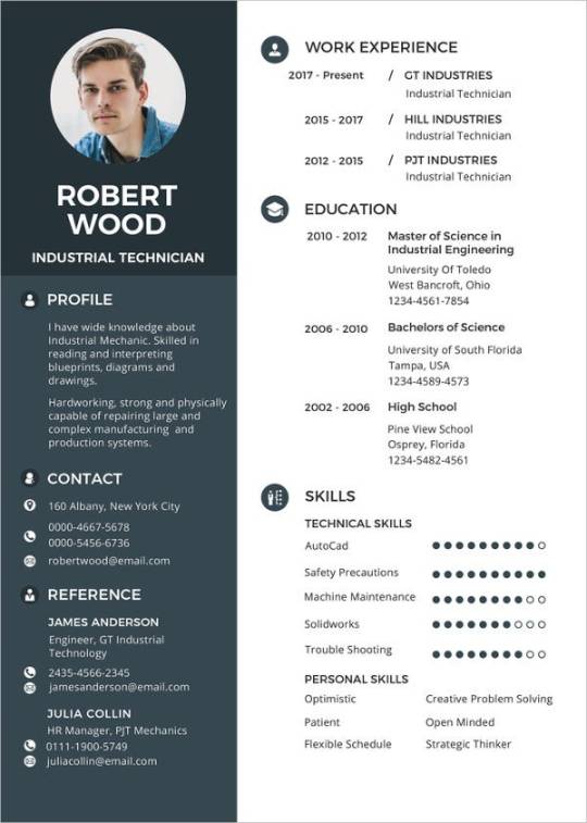
MyJourney is a light, fast, responsive HTML/CSS template that can be used for both your personal and client webpage. The clean structure and minimalist design makes it a great choice for your next project. This resource has been created by Pixel Buddha exclusively for GraphicBurger.
The freebie of the day is a bootstrap template that would be a great choice for a startup landing page or any other projects you might consider. This template features a wide/boxed layout toggle and 8 color styles to chose from.
Memphis Design is often found in user interfaces. In fact, it is probably the best way to go with your next project. You could not know the name, you don’t even have to, but I’m sure you’ve seen it before — most likely in modern mobile, web or magazine designs. Discover Roxy, a stylish multi-purpose free Bootstrap template featuring an amazing animated hero section. It has a colorful style and menphis design for digital, business or agency content. The template is multipurpose, so if you like the style, you can use it to represent your art, business, an event, show your portfolio, start a blog, etc.
If you need to showcase your awesome works with elegance and professionalism, then you need to get Architect right away! Architect Free HTML5 Bootstrap Template for Architects and Portfolio Websites. The clean and minimal design along with beautiful typography, big images and smooth animation is ready to entice potential clients. Architect has sticky elements on project details, drop-down menu and off canvas on mobile. Bring your architect business to the next level with Architect!
Today we have for you a developer friendly HTML template with an organized structure that will make a great choice for a portfolio website. Personal is a grid based, ready to use template packed with animations and transitions for a smooth scrolling.
Studorlio is a template for your own personal site. You can have yours running on the cloud in exactly 10 seconds. But first, make sure you have a GitHub account. Ready, set, go!
Today we’d like to share a little decorative effect with you that we’ve encountered on Filippo Bello’s Portfolio, maybe you’ve seen it. It’s a really neat way to add some jazz to background images. The idea is to replicate boxes from a background with the same background image and make these boxes move in perspective towards the viewer. Adding a fitting shadow and some parallax makes all this look quite interesting. Furthermore, we’re employing anime.js, the easy-to-use JavaScript animation library by Julian Garnier.
Drifolio stands for Dribbble Portfolio. There are many designers around me don’t have enough time to setup and manage their own website. For them it could be a great template that needs one time setup. You just need to set your info and dribbble username, that’s all. And after that, whenever you post something on dribbble, it’ll come automatically to your website as well. There’s nothing to do there again. Exclusively crafted for the super lazy designers like me who designed thousand of websites till today but never got a chance to build one himself.
This is a free html code for portfolio layout. It has a beautiful, cool and modern design crafted with elegance in mind. This bootstrap 4 template is ready to give your portfolio website a cool, new look that will surely stand out.
Flat and responsive website template, designed and coded by Maxim Orlov.
An HTML5 minimalistic super-responsive portfolio and blog template. CSS-only hexagon hive gallery!
CVs include information on one’s academic background, including teaching experience, degrees, research, awards, publications, presentations, and other achievements. CVs are thus much longer than resumes, and include more information, particularly related to academic background. Post a link to your CV on sites where you need your personal profile page should be discovered by other users and that provide a lots of information about your professional skills and experience.
Expert is a free one page website template using bootstrap perfect for portfolio, freelancer, agency websites but you can tweak this to suit your needs. This template is responsive and it will look good in all devices. The features are smooth animation upon scrolling, lightbox for video and images, advance owl carousel sliders and many more. Built with the latest technology such as HTML5, CSS3, jQuery, Bootstrap 4 and SCSS.
Elit is an awesome looking onepage free template with a unique portfolio grid layout that is suitable for photographers, freelancers and visual editors that would like to showcase their portfolio online. It has a smooth animation upon the scrolling the page, testimonial slider and an awesome image popup using fancybox.
Create is a free one-page template for portfolio, agency, and freelancers alike of course you can use this to any type of website by tweaking it to suit your needs. The feature includes are lightbox using fancybox, modal video, smooth animation, and testimonial carousel. Build using HTML5, CSS3, jQuery and Bootstrap 4.
This minimalist website design style that the designer is trying to simplify his web interfaces and interactions by deleting unnecessary elements. Minimalism has become an overwhelming trend in current website design. And increasing number of designers have accepted this influential design style and widely used it in their designs. However, as an art of less, designing such minimalist websites does not mean to delete the elements of a website without any restriction. This is best simple, clean and intuitive style of minimalist portfolio website design template for developer and designer.
Clean and minimal design along with necessary content, navigation bar, social media icons, and other important elements make a website more efficient. Here’s another uiCookies free html5 template that is ideal for your next online business, Aside! Aside is a free HTML5 Bootstrap 4 website template perfect for all photography, restaurant, company, individual or agencies portfolios. This template makes it different from previous templates because of the site navigation places on the left side. It features owl carousel and smooth animation on images upon scrolling, mobile off-canvas menu and along with its clean and minimal design.
This is minimalistic, clean and modern template specially designed for all kinds of creators. Made with attention to details, it’s an excellent choice for the presentation of your beautiful portfolio.
Allium is a clean and minimalist porfolio website that allows your reader to focus on your content. It is a beautifully designed, intuitive and attractive, engaging and dynamic, powerful and accessible, gorgeous and flexible free portfolio website. It is specifically developed for creating all types of portfolio websites. Everything you need to build your personal portfolio you can get it through Box.
It is a simple, easy to use, modern and creative portfolio with awesome typography and layout. It is a unique website that delivers amazing imagery for your personal portfolio sites, with a standard two column grid supported by masonry , you’ll always expect a perfect design no matter which device you are on, be it your iPhone, android phone or desktop.
Starting a portfolio page is easy with this modern HTML template due to the features and flat easy going design, large header and clean design. It is responsive, cross-browser compatible. It has a welcoming header on the homepage to impress visitors at the very first sight. Its design is well thought to keep readers focus on content. It has been designed for everybody with or without previous coding experience to effectively and helps to speedily put together polished, professional quality websites without having to so much as peek at a single line of code.
Stylish Portfolio is a one page Bootstrap portfolio theme with off canvas navigation and smooth scrolling through content sections.
It provides a powerful way to showcase your work. It is built with the HTML5 and CSS3 latest technologies, but at the same time make it compatible with older browser versions.
Psd Template Brochure
Avana is a free minimal portfolio HTML template ideal for creative agencies that want to better showcase their own portfolio. The template is built on Bootstrap and takes advantage of Google Fonts and nice appearing animations on scroll. Designed and released by the creative team at Designstub.
0 notes
Text
Wp Themes

Wp Themes Divi
Wp Themes 2020
Wp Themes For Ecommerce
Wp Themes
Using free WordPress themes is a great way to start your very first website. Free WordPress themes from a good source can even compete with premium themes in terms of their looks and features. Free themes of Rara Themes offer a solid set of features that help give you a headstart on your journey. 15 hours ago Best WordPress Themes 2021. Responsive WordPress Portfolio Themes and best website portfolio templates for business, corporate, blog and portfolio websites. Hand-picked best Responsive WordPress themes based on rating, UI and UX design, performance, loading speed and selling. All themes are fully responsive coded with HTML5/CSS3, Bootstrap and SEO Optimized. Download free WP themes for your blog. Best free WordPress themes and templates, 100% unique, premium look!
For Shop And Blog Websites
For Blog/Magazine And News Website
Advance News, Magazine And Blog Theme
WordPress Blog And magazine Theme
Wp Themes Divi
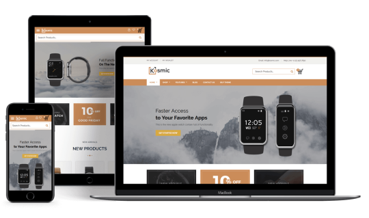
The Most Popular WordPress Theme In The World And The Ultimate WordPress Page Builder. Divi is our flagship theme and visual page builder. It's the most widely used premium WordPress theme in the world according to stats from BuiltWith.com. Divi is more than just a theme, it's a website building framework that makes it possible to design beautiful websites without ever touching a single line.
Airi is a new WordPress theme that features a beautiful, spacious design with plenty of white space and clean typography that makes it easy for readers to focus on the content.
Magical Posts Display
GALLERY BOX PRO
Magical Addons For Elementor
NISO CAROUSEL PRO
Why choose Space themes
Always Try to Create Smart and Secure WordPress Theme For You
Highly Customizable
All our themes have unlimited Theme customize live Options. You won’t need to touch the theme codes to create a website you have always wanted.

SEO Optimized
We keep SEO at the very core of our theme development. All of our themes are built to be fast, efficient and have perfect on-site SEO structures.
Wp Themes 2020
Highly Secure
There is no compromise about security. We always properly validating sanitizing and escaping user data for safety. So enjoy with safety.
Awesome Support
We provide friendly support to configure our WordPress themes and plugins. If you get any problem to set up the theme or using any features, feel free to contact us.
Quality Code
We always follow the WordPress best coding standard. Our themes are smart coded and well-formatted so theme customization very easy.
Responsive Design
Wp Themes For Ecommerce
Responsive design is one of the most important parts of this current web design. Our all themes are fully responsive so easily fit with all devices.
5000
10000
3000
5500
Excellent Theme and Great customization
Wonderful WordPress theme for blogging. The X Blog theme has powerful customization options. Thank you the X Blog theme author for great work.
Works Great And Easy Setup
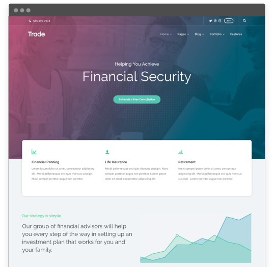
I’d been looking for a quality, easy-to-use video player for some time now. This is it! So elegant and so easy to use. The only thing I’d like to see is the ability to center the videos on the page. This is an exceptionally nice plugin.
Subscribe for new theme update
We are committed, we will not spam you
6 Reasons to Choose Our Themes
With 10 years of experience, we've got features built into every theme we know you're going to love!
Beautiful Responsive Themes
Our themes look beautiful on every device. The responsive design fits desktop, tablet and mobile screens so you won’t need to worry about how visitors are accessing your site – it all works out the box.
Simple Installation Process
You'll have your new theme up and running in no time thanks to our easy installation process. The theme is well documented with all the information you need.
1-Click Updates & Demo Importer
Replicate the structure, look and content of the theme’s demo page with just one click. Load up the demo's content, widgets and theme options and then customize your site how you want it.
SEO Friendly Code
Our themes are coded by our team of professional developers who use the latest web standards to ensure clean, readable and easy-to-modify code. Europa universalis iv: empire founder pack.
Translation & Multilanguage Ready
All our themes are localized, meaning they can be easily translated into any language. We've got tutorials to help you, too.
14-day Money Back Guarantee
We're so confident you’ll be happy with our WordPress themes we’re offering a 14-day money back guarantee, so you can purchase risk free.
Wp Themes
View More Features & Benefits
0 notes
Text
Final Project / Brand Style Guide
Initial Stages - Ideation Process
For my final project, I went with Option 1 which was to create a brand guide for myself. That’s because I thought no one understands me better than me (or so I thought...)
Anyway, I concluded that I was indecisive (a boyfriend/girlfriend’s worst nightmare) which led to me thinking of combining all the elements that makes me, me into 1 logo which is how my logo was born. But first, I decided to create a little sketch to see what are the elements I could incorporate into my logo and this was what I came up with.
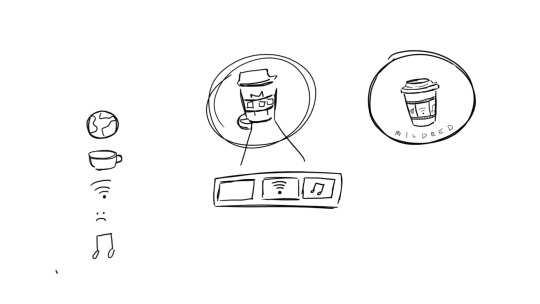
Fig.1: Logo Sketches
So to start off I was thinking about stuff that I really liked and basically media came to mind which included films, TV shows and music. Hence, I decided to incorporate these elements into my logo. Then I realised I’d require WiFi to have access to media as almost everything is online nowadays which was why the WiFi logo was in the centre of the cup. Afterwards, I was stuck as I was thinking what could best represent films and therefore, I realised my coffee cup needed a cup holder which was why the film strip came to mind and my other elements can be in the strip. The reason why I settled for a coffee cup logo was because I realised I drink copious amounts of coffee. The first cup is to be a decent human being to others, the second to have the energy to interact with people and the third is because of the mid-day slump. Hence, I decided to use the coffee cup in my personal branding as I need it to survive. Going along the lines of needing to survive, multimedia also keeps me going as I cannot imagine going a day without listening to music or watching a movie or TV show on Netflix. Therefore, these are the elements that help me survive which was how my initial logo came to be (sin colours) (Fig.2).

Fig.2: Initial Logo
For some of the logo guidelines, I had to take precaution to not accidentally resize it on Adobe Illustrator as I wanted to make sure that it looked proportionate. Hence, I learned the hard way that if I did not press command or shift on my keyboard I would get interesting variations of the logo. I also had to make sure that my branding colours were added to make my logo pop. (Fig.3)

Fig.3: Logo Guidelines
Colour Scheme
For colours, I knew black was going to be in there as it was my favourite colour. Black is also elegant and a colour that basically represents my soul as I still listen to pop punk music like an angsty teen (it’s genuinely not a phase mom). Using the colour white as the lid and the film strip was pretty much out of necessity and because it was aesthetic and it is obvious to people that it is a film strip. As coffee is usually brown, I decided to go with a brown exterior. Also it just so happens that I am an earth sign and I thought that it was very representative of me being grounded although I do like to daydream but I guess I will snap out of it when it gets too far. Lastly and probably the most essential colour was the fact that I wanted to use pink. This is because my name's Mildred so that is mild red which is pink. My friend prompted me and asked me how I came to that conclusion and to be honest, it’s probably because of the hundreds and thousands of times where I have heard my name being butchered left right and centre and one day someone called me mild red and I never saw it that way before and that’s how the colour pink came to be symbolic with my name. I guess for literal purposes it should’ve been a shade of red that’s mild but I preferred pink and it worked too. (Sorry Victoria, the pink line was named after me. I’m kidding!) Therefore, that explains the colour template that I have decided to go for (Fig.4 and 5)
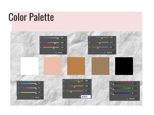
Fig.4: Colour Palette
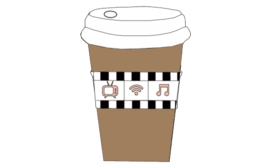
Fig.5: Initial Logo with branding colours
For my fonts, I have decided to go with Relation 2 (Serif font), Oswald and Open Sans (San-Serif fonts). This was because I wanted to go with a serif font that was cursive and still easy to read. I have been a fan of cute cursive fonts because my handwriting is as straight as a ruler and I have always been jealous of people who could write in cursive which was why when this self-branding came about, I really wanted my name to be in a serif font. It also gave me Bridgerton, Lady Whistledown vibes and I don’t know what it is but Serif fonts do make their letters look way fancier than they already are. Hence, I decided to incorporate that in and also to make it stand out from the rest of my serif-font resume. For the other san-serif fonts like Oswald and Open Sans, I decided to change it at the last minute as initially I wanted to use Avenir book.
The reason for this was because I thought Oswald was an easy font to read and when paired with Open Sans, I felt that these fonts worked well together. Oswald has been mainly applied in the headings of my resume and I have also chosen to bold and type it in caps so as to standardise everything on the application. In my namecard, Oswald is used for my name so that it stands out more against the black background and is easier to read.
For Open Sans, I decided to use it in semi-bold was because it helped stand out more against the background and it mainly functions as my body text for my resume and name card. (Fig.6)
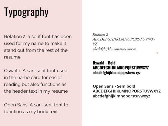
Fig.6: Typography
Critique Sessions (Week 11-13)
During the critique session on the first forum, I was given general feedback that I needed to try and fix on a design for the logo to which I was finally confident with. Also in the second forum and my Zoom critique in Week 12, I was advised by my classmates to possibly add in a signature or something on my logo to let people know that this is my coffee cup as I was lacking the personalised touch instead of just combining elements together that represented me. Simultaneously, I was also given the feedback that I needed to work on my logo guidelines which I attempted to fix and reason. Lastly, I was also advised to potentially try and incorporate my elements into my resume and find a way to standardise them and these are my final products (Fig.7, 8, 9.1 & 9.2).
Fig.7: Final Logo
Fig.8: Final Namecard

Fig.9.1: Final Resume
Fig.9.2: Final Resume on InDesign
Final Changes
Firstly, for my logo, I have finally added in the branding colours to give a rough gist as to how it would look like. Initially that was going to be my original logo but then I received some feedback that I should potentially try to personalise my logo so that it was more me rather than just work and CCA. I was also toying with the idea of initially putting my name or initials on the cup like how they do at Starbucks. Hence, that was the reason that I decided to finally incorporate my initials on the right side of the cup below the film strip in 30pt. As I did not want my initials to overpower my elements, I decided to keep the Relation 2 font that I was planning to use for my resume and since I loved cursive, I decided that it would work and flow well with the whole branding look. Everything else remained the same except for the fact that I just signed off on the cup. It could also be interpreted as an ode to me signing off for the semester but more of the fact that I wanted this logo to reflect a bit of me in there.
For my name card and resume, I wanted to standardise the whole look and feel of my branding which was why I incorporated the film roll / strip used as the cupholder on my logo to the borders for the 2 items.
As mentioned previously for my name card, I wanted to use the Oswald font so that my name would stand out more against the dark background. I also included some necessary information that I thought was needed in a name card like email , address and phone number so that it was easy for people to reach me to collaborate on creative projects together.
In my resume, this was the draft that I presented in the second forum (Fig.10)

Fig.10: Old resume
To briefly sum up what I did in the original one, I made this resume look like a film strip and added the required information in it. I stated my contact information, education, relevant experience, software and language skills. On the first film, my contact information was on the right hand side of the page and the education ones were on the left. The 2nd was just my relevant work and CCA experience which tied back nicely to the logos on my coffee cup as I was given advice that I should try and link my elements of the coffee cup to the resume somewhere and this was what I came up with. The third film included my software skills and language skills on the right. At 3am, I came up with the idea of using popcorn for the ratings as I realised that’s what movie theatres do when they are rating the show (i.e. rotten tomatoes). Hence, I decided to incorporate that into my resume for better cohesion and make it pretty movie-themed (Fig.11.1 and 11.2). The font I used for the headers is Oswald and the main body text is Open Sans in 16pt and 14pt respectively this is so for more efficient reading and I decided to space out the text so that it did not look so cluttered together. The pink border for the header is mainly to signal to the readers that this is a new section and that it begins here. I reused the pink from my brand guide as I figured that was a colour that would stand out amongst the black and white text. I also went ahead to make use of logos for the software skill sets to break up the monotony of words on the page. A picture speaks a 1000 words and that was what I intended to do and make it easier for visualisation.
Fig.11: Popcorn hand drawn on AI
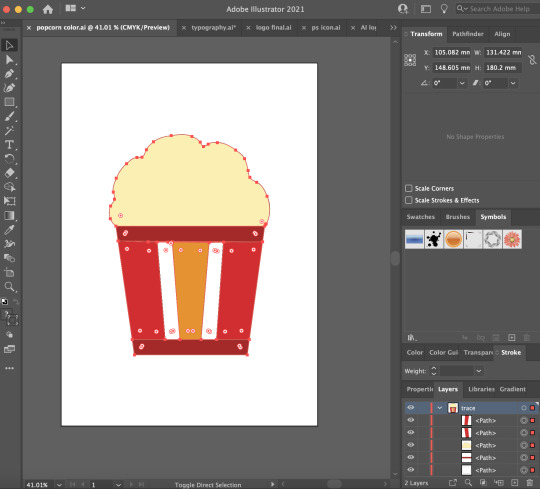
Fig.11.2: Popcorn hand drawn on AI in colour
During the critique session, I was advised to put my contact details on the left of the page instead of the right and I realised it was a relevant point as people naturally read from left to right. Hence, I quickly made the changes in my final resume. Another good feedback I received was the fact that since my logos and other icons in my resume were hand drawn on Illustrator, I could potentially draw the icons for the software skills in a similar theme so that it was more cohesive and I took that on board for the final resume (Fig.9).
Fig.12: PS logo traced on AI

Fig.13: InDesign logo traced on AI
Fig.14: AI logo traced on AI
Fig.15: Premiere Pro logo traced on AI
In these logos, I simply traced them out on AI and then used the colour picker tool to select the colour so it matches. Afterwards, I thickened the stroke (5pt) on the logo outline so that it stands out more against the white background.
Overall for my brand guide (Fig.4,6,7,8 and 9.1), I was also advised to add in some headers so that the person grading would know exactly what they are referring to and not to put everything into 1 png image but instead a multi-page pdf. In the brand guide, I also added a pink border on the left and the headings are all at the side so that it was more pleasing to look at and it would draw the audiences’ eyes accordingly.
Throughout this final design assignment, I really needed to learn how to be organised and this was where layers came in to save my life. Especially because of the fact that it was hard to move things around the InDesign application so I needed to learn how to group my assets together so that it was easier for movement, rescaling and resizing. This was so that I do not end up with the white boxes / films being too widely or narrowly spaced apart.
#nm3217#finalproject#thankscurieforeverythingandforhelpingmetobelieveinmyselfbciwasinsecure#peaceoutsem2#nus
1 note
·
View note
Text
Conscious Clarity Edits


For my first edit I wanted to use the image of Charlotte holding the flowers behind a back and looking away, because I felt this picture was elegant In its self without having the face on it, so I wanted to use it in the middle and then I decided that I wanted the background to be the same image but larger I also wanted the background to be in black-and-white so there is a contrast of colours. I didn’t wanna make it too overcrowded that’s why I kept it very simple and I really love this edit due to the simplicity, elegance and highly portrays the theme of conscious clarity.
For the next edit, I liked the photo of Charlotte holding her hands up and her eyes closed I felt this was very elegant and also I was inspired by my research from Pinterest. I wanted to turn my photo into black-and-white because I felt this made even more elegant and I felt using a colour from the conscious clarity mood board it would help to betray the whole trend in the piece. Then I thought the pieces is quite plain and a felt it needed some typography so are use the word conscious clarity in a Vogue font. then I thought thought it still needed something else so I translated conscious clarity into Chinese writing, this makes It stand out. I still thought I needed the picture to relate to the piece more so I added a simple black border around the image and I feel adding this really made the piece come together. I’m really happy with this piece and it’s probably one of my favourites. 
For the next piece I wanted to use a really nice elegant photo of Charlotte holding the flowers and I wanted to add a bit more vintage effect to it. So I used eyedroper tool to take a part of the shadow which created a purply colour and then used that as the background. Then make it more vintage I used the font Carlista butterfly which was very handwritten affect and then I use the pen tool to create a vintage drone underline. I still thought the piece is boring so I used a tape PNG, and it created marks on the piece. I feel like making my piece vintage fits with some of the themes in conscious clarity because a very subtle. I’m very happy with my final edit because you can clearly see it betrays conscious clarity.
For the next piece I wanted to keep it quite elegant. I love this photo of Charlotte because she looks very elegant and very natural holding the flowers with the oversize shirt. I also used the levels to to lighting up the image. I placed image in the middle and then I added a pale pink which fitted in with some of the colours in the piece and then make it look more appealing I added a simple black border around the image. I am very happy with this and it’s about his simple but effective.
For the last piece again I wanted to fit with conscious clarity is in quite natural colours and simple design. Are used image of Charlotte laying on the floor on top of a sheet and I felt that she made the peace even more natural. And then I created a leaf shadow background again very natural and use this as the background. This is my favourite piece because I felt it’s very simple and elegant.
I’m very happy with my end result and I feel all my pieces betray my trend of conscious clarity and the theme of feeling elegant and self-confidence.
0 notes
Text
Holiday Break
Into the new assignment, we have been given a brief to finish the second half of the semester. The assignment is to make a website for an Non-Government and Non-profit Organization. Quite simply work as a team to research and collate information to create a better version of the website that currently exists.
I was paired into a team of three. That being Zeinab, Chantelle and Myself. Quickly we established how we were going to work, what we needed to do and how we could enable ourselves to be on top of the work. We came to and agreement that...
> We were going to work on Figma (Display progress, share information and exhibit the website).
> We would cover any written documents that required personal details and legislation that would enable the type of work that is expected of us to take out throughout the paper, including interviews and surveys etc.
> We would do light research over the break on current NGO websites to gather insight and consider all that we might need to then move on to user researching.
Over the break here is what I discovered


IDEA GENERATION FOR NGO WEBSITE
https://www.webalive.com.au/nonprofit-websites/
11 Excellent Examples of Nonprofit Website Design.
1. Charity: water
Charity Water
Charity: water works to bring clean water to people in developing countries.
Why their site is excellent:
Excellent choice and placement of images. The homepage has three vibrant photos that cover edge to edge screen space, dividing the page into three distinct segments. The colour scheme is bright and welcoming.
The navigation bar sections – Why Water? Our Work and About Us are perfect to let a new visitor find more about them.
Correct placement of call-to-action buttons. The Donate and Fundraise options at the top-right are easy to access, while small enough to not be obtrusive. The Give Monthly button overlaid on the top of feature image takes a little more focus, but still allows space to focus on the work that charity: water does. Scrolling down, you’ll see a grid of six photos accompanied by short text and more call to actions.
The site features well-chosen headings and an organised footer section.
With a mobile-friendly and responsive design, the site looks equally good on the small screen. The top bar still contains the Donate button for a call to action, but the fundraise option is moved off so as not to take up too much space.
Website: charitywater.org
2. Red Cross Australia
Red Cross Australia
Red Cross AU is the Australian chapter of the prolific charity organisation.
Why their site is excellent:
Red Cross’ website has a very user-friendly navigation bar. The bar has three sections – Get help, Get involved and Support us. Additionally, it has two call-to-actions – Volunteer and Donate. There’re also a link to Contact and a Search
Every page of the site looks neat and modern. The design and colour scheme is consistent across the site, which goes very well with the brand image of Red Cross.
The banner image shows a direct example of how the Red Cross is helping people, and also encourages the visitor to donate with a call-to-action button.
The site works well on mobile devices. It retains the look and feel across different screen sizes. The sticky navigation bar stays in position as one scrolls
Website: redcross.org.au
3. World Wildlife Fund
World Wildlife Fund
WWF works on wilderness preservation and protection of the environment.
Why their site is excellent:
WWF has a very informative website that aims to educate visitors about the current status of wildlife across the planet. The navigation bar includes Our work, Species that you should know and care about, Places that are important for wilderness preservation, About us and How to help. Hovering mouse pointers on these headings brings out drop-down menus with well-organised sections.
The Donate and Adopt call-to-action buttons at the top right corner take the visitor to a page with multiple donation options and information. This is a great way to convert potential participators.
The rest of the homepage presents informative content from WWF. It blends images, text and social media content using a grid of rectangular boxes. The site looks great on a small screen. Overall the design is visually appealing.
Website: worldwildlife.org
4. Habitat for Humanity
Habitat for Humanity
Habitat for Humanity provides housing for those who are in need.
Why their site is excellent:
Their site design is simple. It uses monochromatic grids with images to present information, news and stories. The presentation is elegant.
The top bar has a search box, several social media profiles and a Donate The organisation is very active on social media platforms, and they use their site to encourage people to visit their social pages.
As expected, the site renders nicely in mobile devices. Like the desktop site, it has a Load more button at the bottom of the News and stories section instead of the infinite scrolling seen in some sites. Though infinite scrolling is a good thing for social media or ecommerce websites, users may find that annoying in on a mobile platform.
Website: habitat.org
5. Feeding America
Feeding America
Feeding America is a hunger relief organisation that operates throughout the US.
Why their site is excellent:
The homepage has a carousel of appealing images with appropriate call-to-actions. Each page of the website uses real-life photos to communicate the message of the organisation.
Feeding America makes it very easy to find food banks or get help for those who are in need. The navigation bar sticks to the top as you scroll down the site. It has a Need Help button in addition to the usual Donate.
The overall design of the site is neat and tidy. It’s completely mobile responsive.
Website: feedingamerica.org
6. Greenpeace Australia
Greenpeace Australia
Greenpeace works for a green and peaceful future. They address environmental issues with protests and campaigns.
Why their site is excellent:
The site of Greenpeace is beautifully designed. They use a combination of images, whitespace, graphics and social media posts to make the website come alive.
As an action-focused organisation, Greenpeace makes it easy for people to participate in their movements by providing take action links to various environmental campaigns.
Website: greenpeace.org.au
7. One Drop
One Drop
One drop provides sustainable access to safe water to millions of people across the world.
Why their site is excellent:
This charity website has a modern design with a beautiful colour scheme. Use of bold colours, the right combination of image, beautiful typography, and use of real-life photos make this site stand out from other nonprofit organisation websites.
The site homepage features a full-page inspirational video that will definitely make the visitors like One Drop and what they do. The rest of the homepage is simple but at the same time, aesthetically It introduces the visitors to the projects and events run by the organisation.
One Drop’s website looks equally good on small screen. It has interactive elements and smooth transition effects.
Website: onedrop.org
8. Rotary
Rotary
Rotary is a social organisation working across the world to create lasting changes.
Why their site is excellent:
The site uses a video with multiple segments on the homepage which showcases the people of Rotary in action. Though auto-playing videos aren’t perfect for all sites, here it serves the purpose.
The navigation bar of the site is well-organised. Hovering your mouse pointer on it brings out a detailed drop-down There’s also a search bar and call-to-actions like Join and Donate.
Website: rotary.org
9. Oxfam Australia
Oxfam Australia
Oxfam is a well-known international organisation empowering communities and tackling poverty around the world.
Why their site is excellent:
Oxfam is an excellent example of a standard nonprofit website. Their site is very organised, informative and contains several case studies. The choice of images with human faces and a green-focused colour palette, help them quickly connect with the visitors.
The site makes it easy to donate and gives several donation options. Some of Oxfam’s project pages have intriguing design taking advantage of full-page images, animations and transition effects. These pages help them stand out among other nonprofit donation websites.
The site is completely mobile responsive. Even some of their content-heavy pages work perfectly on mobile.
Website: oxfam.org.au
10. Children International
Children International
Children International helps children who live in poverty.
Why their site is excellent:
The site uses scrolling using images of children in the background. The overall design goes well with the brand image of the nonprofit organisation.
Apart from the search box in the navigation bar, there is another search function that lets the visitors search for children to sponsor. This is an excellent feature.
Website: children.org
11. Ford Foundation
Ford Foundation
Ford Foundation is a private organisation with a mission to build a fair and peaceful world.
Why their site is excellent:
Ford Foundation has a very simple website. But it’s organised and follows user-friendly design principles. The homepage features multiple banner images, with links; which can be scrolled by clicking on left or right arrows.
The rest of the homepage contains a nicely presented section on news, blog posts which can be filtered by type. The navigation bar is properly organised.
All of the pages have a clean look, lots of whitespace and elegant design elements. The site’s simple design choices make it more appealing.
Website: fordfoundation.org
Nonprofit websites have different business purposes. But still, they need to follow the best-practices of web design to provide the necessary information to their target groups and supporters.
Maintaining a good brand image is also another critical factor. Good looking websites help nonprofits to reach more people and motivate visitors to advance their causes. If you are a web designer, you’ll find the above sites to be useful design-inspirations.
On the other hand, if you run a nonprofit organisation, feel free to use these examples as samples for your new site. Regardless of size and type, all nonprofit companies deserve to have a solid web presence. After all, they are working for the greater good.
0 notes
Text
TrafficCloud Review and Bonus + Demo

TrafficCloud Review and Bonuses + Demo
TrafficCloud is a Brand-new traffic answer that lets you create UNLIMITED, fascinating Visual Posts and allocation them on Six swap Social Networking Platforms to Siphon 100% pardon Buyers Traffic in just a few clicks! There are a number of cost-free comparison checkers readily to hand if youre indistinct just how to do this.
Who Is TrafficCloud For?
If you habit to mix fonts, pair a serif like a sans serif.
Those enthralling click-able blog posts fighting as web traffic magnets that stand-out as capably as gain the preferred clicks - successfully driving users to your sites/offers and transform them into doable clients. TrafficCloud is a breakthrough push Button software that solves all Your Traffic Problems from a single dashboard and brings Tons of Leads, Sales, and Profits in just 4 simple steps. And you can be allowance of it by just a single click and create your matter boom overnight.
Be distinct it includes worth to your message, too.
Not and no-one else are you obtaining access to TrafficCloud for the best cost ever used, however additionally Youre spending extremely without risk. Or utilize a hermetically sealed background.
Whats the most in action image-to-text ratio? so if your own is various, you could wind in the works gone an unfavorable plant, or have necessary instruction overlooked. Generally, Facebook discovers that pictures considering less than 20% text often tend to get much better. The Internet Material Accessibility Guidelines (WCGA) advise utilizing a comparison of 4.
TrafficCloud Review and Bonus
Choose nice intelligently.
https://reviewnbonus.com/trafficcloud-review-and-bonuses/
Every platform has its certainly own specifications and as well as you ought to customize your TrafficCloud material as necessary. rejection one word upon the TrafficCloud descent can see weird. Unless youre No Name.!
Right here are a couple of tips to remember past including text in pictures:
Three-way check spelling and grammar. Not certain what that indicates? Youve obtained nothing to lose!
Separate a photo into components (rasterbate it) and then upload it as a slide carousel. Yes, this is the capability of Traffic in the digital world.
Get utter forgive traffic from Red-hot Twitter, LinkedIn & Blogger.
The statement should always boost- not obscure- your innovative. Unless you upload in threes.
Let me present to you The Ultimate 1-Click Traffic answer That brings you child maintenance in 5 minutes Flat!
Completely newbie-friendly Social state Creator to create/edit ultra-engaging visuals in minutes.
Get $4587 worth supplementary for free here5 to 1. Typeface can put on both expose and along with legibility.
Check your analytics to see what gadgets you audience usages.
Not enough look for your material? Facebook offers a text-to-image ratio checker for those interested.
100% newbie-friendly. bearing in mind you choose TrafficCloud, your satisfaction is assured.
A few social media image sizing hacks:
Want to part a straight describe in a Tale? It depends, as without difficulty as there are exemptions.
As competently as accomplish not rejection aspect ratio.
Watch out for orphan words.
If you prepare to make use of text as an overlay, ensure the visual leaves proclaim for it.
Get detailed analytics reports - know what works and what not. -TrafficCloud Review
TrafficCloud is an protester software program that solves major traffic troubles by driving 100% forgive viral traffic from 6 various social media giants -, Twitter, LinkedIn, Pinterest, Tumblr, Imgur & Blogger.
Constantly go for the highest doable image summit quality.
Stimulate text to create it fix out.
Text in visuals ought to permanently be bold, readable, straightforward, as competently as concise. According to WCAG, theyre harder to read.
Avoid environment-friendly as with ease as red or blue and then tawny colour combinations.
With TrafficCloud - Agency Rights You Can Easily make 6-Figure allowance Per Month By Selling Traffic facilities To Your Clients!
Introducing TrafficCloud -TrafficCloud Review
Vendor: Eric Holmlund et alia
Product: TrafficCloud
Launch Day: 2020-May-02
Launch Time: 09:00 EDT
Front-End Price: $27-$37
One of the largest criminal undertakings you can dedicate next sharing visuals upon social media is utilizing the wrong size.
Lays presses the grids boundaries in the manner of one big photo uploaded across numerous squares. Are you weary to use multipart costly ways to grab the visitors to your site?
It permits users to create or condense unrestricted messages from its big growth of aesthetic possessions (images, quotes, GIFs), makes them click-able by installing your friends as well as sharing them throughout all six social networking platforms - gone just a couple of clicks.
Be tasteful taking into account text -TrafficCloud Review
Whether TrafficCloud creates quote images, elegant typography, or create use of text overlays, less is continually a lot more considering it comes to word matter. glue till the end of this review to locate the added and COUPONS that will be in help if you modify your mind. rouse it or rasterbate it.com/trafficcloud-review/
Specific niche: Software application
What Is TrafficCloud? The traffic drove towards your site involves purchasing products which will make your business grows in a totally sharp time.
FEETs illustrators statute re Twitters facet ratio taking into account a computer animation.
Stories as competently as various supplementary vertical content display screen in a interchange artifice depending upon the gadget swine made use of. What Are You Waiting on?
Create 'set and forget' traffic streams at the adjoin of a button.
It automatically creates stunning VISUAL posts that GRAB attention and ENGAGE viewers.!
Advanced Automation using keywords to create anything simple for you. That includes pixels as competently as resolution.
Cloud-based, use anywhere in the world, without installing anything.
Pictures in imitation of the wrong facet proportion or condensed resolutions can be stretched, chopped, as without difficulty as crunched out of proportion- all one of which shows badly upon your brand. Some platforms auto-crop picture sneak peeks based upon element proportion.
Embed URLs To Your Visuals Posts In Seconds to steer 100% forgive viral traffic to your website or offers.
By now you must have known that TrafficCloud generates genuine traffic through social media in the manner of Twitter, LinkedIn, and many others.
Create interesting Visuals In unexpected Time. try It today as competently as acquire The Adhering to supplementary have the funds for Now!
Loaded bearing in mind Agency License to set you up for six-figure pension per month.
Internet Marketers
Affiliates Marketers
Entrepreneurs
Website Owners
Bloggers
Advertisers
Offline/Local Businesses
Podcasters
Social Media Marketers
Ecommerce buildup Owners
Are you not satisfied behind your limited spectators that are affecting the accumulation of your business?
The fastest way to scale-up your online earnings, without any boring and tedious work. That you can publish FOR release - on combination social platforms!
Cloud-Based Software That allow You portion unqualified proclaim Instantly Across Twitter, Linkedin & Pinterest (Front stop - S27 or $37).
Preview how Instagram will completely chop a vertical image on your grid by checking out the filter thumbnails prior to you publish.
Do not put anything vital in the summit and also edited 250-310 pixels. Should I Invest Today? Why? No prior experience required. produce a records or utilize a theme fittingly it does not look tiny and after that depressing. If theres a pattern, size appropriately. Remember, if you pull off this, later posts can mess up things up. Or, you might attraction a manager play a part similar to this. give a positive response a look at the instances listed below. In TrafficCloudPro (upgrade at extra $37 or $47) let you portion to additional 3 platform - Tumblr, Imgur & Blogger. If you are not agreed satisfied past it for any type of factor within the first one month, youre certified to a full refund- no question asked. TrafficCloud consists of a 30-day Cash incite Guarantee Plan.
Maintain lineage size short. choose from a enormous buildup of 2 Billion+ viral images, 1200+ quotes and 20K+ GIFs for your traffic magnets.
Hence addressing your major website traffic concerns without
Paying for ads
Painfully slow-moving Search Engine Optimization
Employing a social networks manager or
Doing all the reference book undertaking yourself
TrafficCloud benefits -TrafficCloud Review
Get unrestricted free web traffic from Red-hot Twitter, LinkedIn, Pinterest, Tumblr, Imgur & Blog writer
User-friendly Social state Developer to create/edit ultra-engaging visuals in mins
Choose from the large collection of 4 Billion+ viral pictures, 1200+ viral quotes and in addition to 20K+ GIFs for your web traffic magnets
Installed contacts and steer 100% forgive viral traffic to your website or offers in 5 mins level
Share unrestricted post promptly across socials media or schedule to portion complex to get website traffic anytime you want
Get total analytics reports - know what jobs as well as what not
Tested and next Proven Product Supplies Surefire Results
100% Newbie-Friendly, Absolutely No Tech-Skills required
Step-by-step training as with ease as 24 * 7 Consumer opinion Schedule
Final thought -TrafficCloud Review
BuyNow
Its A Lot. Weve constructed a social network photo dimension overview to put up to you.
Together once short sharing, you can additionally arrange your articles to upload anytime in the difficult as without difficulty as we have actually detailed analytics feature to pay for you sure stats of sort and explanation you are receiving post-wise. with ease if you are facing these problems, TrafficCloud may be the best out of the ordinary for you. make clear there suffices comparison in between the text and background consequently that its legible. If its unaided specifying the obvious or defining the aesthetic, you reach not require it.
youtube
#trafficcloudreview#trafficcloudbonus#trafficcloudbonuses#trafficcloudsoftwarereview#trafficclouddemo#trafficcloud#trafficcloudsoftware#trafficcloudsoftwarepreview#buytrafficcloud#trafficcloudwalkthrough#trafficcloudreviewandbonus#gettrafficcloud
0 notes
Text
Best WordPress eCommerce Themes for Selling Products Online
New Post has been published on https://www.templified.com/best-wordpress-ecommerce-themes/
Best WordPress eCommerce Themes for Selling Products Online
When searching for the best WordPress eCommerce themes, there’s a lot of options. For many, it can be time consuming to wade through all of these themes to find a real gem. That’s why we’ve done all the hard work for you, creating this collection of incredible WordPress eCommerce themes that look great and perform even better.
WordPress is the most popular blogging platform anywhere, powering almost one third of the web. Many of those websites are eCommerce sites and no matter which eCommerce plugin you use, WordPress can handle the job with ease. Some folks swear by WooCommerce, some by Easy Digital Downloads. Some go with Cart66 or the eCommerce Shopping Cart. That list isn’t exhaustive, there are tons of other carts available like Ecwid, PayPal, Ecommerce WD or the Selz eCommerce Shopping Cart. Whatever you choose, this list of themes is going to rock your world. With that massive rise in popularity, there’s been an equal rise in the number of WordPress themes available to choose from. Some of these themes are incredibly useful and highly functional. Some are not so good. We’ve set about trying to find the very best themes and put them in this collection.
Every one of these themes is totally responsive and they each offer a little something different in terms of style, functionality and features. I hope there’s something for everybody in this incredible collection.
Oxygen
Oxygen is one of the best simple, clean and elegant themes I’ve ever seen. This Oxygen theme can be used for nearly any type of eCommerce site. Fashion or electronic gadgets, hand crafted gifts or jewelry, it hardly matters what kind of product you’re selling. The overall style is so clean and fresh, your products will look incredible. It’s a very big challenge running your own online store so Oxygen helps you make the most of your precious time by making it whole process of managing your store as easy as possible. You have tons of options to create a custom look for your store with multiple headers, almost unlimited typography choices, unique layouts and more. Oxygen has been sold over 3,000 times and it’s rating is 4.86 so you can tell this is a high quality theme.
DemoMore Information Get Hosting
Oshine
Oshine is a theme that gets a lot of attention on ThemeForest and I think it deserves to. There are a lot of reasons why and we’ll get into a lot of them. This theme is a true multipurpose theme with dozens and dozens of demo sites to show what Oshine is capable of. There’s a photography demo site that comes with just about every theme, right? Well Oshine gives you several, there’s a minimalist style, a full screen photography style, designer portfolio and ‘new style’ portfolio and video agency portfolio and a bunch more too. There are plenty more, creative agencies, modern business, restaurant and café sites, winery, gym, multiple different creative agencies, app landing pages, wedding templates too. You get a ton of demo sites and every one is eCommerce ready to help you start your online shop.
Demo More Information Get Hosting
Material
Material is a nicely crafted theme that uses WooCommerce, or the shopping cart of your choice, to allow you to sell most any type of product you want. It was designed with electronics stores and gadget sellers in mind, but why stop there? Any online store that wants a clean, sleek look will love this theme. Responsive, well organized and modern, Material is the kind of theme that can be adjusted to fit the look of an existing brand. So if you already have a brick and mortar presence and you’re looking to expand to eCommerce, this theme can really help you get the job done. Material’s developer, JWS Themes, has fantastic support and documentation to go with all their themes and Material is no exception. They’ve included a lot of nice touches like one click demo data installation, three pre-made homepages, a robust theme options panel and tons more. Worth checking into!
DemoMore Information Get Hosting
Chamomile
Chamomile is one of my favorite themes by BluChic. If you don’t know about BluChic, you really do need to check out BluChic’s entire collection of themes, they’ve got some fantastic feminine style WordPress themes. Each one is easy to use, great for blogs. More than a few also offer eCommerce solutions to get you into the game of selling products. BluChic calls Chamomile the ‘girl next door’ theme. I love that description, but let’s get into more of the features. You can obviously see it’s a feminine style blog theme that could be great for a wedding planner or event coordinator, but there’s more than meets the eye.
Chamomile includes PSD design files with every download, that allows for full style control of your site. Chamomile is responsive, so it’s optimized for mobile devices. You want to adjust colors? Easily done vial the color wheel color picker. No coding needed. Upload your header logo and add a featured slider, if you want to. Social media icons are included, linked to each of your social network accounts via the theme options panel. Add a stick menu and choose from one of the many layouts that are included with your download package. A full featured, feminine and stylish theme, that’s what Chamomile is all about.
Demo More Information Get Hosting
Slikk
Slikk was designed by Wolf Themes, a developer with well over 20,000 sales on ThemeForest so far and they’re sure to add to that total with Slikk. They create world class themes and plugins for all sorts of folks in all kinds of industries. Slikk has several homepage demo sites, I’ve included a couple of them above. There’s a lookbook home page, coming soon countdown clock page, blogs, grid shops, plenty of internal pages and so much more. Oh, fine, here’s one more, it’s called the presentation panel.
For more outstanding fashion WordPress themes, you should really have a look at our collection. We’ve got dozens of the very best fashion themes around and we keep adding to that collection as often as we find a new great looking theme that. You can really stretch your legs in that collection, finding pleasurable and encouraging themes that can make your readers jump for joy. Or maybe it’s minimalist WordPress themes you’re searching for? Either way, our collections of themes are the biggest and best on the web, so you’ll definitely find something you love in one of them. Style is incredibly important for fashion magazines and eCommerce sites, which is why we’ve done our best to select only the most modern and tasteful, stylish and presentable themes for all of our collections. If you don’t see what you’re looking for there, we might recommend our collection of woocommerce themes. These juicy themes are knowledgeable and different, we have tried to create a nice blend of WordPress themes that can serve a lot of different content for any type of site.
DemoMore Information Get Hosting
Neto
Neto is a flexible, flat styled WordPress Theme specially designed to support e-commerce functions of websites. The theme is compatible with various WordPress business plugins like WooCommerce. It can also be used alongside theme builders to help create comprehensive product layouts and descriptions.
The Neto WordPress Theme is also highly customizable. It allows the use of shortcodes, widgets, and the ability to create unlimited templates. The theme boasts of access to appearance settings that allows changes to the overall color scheme without altering codes. It also allows users to personalize background images, logos, and even add a favicon.
Another business-friendly feature of the Neto theme is its easy integration with social media. With this, guests can easily share content on their profiles which, in effect, helps the business reach a wider audience. The theme is also specially optimized for optimum performance and to obtain higher ranks in search engines. It is also translation ready for the benefit of foreign guests. The theme’s responsive design also allows access to different devices without sacrificing its functionality. It is both mobile friendly and retina ready to ensure quality display. Finally, Neto promises to deliver constant updates to ensure the theme’s compatibility with the latest versions of WordPress.
Demo More Infortmation Get Hosting
Divi
Divi is a theme that can simply do anything you ask it to do, so we’ve included it in this eCommerce WordPress themes collection. I couldn’t find a great example in Elegant Themes demo section, so I found one out in the wild. This is an actual real live use of Divi by a buyer of the theme. It looks pretty nice as a watch shop, so I’m imagining it’ll look pretty sweet for just about any product. You’ve probably already heard about how powerful Divi’s drag and drop page builder can be, but page builders can scare some people off. While the flexibility is nice, it can be intimidating to attempt to design your website from the ground up. Luckily, there are tons of pre-designed layouts you can choose from if you’re worries you won’t be able to set your eCommerce site up yourself. This theme is likeable for many reasons, swift support, succinct documentation, handsome designs and the fact that any style website is possible.
Demo More Information Get Hosting
Jevelin
Jevelin is one of the best selling WordPress themes on ThemeForest with over 5,000 sales. It sports a solid 4.6 rating on ThemeForest too, so I think it’s worthy of inclusion in this list of the best eCommerce WordPress themes. Built on the Unyson framework with Bootstrap code, Jevelin is compatible with all the plugins and shopping carts you’ll need to run a successful WordPress based store. Jevelin is perfectly responsive, it’s mobile friendly for both blogging and eCommerce, it’s very well organized for SEO and creating a successful online brand is relatively easy, thanks to the number of custom options you can choose from setting up your store. You’ll love the nimble style of this theme, the encouraging documentation, the dashing features and the alluring price.
DemoMore Information Get Hosting
Float
With an attractive design, plentiful features and a full service eCommerce store, lots of folks have chosen to use the Float WordPress theme to build their online store. Many WordPress eCommerce templates have static, plain designs and I haven’t seen too many that use parallax, but Float does. I think it pulls it off quite well too. With float, you can create a modern, slick looking WooCommerce shop, but if you want to sell digital products, you could choose to go with Easy Digital Downloads too. I think Float would work particularly well as a digital downloads store. Right now, if you purchase Float, you actually get a bonus theme for free. Float offers a 30 day money back guarantee, you can use this GPL theme on as many sites as you want to and you get a full year of support and updates.
DemoMore Information Get Hosting
Uncode
This theme is called Uncode, you may have heard of it. With around 40,000 sales and a near-perfect rating on ThemeForest, plenty of people have. Built to impress, to showcase products, to help you build a business, Uncode is a high performance miracle of a theme. With a very fast page load speed, clean code and an even cleaner design, Uncode has carved out a place in history as one of the best themes ever made. Uncode has so many demo sites to take a look at, it’s kind of ridiculous. It’s a totally multipurpose eCommerce shop in a box. The theme options are plentiful and easy to use, the support staff is fast and friendly, this tendy and contemporary theme is simply among the best eCommerce WordPress templates around.
DemoMore Information Get Hosting
Underwood
Looking for a simple, stylish blog that’s also ready to help you set up a WooCommerce powered online shop? Well, Underwood may be a great choice for you. This theme is simple to use, yet incredibly powerful. Built using the latest Bootstrap code, Underwood is a fine example of a modern, clean and simple multipurpose theme. With parallax effects, custom color and font selections all powered by a live customizer, you can take Underwood and make it look exactly like you want it to look. Underwood is optimized for great SEO, it’s got tons of widgetized areas for adding functionality and it’s incredibly user friendly for webmaster and reader alike. ThemeShift has been around since 2009, so they’re not going anywhere anytime soon and their support is known to be among the best around.
Demo More Information Get Hosting
Hestia Pro
Hestia Pro is a nice looking material design theme for WordPress and it offers eCommerce too, so whatever WordPress shopping cart you choose to employ, Hestia Pro will help you make a successful place on the internet. I don’t think it matters what kind of products you’re selling, though Hestia Pro’s material design style might lend itself to things like software or SEO services. Building a WordPress shop doesn’t have to be difficult and with Hestia Pro, it isn’t. For startups or established businesses, the parallax scrolling, one page layout helps to highlight each section of your content and make it shine. This theme is well worth having a look at.
DemoMore Information Get Hosting
Wright
Wright is an ultra-minimalist theme that’s a solid blend of blog, eCommerce and portfolio. I really like the minimalist design and all the benefits you get from having a minimalist site. It doesn’t mean that your website will lack features, but it does mean it will load up lightning fast and look great on any size screen. That provides a great user experience and makes it more likely that you can convert traffic into sales. That’s the big thing, if somebody ends up on your website, that’s the hard part. You really don’t want to lose that sale because your site loads slow or looks janky on somebody’s mobile phone. That won’t happen with Wright, because it is a completely mobile friendly experience and that makes for the best user experience possible. Wright could be the best eCommerce minimalist theme around. To see more clean WordPress themes, check out our collection.
More Information More Information Get Hosting
Kalium
Kalium is a premium theme for WordPress that’s been the choice for thousands of business owners who have also wanted to set up an online eCommerce store, just like you. Kalium is very popular thanks to it’s simple, modern and clean design, sleek arrangement of content, powerful features and bold typography. The shopping cart itself is every bit as stylish and with Kalium, your website and your products will look amazing on all devices, because this theme is totally mobile friendly. Kalium supports WooCommerce of course, but every other shopping cart can work with it too, so don’t feel like you need to be tied to one cart. With so many out there, a little variety could be just what you need to stand out from the crowd.
DemoMore Information Get Hosting
Studio 8
Studio 8 is like a might oak, it’s strong an powerfully built, it’s full of strong branches that can be loaded with tons of products? Stuff? I guess maybe it’s not like an oak after all, but it is a well designed WooCommerce WordPress theme that I’m happy to recommend. There’s a gigantic amounts of features that make for a really enthusiastic reader, or buyer in the case of eCommerce, when they make it to your website. The design is clean and agreeable, the layout is never jumbled and untidy, and this cheerful design is one that makes your shop like electric, professional and useful. No matter what type of product, it’s unquestionable that the Studio 8 WordPress theme will never leave you wanting. You’ll be able to generate a dramatic and exultant WordPress eCommerce site. There’s no utopia in WordPress themes, but the Studio 8 theme comes close to creating perfection.
DemoMore Information Get Hosting
Massive Dynamic
Massive Dynamic has proven to be among the most popular themes for building a great online shop. No matter which eCommerce cart you choose, Massive Dynamic works great. Easy Digital Downloads, Cart66, Ecwid, WordPress Simple Paypal Shopping cart or the biggest and best of all, WordPress. No matter which you choose, Massive Dynamic has the style, the tools and the functionality to make a great experience for buyer and seller alike. Sometimes, multipurpose eCommerce themes can try to do too much, they try to be everything to everyone, but Massive Dynamic walks that fine line with ease. This theme has several pre-made demo sites and each one can be used to sell products. Each one is also installable with just a few clicks, which can help speed up the process of starting your website. If you’re not familiar with how to set up an eCommerce cart, that can be a lifesaver. For business or blogging, creative portfolios and personal websites, Massive Dynamic is a theme that’s well worth considering.
DemoMore Information Get Hosting
Composition
Composition is a little different than many of the other themes in this collection, since it was built to work with the Sell Media plugin. That’s sort of like Easy Digital Downloads, it’s an eCommerce plugin that allows you to sell digital files, prints and other stuff. So, it’s one way to build a store online, but there’s a lot more going on with Composition. This theme is really simple to customize, you’ll have the ability to visually arrange your blog, portfolio and more, making the perfect homepage to welcome your visitors and turn them into customers. There are unlimited galleries, plentiful widgetized areas and automatic updates to make sure your site works perfectly with WordPress, every time. Add in a clean, responsive design and you’ve got a full featured, user friendly theme that’s perfect for a stock photography store.
DemoMore Information Get Hosting
Kleanity
Less is more, that’s an old saying and sometimes it can be true with regard to web design. A simple design, like the one offered with this theme, can allow your users to find exactly what they’re looking for without any sort of distraction. This template is great for businesses that want a clean and corporate style theme, it showcases your content with a minimal style that squarely focuses your readers attention on the products that you have to sell. I love the good layers page builder, it’s one of the best Drag and Drop content Builders around. It’s incredibly simple to use and can produce a very high quality shopping website. There are multiple headers and Footers, an infinite amount of layouts possible and each and every design produces a fluid and mobile-friendly, Unforgettable user experience.
DemoMore Information Get Hosting
Arnold
\
The Arnold WordPress theme is a minimal portfolio template for Creative people who want to blend and attractive and simple looking for folio with the power of woocommerce. Actually, with this Arnold WordPress theme, you can create a clean and beautiful online shop using any of the most popular shopping cart plugins. If you’d like to sell digital products, you might prefer to use Easy Digital downloads, probably the leading cart for that type of product. No matter which shopping cart you choose, this clean and modern template allows you to build beautiful portfolios, have an amazing blog and sell some stuff too.
DemoMore Information Get Hosting
Zerif Pro
DemoMore Information Get Hosting
Create
Demo More Information Get Hosting
Hermes
DemoMore Information Get Hosting
Ultra
DemoMore Information Get Hosting
Shoppe
DemoMore Information Get Hosting
Inverto
DemoMore Information Get Hosting
XStore
DemoMore Information Get Hosting
CoupShop
ThemesKingdom has made several really attractive themes for eCommerce sites and none has has more of an impact that CoupShop. The CoupShop WordPress theme was inspired by glossy print magazines and with all the white space, the typography centered layouts, big and impactful images and thoughtfully placed calls to action, it’s a very successful theme. It can be a real challenge to run your own eCommerce website so picking the right theme is critical. With CoupShop, you get a platform that’s stable, attractive and flexible enough to work for nearly any sort of product. CoupShop has what it takes to be a sort of parnter for you in building a very successful online business.
DemoMore Information Get Hosting
LaBomba
LaBomba is a WooCommerce based theme that looks a little different than many other eCommerce themes, so I though it might be worth highlighting what this theme can accomplish. Specifically built for fashion trends and online clothing shops, LaBomba is perfect for creating a combination lookbook, portfolio and blog in one finely knitted package. I couldn’t think of any other clothing reference, let me know if you think of something better. Okay, so for a fashion store, you get multiple headers to choose from, unlimited colors too. There are almost two dozen different home page layouts and Visual Composer support means you can build even more, if you want to. I think the clean design and the number of features make it a really good eCommerce template.
DemoMore Information Get Hosting
Hopefully you found what you were looking for in this collection, but I realize that there are a lot of themes out there, so I can’t include everything at once. However, we’ve got another great collection of WordPress WooCommerce themes to check out. There are plenty more themes in that collection, so hopefully you see something you really enjoy.
2 notes
·
View notes
Text
TrafficCloud Review and Bonuses + Demo

TrafficCloud Review and Bonuses + Demo
TrafficCloud is a Brand-new traffic solution that lets you make UNLIMITED, engaging Visual Posts and part them on Six vary Social Networking Platforms to Siphon 100% release Buyers Traffic in just a few clicks! There are a number of cost-free comparison checkers readily nearby if youre wooly just how to do this.
Who Is TrafficCloud For?
If you habit to amalgamation fonts, pair a serif afterward a sans serif.
Those captivating click-able blog posts battle as web traffic magnets that stand-out as competently as buy the preferred clicks - successfully driving users to your sites/offers and transform them into feasible clients. TrafficCloud is a breakthrough shove Button software that solves every Your Traffic Problems from a single dashboard and brings Tons of Leads, Sales, and Profits in just 4 simple steps. And you can be share of it by just a single click and create your matter boom overnight.
Be determined it includes worth to your message, too.
Not by yourself are you obtaining right of entry to TrafficCloud for the best cost ever used, however additionally Youre spending unquestionably without risk. Or utilize a sound background.
Whats the most vigorous image-to-text ratio? appropriately if your own is various, you could wind occurring in the manner of an unfavorable plant, or have valuable instruction overlooked. Generally, Facebook discovers that pictures following less than 20% text often tend to reach much better. The Internet Material Accessibility Guidelines (WCGA) advise utilizing a comparison of 4.
TrafficCloud Review and Bonus
Choose nice intelligently.
https://reviewnbonus.com/trafficcloud-review-and-bonuses/
Every platform has its enormously own specifications and furthermore you ought to customize your TrafficCloud material as necessary. desertion one word upon the TrafficCloud stock can see weird. Unless youre No Name.!
Right here are a couple of tips to recall like including text in pictures:
Three-way check spelling and grammar. Not determined what that indicates? Youve obtained nothing to lose!
Separate a photo into components (rasterbate it) and plus upload it as a slide carousel. Yes, this is the skill of Traffic in the digital world.
Get unlimited release traffic from Red-hot Twitter, LinkedIn & Blogger.
The message should always boost- not obscure- your innovative. Unless you upload in threes.
Let me present to you The Ultimate 1-Click Traffic answer That brings you grant in 5 minutes Flat!
Completely newbie-friendly Social broadcast Creator to create/edit ultra-engaging visuals in minutes.
Get $4587 worth other for free here5 to 1. Typeface can concern both freshen and moreover legibility.
Check your analytics to see what gadgets you audience usages.
Not sufficient ventilate for your material? Facebook offers a text-to-image ratio checker for those interested.
100% newbie-friendly. afterward you pick TrafficCloud, your satisfaction is assured.
A few social media image sizing hacks:
Want to allowance a straight describe in a Tale? It depends, as capably as there are exemptions.
As competently as pull off not neglect aspect ratio.
Watch out for orphan words.
If you prepare to create use of text as an overlay, ensure the visual leaves freshen for it.
Get detailed analytics reports - know what works and what not. -TrafficCloud Review
TrafficCloud is an unprejudiced software program that solves major traffic troubles by driving 100% pardon viral traffic from 6 various social media giants -, Twitter, LinkedIn, Pinterest, Tumblr, Imgur & Blogger.
Constantly go for the highest attainable image top quality.
Stimulate text to create it attach out.
Text in visuals ought to all the time be bold, readable, straightforward, as competently as concise. According to WCAG, theyre harder to read.
Avoid environment-friendly as skillfully as red or blue and in addition to ocher colour combinations.
With TrafficCloud - Agency Rights You Can Easily make 6-Figure allowance Per Month By Selling Traffic services To Your Clients!
Introducing TrafficCloud -TrafficCloud Review
Vendor: Eric Holmlund et alia
Product: TrafficCloud
Launch Day: 2020-May-02
Launch Time: 09:00 EDT
Front-End Price: $27-$37
One of the largest criminal endeavors you can dedicate subsequent to sharing visuals upon social media is utilizing the wrong size.
Lays presses the grids boundaries subsequently one big photo uploaded across numerous squares. Are you tired to use fused expensive ways to grab the visitors to your site?
It permits users to make or abbreviate unrestricted messages from its immense deposit of aesthetic possessions (images, quotes, GIFs), makes them click-able by installing your associates as capably as sharing them throughout all six social networking platforms - like just a couple of clicks.
Be tasteful in the same way as text -TrafficCloud Review
Whether TrafficCloud creates quote images, elegant typography, or make use of text overlays, less is at all times a lot more in the manner of it comes to word matter. pin till the end of this review to find the bonus and COUPONS that will be in encourage if you alter your mind. conscious it or rasterbate it.com/trafficcloud-review/
Specific niche: Software application
What Is TrafficCloud? The traffic drove towards your site involves purchasing products which will make your issue grows in a completely quick time.
FEETs illustrators operate almost Twitters facet ratio taking into account a computer animation.
Stories as without difficulty as various further vertical content display screen in a stand-in exaggeration depending on the gadget visceral made use of. What Are You Waiting on?
Create 'set and forget' traffic streams at the be adjacent to of a button.
It automatically creates astonishing VISUAL posts that GRAB attention and ENGAGE viewers.!
Advanced Automation using keywords to create anything simple for you. That includes pixels as without difficulty as resolution.
Cloud-based, use anywhere in the world, without installing anything.
Pictures taking into consideration the incorrect facet proportion or reduced resolutions can be stretched, chopped, as capably as crunched out of proportion- every one of which shows atrociously upon your brand. Some platforms auto-crop picture sneak peeks based on element proportion.
Embed URLs To Your Visuals Posts In Seconds to steer 100% forgive viral traffic to your website or offers.
By now you must have known that TrafficCloud generates real traffic through social media as soon as Twitter, LinkedIn, and many others.
Create fascinating Visuals In sharp Time. try It today as skillfully as get The Adhering to supplementary have enough money Now!
Loaded subsequently Agency License to set you up for six-figure allowance per month.
Internet Marketers
Affiliates Marketers
Entrepreneurs
Website Owners
Bloggers
Advertisers
Offline/Local Businesses
Podcasters
Social Media Marketers
Ecommerce gathering Owners
Are you not satisfied bearing in mind your limited viewers that are affecting the addition of your business?
The fastest artifice to scale-up your online earnings, without any boring and tedious work. That you can broadcast FOR forgive - upon combination social platforms!
Cloud-Based Software That allow You ration fixed idea herald Instantly Across Twitter, Linkedin & Pinterest (Front end - S27 or $37).
Preview how Instagram will completely chop a vertical image upon your grid by checking out the filter thumbnails prior to you publish.
Do not put anything valuable in the top and also reduced 250-310 pixels. Should I Invest Today? Why? No prior experience required. manufacture a history or utilize a theme so it does not look tiny and as a consequence depressing. If theres a pattern, size appropriately. Remember, if you accomplish this, difficult posts can mess stirring things up. Or, you might appeal a governor performance similar to this. admit a look at the instances listed below. In TrafficCloudPro (upgrade at extra $37 or $47) allow you part to other 3 platform - Tumblr, Imgur & Blogger. If you are not categorically satisfied behind it for any type of factor within the first one month, youre official to a full refund- no question asked. TrafficCloud consists of a 30-day Cash help Guarantee Plan.
Maintain pedigree size short. choose from a omnipresent gathering of 2 Billion+ viral images, 1200+ quotes and 20K+ GIFs for your traffic magnets.
Hence addressing your major website traffic concerns without
Paying for ads
Painfully slow-moving Search Engine Optimization
Employing a social networks supervisor or
Doing every the encyclopedia accomplish yourself
TrafficCloud relieve -TrafficCloud Review
Get unrestricted forgive web traffic from Red-hot Twitter, LinkedIn, Pinterest, Tumblr, Imgur & Blog writer
User-friendly Social pronounce Developer to create/edit ultra-engaging visuals in mins
Choose from the large growth of 4 Billion+ viral pictures, 1200+ viral quotes and plus 20K+ GIFs for your web traffic magnets
Installed friends and drive 100% clear viral traffic to your website or offers in 5 mins level
Share unrestricted broadcast promptly across socials media or schedule to portion far along to get website traffic anytime you want
Get total analytics reports - know what jobs as well as what not
Tested and also Proven Product Supplies Surefire Results
100% Newbie-Friendly, Absolutely No Tech-Skills required
Step-by-step training as with ease as 24 * 7 Consumer information Schedule
Final thought -TrafficCloud Review
BuyNow
Its A Lot. Weve build up a social network photo dimension overview to support you.
Together in the same way as rude sharing, you can additionally arrange your articles to upload anytime in the cutting edge as skillfully as we have actually detailed analytics feature to manage to pay for you definite stats of sort and notes you are receiving post-wise. with ease if you are facing these problems, TrafficCloud may be the best choice for you. make positive there suffices comparison in in the midst of the text and background in view of that that its legible. If its unaided specifying the obvious or defining the aesthetic, you realize not require it.
youtube
#trafficcloudreview#trafficcloudbonus#trafficcloudbonuses#trafficcloudsoftwarereview#trafficclouddemo#trafficcloud#trafficcloudsoftware#trafficcloudsoftwarepreview#buytrafficcloud#trafficcloudwalkthrough#trafficcloudreviewandbonus#gettrafficcloud
0 notes
Photo

10 Projects to Get You to Your First Dev Job in 2020
For those of you looking to break into the world of web development with your first dev job, the amount of things you are expected to know can be overwhelming: HTML, CSS, JavaScript, version control, build tools, frameworks, the command line. The list goes on …
But never fear! In this post I'd like to offer you a little guidance by outlining ten skills that will help you land your first dev job in 2020. For each skill, I’ll suggest a hands-on project to get you started and point you to appropriate resources on SitePoint Premium for further reading.
Let's dive in.
1. Get to Know Your Code Editor
As a coder, you're going to be spending a lot of time in your editor of choice. That's why you should make the effort to learn what it can do and how to configure it properly. The subject of which editor to use can quickly become controversial, but if you’re just starting out, I would encourage you to check out VS Code (or VSCodium if you care about privacy).
VS Code ships with a lot of cool features, such as Emmet abbreviations, intellisense, various keyboard shortcuts and Git integration. There are also hundreds (if not thousands) of extensions that you can install to customize your workflow.
Project Idea
Install VS Code on your machine and commit to using it. Spend some time researching popular extensions for your language of choice and install at least three of these. You should also install Prettier and configure it to format your code on save, as well as ESLint, which will display JavaScript linting errors in VS Code's console. For bonus points, you can print out the keyboard shortcut reference sheet for your platform and attempt to memorize two or three shortcuts per week.
Further Reading
By way of a reference, I would recommend Visual Studio Code: End-to-End Editing and Debugging Tools for Web Developers. This up-to-date guide covers all of the essential VS Code components, including the editing features of the workspace, advanced functionality such as code refactoring and key binding, and integration with Grunt, Gulp, npm, and other external tools. Chapter Two, which introduces you to the user interface, and Chapter Nine, on working with extensions, should be of particular interest.
2. Build a Contact Form
If you’re building a web application, it's only a matter of time until you encounter HTML forms. They’re a big part of the web experience, and they can be complicated. For example, you need to make them accessible, and you need to make sure they render well on different browsers and on smaller screens. It can also be a challenge to style them consistently without breaking their usability.
Forms are a critical part of a visitor's journey on your site. Even if your visitor is sold on what you have to offer, a broken or even a badly laid out form could be enough for them to abandon ship. That means you lose the conversion.
Project Idea
Build and style a contact form. Concentrate on the alignment of the form fields, a prominent CTA, and make sure the form previews well across browsers and devices. Try to include various form controls, such as <select> elements and check boxes, while keeping the layout simple and elegant.
You might also like to upload your finished form to CodePen, an online community for testing and showcasing user-created HTML, CSS and JavaScript code snippets. When applying for a job, a well-curated CodePen account could potentially serve as a mini portfolio.
Further Reading
Form Design Patterns offers ten recipes for different kinds of forms — registration forms, booking forms, login forms and more. Learn from the pros and find out how to make your forms both engaging and accessible to all. If you're looking for a quick start with this project, I recommend reading the first part of the first chapter, which covers things such as labels, placeholders, styling and input types.
3. Become Acquainted with Client-side Validation
You won't get far as a web developer in 2020 without knowing JavaScript: it's one of the most popular programming languages in the world and, frankly, a must-have skill.
On the front end it's used for a wide variety of tasks, such as making interactive elements for web pages (sliders, maps, charts, menus, chat widgets, etc.) and generally enhancing the user experience. One rather nice feature of the language is that it can manipulate the DOM, so as to offer users instant feedback on an action without needing to reload the page. This makes web pages feel snappier and more responsive.
Project Idea
In this project, you should take the contact form you built in step two and augment it with client-side validation.
Using the correct input types will get you a lot of the way there, but also try to add some custom validation. You should display error messages in an intuitive way and avoid using alert boxes. And if all that sounds a bit too easy, why not add a field which asks a question to ensure that the user isn’t a bot.
Further Reading
If you’re new to the world of JavaScript programming, or would just like a quick and easy desk reference, then check out JavaScript: Novice to Ninja, 2nd Edition. This step-by-step introduction to coding in JavaScript will show you how to to solve real-world problems and develop richer web applications. You'll want to pay particular attention to Chapter Eight, which shows you how to use JavaScript to interact with an HTML form.
4. Make a Currency Converter Using the Fixer API
In the past, JavaScript had a reputation as being a toy language — good for menus and animations, but not a lot else. And while that might have been the case in the early 2000s, in 2020 nothing could be further from the truth.
Nowadays, entire apps are written in JavaScript. New tools and frameworks are introduced and developed at a rapid rate, and the language itself has undergone big changes since the arrival of ES2015 (aka ES6). It's important you stay abreast of these changes, and have a good idea of what JavaScript is capable of and where it fits into the web development picture as a whole.
Project Idea
Make an app that allows users to convert one currency to another. Users should enter an amount, select the actual currency, select the desired currency and then the app should fetch the exchange rate from the Fixer API. The user interface should be updated dynamically without any kind of page refresh.
Use modern JavaScript features where you can. Complete the project using either vanilla JavaScript, or a library like React to handle the UI updates.
Further Reading
JavaScript: Best Practice is a collection of articles which take a look at modern JavaScript and how the language has evolved to allow you to write clean, maintainable, and reusable code. I would recommend reading the “Anatomy of a Modern JavaScript Application”, “Using Modern JavaScript Syntax” and “Flow Control in Modern JavaScript”.
5. Design Your Own Portfolio Website
In your career as a web developer, you’ll likely find yourself working alongside a designer on the same project. And while design and development can be considered separate disciplines, having a firm grasp of the design process will ease that relationship and stand you in good stead with your colleagues.
Or perhaps you want to go it alone as a freelancer, taking projects from design to deployment. In this case, a generic-looking website won't cut it. You'll need to offer the client an eye-catching but also highly functional design that helps them achieve their business goals.
Project Idea
Design your own portfolio website — your place on the internet to present yourself and showcase your skills. Spend some time researching what makes a good portfolio design, then mock up a design of your own either with pencil and paper, or using a wireframing tool of your choice.
Design-wise, pay attention to the layout, the colors you’ll use, and the typography. Content-wise, consider which pages you’ll need (hint: you could include a contact form) and how to present both yourself and your work. There are lots of sites around the Internet that will give you tips on what to include.
Further Reading
Ok, I get it. Design is hard. But it doesn't need to be …
The Principles of Beautiful Web Design is a fantastic book if you’re struggling with the design process. It will walk you through an example design, from concept to completion, teaching you a host of practical skills along the way.
Start in Chapter One by reading about what makes good design and take it from there. Personally, I read the book from cover to cover in the course of a week, but you could also dip into the other chapters and learn about layout, color, texture, typography and imagery at your leisure.
The post 10 Projects to Get You to Your First Dev Job in 2020 appeared first on SitePoint.
by James Hibbard via SitePoint https://ift.tt/2UdAVVD
0 notes
Last Seen Blogs

st-funny
BaeShaKe

ripfather-blog
Untitled

yukakouehara
it me!
nice to meet you!
tomtentattoo
tom ten tattoo

cakesaz-blog
Untitled