#the way it was described as worn out and only reminiscent of wealth as a long lost thing now...
Text
I'll say it I miss astarion's EA outfit. I loved his stupid frilly sleeves and -1 to stealth.
#there was so much FUN in that... all the little DETAIL#the way it was described as worn out and only reminiscent of wealth as a long lost thing now...#IT FUCKED. I miss it. tch.#plus the black leather vest was just sexy.... I know his velvet purple now likely fits the vibe better and of course matches#the official art but... I miss her.#me seeing a gifset of EA astarion: my beautiful poofy sleeves....#playing bg3
31 notes
·
View notes
Text
SJ/M’s unacceptable and lazy usages of real world places/cultures
I’m aiming to make this the most comprehensive list of SJ/M stealing bits and pieces of world history and pretending like she came up with them. Feel free to comment down below or send an ask if you can think of anything.
The addition of adaptation of names from some real-world places is included either because of insensitivity (Hybern and Prythian) or mostly because SJ/M doesn’t try to represent any of the cultures she takes from.
Note that this post will keep getting updated as I discover more evidences of unacceptable usages of cultures. Also note that there is every possibility that some resemblances are purely accidental and/or unintentional. So take it with a grain of salt.
T/HRONE OF GLASS
- Most of the cultural activities mentioned in Tower of Dawn are rip-offs of Mongolian culture and seem to resemble the Dothraki from Game of Thrones very closely.
- Pagan holidays mentioned in the books:
Yulemas* is celebrated in Erilea despite there already existing an established religion consisting of 12 gods and goddesses.
Samhain* is a festival celebrated by Irish and Scottish people.
Beltane* is a festival celebrated historically in Ireland and Scotland.
- Nehemia is probably derived from the Jewish leader Nehemiah who helped rebuild Jerusalem. Instead of trying to work that into Nehemia’s narrative, SJ/M killed off Nehemia to serve a white woman’s narrative.
- Mycenae is a historical site in Greece.
- Illium is an actual Greek city as well.
- Ravi in KoA is named after a Hindi word which means “sun”.
- Strangely enough Ravi’s brother is named Sol after the Roman god of the sun.
- Suria, where Ravi is from, is also a synonym for sun in Hindi.
- Mab is from the story of “Queen Mab”.
- Maeve is a sexual goddess in Irish mythology who was actually raped. So making Maeve a rapist in the books was hurtful.
A/COTAR
- Nagas belong to Hindu/Indian mythology included in a book that’s clearly a very western fantasy and has little to no PoC representation.
- Illyrians were an actual indo-european tribe with close relations to modern day Albanians. S/JM is not the first person to feature them in her work but other authors have used versions of the name like “Illyria” by Shakespeare, “Ilirea” by Paolini, “Valyria” by GRRM etc. which are acceptable.
- Calan Mai is actually a celebration of spring in Welsh culture. As @gemorsedd put it so eloquently, SJ/M turned it into a festival about Tamlin being unable to control his hormones.
- Hybern is derived from the classic latin name of Ireland which is “Hibernia”.
- Prythian is a modified version of the ancient name of Britain “Prydain”. COINCIDENTALLY, Prythian VERY closely resembles the UK. It’s also possible that she plagiarised the name from Anne Bishop’s Daughter of Blood.
Note for further reading: Read @blakeseptember’s about why SJ/M was especially insensitive in including Prythia and Hybern in the ways she did: https://blakeseptember.tumblr.com/post/187088853587/hybern-as-ireland
- Bharat is actually the Hindi name for India which is mentioned in ACO/TAR. Not only is it mentioned that Feyre’s father was sailing to Bharat to trade in cloth and spices (which was exactly what British colonialists and traders did when they sailed to India), it’s also said, quite clearly, that Feyre’s mother died of Typhus while her cousin died of Malaria (IN BHARAT). By doing so SJ/M is blatantly promoting a very colonialist view of India.
The Malaria mention: “My mind was void, a blank mess of uselessness. Could it be some sort of disease? My mother had died of typhus and her cousin had died of malaria after going to Bharat. But none of those symptoms seemed to match a riddle. Was it a person?”
The Trade of cloth and spices: “I swallowed. ‘Eight years ago he amassed our wealth on three ships to sail to Bharat for invaluable spices and cloth.’”
- Myrmidons feature in A/COWAR. The Myrmidons is actually a nation from Ancient Greek mythology (led by Achilles in the siege of Troy).
- Harem pants which are worn in parts of South and Middle-east Asia feature in the books where they’re introduced into a court consisting of white people only.
- F/eyre’s floral tattoos are very reminiscent of mehendis which are very important to Indian, Arabic and North African cultures but it’s a trait given to a white woman here. Read this post.
C/RESCENT CITY
- Danaan is from Tuatha de Danaan (celtic mythology) / Danaans is another name for Greece in the Iliad, used interchangeably with “Argives” and “Achaeans”.
- Avallen is Avalon (the legend of King Arthur). Ruhn’s story also bears a very close resemblance to the legend.
- 6 point star = Star of David
- Lehabah = a word in Hebrew meaning "a flame" (להבה)
- Mount Hermon = an actual mountain place in the northern part of Israel. In Hebrew: הר החרמון.
- SPQM’s full form is Senatus Populusque Midgard. Which is awfully close to the SPQR of the ancient Roman empire which is Senatus Populusque Romanus
- The river Tiber mentioned in CC is actually a Roman river.
- Midgard, in Norse mythology, is the home of mankind. In Norse mythology.
- Sandriel: Comes from the angel Sadriel, the angel of order. S/JM added an “n.”
- Orion “Hunt” A/thalar: First name is pretty obvious, Orion as in the hunter which is where his name “Hunt” comes from. Probably from the god Attar called Athtar in Southern Arabia. Attar is sometimes considered a storm god explaining his lightning powers, but also linked to the Morningstar aka Lucifer. No explanations are given regarding as to how the constellations of our world are the same as that of SJ/M’s fantasy AU.
- Shahar Daystar: From the dawn deity Shahar. Also linked to Lucifer.
- Jesiba Roga: A Croatian respelling of Baba Yaga. Jesiba Roga, is quite literally just a combination of Ježibaba (a figure closely related to Baba Yaga in West Slavic folklore) and Baba Roga (the Croatian version of of Baba Yaga).
- Danika Fendyr: Danika is a Slavic dawn deity. Fendyr comes from Fenrir a wolf in Norse mythology.
- Isaiah: Taken from Isaiah 14:12-15 which details the fall of Lucifer. It’s also easily accessible from Shahar’s Wikipedia page (which may imply that SJ/M uses Wikipedia for research and just steals/lazily incorporates whatever she finds along the way.)
12 “How you are fallen from heaven,
O [a]Lucifer, son of the morning!
How you are cut down to the ground,
You who weakened the nations!
13 For you have said in your heart:
‘I will ascend into heaven,
I will exalt my throne above the stars of God;
I will also sit on the mount of the congregation
On the farthest sides of the north;
14 I will ascend above the heights of the clouds,
I will be like the Most High.’
15 Yet you shall be brought down to Sheol,
To the [b]lowest depths of the Pit.
- Fury Axtar: Hunt is likely related to Attar or maybe even Ishtar or Ashtaroth. It’s unclear right now. Ishtar is sometimes linked to Lucifer as well. It’s possible that she’s named after the Furies in Greek mythology, deities of vengeance.
- Micah Domitus: Micah is a prophet in Judaism.
- Syrinx: A chimera in this book, a nymph known for her devotion to Artemis.
- Urd: The god of flame and shadow possibly the name comes from Urðr one of the three Norns in Norse mythology.
- Luna: A Roman moon goddess
- Cthona: “Chthonic”, in English, describes deities or spirits of the underworld, especially in Ancient Greek religion.
- Vanir: The Vanir are actually group of Norse gods.
- Asphodel Meadows: A section of the ancient Greek underworld where ordinary souls were sent to live after death.
- Hel: Hel is a goddess but also a location in Norse Mythology for the dead. Depictions of Hel depend on the source of the information. It’s strange that Hel and Asphodel Meadows belong in the same place, translating to lazy world building on SJ/M’s part.
- Midgard: In Norse Mythology basically the plane of existence of humans.
- Laconic Mountains: Named after Laconia the administrative capital of Sparta.
- Nidaros: Where Bryce grew up. It’s the ancient name of Norway’s capital when the Christian kings ruled. It’s now called Trondheim.
- Istros River: Taken from Istros of Ancient Greece
- Valbara: Taken from the super continent Vaalbara
- Pangera: probably Pangea, the huge supercontinent on which dinosaurs lived
- Crown of Thorns: In reality it’s a symbol of Jesus but in the book it’s branded onto the foreheads of angels who rebelled in a war some decades ago.
- Keres: Phillip Briggs’s terrorist gang is named after the Keres who are “goddesses who personified violent death and who were drawn to bloody deaths on battle fields.”
- Sailing: A Norse funeral custom for Vikings as seen in movies like How To Train Your Dragon 2 and Thor: The Dark World. Here’s more information on it, but it seems SJ/M got it wrong. Most Vikings were usually cremated and it was mostly used for Kings and Chieftains (Danika might fall into the Chieftain category).
- 33rd Imperial Legion: Could be a reference again to Jesus who was 33 at his death.
- The Ophian rebels (of which the the Keres rebels are a subgroup of) are named after Ophian, and elder Titan in Greek mythology.
Sources I’ve derived some facts from so far:
- Sapir Englard on Goodreads via @spaceshipkat’s tumblr post using Hebrew in CCity.
- @bittenwrath for basically everything in crescent city.
- @blakeseptember’s tumblr about Hybern’s origins.
- An anon dropped by with “Hel”
- @chenmighty and @tavithelibrarian pointed out the Illyrians.
- @sylphene and @omourningstar for Prydain
- @ok-boomer pointed out that Yulemas, Samhain and Beltain are all pagan holidays.
- @gemorsedd For pointing out Calan Mai
- An anon pointed out the Norns, Danaan and Avalon.
- @mimiofthemalfoys for the Bharat, malaria, typhus, spices and cloth mention.
- @kryingkardashianz for Danaans being another name of Greece and Myrmidions.
- an anon pointed out Nidaros
- @shurislut for mehendi and harem pants
- @sanktaalinaa for Jesiba Roga
- @croissantcitysucks for the Ophian Rebels
107 notes
·
View notes
Text
Xi’an, China
Day 56 - Beijing to X’ian
We boarded our sleeper train at Beijing West Station in the evening - beginning our 16 hour journey to Xi’an, over a thousand kilometres Southwest of Beijing. The language barrier made for quite a challenge - with Christie and I running all over the massive station, trying to figure out how to collect our tickets. I later found out that Beijing West Station is the largest train station in all of Asia, typically serving over 150,000 passengers per day.
Finally found our platform!!
Fortunately, after a few days of being in China, we had quickly learned to give ourselves lots of extra time with any form of transportation! Having collected our tickets, we joined the throngs of people in the waiting area. Packed into every available chair and inch of floor space, many passengers were travelling with big cardboard boxes and stuffed rice bags. Loud announcements in Mandarin blared from overhead speakers, updating travellers on the constant stream of trains coming and going from the station.
Our sleeper compartment was shared with two other friendly Chinese women. Although we were unable to directly communicate with each other - between Google translate and a similar Chinese app, we were able to exchange a few simple pleasantries and smiles. The small bunks were quite basic, but comfortable enough for our long overnight journey. We secured our passports and valuables in our bags with a bicycle lock, settling down for the night as our train chugged South out of Beijing.
Day 57 - Xi’an
Arriving in Xi’an station mid morning, we walked to our hostel in the middle of the walled city centre. The city of Xi’an is one of the most ancient in China, steeped with thousands of years of Chinese history. Many early royal dynasties called Xi’an home, along with the first Emperor Qin Shi Hueng, who unified China over 2000 years ago by conquering states throughout the region.
In addition to being a capital of ancient civilization, Xi’an was also the terminus of the Silk Road trade route. Because of this important location in ancient trade, Xi’an has evolved over time as a city with an incredible mix of people, religion and culture. These influences continue to be reflected to this day in everything from the vibrant Muslim minority, to the fusion of Chinese and Western architecture seen throughout the city.
As we made our way through the historic city centre, we immediately noticed the poor air quality. Although warmer than Beijing, the winter season in Xi’an is known for the heavy blanket of smog that hangs over the city. Looking through the window of our hostel room, the city skyline was scarcely visible beyond a few blocks, hidden in the thick haze. I have never before experienced smog to the extent we saw in Xi’an, and throughout our entire stay in the city, we barely saw the sun.
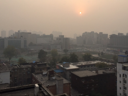
Thick Smog over Xi’an
Dropping off our bags, we set out to explore the city. Our hostel was located in a wholesale/market neighbourhood of the city, with delicious coffee shops scattered throughout wholesale stores. (For the record, the coffee throughout China was consistently fantastic!) Walking along the narrow sidewalks crammed with scooters and bicycles, we passed wholesale vendors selling everything from engine parts, cookware and beauty products. At the end of our block, we were immediately greeted by the strong, unmistakeable smell of a fresh fish market, with every type of seafood imaginable on display in the open air.
In the centre of historic Xi’an, we traversed a chaotic, multi-lane roundabout to visit the ancient Bell Tower. Over 600 years old and built in the Ming Dynasty, the tower was named for the 6.5 ton bell within, which historically was rung to tell time or to raise an alarm in the ancient city. The classical Ming architecture in the tower was reminiscent of the Forbidden City, with green-tiled eaves and red decorative lanterns.
After a few failed attempts to find lunch (complete with one instance of being ignored at a restaurant!), we tucked into a steaming basket of dumplings and bowl of spicy noodles. Continuing our exploration in the afternoon, we wandered towards the Muslim Quarter. Turning a corner, we were met with an immediate assault on the senses - scooters whizzing through crowds of people on Bienyuanmen Muslim Street, with hundreds of handmade food stalls lining the bustling sidewalks.
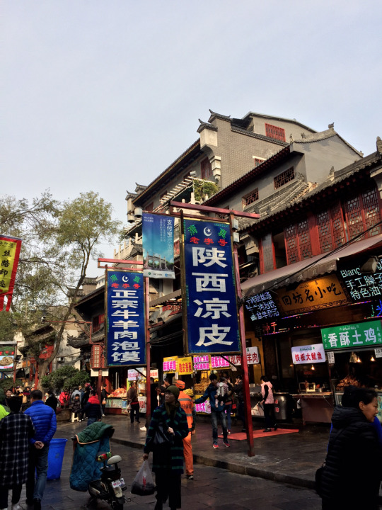
Market in Xi’an’s Muslim Quarter
The food market in the Muslim Quarter was unlike any I had ever seen before. Carcasses of various animals were hung along the street, with the meat stripped down to the bone. In China, almost every part of an animal can be used in cooking - which we saw throughout the market, with lungs, liver and heart displayed for sale. The smell of roasting walnuts, scooter exhaust and pungent jackfruit filled the cold air. Walking amongst the stalls, every imaginable food could be purchased, from deep fried potato spirals, blocks of spiced tofu, freshly squeezed pomegranate juice, and persimmon donuts. Chinese Muslim men behind stalls wore white caps, with women covering their head with beaded headscarves.
We continue along a series of side streets to find hundreds of other products on sale, from spices to pearls. We were quickly on the receiving end of some fairly intense sales pitches and bartering, in one case a vendor grabbing at our clothes as we tried to quickly walk away. Needing a break from the chaos of the Muslim Quarter, Christie and I retreated to the nearby Great Mosque of Xi’an. A complete juxtaposition to the commotion of the nearby streets, the peaceful grounds of the walled complex provided us with a welcome quiet moment. Built in the Ming Dynasty, the Mosque mixes traditional Chinese architecture with Islamic designs seen in the Middle East. Lush gardens were framed by ornate wooden archways, separating a series of beautifully manicured courtyards.

Christie wandering through the grounds of Xi’an’s Mosque
Gathering our energy over another coffee (the fatigue from riding the overnight train kicking in around now!), we headed to the South Gate of the city to walk around the Xi’an City Wall. Running alongside a moat, this impressive wall circles the historic city centre, running for 13.7 kilometres. At 12 metres tall and 18 metres wide, the wall was built to protect Xi’an from invasion, and is among the largest defensive military systems of the ancient world. As the daylight fell, Christie and I wandered along the top of the South wall as the red lanterns were lit. From our vantage point, we could see both the ancient and modern sides of the city as we walked back to our hostel for the night.
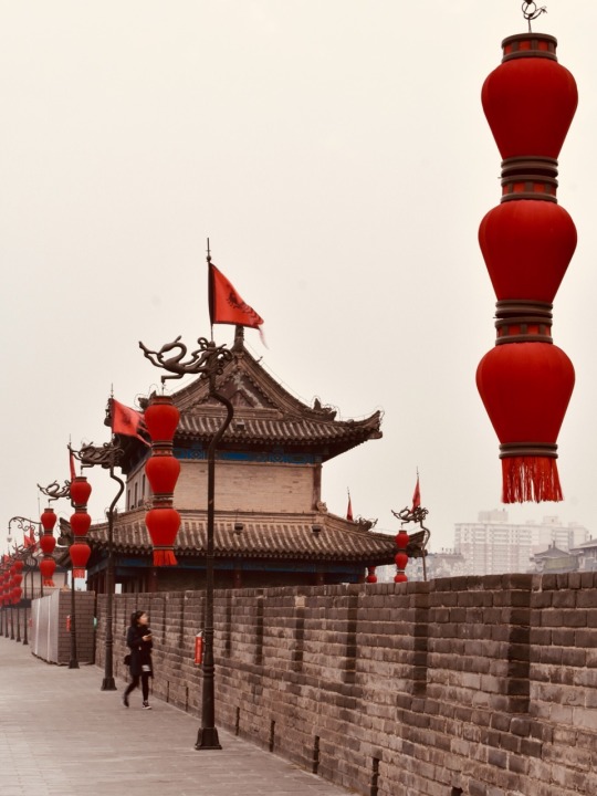
Lanterns along the city wall surrounding Xi’an’s historic centre
Day 58 - Xi’an and Terracotta Army
Christie and I woke early and headed out to visit the Terracotta Warriors, located about 40 kilometres East of Xi’an. The Terracotta Warriors (or “Army”) were only discovered in 1974 when farmers were digging a well, and is considered to be one of the most famous archeological discoveries in modern history. The Terracotta Army is estimated to have been constructed around 200 BC, and is made up of thousands of life-sized clay warriors. This Army was built to provide protection and military power for the first Emperor Qin Shi Hueng in the afterlife, and represents the soldiers he commanded during the wars that unified China. The Terracotta Warriors, which include an infantry, and cavalry, were buried near the tomb of the Emperor.

Terracotta Warriors in Pit 1 - the largest excavation site
It was freezing cold outside as we began our visit to the Terracotta Warriors. The site has three separate excavation pits, with several ongoing digs in progress. The largest pit is the size of an airport hanger, with row upon row of life-sized terracotta models. These warriors would have once been brightly painted, but after thousands of years in the ground, all colour has worn away. As I took in the impressive rows of ancient warriors, I gradually began to notice variations in their uniform, hairstyle, and posture. These small differences indicate the rank of the soldiers: from generals, to archers and charioteers. In another pit, there were also life-sized terracotta horses.

The main excavation site is the size of an airplane hanger, and growing.
After visiting the excavation site, we continued onwards to see the mausoleum of the first Emperor. This tomb has not yet been excavated, and there is little more to see than a massive pyramid of earth in the distance. Archeologists suspect that within this mausoleum there may be further life-sized models to protect the emperor, along with a replica of the ancient city of Xi’an. It is also believed that in addition to the clay figures, thousands of real people were buried alongside the emperor - from concubines to craftsman who built the mausoleum. All of these people were intended to follow the emperor into the afterlife. There are many stories and ancient texts describing the wealth and riches buried within the tomb, as well as descriptions of booby traps to guard against robbers.
Unfortunately, Christie became very sick enroute to the site, so our visit to the Terracotta Warriors ended up being quite brief. (Christie jokingly asked me to call this post “Christie learns what Immodium does and has hallucinations about going on a spirit quest”). It was a pretty rough day for her, and she ended up going to sleep immediately after our return to Xi’an.
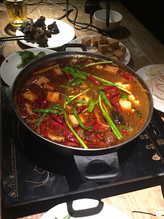
Traditional Chinese Hot Pot
After making sure that Christie was resting and had everything she needed, I joined our British roommates for homemade Chinese hot pot. This delicious dish is made by cooking a variety of vegetables, tofu, noodles and spices in a boiling broth on the table in front of us. I had a few beers with a jovial group of Brits, including one very impressive guy who had cycled all the way from England to China!
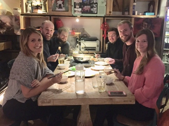
Hotspot dinner with the Brits!
After dinner, we decided to take out Mobi-bikes (one of the countless bike-share programs in the city), to cycle across Xi’an to a bar tucked away near the South Wall. Biking through Chinese traffic, including through massive roundabouts, was equally exhilarating and terrifying - an experience in and of itself, given that so many Xi’an residents get around town this way.
The hidden underground bar, though not visible from the street, was packed with a combination of Chinese locals and a few foreigners, listening to live music, dancing and playing table games. I had a great time, and really enjoyed seeing what a night out in China was like!
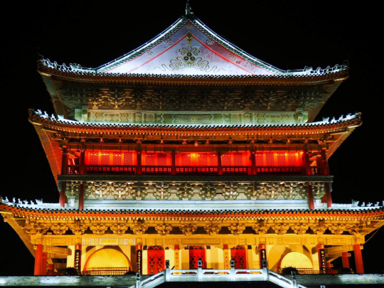
Xi’an’s Bell tower at night
1 note
·
View note
Text
When I was twelve I met my father’s father, FatherGrandpa...
ii
When I was twelve I met my father’s father, FatherGrandpa, for the third time. He was a man who laughed at his own jokes. After a stint as a bookkeeper with the Governor of the Gold Coast, he became a merchant. No one knows how he amassed the wealth he was famous for, but he claimed to have profited from the Second World War. As a direct result of his trading activities, the Ribeiro Trading Company had children in many major port cities in the world: Monrovia, Liverpool, Port of Spain… He kept a list. He came to visit GeeMaa who had just had a hip operation. It was the first time he had come to our house.
He sat. Raised his long, heavy legs onto a patterned sheepskin cushion on the floor. He reached for the water my mother brought him and drank. Sunlight from the living room window cast slatted streaks across his balding head. My father, mother, Naana and I stood in order of decreasing height in front of him. He repeated an old joke as if it was new.
“Ah, Kojo, I see you inherited my taste for fine women!”
He laughed and slapped his left shoulder with his right hand. The sound of his glee was reminiscent of the gurgle of an emptying bath. We barely smiled, but he carried on.
“Where is the beautiful cripple?”
Our parents sat down in the cane armchairs to FatherGrandpa’s left.
“Go and get GeeMaa,” my father instructed.
Naana and I went to GeeMaa’s room to call her. Because of the newness of the operation she walked with the slant and rhythm of a wink. We heard FatherGrandpa laughing as she approached the living room. We looked at each other, shook our heads, and went to sit under the neem tree in our front yard. The neem tree was familiar territory although I hadn’t been to it for a while. It was where I cut chewing sticks for GeeMaa and myself until I went to boarding school.
I didn’t want to be teased in school for chewing sticks while everyone else used fluoride and toothbrushes, so I stopped chewing the sticks. I had felt no ill effects, but I had been unhappy. GeeMaa’s health had been bad since I left for school and it worried me.
I looked across at Naana and smiled. We were still close even though, as my father put it, she was a woman with a vote now. She passed me a stick of green Wrigley’s chewing gum.
“Thank you.”
The tree filtered a net of sunlight that dappled our faces and we sat ensnared within it.
“I’m glad GeeMaa made our names Oppong-Ribeiro.”
I understood Naana. Plain Ribeiro would mean immediate association with our cavalier grandfather. Naana was studying at the University of Ghana, a place where reputations were made, and her image was important to her. I didn’t care much about image, but I understood.
FatherGrandpa summoned me as he was leaving. He opened his red address book (the one that held details of his children) and gave me an address in Trinidad. The book was indexed by name, age, profession and mother’s name. It was well worn but tidy inside.
“Ebo, I saw one of your photos on the wall. That address is for your uncle Sanjit in Trinidad. He is an artist. He will like it.”
“Thank you.”
His height made me feel humble. Though seventy-seven years old, he held himself like an eager cadet.
“Don't thank me,” he laughed. “You have thirty-three uncles and aunties. You have to start knowing them early!”
As he said that I imagined that Miss Havisham would definitely have had her own child if he had been engaged to her. Then she wouldn’t have had time to wallow in self-pity and become so mean. The thought made me smile.
He slapped my back and made me stumble. Then he laughed harder as he sauntered to his chauffeur-driven Lincoln.
I wrote to Uncle Sanjit the next day; a long letter, written on good blue writing paper from my father’s office. The office was simply a table fitted into one corner of the dining room. In the letter I explained to Uncle Sanjit how I got his address, then drew a family tree to show how we were related. For his mother’s name, I drew a dash. I asked for the meaning of his name and added a selection of the pictures I had taken in the five years since Auntie Dee Dee died.
His reply came in a large flat package that my father drove all the way to my boarding school to show me. My school was the Prince of Wales College in the days when Ghana was still called the Gold Coast, but by the time I got there it was called Achimota School. It was my father’s alma mater.
My father helped me open the package with a screwdriver from his glove compartment. It contained a painting and a short note. I painted the picture I liked. It was a pastel rendering of the hills of Aburi at sunset. I had taken that picture during a school trip to play football with the students of Akosombo Secondary School. P.S. My name means he who is always victorious. Keep in touch.
I stared at his interpretation of my picture. Surely he had smelled the evening mist with me, heard the firm crunch of gravel under the tyres of the school bus, seen the sky change from blue to orange to purple. Uncle Sanjit revealed in his next letter that he had studied Art in London and New York, and now ran a small gallery below his studio in Port of Spain. He thought that I had a very good eye and could become an artist if I chose to. For days, I reread his letter, trying to imagine myself as an artist. I loved reading, and taking photographs was something that had helped channel my confusion after Auntie Dee Dee's death – something I had come to love. In the light and shades of its practice, I had come to better appreciate the travel of thoughts across faces. The extra filter it gave to my visualisation enriched my reading and I had come to value storytelling even more. But I didn't think of photography as art, and I had never thought of myself as an artist. I was entranced. I wrote to Uncle Sanjit every two weeks. He wrote back – about one letter for every four I wrote. They were long letters that described every corner of our separate worlds in delicate detail; the way lizards in Ghana dart around in daytime sun like couriers, how the green of the trees in Trinidad seemed to have blood pumping in them. He told me that his mother was of Indian origin with Hindu roots and ran a food hut by the port. He tried to convey in writing the enchanting singsong rhythm of Trinidadian speech, while I translated and wrote short volleys of Ghanaian proverbs, explaining their origins when I could eke the information out of my parents or Auntie Aba, the waache seller. He ended his letters with quotes from an endless list of luminaries. Benedict Spinoza, Patrice Lumumba, Indira Gandhi. I hadn’t heard of half of them so I found myself spending even more time in the library at school just to keep up. I told him that because he was only twenty-six, I thought of him as my bruncle. I sent Uncle Sanjit hundreds of pictures; insects splattered startled on the windscreen of a truck returned from the countryside, electric pylons straddling rubbish dumps, barefoot children playing with handmade footballs, the fragile-looking wooden shack that was our local corn mill, two-toned sunsets, reeds, flowers and trees caught from unusual angles. It must have taken a lot of his time, but he often replied with short notes and prints of paintings of his favourite shots. I sold some of the prints he sent to my father’s friends, but most of them ended up either on my bedroom wall or with Naana. When GeeMaa died two years after her hip operation, I sent him pictures of the funeral. GeeMaa’s coffin was designed in the traditional Ga manner. Carved and painted as an ambulance to honour her forty years of service as a nurse and midwife. Because she was over seventy years old her funeral was of a light mood.
“She had all her time on earth.”
“She has gone to a better place.”
“God called her.”
“She has gone to help HIM.”
Condolences wore clichéd chrysalids. People came wearing white smiles on dark faces. Clothed in black and white; black to signify the death of a friend, white to celebrate her passing on to a better life. A few of the women had glittering white damask and chiffon with black lace scarves thrown artistically across their shoulders. I took a picture of one of them. Head-shaking guests of all ages came. They came bearing nothing but their empty bellies, which they proceeded to fill with food bought with my father’s hard-earned savings. Some claimed GeeMaa had delivered them as babies. Others claimed she had healed them. Every last person had a story to tell. Piecing these anecdotes together, I tried to construct the parts of GeeMaa's life that she had not told me about. Things she had perhaps considered too mundane to share. One of the second intake of British-trained nurses, she had been the only child – boy or girl – from her fishing community sent to the mission school. As she tuned her ears to the clipped tones of sunburnt priests, her playmates and their parents saved treats that the fishermen gave away from the canoes coming in – eels, didɛ bibii and tsile – and waited; first, to hear stories of peculiar behaviour by the missionaries, then, to listen to her reading and translating from her books. She repaid them, after she had qualified as a nurse-midwife, by treating their sick out of hours and teaching the young to read. By 1935, successful young men, social climbers, emerging business magnates and charlatans were camping outside her father's door, hoping to win the affections of the woman one of her friends called 'the best Charleston dancer in Accra'. As such, there was a collective sigh of dismay when FatherGrandpa went to Korle Bu with a broken finger and walked out with a plaster cast and GeeMaa's heart. These stories floated around on the suspension of grief and remembrance, maintaining a steady hubbub on our courtyard. In every corner, a story; not always believable, but a story nonetheless.
“Oh, she was a great woman. Always smiling…”
“Ei, she was good oh! Better than some of the doctors.”
“I have a photo of her with my Kwame when he was born. Look at him now.” The black and white clad bundle of mothering flesh pulled her boy towards her by the sleeve. “Isn’t he handsome?”
Kwame smiled one of those smiles designed to support the social efforts of preening mothers. Lifting his cheeks slightly as though he were swallowing a bitter pill.
By nine a.m. our courtyard was full of chattering mourners. Our square cream-painted house was like a piece of sponge cake besieged by flies. I took a picture from a distance. On the large veranda that led to our front door, GeeMaa’s body lay in state. As the visitors glided past the neat corpse, they stopped and shook hands with my father and his siblings. Auntie Patience, Auntie Ama and Uncle Tommy had all insisted on a big funeral, yet none of them offered to help with the cost of organising it.
“But she died with you,” they said. As though my father had somehow killed GeeMaa.
I overheard my father telling my mother that they were already arguing about who would inherit GeeMaa’s two houses in Adabraka. Yet they sat there, looking fashionably solemn in matching fabric permutated into different outfits. Matching envelopes of discontent – to be opened after the funeral.
continued >> here <<… | start from beginning?
| current projects: The City Will Love You and a collection of poems, The Geez
0 notes
Text
“DAMN”: A Review.
Over two years after the release of the critically acclaimed and Grammy winning sophomore album “To Pimp a Butterfly”, Kendrick Lamar has done it again with the release of his long awaited follow up “DAMN”. While it has been obvious to many in recent years that Kendrick is not only the future of hip hop but very much its present, his new album also further solidifies him as one of Black America’s most important poetic voices, period. If “To Pimp a Butterfly” was heralded for the melodic way in which issues such as racial inequality, profiling, and depression were tackled with skillful clarity, its sequel can be likened to the way a surgeon after addressing the larger tumor, uses his scalpel with steady precision to cut away at and expose the nuances of its effects. This is to say that whereas “To Pimp a Butterfly” was in many ways more of a ‘what’ album, “DAMN” goes a bit further as Kendrick in fourteen tracks, gives us an exposition into the ‘how’s’ of systemic racism and interpersonal conflict. Themes of fear, self-doubt, isolation, mistrust, fame, and posturing are woven in between cinematic production that has the effect of pulling the “foreign” listener into the matrix of schizophrenia that at times characterizes the emotional toll of the Black experience in America. Like most renowned artist, Kendrick through his willingness to be vulnerable and introspective, portrays with stunning depth the many cruxes at which Black folk stand when attempting to deal with life in a world in which they find themselves the seemingly perpetual “subject”. Even further, this latest album sonically succeeds in framing such matters in a way that has made Kendrick Lamar synonymous with being hailed as the poetic interpreter of Black life, by evoking strong idioms of the blues and classic soul via pin point production. While it is true that most artist and thinkers are products of their time often drawing from that which is available personally and macrocosmically, it is just as true that many still can trace at least some of their theory from a predecessor, however intentional or not. Considering this fact, one could argue that in Kendrick’s “DAMN” is most reminiscent of Richard Wright’s semi-autobiographical narrative “Black Boy”. While the former’s latest work isn’t what one would consider autobiographical in the purest sense, Kendrick does utilize personal innuendo in such a way as to strike a note with the listener who can appreciate Kendrick’s honesty about his own personal battles with identity and social crisis. In this way, “DAMN” cleverly blends the polemical with the intimate. Like Wright, Kendrick is apt at painting a vivid picture as it pertains to the totality of subjugation and the myriad of its absurd effects on not only the body, but the psyche and behavior of the oppressed. In the opening Kendrick goes into a short story in which he speaks of a blind woman who appeared to be looking for something, approaching the woman he say’s “it looks like you lost something and I want to help you find it”. In kind the woman responds, “you have lost something…you’ve lost your life” after which the ominous echo of a gunshot can be heard before the album trails into the first track “DNA”. This intro has a shrewdly symbolic bent, and like most symbols can likely be interpreted in several ways. But, given the socially conscious range of Kendrick’s lyricism, it wouldn’t be a stretch to theorize that Kendrick’s attempt at helping the blind woman (in this case the symbol of justice) find something (finding “her” soul, or conscious maybe?) is somehow a figurative representation of the historic and often thwarted attempts of Black America to do the same for the country at large. Or maybe the shot heard in the intro’s finale illustrates the violence placed upon the body, mind, and spirt at such attempts. In any event, Kendrick leaves a cleverly carved space for which the listener can fill in the intro’s blanks before being ushered into the meat of the album beginning with the aforementioned title track “DNA”.
It is on this track that we are forcefully reminded of what makes him great…his sheer adeptness at shredding a track to pieces with crafty lyrical dexterity. He then goes on to blend that which makes him great with that which makes him and ultimately us, human; “I got power, poison, pain and joy inside my DNA/I got hustle though/ambition flow inside my DNA”. This duality is ultimately a part of the human experience but is particularly acute within the realm of Blackness wherein resides the DuBoisian concept of the double consciousness. It is this concept of being both Black (African) and “American” that has simultaneously served as our biggest psychic burden and has allowed us to adapt creatively to circumstances in such a way as to make improvisation one of the signifying markers of Blackness. Thus, Kendrick acknowledges that not only is it in his DNA but in all of ours through that ever-elusive Black genetic marker known as soul or ‘cool’. The following song entitled “YAH” is a slow-paced track in which the image of an isolated star comes to mind, it’s a near dreamlike state in which one awakes to the amalgams of distorted “advice” and rumors from all sides. Cornered he finds that his proverbial “radars is buzzing” with the white noise so often accompanied with fame, he laments from the outset: “I got so many theories and suspicions/I’m diagnosed with real nigga conditions”. He then harps on the signals he receives in everyone from his mother who thinks he will “work himself to death”, to his girlfriend who reminds him “not to let these hoes get his head”. One gets the feeling that being famous has a way of rendering a person worn at the emotional seams from being pulled in multiple directions in an already fast paced world. And as if that isn’t enough, Kendrick then alludes to FOX News’s misinformed critiques of his lyrics (particularly Geraldo Rivera), this while simultaneously seeking clarity via a renewed sense of identity as a Hebrew Israelite a path suggested by a distant cousin eluded to in recorded phone calls throughout the album. The latter path isn’t one atypical of the African American search for identity as it is well documented about myriad of Black socio-political/religious movements that sprang up during the earlier half of 20th century, many of which adopted a nationalistic posture in defense of community and against injustice. However, Kendrick does offer us a glimpse in to what he considers the silver lining of normalcy in it all, his niece who simply sees him as “Uncle Kendrick”. The ensuing track “ELEMENT” could be best described as a Molotov cocktail of witty lyricism, signature hip hop braggadocio and anxiety. After all he opens by stating: “I’m willing to die for this shit/I done cried for this shit/might take a life for this shit/put the Bible down and go eye for an eye for this shit”. Certainly, no one even vaguely familiar with the lyrical elements and strident nature of hip hop verse wouldn’t consider Kendrick “violent” for such an opening line. Rather it reveals the crossroads that one finds themselves at when coping with the pressures of relatively new found fame and the contradiction between wanting to hold dear to what one has worked so hard for, despite whatever could potentially come about. Such is the nature of success and particularly Black success in America which often tends to be linked to surviving extraordinary circumstances to attain status. Said status achievements are then even more guarded with hubris, and sometimes a paranoid anxiety based in fear and mistrust best summed up by Kendrick with the line: “we ain’t going back to broke/family selling dope”. However, in the hook he dually reminds himself not to be taken out of his element given this fear. “FEEL”, the succeeding track opens in a whisper woven into instrumental through which Kendrick and a female voice can be heard repeatedly saying “ain’t nobody praying for me”. Here he comes off on the production as an embattled MC’s withering internally from the demands and misunderstandings of the world around him. Even mentioning the false sense of security yielded from a celebrity that has compounded many of the life’s difficulties. Kendrick feels intensely, yet these feelings about the toxicity level of a rap world in which he dominates are balanced by his own feelings of confidence about his standing in the hip hop world. It’s a theme that has often been explored in depth with childhood celebrity and in spaces outside of hip hop’s mainstream where it is speculated that the pressure to adapt to life in celebrity has led to many a down fall. Hip hop has often been categorized as distinctly different however given the genre’s braggadocios nature, and it is often assumed that since most rappers from starkly humble beginnings fame and fortune serves as not only an antidote, but as a permanent source of material. Kendrick shatters this myth, while simultaneously acknowledging his new-found wealth and celebrity he also considers what’s happening in the world around him as akin to apocalypse where for everyone else “nothing is awkward”. The legendary Nas once stated, “in the land of the blind the man with one eye is the king” and Kendrick heavily tuned into seeing this through the maze of confusion that is fame with all of its participants: “the feelin' of an apocalypse happenin', but nothin' is awkward/the feelin' won't prosper/the feelin' is toxic/I feel like I'm boxin' demons, monsters/false prophets schemin', sponsors, industry promises/niggas, bitches, honkies, crackers, Compton/Church, religion, token blacks, and bondage/Lawsuit visits, subpoena served in concert/fuck your feelings, I mean this for imposters”.
Yet and still, irrespective of these predicaments and more, his sentiment is best condensed in the hook, “ain’t nobody praying for me”... heavy indeed is the head that wears the crown. “LOYALTY” is a track that could best be described as having the components of a future radio single with a classic west coast sound. It’s slow paced and laid back roll out serves as perfect fodder for Kenny’s semi-automatic style flow in which he questions the loyalty of females particularly those near and around the industry. He quips sarcastically, “you caught me at the right time/when it’s dollar signs”. This track featuring Rihanna is a perfect match as she matches the tempo of Kendrick and weaves lyrics that question the nature of a man’s loyalty. Is loyalty merely driven by your convenience to others (family, friends, etc) or is there something deeper? This is question that is faced when one encounter’s extraordinary levels of fame and even more when one is Black and successful, as most Black wealth when such is achieved is often first generational, thrusting one into the role of provider for nearly every family member. This has an adverse effect of blurring the lines of what is considered loyalty. “PRIDE” illustrates a conflict of possessions and purity. Honest enough to acknowledge that his what is often perceived as his persuasion to social consciousness doesn’t make him perfect, he poses a question throughout the length of the track that can be best summed up at the top of the songs opening: “hell-raising, wheel-chasing, new worldly possessions/flesh-making, spirit breaking, which one would you lessen?/the better part, the human heart, you love 'em or dissect 'em/happiness or flashiness? how do you serve the question?/see, in the perfect world, I would be perfect, world/I don't trust people enough beyond they surface, world/I don't love people enough to put my faith in man/I put my faith in these lyrics hoping I make a band, I understand/I ain't perfect”.
In a sense, Kendrick can be found attempting to explain the complexity of human life and the peculiar effect that certain responsibilities have on others perception of you. Fighting internally, one must at times ground themselves or find external ways to do so by reminding those with these expectations of their humanity and flaws, and how those flaws were created. “HUMBLE” the album’s first commercial cut is yet another exercise in lyrical prowess and genius arrangement. Ironically the track is boastful as we are reminded why he is indeed the greatest at press time. It’s lock and step with hip hop’s confidence idiom but not without reminding us from whence Lamar came: “Aye, I remember syrup sandwiches and crime allowances/Finesse a nigga with sum counterfeits/But now I'm countin this/Parmesan where my accountant lives in fact I'm down at this/D'usśe with my boo bae, tastes like kool aid for the analysts”. The end of “HUMBLE” takes us back into the depths of Kendrick’s social analysis with on the succeeding track “LUST”. Much like his theoretical predecessor Richard Wright, Kendrick is more than apt at pointing out with stunning quality the ways in which we as a people often get in the way of our own progress through behaviors that have seemingly become second nature. The first two verses shepherd the listener through the inner sanctum of two parallel lives one male, the other female, engaged in the daily routines of selfish instant gratification. Such a signifier has been considered among one of the many negative elements of Americanism, the desire for immediate pleasures and whims without regard for long term consequences. And given that the Black experience is inextricable in many ways from the American experience at large, this trait has been considered among one of the most damaging. This is a line of thought most often commercially associated with Black nationalist types who espouse industry over frivolity, but which is shared among Black movements of all theoretical types to some degree or another. It’s clear to peep the knowledge of Kendrick through the examples of these two narratives. However, he again drives home the point that he’s not merely critiquing society from a lofty and self-appointed perch, rather he draws from personal experience to reflect on his entanglement in the same web: “I wake in the mornin', my head spinnin' from the last night/both in the trance, feelings I did-what a fast life!/manager called, the lobby called, it's 11: 30/did this before, promised myself I'd be a hour early/room full of clothes, bag full of money: call it loose change/fumbled my jewelry, 100k, I lost a new chain/Hop on the bird, hit the next city for another M/take me a nap and do it again/we all woke up, tryna tune to the daily news/lookin' for confirmation, hopin' election wasn't true/all of us worried, all of us buried, and our feeling's deep/none of us married to his proposal, make us feel cheap/still and sad, distraught and mad, tell the neighbor 'bout it/bet they agree, parade the streets with your voice proudly/time passin', things change/revertin' back to our daily programs, stuck in our ways; lust”. It’s at once a song of frustration with the perpetual cycle of society’s failure to learn from its errors and the absurd notion that even in learning we tend to repeat them, leading to an inner contention that rivals suffering itself. “LOVE” is the ensuing 10th song on an album that if it had ended here would still deserved to be deemed an instant classic. This poem’s sequence on the album however is more like the metrical version of seeing Kendrick relax and take a calming breath of air, this induced only by thoughts and reflections on the meaning of a special someone that he’s been in a long term low profile relationship with. While much of “DAMN” up until this point tends to be about the perils of success the song evokes the duality of its privileges, but only when there is someone to share them with. Not only this, it’s a light track that once again acknowledges the good in a mad world and lightens the album’s genius yet dense subject matters. “XXX” is one of Kendrick Lamar’s most stinging feats of rhetorical prowess in which he connects the dots between what’s often posited as “inner city violence” or rather “Black on Black” violence and America’s role in fostering such environments. Tackling the humanity of anger is yet another narrative of this track wherein upon the murder of a friend’s son he’s contacted by the friend for advice. Hoping for Kendrick to serve as his better half under what could only be described as a parent’s worst nightmare, Kendrick finds himself unable to tap into the loftier spiritual expectations placed upon him, a portion of the verse summarizes this interaction: “yesterday I got a call like from my dog like 101/said they killed his only son because of insufficient funds/he was sobbin', he was mobbin', way belligerent and drunk/talkin' out his head, philosphin' on what the Lord had done/He said: "K-Dot, can you pray for me?/It's been a fucked up day for me/I know that you anointed, show me how to overcome."/he was lookin' for some closure/hopin' I could bring him closer/to the spiritual, my spirit do know better, but I told him/"I can't sugarcoat the answer for you, this is how I feel:/if somebody kill my son, that mean somebody gettin' killed."
One is taken back to the title of his sophomore album “good kid, M.A.D.D. city” and reminded of Kendrick’s Compton, California origins where like so many systematically deprived Black areas, violence is commonplace. But Kenny makes it perfectly clear that this dysfunction isn’t mere osmosis when he states within the last verse (among other barbs): “it's nasty when you set us up/then roll the dice, then bet us up/you overnight the big rifles, then tell Fox to be scared of us/gang members or terrorists, et cetera, et cetera/America's reflections of me, that's what a mirror does”, this statement is made even more superb given the fact that in a country that often embraces the right of white males to arms, people with color and arms are framed as particularly dangerous. Nonetheless the testament track and most Richard Wright-esque work on the album just may be “FEAR”, which delivers an apt description of the trait (other than coolness, spirituality, and improvisation) that so often finds itself expressed in Black behavioral patterns. It opens with a recorded call from Kendrick’s cousin Carl Duckworth a seemingly zealous follower of Old Testament Biblical religion, who we later learn is a possible member of the Hebrew Israelites, a nationalist Judeo African American religious movement. The phone call appears to be in response to a Kendrick that may well be falling victim to an inner crisis, one for which he feels no one has the answer to. At one point on the call Carl harps back to Kendrick’s lament: “I know you been having a lot on your mind you know, like you feel like, you know, people ain’t been praying for you”. He then goes into a spiel that is among the myriad of socio-religious identity theories of found among Black versions of all schools of religion, but especially those born in the states. Carl in part attempts to explain Kendrick’s confusion by attesting to our cursed nature utilizing a verse from Deuteronomy 28: 28. This track’s opening then questions God himself “why God why God do I gotta suffer/pain in my heart carry burdens full of struggle”, before launching into a full-fledged verse in which Kendrick appears to describe abuse or the threat of it, often doled out at the hands of some Black parents (in this case appears to elude to a Black single mother) for the least of infractions. There’s a direct parallel that exist here between the work of Richard Wright and Kendrick Lamar. In “Black Boy”, an overall narrative that runs through much of the text is the domestic corporal punishment that Richard almost always seems to be threatened by. This is particularly acute as it pertains to his maternal grandmother and “Aunt Addie”, strict Seventh Day Adventist who so controlled by a “puritan” religion and the southern “custom” of Black fear of white retribution for Black “misbehavior” that they practically attempt at every turn to “beat out” what to them appears to be a young Richard’s staunch independence. As a result, Wright finds himself trapped between a racist and unforgiving white world and a Black world whose response to the white world is one driven by fear and its own form of “for your own good” oppression and other responsive madness. This kept Wright in a constant state of fear of not only the outside world but what was supposed to be the intimate familial space. This sentiment is echoed on the first verse of Kendrick Lamar’s “fear”. The second verse tackles the fragility of Black life in which activities that would otherwise be harmless, could lead to possible death. It’s a peek into what so often appears to be the randomness of violence in poor Black neighborhoods and the added burden that comes with attempting to navigate a hostile larger world in the microcosm of one’s own community. In the last verse, Kendrick goes into the irony of fame. While the sentiments of American late capitalist types would have us believe that fame and fortune are the only antidotes to poverty and lacking, we are reminded that for those of us who are able to make the transition from the proverbial “rags to riches” it is not always so simple. Kendrick’s new found fame is explored in the last verse as juxtaposed to the poverty from which he came and this has the effect of evoking a new type of fear…the fear of losing it all. It’s in this verse that one can also see where much of his anxiety stems from. The worlds of money and celebrity are riddled with tales of those who have succumbed to its shark infested waters only to return to the places and madness from which they were thought to have escaped. It’s a preoccupation that has seemingly driven Kendrick to the brink at times and it is in part his reason for reaching out to his cousin Carl, who in the swirl of all the madness appears to be a guiding spiritual voice. At the end of the last verse Kendrick’s confusion is summed up in a haunting refrain: “Goddamn you/Goddamn me/Goddamn us/Goddamn we/Goddamn us all. Afterwards, yet another recorded phone call from Kendrick’s cousin Carl can be heard in which he can be heard spinning a somewhat confusing logic on the “curse” of Blackness stating this time:
“So, until we come back to these commandments, until you come back to these commandments, we're gonna feel this way, we're gonna be under this curse. Because he said he's gonna punish us, the so-called Blacks, Hispanics, and Native American Indians, are the true children of Israel. We are the Israelites according to the Bible. The children of Israel, he's gonna punish us for our iniquities, for our disobedience, because we chose to follow other gods that aren't his son, so the Lord, thy God, chasten thee. So, just like you chasten your own son, he's gonna chastise you because he loves you. So that's why we get chastised, that's why we're in the position we're in. Until we come back to these laws, statutes and commandments, and do what the Lord said, these curses are gonna be upon us. We're gonna be at a lower state in this life that we live here in today, in the United States of America. I love you, son, and I pray for you. God, bless you, shalom”.
To be sure pointing out this religious sentiment of Carl’s is not a dig at his religion or beliefs, however within the context of the Black experience in America, it is important to recognize the myriad of systems on the spectrum of Black religion. Historically speaking, religion has served as a guiding light for Blacks, a political tool, and an explanatory narrative of systemic racism. In this way theories of the Black station in American life can at times become varied and confusing from the outside looking in, and one gets the feeling that Carl himself while appearing zealously coherent in Hebrew Israelite doctrine, is just one of the millions of Blacks in America seeking answers to the madness. Appropriately, the following track entitled “GOD” can be looked at from either one of two angles. One the one hand one could interpret this as typical hip hop theatrics of boastfulness, the type wherein the celebratory nature of making it can render one seemingly invincible to at least one’s former woes. Yet everything Kendrick touches seems to hint at deeper meaning, and “GOD” may just as easily be in step with the meeting of the secular and the spiritual. It has often been stated that some are made but the greats are chosen, and on this track, there is full embrace of the latter as he reflects on from whence he came and where he has arrived. It also should not escape the listener that proclaiming oneself as “god” incarnate is not a new religious theory and in hip hop was proselytized by adherents to 5% Islam better known as The Nation of Gods and Earths. The message is context can then be seen as Kendrick reminding us that like him we too can embody gods and goddesses on earth.
“DUCKWORTH” the final track of this album gives a previously unknown glimpse into Kendrick’s origins and the genesis of his relationship with TDE (Top Dawg Entertainment). Known for not only his lyrical prowess but his somewhat guarded nature as it pertains to his personal life, we find that the origins of Kendrick’s relationship began long before he was scouted by Anthony “Top Dawg” Tiffith as a 15-year-old mixtape rapper. It was in-fact a near fatal encounter between the then street hood Tiffith and Kendrick’s father Kenny Duckworth in the 80′s that brought the pair together when Lamar was but a child. Kenny, a Chicago native, relocated to Compton, CA where he too brought his street savvy with him splitting time between hustling and working part time at a KFC across from the infamous Nickerson Garden homes, a blood gang territory and home to the hustling and banging Tiffith. A chance encounter between Kendrick’s father and Tiffith at the fast food spot led to a relationship that was at first born out of Kenny’s savvy in recognizing the street status of Tiffith and his crew, who had previously robbed the restaurant, shooting two people in the process. Little did Kenny aka “Ducky” know that the crew was planning to rob the store again and this time willing to take out Ducky if necessary. However, Tiffith took a liking to Ducky and this led to a relationship that would re-manifest years later when the two would bump into each other at a recording studio. By this time, Anthony “Top Dawg” Tiffith would be managing producers and scouting talent and one such talent would be Ducky’s son, Kendrick Lamar Duckworth. The genius of the track is in a sense admittedly overshadowed by the listener’s interest in the story itself, yet the vivid tale of chance and choices are obvious throughout. “DUCKWORTH” is the proverbial slam dunk ending on an album which at its core is about the duality and absurd complexity of the human condition and more specifically when it’s in Black. While there may be some who will tout “DAMN” as only an album fraught with anxiety, confusion, and introspection, the final track is a testament that in the madness of it all silver linings guided by divine hands still exist. Classic.
1 note
·
View note
Text
Temtem is the “Evolution” That Pokemon Sword and Shield Wasn’t
January 13, 2020 12:00 PM EST
Temtem might be heavily inspired by Pokemon, but it builds on the concept so strongly that it deserves merit in its own right.
Temtem is a lot like Pokemon. Let’s get that out in the open right away. Developer Crema has described Temtem as “a massively multiplayer creature-collection adventure inspired by Pokemon” on their Steam page. Their inspirations are open and unabashed. Many will look at this and simply dismiss it as a Pokemon clone, or an ascended fangame. But I feel that writing Temtem off so quickly is disingenuous; this is clearly a passion project that they have worked very hard on to differentiate it. The inspirations are worn openly on their sleeve, but Crema has done the legwork. It’s immensely rare that I’ve seen a game of such polished quality this early in the development phase.
So with that preamble out of the way, what is Temtem actually? What makes it stand out compared to Pokemon? Let’s dive in.
youtube
What? Your Turn-Based Combat is Evolving!
You start your adventure in Temtem with a bit of light plot and backstory. You’re leaving your hometown to go attend school in the next town over, focused primarily on study and battle of Temtem. After a brief farewell with a selection of NPCs, you make a quick detour to the home of a local Temtem professor, who grants you one of three Temtem to begin your adventure with. You’ll have a quick introductory battle with your plucky rival, wherein you easily best h-
Wait. No. He actually one-shots you immediately using a rare and powerful type of Temtem that has type advantage on all three starters. Huh. That’s new! Either way, with this crushing defeat under your belt, the Professor grants you a second Temtem: a toucan-inspired bird named Tuwai.
Sidenote: I am contractually obligated by DualShocker’s EiC to insist that Tuwai should have been named Toucanslam.
With these two Temtem, you begin your journey proper. Though your immediate goal is to reach the next town and attend classes, there’s nonetheless an encounter with the first Dojo leader along the way. There’s eight of these, and besting the trainers at all of them would surely make you a master of Temtem. As you progress, you’ll encounter an evil organization named Clan Belsoto that you need to stop from achieving their unsavory aims. All the while, you explore the world, find new creatures to battle or capture, defeat all other Temtem tamers in your way… pretty standard stuff for the genre, and it probably sounds a lot like a Pokemon game by now.
But the details are what Temtem excels at. Almost immediately, trying to sink into the old habits of Pokemon will be rebuffed with mechanical alterations and twists. Even from the outset, battles will require strategy and careful consideration. Sure, the average wild Tateru or Pigepic is unlikely to be too threatening, but they’re not going to roll over and die for you either. Allow me to list a few critical systems that allow Temtem to stand out from genre conventions.
Double Battles. You’re granted a second Temtem immediately, and all battles allow you to field two creatures. You might find solo Temtem in the wild or on the occasional tamer, but you can always wield two. This immediately starts affecting strategy, and that’ll become more apparent very quickly.
Moves Require Stamina. Pokemon fans are used to using a set move until it runs out of PP and can’t be used. Temtem instead sees a general Stamina bar for each creature, which starts at full and replenishes a little each turn. As long as you have Stamina to use the move, there’s no problem. If you don’t have the Stamina, you can still use the move, but the excess Stamina will draw from your health and cause your creature to miss the next turn. You also have the option to wait a turn without using a move, if you so wish.
Some Moves Have Cooldowns. In addition to Stamina, some moves cannot be used until the Temtem has been active for a set amount of turns. They then go on cooldown after use for a similar set of turns. This is usually combined with Stamina in some way; stronger moves might have a cooldown for less stamina usage, or else they have a high stamina cost but can be used immediately.
Standardized and Stackable Status Effects. If you inflict Poison or Sleep on an enemy, it will always last a set amount of turns. Damage and debuffs are consistent. Also, you can inflict multiple status effects at once; a Temtem can be affected by two at once, and newer effects will overwrite the oldest one.
Synergy Effects. Certain moves will receive boosts or additional effects based on what kind of Temtem their partner is. My Mental starter Houchic has a move called Energy Manipulation that inflicts damage and the Exhaust status. If the partner Temtem is of a nature type, that damage and status duration is increased. Once again, planning and team composition become more important.
No RNG. Every move has perfect accuracy! Every status effect will land! There are no critical hits! When you use a move or engage in a turn, you can guarantee that it’s going to impact, unless otherwise canceled out by an enemy effect (or your Temtem is defeated before it’s used).
This is only a selection of adjustments and considerations that Temtem employs to spice up the somewhat old turn-based, menu-driven combat of the genre. And this is only a few of the critical differences because there are definitely more; Temtem traits, stat training, individual stat values amongst the species, breeding, and so on. There’s a wealth of combat options under the hood for the clever tamer to employ.
None of this would count for anything if there was no way to utilize it, though. Pokemon has a wealth of options with movesets, but it adequately doesn’t factor into the game until you start playing competitively. Picking a single Pokemon and sweeping your way to the endgame isn’t just a viable strategy… it’s the ideal one. Temtem bucks that trend by offering more of a challenge even in the basic tamer battle.
Attempting to blast your way through with strong moves? Health pools tend to be larger in Temtem, so you’ll get a significant advantage but then drain your stamina and be left vulnerable for a time. Otherwise, your moves might be locked by cooldowns, so it’s best to utilize status effects or soften them with lighter attacks. Type advantages and disadvantages remain — there are 12 different types in Temtem, reminiscent of Pokemon but condensed somewhat — and can stack up to 4x. Still, I’ve found even these don’t guarantee a one-shot at similar levels. Enemy tamers and wild Temtem have some semblance of strategy that they employ, and are leveled up in a way that kept them a fair challenge without stopping to explore or grind.
Even with all these changes, many long-accepted systems remain in place. Using a move that’s the same type as your Temtem grants it a damage bonus. Moves are split into physical and special categories, with a different defense stat tied to each. Temtem with higher speeds will move first, though moves have a priority system that can interrupt that if they’re fast/slow enough. Temtem will evolve into stronger forms after a time; evolution is based on the levels they’ve gained since joining you, however, rather than always at a specific threshold. It goes on and on.
Stats Aplenty
Uncertain of what to expect when going into the game, I quickly found myself given a wealth of options and considerations for battles that immediately enticed my tactical mind. I had to weigh my choices, make good use of items, plan my moves… I was engaged with the system from the outset. The new creatures, moves, evolved forms, types, synergies… all of it made for a far more compelling battle system than I had expected. Persona 5 is a stand out example of how to make actions matter in a turn-based RPG, and now Temtem is promising to do similarly for monster collecting games.
Now, it’d be reasonably easy to get absolutely flooded by information given all the elements at play here. Thankfully, Temtem takes a few commendable steps in how it presents the details you need. First, it provides clear and well-designed tutorials as the game unfolds. They’re paced well instead of dumping exposition on you all at once, plus they’re also completely optional if you already are familiar with the systems. Further information is just a mouseover away (or hover if you’re using a controller), so it need not bog down the screen unless you need it.
Once you’ve gotten past the initial steps and are actively seeking out the information, though, Temtem has you covered. Much of the advanced or esoteric information that is unclear in a lot of games are readily accessible here. Beyond just your levels and stats, you can see every move your Temtem has learned (and you can swap them out between battles). You can see the individual stats that your Temtem has, how much stat training points it has accrued, the cooldown and synergies of moves, and so on. Accessing the Tempedia, you can also quickly cycle through some of the Temtem’s animations, as well as read the traits they can get and the stat Training Value it gives on defeat. It’s all just a click or two away when you need it.
Perhaps the only piece of information I couldn’t find at the drop of a hat was a type matchup chart, but hopefully Crema will include that in later versions.
“It’s incredible to consider just how well polished and presentable Temtem is.”
Speaking of type matchups, the target will be marked as gold or red for effective or ineffective type matches in battles… but only if you’ve got a member of that evolutionary line in your party. It’s a decent balance between providing unknown information in combat and encouraging the player to learn and remember.
It’s incredible to consider just how well polished and presentable Temtem is. Playing for about a dozen hours, I didn’t even come close to exhausting the content on offer. I took my time exploring and tend to be quite methodical, but there’s a tremendous amount of content already good to go. The art style and graphical design is strong, consistent, and pleasant to look at. Under the hood, the systems are functional and sophisticated, yet I rarely ran into any kind of performance issue or a bug. Temtem’s quality would stand out compared to some full-priced triple-A releases at launch, and yet it’s only in a closed technical alpha.
This is all the more impressive when you consider something I’ve yet to speak about: this is a massively multiplayer online game.
From the very outset, I was seeing other players present in the world. There was a functional chat that I could jump into. A slew of multiplayer functionality including full co-op play, casual or competitive battling, trading… that’s all present and correct, even at this early state. Shout-outs to JoCat and Skill Up, who I saw running around in-game. Temtem is still built with the notion that you can play solo just fine and not have to interact with anyone else, but the fact that it all just worked so seamlessly means anyone encouraged to interact won’t have to try too hard.
Aged Up For the Pokemon Veteran
I honestly wasn’t sure how I felt about Temtem when going into the alpha. I’ve had my eye on it for long enough that I quickly raised my hand at the opportunity to preview it. Nonetheless, I had really been struggling to find the spark in Pokemon style games for a while and wasn’t sure that this would resonate any better with me. Not only did Temtem exceed my expectations in pretty much every regard, but it also helped me realize what I failed to feel in Pokemon for some time now: respect for the series veteran.
I’m an old hand among the video game playing crowd by now. Pokemon Red was far from the first game I ever played, but it was one of the first I ever specifically sought out. I played it until I was broke from spending so much on AA batteries for my Game Boy. It’s a cherished memory and one of the major stepping stones that set me on my games player/writer path. From then on, I would usually pick up and play any new mainline Pokemon releases.
And yet… with every passing generation of Pokemon, I approached it with increasingly less enthusiasm.
I was 10-years-old when I played Gen 1. I’m now in my 30s, and I have played through this song and dance so many times. I know what to expect, I know the strategies, I know the formula. But rather than accept that this might be a possibility and provide difficulty options or challenge, Pokemon simply stays the course. Sure, there’s a universal appeal to Pokemon at its heart, but it really struggles to grasp me beyond this. Every new game feels like it’s aimed at 10-year-old Kris, never reaching beyond. Tentative steps towards something more meaningful or improved are occasionally taken, but they’re rarely committed to and often are accompanied by multiple steps backward.
“Not only did Temtem exceed my expectations in pretty much every regard, but it also helped me realize what I failed to feel in Pokemon for some time now: respect for the series veteran.”
It’s easier than ever to power level your team to the point of devastating all opponents. Trainers rarely have a full lineup of six Pokemon. The enemy levels always feel lower than necessary to be a threat. There’s little that amounts to strategy or careful planning beyond “spam type effective move to easy victory.” Hell, sometimes even choosing type effective moves is overkill. All of this could be assuaged by a more exciting plot, but they remain incredibly basic and child-friendly. Instead, I just gather my team of favorite designs and power on through.
I held out hope that Sword and Shield would take steps to address this, but quite frankly? They didn’t. The overall negativity surrounding Dexit didn’t help matters, either. So after careful consideration, I didn’t buy them. Instead, I went back and did a Nuzlocke run of Heart Gold, having a very merry time in the process. That is very likely where my experience with the mainline Pokemon will end. Despite my love for these cute creatures, and my multiple decade connection to them, I just find nothing to draw me in anymore that I cannot get with the games I already own. It’s Mystery Dungeon or nothing for me, most likely.
Or maybe it’s just me.
Nonetheless, this was the state of mind that I approached Temtem with. Coupled with my background and the robust mechanical systems on display, I walked away with a smile on my face. Temtem is a game made by people who clearly respect Pokemon, but more than that: they respect the long-time Pokemon veteran who wants to see the series grow into something more. In this one closed alpha of an indie developer, I have experienced more development of the Pokemon formula than I have in the better part of 20 years of Game Freak’s games.
“Temtem has enough options and complexity to appeal even to those who have Caught ‘Em All before.”
Crema has their finger firmly on the pulse of the jaded Pokemon fan. Temtem has enough options and complexity to appeal even to those who have Caught ‘Em All before. But even with that in mind, it’s far from unapproachable to newcomers or younger audiences. I genuinely think there is something for everyone here, and I cannot wait to see how it develops from this point forward.
Temtem will be available on Steam Early Access from January 21st, with console releases planned once the Early Access period ends. There will be a handful of server stress tests before this; you can find a full list of dates and times on the Steam page. I’ve gone from a curious bystander to an eager follower in just a dozen hours of playtime, so there’s little doubt I’ll be in-game somewhere.
January 13, 2020 12:00 PM EST
from EnterGamingXP https://entergamingxp.com/2020/01/temtem-is-the-evolution-that-pokemon-sword-and-shield-wasnt/?utm_source=rss&utm_medium=rss&utm_campaign=temtem-is-the-evolution-that-pokemon-sword-and-shield-wasnt
0 notes
Text
How to Use Monochrome Color in Photography
Although photography is relativity new in terms of history, color still provides us with the opportunity to convey meaning and draw the eye. Monochromatic pallets take color photography to the next level.
From the origins of color photography, photographers have honed in on the emotional bond humans have with color. First used in prehistoric cave paintings, red ochre is one of the oldest pigments still in use. Blue was popular in Egypt and later in the medieval era to depict the delicate robes of deities. Fast forward to the present and we are surrounded by the same array of colors that impressed our ancestors. The difference now is only that we are able to harness it for our own uses with much greater ease.
What is monochrome color?
Black and white photography (which renders a photograph in varying degrees of gray) is the dominant example of monochromatic photography. You may be surprised to learn, however, that monochromatic photography is not limited to black and white.
A classic example is sepia, the warm tone that is reminiscent of aging photographs. Over time, sepia slowly claims the tones of black and white images and transforms them into shades of reddish-brown instead.
Basically, any photograph containing only the hues or tones of a specific color are considered monochromatic. A photograph can be organically similar in tone or edited in post-production by adjusting the blending mode of a solid colored layer. Either way, monochromatic photography is about prioritizing color to enhance mood and atmosphere.
Red
The color red traditionally conveys vigor, love, anger and valor – all of which are passionate emotions. The blood vessels in our face expand in times of stress making our cheeks flush red. We bleed red blood when we are hurt. When suffering from lack of sleep (or hay fever) we even develop bloodshot eyes. Red has a unique physical relationship with the human body. We are attracted to it because we are so familiar with it in ourselves.
Red also catches our eye so effectively because it triggers an evolutionary response. As humans evolved, we came to understand red as a color that could portend danger. The color which drew the watchful eye of our prehistoric relatives registers as an attention-grabbing color in the modern day. An example of this is red stop signs or signs warning of danger. Photographers can use this evolutionary connection to catch a viewer’s attention quickly and hold it for longer.
Monochromatic red conveys unease or unrest but also appears more gentle in nature with the change of seasons. It’s boldness contrasts pattern and texture, and blends with darker shades to lend the illusion of voyeurism or intimacy.
Orange
Sharing properties with yellow and red, orange is a versatile color most often associated with heat, health, and strength. It encourages extroversion and activity. Red, yellow and orange combine to depict flames and desert landscapes. Orange pumpkins carved out at Halloween lend their color to the annual festival. Red squirrels are actually orange, as is the red fox. The tiger, striped with orange lends its reputation of courage to the color itself.
A monochromatic orange color scheme could indicates sunset to a viewer.
In the color version of the “chicken or the egg” scenario, the color orange is believed to have been named after the fruit, not the other way around. In ancient Egypt, artists used orange mineral pigment for tomb paintings, and medieval artists used the pigment to color manuscripts. Before the late 15th century, Europeans had no specific name for orange, calling it yellow-red instead. Portuguese merchants, trading orange trees to Europe from Asia also imported the Sanskrit word “naranga” which evolved into “orange” in English.
Orange in photography is atmospheric and dense, but like red, it can also indicate danger or the need for caution. Because of its associations with sunsets and autumn, orange is useful for alluding to the time of day or the season. It can lend energy to a photograph, but its warm tones can also emphasize relaxation and warmth, reflecting the warmth of a fire or candle flame.
Orange can remind the viewer of the sweet fruit that shares the color’s namesake.
Yellow
Yellow is the color of joy, spontaneity, and laughter! As the color of the sun, yellow lends vibrancy to a photograph, creating lightness and a sense of ease. Alongside red, prehistoric cave paintings were decorated with yellow ochre and ancient Egyptians used yellow in elaborate tomb paintings to represent gold. The painter Vincent van Gohn was a great admirer of yellow, describing the color to his sister in a letter saying, “The sun, a light that for lack of a better word I can only call yellow, bright sulfur yellow, pale lemon gold. How beautiful yellow is!”
Our predominantly positive associations with the color yellow mean that photographers can convey scenes of happiness more effectively with color. Although darker yellows can be associated with autumn, lighter tones are associated with spring, renewal, and clarity.
Highly discernible from any background, yellow is useful for safety purposes. Bright yellow high-visibility jackets and reflectors are worn universally as a safety precaution. However, yellow’s vibrancy can prove to be fatiguing on the eyes, which could be the reason why jarring shades of yellow are sometimes associated with unease and anxiety. Try balancing yellow out with negative space or a range of soft yellow tones to avoid over-saturated photographs.
Green
In some cultures, green denotes jealousy and sickness. In others, it represents wealth or a lack of experience. Overall, however, most would agree that the dominant association of green is with nature. Green’s associations with health and growth stem from the life cycle of trees, seeds, fruit, and vegetables. Its ties to nature have even been borrowed by environmental groups who aim to preserve the natural environment.
Some scientists suggest that the calming and centering nature of the color green is due to the composition of the human eye. Our eyes have three types of receptors called cones, each dedicated to a particular wavelength – red, green or blue. Two of the three types of cones have a reasonably high degree of sensitivity to the green wavelength. When color information is relayed to the brain, the majority of that information is about green. This means that we are able to decipher variations in green tones much more effectively than we can for other colors which make the color more dynamic to a viewer.
Often green has been described as having a calming or even hypnotic effect due to its tonal variations. Monochromatic green color allows photographers to create densely rich imagery that appeals to our eyes and our emotions.
Blue
Blue is another color that has strong associations with nature. It is an incredibly changeable color, with perhaps the most diverse connotations. Overwhelmingly selected by many as a favorite color, blue speaks to many with the emotion even a picture cannot fully dictate. Interestingly, the distinction between blue and green as separate colors is not universal. For example, ancient Japanese people used the word “ao” as a blanket term for both green and blue. Modern Japanese has a separate word for green – midori – but the boundaries between the two colors is not as cleat-cut as that of English speakers.
Blue can convey sorrow, depression, harmony, relaxation, or modernity. When fluorescent, it can lend a scene of other-worldly surrealism. It’s a color that is often tied to internal emotion. A monochromatic blue scheme can subtly allude to a subject’s state or emphasize detail.
With the invention of new synthetic pigments in the 18th and 19th centuries, impressionist arts began to observe the color that existed in shadow. It became the favorite color of impressionist painters to convey nature, mood, and atmosphere. Later Picasso, realizing the emotional effect of blue tones, began to paint only in blues and greens after the death of a friend.
Pink
Often associated with young love, spring time, sensitivity, and femininity, pink takes its title from a flower of the same name. Ancient poets of Rome described the color in their verse, and Renaissance artist Raphael depicted baby Jesus presenting a pink flower to his mother Mary.
The luxurious hue of the color pink has perhaps been most stunningly captured by the films of director Wes Anderson. The rich wedding-cake pallet of movies such as The Grand Budapest Hotel are heavy with the atmospheric luxury and manicured design. But Wes Anderson’s color pallet is also somewhat stifling. The constant presence of the color pink becomes claustrophobic for the characters who inhabit the hotel. It’s presence, depicting traditional ideas of femininity is beautiful and smotheringly repetitious.
Because of its strong associations of softness and joy, pink can be used ironically to contrast darker imagery teetering between dark surrealism and a sweet dream.
Purple
Because of its associations with lavender, many cultures have come to view purple as the color of health and relaxation. As an intermediate between blue and red, purple is a color that stimulates contemplation but doesn’t belie a greater sense of sorrow as blue.
As the process for obtaining the color purple was long and laborious. Only royalty, nobles, kings and priests of the Mediterranean and Eastern Europe wore a very rich strain of purple dubbed “Tyrian purple”. While purple was worn less frequently by Medieval and Renaissance kings and princes, it continued to be worn by professors of Europe’s new universities, hence the association with wisdom.
While purple is readily available nowadays, it can often be a contentious topic of discussion. In my days of retail, I learned from discerning customers that purple is a color you either love or hate. While I consider myself a fence sitter in the matter, I can understand the passion that the color purple stimulates, worn by the wisest and often the most mysterious individuals in history.
Conclusion
So how do you use monochrome color in your photography? Use this information to use color to add mood and feeling to your images. Please share your monochrome images in the comments below.
The post How to Use Monochrome Color in Photography by Megan Kennedy appeared first on Digital Photography School.
from Digital Photography School https://digital-photography-school.com/use-monochrome-color-photography/
0 notes
Text
How to Use Monochrome Color in Photography
Although photography is relativity new in terms of history, color still provides us with the opportunity to convey meaning and draw the eye. Monochromatic pallets take color photography to the next level.
From the origins of color photography, photographers have honed in on the emotional bond humans have with color. First used in prehistoric cave paintings, red ochre is one of the oldest pigments still in use. Blue was popular in Egypt and later in the medieval era to depict the delicate robes of deities. Fast forward to the present and we are surrounded by the same array of colors that impressed our ancestors. The difference now is only that we are able to harness it for our own uses with much greater ease.
What is monochrome color?
Black and white photography (which renders a photograph in varying degrees of gray) is the dominant example of monochromatic photography. You may be surprised to learn, however, that monochromatic photography is not limited to black and white.
A classic example is sepia, the warm tone that is reminiscent of aging photographs. Over time, sepia slowly claims the tones of black and white images and transforms them into shades of reddish-brown instead.
Basically, any photograph containing only the hues or tones of a specific color are considered monochromatic. A photograph can be organically similar in tone or edited in post-production by adjusting the blending mode of a solid colored layer. Either way, monochromatic photography is about prioritizing color to enhance mood and atmosphere.
Red
The color red traditionally conveys vigor, love, anger and valor – all of which are passionate emotions. The blood vessels in our face expand in times of stress making our cheeks flush red. We bleed red blood when we are hurt. When suffering from lack of sleep (or hay fever) we even develop bloodshot eyes. Red has a unique physical relationship with the human body. We are attracted to it because we are so familiar with it in ourselves.
Red also catches our eye so effectively because it triggers an evolutionary response. As humans evolved, we came to understand red as a color that could portend danger. The color which drew the watchful eye of our prehistoric relatives registers as an attention-grabbing color in the modern day. An example of this is red stop signs or signs warning of danger. Photographers can use this evolutionary connection to catch a viewer’s attention quickly and hold it for longer.
Monochromatic red conveys unease or unrest but also appears more gentle in nature with the change of seasons. It’s boldness contrasts pattern and texture, and blends with darker shades to lend the illusion of voyeurism or intimacy.
Orange
Sharing properties with yellow and red, orange is a versatile color most often associated with heat, health, and strength. It encourages extroversion and activity. Red, yellow and orange combine to depict flames and desert landscapes. Orange pumpkins carved out at Halloween lend their color to the annual festival. Red squirrels are actually orange, as is the red fox. The tiger, striped with orange lends its reputation of courage to the color itself.
A monochromatic orange color scheme could indicates sunset to a viewer.
In the color version of the “chicken or the egg” scenario, the color orange is believed to have been named after the fruit, not the other way around. In ancient Egypt, artists used orange mineral pigment for tomb paintings, and medieval artists used the pigment to color manuscripts. Before the late 15th century, Europeans had no specific name for orange, calling it yellow-red instead. Portuguese merchants, trading orange trees to Europe from Asia also imported the Sanskrit word “naranga” which evolved into “orange” in English.
Orange in photography is atmospheric and dense, but like red, it can also indicate danger or the need for caution. Because of its associations with sunsets and autumn, orange is useful for alluding to the time of day or the season. It can lend energy to a photograph, but its warm tones can also emphasize relaxation and warmth, reflecting the warmth of a fire or candle flame.
Orange can remind the viewer of the sweet fruit that shares the color’s namesake.
Yellow
Yellow is the color of joy, spontaneity, and laughter! As the color of the sun, yellow lends vibrancy to a photograph, creating lightness and a sense of ease. Alongside red, prehistoric cave paintings were decorated with yellow ochre and ancient Egyptians used yellow in elaborate tomb paintings to represent gold. The painter Vincent van Gohn was a great admirer of yellow, describing the color to his sister in a letter saying, “The sun, a light that for lack of a better word I can only call yellow, bright sulfur yellow, pale lemon gold. How beautiful yellow is!”
Our predominantly positive associations with the color yellow mean that photographers can convey scenes of happiness more effectively with color. Although darker yellows can be associated with autumn, lighter tones are associated with spring, renewal, and clarity.
Highly discernible from any background, yellow is useful for safety purposes. Bright yellow high-visibility jackets and reflectors are worn universally as a safety precaution. However, yellow’s vibrancy can prove to be fatiguing on the eyes, which could be the reason why jarring shades of yellow are sometimes associated with unease and anxiety. Try balancing yellow out with negative space or a range of soft yellow tones to avoid over-saturated photographs.
Green
In some cultures, green denotes jealousy and sickness. In others, it represents wealth or a lack of experience. Overall, however, most would agree that the dominant association of green is with nature. Green’s associations with health and growth stem from the life cycle of trees, seeds, fruit, and vegetables. Its ties to nature have even been borrowed by environmental groups who aim to preserve the natural environment.
Some scientists suggest that the calming and centering nature of the color green is due to the composition of the human eye. Our eyes have three types of receptors called cones, each dedicated to a particular wavelength – red, green or blue. Two of the three types of cones have a reasonably high degree of sensitivity to the green wavelength. When color information is relayed to the brain, the majority of that information is about green. This means that we are able to decipher variations in green tones much more effectively than we can for other colors which make the color more dynamic to a viewer.
Often green has been described as having a calming or even hypnotic effect due to its tonal variations. Monochromatic green color allows photographers to create densely rich imagery that appeals to our eyes and our emotions.
Blue
Blue is another color that has strong associations with nature. It is an incredibly changeable color, with perhaps the most diverse connotations. Overwhelmingly selected by many as a favorite color, blue speaks to many with the emotion even a picture cannot fully dictate. Interestingly, the distinction between blue and green as separate colors is not universal. For example, ancient Japanese people used the word “ao” as a blanket term for both green and blue. Modern Japanese has a separate word for green – midori – but the boundaries between the two colors is not as cleat-cut as that of English speakers.
Blue can convey sorrow, depression, harmony, relaxation, or modernity. When fluorescent, it can lend a scene of other-worldly surrealism. It’s a color that is often tied to internal emotion. A monochromatic blue scheme can subtly allude to a subject’s state or emphasize detail.
With the invention of new synthetic pigments in the 18th and 19th centuries, impressionist arts began to observe the color that existed in shadow. It became the favorite color of impressionist painters to convey nature, mood, and atmosphere. Later Picasso, realizing the emotional effect of blue tones, began to paint only in blues and greens after the death of a friend.
Pink
Often associated with young love, spring time, sensitivity, and femininity, pink takes its title from a flower of the same name. Ancient poets of Rome described the color in their verse, and Renaissance artist Raphael depicted baby Jesus presenting a pink flower to his mother Mary.
The luxurious hue of the color pink has perhaps been most stunningly captured by the films of director Wes Anderson. The rich wedding-cake pallet of movies such as The Grand Budapest Hotel are heavy with the atmospheric luxury and manicured design. But Wes Anderson’s color pallet is also somewhat stifling. The constant presence of the color pink becomes claustrophobic for the characters who inhabit the hotel. It’s presence, depicting traditional ideas of femininity is beautiful and smotheringly repetitious.
Because of its strong associations of softness and joy, pink can be used ironically to contrast darker imagery teetering between dark surrealism and a sweet dream.
from DIYS http://ift.tt/2pwggeG
0 notes
Last Seen Blogs

cassberry
Did you get everything you needed?

8xbetvipme
8XBET


referry
Rasgos da minha alma

schneesektchen
… thoughts …