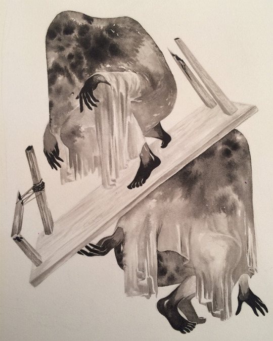
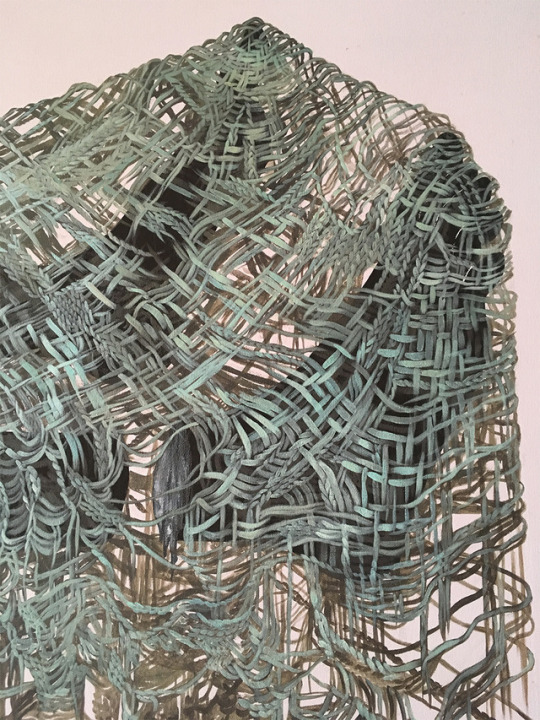
#these are all self portraits depending on which version of myself was present/how i felt at that time
Text
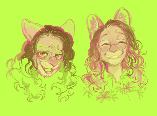
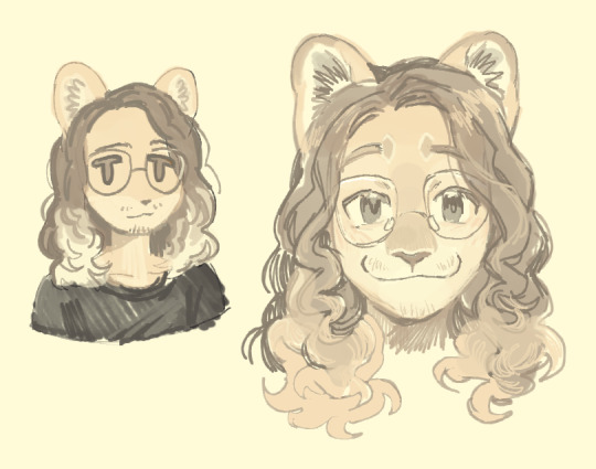
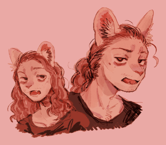
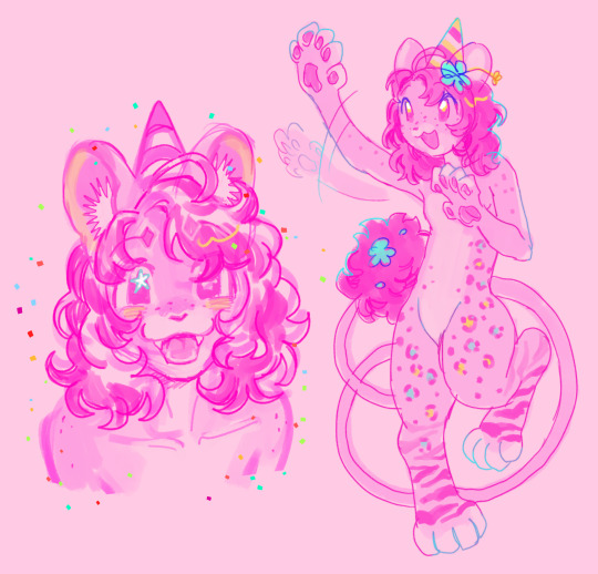
i contain multitudes (lions)
#art#furry art#furry#furry fandom#fursona#maxlion#maxwell the lion#these are all self portraits depending on which version of myself was present/how i felt at that time
623 notes
·
View notes
Photo


Visual Exercise 3 - Great Inspiration
The next assignment we got - ‘Great Inspiration’, was about recreating images by recognized photographers, and this is why it was called that way.
By first look, copying an image of a chair or just a single subject on a plain background seems easy peasy. BUT.
From the first trial I painfully discovered it is terribly hard to imitate a picture with all the details, lights and shadows, position... 😅 I feel it is almost impossible to copy the exact way the original photo was taken. So, during this project I felt overwhelmed, stuck, desparate, confused... but after all I kept on trying and will keep on exploring photographers’ techniques because thus I learn a lot about the perspectives of light, the importance of it and what results its specific use and the arrangement, positioning and representation of an object can bring. In fact, during the process of trying to imitate pictures I myself created a few quite fair captures that may not be as similar to the originals but look good on their own.
All in all, in a few posts I will share with you all my inspirations for work on the project and for further work I will keep on developing. I will also pluck up my courage to post some unsuccessful trials of the copycat and some separate photographs I have been taking while I have not been posting.
Here is a list of the photographers I researched before I started the recreation process. They were quite a lot and I collected a huge folder of photographs I desired to try redoing or just loved much and wanted to keep for my ‘ideas’ book. Quite a few of those grand artists (expectedly) just could not suit my capabilities of recreating such complicated images, which require skill, specific conditions, time and materials I could not afford.
Alexey Titarenko - ghostly vibes, ideas for creative use of exposures
Alma Haser - similar to Sylwia Kowalczyk’s work with crushed/folded paper and cut outs.
André Kertész - diverse work, different styles - new topographics, portraiture..
Arnold Newman
Bill Brandt
Cindy Sherman
Dan Dubowitz
David Hockney - at first I thought ‘oh, I like making collages, why not try redoing one of these joiners’... then I realized that these specific collages demand so much time and arrangement I could not do it before the deadline😅
Edward Weston - I tried recreating his nude portraits. Poses and shadows were extremely difficult. Still I am thinking of sharing some of the results.
Eugenio Recuenco
Fay Godwin
Gerhard Richter - paintings and photographs
Gregory Crewdson
Hannah Starkey
Henri Cartier-Bresson
Idris Khan
Irving Penn - new in my favourites.
Johannes Vermeer
Pablo Zuleta Zahr - super originial and atypical work, ✔️ to try list
Richard Kalvar - loved the humour; found works that will be useful for another project
Rineke Dijkstra
Robert Mapplethorpe - his work looked approachable because I had a male model available, but is also quite specific in terms of lighting and posing, only a professional could do it
Sarah Ann Loreth - love at first sight. Just clicked with my taste of images and love to fire. Her style is visible, noticable and memorable.
Sohrab Hura - genuinely pure and intriguing narrative photographer. Since she was one of the last artists I researched, I kept in mind continuing reading and reviewing her exhibitions.
Sugimoto - liked the abstract approach
Sylwia Kowalczyk - honestly, one of the strongest inspirations I found during this research in terms of style and type of art. I love constructed images. I could not manage to recreate one of hers for the project but started exploring the way I can do it and will soon finish a work inspired by this amazing woman.
Tacita Dean - unique use of film, yet I am not familiar how to work with it and could not include it in the project
Tom Hunter - loved his ‘Swan Songs’
Viveca Koh
William Eggleston
So, even though I could not recreate every artist’s image I definitely appreciated and enjoyed researching their art and saved a lot of ideas in my ‘ideas’ book to try. :) In fact, quite a few of them I will look up to again when it’s time for the final project (portraiture, I will hint nothing more:)). So research is always useful, especially a thorough one and followed by practice. 📸
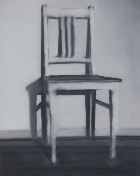
The first photograph I tried copying was Gerhard Richter’s küchenstuhl (kitchen chair). I had to start from somewhere so I thought ‘okay, I have a chair and a wall, I can try this’. Yes, but no as we say in Bulgaria. I had the original picture printed so that I could look up to it and adjust the light and the angles. Yet, as I did it on my own it was difficult holding the source of light (flash), a reflector (to darken the floor), and the camera all by myself. I took about a hundred pictures, realizing a new thing with every other photo taken: at first I hadn’t noticed the chair should be captured a little from the side. Then I saw the floor should be dark and there should be hardly any shadows on it, and thus I kept on noticing details I had to pay attention to.
I tried capturing this photo with daylight (from the window) and with curtains shut (with flash). Anyways, when I saw the pictures on my laptop I realized I’ve made too many mistakes and knowing that I should not fix them on Photoshop, I decided to redo the photoshoot. The second time I had stronger daylight available and could adjust the position of the chair so that I got the right shadows; I took a series with the flash again in order to compare them on the laptop which has come out closer to the original and after all I do not remember which case was the most successful one.
An interesting story behind this first copycat was that initially I chose to do it because I wanted to recreate a painting. Then after recreating it I researched the picture and its artist (G. Richter) more deeply and found out there was a photograph by which the painting was made. And pleasantly surprising, in the photograph there was a similar column on the right of the chair just like in mine (and initially I worried about it being there). So one more time, research turns out quite useful.
(second row, last photograph) ⬇
The choice of picture for the second recreation was induced by my inspiration from the photographer who made it and the way the content is presented. I became a huge fan of Robert Mapplethorpe throughout this project, I enjoy his style very much and had quite a lot of his pictures in the recreation list. What drew me in to this exact photograph of his were the highlights and the way this part of the body, which is my favourite, is captured. I love looking at necks, jawbones, cheekbones - they are such an expressive part of a person’s look. And I think in this Mapplethorpe’s photograph they are depicted and emphasized through the shadows and highlights. The contrast, which I had problem with, plays a big role in the overall look of this image. When I printed mine it appeared flat, so I needed to strengthen the contrast between the whites and the blacks. So, if I am to recreate this picture again, I will use more sources of light to highlight the specific parts of the face and the neck. Overall, I am happy with the composition of my copy - I think this is the feature I’ve nailed in this recreation mostly.
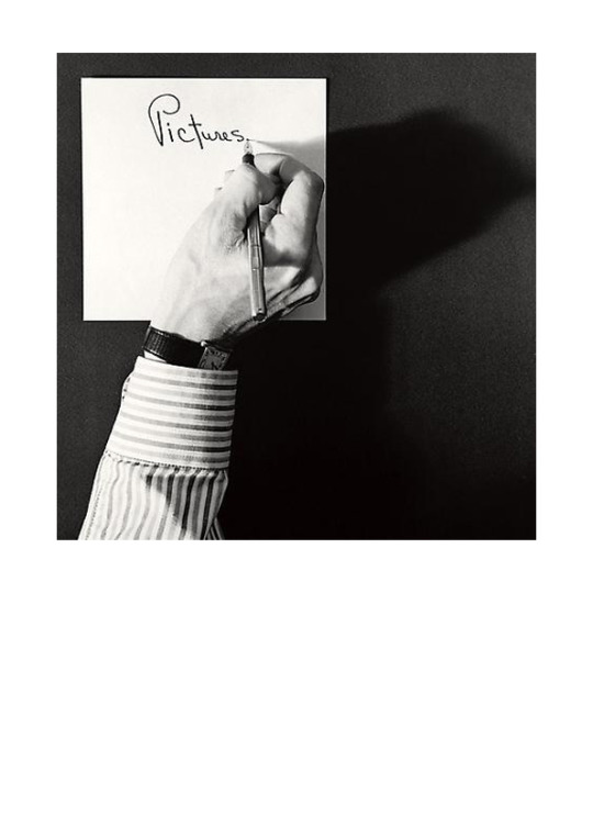
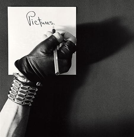
The next photograph also originates from Robert Mapplethorpe’s collection - Pictures/Self Portrait, 1977. Simple, and yet I had to recreate it twice because the first time I thought I have got the shadow right but in fact I had not.
➖ What I think I did not nail in this recreation: the position of the arm (left), the smooth edges of shadow and the small details highlighted on the hand (which can actually depend on the different body/hand).
➕ What I probably nailed: shirt, position of hand according to paper, text on paper, shape of shadow, angle of shoot.
All in all, I loved the simplicity in this picture and the way it clearly delivers a message: ‘Pictures.’. It may wrap up a person’s life, one’s hobby, passion, vision, anything. It makes you think. And the other version of this photograph kind of presents another side of the narrative, where the clothing plays a significant role in the reading of the picture. (shirt and a wrist watch (business) -> rocker gloves and a metal bracelet (rebel)). Everyone can be an artist.
Last but not least, I chose to recreate a picture of Sohrab Hura’s ‘Life is Everywhere’ project. It grabbed me the moment I saw it because it radiates some kind of magic, an honour, the way the photograph is hold. And I love the idea of a photo inside the photo - it somehow reveals the meaning of the images or people’s attitude towards them.
As long as I understood from Hura’s website, the story hidden behind this image of a hand holding a probably old photograph is about the mother of the photographer, who struggled with paranoid schizophrenia. If I have got it wrong about the picture at least I know it is from her work ‘Life is Everywhere’ that is inspired exactly by this tragedy in her life. The disease is not the reason why I wanted to recreate this image with the picture of my mother, thankfully. One reason is because I had her pocket picture I keep in my wallet and wanted to include her in my project. Reading the story, I found even more motivation and connection between the original and my recreation, so I was sure I was going to do it. Hura’s mother’s disease was believed to be caused by the break up with the father of the photographer. My mother went through a similar experience I am not going to elaborate on but I could relate to the story, excluding the severe psychologic disorder caused. Including her picture in my projects, holding it gently, honourably, I want to express my awe and admiration at her endurance and strong personality. She is my idol and I want to show it, so this is my interpretation of this copycat.
In terms of technical execution, I used a plain white wall as a background and had to move the hand away from it so that no shadow would appear on it. The hand was lit from above and a little on the right to achieve those highlights. I did not manage to get all the shadows and dark areas, but I think it is partially due to the lack of hair. I used a camera filter to get the vignette edges but they appeared a little too flat so obviously I had to strengthen them to achieve a similar look to the original.
In a nutshell, this project was a whole new experience to me which I did not expect to be so difficult for realization but after all I am happy with everything I learnt as for techniques, filters, lighting, photographers. I enriched my creativity and filled my ‘ideas’ book, doing my research, and thus have helped my next projects as well. Also I am glad I will have material to work on after this project is over and will now look at light in a different way and think more - how is this shadow achieved? where is this object lit from?...
🔦💡🕯📸🤔
💫📍📒
#photography#project#photography project#photography course#undergraduate#unilife#assignments#visual art#visual exercise#photograph#Famous Photographers#Gerhard Richter#Robert Mapplethorpe#Sohrab Hura#sylwia kowalczyk#art#improve#motivation#inspiration
4 notes
·
View notes
Photo
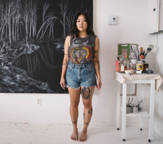


SKETCHY BEHAVIORS | Q&A w/ Marigold Santos
Immigrating to Canada in the late 80′s from the Philippines with her family at seven years old, artist Marigold Santos creates beautiful works that reflect on this journey of uprooted selfhood and fragmented identities. Combining the supernatural and otherworldly beings from Filipino folklore, mainly the Asuang, Santos creates her own mythology by powerfully presenting these creatures to celebrate how we are all not just one thing, but many all at once, every changing. And Santos is not only one thing either, like her art, she is a multiple and plural talent – from sculptor, painter, print maker, ceramicist to animator. We’re super excited to learn more about Marigold in our newest Sketchy Behaviors, where we talk about her early experiences, the folklore of the Asuang, and hear a story about what she saw when playing Bloody Mary with friends.
Photographs courtesy of the artist | Portrait by Stacy Lee
Introduce yourself?
Hello this is Marigold Santos, though my family and pals call me Goldie. I am a visual artist based out of both Montreal, Quebec and Calgary, Alberta, Canada. I am awful at doing summersaults. Or any gymnastics for that matter.
What can you tell us about your art background?
My art practice began with completing my BFA at the University of Calgary, where I did mainly printmaking and drawing, and then I moved to Montreal in 2008 to do my MFA at Concordia University, also in Print Media, but I hardly did any printmaking while I was there! I started on a journey of large-scale drawings, and eventually paintings, sculptural elements, and music/performance, and a bit of animation sometimes. Printmaking was another form of drawing, which is just a wider form of image-making for me. So I would say that though I work in mixed-media, I feel that drawing is the most immediate way for me to make an image, and one that I am the most comfortable with saying that my practice is really based on.
What were the influences that lead you to study and pursue art as a career as opposed to something else?
I was really stubborn when I was growing up about what I wanted to do for a career, I really disliked the feeling of others knowing what might be best for me, before I came to that conclusion myself. And I bring it up because I was always an artistic child, and throughout my early years it was a common understanding among my family and friends that I would go to art school, and I detested that idea! In some ways I was adamant about doing something opposite, so I decided I wanted to be a scientist, in the social field, and I actually started my University years studying Archaeology and Religious Studies. Halfway through the program, it became clear to me that although I loved the Ancient Maya, and learning about belief systems, it just wasn’t a good fit, and I had to make the decision to leave that program and take time off from school to figure out what I wanted to do. In the end it was a no-brainer after all, and I went back for art school, and didn’t turn around. My MFA followed shortly, and it all felt right from there.
What would that “something else” have been? If you weren’t an artist, what would you be doing?
But if I wasn’t an artist, what would I be doing? I sometimes shuffle around the idea of being a butcher, or a dental hygienist. Ha! Though very unlikely I suppose.
Tell us about how your personal experiences that may have shaped your art? Specifically the importance of your childhood memories and family’s immigration to Canada? How does your art address or reflect these important memories.
The departure point for all the art that I make is my family’s immigration to Canada in the late 80’s. I turn to that moment because it was such a pivotal moment for me, even as young person, having to negotiate your sense of identity, in a landscape (social, and geographical) that has dramatically changed. I gave up speaking Tagalog, so I could speak English, and I was desperate to fit in as a Canadian, whatever I thought that was at 7 years old. I started reflecting on identities shaped by diasporic or migratory experiences when I was in my MFA, specifically because I had uprooted myself again, moving across the country to another place where I didn’t know anybody really, and I didn’t know the language.
I came to embrace the idea of a self-hood that was fragmented, and in turn, multiple, or hybrid, or constantly evolving, based on your surroundings and your experience, what you take with you, and what you leave behind. And that this self that was in-flux or constantly in process is something to be celebrated, because the possibilities are empowering. This really creates the foundation for my work, and I began to explore it conceptually with the platform of the supernatural or otherworldly, and specifically with my relationship to the folklore of my upbringing, and where those Filipino mythologies collide with the North American ones I was then exposed to.
In your ink works, there are a lot of appearances of shrouded or draped figures that are very otherworldly and even spectral. How did these series of works evolve and thematically what do they address and speak about?
In Filipino folklore, there is a hybrid, multiple creature called an Asuang, that comes in various shapes and forms, depending on the region and who is telling the story. Predominantly it is a figure that appears to be female human in the day and at night shape-shifting into some sort of viscera sucker that hunts and eats humans. The version I was imparted with as a child was the Mananangal, which translates to “to separate”, because these creatures have the ability to self-sever at the waist, discarding their lower halves in the night, while their upper halves hunt and kill, only to rejoin before sunrise, lest the die fragmented.
Given the Asuang’s multiplicity of self, I was drawn to these creatures to speak about my own sense of self-hood, and reconfigure this character to be less about malevolence, and instead about empowerment and re-inversions of identity. So all the figures I make in my work are always called Asuangs. Including the shrouded figures that are draped in inky messes. These ‘garments’ are not so much fabrics, but are thematically functioning more like a second-skin where the ink reads like blood, or dirt, or rot, or even the cosmos, and represents experience and self. So the porousness of these marks are interchangeable from figure to shroud, and it’s not so much about hiding, but more about revealing. It’s about powerfully presenting your identity in the ways it is multiple, fragmented, plural.
You’ve worked with a lot of different mediums from drawing, printed works, painting, animation, and sculpture. What is your approach with working in new mediums?
I really appreciate exploring new materials that I am not familiar with, and often I don’t know the first thing about this medium, so I’ll either teach myself (and watch so many Youtube videos.
Give us an example of one of the mediums you’ve worked with and how that process evolved?
For instance I once taught myself how to make a real wig) or I’ll find some others who know, and trade/exchange for their knowledge, and workshop with me. An example would be when I decided I wanted to make images on a surface similar to paper, but was a completely different format, and something I would have to make – and I gravitated towards ceramics. I found a ceramicist in Montreal and asked her to workshop with me and teach me how to wheel throw. I made a series of ceramic plates of which I drew on directly with glaze, and then fired, and then finished with gold rim. It was such a great process, and was completely challenging physically, but also reminded me that you have to adapt your drawing skills depending on the medium you’re working in. Drawing on clay is a totally different surface for instance, and the element of surprise (you never know what it will look like until after it has been fired) reminded me to be open to the element of surprise.
What were some of your early artistic influences and what are some of your contemporary ones?
Truly I don’t have too many influences, but I can say I have favourites whose works just move me, from Artemisia Gentileschi, Mary Cassatt, Paul Thek, David Hockney, Cindy Sherman, Yayoi Kusama.
Describe your artist process. How do you organize your thoughts and ideas to the medium or canvas you’re working on?
I carry a black book around with me that is full of notes, I start and finish one of these books on average once a year, but I keep them all because they house all of my thoughts, and research, and scribbles. So they become reference points in some ways, an archive of my thoughts. I find that I write more about what I want to do, rather than make preparatory drawings or sketches of them.
New projects are usually sparked by conversation, research, a book I’m reading, a film I’ve watched, a memory or dream I am reflecting on, and I build on those in my note taking. Most of the actual image-making happens during the creation process, as I continue to respond to previous marks I’ve made. But not all of my works are intuitive, the larger works definitely need some preparation because of their scale. The wall-sized pieces (9’x13’ for instance) are not projected, but are drawn free hand, but I need to make thumbnails to figure out composition before I begin, otherwise it’s a disaster on a ladder. If I am making a giant work, I can only have that one piece to work on until it is finished to the end, which can sometimes be up to 8 weeks. It takes up all the wall space in my studio, and sometimes I do get bored with it and just want it to end! I can forget that large pieces with tiny details take forever to do. But I just hunker down with true crime podcasts, audio books, and a lot of Dolly Parton.
What has been the best project or experience art wise in 2017?
Definitely presenting my work at the Alberta Biennial of Contemporary Art, which opened in both the Art Gallery of Alberta, and the Walter Phillips Gallery in Banff. My piece SUBLIMATION / CONSTELLACHEMY was such a huge work for me, and I was so happy to be able to present it in that context. It was one of the first pieces you see when you come in, and I was happy to start the exhibition with a strong female voice, and representing POC.
You recently did an artist talk and storytelling workshop at Art Gallery of Alberta (AGA). Can you tell us a little about that talk and what were some of the highlights from it?
It turned out to be a fantastic talk, and the crowd was full of such diversity. It was so great to have a supportive Filipino community come out to see my talk, and hear my story, but also was amazing to share stories with the audience who wanted to share their diasporic experiences and the folklore of their youth, and how in turn it has shaped their experience and their identities. A large portion of the crowd consisted of the Canadian Council for Refugees Youth Group of Edmonton, and I loved speaking to each one of the youth after the talk – they were so engaged and excited to tell me about themselves. It was really a gift.
What’s been your biggest challenge as an artist and how have you overcome those obstacles? What have you learned over the years?
I think the biggest challenge at first has been to manage and balance your time. Keeping regular studio hours, while maintaining other life commitments, can sometimes be difficult, especially because the onus is on you to be the enforcer of your own dedication. Sometimes you want to just be lazy! And I definitely give in to those days. But I think over time, you figure out a balance, and when to turn it off, and when to get the ball rolling, and to keep the momentum. I suppose it really is dictated by the fact that I can’t really imagine myself dedicating my hours to any other way of life, so that does drive me.
What advice would you give folks out there who want to pursue art as a career?
It’s going to be feast or famine sometimes, but that’s the curl of the burl.
Just do what feels right for you, and do what you want to do.
Okay, when you’re not doing awesome works and shows or giving talks, how do you unwind or spend your free time?
I don’t know if this qualifies as unwinding, but I’ve started tattooing and it’s what I do when I am not painting or drawing! But outside of the studio, I stay active by going for runs and hikes, and I also box. But I also love croissants, so I dedicate my time to eating the best croissants I can find. .
What would be your ideal collaboration?
I would love to work with some of my favourite musicians to create a moving image piece, animation or projection!
What’s a question you never get asked–what would that be and how would you answer it.
Q: What’s a thing you love that others don’t really love?
A: Going to the dentist, flossing my teeth.
What’s a common misconception folks might have about artists that you might have come across?
One misconception I find is that artists have the ability to channel their feelings always in to art, and whether they are experiencing good to bad times in their life, they should just take that energy and channel it into their work. I don’t think it always works that way. It would be amazing if it did, but art making is also work, and is work for many artists, and sometimes those don’t intersect the way we imagine it to.
What are your favorite Vans?
My old checkered Slip Ons!
How are you not just ONE thing?
Maybe it’s because I am a Libra, it prevents me from pigeonholing myself in any of my multiple interests – I just want it all, I just want to do it all!
What are you looking forward to project wise in 2018?
I have a solo show in Montreal at Galerie D’Este in the fall of 2018 and I am really excited to be making new works for it. I’ve really been making images of landscapes lately, and plenty referenced from my experiences in Joshua Tree. I’d love to do more ceramics for this show, and possibly some brass works.
What’s your strangest or sketchiest art story that you can share?
Because most of my works are a response and reflection of identity informed by lived experience, and presented on a platform of the supernatural or otherworldly, naturally I am drawn to all things scary, grotesque, weird and wild. I’ve only had one supernatural experience – and that when we I was really young a school friend came over and made me do Bloody Mary (scary urban legend) with her in the bathroom. I had no idea what this was, but I knew it was supposed to be scary, sort of. Nothing immediately happened in the dark bathroom we were locked in, but at one point, I saw a blue hand pressed up against the mirror on THE OTHER SIDE OF THE MIRROR. It also had a blue triangle in the palm. I squinted my shut my eyes multiple times to check, but then the light was turned on, and there was nothing there. I can still see that blue hand in my mind’s eye, and if you see a blue hand in my art work on occasion, it’s because it’s referencing that story.
Follow Marigold Santos
Website | www.marigoldsantos.com/
Instagram | @marigoldasantos
#Art#Vans#vans art#painting#marigold santos#Sketchy Behavior#creativity#female artists#inspiration#interview
20 notes
·
View notes
Text
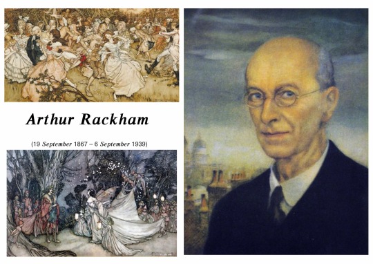
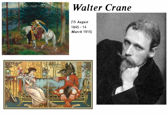
𝑶𝒘𝒏 𝑹𝒆𝒔𝒆𝒂𝒓𝒄𝒉 - 𝑨𝒓𝒕𝒉𝒖𝒓 𝑹𝒂𝒄𝒌𝒉𝒂𝒎 & 𝑾𝒂𝒍𝒕𝒆𝒓 𝑪𝒓𝒂𝒏𝒆
Thursday 12 December 2019
As part of our project, it was emphasised that we needed to do research of own artists that have inspired us in our narrative and integrate styles of their work into our own. As my narrative is inspired by the original story of Little Red Riding Hood, I began to do some research into the Grimm’s dark version of it. This led me to an illustrated fairy tale book by Grimm, which I acquired to further deepen my investigation and see the illustrations on paper for myself.
[Some of my favourite examples of his work and a self portrait he did of himself.]
Rackham was an English Book Illustrator who was considered one of the leading literary figures during The Golden Age of British Book Illustration. His work is recognised through his use of robust ink drawings combined with watercolour. His best known works are found in Fairy Tales of The Brothers Grimm, Rip Van Winkle and Peter Pan in Kensington Gardens. In his early life, Rackham was born in Lewisham as one of 12 children. Then in 1884, when he was 17, he was sent on a voyage to Australia to improve his fragile health, accompanied by two aunts. At the age of 18, he worked as a clerk at the Westminster Fire Office while beginning to study part-time at Lambeth School of Art.
I found out about this artist from seeing his name credited on the cover of the Fairy Tale book. I really like the way he coloured his illustrations and the amount of detail in every corner he put into them. His work is significant because of his fantastical drawings, relating to my fantasy genre narrative and also because he produced his work in 1890 onwards near to the end of The First World War. It was during this period that there was a high demand and boom in the market for high quality illustrated books which were given as Christmas presents. In North America and in Britain, Rackham’s work became even more popular after his death, still used today in a variety of newer editions of the books he illustrated for. Now his original paintings are keenly sought after in auction houses.
The techniques he used with watercolour and Indian ink was delicate and unfortunately sometimes lost in the final print of his work. Technological disandavtages of the time meant that Rackham would ink over his illustrations twice to make sure it shows up when printed. He would sketch out the overall shape and idea in pencil and then ink it in while getting rid of the pencil in the background. When the ink had dried he would faintly go over the top and colour it in with it slightly translucent watercolour and slowly build up tone and colour over multiple layers. After that, he would ink over the lines again. This way of working has been described as Nordic inspired or traditional Japanese woodblock in the early 1900’s.
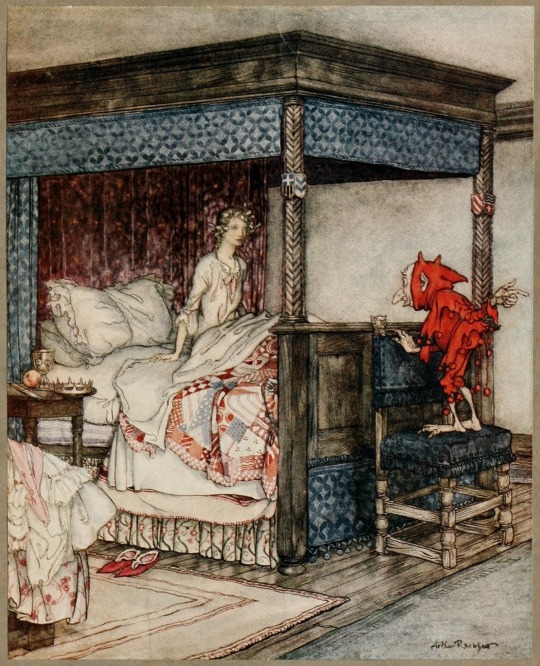

[Source: "‘O waken, waken, Burd Isbel", from Young Beichan, Child ballad number 53 by Arthur Rackhham.]
[Source: "The Three Bears", illustration to English Fairy Tales, written by Flora Annie Stee and illustrated by Arthur Rackham.]
Rackham’s use of translucent watercolour over ink gives his work a ‘grunge’ look, further emphasised by the way his illustrations have been printed though this may not have been intentional due to a lack of technological resources. Most of the texture in his work has been built up in his ink work rather than his watercolour. A good example of this is the illustration “The Three Bears” just above. It is clear that he has used ink to create the fur texture on the bears in a way that makes them stand out from, a still very detailed, background. It appears that he only uses watercolour in his illustrations as a splash of colour to seperate things out rather than putting the emphasis on it. This may have been because he knew the ink would how up more in print rather than the coloured parts, so he clearly spent more time on the part that would show up more.
In the illustration “O waken, waken, Burd Isbel”, there is a very strong and brightly saturated red which stands out dramatically from the rest of the drawing. It is used to highlight the small figure at the end of the girl’s bed. This may be to illustrate evil intentions from the character. The way it is dressed from head to foot in the dramatic colour and its small featured red horns at the top of his head shows connotations of the devil. For a 18th-19th century audience viewing this, they would have likely immediately felt negatively towards a character which quite literally seems to have the appearance of a demon. The way the colour separates the character from the rest of the piece, infers to the viewer that he is not connected in any way with his surroundings. This tells us that he is from some other ‘world’ or place that would not fit into the familiar human reality we are used to.
The light and dark values in Rackham’s work appears to be achieved through his inking methods rather than in his water colouring process. He usually seems to keep characters light unless they’re antagonists (such as a very dark and textured wolf he illustrated for Little Red Cap), or some sort of animalistic creature.
Overall, I believe the theme of Rackham’s work fits in with our fantasy genre project. The way he works with radiation all mediums has appealed to me and made me really want to pick up my watercolours again. After learning more about him and his process, I am now inspired to lean off of digital art as a medium on its own and begin to work with things outside of my comfort zone in order to achieve nicely water coloured illustrations like he did.
[My personal favourite illustrations of his and a photograph of his portrait.]
Walter Crane was a British artist and book illustrator. During his time and up until today, Crane has been considered the most influential children’s books creators of his generation. His work characterised a lot of children’s nursery rhymes and fables, making his work portray a ‘fantasy’ theme as some looked out of the ordinary in terms of character design and style. Unlike Rackham, he involved himself in far more things so his name is more widely known and out there. For example, he was part of the arts and crafts movement (which was an international trend which stood for traditional craftsmanship using simple forms of medieval or folk style celebration) and produced an array of paintings, illustrations, children’s books and ceramic tiles.
He was the second son of the painter, Thomas Crane and his siblings, Thomas and Lucy were very creative as well as Thomas became an illustrator and Lucy became a noted writer. During the artist’s career, he had a lot of problems with the press as they controversially portrayed him as things that he was not. But he was a good student and politically minded (as a socialist), especially when it came to the arts.
He appeared to have two styles. One for his many children’s books illustrations and one for his own personal maturer art. His illustrative designs are almost cartoonised in a way as they have a visible outline to every object and detail in the frame. Compared to Rackham’s, his work is not nearly as textured, as his lines are very neat and organised. Whereas he also uses watercolours like Rackham, his colours are far brighter and they don’t have that same transparency. They look like block colours, almost looked to be done digitally though we know that wasn’t possible. There is little to no tone within his work, as there are no obvious shadows being cast in the illustration below. This may be to emphasise instead the detail of his line work and not make the piece too dark. Because of the lighter colours in the illustration just below (which is a scene depicting the story ‘Beauty and The Beast,’) it gives it a playful, almost humorous aura. If there were extreme shadows though, this would likely change to be somewhat horrorfying, which is not appropriate for a children’s illustration.
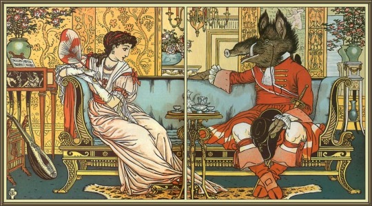
[Source: Beauty and The Beast illustration by Walter Crane.]
What I like personally about his works are his adaptability. When he wants to draw an illustration for a children’s book, he uses this lined, detailed but simple style using ink and water colour. But when he worked more maturely, he used oil paints to create the most busiest and textured paintings. It’s this sort of adaptable quality that I want for my own art and illustrations, allowing myself to be able to work more maturely or childishly, depending on what the illustration is appropriate for.
0 notes
Text
Discussion Leader 10/31
1. “Perhaps the immobility of the things that surround us is forced upon them by our conviction that they are themselves and not anything else, by the immobility of our conception of them… Its [his body’s] memory, the composite memory of its ribs, its knees, its shoulder blades, offered it a series of rooms in which it had at one time or another slept, while the unseen walls, shifting and adapting themselves to the shape of each successive room that it remembered, whirled round it in the dark” (5).
Question: What constitutes this “conviction” we have about things being what they are, according to the narrator?
2. “This torture inflicted on her by my great-aunt, the sight of my grandmother’s vain entreaties, of her feeble attempts, doomed in advance, to move the liqueur-glass from grandfather’s hands—all these were things of the sort to which in later years, one can grow so accustomed as to smile at them and to take the persecutor’s side resolutely and cheerfully enough to persuade oneself that it is not really persecution; but on those days they filled me with such horror that I longed to strike my great-aunt. And yet, as soon as I heard her “Bathilde! Come in and stop your husband drinking brandy,” in my cowardice I became at once a man, and did what all grown men do when face to face with suffering and injustice: I preferred not to see them; I ran up to the top of the house to cry by myself in a little room beside the schoolroom and beneath the roof…” (13–14).
Question: Why does the narrator believe that cowardice is an attribute intrinsic to adult men?
3. “…my grandmother, always happy to find an… additional turn in the garden… would take the opportunity to remove surreptitiously, as she passed, the stakes of a rose-tree or two, so as to make the roses look a little more natural.“… I would slip away unobtrusively to order the liqueurs brought out, for my grandmother made a great point, thinking it “nicer,” of their not being allowed to seem anything out of the ordinary, which we kept for visitors only.” (16-17)
Question: The narrator’s family have near-subconscious processes they go through whenever a guest comes over, to keep up appearances. Does this insistence on maintaining a perfect façade for guests inform their notion of self as much as it influences their projection of Swann?
4. “Our friend’s corporeal envelope had been so well lined with this residuum, as well as various earlier memories of his parents, that their own special Swann had become to my family a complete and living creature; so that even now I have the feeling of leaving someone I know for another quite different person when, going back in my memory, I pass from the Swann whom I knew later and more intimately to this early Swann—this early Swann in whom I can distinguish the charming mistakes of my youth, and who in fact is less like his successor than he is like the other people I knew at that time, as though one’s life were a picture gallery in which all the portraits of any one period had a marked family likeness, a similar tonality—this early Swann abounding in leisure, fragrant with the scent of the great chestnut-tree, of baskets of raspberries and of a sprig of tarragon” (24).
Question: Does the narrator imply that one person’s mental impression of another, or of him or herself, is selective, since it cannot be “identical for everyone” (23)? Or is it the accumulation of interwoven memories?
5. “And so I promised myself that in the dining-room, as they began to eat and drink as I felt the hour approach, I would put beforehand into the kiss, which was bound to be so brief and furtive, everything that my own efforts could muster, would carefully choose in advance the exact spot on her cheek where I would imprint it, and these mental preliminaries, to consecrate the whole of the minute Mamma would grant me to the sensation of her cheek against my lips, as a painter who can have his subject for short sittings only prepares his palette, and from rough notes does in advance everything which he possibly can do in the sitter’s absence” (35).
Question: Is the narrator’s dependency on his mother’s kiss before going to sleep more than just a sign of an insecure childhood?
6. “It was the converse of this relief which I felt when my anguish at having to go up to my room invaded my consciousness in a manner infinitely more rapid, instantaneous almost, a manner at once insidious and brutal, through the inhalation—far more poisonous than moral penetration—of the smell of varnish peculiar to that staircase” (36).
Question: What is the role of the senses in creating and/or stirring memories?
Argument:
Marcel Proust’s narrator in the opening of Swann’s Way embarks on a quest to capture the essence of existence by reliving his past through sensory memory. While lying in bed in a state between dream and wakefulness, the tactile sensations of his body in different positions bring forth memories of similar sensations he has had in the past in different beds, and with them a string of bedrooms, places, people, and events corresponding to each position. Thus, waking up as a child in Combray and hence equipped with a child’s sensitiveness, he rescues all the sensorial experiences whose associations impressed on him singular views on people, places, and situations; and, simultaneously, analyzes them from where he is presently, decades later. The result of this amalgamation of past and present allows him to devise a theory of how reality is structured by habit, which renders a close bond between a subject and his surroundings, like his bedroom which was “[filled] with [his] own personality (11),” and by the accumulation of a subject’s entangled memories of every single object he or she comes in touch with, like his family’s construal of Swann which is based on their relationship with his parents (24). Ultimately, Proust claims that reality is as subjective and malleable. Our sense of reality is subject to the influence of the self, which, in turn, is in itself molded by the influence of those around us, their ideal version of us, and our ability to meet or resist that ideal.
0 notes
Text
PDP Task 5
Demonstrate your research and engagement with self promotion materials used by other photographers and to evidence the planning and production of your own.
Research
One of the most useful books I have read on self promotion is Maria Piscopo’s The Photographer’s Guide to Marketing and Self-Promotion. This book is in it’s fifth edition and published last year. Although it’s written from an American perspective, I found the information easily equated to the UKs photographic industry, the interviews with professional photographers were inspiring and helpful.
So what have I learnt?
Lots of photographers who are self employed really fall down on self-promotion and marketing, even the word self promotion can be off-putting to some. However, if you don’t do it, who will? Another aspect to consider is, are you showing what your clients actually want to see? I talked to Architectural photographer Keith Cooper at the Derby Photofair, about this issue. He said in reality he photographs some “bloody ugly industrial buildings” so whilst it could be a good photograph, it will only appeal to a small number of clients. Therefore, balancing your promotional images whether by portfolios or online, “try to target the level you want to work at, not what you are working at.” This is such good advice and something I had considered before, it’s made me reflect and reexamine what work I would show potential clients.
What is my message and who do I want it to reach, is a question I have asked myself. Having a great website that is current, relevant and easy to navigate, is a crucial part of self promotion and marketing. I really like the website of Architectural photographer Simon Kennedy www.simonkennedy.net
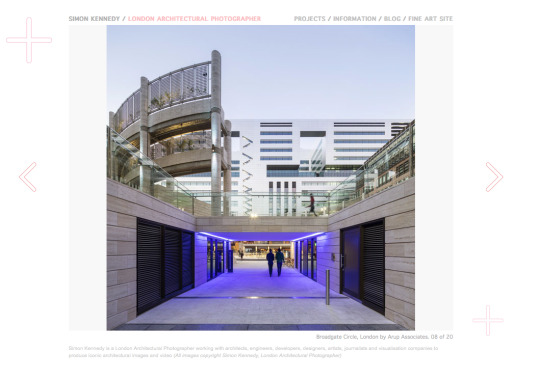
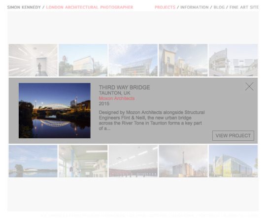
His home page is simple and clear, the main image scrolls using the navigation arrows. The feature that I liked the most was in the section “projects” there were numerous image options to click on, when you chose one it gave you information about the project with the option to view it further. Not overwhelming your audience with multiple images and providing them with a choice to view specific work, is a great design feature.
MY WEBSITE
In the second year at Uni we had to design and build a website, this wasn’t a particularly successful project for me. At the time my main interest was dance and performance photography, so I styled my website based around that. Although it didn’t feel particularly authentic my rational was that as someone unsure about my identity as photographer, it was better to show one genre I was good at, than a few that I was average at. My website looked so bad although tried really hard to make it look personal. In doing this, it just resulted in looking very amateurish, not something I want to share with the world online.
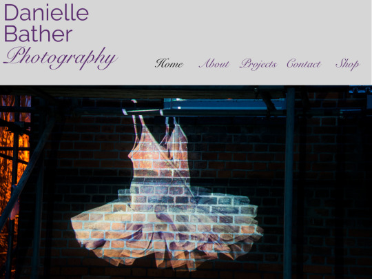
Having researched other photographers websites extensively it’s clear to me that with my limited computer skills I am just not able to create a website that looks or functions professionally. As I have mentioned before with post production editing, website design is a stand alone profession (I’m working hard to get better at photography, I don’t want to, or need to learn to build websites). Therefore I have asked a company called simpleandfunctional to build my new website for me. I still own the domain name www.daniellebather.com which I can continue to use. I chose simpleandfunctional as they manage two websites for architectural photographers that I think are visually striking, designed beautifully and function really well. I have requested that a link is created on my main site that takes the viewer to my fine art work. I saw this on Simon Kenndy’s website and thought it was a brilliant idea. It doesn’t confuse his commercial identity as an architecture and interior photographer or overwhelm his audience by presenting his fine art work.
A recent study in France concluded if people are searching for someone to commission, your website will be viewed on average for forty seven seconds, therefore precise and well presented work is vital. Giving the viewer the option by providing a link to other work and a way to purchase it but don’t bombard people,as they will simply leave your website and look elsewhere.
I asked Luca if he would consider looking at the images I have chosen to use on my website, he was very helpful in encouraging me to have them presented in groupings that were project based, rather than interiors/exteriors. This might seem obvious, but initially when I was considering work to include, I felt I didn’t have enough “projects” to include. He thought it be better to have fewer that are coherent, than more that are a mixture of work.
BUSINESS CARDS
I redesigned by business cards to better reflect who I am as a photographer or so I thought......

On the backs I have included a variety of architectural images. I did show this to my tutor, who said it would be better just saying “photographer”, as I do practice other sorts of photography. I think what I will do, is both and depending on who I am giving my cards to I will give either the generic version or the specific one, best of both worlds.
PRINT PORTFOLIO
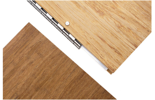
From the research I have done on architectural and interior photographers, the vast majority of them have a printed portfolio. When I interviewed Luca Piffaretti and asked him how he started his business he said “I walked all over London showing Architects/designers my work” People want to see your prints even if you have your work available to to view online. No more than 12 images are necessary, people stop looking after a while, especially if you are one of many portfolios they have to review. Some photographers have book portfolios printed, I think this is appropriate for other genres of photography, for architectural photography, it’s not a great option as it’s important to be able to keep your work updated. Architects and designers are visual people, they are very focused on design and want to see images being beautifully presented, this is really important as it shows that you take care in your work.
There are many leather bound portfolios that are available to buy can be embossed with your name and or logo, as a vegetarian I’m not a fan of leather. I found a company who make wooden portfolios. I chose wood because it Environmentally sustainable, it’s durable. I chose A3 size in landscape orientation and post hinges internally, as I think they look more professional than a ring binder hinge, my work can be added to and removed as necessary. I chose to have the darker tone of wood of the two options because I think it looks more luxurious than the paler colour and have my name embossed on the front, as is simple and classical and ties in well with my website and busnisness cards.
DISASTER! MY PORTFOLIO ARRIVED AND MY NAME HAD BEEN SPELT INCORRECTLY, IT SAID DANIEL BATHER. THEY ARE MAKING ME MAKE A NEW VERSION. THIS IS THE SECOND TIME A COMPANY WHO DOES PERSONALISED PRODUCTS, HAS MADE AN ERROR WITH MY NAME. MY PERSONALISED DIGITAL NAME FOR MY IMAGES SAID DANIELLA. COMPANIES SHOULD LEARN TO PROOF READ MORE EFFECTIVELY.
SOCIAL MEDIA
The internet is full of articles about how vital social media campaigns are, from the research I have undertaken, I think its a mistake to position social media activity as your marketing campaign, when it should only be part of your business message. I do have social media platforms Facebook, Twitter and Instagram that I have used for sharing my work and as a self promotional tool, which has generated work for me in the past. Unfortunately due to a legal situation, that is beyond my control, I am not currently permitted to use any social media accounts.
FACEBOOK
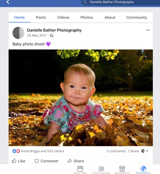
This is an example of a advert that I ran on my Facebook photography page, it was free and ran for a week. I got 14 enquiries for baby portraits. Some people were not local, but I did secure three shoots locally as a result of this advert, so it was worth it. However, I wouldn’t prioritise social media promotion for acrchitectural work, I really haven’t seen any professionals do this. In the future will continue to run adverts for family portraiture and fine art, it is a way to reach a targeted audience for this genre.
INSTAGRAM AND TWITTER
When I was able to use these social media platforms and was starting to think of myself as a brand, I did amend and change the way I was using them, this was really important as they were tied online to my professional work. My only Instagram page is called daniellebatherphotography, but it really was a general page. I decided to change the way I used the platform, I started by only posting images that have been taken on a camera (not my phone), I don’t include any personal photos of my family or friends and I post at least once a week to keep people interested. I don’t think I have had any work as a result of my instagram page, but I have certainly networked with photographers through it, which has helped with my studies and hopefully will beyond. Perviously on my twitter account, I noticed I had retweeted a lot about the NHS being in financial crisis, important yes, relevant to photography, not really. I now only share my own photographic work, and retweet relevant articles ect. There are so many interesting things going on in the world photographically that have wider implications politically, socially and ethically, which is important to me to include. I think it’s an honest reflection of me as a person, as well as a photographer. Again, I haven’t got work as a result of my twitter posts, however I think sharing exhibition information for example on Twitter is a way for reaching a wider audience. Keeping people informed about my photographic practice, I believe will lead to opportunities in the future, once I can use social media again.
0 notes
Last Seen Blogs

inlogicalmath-blog
Inlogicalmath

morgankoi
hi.

mrjonv
Destroy Strongholds

goaparadise-blog1
Goa Nature Hippie