#this is why it is generally better to use codepen to check changes. however i am lazy
Explore tagged Tumblr posts
Visit Tumblr Blog
Explore Tumblr blogs with no restrictions, modern design and the best experience.
Last Seen Tumblr Blogs


Fun Fact
Tumblr was attacked by a cross-site scripting worm deployed by the Internet troll group GNAA on Dec 3, 2012.
Text
idk why my neocities website is updated in the thumbnail but not when i actually go to it? perplexing
#this is why it is generally better to use codepen to check changes. however i am lazy#usually it’s css or javascript that’s slow though. i don’t know why adding one link to my homepage in the html section is being weird.
2 notes
·
View notes
Text
Cool Little CSS Grid Tricks for Your Blog
I discovered CSS about a decade ago while trying to modify the look of a blog I had created. Pretty soon, I was able to code cool things with more mathematical and, therefore, easier-to-understand features like transforms. However, other areas of CSS, such as layout, have remained a constant source of pain.
This post is about a problem I encountered about a decade ago and, until recently, did not know how to solve in a smart way. Specifically, it’s about how I found a solution to a long-running problem using a modern CSS grid technique that, in the process, gave me even cooler results than I originally imagined.
That this is not a tutorial on how to best use CSS grid, but more of a walk through my own learning process.
The problem
One of the first things I used to dump on that blog were random photos from the city, so I had this idea about having a grid of thumbnails with a fixed size. For a nicer look, I wanted this grid to be middle-aligned with respect to the paragraphs above and below it, but, at the same time, I wanted the thumbnails on the last row to be left-aligned with respect to the grid. Meanwhile, the width of the post (and the width of the grid within it) would depend on the viewport.
The HTML looks something like this:
<section class='post__content'> <p><!-- some text --></p> <div class='grid--thumbs'> <a href='full-size-image.jpg'> <img src='thumb-image.jpg' alt='image description'/> </a> <!-- more such thumbnails --> </div> <p><!-- some more text --></p> </section>
It may seem simple, but it turned out to be one of the most difficult CSS problems I’ve ever encountered.
Less than ideal solutions
These are things I have tried or seen suggested over the years, but that never really got me anywhere.
Floating impossibility
Floats turned out to be a dead end because I couldn’t figure out how to make the grid be middle aligned this way.
.grid--thumbs { overflow: hidden; } .grid--thumbs a { float: left; }
The demo below shows the float attempt. Resize the embed to see how they behave at different viewport widths.
CodePen Embed Fallback
inline-block madness
At first, this seemed like a better idea:
.grid--thumbs { text-align: center } .grid--thumbs a { display: inline-block }
Except it turned out it wasn’t:
CodePen Embed Fallback
The last row isn’t left aligned in this case.
At a certain point, thanks to an accidental CSS auto-complete on CodePen, I found out about a property called text-align-last, which determines how the last line of a block is aligned.
Unfortunately, setting text-align-last: left on the grid wasn’t the solution I was looking for either:
CodePen Embed Fallback
At this point, I actually considered dropping the idea of a middle aligned grid. Could a combo of text-align: justified and text-align-last: left on the grid produce a better result?
Well, turns out it doesn’t. That is, unless there’s only a thumbnail on the last row and the gaps between the columns aren’t too big. Resize the embed below to see what I mean.
CodePen Embed Fallback
This is pretty where I was at two years ago, after nine years of trying and failing to come up with a solution to this problem.
Messy flexbox hacks
A flexbox solution that seemed like it would work at first was to add an ::after pseudo-element on the grid and set flex: 1 on both the thumbnails and this pseudo-element:
.grid--thumbs { display: flex; flex-wrap: wrap; a, &::after { flex: 1; } img { margin: auto; } &:after { content: 'AFTER'; } }
The demo below shows how this method works. I’ve given the thumbnails and the ::after pseudo-element purple outlines to make it easier to see what is going on.
CodePen Embed Fallback
This is not quite what I wanted because the grid of thumbnails is not middle-aligned. Thats said, it doesn’t look too bad… as long as the last row has exactly one item less image than the others. As soon as that changes, however, the layout breaks if it’s missing more items or none.

Why the ::after hack is not reliable.
That was one hacky idea. Another is to use a pseudo-element again, but add as many empty divs after the thumbnails as there are columns that we’re expecting to have. That number is something we should be able to approximate since the size of the thumbnails is fixed. We probably want to set a maximum width for the post since text that stretches across the width of a full screen can visually exhausting for eyes to read.
The first empty elements will take up the full width of the row that’s not completely filled with thumbnails, while the rest will spill into other rows. But since their height is zero, it won’t matter visually.
CodePen Embed Fallback
This kind of does the trick but, again, it’s hacky and still doesn’t produce the exact result I want since it sometimes ends up with big and kind of ugly-looking gaps between the columns.
A grid solution?
The grid layout has always sounded like the answer, given its name. The problem was that all examples I had seen by then were using a predefined number of columns and that doesn’t work for this particular pattern where the number of columns is determined by the viewport width.
Last year, while coding a collection of one element, pure CSS background patterns, I had the idea of generating a bunch of media queries that would modify a CSS variable, --n, corresponding to the number of columns used to set grid-template-columns.
$w: 13em; $h: 19em; $f: $h/$w; $n: 7; $g: 1em; --h: #{$f*$w}; display: grid; grid-template-columns: repeat(var(--n, #{$n}), var(--w, #{$w})); grid-gap: $g; place-content: center; @for $i from 1 to $n { @media (max-width: ($n - $i + 1)*$w + ($n - $i + 2)*$g) { --n: #{$n - $i} } }
CodePen Embed Fallback
I was actually super proud of this idea at the time, even though I cringe looking back on it now. One media query for every number of columns possible is not exactly ideal, not to mention it doesn’t work so well when the grid width doesn’t equal the viewport width, but is still somewhat flexible and also depends on the width of its siblings.
A magic solution
I finally came across a better solution while working with CSS grid and failing to understand why the repeat() function wasn’t working in a particular situation. It was so frustrating and prompted me to go to MDN, where I happened to notice the auto-fit keyword and, while I didn’t understand the explanation, I had a hunch that it could help with this other problem, so I dropped everything else I was doing and gave it a try.
Here’s what I got:
.grid--thumbs { display: grid; justify-content: center; grid-gap: .25em; grid-template-columns: repeat(auto-fit, 8em); }
CodePen Embed Fallback
I also discovered the minmax() function, which can be used in place of fixed sizes on grid items. I still haven’t been able to understand exactly how minmax() works — and the more I play with it, the less I understand it — but what it looks like it does in this situation is create the grid then stretch its columns equally until they fill all of the available space:
grid-template-columns: repeat(auto-fit, minmax(8em, 1fr));
CodePen Embed Fallback
Another cool thing we can do here is prevent the image from overflowing when it’s wider than the grid element. We can do this by replacing the minimum 8em with min(8em, 100%) That essentially ensures that images will never exceed 100%, but never below 8em. Thanks to Chris for this suggestion!
Note that the min() function doesn’t work in pre-Chromium Edge!
CodePen Embed Fallback
Keep in mind that this only produces a nice result if all of the images have the same aspect ratio — like the square images I’ve used here. For my blog, this was not an issue since all photos were taken with my Sony Ericsson W800i phone, and they all had the same aspect ratio. But if we were to drop images with different aspect ratios, the grid wouldn’t look as good anymore:
CodePen Embed Fallback
We can, of course, set the image height to a fixed value, but that distorts the images… unless we set object-fit to cover, which solves our problem!
CodePen Embed Fallback
Another idea would be to turn the first thumbnail into a sort of banner that spans all grid columns. The one problem is that we don’t know the number of columns because that depends on the viewport. But, there is a solution — we can set grid-column-end to -1!
.grid--thumbs { /* same styles as before */ a:first-child { grid-column: 1/ -1; img { height: 13em } } }
The first image gets a bigger height than all the others.
CodePen Embed Fallback
Of course, if we wanted the image to span all columns except the last, one we’d set it to -2 and so on… negative column indices are a thing!
auto-fill is another grid property keyword I noticed on MDN. The explanations for both are long walls of text without visuals, so I didn’t find them particularly useful. Even worse, replacing auto-fit with auto-fill in any of the grid demos above produces absolutely no difference. How they really work and how they differ still remains a mystery, even after checking out articles or toying with examples.
However, trying out different things and seeing what happens in various scenarios at one point led me to the conclusion that, if we’re using a minmax() column width and not a fixed one (like 8em), then it’s probably better to use auto-fill instead of auto-fit because, the result looks better if we happen to only have a few images, as illustrated by the interactive demo below:
CodePen Embed Fallback
I think what I personally like best is the initial idea of a thumbnail grid that’s middle-aligned and has a mostly fixed column width (but still uses min(100%, 15em) instead of just 15em though). At the end of the day, it’s a matter of personal preference and what can be seen in the demo below just happens to look better to me:
CodePen Embed Fallback
I’m using auto-fit in this demo because it produces the same result as auto-fill and is one character shorter. However, what I didn’t understand when making this is that both keywords produce the same result because there are more items in the gallery than we need to fill a row.
But once that changes, auto-fit and auto-fill produce different results, as illustrated below. You can change the justify-content value and the number of items placed on the grid:
CodePen Embed Fallback
I’m not really sure which is the better choice. I guess this also depends on personal preference. Coupled with justify-content: center, auto-fill seems to be the more logical option, but, at the same time, auto-fit produces a better-looking result.
The post Cool Little CSS Grid Tricks for Your Blog appeared first on CSS-Tricks.
source https://css-tricks.com/cool-little-css-grid-tricks-for-your-blog/
from WordPress https://ift.tt/3cNgDZf via IFTTT
0 notes
Link
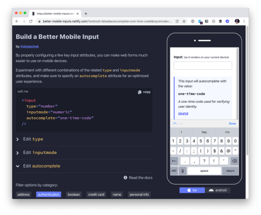
Here’s one simple, practical way to make apps perform better on mobile devices: always configure HTML input fields with the correct type, inputmode, and autocomplete attributes. While these three attributes are often discussed in isolation, they make the most sense in the context of mobile user experience when you think of them as a team.
There’s no question that forms on mobile devices can be time-consuming and tedious to fill in, but by properly configuring inputs, we can ensure that the data entry process is as seamless as possible for our users. Let’s take a look at some examples and best practices we can use to create better user experiences on mobile devices.
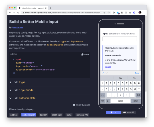
Use this demo to experiment on your own, if you’d like.
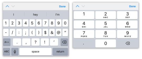
Using the correct input type
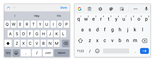
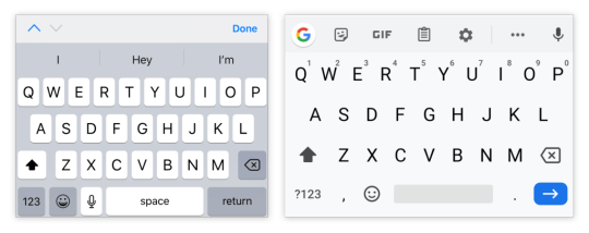
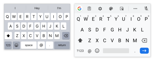
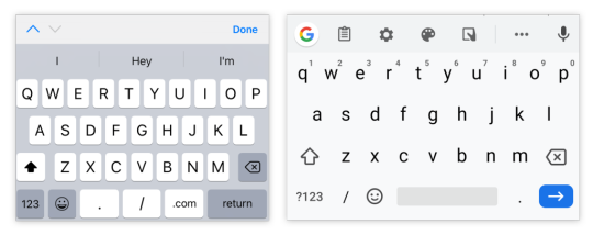
This is the easiest thing to get right. Input types, like email, tel, and url, are well-supported across browsers. While the benefit of using a type, like tel over the more generic text, might be hard to see on desktop browsers, it’s immediately apparent on mobile.
Choosing the appropriate type changes the keyboard that pops up on Android and iOS devices when a user focuses the field. For very little effort, just by using the right type, we will show custom keyboards for email, telephone numbers, URLs, and even search inputs.

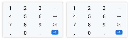
Text input type on iOS (left) and Android (right)

Email input type on iOS (left) and Android (right)
URL input type on iOS (left) and Android (right)
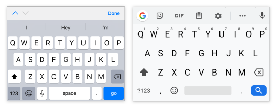
Search input type on iOS (left) and Android (right)
One thing to note is that both input type="email" and input type="url" come with validation functionality, and modern browsers will show an error tooltip if their values do not match the expected formats when the user submits the form. If you’d rather turn this functionality off, you can simply add the novalidate attribute to the containing form.
A quick detour into date types
HTML inputs comprise far more than specialized text inputs — you also have radio buttons, checkboxes, and so on. For the purposes of this discussion, though, I’m mostly talking about the more text-based inputs.
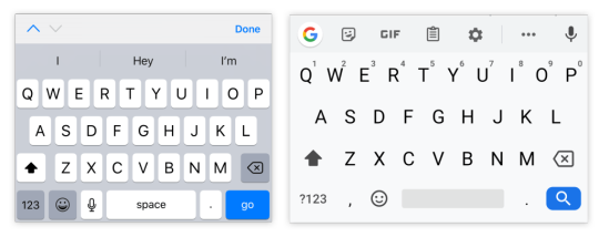
There is a type of input that sits in the liminal space between the more free-form text inputs and input widgets like radio buttons: date. The date input type comes in a variety of flavors that are well-supported on mobile, including date, time, datetime-local, and month. These pop up custom widgets in iOS and Android when they are focused. Instead of triggering a specialized keyboard, they show a select-like interface in iOS, and various different types of widgets on Android (where the date and time selectors are particularly slick).
I was excited to start using native defaults on mobile, until I looked around and realized that most major apps and mobile websites use custom date pickers rather than native date input types. There could be a couple reasons for this. First, I find the native iOS date selector to be less intuitive than a calendar-type widget. Second, even the beautifully-designed Android implementation is fairly limited compared to custom components — there’s no easy way to input a date range rather than a single date, for instance.
Still, the date input types are worth checking out if the custom datepicker you’re using doesn’t perform well on mobile. If you’d like to try out the native input widgets on iOS and Android while making sure that desktop users see a custom widget instead of the default dropdown, this snippet of CSS will hide the calendar dropdown for desktop browsers that implement it:
::-webkit-calendar-picker-indicator { display: none; }

Date input type on iOS (left) and Android (right)

Time input type on iOS (left) and Android (right)
One final thing to note is that date types cannot be overridden by the inputmode attribute, which we’ll discuss next.
Why should I care about inputmode?
The inputmode attribute allows you to override the mobile keyboard specified by the input’s type and directly declare the type of keyboard shown to the user. When I first learned about this attribute, I wasn’t impressed — why not just use the correct type in the first place? But while inputmode is often unnecessary, there are a few places where the attribute can be extremely helpful. The most notable use case that I’ve found for inputmode is building a better number input.
While some HTML5 input types, like url and email, are straightforward, input type="number" is a different matter. It has some accessibility concerns as well as a somewhat awkward UI. For example, desktop browsers, like Chrome, show tiny increment arrows that are easy to trigger accidentally by scrolling.
So here’s a pattern to memorize and use going forwards. For most numeric inputs, instead of using this:
<input type="number" />
…you actually want to use this:
<input type="text" inputmode="decimal" />
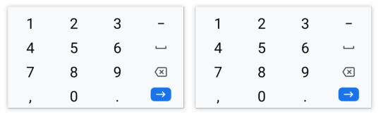
Why not inputmode="numeric" instead of inputmode="decimal" ?
The numeric and decimal attribute values produce identical keyboards on Android. On iOS, however, numeric displays a keyboard that shows both numbers and punctuation, while decimal shows a focused grid of numbers that almost looks exactly like the tel input type, only without extraneous telephone-number focused options. That’s why it’s my preference for most types of number inputs.

iOS numeric input (left) and decimal input (right)
Android numeric input (left) and decimal input (right)
Christian Oliff has written an excellent article dedicated solely to the inputmode attribute.
Don’t forget autocomplete
Even more important than showing the correct mobile keyboard is showing helpful autocomplete suggestions. That can go a long way towards creating a faster and less frustrating user experience on mobile.
While browsers have heuristics for showing autocomplete fields, you cannot rely on them, and should still be sure to add the correct autocomplete attribute. For instance, in iOS Safari, I found that an input type="tel" would only show autocomplete options if I explicitly added a autocomplete="tel" attribute.
You may think that you are familiar with the basic autocomplete options, such as those that help the user fill in credit card numbers or address form fields, but I’d urge you to review them to make sure that you are aware of all of the options. The spec lists over 50 values! Did you know that autocomplete="one-time-code" can make a phone verification user flow super smooth?
Speaking of autocomplete…
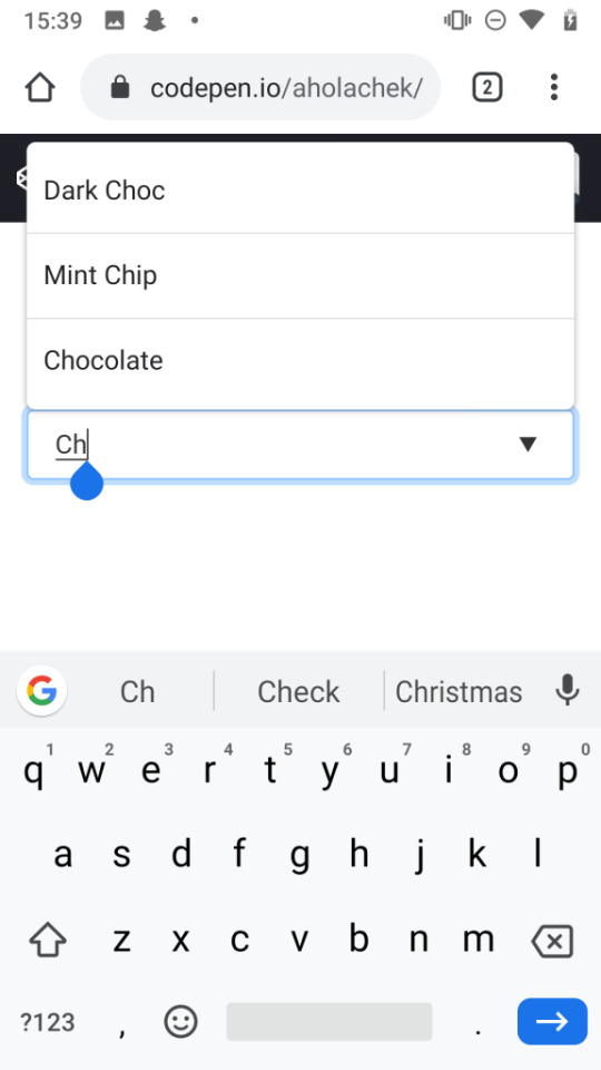
I’d like to mention one final element that allows you to create your own custom autocomplete functionality: datalist. While it creates a serviceable — if somewhat basic — autocomplete experience on desktop Chrome and Safari, it shines on iOS by surfacing suggestions in a convenient row right above the keyboard, where the system autocomplete functionality usually lives. Further, it allows the user to toggle between text and select-style inputs.
On Android, on the other hand, datalist creates a more typical autocomplete dropdown, with the area above the keyboard reserved for the system’s own typeahead functionality. One possible advantage to this style is that the dropdown list is easily scrollable, creating immediate access to all possible options as soon as the field is focused. (In iOS, in order to view more than the top three matches, the user would have to trigger the select picker by pressing the down arrow icon.)

You can use this demo to play around with datalist:
CodePen Embed Fallback
And you can explore all the autocomplete options, as well as input type and inputmode values, using this tool I made to help you quickly preview various input configurations on mobile.
In summary
When I’m building a form, I’m often tempted to focus on perfecting the desktop experience while treating the mobile web as an afterthought. But while it does take a little extra work to ensure forms work well on mobile, it doesn’t have to be too difficult. Hopefully, this article has shown that with a few easy steps, you can make forms much more convenient for your users on mobile devices.
0 notes
Text
Enhancing CSS Layout: From Floats To Flexbox To Grid
Earlier this year, support for CSS grid layout landed in most major desktop browsers. Naturally, the specification is one of the hot topics at meet-ups and conferences. After having some conversations about grid and progressive enhancement, I believe that there’s a good amount of uncertainty about using it. I heard some quite interesting questions and statements, which I want to address in this post.
Statements And Questions I’ve Heard In The Last Few Weeks Link
“When can I start using CSS grid layout?”
“Too bad that it’ll take some more years before we can use grid in production.”
“Do I need Modernizr131 in order to make websites with CSS grid layout?”
“If I wanted to use grid today, I’d have to build two to three versions of my website.”
“Progressive enhancement sounds great in theory, but I don’t think it’s possible to implement in real projects.”
“How much does progressive enhancement cost?”
These are all good questions, and not all of them are easy to answer, but I’m happy to share my approach. The CSS grid layout module is one of the most exciting developments since responsive design. We should try to get the best out of it as soon as possible, if it makes sense for us and our projects.
Demo: Progressively Enhanced Layout Link
Before going into detail and expounding my thoughts on the questions and statements above, I want to present a little demo42 I’ve made.
Disclaimer: It would be best to open the demo on a device with a large screen. You won’t see anything of significance on a smartphone.
3 The home page of an example website, with an adjustable slider to switch between different layout techniques.
When you open the demo42, you’ll find yourself on the home page of a website with a very basic layout. You can adjust the slider in the top left to enhance the experience. The layout switches from being very basic to being a float-based layout to being a flexbox layout and, finally, to being one that uses grid.
It’s not the most beautiful or complex design, but it’s good enough to demonstrate which shapes a website can take based on a browser’s capabilities.
This demo page is built with CSS grid layout and doesn’t use any prefixed properties or polyfills. It’s accessible and usable for users in Internet Explorer (IE) 8, Opera Mini in Extreme mode, UC Browser and, of course, the most popular modern browsers. You can perfectly use CSS grid layout today if you don’t expect exactly the same appearance in every single browser, which isn’t possible to achieve nowadays anyway. I’m well aware that this decision isn’t always up to us developers, but I believe that our clients are willing to accept those differences if they understand the benefits (future-proof design, better accessibility and better performance). On top of that, I believe that our clients and users have — thanks to responsive design — already learned that websites don’t look the same in every device and browser.
In the following sections, I’m going to show you how I built parts of the demo and why some things just work out of the box.
Quick side note: I had to add a few lines of JavaScript and CSS (an HTML5 shim) in order to make the page work in IE 8. I couldn’t resist, because IE 8+ just sounds more impressive than IE 9+.
CSS Grid Layout And Progressive Enhancement Link
Let’s take a deeper look at how I built the “four levels of enhancement” component in the center of the page.
I started off by putting all items into a section in a logical order. The first item in the section is the heading, followed by four subsections. Assuming that they represent separate blog posts, I wrapped each of them in an article tag. Each article consists of a heading (h3) and a linked image. I used the picture element here because I want to serve users with a different image if the viewport is wide enough. Here, we already have the first example of good ol’ progressive enhancement in action. If the browser doesn’t understand picture and source, it will still show the img, which is also a child of the picture element.
<section> <h2>Four levels of enhancement</h2> <article><h3>No Positioning</h3><a href="#"> <picture> <source srcset="320_480.jpg" media="(min-width: 600px)"> <img src="480_320.jpg" alt="image description"> </picture></a> </article> </section>
Float Enhancements Link
All items in the “four levels of enhancement” component, floated left
On larger screens, this component works best if all items are laid out next to each other. In order to achieve that for browsers that don’t understand flexbox or grid, I float them, give them a size and some margin, and clear the floating after the last floated item.
article { float: left; width: 24.25%; } article:not(:last-child) { margin-right: 1%; } section:after { clear: both; content: ""; display: table; }
Flexbox Enhancements Link
All items in the “four levels of enhancement” enhanced with flexbox
In this example, I actually don’t need to enhance the general layout of the component with flexbox, because floating already does what I need. In the design, the headings are below the images, which is something that’s achievable with flexbox.
article { display: flex; flex-direction: column; } h3 { order: 1; }
We have to be very cautious when reordering items with flexbox. We should use it only for visual changes, and make sure that reordering doesn’t change the user experience for keyboard or screen-reader users for the worse.
Grid Enhancements Link
All items in the “four levels of enhancement” enhanced with CSS grid
Everything looks pretty good now, but the heading still needs some positioning. There are many ways to position the heading right above the second item. The easiest and most flexible way I found is to use CSS grid layout.
First, I drew a four-column grid, with a 20-pixel gutter on the parent container.
section { display: grid; grid-template-columns: repeat(4, 1fr); grid-gap: 20px; }
Because all articles still have a width of 24.25%, I reset this property for browsers that understand grid.
@supports(display: grid) { article {width: auto; } }
Then, I put the heading in the first row and second column.
h2 { grid-row: 1; grid-column: 2; }
To work against grid’s auto-placement, I also put the second article explicitly in the second row and second column (below the heading).
article:nth-of-type(2) { grid-column: 2; grid-row: 2 / span 2; }
Finally, in order for the gap between the heading and the second item to be removed, all the other items have to span two rows.
article { grid-row: span 2; }
That’s it. You can see the final layout on Codepen5.
If I extract the extra lines that I need to make this thing work in IE 9+, then we’ll get a total of eight lines (three of which are actually for the clearfix and are reusable). Compare that to the overhead you get when you use prefixes.
article { float: left; width: 24.25%; } @supports(display: grid) { article {width: auto; } } section:after { clear: both; content: ""; display: table; }
I know that that’s just a simple example and not a complete project, and I know that a website has way more complex components. However, imagine how much more time it would take to build a layout that would look pixel-perfectly the same across all the various browsers.
You Don’t Have To Overwrite Everything Link
In the preceding example, width was the only property that had to be reset. One of the great things about grid (and flexbox, too, by the way) is that certain properties lose their power if they’re applied to a flex or grid item. float, for example, has no effect if the element it’s applied to is within a grid container. That’s the same for some other properties:
display: inline-block
display: table-cell
vertical-align
column-* properties
Check “Grid ‘Fallbacks’ and Overrides6” by amazing Rachel Andrew7 for more details.
8 CSS feature queries are supported in every major browser. (Image: Can I Use249) (View large version10)
If you do have to overwrite properties, use feature queries11. In most cases, you’ll only need them to overwrite properties such as width or margin. Support for feature queries12 is really good, and the best part is that they’re supported by every browser that understands grid as well. You don’t need Modernizr131 for that.
Also, you don’t have to put all grid properties in a feature query, because older browsers will simply ignore properties and values they don’t understand14.
The only time when it got a little tricky for me while working on the demo was when there was a flex or grid container with a clearfix applied to it. Pseudo-elements with content become flex or grid items as well15. It may or may not affect you; just be aware of it. As an alternative, you can clear the parent with overflow: hidden, if that works for you.
Measuring The Costs Of Progressive Enhancement Link
Browsers already do a lot of progressive enhancement for us. I already mentioned the picture element, which falls back to the img element. Another example is the email input field, which falls back to a simple text input field if the browser doesn’t understand it. Another example is the range slider that I’m using in the demo. In most browsers, it’s rendered as an adjustable slider. The input type range isn’t supported in IE 9, for example, but it’s still usable because it falls back to a simple input field. The user has to enter the correct values manually, which isn’t as convenient, but it works.
Comparison of how the range input type is rendered in Chrome and IE 9
Some Things Are Taken Care of by the Browser, Others by Us Link
While preparing the demo, I came to the realization that it’s incredibly helpful to really understand CSS, instead of just throwing properties at the browser and hoping for the best. The better you understand how floating, flexbox and grid work and the more you know about browsers, the easier it’ll be for you to progressively enhance.
Becoming someone who understands CSS, rather than someone who just uses CSS, will give you a huge advantage in your work.
Rachel Andrew16
Also, if progressive enhancement is already deeply integrated in your process of making websites, then it would be difficult to say how much extra it costs, because, well, that’s just how you make websites. Aaron Gustafson4517 shares a few stories of some projects he has worked on in his post “The True Cost of Progressive Enhancement3618” and on the Relative Paths podcast19. I highly recommend that you listen to and read about his experiences.
Resilient Web Development Link
Your website’s only as strong as the weakest device you’ve tested it on.
Ethan Marcotte20
Progressive enhancement might involve some work in the beginning, but it can save you time and money in the long run. We don’t know which devices, operating systems or browsers our users will be using next to access our websites. If we provide an accessible and usable experience for less capable browsers, then we’re building products that are resilient and better prepared for new and unexpected developments21.
I have the feeling that some of us forget what our job is all about and maybe even forget that what we’re actually doing is “just” a job. We’re not rock stars, ninjas, artisans or gurus, and what we do is ultimately about putting content online for people to consume as easily as possible.
Content is the reason we create websites.
Aaron Gustafson22
That sounds boring, I know, but it doesn’t have to be. We can use the hottest cutting-edge technologies and fancy techniques, as long as we don’t forget who we are making websites for: users. Our users aren’t all the same, nor do they use the same device, OS, browser, Internet provider or input device. By providing a basic experience to begin with, we can get the best out of the modern web without compromising accessibility.
23 CSS grid layout is supported in almost every major browser. (Image: Can I Use249) (View large version25)
Grid, for example, is available in almost every major browser26, and we shouldn’t wait more years still until coverage is 100% in order to use it in production, because it’ll never be there. That’s just not how the web works.
Grid is awesome27. Use it now!
Screenshots Link
Here are some screenshots of the demo page in various browsers:
Resources and Further Reading Link
Progressive enhancement and CSS grid layout34 (demo), Manuel Matuzovic
“Crippling the Web35,” Tim Kadlec
“The True Cost of Progressive Enhancement3618,” Aaron Gustafson
“Using Feature Queries in CSS37,” Jen Simmons
“A Very Good Time to Understand CSS Layout38,” Rachel Andrew
“Browser Support for Evergreen Websites39,” Rachel Andrew
The Experimental Layout Lab of Jen Simmons40 (demos), Jen Simmons
Grid by Example41 (articles, videos, demos), Rachel Andrew
“World Wide Web, Not Wealthy Western Web, Part 142, Bruce Lawson
“Resilience43” (video), Jeremy Keith, View Source conference 2016
“Left to Our Own Devices44,” Ethan Marcotte
Thanks to my mentor Aaron Gustafson4517 for helping me with this article, to Eva Lettner46 for proofreading and to Rachel Andrew47 for her countless posts, demos and talks.
(al)
1 https://modernizr.com/
2 http://ift.tt/2tSBmED
3 http://ift.tt/2tSBmED
4 http://ift.tt/2tSBmED
5 http://ift.tt/2ttaI5R
6 http://ift.tt/2mCexpX
7 http://ift.tt/1EPZxs2
8 http://ift.tt/2uPuqw8
9 http://caniuse.com/
10 http://ift.tt/2uPuqw8
11 http://ift.tt/2b0zZuo
12 http://ift.tt/10kxdHO
13 https://modernizr.com/
14 http://ift.tt/2uPaqtl
15 http://ift.tt/2uhA2hT
16 http://ift.tt/2tt0brd
17 https://twitter.com/AaronGustafson
18 http://ift.tt/1e4GZIc
19 http://ift.tt/2uPxpV3
20 http://ift.tt/2sM4XPQ
21 http://ift.tt/2rgFXTY
22 http://ift.tt/2nvrCjR
23 http://ift.tt/1Eia7BF
24 http://caniuse.com/
25 http://ift.tt/2uPn5g0
26 http://ift.tt/1Eia7BF
27 http://ift.tt/2rTQb9s
28 http://ift.tt/2uPjRcq
29 http://ift.tt/2uPFp8B
30 http://ift.tt/2uPwSTg
31 http://ift.tt/2uPw4h7
32 http://ift.tt/2uPMNRg
33 http://ift.tt/2uPAhkL
34 http://ift.tt/2tSBmED
35 http://ift.tt/2aSyJd1
36 http://ift.tt/1e4GZIc
37 http://ift.tt/2b0zZuo
38 http://ift.tt/2tt0brd
39 http://ift.tt/2jTtK40
40 http://ift.tt/1RYv5fq
41 http://ift.tt/2qNk5hJ
42 http://ift.tt/2lRWVSl
43 https://www.youtube.com/watch?v=W7wj7EDrSko
44 http://ift.tt/2sM4XPQ
45 https://twitter.com/AaronGustafson
46 https://twitter.com/eva_trostlos
47 https://twitter.com/rachelandrew
↑ Back to top Tweet itShare on Facebook
via Smashing Magazine http://ift.tt/2vAvCBd
0 notes
Text
Cool Little CSS Grid Tricks for Your Blog
I discovered CSS about a decade ago while trying to modify the look of a blog I had created. Pretty soon, I was able to code cool things with more mathematical and, therefore, easier-to-understand features like transforms. However, other areas of CSS, such as layout, have remained a constant source of pain.
This post is about a problem I encountered about a decade ago and, until recently, did not know how to solve in a smart way. Specifically, it’s about how I found a solution to a long-running problem using a modern CSS grid technique that, in the process, gave me even cooler results than I originally imagined.
That this is not a tutorial on how to best use CSS grid, but more of a walk through my own learning process.
The problem
One of the first things I used to dump on that blog were random photos from the city, so I had this idea about having a grid of thumbnails with a fixed size. For a nicer look, I wanted this grid to be middle-aligned with respect to the paragraphs above and below it, but, at the same time, I wanted the thumbnails on the last row to be left-aligned with respect to the grid. Meanwhile, the width of the post (and the width of the grid within it) would depend on the viewport.
The HTML looks something like this:
<section class='post__content'> <p><!-- some text --></p> <div class='grid--thumbs'> <a href='full-size-image.jpg'> <img src='thumb-image.jpg' alt='image description'/> </a> <!-- more such thumbnails --> </div> <p><!-- some more text --></p> </section>
It may seem simple, but it turned out to be one of the most difficult CSS problems I’ve ever encountered.
Less than ideal solutions
These are things I have tried or seen suggested over the years, but that never really got me anywhere.
Floating impossibility
Floats turned out to be a dead end because I couldn’t figure out how to make the grid be middle aligned this way.
.grid--thumbs { overflow: hidden; } .grid--thumbs a { float: left; }
The demo below shows the float attempt. Resize the embed to see how they behave at different viewport widths.
CodePen Embed Fallback
inline-block madness
At first, this seemed like a better idea:
.grid--thumbs { text-align: center } .grid--thumbs a { display: inline-block }
Except it turned out it wasn’t:
CodePen Embed Fallback
The last row isn’t left aligned in this case.
At a certain point, thanks to an accidental CSS auto-complete on CodePen, I found out about a property called text-align-last, which determines how the last line of a block is aligned.
Unfortunately, setting text-align-last: left on the grid wasn’t the solution I was looking for either:
CodePen Embed Fallback
At this point, I actually considered dropping the idea of a middle aligned grid. Could a combo of text-align: justified and text-align-last: left on the grid produce a better result?
Well, turns out it doesn’t. That is, unless there’s only a thumbnail on the last row and the gaps between the columns aren’t too big. Resize the embed below to see what I mean.
CodePen Embed Fallback
This is pretty where I was at two years ago, after nine years of trying and failing to come up with a solution to this problem.
Messy flexbox hacks
A flexbox solution that seemed like it would work at first was to add an ::after pseudo-element on the grid and set flex: 1 on both the thumbnails and this pseudo-element:
.grid--thumbs { display: flex; flex-wrap: wrap; a, &::after { flex: 1; } img { margin: auto; } &:after { content: 'AFTER'; } }
The demo below shows how this method works. I’ve given the thumbnails and the ::after pseudo-element purple outlines to make it easier to see what is going on.
CodePen Embed Fallback
This is not quite what I wanted because the grid of thumbnails is not middle-aligned. Thats said, it doesn’t look too bad… as long as the last row has exactly one item less image than the others. As soon as that changes, however, the layout breaks if it’s missing more items or none.

Why the ::after hack is not reliable.
That was one hacky idea. Another is to use a pseudo-element again, but add as many empty divs after the thumbnails as there are columns that we’re expecting to have. That number is something we should be able to approximate since the size of the thumbnails is fixed. We probably want to set a maximum width for the post since text that stretches across the width of a full screen can visually exhausting for eyes to read.
The first empty elements will take up the full width of the row that’s not completely filled with thumbnails, while the rest will spill into other rows. But since their height is zero, it won’t matter visually.
CodePen Embed Fallback
This kind of does the trick but, again, it’s hacky and still doesn’t produce the exact result I want since it sometimes ends up with big and kind of ugly-looking gaps between the columns.
A grid solution?
The grid layout has always sounded like the answer, given its name. The problem was that all examples I had seen by then were using a predefined number of columns and that doesn’t work for this particular pattern where the number of columns is determined by the viewport width.
Last year, while coding a collection of one element, pure CSS background patterns, I had the idea of generating a bunch of media queries that would modify a CSS variable, --n, corresponding to the number of columns used to set grid-template-columns.
$w: 13em; $h: 19em; $f: $h/$w; $n: 7; $g: 1em; --h: #{$f*$w}; display: grid; grid-template-columns: repeat(var(--n, #{$n}), var(--w, #{$w})); grid-gap: $g; place-content: center; @for $i from 1 to $n { @media (max-width: ($n - $i + 1)*$w + ($n - $i + 2)*$g) { --n: #{$n - $i} } }
CodePen Embed Fallback
I was actually super proud of this idea at the time, even though I cringe looking back on it now. One media query for every number of columns possible is not exactly ideal, not to mention it doesn’t work so well when the grid width doesn’t equal the viewport width, but is still somewhat flexible and also depends on the width of its siblings.
A magic solution
I finally came across a better solution while working with CSS grid and failing to understand why the repeat() function wasn’t working in a particular situation. It was so frustrating and prompted me to go to MDN, where I happened to notice the auto-fit keyword and, while I didn’t understand the explanation, I had a hunch that it could help with this other problem, so I dropped everything else I was doing and gave it a try.
Here’s what I got:
.grid--thumbs { display: grid; justify-content: center; grid-gap: .25em; grid-template-columns: repeat(auto-fit, 8em); }
CodePen Embed Fallback
I also discovered the minmax() function, which can be used in place of fixed sizes on grid items. I still haven’t been able to understand exactly how minmax() works — and the more I play with it, the less I understand it — but what it looks like it does in this situation is create the grid then stretch its columns equally until they fill all of the available space:
grid-template-columns: repeat(auto-fit, minmax(8em, 1fr));
CodePen Embed Fallback
Another cool thing we can do here is prevent the image from overflowing when it’s wider than the grid element. We can do this by replacing the minimum 8em with min(8em, 100%) That essentially ensures that images will never exceed 100%, but never below 8em. Thanks to Chris for this suggestion!
Note that the min() function doesn’t work in pre-Chromium Edge!
CodePen Embed Fallback
Keep in mind that this only produces a nice result if all of the images have the same aspect ratio — like the square images I’ve used here. For my blog, this was not an issue since all photos were taken with my Sony Ericsson W800i phone, and they all had the same aspect ratio. But if we were to drop images with different aspect ratios, the grid wouldn’t look as good anymore:
CodePen Embed Fallback
We can, of course, set the image height to a fixed value, but that distorts the images… unless we set object-fit to cover, which solves our problem!
CodePen Embed Fallback
Another idea would be to turn the first thumbnail into a sort of banner that spans all grid columns. The one problem is that we don’t know the number of columns because that depends on the viewport. But, there is a solution — we can set grid-column-end to -1!
.grid--thumbs { /* same styles as before */ a:first-child { grid-column: 1/ -1; img { height: 13em } } }
The first image gets a bigger height than all the others.
CodePen Embed Fallback
Of course, if we wanted the image to span all columns except the last, one we’d set it to -2 and so on… negative column indices are a thing!
auto-fill is another grid property keyword I noticed on MDN. The explanations for both are long walls of text without visuals, so I didn’t find them particularly useful. Even worse, replacing auto-fit with auto-fill in any of the grid demos above produces absolutely no difference. How they really work and how they differ still remains a mystery, even after checking out articles or toying with examples.
However, trying out different things and seeing what happens in various scenarios at one point led me to the conclusion that, if we’re using a minmax() column width and not a fixed one (like 8em), then it’s probably better to use auto-fill instead of auto-fit because, the result looks better if we happen to only have a few images, as illustrated by the interactive demo below:
CodePen Embed Fallback
I think what I personally like best is the initial idea of a thumbnail grid that’s middle-aligned and has a mostly fixed column width (but still uses min(100%, 15em) instead of just 15em though). At the end of the day, it’s a matter of personal preference and what can be seen in the demo below just happens to look better to me:
CodePen Embed Fallback
I’m using auto-fit in this demo because it produces the same result as auto-fill and is one character shorter. However, what I didn’t understand when making this is that both keywords produce the same result because there are more items in the gallery than we need to fill a row.
But once that changes, auto-fit and auto-fill produce different results, as illustrated below. You can change the justify-content value and the number of items placed on the grid:
CodePen Embed Fallback
I’m not really sure which is the better choice. I guess this also depends on personal preference. Coupled with justify-content: center, auto-fill seems to be the more logical option, but, at the same time, auto-fit produces a better-looking result.
The post Cool Little CSS Grid Tricks for Your Blog appeared first on CSS-Tricks.
Cool Little CSS Grid Tricks for Your Blog published first on https://deskbysnafu.tumblr.com/
0 notes
Text
Better Form Inputs for Better Mobile User Experiences
Here’s one simple, practical way to make apps perform better on mobile devices: always configure HTML input fields with the correct type, inputmode, and autocomplete attributes. While these three attributes are often discussed in isolation, they make the most sense in the context of mobile user experience when you think of them as a team.
There’s no question that forms on mobile devices can be time-consuming and tedious to fill in, but by properly configuring inputs, we can ensure that the data entry process is as seamless as possible for our users. Let’s take a look at some examples and best practices we can use to create better user experiences on mobile devices.
Use this demo to experiment on your own, if you’d like.
Using the correct input type
This is the easiest thing to get right. Input types, like email, tel, and url, are well-supported across browsers. While the benefit of using a type, like tel over the more generic text, might be hard to see on desktop browsers, it’s immediately apparent on mobile.
Choosing the appropriate type changes the keyboard that pops up on Android and iOS devices when a user focuses the field. For very little effort, just by using the right type, we will show custom keyboards for email, telephone numbers, URLs, and even search inputs.
Text input type on iOS (left) and Android (right)
Email input type on iOS (left) and Android (right)
URL input type on iOS (left) and Android (right)
Search input type on iOS (left) and Android (right)
One thing to note is that both input type="email" and input type="url" come with validation functionality, and modern browsers will show an error tooltip if their values do not match the expected formats when the user submits the form. If you’d rather turn this functionality off, you can simply add the novalidate attribute to the containing form.
A quick detour into date types
HTML inputs comprise far more than specialized text inputs — you also have radio buttons, checkboxes, and so on. For the purposes of this discussion, though, I’m mostly talking about the more text-based inputs.
There is a type of input that sits in the liminal space between the more free-form text inputs and input widgets like radio buttons: date. The date input type comes in a variety of flavors that are well-supported on mobile, including date, time, datetime-local, and month. These pop up custom widgets in iOS and Android when they are focused. Instead of triggering a specialized keyboard, they show a select-like interface in iOS, and various different types of widgets on Android (where the date and time selectors are particularly slick).
I was excited to start using native defaults on mobile, until I looked around and realized that most major apps and mobile websites use custom date pickers rather than native date input types. There could be a couple reasons for this. First, I find the native iOS date selector to be less intuitive than a calendar-type widget. Second, even the beautifully-designed Android implementation is fairly limited compared to custom components — there’s no easy way to input a date range rather than a single date, for instance.
Still, the date input types are worth checking out if the custom datepicker you’re using doesn’t perform well on mobile. If you’d like to try out the native input widgets on iOS and Android while making sure that desktop users see a custom widget instead of the default dropdown, this snippet of CSS will hide the calendar dropdown for desktop browsers that implement it:
::-webkit-calendar-picker-indicator { display: none; }
Date input type on iOS (left) and Android (right)
Time input type on iOS (left) and Android (right)
One final thing to note is that date types cannot be overridden by the inputmode attribute, which we’ll discuss next.
Why should I care about inputmode?
The inputmode attribute allows you to override the mobile keyboard specified by the input’s type and directly declare the type of keyboard shown to the user. When I first learned about this attribute, I wasn’t impressed — why not just use the correct type in the first place? But while inputmode is often unnecessary, there are a few places where the attribute can be extremely helpful. The most notable use case that I’ve found for inputmode is building a better number input.
While some HTML5 input types, like url and email, are straightforward, input type="number" is a different matter. It has some accessibility concerns as well as a somewhat awkward UI. For example, desktop browsers, like Chrome, show tiny increment arrows that are easy to trigger accidentally by scrolling.
So here’s a pattern to memorize and use going forwards. For most numeric inputs, instead of using this:
<input type="number" />
…you actually want to use this:
<input type="text" inputmode="decimal" />
Why not inputmode="numeric" instead of inputmode="decimal" ?
The numeric and decimal attribute values produce identical keyboards on Android. On iOS, however, numeric displays a keyboard that shows both numbers and punctuation, while decimal shows a focused grid of numbers that almost looks exactly like the tel input type, only without extraneous telephone-number focused options. That’s why it’s my preference for most types of number inputs.
iOS numeric input (left) and decimal input (right)
Android numeric input (left) and decimal input (right)
Christian Oliff has written an excellent article dedicated solely to the inputmode attribute.
Don’t forget autocomplete
Even more important than showing the correct mobile keyboard is showing helpful autocomplete suggestions. That can go a long way towards creating a faster and less frustrating user experience on mobile.
While browsers have heuristics for showing autocomplete fields, you cannot rely on them, and should still be sure to add the correct autocomplete attribute. For instance, in iOS Safari, I found that an input type="tel" would only show autocomplete options if I explicitly added a autocomplete="tel" attribute.
You may think that you are familiar with the basic autocomplete options, such as those that help the user fill in credit card numbers or address form fields, but I’d urge you to review them to make sure that you are aware of all of the options. The spec lists over 50 values! Did you know that autocomplete="one-time-code" can make a phone verification user flow super smooth?
Speaking of autocomplete…
I’d like to mention one final element that allows you to create your own custom autocomplete functionality: datalist. While it creates a serviceable — if somewhat basic — autocomplete experience on desktop Chrome and Safari, it shines on iOS by surfacing suggestions in a convenient row right above the keyboard, where the system autocomplete functionality usually lives. Further, it allows the user to toggle between text and select-style inputs.
On Android, on the other hand, datalist creates a more typical autocomplete dropdown, with the area above the keyboard reserved for the system’s own typeahead functionality. One possible advantage to this style is that the dropdown list is easily scrollable, creating immediate access to all possible options as soon as the field is focused. (In iOS, in order to view more than the top three matches, the user would have to trigger the select picker by pressing the down arrow icon.)
You can use this demo to play around with datalist:
CodePen Embed Fallback
And you can explore all the autocomplete options, as well as input type and inputmode values, using this tool I made to help you quickly preview various input configurations on mobile.
In summary
When I’m building a form, I’m often tempted to focus on perfecting the desktop experience while treating the mobile web as an afterthought. But while it does take a little extra work to ensure forms work well on mobile, it doesn’t have to be too difficult. Hopefully, this article has shown that with a few easy steps, you can make forms much more convenient for your users on mobile devices.
The post Better Form Inputs for Better Mobile User Experiences appeared first on CSS-Tricks.
Better Form Inputs for Better Mobile User Experiences published first on https://deskbysnafu.tumblr.com/
0 notes
Text
Multi-Thumb Sliders: Particular Two-Thumb Case
This is a concept I first came across a few years back when Lea Verou wrote an article on it. Multi-range sliders have sadly been removed from the spec since, but something else that has happened in the meanwhile is that CSS got better — and so have I, so I recently decided to make my own 2019 version.
In this two-part article, we'll go through the how, step-by-step, first building an example with two thumbs, then identify the issues with it. We'll solve those issues, first for the two-thumb case then, in part two, come up with a better solution for the multi-thumb case.
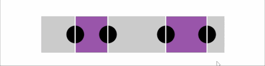
The sliders we'll be coding.
Note how the thumbs can pass each other and we can have any possible order, with the fills in between the thumbs adapting accordingly. Surprisingly, the entire thing is going to require extremely little JavaScript.
Article Series:
Multi-Thumb Sliders: Particular Two-Thumb Case (This Post)
Multi-Thumb Sliders: General Case (Coming Tomorrow!)
Basic structure
We need two range inputs inside a wrapper. They both have the same minimum and maximum value (this is very important because nothing is going to work properly otherwise), which we set as custom properties on the wrapper (--min and --max). We also set their values as custom properties (--a and --b).
- let min = -50, max = 50 - let a = -30, b = 20; .wrap(style=`--a: ${a}; --b: ${b}; --min: ${min}; --max: ${max}`) input#a(type='range' min=min value=a max=max) input#b(type='range' min=min value=b max=max)
This generates the following markup:
<div class='wrap' style='--a: -30; --b: 20; --min: -50; --max: 50'> <input id='a' type='range' min='-50' value='-30' max='50'/> <input id='b' type='range' min='-50' value='20' max='50'/> </div>
Accessibility considerations
We have two range inputs and they should probably each have a <label>, but we want our multi-thumb slider to have a single label. How do we solve this issue? We can make the wrapper a <fieldset>, use its <legend> to describe the entire multi-thumb slider, and have a <label> that's only visible to screen readers for each of our range inputs. (Thanks to Zoltan for this great suggestion.)
But what if we want to have a flex or grid layout on our wrapper? That's something we probably want, as the only other option is absolute positioning and that comes with its own set of issues. Then we run into a Chromium issue where <fieldset> cannot be a flex or grid container.
To go around this, we use the following ARIA equivalent (which I picked up from this post by Steve Faulkner):
- let min = -50, max = 50 - let a = -30, b = 20; .wrap(role='group' aria-labelledby='multi-lbl' style=`--a: ${a}; --b: ${b}; --min: ${min}; --max: ${max}`) #multi-lbl Multi thumb slider: label.sr-only(for='a') Value A: input#a(type='range' min=min value=a max=max) label.sr-only(for='b') Value B: input#b(type='range' min=min value=b max=max)
The generated markup is now:
<div class='wrap' role='group' aria-labelledby='multi-lbl' style='--a: -30; --b: 20; --min: -50; --max: 50'> <div id='multi-lbl'>Multi thumb slider:</div> <label class='sr-only' for='a'>Value A:</label> <input id='a' type='range' min='-50' value='-30' max='50'/> <label class='sr-only' for='b'>Value B:</label> <input id='b' type='range' min='-50' value='20' max='50'/> </div>
If we set an aria-label or an aria-labelledby attribute on an element, we also need to give it a role.
Basic styling
We make the wrapper a middle-aligned grid with two rows and one column. The bottom grid cell gets the dimensions we want for the slider, while the top one gets the same width as the slider, but can adjust its height according to the group label's content.
$w: 20em; $h: 1em; .wrap { display: grid; grid-template-rows: max-content $h; margin: 1em auto; width: $w; }
To visually hide the <label> elements, we absolutely position them and clip them to nothing:
.wrap { // same as before overflow: hidden; // in case <label> elements overflow position: relative; } .sr-only { position: absolute; clip-path: inset(50%); }
Some people might shriek about clip-path support, like how using it cuts out pre-Chromium Edge and Internet Explorer, but it doesn't matter in this particular case! We're getting to the why behind that in a short bit.
We place the sliders, one on top of the other, in the bottom grid cell:
input[type='range'] { grid-column: 1; grid-row: 2; }
See the Pen by thebabydino (@thebabydino) on CodePen.
We can already notice a problem however: not only does the top slider track show up above the thumb of the bottom one, but the top slider makes it impossible for us to even click and interact with the bottom one using a mouse or touch.
In order to fix this, we remove any track backgrounds and borders and highlight the track area by setting a background on the wrapper instead. We also set pointer-events: none on the actual <input> elements and then revert to auto on their thumbs.
@mixin track() { background: none; /* get rid of Firefox track background */ height: 100%; width: 100%; } @mixin thumb() { background: currentcolor; border: none; /* get rid of Firefox thumb border */ border-radius: 0; /* get rid of Firefox corner rounding */ pointer-events: auto; /* catch clicks */ width: $h; height: $h; } .wrap { /* same as before */ background: /* emulate track with wrapper background */ linear-gradient(0deg, #ccc $h, transparent 0); } input[type='range'] { &::-webkit-slider-runnable-track, &::-webkit-slider-thumb, & { -webkit-appearance: none; } /* same as before */ background: none; /* get rid of white Chrome background */ color: #000; font: inherit; /* fix too small font-size in both Chrome & Firefox */ margin: 0; pointer-events: none; /* let clicks pass through */ &::-webkit-slider-runnable-track { @include track; } &::-moz-range-track { @include track; } &::-webkit-slider-thumb { @include thumb; } &::-moz-range-thumb { @include thumb; } }
Note that we've set a few more styles on the input itself as well as on the track and thumb in order to make the look consistent across the browsers that support letting clicks pass through the actual input elements and their tracks, while allowing them on the thumbs. This excludes pre-Chromium Edge and IE, which is why we haven't included the -ms- prefix — there's no point styling something that wouldn't be functional in these browsers anyway. This is also why we can use clip-path to hide the <label> elements.
If you'd like to know more about default browser styles in order to understand what's necessary to override here, you can check out this article where I take an in-depth look at range inputs (and where I also detail the reasoning behind using mixins here).
See the Pen by thebabydino (@thebabydino) on CodePen.
Alright, we now have something that looks functional. But in order to really make it functional, we need to move on to the JavaScript!
Functionality
The JavaScript is pretty straightforward. We need to update the custom properties we've set on the wrapper. (For an actual use case, they'd be set higher up in the DOM so that they're also inherited by the elements whose styles that depend on them.)
addEventListener('input', e => { let _t = e.target; _t.parentNode.style.setProperty(`--${_t.id}`, +_t.value) }, false);
See the Pen by thebabydino (@thebabydino) on CodePen.
However, unless we bring up DevTools to see that the values of those two custom properties really change in the style attribute of the wrapper .wrap, it's not really obvious that this does anything. So let's do something about that!
Showing values
Something we can do to make it obvious that dragging the thumbs actually changes something is to display the current values. In order to do this, we use an output element for each input:
- let min = -50, max = 50 - let a = -30, b = 20; .wrap(role='group' aria-labelledby='multi-lbl' style=`--a: ${a}; --b: ${b}; --min: ${min}; --max: ${max}`) #multi-lbl Multi thumb slider: label.sr-only(for='a') Value A: input#a(type='range' min=min value=a max=max) output(for='a' style='--c: var(--a)') label.sr-only(for='b') Value B: input#b(type='range' min=min value=b max=max) output(for='b' style='--c: var(--b)')
The resulting HTML looks as follows:
<div class='wrap' role='group' aria-labelledby='multi-lbl' style='--a: -30; --b: 20; --min: -50; --max: 50'> <div id='multi-lbl'>Multi thumb slider:</div> <label class='sr-only' for='a'>Value A:</label> <input id='a' type='range' min='-50' value='-30' max='50'/> <output for='a' style='--c: var(--a)'></output> <label class='sr-only' for='b'>Value B:</label> <input id='b' type='range' min='-50' value='20' max='50'/> <output for='b' style='--c: var(--b)'></output> </div>
We display the values in an ::after pseudo-element using a little counter trick:
output { &::after { counter-reset: c var(--c); content: counter(c); } }
See the Pen by thebabydino (@thebabydino) on CodePen.
It's now obvious these values change as we drag the sliders, but the result is ugly and it has messed up the wrapper background alignment, so let's add a few tweaks! We could absolutely position the <output> elements, but for now, we simply squeeze them in a row between the group label and the sliders:
.wrap { // same as before grid-template: repeat(2, max-content) #{$h}/ 1fr 1fr; } [id='multi-lbl'] { grid-column: 1/ span 2 } input[type='range'] { // same as before grid-column: 1/ span 2; grid-row: 3; } output { grid-row: 2; &:last-child { text-align: right; } &::after { content: '--' attr(for) ': ' counter(c) ';' counter-reset: c var(--c); } }
Much better!
See the Pen by thebabydino (@thebabydino) on CodePen.
Setting separate :focus styles even gives us something that doesn't look half bad, plus allows us to see which value we're currently modifying.
input[type='range'] { /* same as before */ z-index: 1; &:focus { z-index: 2; outline: dotted 1px currentcolor; &, & + output { color: darkorange } } }
See the Pen by thebabydino (@thebabydino) on CodePen.
All we need now is to create the fill between the thumbs.
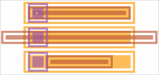
The tricky part
We can recreate the fill with an ::after pseudo-element on the wrapper, which we place on the bottom grid row where we've also placed the range inputs. This pseudo-element comes, as the name suggests, after the inputs, but it will still show up underneath them because we've set positive z-index values on them. Note that setting the z-index works on the inputs (without explicitly setting their position to something different from static) because they're grid children.
The width of this pseudo-element should be proportional to the difference between the higher input value and the lower input value. The big problem here is that they pass each other and we have no way of knowing which has the higher value.
First approach
My first idea on how to solve this was by using width and min-width together. In order to better understand how this works, consider that we have two percentage values, --a and --b, and we want to make an element's width be the absolute value of the difference between them.
Either one of the two values can be the bigger one, so we pick an example where --b is bigger and an example where --a is bigger:
<div style='--a: 30%; --b: 50%'><!-- first example, --b is bigger --></div> <div style='--a: 60%; --b: 10%'><!-- second example, --a is bigger --></div>
We set width to the second value (--b) minus the first (--a) and min-width to the first value (--a) minus the second one (--b).
div { background: #f90; height: 4em; min-width: calc(var(--a) - var(--b)); width: calc(var(--b) - var(--a)); }
If the second value (--b) is bigger, then the width is positive (which makes it valid) and the min-width negative (which makes it invalid). That means the computed value is the one set via the width property. This is the case in the first example, where --b is 70% and --a is 50%. That means the width computes to 70% - 50% = 20%, while the min-width computes to 50% - 70% = -20%.
If the first value is bigger, then the width is negative (which makes it invalid) and the min-width is positive (which makes it valid), meaning the computed value is that set via the min-width property. This is the case in the second example, where --a is 80% and --b is 30%, meaning the width computes to 30% - 80% = -50%, while the min-width computes to 80% - 30% = 50%.
See the Pen by thebabydino (@thebabydino) on CodePen.
Applying this solution for our two thumb slider, we have:
.wrap { /* same as before */ --dif: calc(var(--max) - var(--min)); &::after { content: ''; background: #95a; grid-column: 1/ span 2; grid-row: 3; min-width: calc((var(--a) - var(--b))/var(--dif)*100%); width: calc((var(--b) - var(--a))/var(--dif)*100%); } }
In order to represent the width and min-width values as percentages, we need to divide the difference between our two values by the difference (--dif) between the maximum and the minimum of the range inputs and then multiply the result we get by 100%.
See the Pen by thebabydino (@thebabydino) on CodePen.
So far, so good... so what?
The ::after always has the right computed width, but we also need to offset it from the track minimum by the smaller value and we can't use the same trick for its margin-left property.
My first instinct here was to use left, but actual offsets don't work on their own. We'd have to also explicitly set position: relative on our ::after pseudo-element in order to make it work. I felt kind of meh about doing that, so I opted for margin-left instead.
The question is what approach can we take for this second property. The one we've used for the width doesn't work because there is no such thing as min-margin-left.
A min() function is now in the CSS spec, but at the time when I coded these multi-thumb sliders, it was only implemented by Safari (it has since landed in Chrome as well). Safari-only support was not going to cut it for me since I don't own any Apple device or know anyone in real life who does... so I couldn't play with this function! And not being able to come up with a solution I could actually test meant having to change the approach.
Second approach
This involves using both of our wrapper's (.wrap) pseudo-elements: one pseudo-element's margin-left and width being set as if the second value is bigger, and the other's set as if the first value is bigger.
With this technique, if the second value is bigger, the width we're setting on ::before is positive and the one we're setting on ::after is negative (which means it's invalid and the default of 0 is applied, hiding this pseudo-element). Meanwhile, if the first value is bigger, then the width we're setting on ::before is negative (so it's this pseudo-element that has a computed width of 0 and is not being shown in this situation) and the one we're setting on ::after is positive.
Similarly, we use the first value (--a) to set the margin-left property on the ::before since we assume the second value --b is bigger for this pseudo-element. That means --a is the value of the left end and --b the value of the right end.
For ::after, we use the second value (--b) to set the margin-left property, since we assume the first value --a is bigger this pseudo-element. That means --b is the value of the left end and --a the value of the right end.
Let's see how we put it into code for the same two examples we previously had, where one has --b bigger and another where --a is bigger:
<div style='--a: 30%; --b: 50%'></div> <div style='--a: 60%; --b: 10%'></div>
div { &::before, &::after { content: ''; height: 5em; } &::before { margin-left: var(--a); width: calc(var(--b) - var(--a)); } &::after { margin-left: var(--b); width: calc(var(--a) - var(--b)); } }
See the Pen by thebabydino (@thebabydino) on CodePen.
Applying this technique for our two thumb slider, we have:
.wrap { /* same as before */ --dif: calc(var(--max) - var(--min)); &::before, &::after { grid-column: 1/ span 2; grid-row: 3; height: 100%; background: #95a; content: '' } &::before { margin-left: calc((var(--a) - var(--min))/var(--dif)*100%); width: calc((var(--b) - var(--a))/var(--dif)*100%) } &::after { margin-left: calc((var(--b) - var(--min))/var(--dif)*100%); width: calc((var(--a) - var(--b))/var(--dif)*100%) } }
See the Pen by thebabydino (@thebabydino) on CodePen.
We now have a nice functional slider with two thumbs. But this solution is far from perfect.
Issues
The first issue is that we didn't get those margin-left and width values quite right. It's just not noticeable in this demo due to the thumb styling (such as its shape, dimensions relative to the track, and being full opaque).
But let's say our thumb is round and maybe even smaller than the track height:
See the Pen by thebabydino (@thebabydino) on CodePen.
We can now see what the problem is: the endlines of the fill don't coincide with the vertical midlines of the thumbs.
This is because of the way moving the thumb end-to-end works. In Chrome, the thumb's border-box moves within the limits of the track's content-box, while in Firefox, it moves within the limits of the slider's content-box. This can be seen in the recordings below, where the padding is transparent, while the content-box and the border are semi-transparent. We've used orange for the actual slider, red for the track and purple for the thumb.

Recording of the thumb motion in Chrome from one end of the slider to the other.
Note that the track's width in Chrome is always determined by that of the parent slider - any width value we may set on the track itself gets ignored. This is not the case in Firefox, where the track can also be wider or narrower than its parent <input>. As we can see below, this makes it even more clear that the thumb's range of motion depends solely on the slider width in this browser.
Recording of the thumb motion in Firefox from one end of the slider to the other. The three cases are displayed from top to bottom. The border-box of the track perfectly fits the content-box of the slider horizontally. It's longer and it's shorter).
In our particular case (and, to be fair, in a lot of other cases), we can get away with not having any margin, border or padding on the track. That would mean its content-box coincides to that of the actual range input so there are no inconsistencies between browsers.
But what we need to keep in mind is that the vertical midlines of the thumbs (which we need to coincide with the fill endpoints) move between half a thumb width (or a thumb radius if we have a circular thumb) away from the start of the track and half a thumb width away from the end of the track. That's an interval equal to the track width minus the thumb width (or the thumb diameter in the case of a circular thumb).
This can be seen in the interactive demo below where the thumb can be dragged to better see the interval its vertical midline (which we need to coincide with the fill's endline) moves within.
See the Pen by thebabydino (@thebabydino) on CodePen.
The demo is best viewed in Chrome and Firefox.
The fill width and margin-left values are not relative to 100% (or the track width), but to the track width minus the thumb width (which is also the diameter in the particular case of a circular thumb). Also, the margin-left values don't start from 0, but from half a thumb width (which is a thumb radius in our particular case).
$d: .5*$h; // thumb diameter $r: .5*$d; // thumb radius $uw: $w - $d; // useful width .wrap { /* same as before */ --dif: calc(var(--max) - var(--min)); &::before { margin-left: calc(#{$r} + (var(--a) - var(--min))/var(--dif)*#{$uw}); width: calc((var(--b) - var(--a))/var(--dif)*#{$uw}); } &::after { margin-left: calc(#{$r} + (var(--b) - var(--min))/var(--dif)*#{$uw}); width: calc((var(--a) - var(--b))/var(--dif)*#{$uw}); } }
Now the fill starts and ends exactly where it should, along the midlines of the two thumbs:
See the Pen by thebabydino (@thebabydino) on CodePen.
This one issue has been taken care of, but we still have a way bigger one. Let's say we want to have more thumbs, say four:
An example with four thumbs.
We now have four thumbs that can all pass each other and they can be in any order that we have no way of knowing. Moreover, we only have two pseudo-elements, so we cannot apply the same techniques. Can we still find a CSS-only solution?
Well, the answer is yes! But it means scrapping this solution and going for something different and way more clever — in part two of this article!
Article Series:
Multi-Thumb Sliders: Particular Two-Thumb Case (This Post)
Multi-Thumb Sliders: General Case (Coming Tomorrow!)
The post Multi-Thumb Sliders: Particular Two-Thumb Case appeared first on CSS-Tricks.
Multi-Thumb Sliders: Particular Two-Thumb Case published first on https://deskbysnafu.tumblr.com/
0 notes
Text
A Handy Sass-Powered Tool for Making Balanced Color Palettes
For those who may not come from a design background, selecting a color palette is often based on personal preferences. Choosing colors might be done with an online color tool, sampling from an image, "borrowing" from favorite brands, or just sort of randomly picking from a color wheel until a palette "just feels right."
Our goal is to better understand what makes a palette "feel right" by exploring key color attributes with Sass color functions. By the end, you will become more familiar with:
The value of graphing a palette’s luminance, lightness, and saturation to assist in building balanced palettes
The importance of building accessible contrast checking into your tools
Advanced Sass functions to extend for your own explorations, including a CodePen you can manipulate and fork
What you’ll ultimately find, however, is that color on the web is a battle of hardware versus human perception.
What makes color graphing useful
You may be familiar with ways of declaring colors in stylesheets, such as RGB and RGBA values, HSL and HSLA values, and HEX codes.
rbg(102,51,153) rbga(102,51,153, 0.6) hsl(270, 50%, 40%) hsla(270, 50%, 40%, 0.6) #663399
Those values give devices instructions on how to render color. Deeper attributes of a color can be exposed programmatically and leveraged to understand how a color relates to a broader palette.
The value of graphing color attributes is that we get a more complete picture of the relationship between colors. This reveals why a collection of colors may or may not feel right together. Graphing multiple color attributes helps hint at what adjustments can be made to create a more harmonious palette. We’ll look into examples of how to determine what to change in a later section.
Two useful measurements we can readily obtain using built-in Sass color functions are lightness and saturation.
Lightness refers to the mix of white or black with the color.
Saturation refers to the intensity of a color, with 100% saturation resulting in the purest color (no grey present).
$color: rebeccapurple; @debug lightness($color); // 40% @debug saturation($color); // 50%;
However, luminance may arguably be the most useful color attribute. Luminance, as represented in our tool, is calculated using the WCAG formula which assumes an sRGB color space. Luminance is used in the contrast calculations, and as a grander concept, also aims to get closer to quantifying the human perception of relative brightness to assess color relationships. This means that a tighter luminance value range among a palette is likely to be perceived as more balanced to the human eye. But machines are fallible, and there are exceptions to this rule that you may encounter as you manipulate palette values. For more extensive information on luminance, and a unique color space called CIELAB that aims to even more accurately represent the human perception of color uniformity, see the links at the end of this article.
Additionally, color contrast is exceptionally important for accessibility, particularly in terms of legibility and distinguishing UI elements, which can be calculated programmatically. That’s important in that it means tooling can test for passing values. It also means algorithms can, for example, return an appropriate text color when passed in the background color. So our tool will incorporate contrast checking as an additional way to gauge how to adjust your palette.
The functions demonstrated in this project can be extracted for helping plan a contrast-safe design system palette, or baked into a Sass framework that allows defining a custom theme.
Sass as a palette building tool
Sass provides several traditional programming features that make it perfect for our needs, such as creating and iterating through arrays and manipulating values with custom functions. When coupled with an online IDE, like CodePen, that has real-time processing, we can essentially create a web app to solve specific problems such as building a color palette.
Here is a preview of the tool we’re going to be using:
See the Pen Sass Color Palette Grapher by Stephanie Eckles (@5t3ph) on CodePen.
Features of the Sass palette builder
It outputs an aspect ratio-controlled responsive graph for accurate plot point placement and value comparing.
It leverages the result of Sass color functions and math calculations to correctly plot points on a 0–100% scale.
It generates a gradient to provide a more traditional "swatch" view.
It uses built-in Sass functions to extract saturation and lightness values.
It creates luminance and contrast functions (forked from Material Web Components in addition to linking in required precomputed linear color channel values).
It returns appropriate text color for a given background, with a settings variable to change the ratio used.
It provides functions to uniformly scale saturation and lightness across a given palette.
Using the palette builder
To begin, you may wish to swap from among the provided example palettes to get a feel for how the graph values change for different types of color ranges. Simply copy a palette variable name and swap it for $default as the value of the $palette variable which can be found under the comment SWAP THE PALETTE VARIABLE.
Next, try switching the $contrastThreshold variable value between the predefined ratios, especially if you are less familiar with ensuring contrast passes WCAG guidelines.
Then try to adjust the $palette-scale-lightness or $palette-scale-saturation values. Those feed into the palette function and uniformly scale those measurements across the palette (up to the individual color's limit).
Finally, have a go at adding your own palette, or swap out some colors within the examples. The tool is a great way to explore Sass color functions to adjust particular attributes of a color, some of which are demonstrated in the $default palette.
Interpreting the graphs and creating balanced, accessible palettes
The graphing tool defaults to displaying luminance due to it being the most reliable indicator of a balanced palette, as we discussed earlier. Depending on your needs, saturation and lightness can be useful metrics on their own, but mostly they are signalers that can help point to what needs adjusting to bring a palette's luminance more in alignment. An exception may be creating a lightness scale based on each value in your established palette. You can swap to the $stripeBlue example for that.
The $default palette is actually in need of adjustment to get closer to balanced luminance:

The $default palette’s luminance graph
A palette that shows well-balanced luminance is the sample from Stripe ($stripe):
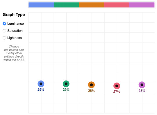
The $stripe palette luminance graph
Here's where the tool invites a mind shift. Instead of manipulating a color wheel, it leverages Sass functions to programmatically adjust color attributes.
Check the saturation graph to see if you have room to play with the intensity of the color. My recommended adjustment is to wrap your color value with the scale-color function and pass an adjusted $saturation value, e.g. example: scale-color(#41b880, $saturation: 60%). The advantage of scale-color is that it fluidly adjusts the value based on the given percent.
Lightness can help explain why two colors feel different by assigning a value to their brightness measured against mixing them with white or black. In the $default palette, the change-color function is used for purple to align it's relative $lightness value with the computed lightness() of the value used for the red.
The scale-color function also allows bundling both an adjusted $saturation and $lightness value, which is often the most useful. Note that provided percents can be negative.
By making use of Sass functions and checking the saturation and lightness graphs, the $defaultBalancedLuminance achieves balanced luminance. This palette also uses the map-get function to copy values from the $default palette and apply further adjustments instead of overwriting them, which is handy for testing multiple variations such as perhaps a hue shift across a palette.
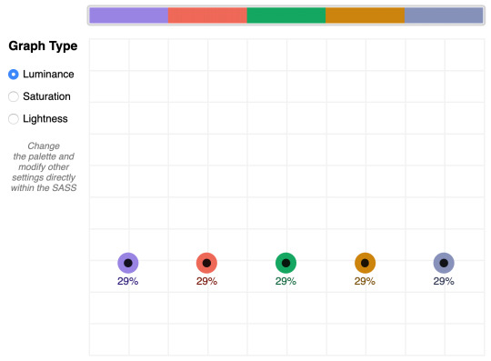
The $defaultBalancedLuminance luminance graph
Take a minute to explore other available color functions.

http://jackiebalzer.com/color offers an excellent web app to review effects of Sass and Compass color functions.
Contrast comes into play when considering how the palette colors will actually be used in a UI. The tool defaults to the AA contrast most appropriate for all text: 4.5. If you are building for a light UI, then consider that any color used on text should achieve appropriate contrast with white when adjusting against luminance, indicated by the center color of the plot point.
Tip: The graph is set up with a transparent background, so you can add a background rule on body if you are developing for a darker UI.
Further reading
Color is an expansive topic and this article only hits the aspects related to Sass functions. But to truly understand how to create harmonious color systems, I recommend the following resources:
Color Spaces - is a super impressive deep-dive with interactive models of various color spaces and how they are computed.
Understanding Colors and Luminance - A beginner-friendly overview from MDN on color and luminance and their relationship to accessibility.
Perpetually Uniform Color Spaces - More information on perceptually uniform color systems, with an intro the tool HSLuv that converts values from the more familiar HSL color space to the luminance-tuned CIELUV color space.
Accessible Color Systems - A case study from Stripe about their experience building an accessible color system by creating custom tooling (which inspired this exploration and article).
A Nerd's Guide to Color on the Web - This is a fantastic exploration of the mechanics of color on the web, available right here on CSS-Tricks.
Tanaguru Contrast Finder - An incredible tool to help if you are struggling to adjust colors to achieve accessible contrast.
ColorBox - A web app from Lyft that further explores color scales through graphing.
Designing Systematic Colors - Describes Mineral UI's exceptional effort to create color ramps to support consistent theming via a luminance-honed palette.
How we designed the new color palettes in Tableau 10 - Tableau exposed features of their custom tool that helped them create a refreshed palette based on CIELAB, including an approachable overview of that color space.
The post A Handy Sass-Powered Tool for Making Balanced Color Palettes appeared first on CSS-Tricks.
A Handy Sass-Powered Tool for Making Balanced Color Palettes published first on https://deskbysnafu.tumblr.com/
0 notes
Text
A Dark Mode Toggle with React and ThemeProvider
I like when websites have a dark mode option. Dark mode makes web pages easier for me to read and helps my eyes feel more relaxed. Many websites, including YouTube and Twitter, have implemented it already, and we’re starting to see it trickle onto many other sites as well.
In this tutorial, we’re going to build a toggle that allows users to switch between light and dark modes, using a <ThemeProvider wrapper from the styled-components library. We’ll create a useDarkMode custom hook, which supports the prefers-color-scheme media query to set the mode according to the user’s OS color scheme settings.
If that sounds hard, I promise it’s not! Let’s dig in and make it happen.
See the Pen Day/night mode switch toggle with React and ThemeProvider by Maks Akymenko (@maximakymenko) on CodePen.
Let’s set things up
We’ll use create-react-app to initiate a new project:
npx create-react-app my-app cd my-app yarn start
Next, open a separate terminal window and install styled-components:
yarn add styled-components
Next thing to do is create two files. The first is global.js, which will contain our base styling, and the second is theme.js, which will include variables for our dark and light themes:
// theme.js export const lightTheme = { body: '#E2E2E2', text: '#363537', toggleBorder: '#FFF', gradient: 'linear-gradient(#39598A, #79D7ED)', } export const darkTheme = { body: '#363537', text: '#FAFAFA', toggleBorder: '#6B8096', gradient: 'linear-gradient(#091236, #1E215D)', }
Feel free to customize variables any way you want, because this code is used just for demonstration purposes.
// global.js // Source: https://github.com/maximakymenko/react-day-night-toggle-app/blob/master/src/global.js#L23-L41 import { createGlobalStyle } from 'styled-components'; export const GlobalStyles = createGlobalStyle` *, *::after, *::before { box-sizing: border-box; } body { align-items: center; background: ${({ theme }) => theme.body}; color: ${({ theme }) => theme.text}; display: flex; flex-direction: column; justify-content: center; height: 100vh; margin: 0; padding: 0; font-family: BlinkMacSystemFont, -apple-system, 'Segoe UI', Roboto, Helvetica, Arial, sans-serif; transition: all 0.25s linear; }
Go to the App.js file. We’re going to delete everything in there and add the layout for our app. Here’s what I did:
import React from 'react'; import { ThemeProvider } from 'styled-components'; import { lightTheme, darkTheme } from './theme'; import { GlobalStyles } from './global'; function App() { return ( <ThemeProvider theme={lightTheme}> <> <GlobalStyles /> <button>Toggle theme</button> <h1>It's a light theme!</h1> <footer> </footer> </> </ThemeProvider> ); } export default App;
This imports our light and dark themes. The ThemeProvider component also gets imported and is passed the light theme (lightTheme) styles inside. We also import GlobalStyles to tighten everything up in one place.
Here’s roughly what we have so far:

Now, the toggling functionality
There is no magic switching between themes yet, so let’s implement toggling functionality. We are only going to need a couple lines of code to make it work.
First, import the useState hook from react:
// App.js import React, { useState } from 'react';
Next, use the hook to create a local state which will keep track of the current theme and add a function to switch between themes on click:
// App.js const [theme, setTheme] = useState('light'); // The function that toggles between themes const toggleTheme = () => { // if the theme is not light, then set it to dark if (theme === 'light') { setTheme('dark'); // otherwise, it should be light } else { setTheme('light'); } }
After that, all that’s left is to pass this function to our button element and conditionally change the theme. Take a look:
// App.js import React, { useState } from 'react'; import { ThemeProvider } from 'styled-components'; import { lightTheme, darkTheme } from './theme'; import { GlobalStyles } from './global'; // The function that toggles between themes function App() { const [theme, setTheme] = useState('light'); const toggleTheme = () => { if (theme === 'light') { setTheme('dark'); } else { setTheme('light'); } } // Return the layout based on the current theme return ( <ThemeProvider theme={theme === 'light' ? lightTheme : darkTheme}> <> <GlobalStyles /> // Pass the toggle functionality to the button <button onClick={toggleTheme}>Toggle theme</button> <h1>It's a light theme!</h1> <footer> </footer> </> </ThemeProvider> ); } export default App;
How does it work?
// global.js background: ${({ theme }) => theme.body}; color: ${({ theme }) => theme.text}; transition: all 0.25s linear;
Earlier in our GlobalStyles, we assigned background and color properties to values from the theme object, so now, every time we switch the toggle, values change depending on the darkTheme and lightTheme objects that we are passing to ThemeProvider. The transition property allows us to make this change a little more smoothly than working with keyframe animations.
Now we need the toggle component
We’re generally done here because you now know how to create toggling functionality. However, we can always do better, so let’s improve the app by creating a custom Toggle component and make our switch functionality reusable. That’s one of the key benefits to making this in React, right?
We’ll keep everything inside one file for simplicity’s sake,, so let’s create a new one called Toggle.js and add the following:
// Toggle.js import React from 'react' import { func, string } from 'prop-types'; import styled from 'styled-components'; // Import a couple of SVG files we'll use in the design: https://www.flaticon.com import { ReactComponent as MoonIcon } from 'icons/moon.svg'; import { ReactComponent as SunIcon } from 'icons/sun.svg'; const Toggle = ({ theme, toggleTheme }) => { const isLight = theme === 'light'; return ( <button onClick={toggleTheme} > <SunIcon /> <MoonIcon /> </button> ); }; Toggle.propTypes = { theme: string.isRequired, toggleTheme: func.isRequired, } export default Toggle;
You can download icons from here and here. Also, if we want to use icons as components, remember about importing them as React components.
We passed two props inside: the theme will provide the current theme (light or dark) and toggleTheme function will be used to switch between them. Below we created an isLight variable, which will return a boolean value depending on our current theme. We’ll pass it later to our styled component.
We’ve also imported a styled function from styled-components, so let’s use it. Feel free to add this on top your file after the imports or create a dedicated file for that (e.g. Toggle.styled.js) like I have below. Again, this is purely for presentation purposes, so you can style your component as you see fit.
// Toggle.styled.js const ToggleContainer = styled.button` background: ${({ theme }) => theme.gradient}; border: 2px solid ${({ theme }) => theme.toggleBorder}; border-radius: 30px; cursor: pointer; display: flex; font-size: 0.5rem; justify-content: space-between; margin: 0 auto; overflow: hidden; padding: 0.5rem; position: relative; width: 8rem; height: 4rem; svg { height: auto; width: 2.5rem; transition: all 0.3s linear; // sun icon &:first-child { transform: ${({ lightTheme }) => lightTheme ? 'translateY(0)' : 'translateY(100px)'}; } // moon icon &:nth-child(2) { transform: ${({ lightTheme }) => lightTheme ? 'translateY(-100px)' : 'translateY(0)'}; } } `;
Importing icons as components allows us to directly change the styles of the SVG icons. We’re checking if the lightTheme is an active one, and if so, we move the appropriate icon out of the visible area — sort of like the moon going away when it’s daytime and vice versa.
Don’t forget to replace the button with the ToggleContainer component in Toggle.js, regardless of whether you’re styling in separate file or directly in Toggle.js. Be sure to pass the isLight variable to it to specify the current theme. I called the prop lightTheme so it would clearly reflect its purpose.
The last thing to do is import our component inside App.js and pass required props to it. Also, to add a bit more interactivity, I’ve passed condition to toggle between "light" and “dark" in the heading when the theme changes:
// App.js <Toggle theme={theme} toggleTheme={toggleTheme} /> <h1>It's a {theme === 'light' ? 'light theme' : 'dark theme'}!</h1>
Don’t forget to credit the flaticon.com authors for the providing the icons.
// App.js <span>Credits:</span> <small><b>Sun</b> icon made by <a href="https://www.flaticon.com/authors/smalllikeart">smalllikeart</a> from <a href="https://www.flaticon.com">www.flaticon.com</a></small> <small><b>Moon</b> icon made by <a href="https://www.freepik.com/home">Freepik</a> from <a href="https://www.flaticon.com">www.flaticon.com</a></small>
Now that’s better:

The useDarkMode hook
While building an application, we should keep in mind that the app must be scalable, meaning, reusable, so we can use in it many places, or even different projects.
That is why it would be great if we move our toggle functionality to a separate place — so, why not to create a dedicated account hook for that?
Let’s create a new file called useDarkMode.js in the project src directory and move our logic into this file with some tweaks:
// useDarkMode.js import { useEffect, useState } from 'react'; export const useDarkMode = () => { const [theme, setTheme] = useState('light'); const toggleTheme = () => { if (theme === 'light') { window.localStorage.setItem('theme', 'dark') setTheme('dark') } else { window.localStorage.setItem('theme', 'light') setTheme('light') } }; useEffect(() => { const localTheme = window.localStorage.getItem('theme'); localTheme && setTheme(localTheme); }, []); return [theme, toggleTheme] };
We’ve added a couple of things here. We want our theme to persist between sessions in the browser, so if someone has chosen a dark theme, that’s what they’ll get on the next visit to the app. That’s a huge UX improvement. For this reasons we use localStorage.
We’ve also implemented the useEffect hook to check on component mounting. If the user has previously selected a theme, we will pass it to our setTheme function. In the end, we will return our theme, which contains the chosen theme and toggleTheme function to switch between modes.
Now, let’s implement the useDarkMode hook. Go into App.js, import the newly created hook, destructure our theme and toggleTheme properties from the hook, and, put them where they belong:
// App.js import React from 'react'; import { ThemeProvider } from 'styled-components'; import { useDarkMode } from './useDarkMode'; import { lightTheme, darkTheme } from './theme'; import { GlobalStyles } from './global'; import Toggle from './components/Toggle'; function App() { const [theme, toggleTheme] = useDarkMode(); const themeMode = theme === 'light' ? lightTheme : darkTheme; return ( <ThemeProvider theme={themeMode}> <> <GlobalStyles /> <Toggle theme={theme} toggleTheme={toggleTheme} /> <h1>It's a {theme === 'light' ? 'light theme' : 'dark theme'}!</h1> <footer> Credits: <small>Sun icon made by smalllikeart from www.flaticon.com</small> <small>Moon icon made by Freepik from www.flaticon.com</small> </footer> </> </ThemeProvider> ); } export default App;
This almost works almost perfectly, but there is one small thing we can do to make our experience better. Switch to dark theme and reload the page. Do you see that the sun icon loads before the moon icon for a brief moment?
That happens because our useState hook initiates the light theme initially. After that, useEffect runs, checks localStorage and only then sets the theme to dark.
So far, I found two solutions. The first is to check if there is a value in localStorage in our useState:
// useDarkMode.js const [theme, setTheme] = useState(window.localStorage.getItem('theme') || 'light');
However, I am not sure if it’s a good practice to do checks like that inside useState, so let me show you a second solution, that I’m using.
This one will be a bit more complicated. We will create another state and call it componentMounted. Then, inside the useEffect hook, where we check our localTheme, we’ll add an else statement, and if there is no theme in localStorage, we’ll add it. After that, we’ll set setComponentMounted to true. In the end, we add componentMounted to our return statement.
// useDarkMode.js import { useEffect, useState } from 'react'; export const useDarkMode = () => { const [theme, setTheme] = useState('light'); const [componentMounted, setComponentMounted] = useState(false); const toggleTheme = () => { if (theme === 'light') { window.localStorage.setItem('theme', 'dark'); setTheme('dark'); } else { window.localStorage.setItem('theme', 'light'); setTheme('light'); } }; useEffect(() => { const localTheme = window.localStorage.getItem('theme'); if (localTheme) { setTheme(localTheme); } else { setTheme('light') window.localStorage.setItem('theme', 'light') } setComponentMounted(true); }, []); return [theme, toggleTheme, componentMounted] };
You might have noticed that we’ve got some pieces of code that are repeated. We always try to follow the DRY principle while writing the code, and right here we’ve got a chance to use it. We can create a separate function that will set our state and pass theme to the localStorage. I believe, that the best name for it will be setTheme, but we’ve already used it, so let’s call it setMode:
// useDarkMode.js const setMode = mode => { window.localStorage.setItem('theme', mode) setTheme(mode) };
With this function in place, we can refactor our useDarkMode.js a little:
// useDarkMode.js import { useEffect, useState } from 'react'; export const useDarkMode = () => { const [theme, setTheme] = useState('light'); const [componentMounted, setComponentMounted] = useState(false); const setMode = mode => { window.localStorage.setItem('theme', mode) setTheme(mode) }; const toggleTheme = () => { if (theme === 'light') { setMode('dark'); } else { setMode('light'); } }; useEffect(() => { const localTheme = window.localStorage.getItem('theme'); if (localTheme) { setTheme(localTheme); } else { setMode('light'); } setComponentMounted(true); }, []); return [theme, toggleTheme, componentMounted] };
We’ve only changed code a little, but it looks so much better and is easier to read and understand!
Did the component mount?
Getting back to componentMounted property. We will use it to check if our component has mounted because this is what happens in useEffect hook.
If it hasn’t happened yet, we will render an empty div:
// App.js if (!componentMounted) { return <div /> };
Here is how complete code for the App.js:
// App.js import React from 'react'; import { ThemeProvider } from 'styled-components'; import { useDarkMode } from './useDarkMode'; import { lightTheme, darkTheme } from './theme'; import { GlobalStyles } from './global'; import Toggle from './components/Toggle'; function App() { const [theme, toggleTheme, componentMounted] = useDarkMode(); const themeMode = theme === 'light' ? lightTheme : darkTheme; if (!componentMounted) { return <div /> }; return ( <ThemeProvider theme={themeMode}> <> <GlobalStyles /> <Toggle theme={theme} toggleTheme={toggleTheme} /> <h1>It's a {theme === 'light' ? 'light theme' : 'dark theme'}!</h1> <footer> <span>Credits:</span> <small><b>Sun</b> icon made by <a href="https://www.flaticon.com/authors/smalllikeart">smalllikeart</a> from <a href="https://www.flaticon.com">www.flaticon.com</a></small> <small><b>Moon</b> icon made by <a href="https://www.freepik.com/home">Freepik</a> from <a href="https://www.flaticon.com">www.flaticon.com</a></small> </footer> </> </ThemeProvider> ); } export default App;
Using the user’s preferred color scheme
This part is not required, but it will let you achieve even better user experience. This media feature is used to detect if the user has requested the page to use a light or dark color theme based on the settings in their OS. For example, if a user’s default color scheme on a phone or laptop is set to dark, your website will change its color scheme accordingly to it. It’s worth noting that this media query is still a work in progress and is included in the Media Queries Level 5 specification, which is in Editor’s Draft.
This browser support data is from Caniuse, which has more detail. A number indicates that browser supports the feature at that version and up.
Desktop
ChromeOperaFirefoxIEEdgeSafari766267No7612.1
Mobile / Tablet
iOS SafariOpera MobileOpera MiniAndroidAndroid ChromeAndroid Firefox13NoNo76No68
The implementation is pretty straightforward. Because we’re working with a media query, we need to check if the browser supports it in the useEffect hook and set appropriate theme. To do that, we’ll use window.matchMedia to check if it exists and whether dark mode is supported. We also need to remember about the localTheme because, if it’s available, we don’t want to overwrite it with the dark value unless, of course, the value is set to light.
If all checks are passed, we will set the dark theme.
// useDarkMode.js useEffect(() => { if ( window.matchMedia && window.matchMedia('(prefers-color-scheme: dark)').matches && !localTheme ) { setTheme('dark') } })
As mentioned before, we need to remember about the existence of localTheme — that’s why we need to implement our previous logic where we’ve checked for it.
Here’s what we had from before:
// useDarkMode.js useEffect(() => { const localTheme = window.localStorage.getItem('theme'); if (localTheme) { setTheme(localTheme); } else { setMode('light'); } })
Let’s mix it up. I’ve replaced the if and else statements with ternary operators to make things a little more readable as well:
// useDarkMode.js useEffect(() => { const localTheme = window.localStorage.getItem('theme'); window.matchMedia && window.matchMedia('(prefers-color-scheme: dark)').matches && !localTheme ? setMode('dark') : localTheme ? setTheme(localTheme) : setMode('light');}) })
Here’s the userDarkMode.js file with the complete code:
// useDarkMode.js import { useEffect, useState } from 'react'; export const useDarkMode = () => { const [theme, setTheme] = useState('light'); const [componentMounted, setComponentMounted] = useState(false); const setMode = mode => { window.localStorage.setItem('theme', mode) setTheme(mode) }; const toggleTheme = () => { if (theme === 'light') { setMode('dark') } else { setMode('light') } }; useEffect(() => { const localTheme = window.localStorage.getItem('theme'); window.matchMedia && window.matchMedia('(prefers-color-scheme: dark)').matches && !localTheme ? setMode('dark') : localTheme ? setTheme(localTheme) : setMode('light'); setComponentMounted(true); }, []); return [theme, toggleTheme, componentMounted] };
Give it a try! It changes the mode, persists the theme in localStorage, and also sets the default theme accordingly to the OS color scheme if it’s available.
Congratulations, my friend! Great job! If you have any questions about implementation, feel free to send me a message!
The post A Dark Mode Toggle with React and ThemeProvider appeared first on CSS-Tricks.
A Dark Mode Toggle with React and ThemeProvider published first on https://deskbysnafu.tumblr.com/
0 notes
Text
A Dark Mode Toggle with React and ThemeProvider
I like when websites have a dark mode option. Dark mode makes web pages easier for me to read and helps my eyes feel more relaxed. Many websites, including YouTube and Twitter, have implemented it already, and we’re starting to see it trickle onto many other sites as well.
In this tutorial, we’re going to build a toggle that allows users to switch between light and dark modes, using a <ThemeProvider wrapper from the styled-components library. We’ll create a useDarkMode custom hook, which supports the prefers-color-scheme media query to set the mode according to the user’s OS color scheme settings.
If that sounds hard, I promise it’s not! Let’s dig in and make it happen.
See the Pen Day/night mode switch toggle with React and ThemeProvider by Maks Akymenko (@maximakymenko) on CodePen.
Let’s set things up
We’ll use create-react-app to initiate a new project:
npx create-react-app my-app cd my-app yarn start
Next, open a separate terminal window and install styled-components:
yarn add styled-components
Next thing to do is create two files. The first is global.js, which will contain our base styling, and the second is theme.js, which will include variables for our dark and light themes:
// theme.js export const lightTheme = { body: '#E2E2E2', text: '#363537', toggleBorder: '#FFF', gradient: 'linear-gradient(#39598A, #79D7ED)', } export const darkTheme = { body: '#363537', text: '#FAFAFA', toggleBorder: '#6B8096', gradient: 'linear-gradient(#091236, #1E215D)', }
Feel free to customize variables any way you want, because this code is used just for demonstration purposes.
// global.js // Source: https://github.com/maximakymenko/react-day-night-toggle-app/blob/master/src/global.js#L23-L41 import { createGlobalStyle } from 'styled-components'; export const GlobalStyles = createGlobalStyle` *, *::after, *::before { box-sizing: border-box; } body { align-items: center; background: ${({ theme }) => theme.body}; color: ${({ theme }) => theme.text}; display: flex; flex-direction: column; justify-content: center; height: 100vh; margin: 0; padding: 0; font-family: BlinkMacSystemFont, -apple-system, 'Segoe UI', Roboto, Helvetica, Arial, sans-serif; transition: all 0.25s linear; }
Go to the App.js file. We’re going to delete everything in there and add the layout for our app. Here’s what I did:
import React from 'react'; import { ThemeProvider } from 'styled-components'; import { lightTheme, darkTheme } from './theme'; import { GlobalStyles } from './global'; function App() { return ( <ThemeProvider theme={lightTheme}> <> <GlobalStyles /> <button>Toggle theme</button> <h1>It's a light theme!</h1> <footer> </footer> </> </ThemeProvider> ); } export default App;
This imports our light and dark themes. The ThemeProvider component also gets imported and is passed the light theme (lightTheme) styles inside. We also import GlobalStyles to tighten everything up in one place.
Here’s roughly what we have so far:
Now, the toggling functionality
There is no magic switching between themes yet, so let’s implement toggling functionality. We are only going to need a couple lines of code to make it work.
First, import the useState hook from react:
// App.js import React, { useState } from 'react';
Next, use the hook to create a local state which will keep track of the current theme and add a function to switch between themes on click:
// App.js const [theme, setTheme] = useState('light'); // The function that toggles between themes const toggleTheme = () => { // if the theme is not light, then set it to dark if (theme === 'light') { setTheme('dark'); // otherwise, it should be light } else { setTheme('light'); } }
After that, all that’s left is to pass this function to our button element and conditionally change the theme. Take a look:
// App.js import React, { useState } from 'react'; import { ThemeProvider } from 'styled-components'; import { lightTheme, darkTheme } from './theme'; import { GlobalStyles } from './global'; // The function that toggles between themes function App() { const [theme, setTheme] = useState('light'); const toggleTheme = () => { if (theme === 'light') { setTheme('dark'); } else { setTheme('light'); } } // Return the layout based on the current theme return ( <ThemeProvider theme={theme === 'light' ? lightTheme : darkTheme}> <> <GlobalStyles /> // Pass the toggle functionality to the button <button onClick={toggleTheme}>Toggle theme</button> <h1>It's a light theme!</h1> <footer> </footer> </> </ThemeProvider> ); } export default App;

How does it work?
// global.js background: ${({ theme }) => theme.body}; color: ${({ theme }) => theme.text}; transition: all 0.25s linear;
Earlier in our GlobalStyles, we assigned background and color properties to values from the theme object, so now, every time we switch the toggle, values change depending on the darkTheme and lightTheme objects that we are passing to ThemeProvider. The transition property allows us to make this change a little more smoothly than working with keyframe animations.
Now we need the toggle component
We’re generally done here because you now know how to create toggling functionality. However, we can always do better, so let’s improve the app by creating a custom Toggle component and make our switch functionality reusable. That’s one of the key benefits to making this in React, right?
We’ll keep everything inside one file for simplicity’s sake,, so let’s create a new one called Toggle.js and add the following:
// Toggle.js import React from 'react' import { func, string } from 'prop-types'; import styled from 'styled-components'; // Import a couple of SVG files we'll use in the design: https://www.flaticon.com import { ReactComponent as MoonIcon } from 'icons/moon.svg'; import { ReactComponent as SunIcon } from 'icons/sun.svg'; const Toggle = ({ theme, toggleTheme }) => { const isLight = theme === 'light'; return ( <button onClick={toggleTheme} > <SunIcon /> <MoonIcon /> </button> ); }; Toggle.propTypes = { theme: string.isRequired, toggleTheme: func.isRequired, } export default Toggle;
You can download icons from here and here. Also, if we want to use icons as components, remember about importing them as React components.
We passed two props inside: the theme will provide the current theme (light or dark) and toggleTheme function will be used to switch between them. Below we created an isLight variable, which will return a boolean value depending on our current theme. We’ll pass it later to our styled component.
We’ve also imported a styled function from styled-components, so let’s use it. Feel free to add this on top your file after the imports or create a dedicated file for that (e.g. Toggle.styled.js) like I have below. Again, this is purely for presentation purposes, so you can style your component as you see fit.
// Toggle.styled.js const ToggleContainer = styled.button` background: ${({ theme }) => theme.gradient}; border: 2px solid ${({ theme }) => theme.toggleBorder}; border-radius: 30px; cursor: pointer; display: flex; font-size: 0.5rem; justify-content: space-between; margin: 0 auto; overflow: hidden; padding: 0.5rem; position: relative; width: 8rem; height: 4rem; svg { height: auto; width: 2.5rem; transition: all 0.3s linear; // sun icon &:first-child { transform: ${({ lightTheme }) => lightTheme ? 'translateY(0)' : 'translateY(100px)'}; } // moon icon &:nth-child(2) { transform: ${({ lightTheme }) => lightTheme ? 'translateY(-100px)' : 'translateY(0)'}; } } `;
Importing icons as components allows us to directly change the styles of the SVG icons. We’re checking if the lightTheme is an active one, and if so, we move the appropriate icon out of the visible area — sort of like the moon going away when it’s daytime and vice versa.
Don’t forget to replace the button with the ToggleContainer component in Toggle.js, regardless of whether you’re styling in separate file or directly in Toggle.js. Be sure to pass the isLight variable to it to specify the current theme. I called the prop lightTheme so it would clearly reflect its purpose.
The last thing to do is import our component inside App.js and pass required props to it. Also, to add a bit more interactivity, I’ve passed condition to toggle between "light" and “dark" in the heading when the theme changes:
// App.js <Toggle theme={theme} toggleTheme={toggleTheme} /> <h1>It's a {theme === 'light' ? 'light theme' : 'dark theme'}!</h1>
Don’t forget to credit the flaticon.com authors for the providing the icons.
// App.js <span>Credits:</span> <small><b>Sun</b> icon made by <a href="https://www.flaticon.com/authors/smalllikeart">smalllikeart</a> from <a href="https://www.flaticon.com">www.flaticon.com</a></small> <small><b>Moon</b> icon made by <a href="https://www.freepik.com/home">Freepik</a> from <a href="https://www.flaticon.com">www.flaticon.com</a></small>
Now that’s better:

The useDarkMode hook
While building an application, we should keep in mind that the app must be scalable, meaning, reusable, so we can use in it many places, or even different projects.
That is why it would be great if we move our toggle functionality to a separate place — so, why not to create a dedicated account hook for that?
Let’s create a new file called useDarkMode.js in the project src directory and move our logic into this file with some tweaks:
// useDarkMode.js import { useEffect, useState } from 'react'; export const useDarkMode = () => { const [theme, setTheme] = useState('light'); const toggleTheme = () => { if (theme === 'light') { window.localStorage.setItem('theme', 'dark') setTheme('dark') } else { window.localStorage.setItem('theme', 'light') setTheme('light') } }; useEffect(() => { const localTheme = window.localStorage.getItem('theme'); localTheme && setTheme(localTheme); }, []); return [theme, toggleTheme] };
We’ve added a couple of things here. We want our theme to persist between sessions in the browser, so if someone has chosen a dark theme, that’s what they’ll get on the next visit to the app. That’s a huge UX improvement. For this reasons we use localStorage.
We’ve also implemented the useEffect hook to check on component mounting. If the user has previously selected a theme, we will pass it to our setTheme function. In the end, we will return our theme, which contains the chosen theme and toggleTheme function to switch between modes.
Now, let’s implement the useDarkMode hook. Go into App.js, import the newly created hook, destructure our theme and toggleTheme properties from the hook, and, put them where they belong:
// App.js import React from 'react'; import { ThemeProvider } from 'styled-components'; import { useDarkMode } from './useDarkMode'; import { lightTheme, darkTheme } from './theme'; import { GlobalStyles } from './global'; import Toggle from './components/Toggle'; function App() { const [theme, toggleTheme] = useDarkMode(); const themeMode = theme === 'light' ? lightTheme : darkTheme; return ( <ThemeProvider theme={themeMode}> <> <GlobalStyles /> <Toggle theme={theme} toggleTheme={toggleTheme} /> <h1>It's a {theme === 'light' ? 'light theme' : 'dark theme'}!</h1> <footer> Credits: <small>Sun icon made by smalllikeart from www.flaticon.com</small> <small>Moon icon made by Freepik from www.flaticon.com</small> </footer> </> </ThemeProvider> ); } export default App;
This almost works almost perfectly, but there is one small thing we can do to make our experience better. Switch to dark theme and reload the page. Do you see that the sun icon loads before the moon icon for a brief moment?
That happens because our useState hook initiates the light theme initially. After that, useEffect runs, checks localStorage and only then sets the theme to dark.
So far, I found two solutions. The first is to check if there is a value in localStorage in our useState:
// useDarkMode.js const [theme, setTheme] = useState(window.localStorage.getItem('theme') || 'light');
However, I am not sure if it’s a good practice to do checks like that inside useState, so let me show you a second solution, that I’m using.
This one will be a bit more complicated. We will create another state and call it componentMounted. Then, inside the useEffect hook, where we check our localTheme, we’ll add an else statement, and if there is no theme in localStorage, we’ll add it. After that, we’ll set setComponentMounted to true. In the end, we add componentMounted to our return statement.
// useDarkMode.js import { useEffect, useState } from 'react'; export const useDarkMode = () => { const [theme, setTheme] = useState('light'); const [componentMounted, setComponentMounted] = useState(false); const toggleTheme = () => { if (theme === 'light') { window.localStorage.setItem('theme', 'dark'); setTheme('dark'); } else { window.localStorage.setItem('theme', 'light'); setTheme('light'); } }; useEffect(() => { const localTheme = window.localStorage.getItem('theme'); if (localTheme) { setTheme(localTheme); } else { setTheme('light') window.localStorage.setItem('theme', 'light') } setComponentMounted(true); }, []); return [theme, toggleTheme, componentMounted] };
You might have noticed that we’ve got some pieces of code that are repeated. We always try to follow the DRY principle while writing the code, and right here we’ve got a chance to use it. We can create a separate function that will set our state and pass theme to the localStorage. I believe, that the best name for it will be setTheme, but we’ve already used it, so let’s call it setMode:
// useDarkMode.js const setMode = mode => { window.localStorage.setItem('theme', mode) setTheme(mode) };
With this function in place, we can refactor our useDarkMode.js a little:
// useDarkMode.js import { useEffect, useState } from 'react'; export const useDarkMode = () => { const [theme, setTheme] = useState('light'); const [componentMounted, setComponentMounted] = useState(false); const setMode = mode => { window.localStorage.setItem('theme', mode) setTheme(mode) }; const toggleTheme = () => { if (theme === 'light') { setMode('dark'); } else { setMode('light'); } }; useEffect(() => { const localTheme = window.localStorage.getItem('theme'); if (localTheme) { setTheme(localTheme); } else { setMode('light'); } setComponentMounted(true); }, []); return [theme, toggleTheme, componentMounted] };
We’ve only changed code a little, but it looks so much better and is easier to read and understand!
Did the component mount?
Getting back to componentMounted property. We will use it to check if our component has mounted because this is what happens in useEffect hook.
If it hasn’t happened yet, we will render an empty div:
// App.js if (!componentMounted) { return <div /> };
Here is how complete code for the App.js:
// App.js import React from 'react'; import { ThemeProvider } from 'styled-components'; import { useDarkMode } from './useDarkMode'; import { lightTheme, darkTheme } from './theme'; import { GlobalStyles } from './global'; import Toggle from './components/Toggle'; function App() { const [theme, toggleTheme, componentMounted] = useDarkMode(); const themeMode = theme === 'light' ? lightTheme : darkTheme; if (!componentMounted) { return <div /> }; return ( <ThemeProvider theme={themeMode}> <> <GlobalStyles /> <Toggle theme={theme} toggleTheme={toggleTheme} /> <h1>It's a {theme === 'light' ? 'light theme' : 'dark theme'}!</h1> <footer> <span>Credits:</span> <small><b>Sun</b> icon made by <a href="https://www.flaticon.com/authors/smalllikeart">smalllikeart</a> from <a href="https://www.flaticon.com">www.flaticon.com</a></small> <small><b>Moon</b> icon made by <a href="https://www.freepik.com/home">Freepik</a> from <a href="https://www.flaticon.com">www.flaticon.com</a></small> </footer> </> </ThemeProvider> ); } export default App;
Using the user’s preferred color scheme
This part is not required, but it will let you achieve even better user experience. This media feature is used to detect if the user has requested the page to use a light or dark color theme based on the settings in their OS. For example, if a user’s default color scheme on a phone or laptop is set to dark, your website will change its color scheme accordingly to it. It’s worth noting that this media query is still a work in progress and is included in the Media Queries Level 5 specification, which is in Editor’s Draft.
This browser support data is from Caniuse, which has more detail. A number indicates that browser supports the feature at that version and up.
Desktop
ChromeOperaFirefoxIEEdgeSafari766267No7612.1
Mobile / Tablet
iOS SafariOpera MobileOpera MiniAndroidAndroid ChromeAndroid Firefox13NoNo76No68
The implementation is pretty straightforward. Because we’re working with a media query, we need to check if the browser supports it in the useEffect hook and set appropriate theme. To do that, we’ll use window.matchMedia to check if it exists and whether dark mode is supported. We also need to remember about the localTheme because, if it’s available, we don’t want to overwrite it with the dark value unless, of course, the value is set to light.
If all checks are passed, we will set the dark theme.
// useDarkMode.js useEffect(() => { if ( window.matchMedia && window.matchMedia('(prefers-color-scheme: dark)').matches && !localTheme ) { setTheme('dark') } })
As mentioned before, we need to remember about the existence of localTheme — that’s why we need to implement our previous logic where we’ve checked for it.
Here’s what we had from before:
// useDarkMode.js useEffect(() => { const localTheme = window.localStorage.getItem('theme'); if (localTheme) { setTheme(localTheme); } else { setMode('light'); } })
Let’s mix it up. I’ve replaced the if and else statements with ternary operators to make things a little more readable as well:
// useDarkMode.js useEffect(() => { const localTheme = window.localStorage.getItem('theme'); window.matchMedia && window.matchMedia('(prefers-color-scheme: dark)').matches && !localTheme ? setMode('dark') : localTheme ? setTheme(localTheme) : setMode('light');}) })
Here’s the userDarkMode.js file with the complete code:
// useDarkMode.js import { useEffect, useState } from 'react'; export const useDarkMode = () => { const [theme, setTheme] = useState('light'); const [componentMounted, setComponentMounted] = useState(false); const setMode = mode => { window.localStorage.setItem('theme', mode) setTheme(mode) }; const toggleTheme = () => { if (theme === 'light') { setMode('dark') } else { setMode('light') } }; useEffect(() => { const localTheme = window.localStorage.getItem('theme'); window.matchMedia && window.matchMedia('(prefers-color-scheme: dark)').matches && !localTheme ? setMode('dark') : localTheme ? setTheme(localTheme) : setMode('light'); setComponentMounted(true); }, []); return [theme, toggleTheme, componentMounted] };
Give it a try! It changes the mode, persists the theme in localStorage, and also sets the default theme accordingly to the OS color scheme if it’s available.
Congratulations, my friend! Great job! If you have any questions about implementation, feel free to send me a message!
The post A Dark Mode Toggle with React and ThemeProvider appeared first on CSS-Tricks.
A Dark Mode Toggle with React and ThemeProvider published first on https://deskbysnafu.tumblr.com/
0 notes
Text
A Dark Mode Toggle with React and ThemeProvider
I like when websites have a dark mode option. Dark mode makes web pages easier for me to read and helps my eyes feel more relaxed. Many websites, including YouTube and Twitter, have implemented it already, and we’re starting to see it trickle onto many other sites as well.
In this tutorial, we’re going to build a toggle that allows users to switch between light and dark modes, using a <ThemeProvider wrapper from the styled-components library. We’ll create a useDarkMode custom hook, which supports the prefers-color-scheme media query to set the mode according to the user’s OS color scheme settings.
If that sounds hard, I promise it’s not! Let’s dig in and make it happen.
See the Pen Day/night mode switch toggle with React and ThemeProvider by Maks Akymenko (@maximakymenko) on CodePen.
Let’s set things up
We’ll use create-react-app to initiate a new project:
npx create-react-app my-app cd my-app yarn start
Next, open a separate terminal window and install styled-components:
yarn add styled-components
Next thing to do is create two files. The first is global.js, which will contain our base styling, and the second is theme.js, which will include variables for our dark and light themes:
// theme.js export const lightTheme = { body: '#E2E2E2', text: '#363537', toggleBorder: '#FFF', gradient: 'linear-gradient(#39598A, #79D7ED)', } export const darkTheme = { body: '#363537', text: '#FAFAFA', toggleBorder: '#6B8096', gradient: 'linear-gradient(#091236, #1E215D)', }
Feel free to customize variables any way you want, because this code is used just for demonstration purposes.
// global.js // Source: https://github.com/maximakymenko/react-day-night-toggle-app/blob/master/src/global.js#L23-L41 import { createGlobalStyle } from 'styled-components'; export const GlobalStyles = createGlobalStyle` *, *::after, *::before { box-sizing: border-box; } body { align-items: center; background: ${({ theme }) => theme.body}; color: ${({ theme }) => theme.text}; display: flex; flex-direction: column; justify-content: center; height: 100vh; margin: 0; padding: 0; font-family: BlinkMacSystemFont, -apple-system, 'Segoe UI', Roboto, Helvetica, Arial, sans-serif; transition: all 0.25s linear; }
Go to the App.js file. We’re going to delete everything in there and add the layout for our app. Here’s what I did:
import React from 'react'; import { ThemeProvider } from 'styled-components'; import { lightTheme, darkTheme } from './theme'; import { GlobalStyles } from './global'; function App() { return ( <ThemeProvider theme={lightTheme}> <> <GlobalStyles /> <button>Toggle theme</button> <h1>It's a light theme!</h1> <footer> </footer> </> </ThemeProvider> ); } export default App;
This imports our light and dark themes. The ThemeProvider component also gets imported and is passed the light theme (lightTheme) styles inside. We also import GlobalStyles to tighten everything up in one place.
Here’s roughly what we have so far:

Now, the toggling functionality
There is no magic switching between themes yet, so let’s implement toggling functionality. We are only going to need a couple lines of code to make it work.
First, import the useState hook from react:
// App.js import React, { useState } from 'react';
Next, use the hook to create a local state which will keep track of the current theme and add a function to switch between themes on click:
// App.js const [theme, setTheme] = useState('light'); // The function that toggles between themes const toggleTheme = () => { // if the theme is not light, then set it to dark if (theme === 'light') { setTheme('dark'); // otherwise, it should be light } else { setTheme('light'); } }
After that, all that’s left is to pass this function to our button element and conditionally change the theme. Take a look:
// App.js import React, { useState } from 'react'; import { ThemeProvider } from 'styled-components'; import { lightTheme, darkTheme } from './theme'; import { GlobalStyles } from './global'; // The function that toggles between themes function App() { const [theme, setTheme] = useState('light'); const toggleTheme = () => { if (theme === 'light') { setTheme('dark'); } else { setTheme('light'); } } // Return the layout based on the current theme return ( <ThemeProvider theme={theme === 'light' ? lightTheme : darkTheme}> <> <GlobalStyles /> // Pass the toggle functionality to the button <button onClick={toggleTheme}>Toggle theme</button> <h1>It's a light theme!</h1> <footer> </footer> </> </ThemeProvider> ); } export default App;

How does it work?
// global.js background: ${({ theme }) => theme.body}; color: ${({ theme }) => theme.text}; transition: all 0.25s linear;
Earlier in our GlobalStyles, we assigned background and color properties to values from the theme object, so now, every time we switch the toggle, values change depending on the darkTheme and lightTheme objects that we are passing to ThemeProvider. The transition property allows us to make this change a little more smoothly than working with keyframe animations.
Now we need the toggle component
We’re generally done here because you now know how to create toggling functionality. However, we can always do better, so let’s improve the app by creating a custom Toggle component and make our switch functionality reusable. That’s one of the key benefits to making this in React, right?
We’ll keep everything inside one file for simplicity’s sake,, so let’s create a new one called Toggle.js and add the following:
// Toggle.js import React from 'react' import { func, string } from 'prop-types'; import styled from 'styled-components'; // Import a couple of SVG files we'll use in the design: https://www.flaticon.com import { ReactComponent as MoonIcon } from 'icons/moon.svg'; import { ReactComponent as SunIcon } from 'icons/sun.svg'; const Toggle = ({ theme, toggleTheme }) => { const isLight = theme === 'light'; return ( <button onClick={toggleTheme} > <SunIcon /> <MoonIcon /> </button> ); }; Toggle.propTypes = { theme: string.isRequired, toggleTheme: func.isRequired, } export default Toggle;
You can download icons from here and here. Also, if we want to use icons as components, remember about importing them as React components.
We passed two props inside: the theme will provide the current theme (light or dark) and toggleTheme function will be used to switch between them. Below we created an isLight variable, which will return a boolean value depending on our current theme. We’ll pass it later to our styled component.
We’ve also imported a styled function from styled-components, so let’s use it. Feel free to add this on top your file after the imports or create a dedicated file for that (e.g. Toggle.styled.js) like I have below. Again, this is purely for presentation purposes, so you can style your component as you see fit.
// Toggle.styled.js const ToggleContainer = styled.button` background: ${({ theme }) => theme.gradient}; border: 2px solid ${({ theme }) => theme.toggleBorder}; border-radius: 30px; cursor: pointer; display: flex; font-size: 0.5rem; justify-content: space-between; margin: 0 auto; overflow: hidden; padding: 0.5rem; position: relative; width: 8rem; height: 4rem; svg { height: auto; width: 2.5rem; transition: all 0.3s linear; // sun icon &:first-child { transform: ${({ lightTheme }) => lightTheme ? 'translateY(0)' : 'translateY(100px)'}; } // moon icon &:nth-child(2) { transform: ${({ lightTheme }) => lightTheme ? 'translateY(-100px)' : 'translateY(0)'}; } } `;
Importing icons as components allows us to directly change the styles of the SVG icons. We’re checking if the lightTheme is an active one, and if so, we move the appropriate icon out of the visible area — sort of like the moon going away when it’s daytime and vice versa.
Don’t forget to replace the button with the ToggleContainer component in Toggle.js, regardless of whether you’re styling in separate file or directly in Toggle.js. Be sure to pass the isLight variable to it to specify the current theme. I called the prop lightTheme so it would clearly reflect its purpose.
The last thing to do is import our component inside App.js and pass required props to it. Also, to add a bit more interactivity, I’ve passed condition to toggle between "light" and “dark" in the heading when the theme changes:
// App.js <Toggle theme={theme} toggleTheme={toggleTheme} /> <h1>It's a {theme === 'light' ? 'light theme' : 'dark theme'}!</h1>
Don’t forget to credit the flaticon.com authors for the providing the icons.
// App.js <span>Credits:</span> <small><b>Sun</b> icon made by <a href="https://www.flaticon.com/authors/smalllikeart">smalllikeart</a> from <a href="https://www.flaticon.com">www.flaticon.com</a></small> <small><b>Moon</b> icon made by <a href="https://www.freepik.com/home">Freepik</a> from <a href="https://www.flaticon.com">www.flaticon.com</a></small>
Now that’s better:

The useDarkMode hook
While building an application, we should keep in mind that the app must be scalable, meaning, reusable, so we can use in it many places, or even different projects.
That is why it would be great if we move our toggle functionality to a separate place — so, why not to create a dedicated account hook for that?
Let’s create a new file called useDarkMode.js in the project src directory and move our logic into this file with some tweaks:
// useDarkMode.js import { useEffect, useState } from 'react'; export const useDarkMode = () => { const [theme, setTheme] = useState('light'); const toggleTheme = () => { if (theme === 'light') { window.localStorage.setItem('theme', 'dark') setTheme('dark') } else { window.localStorage.setItem('theme', 'light') setTheme('light') } }; useEffect(() => { const localTheme = window.localStorage.getItem('theme'); localTheme && setTheme(localTheme); }, []); return [theme, toggleTheme] };
We’ve added a couple of things here. We want our theme to persist between sessions in the browser, so if someone has chosen a dark theme, that’s what they’ll get on the next visit to the app. That’s a huge UX improvement. For this reasons we use localStorage.
We’ve also implemented the useEffect hook to check on component mounting. If the user has previously selected a theme, we will pass it to our setTheme function. In the end, we will return our theme, which contains the chosen theme and toggleTheme function to switch between modes.
Now, let’s implement the useDarkMode hook. Go into App.js, import the newly created hook, destructure our theme and toggleTheme properties from the hook, and, put them where they belong:
// App.js import React from 'react'; import { ThemeProvider } from 'styled-components'; import { useDarkMode } from './useDarkMode'; import { lightTheme, darkTheme } from './theme'; import { GlobalStyles } from './global'; import Toggle from './components/Toggle'; function App() { const [theme, toggleTheme] = useDarkMode(); const themeMode = theme === 'light' ? lightTheme : darkTheme; return ( <ThemeProvider theme={themeMode}> <> <GlobalStyles /> <Toggle theme={theme} toggleTheme={toggleTheme} /> <h1>It's a {theme === 'light' ? 'light theme' : 'dark theme'}!</h1> <footer> Credits: <small>Sun icon made by smalllikeart from www.flaticon.com</small> <small>Moon icon made by Freepik from www.flaticon.com</small> </footer> </> </ThemeProvider> ); } export default App;
This almost works almost perfectly, but there is one small thing we can do to make our experience better. Switch to dark theme and reload the page. Do you see that the sun icon loads before the moon icon for a brief moment?
That happens because our useState hook initiates the light theme initially. After that, useEffect runs, checks localStorage and only then sets the theme to dark.
So far, I found two solutions. The first is to check if there is a value in localStorage in our useState:
// useDarkMode.js const [theme, setTheme] = useState(window.localStorage.getItem('theme') || 'light');
However, I am not sure if it’s a good practice to do checks like that inside useState, so let me show you a second solution, that I’m using.
This one will be a bit more complicated. We will create another state and call it componentMounted. Then, inside the useEffect hook, where we check our localTheme, we’ll add an else statement, and if there is no theme in localStorage, we’ll add it. After that, we’ll set setComponentMounted to true. In the end, we add componentMounted to our return statement.
// useDarkMode.js import { useEffect, useState } from 'react'; export const useDarkMode = () => { const [theme, setTheme] = useState('light'); const [componentMounted, setComponentMounted] = useState(false); const toggleTheme = () => { if (theme === 'light') { window.localStorage.setItem('theme', 'dark'); setTheme('dark'); } else { window.localStorage.setItem('theme', 'light'); setTheme('light'); } }; useEffect(() => { const localTheme = window.localStorage.getItem('theme'); if (localTheme) { setTheme(localTheme); } else { setTheme('light') window.localStorage.setItem('theme', 'light') } setComponentMounted(true); }, []); return [theme, toggleTheme, componentMounted] };
You might have noticed that we’ve got some pieces of code that are repeated. We always try to follow the DRY principle while writing the code, and right here we’ve got a chance to use it. We can create a separate function that will set our state and pass theme to the localStorage. I believe, that the best name for it will be setTheme, but we’ve already used it, so let’s call it setMode:
// useDarkMode.js const setMode = mode => { window.localStorage.setItem('theme', mode) setTheme(mode) };
With this function in place, we can refactor our useDarkMode.js a little:
// useDarkMode.js import { useEffect, useState } from 'react'; export const useDarkMode = () => { const [theme, setTheme] = useState('light'); const [componentMounted, setComponentMounted] = useState(false); const setMode = mode => { window.localStorage.setItem('theme', mode) setTheme(mode) }; const toggleTheme = () => { if (theme === 'light') { setMode('dark'); } else { setMode('light'); } }; useEffect(() => { const localTheme = window.localStorage.getItem('theme'); if (localTheme) { setTheme(localTheme); } else { setMode('light'); } setComponentMounted(true); }, []); return [theme, toggleTheme, componentMounted] };
We’ve only changed code a little, but it looks so much better and is easier to read and understand!
Did the component mount?
Getting back to componentMounted property. We will use it to check if our component has mounted because this is what happens in useEffect hook.
If it hasn’t happened yet, we will render an empty div:
// App.js if (!componentMounted) { return <div /> };
Here is how complete code for the App.js:
// App.js import React from 'react'; import { ThemeProvider } from 'styled-components'; import { useDarkMode } from './useDarkMode'; import { lightTheme, darkTheme } from './theme'; import { GlobalStyles } from './global'; import Toggle from './components/Toggle'; function App() { const [theme, toggleTheme, componentMounted] = useDarkMode(); const themeMode = theme === 'light' ? lightTheme : darkTheme; if (!componentMounted) { return <div /> }; return ( <ThemeProvider theme={themeMode}> <> <GlobalStyles /> <Toggle theme={theme} toggleTheme={toggleTheme} /> <h1>It's a {theme === 'light' ? 'light theme' : 'dark theme'}!</h1> <footer> <span>Credits:</span> <small><b>Sun</b> icon made by <a href="https://www.flaticon.com/authors/smalllikeart">smalllikeart</a> from <a href="https://www.flaticon.com">www.flaticon.com</a></small> <small><b>Moon</b> icon made by <a href="https://www.freepik.com/home">Freepik</a> from <a href="https://www.flaticon.com">www.flaticon.com</a></small> </footer> </> </ThemeProvider> ); } export default App;
Using the user’s preferred color scheme
This part is not required, but it will let you achieve even better user experience. This media feature is used to detect if the user has requested the page to use a light or dark color theme based on the settings in their OS. For example, if a user’s default color scheme on a phone or laptop is set to dark, your website will change its color scheme accordingly to it. It’s worth noting that this media query is still a work in progress and is included in the Media Queries Level 5 specification, which is in Editor’s Draft.
This browser support data is from Caniuse, which has more detail. A number indicates that browser supports the feature at that version and up.
Desktop
ChromeOperaFirefoxIEEdgeSafari766267No7612.1
Mobile / Tablet
iOS SafariOpera MobileOpera MiniAndroidAndroid ChromeAndroid Firefox13NoNo76No68
The implementation is pretty straightforward. Because we’re working with a media query, we need to check if the browser supports it in the useEffect hook and set appropriate theme. To do that, we’ll use window.matchMedia to check if it exists and whether dark mode is supported. We also need to remember about the localTheme because, if it’s available, we don’t want to overwrite it with the dark value unless, of course, the value is set to light.
If all checks are passed, we will set the dark theme.
// useDarkMode.js useEffect(() => { if ( window.matchMedia && window.matchMedia('(prefers-color-scheme: dark)').matches && !localTheme ) { setTheme('dark') } })
As mentioned before, we need to remember about the existence of localTheme — that’s why we need to implement our previous logic where we’ve checked for it.
Here’s what we had from before:
// useDarkMode.js useEffect(() => { const localTheme = window.localStorage.getItem('theme'); if (localTheme) { setTheme(localTheme); } else { setMode('light'); } })
Let’s mix it up. I’ve replaced the if and else statements with ternary operators to make things a little more readable as well:
// useDarkMode.js useEffect(() => { const localTheme = window.localStorage.getItem('theme'); window.matchMedia && window.matchMedia('(prefers-color-scheme: dark)').matches && !localTheme ? setMode('dark') : localTheme ? setTheme(localTheme) : setMode('light');}) })
Here’s the userDarkMode.js file with the complete code:
// useDarkMode.js import { useEffect, useState } from 'react'; export const useDarkMode = () => { const [theme, setTheme] = useState('light'); const [componentMounted, setComponentMounted] = useState(false); const setMode = mode => { window.localStorage.setItem('theme', mode) setTheme(mode) }; const toggleTheme = () => { if (theme === 'light') { setMode('dark') } else { setMode('light') } }; useEffect(() => { const localTheme = window.localStorage.getItem('theme'); window.matchMedia && window.matchMedia('(prefers-color-scheme: dark)').matches && !localTheme ? setMode('dark') : localTheme ? setTheme(localTheme) : setMode('light'); setComponentMounted(true); }, []); return [theme, toggleTheme, componentMounted] };
Give it a try! It changes the mode, persists the theme in localStorage, and also sets the default theme accordingly to the OS color scheme if it’s available.
Congratulations, my friend! Great job! If you have any questions about implementation, feel free to send me a message!
The post A Dark Mode Toggle with React and ThemeProvider appeared first on CSS-Tricks.
A Dark Mode Toggle with React and ThemeProvider published first on https://deskbysnafu.tumblr.com/
0 notes
Text
Five Methods for Five-Star Ratings
In the world of likes and social statistics, reviews are very important method for leaving feedback. Users often like to know the opinions of others before deciding on items to purchase themselves, or even articles to read, movies to see, or restaurants to dine.
Developers often struggle with with reviews — it is common to see inaccessible and over-complicated implementations. Hey, CSS-Tricks has a snippet for one that’s now bordering on a decade.
Let’s walk through new, accessible and maintainable approaches for this classic design pattern. Our goal will be to define the requirements and then take a journey on the thought-process and considerations for how to implement them.
Scoping the work
Did you know that using stars as a rating dates all the way back to 1844 when they were first used to rate restaurants in Murray's Handbooks for Travellers — and later popularized by Michelin Guides in 1931 as a three-star system? There’s a lot of history there, so no wonder it’s something we’re used to seeing!
There are a couple of good reasons why they’ve stood the test of time:
Clear visuals (in the form of five hollow or filled stars in a row)
A straightforward label (that provides an accessible description, like aria-label)
When we implement it on the web, it is important that we focus meeting both of those outcomes.
It is also important to implement features like this in the most versatile way possible. That means we should reach for HTML and CSS as much as possible and try to avoid JavaScript where we can. And that’s because:
JavaScript solutions will always differ per framework. Patterns that are typical in vanilla JavaScript might be anti-patterns in frameworks (e.g. React prohibits direct document manipulation).
Languages like JavaScript evolve fast, which is great for community, but not so great articles like this. We want a solution that’s maintainable and relevant for the long haul, so we should base our decisions on consistent, stable tooling.
Methods for creating the visuals
One of the many wonderful things about CSS is that there are often many ways to write the same thing. Well, the same thing goes for how we can tackle drawing stars. There are five options that I see:
Using an image file
Using a background image
Using SVG to draw the shape
Using CSS to draw the shape
Using Unicode symbols
Which one to choose? It depends. Let's check them all out.
Method 1: Using an image file
Using images means creating elements — at least 5 of them to be exact. Even if we’re calling the same image file for each star in a five-star rating, that’s five total requests. What are the consequences of that?
More DOM nodes make document structure more complex, which could cause a slower page paint. The elements themselves need to render as well, which means either the server response time (if SSR) or the main thread generation (if we’re working in a SPA) has to increase. That doesn’t even account for the rendering logic that has to be implemented.
It does not handle fractional ratings, say 2.3 stars out of 5. That would require a second group of duplicated elements masked with clip-path on top of them. This increases the document’s complexity by a minimum of seven more DOM nodes, and potentially tens of additional CSS property declarations.
Optimized performance ought to consider how images are loaded and implementing something like lazy-loading) for off-screen images becomes increasingly harder when repeated elements like this are added to the mix.
It makes a request, which means that caching TTLs should be configured in order to achieve an instantaneous second image load. However, even if this is configured correctly, the first load will still suffer because TTFB awaits from the server. Prefetch, pre-connect techniques or the service-worker should be considered in order to optimize the first load of the image.
It creates minimum of five non-meaningful elements for a screen reader. As we discussed earlier, the label is more important than the image itself. There is no reason to leave them in the DOM because they add no meaning to the rating — they are just a common visual.
The images might be a part of manageable media, which means content managers will be able to change the star appearance at any time, even if it’s incorrect.
It allows for a versatile appearance of the star, however the active state might only be similar to the initial state. It’s not possible to change the image src attribute without JavaScript and that’s something we’re trying to avoid.
Wondering how the HTML structure might look? Probably something like this:
<div class="Rating" aria-label="Rating of this item is 3 out of 5"> <img src="/static/assets/star.png" class="Rating--Star Rating--Star__active"> <img src="/static/assets/star.png" class="Rating--Star Rating--Star__active"> <img src="/static/assets/star.png" class="Rating--Star Rating--Star__active"> <img src="/static/assets/star.png" class="Rating--Star"> <img src="/static/assets/star.png" class="Rating--Star"> </div>
In order to change the appearance of those stars, we can use multiple CSS properties. For example:
.Rating--Star { filter: grayscale(100%); // maybe we want stars to become grey if inactive opacity: .3; // maybe we want stars to become opaque }
An additional benefit of this method is that the <img> element is set to inline-block by default, so it takes a little bit less styling to position them in a single line.
Accessibility: ★★☆☆☆ Management: ★★★★☆ Performance: ★☆☆☆☆ Maintenance: ★★★★☆ Overall: ★★☆☆☆
Method 2: Using a background image
This was once a fairly common implementation. That said, it still has its pros and cons.
For example:
Sure, it’s only a single server request which alleviates a lot of caching needs. At the same time, we now have to wait for three additional events before displaying the stars: That would be (1) the CSS to download, (2) the CSSOM to parse, and (3) the image itself to download.
It’s super easy to change the state of a star from empty to filled since all we’re really doing is changing the position of a background image. However, having to crack open an image editor and re-upload the file anytime a change is needed in the actual appearance of the stars is not the most ideal thing as far as maintenance goes.
We can use CSS properties like background-repeat property and clip-path to reduce the number of DOM nodes. We could, in a sense, use a single element to make this work. On the other hand, it’s not great that we don’t technically have good accessible markup to identify the images to screen readers and have the stars be recognized as inputs. Well, not easily.
In my opinion, background images are probably best used complex star appearances where neither CSS not SVG suffice to get the exact styling down. Otherwise, using background images still presents a lot of compromises.
Accessibility: ★★★☆☆ Management: ★★★★☆ Performance: ★★☆☆☆ Maintenance: ★★★☆☆ Overall: ★★★☆☆
Method 3: Using SVG to draw the shape
SVG is great! It has a lot of the same custom drawing benefits as raster images but doesn’t require a server call if it’s inlined because, well, it’s simply code!
We could inline five stars into HTML, but we can do better than that, right? Chris has shown us a nice approach that allows us to provide the SVG markup for a single shape as a <symbol> and call it multiple times with with <use>.
<!-- Draw the star as a symbol and remove it from view --> <svg xmlns="http://www.w3.org/2000/svg" style="display: none;"> <symbol id="star" viewBox="214.7 0 182.6 792"> <!-- <path>s and whatever other shapes in here --> </symbol> </svg> <!-- Then use anywhere and as many times as we want! --> <svg class="icon"> <use xlink:href="#star" /> </svg> <svg class="icon"> <use xlink:href="#star" /> </svg> <svg class="icon"> <use xlink:href="#star" /> </svg> <svg class="icon"> <use xlink:href="#star" /> </svg> <svg class="icon"> <use xlink:href="#star" /> </svg>
What are the benefits? Well, we’re talking zero requests, cleaner HTML, no worries about pixelation, and accessible attributes right out of the box. Plus, we’ve got the flexibility to use the stars anywhere and the scale to use them as many times as we want with no additional penalties on performance. Score!
The ultimate benefit is that this doesn’t require additional overhead, either. For example, we don’t need a build process to make this happen and there’s no reliance on additional image editing software to make further changes down the road (though, let’s be honest, it does help).
Accessibility: ★★★★★ Management: ★★☆☆☆ Performance: ★★★★★ Maintenance: ★★★★☆ Overall: ★★★★☆
Method 4: Using CSS to draw the shape
This method is very similar to background-image method, though improves on it by optimizing drawing the shape with CSS properties rather than making a call for an image. We might think of CSS as styling elements with borders, fonts and other stuff, but it’s capable of producing ome pretty complex artwork as well. Just look at Diana Smith’s now-famous “Francine" portrait.

Francine, a CSS replica of an oil painting done in CSS by Diana Smith (Source)
We’re not going to get that crazy, but you can see where we’re going with this. In fact, there’s already a nice demo of a CSS star shape right here on CSS-Tricks.
See the Pen Five stars! by Geoff Graham (@geoffgraham) on CodePen.
Or, hey, we can get a little more crafty by using the clip-path property to draw a five-point polygon. Even less CSS! But, buyer beware, because your cross-browser support mileage may vary.
See the Pen 5 Clipped Stars! by Geoff Graham (@geoffgraham) on CodePen.
Accessibility: ★★★★★ Manangement: ★★☆☆☆ Performance: ★★★★★ Maintenance: ★★☆☆☆ Overall: ★★★☆☆
Method 5: Using Unicode symbols
This method is very nice, but very limited in terms of appearance. Why? Because the appearance of the star is set in stone as a Unicode character. But, hey, there are variations for a filled star (★) and an empty star (☆) which is exactly what we need!
Unicode characters are something you can either copy and paste directly into the HTML:
See the Pen Unicode Stars! by Geoff Graham (@geoffgraham) on CodePen.
We can use font, color, width, height, and other properties to size and style things up a bit, but not a whole lot of flexibility here. But this is perhaps the most basic HTML approach of the bunch that it almost seems too obvious.
Instead, we can move the content into the CSS as a pseudo-element. That unleashes additional styling capabilities, including using custom properties to fill the stars fractionally:
See the Pen Tiny but accessible 5 star rating by Fred Genkin (@FredGenkin) on CodePen.
Let’s break this last example down a bit more because it winds up taking the best benefits from other methods and splices them into a single solution with very little drawback while meeting all of our requirements.
Let's start with HTML. there’s a single element that makes no calls to the server while maintaining accessibility:
<div class="stars" style="--rating: 2.3;" aria-label="Rating of this product is 2.3 out of 5."></div>
As you may see, the rating value is passed as an inlined custom CSS property (--rating). This means there is no additional rendering logic required, except for displaying the same rating value in the label for better accessibility.
Let’s take a look at that custom property. It’s actually a conversion from a value value to a percentage that’s handled in the CSS using the calc() function:
--percent: calc(var(--rating) / 5 * 100%);
I chose to go this route because CSS properties — like width and linear-gradient — do not accept <number> values. They accept <length> and <percentage> instead and have specific units in them, like % and px, em. Initially, the rating value is a float, which is a <number> type. Using this conversion helps ensure we can use the values in a number of ways.
Filling the stars may sound tough, but turns out to be quite simple. We need a linear-gradient background to create hard color stops where the gold-colored fill should end:
background: linear-gradient(90deg, var(--star-background) var(--percent), var(--star-color) var(--percent) );
Note that I am using custom variables for colors because I want the styles to be easily adjustable. Because custom properties are inherited from the parent elements styles, you can define them once on the :root element and then override in an element wrapper. Here’s what I put in the root:
:root { --star-size: 60px; --star-color: #fff; --star-background: #fc0; }
The last thing I did was clip the background to the shape of the text so that the background gradient takes the shape of the stars. Think of the Unicode stars as stencils that we use to cut out the shape of stars from the background color. Or like a cookie cutters in the shape of stars that are mashed right into the dough:
-webkit-background-clip: text; -webkit-text-fill-color: transparent;
The browser support for background clipping and text fills is pretty darn good. IE11 is the only holdout.
Accessibility: ★★★★★ Management: ★★☆☆☆ Performance: ★★★★★ Maintenance: ★★★★★ Overall: ★★★★★
Final thoughts
Image Files Background Image SVG CSS Shapes Unicode Symbols Accessibility ★★☆☆☆ ★★★☆☆ ★★★★★ ★★★★★ ★★★★★ Management ★★★★☆ ★★★★☆ ★★☆☆☆ ★★☆☆☆ ★★☆☆☆ Performance ★☆☆☆☆ ★★☆☆☆ ★★★★★ ★★★★★ ★★★★★ Maintenance ★★★★☆ ★★★☆☆ ★★★★☆ ★★☆☆☆ ★★★★★ Overall ★★☆☆☆ ★★★☆☆ ★★★★☆ ★★★☆☆ ★★★★★
Of the five methods we covered, two are my favorites: using SVG (Method 3) and using Unicode characters in pseudo-elements (Method 5). There are definitely use cases where a background image makes a lot of sense, but that seems best evaluated case-by-case as opposed to a go-to solution.
You have to always consider all the benefits and downsides of a specific method. This is, in my opinion, is the beauty of front-end development! There are multiple ways to go, and proper experience is required to implement features efficiently.
The post Five Methods for Five-Star Ratings appeared first on CSS-Tricks.
Five Methods for Five-Star Ratings published first on https://deskbysnafu.tumblr.com/
0 notes
Text
Weaving a Line Through Text in CSS
Earlier this year, I came across this demo by Florin Pop, which makes a line go either over or under the letters of a single line heading. I thought this was a cool idea, but there were a few little things about the implementation I felt I could simplify and improve at the same time.
First off, the original demo duplicates the headline text, which I knew could be easily avoided. Then there's the fact that the length of the line going through the text is a magic number, which is not a very flexible approach. And finally, can't we get rid of the JavaScript?
So let's take a look into where I ended up taking this.
HTML structure
Florin puts the text into a heading element and then duplicates this heading, using Splitting.js to replace the text content of the duplicated heading with spans, each containing one letter of the original text.
Already having decided to do this without text duplication, using a library to split the text into characters and then put each into a span feels a bit like overkill, so we're doing it all with an HTML preprocessor.
- let text = 'We Love to Play'; - let arr = text.split(''); h1(role='image' aria-label=text) - arr.forEach(letter => { span.letter #{letter} - });
Since splitting text into multiple elements may not work nicely with screen readers, we've given the whole thing a role of image and an aria-label.
This generates the following HTML:
<h1 role="image" aria-label="We Love to Play"> <span class="letter">W</span> <span class="letter">e</span> <span class="letter"> </span> <span class="letter">L</span> <span class="letter">o</span> <span class="letter">v</span> <span class="letter">e</span> <span class="letter"> </span> <span class="letter">t</span> <span class="letter">o</span> <span class="letter"> </span> <span class="letter">P</span> <span class="letter">l</span> <span class="letter">a</span> <span class="letter">y</span> </h1>
Basic styles
We place the heading in the middle of its parent (the body in this case) by using a grid layout:
body { display: grid; place-content: center; }
The heading doesn't stretch across its parent to cover its entire width, but is instead placed in the middle.
We may also add some prettifying touches, like a nice font or a background on the container.
Next, we create the line with an absolutely positioned ::after pseudo-element of thickness (height) $h:
$h: .125em; $r: .5*$h; h1 { position: relative; &::after { position: absolute; top: calc(50% - #{$r}); right: 0; height: $h; border-radius: 0 $r $r 0; background: crimson; } }
The above code takes care of the positioning and height of the pseudo-element, but what about the width? How do we make it stretch from the left edge of the viewport to the right edge of the heading text?
Line length
Well, since we have a grid layout where the heading is middle-aligned horizontally, this means that the vertical midline of the viewport coincides with that of the heading, splitting both into two equal-width halves:
The middle-aligned heading.
Consequently, the distance between the left edge of the viewport and the right edge of the heading is half the viewport width (50vw) plus half the heading width, which can be expressed as a % value when used in the computation of its pseudo-element's width.
So the width of our ::after pseudo-element is:
width: calc(50vw + 50%);
Making the line go over and under
So far, the result is just a crimson line crossing some black text:
CodePen Embed Fallback
What we want is for some of the letters to show up on top of the line. In order to get this effect, we give them (or we don't give them) a class of .over at random. This means slightly altering the Pug code:
- let text = 'We Love to Play'; - let arr = text.split(''); h1(role='image' aria-label=text) - arr.forEach(letter => { span.letter(class=Math.random() > .5 ? 'over' : null) #{letter} - });
We then relatively position the letters with a class of .over and give them a positive z-index.
.over { position: relative; z-index: 1; }
My initial idea involved using translatez(1px) instead of z-index: 1, but then it hit me that using z-index has both better browser support and involves less effort.
The line passes over some letters, but underneath others:
CodePen Embed Fallback
Animate it!
Now that we got over the tricky part, we can also add in an animation to make the line enter in. This means having the crimson line shift to the left (in the negative direction of the x-axis, so the sign will be minus) by its full width (100%) at the beginning, only to then allow it to go back to its normal position.
@keyframes slide { 0% { transform: translate(-100%); } }
I opted to have a bit of time to breathe before the start of the animation. This meant adding in the 1s delay which, in turn, meant adding the backwards keyword for the animation-fill-mode, so that the line would stay in the state specified by the 0% keyframe before the start of the animation:
animation: slide 2s ease-out 1s backwards;
CodePen Embed Fallback
A 3D touch
Doing this gave me another idea, which was to make the line go through every single letter, that is, start above the letter, go through it and finish underneath (or the other way around).
This requires real 3D and a few small tweaks.
First off, we set transform-style to preserve-3d on the heading since we want all its children (and pseudo-elements) to a be part of the same 3D assembly, which will make them be ordered and intersect according to how they're positioned in 3D.
Next, we want to rotate each letter around its y-axis, with the direction of rotation depending on the presence of the randomly assigned class (whose name we change to .rev from "reverse" as "over" isn't really suggestive of what we're doing here anymore).
However, before we do this, we need to remember our span elements are still inline ones at this point and setting a transform on an inline element has absolutely no effect.
To get around this issue, we set display: flex on the heading. However, this creates a new issue and that's the fact that span elements that contain only a space (" ") get squished to zero width.
Inspecting a space only <span> in Firefox DevTools.
A simple fix for this is to set white-space: pre on our .letter spans.
Once we've done this, we can rotate our spans by an angle $a... in one direction or the other!
$a: 2deg; .letter { white-space: pre; transform: rotatey($a); } .rev { transform: rotatey(-$a); }
Since rotation around the y-axis squishes our letters horizontally, we can scale them along the x-axis by a factor ($f) that's the inverse of the cosine of $a.
$a: 2deg; $f: 1/cos($a) .letter { white-space: pre; transform: rotatey($a) scalex($f) } .rev { transform: rotatey(-$a) scalex($f) }
If you wish to understand the why behind using this particular scaling factor, you can check out this older article where I explain it all in detail.
And that's it! We now have the 3D result we've been after! Do note however that the font used here was chosen so that our result looks good and another font may not work as well.
CodePen Embed Fallback
The post Weaving a Line Through Text in CSS appeared first on CSS-Tricks.
Weaving a Line Through Text in CSS published first on https://deskbysnafu.tumblr.com/
0 notes
Text
While You Weren’t Looking, CSS Gradients Got Better
One thing that caught my eye on the list of features for Lea Verou's conic-gradient() polyfill was the last item:
Supports double position syntax (two positions for the same color stop, as a shortcut for two consecutive color stops with the same color)
Surprisingly, I recently discovered most people aren't even aware that double position for gradient stops is something that actually exists in the spec, so I decided to write about it.
According to the spec:
Specifying two locations makes it easier to create solid-color "stripes" in a gradient, without having to repeat the color twice.
I completely agree, this was the first thing I thought of when I became aware of this feature.
Let's say we want to get the following result: a gradient with a bunch of equal width vertical stripes (which I picked up from an earlier post by Chris):
Desired gradient result.
The hex values are: #5461c8, #c724b1, #e4002b, #ff6900, #f6be00, #97d700, #00ab84 and #00a3e0.
Let's first see how we'd CSS this without using double stop positions!
We have eight stripes, which makes each of them one-eighth of the gradient width. One eighth of 100% is 12.5%, so we go from one to the next at multiples of this value.
This means our linear-gradient() looks as follows:
linear-gradient(90deg, #5461c8 12.5% /* 1*12.5% */, #c724b1 0, #c724b1 25% /* 2*12.5% */, #e4002b 0, #e4002b 37.5% /* 3*12.5% */, #ff6900 0, #ff6900 50% /* 4*12.5% */, #f6be00 0, #f6be00 62.5% /* 5*12.5% */, #97d700 0, #97d700 75% /* 6*12.5% */, #00ab84 0, #00ab84 87.5% /* 7*12.5% */, #00a3e0 0)
Note that we don't need to repeat stop position % values because, whenever a stop position is smaller than a previous one, we automatically have a sharp transition. That's why it's always safe to use 0 (which is always going to be smaller than any positive value) and have #c724b1 25%, #e4002b 0 instead of #c724b1 25%, #e4002b 25%, for example. This is something that can make our life easier in the future if, for example, we decide we want to add two more stripes and make the stop positions multiples of 10%.
Not too bad, especially compared to what gradient generators normally spit out. But if we decide one of those stripes in the middle doesn't quite fit in with the others, then changing it to something else means updating in two places.
Again, not too bad and nothing we can't get around with a little bit of help from a preprocessor:
$c: #5461c8 #c724b1 #e4002b #ff6900 #f6be00 #97d700 #00ab84 #00a3e0; @function get-stops($c-list) { $s-list: (); $n: length($c-list); $u: 100%/$n; @for $i from 1 to $n { $s-list: $s-list, nth($c-list, $i) $i*$u, nth($c-list, $i + 1) 0 } @return $s-list } .strip { background: linear-gradient(90deg, get-stops($c))) }
This generates the exact CSS gradient we saw a bit earlier and now we don't have to modify anything in two places anymore.
See the Pen by thebabydino (@thebabydino) on CodePen.
However, even if a preprocessor can save us from typing the same thing twice, it doesn't eliminate repetition from the generated code.
And we may not always want to use a preprocessor. Leaving aside the fact that some people are stubborn or have an irrational fear or hate towards preprocessors, it sometimes feels a bit silly to use a loop.
For example, when we barely have anything to loop over! Let's say we want to get a much simpler background pattern, such as a diagonal hashes one, which I'd imagine is a much more common use case than an over-the-top rainbow one that's probably not a good fit on most websites anyway.
Desired hashes result
This requires using repeating-linear-gradient() and this means a bit of repetition, even if we don't have the same long list of hex values as we did before:
repeating-linear-gradient(-45deg, #ccc /* can't skip this, repeating gradient won't work */, #ccc 2px, transparent 0, transparent 9px /* can't skip this either, tells where gradient repetition starts */)
Here, we cannot ditch the first and last stops because those are precisely what indicate how the gradient repeats within the rectangle defined by the background-size.
If you want to understand why it's better to use repeating-linear-gradient() instead of a plain old linear-gradient() combined with the proper background-size in order to create such hashes, check out this other article I wrote a while ago.
This is precisely where such feature comes to the rescue — it allows us to avoid repetition in the final CSS code.
For the rainbow stripes case, our CSS becomes:
linear-gradient(90deg, #5461c8 12.5%, #c724b1 0 25%, #e4002b 0 37.5%, #ff6900 0 50%, #f6be00 0 62.5%, #97d700 0 75%, #00ab84 0 87.5%, #00a3e0 0)
And to recreate the hashes, we only need:
repeating-linear-gradient(-45deg, #ccc 0 2px, transparent 0 9px)
See the Pen by thebabydino (@thebabydino) on CodePen.
What about support? Well, glad you asked! It actually happens to be pretty good! It works in Safari, Chromium browsers (which now includes Edge as well!) and Firefox. Pre-Chromium Edge and maybe some mobile browsers could still hold you back, but if you don't have to worry about providing support for every browser under the sun or it's fine to provide a fallback, go ahead and start using this!
The post While You Weren’t Looking, CSS Gradients Got Better appeared first on CSS-Tricks.
While You Weren’t Looking, CSS Gradients Got Better published first on https://deskbysnafu.tumblr.com/
0 notes
Text
Various Methods for Expanding a Box While Preserving the Border Radius
I've recently noticed an interesting change on CodePen: on hovering the pens on the homepage, there's a rectangle with rounded corners expanding in the back.
Expanding box effect on the CodePen homepage.
Being the curious creature that I am, I had to check how this works! Turns out, the rectangle in the back is an absolutely positioned ::after pseudo-element.
Initial ::after styles. A positive offset goes inwards from the parent's padding limit, while a negative one goes outwards.
On :hover, its offsets are overridden and, combined with the transition, we get the expanding box effect.
The ::after styles on :hover.
The right property has the same value (-1rem) in both the initial and the :hover rule sets, so it's unnecessary to override it, but all the other offsets move by 2rem outwards (from 1rem to -1rem for the top and left offsets and from -1rem to -3rem for the bottom offset)
One thing to notice here is that the ::after pseudo-element has a border-radius of 10px which gets preserved as it expands. Which got me to think about what methods we have for expanding/shrinking (pseudo-) elements while preserving their border-radius. How many can you think of? Let me know if you have ideas that haven't been included below, where we take a look at a bunch of options and see which is best suited for what situation.
Changing offsets
This is the method used on CodePen and it works really well in this particular situation for a bunch of reasons. First off, it has great support. It also works when the expanding (pseudo-) element is responsive, with no fixed dimensions and, at the same time, the amount by which it expands is fixed (a rem value). It also works for expanding in more than two directions (top, bottom and left in this particular case).
There are however a couple of caveats we need to be aware of.
First, our expanding element cannot have position: static. This is not a problem in the context of the CodePen use case since the ::after pseudo-element needs to be absolutely positioned anyway in order to be placed underneath the rest of this parent's content.
Second, going overboard with offset animations (as well as, in general, animating any property that affects layout with box properties the way offsets, margins, border widths, paddings or dimensions do) can negatively impact performance. Again, this is not something of concern here, we only have a little transition on :hover, no big deal.
Changing dimensions
Instead of changing offsets, we could change dimensions instead. However, this is a method that works if we want our (pseudo-) element to expand in, at most, two directions. Otherwise, we need to change offsets as well. In order to better understand this, let's consider the CodePen situation where we want our ::after pseudo-elements to expand in three directions (top, bottom and left).
The relevant initial sizing info is the following:
.single-item::after { top: 1rem; right: -1rem; bottom: -1rem; left: 1rem; }
Since opposing offsets (the top-bottom and left-right pairs) cancel each other (1rem - 1rem = 0), it results that the pseudo-element's dimensions are equal to those of its parent (or 100% of the parent's dimensions).
So we can re-write the above as:
.single-item::after { top: 1rem; right: -1rem; width: 100%; height: 100%; }
On :hover, we increase the width by 2rem to the left and the height by 4rem, 2rem to the top and 2rem to the bottom. However, just writing:
.single-item::after { width: calc(100% + 2rem); height: calc(100% + 4rem); }
...is not enough, as this makes the height increase the downward direction by 4rem instead of increasing it by 2rem up and 2rem down. The following demo illustrates this (put :focus on or hover over the items to see how the ::after pseudo-element expands):
See the Pen by thebabydino (@thebabydino) on CodePen.
We'd need to update the top property as well in order to get the desired effect:
.single-item::after { top: -1rem; width: calc(100% + 2rem); height: calc(100% + 4rem); }
Which works, as it can be seen below:
See the Pen by thebabydino (@thebabydino) on CodePen.
But, to be honest, this feels less desirable than changing offsets alone.
However, changing dimensions is a good solution in a different kind of situation, like when we want to have some bars with rounded corners that expand/shrink in a single direction.
See the Pen by thebabydino (@thebabydino) on CodePen.
Note that, if we didn't have rounded corners to preserve, the better solution would be to use directional scaling via the transform property.
Changing padding/border-width
Similar to changing the dimensions, we can change the padding or border-width (for a border that's transparent). Note that, just like with changing the dimensions, we need to also update offsets if expanding the box in more than two dimensions:
See the Pen by thebabydino (@thebabydino) on CodePen.
In the demo above, the pinkish box represents the content-box of the ::after pseudo-element and you can see it stays the same size, which is important for this approach.
In order to understand why it is important, consider this other limitation: we also need to have the box dimensions defined by two offsets plus the width and the height instead of using all four offsets. This is because the padding/ border-width would only grow inwards if we were to use four offsets rather than two plus the width and the height.
See the Pen by thebabydino (@thebabydino) on CodePen.
For the same reason, we cannot have box-sizing: border-box on our ::after pseudo-element.
See the Pen by thebabydino (@thebabydino) on CodePen.
In spite of these limitations, this method can come in handy if our expanding (pseudo-) element has text content we don't want to see moving around on :hover as illustrated by the Pen below, where the first two examples change offsets/ dimensions, while the last two change paddings/ border widths:
See the Pen by thebabydino (@thebabydino) on CodePen.
Changing margin
Using this method, we first set the offsets to the :hover state values and a margin to compensate and give us the initial state sizing:
.single-item::after { top: -1rem; right: -1rem; bottom: -3rem; left: -1rem; margin: 2rem 0 2rem 2rem; }
Then we zero this margin on :hover:
.single-item:hover::after { margin: 0 }
See the Pen by thebabydino (@thebabydino) on CodePen.
This is another approach that works great for the CodePen situation, though I cannot really think of other use cases. Also note that, just like changing offsets or dimensions, this method affects the size of the content-box, so any text content we may have gets moved and rearranged.
Changing font size
This is probably the trickiest one of all and has lots of limitations, the most important of which being we cannot have text content on the actual (pseudo-) element that expands/shrinks — but it's another method that would work well in the CodePen case.
Also, font-size on its own doesn't really do anything to make a box expand or shrink. We need to combine it with one of the previously discussed properties.
For example, we can set the font-size on ::after to be equal to 1rem, set the offsets to the expanded case and set em margins that would correspond to the difference between the expanded and the initial state.
.single-item::after { top: -1rem; right: -1rem; bottom: -3rem; left: -1rem; margin: 2em 0 2em 2em; font-size: 1rem; }
Then, on :hover, we bring the font-size to 0:
.single-item:hover::after { font-size: 0 }
See the Pen by thebabydino (@thebabydino) on CodePen.
We can also use font-size with offsets, though it gets a bit more complicated:
.single-item::after { top: calc(2em - 1rem); right: -1rem; bottom: calc(2em - 3rem); left: calc(2em - 1rem); font-size: 1rem; } .single-item:hover::after { font-size: 0 }
Still, what's important is that it works, as it can be seen below:
See the Pen by thebabydino (@thebabydino) on CodePen.
Combining font-size with dimensions is even hairier, as we also need to change the vertical offset value on :hover on top of everything:
.single-item::after { top: 1rem; right: -1rem; width: calc(100% + 2em); height: calc(100% + 4em); font-size: 0; } .single-item:hover::after { top: -1rem; font-size: 1rem }
Oh, well, at least it works:
See the Pen by thebabydino (@thebabydino) on CodePen.
Same thing goes for using font-size with padding/border-width:
.single-item::after { top: 1rem; right: -1rem; width: 100%; height: 100%; font-size: 0; } .single-item:nth-child(1)::after { padding: 2em 0 2em 2em; } .single-item:nth-child(2)::after { border: solid 0 transparent; border-width: 2em 0 2em 2em; } .single-item:hover::after { top: -1rem; font-size: 1rem; }
See the Pen by thebabydino (@thebabydino) on CodePen.
Changing scale
If you've read pieces on animation performance, then you've probably read it's better to animate transforms instead of properties that impact layout, like offsets, margins, borders, paddings, dimensions — pretty much what we've used so far!
The first issue that stands out here is that scaling an element also scales its corner rounding, as illustrated below:
See the Pen by thebabydino (@thebabydino) on CodePen.
We can get around this by also scaling the border-radius the other way.
Let's say we scale an element by a factor $fx along the x axis and by a factor $fy along the y axis and we want to keep its border-radius at a constant value $r.
This means we also need to divide $r by the corresponding scaling factor along each axis.
border-radius: #{$r/$fx}/ #{$r/$fy}; transform: scale($fx, $fy)
See the Pen by thebabydino (@thebabydino) on CodePen.
However, note that with this method, we need to use scaling factors, not amounts by which we expand our (pseudo-) element in this or that direction. Getting the scaling factors from the dimensions and expansion amounts is possible, but only if they're expressed in units that have a certain fixed relation between them. While preprocessors can mix units like in or px due to the fact that 1in is always 96px, they cannot resolve how much 1em or 1% or 1vmin or 1ch is in px as they lack context. And calc() is not a solution either, as it doesn't allow us to divide a length value by another length value to get a unitless scale factor.
This is why scaling is not a solution in the CodePen case, where the ::after boxes have dimensions that depend on the viewport and, at the same time, expand by fixed rem amounts.
But if our scale amount is given or we can easily compute it, this is an option to consider, especially since making the scaling factors custom properties we then animate with a bit of Houdini magic can greatly simplify our code.
border-radius: calc(#{$r}/var(--fx))/ calc(#{$r}/var(--fy)); transform: scale(var(--fx), var(--fy))
Note that Houdini only works in Chromium browsers with the Experimental Web Platform features flag enabled.
For example, we can create this tile grid animation:
Looping tile grid animation (Demo, Chrome with flag only)
The square tiles have an edge length $l and with a corner rounding of $k*$l:
.tile { width: $l; height: $l; border-radius: calc(#{$r}/var(--fx))/ calc(#{$r}/var(--fy)); transform: scale(var(--fx), var(--fy)) }
We register our two custom properties:
CSS.registerProperty({ name: '--fx', syntax: '<number>', initialValue: 1, inherits: false }); CSS.registerProperty({ name: '--fy', syntax: '<number>', initialValue: 1, inherits: false });
And we can then animate them:
.tile { /* same as before */ animation: a $t infinite ease-in alternate; animation-name: fx, fy; } @keyframes fx { 0%, 35% { --fx: 1 } 50%, 100% { --fx: #{2*$k} } } @keyframes fy { 0%, 35% { --fy: 1 } 50%, 100% { --fy: #{2*$k} } }
Finally, we add in a delay depending on the horizontal (--i) and vertical (--j) grid indices in order to create a staggered animation effect:
animation-delay: calc((var(--i) + var(--m) - var(--j))*#{$t}/(2*var(--m)) - #{$t}), calc((var(--i) + var(--m) - var(--j))*#{$t}/(2*var(--m)) - #{1.5*$t})
Another example is the following one, where the dots are created with the help of pseudo-elements:
Looping spikes animation (Demo, Chrome with flag only)
Since pseudo-elements get scaled together with their parents, we need to also reverse the scaling transform on them:
.spike { /* other spike styles */ transform: var(--position) scalex(var(--fx)); &::before, &::after { /* other pseudo styles */ transform: scalex(calc(1/var(--fx))); } }
Changing... clip-path!
This is a method I really like, even though it cuts out pre-Chromium Edge and Internet Explorer support.
Pretty much every usage example of clip-path out there has either a polygon() value or an SVG reference value. However, if you've seen some of my previous articles, then you probably know there are other basic shapes we can use, like inset(), which works as illustrated below:
How the inset() function works. (Demo)
So, in order to reproduce the CodePen effect with this method, we set the ::after offsets to the expanded state values and then cut out what we don't want to see with the help of clip-path:
.single-item::after { top: -1rem; right: -1rem; bottom: -3em; left: -1em; clip-path: inset(2rem 0 2rem 2rem) }
And then, in the :hover state, we zero all insets:
.single-item:hover::after { clip-path: inset(0) }
This can be seen in action below:
See the Pen by thebabydino (@thebabydino) on CodePen.
Alright, this works, but we also need a corner rounding. Fortunately, inset() lets us specify that too as whatever border-radius value we may wish.
Here, a 10px one for all corners along both directions does it:
.single-item::after { /* same styles as before */ clip-path: inset(2rem 0 2rem 2rem round 10px) } .single-item:hover::after { clip-path: inset(0 round 10px) }
And this gives us exactly what we were going for:
See the Pen by thebabydino (@thebabydino) on CodePen.
Furthermore, it doesn't really break anything in non-supporting browsers, it just always stays in the expanded state.
However, while this is method that works great for a lot of situations — including the CodePen use case — it doesn't work when our expanding/shrinking elements have descendants that go outside their clipped parent's border-box, as it is the case for the last example given with the previously discussed scaling method.
The post Various Methods for Expanding a Box While Preserving the Border Radius appeared first on CSS-Tricks.
Various Methods for Expanding a Box While Preserving the Border Radius published first on https://deskbysnafu.tumblr.com/
0 notes