#tldr i can physically visualize these outfits and if i have to see them in my mind's eye then you have to too asdlkhsadlfkgh
Text
chivalry is dead — ball outfits
as of chapter 20, everyone is dressed Fancy™
outfits and ID explanations below!
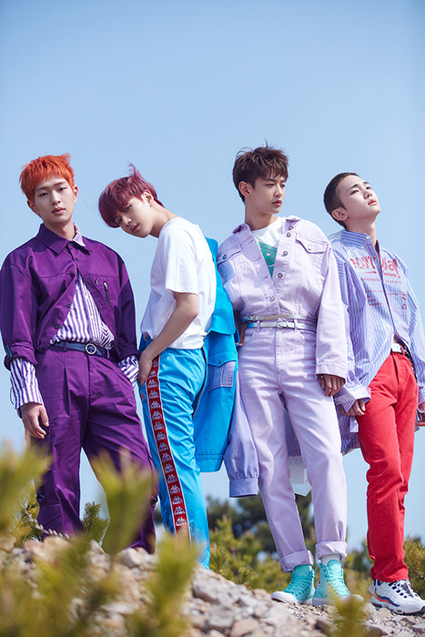
Patton — Cat

i gotta start with our kitty-pat!!!!! he’s so cute !!!! his dress is a lot like cinderella’s, actually, now that i think about it. His dress corset has the princess-cut lines down the center that have some silver thread detailing, and the center part is a sparkly grey while the outside is a pale grey-blue velvet. The corset’s waist juts out, and at the center middle of the waist there’s a large bow made of glittery black tulle. The top most layer of his dress is glittery silver tulle, while the next layer (and the one that extends out behind him in a train) is glittery black tulle. i feel like it should bunch in the back, but i didn’t draw the back, but it also probably bunches in the back just given how fabric Moves™. the inner most layer of his dress is a velvet gradient from the same pale grey-blue on his corset to an actual dark grey, similar in shade to the silver tulle! his shoulder poofs are also scrunched up silver tulle, and that’s all the sleeve he’s got. he does have forearm-length gloves, though, which are grey with pink toe beans that mimic a cat’s!
his mask is also pretty standard for a masquerade ball — it’s a grey cat mask, with a silver gem for the nose and with pink ears and whiskers!
Logan — Octopus

a smart animal for our smart boi :^) also like, my favorite outfit of the bunch, i want it so badly. his blazer doesn’t clasp, but it’s fitted pretty well and clips on the inside to his vest. It’s dark blue, with a black adjustable waist strap that goes around his back, and with four tails that seem more like tentacles. The shoulders of his blazer are also adorned with light blue “bubble” rhinestones. His vest is just a shimmery royal blue, and his undershirt is white, but his tie is iridescent blue and black. It’s tied up in an eldritch knot tho ;0 His pants are pretty tame, just some dark blue slacks. hes got a little piece of pink coral tucked into his lapel, too!
logan’s mask is. like. like i’d die for it. like it’s so cool. there are four tendrils poking out and swirling around it on either side, protruding from the mask itself, and while the coloring of the mask is fairly basic (it’s just dark blue) the “underside” of the tentacles are decorated in silver gems that mimic an octopus’ suckers. this was the first one i did and. like. im still yelling. i want that mask.
Deceit — Peacock

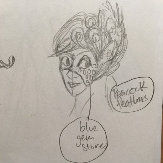
thought i’d mix it up a little!!!! deceit’s suddenly flashy and, in the bard’s words, “the hottest chick in the coop.” he doesn’t have a blazer, but he does have a half-cape thingie, which has blue and purple and green rhinestones on the shoulder pad while shimmers an iridescent purple and green when he moves. his vest is a matte teal, and his undershirt is mint green, and he has lil arm bands that keep his sleeves pulled up that are dark blue. his ascot is also iridescent, and shimmers blue and purple. His pants are pretty tame, though (as i’ve seemed to do with most everyone’s pants lmao) they’re black with a glittery green stripe down the side. his shoes are. supposed to be black dress shoes. but it seems i forgot to draw them. and his gloves are dark green! i love this outfit but its also a mess of colors asdfgjkl
his mask covers the scaled side of his face and has blue rhinestones decorated similarly to the cape. There are also a lot of feathers. Like a lot of peacock feathers. all coming out of the left side. his scales are well hidden.
The Thief — Snake
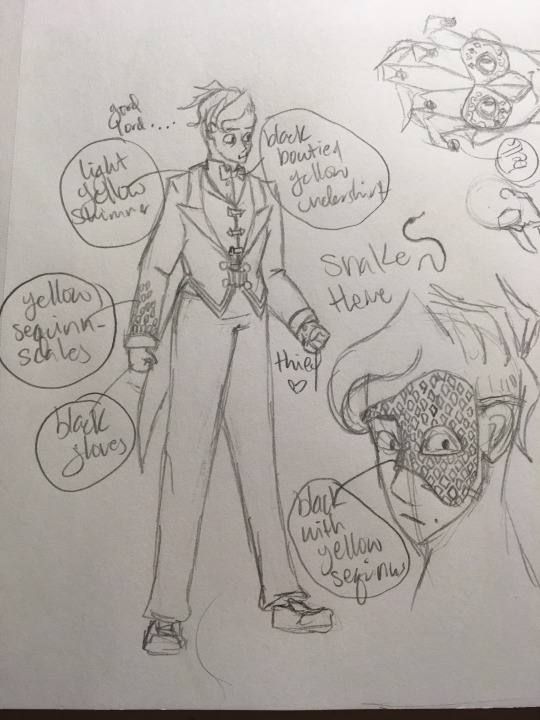
speaking of mixing it up a little, the thief does love being a red herring. his outfit is less snake themed and more deceit themed t b h. idk what to call that blazer, but it’s black, and short in the front with two long coat tails in the back, and is buttoned low and twice with gold circles and chains that mimic deceit’s coat clasp. His blazer also has sequins arranged in diamonds, traveling up his sleeves’ forearms. his vest is black, too, but is sheer while the blazer itself is matte. his dress shirt is a pastel yellow, and the bowtie is black, calling back to deceit’s SvS outfit. his slacks are also pretty plain, just black, and he’s wearing black gloves.
his mask is literally a call back to deceit — covers the let side of his face, and has sequins arranged in diamonds all across it, mimicking deceit’s scales. If you look close enough, though, you can see his face scar jutting out at the very edge
remember when virgil was tryna convince the thief that he was the virgil-esque roman? :^)
The Bard — Harlequin
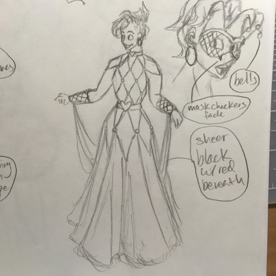
i love love love the bard’s outfit. it’s actually a ball-dance dress, meant for people who are actually doing ballroom dancing, with some red sheer tulle as the skirt. His bodice isn’t a corset, though it is kinda stiff and sinched at the waist by a thick black belt with a heart on it. The belt matches his choker, which incidentally is connected to his dress :^) the bodice also has a red and black checkered pattern throughout, with a large white pearl at every check intersection. There are pieces of tulle from his dress connected to his wrists by thick forearm bands, also with the red and black checkered pattern — good for showy dancing!
his mask is also based on a harlequin/jester theme, with five protrusions at the top in alternating red-black-red-black-red, and with bells at the ends. the center of his mask is white and fades into the red and black checkered pattern at the sides.
The Artist — Jester
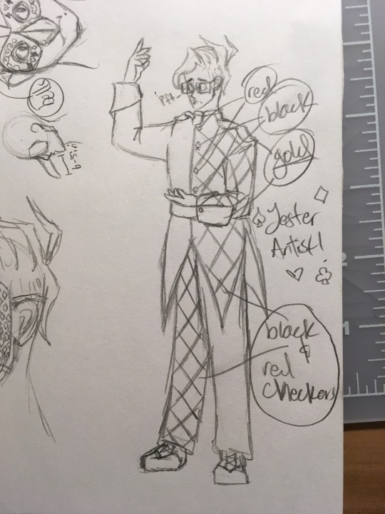
shout out to the artist for his character development, because the boy’s learned to be okay laughing at himself and at things. He’s going as a jester, so his outfit is semi-formal and semi-flashy (good for distracting ;) ). The left half of his suit is a solid black, while the right half has a checkered pattern of red and black. His suit’s sleeve cuffs spiral out a little, and are gold. His slacks are solid red on the right while adorned with the red and black checkered pattern on the left.
his mask is similar to the bard’s — the top has five jester-hat-like protrusions, alternating black-red-black-red-black, with bells on the ends. The mask itself, however, is white with little marks of all four card suits.
The Playwright — Queen of Hearts

The Playwright’s dress harkens back to the animated Alice in Wonderland’s queen of hearts dress. The skirt is nearly identical, with an outer most layer that’s half red and half black, and with chevrons on the inside that alternate black and gold. At the tip of his corset’s waist is a large red rhinestone in the shape of a heart, and across his bodice is a large red heart that stretches from the neckline to the waist. His sleeves? Basically remus’ sleeves. Poofy shoulder parts that pinch in near his elbow, then are flush against his skin to the wrist, and then floof out at the wrist. The sleeves are black with glittery red trims around the wrist floofs and in the creases of the shoulder poofs.
his mask is actually all rose gold wire-work, in intricate spirals. there’s a crown in the middle, on the top, also made of wire.
Dragon and Damsel — the Prince and flames

ignore the big doodle on the left — that was for another drawing!
Dragon’s outfit is fairly simple, he’s just wearing Roman’s usual white princely outfit with the gold trims, red sash, black boots, etc. The main difference is that his crest has been replaced with Dragon’s part of the crest, which is just the castle’s outer towers and wall.
Damsel on the other hand is wearing a ball gown. His corset has a tall behind-head-neck-thing-whose-name-ive-forgotten, taller than his head with orange and red detailing shaped like flames. The corset has stiff gold shoulder pads that actually prevent him from lifting his arms high, and the body itself is detailed with sequins and rhinestones that mimic the red sash. There’s a little bit of rolled up red tulle at his waist, and then the gown. The first two layers are kind of torn up and in tatters (almost as though they’d been physically torn and then burned) and are colored orange, then red, and the inner most visible layer is a dark ashy grey. His eye, usually covered in a bandage, is patched over with a red rose.
neither of them have masks, but the damsel has a red veil (not in the picture). they want to be seen and identified.
no taglist bc uhhhh idk if y’all wanna see this (its not writing?? )
#chivalry au#art#my art#logan#patton#roman#deceit#: ^ )#let the games begin#tldr i can physically visualize these outfits and if i have to see them in my mind's eye then you have to too asdlkhsadlfkgh#Join Me in making masquerade outfits
80 notes
·
View notes
Note
So, incel!childe likes soft waifu girls. Please tell me, would he also find a big titty soft goth gf acceptable? I don't dress explicitly goth but I have two very similar outfits to what you posted just in darker colors. I'm just wondering 😌👉👈 if he would look at me 😌👉👈 or if I have to add some pastels to my wardrobe first 😌👉👈
fuck childe i wont u <33 but i do indeed have thoughts about this how crazy is that??? i’m gonna include not only childe but also kaeya, diluc, and zhongli in this lil analysis hehe
in terms of incel men, i kinda place them on various points of various charts. when it comes to physical appearance think of the x axis as ‘has a preference’ and the y axis as ‘cares about said preference’.
in terms of those who i think would have a preference in appearance are: childe, zhongli, and diluc. i don’t think kaeya would have one solely because he has bigger things to worry about than how you choose to dress yourself…
those who actually care about their preference would be: only zhongli. childe has no right to be picky considering women don’t look at him in the first place and diluc sees anything and everything about you as ‘fixable’. zhongli doesn’t care TOO much but he’s generally more interested in docile and innocent girls thusly soft and light colours??? visually feeds into that. makes him happy and his dick hard!!
childe also likes soft girls since he’s got the whole ‘anime waifu’ thing going on cause he’s gross but put a set of tits near him and he doesn’t care one bit about what goes on top. he just sees boobs!! don’t sweat about your personal style at all, he’s got no problem spoiling u with a new wardrobe <33
diluc is a classic incel if that makes sense. he’s a very traditional man by nature; he was raised that way. consequently he sees women as inferior and things to be protected so it’s best to go with his mindset to avoid making him upset. he experiences more remorse for his actions than any of the other guys but after childe, he’s the quickest to resort to aggression. he has ISSUES.
kaeya doesn’t care because he doesn’t see a need to. regardless of what you wear, he’ll come up with some sort of backhanded sexual comment. wear what you want with him!! it’s just pieces of fabric in his eyes, who cares? it’ll all come off eventually. he’s quite the exhibitionist as well so having a goth leaning girl on his arm that catches eyes does excite him in ways a softer partner wouldn’t be able to.
TLDR; all the boys will fuck u no matter what. keep in mind they are indeed incels, they don’t get pussy!! they’re grateful for what they can get from their lil obsessions <33
36 notes
·
View notes
Note
When I look at yuzuru he strikes me as a really soft cutesy charming etheral individual not really homme fatal kind of guy that's why I think he's pure romantic rather than TR what do u think? ( love you btw)
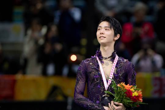
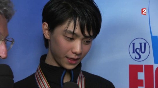
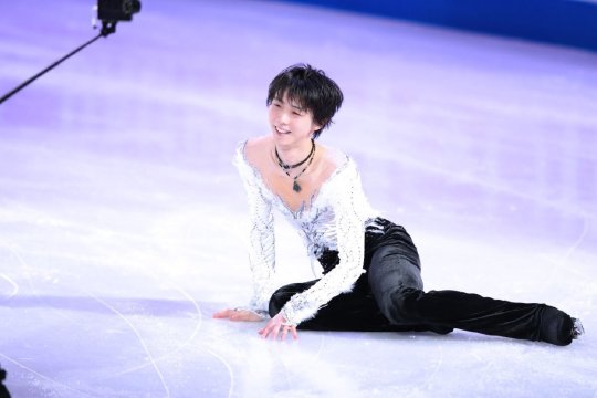
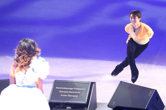
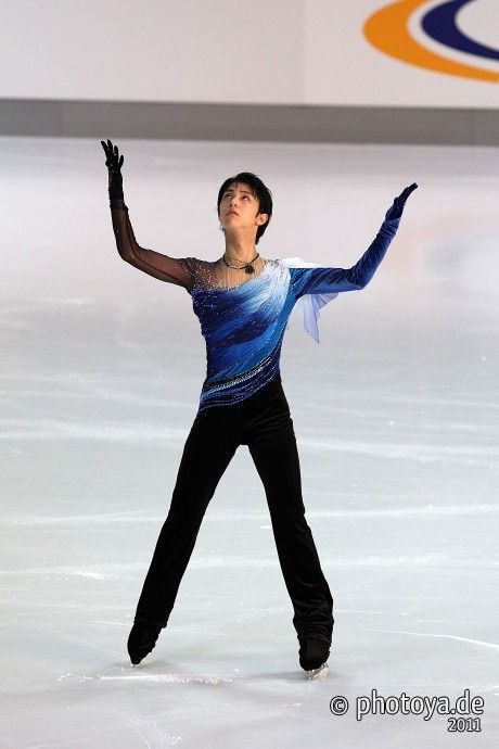
i’ve been thinking about it as well, but it’s not a crystal clear case. he’s a sportsman, skating morphs the body in the most uncommon ways which makes it harder to narrow down the type.
basics first so we get the foundations right: pinpointing the kibbe category he is + isn’t and why, the subtype after.
1. which one of the big 5?
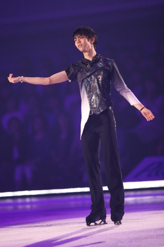
- safe to say, yes: he’s somewhere in the romantic category. nobody does these outfits quite like yuzu. light fabrics, intricate embellishments, he is famous for all that gorgeous princely tailoring. the sport is all about the sequins, he definitely shines in them. every professional figure skating photographer out there will tell you that he hits different and you can see why.
WOW.
i’ve witnessed people complaining that the glitz and glam no longer suits his age, he gets scorn for not dressing traditionally masculine, but i don’t know how it wouldn’t look appropriate. the only valid criticism is that it’s often a hit or miss, but we’d be damned if this isn’t what an ice prince looks like.
he’s the best in the world and his main goal is to put on a show. rolling up in a polo shirt would contradict the objective, being an allround artist first and only then a jump technician. he’s exactly how you’d expect a yuzuru hanyu to look like. if you appear ‘like yourself’, it’s the right kibbe category.
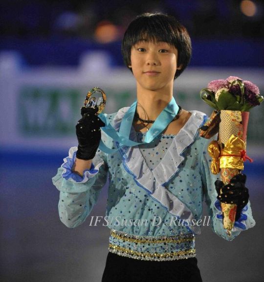
R clothing typically has a sexy edge as well, you can’t put a kid into that. cut out cleavage, transparent, figure-hugging, no way. if anything, most R styles seemed all over the place when yuzu was younger (this is from 2010). yin is meant to be tailored for adults to begin with, you can’t make it teenage gamine.
eleven years later at 26, yuzuru hanyu in 2021, adult man, wearing the hell out of a skating gala outfit. this would be tacky on someone any younger. R is not just light and sweet but also dignified and mature. long story short. he’s grown into a yin-dominant type. fits to a T, a feast for the eye.
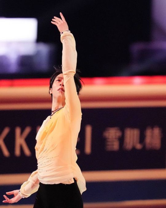
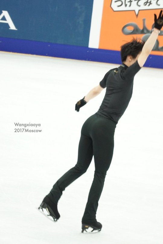
- meanwhile: you can easily exclude dramatic. very thick, stable fabrics with large lines are gigantic on him. D clothing is a yuzu charm killer, figures because it’s the type opposite to romantic (pure yang). it washes out the face and is twice as wide as his frame is, bulks out around the shoulders.
- not a natural type either, it feels a bit too simple, underchallenging. ruffled hair appears dishevelled where it’d be just right on a natural. it doesn’t fully highlight him: natural looks aren’t the most memorable on yuzuru even if they tend to be rather neutral and don’t look too off per se, it has a bit of draping after all.
he looks really good in the below outfit, but his frame doesn’t fill it out. he’s all elegant underneath and radiates ballet while N is a rough, easy-going, and leisurely concept for very bulky frames. the waist gets missing in translation, the mid-section of shirts like these is too wide.
- not a gamine either. he might appear like one and i deliberated back and forth whether he is Pure G or FG, but the material mix, line breaks, and fashion experiments are creating chaos rather than something put-together. it just isn’t as flattering as when he does drapes and florals. the hair being cropped (typical gamine cut) often obfuscates the face. G styles are confusing on yuzu.
his skating is from outer space but this is probably a bit too galactical 😅
- not a classic. something’s not right, suits like these contrast a lot with how round his face is and sit on his body very randomly. missing waist again (yin). the same people who want him to dress more conservatively/masculine have been roasting yuzu for looking like a salary man in that style 🤔 i sense hypocrisy. in any case, classic underwhelms, he’s made to dress up. more points to yin, he he’s too petite to wear C.
now, we got the main category down, time for subtyping. romantic has two options.
2. which romantic?
arguments in favor of Theatrical Romantic:
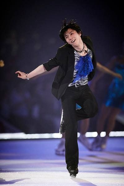
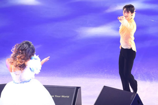
this type is what he often portrays in the rink (e.g. the phantom of the opera programme) and has become his secret weapon. whether that speaks of his true type is the question. what i mean is, he can pull it off, the seductive homme fatale. compare jimin, people lose their minds over theatrical romantic men. yuzu is in that lane as well.
as in, balance of main yin with a yang undercurrent — the very gentle, princely young man with the soft face who gathers everyone’s hearts, and he is a damn flirt on ice, but who can give a very visceral, dark performance. that shows a tremendous fervor and an edge, with an athletic and taut body.
he does have some yang elements to his physicality. streamlined silhouette, some narrowness, extreme flat muscle, long triangular upper body, some vertical line. also — his color palette (aka skin undertone, cool v warm, hue, chroma, deepness etc) might match TR. on the other hand, it might simply be the black hair giving him the contrast for it.
the reason why we might get the TR impression is that he often wears all black which suggests dramatic, and the athleticism in his profession has trained away the chubbiness he might naturally have. the face as the only part that won’t be somehow affected by his routine is all yin.
arguments in favor of pure Romantic:
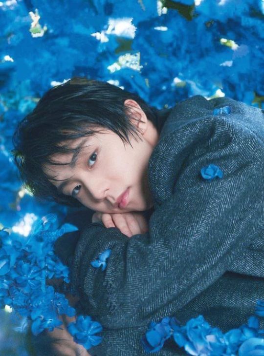
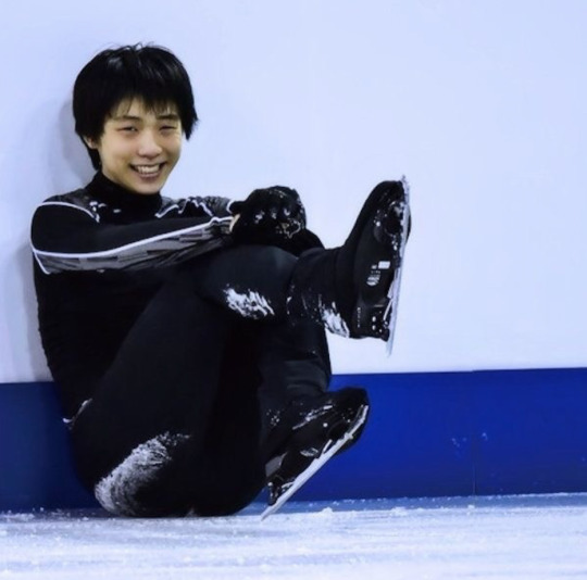
... as you pointed out. in private life and backstage, he is quite effortlessly sweet- and small-looking. with the delicacy and doe-eyedness you’d expect from pure romantic, very unlike his performance persona.
if you didn’t know he’s copyrighted BDE on the ice, yuzu seems like he can’t harm a fly, round rosy bean he is. he makes a very innocent and soft 1st impression in candids which no other type except soft gamine does.
facial features, all opposite of yang. not long, not sharp, not planar, not angular, not bony, not narrow. the button nose, full lips, and puffy cheeks is all you see. you’d not think of him as striking (=D, FN).
that’s also why he’s always pitted as nathan chen’s opposite in whatever he does. nate is on the other end of the kibbe spectrum, people probably don’t even realize that their physical lines are contrasting archetypes. it’s subconsciously part of why people can construct such a rivalry.
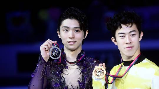
study nathan’s face and it becomes apparent. very oblong shape, flat-laying flesh and an asymmetric jaw that couldn’t be any more prominent (=yang). the brows and eyes create a powerful horizontal unlike yuzu’s more wide-set puppy eyes. the nose is longer, the ears, too. nathan looks sharp, piercing, and intimidating rather than soft. you see the exact outline of the bone.
with him, you assume the reverse of what people think of yuzu at first glance. if you didn’t know that nathan couldn’t be any nerdier, you’d believe he’s 1000% jock-off-the-charts. how he has a lot of yang contributed to his on-ice image, too. one’s kibbe type can shape life choices since people see you in a certain way simply based on your lines.
how yuzu is such a visual difference to nathan further points to how he’s closer to pure yin: rather than a subtype that picks up elements from dramatic. otherwise, you’d see some of that angularity. but no: roundness over structure, you see the flesh, not frame. you couldn’t call him a jock by all means 😆
you won’t see that chiseled geometry and crazy jawline/browline. as you say he’s more cutesy, and a charmer, the whole fandom will agree. pure romantics have everyone wrapped around their fingers (and their booty lmao!) because you want to pepper them with kisses, yin types all look so non-threatening and beautiful. ethereal is the right word.
and they’re the sexiest ofc, since they’re curvy. R got hips.
sigh... this type is a showstopper. what to do with him. he can beam at ya or he can sway his hips at ya, another unsuspecting hanyu interessee falls for the guy. he does the prince concept and the sexy cutie alike.
he tries to convince us otherwise 😂
sexy aside, he looks great in the respective clothing recs, with waist emphasis and rounded edges. kimonos are often soft dramatic or natural-inspired, but it works out well this way. and again: romantic is not childish/playful clothing of some kind, it can be very official and deliberate.
rather than in edge tailoring which is very loose around his arms and does yuzu no justice. that’s actually the kind of clothing that makes him appear either younger or older depending on if it’s D or C.
TLDR - he might not seem completely yin in his appearance, but that’s because of his excessive sports regimen. since yuzu has been training since he was a kid, we never saw how he’d normally be. he rocks the pure romantic regardless and it’s likely it’s his kibbe type. him wearing R is always a spectacle.
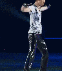
bonus kibbe meme: yuzu, photoshopped to the moon and back, wearing soft dramatic for a toothpaste ad. amazing.
#kibbe#kibbe body types#yuzuru hanyu#kibbe types#figure skating#cub mail 🐆#anon#ask#long post#yuzuru hayu thread
89 notes
·
View notes
Note
I'm curious for your take on a fashion trend that always has been hanging out in the wings, but seems to have really taken off in K-Pop in particular the last few years.
It seems like every way I look these days, we're getting hit with luxury "looks" that are legit just the luxury brand printed all over a bland or non-innovative item. This definitely isn't new (it makes me think of the prevalence of those stupid - and stupidly expensive - Abercrombie & Fitch t-shirts in the US back in the 2000s), but I feel like it's now seeping into K-Pop album concept photos and stage outfits in addition to just their every day fashion/sponsored photo shoots. In some cases it doesn't bother me as much because its a small addition (like Sunmi's triangle Prada barrettes in some of her latest comeback photos - I don't like the barrettes, but they work because the wider concept is great) or its used unconventionally (like TxT's latest concept photos, where you can see some of the usual brands but thrown together with unconventional pieces so they feel fresh).
But in other cases, it feels like they're just phoning it in by picking luxury clothing so they can say "look, we're expensive" and calling it a day. I'd submit the examples of The Boyz in some of their latest teasers, the latest Stray Kids concept photos, and quite a few of Blackpink's albums/promotions since they all have their own brand sponsors that they stick to these days. A lot of American celebrities are guilty of this as well so its not just K-Pop, but I honestly just don't expect more from Hollywood like I do from K-Pop.
It's clear that you can have effective styling without defaulting to the luxury branding (A.C.E comes to mind immediately), and there are plenty of luxury pieces that don't have their branding all over it that often allow the same luxury feel without shoving the brand in your face. So this branded merchandise trend really ends up rubbing me the wrong way.
What are your thoughts? I think my stance is clear, but I'd love a different perspective from someone that has a lot more background in fashion, particularly stage fashion, than myself.
anon ilu i have many thoughts on this topic but i don't think i've ever mentioned it before so thank you thank you for somehow reading my single braincell and asking about it!
basically for anyone who doesn't want to read me going off about luxury branding the tldr is yes i agree, i personally don't like branding in general and luxury branding especially. i don't own a single item of clothing or accessory with an obvious/recognizable brand logo and i haven't for probably over a decade now. now let's get into some nitty gritty.
in the current fashion climate i think most of the time it's tacky to display wealth so openly and obviously and it is one of the main factors in driving the machine of fashion consumerist culture. i also think it's a weak styling choice because it only has one association: money. 99% of the time it does not contribute anything meaningful to the artistic vision of the work and it's just to brag. sm stylists pull off luxury branding better than most other groups because they tend to integrate it well into the overall aesthetics of the specific mvs, and it's usually pretty sparing. with sm they use it more as a confirmation of the quality of the sm brand than just boasting about money in general. notable examples where i think visible branding works are kun's supreme jacket in kick back, and taemin's balenciaga 2017 in day and night, because both well integrated into the aesthetics of the videos and they're also offset by other looks. i also like the styling in bambam's ribbon, because although the whole mv is designer looks, he only uses one actually logo-ed one (louis vuitton escale summer 2020), which gives a visual indication of expense to anyone who isn't familiar with fashion. the only time i can think of an idol using a brand ironically is taemin's supreme instagram bad bitch outfit in advice, because he's parodying a specific look.
most of the clothing from designer houses is absent of logos, with the exception of a few (lv, gucci are the main offenders). but, there is the caveat that it does tend to be the ready to wear collections that have that kind of design. (ready to wear is the stuff that is available for off the rack purchase). here's a few examples:


taemin and key in balenciaga menswear ss2018 for story of light, taemin and ten in louis vuitton menswear ss2021 for advice and paint me naked.
in my opinion there's only one house that can get away with the irony of its own branding and that's balenciaga, because they consistently do the weirdest shit you could possibly think of. they have a collaboration with crocs. no i am not joking. the shoes for their fall 2021 collection are platemail stilettos. yes like the medieval armour. they launched that collection as a video game. they recently cleared their entire instagram but prior to that they were just letting models post cryptid blurry shots with no captions. there are designers that are doing interesting things, but very rarely is it with the physical branding itself. it's difficult because like i said before, it locks the audience into an extremely specific connotation and honestly most kpop stylists are not deft enough to work around that in a truly meaningful way.
the important things to hit in any styling are colour, harmony, and silhouette. thank you for bringing up a.c.e because i would have done it anyways, because their stylist is probably the best in the business right now. i talk about the basics here (of styling and of a.c.e in particular), but anon you are correct, a.c.e uses very very little branded styling and they look great. good styling is not about looking expensive, it's about looking the best as befitting of the concept.
but here's where we come to an important point. like with most things about kpop and western pop culture as a whole, luxury branding and streetwear as a trend has been appropriated from black hiphop artists and black streetwear fashion in the 90s and 00s. it started in the hood as a reclamation of items that were meant to be 'outside their station' (luxury) and an elevation of plainclothes that were available to them. sportswear by and large was always cheaper and mass produced, in comparision to day to day wear, which used more expensive materials and had more complicated construction. and was activities based only. it wasn't until around the 1860s that sportwear even existed at all, and even then it was not what you would think of as sportwear by modern standards. there was, up until the 1980s, a pretty strict unspoken dress code that if you wanted to be taken seriously in polite (white) society, you had to dress according to the class standards at the time. (this still exists by the way, it hasn't gone away at all, especially in relation to workplaces and black/natural hair). streetwear at the time was a form of celebration of black excellence and a subversion of white society. but like all innovations by black people, it got jacked by white america and now it's lost the meaning behind its context. on black bodies and paired with black achievements, branding is an important and relevant styling choice. on kpop boys? they're already lifting second hand at this point. do better.
#i didnt even talk about the new wealth vs old wealth aesthetic but whatever#theres a lot here ok!!!!#contemporary fashion gets complicated if you try to untangle the origins of trends#but the majority of them come from black culture#baggy/oversized clothing is another one#its not that i dont think people should be restricted from wearing specific things***#but it is important to acknowledge where those things came from#and if the population that started the trend of that thing is still subjected to persecution because of it#while others get deemed as 'cool' or trendy#maybe you should not be wearing that thing#and kpop has a history of not understanding contexts or crediting originators#(in aesthetics and in music)#so no i dont like luxury branding in kpop#***EXCEPT for traditional/ceremonial/religious garments#please for the love of all that is holy stop wearing fucking warbonnets#ah but the appropriation of native american/first nations imagery in kpop is a topic for another day#and also one that fans REALLY dont want to talk about#BUT do not take me for an authority here i am not an authority my opinions do not matter#listen to bipoc but also dont demand answers of them#google is right there#tumblr is so fucking garbage at image layouts and im too lazy to make it look nicer#but im pretty sure yall can see what im talking about#kpop questions#kpop analysis#text#answers#general design questions#kpop styling
14 notes
·
View notes
Text
Flow hot takes
1. PW and Flow are the best singles we've had since SR. Every single song has felt complete i.e., LAYERS (that change throughout the song), choruses with LYRICS (no woahs oooohs aaaahs disdisdisplays), interesting bridges that go places without being obnoxious for the sake of it. Also no chipmunk voices (by Nakata standards). The gritty bass line is also a big plus. As long as Nakata maintains this level of output the next album has a chance of actually being a really great album. I just pray he doesnt do a 180 and butcher the current era's direction like he did with FP.
2. The MV is terrible and all the more frustrating because it actually had all the ingredients of being good.
3. MV street outfits are great (im gonna ignore the pink/white ones i have accepted that terrible costumes are the norm now). Its cool that theyre experimenting with the braids too. And the color palette of the VFX looked really fresh and theyve never had this sort of style going on before.
4. But then it's bogged down by all the stupid choices. Why aren't they singing? Because it's a "dance video"???? Okay and??? Are DF and Flash etc not dance videos too????
5. And if this is a dance video why are they obscuring said dance with all the visual effects??? (greatest offender is the blocky nonsense going on around the 30s mark) I know this shit was rushed out in a week but please.... I dont even expect anyone on the team to use their entire brain anymore, but please, even one brain cell will do....!!!!
6. Lack of glamour shots (close ups) makes them feel really distant. Yes i know faraway flowing clouds and all that, and i was always the first to complain abt excessive glamour shots, but this has just swung to the other extreme and its not good either. Literally whats the point of trying new hairstyles with braids if i cant fckin see it!!!! The excessive effects sure arent helping either!!!
7. That last 30s looks cheap af and highly anticlimatic as compared to the rest of the video. I also dont understand why they had to go out of their way to make a physical set when the CGI going on at the start of the video looked so much cleaner and better. Who is approving these budgets???
8. I think this video is kinda the culmination of all my problems ive had with their direction in recent years. Over reliance on "technology" and whatnot. Like yeah its cool but im also watching perfume content for perfume. If i wanted to see a tech demo id watch a fckin tech demo. At no point should showcasing the technological gimmicks take precedence over showcasing the members and their personalities.
9. And that leads me to something ive only just realised. When was the last time uve seen them look like they actually enjoy dancing in their PVs??? MoL???? I just did a quick dive through their videos and Ive come to realise that ever since theyve shifted from tokuma to universal theyve been trying to take on some cool emotionless doll android big sister image or whatever and like Okay. But why cant we have both???? Was the charm of perfume not always that they can switch between being fun and quirky as well as being cool and badass??? Post MoL it seems like they dont even smile anymore while theyre dancing. Sure a resting bitch face looks cool, but given how excessive its gotten it just feels so devoid of personality and life.
10. Something something practical effects quirky and full of personality something something CGI is everywhere now none of what theyre doing feels special something something jurassic park aged well because it used practical effects something something their older videos are much more fun to watch and much more replayable (i still think IYW is perfection but id still rather rewatch/show people VOICE or FNG etc)
Tldr songs good video bad but who cares i just need the music to be good
5 notes
·
View notes
Last Seen Blogs

ntrftwwo
Untitled

nggitjatmiko
Page Turning

eepnoe
noe's silly drawings
sexymusclebeast7
Men&Muscle

hngryazn
I draw sometimes.