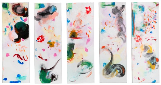
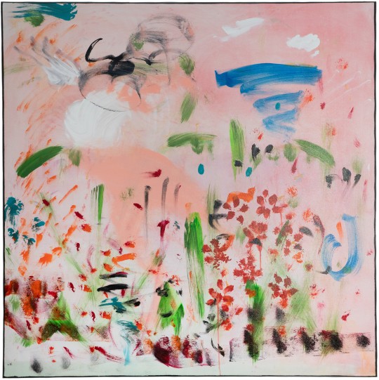
#traditional artmaking
Text

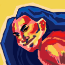
#linocut#lino#linoprint#linocutting#reliefprinting#printmaking#illustration#sleepingcat#art#traditional artmaking#artmaking#cat illo#lino print#linocut print#linocut printing#relief print#traditional art#traditional printmaking#cat art#cat illustration#artists on tumblr
759 notes
·
View notes
Note
So, 19th century whaling stuff huh? (purely on recommendation from a reblog from ltwilliammowett)
Got any recommendations for visual references about the different kinds of whaling ship at the time?
Looking for stuff that could of existed around the 1870s towards the 1890s
I’ll unpaywall a longish essay I wrote about a year ago on patreon about the general design of whaleships, that includes images as well as ship register lists that describe them. It’s written from the angle of design decisions I made for a graphic novel, but reading beyond the artmaking conversation I share information about how whalers tended to be shaped and the identifying features they carried.
For additional visual references I’d check out the photo collections of the New Bedford Whaling Museum and the Charles W. Morgan at Mystic Seaport. The photos from the NBWM are early 20th century, but the ships within them are older. Mid 19th century vessels were used well into the late part of the century and into the early 1900s with very little change, though by that point the industry was fully on its way out the door. The sketches in whaling logbooks or on scrimshaw are also a good way to get a sailor’s interpretation of the vessels. Whaleships and Whaling by Albert Cook Church and Sperm Whaling from New Bedford by Elton W Hall (that is a collection of Clifford Ashley’s photographs from his time on the whaler Sunbeam) are good visual books too. ANYWAY, onto the Essay under the readmore, if you’re so inclined.
Melville described Captain Ahab's ship the Pequod as having an “old-fashioned claw-footed look about her." It's a description I always hold in my mind whenever I draw a whaler. Melville, of course, added more whimsy to his iconic vessel, ‘a cannibal of a craft, tricking herself forth in the chased bones of her enemies’. With sperm whale teeth in the place of belaying pins, blocks made of sea-ivory instead of wood, and a whale’s jawbone in place of a tiller. While whalebone blocks and belaying pins were absolutely made on occasion, whaleships in general were not so unique from one another.
In looking at the long list of Ship Registers out of New Bedford, 1796-1850, it seems that if you saw one whaleship you more or less saw ‘em all.
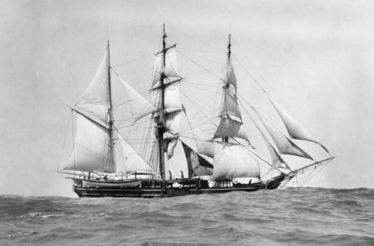
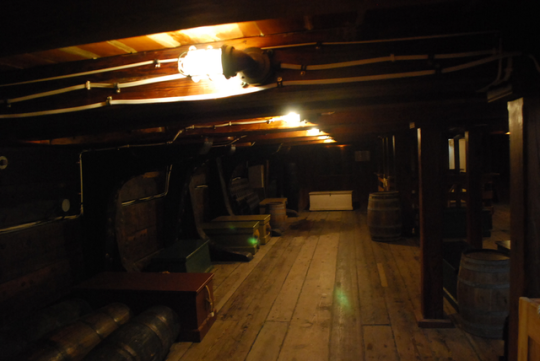
Photo of the bark Sunbeam hove to at sea, 1904, Clifford Ashley. Via New Bedford Whaling Museum.
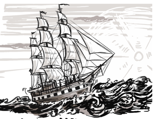
Typically 19th century whaleships were three-masted ships or barks, and many ships were eventually re-rigged as barks in the latter half of the century as it required a smaller crew to handle. Whalers tended to be squat and broad, built for stability rather than speed. They were going to be at sea for years, with big cavernous holds for hundreds upon hundreds of barrels of oil, as well as equipment and provisions set to last many months without resupply. Thus, sturdiness was the primary focus in their design.
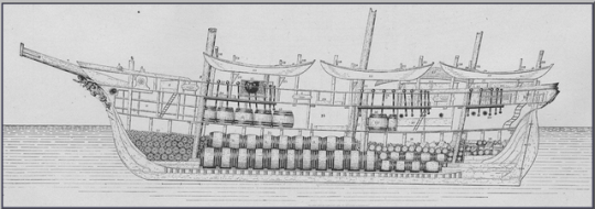
A cross section of the bark Alice Knowles from G.B. Goode's The Fisheries and Fishery Industry of the United States. Look at all that needed storage space!
With square sterns and a typical ratio of 1:4 for beam to length (as opposed to sleek merchant ships that often were more of a 1:6), describing them as a ‘tub’,--as many whalers grudgingly did when speaking of their floating home--is rather fitting (though perhaps a bit uncharitable). On average, whaleships were 100-115 ft in length, 25-30ft wide, with a tonnage ranging from 180-400.
They were built with few frills. Rarely did they have galleries or figureheads, instead having a simple billet-head or doing without the flourish entirely. My biggest indulgence was giving the Valor a bit more of an elegant prow, which I might regret a little bit since now I have to draw it all the time.
Billet-head vs figurehead...
A distinct lack of fanciness!
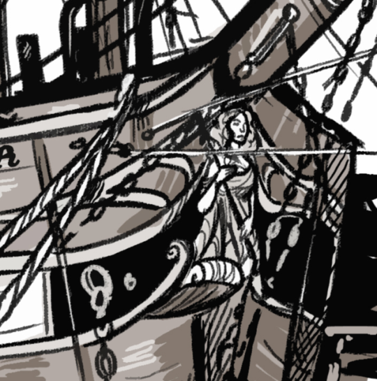
I wanted to draw a lady tho. The one of……three women in GTW. Does she count?
Sometimes whalers were painted with false gun ports along their hull, a traditional holdover from when they had to worry more often about wartime enemies in the late 18th century. The hope was that the paint job in combination with her chunky appearance would lead to her being mistaken for a small warship at a distance and thus spared harassment. Even when no longer really necessary, the design often made its appearance.
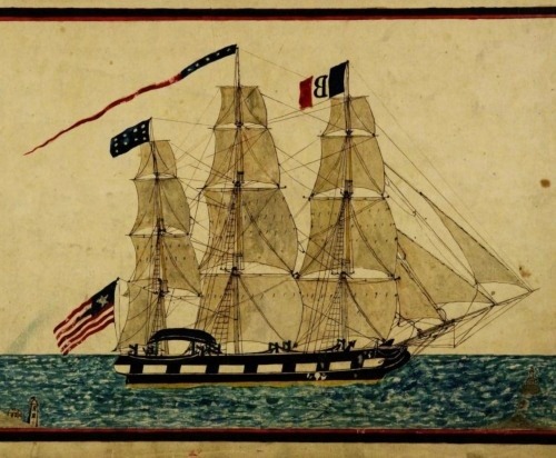
Drawing in the logbook of Captain James Coffin of his ship Washington, 1841.
I quite liked the look of the psuedo gun ports, and decided to give the Valor the same as an embellishment for some extra contrast.
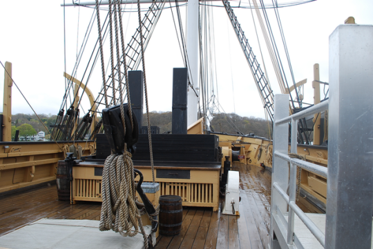
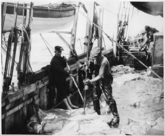
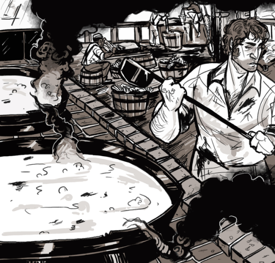
The most identifying feature of a whaler was the tryworks—a large brick oven with heavy iron pots located aft of the foremast and in front of the main hatch. They were built with a pen that would be filled with sea water that flowed freely beneath a checker-board laid brick base to keep the extreme heat from setting fire to the ship. The tryworks would have to be rebuilt for each voyage, so there was sometimes a rather joyous moment at the end of a long trip when the crew would tear the structure apart and toss it in the sea.
Along the port side, three whaleboats would be slung on the davits. Fore, aft, and amidships. A fourth whaleboat would be located on the starboard quarter.

Screenshot of my desktop background that's some deck plans of a whaleship cos I got sick of digging for the reference every time I had to spatially orient myself when drawing a panel!
Deckhouses were built aft to house the galley and storage lockers, and there was also a ‘hurricane house’ built over the helm to protect whoever was steering during foul weather. Spare whaleboats, as well as harpoons, spades, lances, and other whaling gear would be stored on top of this cover or on hanging shelves beneath it.
A view of whalers and the afthouse, on the bark Greyhound. Via NBWM.
The final identifying feature of a whaleship was a pair of cross trees, a platform with hoops at the top of the mast where men would be stationed to look out for whales.

The ship that I’ve referenced the most in my design of the Valor is, of course, the Charles W. Morgan because she can still be visited! The last surviving wooden whaleship, she had a long life of 37 voyages (and a couple movie roles in her sunset years) spanning from 1841-1921 (and one more voyage in 2014! Heartbreak of heartbreaks that I was not on it!). She’s now a crown jewel at the Mystic Seaport Museum. I was honored to meet her.

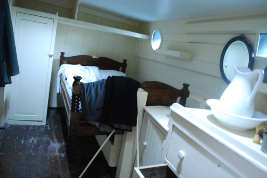
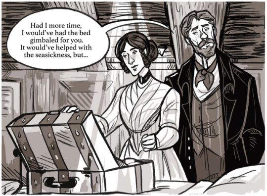
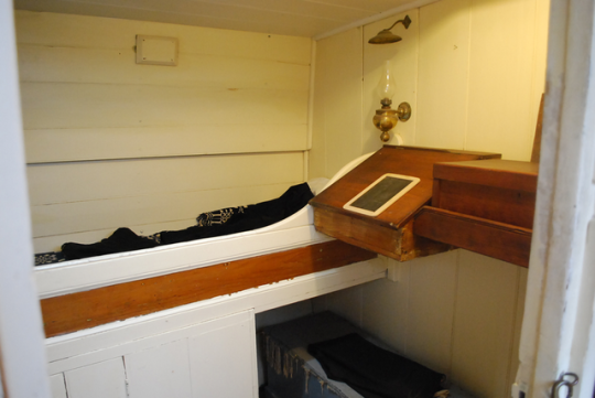
She had some lovely authenticating details that I was happy to put into my own worldbuilding, such as a reference to this gimballed bed. It was designed to always stay level even as the ship rolled, installed by one of the Morgan’s captains to try mitigating his wife's seasickness.
Another favorite detail of mine was how natural daylight was drawn into the cabins and forecastle via deck prisms. Set with their bases flush with the deck above, glass deck prisms were designed to bring light down below.
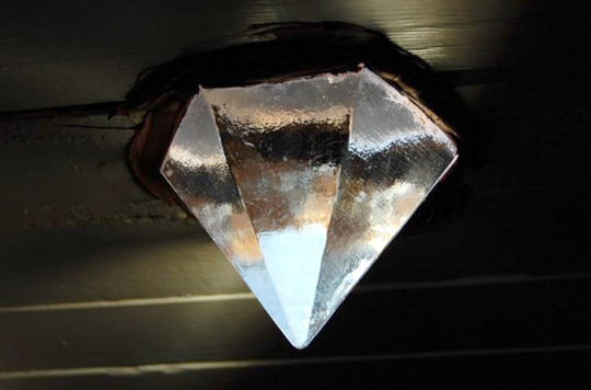
I remember being surprised at how effective they were. In the photo below, the yellow light is artificial, but the blue light is coming solely from the deck prism. This was on a dark rainy day.

As such, I really enjoy always thinking about how these prisms are lighting the areas below on the Valor.

During my visit I remember thinking that this old surviving whaleship looked quite comfortable and cozy.
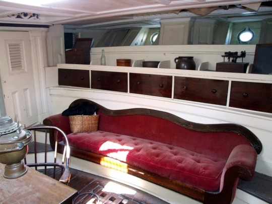
Look at that.
Such homey little flourishes.
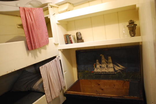
Look at how cute.
I’d live here.
That is, until I thought about the reality of this work and world. The fo'c'sle helped bring that reality forward. There wasn't anyone else on the ship and it was a cold spring day, but upon stepping into the space I could feel the humidity that had gathered there.
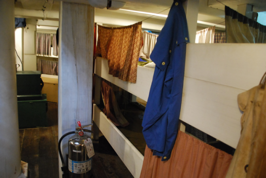
I could imagine the noise of it, the smell of it, the heaviness of the air that came with 20 men sharing such a space, eating and smoking in it, crushing cockroaches in it, dumping their wet gear in it, vomiting in it, keeping a communal urine barrel in it, reeking of blood and oil and smoke and ash as everything mouldered in the damp for for three to four years. The dimensions of the fo'c'sle was enough to set my imagination a’going. It was a perfect reference, and for the comic it just needed to be populated.
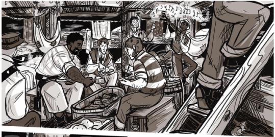
For the sake of having somewhat readable panels, my boys are lucky to have been given a much more spacious residence. But still, I try to build out the claustrophobia of the space. And this is just the first night. As time goes on, I’m looking forward to besmirching this place.
Superimposing the reality of a whaler was also necessary in drawing the decks (and will become even more so when I get to the whaling scenes). Now, as a museum, the ship is pristine...
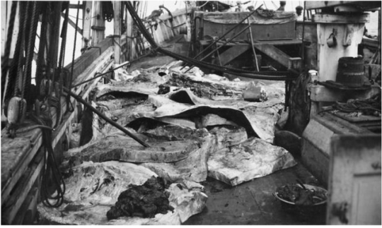
But I must always remember the description given by a 19th century whaler grumbling that while cutting in a whale, ‘everything is beshit’. Documentary footage as well as photographs, coupled with the words from dead men's journals and one’s own imagination of the hellishness of the work is how I begin to paint the decks of this whaler, especially during the work of cutting in.
(warning for sensitive images below of a lot of blubber)
Photos by William H Tripp, 1925. Via NBWM
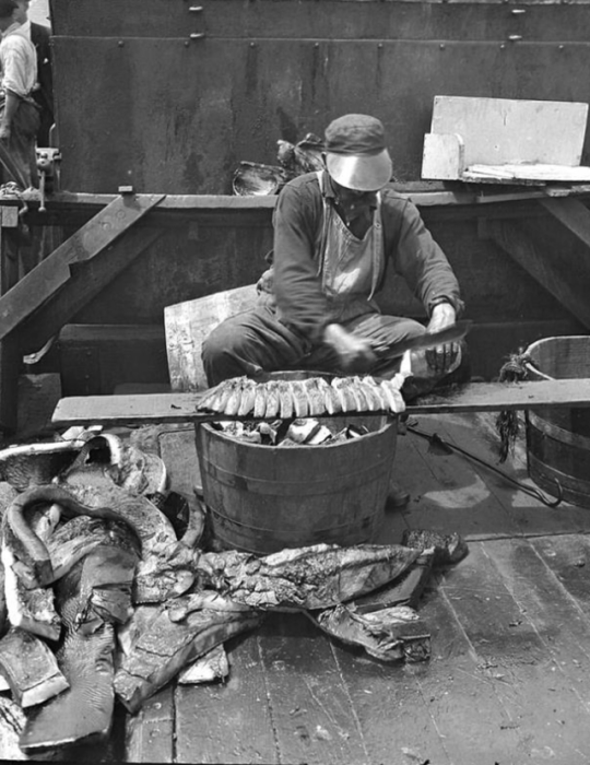
Photo by Albert Cook Church. NBWM.
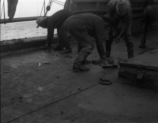
This 1904 image, as described by its photographer Clifford Ashley, 'Rectangular blocks of blubber (lippers) are used to scrape up bits of blubber and slush from the deck so nothing is wasted'. Via NBWM.
But the place that made me feel the closest sense of reality on the Morgan was the blubber room. The deck prisms didn’t reach here, and in some places the beams were so low I had to duck my head.
This was where large 15ft sheets of blubber would be dumped below via the hatch, for men to hack them up into smaller 6ft ‘horse pieces’ and then pitch them back up on deck to be further minced. I couldn’t help but think of the movement of the ship in the dark, of the slabs of blubber filling the space, slick with oil. I thought of how much oil would be tracked across the deck and how slippery it’d be, and how a man would have to keep his head cocked to one side for hours to work in there. I thought of how he would get to the fo'c'sle through the blubber room and how the work would be tracked all over the ship and find its way into every bunk. How it would be absolutely inescapable. I thought about the hot sick closeness of having no air down there, the heat from the tryworks radiating mercilessly from above, a crick in your neck, your double-edged boarding knife handle too slick.
Being there and overlaying that work within it was one of the closest times I felt to time travel. And as I try to make the Valor feel alive, to feel real, I always try to capture what I felt here in every panel, and push each one just a little more to get as close as I can to that place.
26 notes
·
View notes
Photo


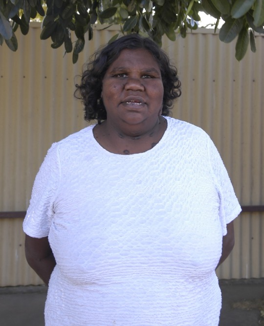
Esther Haywood, born 1982
in Alice Springs, NT
LANGUAGE GROUP: Alyawarre
COMMUNITY: Utopia, NT
Esther Haywood is part of the exciting next generation of Utopian artists who are using artmaking as a means to uphold their commitment to traditional culture and knowledge. She belongs to the Alyawarre language group and associates with her grandmothers country of Atnangkere in the Utopia region, approximately 230kms north east of Alice Springs.
As a child Esther was surrounded by celebrated Utopian artists who had led the way in depicting their ancient dreaming stories in a highly contemporary and expressive manner. Her aunties include the late Ada Bird Petyarre and Kathleen Petyarre and her cousin is Gracie Pwerle Morton.Her grandmother, internationally acclaimed artist Gloria Petyarre (deceased), taught her the songs, dances and body paint designs to all the stories that belong to her Atnangkere country. In later years, Esther also cared for her grandmother and assisted her with painting.
Esther's intimate knowledge of her culture and Country, as well as her considerable experience in painting with acrylics and canvas, has resulted in an extraordinary body of work for an artist who has only painted in her own right for a short number of years. Her sense of artistic authority has developed quickly and she is exciting everyone with the boldness and beauty of her paintings.
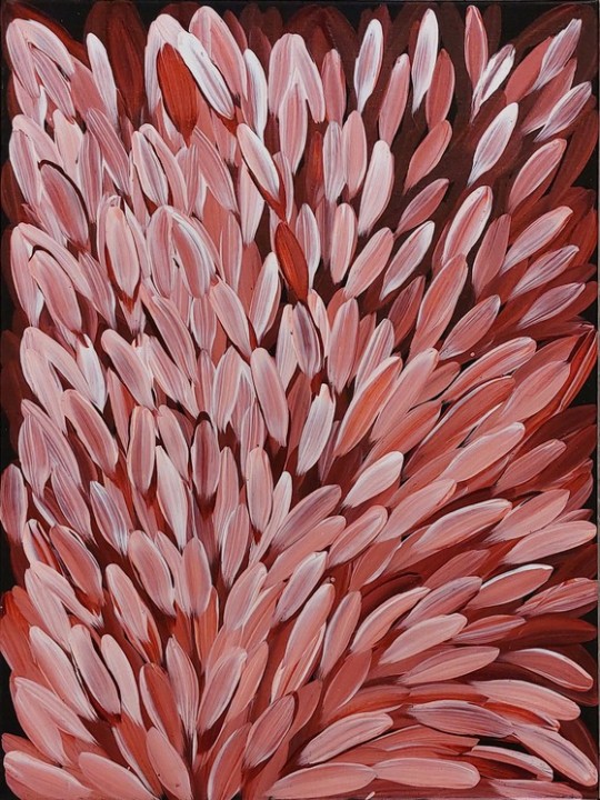
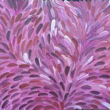
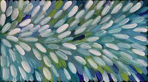
She carries on her grandmother's bush medicine leaf style. Bush Medicine leaves are healing leaves of the Kurrajong tree used by women from the Utopia region in traditional bush medicines. Through painting, Esther pays homage to the spirit of the bush medicine leaves to ensure its regeneration, so her people can continue to benefit from its medicinal powers.As an artist Esther has an incredible eye for detail and beautiful use of colour. Her works are radiant and dynamic. We look forward to seeing Esther develop on her incredible talent in the coming years.
Copyright Kate Owen Gallery June 2021
https://www.kateowengallery.com/artists/Est981/Est18099.htm
28 notes
·
View notes
Text
probably one of the deepest & most intractable forms of rot in society right now is the instagram artist grift mill that is almost entirely structured around clapping back at "haters" and functions entirely in the following disingenuous paradigms —
1) "they said i couldn't do it but i did" creates a strawman "hater" object and, in a cultural moment dominated by toxic positivity, profits off the imagined negativity by encouraging positivity groupthink/collective shaming of any dissenters. content is produced largely in response to negative comments. congruent phenomenon to the tiktok movie reviewers who refuse to be called critics (and actually aren't) because they think criticism = negativity = bad
2) "if my art is [ugly/amateurish/wasteful] then why do i have so many followers" fallacious a positioning of the artist as an outsider, when true outsider art does not actually participate in traditional systems of promotion - and i would say, unarguably, instagram has become a mainstream and parallel pathway for an artist analogous to the domination of the gallery system. however, because the gallery system has centuries of cultural cachet, instagram art is still considered to some degree "lowbrow" - though i would say lowbrow art right now holds greater sway over mainstream/popular culture over highbrow art. so in fact, having followers has more cultural & literal capital in it than having approval from the academe, but due to the lowbrow/highbrow distinction this rhetoric is able to be used for successful manipulation of the actual image-economy by instagram artist grifters
3) "i'm just a small-time creator 🥺 won't you please spare a follow, friend?" related to the last but weaponised by people of all levels of viewership. cultivates parasocial relationships on a superficial level. positions influencer status as desirable while also profiting off the general understanding that "popular" doesn't necessarily mean "good" in a détournement/inversion of the previous point - where previously underdog status is used as a marker of authenticity and therefore quality, here, underdog status is acknowledged but not seen as desirable/commensurate with the artist's skill level. of course the paradox of this reappropriation of art as Content is that both are true
— and in answer to the question "why is this a bad thing?" it's bad because the supposed democratisation of art has failed, it has just created an economy of spectacle where hierarchies are reinforced and critical thinking is discouraged. it reduces art to a struggle for viewership and limits the practice of artmaking to an idealised virtuosic display of technique and superficial aesthetics with no room for deeper meaning (and therefore analysis) or engagement with art and culture beyond its own algorithm-driven feedback loop. also most of it fucking sucks
#this is a take#going back in time and kissing guy debord with tongue for teaching me to talk like this#been trying to put this in words for a while#alternatively you can just go listen to 'the memo' by father john misty
9 notes
·
View notes
Text


Thinking about these comics that I made for my previous band Super Duper Club. I had remembered how much I liked afex aventurs growing up and I thought I should give the whole poorly drawn webcomic thing a go as a quick promo thing. As is the case with any of these types of projects I got super carried away and spent too much time on these and decided to quit after like 5.
I really cherish them though and want an excuse to make something like these again. I rarely feel comfortable making much art that I consider "internet-y" or that properly reflects on the millions of net-art and shitpost adjacent images that I've been exposed to in my short lifetime. It's a mindset to artmaking that I'm so familiar with and enjoy engaging with as a viewer but I equally feel like an outsider to it, that my skill set translates better to a more traditional practice.
It's good to see that it's totally do-able though, that this style is approachable by design, that you can just make funny stupid drawings that wind up being nice to look at in a weird way.
7 notes
·
View notes
Text
I will never ever listen to anti-AI art arguments that boil down to “it makes it easier for unskilled people to make art”. Ok? MOST of the art I see on here is digital rather than traditional. THAT is a medium that makes it easier for unskilled people to make art. I use it myself, because yeah, it’s way harder to ink or color a drawing without a handy Undo button at the ready.
Either be consistent and start bullying digital artists for not being as skilled as traditional artists, or come back when you want to talk about ACTUAL problems with AI art, like questions of intellectual property, or the effect that rapid AI art production has on the artistic job market. Lowering the bar of entry for artmaking ain’t a problem, and if it you think it is, you’re an art snob.
6 notes
·
View notes
Photo

Descent by Pepper Raccoon
A re-entry in traditional artmaking, Descent is my exploration of a spiritual realm my mind turns to when seeking inspiration. This piece was inspired specifically by diving gannets in the bay in my home city of Wellington, New Zealand, they are beautiful birds who eventually go blind from the impact of the water on their eyes when diving.
Watercolour, ink, and gold ink on Lana Dessin 220.
21 cm × 29.7 cm
11.7 inches x 8.5 inches
VIEW DETAILS brought to you by Every Day Original
9 notes
·
View notes
Text
Gallery visit: GOMA - SIS: Pacific Contemporary Art 1980-2023 PART 3 (31.1.24)
Context: The following exhibition was a collection of contemporary artworks by artists from the Pacific. Despite addressing a broad spectrum of themes (from cultural/personal identity and history to colonialism and political inequalities to the natural landscape), they are underpinned by one term: "Sis". "Sis" (sister), with variations used across the Pacific, is associated with family and community.
Exhibition description: "'Sis' is a term of familiarity and endearment used throughout the Pacific, and 'SIS: Pacific Art 1980-2023' honours and celebrates the work and stories of women artists from across the Pacific, as told through the QAGOMA Collection. 'SIS' offers a deeper understanding of the contribution that our Pacific sisters make to the art of the region by redressing past wrongs and engaging in new conversations about the world and our place in it. The exhibition explores how, over many years, a sisterhood of women and non-binary artists has challenged inequalities involving race, gender, sexuality, representation and power. Though not always overtly political, many artists' customary practices are nonetheless deliberate and powerful responses to the loss of sovereignty, land and culture resulting from histories of colonialism, conflict, nuclear testing, resource extraction and climate change. This continuation and revival of tradition can be found in the mats, quilts, weavings, tapa and body adornments by artists from the Marshall Islands, Tonga, Hawaii and the Autonomous Region of Bougainville. These customary works represent a host of strident voices, which are echoed by a group of politically engaged 'sisters' whose performance, video, photography and installation works are more traditionally aligned with the contemporary art world. Though using markedly different media, each artist's practice is focused on the importance of cultural resilience and self-determination in the face of immense change and environmental peril. We hope you are inspired by the intimate, relational and deeply caring nature of the artworks featured in the exhibition, which continue the stories and legacies of this Pacific sisterhood."
Reflection: This exhibition intrigued me as someone who:
Is familiar with and interested in learning about Pacific cultures and histories (courtesy of my grandmother who grew up in Fiji as a 3rd generation European decades before Fiji gained its independence).
Is passionate about botany and the natural landscape.
Appreciates the different narratives artists explore within their works.
This exhibition not only showcases the diverse cultures and personal experiences of the artists showcased, but also a diverse range of artmaking practices (film, textiles, sculpture, photography/photocollage, etc.). Havini's film Habitat: Konawiru (2016), Jetñil-Kijiner's film Eorak for Section 177 (2021) and the works by Bernice Akamine, the Wotje Weavers, and Kapulani Landgraf stood out to me the most. I believe that any of them could potentially act as inspirations for my future works.
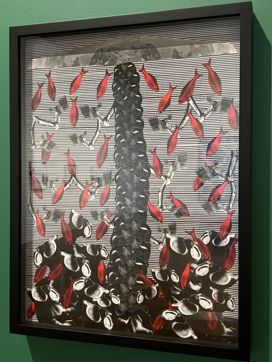
Kapulani Landgraf's Ho'okuleana (to give responsibility) (2016 - reprinted 2018, gelatin silver collage on fibre-based paper)

Description: "In Hoʻokuleana (to give responsibility) (2018), Landgraf’s dramatic composition centres on a drain-like gate connected to pipes that divert fresh water from streams to foreign-owned sugar and pineapple plantations... Landgraf repeatedly uses the red fish as an omen of imminent portentous events — in this case, a warning against continued military operations and the misappropriation of water as a commodity by private land owners and profit-driven companies."
Kapulani Landgraf's White Woman (1994 - reprinted 2018, gelatin silver collage on fibre-based paper)
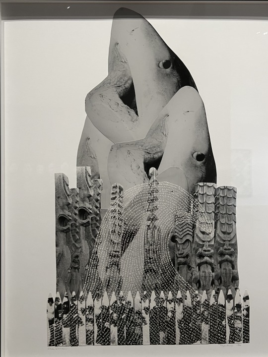
Description: "One of Landgraf’s earliest collages, White Woman (1994–2018), laments the culling of manō (sharks) following attacks on swimmers during the 1980s. In some Hawaiian families, sharks are considered ‘aumākua (ancestral gods). Landgraf’s collage features three large white pointers (niuhi — tiger shark) dramatically breaking through the surface of traditional Polynesian wood carvings, as if gasping for air. A wave of text, issuing from a group of missionaries at the base of the image, threatens to engulf the sharks, recognising the clash that often occurs between indigenous and introduced beliefs. The work also comments on the way in which language has been used as a means of conquest throughout history."
Kapulani Landgraf's Ho'okahi Po'ohiwi (be of one shoulder) (2016 - reprinted 2018, gelatin silver collage on fibre-based paper)
Description: "Hoʻokahi Poʻohiwi (Be of one shoulder) is inspired by a phrase that was chanted by Koa (warriors) of Hawaiian Mōʻī (King) Kamehameha. In 1975, the canoes of Kamehameha lined the shores of Oʻahu, hull to hull from Waikīkī bay right around to Waiʻalae. The warriors marched from the canoes towards the inland mountain range of Nuʻuanu in unison, shoulder to shoulder. Their intent was to unify the islands of Hawaiʻi — and as they marched they chanted: 'ʻUmia ka hanu! Hoʻokahi ka umauma ke kīpoʻohiwi i ke kīpoʻohiwi.' (Hold the breath, be patient and persist! Walk abreast shoulder to shoulder. Be of one accord, as in exerting every effort to lift a heavy weight to the shoulder and to keep together in carrying it along.)"
Kapulani Landgraf's Hawaii photographic series (gelatin silver photograph on fibre-based paper)
1st Row: Ko'ona (1997 - reprinted 2017), Kihaapi'ilani (1997 - reprinted 2017)
2nd Row: Kanahā (1997 - reprinted 2017), Kawaialoa (1998 - reprinted 2017)


Description (paragraphs in order of artwork - with both Hawaiian and English translations):
Ko'ona: "ʻEuʻeu ka puhi i ka huna kai o Kapukaulua,
leʻaleʻa ka maka i ke kai o Lehoʻula.
Ke ʻume nei ka makau lehua a ʻAiʻai,
lawa lua ke kāwelewele hau ʻo ʻAleamai.
Ahuwale ka iwi kuamoʻo o Wailau,
Pōhā ka hanu ʻo Koʻona ma ke kai laumeki.
The eel cavorts in the sea foam of Kapukaulua;
the eye delighted in the ocean of Lehoʻula.
Lured by the pearl fishhook of ʻAiʻai,
strong as the hau ropes of ʻAleamai,
the ridges of Wailau are in full view,
Koʻona’s gasping breath in the receding tide."
Kihaapi'ilani: "Puka ‘o Pimoe ke ao pua‘a ha‘aha‘a,
‘ea‘ea ka wai ea ma Pōhakueaea.
Pihana papau ka mo‘o hele o Kiha mai nā kūpuna mai,
‘eha ka mana‘o ma ka ‘o‘io‘ina ma ka pīp ala wela.
Welo ha‘aheo lā ka ‘ahu‘ula o Pi‘ilani i ka makani Kiu,
kūpa’a ka paepae pōhaku i ke one ‘ā o Pele.
Pīmoe crowned with low-hanging thick clouds,
water of life dignified at Pōhakueaea,
Kiha’s trail gathers, uniting our descendants;
we rest along the scorching path, a procession of painful rememberances,
Pi’ilani’s ‘ahu’ula streaming proudly in the Kiu wind,
foundation stones steadfast in the shifting cinders of Pele."
Kanahā: "Ua ho’i ke ao kōkōli‘i ma Mauna Leo,
mumule ka pahu ahimakani o Milu mai Kahului mai.
Hō‘ā ke ahi lele ‘ē i nā kūkaekōlea,
ke ho’okakano nei i ka mauli o Kanahā.
Pō‘ele‘ele ‘o Mau‘oni i ka ua halahala,
malumalu ‘ia nā ae‘o e ka papa makaloa.
Black clouds have returned to Mauna Leo;
Milu’s fuel tanks from Kahului are mute.
The weeds burn and spread,
threatening the essence of Kahahā.
Bitter rains have extinguished Mau‘oni,
makaloa flats shielding the ae‘o."
Kawaialoa: "‘Ai ā manō ke kai eaea o ke one o Kahekili,
kūpale ‘o Pehu i ke kai kūlipo o Haui.
Ho’opō’ai ‘ia ‘o Līhauwai‘eke‘ekeikalani e ka makani kūhonua,
e lalahū ‘o Kīlea ma waena o ke kō lehu ahi.
Ho’ohūnā ‘ia ka lo‘i kalo o Olowalu,
ho’ohonua ka pōhaku niho o Kawaialoa.
Like a shark, the rising sea eats the sands of Kahekili;
Pehu defends the dark sea of Haui.
Līhauwai‘eke‘ekeikalani is girdled by unrelenting wind;
Kīea swells among the sugar cane’s ashes.
Secreted are the lo‘i of Olowalu,
and the interlocked stones of Kawaialoa are established."
1 note
·
View note
Text
The East Coast Premiere of Sharon Stone's Paintings - Sharon Stone: Welcome To My Garden
The C. Parker Gallery in Greenwich, Connecticut presents the East Coast premiere of Sharon Stone’s paintings with the new exhibition Sharon Stone: Welcome To My Garden, on view October 12 through December 10. “We are honored to present the highly anticipated East Coast debut of Sharon Stone’s powerful art, for our tenth anniversary season,” says Tiffany Benincasa, C. Parker Gallery’s owner and curator. “This new exhibition offers a never-before-seen panorama into Sharon Stone’s creative prowess. The artist invites viewers on a journey through the vibrant landscapes of her imagination, reflecting her inner world. A testament to Stone’s profound talents,” adds Benincasa. The gallery is located at 409 Greenwich Avenue, just a 40-minute train ride from New York City.
The gallery show features 19 paintings by Stone, and is the first time her artworks are exhibited outside of Los Angeles. Her art is praised by collectors and art world luminaries, including Jerry Saltz (Senior Art Critic for New York Magazine and winner of the Pulitzer Prize for Criticism). Stone’s celebrated slide-shows of her paintings are taking Instagram by storm. “I created these works to understand the essence of pure creativity that comes from heartfelt truth, to let go of the noise, the judgements, and the pollution of our societal pulls,” says Sharon Stone. Her immense talents and acute powers of observation blossomed onto the painted medium. Stone’s ability to observe and interpret human behavior, and her capacity to turn human frailties into sources of strength, shine through in ways that are combative, conquering, and victorious. Her connection to nature is always visually present. “Color becomes a wavelength for me,” says Stone. “Being a colorist moves the directions of my paintings. Color speaks to me.”
Stone has been painting her entire life. In her early years, her Aunt Vonne had a Master’s degree in painting and would create murals across the walls of the home where she lived as a child. Stone studied painting in college, and her artmaking became her laser-focus during the pandemic when she entered a new creative portal. This period of planetary crisis transported Stone to open up new artistic channels, transferring her lifelong creative instincts onto the canvas. Since then, she paints every day, four to 17 hours per day. Stone is internationally recognized as a global cultural leader, her many honors include: the Women Making History Award from the National Women’s History Museum; the Einstein Spirit of Achievement Award; the Nobel Peace Summit Award Laureate; the Golden Globe Award; a Primetime Emmy Award; an Academy Award Nomination; she was named a Commander of the Order of Arts and Letters in France; the 2023 Courage Award; the Harvard Humanitarian Award; and the Human Rights Campaign Humanitarian Award, among her many accolades.
C. Parker Gallery is a full-service art gallery and consultancy celebrating its tenth year in Greenwich, Connecticut. Representing an extensive collection of works by traditional and contemporary artists, the Gallery is a recipient of the Best of Greenwich Award and Best of the Gold Coast Award. The gallery’s inventory features more than 1,800 works from over 70 artists representing original paintings, prints, sculpture, and collectibles.


https://vimeo.com/878010744
0 notes
Text
Interview -- Kaitlin K.
NG: As someone working with paint, cut canvas, and even seeds, what draws you to mixed-media artmaking?
KK: I wanted to experiment with how else to express the themes (memory, childhood, nostalgia) I have been interested in with painting, and I do enjoy when a work has a tactile element. I wanted to understand if a different or additional media would be more successful. However, I am not sure I am liking the direction I was going with mixed media works or how I could move forward with it purposefully, so I think for now I want to want to focus back on painting. To experiment more with abstracted shapes, maybe "deskilling", the idea of "disruptors" in scenes, and misshapen or cut canvases. I need to explore how these different shapes could add meaning or what it means to take away something traditional. Like the canvases I just cut were traced from the shadows the morning light was making coming through the window of my studio.
NG: You’ve mentioned the importance of art festivals in your practice, particularly the overlap between that environment and your market knowledge that lets you know what you can make that will sell! What other influence/information do you feel you’ve benefitted from by participating in various art festivals?
KK: From working as an interior design consultant, I get good insight as to what people like to put in their homes. At art festivals I get a good understanding on what content people respond well too, which tends to be clouds. I get feedback from both visitors and other artists, which can be nice to hear commentary that is not solely academic based. I have only done a few so far that are juried/ of notable size but I do find them worth continuing to do since they seem to be the only opportunity I have to learn how to market myself rather than being research/academia focused.
NG: You described your process when you beginning a piece as very intuitive, letting the paint fall where it may before you make any specific compositional decisions. While in this part of the process, what questions are you asking yourself that eventually inform how you finish the piece?
KK: The first thing I make a decision on is color palette based on the mood I am trying to convey. Once I have general composition down the next thing I decide is scale, one big cloud or lots or small clouds, tiny trees far away or larger ones taking up the foreground, how far back should the viewer be from the scene? I think in upcoming works I want the viewer to feel distanced and like they are viewing the scene from above. Content wise I try to keep the shapes of the natural elements and structures, kind of "generic" in a way so they do not feel to evocative of a specific time or place, but I think moving forward I want to look through descriptions of landscapes in fairytales (Brothers Grimm, Hans Christian Anderson versions) to draw inspiration from those. Once I have all the elements in I want I will add as much of them (abstract shapes, foliage, waterfalls, etc) until the composition feels balanced to me.
0 notes
Text
Final Work - Video Resolution for Moving Through a Landscape
Video & sound installation.
Video Resolution for Moving Through a Landscape mobilises the inherent resolutions and textures of technological recording to form the principal image of artmaking, acting on the object’s response to physical environments of lightness and darkness as a central focus to capture. Rather than the recorder depending on its real-world tangible subject, image resolution is harnessed to become the visual subject of the work. Through this framework, the camera autonomously creates abstract shapes and textures on screen likewise to paint applied on canvas.
The process of prioritising inherent digital structures stemmed from an infatuation of Structural film and early Video Art, lacking attention to common filmic traditions and centralising properties such as light flickers (Conrad, The Flicker, 1965) and videographic “errors” (Jonas, Vertical Roll, 1972). Indeed, the isolated video bounds itself to Structural conditions of the fixed camera angle and flicker effects, yet its installation adaptation extends its aesthetic light work.
Beyond the screen, the video produces rays of light that build a continuation of image, constructing the environment to balance filmic viewing and an atmospheric lightwell. As the videographic landscape is navigated through, one can inhabit the physical landscape that the work provides in equal exploration.


0 notes
Text


Currently on view at Bortolami is Tom Burr’s excellent multimedia exhibition. With new discoveries around every corner, the show keeps you engaged, at times even on an emotional level.
From the press release-
Once more Burr has assumed his dual role as artist and exhibition maker, relocating the act of making from the traditional studio space into the gallery. An architectural intervention of four walls defines the show, a deconstructed box whose contents have been scattered both in view and out of sight yet remain connected on levels of materiality, memory, biography, and history. Moving through the gallery, the viewer is directly confronted by Burr’s work, activating the artworks and the physical space created for them. As the interconnectivity of the different facets of the exhibition comes into view, not only here and now but in its connection to the entirety of Burr’s career, we begin to understand this as not merely an assortment of objects as artworks, but on a larger scale as a total artwork.
Four new wooden panels populate each makeshift wall, continuing the signature plywood sculptural series begun in the 1990s. Each painted a different color, the artist loosely utilizes the shipping crate motif, a point of interest for Burr. Adhering stainless steel and brass plates to each panel, the images portray the artist himself as well as his own simulation of stereotypical “faggy gestures,” as he refers to them, creating an intersection of public expectations of artistic sensibility, identity performance and exposure.
Also on view in the main gallery are a series of furniture-based sculptures. Set behind the walls, each work draws the viewer into the constructed architectural space as they grapple with themes of legacy, memory, and biography. Pulse utilizes various items once belonging to the “lounge” at Burr’s project space in Torrington, Connecticut—a disco ball, a couch, a lamp, a wool blanket — the disco ball being a relic from American Fine Arts, the legendary SoHo gallery run by Colin de Land where Burr exhibited throughout the 1990s and early 2000s. Accompanying the work is a wall text listing the various academic definitions of the word “pulse,” while the last line, a new addition by the artist, is a reference to the infamous shooting at the gay nightclub in Orlando, Florida, a signal to both the individual and communal meanings associated with the word. Similarly, the artist has gathered various items belonging to his father to create Johns (my father’s chest)—a chest of drawers, long johns, a metal storage box, and a handkerchief— evoking the same ideas of legacy and biography.
A new photo series entitled Capricornus I, II, III, and IV lines the outer walls of the main gallery. Depicting Burr in the three public bathrooms of his Torrington space, he is in the midst of various movements—lounging, laying down, reading. In a string of associations from Bruce Nauman to Francesca Woodman, as well as nods to his own past work, here the studio becomes a stage as Burr equates the everyday banal and artmaking.
Occupying the small gallery space, Floor Model (adolescent), is the most recent continuation of the artist’s series His Personal Effects, while in the office Burr has installed a series of new collages made in homage to Stefania Bortolami. The Visit, I, II, III depicts images of a visit by Bortolami to Burr’s space in Torrington, CT, as well as images of plant foliage from Burr’s seminal work, Construction of An American Garden, currently installed in the Torrington space. In the words of scholar and curator Blake Oetting “the body of the dealer emphasizes the commercial system that supports Burr’s work and translates it into exchange-value, a framework, he reveals, that often moves beyond the physical boundaries of the gallery.”
This exhibition closes 5/4/23.
#tom burr#bortolami gallery nyc#bortolami#nyc art shows#art#art show#mixed media#art installation#pulse nightclub#sculpture#photography#conceptual art
1 note
·
View note
Text
SHIRLEY MACNAMARA - RESILIENCE ON SPINIFEX COUNTRY
Storytelling
Country
Pastoralism
Land Rights and Native Title
Connection
Environment
Tradition, Law, Custom, Language
Women
COLLECTIVE MEMORY
Lived Experience
Extractive Frontier
Resistance / Regeneration / Resilience
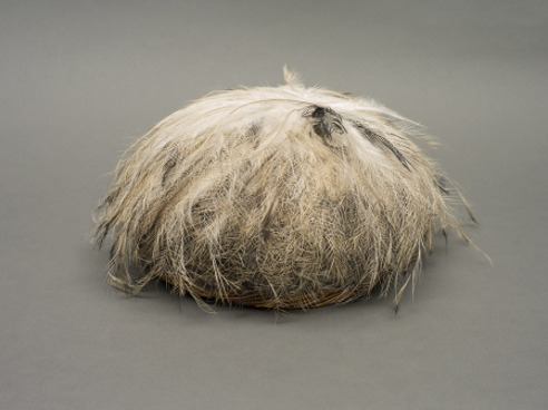
Shirley Macnamara (b.1949) is an Indjalandji / Alyawarr woman. Her contemporary artistic practice is underpinned by her lived experience on Country in far northwest Queensland on the Barkly Tablelands. For over two decades, her chosen medium has been spinifex (Triodia pungens), a hardy native grass that grows in the arid drylands of the Indjalandji / Alyawarr nations. She is the only known artist to work with spinifex. For Macnamara, spinifex embodies strength, hardiness and resilience. As a plant of survival, spinifex is a symbol of her direct connections to ancestral history and to Country. Many of the artist's sculptural works are guutu - the Indjalandji word for vessels or containers - whose cylindrical and circular shapes reference women's understandings of cultural heritage. Macnamara's lyrical exploration of the formal, textural and tonal properties of spinifex finds synergy with the inclusion of other significant objects - feathers, shells, bones, ochres - from her Country. Their materiality encompasses a tactile and kinaesthetic - in addition to visual - consideration of the environment in which Shirley Macnamara lives and works.
Macnamara's approach is generous - she seeks to share her cultural experience; to provide an accessible portal for people (including non-Aboriginal people) to witness her lived experience. Her approach is also holistic. Macnamara's sculptures reference the complexity of interactions among themes of environmental degradation on the extractive frontier, care of Country, pastoralism, rights to land, governmental policies of assimilation (and control, exclusion and removal), missions (and stations and reserves), and inter-generational cultural knowledge, strength and resilience. None of these themes can be considered in isolation - all are interwoven into the fabric of Macnamara's Indjalandji / Alyawarr lived cultural experience. For example, while Cu (2016) draws attention to the environmental impact of copper mining in the region, Wingreeguu (2012) embodies cultural knowledge and deep connection to Country. Skullcap (2013) pays homage to Aboriginal soldiers who fought in World War 1 and Dyinala - Bine By (2018) addresses the working conditions of Aboriginal people on pastoral properties. Together, Shirley Macnamara's contemporary forms reject the colonial imposition of traditional notions of authenticity in Indigenous artmaking. Yet her highly personal and creative use of natural materials empowers the visual representation of the strong continuity of her Indjalandji / Alyawarr culture.

Shirley Macnamara in her artist studio on Country
Nyurruga Muulawaddi (2017) University of Queensland Art Museum
"I have been thinking about my grandmother. Before the 1967 Referendum our old women sung everything but lived in fear of passing songs on. I don't have the songs, but I have the history woven into my Spinifex art." Shirley Macnamara 2017
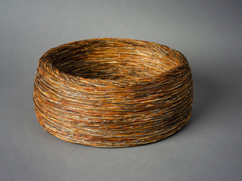

Spinifex Vessel, Bowl (1998) City of Townsville Art Collection
Dyinala - Bine By (2018) Alcaston Gallery, Melbourne
"I dedicate this work to those whose names are on these documents. I sincerely acknowledge with the deepest of respect the families and descendants of those whose names are on these papers. Its been a privilege and an honor and I feel proud to have known them all. Stockmen with numbers, permits for horses and cattle to travel, they belonged to the bush when it was all horse and cattle jobs, droving mobs of cattle on dusty stock routes far from home, each tell a different story, it is my story also. I was there. Uncle Ned was my mother's cousin. Stockman number N338 complete with thumbprint. My late husband was the drover. Their legacy lives on." Shirley Macnamara 2018
Gilgai (2017) University of Queensland Art Museum

Skullcap (2013) University of Queensland Art Museum

Cu (2016) University of Queensland Art Museum
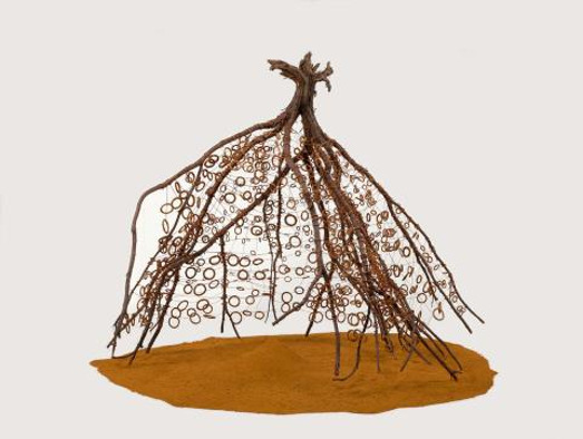

Wingreeguu (2012) QAG l GOMA Prototype for Fenced In (2014)
"I've always been looking for something I wanted to do from my country, from the ground; to work with the ground - what comes from the ground". Shirley Macnamara 2019
"I deemed it advisable to return at once up the river because there were about one hundred blacks in the neighbourhood of the camp, some of whom were so bold that I feared it might be necessary to shoot some of them." William Landsborough 29/12/1861 Search party for Burke and Wills on Indjalandji-Dhidhanu Country
Well of Remembering (2016) University of Queensland Art Museum

"Yaringa was the most important place where I lived. I'd lay down and eat dirt from there: that's my home. The deep part of my country. I was fortunate having lived on my traditional country until I was an adult....that means so much. You carry it inside all the time. My spirit comes from there."
Shirley Macnamara 2019
Annotated Bibliography
AIATSIS. (2023). Saltmere on behalf of the Indjalandji-Dhidhanu People v State of Queensland (2012) FCA 1423. https://aiatsis.gov.au/ntpd-resource/1088 Accessed 10th March 2023.
This webpage summarizes the legal determination made in 2012 that recognized the native title and interests of the Indjalandji-Dhidhanu people over approximately 19,730 square kilometres on the Eastern Barkly Tableland in the upper reaches of the Georgina River Basin and on the Queensland / Northern Territory border. The native title and interests of the Indjalandji-Dhidhanu people include access to the area to camp, hunt, fish, use natural resources including water, conduct ceremonies, teach, maintain places of importance and be buried within the area. The successful determination of this claim has direct implications for Shirley Macnamara’s artistic practice which shows her ongoing connection to country.
AIATSIS. (2023). The Stolen Generations. https://aiatsis.gov.au/explore/stolen-generations. Accessed 11th March 2023.
This webpage provides information on the Bringing Them Home Report (1997) which was tabulated following the National Inquiry into the Separation of Aboriginal and Torres Strait Islander Children from their families (1995-1997). This report made 54 recommendations for redress – one of which was a formal acknowledgement and apology for the forcible removal of Aboriginal and Torres Strait Islander children. The webpage also includes an audio recording of the National Apology which was delivered by Prime Minister Kevin Rudd on the 13th February 2007. This information provides an important historical context for some of Macnamara’s artworks that address conditions for Aboriginal people who lived on cattle stations during the early and mid 1900s.
Alcaston Gallery. (2023). Shirley Macnamara. https://www.alcastongallery.com.au/artist/read/1239-shirley-macnamara Accessed 7th March 2023.
Alcaston Gallery has been Macnamara’s gallerist for over a decade. This website includes information on biography, artistic process, exhibition history and collections. It provides useful contextual information about Shirley Macnamara’s life and art-making.
Australian War Memorial. (2023). Indigenous Service in Australia’s Armed Forces in Peace and War. https://www.awm.gov.au/articles/indigenous-service/report-executive-summary. Accessed 10th March 2023.
On this webpage, a summary is provided about the historical regulations concerning Indigenous military service, as well as official records of Indigenous defence force personnel. Of particular note, it explains the imposed restrictions or exemptions placed on Aboriginal and Torres Strait people during the First World War. It underpins Shirley Macnamara’s mourning cap sculptural works.
Burbidge, Madeleine. (1999). Spiritual Spinning. Arts Yarn-Up, Winter 1999, pp. 16-17.
This article explains how Shirley Macnamara spent many years trying to find a medium that was able to convey her artistic motivations and align with her relationship to Country. Her chosen medium of spinifex has qualities of strength, resilience, flexibility, connectivity, hardiness and survival in the arid lands of her Country. While spinifex is not considered to have commercial value to the general Australian economy, it had important traditional use and economic value for Aboriginal people. Macnamara explains the process used in the preparation of spinifex and her research into the traditional containers that were used to carry bush foods. This article emphasizes how an understanding of spinifex is absolutely essential to conveying the essence of Macnamara’s artworks.
Castlemaine State Festival. (2017). The Extractive Frontier: Mining for Art. Castlemaine Art Museum https://castlemainefestival.com.au/2017/events/the-extractive-frontier-mining-for-art/ Accessed 9th March 2023.
Shirley Macnamara worked with her 12 year old grandson to explore an abandoned copper mine near their cattle station in northwest Queensland. Their collaborative artwork, Cu, 2016, incorporates raw copper and wire found at an old mining site near their home and is symbolic of the deep hole that remains at the mining site. Cu was included in the 2017 Castlemaine State Festival exhibition, The Extractive Frontier – Mining for Art, which examined the colonial history of frontier encounters around the extraction of mineral resources and its associated socio-political and commercial economies. Themes of exchange, power, resource use, custody, land, destruction and renewal were addressed by the eighteen participating artists. These themes are relevant to Shirley Macnamara’s lived experience on Country in far northwest Queensland.
Davidson, Daniel S. (1949). Mourning-caps of the Australian Aborigines. Proceedings of the American Philosophical Society, April 18th, Vol. 93, No.1. pp. 57-70.
This article provides an anthropological investigation into the practice of wearing mourning caps following the death of a relative among Aboriginal people in parts of Australia. Despite regional differences in how the mourning caps were made, preceding preparations with nets or hair removal, how long caps were worn, and their subsequent placement on graves, mourning ritual involving the use of skullcaps was a widespread practice by many Aboriginal nations throughout Australia. Some of Shirley Macnamara’s artworks are artistic interpretations of mourning caps and respond to the concept of mourning in relation to Aboriginal and Torres Strait Islander Defence Force men and women, as well as to mourning Aboriginal history in the context of colonialism and more contemporary governmental policies.
Mackay, Alana, K. & Taylor, Mark, P. (2013) Floodwater metal contaminants in an Australian dryland river: A baseline for assessing change downstream of a major lead-zinc-silver and copper mine. Journal of Environmental Quality, Vol, 42(2), pp. 474 – 483.
Mackay and Taylor present their rigorous research into the impact of lead, zinc, silver and copper mining in the Mt. Isa region of northwest Queensland. This dryland region of Queensland relies on ephemeral flooding to resupply local water resources that sustain local communities during extended dry periods. Their research found that tributaries draining the mines contained high concentrations of dissolved metals. One of Shirley Macnamara’s artworks, Cu, 2016, directly references the impact of copper mining on the environment in her region.
Martin-Chew, Louise. (2019). I did it my way. Art Collector, Vol. 90. October-December. pp. 57-61.
In this article, Martin-Chew reviews the exhibition Dyinala Nganinya held at the Queensland Art l Gallery of Modern Art in 2019. Shirley Macnamara – whose artistic career has risen sharply over the past two decades is the only known sculptural artist whose primary material is spinifex. The title of the exhibition are Indjalandji words. Dyinala means ‘by and by’; ‘wait, all things will work out in time’ and alludes to patience. Nganinya means ‘this way’, which Macnamara embodies as her own way of making art. The exhibition included the sculptural installation Wingreeguu which was first exhibited in the 7th Asia Pacific Triennial at QAGOMA in 2012. This installation has poetic reference to the bush shelters traditionally made from spinifex and turpentine bushes. Crucifixes made from spinifex or from rusted wire reference the impact of Christianity and missions on Aboriginal culture, as well as referring to a symbol of remembrance. An important written narration refers to the employment conditions of Aboriginal stockmen during the early and mid 1900s, an issue which has immense personal importance to Macnamara. Her husband was a drover and she was witness to the conditions on pastoral properties. Although Macnamara refutes overt political messaging in her artworks, she draws on autobiographical storytelling and the collective memory of her family’s cultural history to deliver strong cultural messages. This exhibition review provides a supplementary information to the publication Shirley Macnamara Dyinala Nganinya which was produced for the QAGOMA exhibition.
Miller, Pavla. (2015). Antipodean Patrimonialism? Squattocracy, Democracy and Land Rights in Australia. In Patrimonial Capitalism and Empire. Vol 28, pp. 137-163.
Miller provides a detailed analysis of the effects of colonial expansionist policies and pastoralism on how Aboriginal people performed and experienced their traditional obligations to Country and kinship relationships. Using a model of Patrimonialism, Miller’s arguments provide a compelling foundation to understand the evolution of violent frontier conflicts, official government policies, the rights (or lack thereof) of Aboriginal workers on cattle properties and systematic dispossession and dispersal throughout the 1800s and 1900s. This has direct relevance to understanding Shirley Macnamara’s artwork. The artist is an Indjalandji / Alyawarr woman who has intimate ongoing connections with Country and cattle stations in far north west Queensland. Her artistic approach speaks directly to her own lived experience working on cattle stations, as well as that of her past kin.
Moon, Diane. (2013). Shirley Macnamara. Wingreeguu, 2012. Artlines, No. 1, pp. 24-27.
In addition to providing biographical and materials-based information relevant to the artist’s preferred medium of spinifex, this article focusses on the sculptural installation Wingreeguu which was exhibited at the 7th Asia Pacific Triennial at the Queensland Art Gallery l Gallery of Modern Art in 2012. In this sculpture, an upturned turpentine bush is embellished with small spinifex circles and rests on a bed of yellow ochre. Macnamara explains how the ochre is nurturing and imbued with meaning as it is sourced from a special place on Country. The turpentine bush references traditional Aboriginal temporary shelters. Turpentine bushes grow densely in the arid drylands and dead bushes can easily be upturned by whirly winds, thus becoming a source of shelter if they were covered. The small spinifex circles represent tracks, storylines and the cycle of life and death. Macnamara’s personal philosophy of “where we are, who we are and where we come from” is embodied in the circles.
Museum and Art Gallery of the Northern Territory. (2017). Telstra National Indigenous Aboriginal and Torres Strait Islander Art Awards 12 August – 26 November 2017. Darwin: Museum and Art Gallery of the Northern Territory. p. 58.
In 2017, Shirley Macnamara won the Wandjuk Marika Memorial Three-Dimensional Award for her work Nyurruga Muulawaddi. This vessel is made from aged spinifex. Macnamara’s artistic statement for this work is also of upmost importance to all her works using spinifex. “I have been thinking about my grandmother. Before the 1967 referendum our old women sung everything but lived in fear of passing songs on. I don’t have the songs, but I have the history woven into my spinifex art.”
National Native Title Tribunal. (2023). QCD2012/015 Indjalanji-Dhidhanu People. https://nntt.gov.au.searchRegApps/NativeTitleClaims/Pages/Determination_details.aspx?NNTT_Fileno=QCD2012/015 Accessed 10th March 2023.
This webpage presents the full documentation for, and determination of, the Native Title Claim Saltmere on behalf of the Indjalandji-Dhidhanu People v The State of Queensland. Professor Paul Memmott’s comprehensive anthropological review - from the time of the people’s first contact with Europeans during Burke and Wills’ exploratory expedition in 1860 through to the present day – presented evidence for Indjalandji-Dhidhanu peoples’ ongoing observation of traditional laws and customs which has been communicated to succeeding generations. Indjalandji-Dhidhanu people have an unbroken physical connection to their Country dating back to a time prior to 1788. Shirley Macnamara’s testimony is included in the court’s determination. This Native Title Claim and successful determination has direct implications for understanding Shirley Macnamara’s artistic motivations and methodologies.
Pascoe, Bruce. (2018). The Little Red Yellow Black Book. Canberra: The Australian Institute of Aboriginal and Torres Strait Islander Studies.
This book provides important socio-cultural contextual information about historical and contemporary conditions for Aboriginal and Torres Strait Islander people. Of particular relevance to Shirley Macnamara’s artistic practice are the sections dealing with connections to Country and kinship, war service, protection acts, reserves, station and missions, the influence of the church, pastoralism, stolen wages, The Stolen Generations and The Apology and The 1967 Referendum.
Pearson, Michael. (2003). The Early Copper Mining Industry in Central Queensland 1863-1879 – History and Place. Journal of Australasian Mining History, Vol. 1, No. 1, pp. 121-143.
Pearson’s article studies the history of copper mining throughout Queensland during the mid to late 1800s. During this period, many mines were isolated, experimental and small-scale operations which had no environmental regulations. Remains of one such small-scale mining operation are located on the cattle station where Shirley Macnamara lives and works.
Queensland Art Gallery l Gallery of Modern Art. (2019). Shirley Macnamara: Dyinala, Nganinya. South Brisbane: Queensland Art Gallery l Gallery of Modern Art.
This publication was produced for the Shirley Macnamara Dyinala, Nganinya exhibition at the Queensland Art Gallery l Gallery of Modern Art in 2019. Three essays provide a detailed analysis of the artist’s life and artistic journey. Julie Ewington discusses the materiality and form of Macnamara’s spinifex guutu. Dianne Moon links traditional and socio-cultural context with the layered meanings which underpin the artist’s sculptures and guutu. As part of the Indjalandji-Dhidhanu Native Title Claim (2010), Paul Memmott’s essay reflects on the artist’s – and her ancestors - continuing connection to country since her infancy. Together, these essays will inform the theme of autobiographical storytelling in her connection to Country which embraces all aspects of Shirley Macnamara’s creative works.
Silver, Anneke. (1997). Spinifex, Ochres and the Land. Periphery, Issue No. 33. Summer 1997-1998, pp.28-29.
In an interview with Anneke Silver, Shirley Macnamara explains why spinifex is her preferred medium. The process of collecting spinifex gives her an opportunity to spend time on Country like she once did when she went gathering with her grandmother. As a plant, spinifex is strong, resilient and hardy. Its roots provide a direct connection to Country while its runners (the strands that grow out and put down roots for a new plant to grow) provide a connectivity between plants. After removing the three outer shells of the spinifex, the inner layer is a rich red – the colour of the earth itself in the arid lands of northwest Queensland. All these attributes resonate with Macnamara’s personal experience and philosophy living on Country as well as a symbol for the strength and resilience of Aboriginal people.
Silver, Anneke. (2019). Shirley Macnamara: Respect, Balance, and Belonging. Artlines, 3, pp. 24-29.
Silver provides a biographical background to Shirley Macnamara’s artistic practice which is underpinned by her ancestor’s cultural heritage. Macnamara’s maternal grandmother lived with family on an outstation at Barkly Downs. As an important law woman, her grandmother held knowledge of song and dance connected to Country, yet she felt unable to share this knowledge because she lived under the governmental policies which were founded on the systematic erasure of Aboriginal culture. The article also explains Macnamara’s early artistic development through the Flying Arts programme during the 1990s. At this time, she experimented with the use of spinifex as a medium and was encouraged by Tracey Moffatt who was a tutor at the Flying Arts conference in 1994. Silver explains how the materiality of Macnamara’s spinifex vessels invokes layers of meaning. The article has direct relevance to an understanding of Macnamara’s artistic inspiration and methodologies.
The University of Queensland Art Museum. (2018). Shirley Macnamara: Layered Threads. https://art-museum.uq.edu.au/whats/past-exhibitions/2018/Shirley-macnamara-layered-threads. Accessed 3rd March 2023.
In 2018, Shirley Macnamara had a solo exhibition – Shirley Macnamara: Layered Threads - at The University of Queensland Art Museum from the 18th August to the 24th November. An exhibition of Judy Watson’s artworks – Judy Watson: Concealed Histories – was held concurrently at the art museum. Both artists share an aesthetic approach to their art making which draws on layers – both in concept and process, principles of form and design, and a liminal representation of underlying meaning. Using spinifex (Triodia) – a native grass common to arid drylands – as her preferred medium, Macnamara weaves into her artworks generations of traditional knowledge, care of Country and the history of the people of her nation.
Were, Ian. (2003). Beyond the city limits. Object, No. 42. pp.24-25.
Shirley Macnamara began painting her surroundings in 1988, but changed to the use of found plants (especially spinifex), feathers, animal bones and ochres from the natural environment as it allowed her artistic practice to emerge directly from Country. In traditional Aboriginal culture, spinifex was an important commodity. It was used in the construction of mattresses and shelters; it had medicinal properties; its seeds were ground to make bush damper and its resin was extracted to bind weapons and tools. Macnamara collects spinifex between August and September each year during the dry period. Spinifex is a metaphor for resilience as this hardy, strong native grass resists the harshest conditions and its roots and runners enable long term survival. This article explains how Macnamara’s sophisticated Guutu – the word for vessels or containers in her language – embody a fragile beauty and layered meaning that is born directly out of Queensland’s harsh northwest drylands.
1 note
·
View note
Photo

Floral Ikebana The Japanese art of flower arranging, blossoms, branches, leaves, and stems find new life as materials for artmaking. In contrast to the western habits of casually placing flowers in a vase, ikebana aims to bring out the inner qualities of flowers and other live materials and express emotion. The Cushions are made on a pure linen base with traditional hand embroidery techniques. Shop at https://www.bankasilk.com/product/ikebana-floral-romance #cushions #ethnic #chic #homeinterior #homefurnishings #sustainablefashion #handembroidery #bankaweaves #bankasilk #homedecor #luxurylifestyle #linen #pureliving https://www.instagram.com/p/CmuSl72S9Hh/?igshid=NGJjMDIxMWI=
#cushions#ethnic#chic#homeinterior#homefurnishings#sustainablefashion#handembroidery#bankaweaves#bankasilk#homedecor#luxurylifestyle#linen#pureliving
1 note
·
View note
Text
Photobee papaer

PHOTOBEE PAPAER HOW TO
One of the other two in the stack is Art and Fear: Observations on the Perils (and Rewards) of Artmaking by David Bayles and Ted Orland.
PHOTOBEE PAPAER HOW TO
Barthes Camera Lucida is much more personal, and my least favorite of the three, but it still offers some valuable insights towards how to think about photography. Sontag's On Photography is considered one of the most highly-regarded books of this kind, and I found it very interesting, too-though I probably would have enjoyed it much more if I as read it as part of a class, with some guidance and discussion. Like, it took me forever to finish because I kept reading passages aloud to the Mister and discussing what he was saying. I didn't read the books in any particular order (nor do I claim to have the first drop of previous knowledge about the subject!) but, from just jumping in, I found Flusser's Towards a Philosophy of Photography the most fascinating, by far. So, I started here, with A Photo Student blog's list of writings on photography.īased on the blog's list, I snagged On Photography, Camera Lucida and Towards a Philosophy of Photography from the library. Sometime in the last few months, however, I realized that I've read very little about the why of photography-why we photographers do what we do, and the philosophies behind it. In the past, I've done a lot of reading (both in books and online) about how to take pictures. This has been an absolutely wonderful year for me, both personally and professionally, and I'm so grateful for all of your love and support. I hope you have a happy and beautiful Christmas, surrounded by family and friends. Such an easy and inexpensive way to spice up cards-and would be wonderful for a birthday card or party invitations any time of year! We designed cards from a picture I took, swapped out the plain paper envelopes for vellum ones, and finished them off with a sprinkling of glitter. Last year I sent vintage Christmas cards, too, but this year we did something a little different. I just love that so many of our holiday elements are tied to the past and were parts of other families' traditions, especially this year, our first in our new-to-us, hundred-year-old house. Christmas is solidly vintagey around here, both because it is what we love, and also because (though it isn't always), it has proved to be a bit less expensive-vintage glass bulbs are only a couple dollars a box at my favorite thift store, and the several industrial-sized rolls of vintage wrapping paper I found last year are still going strong.
0 notes
Text
Notes on wordplay in hip hop
I’ve been thinking a little bit about why I love rap lyrics so much, and why the use of word play is really important in my work. Traditionally, we learn in schools that a similie is used to connect two distinct ideas into something that connotes a deeper kind of meaning. I’ll use this lyric by Leonard Cohen as an example:
“You held on to me like I was a crucifix”
Here we understand that a crucifix is held in times of need, in times of desperation, in times of prayer, they are clutched tightly for protection and assurance. Connecting this connotation to the way one holds a lover creates this really beautiful image. It produces a meaning more profound than something like “you held on to me tightly/desperately/lovingly”
However often times in rap lyrics, similies make a connection that by traditional measures might read as sloppy or ineffective. Take this lyric from Drake:
“Like a job straight out of High School there’s no you and I”
Here “you and I” is a homophone of “U.N.I.,” as in “university”—people who start working right after high school haven’t gone to university yet. But beyond this word play there is no deeper connotation. What does getting a job straight out of high school have to do with there being no relationship between Drake and who ever it is he is talking about? Nothing really. This happens quite a lot in rap, a connection is made between two things seemingly on a purely aesthetic basis. Some might put this down to poor writing, but I think there is something more interesting going on here.
These lines express an exuberant unpredictability which defy the conventions of poetic language. They are playful, and priotize the creativity of the initial connection over concern to adhere to the normal ways in which literary devices are used. While there may not be a strong initial connection between two ideas in the traditional sense, meaning is still conveyed in the shear creativity of the connection in a way that I find quite radical and precisely unique to hip hop.
I think there is something to be learned from this ‘tossing out’ of the rule book. Rap has developed its own set of rules and precedents. I think there are possiblities to adopt this kind of attitude when it comes to artmaking, and particularly in regards to my ongoing practice of clustering together seemingly disperate cultural ideas. Its about the play itsself.
0 notes
Last Seen Blogs
hamstringy
oh mary oliver, we're really in it now

the-bnuuy-zone
THE BNUUY ZONE

bae-jin-young
i know you and me

moonwritesatnight
Introverted Josuke

im-a-sushi-boi
“🍱”