#trent russell
Text
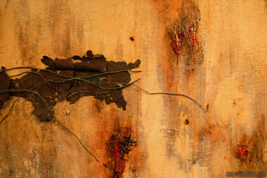
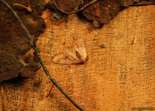
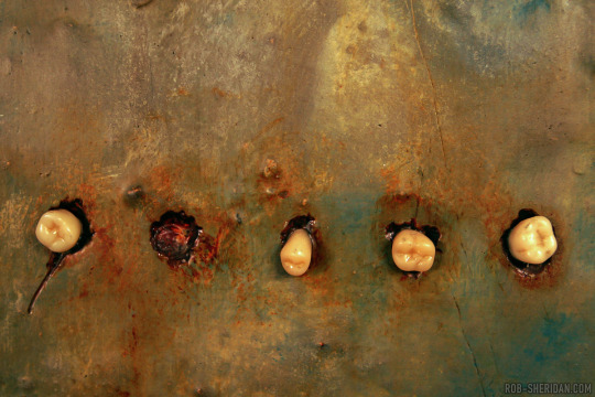
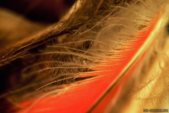
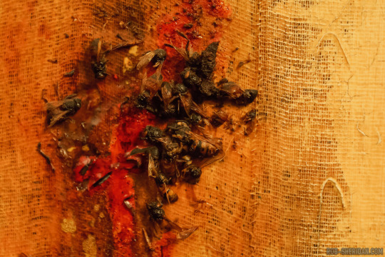
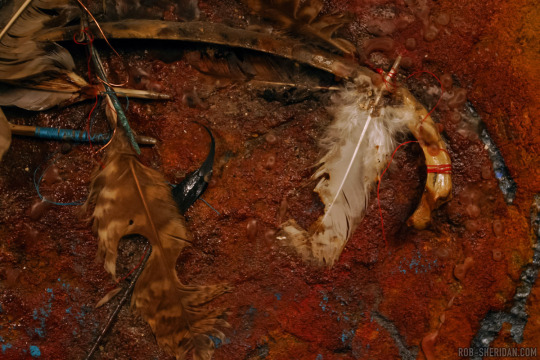
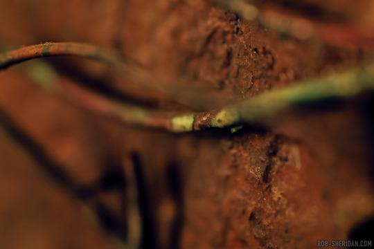
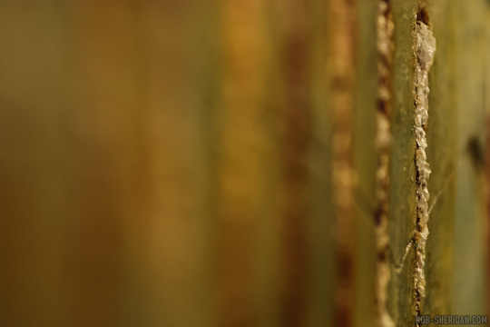

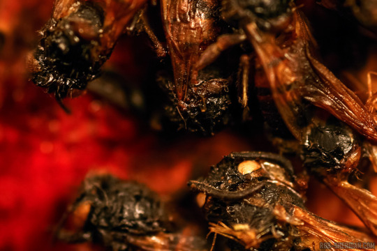
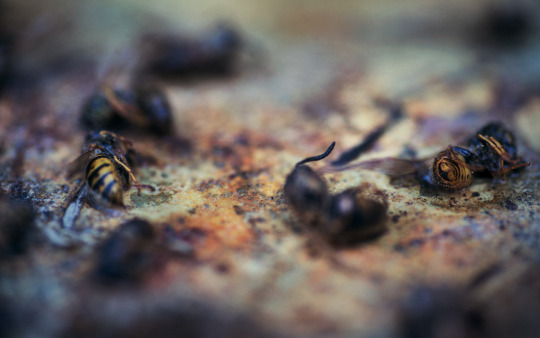
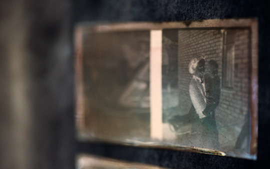
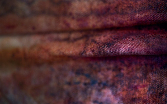
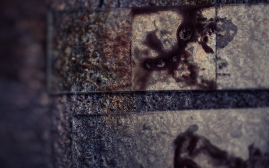
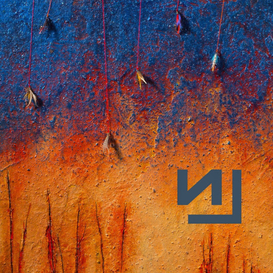
Hard to believe Nine Inch Nails' classic The Downward Spiral is 30 years old today! Here is some detail photography I took of the original album cover painting by Russell Mills for the 10th anniversary deluxe edition release, which I had the unique honor of designing, and somehow that is now 20 year old.
Everyone has that one album that hit at just the right moment of adolescence to change their perspective on music and get them through their teenage angst. The Downward Spiral was that album for me, released as it was in 1994, when I was a freshman in high school (and an absolute banner year for music/films/games all around). I must have stared at the artwork for hours over those years, without even much detail to draw from on its tiny 5” CD slip case. So five years later, when I found myself inexplicably working for Nine Inch Nails, it was surreal to see the actual original painting in the flesh, hanging as it was at the time in Trent Reznor’s office at Nothing Studios, New Orleans.
I was struck by how much dimension and texture there was in the artwork that never translated on that tiny slipcase printing, how much detail was happening in the physical materials of the art: Flies, moths, wires, blood… I had been staring at this “painting” for so long, yet suddenly it was like I had never seen it before. I also noticed that it had aged - the wires had wilted over the years, drooping down from their original position as captured in the original album cover (interestingly, judging by the photo posted today by NIN, the piece has since been restored); a tooth was missing from the other main piece.
That experience stuck with me and it was the first thing I thought about when the task of re-imagining the album package fell upon me in 2004. I wanted to re-photograph the artwork, subtly updating the cover to show that ten years had changed it physically, much like our perceptions of art and music and memories change over time with perspective. I also wanted to dig into the previously unseen details of the work and explore it with my macro lens, so that fans like me, old and new, could have new layers of texture to pore over for hours while listening to a legendary album.
Happy birthday, old friend.
#nine inch nails#the downward spiral#nin#trent reznor#90s nostalgia#90s music#industrial#rob sheridan#Russell mills#photography#album art#album design
2K notes
·
View notes
Photo

Further Down The Spiral (1995)
#old magazines#90s#music#nin#coil#aphex twin#rick rubin#nine inch nails#nothing records#trent reznor#russell mills#the downward spiral#1995#hologram parade#robin finck#danny lohner#chris vrenna#charlie clouser#dave navarro#new musical express#further down the spiral
983 notes
·
View notes
Text

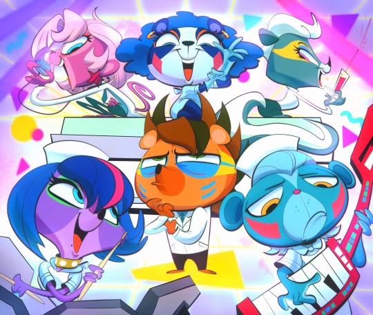
lps 2012 gamer AU
#some of these are innacurate ik#like buttercream sudae's should be “I'm gonna teabag-bo-bebag you silly-billy camper-wampers >w<”#or something to that effect#if i did this again id probably change some of them around#but I won't#octo's art#art#artists on tumblr#littlest pet shop 2012#lps 2012#sunil nevla#russell ferguson#penny ling#buttercream sundae#or is it buttercream sunday#sugar sprinkles#vinnie terrio#minka mark#zoe trent#pepper clark
126 notes
·
View notes
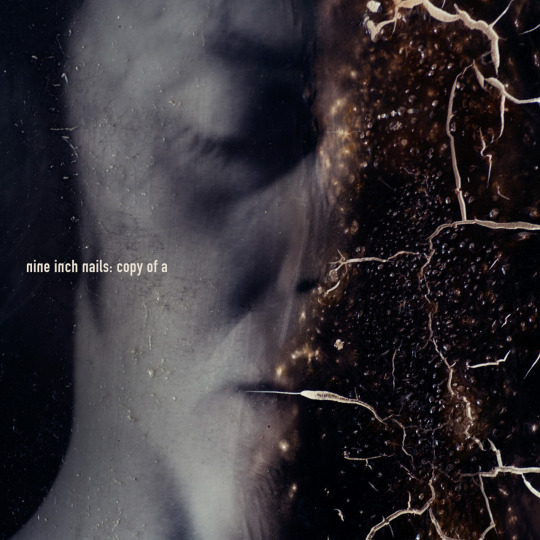
Text
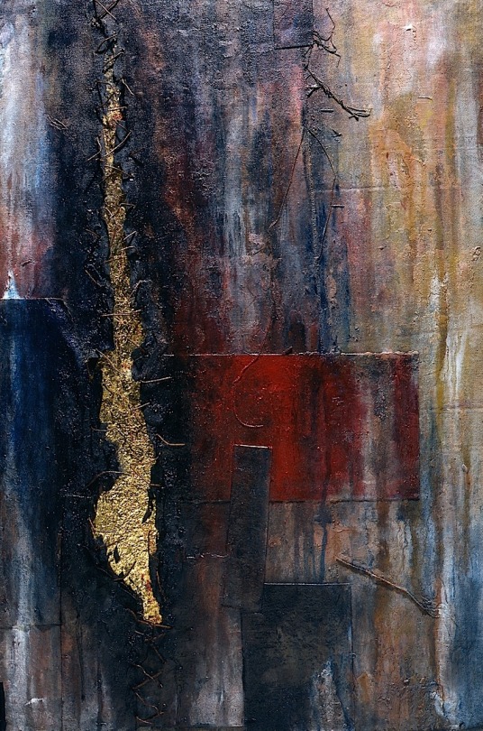


According to Russell Mills, who created the artwork, a live album was also planned as a companion to Closure and artwork was made for it, but the idea was scrapped.
enjoy it
205 notes
·
View notes
Text

So last year I got back into Littlest Pet Shop (2012), a series that I haven't watched since 2015 due to only being able to access it through online uploads.
Still after all those years, I'm still quite fond of it and the characters. Anyway, I had a sketch lying around for an entire year and decided to finally finish the art piece.
Normally I sketch the characters on paper until I understand their proportions and small details, but I was struggling with this. Case in point, this is how I left the sketch a year ago:

I guess attempting to draw other characters during the break helped out a lot.
#littlest pet shop 2012#littlest pet shop#lps 2012#blythe baxter#zoe trent#pepper clark#vinnie terrio#minka mark#sunil nevla#penny ling#russell ferguson
90 notes
·
View notes
Text
Humanarian 🩺
I actually was so obsessed with this show when I was little and I thought this song was AWESOME.
#LPS#littlest pet shop#cartoon art#digital art#cartoon#fanart#80s#retro#sunil nevla#Russell#zoe trent#minka mark#pepper clark#Hasbro#penny ling#LPS Art#mlp
358 notes
·
View notes
Text

loaded indeed my anon mate. but i did do it!


and as a bonus:

#lps 2012#fanart#humanization#vinnie terrio#sunil nevla#zoe trent#pepper clark#russell ferguson#penny ling#minka mark#blythe baxter
97 notes
·
View notes
Text


NIИ | Closure VHS | Halo 12 | Released on November 25, 1997 | Directed by Jonathan Rach & Jeff Richter | Package by Gary Talpas | All Paintings by Russell Mills | Photography by Andrew Morris | Nothing/Interscope
#nine inch nails#nin#trent reznor#robin finck#chris vrenna#charlie clouser#danny lohner#james woolley#closure vhs#self destruct tour#further down the spiral#94 96#jonathan rach#jeff richter#gary talpas#russell mills#nothing records#interscope records#halo 12#1997#andrew morris#photography#album art#cover art#vhs tapes#post industrial#industrial metal#industrial#electro industrial#industrial rock
53 notes
·
View notes
Text
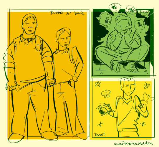
bullies in junior high
#bully game#bully scholarship edition#bully rockstar#russell northrop#wade martin#troy miller#trent northwick
134 notes
·
View notes
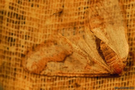
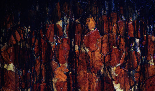
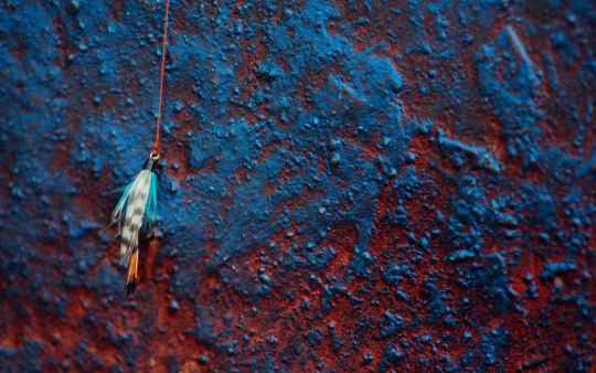
Photo

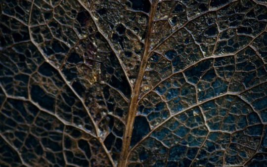
The Downward Spiral (1994)
#behind the scenes#music#art#album art#90s#russell mills#nin#trent reznor#nine inch nails#the downward spiral
2K notes
·
View notes
Text

Mrs. Twombly adopted two dogs for the camp! After a while, Blythe finally got used to the chaotic children.
(The papa dog is nowhere to be seen, the kids say he is flying, but hes actually barking at passing planes-)
#russell ferguson#sunil nevla#vinnie terrio#zoe trent#minka mark#pepper clark#penny ling#blythe baxter#littlest pet shop 2012#littlest pet shop#lps 2012#lps art#lps#swap lps au#swap lps au ig?
49 notes
·
View notes
Text

fitting in 😝‼️‼️ (Little lps human designs)
#lps 2012#so silly#russell ferguson#sunil nevla#vinnie terrio#minka mark#penny ling#zoe trent#pepper clark#erm#sugar sprinkles#buttercream#(sundae ;-;)
71 notes
·
View notes
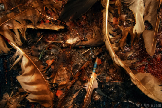
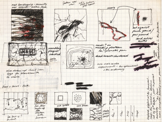
Text


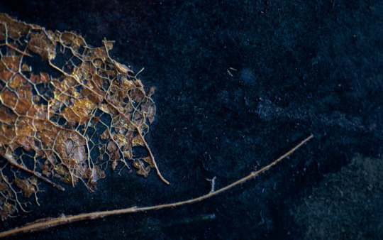
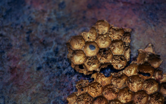
Another beautiful work scrapped for TDS, called: "Liquid History" was made towards possible use on the Nine Inch Nails' seminal Downward Spiral release of 1994.
168 notes
·
View notes
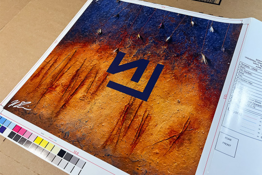
Text
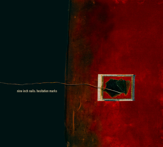
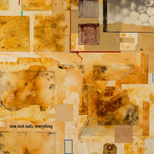
Hard to believe it’s been 10 years since Hesitation Marks, the last NIN album I worked on. The great Russell Mills (who did the iconic artwork for The Downward Spiral) returned to create new paintings for this album. I took macro photographs of the paintings in the same way I did for the 10th anniversary deluxe package of The Downward Spiral, finding little moments in all the incredible details and textures of Russell’s massive physical pieces.
I wrote an extensive breakdown of the album's art and design process on my Patreon. It covers a lot of topics: Working with Russell Mills, channeling NIN design decisions of the past, the typography of The Downward Spiral, the concept behind the minimal NIN logo, David Carson and the design philosophies of what isn't shown, photographing Russell's artwork, and spending months living in "a surreal, claustrophobic warehouse of dead things and old blood."
Below are some of my photography from the interior package, alternate cover and single designs, and a couple photos of original printer proofs from the production of the album.


#rob sheridan#nine inch nails#nin#hesitation marks#the downward spiral#trent reznor#russell mills#album design#design#photography#macro photography
205 notes
·
View notes
Text


At first I just wanted to draw Zoe's and Vinnie's winter outfits and now they are in love. I'm not entirely sure how i got here.

#i went through like 20 versions of the punchline for the last panel.#this is the best i could come up with#art#octo's art#artists on tumblr#lps 2012#littlest pet shop 2012#vinnie terrio#zoe trent#russell ferguson#Zinnie#that's their ship name apparently
47 notes
·
View notes
Text

Edited them with drawing over and lots of liquify. Only major changes, design-wise, were giving Russell a tie and changing Vinnie’s stripe colors.
#pristelle’s artwork#lps 2012#fanart#humanization#vinnie terrio#sunil nevla#zoe trent#pepper clark#russell ferguson#minka mark#penny ling
54 notes
·
View notes
Last Seen Blogs

mahesh13000blr-blog
Untitled

isleepwell
someone who sings songs

btssimsbullshittery
BTS Sims Bullshittery

biglipwifefan
Hairy Ladies Fan
samalpuritee
SamlpuriTee