#ui-bar
Explore tagged Tumblr posts
Visit Tumblr Blog
Explore Tumblr blogs with no restrictions, modern design and the best experience.
Last Seen Tumblr Blogs


Fun Fact
Kazakhstan’s Minister of Communications and Informatics has blocked the Tumblr site because it contained 60 sites of terrorism, extremism, and pornography in 2015.
Text
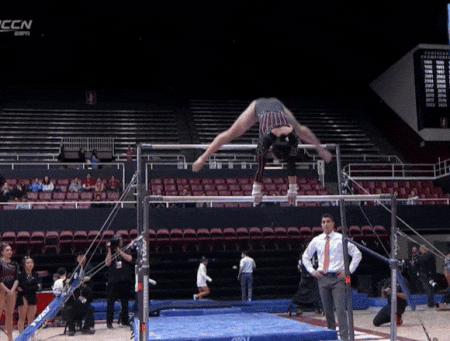
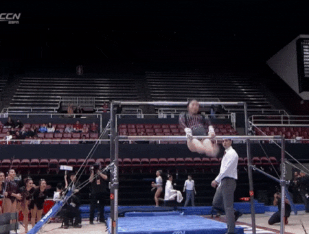
Ui Soma puts on a handstand clinic during her career high 9.925 bar routine
57 notes
·
View notes
Text
fuck i miss when video games had ui elements that didn't always overlap each other
#listen call me 'you need glasses' but i liked when zelda had the black bar hud#i wanna see stuff i keep instinctively trying to lean around random stuff overlaying my ui
22 notes
·
View notes
Text


I'm cooking. I'm cooking
#ghost bar ocs#my art#i think this is a cool ui placement im just not good enough at coding to make everything flow good#cause if there's no glenncon (glenn icon) there there's just a void#i think my next test is gonna be the menu screen. and getting movies in this thang so i dont have to rely on 3 frame loops for the animatio#caleb rambles
78 notes
·
View notes
Text

my take on the lethal company UI
#rz-doodle#lethal company#i like the vanilla UI but i wish it communicated certain information a little differently#i think the way i did the stamina bar is kinda cluttered though idk
209 notes
·
View notes
Text
I FIGURED OUT HOW TO MAKE A MENU. ITS SO OVER FOR YALL
#yall have no idea how long this took#ive been CHEWING on this since january#know all about story menu. ui bar. side bar.#no one. cared to tell me it was just A NORMAL PASSAGE to add#i stay winning#is it lowkey embarrassing that it took 4 months to figure it out?#no. it falls in line with everything.#if i dont get EXACT instructions I will fail at the task continuesly#or at least for 4 months
11 notes
·
View notes
Text


#tumblr#tumblr update#ui#why every time I open this app the bar at the bottom gets worse‽‽‽‽#staff#tumblr stuff#tumblr staff
13 notes
·
View notes
Text
also no judgement but uh why is tumblr round? Early april fools joke or???
#girl stop chaning the UI#back in my day the side bar used to be on top and everything was boxy and the dash was a different shade of blue#“ok grandma let's get you to bed”#hellsite
8 notes
·
View notes
Text
once you work in ui for a little bit you start to see ui Things that make you feel like crawling into your screen, finding whoever wanted that, and making them use their own fucking application.
my most hated ui features: when the dimensions of the screen are different depending on if you have a keyboard visible. too many times i have minimised the keyboard and tapped on something, only for the screen to update as I'm tapping, so i select exactly the wrong thing
things that havent been considered for mobile vs browser use. you cant hover on mobile. update your fucking side panel to be one tap open one tap close, i cant see your options
when the button that means "confirm/send" or "delete" switches side within an app (tumblr, why is "discard" on the left when you exit a post draft but on the right side when you exit an ask???????)
confusing icons. text is not the enemy. how am i meant to know what 📝 means in this context?
#the ui on mobile is the least intuitive thing ever#theres one ui at work that i am forced to work in and i hate it so much because the nav bar is like#you spend 90% of your time in one section and its hard to navigate within that section!!!!#but the template is approved so i can't even suggest anything new :((((
13 notes
·
View notes
Note
revisiting hollow bastion in an attempt to take some nice shots and not only does the UI clog everything up, donel and goofer are constantly putting their big snouts in the frame. i have so much respect for what you no doubt endure for your impeccable gifs
I'm laughing because YEAH this is what I have to deal with... Every single time. At least this area is spacious and I can reposition myself easily but getting a clean shot from within a tiny room? Forget about it
#at least donald is short#but yeah it's a pain!!!#do you know how awful it was to try and get shots of the traverse town hotel? do you have any idea#and yeah the ui can be annoying to deal with. i had to remove so many items to decrease our hp bars#it's nice to get some recognition though haha i'm sorry you gotta deal with this too. good luck
70 notes
·
View notes
Text
Windows Vista - shell32.dll, icon 16752
136 notes
·
View notes
Note
heyy, i am the anon of the last ask, and i was referring to adding a background image to the sidebar. sorry for the confusion😅
Ah okay! I use Twine Sugarcube to code, so this won't work for any other story format. You can easily add a background image to the UI bar by adding something like this in the stylesheet:

Here, the background-image is where I'll add the source for the background image I want to include in my UI bar. You'll need to figure out media queries because different screens will display the image differently depending on the size of the image you're using.
I cheated because I didn't want to go through learning about media queries and just used a huge background image (think desktop wallpaper size) and because it was an image that I didn't really care how it appeared on different screens, it worked out fine for me.
In this example, I'm using a local folder/location for my images because I didn't want to rely on an image hosting site to do that, you'll just have a folder within your game folder named images (or whatever you want it called) and that's where you will add your background image for your UI bar.
So if your images folder is called pics and your background image is called bg_image.png, you will add something like this within your stylesheet:
#ui-bar: { background-image: [img[pics/bg_image.png]] }
In my example, I've added a background colour as well, in case the image fails for whatever reason and I've also added other properties to style the way I wanted the image to look. You'll need to fiddle around with it a bit to see what works best for you, but there is a high chance if you're looking for a specific format for your picture, you're going to need to use media queries especially if the game is going to be played on different devices such as phones and desktops.
I hope this helps you and if you're still confused, please feel free to send in another ask/message!
27 notes
·
View notes
Text
i would just like to talk to tumblrs ux designers about the app design, because why the hell did they place the "create post" button in the bottom right. there is no need for that to be in the Thumb Zone. no one makes new posts often enough for that button to have to be so accessible. all it does is make me crazy because when i scroll, i constantly hit it by accident and the "create post" pop up, well, pops up and i have to close it and it actually drives me a bit insane
#just remove the community button and put new post button in the middle of the nav bar#like instagram#it works#ux design#ui design#stina.txt#it is kinda satisfying to drag it around tho#but it's so annoying to click by accident
4 notes
·
View notes
Text
Is it just me or is the Trails Through Daybreak menu/combat UI incredibly over designed?
#trails through daybreak#cold steel had it perfect!#kuro’s ui just feels really difficult to parse and see what’s happening#and the less said about what they did to the combat turn order bar the better#HOW DO YOU MESS UP A COMBAT TURN ORDER BAR!
13 notes
·
View notes
Text
wait... did. was the option to make posts at the top of the feed removed??? while i was streaming???
#rubys clown thoughts#the full bar isnt there anymore. just the ui thats next to the search bar and the ''make a post'' button#BTW i am using old tumblr dashboard stylus layout. never gonna switch over to the new layout#i am also talking about desktop btw if ur on the app ignore this
11 notes
·
View notes
Text
i hate you new one ui update, why did you have to do this to me
#one ui#samsung#neo.txt#rant#i spent a solid hour fixing shit aaaaaa#and had to download a seperate samsung app to revert some of the home screen changes because why would that be included in the base settings#also the search bar is in the bottom of the app screen now which is horrendous#i hate it here
6 notes
·
View notes
Text
its amazing how much every tweak to the icons pisses me off so much
#boy put me back of square right now#im glad they're big again [or at least glad for it on the top bar for the immediate reblogger]#but having EVERY icon on the chain be that big is so annoying. and the new ui arrangement around it is incredibly ugly#also the elements dont all work properly on themed posts now#and moreover GIVE ME THE OPTION FOR SQUARE BACK. I DREW THIS. TO FIT IN A SQUARE. IT LOOKS GROSS IN A CIRCLE!!!!
3 notes
·
View notes