#usc libraries special collections
Photo

“Please take me. I am a good kitty. My name is Tiger. I don’t eat much either. Thank you.”
Los Angeles Examiner, March 14, 1952
#cats#cat#1950s#vintage#photojournalism#50s#vintage cats#los angeles#old los angeles#photography#black and white#los angeles examiner#photo restoration#~(=^–^)#usc libraries special collections#exm-n-9512-044~1#uc11702444
3K notes
·
View notes
Photo

Dancer Charged with Mayhem. August 4, 1951.
Juanita Hardy, alias Christine Marlow, photographed in police custody relating to a fracas backstage at the Embassy Club, North Las Vegas, which started with a missing $20 bill, and ended with Marlow gnawing off the ear of fellow dancer Doreen Manos.
“Stripper to Face Mayhem Charges.” Review-Journal, 9/22/51. Photo: USC Libraries Special Collections.
206 notes
·
View notes
Text
Headcanons I have for Sarina Bhonsle.
She was born and raised in Southern California.
Bhonsle is pronounced bons-lee. (One of the DnD guys in "And some Dude Named Jeff" pronounced it bon-sel. But I think he'd only seen the name written and was using spelling pronunciation and not the correct pronunciation.)
In high school, she went through a western movie phase. She still has a small DVD collection of her favorite movies.
She was on her high school's yearbook committee.
She worked as a hostess during high school.
She attended USC Annenberg in Los Angeles. She got a Bachelor's degree in Journalism and minored in Justice, Voice, and Advocacy. She then got her Master's in Specialized Journalism (Arts and Culture)
She wrote for her college newsletter.
During college she worked at a photography store.
After college she continued living in LA.
She was an arts and culture journalist.
She fiddles with her rings when she's nervous
While doing a piece on a local art gallery, she uncovered that it was a front for an art forging and smuggling ring. After which she became an investigative reporter.
She moved to Portland, Oregon to write for The Oregonian.
She enjoys french press coffee.
She collects novelty mugs.
She saw the ley lines (supercharged by Prospero) which started her on the path to investigating magic.
She's a self taught hacker.
She's Indian-American with Pakistani heritage. Most of her family came from the Indian state Maharashtra.
She has a lotus tattoo on her sternum.
She's won five prizes in journalism. Three in arts and culture journalism and two in investigative journalism.
She was once a finalist for a Pulitzer.
Her parents died in a car crash when she was in college.
After getting fired from The Oregonian, Sarina began a blog to write about The Library, D.O.S.A, and her investigations into magic. After meeting Jake she takes down the blog.
She has trouble finding a new job after the team building camp shut down. She eventually gets a job at Portland Monthly Magazine and gets back in to arts and culture journalism.
She's claustrophobic.
She's fluent in French and she spent a semester abroad in Paris.
3 notes
·
View notes
Link
https://www.blogtalkradio.com/themotherloveshow/2024/04/10/waide-riddle Meet the award winning Author, Poet, Screen Writer and some more else stuff with Mother Love
0 notes
Text
Academic Archives
After the first season of this popular horror fiction podcast things go a little off the rails, but the premise of the first season is fairly simple: Jonathan Sims, head archivist for the archives at the Magnus Institute, is making audio recordings of a collection of supernatural testimonies collected by researchers of the strange and unusual. He claims the archives are rather ill maintained by researchers too caught up in academia and attempts to digitize the written testimonies by recording himself reading them all.
Academic archives can be administrative, special collections, and/or results of research like at the fictional Magnus Institute. Once you turn 18, in the U.S. your university cannot release any records about you to anyone, not even your relatives, without your consent under the Family Educational Rights and Privacy Act (FERPA). When you think about it, your university typically has a lot of information about you. Your financial status for your financial aid and scholarship applications, your citizenship status including your state residency, your parents' educational backgrounds, every grade you've ever earned, and if you've ever used campus counseling resources they could even have sensitive mental health issues on file. These are just a few examples. Some jobs or internships may require a transcript, but no parent, employer, or landlord can contact your school and demand to see your grades or anything else about you thanks to these privacy acts. Jonathan Sims' audio transcripts being aired online as a podcast might be breaking some privacy acts, but oh well. The Magnus Institute has bigger issues going on. The Magnus Archives (the podcast itself, not the fictional institute) has an archive too containing transcripts of all the episodes here.
Many academic libraries also hold special collections, which are often technically archives even if they're under a library heading. Sometimes, archives struggling with funding or location can benefit from partnerships with academic institutions. One such example is the ONE Archives, the largest and oldest LGBTQ+ archive in the U.S., which was absorbed into the University of Southern California library in 2010 following struggles with funding. Becoming part of USC (a private university) provided a stable budget as well as access to appropriate facilities to preserve analog materials as well as digitize items from the collection. However, universities in America are massive bureaucratic institutions often steeped in whiteness and imperialism. It is not guaranteed that being swept into an institution like this (especially when public universities are subject to state governmental funding allocation) is universally beneficial to all archives.
1 note
·
View note
Text
January 27, 2023
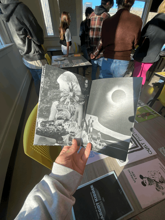
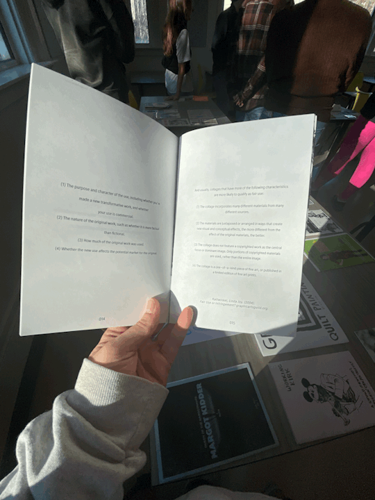
This was a special week—USC’s SVAD had the privilege of hosting the multi-talented illustrator & educator Kate Bingaman-Burt. She brought a library of zines, a super cool collection of supplies like washi tape and Crap Hound magazines, and a great enthusiasm for teaching and storytelling. Kate kicked off her tour of Columbia with a full dive into her zine workshop on Monday. We spent the better half of the day browsing her zine library, creating our own, and then reproducing our creations. Her traveling library was impressively big for it to be the traveling collection! One that caught my eye was a B&W zine; it was amongst a sea of loud and colorful designs, yet it stood out. As a mini case study on the copyrightability of collages, I was immediately super interested in the topic. But also, there was a simplicity that I really admired—I’m including images below. Type was handled in a light and airy way, while the collaged pages were intense and bold which created a lovely juxtaposition as I turned the pages.
Another composition that caught my eye, but for a different reason, was an informative zine comprised of weird facts about Chuck-E-Cheese. It was absurd, hilarious, and ridiculous in all the best ways. I laughed so much while reading through it and my favorite pages are the two shown below.


While the first zine gave me a beautiful example of how to handle type and imagery, the second zine gave me permission to be more ridiculous and carefree when I create. The look of a clean aesthetic is so appealing to me, but it has proven in the past to limit my ability to think outside the box. So even though I gained different insights from these zines, I gained so much inspiration from both. I took to creating my own zine once I got inspired from browsing Kate’s collection. My first composition was based on a recipe that has been at the forefront of my mind lately—egg custard pie that came from the Joy of Cooking, but I associate it with my grandmother because I’ve literally never met another person who has made/consumed it. The zine that became of this recipe was a how-to guide on making the pie. And, to provide context, it also became a small introduction to my grandmother. I thoroughly enjoyed making it, and reproducing was just as good because of the repetitive, meditative nature of the process. On day two of Kate’s visit to the school, I could only catch the very last hour of her workshop because of work, but I was able to compose another zine. I approached this one with a much more carefree attitude than I did the day before because time was of the essence, and I was just in a sillier, goofier mood. Pulling entirely from Kate’s Crap Hound magazines, I created this nonsensical zine using cutout imagery and then embellished with some washi tape, googly eyes, and caution tape. To my surprise, I much prefer my quick, out-of-context zine over my sentimental and well-thought-out zine. This feels like a testament to the notion that I need to be less careful in my art. I pasted the flat of the weird zine in my sketchbook as a reminder of this experience and the conclusion it led me to.

As a conclusion to her time in Columbia, Kate spoke at the Museum of Art Tuesday evening and it was a treat to attend. She provided insight into her business and, ironically, talked a good bit about her grandmother. Her relationship with art was based heavily on the way her grandmother worked, which was maximalist and colorful. However, I found it very interesting to hear that Kate was not always such an avid illustrator. Instead, her relationship with illustration has been a slow-burn from really not liking it at all, to forcing herself to do it as punishment for racking up credit card debt, to maybe not hating it completely, to finding herself actually enjoying it, to where she is now as a prolific illustrator and educator on the topic. Some advice I took really seriously was that there is no better way to improve other than to keep creating, and there is nothing stopping me from creating except my own inhibitions. Since her talk, I have picked back up a neglected sketchbook and started making marks with one of my favorite utensils (a bright Posca paint pen) to give myself an opportunity to simply enjoy putting marks on a blank page. I ended up hating what I drew, but the practice was impactful, and I felt the tiniest bit more creative than I had before so it was effective. I got some souvenirs from Kate’s visit to commemorate the experience—here they are pictured below.

I feel very grateful to have been given these opportunities to interact with and learn from Kate. She is, to put it plainly, an inspiration.
1 note
·
View note
Photo
Cat belly. Al'manakh, no. 1. 1906. Russian satire journal.
USC Libraries Special Collections
193 notes
·
View notes
Photo


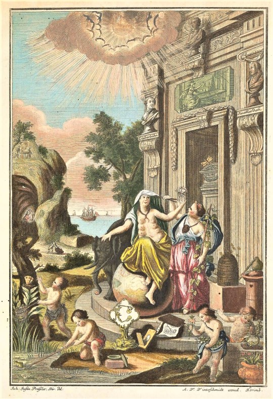
Summer Series: The Spectacle of Nature: Illustrated Natural History Books
This summer in preparation for my final year as a UW-Milwaukee History Masters student I am undertaking an Individual Study overseen by head of UWM Special Collections, Max Yela. For years now I have been fascinated by the visual representation of nature in books, especially the proliferation of images produced during the 19th century when new printing methods such as lithography and wood engraving became popular. The Victorian period is also the time when natural history study became a suitable activity for women and children, and not just networks of wealthy “gentleman scientists.” My thesis will be about the popularization of natural history during the 19th century in Europe and the United States and how books containing illustrations of plants and animals contributed to that.
To get a better sense of the scope and history of scientific illustrations, I am spending this summer researching some of the earliest known natural history books. This is largely inspired by a week-long course I took with the California Rare Book School in the Summer of 2019 on “Illustrated Scientific Books in Early Modern Europe” taught by University of Southern California Art History and History Professor Daniela Bleichmar. That course provided a foundational knowledge about the role that images play in the production of scientific knowledge. Illustrations can also be religious, allegorical, emblematic, and political. This summer I will be researching the interplay between the history of science and the history of the book. Starting with medieval bestiaries and herbals in the manuscript tradition and working my way through some of the earliest printed scientific books of the 16th to 18th centuries. I am going to be utilizing materials within the UWM Special Collections, the American Geographical Society Library, and other local libraries to deepen my understanding of the role of images in natural history books.
Today I am highlighting illustrations from some well-known natural history books to get started!
List of Images:
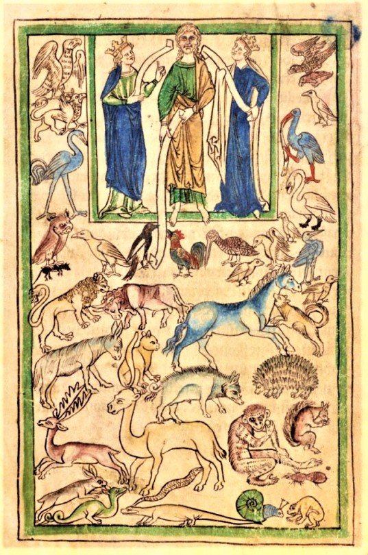
1. Bern Physiologus, 9th-century illuminated copy of the Latin translation of the Physiologus, a text that was originally written in Greek by an unknown author in Alexandria sometime between the 2nd -4th century CE. It is a didactic Christian text that describes the moral and symbolic meaning of various plants, animals, and mythical creatures and is thought to be the predecessor and inspiration to medieval bestiaries. Image courtesy of Wikipedia Commons.
2. Adam Naming the Animals from the Northumberland Bestiary, about 1250–60, English. The J. Paul Getty Museum, Ms. 100, fol. 5v. Digital image courtesy of the Getty’s Open Content Program.
3. Reproduction of Albrecht Dürer’s Rhinoceros. This is a copperplate etching from our copy of Gaspar Schott’s Physica Curiosa, published in 1662. Dürer's Rhinoceros was originally a woodcut made in 1515 based on a written description and sketch of an Indian rhinoceros. It became an iconic image that was copied and included in many published books, including Conrad Gessner’s Historia animalium.
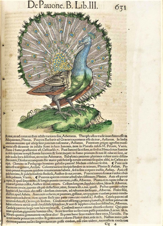
4. Hand-colored woodcut of a peacock from Conrad Gessner’s Historia animalium published 1551–1558. Image courtesy of U.S. National Library of Medicine’s online collection “Historical Anatomies on the Web.”
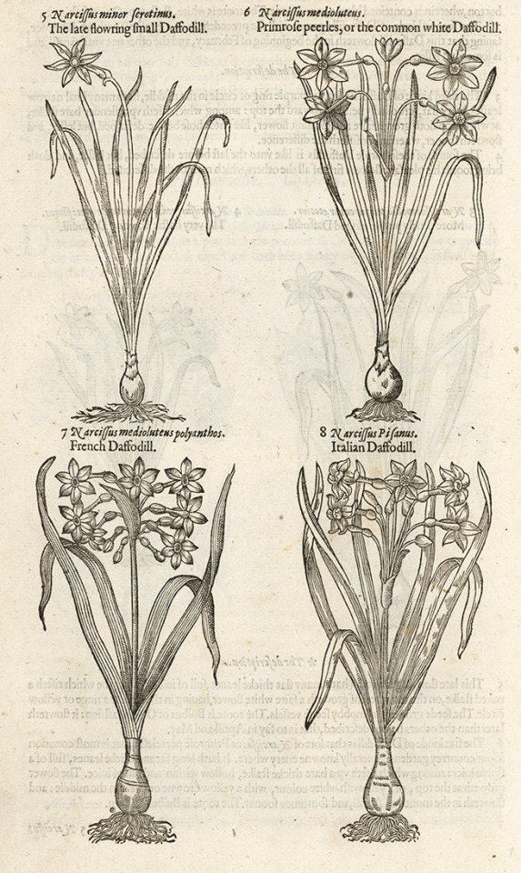
5. Daffodil (or Narcissus) flowers from our copy of the 1597 printing of John Gerard’s The Herball, or, Generall Historie of Plantes.
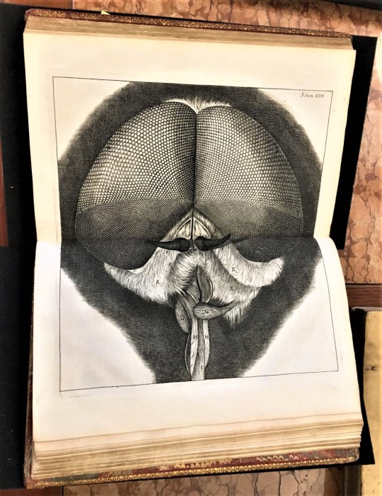
6. Head of fly from Robert Hooke’s book Micrographia: or Some Physiological Descriptions of Minute Bodies Made by Magnifying Glasses, with Observations and Inquiries Thereupon, published in 1665. This is a photograph I took of USC Special Collections copy.
7. Illustration from Maria Sibylla Merian’s Metamorphosis insectorum surinamensium, first published in 1705. Image from the Biodiversity Heritage Library’s digital copy.
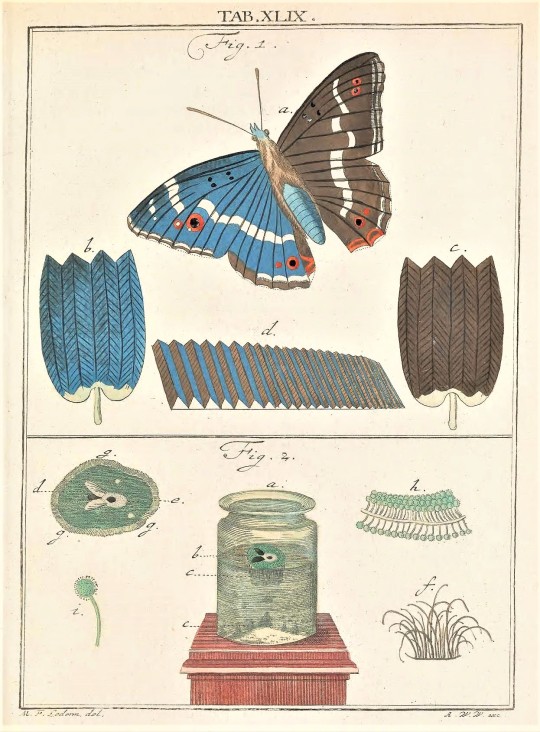
8.-9. Allegorical title page from Amusement microscopique tant pour l'esprit by Martin Frobenius Ledermüller, published 1764-1768. Illustration of a butterfly and what its wings look like under a microscope. Images from the Biodiversity Heritage Library’s digital copy.
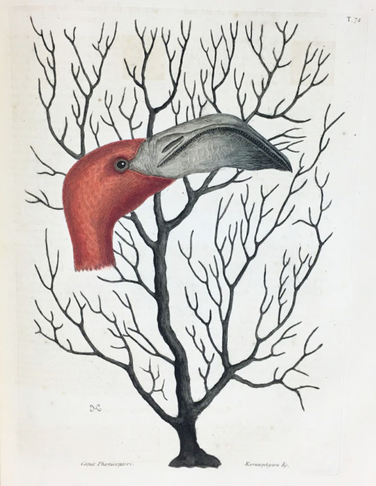
10. Flamingo from Mark Catesby’s Natural History of Carolina, Florida and the Bahama Islands. Catesby taught himself to make the engravings for the book, based on his original drawings from out in the field. He created 263 original watercolors as preparatory studies which he later turned into hand-colored etchings. The first volume was completed in 1732 and the second volume was completed in 1743. This is from Milwaukee Public Library’s copy.
I am naming my independent study “The Spectacle of Nature” as a homage to Noël Antoine Pluche’s Le Spectacle de la Nature, a popular work of natural history first published in French from 1732-1750.
–Sarah, Special Collections Senior Graduate Intern
#Summer Series#The Spectacle of Nature#Illustrated Natural History Books#Illustrated Scientific Books in Early Modern Europe#California Rare Book School#scientific illustrations#natural history#plants#animals#bestiaries#bestiary#herbal#Bern Physiologus#Physiologus#Albrecht Dürer#Gaspar Schott#Conrad Gessner#Robert Hooke#Maria Sibylla Merian#Mark Catesby#Sarah Finn#sarah
179 notes
·
View notes
Text
Could Tattoo Ink Be Used to Detect Cancer?
https://sciencespies.com/nature/could-tattoo-ink-be-used-to-detect-cancer/
Could Tattoo Ink Be Used to Detect Cancer?
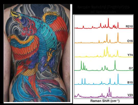
When amateur artist Cristina Zavaleta signed up to take an illustration class with Pixar animators on character design, she had no idea she’d also be embarking on a new scientific study. At the time, Zavaleta’s work as a post-doctoral biomedical researcher in a molecular imaging lab at Stanford involved evaluating contrasting agents, like dyes, used to detect tumors in animals. During her art class, the researcher was struck by the intensity of the colors of gouache, vibrant water-based paints, that her fellow illustrators were using. “They were bringing back these pieces that were just incredible, really rich colors. And I thought, how do you even achieve that color, visually,” says Zavaleta.
That simple question ultimately led Zavaleta, now an assistant professor of biomedical engineering at the University of Southern California, and her colleagues to create a first-of-its-kind library detailing the optical imaging properties of commonly used pigments and dyes, found in everything from tattoos to food coloring. The researchers hope their study will open the doors for the novel use of everyday colorants as imaging agents in medical tests, that may be more effective at early detection of several kinds of cancers.
Currently, only three dyes with fluorescent properties used as optical imaging contrast agents—methylene blue, indocyanine green and fluorescein—are approved for human use by the U.S. Food and Drug Administration (FDA). In diagnostic medicine and in some surgical procedures, imaging contrast agents are materials used to improve internal body pictures produced by X-rays, computed tomography (CT) scans, magnetic resonance imaging (MRI), and ultrasounds. These materials can be ingested or injected and temporarily color targeted parts of the body, like specific cells, organs, blood vessels and tissues, to help clinicians see differences and abnormalities that may indicate disease. Yet, Zavaleta wondered about the significant catalogue of approved food, drug and cosmetic dyes that people routinely encounter in their everyday lives. Are there other imaging agents hiding in plain sight?
youtube
“As my art brain was thinking about these paints [from class], I thought to myself, what paints are already being used in humans?” says Zavaleta. “And a lightbulb went off.”
Tattoos. High quality pigments used in tattooing are made from mineral salts and metal chelates, which have been isolated from natural sources and used by humans for thousands of years.
Zavaleta’s next step was to do her homework, as any good researcher would. She contacted Adam Sky, a tattoo artist in the Bay Area whose work she admired. Sky was interested in her research, and gave her samples of some of the inks he was using, which Zavaleta collected in a well plate, a tray with multiple divots, or wells, that can be used as test tubes, she’d brought along, just in case.
“I immediately took them to my microscope over at Stanford, and I did all these different tests on them,” Zavaleta says. “I was amazed at what I was seeing.”
In a tattoo ink color palette, each color carries a unique spectral fingerprint that can be used as an imaging barcode to better identify and detect tumors.
(Tattoo and design created by Adam Sky)
She measured two optical elements of the inks, their fluorescence properties and Raman properties. Fluorescence relates to a dye or pigment’s capacity for absorption and emission of light, while Raman indicates how light scatters. Both are commonly used in imaging techniques in the cancer field. Highly fluorescent agents offer sensitivity in imaging; very small amounts are needed for them to illuminate areas very brightly. Raman imaging, on the other hand, offers specificity by allowing multiplexing, or the ability to look at several processes happening inside the human body at once. These can help show whether cells or tissues are expressing multiple genes, for example, or expressing one more highly that may be associated with a particular cancer, like HER2 and breast cancer or EGFR with lung cancer. Each of the targets has different receptors that will be illuminated by different agents, and depending on their optical properties, some agents will be better than others.
In all, the researchers evaluated the optical properties of 30 approved food, drug and cosmetic coloring dyes and tattoo ink pigments using a spectrophotometer, an instrument that measures the intensity of light after it passes through a sample solution. Seven of the colorants displayed fluorescence properties that were comparable to or exceeded the three FDA-approved clinical dyes. The researchers next measured the Raman signatures, to see how high the colors’ unique signatures of light photon peaks were, with high peaks being indicative of usefulness in terms of multiplexing. Finally, they tested the best-performing dyes and pigments by injecting them as imaging agents in mice with cancerous tumors.
The researchers evaluated the optical properties of 30 approved food, drug and cosmetic coloring dyes and tattoo ink pigments.
(Cristina Zavaleta)
Data from Zavaleta and her colleagues’ study showed that FDA-approved Green 8 dyes used in drugs and cosmetics have significant tumor targeting potential in mice with cervical and colon tumors, and the Orange 16 pigment found in tattoo inks also showed, according to the authors, promising fluorescent properties and tumor targeting potential. This is significant because, as they note in the study, “no single imaging modality currently meets all the clinical needs of high sensitivity, high spatial and temporal resolution, high multiplexing capacity, high depth of penetration, low cost, and high throughput.” In other words, no single imaging agent can provide all the information a doctor might need.
The USC lab where Zavaleta and her colleagues conducted the research uses nano-based imaging contrast agents, or tiny spherical vesicles that are loaded with the dyes or pigments. While nano-based agents are approved for use as a medium in human imaging, they have been controversial in the past because of potential toxicity. Metallic-based nanoparticles like those made from gold and silver have been known to stay inside the body for long periods of time after exposure. This is one of the main reasons the team instead uses liposomal nanoparticles, made up of biodegradable materials with fatty skins similar to human body cells, that are already used in other applications, like drug and nutrient delivery.
“You can think of it as us having all these different batches of nanoparticles, and one has a different tattoo ink [or other dye or pigment] inside of it. And that tattoo ink has a very special barcode that’s associated with it; every ink has a unique fingerprint, yellow different from red, red different from purple,” Zavaleta explains. “So, if we have all these different flavors of nanoparticles that we can now target to different receptors on tumors, we can enhance our ability to distinguish between different [cancers].”
One use for such materials could be gathering real-time information during a test, such as a colonoscopy, where physicians are visually searching for certain kinds of polyps. Enhanced imaging agents have the potential to also reduce the invasiveness of disease detection and diagnosis, such as the number and size of biopsies needed, by providing more information from a smaller sample.
Christian Kurtis, who made the career change from biomedical researcher at the National Institutes of Health to tattoo artist in Rockville, Maryland, spent his post-doctoral period in a cancer research lab at the Uniformed Services University of the Health Sciences. Kurtis says the specificity these kinds of dyes could offer for imaging is key to better treatment.
“The unfortunate problem with malignant [tumors] is that they comprise a [variety] of molecular markers that may not be present on all cell types. The increased metabolic activity of malignancy is the signature most commonly exploited in imaging, and is the reason these liposomal techniques are effective,” says Kurtis. In other words, because cancer cells tend to spread quickly, researchers and physicians are able to track their growth with imaging. Having multiple types of agents that bind to the different markers would be even more helpful. “In my opinion, it will be personalized or individualized medicine that will hold the key to meaningful early diagnosis of disease,” he adds.
Jocelyn Rapelyea, the associate director of breast imaging and the program director of the radiology residency program at the George Washington University Cancer Center, adds that while tools like molecular breast imaging have been around for a while and help to identify problematic cells before they grow into lumps, advancing knowledge is always a positive. What works well for one patient may not for another.
“It’s always exciting to have the ability to be able to identify tumors at a potentially early stage. It’s quite interesting how [Zavaleta] came to dyes,” Rapelyea says. “This is obviously a model in mice at this point, but it is promising to see that there could be potential of being able to identify earlier development.”
Zavaleta knows the dyes and pigments her team has catalogued in a library will be subject to the FDA’s rigorous regulatory procedures before they could ever be used as imaging agents in humans. “We’re not suggesting in any way that they’re safe,” she says. “We’re saying, ‘Hey, these are dyes that we’re continuously being exposed to on a day-to-day basis. Let’s have a look at them further.’”
#Nature
5 notes
·
View notes
Text
Chapter 6 & 7; Image 7
Chapter 6 describes how typography is “a language of potent visible signs, a language capable of educating, persuading, informing, and entertaining.” The message that typography conveys is verbal, visual, and vocal. The authors of the book describe it as a very “dynamic communication medium” as typography can also be viewed and interpreted visually, and heard and interpreted audibility rather than it strictly being viewed visually. With the creation of works based around the moments of Futurism such as Dadaism, de Stijl, and Constructivism in Russia, the typographic message started to become a “multifaced and expressive form of communication” that needed to be “read, seen, heard, felt, and experienced” by the viewers. The most important role of typography is to ensure that the viewer/reader clearly understand the message that the designer is trying to get across. This designer should try to achieve this by using both logic and intuitive judgement. Typographic signs operate in two dimensions: syntactic and semantic. The author states that “when the mind is concerned with the form of a sign, it is involved with typographic syntax. When it associates a particular meaning with a sign, it is operating in the semantic dimension.” These signs can either be connotative, being drawn from personal experiences, or denotative, the objective meaning or the factual world of collective awareness and experience. I really enjoyed all of the examples of the designs of the typographic signs to actually experience them in order to see just how typography can be viewed visually, verbally, vocally, and can be interpreted audibility. Chapter 7 discuss the evolution of type. Typographic design is closely related to the evolution of type and how it has emerged over the years. When type and typesetting was first invented, it was very difficult to make small subtle changes to the type. There was a whole process to do so and it took time. Type and typesetting have emerged over the years from hand composition, to machine compositions such as the linotype, monotype, and Ludlow, to digital publishing. Once type moved to digital, it became much easier to make these small subtle changes such as type size, leading, kerning, etc. When we visited the Special Collections Library here at USC, I found it very interesting to look and hold and see how type was set back before it was digital.


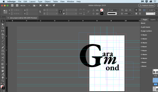
Above are some images displaying my progress with my Zine project. I decided to the typeface, Garamond. The first few pictures are screenshots of the grid and layout that was due. I wanted to do wider margins since I personally like wide margins in works. Since the Garamond typeface is such an air-y and elegant and soft typeface, I wanted the wide margins in order to create a sense of calmness and tranquility throughout my grid. However, I am thinking about decreasing my margins just a bit but not too much so it will still create this sensation. As you can also see from my grid and layout screenshots, I decided to use a modular grid in order to give myself some more freedom to experiment and play around with where I want things to be placed. I have never really used InDesign before, and this was my first time being introduced and using master pages in order to create a book. It did get some taken used to do but once I started doing all the pages, I think I got a good hang of it. I am still playing around with the layout and it more than likely change in some way. Since the typeface itself is elegant and classy, I want to make sure that the layout and design is also elegant and classy like. I am still working on finishing up some of my research as I want to include some body copy and a brief ‘essay’ that describes the history and characteristics and the designer of Garamond. After reading Chapter 6 of the textbook, depending on exactly what my poem is going to be or maybe even for one of my made images I have to create for this typeface, I am thinking about possibly using a typographic sign like those examples shown in the “Verbal/Visual Equations” section of Chapter 6.
1 note
·
View note
Photo
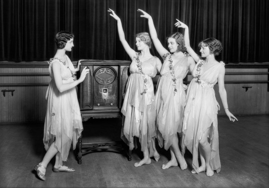
Belcher School of Dancing, Los Angeles, 1929 | Dick Whittington Studio
#dance#1920s#1920s fashion#vintage fashion#vintage#los angeles#old los angeles#ernest belcher#dance studio#belcher school of dancing#dick whittington studio#majestic radios#vintage radio#black and white#photography#photo restoration#usc libraries special collections#dw-1929-08-20-114~04#uc12037952
360 notes
·
View notes
Photo
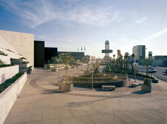
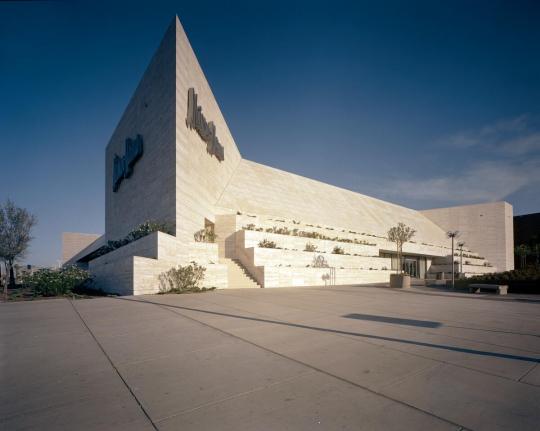
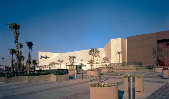
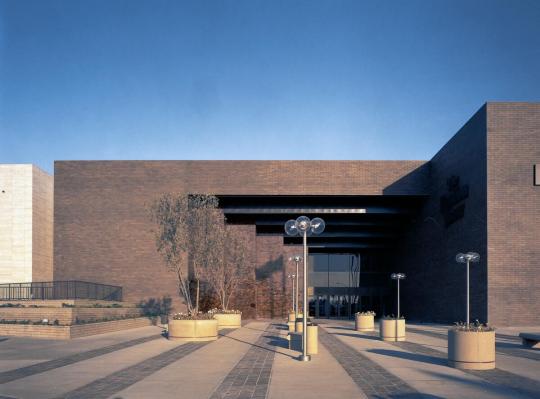


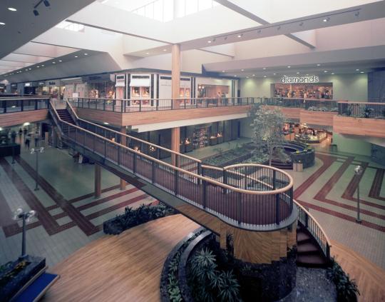
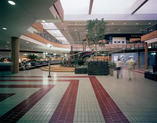
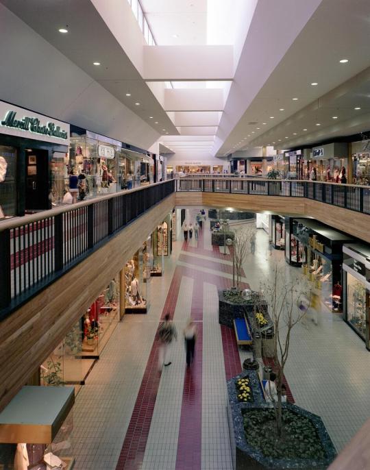

Fashion Show Mall, 3200 Las Vegas Blvd S, Las Vegas, June 1981
Photos by Wayne Thom, USC Libraries Special Collections.
Howard Hughes died owning thousands of undeveloped acres in and around Las Vegas through the holding company Summa Corp. William Lummis, a cousin, one of several court-appointed heirs, took control of the estate in the late 70s and began recasting Summa as a real estate developer. One of their first projects was the Fashion Show mall, developed with builder Ernest Hahn. The mall opened 2/14/81.
691 notes
·
View notes
Photo
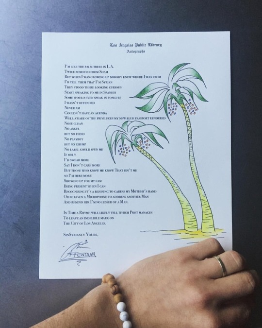
The @lapubliclibrary recently sent me an official letterhead with the simple request to “improve the enclosed page”; thus partaking in a special tradition that has 112 year-old roots in this great city ... This was my humble contribution. ✨🌴✨ Here’s some more information on this thoughtful initiative: “In 1906, City Librarian #CharlesLummis initiated an #autographcollection, soliciting hundreds of notable men and women from across the country to submit a representative expression or artwork to the #LosAngeles Public #Library’s permanent collection. Lummis sent blank stationery out with the call to “improve the enclosed page”, 📜 and received paintings, #poems, speeches, and #music from the likes of author L. Frank Baum, anthropologist Franz Boas, painter James Carol Beckwith, and “America the Beautiful” songwriter Katherine Lee Bates. The collection continued to grow intermittently after Lummis’ request, eventually adding pieces from Langston Hughes, Isaac Asimov, Helen Keller and many others. The library is now re-visiting the #Autograph Collection, asking how to improve upon the city’s many pages. This project culminates in Spring 2019 with a city-wide conversation and a book that will draw from the Autograph Collection to help us think about the culture, history, and politics of the #LA autograph and signature—from sidewalk cement names to murals and street names. Following Songs in the Key of L.A. and To Live and Dine in L.A., this is the third in a series of projects examining and activating the special collections of the #LosAngelesPublicLibrary, 🏛 curated by @joshdkun, author and Director of the USC Annenberg School of Communication.” https://www.instagram.com/p/Bpmn5TNByJ1/?utm_source=ig_tumblr_share&igshid=1vgl71inav3sf
#charleslummis#autographcollection#losangeles#library#poems#music#autograph#la#losangelespubliclibrary
2 notes
·
View notes
Link
@WaideRiddle @themotherloveshow Waide is an award-winning author, poet & filmmaker, and is a proud member of SAG-AFTRA.p://tobtr.com/s/12297526
0 notes
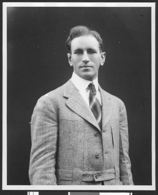
Photo

F. W. Teschke Corp 1930 Contractors [Photo taken by Esotouric this month in advance of their webinar “Know Your Los Angeles County Poor Farm / Rancho Los Amigos (1888-?). I couldn’t get this research done ahead of time, but check out their upcoming webinars!]
It’s possible this F.W. Teschke was the Frederic (without a K) W Teschke born around 1886 in New Jersey and, as of the 1940 Census, lived at 1502 Ogden Dr. in Los Angeles, CA. If so, he was married to Sarah Teschke and had a daughter named Diana and a stepson named “Taft Sherman Taft.” Interesting name! Also possibly the connection to the “Taft Realty Co.” mentioned later and a vote in the we-have-the-right-Teschke box.
A Frederick (with a K) W. Teschke was listed as a second lieutenant in the Engineer Officers’ Reserve Corps who was assigned to active duty during World War I (”Reserve Corps Officers Assigned to Active Duty,” The Official U.S. Bulletin: Saturday, October 6, 1917, pg. 6, Committee on Public Information, 1917). Also shown without a K in his name as “attached to the 8th engineers, El Paso, Tex.” as a second lieutenant (Army-Navy-Air Force Register and Defense Times, Volume 62, 1917).
He lost a bid for work on an around 6-mile state highway in Orange County (Southwest Builder and Contractor, p. 23, F.W. Dodge Company, June 9, 1922).
He was awarded the contract for paving over two miles of highway through Banning (Southwest Builder and Contractor, Volume 60, Issue 1, Parts 1-13, 1922) including a “16 feet by 5 inch concrete base, 7 inch alt. edges” with materials furnished by the state (Electrical West, Volume 49, McGraw-Hill Company of California, 1922).
Here’s a chart that shows Teschke winning a contract because of having the lowest bid (Western Highways Builder, pg. 35, September, 1922):

Fred W. Teschke was issued S. license number 6289 on January 1, 1925 in Los Angeles (Directory of Brokers and Salesmen, Volume 6, p. 359, California State Real Estate Division, 1925), listed as “with Taft Realty Co.” (I assume he was working for them in this capacity). S is a Salesman license.
Fred W. Teschke, Jr. was a “Special Student” (?) “candidate for the degree of S.B.” and listed as also being from New Jersey (Newark) (University of Southern California, “Catalogue of Students: The College of Liberal Arts,” Year-book, p. 322, Daily Herald Book and Job Printing House, 1912). I think it’s possible that the contractor Fred was this Jr. because the years work pretty well. Maybe he was “special” in that he was also the Freshman Football Coach by 1915 and looked like this then (USC Libraries Special Collections):
1 note
·
View note
Photo

“Buildings on a road.” Philippines. n.d.
USC Libraries Special Collections
126 notes
·
View notes
Last Seen Blogs
ntrlily
consider maybe donating blood if you can

juicy-matthews
no. your feelings are injured, bro
bigdaddytjj
TJJJ

jarmes
Contrarian Anarchist Dipshit
narnina
welcome to the other side