#visualelements
Explore tagged Tumblr posts
Visit Tumblr Blog
Explore Tumblr blogs with no restrictions, modern design and the best experience.
Last Seen Tumblr Blogs


Fun Fact
Forty percent of Tumblr users are between the ages of 18 to 25.
Text
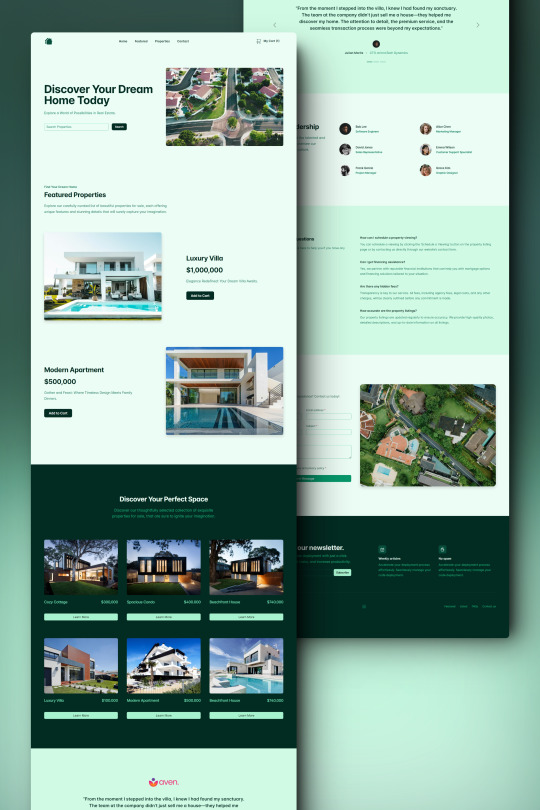
Properta - Real Estate HTML Landing Page Template
Properta is a real estate template offering a blend of elegance and functionality. Its responsive design and SEO optimization ensure a standout online presence, attracting clients effectively.
Live Demo
Buy Now
#RealEstateTemplate#ModernDesign#ResponsiveLayout#RTLsupport#EasyCustomization#W3CValidated#CrossBrowser#LatestTechStandards#OngoingSupport#AccessibleRealEstate#SEOoptimized#FastPerformance#SocialMediaIntegration#SCSSCustomizable#InteractiveAnimations#UserExperience#VisualElements#FAQSection#MailchimpIntegration#TestimonialsSection
2 notes
·
View notes
Text
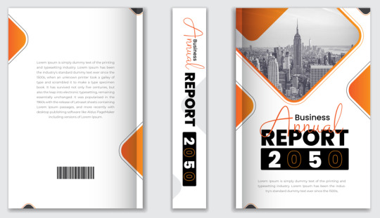
The Art of Design: Avoiding Common Mistakes in Book Cover Aesthetics
Book Cover Design Mistakes: Frequently Asked Questions Explained
1. What are the most common visual elements that can lead to an unappealing book cover?
Common visual elements that can lead to an unappealing book cover include poor typography, cluttered layouts, mismatched color schemes, low-quality images, and overused clichés. Additionally, covers that lack a clear focal point or do not align with the book's genre can also detract from their appeal, making them less attractive to potential readers.
2. How does the misuse of color in book cover design impact reader perception and marketability?
Misusing color in book cover design can lead to misalignment with the book's genre or tone, confusing potential readers. This can diminish marketability, as colors evoke specific emotions and expectations. An ineffective color scheme may result in lower sales, as readers might overlook the book or feel it's not for them based on its cover alone.
3. What role does genre consistency play in book cover design, and what mistakes do designers often make that lead to genre confusion?
Genre consistency in book cover design helps readers quickly identify the book's category and target audience. Designers often make mistakes by using inappropriate colors, fonts, or imagery that don't align with genre conventions. For example, a whimsical font for a thriller can create confusion, leading potential readers to overlook the book or misinterpret its content.
4. In what ways do color schemes influence a book's appeal, and what are some trending color mistakes that could alienate potential readers?
Color schemes influence a book's appeal by evoking emotions, setting the tone, and attracting specific target audiences. Trending color mistakes include using clashing colors, overly dark palettes that obscure details, or designs that don't align with the genre. These can alienate potential readers by making the book look unprofessional or confusing, detracting from its content and message.
5. What are the most common visual elements that authors overlook when designing their book covers, leading to ineffective marketing?
Authors often overlook font choice, which can affect readability and appeal. They may neglect the importance of color schemes that convey the book's tone. Additionally, a lack of clear focal points can make covers visually cluttered. Lastly, failing to align imagery with the genre can mislead potential readers, ultimately hindering effective marketing.
Visit: VS Website See: VS Portfolio
0 notes
Text
IconAdda- Free system, media icons
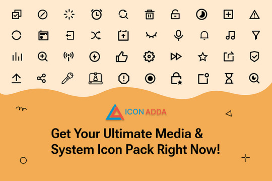
IconAdda, a library providing free system icons and media is available for every digital project-one that can come in handy especially for websites and apps, all the way down to UI and UX design with all of the above being utterly free to utilize.
For Free System and Media Icons, Why Pick IconAdda? 1. Adaptable and Contemporary Designs Media icons like play, stop, volume, and camera are some of our choices, as well as the system icons that include settings, notifications, and file management. The goal of these icons is to make both look and feel better.
2. Richer and Extensive Visuals All icons are designed professionally and provided in SVG, PNG, and more to ensure the high quality and ease of use for a variety of print and digital works.
3. Completely Royalty-Free Icons IconAdda is a source of royalty-free icons; you may freely use them for all your personal and professional work without any form of limitation.

How Can I Use Media Icons and the Free System? Website and App Interface: Make more use of interactive and simple graphics for better interface/ user interface and user experience. Infographics and Presentations: Utilize illustrative or educative characters for enhanced visions Software Interface: Make their user interfaces for better usability on the internet platform
Get FREE Media and Systems Icons Today!
Check out IconAdda for free media and system icons. Add the best premium icons to your designs today at IconAdda !
#SystemIcons#MediaIcons#UIUXDesign#FlatIcons#LinealIcons#TechIcons#DigitalAssets#IconPack#MinimalIcons#DesignResources#MediaGraphics#WebDesignIcons#AppIcons#SmartDesign#ModernIcons#CreativeUI#InterfaceIcons#EssentialIcons#TechDesign#VisualElements
0 notes
Video
youtube
(via Divi: The Beginner’s Guide to the Fantastic Blurb Module)
Embark on your journey into the captivating world of web design with our comprehensive guide, "Divi: The Beginner's Guide to the Fantastic Blurb Module." Tailored for newcomers to the Divi theme, this blog post serves as your gateway to mastering the art of the Fantastic Blurb Module. From desktop to tablet and mobile, we'll navigate the intricacies of crafting visually stunning elements, ensuring your website captivates users on every device.
0 notes
Text
Dune, de Jodorowsky (2013)
Dune, de Jodorowsky pudo cambiar el cine para siempre. Su ambición y visión dejaron una huella que todavía influye hoy. #Dune #Cine #Jodorowsky
¿Cómo Dune, de Jodorowsky pudo cambiar el cine para siempre? Índice:El sueño más ambicioso del cine que nunca se realizóEl origen de un proyecto visionarioEl equipo de los sueños: arte y revolución visualEl elenco soñado: Dalí, Jagger y másLa caída de un sueño: la lucha contra HollywoodEl legado de DuneDune, de Jodorowsky El sueño más ambicioso del cine que nunca se realizó La historia detrás…
0 notes
Link
0 notes
Link
1 note
·
View note
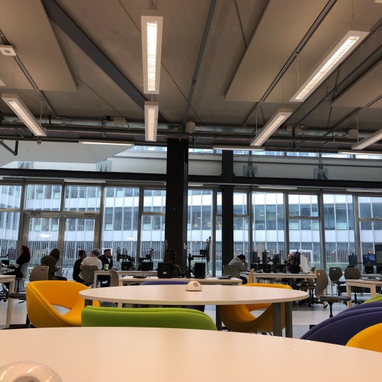
Photo
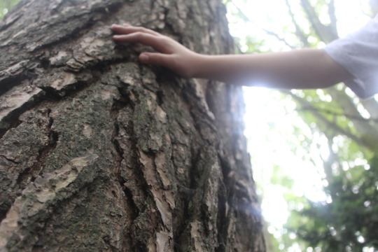

We had to take lots of photos for this task. My two words were line and proportion. I tried to show the difference in scale as well as how your eye follows the lines in these images. I really enjoyed taking my camera out and exploring - the weather was nice for once!
8 notes
·
View notes
Photo
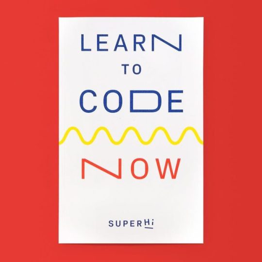
Learn to Code Now! Available at www.draw-down.com Covering everything a creative person would need to know when learning to code with HTML, CSS + Javascript—the building blocks of web design. This book is an opinionated guide to learning #HTML, #CSS and #Javascript—the three building blocks needed to create the #visualelements of web pages. Learn how to create web pages from scratch incorporating the latest tricks that professional front-end web developers use daily. You'll have the freedom to create bespoke websites to suit your personal needs, without relying on template. Along with the book, you'll gain access via an enclosed code to SuperHi's #code editor and online tools. You'll also also get a super special #SuperHi bookmark, sticker set, writing tablet, and pencil. 444 pages #graphicdesign #learntocode #summerschool #DIY https://www.instagram.com/p/Bw4TY3qHTFt/?igshid=n6to72p9wn1d
8 notes
·
View notes
Text
RESEARCH METHODS////////////QWWK 12////////////VISUAL RESEARCH METHODS II
Time and dimension: Order
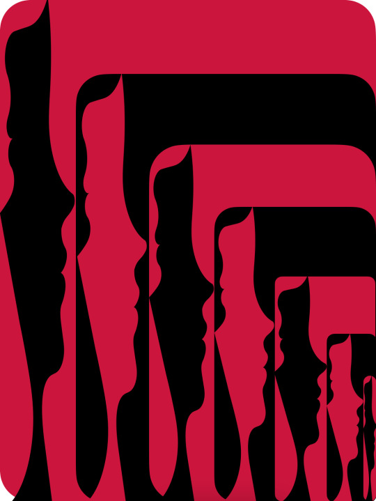
Movement creates a sense of action in the visual arts. It can be created by repeating visual elements (motifs): lines, shapes, colours. When depicting a person, movement is achieved by changing the person's balance point and posture, as seen in the illustrations of contemporary New Zealand artist and film animator Erica Russell.
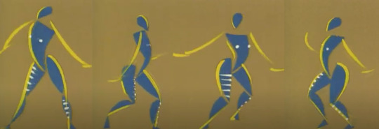
Feet of Song by Erica Russell
Feet of Song by Erica Russell
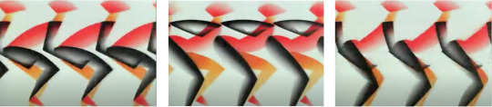
Another very interesting way to create movement is by using illusion.The beginning is connected with the appearance of the Op-art movement in the middle of the last century. It uses the human brain's ability to perceive complex patterns built through repetition and contrast. In this way, an illusion of movement is created in the still image.
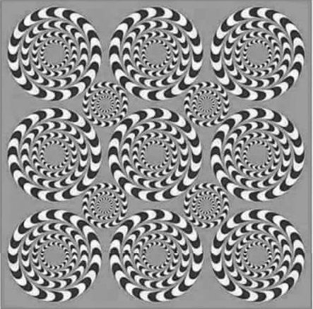
Spinning Illusion, Source : Pinterest
We consider this approach extremely suitable for illustrating Alice's adventures,In relation to the whole context. Therefore it will be used frequently in the layout of the spreads.
Visual attributes: Movement / on illustrations of my 'Alice' project
Visual attributes: Movement / on illustrations of my 'Alice' project
Time and dimension: Sequence
Sequence is the relationship between elements that determines their order in the composition. It is closely related to hierarchy as both follow the principle of "orderliness".(The sequence follows The English reading comprehension : left-right/up-down.)
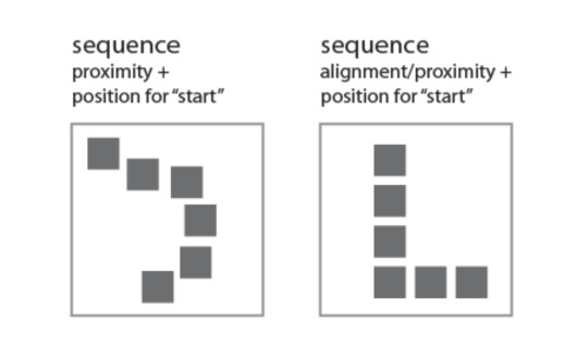
Sequence = Alignment/Proximity+Position for 'start'
We will visually demonstrate the principle of consistency in the cover of our product.
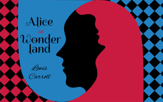
Use of Аlignment - it serves both to give a tidy appearance to the cover and to help convey information.
Typography - I chose to use two fonts in the cover layout: Spirax and Alex Brush. This contrast in fonts serves to emphasize the hierarchy: Spirax has a dominant role, bringing to the fore two words: "Alice" and "Wonderland". Alex Brush imitates handwriting. It has a supporting role and is used for the preposition "in" and for the author's name. Although completely different, the two fonts do not seek opposition. They are consistent within the overall layout. It can be said that they are grouped consecutively into two groups, with the title above the author's name, aiming to focus attention on it.
There is also Colour contrast within the title. It is achieved as a sum of the two colors: black and red. Contrast is used sparingly. The only word in red is the preposition "in", which aims to draw attention to the connection of the two words "Alice" and "Wonderland" in a single group.
Light and colour: hue saturation
Light and colour: Tone saturation
Light and colour: Transparency
Light and colour: Opacity
Factors of visual grammar: mass, unity, fragmentation, regularity, irregularity, activity, passivity, space, order, randomness, continuity, interruption.
Visual grammar According to Gestalt, "the whole is greater than the sum of its parts," but let's look at them anyway.
Mass By common definition in art and design, mass is the amount of matter (visual weight) in any one object in a scene. It is closely related to balance, i.e. to the positioning of the various objects. Their visual weight should be balanced around a central point so that the composition feels complete.
Unity Unity in design is cohesion between its various elements using powerful factors such as color, proximity, font, alignment, contrast. The goal is a maximally satisfying aesthetic perception for the user. -Choosing the right colours and their consistency within the design reinforces the connection between individual pages (if it's a web design) or individual elements (if it's a logo or print design). -Proximity helps to understand which elements within the design are related and how they are related. -Font is also a unifying factor, both in web design and in logo or print design. The combination of different, skillfully chosen and complementary fonts can build consistency across individual pages, as well as build hierarchy when needed. -Alignment unifies and enhances the user experience by arranging all elements on a single axis so that they appear connected. -It is important to note that unity does not always mean equality. Depending on the context, some design concepts focus on contrast in color scheme or fonts to distinguish separate groups of elements or simply to create a different mood. Adherence to Unity ensures a correct understanding of the message even by those users who do not have professional design knowledge.
Exploiting the cultural contexts surrounding 'Alice in Wonderland' and critically examining its use as a sign, symbol, icon and metaphor.
INDEX - We designate the smile of the Cheshire Cat in this image as an index because it is a consequence of the cat itself, which is no longer there, but was once there, and has disappeared, leaving its smile behind.
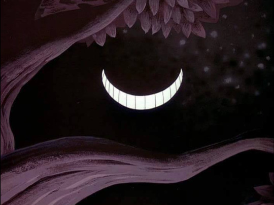
INDEX / Smile of Cheshire cat, Source : DeviantArt
SYMBOL - An issue by Tim Walker is a fashion collection for Vogue Italia, which rather emphasizes the presentation of clothes, but due to the specific scenography and mise-en-scene, it gives the impression of being close to Lewis Carroll's books. Symbols could be found in the references that the decor creates.
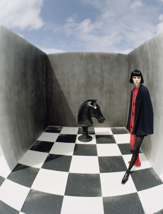
SYMBOL / An issue by Tim Walker for Vogue Italia, December 2015; Model : Edie Campbell, Styled by Jacob K. Hair by Shon. Make-up by Miranda Joyce
METAPHOR -
METAPHOR :
“The time has come,' the Walrus said,
To talk of many things:
Of shoes — and ships — and sealing-wax —
Of cabbages — and kings —
And why the sea is boiling hot —
And whether pigs have wings.’
L.Carroll
“When pigs fly" is not just a common saying or a funny phrase. Usually behind it lies the idea that the probability of something happening is very small or almost non-existent. This is probably the message that Roger Waters wants to convey at his legendary "The Wall" live concerts, because the allusion to Carroll's text is obvious.
METAPHOR / Roger Waters concert "The Wall" in 2013, Sofia, Bulgaria, Photo : personal archive
ICON - This is my idea for Alice, which is the result of many years of personal interest and professional research.
My idea is that she should be presented in a minimalist style, and the play between positive and negative space should emphasize the illusory world of wonders in which it has fallen. Although not very realistic, we define this image as an icon because it bears a physical resemblance to the object it signifies.
ICON / Alice, herself, on my 'Alice' project
Questions about "Alice in Wonderland" in a range of contexts, meanings and values of the shape.
1/ What is the significance of Alice's fluctuations in size and shape in Alice's Adventures in Wonderland?
2/ How does Alice reach new knowledge about the interrelationships between shape, colour, smell, taste, content?
3/ What is the meaning of form in the world of the imaginary real?
4/ How does Alice challenge the physical laws of space, time and distance?
5/ What are form and content as philosophical categories in Alice?
1 note
·
View note
Photo
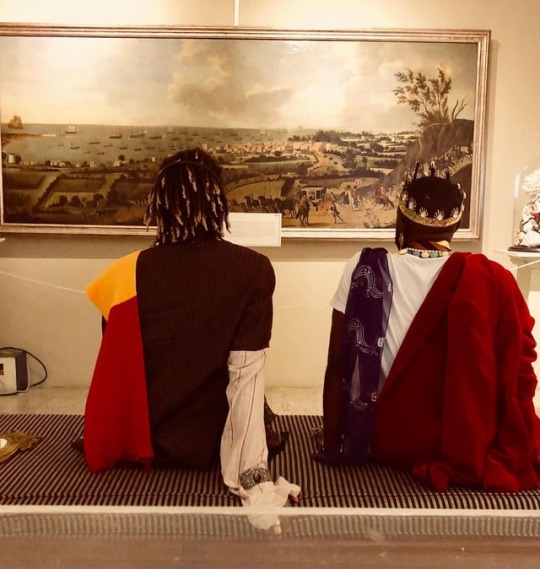
The models prepped for the living sculpture conceived by @adriansworldinphotos with @juniorsealy in the Cunard room and @itsacflyy in the Warmington Gallery. Kudos and thanks to @natsmcguire for her help and a special hi five to @sheenaroseartist for her support. #instagood #instadaily #adiscusion #visualelements #livingsculpture #contemporaryart #barbadosmuseum
2 notes
·
View notes
Photo

https://customermaps.ca/about-us/
#Digitaladsagency#digitalmarketing#marketingandadvertising#companies#business#visualelements#graphics#infographics#engagement
0 notes
Photo
En la clase enseñándoles "Vestuario y elementos visuales" y a causar polémica 🤭🤣😂🤣😂😅😅😅😅 #LadyGaga #Clothes #visualelements https://www.instagram.com/p/B7J0K0QgsyE/?igshid=1c8s6z4yjxxg3
0 notes
Text

12/09/19
Today we were to explore to college and take pictures of subjects that related to two words we were given. The pictures were to be taken on our phones using square mode.
My words were Emphasis and Space.
This is some of the pictures I have taken to try and link up with my words.
0 notes
Photo
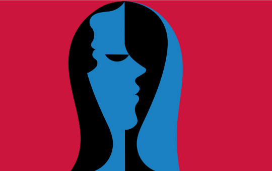
@bradrkunkle ❤️ #bradkunkle #annewithane #anneofgreengables #netflix #visualelements #imagineryforcesstudios
1 note
·
View note