Independent publisher and bookseller of books, zines, and printed matter about graphic design, typography, and art. www.draw-down.com || @drawdownbooks || @drawdownbooks
Don't wanna be here? Send us removal request.
Text

Trading Between Architecture and Art does not attempt to answer the question of whether architecture is an art but considers the question itself: how it affects architecture, and art, as a practice + a discipline. This volume aims to identify the overlaps and misalignments between concepts + categories implied in the question and to trace the impact of these on the ways that art and architecture are valued.
By unpacking the historical and current interests at stake in defining architecture as art, Trading between Architecture and Art reconsiders the place of architecture in contemporary culture.
With texts by Angelique Campens, Guy Châtel, Mark Dorrian, Maarten Liefooghe, Mark Linder, John Macarthur, Léa-Catherine Szacka, Annalise Varghese, Stefaan Vervoort, Stephen Walker, and Rosemary Willink
Edited by Wouter Davidts, Susan Holden, and Ashley Paine
Designed by Sam de Groot
Published by Valiz, 2019 Available at Draw Down Books
33 notes
·
View notes
Text


In this 78 page Riso and inkjet printed publication, Graphic Design MFA students at the Otis College of Art and Design in LA discuss different contemporary design titles and produce graphic compositions inspired by each one! The result is a showcase of creativity and responses to design discourse and artist publications, reflecting the perspectives and talents of an international cohort.
What Can Books Do? is the outcome of a three-day workshop we did in June with 14 students. The publication was collectively printed and bound by the students on 3 paper stocks, with help from the incredible lab staff at Otis.
Graphic contributions designed and printed by Aurora Cecconi, Angie Chan, Wai Yan Cheung, Anthony Luna, Darah Haimovitz, Amanda Liu, Graciela De La Maza, Poppy Pu, Jack Rielly, Yolanda Sinaga, Antonio Valverde, Xingfei Wang, Nano Wu, and Gama Yangzong.
Printed in a limited edition of 97 copies
Softcover, 78 pages, covered saddle-stitch binding, 1-, 2-, and 3 color Risograph and 1-color laserprint, 7.25 × 10.10 inches
#Risograph zine#zines#graphic design#writing about graphic design#poster design#graphic design zines#Otis College of Art and Design#Draw Down Books#publishing workshop
22 notes
·
View notes
Text


Join us at Typographics 2024 in NYC this weekend! Draw Down will be participating in the book fair, which is free and open to the public!
Friday 6/14 through Sunday 6/16, 10AM-5PM every day at 41 Cooper Square (The Cooper Union) in New York City. The fair is between E 6th St & E 7th St (just across the street from the Great Hall where the main Typographics conference will be taking place) We'll be with friends @pioneerworks @letterformarchive @ksmallgallery @leftbankbooks @lubalincenter + more! Ellen Lupton will be on site on Saturday signing her latest book! The fair is right around the corner from Printed Matter's East Village Zine Fair (also free and open to the public), so you can have a full day of zines, books, and typography!
#draw down books#book fair#artist books#type specimens#Typographics#Typographics 2024#Typographics Book Fair#graphic design books#typography books
22 notes
·
View notes
Text
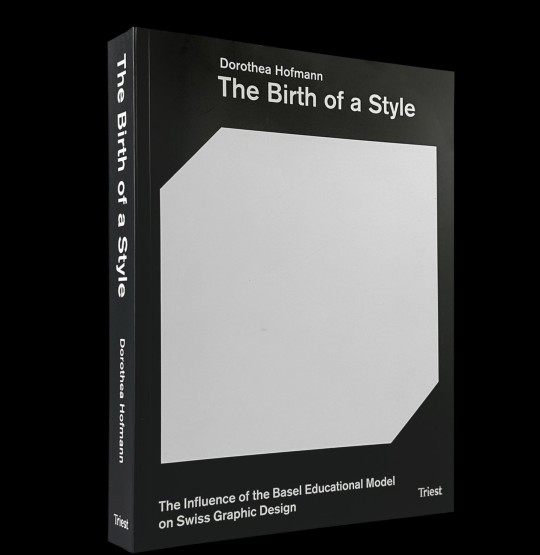
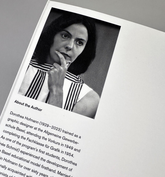
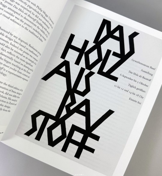
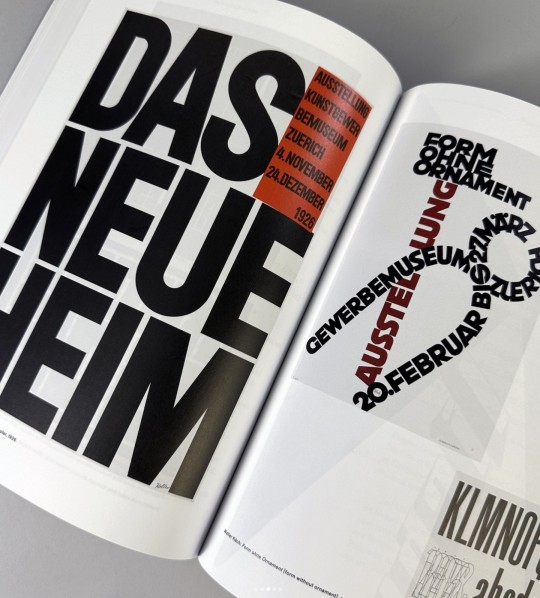
The Birth of a Style: The Influence of the Basel Educational Model on Swiss Graphic Design
By Dorthea Hofmann
Designed by Matthias Hofmann
Published by Triest Verlag, 2024
Softcover with flaps, 472 pages, ca. 400 color and b&w images, 7.5 × 9.8 inches
#graphic design#graphic design books#Swiss Style#International Style#Armin Hofmann#Dorthea Hofmann#Basel Educational Model#Swiss Graphic Design#graphic design history#Draw Down Books
24 notes
·
View notes
Text

We don't just make books, we make bookends too!
Durable powder-coated steel construction (made in the USA), and a classic L-shape form designed to keep your books in place. 5.5 in. × 5.25 in. One piece. Designed by Christopher and Kathleen Sleboda
21 notes
·
View notes
Text

Space as Language: The Properties of Typographic Space
This publication, part of the Cambridge Elements: Publishing and Book Culture series, examines the function and significance of typographic space. Readers are invited to consider in turn the space within letters, the space between letters, the space between lines, and the margin space surrounding the text-block, to develop the hypothesis that viewed collectively these constitute a 'metalanguage' complementary to the text.
Drawing upon critical perspectives from printing, typeface design, typography, avant-garde artistic practice, and design history, Space as Language examines the connotative values and philosophies embodied in the form and disposition of space. These include the values attributed to symmetry and asymmetry, the role of "active" space in the development of modernist typography, the debated relationship between type and writing, the divergent ideologies of the printing industry and the letter arts, and the impact of successive technologies upon both the organization and the perception of typographic space.
Published by Cambridge University Press, 2023
Softcover, 75 pages, 5 × 7 inches
ISBN: 978-1-00-926543-0
#Space as Language#typography book#graphic design book#typographic theory#graphic design theory#Cambridge University Press#Will Hill#Draw Down Books
34 notes
·
View notes
Text
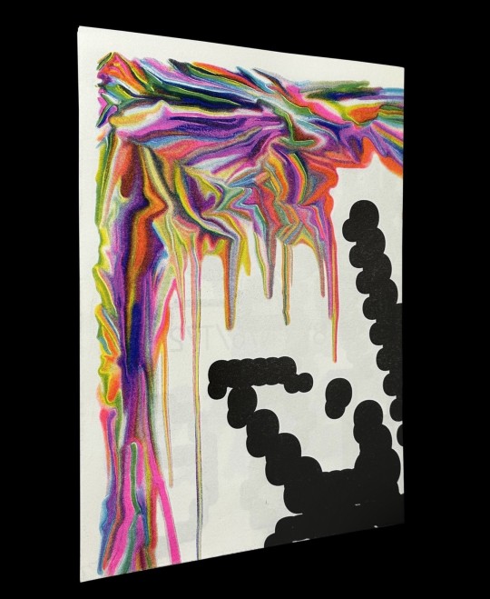
Harber Type Specimen (A2 version) by Benoît Bodhuin
Harber is a dot matrix design with variable axes for weight, slant, volume, noise, and optical size.
Published by Benoît Bodhuin, 2023
1 double-sided sheet, 5-color Risograph, 16.5 × 23.4 inches Ships folded, dimensions 8.3 × 11.7 inches
#type specimen#Risograph type specimen#Harber typeface#Benoit Bodhuin#variable type#type design#dot matrix typeface#Draw Down Books
42 notes
·
View notes
Text


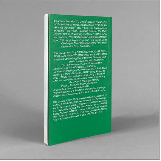
A Line Which Forms a Volume 4
On sale! A Line Which Forms a Volume 4 comes to you from the London College of Communication where students in the MA Graphic Media Design program put together ALWFV on a regular basis. Issue 4 focuses on the constructed borders of the design canon. How do design practices move and cross borders? Contributors include Ahmed Ansari, Clara Balaguer, Yu Jiwon, Lucas LaRochelle, and more. Designed by Yao Qi and Zhu Yiting.
#A Line Which Forms a Volume#LCC#London College of Communication#ALWFV 4#Clara Balaguer#Yao Qi#Zhu Yiting#MA Graphic Media Design#Draw Down Books
19 notes
·
View notes
Text
Means of Production: Indigenous Patterns, Forms, and Letters Join Fillip and design educators Christopher and Kathleen Sleboda (nłeʔképmx) of Draw Down Books on Saturday, January 27, for a typography workshop presented in collaboration with the Jake Kerr Faculty of Graduate Studies at Emily Carr University of Art + Design in Vancouver, British Columbia.
Christopher and Kathleen Sleboda will guide participants through a hands-on program intended to deepen understanding of the profound connection between language, culture, and design, with a particular focus on the nuances and cultural specificity of Indigenous patterns from Native North American communities. The workshop will encourage individuals to consider the stories and symbolism behind each stroke and curve, and explore the intricate relationship between cultural heritage and the visual language of typography.
Entrance is free but space is limited, and registration is required. All are welcome; priority registration will be provided for Indigenous participants.
More info and to register: https://www.eventbrite.com/e/means-of-production-indigenous-patterns-forms-and-letters-tickets-788674254927
#Draw Down Books#Fillip#typography workshop#free workshop#graphic design workshop#Indigenous type#Emily Carr University of Art + Design#Jake Kerr Faculty of Graduate Studies
11 notes
·
View notes
Text
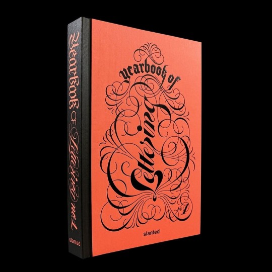
Just arrived from Europe! Slanted's Yearbook of Lettering
Letters and typefaces not only transport information, but create a feeling or have a personality. Lettering takes this even a step further: with its movement, artistic strokes, and variety, it has the potential to radiate a whole range of energies, telling stories of harmony and distortion about positive and negative space. Words become drawings and pictures themselves.
Born out of the success of the concept of their Yearbook of Type series Slanted created the Yearbook of Lettering, which presents a selection of lettering artwork from around the world—from traditional calligraphy and hand lettering, street art and graffiti, to 3D digital lettering, showcasing the vibrant and wide range of 21st-century styles and techniques.
Both a catalog and reference work, the Yearbook of Lettering can help clients source the right artist for a project, and can be a source of inspiration for those in the design world. The volume celebrates the many facets of lettering that continue to flourish and evolve, platforming the most exemplary artists and providing a glimpse into a world of color, sweeps, curls, brushstrokes, and pure creative energy.
Art direction by Tessa Breuer with graphic design assistance from Juliane Nöst
Published by Slanted Publishers, 2023
Hardcover, 320 pages, full color, 6.4 × 9.5 inches
ISBN: 978-3-94-844053-4
#Slanted Publishers#Yearbook of Lettering#Tessa Breuer#lettering books#graphic design books#typography books#Draw Down Books#books about type
13 notes
·
View notes
Text

For almost 50 years, Brazilian-born New York–based artist Lydia Okumura (b. 1948), like her contemporaries Dorothea Rockburne and Robert Irwin, has explored the realm of geometric abstraction by challenging our perception of space in her sculptures, installations, and works on paper. In the 1970s, as a young artist in her native São Paulo, she was introduced to Conceptual art, Minimalism, Land Art, and Arte Povera through the Japanese art magazine Bijutsu Techou. These movements, along with Brazilian Concretism and Neoconcretism, influenced Okumura’s dynamic work in which she uses simple materials such as string, glass and paint to balance line, plane and shadow.
This handsome exhibition catalog, produced to accompany the artist’s first solo exhibition in the United States at the University of Buffalo Art Gallery and to encourage a critical reassessment of Okumura’s oeuvre within art history, is a rich document of her minimal practice and independent vision. The catalog includes an essay on Okumura and her work by curator Rachel Adams; an account of vanguardism in Brazilian art from 1960 to 1975 by art historian Mari Rodriguez Binnie; a conversation between Adams and Okumura; and extensive photo documentation of Okumura’s work from the 1970s until today.
Edited by Rachel Adams & Charlie Tatum
Designed by Mark Owens with Sarah Cleeremans
Published by Sternberg Press and the UB Art Galleries Printed in an edition of 1,200 copies
In English and Portuguese
Softcover, 112 pages, 48 b&w and 56 color images, 9.5 × 11.5 inches
ISBN: 978-3-95679-291-5
#Lydia Okumur#art book#artist book#Brazilian artist#exhibition catalog#Mark Owens#Sternberg Press#female* artist#sculpture book#Draw Down Books
24 notes
·
View notes
Text
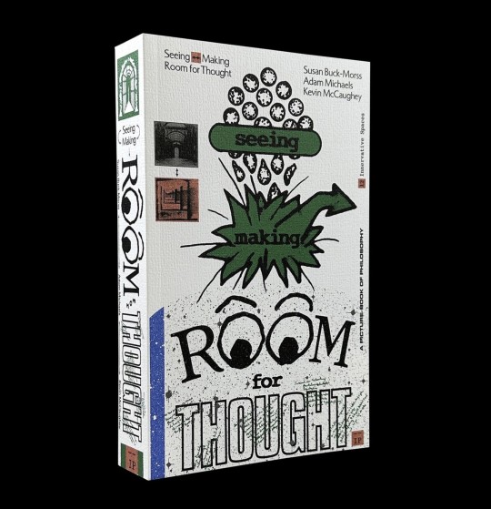
This book is incredible! Seeing <—> Making: Room for Thought is an image-packed deep dive into McLuhan and Benjamin, a collaboration between philosopher Susan Buck-Morss, Adam Michaels, and Kevin McCaughey of Boot Boyz Biz. The volume makes theory visible in a captivating way, and traverses history, politics and aesthetics as well as visual culture. Shipping now!
Designed by Kevin McCaughey and IN-FO-CO (Adam Michaels, Shannon Harvey, V.E. Chen)
Published by Inventory Press, 2024
Softcover, 400 pages, 600 b&w images, 4.75 × 7.75 inches
ISBN: 978-1-94-175353-8
#Seeing <—> Making: Room for Thought#Boot Boyz Biz#Adam Michaels#Inventory Press#Kevin McCaughey#Susan Buck-Morss#Marshall McLuhan#Walter Benjamin#John Berger#graphic design and theory#illustrated theory books#graphic design books#2024#Draw Down Books
19 notes
·
View notes
Text
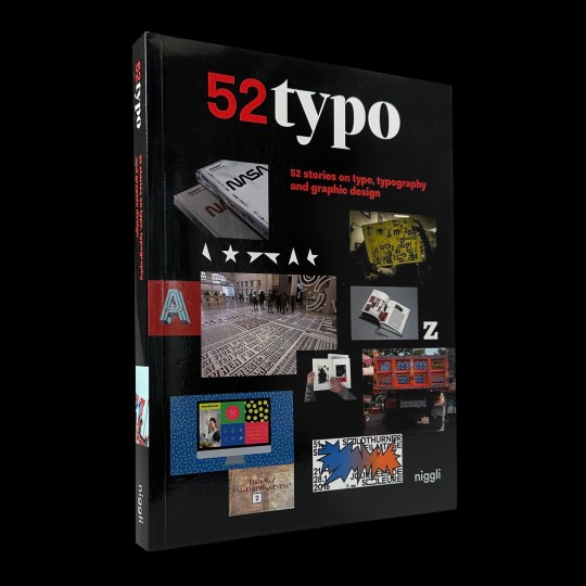
52 stories on type, typography, and graphic design. A fascinating journey through the world of typography.
Every day something is happening in the world of typography and graphic design – something new is being created in Buenos Aires, Paris, Tel Aviv, Tehran, Seoul or Melbourne.
For this volume, the most inspiring, trend-setting, and enduring stories, events, and works have been collected together: 52 entries for 52 weeks, written by more than 40 experts.
16 notes
·
View notes
Text

Shop our annual sale and find gems like this rare FIRST ISSUE of SOFA!
SOFA was a magazine that uncovered and defined its present and looked into the near future by exploring one tantalizing, terrifying, tantamount, or taboo topic per issue while sitting on international sofas with the day's most interesting people. The first issue dove into the minds of Generation Z by giving the floor to a diverse group of international teenagers.
6 notes
·
View notes
Text
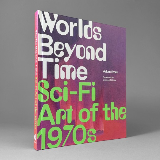
The definitive visual history of the spaceships, alien landscapes, cryptozoology, and imagined industrial machinery of 1970s paperback sci-fi art and the artists who created these extraordinary images. Designed by Eli Mock, published by Abrams Books, 2023.
Learn more at Draw Down!
#Worlds Beyond Type#sci fi books#sci fi typography#graphic design#typography#fantasy art#sci fi art#Draw Down Books
15 notes
·
View notes
Text
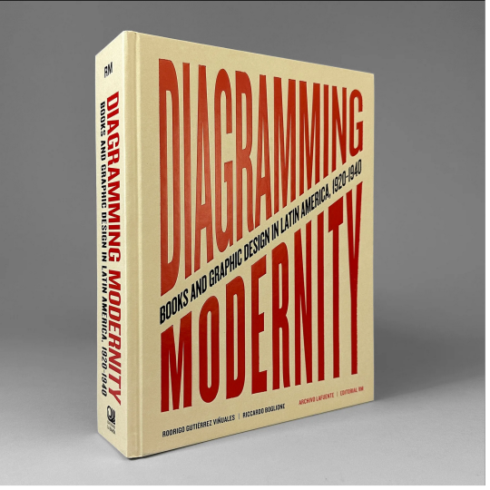


Diagramming Modernity: Books and Graphic Design in Latin America, 1920–1940 This massive publication offers the first comprehensive panorama of the Latin American illustrated book between the 1920s and 1940s, a period characterized by the region's rapid modernization. The books reproduced here encapsulate this transformative era, expressing and embodying emergent national and continental narratives in Latin American countries.
Diagramming Modernity reproduces more than 1,000 illustrated first editions, analyzing the cornucopia of cultural narratives they contain. In addition to showcasing relatively unknown work by many consecrated artists, the publication also boasts an extensive repertoire of avant-garde artists largely forgotten until today.
Chapters are devoted to countries and to specific themes such as Word-Image, Verbal Visualities, Pre-Columbianisms and Ancestralisms, and Social and Political Graphics.
Writers and thinkers Rodrigo Gutiérrez Viñuales, Riccardo Boglione, Juan Manuel Bonet, Mariana Garone Gravier and Dafne Cruz Porchini conscientiously investigate these themes and more.
Edited by Rodrigo Gutiérrez Viñuales and Riccardo Boglione
With texts by Juan Manuel Bonet, Rodrigo Gutiérrez Viñuales, Riccardo Boglione, Marina Garone Gravier, and Dafne Cruz Porchini
Designed by José Luis Lugo
Published by Editoriale RM and Ediciones La Bahía, 2023
Hardcover, 876 pages, 1500 color images, 9 × 12.25 inches
ISBN: 978-8-41-797579-1
#Diagramming Modernity#Latin American graphic design#graphic design books#books about books#Latin American visual history#Latin American graphic design history#graphic design history#Rodrigo Gutiérrez Viñuales#Riccardo Boglione#José Luis Lugo#Editoriale RM#Ediciones La Bahia#Draw Down Books
41 notes
·
View notes
Text
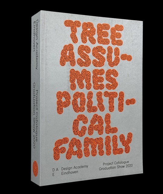
Graduation 2020 Design Academy Eindhoven
Published by the Design Academy Eindhoven on the occasion of its 2020 graduation show, this catalog is an example of what has been referred to as the extreme present. At once intimidating and intoxicating, it is built around a reality that was in a state of accelerated flux. The catalog's relevance depended on the ability to uninterruptedly interpret this evolving reality.
The graduation projects in this volume were largely conceived in a past that seemed very distant at the time of publication, in the midst of a global pandemic. However, in many ways, this body of work is also anticipatory, looking forward to the future that promises a return to embodied practice.
A series of hypothetical news headlines were generated by an open-source tool that was fed with written descriptions of all 185 graduate projects. The works became a dataset, and the generated headlines reveal the collective (sub)consciousness of the graduating class. The assorted headlines unveil surprising trends, methodologies, biases, and desires, allowing for new connections to be made between the projects.
Designed by Ward Goes with Mia Tamme
Published by Design Academy Eindhoven, 2020
Softcover, 506 pages, 6.69 × 9.45 inches
ISBN: 978-9-49-140045-2
#Design Academy Eindhoven#graphic design books#art books#21st century art and design education#COVID cohorts#Ward Goes#Draw Down Books
24 notes
·
View notes