#wanting so bad 2 make the text color match the drawing but i already committed 2 doing it in rainbow order augh
Text
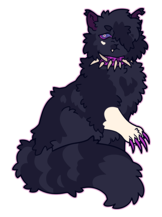
SCOURGE SUNDAY 003/???
heartbreaker
#scourge#scourge wc#scourge warriors#scourge warrior cats#wc#wc scourge#warriors#warrior cats#bloodclan#wanting so bad 2 make the text color match the drawing but i already committed 2 doing it in rainbow order augh#<-- fuck it we r changing the plan this is onl drawing 3 i still hav time color now based on drawing
251 notes
·
View notes
Text
There’s an evil trifecta that will always affect everything you do. You must choose between:
Good
Cheap
Fast
And I’ve not figured out how to get around that. Sometimes you can get good and cheap, but it probably won’t be fast. Good and fast won’t be cheap, and fast and cheap are almost never good. This is true for food and books, and it’s also true for book covers.
So let it be known that if you follow the advice on this page, you’re at best going to get good and cheap. It won’t be fast, and at some level the “good” part will depend on your skill level. That being said, here’s how I make my covers.
1. Choose a Style
I like to pick a style first so I know what I’m going for. My cover for American Chimera, for instance, was done in an art-deco style. Evolution of the Predator was supposed to make you think of a peaceful homeland, and If I Only Had No Heart was honestly just bad but was supposed to make you think of evil computers. Good Intentions is a God-don’t-let-it-off-my-computer werewolf story that I wrote to prove that Twilight could have been “cool” instead of “garbo”, and I chose to go with something that reminded me of gangsters. The Poet of the Week Compilation was made with a style to imitate Colleen Chesebro’s website, nature-inspired works, the feel of the contest, and the need to have a printer-friendly cover. The Mercury Dimension is deceptive because it’s hard to see the stupid spaceship I painstakingly shopped in.
#gallery-0-5 { margin: auto; } #gallery-0-5 .gallery-item { float: left; margin-top: 10px; text-align: center; width: 33%; } #gallery-0-5 img { border: 2px solid #cfcfcf; } #gallery-0-5 .gallery-caption { margin-left: 0; } /* see gallery_shortcode() in wp-includes/media.php */
They’re all different, and I’ve learned over the course of all of them.
2. Make a Crappy Idea Drawing
Let’s say I have an idea for a book cover in my head. If I don’t commit it to paper in any form or fashion, I’m not really going to have an idea how it will look. I won’t know what kind of space it will take up on the page or if it makes sense.
Once it’s on paper, I can gauge if it has any merit at all. Sometimes I put it to paper and realize it’s melodramatic, or I realize it won’t have anywhere for a title to go. The other thing I realize by making a Crappy Idea Drawing is if the cover is too ambitious. Like on the Great British Baking Show, going for something too ambitious for your skill level can lead to despair later. If you’re having too hard a time drawing the crappy version, you can decide if your idea is just too much for you.
Once I settle on the Crappy Idea Drawing, it’s time to move to a computer.
3. Get GIMP
GIMP is a freeware photoshop. I guess you can get Photoshop instead (I can confirm that it’s better and more intuitive), but it’s so much less free than GIMP.
All of the covers I’ve made have been in GIMP.
4. Get a Template
No, not an art template – a template for the size of your cover! Amazon has standard sizes for their Kindle and Print-on-Demand services, and you can download a template for your book. If you plan on including the back and spine, though, you’ll need to have your book written already; that will allow Amazon to calculate how big the spine will actually be.
If you’re not going to do Print On Demand and just want a front cover, then huzzah and hurrah! You can choose whatever you damn well please.
5. Choose a Color Palette
This is most important if you’re making graphic art, but even if you’re going for something more natural, you’ll at least want to make some decisions about colors. With American Chimera, I wanted to evoke thoughts of gold, of riches, of opulence, which is why I went with the yellow and yellow-gold tones. Evolution of the Predator is a survival tale on an alien world, so I went with natural tones and then a red for a standout title.
6. Choose a Font
If there’s nothing else on this stupid post you pay attention to, this is the big one.
A font is everything. The font should match your style, should be daring. Yet, it should be legible, clear, easy to read. Serif and non-serif fonts have an enormous difference between the two and can make huge impacts on your work. Go to font download sites and look for exactly what you need. Then keep looking. Keep looking. Find the perfect font, and the rest of the cover will be easier.
Be sure to choose fonts that don’t require attribution.
7. Le Sigh… Draw It On GIMP…
Ok, this one’s the major step, and it’s the one that will screw with you the most. However, since no two covers will be the same, it’s excessively hard to tell you every step for your book specifically. Feel free to ask me questions in the comments, or there’s YouTube videos for almost anything you want to make.
Here’s some hints and tips, though:
It Will Take Forever
You’ll get dispirited if you’ve never used GIMP or Photoshop before. It takes such a long time to get a handle on the program. But that’s where your crap drawing and style will help you – figure out what your goal is, and you’ll be better equipped to put questions into Google. Take the time to figure out the how, and you’ll get better. Be patient and forgive yourself for sucking. People take classes on this crap for a reason.
Use the Pen (it takes forever)
The “Pen” tool (in GIMP, not sure if it’s the same in Photoshop) allows you to draw vectors or paths. These paths can be resized without diminishing image quality, which is something I wish I’d known when making that Good Intentions cover seen above. With American Chimera and the Poet of the Week compilation, I knew about paths and could make good use of them. Paths create smooth, crisp lines on any size document you want to make.
Understand Layers
A layer is like adding a clear piece of plastic overtop the image for you to draw on, except it remains stable and in place. You can afterward pull that piece out of the way, or you can switch which piece you’re working on. Or you can toss the crappy pieces. If you’re new to photoshop or GIMP, look up layers so you can get this concept.
Start With the Background Layer and Work Forward
Let’s pretend you want your cover to be a landscape. Start with the sky, then make a new layer and put in any mountains or items in the distance. Then draw the foreground. Put in another layer for things on top of the foreground. Work your way closer to the camera, putting layer on top of layer.
Keep A Color Palette Layer
It’s easy to lose track of what colors you have and where you want them. If you have a layer just full of stupid splotches of the colors you’re using, you’ll never completely lose it ever again.
When In Doubt, Start a New Layer
If you start a new layer, you won’t screw up anything you’ve done under or above it.
Use Guidelines
Guidelines are lines that don’t show up on the final image but help you with placement. Put them where you want them to be, and you’ll be well-off.
Huzzah! You’ve Got a Cover!
And, at last, you’ve drawn something. Like I said, a lot of it will depend on your skills, but these things have helped me make a lot of perfectly ok covers.
Cover Making On a Dime There's an evil trifecta that will always affect everything you do. You must choose between: Good…
0 notes
Last Seen Blogs

tallourii
Oops! All Art

xiafeng
夏风


akwsr
Anthony's Take On Things

khanorthodonticgroupmerrick
Khan Orthodontic Group - Merrick Office