#warmups from this week. trying one layer drawing again :)
Text


who is the lamb and who is the knife?
#kingdom hearts#khux#kh#strelitzia#ventus#my art#digital art#warmups from this week. trying one layer drawing again :)
1K notes
·
View notes
Note
PLEASE forgive me if someone has asked about this before, but how do you start a digital sketchbook? What's a good page goal to reach, in your opinion? Your art rules <3
thank you so much! tbh tho i think that totally depends... mine tend to be 13-ish pages plus cover, but they're BIG vertical digital pages with several irl-pages-worth of sketches crammed in. and there's not really any specific reason why i do it that way! that just happened to be the number i landed on when i put my first one together (and now i don't remember why), and then i just kept them all around the same length for consistency.
most of the time when i see other ppl's digital sketchbooks they're way longer than that, though i'm not sure if maybe most people don't cram as many separate drawings per page as i do? also, if this matters at all: my sketchbooks don't sell well a la carte at all, they're primarily a patreon reward and then i offer them as itchio downloads just in case someone wants to buy them one at a time... once in a blue moon someone buys them that way, but it's rare. so i actually really can't offer any advice on what ppl look for when they're buying digital sketchbooks, or what would make a digital sketchbook sell well — because mine don't, haha!!
but if i had to guess, more pages released less frequently (i.e. collecting up all your art from an entire year) would probably do better for standalone sales. i keep mine short bc then i can release them a little more frequently, again bc mine are geared at patreon.
as for how to start or any other tips — tbh, mine are just a combination of what i'm already doing, both digital and traditional scans! warmups, character design, concept work and doodling, stuff that just normally doesn't get posted. it's rare for me to draw something specifically bc i'm like "oh, i want this to be in the sketchbook pdf" — the only stuff i usually draw bespoke is like, filling in empty spaces after i've puzzle-pieced existing work together. and especially if you're doing stuff for patreon, that's my general advice: try to make as much of your workload stuff you would already be drawing anyway, rather than giving yourself NEW tasks on top of everything else.
my actual technical process is very simple: i have a big old multi-layer document, with folders for each page. (since these are always intended for digital viewing, i make sure the width of the page at 100% zoom is nice and comfy on a computer monitor, to spare ppl a bunch of annoying scrolling side to side; and when i put drawings together on the pages i try to make sure they're sized nicely in the same way, so you can see the entire drawing without having to scroll around it.) every once in a while i go through my digital warmups and copy them over and arrange them nicely on the pages, and the same with scanning in everything i've drawn on paper every week or two; once the pages are filled up i save each folder as a separate page and then stitch it all together into a pdf! nothing fancy.
37 notes
·
View notes
Text
Week 5 - Sketching
This weeks activity was definitely the hardest for me mentally. The previous weeks of content were quite technique based, in the sense that once you learn the rules, the results are straightforward to replicate and ideate upon. This week's content was much more skills based than it was techniques based, and that lead to a lot of frustration and challenges - mainly around the fact that my drawing skills weren't as developed, making it harder to replicate my ideas how I initially saw them in my head.
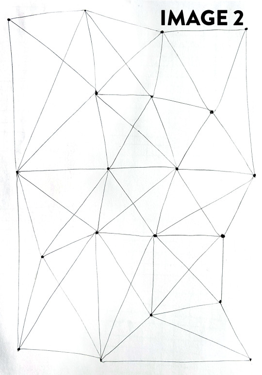
The warmup exercises were a great start to the tutorial, they definitely brought the skillset of hand drawing into focus; immediately making me realise how reliant I was upon the tools in the previous classes. I felt like the exercises definitely increased in skills and difficulty. The lines exercises (Image 1, 2) made me realise how important grip, posture and positioning is when drawing. I played around with the speed and control of the pen, and I noticed that holding the pen further down the barrel helped reduced my shaky motions.

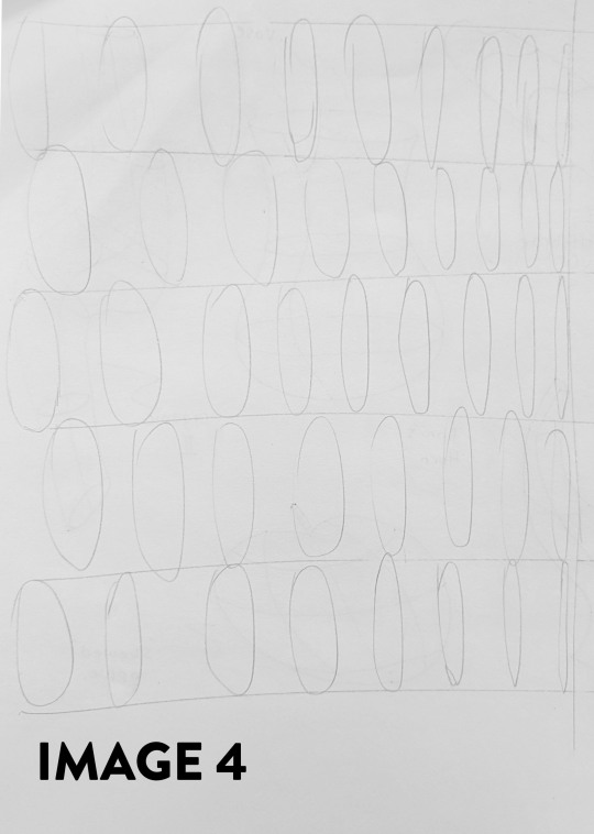
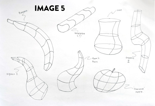
Along with the other exercises, the ones I enjoyed the most were the contour lines (Image 5), and the circles and ellipses (Images 3, 4). The circles exercise was really difficult, and at times I found it very frustrating when the circle would look more like an ellipse, but I think it was the most rewarding as I forced myself to complete the page. Sometimes I find that completing something is more important than refining it. As someone who can be overly critical of my own work, completing a task where the result may not be perfect is a great way to improve. The circles in perspective exercise was also difficult for the same reasons. The contour lines exercise was definitely my favourite (Image 5), because it really taught me to visualise forms on a 2D page. I think I gained the most from this exercise because it amalgamated all of the skills from line confidence, ellipses and circles into one.

Moving on from the warmup exercises, the task for this week was to redesign an Olay Moisturiser bottle. I found myself trying to consider the brand identity and constraints, as I think they are a great way to come up with inspiration. Doing some research on the Olay line, their bottles have very simplistic and curved form without many extrusions and harsh edges. When undertaking the first task (Image 6), I wanted to focus on the overall silhouette of the bottles, rather than supplying detail for each concept. This exercise allowed me to quickly iterate on ideas, and gave me immediate reactions to what I liked and disliked as I put pen to paper. There were times I drew the first line of the bottle and knew I wasn't going to like it (for example, bottom left). Not devoting too much time, and overthinking allowed me to produce bottles which I thought had a lot of potential for the next stage.

When it came to add shading to the bottles, I started to experience some issues. Having never worked with alcohol markers before, I bought a couple of Copic markers in two shades of grey (C4, C5) to try and do some shading. I quickly learned that I should have purchased some lighter shades of grey as well, as they can be layered to increase the richness of value. I found that I wasn't moving the markers across the page fast enough, and it caused some ugly bleeding, so I smoothed over the marker with some graphite pencils which were more familiar and easier to control. Eventually, I would like to not rely on pencil for correcting my mistakes, especially if I decide to buy coloured Copics in the future. My corrective efforts are definitely a bi-product of being a beginner, but it was a great lesson to learn early on.
The second exercise started off very similar to week four's content. Drawing the boundary box template using the perspective techniques worked well. When transferring the boxes to other paper, I used thin mechanical pencil to lightly place them on the page. When drawing the three forms I liked from task 1, I found that the construction of the form was relatively ok during the straight line sections. When constructing circles and ellipses, I found that I was still too shaky and lacked control, so I drew them with the mechanical pencil, and then went over them with pen. When adding marker to these concepts, I once again found that I was not happy with the results. Unfortunately, because marker is rather permanent, my mistakes were immortalised on the page. I don't regret using the Copic markers, because I know that I will develop control with practise.
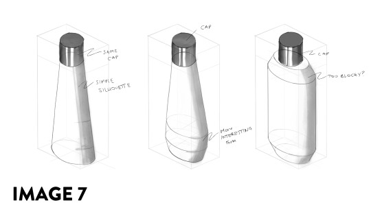
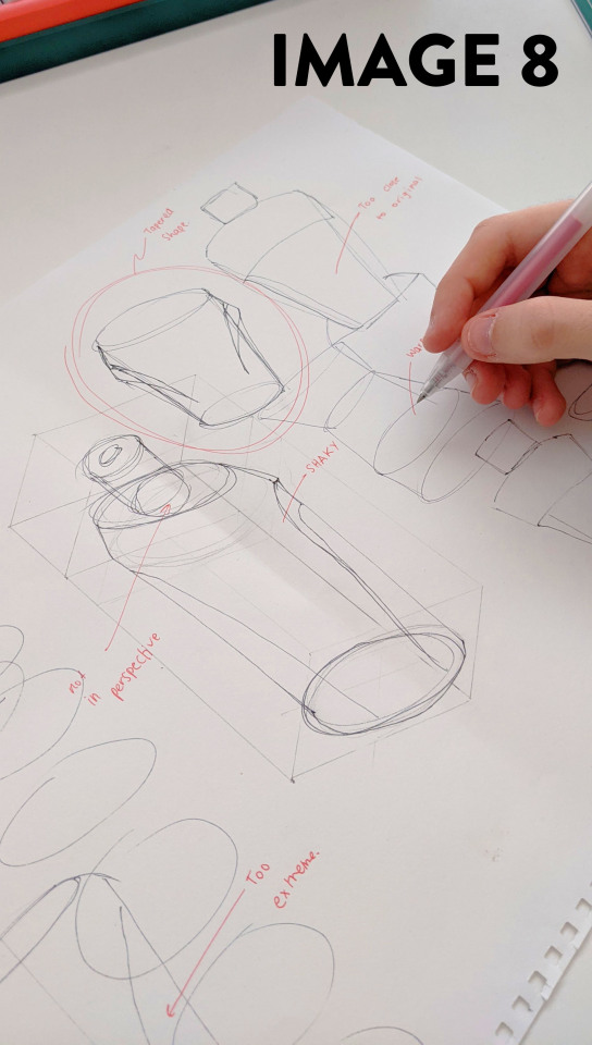
I wasn't completely happy with these three concepts (Image 7), so I wanted to create a final concept which was more visually interesting. I think I set my constraints too early, and should have allowed myself to make anything that came to mind - so I could rein them in when it cam time to develop them into final drawings. With this concept I went back to sketching without considering the proper dimensions. I made annotations on what was good, and more importantly, what I didn't like (Image 8).
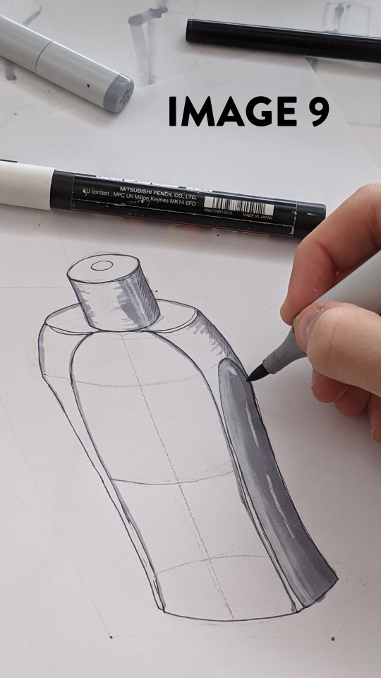
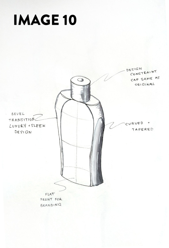
When it finally came time to finishing the activity, I placed dots on the corner in thin mechanical pencil so I could remove them later. I liked this technique because it still gave me guidelines to work from, but kept the page clean and legible. I focused more on the detail and creating interesting forms on the bottle, and used these guidelines to create curved shapes and lines which tapered and chamfered the bottle, which I tried to highlight with the markers (Image 9). Overall, I wasn't entirely happy with the final product (Image 10), but I could definitely see my improvement with the markers from my first and second attempts.
Confidence is definitely something I lack when drawing, particularly with ellipses and circles; and it is something that can only be developed with practise and time. If I were to redo this activity, I would really focus on the circular forms and improving them, as well as practising with the markers more before using them in my linework. Using the YouTube Channels from the Pre-Class activities, I want to keep developing these skills and create my own style. It really is the skill I look most forward to developing for concepting as an Engineer and as a Designer.
8 notes
·
View notes
Note
Hello, yes, hi, I recently found your art and account and I love what you do. I'm turning 14 in April and I've asked for a drawing pad, but I have no idea how to use one as of yet. Have you got any tips or anything? Because I've wanted to try digital art for a while and your art makes me want to even more lmao. Thanks! - B.A.
BOI OH BOI DO I GOT SOME TIPS FOR U
(I’m not sure what kind of comp you’re going to be using, so I’ll list for both.)
FIRST: Drawing Programs; the free and the great.
-Firealpaca: Lightweight drawing program. I draw Recovery using this! It’s easy on the RAM if you have a weak comp/are paranoid about yours like I am, it is mainly for basic comic making, and has all the basic brushes you need (pen/pencil/airbrush/symmetry/etc). You can add your own brushes as well but they’re p basic settings. Has basic Animation/Gif making as well using Onion Mode! Layout is a piece of cake. Please note that If you leave it open for a week it’ll crash on you, even if you haven’t anything on it at the moment, and sometimes the brush sensitivity just stops working so you just have to close and then open it again. (Also I have no idea how to update it aside from deleting it completely and just downloading the new version from scratch, so thats a thing.) Mac/Windows
-MedibangPaint: This is basically FireAlpaca But Better. Has tons of screen tones, brush patterns, and tools. I don’t use it much because I’m used to FA’s layout and get confused with the the placement of tools in here, so if you can I highly suggest just going with this first. Also has basic animation/gif making! Has storage for the website as well, and you can upload more preset brushes. It’s v anime. This program has waaay more in terms of basically everything, so it just takes more RAM. NBD, you don’t have to have every brush downloaded from the storage ^u^. Mac/Windows
-Clip Studio Paint: Okay this one isn’t free, it’s a pricey one, HOWEVER once a year they take the price way fuckin down by at least 75%. Sign up for the email list and it’ll let you know when that precious day comes. It’s how I got it @u@, around christmastime? This program is basically MedibangPaint On Steroids. I do all of my digital-yet-tradition-style-painting on here! The brushes all have some neat af settings to play with, you can make your own brushes, has tons of screen tones, pre-made panels, and settings. You can save projects as basically anything you need, is a hardy program that almost never crashes, and It’ll take a nice chunk of space on your comp depending on how much memory you have but hey, its worth it. It’s much more complex layout-wise than the other two here, but you get used to it after playing around and watching tutorials haha.
-Mischief: It’s a 25$ app, has like four brushes and five layers only but is vector-based with an endless canvas. Not really worth having unless you like the vector thing. UP TO YOU. I spent forever with this one doing all that homestuck stuff, so it’s not really bad so much as it is a basic bitch. Mac
-MyPaint: I used this a bunch when I still did digital art on my windows laptop before I upgraded to a Mac. It’s easy on the comp and has plenty of brushes and settings. You can also get brush packages if you don’t feel like you have enough that comes with the program! Also has endless canvas; pretty sure you can just select an area and then export as is. I barely remember the rest but It’s pretty great. Windows/MacPorts(which I hate)
-GIMP: I hate this thing. I cannot figure it out for the life of me. It’s got loads of shit though, can handle layers, has plenty of brushes, and can do basic animation/gifs if you ever figure it out. Windows/mac
I’ve heard good things from paint tool SAI and Krita as well, but have never used them myself.
***You can always pay through the nose/use a student discount for the photoshop series and pay that shit monthly, those fuckers have literally everything, but I am a cheap college kid making minimum wage with a car payment; I’d rather just pay once/not at all.
TABLETS: treat that shit like a newborn babe 24/7
-I have literally only ever owned a Wacom Intuos4. It has lasted me six years, and at least five moves across many miles. I broke one of the cord ports the day I opened it by holding it wrong, have one left, and now treat it like it’s going to die if the cord moves badly. Please be aware that if you break both ports, you better either sodder it back together yourself or upgrade to smth else because it costs about as much as the tablet itself was bought at to be fixed. Good news, though, it comes with at least six extra pen nibs, has programable buttons on the side (that I have never bothered to use) and a scroll bar in case you’re too lazy to use the keyboard (…I don’t really use that either unless I’m just scrolling through tumblr LMFAO).
-I would die for a Cintiq.
HOT TIPS: its useful.
-most of the programs listed use the same keyboard shortcuts. MEMORIZE THEM. It’s pretty easy, since you’ll use em a lot. [cntrl/cmmd+T] lets you resize what you just drew on that layer, and [cntrl/cmmd+z] is undo. I use those the most, for obvious reasons.
-vector-based programs are pretty great because when you resize an image it looks prefect. You can’t do that with a program that isn’t, so I just resize the base roughdraft and draw the lineart again on the layer above so I don’t get weird JPEG quality lines.
-You can use a ruler with your tablet, just slap it on and go, but honestly most programs have settings for that. just use those.
-You can also trace stuff on your tablet, so long as the paper isn’t too thick. I just scan/take a photo and then open it up in the program, though. much easier.
-SAVE CONSTANTLY. Art programs like to crash on you, even when they’re hardy and you have a good comp. make it a habit to quick save your work.
-Use a desk and have good posture. You’ll be able to draw a hell of a lot longer if you do. I personally keep fucking up my knees by sitting on my legs as I work out of habit, and don’t actually have a desk chair. Keep your screen at eye level and at a fair distance to prevent eyestrain and also neck-strain haha
-Chances are you won’t be used to the tablet right away. Most places you buy from say it’ll take a couple of months to get used to how weird it is to draw while not looking at your own hand, so don’t be frustrated If your drawings look a bit off at first.
-if you draw at least one thing every day, by the end of the year you’ll have improved exponentially. I literally made this blog to make myself draw once a day.
-don’t be afraid to check out speedpaints and tutorials. It’s always good to get more familiar with the program you’re using and new techniques previously unconsidered.
-get familiar with clipping layers. They are insanely useful; you clip one layer to the one below and then when you draw it only shows up on the drawing of that layer below. Shit is a godsend if you’re bad at coloring in the lines/lazy. The bucket tool is also really useful, and you can adjust the expansion by pixel so you don’t miss anything between the lines.
-experiment with your brushes, shit be fun af
-warmup your wrists before and after drawing. prevent swollen veins and such. dont want hand pain/numbness, its reaaaaally bad.
—basically if your hands hurt stop for the day.
-PNGS are for internet, JPEGS are for printing/fucking with quality (cough hack homestuck)
-resolution doesn’t have to be much more than 350 dpi if its just going to be on a webpage. Maximize that shit if you’re going to be printing, though. Especially if you put stuff on redbubble.
-DeviantArt has this thing called Sta.sh where you can dump art, keep it in perfect quality and just share it with certain people with a link instead of all of the website. Great for storing commission pieces, its the only reason I have DA in the first place.
-you get a different audience depending on what site you use for posting art, so keep that in mind for the kind of feedback you want.
-after awhile of drawing using a tablet, you may lose patience/forget that in traditional art there isn’t an undo button lmfao It’s cool; you don’t have to choose one over the other or anything.
-Honestly you can work around almost anything. You just invent new ways and techniques for yourself and you’ll do just fine.
Aaaaand that’s all I got for today! Thanks for sticking around
277 notes
·
View notes
Last Seen Blogs
girlbehindbooks
☾.⋆Rox.
poporaderio
anacrónica

ao3-anonymous
AO3 Readers Anonymous

lil-tachyon
Tachyon

alteredlifephotography
AlteredLifePhotography