#we also both almost went as gerard a few years ago for halloween like as a joke bc we were both 'former emo kids'
Text
i have this friend that moved a few hours away that i like Used to have a bunch in common with back when i was still trying to be cool and listening to like fuckin king krule and mac demarco and like. bowie deep cuts and being obsessed with glossier or whatever and she texted me the day pitchfork finally reviewed tcfsr and im like almost Certain she saw the review and was like “oh i wonder how kady is doing” lmao like the fact that her snobby pitchfork loyalist friends have to live with the fact that they gave it an 8.2?? like its okay to like it without it being some cringey middle school thing now guys pitchfork gave you permission i was just ahead of the curve 💅🏻 lmao
#we also both almost went as gerard a few years ago for halloween like as a joke bc we were both 'former emo kids'#and had bought red eye makeup recently and thought 'oh thats Perfect' lmao#it didnt work out neither of us wanted to risk fucking up our blonde hair by spraying it black and we couldnt find wigs in time lmao
11 notes
·
View notes
Photo
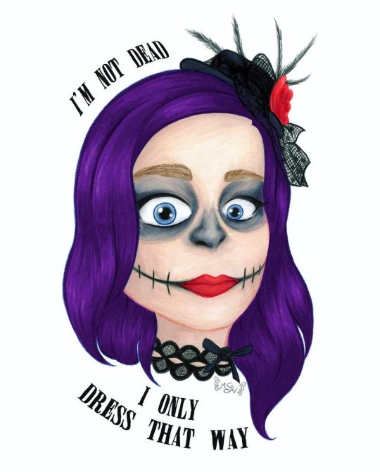
I’m Not Dead
I'm not laughin', You're not jokin'
I'm not dead I only dress that way
Out nowhere take me out there
Far away and save me from my
Self-destruction, hopeless for you
Sing a song for California
--My Chemical Romance, "Boy Division"
____
Have you heard?? Have you heard the news?? Well if not, I'm gonna tell ya: MY CHEMICAL ROMANCE IS BACK, BABY!!! :D
On Halloween, we got the announcement that they will be playing a show in Los Angeles, California on December 20th. And just a few days ago we got the news that they're also going to New Zealand, Australia, and Japan which basically confirms to me they're doing so sort of tour, whether they actually call it that or not.
There's still a lot we don't know for sure; whether this is just a one-time reunion tour or their official comeback tour, if we'll be getting new original music both at the shows and available for download/purchase or if they're just going to redo their existing music and covers, if it's only going to be the main four that were there at the end or if there will be some of the other members that were in and out over the years rejoining them...Where all they're going to go on this tour...the list goes on. But! The important thing, at least to me, is that they came back at all.
Six years. Six years we've waited and hoped and prayed, been let down by false rumors and speculation...And now it's actually happening. I just...
Hence why I had to make an art piece celebrating the occasion and as an excuse to talk about it. (I figure if I'm going to dump my opinions on the internet I might as well make some art to go with them. Sue me. )
Originally, I was planning on making something more along the lines of true fan art, as this is more pseudo fan art here, but I just couldn't settle on one good idea that I felt really comfortable pursuing. Although I am still considering doing an updated (or at least colored in) version of my Killjoys, Make Some Noise! (lineart) I did a couple of years ago...we'll see.
Anyway. Since we did get the news on Halloween, it's worth noting that originally I'd been debating if I wanted to do any makeup this year at all or just slide on a mask since my only plans were going to Krispy Kreme, who was offering a free donut if you showed up in costume. But after the news broke, my decision was made for me. I had to. MCR isn't strictly associated with skeletons/skulls, as has become my preferred Halloween costume, but The Black Parade, their second album, does have a little skeleton as the leader of the marching band, and the band members did wear skeleton/skull inspired makeup during that time.
Admittedly this year's makeup wasn't nearly as involved or elaborate as what I've done in years' past, but it beats last year's absolutely nothing.
I ended up taking a few pictures to preserve the look, as I always do even though I rarely take photos of myself, and I would decide to draw one of them where I was trying to do this face that Gerard (the frontman and lead singer of the band) has made on a several occasions; this wide-eyed intense stare. Partly because this, I'm sure, is very close to my actual face when I heard the news that they're back, the makeup was inspired by them anyway, and also because it pairs very well with one of my favorite lines from my favorite song by them.
Said line being, obviously, "I'm not dead I only dress that way," from Boy Division, as cited at the top of the description.
If I'm being completely truthful, I can't even really put my finger on what it is about Boy Division specifically that makes it my favorite, as I've yet to hear an MCR song I truly do not like, but I think there's something in the lyrics of the full song that just sells it for me in combination with the high-energy music. But whatever the case, it is my favorite nonetheless. Beyond that though, it's really hard to place the rest of them in any coherent order because, at least to my ears, they're all really great.
Anyway. So I went about drawing my face, erring slightly more on the realistic side than usually (but obviously not too much) in hopes of capturing the facial expression. Which, it's pretty good, but I do think it could've been a little better. I think my biggest problem was getting the eyebrows a mouth right, and I'm still not sure they're quite there since my real eyebrows are pretty translucent and the mouth was hard to balance between looking logical and more neutral than sad/angry. And I think maybe the proper expression was a little more apparent in the sketch, but it's pretty normal to lose some feeling between the sketch and the final product so that I won't discount too much.
After that, I had to take a break from the drawing to think about how to color it in any style it and everything. I ended up transferring the sketch to Mixed Media paper after deciding I wanted to use alcohol markers as a base but not knowing if I'd need to adjust it with colored pencil and/or other mediums on top or not, and I did the lines with my Faber Castell Polychromos once I felt like just black lines would be too harsh and thinking colored lines would be better. Plus, the Polychromos are very non-reactive to water, so if I really wanted to I could add watercolor or something water-activated without having to worry about the lines getting messed up.
I did not consider how the Polychromos would react to the alcohol markers, but other than one or two spots where the top layer of pencil kinda dissolved after some heavy layering (which was easily fixed by just going back over the lines in that area again really quickly), fortunately, it worked out okay. Although sweet sparkles I swear it took at least twice as long to actually do the lines as opposed to normal between having to apply enough pressure to get the right amount of color down and working on the differences inline weight.
Anyway. I was a little worried about some of the shading/effects I'd be doing with the markers, but I think I did alright with it. This mixed media paper (Strathmore 400 series for anyone who cares) is nice and thick, so I had plenty of room to layer up and blend as I needed to get the look I was going for. This came in especially handy around the eyes and on the nose when I told myself to at least try and get the colors like the photo before cheesing it and just using straight (or nearly) black. The only area that I think came out a little rough is really the skin, mainly the forehead. But that has more to do with 1. There isn't much contrast on the face in the photo so I didn't want to take it too far in the drawing and 2. I think I may have started slightly too dark for skin this pale. I realize that's a weird thing to say, but when you're pale as a ghost like I am, you'd be surprised how easy that is to do. And to be fair, I probably could've tried to adjust that with colored pencils, and my original plan was to add some white pencil on top in the areas of the face where a highlight would naturally hit (forehead, bridge of the nose, cheekbones, etc.) But by the time I got done with the markers, I honestly felt like it was nice enough without any additional pencil that I thought it might be best to just leave it alone.
Since I still have the original drawing, my thoughts may change on that and I could update this eventually, but for now, my decision stands.
On the other hand, I was actually pretty pleased with how the hair turned out once it was colored.
That is until I scanned it in.
I don't know why, but the darkest shadows in the hair were too dark and too bluish on the scan, despite everything else looking fairly color-accurate. I fiddled with the scanner settings for a few minutes to try and fix it, but it became quickly apparent there wasn't much to be done about it at the level. Which meant I had to try making the adjustments in Photoshop.
Now, I've done my fair share of scan-fixing, photo editing, and just color adjustments on digital art, but for the life of me I could not get things to work the way I wanted them to here. It became to the point I'm starting to suspect if the actual true-to-life shades of purple of the drawing are just really hard or even impossible for computers to capture and/or create accurately. Fluorescent colors fall in that category, surely they're not the only ones.
In the end, after more time than I bothered to document messing around with settings and adjustments, and firmly decided I was not going to essentially manually re-color/shade the hair digitally, I tried the only other thing I could think to do.
I took the hair, as I had been for all my adjustments since the rest of the colors were fine, on a separate layer and took all the saturation out so I was left with just the gray values. And I noted while I was at that point that it didn't seem to be an issue of the contrast between the shadows and the rest of the hair. The transition looked perfectly acceptable in grayscale. Then, I added a color layer on top of that one, clipped it to only show up on the hair, and changed it to an "overlay" layer so that I would get the values from the gray layer, but colored purple.
It did take a couple of tries to get the right shade of purple for the color layer, and I'm sure it's still not 100% accurate to the IRL drawing, but it's a heck of a lot closer than it was.
And this gets even weirder when you consider that just a few days before I made this drawing, I made a different one for a friend where I used the exact same marker colors for the hair, blended in almost exactly the same manner, on the same paper, and it didn't have this problem when I scanned that one in. I have never in my life.
Anyway. The accessories actually didn't give me much trouble in drawing or coloring. Admittedly, I did tone down how many feathers and stuff are actually on the tiny hat for my own sanity's sake, and while I did my best with the lace on the choker, I don't have a ton of practice with drawing lace like this so I'm sure it could be improved.
Although I did decide to color both of those areas (what I didn't draw/fill in with the pencils at the line stage) with a super dark blue-violet instead of a gray or straight black for the purpose of not totally hiding the linework I'd put in and to make it just slightly more dynamic. Which I think was a good call as it seems to tie in pretty nicely with the grayish tones on the face.
Other than that though, I did try to stay fairly accurate with my color choices, and I think I did pretty well with that, all things considered. (Despite having a much larger selection than I did just a few months ago, I do still need a wider selection of alcohol markers in some areas just for the sake of color accuracy and smooth transitions.)
Once my face was done, then came the text.
I searched for a while, hoping to find an MCR appropriate font that I could hopefully add by hand, but my search came up empty. I did find one I really liked the look of though, called "Miserable."
So I scanned the drawing in and after the aforementioned hair struggles, I got to play with the placement and structure of the words. I knew I kinda wanted something that just has that "I'm a logo/t-shirt emblem" kind of feel, and in the end, I think I got that. But I do think I could've planned out the drawing itself a little bit better in terms of the space left to fit the words into. I really didn't do myself a lot of favors on that one.
It has its problems, but I'm still really actually kind of proud of how this turned out...and that's really all I have to say about it.
Eh, maybe I'm just really happy because I know why I made it in the first place.
Now if MCR can just come within 1-2 hours of my location so I can actually go see them...please...
____
Artwork © me, MysticSparkleWings
____
Where to find me & my artwork:
My Website | Commission Info + Prices | Ko-Fi | dA Print Shop | RedBubble | Twitter | Tumblr | Instagram
#my chemical romance#mcr#boy division#dead#conventional weapons#return#the black parade#skullmakeup#art#fan art#self portrait#i’m not okay#killjoys make some noise
2 notes
·
View notes
Last Seen Blogs

oneneatcat
Just One Neat Cat

iceboundolive
Yes This is Fuckass

sapphicmutants-blog
um. xmen femslash. ya

callsign-phoenix
Sophie