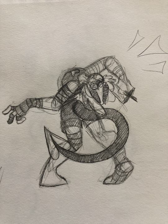
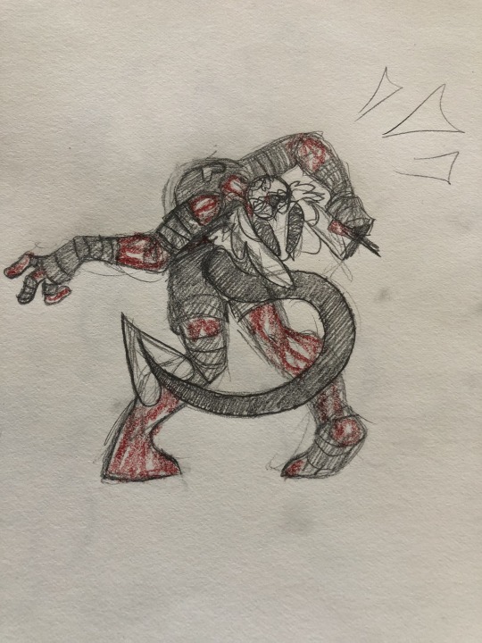
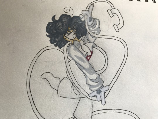
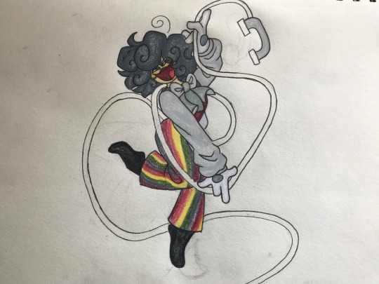
#which i need for my lineart because of Vector tools
Text
also ive been using a new line art brush for the last couple drawings and i think i really vibe with it woohoo
#ppl who say brushes dont matter are wrong ajdkfkfkfgkh#finding one thats more Lines but also Similar to my sketching brush is my goal#i cant just use my sketching brush because it doesnt vibe as well on a vector layer#which i need for my lineart because of Vector tools#the prophet speaks
8 notes
·
View notes
Text
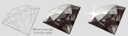
Mirre’s “How i render gemstones” tutorial!
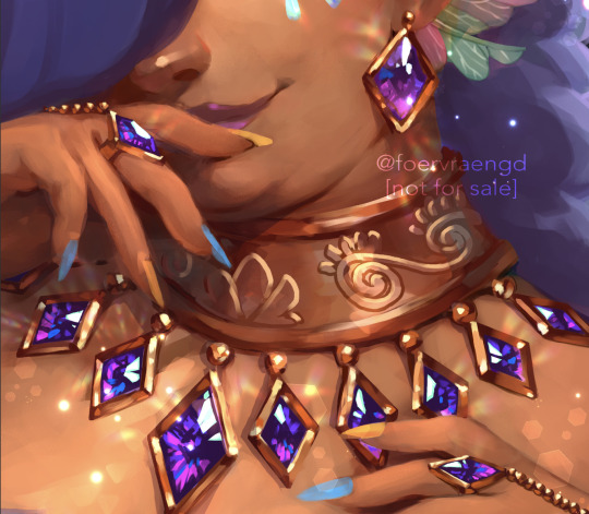
(note: image above is not what is shown in the walkthrough. It is an example piece)
Ingredients:
Art program that has layers and selection tools
Patience (hubris or stubbornness is fine too)
(recommended) photo references of gemstones and/or prisms
(Optional but very helpful) Knowledge on how to use Reference layers and anti-overflow in Clip studio Paint
For this tutorial i am going to use clip studio’s “anti-overflow” feature. This post is not going to explain how to use that specific setting but you should be able to find guides on how to use it on clip studio’s official website or on youtube.
Please Note: The result of this technique will not 100% represent real life gemstones. These are more simplified but should still make an impression of the brilliance and appeal of gems, crystals and diamonds.
If you don’t work in CSP: the best workaround is to use the polygonal lasso selection tool for the same purpose.
This ended up being a long post so I am putting it under the readmore:
First off; Basic idea on how the light refracts inside a solid transparent object:
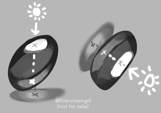
Wether it is acrylic, glass, water or crystal, the way light pass through more or less should behave the same as long as it is solid and not hollow inside. Pay attention to how the darkest parts of the stone goes along the inner edges, leaving a ”mid tone” sort of in the center. However, this might vary depending on the light setting. But it is a generally good rule-of-thumb to follow if you’re drawing something not based on a photo. Another thing to pay attention to here is how the placement of the highlight will lit up the inside of the gem in a parallel line. It also shows through on the cast shadow.
Light refraction on a cube:
I have already made two posts on this, so definitely go through them:
CUBE BREAKDOWN POST HERE
But a rough summary from those two links would be: Every side/facet of a gem or a cube etc refracts the light individually and not as one entity (that would make it look hollow and not solid). Think of it like how each piece in a broken mirror individually reflect your face back to you. Like a weird patchwork!
Putting this into practice:
For this tutorial I’m going to be nice to myself and not try to draw perfectly accurate gemstones. Instead I’m gonna draw them with a more ”natural” looking set of facets. Which actually isnt as common in real world as video games makes us think. Some crystals have geometric shapes naturally, but a lot of other stones are not as fancy. Anyway, im taking artistic liberty on these example stones because the technique I’m going to use will work for these just fine.
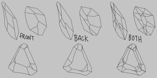
So, in clip studio paint, I first draw the stones on a vector layer. I give them facets for the front side. Then I duplicate the layer, remove the front facets and replace them with the facets on the back of the stone. The third image here shows both layers visible on top of each other. I now put these into a layer folder and mark the folder as ”reference”.
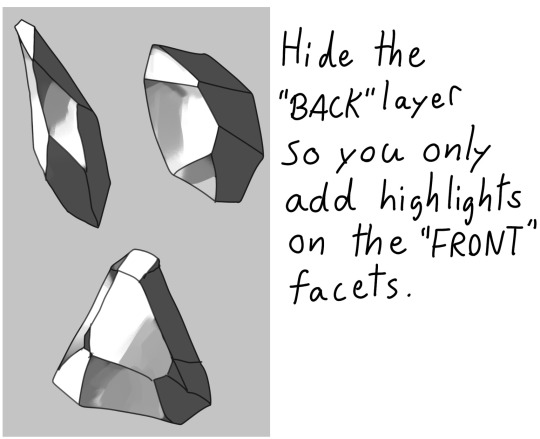
Now, on a layer below the lineart folder, fill with your base tone. Then make a layer on top (if you can clip it to the base tone, do that), this layer is where you decide where the highlight will be placed. In some cases the highlight is only lighting up one single facet - it really depends on the design of the stone. You can also blend and soften the highlight here if it looks good for you, just make sure not every facet is highlighted. The highlight layer should be on top of all the other layers clipped to the base tone layer.
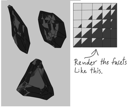
Now it is time for the juicy juicy stuff! Turn on both lineart layers so they’re both visible. I hid the hilight layer here because it was in the way, but might not be needed in your case. Make a layer clipped to the base tone and paint in the darkest tone. This is where anti-overflow helps me out, because when i run my brush over all these crossed lines it will make the stroke pop in and out for each facet. If you dont use CSP, this is where you can use the lasso tool and select every second facet. It will take a bit more time but it should work similarly.
After the darkest tones I then make a layer for the inside light that the highlight has lit up. Here i keep it inside the darkest tone but this might vary depending on the light setting. If it looks good to me, then that’s what i stick to.
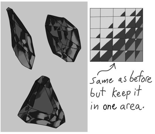
The way I approach rendering the facets here is like the grid in the example images above, every shade and tone appear more or less in each facet but the amount is relative to their position. So a gradient wouldnt have a smooth transition; it would be slightly scewed in each square on this example grid. Essentially like how some bathroom window glass panes look like.
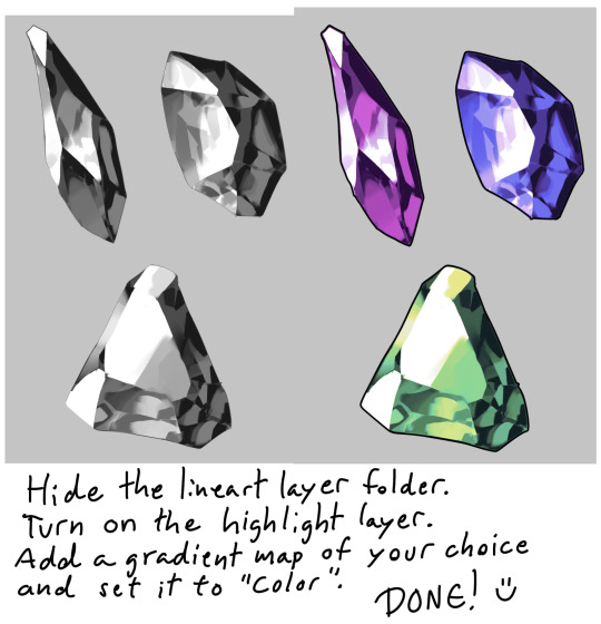
Now it’s time to hide the lineart layer folder and check if the gemstones look decent to you. If not, then you can look up some reference photos and analyze where the values group together the most; be careful not to focus too much on the photos 500 million sparkles. Squint your eyes or blur the reference and try to see how the overall values behae.
I, personally, am satisfied with these rocks so I slap on a gradient map (you can manually color in them too if that’s your thing) and call it a day. The lit up inside of a gemstone tend to have a brighter and more saturated color than the mid tone.
Other Examples with this technique:
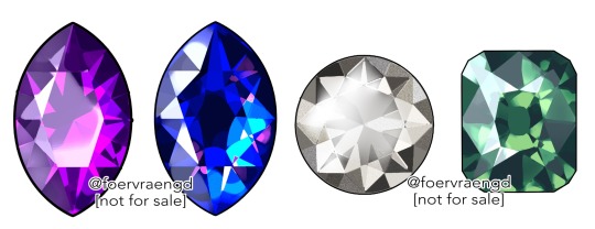
If you look up ”gemstone types” you can often find images displaying various facet types from more than just front view. These can serve as useful base templates for practicing this rendering technique. The backside of a gemstone is called the “pavillion” and is really useful to have at hand when it comes to painting the inner refractions. You can probably also use 3D models and convert the wireframe into lineart. But that is slightly out of my pool of knowledge.
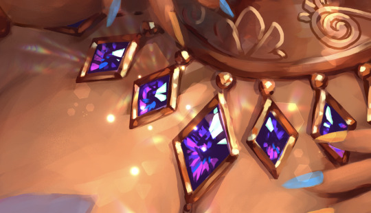
Applying this knowledge without using a base lineart layer is of course possible. In this painting I followed a simplified summary of how the facets sparkle: Keep the highlight shape to match the front facet design, and all the inner refractions should be more scattered and split up but face a direction towards the center of the gem. Now don’t you think this sort of makes the gems look like eyes? That’s right! You can, and absolutely should, apply this on eyes to create the most sparkly anime eyes ever.
Now, refracted light that lands on the surface surrounding gemstones varies depending on the material - and if the gem is inside a metal frame it usually doesnt create this much refraction around it. But I want to have fun so i decided to break this rule in the name of pretty sparkles. :)
3K notes
·
View notes
Note
What's your art process?
For my daily sketches I usually start with very rough scaffolding (this takes about 10-15 seconds to just get the pose down)
The reason why it’s so quick is that if I’m any faster I tend to lose that fluidity
after this I start blocking out the figure from top to bottom (I start out very rough and slowly refine it, almost like wood carving)
Then I clean things up and add features like clothes and hair
If needed I’ll add splashes of color
Then I’m done
For finished traditional art pieces it starts out the same way with a sketch, blocking and finish up, but then I take an outliner and refine the lineart even more and erase the pencil work
Then I block out where the colors will be the strongest like around edges or where there’s less light
then I finish it up and blend
For digital art it’s pretty similar, I use CSP for my digital stuff
I start with a sketch on a raster layer trying to keep the same rules as before- don’t spend too long on the initial pose
I block and sketch on the same layer so I end up with this really messy looking thing that no one else can understand besides me
then I start the lineart on a vector layer with a dark purple because it makes it look richer
then I Color with the fill tool

then I start blocking out the shading with multiply and add layers (I didn’t do this on the merchant one because it’s a toyhouse pfp)


I tend to include light scatter on my multiply layers, which is rimming the edges of your shadows with a different contrasting Color and blurring it (at least that’s what I do)
I try to keep light scattering realistic because not all surfaces do that, and it’s also important that not every single edge of the shadow has this (try to make it make sense, it’s only where the shadow hits the light, not the edge of the lineart)
I also sometimes add white highlights around the edges depending on the intensity of light
after that I just go crazy with filters and overlays until i get something I like

I Hope that explains it, I don’t really have a lot of complex things happening and I tend to mix these steps up as I go
I’m not a very consistent artist so
yuh
17 notes
·
View notes
Note
Hey, absolutely LOVE your art and I enjoy seeing your comics! Small question, how long does it take for you to make one page? And what is your process?
thank you!!!
THANK U!!!!!!!
it's a decidedly long-ish process and i'M KIND OF WONDERING HOW I MANAGED TO CHURN OUT TWO PER WEEK FOR A WHILE... (it was bad for my mental health i think is how). some artists can do like THREE OR EVEN FOUR PER WEEK!! but i am slow and so it takes me like 4-5 days to make one dfkjhgfdkjg
anyway first step is thumbnailing! that's when you make a tiny comic page and map out where you will have the panels, and what you want in them. also very good to figure out where your text bubbles will be at this stage.
NEXT!! transferring the thumbnail to a regular comic canvas! i like to thumbnail on paper with pencil because i eRASE STUFF A LOT (paneling is hard and i'm still learning), so i take a picture of it and then paste it onto the canvas >w>
NEXT!!! rough sketch phase. the picture quality tends to be jank as hell b/c i'm lazy & refuse to take more than one picture EVEN IF IT'S BLURRY, so i go over everything with a VERY QUICK SKETCH to lay out the same ideas. then I go in with a vector tool to make the panels!!
NEXT!!! Sometimes skipped depending on the page, is any 3D background work if I feel like i need it! which is usually always, because my perspective skills are uh. LACKING. (aND YES IT'LL TAKE LONGER TO LEARN PROPERLY IF I RELY ON 3D TOOLS BUT I DON'T CARE!! I JUST WANT TO TELL STORIES RIGHT NOW!)
this also involves MAKING the 3-d structure which i try to do if i know the scene i want to make is in a moderately complex looking area. it takes.......... so long............................ 3D modelling is hard....
NEXT!! Actual Sketch. This is me figuring out what the characters will look like Proper instead of throwing vague blobs on the page. i have to turn my brain on a higher setting for this part so it's usually a harder step for me. i also like to finish the background lineart by this stage.
NEXT!!! THE DREADED PEOPLE LINEART........ hardest stage. VERY BORING. lack the attention span for this to not be a horrific slog. HAVE TO HAVE SOME FORM OF ENTERTAINING NOISE ON OR ELSE CAN'T COMPLETE.
NEXT!! FLAT COLORS AND SHADOWS! self explanatory! i usually do the background first since it's cooler to watch characters come to life on an already completed BG.
NEXT!!!! Text stuff. Drawing out proper text bubbles, adding in text, changing the colors of the bubbles to match the characters.. this is also where i attempt to add SFX if there are any, and this is extremely difficult for me for whatever reason. STILL LEARNING LMAO.. i also blur stuff if i'm trying to show like... depth at this stage. like making one character blurry so you know they're closer to the "camera" so to speak
NEXT!!!!!!! AND FINALLY!!!! THE BEST PART!!!! Gradients. MAKES EVERYTHING BETTER. FUN TO APPLY. PULLS THE ENTIRE PAGE TOGETHER.
....................hm that's actually quite an involved & difficult process. i am only now realizing that
HM.
62 notes
·
View notes
Text
Best photosketcher software

#Best photosketcher software how to
#Best photosketcher software pro
#Best photosketcher software software
#Best photosketcher software trial
#Best photosketcher software professional
Paint Tool Sai's in house brush stabilizer engine is considered as one of the best, if not the best out there. In fact the “easy” part of its name is not just a trademark it really is easy.Īrtist love it for it's lack of lag, great paint feeling and it's superior linear to even photoshop's. It's very lightweight and very easy to learn and master. It has an amazing watercolor brush and eight out of ten times most manga style art, on the internet, is made with this software.
#Best photosketcher software software
This is the program all other “manga” painting software want to be. It has a pretty good drawing engine overall. Really popular and cheap for its capabilities. It can be complicated, frustrating and the default brush engine is not that good with lineart, but still, it's can be considered the best in everything overall.
#Best photosketcher software how to
At some point you'll have to learn how to use it in one way or another. While it can be faulty, Photoshop is still "the industry standard". Not sure if you can buy older versions for a fixed amount. Tons of options like custom brushes, workspace customization, plug-ins, filters, effects, 3D support, and many more features. There are different tiers starting from $15/month (Photoshop + Lightroom + other stuff) up to $100 (All adobe apps + adobe stock). Has so much stuff featured and it's good at doing anything. It's easy to find tutorials, brushes, or anything else you need, It's main drawbacks are the fact that it's a very heavy program that will demand a lot resources from your computer, like memory and RAM. All painting programs owe something to this one. Most tutorials and learning tools are made for photoshop so it's ideal for beginners and pros alike. In fact if you learn to use this program you'll know the basics of all the others.Īll painting programs want to be as good as it (whether they admit it or not). Because you won't be needing most of its tools as the majority are mainly used for photo manipulation -not for painting. Some people get intimidated by it, but it's actually very easy to learn. This one is the favorite for all professionals mainly due to all the highly advanced tools it has and it's second to none brush engine. On the free side only Krita comes close to match it's raw power. When you see an amazing painting eight out of ten times was made on photoshop. The king of photo editing, painting and hands down the best program.
#Best photosketcher software trial
| Price: Free trial and subscription model They won't suffer from a lack of updates or bugs like most opens source programs do. They can be very pricey but they have the advantage in that you're buying a high quality product right out of the box made by paid professionals. On this side we've the comercial programs. I can name some really-well known ones and I'll say my own personal opinion about them.ĥ Best Paid Digital Drawing programs for Artists : That's why I suggest to try different softwares before you decide which one is the best for you. The question is: what advantages are good for you personally. What I can say is that every software has their own advantages.
#Best photosketcher software pro
I own a XPPen Artist Pro 16 graphics tablet with laminated screen 15.4-inch. I tried out a lot during the years: photoshop (cs6 - cc ), krita, gimp, paint tool SAI, mypaint, corel painter, Clip studio paint and maybe more, just can't remember. So you should pick the right software for your needs and preferences.
#Best photosketcher software professional
Tablets are great to have when you need to transfer a raster image into a vector environment and vice versa because you are definitely going to need to edit pixel by pixel to get edges to blend etc.Īlmost any professional graphics software will work for Drawing tablets, as they have pretty much a stranglehold on the digitizer tablet market. sketching basically, i'm not good at it but a good sketcher would probably love a good tablet.Īnd, if you need to edit (especially for raster images) down to individual pixels and pixel groups then a tablet is very helpful. If you are good at freehand pencil/drawing then a tablet is great to have your work already created in the digital realm without transferring it there later to work on more. In recent years digital advancements have designers leaving pen and paper behind, allowing them to create visual image files using their computer mouse or Graphic Drawing Tablets.
1 note
·
View note
Text
zipper trouble...
another timelapse/art rambling under the cut, probably needs an epilepsy warning for when i start workin on those sleeve stripes tho. i tried making a brush instead of just manually drawing them and my undos caused a lot of rapid flickering
mostly just on one layer except for that initial midgray jacket fill-- felt like itd be a dumb idea to just bulldoze my sketch lines so soon. by the time i got to the darker tones i just slammed it on top of everything though. ive never used oil paints irl because i am both a coward and impatient, but i'd imagine the type of process or principles or whatever im doing here is vaguely similar. extremely destructive. yolo!
nice thing about the one layer thing is being able to just liquify tool nudge stuff around. i hate having to adjust it layer by layer. iirc the liquify tool doesnt work on vector layers tho which is pretty lame u_u but whatever i dont like doing lineart on separate layers anyway (i just draw them directly on my sketch layer) (it usually ends up getting buffed out in the rendering anyway) (i dont recommend doing this its a huge pain if you ever change your mind and want to have your lines separate later)
i never used liquify that much in ps but i use it all da time in csp. love it. i miss being able to relax the distortion before applying it, but oh well
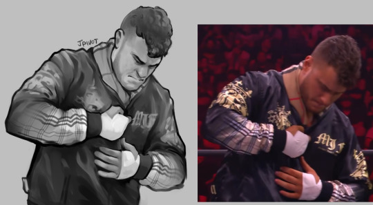
prolly couldve tilted mjf's head down more to match the ref but its a real tough angle as it is so whatever i'll forgive myself lol. been thinking a lot about The Jowls Zone in drawing lately. one of these days im gonna have to sit down and figure out how to draw lips in a way that looks normal and not bad, its starting to get weird to just ignore it and have everyone have skin flesh where their lips should be
anyway what is the DEAL with the burberry pattern fading out on his sleeves. such an ostentatious custom jacket job
#wrestling#mjf#been on this one-layer-only kick lately and im starting to be over it -_-#its got its pros and cons... its own set of annoyances...#process stuff#dailysplace
43 notes
·
View notes
Text
due to not being able to access my good ole computer for now, i have been forced to work in clip studio paint, a good art program, and on a good new fancy macbook i borrowed. instead of my old kinda wonky and glitchy version of paint tool sai, and on a shitty old computer that has software on it that is no longer available anywhere and doesnt work with the new OS. which is what i am used to working with, usually earning a "you live like this?" from others (i do and its great). to be clear i would have to upgrade at some point anyway, because my own computer has been through a lot and may soon pass away (although i thought that 5 years ago and here we are), but what im trying to say is ive been trying to get the hang of it. i am slow to embrace new tools and software. so i am working on overdue commissions yes but also i may need to do some bullshit Test Art first to figure things out as i would rather not deliver Awkwardly Produced Product if i am being paid for it. also does anyone know how to work with vector lineart in csp in a way that does not make one wish to throw rocks at cars
57 notes
·
View notes
Text
art wip stuff + me yelling about symbolism

so i took off all the lineart on this piece because i was bored, and it spat me this. thought it looked pretty baller :D
other wips + me yelling about symbolism under cut:
this is honestly the most complex piece i’ve ever done, pose + background + rendering considered. good grief, the number of layers i was juggling was insane XD
initial thumbnail:

did this way back in february.
background line art:

god, so i hate the task of laying out backgrounds- but once the line art is settled, painting them is a whole lot of fun. i’ll take painting and flats/shades over drawing line art any day.
background (without water rendering, anyways, ahah):

originally, the water shadows were rendered simplistically, like how water was shadowed in the ep an indirect kiss, but by the time i added in steven and the other elements i decided it looked too messy and needed a little more pizazz to properly give off a watery vibe. i also had no plans to add in vines in the foreground, yet- that decision was made FAR later, as an attempt to better frame steven in the piece.
line art hell!!!

literally the only reason steven’s barefoot instead of in sandals like i drew in the sketch is the fact that i didn’t want to draw shoes with his feet bent at these angles. XD
also, hands are hard. if you look closely, you can see the scribbled, non-connected mess my hands are before i pretty them up with vector tools.
flats (mostly) done:

this is the state this piece sat in for months while i took a break on it. i’m really glad i did so, because it gave me the idea to spread the chunks of the shattered diamond out, to add in rose petals floating from the sky, and to add vines in the foreground.
shattering that diamond:

goodness, this took some work. i lined in the shatter pattern on one layer so it all slots perfectly together, and then separated each chunk onto separate layers so i could move them apart. pointlessly time consuming, and i’m sure there could’ve been a better way to do this, but it worked all right in the end.
all the attempted symbolism nonsense in this piece:
it's set at rose's fountain because that's the place where steven first came face to face with just how larger than life his mother's legacy is- saw her statue towering over him- and realized he really doesn't know how to feel about her, or this "legacy" he has to uphold.
he's in the atlas pose because he feels he's the only soul upholding the peace in this new era three, and that if he slips up for even a moment, stops helping, becomes a burden, both earth and homeworld will fall.
earth is placed right in front of the star entrance of rose's fountain as a symbol for the crystal gems.
the roses resting on the rock and the petals falling are yet another reminder for steven of his mom.
he’s barefoot as another reference to his mom. he fears he’s walking in her footsteps, so to speak.
the thorns in the foreground and entangling steven are because he feels like fate has tied him to this path- also, rose thorns... more mommy issues, woo!
the diamond authority symbol is the flipped variety, with pink/steven's diamond on top... it's shattering, which is representative of steven's current mental state
154 notes
·
View notes
Note
Hey Tashi! I’m looking to get more into digital art. I know next to nothing however and was wondering what advice you could give about tablets to use and programs? Thank you!
My favourite art programs are Paint Tool Sai and Sai2. You need a license for Sai2, but there ARE versions of regular Paint Tool Sai you can get without paying for it, you just kind of have to poke around. (I know there are a few on deviantart if I remember). Pros of Sai are that it's fairly easy to use, it's user interface is very easy to understand and you have a few layer options. Biggest con is that it doesn’t autosave or backup save if it crashes. Sai2 does have autosave features.
Sai 2 has more options in terms of layers too, and has a textbox so if you want to spend $50 on a license I do recommend it. I have heard that the free programs for art are also good, I personally tried using gimp and it wasn’t terribly user friendly but that was a long time ago.
Photoshop CS2 is not exactly user friendly and can be very complicated. Photoshop CS6 is much the same. I personally don't care for them, myself.
Tablets can be expensive, but I prefer them. You CAN find them sometimes at thrift stores but generally they'll be the tiny ones and you'll have to look online for driver support to enable pen pressure which is your best friend. I recommend starting with a small cheaper tablet at first because generally most drawing tablets are all the same and you don;t need one with a screen to be able to work it.
There IS a disconnect between what your hand does and where you're looking but you'll get used to it pretty quickly. I also recommend scanning in your artwork if you are able to onto your laptop if you have one to be able to colour that way if you find you have trouble using a tablet or can;t afford one.
Paint Tool Sai's lineart layer is a vector tool and you don't need a tablet to be able to use the vectors to line your work, you just need to edit line points. I personally really like Wacom tablets. they fucking SUCK when it comes to usb chargers, every single USB port I have ever had on every tablet I've had of theirs breaks way too easily, HOWEVER all you have to do is get 2 rechargable batteries and a universal charger and you can alternate charging batteries and basically never run out. I think aesthetically they suck, but they DO last for a long time. they are too expensive for how cheaply they are made though and I have been told that huion tablets are better. Honestly the next time I get a tablet I'll be looking into a different brand mainly because of the price and also because all tablets pretty much do the same thing.
Personally my favourite size of tablet is medium, I think it gives you a better space to work with.
There are regular non-art tablets you can use, I know Bumble ( @sweetest-honeybee) uses a non-laptop tablet I think and she could probably tell you more about price and tools and how it works for her.
So to sum up and add a few more short notes:
- Paint tool Sai and Sai2 are my favourite art programs
- Photoshop is hard to navigate and you'll have to look up keyboard shortcuts, BUT it has a lot to offer in the ways of free downloadable brushes
- free art programs all have pros and cons and I suggest giving them a quick goodle
- scanning in your artwork to line and/or colour can be a good way to go
- All drawing tablets pretty much do the same thing
- Medium tablets have better space than small but they're more expensive
- Check that your tablet drivers work because pen pressure won't work without the drivers
- Paint Tool Sai does NOT have an auto recovery feature. Sai 2 does.
- FIND A WAY TO CONNECT YOUR TABLET PEN TO YOUR TABLET. I tied a ribbon to mine and I've never lost my tablet pen since doing that.
67 notes
·
View notes
Photo
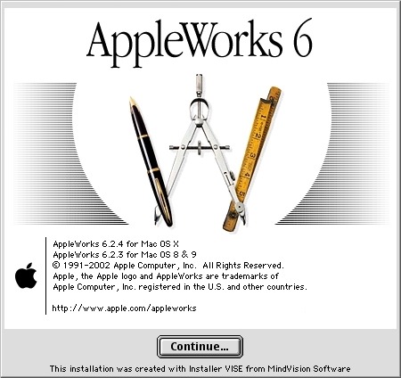
Back to childhood with AppleWorks
Hi everyone!
Today I'm going to tell you about a very old software that kept me busy for many, many hours during my teenage years and that I've had the pleasure of rediscovering these days.
Apple fans will have glitter of nostalgia in their eyes, others will have the opportunity to discover a beautiful tool that has not forgotten to be compatible with Windows.
It is AppleWorks!
AppleWorks was an office suite, installed on all Apple computers of the time, which, in addition to the classic word processor, spreadsheet and Power Point presentation, also offered a vector drawing tool and a bitmap drawing tool. It was my first experience in digital drawing and photo manipulation and with a bit of inventiveness, I was able to get some amazing things out of it.
Behind its apparent simplicity, this little soft hides an unsuspected power.
Let's go for a little trip back in time!
Small overview
The painting module
Gallery of illustrations
Install AppleWorks (Yes! It still works! )
Small overview
AppleWorks is 6 softwares grouped into one.
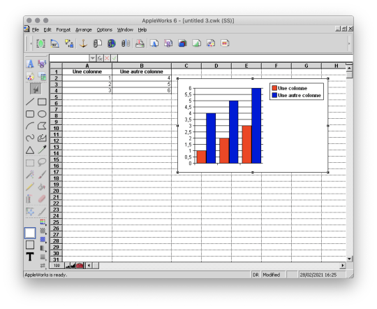
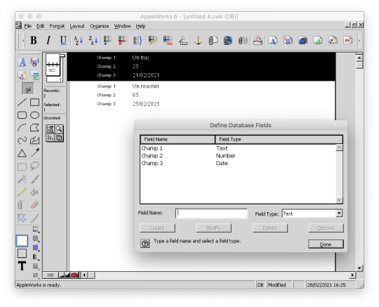
When you launch it, it offers you the possibility to create 6 types of documents: word processor, spreadsheet, database, presentation, bitmap drawing, vector drawing.
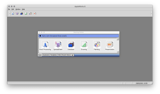
I quickly talk about Spreadsheet, Database and Presentation because I never used these modules.
Anyway, know that with Spreadsheet you could make like with Excel, with Database, create databases and with Presentation, make like with Power Point.
(You can click on the images to enlarge them to full size.)

And here are, then, the 3 modules that I really used!
The word processor

I wrote all my comics scripts, presentations and internship reports there when I was at school, until my dad bought Microsoft Office. Hard to compete with the Word arts. 8D
Except that Microsoft Office did not offer vector drawing software, nor bitmap drawing software. So it was not about to dethrone AppleWorks.
The vector drawing module

This module helped me a lot to make diagrams to integrate in the word processor, draw dungeon plans for our Donjons and Dragons sessions, make some logos or paste editable text on images like my comics pages.
I particularly liked its ability to generate gradients that roughly matched the shape in which they were applied, and there are recent vector drawing technologies that still can't do that and that's a little bit annoying to me.
And finally, here is the module where I really spent the most time!
The bitmap drawing module
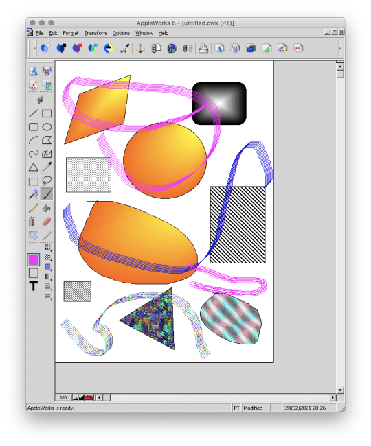
Well...
Some geometrical shapes, a pencil, a brush, a filling tool, an eraser...
So far it doesn't look much different from Paint.
Wait until you see what it is capable of. :p
The painting module (bitmap drawing)
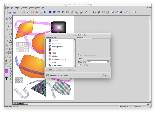
To begin, AppleWorks 6 is not the first version of AppleWorks that I worked with and already at that time, I had my little habits and what a disappointment for me when I didn't find my favorite features !!
Looking for a little bit it turned out that they were just a little hidden and just needed to be tidied up a bit.
Because yes! This small software already had a customizable interface by drag and drop as on a modern Photoshop!
Now all is clear, we can get to the heart of the matter: drawing! :p
I've already mentioned the toolbar on the side earlyer, which is already familiar to you if you've ever used Paint.
Now, let's move on to the area just below: the palettes.
AppleWorks offers a limited palette of colors.

You can combine the selected color with a pattern to apply. Some of them look like manga screentones.

Some fun colorful patterns are also available.

And finally a small palette of gradients is also available.
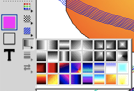
Well... A few funny patterns, some gradients. It's enough to have fun for 5 minutes, but nothing special. We will going not very far.
That's where the real work begins. :p
Do you remember? A few moments ago I added buttons in the horizontal bar at the top, including this one.

And this is what it opens!

A customization window! :D
Not enough colors in the default palette?
Never mind! You can create as many color palettes as you want.

Not enough patterns either in black and white or in color?
You can create as many pattern palettes as you want!


The default gradients palettes is too poor?
No problem! You can create as many gradient palettes as you want! And for the moment, I spent a lot, a lot, a lot of time on this section!
You can make circular gradients.

Linear gradients.

And gradients that fit the shape in which you apply them. Well, it's far from perfect with concave shapes, but it already allows for interesting things.

And to give the coup de grace to Paint, with AppleWorks you could even create your own brushes! :p

There are even some effects available such as blurring.
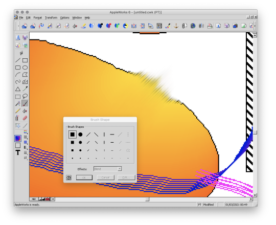
This AppleWorks is a piece of cake in the belly! :D
Now that we know about its possibilities, I propose to show you a small gallery of what I was able to do with this software from end of nineties to middle of 2000s. :D
Gallery of illustrations
Let's start with the very first drawing I made with AppleWorks in 1998.
We didn't have a scanner at the time, so I had to do it entirely with the mouse.
It was also a time when I didn't have much notion of saving the original files and I considered that as soon as I had printed the drawing, it was no longer worth keeping it on the computer to save space (the hard drive was 4 GB).
So this is a scan of the printed version you see here. x)
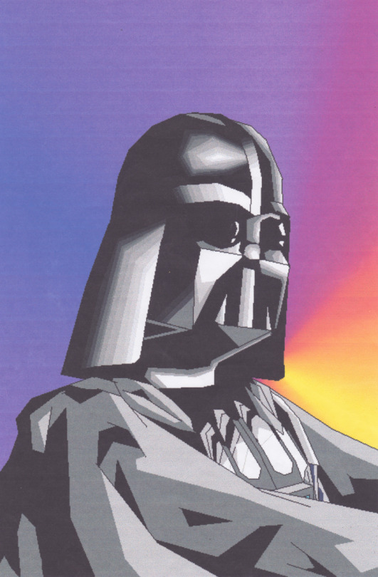
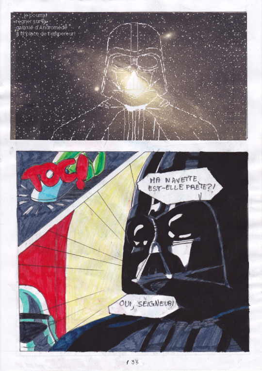
A good old Darth Vader! (1998)
Well, making a drawing from A to Z entirely with the mouse was laborious, so I also used AppleWorks to create backgrounds and print them. Then I would do my drawing by hand and cut it out and paste it onto the printed background.
I was able to make interesting effects by understanding the limitations of the software and exploiting them. By understanding that gradients were composed of a series of solid color bands, I could make focus line effects by filling them with the filling tool with a different patterns or gradients.
This posing remind some Dragon Ball character (Between 1998 and 2000)
It is also with AppleWorks that I made my first attempts at photo manipulation. I used photos from an encyclopedia we had on CD-ROM and manipulate them by tinkering them and copying and pasting small pieces here and there.
Then I printed my montages and paste them onto the comics pages.
My montages were mainly used for space scenery. (1999 - 2000 in collaboration with my sister)
This software really pushed me to be creative to get what I wanted out of it. I had even managed the tour de force of pasting a white lineart over a photo.
(2000 - 2001)
In the absence of layers, I had to work on 2 files in parallel and with the lasso select tool.
And then one day, our first scanner finally arrived home!
There the serious things could begin!
I was able to stop trying to make drawings with the mouse and use AppleWorks to put in color drawings made with the traditional way. So I was able to go further from the end of nineties.
It obviously started with Saint Seiya. x)
(You can always click on the images to enlarge them to full size.)
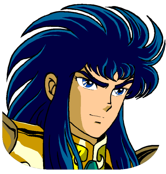
I loved the Aquarius saint. He was my favorite character from Saint Seiya. ^^ (2000 - 2001, this way)
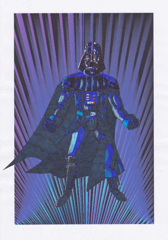
At the beginning I was just doing solid colors, but as I experimented with the features and learned how to combine them, I ended up getting more and more advanced renderings.
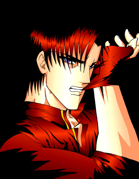
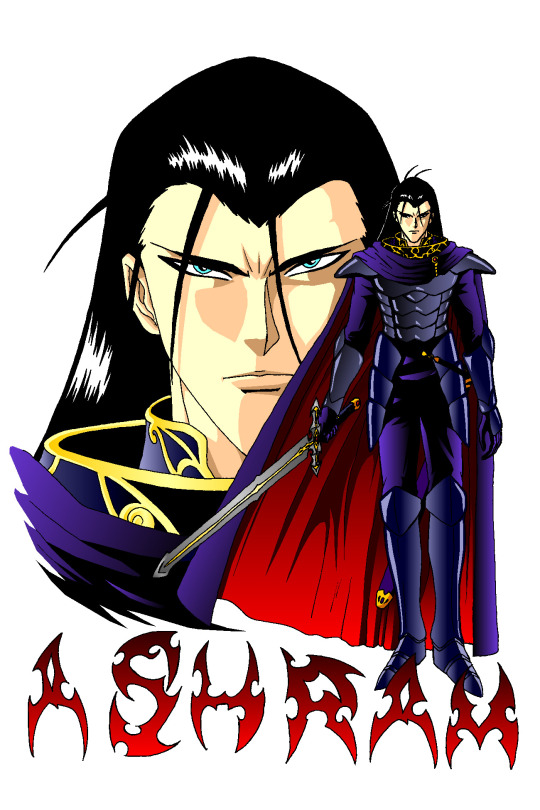
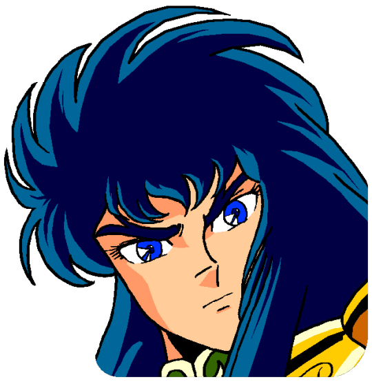
Aoshi Shinomori from Kenshin and Ashram from Record of Lodoss War. These two were also my favorites characters at one time. (Between 2004 and 2006)
If you have enlarged the images you must have noticed that the line is particularly crenellated. There was no antialiasing, no layer system with opacity levels, no tolerance threshold for the filling tool. So it had to be black, or white, but not in between.
As a result, AppleWorks was not really adapted to work on drawings with small details, hatching or heavily detailled backgrounds...
I tried anyway. :p
These last 4 examples I think I made them between 2004 and 2006.
The comics pages come from the first version of the Nécrotech project which is currently in a dormant state (but which I intend to resume one day). You'll notice on the first image of the last page some effects whose style stands out a bit from the rest. It's normal, I made them in another old painting software, Art Dabbler, but this is another story. :p
In 2007, I got tired of suffering, I started to use The Gimp, in 2008 I bought my first graphics tablet, in 2009 I embarked on the Photoshop adventure and you know the rest: I sold my soul to Promarkers and Clip Studio Paint.
And then there are days like that, we fall back into childhood.
(Click on the image to see it at full size and distinguish the pixel patterns. I know, I repeat myself, but the devil is in the details. :p )

Last week, I decided to make a theme of the Drink'N'Draw from A to Z with AppleWorks to see what I could get out of it with 15 more years of experience in drawing and illustration. 8D
With some tips you can get a pretty amazing result!
I am happy with the result, especially the colors.
It wasn't done without pain. The feature I wanted to take full advantage of (customizing color patterns) is buggy on the Windows version of the software, so I had to set up a Mac OS X Snow Leopard virtual machine to be able to do the finishing touches. What an adventure!
In any case, AppleWorks is always well adapted to make pixel art and this experience has allowed me to learn new things applicable in recent and professional softwares.
I had never really tried pixel art, which I love, by apprehension of the execution time. I think I found the trigger to get serious about it. I will explore it further. :D
Well, well, well! But in fact, calculating gradient patterns for pixel art with shaders shouldn't be complicated. I think I will add such an effect in Péguy ! :D
Install AppleWorks
You've read it right! You can still install and use AppleWorks in 2021! :D
Windows
I did the test with Windows 8.1 on my Cintiq Companion tablet from Wacom, and in the comments it seems that it also works very well on Windows 10.
To do this you will first install the latest version of QuickTime 7 which you can find on this page. You double click on the installer and you do next, next, next... Even when you are asked if you have a product key. It is not mandatory and useless for our needs.
Then you go to this page and download the first file. You unzip the file and double click on the installer, then same procedure as before: next, next, next...
You can do retro digital painting now! :D
Mac OS X
Apple computers have changed so much in 20 years that it is now impossible or at least very complicated to run the original programs on today's machines. The manipulation therefore consists in using the Windows version with the Wine emulator.
If I had no problem with the procedure, it may seem a bit complicated for non-technical profiles so I simply propose you to download the final application I created myself via this link on Google Drive. You just have to download it, unzip it (with a double click) and launch it.
If you're a computer geek and want to get a version of AppleWorks without the color pattern bug, you can get the .dmg here and install it in a Snow Leopard virtual machine.
Be reasonable about the size of your files. This is an old software that will have trouble supporting surfaces exceeding 2000px by 2000px. There is a way to cheat a bit, it is by creating a vector drawing file and creating a bitmap drawing surface inside.
That's all for that nostalgic moment. I think I will come back with some illustrations made with AppleWorks in the future. :D
Have a nice day and see you soon!
Suisei
P.S. If you want miss no news and if you haven't already done so, you can subscribe to the newsletter here : https://www.suiseipark.com/User/SubscribeNewsletter/language/english/
Source : https://www.suiseipark.com/News/Entry/id/308/
0 notes
Note
Hello, yes, hi, I recently found your art and account and I love what you do. I'm turning 14 in April and I've asked for a drawing pad, but I have no idea how to use one as of yet. Have you got any tips or anything? Because I've wanted to try digital art for a while and your art makes me want to even more lmao. Thanks! - B.A.
BOI OH BOI DO I GOT SOME TIPS FOR U
(I’m not sure what kind of comp you’re going to be using, so I’ll list for both.)
FIRST: Drawing Programs; the free and the great.
-Firealpaca: Lightweight drawing program. I draw Recovery using this! It’s easy on the RAM if you have a weak comp/are paranoid about yours like I am, it is mainly for basic comic making, and has all the basic brushes you need (pen/pencil/airbrush/symmetry/etc). You can add your own brushes as well but they’re p basic settings. Has basic Animation/Gif making as well using Onion Mode! Layout is a piece of cake. Please note that If you leave it open for a week it’ll crash on you, even if you haven’t anything on it at the moment, and sometimes the brush sensitivity just stops working so you just have to close and then open it again. (Also I have no idea how to update it aside from deleting it completely and just downloading the new version from scratch, so thats a thing.) Mac/Windows
-MedibangPaint: This is basically FireAlpaca But Better. Has tons of screen tones, brush patterns, and tools. I don’t use it much because I’m used to FA’s layout and get confused with the the placement of tools in here, so if you can I highly suggest just going with this first. Also has basic animation/gif making! Has storage for the website as well, and you can upload more preset brushes. It’s v anime. This program has waaay more in terms of basically everything, so it just takes more RAM. NBD, you don’t have to have every brush downloaded from the storage ^u^. Mac/Windows
-Clip Studio Paint: Okay this one isn’t free, it’s a pricey one, HOWEVER once a year they take the price way fuckin down by at least 75%. Sign up for the email list and it’ll let you know when that precious day comes. It’s how I got it @u@, around christmastime? This program is basically MedibangPaint On Steroids. I do all of my digital-yet-tradition-style-painting on here! The brushes all have some neat af settings to play with, you can make your own brushes, has tons of screen tones, pre-made panels, and settings. You can save projects as basically anything you need, is a hardy program that almost never crashes, and It’ll take a nice chunk of space on your comp depending on how much memory you have but hey, its worth it. It’s much more complex layout-wise than the other two here, but you get used to it after playing around and watching tutorials haha.
-Mischief: It’s a 25$ app, has like four brushes and five layers only but is vector-based with an endless canvas. Not really worth having unless you like the vector thing. UP TO YOU. I spent forever with this one doing all that homestuck stuff, so it’s not really bad so much as it is a basic bitch. Mac
-MyPaint: I used this a bunch when I still did digital art on my windows laptop before I upgraded to a Mac. It’s easy on the comp and has plenty of brushes and settings. You can also get brush packages if you don’t feel like you have enough that comes with the program! Also has endless canvas; pretty sure you can just select an area and then export as is. I barely remember the rest but It’s pretty great. Windows/MacPorts(which I hate)
-GIMP: I hate this thing. I cannot figure it out for the life of me. It’s got loads of shit though, can handle layers, has plenty of brushes, and can do basic animation/gifs if you ever figure it out. Windows/mac
I’ve heard good things from paint tool SAI and Krita as well, but have never used them myself.
***You can always pay through the nose/use a student discount for the photoshop series and pay that shit monthly, those fuckers have literally everything, but I am a cheap college kid making minimum wage with a car payment; I’d rather just pay once/not at all.
TABLETS: treat that shit like a newborn babe 24/7
-I have literally only ever owned a Wacom Intuos4. It has lasted me six years, and at least five moves across many miles. I broke one of the cord ports the day I opened it by holding it wrong, have one left, and now treat it like it’s going to die if the cord moves badly. Please be aware that if you break both ports, you better either sodder it back together yourself or upgrade to smth else because it costs about as much as the tablet itself was bought at to be fixed. Good news, though, it comes with at least six extra pen nibs, has programable buttons on the side (that I have never bothered to use) and a scroll bar in case you’re too lazy to use the keyboard (…I don’t really use that either unless I’m just scrolling through tumblr LMFAO).
-I would die for a Cintiq.
HOT TIPS: its useful.
-most of the programs listed use the same keyboard shortcuts. MEMORIZE THEM. It’s pretty easy, since you’ll use em a lot. [cntrl/cmmd+T] lets you resize what you just drew on that layer, and [cntrl/cmmd+z] is undo. I use those the most, for obvious reasons.
-vector-based programs are pretty great because when you resize an image it looks prefect. You can’t do that with a program that isn’t, so I just resize the base roughdraft and draw the lineart again on the layer above so I don’t get weird JPEG quality lines.
-You can use a ruler with your tablet, just slap it on and go, but honestly most programs have settings for that. just use those.
-You can also trace stuff on your tablet, so long as the paper isn’t too thick. I just scan/take a photo and then open it up in the program, though. much easier.
-SAVE CONSTANTLY. Art programs like to crash on you, even when they’re hardy and you have a good comp. make it a habit to quick save your work.
-Use a desk and have good posture. You’ll be able to draw a hell of a lot longer if you do. I personally keep fucking up my knees by sitting on my legs as I work out of habit, and don’t actually have a desk chair. Keep your screen at eye level and at a fair distance to prevent eyestrain and also neck-strain haha
-Chances are you won’t be used to the tablet right away. Most places you buy from say it’ll take a couple of months to get used to how weird it is to draw while not looking at your own hand, so don’t be frustrated If your drawings look a bit off at first.
-if you draw at least one thing every day, by the end of the year you’ll have improved exponentially. I literally made this blog to make myself draw once a day.
-don’t be afraid to check out speedpaints and tutorials. It’s always good to get more familiar with the program you’re using and new techniques previously unconsidered.
-get familiar with clipping layers. They are insanely useful; you clip one layer to the one below and then when you draw it only shows up on the drawing of that layer below. Shit is a godsend if you’re bad at coloring in the lines/lazy. The bucket tool is also really useful, and you can adjust the expansion by pixel so you don’t miss anything between the lines.
-experiment with your brushes, shit be fun af
-warmup your wrists before and after drawing. prevent swollen veins and such. dont want hand pain/numbness, its reaaaaally bad.
—basically if your hands hurt stop for the day.
-PNGS are for internet, JPEGS are for printing/fucking with quality (cough hack homestuck)
-resolution doesn’t have to be much more than 350 dpi if its just going to be on a webpage. Maximize that shit if you’re going to be printing, though. Especially if you put stuff on redbubble.
-DeviantArt has this thing called Sta.sh where you can dump art, keep it in perfect quality and just share it with certain people with a link instead of all of the website. Great for storing commission pieces, its the only reason I have DA in the first place.
-you get a different audience depending on what site you use for posting art, so keep that in mind for the kind of feedback you want.
-after awhile of drawing using a tablet, you may lose patience/forget that in traditional art there isn’t an undo button lmfao It’s cool; you don’t have to choose one over the other or anything.
-Honestly you can work around almost anything. You just invent new ways and techniques for yourself and you’ll do just fine.
Aaaaand that’s all I got for today! Thanks for sticking around
277 notes
·
View notes
Last Seen Blogs

morgothhighking
COUNTERACT

my-name-is-markus-with-a-k
The Hope of a People
kpop-obsessive-obsession
Kpop Obsessive Obsession

cocoagorgeous
Cocoa G 🥀 Glamour Girl